the use of measurement in quality improvement · · 2017-09-28national health performance...
TRANSCRIPT

www.monash.edu.au
The use of measurement in quality improvement
Damien Jolley Centre of Research Excellence in Patient Safety School of Public Health & Preventive Medicine With acknowledgements to:
2
Suggested topics for discussion
• Motivating examples: indicators, graphs • Quality & quality improvement • Measurement • Understanding variation • Statistical process control charts • The anatomy of a good indicator • PDSA cycles & implementing change • Communicating – visual displays • Any others … ?
References & further reading

3
Communicating numbers effectively
• Indicators of global health & associations between them – http://graphs.gapminder.org/world
• Indicators of health system performance
and comparisons between hospitals – http://www.drfoster.co.uk/Guides/

4
What is quality?
• Degree to which a set of inherent characteristics meets requirements [ISO9000]
• Number of defects per million opportunities [6σ]
• Conformance to requirements [Crosby]
• Fitness for use [Juran]
• Products and services that meet or exceed customers’ expectations [Kano]
• The result of care [Pirsig]
http://en.wikipedia.org/wiki/Quality

5
American Society for Quality
• “Quality” is a subjective term for which each person has his or her own definition
• In technical usage, “quality” can have two meanings:
– The characteristics of a product or service that bear on its ability to satisfy stated or implied needs
– A product or service free of deficiencies
http://www.asq.org/glossary

6
Quality in a health care setting
• Quality : the extent to which a health care service produces a desired outcome
• Quality improvement : better health outcomes are achieved through analysing and improving service delivery processes
http://www.health.vic.gov.au/qualitycouncil/pub/improve/data_guide.htm

7
National Health Performance Committee (NHPC) (2001), National Health Performance Framework Report, Queensland Health, Brisbane.

8
Using data to improve quality
• Collecting & analysing data helps: – To see problems – To identify opportunities for improvement
http://www.health.vic.gov.au/qualitycouncil/pub/improve/data_guide.htm

9
modified from: G. Rubin & B. Harrison, NSW Health http://www.health.nsw.gov.au/pubs/2001/pdf/clinicians_toolkit.pdf
The Quality Improvement Cycle What is the question, or problem?
What can we improve?
How can we achieve
improvement?
Have we achieved
improvement?
Have we sustained
improvement?

10
Phase 1: What is the problem, or question?
• With (good) data you can: – assess current performance and identify
performance gaps – understand the needs and opinions of stakeholders – prioritise problems and improvement projects – establish overall aims and targets for improvement – establish a clear case for the need for improvement.
• Tools to prioritise: – Quality impact analysis
http://www.health.vic.gov.au/qualitycouncil/pub/improve/data_guide.htm

11
Phase 2: What can we improve in this system?
• With (good) data, you can: – define the processes and people involved in
the processes – identify problem steps in the process – identify and prioritise opportunities for
improvement – establish clear objectives for improvement
of process steps – identify barriers and enablers to change
http://www.health.vic.gov.au/qualitycouncil/pub/improve/data_guide.htm

12
http://www.tin.nhs.uk/tools--techniques
Example: INR testing processes

13
Phase 3: How can we improve?
• With (good) data, you can: – determine the most appropriate
interventions to address your particular problem and to suit your situation
– prioritise interventions and implementation strategies
– compare the benefits of alternative interventions and implementation strategies
http://www.health.vic.gov.au/qualitycouncil/pub/improve/data_guide.htm

14
Setting targets for improvement
• Make sure your targets are linked to your aims and objectives
• Be realistic in your expectations – you won’t be able to eliminate all adverse events or all
inappropriate admissions • Express the target as a value, not as a percentage
improvement. – For example, if baseline throughput in a clinic is five
patients per hour and you want to improve by 10%, then state your target as 5.5 patients per hour
• Reassess targets throughout the project and be prepared to modify them in light of experience and in consultation with stakeholders
http://www.health.vic.gov.au/qualitycouncil/pub/improve/data_guide.htm

15
Phase 4: Have we achieved improvement?
• With (good) data, you can: – assess the impacts of interventions and
implementation strategies – demonstrate the success of the
improvement project to stakeholders • Some methods:
– Repeated audits, surveys – Key informant interviews, focus groups – Statistical control charts
http://www.health.vic.gov.au/qualitycouncil/pub/improve/data_guide.htm

16
Phase 5: Have we sustained improvement?
• With (good) data, you can: – provide feedback to reinforce change and
demonstrate benefits for clinicians and clients/patients
– identify slippage in practice and the need for repeated intervention or change of intervention approach
• Demonstrating sustained improvement required sustained measurement!
http://www.health.vic.gov.au/qualitycouncil/pub/improve/data_guide.htm

17
IHI Hints for Effective Measurement
• Seek usefulness, not perfection • Use sampling • Plot data over time • Integrate measurement into the daily
routine • Use qualitative and quantitative data
http://www.ihi.org/

18
Usefulness, not Perfection
• All measurements are wrong !!
• Most measurements are useful !!
• Measurement is not the goal – Improvement is the goal – Measurement is the tool – measure change

19
Use sampling
• Don’t try to measure ALL events or outcomes
• Sampling leads to: – Efficiency – Simplicity – Acceptance – Quality – Accuracy

20
Easy sampling methods
Systematic sampling – Regular selection
eg every hour on the hour, every 10th patient
1. Decide how many 2. Work out flow rate 3. Divide total number by
the number you need
Block sampling – Select a straight
sequence in a single time frame
1. Decide how many 2. Select location and time
to begin 3. Select 1st unit and keep
going until target reached
http://www.ihi.org/

21
How many to sample?
• THIS IS NOT RESEARCH !! – So not necessary to think of “power”
• Use intuition
– even small samples are very useful
• Accumulate over time – Measure for change

22
Plot data over time
• Measure for change – change implies time
• Visual inspection of temporal patterns is much more informative than statistical test
• Tracking a few key measures over time is the single most powerful tool a team can use
http://www.ihi.org/

23
Integrate measurement into the daily routine
• Regularity, recency, responsibility are key features of useful data collection
• DON’T rely on IT department !!
• Use simple forms, part of someone’s job
• Reward/praise for accurate, regular collection and reporting
http://www.ihi.org/

24
Qualitative AND Quantitative
• Use ALL levels of measurement – Nominal (categorical) – Ordered categories, eg satisfaction, pain – Interval or ratio (quantitative) data
• Measure qualitative outcomes:
opinions, advice, satisfaction, experiences
http://www.ihi.org/

25
What’s a “good” measurement?
• Two measures of quality : – Reliability
> aka: consistency, agreement, reproducibility > Will yield same, or close, value when
remeasured – Validity
> aka: accuracy, lack of bias, correctness > Measures what it is intended to measure

26
Reliability
One man’s definition…


28
Reliability vs validity
Reliability vs validity

29
Validity
• Content validity – Covers the domain of its intent
• Construct validity – Consistent with theoretical constructs
• Criterion validity – Close to an external reference, or “gold
standard” true measurement

30
For Quality Improvement…
• Measures should be: – Reliable – Content valid – Construct valid
• Need for criterion validity (the hard one!)
is less critical

31
Understanding variation
• Two distinct types of variation: – Common cause variation
Normal, everyday, inevitable (and usually unimportant) variation which is intrinsic and natural to any system
– Special cause variation Indicative of something special
happening and calls for a fuller understanding and often action
“Ultimately, the ability to lead depends upon
one’s ability to understand variation” W. Edwards Deming
http://www.apho.org.uk/resource/item.aspx?RID=44584


33
Deming’s System of Profound Knowledge
• Appreciation of a system – understanding the overall processes involving suppliers,
producers, and customers (or recipients) of goods and services
• Knowledge of variation – the range and causes of variation in quality, and use of
statistical sampling in measurements • Theory of knowledge
– the concepts explaining knowledge and the limits of what can be known
• Knowledge of psychology – concepts of human nature
http://www.apho.org.uk/resource/item.aspx?RID=44584

34
Example: Hospital league tables
Performance league tables: the NHS deserves better Peymané Adab, Andrew M Rouse, Mohammed A Mohammed, Tom Marshall BMJ 2002;324:95-98

35
Better displayed as a Control Chart:
Performance league tables: the NHS deserves better Peymané Adab, Andrew M Rouse, Mohammed A Mohammed, Tom Marshall BMJ 2002;324:95-98
19
32
35

36
Statistical Process Control
• Helps to distinguish types of variation • Allows us to judge whether we have:
action: concentrate on the whole system rather than particular individuals within the system
A system with average level of performance which is not acceptable, regardless of the variation
C
action: address the outliers
A working system with average level of performance acceptable but with outliers
B
ideal A working system with average level of performance is acceptable & no outliers A
http://www.apho.org.uk/resource/item.aspx?RID=44584

37
A statistically uniform system
• Proportion of ED attendances seen within 4 hours
• Average = 98.4% • Plenty of common
cause variation • One special cause
variation () at week 10
http://www.apho.org.uk/resource/item.aspx?RID=44584

38
A uniform system not meeting requirements
• Compared with target expectations, this system is performing at the wrong level
http://www.apho.org.uk/resource/item.aspx?RID=44584

39
Funnel plot
• MRSA rates, NHS hospitals, UK 2005/6
• “Alert” area between red lines
• “Alarm” area above red lines
• Good performers below green lines
http://www.apho.org.uk/resource/item.aspx?RID=44584

40
Example of Control Chart
• Outpatient clinic: – Do we meet quality requirement for patient
waiting times?
• Beginnings of solution: – Decide on a sampling strategy – ? How many patients? How many days? – Try to be uniform across days

41
Data
• Waiting times of n=30 patients recorded each weekday for four weeks
• Mean and standard deviation of each batch calculated and entered into spreadsheet
• Summary data: – Average batch size
> n = 30 – Average of means
> mean = 15.93 minutes – Average of std devs
> sd = 4.91 minutes

42
Plot data
• Use time as horizontal axis, mean time vertical
• Plot a straight line at the overall mean
• Series shows variation (?special or common?) and a pattern
10
12
14
16
18
20
22
0 4 8 12 16 20
Sample #
Mea
n w
aitin
g tim
e
meangmean

43
Calculate some control limits
• Upper control limit = (overall mean) + 3 x (avg SD)/sqrt(n)
• Lower control limit = (overall mean) - 3 x (avg SD)/sqrt(n)
• Note: If batch size is small (n < 25), we need to inflate “avg SD” by a small amount. See standard textbooks (eg Winkel 2008) for details
3091.4393.15UCL ×+= min 62.18687.293.15 =+=
3091.4393.15UCL ×−= min 27.17687.293.15 =−=

44
Plot data, mean and control limits
• Control limits shown as dotted lines on the time-chart • Three values (days 5, 10 and 15) are above UCL • Process is not “in control” • Action:
– identify these points as “special variation” – remove these points and repeat the calculations for UCL & LCL
10
12
14
16
18
20
22
0 4 8 12 16 20
Sample #
Mea
n w
aitin
g tim
e
meanLCLUCLgmean

45
First cull…
• With three outliers removed, mean & SD change
• Changes flow through to UCL and LCL
• Plot changes as well… • Now we find one more
outlier: sample #20
10
12
14
16
18
20
22
0 4 8 12 16 20
Sample #
Mea
n w
aitin
g tim
e
meanLCLUCLgmeanoutliers

46
Second cull…
• With four outliers removed, we now have a system which is “in control”
• All remaining variation is common cause variation
• The samples with special cause variation (samples 5,10,15 and 20) used to seek reasons
10
12
14
16
18
20
22
0 4 8 12 16 20
Sample #
Mea
n w
aitin
g tim
e
meanLCLUCLgmeanoutliers

47
Conclusions
• With special cause variation removed, process is “in control” • Team needs to decide if resultant overall mean and UCL/LCL
are within quality requirements for the system
• Turn to special cause variation; notice that: – All outliers are on Fridays – Cardiology schedules ECG recordings on Fridays – Overtime more common on Fridays than other days – Need to address efficiency of ECG venipunctures

48
Second example: binary outcome (yes/no)
• Fasting & Gisvold report audit of anaesthesia outcome at Trondheim University Hospital, 1997 to 2001
• Around 1500 general anaesthesias per month
• One measured outcome: difficult emergence – Possibly associated with airways or circulation on awakening – No patients younger than 16 years, or with cardiac anaesthesia
• In 1999 (month #15), long-acting muscular relaxants replaced
with intermediate-acting muscular relaxants
Fasting S & Gisvold SE. Can J Anesth 2003; 50:767-74 cited in Winkel & Zhang (2007)

49
Data
• Audit data entered into Excel spreadsheet
• “GAs” = general anaesthesias “DEs” = difficult emergences
• In all, 45,088 anaesthesias, with 1,123 difficult emergences recorded
• Rate = 25 per 1000
• Intervention from Month 15 onwards

50
Control limits for variable sample size
• UCL = (overall p) + 3 x sqrt( p(1-p)/ni ) – note ni changes monthly • LCL = max(0, p – 3 x sqrt( p(1-p)/ni )
• There are two points beyond the control limits, and 14 of last 16
fall below the centre line; so system is not in control
0.010
0.015
0.020
0.025
0.030
0.035
0.040
0 5 10 15 20 25 30
Month #
Frac
tion
with
diff
icul
t em
erge
nce
rate
average
UCL
LCL
Intervention

51
Separate intervals
• With knowledge of intervention, we can divide the series into two • We compute control levels separately, and create two charts
• Both are in statistical control; post intervention rate = 20 difficult
emergences per 1000 general anaesthesias performed
Prior to Intervention
0.010
0.015
0.020
0.025
0.030
0.035
0.040
0.045
0.050
-1 1 3 5 7 9 11 13 15
Month #
Fra
ctio
n w
ith d
iffic
ult
em
erg
en
ce
rateaverageUCLLCL
After Intervention
0.008
0.013
0.018
0.023
0.028
0.033
15 20 25 30
Month #
Fra
ctio
n w
ith d
iffic
ult
em
erg
en
ce
rateaverageUCLLCL

52
Monitoring performance: CUSUM charts
• Poloniecki et al (2004) report heart transplant data 1986-2000 from St. George’s hospital UK
• Outcome: death in 30 days
• Overall risk = 79/371 = 21%
• “Acceptable” risk set at 15%
• Is this system out of control?
Poloniecki J et al BMJ 2004; 328: 375

53
Repeated P-value test
• Graph shows the death rate by operation number (red line) • Above “acceptable” rate of 15% at all times • Month-by-month test of hypothesis H0: rate=15% (blue line)
shows statistically significant excesses most of the time
54
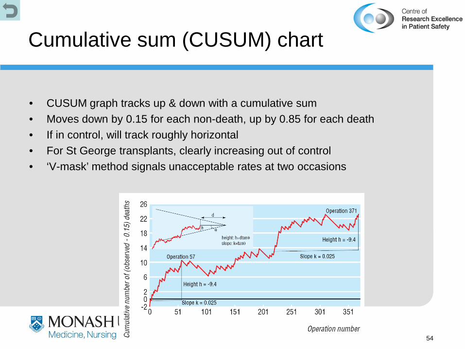
Cumulative sum (CUSUM) chart
• CUSUM graph tracks up & down with a cumulative sum • Moves down by 0.15 for each non-death, up by 0.85 for each death • If in control, will track roughly horizontal • For St George transplants, clearly increasing out of control • ‘V-mask’ method signals unacceptable rates at two occasions

55
Indicators
• Indicators are succinct measures that aim to describe sa much about a system in as few points as possible
• They help us to understand a system, to compare it and to improve it
• Example: National Hospitals and Health Reform Commission “Beyond The Blame Game”, April 2008
http://www.apho.org.uk/resource/item.aspx?RID=44584

56
Characteristics of indicators
• Key roles: – Understanding how a system works – Performance monitoring – Accountability to patients, taxpayers
• Fear & loathing – Mistrust and ambivalence are common – Indicators make people & organisations feel
vulnerable, exposed & defensive

57
Anatomy of an indicator
• “Indicator” = data + metadata – “metadata” is ‘data about the data’

58
Good metadata
• An indicator’s metadata will help you to assess if the indicator is:
– important & relevant – able to be populated
with reliable data – likely to have the
desired effect when communicated well
• Ten basic questions to ask about the metadata:--
1 What is being measured?
2 Why is it being measured?
3 How is this indicator actually defined?
4 Whom does it measure?
5 When does it measure it?
6 Will it measure absolute numbers or proportions?
7 Where does the data actually come from?
8 How accurate and complete will the data be?
9 Are there any caveats/warnings/problems?
10 Are particular tests needed, such as standardisation, signficicance tests, or statistical process control to test the meaning of the data and the variation they show?

59
Critically appraising indicators
A: Do the indicators address the important issues?
B: Are they scientifically valid? Do not proceed unless the indicators are
both important and valid

60
Critically appraising indicators
C: Is it actually possible to populate the indicator with meaningful data?
D: What is its meaning? What is the
indicator telling you, and how much precision is in that?
E: What are you going to do about it?

61
Model for Improvement
1. The conversation leading to agreed, measurable objectives
2. Well-designed indicators that measure the right data, in the right parts of the system, at the right time
3. Indicators that help you understand what part of the system to change and how
Act Plan
Study Do
1. What are we trying to accomplish?
2. How will we know if a change is an improvement?
3. What changes can we make that will result in improvement?
http://www.apho.org.uk/resource/item.aspx?RID=44584

62
Some Things to Consider When Making Improvements
• Multiple PDSA Cycles (and time) are usually needed to adapt a change
• Pay attention to detail • Measurement - useful not perfect • Promote the project • Overcoming barriers to achieving success
• Hold the gains
http://www.ihi.org/
63
Learning in Plan-Do-Study-Act Cycles
• Build knowledge sequentially – a short time period, a shift, a unit, a few clinicians – use multiple PDSA Cycles
• Some reasons for changes not resulting in improvement: – Hypothesis wrong – Change not executed well – Unexpected problems
• Use of data – qualitative data to help refine your change – data on sub-components of the system during cycles
http://www.ihi.org/

64
Repeated Use of the PDSA Cycle to Improve LOS for Patients with X-rays
Theories Ideas
Changes That Result in
Improvement
A P S D
A P S D
Cycle 1a: Pilot quick-look for extremity x-rays on one shift. Monitor LOS for patients with x-rays and error rate. Review results with Radiology.
Cycle 1b: Revise documentation process and try quick-look for two days.
Cycle 1c: Redesign viewing area and continue quick-look for two weeks.
Cycle 1d: Make quick-look standard practice and monitor.
http://www.ihi.org/

65
Use of Data
Theories Ideas
Changes That Result in
Improvement
160
180
200
220
240
260
280
300
320
LOS
(min
utes
)
Goal
A P S D
A P S D
1a
1b
1c
1d
1 2 3
Median LOS for Admitted Patients
Week
1. “quick-look” x-rays 3. Bed ahead
2. Work-up done on floor

66
Decrease the Time Frame for a PDSA Test Cycle
• Years • Quarters • Months • Weeks • Days • Hours • Minutes
Drop down next “two levels” to plan Test Cycle!
http://www.ihi.org/

67
New/Review Ratio
Time Waiting for Service
Did Not Attend
Discharges to primary
health
The Use of Multiple PDSA Cycles Improving Performance in the Outpatient Dept
http://www.ihi.org/

68
We found a new technology represented by a sequence that can help our organization improve health care. We want to discover the rule (or theory) that
generated this sequence.
Each improvement team should run tests to determine the rule. When they are sure that they have the rule (based on enough tests), then implement the technology in their organization.
Learning the Sequence

69
How will we know that a change is an improvement?
1. Correct predictions of results of tests
2. A statement of the correct rule upon implementation
Learning the Sequence
70
What changes can we make that will result in improvement? 1. Each team can test one sequence on each cycle. Write
down the specific sequence (example) being tested. The seminar leader will classify as either conforming or nonconforming.
2. Run as many cycles as required until you are sure you know the rule. Keep track of the number of cycles, and whether the example test sequence was conforming or nonconforming to the rule.
3. When testing cycles are complete, wait until all teams are done to report the implementation cycle (state the rule).
Learning the Sequence

71
PlanAct
DoStudy
Objective - test another sequence. Predictions - will test sequence be correct? Plan - write down next sequence.
Carry out the plan. Show test sequence to instructor. Record confirming or nonconforming.
Compare data to predictions Summarize what was
learned. Update the team’s
theory(s). What is our degree
of belief in ourtheory?
Are we ready toimplement thechange?
What examplesshould we test on thenext cycle?
PDSA Cycle for Learning the Sequence

72
What Did We Learn About PDSA?

73
Useful Measurement
• Data directly related to aims • Data collected in cycles to determine the
effect of a particular change • Qualitative data to assist in refining a
change • Narrow bandwidth & stay on the money
http://www.ihi.org/

74
Collecting Data
• Use purposive sampling to conserve resources – Sample data daily for Fast Track, Main ED, Admitted – Summarize data weekly using the median to lessen
the effect of outliers – To calculate Total LOS, use a weighted average of
the medians • Integrate measurement into the daily routine
http://www.ihi.org/

75
How to do it: Resources
• Use internal QI support for collecting, analyzing and reporting data
• Use internal facilitators • Use the work of others within the
Collaborative • Use small-scale data collection to
minimize additional resources needed • Reframe the scope of the project
http://www.ihi.org/

76
The Key: Holding the Gains
• Document processes and adhere to standards
• Pay attention to orientation and training • Assign ownership • Use measurement and audits
http://www.ihi.org/

77
Steps for better graphs
• Identify direction of effect – In almost all cases, the cause or predictor variable should
be horizontal (X) – Effect or outcome variable is best vertical (Y)
• Identify the levels of measurement – Nominal, ordinal or quantitative are different!
• Think of visual perception guides – Columns or dots? Lines or scatterplot?
• Minimise guides and non-data – Grid lines, tick marks, legends are non-data

78
Levels of Measurement
• The right display for a variable depends on its level of measurement
• For just one variable, –qualitative ⇒ barplot –ordinal ⇒ column chart –quantitative ⇒ boxplot or histogram
• For two variables,
–X ordinal, Y binary ⇒ connected percents
–X & Y both quantitative ⇒ scatterplot
–X categorical, Y quant ⇒ box plots
• Binary > eg gender, death, pregnant
• Categorical –Qualitative
> eg race, political party, religion
–Ordinal > eg rating scale, satisfaction
• Quantitative –Interval
> only differences matter, eg BP, temperature
–Ratio > absolute zero, ratios matter,
eg weight, height, time

Source:
Killias M. International correlations between gun ownership and rates of homicide and suicide.
Can Med Assoc J 1993; 148: 1721-5

% of households owning guns
Rat
e of
hom
icid
e w
ith a
gun
(per
mill
ion
per y
ear)
10 20 30 40
1
5
10
50 USA
Norway
Canada
France
Finland Belgium
Australia
Spain Switzerland
Netherlands
West Germany
Scotland
England & Wales
Exploit the levels of measurement …
Drawn using S-plus

81
Time charts
• Quality improvement is about change
• Time is often the predictor variable
• Connected lines are very powerful
• Added text helps • Target line
160
180
200
220
240
260
280
300
320
LO
S (m
inut
es)
Goal
Work-up done on floor
2/16/98 3/16 4/13 5/1 1 6/8 7/6
Week
Bed ahead
Individual responsible for bed control
Quick - look x - rays
160
180
200
220
240
260
280
300
320
LO
S (m
inut
es)
Goal
Work-up done on floor
2/16/98 3/16 4/13 5/1 1 6/8 7/6
Week
160
180
200
220
240
260
280
300
320
LO
S (m
inut
es)
Goal
Work-up done on floor
2/16/07 3/16 4/13 5/1 1 6/8 7/6
Week
Bed ahead
Individual responsible for bed control
Quick - look x - rays
82
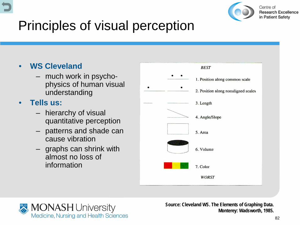
Principles of visual perception
• WS Cleveland – much work in psycho-
physics of human visual understanding
• Tells us: – hierarchy of visual
quantitative perception – patterns and shade can
cause vibration – graphs can shrink with
almost no loss of information
Source: Cleveland WS. The Elements of Graphing Data. Monterey: Wadsworth, 1985.

83
Ubiquitous column charts
Source: Jamrozik K, SpencerCA, et al. Does the Mediterranean paradox extend to abdominal aortic aneurism? Int J Epidemiol 2001; 30(5): 1071

84
A dotchart version…
Drawn using S-plus “Trellis” graphics
Mediterranean Netherlands
All other Other N Europe
Australia Scotland
Full fat milk
50 60 70 80
Adds salt 50 60 70 80
Meat 3+ weekly
50 60 70 80
Fish 1+ weekly 50 60 70 80
Percent
85

86
Moiré vibration
is easy with a computer !!!

87
Moiré vibration
• Vibration is maximised with lines of equal separation • This is common in scientific column charts
cited in Tufte E. The Visual Display of Quantitative Information.
88
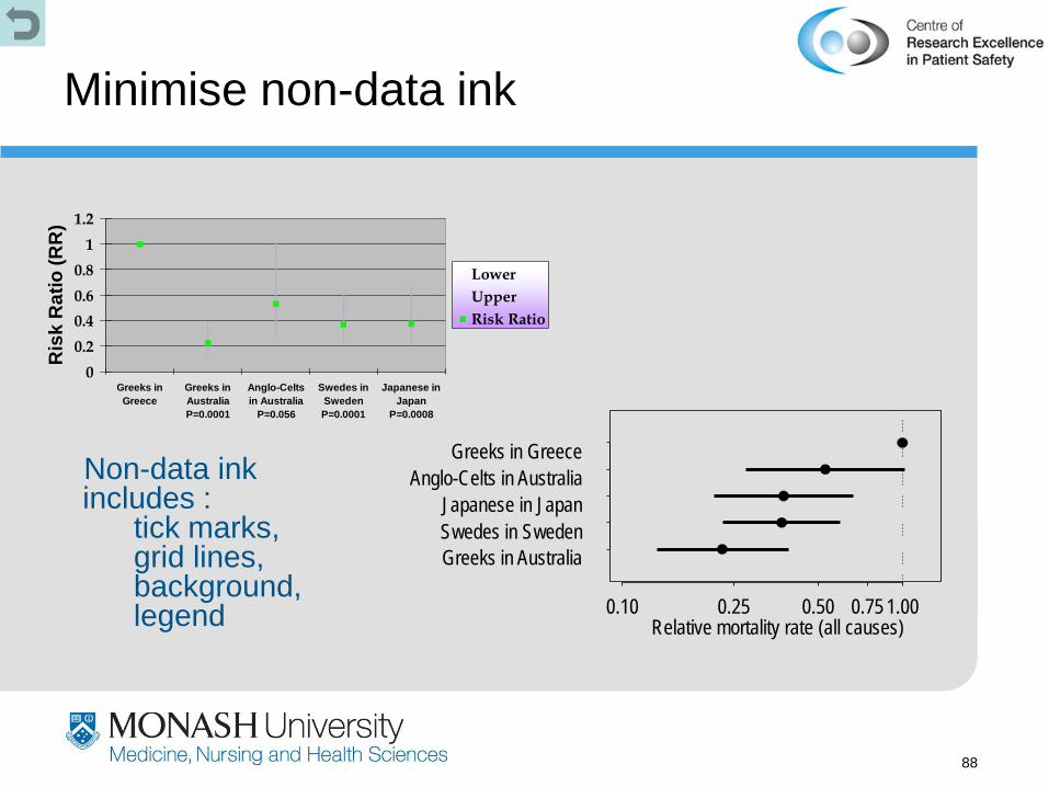
Minimise non-data ink
Non-data ink includes : tick marks, grid lines, background, legend
00.20.40.60.8
11.2
Greeks inGreece
Greeks inAustraliaP=0.0001
Anglo-Celtsin Australia
P=0.056
Swedes inSwedenP=0.0001
Japanese inJapan
P=0.0008
Ris
k R
atio
(RR
)
LowerUpperRisk Ratio
Greeks in Australia Swedes in Sweden Japanese in Japan
Anglo-Celts in Australia Greeks in Greece
0.10 0.25 0.50 0.75 1.00 Relative mortality rate (all causes)

89
Summary
• Seek usefulness, not perfection
• Use sampling • Plot data over time • Integrate
measurement into the daily routine
• Use qualitative and quantitative data
• Good measures for quality improvement are:
– Reliable
– Content valid
– Construct valid

90
Summary (ctd)
• Measurement is important –identifying a problem (helps convince others too) –demonstrating that change can lead to improvement (data will convince sceptics) –holding the gains
• If you aren’t committed to measurement –how will you know you made a difference? –your activity is diversionary therapy

91
References & further reading
Victorian Quality Council A guide to using data for health care quality improvement
http://www.health.vic.gov.au/qualitycouncil/pub/ improve/data_guide.htm
Association of Public Health Observatories The Good Indicators Guide
http://www.apho.org.uk/resource/ view.aspx?RID=44584
Institute of Healthcare Improvement
various White Papers http://www.ihi.org/IHI/Results/WhitePapers/
Tufte E. (2007) The visual display of quantitative information. 2nd ed
http://www.edwardtufte.com/tufte/books_vdqi Tufte E. (2007) Envisioning information. http://www.edwardtufte.com/tufte/books_ei plus several more at this website Winkel P & Zhang NF. (2007) Statistical
development of quality in medicine. Chichester: Wiley & Sons
http://www.wiley.com/WileyCDA/WileyTitle/ productCd-0470027770.html
Cleveland WS. (1993) Visualizing data. Summit, NJ: Hobart Press
http://www.hobart.com/