the use of colour in movie poster design - theseus · the use of colour in movie poster design an...
TRANSCRIPT
The use of colour in movie poster design
An analysis of four genres
Viestintä Digitaalinen viestintä Opinnäytetyö 4.3.2009
Cecilia Fagerholm
2
TABLE OF CONTENTS
1 INTRODUCTION ..................................................................................................3
2 POSTER DESIGN .................................................................................................5
3 GENRES AND MOVIES..........................................................................................6
3.1 Science Fiction ........................................................................................................ 8
3.2 Romantic comedy ................................................................................................... 8
3.3 Action...................................................................................................................... 9
3.4 3D Animation ........................................................................................................ 10
4 COLOUR ANALYSIS............................................................................................ 11
4.1 Colour terminology ............................................................................................... 11
4.2 What colours are really saying ............................................................................. 12
5 COLOUR PALETTES ........................................................................................... 17
6 SIMILARITIES WITHIN A GENRE ........................................................................ 18
6.1 Science Fiction ...................................................................................................... 18
6.2 Romantic comedies .............................................................................................. 24
6.3 Action.................................................................................................................... 28
6.4 3D Animation ........................................................................................................ 33
7 SIMILARITIES BETWEEN GENRES....................................................................... 40
7.1 Science Fiction vs. Action ..................................................................................... 40
7.2 The duality of 3D Animations............................................................................... 40
7.3 Accentuating colours ............................................................................................ 41
8 MAIN DIFFERENCES BETWEEN THE GENRES ....................................................... 43
9 A PRACTICAL EXPLORATION .............................................................................. 43
10 CONCLUSION.................................................................................................... 51
SOURCE MATERIAL................................................................................................... 52
IMAGE INDEX........................................................................................................... 55
ATTACHMENTS
3
1 INTRODUCTION
Looking at a movie poster there are many layers of information to take in; text, objects,
colour and release date to name a few. One very important element in poster design is the
use of colour. Colour is one of the best tools in design and allows for a vast amount of
possibilities for conveying ones message to the viewer. If stripped of colour a movie poster
would not be able to convey its message in as powerful a way as it otherwise does.
Emotionally, we react strongly to colours. No matter how good a poster may be in its
design, if stripped of all colour it would not be very impressive.
Image 1: A comparison of the poster for Wall-E with original colouring and in greyscale.
4
Despite other design elements, a poster without colour would undoubtedly be dull, unless
the message of the movie itself would actually work with, or benefit from, a
monochromatic colour scheme. A good example of this is the poster for one of the movies
I will go on to analyse here, Bourne Ultimatum (2007), which is entirely in greyscale.
Image 2: The poster for The Bourne Ultimatum.
There are many layers to colour perception. Age, culture, geography and political views all
play a part in how we interpret specific colours. As such it may be prudent to take these
things into consideration when one designs something like a movie poster which will be
shown all over the world, in all different cultures.
In this thesis I will use colour analysis to explore the use, and reasons behind the use, of
colour in four different genres of movies in order to explore what colours – or colour
combinations – are favoured within each genre and what similarities and main differences
there are in the use of colour between these different genres. I expect to find some
significant differences between a few of the genres, but it is my guess that the genres of
Science Fiction and Action may be as closely related in their colour schemes as the genres
are in their main cinematic themes.
In order to visually illustrate the results and findings of my analysis I will choose an
existing movie and recreate the colour scheme of a chosen image from the movie four
times to fit all the different genres I have previously analysed. The image will remain
exactly the same in all four examples, allowing the colours to be the one element that
changes the perception of the movie itself according to each genre. By doing this I hope
5
to illustrate how the preferred colours of each genre help to create an individual identity
for the movie.
2 POSTER DESIGN
Posters are a celebrated part of design. They are easy to collect and add a personal touch
to a room when hung on the walls. Posters are primarily advertisements and their task is
to connect with the people on the street, not with the images on the screen (King, Emily.
2003: 4.) However, a successful movie poster should still be able to convey the general
message of the movie as well as the emotions the movie itself conveys on the screen. The
viewer needs to be able to look at the poster and relate to the movie through it. A Science
Fiction movie should preferably, although not exclusively, attract Sci-Fi fans. As such, the
poster cannot be designed as it would be for a romantic comedy.
One main difference between general posters and movie posters is that a general poster
usually doesn’t target a certain group of people over another, while a movie poster
generally does. This is not to say that the hope for a movie poster isn’t to attract the
attention of every viewer. It is simply saying that there is a need for the poster to convey
the identity of the movie, which inevitably speaks more strongly to those who can be
considered fans of the genre in question.
One of the poster’s greatest strengths is immediacy. If the definition of a ‘living’ poster is
one that is fulfilling its primary function – that of delivering a message – then once the
information a poster relays is out of date, technically it dies (Frost, M, Lewis, A,
Winterburn, A. 2006: 23). This is never more accurate than when it comes to movie
posters. Before the movie premieres there is an air of mystery surrounding the poster. You
may have seen the poster several times. You may have seen the trailer for the movie and
plenty of other promotional material. But you have yet to see the movie. You do not know
what it is like, what kind of emotions it triggers in you. You do not know the exact
storyline or how attached, if at all, you are going to get to the main characters. All you
have is the image of the poster and your own imagination. This is when the poster is at its
very best. The poster is fascinating because you do not know the secret yet. You have the
6
leads, but not the conclusion. Once you have seen the movie, the mystery disappears.
Either you were let down by the movie and the poster will now always remind you of that,
or you were impressed and delighted by it and will remember that whenever you see the
poster. Either way, you will not look at it in the same way anymore. You know the secrets.
You are no longer wondering who the characters in the poster are or what the story is
behind any of the objects seen in the poster, or the choice of colour. This air of mystery is
what sells the movie through the posters. It is what makes the viewer want to go see the
movie. This is, after all, the purpose of the poster in the first place; to get as many
viewers into the movie theatre as possible.
In John Foster’s book (New Masters of Poster Design – Poster design for the next century.
2006: 108), James and Melissa Buchanan state that a poster ought to look great from 20
feet but still reward a viewer’s close inspection with something extra to look at once
you’ve got it in your hands. It’s got to be a big, bold statement that works for the entire
audience. This is where the colour choices play a very big part in movie poster design.
From afar you may see the colours, blending into each other a bit. The rest of the design
is not as visible at a distance, so the colours have to be interesting and preferably convey
the genre of the movie so that the viewer will have incentive to step closer and look at the
poster more thoroughly, at which point other details of the design, such as characters,
background, title and release date, central objects and names of actors will provide the
viewer with more information.
3 GENRES AND MOVIES
In order to properly analyse not only the similarities of the colour schemes between
posters within a specific genre, but also the similarities and main differences of posters in
different genres I needed a broad enough sample of genres that will be both very
different, as well as have certain similarities. There is no question that I am going to focus
only on the posters of the bigger Hollywood movies, rather than including posters of
movies from all around the world. This choice has been made simply in order to make my
analysis as fair as possible as the poster design in, for example, Europe varies quite a bit
from the design in Hollywood.
7
I decided to choose four main genres and five posters within each genre, the genres being
Science Fiction, Romantic comedy, Action and 3D Animation. There are of course a few
other genres, such as Horror and Fantasy that one might argue should have been
included, but I opted not to analyse all the possible genres as this is not an analysis of all
existing genres, but simply of a few genres with more significant stylistic differences.
Although I had originally chosen to analyse Romance movies and Comedies as two
different genres, I soon realized that we have come to a time where these two genres
tend to include, rather than exclude, each other. Romantic comedy is an established genre
with several different styles of movies within the genre itself. Although movies like The
Holiday and Knocked Up can both be considered Romantic comedies, they are situated at
very different ends of the spectrum. The Holiday puts more emphasis on the romance,
with humour thrown in to round up the story while Knocked Up is much more a comedy,
with some romantic elements. One could easily divide these two movies into the
categories of male and female Romantic comedies, female ones concentrating more on
romance and male ones on comedy. But this would undoubtedly be generalizing too much.
Upon deciding what posters to analyse within each genre I made the decision not to
choose any posters for movies released earlier than 2004. Movie poster design has
changed considerably over the years, owing much of this change to the development of
new and better graphic design software. In order to make a just analysis of the chosen
posters, the tools available at the time the poster was designed have to have been of
approximately the same standard. As such, choosing movie posters created within the
past five years appears a logical solution.
I have also chosen movies that cover most of the different styles of movies within a genre.
As such, I could not rely on my own taste in movies, but did extensive research online in
order to find movies that would represent as many of the different styles and tastes as
possible.
Most of the movies I have chosen have had several different promotional posters made for
them, all of which have followed the same general style. For each movie I chose I have
tried to do as much research as possible to find out which of the posters was featured
8
most prominently in the promotion of the movie. Although my choices may not always
match those of the reader, the different posters for one movie are, as mentioned earlier,
generally of an extremely similar design and follow the same stylistic approaches and as
such the result would be very similar no matter which poster I chose for a specific movie.
3.1 Science Fiction
The Science Fiction genre has started to thrive during the new millennium. More and more
TV shows incorporate elements of Science Fiction into their storylines and Sci Fi movies
have been known to be some of the top grossing movies at the box office. Box Office Mojo
(www.boxofficemojo.com) reports that the two top grossing movies of 2008 were The
Dark Knight and Iron Man, both Sci Fi movies based on comic books. Sci Fi TV shows are
becoming some of the most popular among the general public, giving the American cable
television channel Sci Fi Channel – whose top shows include Battlestar Galactica and
Stargate Atlantis - many more viewers in the past few years. As stated on The Futon Critic
on (www.thefutoncritic.com, 17th December 2008) 2008 marks Sci Fi Channel's best year
ever in all key demographics, most notably the double digit growth among female viewers.
The Sci Fi fan-base has increased exponentially and people of all ages are getting
fascinated with the central themes of this genre.
Chosen movies
The Dark Knight (2008)
The Hitchhiker’s Guide to the Galaxy (2005)
Transformers (2007)
X-Men: The Last Stand (2006)
War of the Worlds (2005)
3.2 Romantic comedy
Romantic comedy, also known as romcom, is a light-hearted genre with humorous and
romantic themes. There are many kinds of Romantic comedies, some focusing more on
9
the romance themes and others more on humorous ones. Although the genre often stays
below the line of the top ten grossing movies in the box office results, it is a notable genre
with many different layers and a wide range of viewers. The top grossing romcom of 2008
was Sex and the City as #11 on the box office list at Box Office Mojo
(www.boxofficemojo.com).
Chosen movies
Just like heaven (2005)
Eternal Sunshine of the Spotless Mind (2004)
The Holiday (2006)
Music and Lyrics (2007)
Knocked Up (2007)
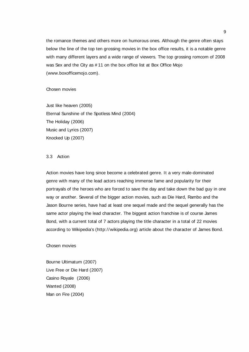
3.3 Action
Action movies have long since become a celebrated genre. It a very male-dominated
genre with many of the lead actors reaching immense fame and popularity for their
portrayals of the heroes who are forced to save the day and take down the bad guy in one
way or another. Several of the bigger action movies, such as Die Hard, Rambo and the
Jason Bourne series, have had at least one sequel made and the sequel generally has the
same actor playing the lead character. The biggest action franchise is of course James
Bond, with a current total of 7 actors playing the title character in a total of 22 movies
according to Wikipedia’s (http://wikipedia.org) article about the character of James Bond.
Chosen movies
Bourne Ultimatum (2007)
Live Free or Die Hard (2007)
Casino Royale (2006)
Wanted (2008)
Man on Fire (2004)
10
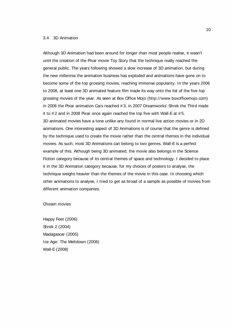
3.4 3D Animation
Although 3D Animation had been around for longer than most people realise, it wasn’t
until the creation of the Pixar movie Toy Story that the technique really reached the
general public. The years following showed a slow increase of 3D animation, but during
the new millennia the animation business has exploded and animations have gone on to
become some of the top grossing movies, reaching immense popularity. In the years 2006
to 2008, at least one 3D animated feature film made its way onto the list of the five top
grossing movies of the year. As seen at Box Office Mojo (http://www.boxofficemojo.com)
in 2006 the Pixar animation Cars reached #3, in 2007 Dreamworks’ Shrek the Third made
it to #2 and in 2008 Pixar once again reached the top five with Wall-E at #5.
3D animated movies have a tone unlike any found in normal live action movies or in 2D
animations. One interesting aspect of 3D Animations is of course that the genre is defined
by the technique used to create the movie rather than the central themes in the individual
movies. As such, most 3D Animations can belong to two genres. Wall-E is a perfect
example of this. Although being 3D animated, the movie also belongs in the Science
Fiction category because of its central themes of space and technology. I decided to place
it in the 3D Animation category because, for my choices of posters to analyse, the
technique weighs heavier than the themes of the movie in this case. In choosing which
other animations to analyse, I tried to get as broad of a sample as possible of movies from
different animation companies.
Chosen movies
Happy Feet (2006)
Shrek 2 (2004)
Madagascar (2005)
Ice Age: The Meltdown (2006)
Wall-E (2008)
11
4 COLOUR ANALYSIS
Colour has been a part of our everyday life for much longer than we think. We naturally
react to colour as we have evolved with a certain understanding of it, party because the
survival of our ancestors depended on it with regard to what to consume and avoid
(Ambrose, G. & Harris, P. 2005: 6). A lot of the time the human being doesn’t realize she
is reacting to colour, but all the while she is getting very strong messages from it. This
subconscious reaction is exactly what makes colour such a significant part of
communication and graphic design.
Colour can be used in many different ways and for many different purposes. If understood
and used the right way, it can be a very handy tool. A colour is a visual language in and of
itself, a designer can use it to attract the eye and focus attention on the intended
messages in the work (Stone, T. Adams, S. & Morioka, N. 2006: 46). But in order to get
the best use of colours, one should be aware of the different messages the colours send
out to the viewer.
4.1 Colour terminology
Hues, Tints, Shades and Tones are four concepts that are very closely related and
therefore often confused with each other. Colour Cube (www.colorcube.com) has an easy
way of explaining the differences between these concepts in a non-nonsense way.
Putting it very simply, hues are colours. If we are speaking about red, green, blue or
yellow, we are talking about different hues. Hues are caused by different wavelengths of
light. A tint is a colour that is lighter than its original colour by adding white to it while a
shade is the original colour with black added to it and a tone is the original colour with
grey added to it.
The term Saturation refers to the purity of a colour. As the saturation of a colour lessens
the colour turns greyer. If you desaturate a colour completely it essentially turns grey.
Luminance, or lightness, adds the amount of white in a colour. The more luminosity you
add the paler the colour gets. If you decrease the luminosity the colour darkens as the
amount of white lessens.
12
4.2 What colours are really saying
Red
Red is one of the oldest colour names, is the first to be seen in a rainbow, and has the
greatest emotional impact of all (Anderson Feisner, Edith. 2006: 121.) The colour causes a
chemical reaction in the body, which speeds up the pulse, raises the blood pressure and
causes the viewer to breath more rapidly. For this reason, red is thought of as the power
of passion. It is also usually the colour children learn first. In print or at sales counters red
colour is nearly impossible not to notice. It has an aggressive nature, commanding
attention and demanding action (Eiseman, L. 2000: 20). In the western world, we usually
do not use red in wedding dresses because the colour has often been connected to sex
and prostitution, for example in the so called “Red district” in Amsterdam. But in the East,
in countries like China, red is the colour that is mostly used for the specific purpose of
weddings and wedding dresses because in these countries red means joy and luck. Red is
also a very political colour, often connected to communism, which is why it is a colour that
should be used carefully. Especially as it is the colour of blood, a staple of the horror
movie genre.
Pink
Pink is youthful and feminine. Because of this very reason, it is a colour often favoured by
the cosmetics industry. As the amount of red in pink increases, it becomes more vivid and
youthful, and with lower amounts of red, it becomes more delicate and mature (Ambrose,
G. & Harris, P. 2005: 110). It is a colour often thought of as a girls’ colour and is usually
connected to baby girls. It is a colour rarely seen on boys, although in recent years it has
become a more acceptable colour for men as well. Pink is also generally associated with
breast cancer, as the colour is used in the ribbon supporting this cause.
13
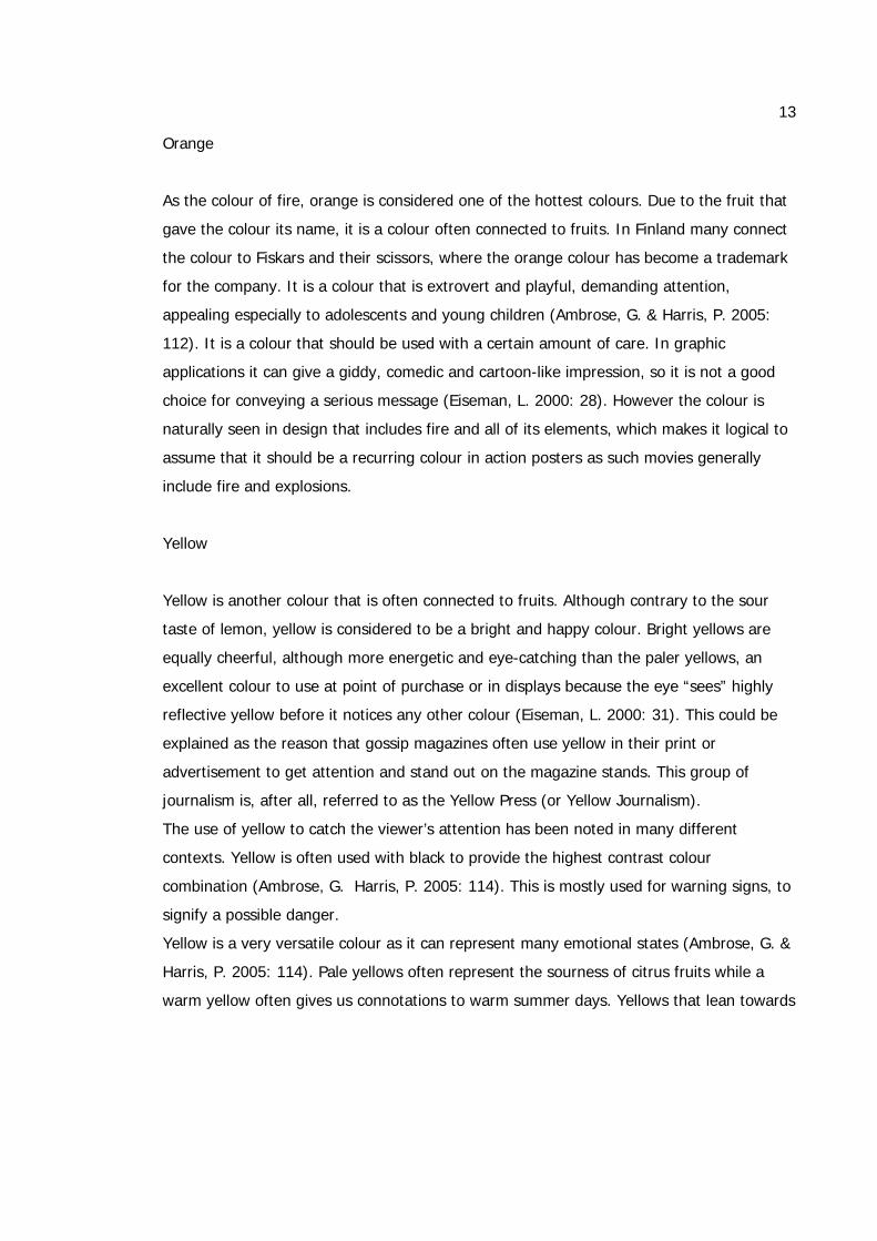
Orange
As the colour of fire, orange is considered one of the hottest colours. Due to the fruit that
gave the colour its name, it is a colour often connected to fruits. In Finland many connect
the colour to Fiskars and their scissors, where the orange colour has become a trademark
for the company. It is a colour that is extrovert and playful, demanding attention,
appealing especially to adolescents and young children (Ambrose, G. & Harris, P. 2005:
112). It is a colour that should be used with a certain amount of care. In graphic
applications it can give a giddy, comedic and cartoon-like impression, so it is not a good
choice for conveying a serious message (Eiseman, L. 2000: 28). However the colour is
naturally seen in design that includes fire and all of its elements, which makes it logical to
assume that it should be a recurring colour in action posters as such movies generally
include fire and explosions.
Yellow
Yellow is another colour that is often connected to fruits. Although contrary to the sour
taste of lemon, yellow is considered to be a bright and happy colour. Bright yellows are
equally cheerful, although more energetic and eye-catching than the paler yellows, an
excellent colour to use at point of purchase or in displays because the eye “sees” highly
reflective yellow before it notices any other colour (Eiseman, L. 2000: 31). This could be
explained as the reason that gossip magazines often use yellow in their print or
advertisement to get attention and stand out on the magazine stands. This group of
journalism is, after all, referred to as the Yellow Press (or Yellow Journalism).
The use of yellow to catch the viewer’s attention has been noted in many different
contexts. Yellow is often used with black to provide the highest contrast colour
combination (Ambrose, G. Harris, P. 2005: 114). This is mostly used for warning signs, to
signify a possible danger.
Yellow is a very versatile colour as it can represent many emotional states (Ambrose, G. &
Harris, P. 2005: 114). Pale yellows often represent the sourness of citrus fruits while a
warm yellow often gives us connotations to warm summer days. Yellows that lean towards
14
a brown shade can give us bad images due to its connection to dirt while yellows that lean
towards green are often connected with nausea.
Brown
Brown is a colour logically connected to the earth. This can be both positive and negative,
sometimes depending on the viewer and their experiences of this element. To some it can
convey and impression of warmth, stability and the solid properties of earth. However,
more often than not, brown is connected to dirt and odours. Other negative associations
include gloom and boredom.
Brown is not a colour that goes with everything and especially in the promotion and
advertisement of food, brown should be avoided, with the exception of a few cases, such
as chocolate. It is a colour that should be used with care. Things are changing however.
More recently brown has earned a greater visibility and respect due in large part to the
panache of designer coffees like richly brewed espresso or the deeply polished patinas of
brown leathers in both the stylish worlds of fashion and interiors (Eiseman, L. 2000: 36).
This is true, although these are some of the very few areas where the use of brown is a
safe bet.
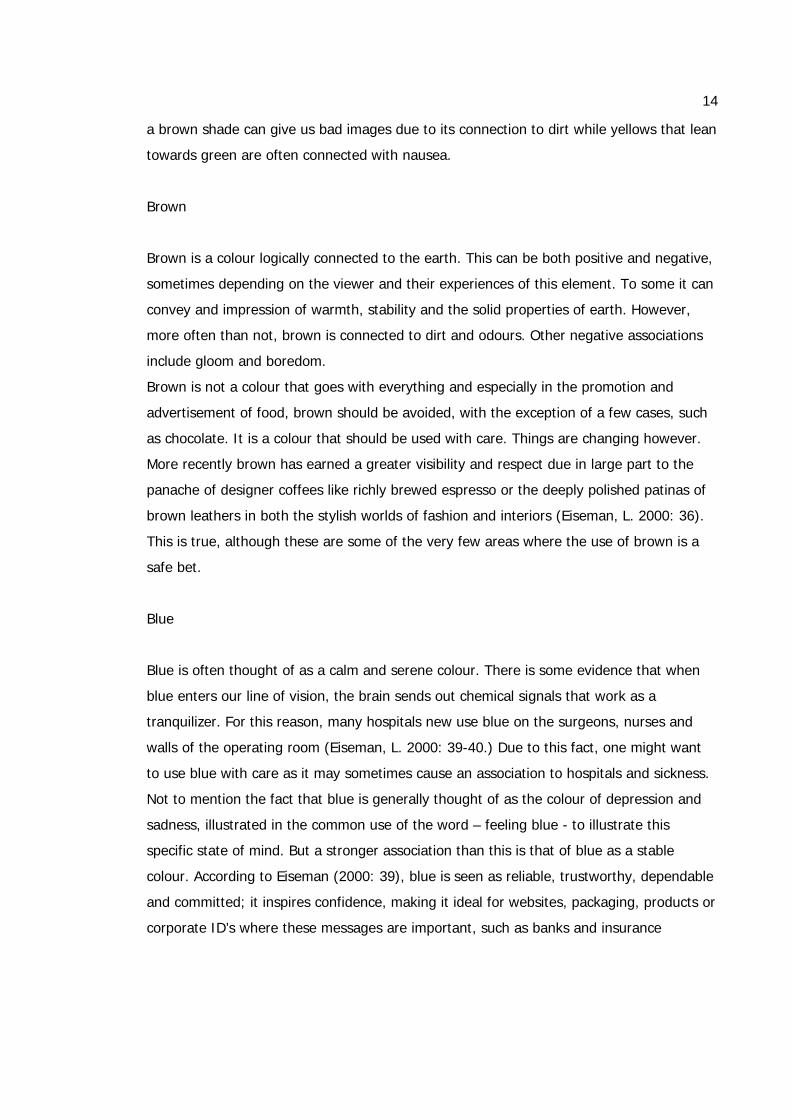
Blue
Blue is often thought of as a calm and serene colour. There is some evidence that when
blue enters our line of vision, the brain sends out chemical signals that work as a
tranquilizer. For this reason, many hospitals new use blue on the surgeons, nurses and
walls of the operating room (Eiseman, L. 2000: 39-40.) Due to this fact, one might want
to use blue with care as it may sometimes cause an association to hospitals and sickness.
Not to mention the fact that blue is generally thought of as the colour of depression and
sadness, illustrated in the common use of the word – feeling blue - to illustrate this
specific state of mind. But a stronger association than this is that of blue as a stable
colour. According to Eiseman (2000: 39), blue is seen as reliable, trustworthy, dependable
and committed; it inspires confidence, making it ideal for websites, packaging, products or
corporate ID’s where these messages are important, such as banks and insurance
15
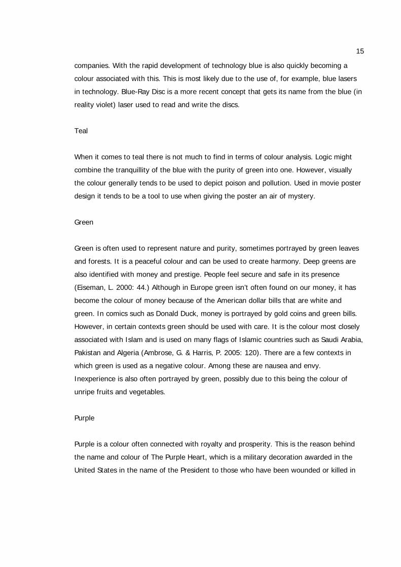
companies. With the rapid development of technology blue is also quickly becoming a
colour associated with this. This is most likely due to the use of, for example, blue lasers
in technology. Blue-Ray Disc is a more recent concept that gets its name from the blue (in
reality violet) laser used to read and write the discs.
Teal
When it comes to teal there is not much to find in terms of colour analysis. Logic might
combine the tranquillity of the blue with the purity of green into one. However, visually
the colour generally tends to be used to depict poison and pollution. Used in movie poster
design it tends to be a tool to use when giving the poster an air of mystery.
Green
Green is often used to represent nature and purity, sometimes portrayed by green leaves
and forests. It is a peaceful colour and can be used to create harmony. Deep greens are
also identified with money and prestige. People feel secure and safe in its presence
(Eiseman, L. 2000: 44.) Although in Europe green isn’t often found on our money, it has
become the colour of money because of the American dollar bills that are white and
green. In comics such as Donald Duck, money is portrayed by gold coins and green bills.
However, in certain contexts green should be used with care. It is the colour most closely
associated with Islam and is used on many flags of Islamic countries such as Saudi Arabia,
Pakistan and Algeria (Ambrose, G. & Harris, P. 2005: 120). There are a few contexts in
which green is used as a negative colour. Among these are nausea and envy.
Inexperience is also often portrayed by green, possibly due to this being the colour of
unripe fruits and vegetables.
Purple
Purple is a colour often connected with royalty and prosperity. This is the reason behind
the name and colour of The Purple Heart, which is a military decoration awarded in the
United States in the name of the President to those who have been wounded or killed in
16
action. Purple has also been said to have a calming effect, used for example in meditation.
It is a colour with several different properties. It has the hot nature of red and the cool
nature of blue, all in one. Although it is not only a positive colour. According to Ambrose
and Harris (2005: 112), it can be used in a negative context to suggest cruelty and
arrogance. Although these traits do not represent a very general point of view and does
not necessarily need to be used with as much care as brown. In its more radiant
intensities, it is the colour most associated with the spirituality of New Age philosophies. It
has a futuristic quality that would speak well for products that involve newness and cutting
edge technologies as it is a complex colour embracing a diversity of undertones linked
with artistry and uniqueness (Eiseman, L. 2000: 48.)
White
White is a pure and clean colour and is often used in products involving health and
hygiene for this reason. It is associated with purity, which is why, in the West, brides wear
white dresses to convey the image of them as innocent and pure. In the east, however,
white is recognized as the colour of mourning and is therefore associated with funerals
and death (Ambrose, G. & Harris, P. 2005: 126). This is an interesting fact that might be
taken into careful consideration by anyone who is designing for an international consumer
base. White provides a good contrast to strong colours, such as black and blue. It can be
used in small amounts or large amounts without becoming too overpowering or
overwhelming, a positive aspect of the colour. A negative point is that it is the colour
associated with surrender and cowardliness as the symbol of surrender is a white flag.
Black
Black limousines, suits and ties. Black has an image of being conservative, sophisticated
and powerful, yet at the same time sexy. A perfect example of this is the James Bond
franchise. Black can be used to up the value of almost anything. The consumer sees black
as the most powerful, dramatic, elegant and expensive presence. This extends into food
packaging where the consumer will actually pay more for this “gourmet image” (Eiseman,
L. 2000: 59.) In western countries black is the colour we associate with mourning and
17
death. Although this image is strongly rooted, black is still used in design a lot, which
takes away a bit from the image of it as a death colour, yet keeps its air of elegance and
sophistication. In movies in particular the colour is used a lot in movies with horror or
gothic themes, using our fear of the unknown and unexplored – the dark spaces we know
nothing about – to promote their themes.
Grey
Although a neutral colour, grey is not without symbolism. Although rarely used as a
primary colour in movie posters it is often seen in one way or another, often in ways we
may not immediately notice. Mostly the colour is used for certain objects in the poster
rather than being the primary colour. Grey is neither positive nor negative, and implies
confusion, loss of distinction (grey area), age (dust, cobwebs, grey hair), intelligence (grey
matters of brain), technology, shadows, and work (people in grey suits) (Anderson
Feisner, Edith. 2006: 121)
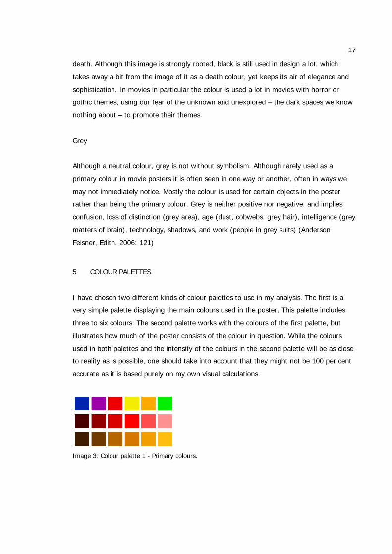
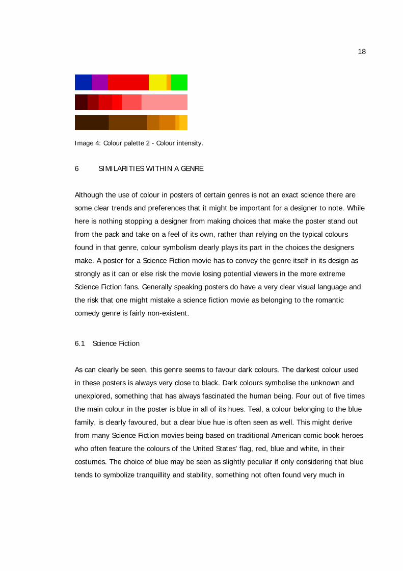
5 COLOUR PALETTES
I have chosen two different kinds of colour palettes to use in my analysis. The first is a
very simple palette displaying the main colours used in the poster. This palette includes
three to six colours. The second palette works with the colours of the first palette, but
illustrates how much of the poster consists of the colour in question. While the colours
used in both palettes and the intensity of the colours in the second palette will be as close
to reality as is possible, one should take into account that they might not be 100 per cent
accurate as it is based purely on my own visual calculations.
Image 3: Colour palette 1 - Primary colours.
18
Image 4: Colour palette 2 - Colour intensity.
6 SIMILARITIES WITHIN A GENRE
Although the use of colour in posters of certain genres is not an exact science there are
some clear trends and preferences that it might be important for a designer to note. While
here is nothing stopping a designer from making choices that make the poster stand out
from the pack and take on a feel of its own, rather than relying on the typical colours
found in that genre, colour symbolism clearly plays its part in the choices the designers
make. A poster for a Science Fiction movie has to convey the genre itself in its design as
strongly as it can or else risk the movie losing potential viewers in the more extreme
Science Fiction fans. Generally speaking posters do have a very clear visual language and
the risk that one might mistake a science fiction movie as belonging to the romantic
comedy genre is fairly non-existent.
6.1 Science Fiction
As can clearly be seen, this genre seems to favour dark colours. The darkest colour used
in these posters is always very close to black. Dark colours symbolise the unknown and
unexplored, something that has always fascinated the human being. Four out of five times
the main colour in the poster is blue in all of its hues. Teal, a colour belonging to the blue
family, is clearly favoured, but a clear blue hue is often seen as well. This might derive
from many Science Fiction movies being based on traditional American comic book heroes
who often feature the colours of the United States’ flag, red, blue and white, in their
costumes. The choice of blue may be seen as slightly peculiar if only considering that blue
tends to symbolize tranquillity and stability, something not often found very much in
19
Science Fiction movies. But, as stated previously in my colour analysis, blue is a colour
closely associated with technology, which is one of the key elements in Science Fiction.
It is not uncommon for Science Fiction posters to use a small amount of a warm colour to
accentuate something and create a focal point, demanding the viewer’s attention and
keeping the poster from becoming dull.
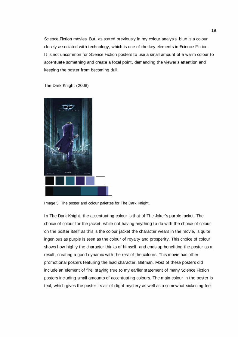
The Dark Knight (2008)
Image 5: The poster and colour palettes for The Dark Knight.
In The Dark Knight, the accentuating colour is that of The Joker’s purple jacket. The
choice of colour for the jacket, while not having anything to do with the choice of colour
on the poster itself as this is the colour jacket the character wears in the movie, is quite
ingenious as purple is seen as the colour of royalty and prosperity. This choice of colour
shows how highly the character thinks of himself, and ends up benefiting the poster as a
result, creating a good dynamic with the rest of the colours. This movie has other
promotional posters featuring the lead character, Batman. Most of these posters did
include an element of fire, staying true to my earlier statement of many Science Fiction
posters including small amounts of accentuating colours. The main colour in the poster is
teal, which gives the poster its air of slight mystery as well as a somewhat sickening feel
20
to it. This might possibly be meant to depict how the Joker’s actions are infecting the city.
The character has some slight backlighting to him, making sure he stands out as the
overall colour scheme is quite cold and the colours blend into each other quite a bit. White
is used in the small font and in the streetlights to give the poster some light while still
keeping with the overall cold air in the entire thing.
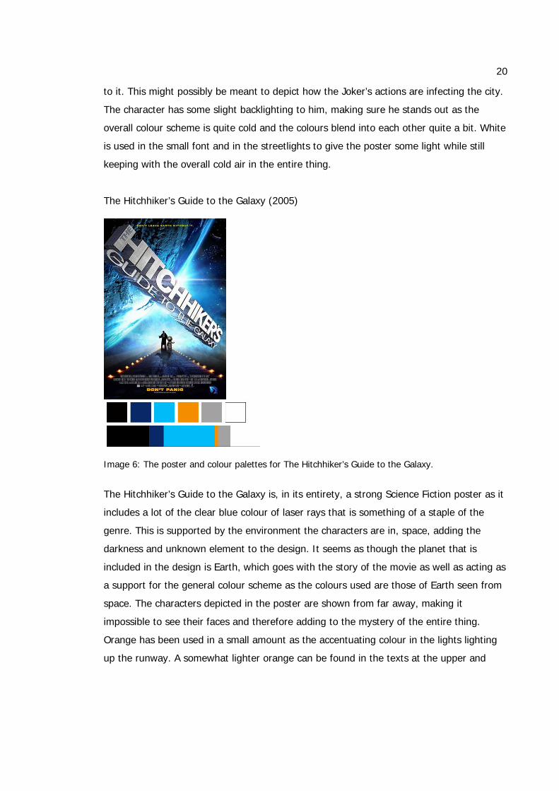
The Hitchhiker’s Guide to the Galaxy (2005)
Image 6: The poster and colour palettes for The Hitchhiker’s Guide to the Galaxy.
The Hitchhiker’s Guide to the Galaxy is, in its entirety, a strong Science Fiction poster as it
includes a lot of the clear blue colour of laser rays that is something of a staple of the
genre. This is supported by the environment the characters are in, space, adding the
darkness and unknown element to the design. It seems as though the planet that is
included in the design is Earth, which goes with the story of the movie as well as acting as
a support for the general colour scheme as the colours used are those of Earth seen from
space. The characters depicted in the poster are shown from far away, making it
impossible to see their faces and therefore adding to the mystery of the entire thing.
Orange has been used in a small amount as the accentuating colour in the lights lighting
up the runway. A somewhat lighter orange can be found in the texts at the upper and
21
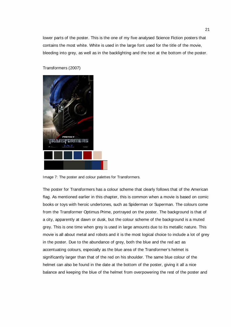
lower parts of the poster. This is the one of my five analysed Science Fiction posters that
contains the most white. White is used in the large font used for the title of the movie,
bleeding into grey, as well as in the backlighting and the text at the bottom of the poster.
Transformers (2007)
Image 7: The poster and colour palettes for Transformers.
The poster for Transformers has a colour scheme that clearly follows that of the American
flag. As mentioned earlier in this chapter, this is common when a movie is based on comic
books or toys with heroic undertones, such as Spiderman or Superman. The colours come
from the Transformer Optimus Prime, portrayed on the poster. The background is that of
a city, apparently at dawn or dusk, but the colour scheme of the background is a muted
grey. This is one time when grey is used in large amounts due to its metallic nature. This
movie is all about metal and robots and it is the most logical choice to include a lot of grey
in the poster. Due to the abundance of grey, both the blue and the red act as
accentuating colours, especially as the blue area of the Transformer’s helmet is
significantly larger than that of the red on his shoulder. The same blue colour of the
helmet can also be found in the date at the bottom of the poster, giving it all a nice
balance and keeping the blue of the helmet from overpowering the rest of the poster and
22
knocking the entire design out of balance. The laser blue colour mentioned earlier can be
found in this poster as well, in the character’s eye. Once again backlighting has been used
to accentuate the character.
X-Men: The Last Stand (2006)
Image 8: The poster and colour palettes for X-Men: The Last Stand.
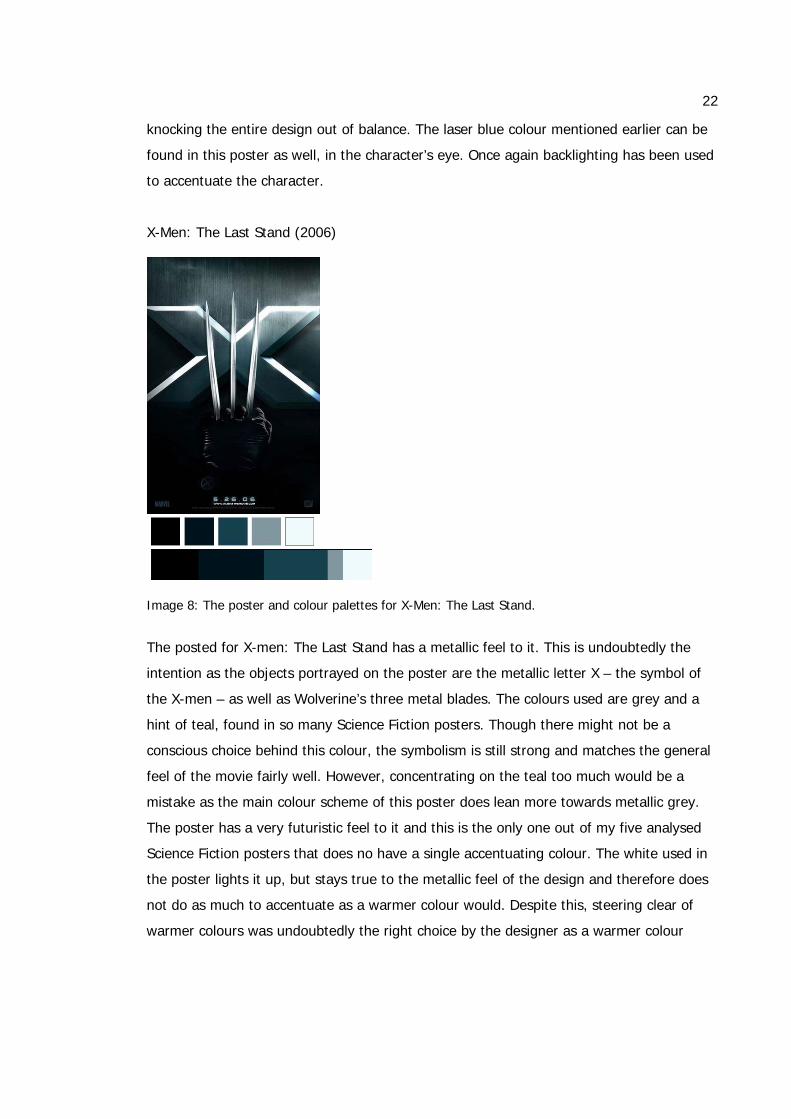
The posted for X-men: The Last Stand has a metallic feel to it. This is undoubtedly the
intention as the objects portrayed on the poster are the metallic letter X – the symbol of
the X-men – as well as Wolverine’s three metal blades. The colours used are grey and a
hint of teal, found in so many Science Fiction posters. Though there might not be a
conscious choice behind this colour, the symbolism is still strong and matches the general
feel of the movie fairly well. However, concentrating on the teal too much would be a
mistake as the main colour scheme of this poster does lean more towards metallic grey.
The poster has a very futuristic feel to it and this is the only one out of my five analysed
Science Fiction posters that does no have a single accentuating colour. The white used in
the poster lights it up, but stays true to the metallic feel of the design and therefore does
not do as much to accentuate as a warmer colour would. Despite this, steering clear of
warmer colours was undoubtedly the right choice by the designer as a warmer colour
23
would have been difficult to incorporate and would have changed the entire mood of the
poster itself.
War of the Worlds (2005)
Image 9: The poster and colour palettes for War of the Worlds.
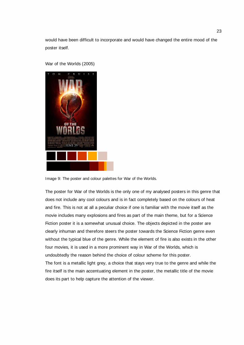
The poster for War of the Worlds is the only one of my analysed posters in this genre that
does not include any cool colours and is in fact completely based on the colours of heat
and fire. This is not at all a peculiar choice if one is familiar with the movie itself as the
movie includes many explosions and fires as part of the main theme, but for a Science
Fiction poster it is a somewhat unusual choice. The objects depicted in the poster are
clearly inhuman and therefore steers the poster towards the Science Fiction genre even
without the typical blue of the genre. While the element of fire is also exists in the other
four movies, it is used in a more prominent way in War of the Worlds, which is
undoubtedly the reason behind the choice of colour scheme for this poster.
The font is a metallic light grey, a choice that stays very true to the genre and while the
fire itself is the main accentuating element in the poster, the metallic title of the movie
does its part to help capture the attention of the viewer.
24
6.2 Romantic comedies
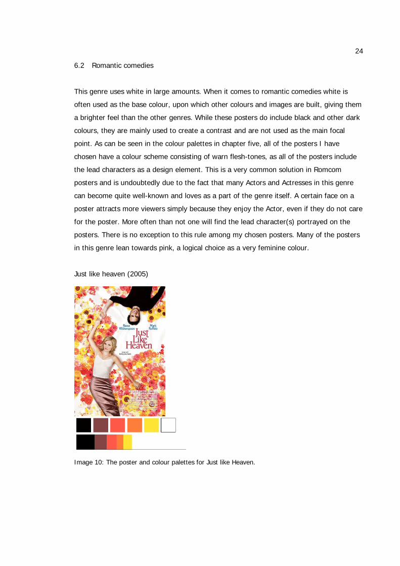
This genre uses white in large amounts. When it comes to romantic comedies white is
often used as the base colour, upon which other colours and images are built, giving them
a brighter feel than the other genres. While these posters do include black and other dark
colours, they are mainly used to create a contrast and are not used as the main focal
point. As can be seen in the colour palettes in chapter five, all of the posters I have
chosen have a colour scheme consisting of warn flesh-tones, as all of the posters include
the lead characters as a design element. This is a very common solution in Romcom
posters and is undoubtedly due to the fact that many Actors and Actresses in this genre
can become quite well-known and loves as a part of the genre itself. A certain face on a
poster attracts more viewers simply because they enjoy the Actor, even if they do not care
for the poster. More often than not one will find the lead character(s) portrayed on the
posters. There is no exception to this rule among my chosen posters. Many of the posters
in this genre lean towards pink, a logical choice as a very feminine colour.
Just like heaven (2005)
Image 10: The poster and colour palettes for Just like Heaven.
25
This poster is the most feminine one out of the five in this genre. The colours are very soft
and the entire theme of the poster is very feminine, much of the design consisting of
flowers.
The colours used suggest playfulness rather than passion, with oranges and yellows rather
than intense reds. This fits well with the theme of the movie as it is more of comedy then
a fiery romance. Black is used in a larger, consistent, area in the man’s shirt and hair,
giving the poster more depth than it would otherwise have and demanding attention.
Without that splash of black the poster would easily fade away.
Eternal Sunshine of the Spotless Mind (2004)
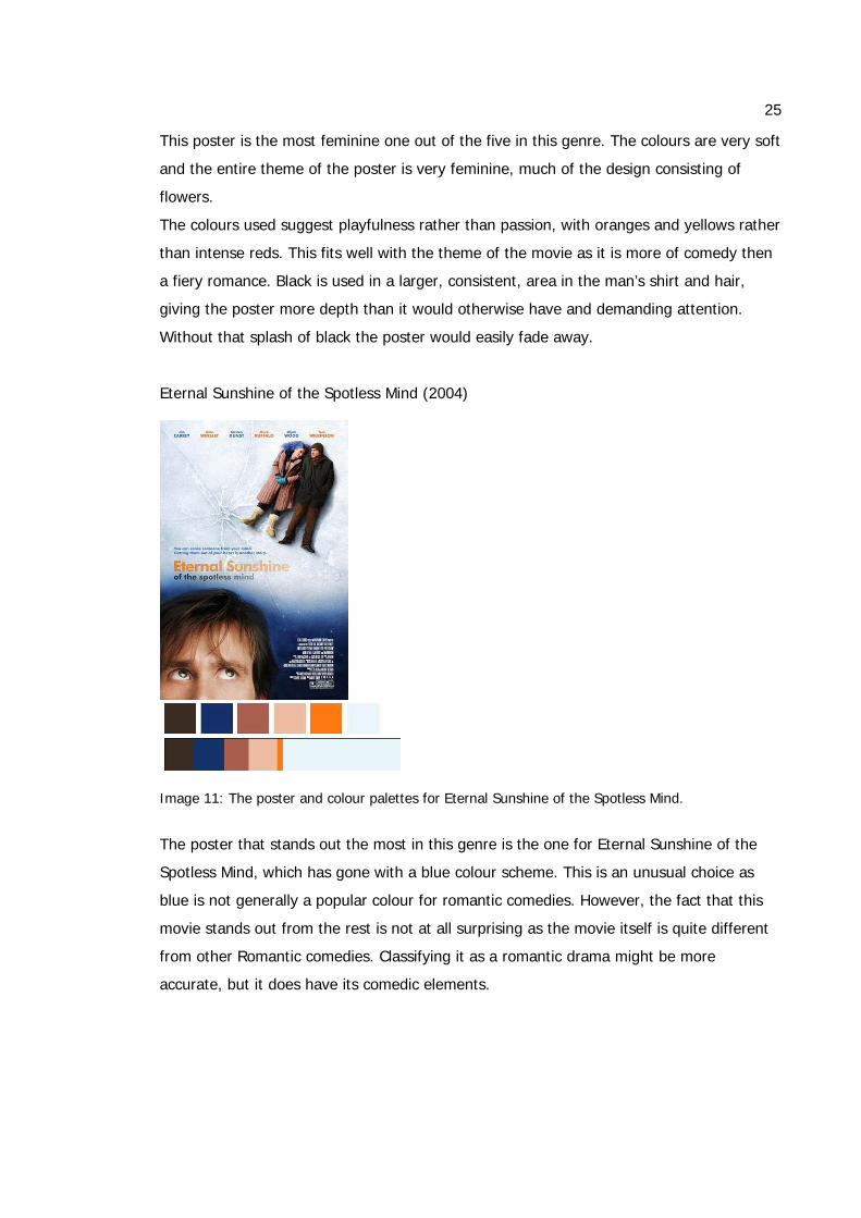
Image 11: The poster and colour palettes for Eternal Sunshine of the Spotless Mind.
The poster that stands out the most in this genre is the one for Eternal Sunshine of the
Spotless Mind, which has gone with a blue colour scheme. This is an unusual choice as
blue is not generally a popular colour for romantic comedies. However, the fact that this
movie stands out from the rest is not at all surprising as the movie itself is quite different
from other Romantic comedies. Classifying it as a romantic drama might be more
accurate, but it does have its comedic elements.
26
Going deeper into the plot of the movie, the choice for the blue colour might not seem as
odd. The lighter blue colour has its own reasons for being included, which is very simply
the fact that the characters are lying on the ice. But the darker blue area almost looks like
Space, the unknown and unexplored. As the movie focuses on a couple who are erasing
all of their memories of each other, a large part of the movie takes place inside the man’s
head, inside his memories. The mind and consciousness has always been something quite
unknown and mysterious, which can very well be compared to how we see Space.
The Holiday (2006)
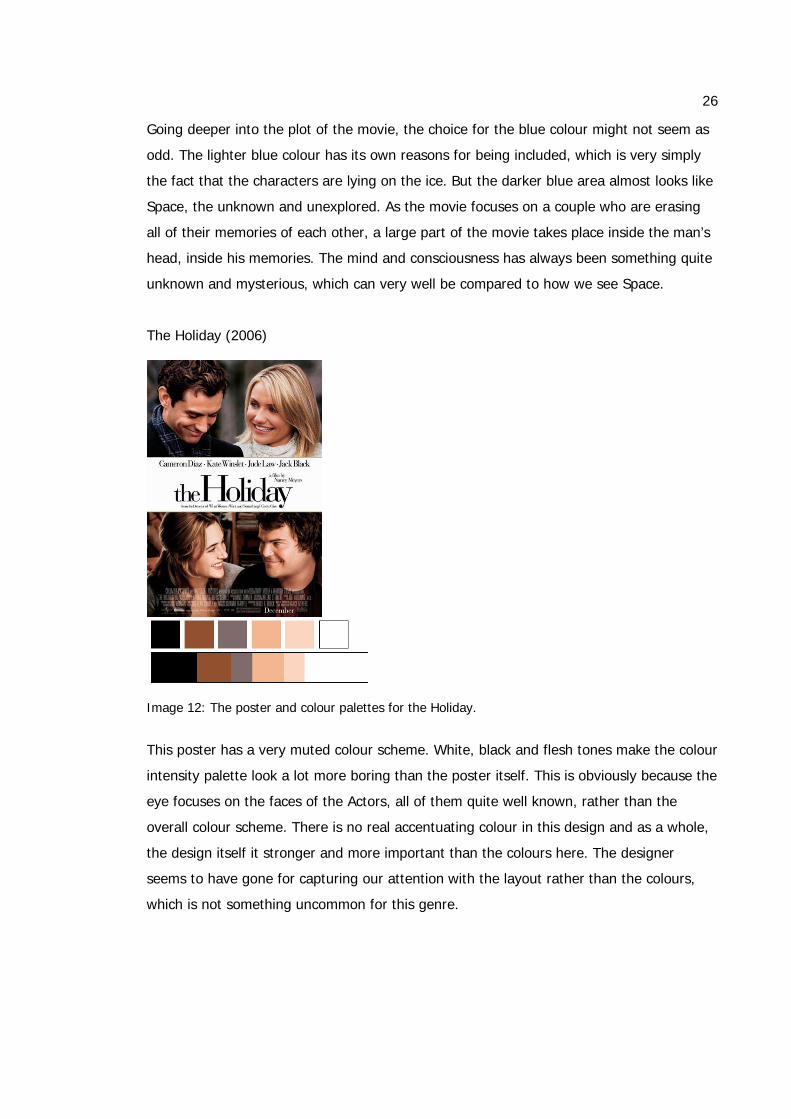
Image 12: The poster and colour palettes for the Holiday.
This poster has a very muted colour scheme. White, black and flesh tones make the colour
intensity palette look a lot more boring than the poster itself. This is obviously because the
eye focuses on the faces of the Actors, all of them quite well known, rather than the
overall colour scheme. There is no real accentuating colour in this design and as a whole,
the design itself it stronger and more important than the colours here. The designer
seems to have gone for capturing our attention with the layout rather than the colours,
which is not something uncommon for this genre.
27
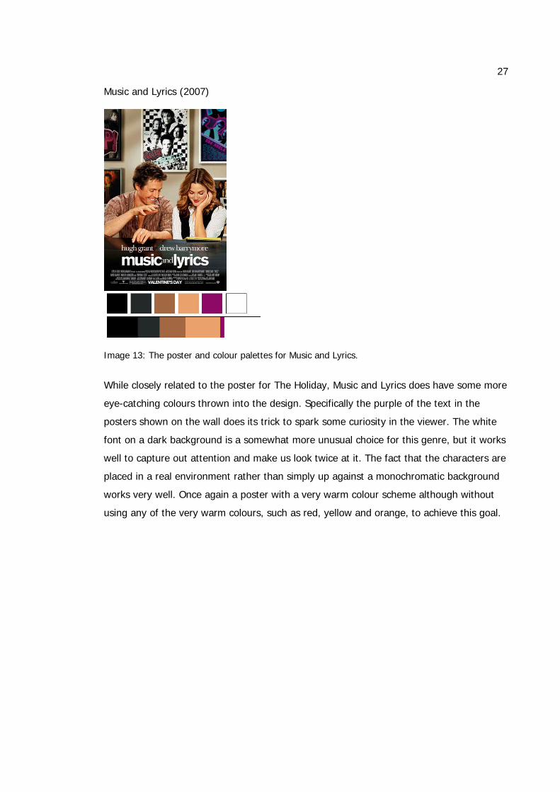
Music and Lyrics (2007)
Image 13: The poster and colour palettes for Music and Lyrics.
While closely related to the poster for The Holiday, Music and Lyrics does have some more
eye-catching colours thrown into the design. Specifically the purple of the text in the
posters shown on the wall does its trick to spark some curiosity in the viewer. The white
font on a dark background is a somewhat more unusual choice for this genre, but it works
well to capture out attention and make us look twice at it. The fact that the characters are
placed in a real environment rather than simply up against a monochromatic background
works very well. Once again a poster with a very warm colour scheme although without
using any of the very warm colours, such as red, yellow and orange, to achieve this goal.
28
Knocked Up (2007)
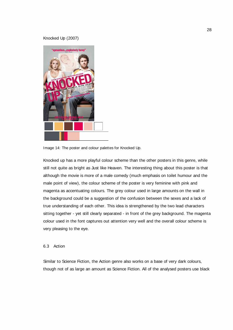
Image 14: The poster and colour palettes for Knocked Up.
Knocked up has a more playful colour scheme than the other posters in this genre, while
still not quite as bright as Just like Heaven. The interesting thing about this poster is that
although the movie is more of a male comedy (much emphasis on toilet humour and the
male point of view), the colour scheme of the poster is very feminine with pink and
magenta as accentuating colours. The grey colour used in large amounts on the wall in
the background could be a suggestion of the confusion between the sexes and a lack of
true understanding of each other. This idea is strengthened by the two lead characters
sitting together - yet still clearly separated - in front of the grey background. The magenta
colour used in the font captures out attention very well and the overall colour scheme is
very pleasing to the eye.
6.3 Action
Similar to Science Fiction, the Action genre also works on a base of very dark colours,
though not of as large an amount as Science Fiction. All of the analysed posters use black
29
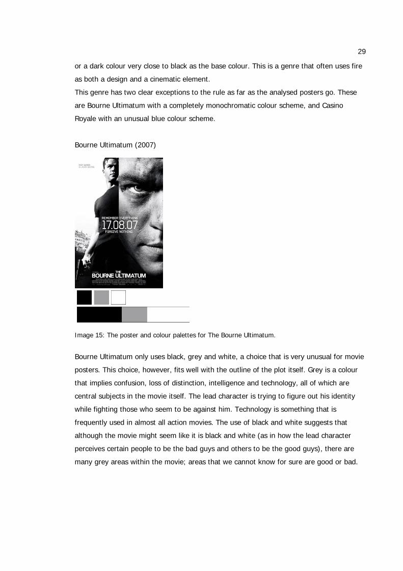
or a dark colour very close to black as the base colour. This is a genre that often uses fire
as both a design and a cinematic element.
This genre has two clear exceptions to the rule as far as the analysed posters go. These
are Bourne Ultimatum with a completely monochromatic colour scheme, and Casino
Royale with an unusual blue colour scheme.
Bourne Ultimatum (2007)
Image 15: The poster and colour palettes for The Bourne Ultimatum.
Bourne Ultimatum only uses black, grey and white, a choice that is very unusual for movie
posters. This choice, however, fits well with the outline of the plot itself. Grey is a colour
that implies confusion, loss of distinction, intelligence and technology, all of which are
central subjects in the movie itself. The lead character is trying to figure out his identity
while fighting those who seem to be against him. Technology is something that is
frequently used in almost all action movies. The use of black and white suggests that
although the movie might seem like it is black and white (as in how the lead character
perceives certain people to be the bad guys and others to be the good guys), there are
many grey areas within the movie; areas that we cannot know for sure are good or bad.
30
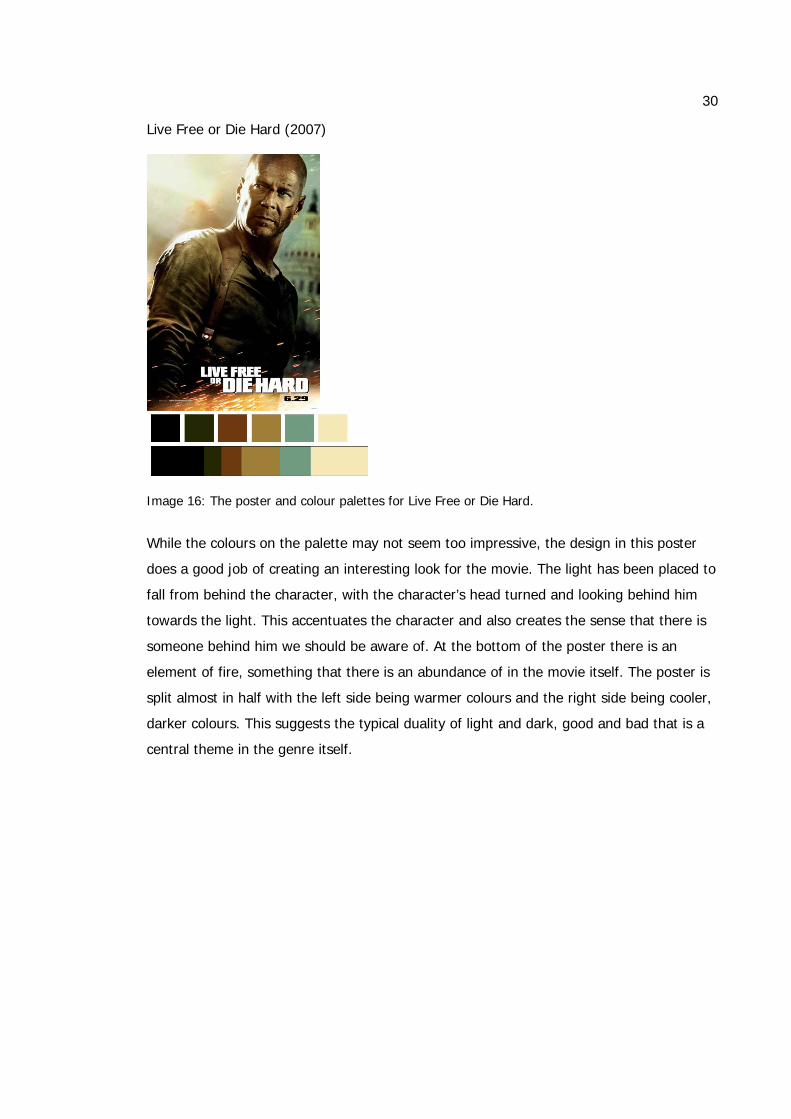
Live Free or Die Hard (2007)
Image 16: The poster and colour palettes for Live Free or Die Hard.
While the colours on the palette may not seem too impressive, the design in this poster
does a good job of creating an interesting look for the movie. The light has been placed to
fall from behind the character, with the character’s head turned and looking behind him
towards the light. This accentuates the character and also creates the sense that there is
someone behind him we should be aware of. At the bottom of the poster there is an
element of fire, something that there is an abundance of in the movie itself. The poster is
split almost in half with the left side being warmer colours and the right side being cooler,
darker colours. This suggests the typical duality of light and dark, good and bad that is a
central theme in the genre itself.
31
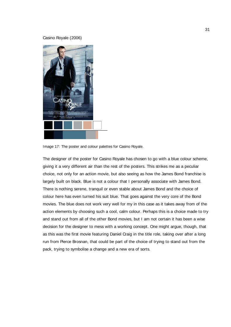
Casino Royale (2006)
Image 17: The poster and colour palettes for Casino Royale.
The designer of the poster for Casino Royale has chosen to go with a blue colour scheme,
giving it a very different air than the rest of the posters. This strikes me as a peculiar
choice, not only for an action movie, but also seeing as how the James Bond franchise is
largely built on black. Blue is not a colour that I personally associate with James Bond.
There is nothing serene, tranquil or even stable about James Bond and the choice of
colour here has even turned his suit blue. That goes against the very core of the Bond
movies. The blue does not work very well for my in this case as it takes away from of the
action elements by choosing such a cool, calm colour. Perhaps this is a choice made to try
and stand out from all of the other Bond movies, but I am not certain it has been a wise
decision for the designer to mess with a working concept. One might argue, though, that
as this was the first movie featuring Daniel Craig in the title role, taking over after a long
run from Pierce Brosnan, that could be part of the choice of trying to stand out from the
pack, trying to symbolise a change and a new era of sorts.
32
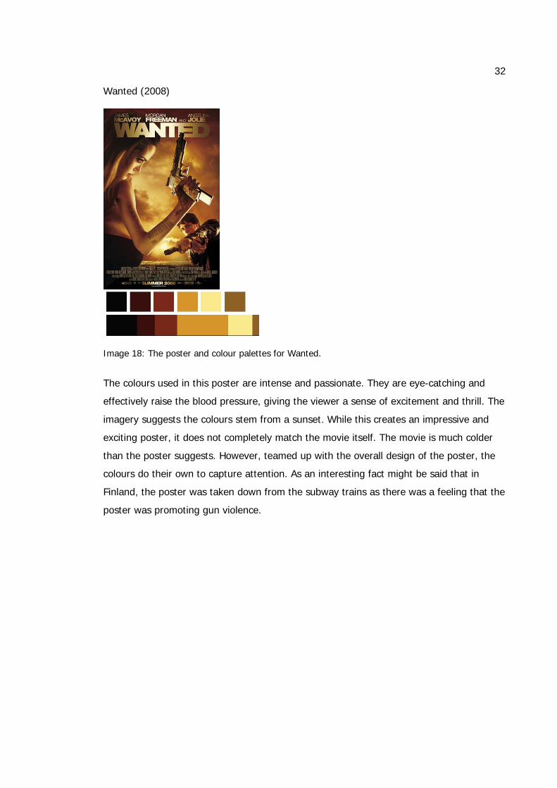
Wanted (2008)
Image 18: The poster and colour palettes for Wanted.
The colours used in this poster are intense and passionate. They are eye-catching and
effectively raise the blood pressure, giving the viewer a sense of excitement and thrill. The
imagery suggests the colours stem from a sunset. While this creates an impressive and
exciting poster, it does not completely match the movie itself. The movie is much colder
than the poster suggests. However, teamed up with the overall design of the poster, the
colours do their own to capture attention. As an interesting fact might be said that in
Finland, the poster was taken down from the subway trains as there was a feeling that the
poster was promoting gun violence.
33
Man on Fire (2004)
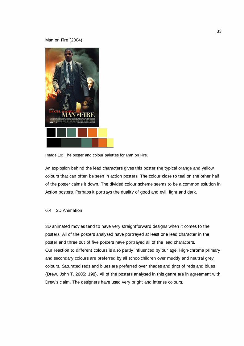
Image 19: The poster and colour palettes for Man on Fire.
An explosion behind the lead characters gives this poster the typical orange and yellow
colours that can often be seen in action posters. The colour close to teal on the other half
of the poster calms it down. The divided colour scheme seems to be a common solution in
Action posters. Perhaps it portrays the duality of good and evil, light and dark.
6.4 3D Animation
3D animated movies tend to have very straightforward designs when it comes to the
posters. All of the posters analysed have portrayed at least one lead character in the
poster and three out of five posters have portrayed all of the lead characters.
Our reaction to different colours is also partly influenced by our age. High-chroma primary
and secondary colours are preferred by all schoolchildren over muddy and neutral grey
colours. Saturated reds and blues are preferred over shades and tints of reds and blues
(Drew, John T. 2005: 198). All of the posters analysed in this genre are in agreement with
Drew’s claim. The designers have used very bright and intense colours.

34
Cool colours are clearly favoured above warn ones in this genre. All of the posters include
blue hues, only one of them with a green tint. However, all of the posters do have at least
one warmer colour in the design, generally used as a highlight and often used in the text.
It has to be said, though, that all of the four posters with pure blue colours get their blues
from the sky illustrated in the poster. The colours used in Animation posters are generally
very clearly related to the environment. All of the posters are set outside and the colours
in the posters reflect this.
Happy Feet (2006)
Image 20: The poster and colour palettes for Happy Feet.
Happy Feet is one of the two analysed posters that only uses two accentuating colours;
red and yellow. These colours are found in the title and the short introduction text at the
bottom of the poster. Without these warm colours the poster would be very cold and not
at all as eye-catching (as can be seen in my comparison in my subchapter 7.3. The red
and yellow are two colours that immediately catch the viewer’s attention and demand a
reaction. The warm colours are not something there is much of in the movie itself, but the
poster would not have benefited from a completely cool colour scheme.
35
Shrek 2 (2004)
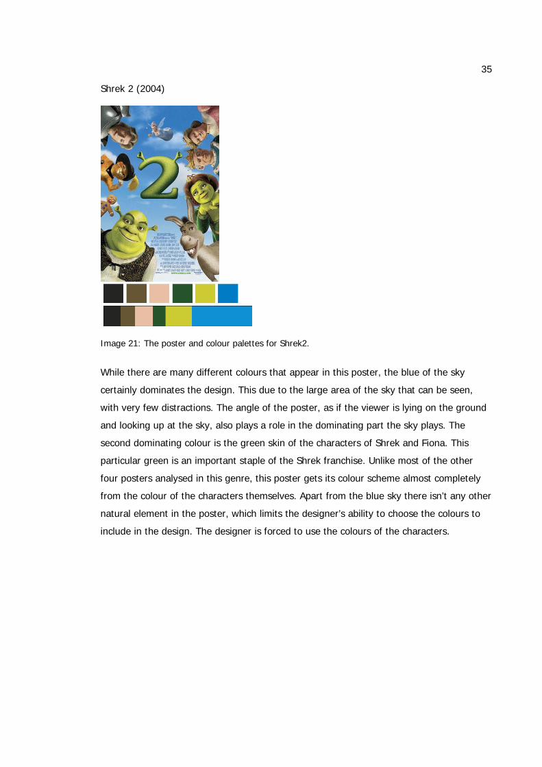
Image 21: The poster and colour palettes for Shrek2.
While there are many different colours that appear in this poster, the blue of the sky
certainly dominates the design. This due to the large area of the sky that can be seen,
with very few distractions. The angle of the poster, as if the viewer is lying on the ground
and looking up at the sky, also plays a role in the dominating part the sky plays. The
second dominating colour is the green skin of the characters of Shrek and Fiona. This
particular green is an important staple of the Shrek franchise. Unlike most of the other
four posters analysed in this genre, this poster gets its colour scheme almost completely
from the colour of the characters themselves. Apart from the blue sky there isn’t any other
natural element in the poster, which limits the designer’s ability to choose the colours to
include in the design. The designer is forced to use the colours of the characters.
36
Madagascar (2005)
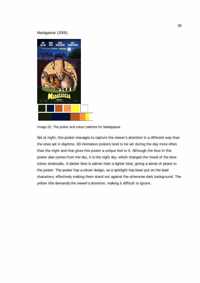
Image 22: The poster and colour palettes for Madagascar.
Set at night, this poster manages to capture the viewer’s attention in a different way than
the ones set in daytime. 3D Animation posters tend to be set during the day more often
than the night and that gives this poster a unique feel to it. Although the blue in this
poster also comes from the sky, it is the night sky, which changes the mood of the blue
colour drastically. A darker blue is calmer than a lighter blue, giving a sense of peace to
the poster. The poster has a clever design, as a spotlight has been put on the lead
characters, effectively making them stand out against the otherwise dark background. The
yellow title demands the viewer’s attention, making it difficult to ignore.
37
Ice Age: The Meltdown (2006)
Image 23: The poster and colour palettes for Ice Age: The Meltdown.
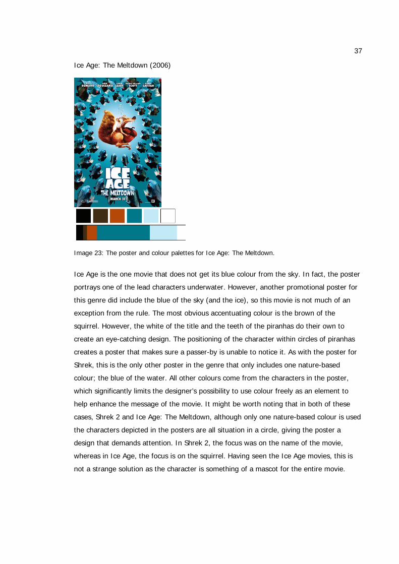
Ice Age is the one movie that does not get its blue colour from the sky. In fact, the poster
portrays one of the lead characters underwater. However, another promotional poster for
this genre did include the blue of the sky (and the ice), so this movie is not much of an
exception from the rule. The most obvious accentuating colour is the brown of the
squirrel. However, the white of the title and the teeth of the piranhas do their own to
create an eye-catching design. The positioning of the character within circles of piranhas
creates a poster that makes sure a passer-by is unable to notice it. As with the poster for
Shrek, this is the only other poster in the genre that only includes one nature-based
colour; the blue of the water. All other colours come from the characters in the poster,
which significantly limits the designer’s possibility to use colour freely as an element to
help enhance the message of the movie. It might be worth noting that in both of these
cases, Shrek 2 and Ice Age: The Meltdown, although only one nature-based colour is used
the characters depicted in the posters are all situation in a circle, giving the poster a
design that demands attention. In Shrek 2, the focus was on the name of the movie,
whereas in Ice Age, the focus is on the squirrel. Having seen the Ice Age movies, this is
not a strange solution as the character is something of a mascot for the entire movie.
38
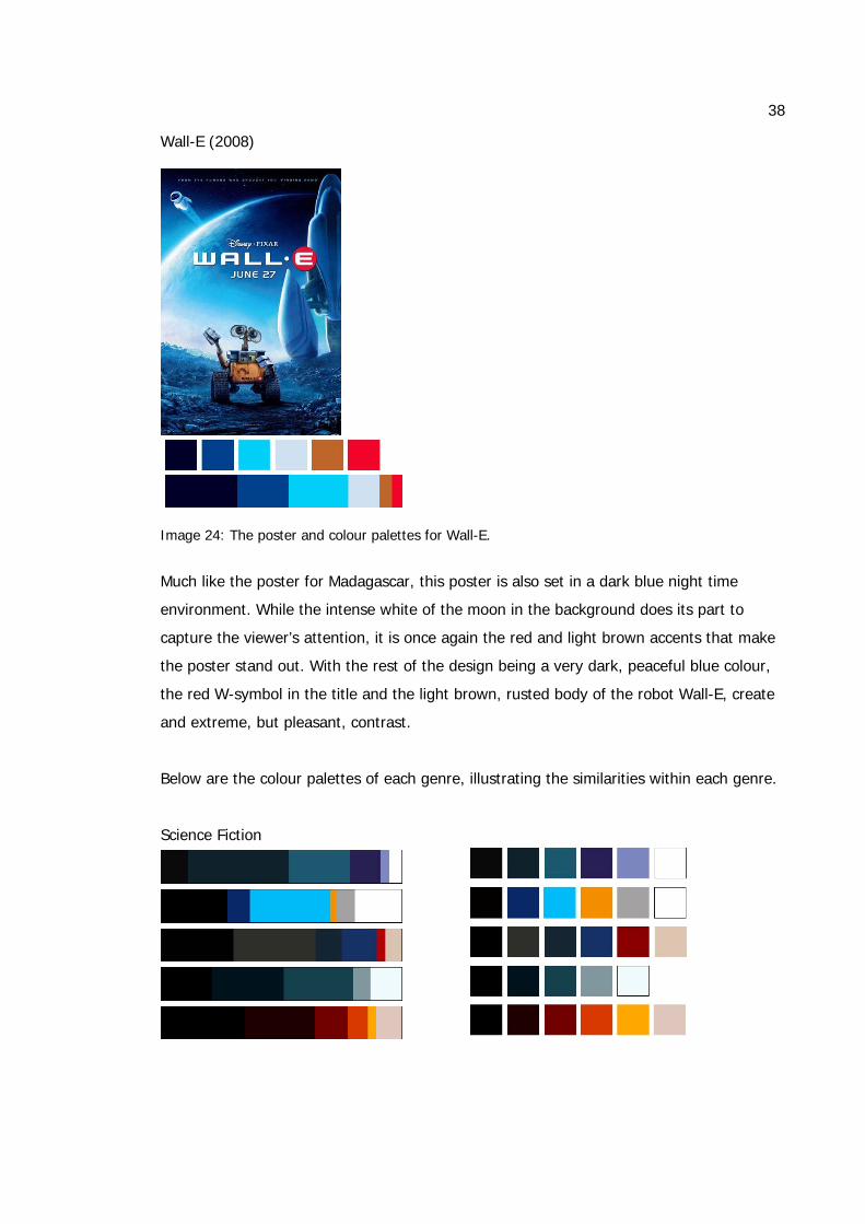
Wall-E (2008)
Image 24: The poster and colour palettes for Wall-E.
Much like the poster for Madagascar, this poster is also set in a dark blue night time
environment. While the intense white of the moon in the background does its part to
capture the viewer’s attention, it is once again the red and light brown accents that make
the poster stand out. With the rest of the design being a very dark, peaceful blue colour,
the red W-symbol in the title and the light brown, rusted body of the robot Wall-E, create
and extreme, but pleasant, contrast.
Below are the colour palettes of each genre, illustrating the similarities within each genre.
Science Fiction
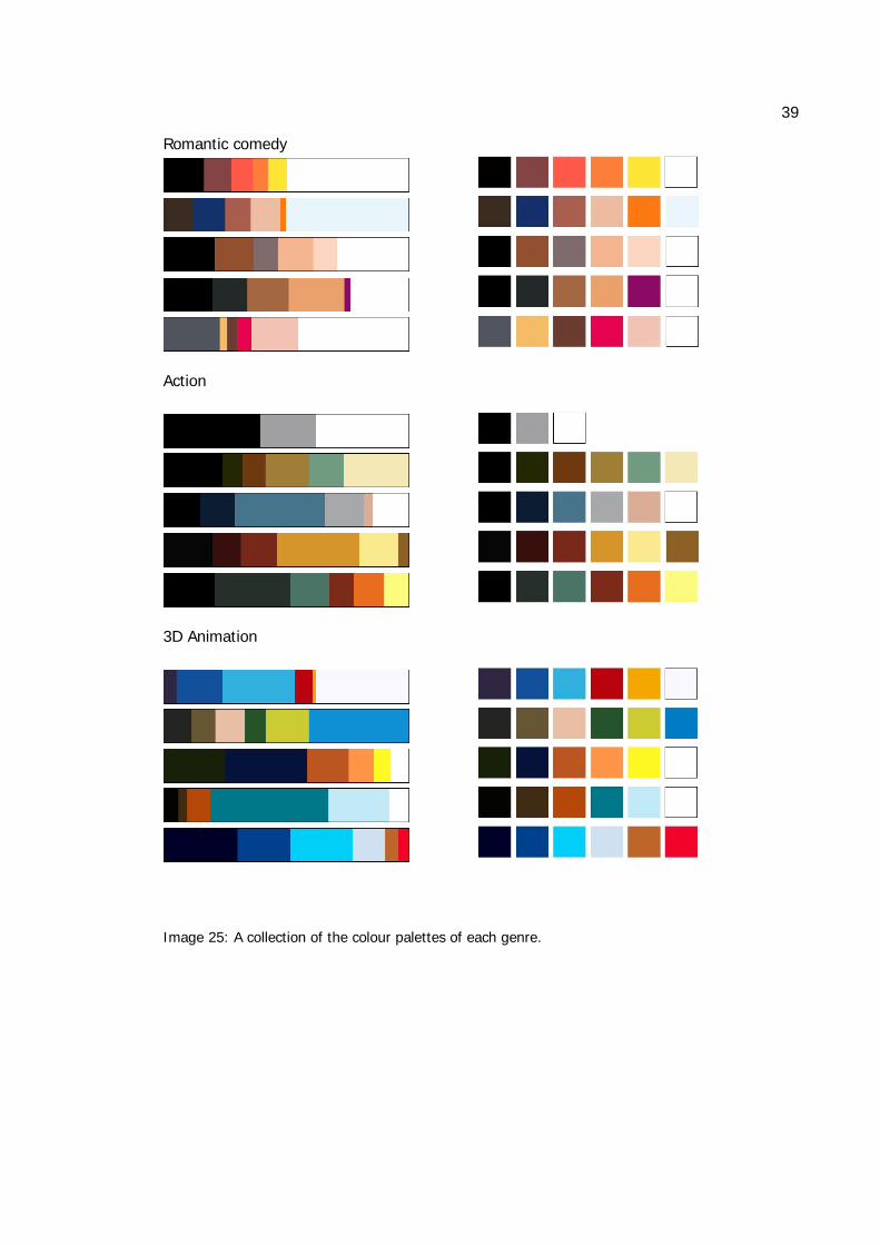
39
Romantic comedy
Action
3D Animation
Image 25: A collection of the colour palettes of each genre.
40
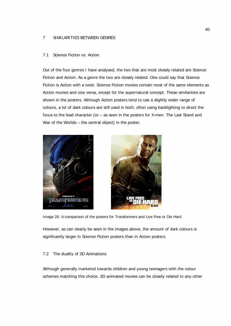
7 SIMILARITIES BETWEEN GENRES
7.1 Science Fiction vs. Action
Out of the four genres I have analysed, the two that are most closely related are Science
Fiction and Action. As a genre the two are closely related. One could say that Science
Fiction is Action with a twist. Science Fiction movies contain most of the same elements as
Action movies and vice versa, except for the supernatural concept. These similarities are
shown in the posters. Although Action posters tend to use a slightly wider range of
colours, a lot of dark colours are still used in both, often using backlighting to direct the
focus to the lead character (or – as seen in the posters for X-men: The Last Stand and
War of the Worlds – the central object) in the poster.
Image 26: A comparison of the posters for Transformers and Live Free or Die Hard.
However, as can clearly be seen in the images above, the amount of dark colours is
significantly larger in Science Fiction posters than in Action posters.
7.2 The duality of 3D Animations
Although generally marketed towards children and young teenagers with the colour
schemes matching this choice, 3D animated movies can be closely related to any other
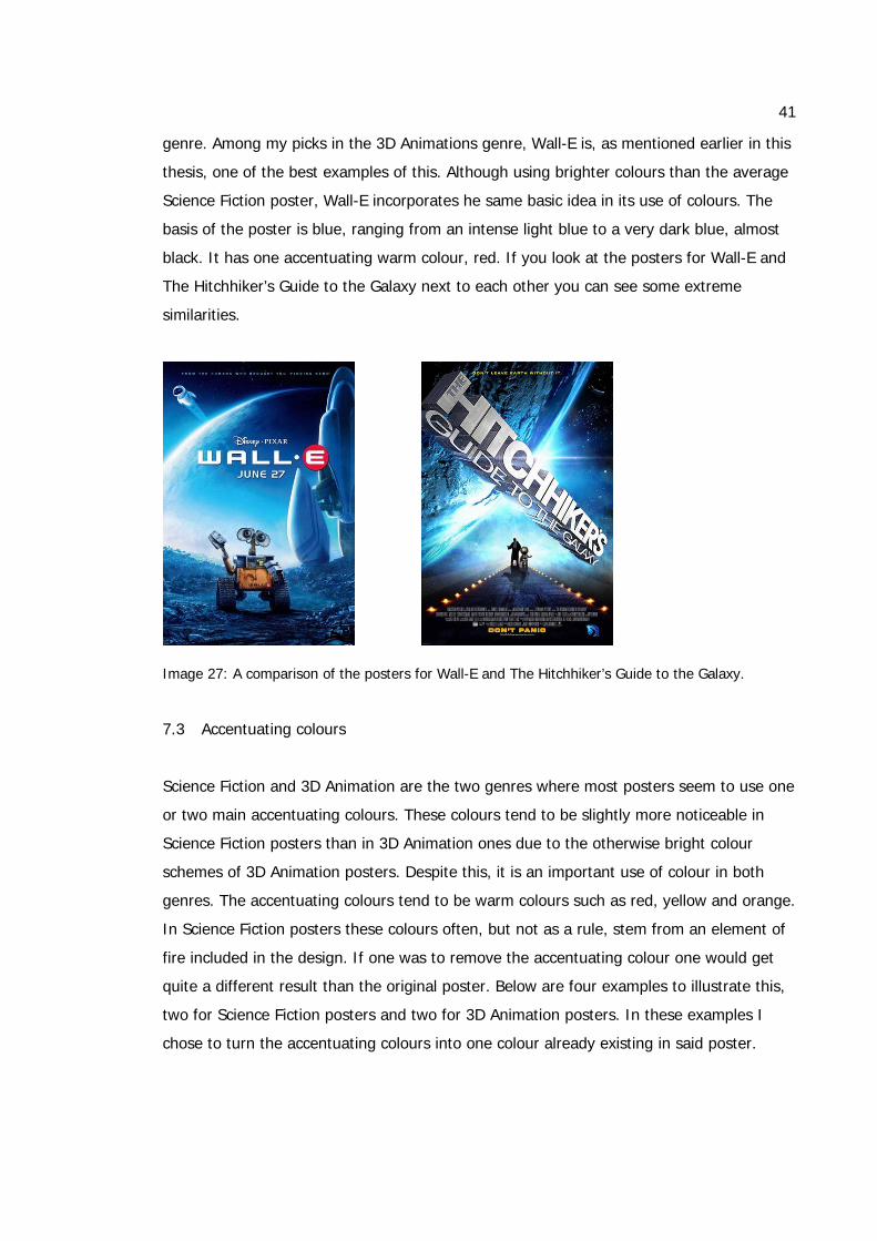
41
genre. Among my picks in the 3D Animations genre, Wall-E is, as mentioned earlier in this
thesis, one of the best examples of this. Although using brighter colours than the average
Science Fiction poster, Wall-E incorporates he same basic idea in its use of colours. The
basis of the poster is blue, ranging from an intense light blue to a very dark blue, almost
black. It has one accentuating warm colour, red. If you look at the posters for Wall-E and
The Hitchhiker’s Guide to the Galaxy next to each other you can see some extreme
similarities.
Image 27: A comparison of the posters for Wall-E and The Hitchhiker’s Guide to the Galaxy.
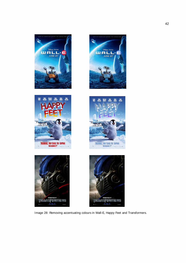
7.3 Accentuating colours
Science Fiction and 3D Animation are the two genres where most posters seem to use one
or two main accentuating colours. These colours tend to be slightly more noticeable in
Science Fiction posters than in 3D Animation ones due to the otherwise bright colour
schemes of 3D Animation posters. Despite this, it is an important use of colour in both
genres. The accentuating colours tend to be warm colours such as red, yellow and orange.
In Science Fiction posters these colours often, but not as a rule, stem from an element of
fire included in the design. If one was to remove the accentuating colour one would get
quite a different result than the original poster. Below are four examples to illustrate this,
two for Science Fiction posters and two for 3D Animation posters. In these examples I
chose to turn the accentuating colours into one colour already existing in said poster.
42
Image 28: Removing accentuating colours in Wall-E, Happy Feet and Transformers.
43
8 MAIN DIFFERENCES BETWEEN THE GENRES
As has clearly been seen throughout the latter part of this thesis, there are some big
differences between the four different genres. Although some of them share similarities as
well, it is still easy to tell the difference between a poster for a Romantic comedy and one
for an Action movie. In reality, the names of the actors in the movies, as displayed on the
posters, also act as a hint as to the genre of the movie as many actors tend to do many
roles in the same genre.
3D Animations is the genre that stands out the most against the other three. This is not
surprising as this is the only genre that is marketed to both children and adults. The colour
scheme needs to feel attractive to all age groups, but most designers tend to use a colour
scheme that is more attractive to children. With its bright colours, dominated by blue, the
genre creates an air of its own.
However, Romantic comedy is another genre with a very individual colour scheme. The
only of the four genres to be dominated by light colours – mainly white – Romantic
comedy is also the one genre to include the biggest amount of warm colours to create a
romantic and feminine air.
Science Fiction on the other hand is the darkest genre with the biggest amount of dark
colours in the posters.
While 3D Animations contain colours relating to nature, Action is the genre to have the
biggest amount of earthy colours, mostly including the elements of air and fire.
9 A PRACTICAL EXPLORATION
For the practical part of my thesis, I have chosen one existing movie and will redesign the
poster for it, choosing colour schemes to match the genres I have previously explored.
The basic design remains the same in each version – using an image from the movie as
the basis for the whole design, but the colour scheme changes drastically to match the
colours of that specific genre, thus illustrating the results I have reached with my analysis.
I have exaggerated the colour schemes for each of the genres slightly, so that the
impression and message may be more powerful. I will not be including any text in the
posters, making them less like posters and more like a screenshot from the movie. This is
44
simply because I do not wish for the choice of font to influence the feel of the poster and
help convince the viewer what genre it belongs in.
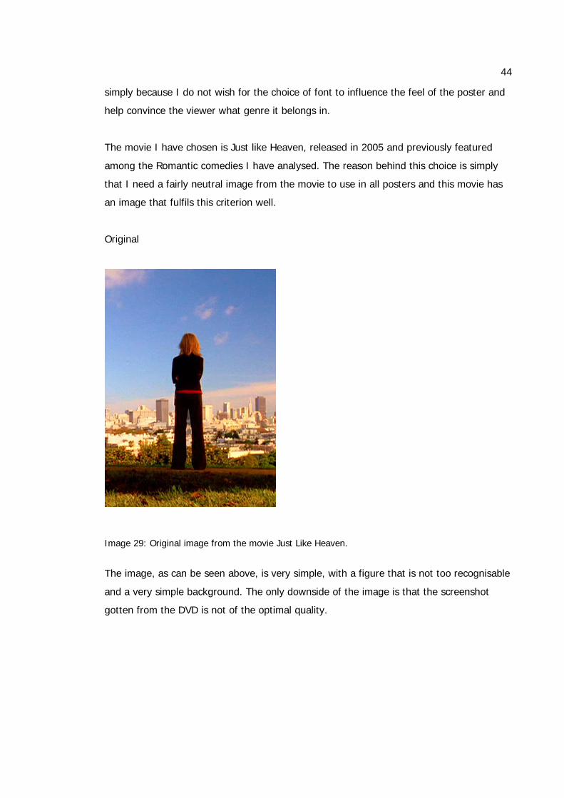
The movie I have chosen is Just like Heaven, released in 2005 and previously featured
among the Romantic comedies I have analysed. The reason behind this choice is simply
that I need a fairly neutral image from the movie to use in all posters and this movie has
an image that fulfils this criterion well.
Original
Image 29: Original image from the movie Just Like Heaven.
The image, as can be seen above, is very simple, with a figure that is not too recognisable
and a very simple background. The only downside of the image is that the screenshot
gotten from the DVD is not of the optimal quality.
45
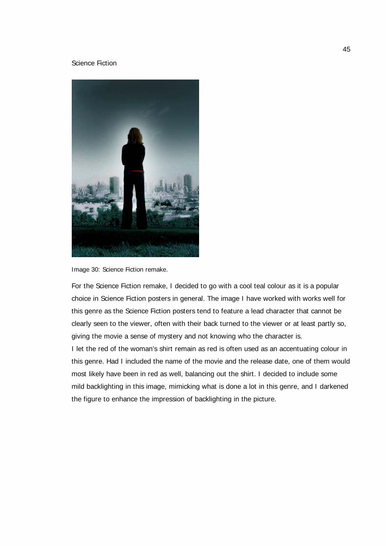
Science Fiction
Image 30: Science Fiction remake. For the Science Fiction remake, I decided to go with a cool teal colour as it is a popular
choice in Science Fiction posters in general. The image I have worked with works well for
this genre as the Science Fiction posters tend to feature a lead character that cannot be
clearly seen to the viewer, often with their back turned to the viewer or at least partly so,
giving the movie a sense of mystery and not knowing who the character is.
I let the red of the woman’s shirt remain as red is often used as an accentuating colour in
this genre. Had I included the name of the movie and the release date, one of them would
most likely have been in red as well, balancing out the shirt. I decided to include some
mild backlighting in this image, mimicking what is done a lot in this genre, and I darkened
the figure to enhance the impression of backlighting in the picture.
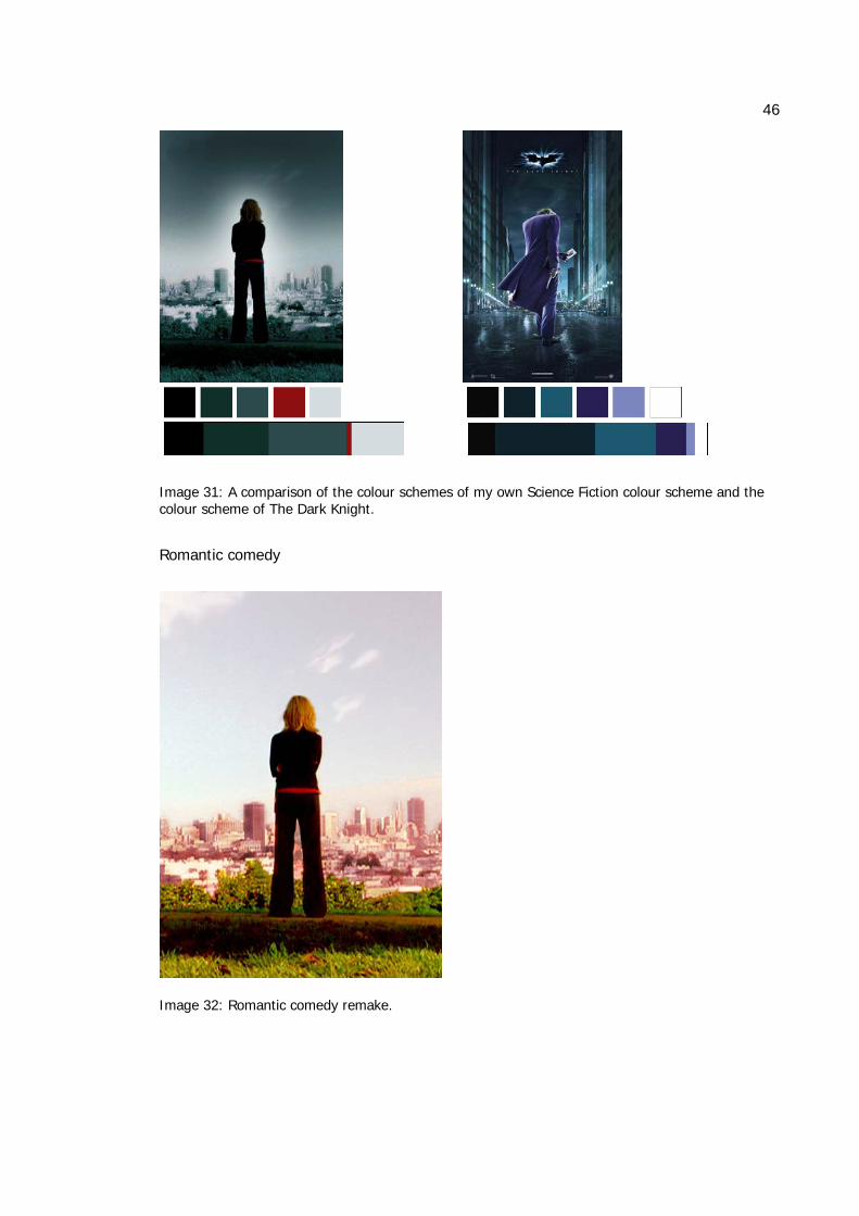
46
Image 31: A comparison of the colour schemes of my own Science Fiction colour scheme and the colour scheme of The Dark Knight.
Romantic comedy
Image 32: Romantic comedy remake.
47
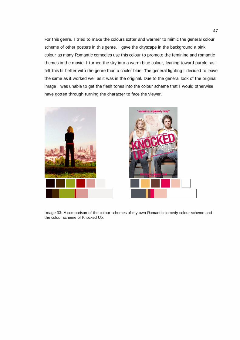
For this genre, I tried to make the colours softer and warmer to mimic the general colour
scheme of other posters in this genre. I gave the cityscape in the background a pink
colour as many Romantic comedies use this colour to promote the feminine and romantic
themes in the movie. I turned the sky into a warm blue colour, leaning toward purple, as I
felt this fit better with the genre than a cooler blue. The general lighting I decided to leave
the same as it worked well as it was in the original. Due to the general look of the original
image I was unable to get the flesh tones into the colour scheme that I would otherwise
have gotten through turning the character to face the viewer.
Image 33: A comparison of the colour schemes of my own Romantic comedy colour scheme and the colour scheme of Knocked Up.
48
Action
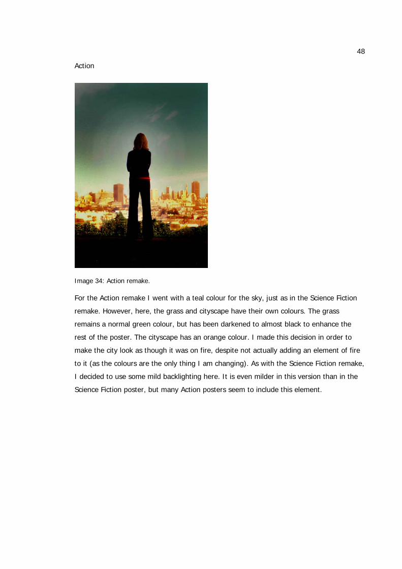
Image 34: Action remake. For the Action remake I went with a teal colour for the sky, just as in the Science Fiction
remake. However, here, the grass and cityscape have their own colours. The grass
remains a normal green colour, but has been darkened to almost black to enhance the
rest of the poster. The cityscape has an orange colour. I made this decision in order to
make the city look as though it was on fire, despite not actually adding an element of fire
to it (as the colours are the only thing I am changing). As with the Science Fiction remake,
I decided to use some mild backlighting here. It is even milder in this version than in the
Science Fiction poster, but many Action posters seem to include this element.
49
Image 35: A comparison of the colour schemes of my own Action colour scheme and the colour scheme of Man on Fire.
3D Animation
Image 36: 3D Animation remake.
50
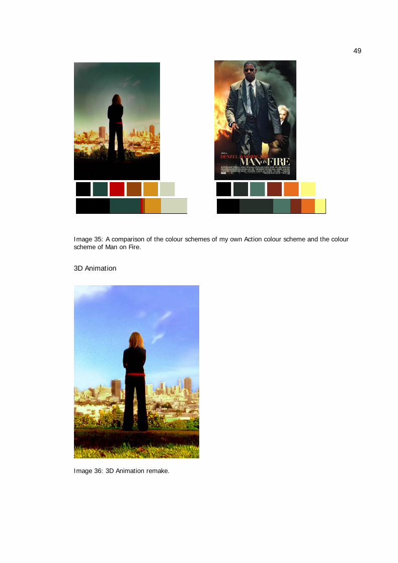
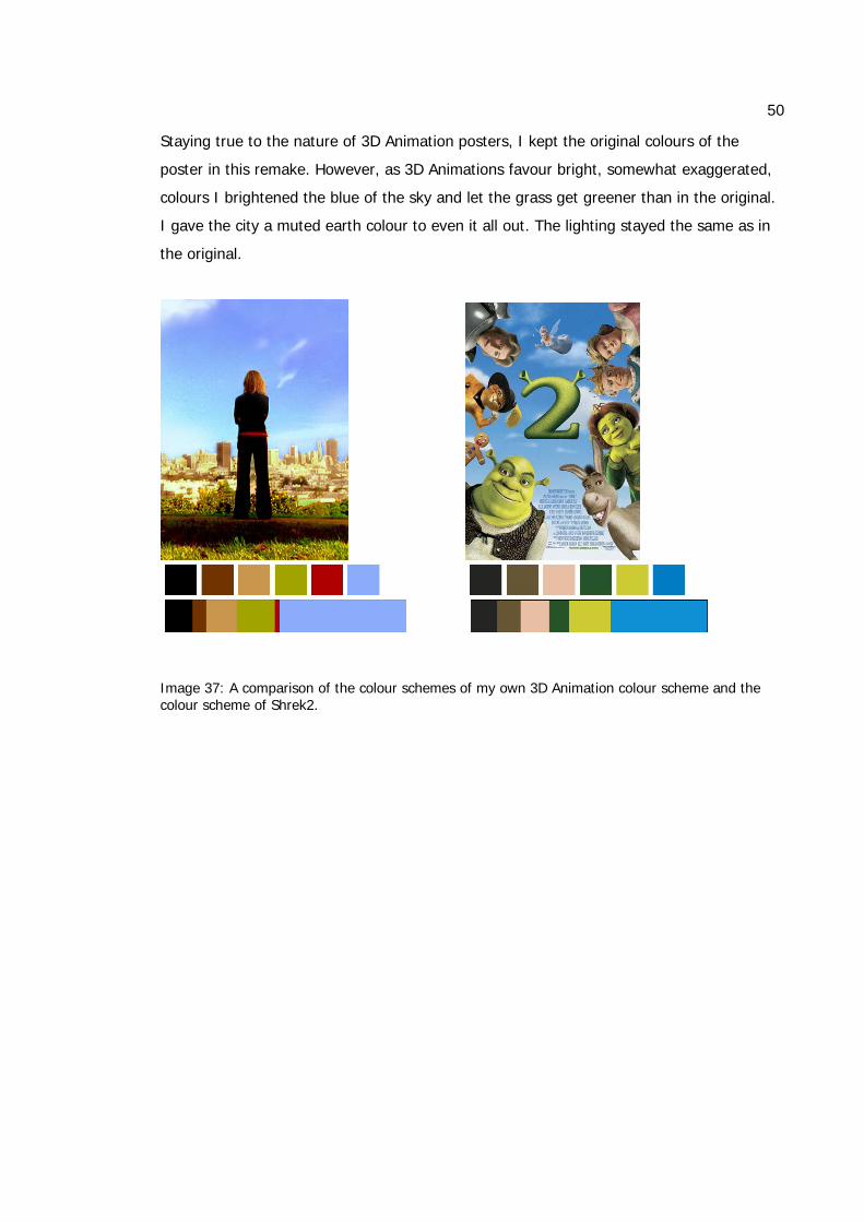
Staying true to the nature of 3D Animation posters, I kept the original colours of the
poster in this remake. However, as 3D Animations favour bright, somewhat exaggerated,
colours I brightened the blue of the sky and let the grass get greener than in the original.
I gave the city a muted earth colour to even it all out. The lighting stayed the same as in
the original.
Image 37: A comparison of the colour schemes of my own 3D Animation colour scheme and the colour scheme of Shrek2.
51
10 CONCLUSION
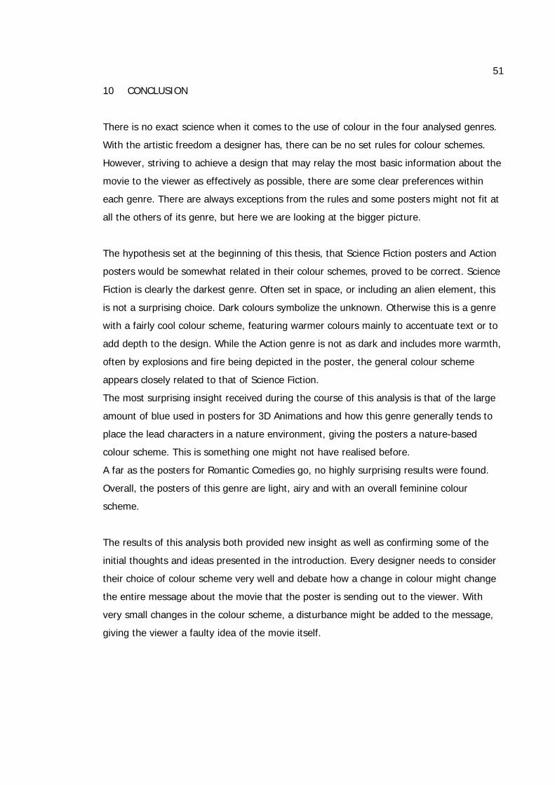
There is no exact science when it comes to the use of colour in the four analysed genres.
With the artistic freedom a designer has, there can be no set rules for colour schemes.
However, striving to achieve a design that may relay the most basic information about the
movie to the viewer as effectively as possible, there are some clear preferences within
each genre. There are always exceptions from the rules and some posters might not fit at
all the others of its genre, but here we are looking at the bigger picture.
The hypothesis set at the beginning of this thesis, that Science Fiction posters and Action
posters would be somewhat related in their colour schemes, proved to be correct. Science
Fiction is clearly the darkest genre. Often set in space, or including an alien element, this
is not a surprising choice. Dark colours symbolize the unknown. Otherwise this is a genre
with a fairly cool colour scheme, featuring warmer colours mainly to accentuate text or to
add depth to the design. While the Action genre is not as dark and includes more warmth,
often by explosions and fire being depicted in the poster, the general colour scheme
appears closely related to that of Science Fiction.
The most surprising insight received during the course of this analysis is that of the large
amount of blue used in posters for 3D Animations and how this genre generally tends to
place the lead characters in a nature environment, giving the posters a nature-based
colour scheme. This is something one might not have realised before.
A far as the posters for Romantic Comedies go, no highly surprising results were found.
Overall, the posters of this genre are light, airy and with an overall feminine colour
scheme.
The results of this analysis both provided new insight as well as confirming some of the
initial thoughts and ideas presented in the introduction. Every designer needs to consider
their choice of colour scheme very well and debate how a change in colour might change
the entire message about the movie that the poster is sending out to the viewer. With
very small changes in the colour scheme, a disturbance might be added to the message,
giving the viewer a faulty idea of the movie itself.

52
SOURCE MATERIAL
King, Emily. 2003, Movie Poster. London: Mitchell Beazley.
Foster, John. 2006, New Masters of Poster Design – Poster design for the next century.
Beverly: Rockport Publishers, Inc.
Frost, M, Lewis, A, Winterburn, A. 2006, The Rise and Fall of the Poster – Street Talk.
Victoria: The Images Publishing Group Pty Ltd.
Nourmand, T. & Marsh, G. 2006, Film posters: horror. London: Taschen
Nourmand, T. & Marsh, G. 2006, Film posters: exploitation. London: Taschen
Nourmand, T. & Marsh, G. 2006, Film posters: science fiction. London: Taschen
Nourmand, T. & Marsh, G. 2005, Film posters of the 90s: the essential movies of the
decade from the reel poster gallery collection. London: Aurum.
Ambrose, G. & Harris, P. 2005, Colour. Lausanne: AVA Publishing SA.
Anderson Feisner, Edith. 2006. London: Laurence King Publishing Ltd. (Orig. 2001)
Eiseman, L. 2000. Pantone Guide to Communicating with Color. USA: Grafix Press, Ltd.
Stone, T., Adams, S. & Morioka, N. 2006. Color Design Workbook, A Real-World Guide to
Using Color in Graphic Design. USA: Rockport Publishers, Inc.
Drew, John T. 2005, Color management : a comprehensive guide for graphic designers.
East Sussex: RotoVision.
53
Triedman, K. & Dangel Cullen, C. 2002. Colour graphics – the power of colour in graphic
design. USA: Rockport Publishers, Inc.
Posterwire
‘”Posterwire.com is a movie poster weblog. From images of the latest Hollywood one-
sheets to vintage movie posters, this film poster weblog hopes to offer a bit of insight into
film key art.”
http://posterwire.com/
Speak Up
“Speak Up is an author-based, reader-supported community devoted to graphic design
open to conversation and dialogue…Through interviews, discussions, reviews and
supported by openness, honesty and immediacy, Speak Up strives to distinguish
exceptional practices in graphic design that exemplify the importance and relevance of the
profession as well as shed light on those that deteriorate it.”
http://www.underconsideration.com/speakup/archives/003641.html
COLORCUBE
Colorcube is a website which “features color puzzles, downloadable screensavers, a color
playground and resources to help you learn about three-dimensional color.”
http://www.colorcube.com/articles/theory/glossary.htm
Internet Movie Poster Awards
“Featuring one of the largest collections of movie poster images on the web.”
http://www.impawards.com/
the FUTON CRITIC
FUTON CRITIC is a web-based television resource site.
http://www.thefutoncritic.com/news.aspx?date=12/17/08&id=20081217scifi01
54
Box Office Mojo
Box Office Mojo is a website featuring articles concerning box office results as well as box
office statistics.
http://www.boxofficemojo.com
http://en.wikipedia.org/wiki/James_bond
http://www.scifi-movies.com
http://best-action-movies.blogspot.com/
55
IMAGE INDEX
Image 1: A comparison of the poster for Wall-E with original colouring and in greyscale. .. 3
Image 2: The poster for The Bourne Ultimatum.................................................................... 4
Image 3: Colour palette 1 - Primary colours........................................................................ 17
Image 4: Colour palette 2 - Colour intensity. ....................................................................... 18
Image 5: The poster and colour palettes for The Dark Knight. ........................................... 19
Image 6: The poster and colour palettes for The Hitchhiker’s Guide to the Galaxy........... 20
Image 7: The poster and colour palettes for Transformers................................................. 21
Image 8: The poster and colour palettes for X-Men: The Last Stand. ................................ 22
Image 9: The poster and colour palettes for War of the Worlds. ........................................ 23
Image 10: The poster and colour palettes for Just like Heaven.......................................... 24
Image 11: The poster and colour palettes for Eternal Sunshine of the Spotless Mind. ..... 25
Image 12: The poster and colour palettes for the Holiday. ................................................. 26
Image 13: The poster and colour palettes for Music and Lyrics. ........................................ 27
Image 14: The poster and colour palettes for Knocked Up................................................. 28
Image 15: The poster and colour palettes for The Bourne Ultimatum................................ 29
Image 16: The poster and colour palettes for Live Free or Die Hard. ................................ 30
Image 17: The poster and colour palettes for Casino Royale............................................. 31
Image 18: The poster and colour palettes for Wanted. ....................................................... 32
Image 19: The poster and colour palettes for Man on Fire. ................................................ 33
Image 20: The poster and colour palettes for Happy Feet.................................................. 34
Image 21: The poster and colour palettes for Shrek2. ........................................................ 35
Image 22: The poster and colour palettes for Madagascar. ............................................... 36
Image 23: The poster and colour palettes for Ice Age: The Meltdown. .............................. 37
Image 24: The poster and colour palettes for Wall-E.......................................................... 38
Image 25: A collection of the colour palettes of each genre. .............................................. 39
Image 26: A comparison of the posters for Transformers and Live Free or Die Hard. ...... 40
Image 27: A comparison of the posters for Wall-E and The Hitchhiker’s Guide to the
Galaxy. ................................................................................................................................. 41
Image 28: Removing accentuating colours in Wall-E, Happy Feet and Transformers....... 42
Image 29: Original image from the movie Just Like Heaven. ............................................. 44
Image 30: Science Fiction remake. ..................................................................................... 45
56
Image 31: A comparison of the colour schemes of my own Science Fiction colour scheme
and the colour scheme of The Dark Knight. ........................................................................ 46
Image 32: Romantic comedy remake.................................................................................. 46
Image 33: A comparison of the colour schemes of my own Romantic comedy colour
scheme and the colour scheme of Knocked Up.................................................................. 47
Image 34: Action remake. .................................................................................................... 48
Image 35: A comparison of the colour schemes of my own Action colour scheme and the
colour scheme of Man on Fire. ............................................................................................ 49
Image 36: 3D Animation remake. ........................................................................................ 49
Image 37: A comparison of the colour schemes of my own 3D Animation colour scheme
and the colour scheme of Shrek2........................................................................................ 50
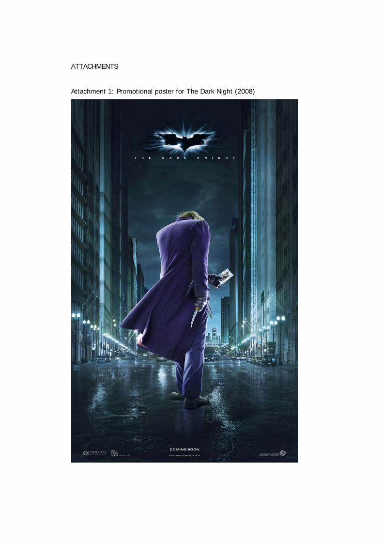
ATTACHMENTS
Attachment 1: Promotional poster for The Dark Night (2008)

2
Attachment 2: Promotional poster for Knocked Up (2007)
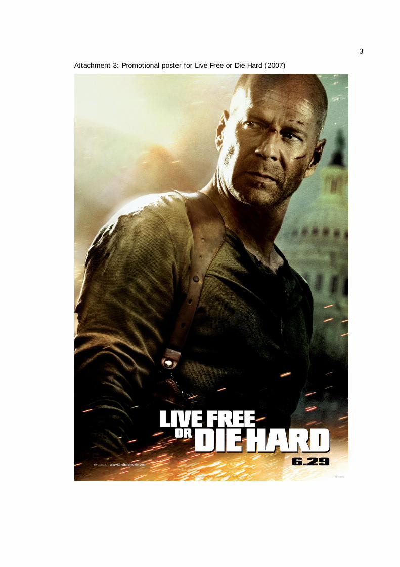
3
Attachment 3: Promotional poster for Live Free or Die Hard (2007)
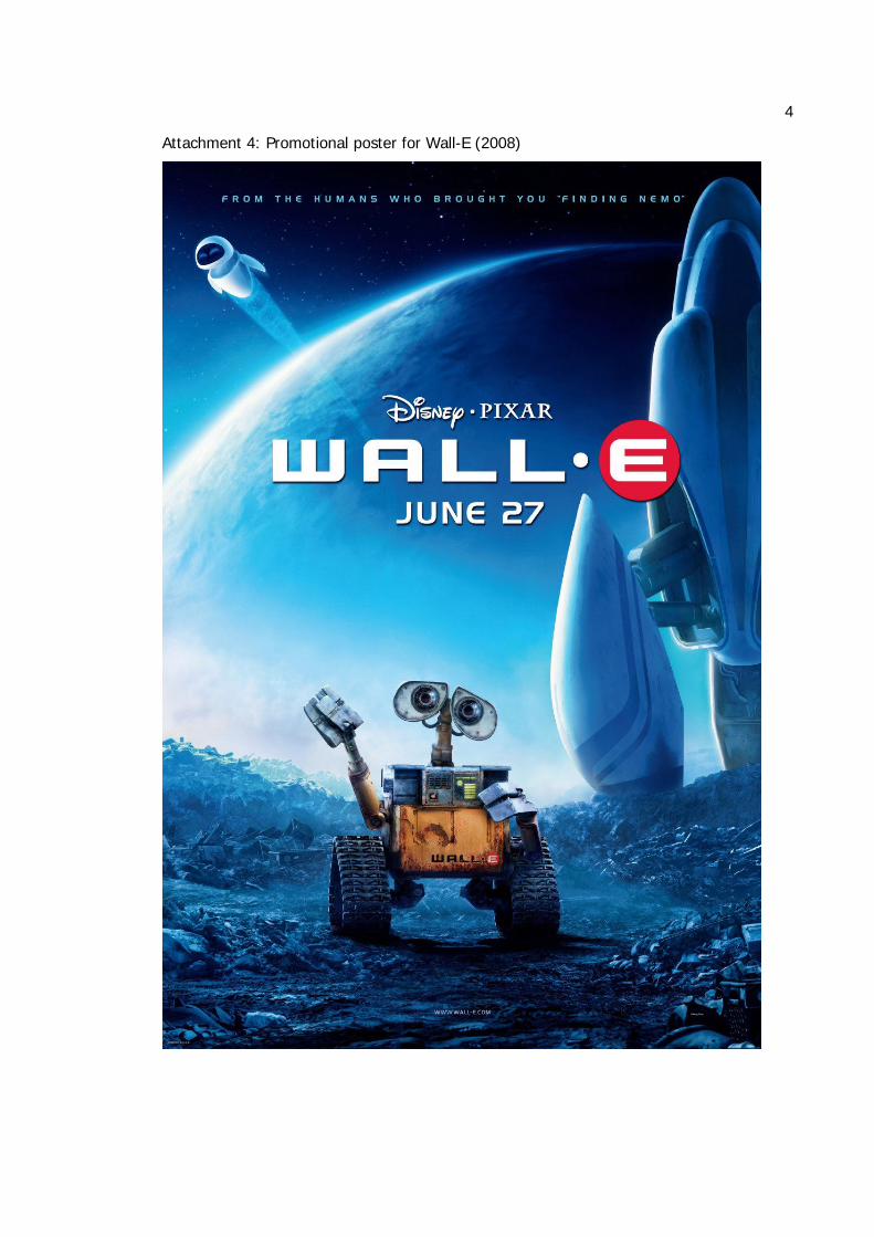
4
Attachment 4: Promotional poster for Wall-E (2008)