the relational origins of inter-media art in painting...
TRANSCRIPT
109
The relational origins of inter-media art in painting, interior design and picture framing: Pamela Gaunt’s Errant Abstractions
Richard Read
Abstract: This paper examines the conscious anachronism of traditional floral designs from Britain, Italy, India and Central Asia incorporated as basic modules in Pamela Gaunt’s installation Errant abstractions (2008). Starting with a phenomenological response to several kinds of fantasy that viewers might experience from interaction with the work, the essay goes on to establish a broad historical framework for the confluence of painting, interior design and frame-making in contemporary multimedia art and craft. This takes account of the developments that led to the inauguration of comfort and interior decoration as prerequisites of ordinary Western domestic life. In considering the varieties of social harmony that embellishment of privileged places afforded to owners, the essay takes two other factors into account. One is the role of art and decoration in increasing the immediacy of nature within buildings or abstracting it to a civilising distance from the world outside. The other is the role of anachronism (in Walter Benjamin’s sense) that modern hybrid works exploit when they re-enact the creative conflicts between painters, interior decorators and picture framers that once informed their necessary collaborations and now condition our variegated responses to the environments they created.
Pamela Gaunt’s show Errant Abstractions (Galerie Düsseldorf, Perth, 2008) consciously situated itself on the cusp of innovative High Art and decorative anachronism to foreground the intervention of contemporary industrial processes upon traditional craft and decorative practices. As such it provided a test case for exploring the surprisingly longstanding heritage of paragone debates (quests for supremacy between Renaissance artists of different media) between artists, interior decorators and frame-makers that forms the forgotten ground of many contemporary experiments in cross media. The conflicting agendas of these practices betray an unconscious survival that it might be worthwhile for practitioners to rediscover an awareness of. I begin by taking a phenomenological approach that reconstructs my first experience of visiting the show and the many contending fantasies of interpretation that occurred to me and certain other visitors I spoke to. This then drives disquisitions upon antecedents of the tensions in Gaunt’s work amongst three professions that over many centuries often found themselves in collaborative rivalry for the upper hand in embellishing the same spaces. These are the designers and makers of paintings, interior decorations and, as the mediating term between them, picture frames. The essay is an attempt to introduce historical imagination into
craft + design enquiry
110
current debates about the future relationship of art, craft and design. We shall also see that, in terms of the corrective that Clare Bishop proposed to Nicholas Bourriaud’s conception of relational aesthetics (Bishop, 2004), conflict played as great a part as harmony in the long histories of interaction between these professions. This, too, is tacitly embedded in the hybridity of contemporary multimedia installations.
The exhibition
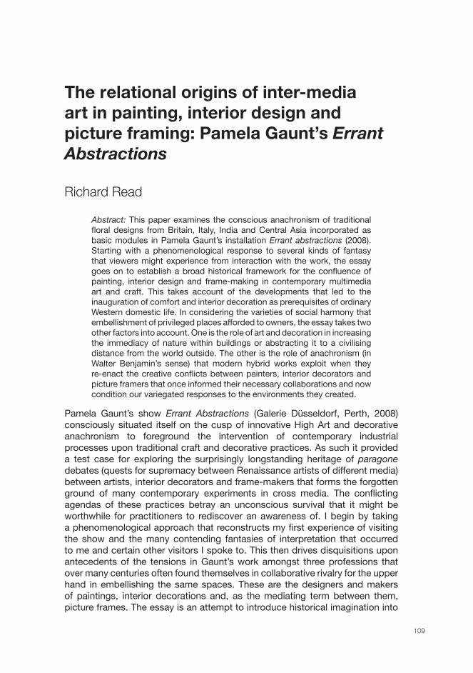
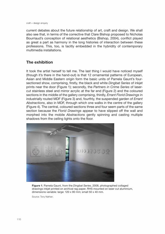
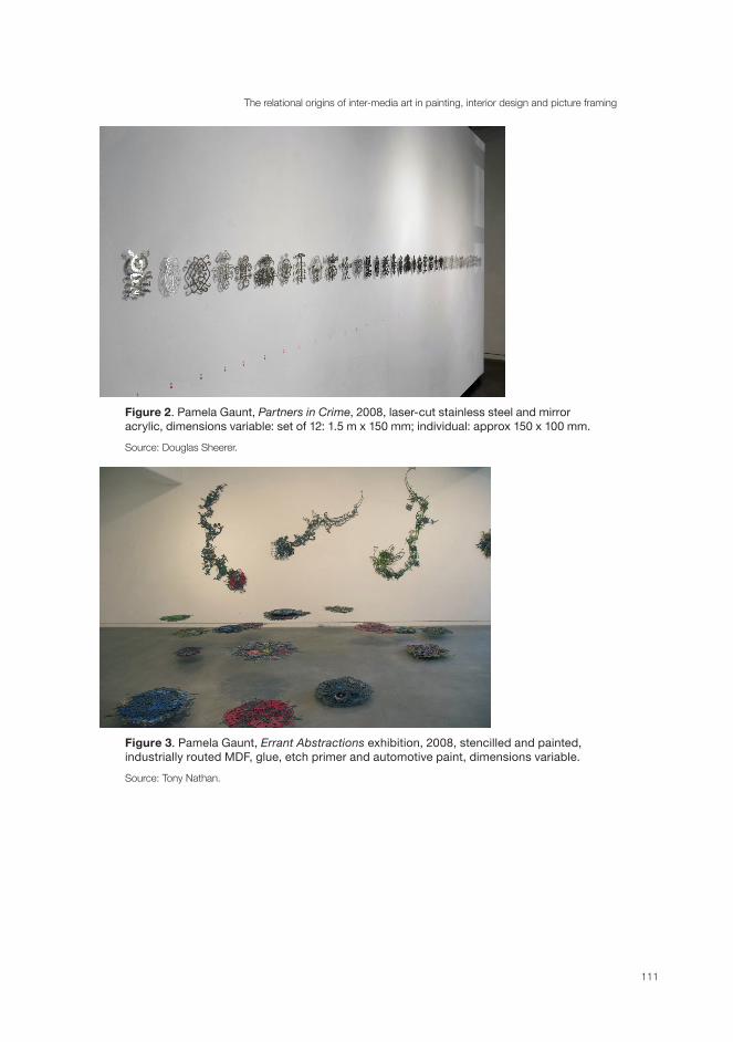
It took the artist herself to tell me. The last thing I would have noticed myself (though it’s there in the hand-out) is that 12 ornamental patterns of European, Asian and Middle Eastern origin form the basic units of Pamela Gaunt’s four-sectioned show, comprising, firstly, the black and white Dingbat Series of inkjet prints near the door (Figure 1); secondly, the Partners in Crime Series of laser-cut stainless steel and mirror acrylic at the far end (Figure 2) and the coloured sections in the middle of the gallery comprising, thirdly, Errant Florid Drawings in industrially routed MDF (Figure 3) and, fourthly, the suspended garden of Errant Abstractions, also in MDF, through which one walks in the centre of the gallery (Figure 4). The central, coloured sections three and four seem parts of the same section because the Florid Drawings appear to have slipped off the wall and morphed into the mobile Abstractions gently spinning and casting multiple shadows from the ceiling lights onto the floor.
Figure 1. Pamela Gaunt, from the Dingbat Series, 2008, photographed collaged drawings inkjet printed on archival rag paper, RHS mounted on laser cut aluminium, dimensions variable: large: 120 x 90 mm; small 50 x 40 mm.
Source: Tony Nathan.
The relational origins of inter-media art in painting, interior design and picture framing
111
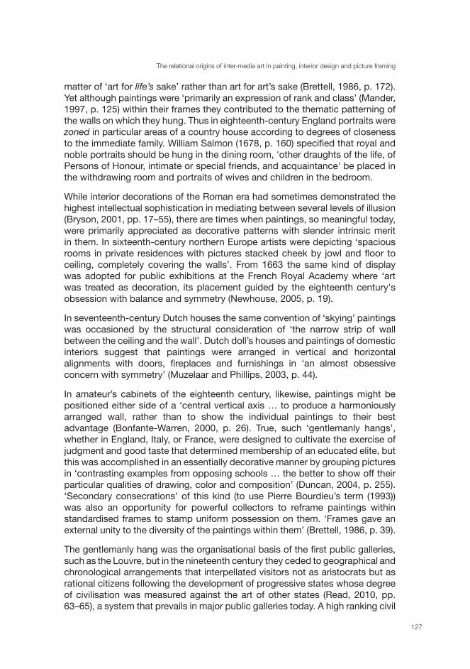
Figure 2. Pamela Gaunt, Partners in Crime, 2008, laser-cut stainless steel and mirror acrylic, dimensions variable: set of 12: 1.5 m x 150 mm; individual: approx 150 x 100 mm.
Source: Douglas Sheerer.
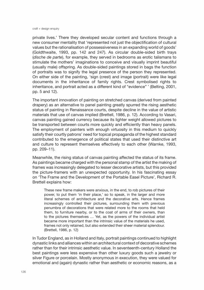
Figure 3. Pamela Gaunt, Errant Abstractions exhibition, 2008, stencilled and painted, industrially routed MDF, glue, etch primer and automotive paint, dimensions variable.
Source: Tony Nathan.
craft + design enquiry
112
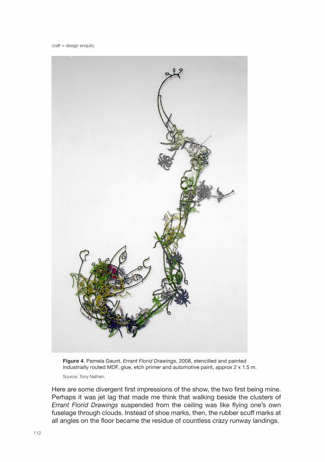
Figure 4. Pamela Gaunt, Errant Florid Drawings, 2008, stencilled and painted industrially routed MDF, glue, etch primer and automotive paint, approx 2 x 1.5 m.
Source: Tony Nathan.
Here are some divergent first impressions of the show, the two first being mine. Perhaps it was jet lag that made me think that walking beside the clusters of Errant Florid Drawings suspended from the ceiling was like flying one’s own fuselage through clouds. Instead of shoe marks, then, the rubber scuff marks at all angles on the floor became the residue of countless crazy runway landings.
The relational origins of inter-media art in painting, interior design and picture framing
113
Stop there. If they were clouds they would all have been at the same altitude, or at least in different horizontal bands, but these mobiles were in wave formation. So now I was Howard Holt, so to speak, tramping back from the deep bedecked in seaweed, and these floating stencils of slowly twirling MDF were flotsam and jetsam, no, teeming octopuses or shards of fractured coral, rising and falling with the waves, while the Florid Drawings on the walls beside them became sea horses tilting backwards and forwards. But no, the organising fantasy morphs again, and the pieces from both sections are all floral and not far off from Monet’s water lilies in colour and distribution, except that the lake at Giverny has been sent into convulsions, with its water lilies in three, not two, dimensions as they lurch up and down in the centre of the gallery. (It transpired in discussion with the artist that the debt was actually to Matisse’s cutouts from the Paradise and Bird and Swimming Pool series.)
Alerted to the 12 ornamental patterns that form the modular basis of the show, another viewer, an architect, flashed upon quite different associations that drew upon his unique professional experience (though I saw what he meant). He wondered why the clusters didn’t climb nearer to the ceiling, as buildings would do, while the Errant Florid Drawings reminded him of conurbation strips alongside the Los Angeles Highway that are generated out of basic modules by computer programs. When he said that, I saw them that way too, or rather they stopped being sea horses and reminded me instead of saxophones and eventually of those reticulated fold-up bicycles urban commuters take on trains. I had been tipped over to the technological end of the spectrum of these industrially fashioned floral patterns.
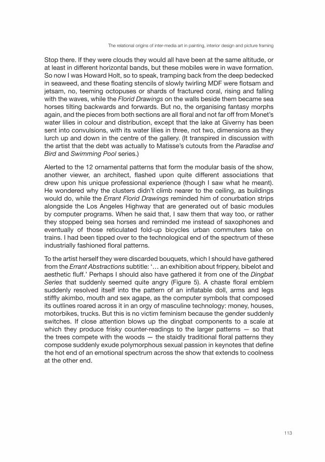
To the artist herself they were discarded bouquets, which I should have gathered from the Errant Abstractions subtitle: ‘… an exhibition about frippery, bibelot and aesthetic fluff.’ Perhaps I should also have gathered it from one of the Dingbat Series that suddenly seemed quite angry (Figure 5). A chaste floral emblem suddenly resolved itself into the pattern of an inflatable doll, arms and legs stiffly akimbo, mouth and sex agape, as the computer symbols that composed its outlines roared across it in an orgy of masculine technology: money, houses, motorbikes, trucks. But this is no victim feminism because the gender suddenly switches. If close attention blows up the dingbat components to a scale at which they produce frisky counter-readings to the larger patterns — so that the trees compete with the woods — the staidly traditional floral patterns they compose suddenly exude polymorphous sexual passion in keynotes that define the hot end of an emotional spectrum across the show that extends to coolness at the other end.
craft + design enquiry
114
Figure 5. Pamela Gaunt, Dingbat Drawing (detail), 2008, photographed collaged drawing using Wingdings/Webdings/Dingbats on Canson paper, 120 x 90 mm.
Source: Tony Nathan.
These, then, have been four radically incompatible responses to the show. Are we therefore contemplating a failure of communication, in which the intentions of the artist and the viewers’ responses pass like ships in the night — except in so far as we all ‘read from the same page’ of the more enduring catalogue essay? Not necessarily. Without ascribing to Gombrich’s theory of the ‘essential copy’, the ‘feel’ of seriously trying to interpret a work of art by applying a series of hypotheses has about it much of Gombrich’s manner of discarding one schema after another until the ‘fit’ gets closer. Poussin wrote that
you should know that there are two kinds of looking at objects. One is simply seeing them and the other is considering them attentively. Simply to see is nothing but naturally receiving in the eye the form and resemblance of the thing seen. But to see an object in considering it, is beyond the simple and natural perception of the form of the eye, one looks with a particular determination to ascertain the means of best knowing this same object. Thus one could say that the simple aspect is a natural operation, and that which I call the ‘Prospect’ is an office of reason. (Poussin, cited in Georgel and Lecocq, 1987, p. 134)
The relational origins of inter-media art in painting, interior design and picture framing
115
But it is still from one’s own deeply subjective, usually recent, experience that one intuits one’s way into a work of art, discarding one interpretative schema after another until the ‘fit’ seems more shareably probable.
Arguably a ‘good’ work of art channels diverse experience into a structure that alters without coercing our understanding, and sets off trains of thought that acquire a structure of their own. To me it seems Gaunt’s work is a clear but capacious apparatus for free thinking about the relationship between painting, interior decoration and framing as terminals for several abiding clusters of meaning, but since the forms that Gaunt uses enshrine the pre-histories of these activities, it is more than arbitrary and private for me to do so. At a meta-level these works alert us to the possibility that painting and decoration have often tended to make different sorts of claims on those who enter their presence, and have sought to influence viewers in different, often contrary ways, particularly as we move from the outside word into a housed collection.
In a spare and cogent essay, Marco Marcon explored the philosophical implications of Gaunt’s work by capitalising upon the physical substratum of ‘ornament’ in Derrida’s conceptual metaphor of the ‘parergon’.
Derrida sees Kant’s treatment of the parergon — or, which is the same thing … of the ornament — as an attempt to address a fundamental philosophical problem: the distinction between the ’inside‘ and the ’outside‘ … between the ’proper‘ work of art and the surrounding environment …
At a theoretical level, the physical marginality of the parergon/ornament is a reflection of its ambiguous or ‘undecidable’ (to use a term dear to Derrida) positioning on the border which delimits what is inside of the true and proper realm of the pure judgement of taste from what lies outside it.
Ornament is debased in so far as it is identified with sensuous matter on the boundary with intellectual form.
But a deconstructive analysis could in fact show that the supposedly debased supplement is required because the centres lack something. And in the case of Kantian aesthetics this ‘something’ that the supplementary ornament reveals is the lack of the body in the aesthetic of the beautiful. The lack, which is created by the expulsion of the supplement, perpetually haunts the stability of traditional, or non-deconstructive, philosophical theories and provides the main entryway for those who want to carry-out [sic] a deconstructive reading of their legacy.
At the end of his essay, Marcon advocates Gaunt’s work for subverting ‘the bombastic posturing of those modernist “heroes” who are always a little too eager to occupy and conquer the visual field with their boisterous works’ (Marcon, 1996, pp. 40–41). Presumably he means the modernist colossi of the ‘higher’ arts, architecture, sculpture and painting. The architect Adolph Loos is the usual culprit here, though his colourful denunciations of ornament as crime are really based on economic rather than aesthetic or philosophical grounds and are belied by his own practice, for in substituting lavish decorative materials
craft + design enquiry
116
for applied ornament behind his austerely reticent façades, he is objecting not to ornament per se but only to the cluttered and applied kind arising from nineteenth-century horror vacui (Brett, 2005, p. 196; Trilling, 2003, pp. 131–33), the kind that Edith Wharton in The Decoration of Houses (1898) had denounced some time before in favour of the simple, classical design principles that Loos took in a new direction.
I admire Marcon’s essay, but the disadvantage of a purely theoretical approach to Gaunt’s work seems twofold. Paradoxically, it subverts the subversive qualities claimed for that work by making them conform to a dominant, albeit subversive, critical paradigm. The work becomes an excuse for retracing the prestigious intellectual manoeuvre. Secondly, and paradoxically, it tends to strip the myriad forms of decoration of their historically specific and often contending social functions and so reduce them to the unnuanced, catch-all, timeless concept of ‘Decoration’ (with a capital P for Parergon). We miss how decorations change and remould the social bodies that supplementary ornament is shown to lack. This misses the radical hybridity of Gaunt’s work. In pressing in what follows on those 12 basic ornamental units from which the exotic mutations of the show branch out (like woods from trees), I want to pass like Alice through the looking glass into some half-forgotten conflicts between the various Fine Arts and interior decoration. The procedure may seem quaint, for what has the old stuff got to do with contemporary art? The answer is that anachronism — those 12 basic patterns and the dingbats out of which many are composed — is another intrinsic theme of the exhibition. The show’s anachronisms monadically reveal themselves at different distances and stylistic levels of the forms, and so reveal what another modernist colossus, Walter Benjamin, called in 1929 ‘the revolutionary energies which appear in the “outmoded”, that is: the obsolete, neglected and slightly dilapidated remains of a just-out-of-date material culture’ (cited in Auerbach, 2007, n.p.). I regard the mild anachronism as bait for catching the relevance of fiercer anachronisms of older material cultures so utterly forgotten that they strike out at us with the Return of the Repressed and the Shock of the Old.
But first to confrontations between media. Because they are composed of flat, detachable units, sometimes on paper, Gaunt’s installation pieces break a cardinal rule of relief ornament that James Ward stipulated in his once canonical The Principles of Ornament (1892, p. 61): ‘no carved decoration should be fastened on to a ceiling or panel, but should be worked out of the material itself …’. Gaunt’s conceptual purchase on meta-meaning arises from this infringement. Her pieces are strictly hybrid, for if they do not count as decoration, no more so do they as paintings or wall hangings, for they resolutely move into the centre of the gallery where, defying gravity, they escape the category of sculpture on pedestals too. In doing so they fight the famous condition of the White Cube art gallery as ‘a ritual place of meeting’ that ‘censors out the world of social variation, promoting a sense of the sole reality of its own point of view and, consequently, its endurance or eternal rightness’ (O’Doherty, 1986, p. 9), though in another sense the ‘frippery’ harks back to a feminine aristocratic sensibility

The relational origins of inter-media art in painting, interior design and picture framing
117
undercut by mass-produced retro keepsakes and clothing logos, so that to hybridity of materials is added hybridity of manufacturing processes, including highly industrialised ones involving laser cuts, mirror acrylic and MDF. Most of all these installation pieces undermine the static viewing conditions of galleries in which each exhibit is addressed as a discrete world unto itself. This is a modern if not modernist assumption that we easily project onto the viewing conditions of the remoter past, as Theodor Hetzer did in 1912 when contemplating the sequence of Giotto’s frescos at Padua as if he were observing single works in a modern art gallery:
Every picture, both in its format and its spirituality, is entirely self-contained. In the Arena chapel we walk from picture to picture, but there is nothing hurrying in our pace, nothing connecting or deviating in our gaze. We must arrest ourselves in front of each picture and turn toward it; while we look at the one, we do not deviate to its neighbours. (Cited in Puttfarken, 2000, p. 10)
So high have the expectations of dense metaphorical meaning in autonomous gallery pictures become, that we forget that their most obvious attraction would once have been their powers of illusion (Elkins, 1999, p. 39). We also forget that museums destroy the original contexts of the works they contain and force visitors to appreciate aesthetic and technical qualities instead of what would originally have been valued as pure subject matter (Lacambre, 2003, p. 68). In recalling my opening anecdotes about works of art changing the experience we bring to them from outside the gallery, let us consider the inside-outside binary not from the Derridean perspective of the form/content dyad that preoccupied Gaunt’s commentator, but as it applies to the different kinds of claims that paintings and interior designs have made on spectators coming into privileged places of display from outside. As promised I will consider these claims as they apply to paintings, interior decorations and frames whose histories I will interlace with further responses to Gaunt’s works. I make no apology for illustrating my argument with quotations of some length that convey the flavour of primary sources or of scholars whose originality as writers and thinkers is rarely encountered in discussions of contemporary art.
Paintings
G.M. Sargeaunt (1936, pp. 208–09) was the first to notice that descriptions of paintings by the English Romantic art critic William Hazlitt in Sketches of the Principal Picture Galleries of England (1824) are preceded by equally vivid descriptions of the approach through natural surroundings to each gallery. The approach to Hampton Court, for example, ‘through Bushy-Park is delightful, inspiriting at this time of year; and the gardens about it, with their close-clipped holly hedges and arbors of evergreen, look an artificial summer all the year round.’ (Hazlitt, 1824, p. 42). The gardens represent a transitional stage between reality and the paintings Hazlitt had come to visit. Peter George Patmore, who accompanied Hazlitt on some of his visits to country houses and who plagiarised
craft + design enquiry
118
the Sketches in his British Galleries of Art (1824, pp. 168–69) in his own writings, describes the approach to Dulwich Gallery, and then makes explicit the kind of explanation that Hazlitt felt was unnecessary:
The reader must not think that I am heedlessly calling upon him to attend to these objects of external nature, instead of leading him at once to those of which we are more immediately in search. I have purposely asked him to fix the former on his memory, and to yield himself for a moment to their influence exclusively, in order that, by a pleasing and not abrupt contrast, he may be the better prepared to appreciate the blush, the bloom, the burning glow of beauty that will fall upon his sense from the rich summer of Art that greets him on his entry to this exquisite Gallery.
Patmore is aping Hazlitt’s critical method assembling a stock of natural impressions in his reader’s mind that he then releases upon representations of nature inside the galleries he has travelled to.
From this perspective the role of painting is to return us in imagination to the realm of nature outside the gallery. In the eighteenth century, Jonathan Richardson made paintings take their viewers still further outdoors on vicarious adventures. In The Theory of Painting (1715, p. 7), he conceived of them taking on the role of windows on the world that we now rather associate with the armchair appreciation of television and DVDs:
By the help of this art we have the pleasure of seeing a vast variety of things and actions, of travelling by land or water, of knowing the humours of low life without mixing with it, of viewing tempests, battles, inundations, and in short, of all real, or imagined appearance in heaven, earth, or hell; and this as we sit at our ease, and cast our eye round a room: we may ramble with delight from one idea to another, or fix upon any as we please.
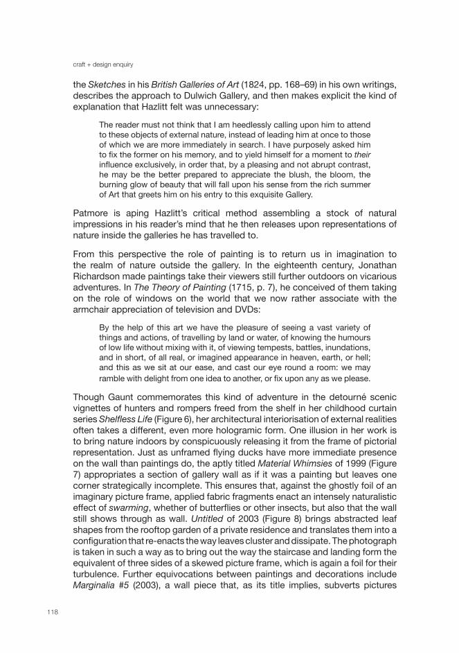
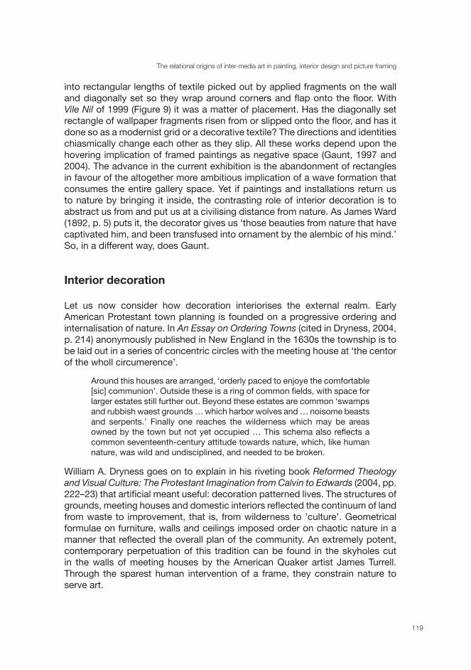
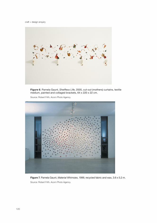
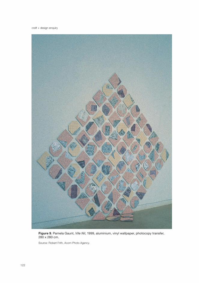
Though Gaunt commemorates this kind of adventure in the detourné scenic vignettes of hunters and rompers freed from the shelf in her childhood curtain series Shelfless Life (Figure 6), her architectural interiorisation of external realities often takes a different, even more hologramic form. One illusion in her work is to bring nature indoors by conspicuously releasing it from the frame of pictorial representation. Just as unframed flying ducks have more immediate presence on the wall than paintings do, the aptly titled Material Whimsies of 1999 (Figure 7) appropriates a section of gallery wall as if it was a painting but leaves one corner strategically incomplete. This ensures that, against the ghostly foil of an imaginary picture frame, applied fabric fragments enact an intensely naturalistic effect of swarming, whether of butterflies or other insects, but also that the wall still shows through as wall. Untitled of 2003 (Figure 8) brings abstracted leaf shapes from the rooftop garden of a private residence and translates them into a configuration that re-enacts the way leaves cluster and dissipate. The photograph is taken in such a way as to bring out the way the staircase and landing form the equivalent of three sides of a skewed picture frame, which is again a foil for their turbulence. Further equivocations between paintings and decorations include Marginalia #5 (2003), a wall piece that, as its title implies, subverts pictures
The relational origins of inter-media art in painting, interior design and picture framing
119
into rectangular lengths of textile picked out by applied fragments on the wall and diagonally set so they wrap around corners and flap onto the floor. With Vile Nil of 1999 (Figure 9) it was a matter of placement. Has the diagonally set rectangle of wallpaper fragments risen from or slipped onto the floor, and has it done so as a modernist grid or a decorative textile? The directions and identities chiasmically change each other as they slip. All these works depend upon the hovering implication of framed paintings as negative space (Gaunt, 1997 and 2004). The advance in the current exhibition is the abandonment of rectangles in favour of the altogether more ambitious implication of a wave formation that consumes the entire gallery space. Yet if paintings and installations return us to nature by bringing it inside, the contrasting role of interior decoration is to abstract us from and put us at a civilising distance from nature. As James Ward (1892, p. 5) puts it, the decorator gives us ‘those beauties from nature that have captivated him, and been transfused into ornament by the alembic of his mind.’ So, in a different way, does Gaunt.
Interior decoration
Let us now consider how decoration interiorises the external realm. Early American Protestant town planning is founded on a progressive ordering and internalisation of nature. In An Essay on Ordering Towns (cited in Dryness, 2004, p. 214) anonymously published in New England in the 1630s the township is to be laid out in a series of concentric circles with the meeting house at ‘the centor of the wholl circumerence’.
Around this houses are arranged, ‘orderly paced to enjoye the comfortable [sic] communion’. Outside these is a ring of common fields, with space for larger estates still further out. Beyond these estates are common ‘swamps and rubbish waest grounds … which harbor wolves and … noisome beasts and serpents.’ Finally one reaches the wilderness which may be areas owned by the town but not yet occupied … This schema also reflects a common seventeenth-century attitude towards nature, which, like human nature, was wild and undisciplined, and needed to be broken.
William A. Dryness goes on to explain in his riveting book Reformed Theology and Visual Culture: The Protestant Imagination from Calvin to Edwards (2004, pp. 222–23) that artificial meant useful: decoration patterned lives. The structures of grounds, meeting houses and domestic interiors reflected the continuum of land from waste to improvement, that is, from wilderness to ’culture’. Geometrical formulae on furniture, walls and ceilings imposed order on chaotic nature in a manner that reflected the overall plan of the community. An extremely potent, contemporary perpetuation of this tradition can be found in the skyholes cut in the walls of meeting houses by the American Quaker artist James Turrell. Through the sparest human intervention of a frame, they constrain nature to serve art.
craft + design enquiry
120
Figure 6. Pamela Gaunt, Shelfless Life, 2005, cut-out (mothers) curtains, textile medium, painted and collaged brackets, 64 x 220 x 22 cm.
Source: Robert Frith, Acorn Photo Agency.
Figure 7. Pamela Gaunt, Material Whimsies, 1999, recycled fabric and wax, 3.6 x 5.2 m.
Source: Robert Frith, Acorn Photo Agency.
The relational origins of inter-media art in painting, interior design and picture framing
121
Figure 8. Pamela Gaunt, Untitled, 2003, coloured and jet water cut 20 mm glass, 3.8 x 1.8 m. Artwork viewed from base of stairs, home of Lyn Hughes and Dr Graham Raad.
Source: Robert Frith, Acorn Photo Agency.
craft + design enquiry
122
Figure 9. Pamela Gaunt, Vile Nil, 1999, aluminium, vinyl wallpaper, photocopy transfer, 280 x 280 cm.
Source: Robert Frith, Acorn Photo Agency.
The relational origins of inter-media art in painting, interior design and picture framing
123
Interior decoration integrated by a single designer began in eighteenth-century England with William Kent, Robert Adams and William Chambers and carried over into French Rococo later in the century. In these environments Protestant ordering of the civilised soul gave way to ‘total works of art’ where distance from the brute realities of nature and society was measured by playful frivolity. ‘What makes the rococo almost unique is the combination of clarity and fluidity in the parts, and apparent chaos in the composition as a whole’ (Trilling, 2003, pp. 33–34). This did not deprive Rococo interiors of the religious significance promoted by their Protestant counterparts, however.
Visitors to the charnel house beneath Santa Maria della Concezione dei Cappuccini in Rome will know that its decorations are composed of bones from more than 4000 skeletons brought down from the Quirinal from 1628 to 1870. The disarticulation of individual skeletons into promiscuously batched types of bone ensured an effect of almost impersonal freedom. Hundreds of skulls are piled up together and pinned back by wire netting into an architecture of alcoves in which only the occasional grinner beneath a cowl with a scythe in its hands remains intact to personify the abstract figure of Death. A clock made of real arm and finger-bones signifies the inexorable passage of time while everything else answers to the memento mori motto:
Where you are now so once were we,Where we are now you soon shall be.
Perhaps this spectacle of human remains should seem macabre, but that is not how it comes across. On the contrary, the disposition of the most curvilinear bones — ribs, radiae and ulnae — into a flow of opposed c-scrolls that swerve around the formal borders of the walls emulate the most carefree Rococo drawing rooms. Here if anywhere a decorative interior modifies the visitor’s sense of self. Why should the builders of a mass grave have aspired to such an elegantly whimsical effect? Because for an ardent Catholic community the prospect of the life everlasting was so real that death was naught but a joke, a mild velleity, polite enough for everyone to smile at. Many of Gaunt’s more aberrant convoluted intricacies have a Rococo source. Without any suggestion of religious persuasion, the frippery of her brittle bouquets and coral flowers is qualified by something of a ‘Dem Bones’ effect at the cooler end of the emotional spectrum.1
The American, British and French developments in interior decoration were made possible by the English acceptance of the invitation to take up polite architecture as Italians were already living it in Renaissance palaces. Erasmus’s reflections on the causes of ‘sweating-sickness’ to Cardinal Wolsey’s physician registers his disgust at an unhygienic pre-Humanist past. The floors of English houses are, he writes,
1 These thoughts are drawn from and developed further in my ‘Representing Trauma: the Case for Troubling Images’ (Read, 2006, pp. 217–42), where the chapel receives fuller consideration.
craft + design enquiry
124
generally spread with clay, and then with rushes from some marsh, which are renewed from time to time but so as to leave a basic layer, sometimes for twenty years, under which fester spittle, vomit, dogs’ urine and men’s too, dregs of beer and cast-off bits of fish, and other unspeakable kinds of filth. As the weather changes, this exhales a sort of miasma, which in my opinion is far from conducive to bodily health. (cited in Crowley, 2001, p. 49)
Partly for hygienic reasons monastic institutions had already articulated distinct spaces for the different domestic activities of praying, eating, sleeping, washing and excreting, while in Renaissance Paris, as Dominique Laporte evokes in his malodorously titled History of Shit (2002), legislation stipulating household responsibility for waste inaugurated processes of architectural individuation that eventuated in such novelties as raised beds in separated bedrooms.
Moving still further back in history, there were no permanent constructions in Britain before the Norman invasion. Cob or turf walls reinforced by wooden poles were the predominant materials. Long houses, the domicile that characterised most of Britain and large parts of the Continent, divided the human habitations from cattle only by a single wall. Humans defecated with the cattle in a central channel that manured the surrounding pastures. Only with the Great Rebuilding in the mid sixteenth-century were open hearths replaced by chimneypieces and separate rooms installed in upper stories (Crowley, 2001, pp. 19, 24 and 53). Yet I am not moving backwards in history to reinforce the prejudice that decoration evolves as civilisation progresses, for I hold that the humblest communities of the past and present world are decorated with as much complex functionality and aesthetic imagination as the wealthiest.2
The medieval scene fires the imagination of anyone interested in mobile conceptions of decoration. The French word ‘meubles’ suggests the buried sense of portable furnishings within the modern sense of ‘mobiles’ that the American kinetic sculptor Alexander Calder made famous. Nicholas Mander defines its original sense in his eye-opening essay on ‘Painted Cloths: History, Craftsmen and Techniques’:
Because they were cheaper, lighter and more portable than wood, the earlier cloths were used for temporary and ephemeral decorations, as furniture in an architectural context. Unlike wall-paintings, they were moveable (mobile, mobili, Möbel, meubles), adaptable in a world where landowners and ecclesiastics were constantly moving from one manor or religious house to another, where churches would be decorated seasonally for the feasts, festivals and colours of the liturgical cycle. In the medieval world, always hieratic, where court ceremonial was structured by elaborate rules of precedence, where each rank, degree, or estate, was marked by the privileged use of certain possessions, furniture and fabric, the most costly textiles would be reserved for such dignitaries, while lower down the social scale, and in apartments or areas reserved for men of
2 For a fascinating account of the role of unmodified nature in the religious decoration of societies outside Europe, see Klein (1994, pp. 401–04). See also the discussion of London slum interiors towards the beginning of Massey, Interior Design since 1900 (2008) and Robert Polidori’s photographs of New Orleans interiors after Hurricane Katrina (Polidori, 2006).
The relational origins of inter-media art in painting, interior design and picture framing
125
lesser rank, coverings of painted cloth and canvas would have been the rule. Textiles and cloths were easily taken down and stored, but bare walls could be quickly transformed for the occasion by their use, with specific armorials and devices; for we know that textiles, like jewelry and Figure, possessed a special importance in the material equipment of the medieval household. (Mander, 1997, p. 119)
Today we think of paintings (from the French tableaux or tables) as portable, but this was then the priority of textile furnishings. Only later were they used to make a single, permanent residence habitable. Until then inventories always carefully distinguished meubles from tableaux.
The eventual ascent of paintings over furnishings in the hierarchies of taste was by no means without reversal. After the Golden Age of painting in seventeenth-century Holland, for example, innovators in porcelain, wallpaper and prints captured the eighteenth-century market for interior decoration that in the seventeenth century had been dominated by painters (de Vries, 1991, p. 270). Since picture frames were a crucial mediator in the battles between painters and interior decorators, I shall bring this historical excursus to a close with considerations that may illuminate the peculiarity that the pictorial images (if such they are) in Gaunt’s Errant Abstractions are composed entirely of fragmentary painted frames. In so doing we rebound on our opening theme of the troubled boundaries between what is internal and external to the artwork and its setting.
Frames
The frames of medieval ecclesiastic altarpieces were essentially architectural in reflecting the cross section of the nave. In truth this only reflected a situation in which entire cities were frames within frames demarcating civic and religious zones of social power. In his great work on fourteenth-century Florentine ritual, Richard Trexler argued that
The Renaissance frame contained more than rich materials and craftsmanship, the child learned. It was often studded with discrete objects like jewels — not only valuable commercially but possessing a characterological value — and coats of arms, which were valuable because of the social honour of the families they represented. The spatially mediating frame thus also mediated material and moral values between devotees and enclosed images. In Leonardo's terms, the honour due to the virtu of the objects was the frame. The more honourable the materials, the more valuable the object was to the patron; for the more honourable the patron whose arms stood on the frame, the more valuable the object to those who viewed it. (Trexler, 1980, p. 92)
Ecclesiastical frames gave rise to religious images in the home. With ‘the rise of devotional piety and the diffusion of inexpensive panel paintings throughout the marketplace, Italians could take pictures home with them and into their
craft + design enquiry
126
private lives.’ There they developed secular content and functions through a new consumer mentality that ‘represented not just the objectification of cultural values but the rationalisation of possessiveness in an expanding world of goods’ (Goldthwaite, 1993, pp. 142 and 247). As circular double-sided birth trays (dische de parte), for example, they served in bedrooms as erotic talismans to stimulate the mothers’ imaginations to conceive and visually imprint beautiful (usually male) offspring. As double-sided paintings stored in bags the function of portraits was to signify the legal presence of the person they represented. On either side of the painting, ‘sign (crest) and image (portrait) were like legal documents in the inheritance of family rights. Crest symbolised rights to inheritance, and portrait acted as a different kind of “evidence” ’ (Belting, 2001, pp. 5 and 12).
The important innovation of painting on stretched canvas (derived from painted drapery) as an alternative to panel painting greatly spurred the rising aesthetic status of painting in Renaissance courts, despite decline in the value of artistic materials that use of canvas implied (Brettell, 1986, p. 12). According to Vasari, canvas painting gained currency because its lighter weight allowed pictures to be transported between courts more quickly and efficiently than heavy panels. The employment of painters with enough virtuosity in this medium to quickly satisfy their courtly patrons’ need for topical propaganda of the highest standard contributed to the emergence of political states that used their distinctive art and culture to represent themselves effectively to each other (Warnke, 1993, pp. 209–11).
Meanwhile, the rising status of canvas painting affected the status of its frame. As paintings became charged with the personal stamp of the artist the making of frames was increasingly delegated to lesser decorative artists, but this provided the picture-framers with an unexpected opportunity. In his fascinating essay on ‘The Frame and the Development of the Portable Easel Picture’, Richard R. Brettell explains how:
These new frame makers were anxious, in the end, to rob pictures of their power, to put them ‘in their place,’ so to speak, in the larger and more literal schemes of architecture and the decorative arts. Hence frames increasingly controlled their pictures, surrounding them with previous penumbra of decorations that were related more to the rooms that held them, to furniture nearby, or to the coat of arms of their owners, than to the pictures themselves … Yet, as the powers of the individual artist became more important than the intrinsic value of the materials he used, frames not only retained, but also extended their sheer material splendour. (Brettell, 1986, p. 12)
In Tudor England, as in Holland and Italy, portrait paintings continued to highlight dynastic links and alliances within an architectural context of decorative schemes rather than for their intrinsic aesthetic value. In seventeenth-century Holland the best paintings were less expensive than other luxury goods such a jewelry or silver Figure or porcelain. Mostly anonymous in execution, they were valued for emotional and (again) dynastic rather than aesthetic or economic reasons, as a
The relational origins of inter-media art in painting, interior design and picture framing
127
matter of ‘art for life’s sake’ rather than art for art’s sake (Brettell, 1986, p. 172). Yet although paintings were ‘primarily an expression of rank and class’ (Mander, 1997, p. 125) within their frames they contributed to the thematic patterning of the walls on which they hung. Thus in eighteenth-century England portraits were zoned in particular areas of a country house according to degrees of closeness to the immediate family. William Salmon (1678, p. 160) specified that royal and noble portraits should be hung in the dining room, 'other draughts of the life, of Persons of Honour, intimate or special friends, and acquaintance' be placed in the withdrawing room and portraits of wives and children in the bedroom.
While interior decorations of the Roman era had sometimes demonstrated the highest intellectual sophistication in mediating between several levels of illusion (Bryson, 2001, pp. 17–55), there are times when paintings, so meaningful today, were primarily appreciated as decorative patterns with slender intrinsic merit in them. In sixteenth-century northern Europe artists were depicting ‘spacious rooms in private residences with pictures stacked cheek by jowl and floor to ceiling, completely covering the walls’. From 1663 the same kind of display was adopted for public exhibitions at the French Royal Academy where ‘art was treated as decoration, its placement guided by the eighteenth century's obsession with balance and symmetry (Newhouse, 2005, p. 19).
In seventeenth-century Dutch houses the same convention of ‘skying’ paintings was occasioned by the structural consideration of ‘the narrow strip of wall between the ceiling and the wall’. Dutch doll’s houses and paintings of domestic interiors suggest that paintings were arranged in vertical and horizontal alignments with doors, fireplaces and furnishings in ‘an almost obsessive concern with symmetry’ (Muzelaar and Phillips, 2003, p. 44).
In amateur’s cabinets of the eighteenth century, likewise, paintings might be positioned either side of a ‘central vertical axis … to produce a harmoniously arranged wall, rather than to show the individual paintings to their best advantage (Bonfante-Warren, 2000, p. 26). True, such ‘gentlemanly hangs’, whether in England, Italy, or France, were designed to cultivate the exercise of judgment and good taste that determined membership of an educated elite, but this was accomplished in an essentially decorative manner by grouping pictures in ‘contrasting examples from opposing schools … the better to show off their particular qualities of drawing, color and composition’ (Duncan, 2004, p. 255). ‘Secondary consecrations’ of this kind (to use Pierre Bourdieu’s term (1993)) was also an opportunity for powerful collectors to reframe paintings within standardised frames to stamp uniform possession on them. ‘Frames gave an external unity to the diversity of the paintings within them’ (Brettell, 1986, p. 39).
The gentlemanly hang was the organisational basis of the first public galleries, such as the Louvre, but in the nineteenth century they ceded to geographical and chronological arrangements that interpellated visitors not as aristocrats but as rational citizens following the development of progressive states whose degree of civilisation was measured against the art of other states (Read, 2010, pp. 63–65), a system that prevails in major public galleries today. A high ranking civil

craft + design enquiry
128
servant recently expressed the view to the present author that a projected new gallery complex in Western Australia should be billed as ‘a splendid opportunity to tell the story of WA’.
The decorative sensibility of the gentlemanly hang was lost to state galleries. It passed instead to the nineteenth-century departmental store where its élitism was associated with feminised, individualistic interiority. ‘Interior décor, which had been an exercise in historicism (i.e. period rooms) was transformed in the later nineteenth century into a species of self-expression, with each object, work of art, and choice of colour or fabric being a reflection of the individual.’ As a defence against an increasingly classless society, purchasers could at least take refuge in interior spaces that felt psychologically privileged and which commercial interests were quick to individualise by increasing the range of home furnishings in department stores from which individuals could purchase (Mainardi, 1993, pp. 110–11). Such lavishly decorated inner sancta placed a heavy burden on individual paintings that were now expected to transcend the everyday reality of these already exoticised settings, a pressure on the artist that is graphically recorded as early as 1819 in a reviewer’s lament at the fate of a portrait on display in Boston by the American painter Samuel F.B. Morse:
Our able countryman Morse has finished another splendid picture, which was exhibited this week, and his rooms were crowded with those who are vulgarly styled ‘the gay‘ and ‘the great’. — but — reader … these wise great ones — (wise, because rich) in ninety-nine instances out of a hundred, admired the frame, in preference to the picture. ‘Oh, what an elegant frame!!’ ‘Did you ever see the like?’ was the general exclamation of the bon ton, and Mr. Doggett, the frame maker, gathered all the laurels at the expense of Mr. Morse the artist. (Staiti, 1989, p. 69)
It was amidst the plethora of mass-produced frames enclosing photographs and lithographs as well as pictures that painters began to reclaim the picture frame as part of their own creation. Whistler, for example, took sole responsibility for the decoration of his frames, creating ‘simple, unadorned rectangles, duly gilded so as not to break with the grayed palettes of the pictures within’. The Impressionists and Post-Impressionists followed him until the point was reached when, ‘for the modern artist, the frame once again became part of the picture’ (Brettell, 1986, p. 14), though Mondrian, when asked what should happen if a painting did not fit in with one of his neo-plastic environments, replied that you could turn it to the wall. This was hardly intended as a capitulation of art to design, but a subtle derangement of those serried and symmetrical ranks of paintings in the salon hang and an enlargement of the frame to encapsulate the entire room:
He hung his coloured-paper squares … in erratic rows, groupings that seemed carefully unplanned, sometimes in little constellations … He kept them away from each other, but not so far that they forgot each other. Each square remained mostly a single perception that said blue, red, yellow, white. An occasional gestalt offered itself. It is easy to see that this studio was a proto-gallery. (O’Doherty, 2007, pp. 35–36)
The relational origins of inter-media art in painting, interior design and picture framing
129
Competing with the gallery wall and enveloping the spectator in a sea of colour, vast, unframed American Abstract Expressionist canvases broke free of what was considered the tyrannical constraint of the European frame. From Tàpies in Spain, the Support-Surface group in Paris and Arte Povera in Italy, however, the European reply to the expansionism of vast American Expressionist canvases was to take frames and stretchers down from the walls to make them equal partners with spectators both within and beyond the gallery space.
Gaunt is firmly within the tradition of sculptured painting and exploded frames that perpetuated these tendencies in works by Frank Stella and Juan Davila.
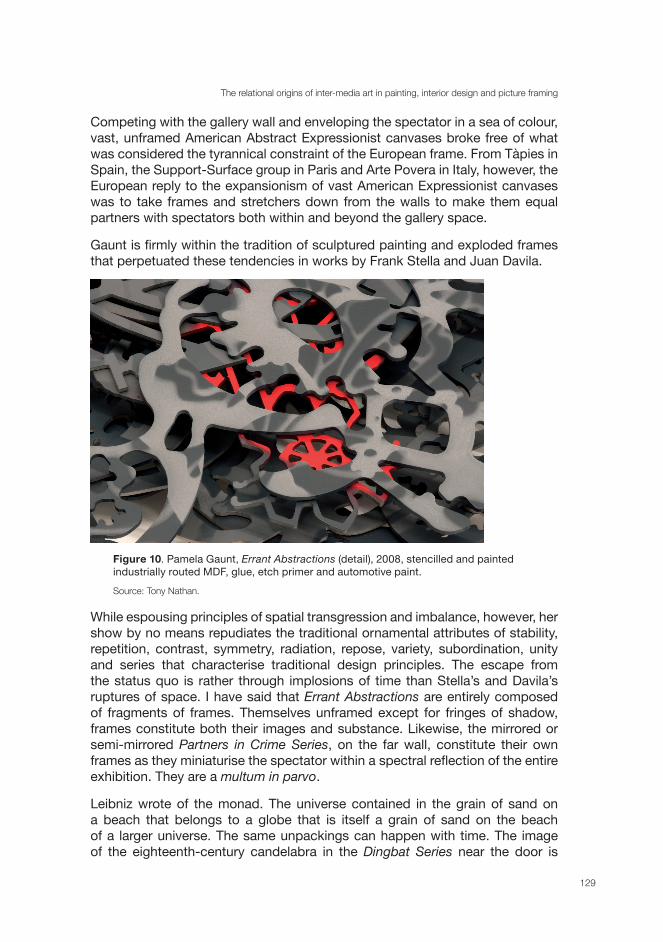
Figure 10. Pamela Gaunt, Errant Abstractions (detail), 2008, stencilled and painted industrially routed MDF, glue, etch primer and automotive paint.
Source: Tony Nathan.
While espousing principles of spatial transgression and imbalance, however, her show by no means repudiates the traditional ornamental attributes of stability, repetition, contrast, symmetry, radiation, repose, variety, subordination, unity and series that characterise traditional design principles. The escape from the status quo is rather through implosions of time than Stella’s and Davila’s ruptures of space. I have said that Errant Abstractions are entirely composed of fragments of frames. Themselves unframed except for fringes of shadow, frames constitute both their images and substance. Likewise, the mirrored or semi-mirrored Partners in Crime Series, on the far wall, constitute their own frames as they miniaturise the spectator within a spectral reflection of the entire exhibition. They are a multum in parvo.
Leibniz wrote of the monad. The universe contained in the grain of sand on a beach that belongs to a globe that is itself a grain of sand on the beach of a larger universe. The same unpackings can happen with time. The image of the eighteenth-century candelabra in the Dingbat Series near the door is
craft + design enquiry
130
composed of 1990s dingbats composed of 1940s motorcycles. To return to an initial question: how might these monadic shifts of temporal style change the experience we bring into the gallery? Personally they have prompted me to bring a series of texts on the social function of superseded pictorial and decorative schemes into uncustomary relations with each other, but it seems to me that Gaunt’s mobiles twirl and eddy in many other strange winds that history blows upon them. Earlier I adverted to Benjamin’s account of the anachronistic image in the Arcades project. The anachronistic image is a dialectical image: ‘for while the relation of the present to the past is a purely temporal, continuous one, the relation of what-has-been to the now is dialectical: is not progression but image, suddenly emergent? Only dialectical images are genuine images (that is, not archaic)’. In his ‘On the Concept of History’ (1940) Benjamin’s ‘dialectical image’ is eclipsed by the ‘monad’, which is ‘no metaphorical constellation of fixed stars: it is more like a momentous conjunction’. Anachronism in Gaunt’s work is monadic in this way. Its purpose is not to release the significance of the past, but to signal a ’Messianic cessation … of happening … a revolutionary chance in the fight for the oppressed past’ (Auerbach, 2007, n.p.). The doubling-up effects of the Alhambra, where ‘abstract outlines have the local effect of arresting the wandering arabesques, but on the large scale they build up repeating star and lozenge shape configurations of colour and line which have a criss-crossing movement of their own’ (Brett, 2005, p. 139), are certainly part of the congestion and release here (Figure 10), for the temporal hybridity is also multicultural.
Throughout this paper we have seen that relational aesthetics has a very long history indeed in the sedimented interactions between the professions that combined their skills to embellish interiors so as to please and surprise their occupants. We have also appreciated how apt it is to view conflict rather than harmony as the more powerful agency in these ever-changing collaborations. In admitting more of the past than we expect, works such as Gaunt’s not only help to shine a light on this history, but may also age in such a way as to enlarge the chance of momentous conjunctions with conditions of reception that cannot yet be anticipated, and so continue to act as an abrasive upon contemporary amnesia in unexpected ways, as every artefact in its own way does if time allows it to.
Professor Richard Read (UWA) has published in major journals on the relationship between literature and the visual arts, nineteenth- and twentieth-century European and Australian art history, contemporary film and complex images in global contexts.
Bibliography
Benjamin, W. 1996–2003, Selected Writings / Walter Benjamin, 4 vols, Cambridge, Mass.: Belknap Press
Bourdieu, P., 1993, The Field of Cultural Production, Cambridge: Polity Press
The relational origins of inter-media art in painting, interior design and picture framing
131
Auerbach, A., 2007, ‘Imagine no Metaphors: The Dialectical Image of Walter Benjamin’, Image [&] Narrative, 18, [online] 18 Available at: <http://www.imageandnarrative.be/thinking_pictures/auerbach.htm> [Accessed 26 April 2011]
Belting, H. 2001, Bild-Anthropologie: Entwurfe fur eine Bildwissenschaft, Munich: Wilhelm Fink Verlag
Bonfante-Warren, A., 2001, The Louvre, Southport, Con.: Hugh Lauter Leven Associates, Inc
Brett, D. 2005, Rethinking Decoration: Pleasure & Ideology in the Visual Arts, Cambridge University Press
Brettell, R.R., 1986, ‘The Frame and the Development of the Portable Easel Picture’. In: R.R. Brettell and S. Starling eds, The Art of the Edge: European Frames 1300—1900, Art Institute of Chicago
Bryson, N. 2001, Looking at the Overlooked: Four Essays on Landscape Painting, London: Reaktion
Crowley, J.E., 2001, The Invention of Comfort: Sensibilities & Design in Early Modern Britain & Early America, Baltimore and London: The Johns Hopkins University Press
de Vries, J., 1991, ‘Art History’. In: D. Freedberg and J. de Vries ed., Art in History, History in Art: Studies in Seventeenth-century Dutch Culture, Santa Monica, CA: Getty Center for the History of Art and the Humanities
Dryness, W.A., 2004, Reformed Theology and Visual culture: The Protestant imagination from Calvin to Edwards, Cambridge University Press
Duncan, C., 2004, ‘From the Princely Gallery to the Public Art Museum: The Louvre Museum and the National Gallery, London’. In: D. Preziosi and C. Farago ed., Grasping the World: The Idea of the Museum, Aldershot, Hants, England; Burlington, VT: Ashgate
Elkins, J., 1999, Why are Our Pictures Puzzles? On the Modern Origins of Pictorial Complexity, New York and London, Routledge
Gaunt, P., 1997, pam gaunt: selected works, 1989–1996, Perth
Gaunt, P., 2004, pam gaunt, selected works 1997–2004, Perth
Gaunt, P. 2008, Pam Gaunt, selected works 2005–2008, Perth
Georgel, P. and Lecocq, A.-M., 1987, La Peinture dans la Peinture, Paris: Adam Biro
Goldthwaite, R.A., 1993, Wealth and the Demand for Art in Italy, 1300–1600, Baltimore and London: the John Hopkins University Press

craft + design enquiry
132
Hazlitt, W. 1824, Sketches of the Principal Picture Galleries of England. In: P.P. Howe, 1930–34, The Complete Works of William Hazlitt, 12 vols. London: Dent, vol. 10
Klein, C., 1994, ‘Objects Are Nice, But …’, Art Bulletin, vol. 76, no.3, pp. 401–04
Lacambre, G.,Tinterow, G. and Roldán, D. L, 2003, Manet/Velázquez: The French taste for Spanish painting, New York; Metropolitan Museum of Art; New Haven: Yale University Press
Mainardi, P., 1993, The End of the Salon: Art and the State in the Early Third Republic, Cambridge University Press
Mander, N., 1997, ‘Painted Cloths: History, Craftsmen and Techniques’, Textile History, vol. 28, no. 2, pp. 119–48
Marcon, M., 1996, ‘Excessive Beauty: Ornamentation, Supplementarity and Modernism’, In: P. Gaunt, pam gaunt: selected works, 1989–1996, Perth: Curtin Printing Services, pp. 40–41
Massey, A., 2008, Interior Design since 1900, London: Thames & Hudson
Muzelaar, K. and Phillips, D., 2003, Picturing Men and Women in the Dutch Golden Age: Paintings and People in Historical Perspective, New Haven and London: Yale University Press
Newhouse, V., 2005, Art and the Power of Placement, New York: The Montacelli Press
O’Doherty, B. (1976), 1986, Inside the White Cube: the Ideology of the Gallery Space, Santa Monica and San Francisco: The Lapis Press
O’Doherty, B., 2007, Studio and Cube: On the Relationship between Where Art is Made and Where Art is Displayed, New York: The Temple Hoyne Buel Center
Outram, D. 1989, The Body and the French Revolution: Sex, Class and Political Culture, New Haven: Yale University Press, 1989
Patmore, P.G., 1824, British Galleries of Art, London
Polidori, R., 2006, After the Flood, New York: Metropolitan Museum of Art
Puttfarken, T., 2000, The Discovery of Pictorial Composition: Theories of Visual Order in Painting 1400–1800, New Haven and London: Yale University Press
Read, R., 2006, ‘Representing Trauma: The Case for Troubling Images’. In: Margaret Mitchell ed., Remember Me: Socially Constructing Life after Death, New York: Taylor and Francis

The relational origins of inter-media art in painting, interior design and picture framing
133
Read. R, 2010, ‘The Diastolic Rhythm of the Gallery: Copies, Originals, and Reversed Canvases’, The Australian and New Zealand Journal of Art, vol. 10, pp. 57–77
Richardson, J., 1715, ‘The Theory of Painting’. In: J. Richardson, 1792, The Works of Jonathan Richardson. London: B. White and Son
Salmon, W., 1678, Polygraphice, London
Sargeaunt, G.M., 1936, ‘Hazlitt as a Critic of Painting’. In: The Classical Spirit, London: Cloanthus Press, pp. 206–23
Staiti, P.J., 1989, Samuel F.B. Morse, Cambridge University Press,
Trexler, R.C., 1980, Public Life in Renaissance Florence, Ithaca and London: Cornell University Press
Trilling, J., 2003, Ornament: A Modern Perspective, Seattle and London: University of Washington Press
Ward, J., 1982, The Principles of Ornament, London: Chapman and Hall
Warnke, M., 1993, The Court Artist: on the Ancestry of the Modern Artist, Cambridge and New York: Cambridge University Press
Wharton, E., 1898, The Decoration of Houses, London: B.T. Batsford