the price of beauty - si
TRANSCRIPT

The Price of BeautyA Study of Visitors toPatterned Feathers, Piercing Eyes: Edo Masters from the Price Collection
Offi ce of Policy and AnalysisSmithsonian Institution June 2008


1
Preface
This study represents the latest contribution to an ongoing collaborative effort between the Freer and Sackler Galleries (FSG) and the Smithsonian Office of Policy and Analysis (OP&A) aimed at understanding who visits the Galleries, what they are looking for, and what they encounter when they are there. This effort has involved 16 visitors studies undertaken in the Galleries since 1994, which have provided a rich source of data and insights about FSG visitors—much of which is relevant to OP&A work at other Smithsonian museums, especially the art museums. The result has been information for FSG leaders that helps them to serve their public more effectively, as well as valuable data and experience for OP&A researchers that have enabled them to undertake their survey and evaluation work more effectively.
I wish to thank FSG Director Julian Raby for his sustained interest in visitor studies, which is driven by his concern to serve FSG’s audience. Likewise, I thank FSG Deputy Director James Ulak, Head of Education and Public Programs Claire Orologas, and Manager of In-Gallery Interpretation Theresa Esterlund, who worked with OP&A to shape the exhibition-specific areas of inquiry for this study, and who provided the input and support without which studies of this nature would not be possible.
I also wish to thank the OP&A personnel who put this study together. The survey was written and administered by a core team consisting of OP&A Intern Justin Cason and OP&A Analysts Lance Costello and James Smith; staff member Samantha Grauberger and contractors Christina Kim and Kayleigh Bryant assisted with survey administration. Interviews were conducted by Lance, James, Justin, and OP&A Intern Allison Butts. Lance and James were responsible for quantitative analysis of the survey data and qualitative analysis of the interviews, and James wrote the final report.
Carole M. P. Neves, Ph.D. Director Office of Policy and Analysis

2

3
Background and Methodology
Patterned Feathers, Piercing Eyes: Edo Masters from the Price Collection (henceforth Price) was on view at the Arthur M. Sackler Gallery of the Freer and Sackler Galleries (FSG) from November 10, 2007 through April 13, 2008. This selection of more than 100 painted screens, scrolls, and fans from the Japanese Edo period (1615-1868) was drawn from the world-renowned California-based private collection of Joe and Etsuko Price. It came to the Sackler after completing a year-long tour of Japan.
The exhibition occupied the Sackler’s main exhibition space on the second and third floors of the Gallery. The layout was intentionally sparse, with a relatively small number of art works in each room, widely set apart; this served to focus visitors’ attention on each individual piece, and to produce an uncluttered, spacious overall feel. The show was loosely organized by theme, rather than by artist, style, or chronology. This also was deliberate; Price was not intended as a scholarly overview of Edo art so much as a collector’s-eye presentation of a distinctive set of works assembled above all for their aesthetic appeal. A Japanese-themed gift shop complemented the exhibition.
The curator of the FSG installation of Price indicated that the exhibition contained several examples of the Galleries’ ongoing experimentation with “investments in nuance.” Painted screens were presented without protective glass, thus removing the problem of glare and allowing visitors to better appreciate the colors and textures of the works. Lighting levels on several screens were programmed to rise and fall, thus simulating how the screens’ appearance in Japanese homes would have changed as the ambient light waxed and waned with the day and the season. Perhaps most importantly, the rotation of works in and out of the exhibition was comprehensive; a completely different set of works eventually replaced the set presented at the show’s opening. This was not undertaken solely for conservation reasons; rather, it was intended to allow the display of more artworks from the collection over the course of the show’s run, to give visitors an incentive to return for multiple visits, and to give the exhibition something of a living and evolving character.
In conducting this study, the OP&A study team used two main research methods:
• A survey of a random sample of visitors exiting the exhibition. Visitors completed 318 self-administered survey questionnaires, with a response rate of 71 percent. Frequencies of responses to the questions on the survey are provided in Appendix B.

4
• In-depth qualitative interviews with visitors to the exhibition. Some interviews were done prior to the survey for the purpose of informing its content. The study team conducted 21 interviews, with a total of 35 people. Interviews were recorded, transcribed, and analyzed by the study team to search for common themes and well-articulated insights.

5
Findings: Survey
Visitor Characteristics
Intention: Previous studies of Sackler exhibitions have shown that the Gallery receives two categories of visitors: those who come for a particular exhibit, and those on a general visit to see Asian art, art in general, or just another part of the Smithsonian. About two in five visitors to Price (39 percent) came to the Sackler specifically to see this exhibition. We will refer to these visitors as exhibition specific visitors.
Previous visits: Half of the survey respondents (50 percent) had made at least one previous visit to FSG before the day on which they were surveyed, and one in four (25 percent) were recent regulars who had visited the museum at least once during the previous year. About three fifths of recent regulars were residents of the Washington DC metropolitan area. Recent regulars were more likely than others to also be exhibition specific visitors (53 percent versus 35 percent)
Demographics
Age: The average age of respondents was 44 and the median age was 45—very close to the figures for FSG visitors as a whole over the past several years.1 Divided by generation, 15 percent were from the Postwar Generation (born 1925-1945); 18 percent were Leading Edge Boomers (born 1946-1955); 18 percent were Trailing Edge Boomers (born 1956-1964); 34 percent were Generation X (born 1965-1981); and 15 percent were Generation Y (born 1982-2001). (See Figure 1, next page.)
Sex: As is typical of art museum visitation, a majority of visitors to Price were female (62 percent).
Residence: Over nine-tenths of respondents (93 percent) were residents of the United States, and about a third (32 percent) were from the Washington DC metropolitan area. As with recent regulars, about three fifths of exhibition specific visitors were local residents.
1 Based on 14 visitors studies conducted at FSG by OP&A, ten of which were done within the last five years.

6
Group size and composition: About one-quarter of the visitor groups2 approached for the survey consisted of one adult visiting alone (24 percent), 46 percent were adults visiting with one other adult, and 16 percent came in a group with someone under eighteen.
Awareness
The most common way visitors reported finding out about the exhibition was from visiting the museum today, marked by 45 percent of respondents. The figure was much higher (64 percent) among visitors not identified as exhibition specific visitors.
The other sources from which visitors learned about the exhibition were friends/family/colleagues (16 percent), a newspaper ad/article (13 percent), the Web (13 percent) or a poster/billboard (5 percent). Another 13 percent indicated they found out about Price through some source other than the five listed above. Among these other sources were the FSG calendar, Washingtonian magazine, general Smithsonian or Cherry Blossom Festival literature, or a college class. (See Figure 2, next page.)
2 Note that a “group” as used here can denote a “group” of one person. Because the survey methodology specified one survey per group and because results were not specifically weighted for group size, it is not possible to say exactly what percentage of total visitors in surveyed groups were visiting alone. This figure would necessarily be lower than the percentage of surveyed groups themselves consisting of one person.
Figure 1: Age, by Generation
Generation X (b. 1965-1981), 34%
Trailing Edge Boomers (b.
1956-64), 18%
Leading Edge Boomers (b.
1946-55), 18%
Generation Y (b. 1982-2001), 15%
Postw ar Generation (b. 1925-45), 15%

7
Exhibition specific visitors were more likely to have learned about Price through a newspaper (25 percent), on the Web (19 percent), or from some source other than the five listed options (20 percent). Recent regulars were more likely to have found out about it through a newspaper (26 percent) or from some source other than the listed ones (23 percent). Visitors who had never been to FSG before the day on which they were surveyed—henceforth new visitors—were more likely to have learned about Price simply by coming across it in the museum during their visit (55 percent).
Interests
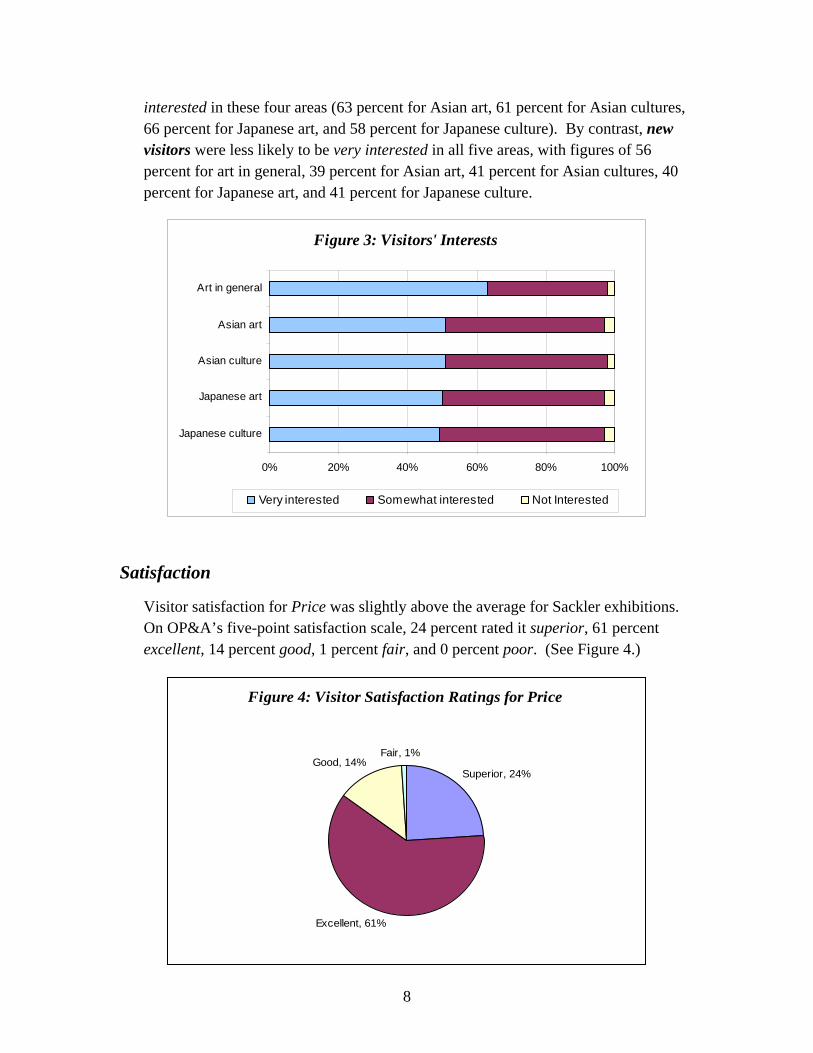
Visitors were asked about their interest (very interested, somewhat interested, or not interested) in five subject areas into which the Price exhibition might be considered to fall: art in general, Asian art, Asian cultures, Japanese art, and Japanese culture.
Nearly two thirds (63 percent) indicated they were very interested in art in general, while about half indicated they were very interested in all other areas: Asian art, 51 percent; Asian cultures, 51 percent; Japanese art, 50 percent; and Japanese culture, 49 percent. The percentage of respondents indicating they were not interested in a topic was no higher than 3 percent in any case. (See Figure 3, next page.)
Recent repeat visitors were more likely than others to be very interested in Asian art (75 percent), Asian culture (67 percent), Japanese art (73 percent), and Japanese culture (67 percent). Exhibition specific visitors were also more likely to be very
Figure 2: How Visitors Found Out About Price
0% 10% 20% 30% 40% 50%
Other
Poster/ billboard
New spaper article/ ad
Website
Friends/ family/ colleagues
Visiting the museum today
8
interested in these four areas (63 percent for Asian art, 61 percent for Asian cultures, 66 percent for Japanese art, and 58 percent for Japanese culture). By contrast, new visitors were less likely to be very interested in all five areas, with figures of 56 percent for art in general, 39 percent for Asian art, 41 percent for Asian cultures, 40 percent for Japanese art, and 41 percent for Japanese culture.
Satisfaction
Visitor satisfaction for Price was slightly above the average for Sackler exhibitions. On OP&A’s five-point satisfaction scale, 24 percent rated it superior, 61 percent excellent, 14 percent good, 1 percent fair, and 0 percent poor. (See Figure 4.)
Figure 4: Visitor Satisfaction Ratings for Price
Superior, 24%
Excellent, 61%
Fair, 1%Good, 14%
Figure 3: Visitors' Interests
0% 20% 40% 60% 80% 100%
Japanese culture
Japanese art
Asian culture
Asian art
Art in general
Very interested Somewhat interested Not Interested

9
Superior ratings: Price’s 24 percent superior rating was higher than Asia in America (10 percent) and Facing East (16 percent); comparable to Wine, Worship, and Sacrifice (23 percent) Return of the Buddha (23 percent), Encompassing the Globe (21 percent), and Caravan Kingdoms (20 percent); and lower than Style and Status (35 percent), In the Beginning (40 percent), and Hokusai (52 percent). (See Figure 5.)
Lower ratings: Combining all respondents who rated the exhibition poor, fair, or good, 15 percent of visitors rated Price less than excellent. This is far lower than the figures for Asia in America (38 percent) and Facing East (37 percent); and slightly lower than Caravan Kingdoms (24 percent), Return of the Buddha (23 percent), Encompassing the Globe (22 percent), In the Beginning (19 percent), and Wine, Worship, and Sacrifice (19 percent). Only Style and Status (11 percent) and Hokusai (7 percent) did slightly better than Price on this measure.3 (See Figure 6, next page.)
3 Note that the differences noted in this paragraph between Price and all the other exhibitions—except Asia in America and Facing East—are small enough that they may represent statistical artifact, rather than actual differences in the satisfaction of the surveyed populations.
0
10
20
30
40
50
60
(Per
cent
)
Hokusa
i
In the
Beginnin
g
Style a
nd S
tatus Price
Wine W
orship
and S
acrifi
ce
Return of
the B
uddh
a
Averag
e Smithso
nian
Encompa
ssing
the G
lobe
Caravan
Kingd
oms
Facing
East
Asia in
America
Figure 5: Superior Ratings

10
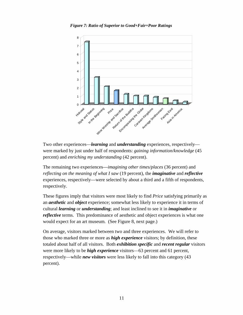
Ratio of Superior to Poor+Fair+Good: The percentage of visitors who rated the exhibition superior outpaced the percentage who rated it poor, fair, or good by a ratio of 1.6. Among recent Sackler exhibitions, this ratio clearly lagged only Hokusai and Style and Status, and was just slightly below In the Beginning. (See Figure 7, next page.)
Exhibition specific visitors far were more likely to rate the exhibition superior than other visitors (36 percent) and less likely to rate it good, fair, or poor (5 percent). Recent repeat visitors were also considerably more inclined than others to rate it superior (33 percent) and less likely to rate it only good, fair, or poor (4 percent). On the other hand, new visitors were less likely to rate it superior (18 percent).4
Experiences
When asked to select from among a list of six possible experiences the ones they found especially satisfying in Price, two experiences were marked by a majority of respondents: being moved by beauty (63 percent) and seeing rare/uncommon/valuable things (54 percent). We will refer to these as the aesthetic and object experiences, respectively.
4 The difference between new visitors and others in terms of rating the exhibition good or lower was not statistically significant at the 95 percent level.
0
5
10
15
20
25
30
35
40
(Per
cent
)
Hokus
ai
Style a
nd Stat
usPric
e
In the
Beginn
ing
Wine W
orship
and S
acrifi
ce
Encom
pass
ing th
e Glob
e
Return
of the B
uddh
a
Carava
n Kingd
oms
Averag
e Smith
sonia
n
Facing
East
Asia in
America
Figure 6: Sum of Good+Fair+Poor Ratings
11
Two other experiences—learning and understanding experiences, respectively—were marked by just under half of respondents: gaining information/knowledge (45 percent) and enriching my understanding (42 percent).
The remaining two experiences—imagining other times/places (36 percent) and reflecting on the meaning of what I saw (19 percent), the imaginative and reflective experiences, respectively—were selected by about a third and a fifth of respondents, respectively.
These figures imply that visitors were most likely to find Price satisfying primarily as an aesthetic and object experience; somewhat less likely to experience it in terms of cultural learning or understanding; and least inclined to see it in imaginative or reflective terms. This predominance of aesthetic and object experiences is what one would expect for an art museum. (See Figure 8, next page.)
On average, visitors marked between two and three experiences. We will refer to those who marked three or more as high experience visitors; by definition, these totaled about half of all visitors. Both exhibition specific and recent regular visitors were more likely to be high experience visitors—63 percent and 61 percent, respectively—while new visitors were less likely to fall into this category (43 percent).
0
1
2
3
4
5
6
7
8
Hokus
ai
Style a
nd Stat
us
In the
Beginn
ingPric
e
Wine W
orship
and S
acrifi
ce
Return
of the B
uddh
a
Encom
pass
ing th
e Glob
e
Carava
n Kingd
oms
Averag
e Smith
sonia
n
Facing
East
Asia in
America
Figure 7: Ratio of Superior to Good+Fair+Poor Ratings

12
Exhibition specific visitors were even more likely than others to indicate having satisfying aesthetic experiences (75 percent), object experiences (65 percent), and understanding experiences (54 percent). Recent repeat visitors displayed the same patterns, being more likely to select aesthetic experiences (78 percent), object experiences (66 percent), and understanding experiences (57 percent).
Once again, new visitors displayed patterns that resembled a mirror image of exhibition specific and recent repeat visitors, being less inclined than others to mark aesthetic experiences (56 percent), object experiences (48 percent), and understanding experiences (34 percent).
Respondents who indicated having satisfying aesthetic and object experiences were also more likely to rate the exhibition superior, although this is probably due to the high correlation between marking these experiences and being either an exhibition specific or recent regular visitor.
Labels and Information
Asked about the information provided in the exhibition through labels and wall text, an overwhelming majority of respondents indicated that they found just the right amount of information (86 percent). Only 11 percent thought there was too little information, and a negligible 2 percent judged there was too much information.
Figure 8: Visitor Experiences in Price
0% 10% 20% 30% 40% 50% 60% 70%
Reflecting on the meaning of what I saw
Imagining other times and places
Enriching my understanding
Gaining knowledge/information
Seeing rare/uncommon/valuable things
Being moved by beauty
13
Suggested Enhancements
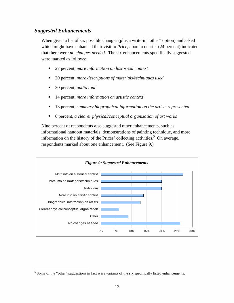
When given a list of six possible changes (plus a write-in “other” option) and asked which might have enhanced their visit to Price, about a quarter (24 percent) indicated that there were no changes needed. The six enhancements specifically suggested were marked as follows:
27 percent, more information on historical context
20 percent, more descriptions of materials/techniques used
20 percent, audio tour
14 percent, more information on artistic context
13 percent, summary biographical information on the artists represented
6 percent, a clearer physical/conceptual organization of art works
Nine percent of respondents also suggested other enhancements, such as informational handout materials, demonstrations of painting technique, and more information on the history of the Prices’ collecting activities.5 On average, respondents marked about one enhancement. (See Figure 9.)
5 Some of the “other” suggestions in fact were variants of the six specifically listed enhancements.
Figure 9: Suggested Enhancements
0% 5% 10% 15% 20% 25% 30%
No changes needed
Other
Clearer physical/conceptual organization
Biographical information on artists
More info on artistic context
Audio tour
More info on materials/techniques
More info on historical context
14
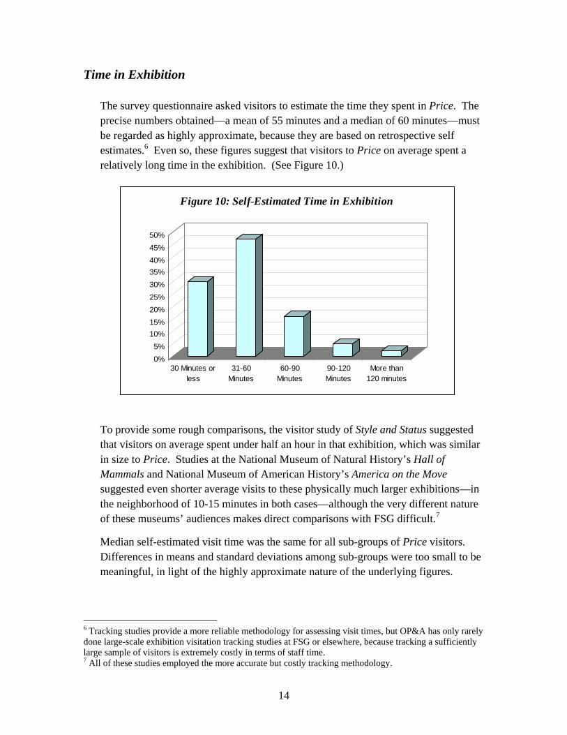
Time in Exhibition
The survey questionnaire asked visitors to estimate the time they spent in Price. The precise numbers obtained—a mean of 55 minutes and a median of 60 minutes—must be regarded as highly approximate, because they are based on retrospective self estimates.6 Even so, these figures suggest that visitors to Price on average spent a relatively long time in the exhibition. (See Figure 10.)
To provide some rough comparisons, the visitor study of Style and Status suggested that visitors on average spent under half an hour in that exhibition, which was similar in size to Price. Studies at the National Museum of Natural History’s Hall of Mammals and National Museum of American History’s America on the Move suggested even shorter average visits to these physically much larger exhibitions—in the neighborhood of 10-15 minutes in both cases—although the very different nature of these museums’ audiences makes direct comparisons with FSG difficult.7
Median self-estimated visit time was the same for all sub-groups of Price visitors. Differences in means and standard deviations among sub-groups were too small to be meaningful, in light of the highly approximate nature of the underlying figures.
6 Tracking studies provide a more reliable methodology for assessing visit times, but OP&A has only rarely done large-scale exhibition visitation tracking studies at FSG or elsewhere, because tracking a sufficiently large sample of visitors is extremely costly in terms of staff time. 7 All of these studies employed the more accurate but costly tracking methodology.
0%5%
10%15%20%25%30%35%40%45%50%
30 Minutes orless
31-60Minutes
60-90Minutes
90-120Minutes
More than120 minutes
Figure 10: Self-Estimated Time in Exhibition

15
Staff Interaction
Respondents were asked if they interacted with FSG staff members or volunteers during their visit to Price. A large majority (70 percent) indicated they had not done so. About one in five (21 percent) indicated they had interacted in some way with a security guard, although this could have been something as trivial as being asked to step back after triggering an alarm.
The figures for interaction with docents were quite low. Only 6 percent indicated they had taken a docent tour and 4 percent spoke to a docent outside the tour context. (Another 5 percent indicated they had some other kind of staff interaction; the study team believes this typically referred to exhibition shop staff.)
Interestingly, respondents who had some interaction with docents were no more likely to rate the exhibition superior or less likely to rate it good or below. However, because the absolute numbers involved were so low, this finding should be viewed with some skepticism.8
Website Use
Visitors were asked whether they had used the FSG website before their visit to Price—either to plan their visit, to learn about Asian art, or for some other reason. Most (71 percent) had not. Of those who did, the percentage who used the website to plan their visit (21 percent) was far higher than those who used it to learn about Asian art generally (4 percent) or for some other reason (6 percent), the latter of which included online shopping, scholarly research, visiting virtual exhibitions, and checking the scheduling for FSG events, concerts, or films.9
However, exhibition specific visitors displayed strikingly different responses in this area, with about a third (34 percent) indicating that they had used the FSG website to plan their visit and a correspondingly smaller percentage (56 percent) indicating they had not used it at all prior to their visit. Recent repeat visitors also differed from others in terms of website use, but less dramatically so; 14 percent indicated they had used the website for some other reason than planning their visit or learning about Asian art.
8 The study team would suggest that it might be valuable at some point to undertake a specific survey of visitors on docent-led tours, whether in addition to or in place of a general exhibition visitor survey. 9 Again, some of the write-in “other” responses were variants of the listed options.

16
Awareness of Freer Gallery
The study team was interested in whether visitors to Price were aware of complementary exhibits of East Asian art in the Freer Gallery of Art adjoining the Sackler. Overall, nearly two-thirds of respondents (64 percent) indicated they were. Unsurprising, the proportions varied considerably on the basis of whether a respondent had visited FSG on previous occasions. Among new visitors, less than half (49 percent) knew about similar exhibits at the Freer. Among all repeat visitors, the figure was closer to four fifths (78 percent), while for recent repeat visitors it was over nine tenths (91 percent).
No significant difference in awareness of the Freer between exhibition specific visitors and other visitors was found.
Design Elements
The survey also included a question about specific design elements of Price, some of which were being used for the first time at FSG. The questionnaire listed five design elements—the changing lighting levels on some painted screens, absence of protective glass in front of screens, exhibition-specific shop, number of artworks on display, and spacing of artworks10—and asked survey-takers whether each element added to their experience in the exhibition, detracted from their experience, had no effect, or indeed was noticed at all.
In no case did more than a tiny minority of respondents (ranging from 1 percent to 6 percent) indicate than any of these design elements detracted from their experience.
In four of five cases, a large majority of respondents indicated that the element in question added to their experience—77 percent for the absence of glass, 68 percent for the spacing of artworks, 63 percent for the changing lighting levels, and 60 percent for the number of artworks. The exception was the exhibition-specific shop, which 41 percent of respondents said added to their experience. However, most other respondents indicated an indifferent rather than a negative response to the shop—45 percent no effect/not sure, 6 percent detracted from experience.
10 The last two of these together were intended to probe how visitors responded to the relatively small number of widely-spaced artworks in the exhibition.
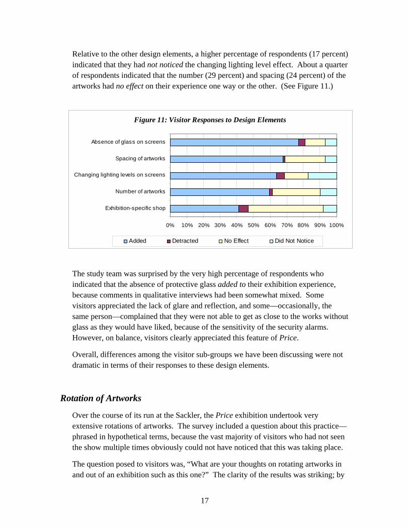
17
Relative to the other design elements, a higher percentage of respondents (17 percent) indicated that they had not noticed the changing lighting level effect. About a quarter of respondents indicated that the number (29 percent) and spacing (24 percent) of the artworks had no effect on their experience one way or the other. (See Figure 11.)
The study team was surprised by the very high percentage of respondents who indicated that the absence of protective glass added to their exhibition experience, because comments in qualitative interviews had been somewhat mixed. Some visitors appreciated the lack of glare and reflection, and some—occasionally, the same person—complained that they were not able to get as close to the works without glass as they would have liked, because of the sensitivity of the security alarms. However, on balance, visitors clearly appreciated this feature of Price.
Overall, differences among the visitor sub-groups we have been discussing were not dramatic in terms of their responses to these design elements.
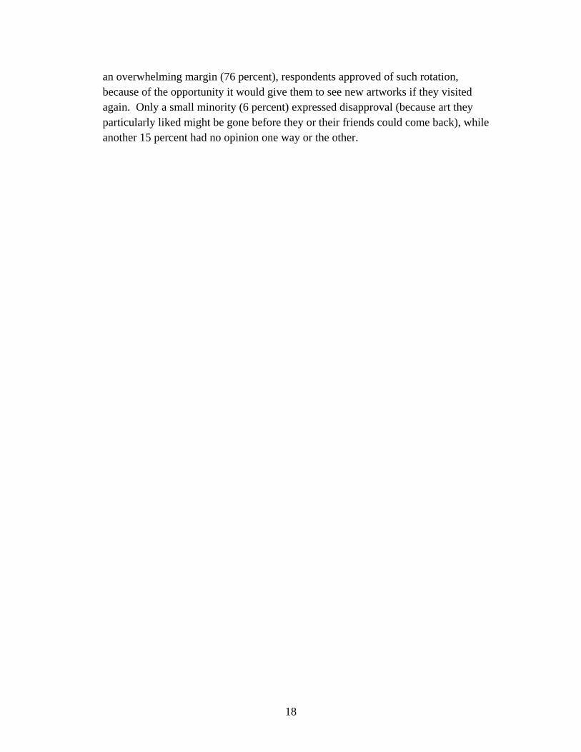
Rotation of Artworks
Over the course of its run at the Sackler, the Price exhibition undertook very extensive rotations of artworks. The survey included a question about this practice—phrased in hypothetical terms, because the vast majority of visitors who had not seen the show multiple times obviously could not have noticed that this was taking place.
The question posed to visitors was, “What are your thoughts on rotating artworks in and out of an exhibition such as this one?” The clarity of the results was striking; by
Figure 11: Visitor Responses to Design Elements
0% 10% 20% 30% 40% 50% 60% 70% 80% 90% 100%
Exhibition-specific shop
Number of artworks
Changing lighting levels on screens
Spacing of artworks
Absence of glass on screens
Added Detracted No Effect Did Not Notice
18
an overwhelming margin (76 percent), respondents approved of such rotation, because of the opportunity it would give them to see new artworks if they visited again. Only a small minority (6 percent) expressed disapproval (because art they particularly liked might be gone before they or their friends could come back), while another 15 percent had no opinion one way or the other.

19
Findings: Interviews
The study team talked to 35 visitors to the Price exhibition in a series of 21 semi-structured interviews, to hear how visitors might expand upon issues covered in the survey in their own words, as well as to probe issues not easily translated into survey language. Although results obtained through qualitative surveying cannot be generalized to the larger population of exhibition visitors, interviewees’ comments raised some interesting issues and provided deeper insights into how some visitors perceived the exhibition.
Objects and Aesthetics
As noted above, the survey results suggested that a majority of visitors seemed to connect with Price most deeply at the aesthetic and object levels. Interviews left the same impression.
Comments about the beauty of the pieces were common, and positive aesthetic reactions had little to do with interviewees’ familiarity with the style or culture:
I don’t know if I’m interested [in Japanese art]. I’ve never really known anything about it. When I came in, I had no idea what to expect. But I just thought the art was beautiful, and aesthetically it really appealed to me. And I like birds!
They’re magnificent. They’re just absolutely magnificent. … The only Japanese art I’d seen was in books and magazines. And I’ve read a few things about Japanese culture, but not a lot. I once even visited Japan, but I never saw things like this when I visited Japan.
Interviewees were as likely to be impressed by the collection as they were to be moved by the beauty of individual pieces. One aficionado had this to say about it:
Mr. and Mrs. Price have amassed an amazing collection, with some of the rarest and best screens I’ve ever seen. Very rare screens. The treatment of the edging and some of the other things [is] very rare; I’ve never seen so much color. The Jakuchu works are quite amazing; he was obviously very prolific. To see large-scale screens of Hokusai’s work is also amazing. It’s much more satisfying to see these things in person than in a book.
Moving on to more specific comments, the colors of the artwork were noted by several visitors, who appeared somewhat surprised by this aspect:
I really liked the city scenes, where I saw a little bit of [the contrast] between the upper class and the regular people on the street. I liked the colors in those, and I

20
also liked the colors that were in the fans floating in the river. It’s kind of nice to suddenly go from the subtle tones [of some of the pieces] to a very bright, colorful picture that stands out.
I liked the more colorful pieces. Some Asian art I have seen is a little bit too monochromatic, with a lot of grays. So I really liked how colorful these were. Some of the colors were terrific. I was surprised by the bright colors.
Other interviewees were pleasantly surprised either by the variety of artworks and the themes depicted in them, or by some of the more unconventional depictions they found:
I was surprised at the variation. A lot of it is what I expected it to be—you know, scrolls with cranes or something—but some of it was not at all what I expected. … [Like] the seven little monks who looked like South Park [cartoon characters]. I didn’t expect that. … I was expecting the screens with the naturalistic birds and flowers, and that was about it. My brother spent three years in Japan, and his house has a funny little collection of “B grade” Japanese art. I was expecting the sort of things he brought back. I didn’t expect ones like the little, fat, happy people. The animal treatments are wonderful. The scenes of Edo life, with the courtesans and the samurai class—those are always rewarding. The treatment of the four seasons and the celebration of the seasons is also something that we miss in Western culture. I really liked the animals, but I liked the people most of all. It’s just so interesting how they are depicted in this art work. The mythical aspect of the way the people are painted was interesting.
This is the most paintings with roosters I’ve even seen, and all in one collection. Usually you see the cranes, the sparrows, the egrets—but not the roosters so much. And the one with 88 birds—that’s a nice one. … The seven cranes all tangled together—that’s also a very interesting piece.
A number of interviewees appeared particularly attracted to the mythologized or stylized aspects of the art, in some cases discussing the fascinating contrast between these and the more naturalistic art:
There’s a lot of mythology, and yet their birds are so realistic. The one painting with the 88 birds on one scroll—so realistic! So some of [the depictions] are realistic, and some of them are not.
21
You had the ghosts and the legends, but you also saw the flowers that were very simplistic and really detailed. So it was a really nice variation. I liked the fact that they weren’t efforts to portray absolutely natural detail. … These were very playful and interesting, I found. It was neat to see the paintings of the tigers, and then to read that all they had to go by were woodblocks. They had no contact with real tigers. I guess that’s why the tigers look so fantastical. They were just great. The eyes—everything was really neat.
Information and Labels
Although survey respondents were most likely to select more information on historical context as a desirable enhancement, the interviewees to whom the study team spoke were generally satisfied with the contextual information provided by the exhibition’s panels and labels:
It’s always a balance between how much information about the paintings you give, and [presenting the art for its own sake]. I think this exhibition struck that balance well.
I am an information seeker, and I like to learn things. I have no problem with looking at things and trying to understand the whole context and influence of why that person did this, and when and where. … I found this was very informative.
[The labels] were good and handy descriptions of what the picture was about and the date and the artist.
I try to look at something first before I read the label, to get an impression of it, before someone tells me it symbolizes this or that. But I did read the labels, because sometimes you miss something. … A lot of this is symbolic, and if you don’t know a lot about what these birds symbolize, you miss something.
Indeed, several interviewees explicitly indicated that they did not think that the sort of information presented in the panels and labels was the point of an exhibition such as Price:
I wasn’t really reading the labels. I’m sure there’s stuff there that I didn’t know, but let’s just say I was mainly looking for the enjoyment of looking.
I was mainly there for the aesthetic [experience]. I did read some of the labels, but I mainly just stood back and took in the visuals. I’m content just to look at the painting and screens. The words are sometimes a necessary evil. [Laughs]

22
I’m not saying I know the history that well, but I was much more interested in just the decorative aspects—the art itself. I won’t remember the geography and history anyway, so I don’t really need to pay attention to that.
That said, a few interviewees did mention gaps in the available information that they would have liked to have seen filled. The study team would suggest this is probably inevitable for some subset of visitors to exhibitions of non-Western art:
There’s a historic piece that I didn’t understand. … Basically it said, “Obviously some of this information came in from trade, because it wouldn’t have been in Japan.” But I don’t know what that information was. I’m looking at the picture saying, “Birds over the waves—what part of this didn’t come from Japan?” [Laughs] Some things [in the panels and labels] refer to chronology and geography. … [For example,] it made a reference that suggested Western Japan was somehow different than Eastern Japan at the time. That sort of led you to a question, but it didn’t answer the question. Why do you make the point if you don’t say why it’s important? … I don’t know anything about Japan, so it would help me to place the art to know something about the chronology and the location. That’s probably the engineer in me.
However, in an ironic illustration of the truism that it is impossible to please all of the people all of the time, a few other interviewees noted that they would have preferred less written information in Price:
I thought the amount of information was almost an overload for people who don’t know much about Japanese art. I think half as much information would have been just fine. I spent just as much time reading as looking. I am not one who likes to have too much reading material around me. People start reading it all and they get in the way of the people looking at the pictures.
Design and Presentation
The exhibition’s design and presentational aspects were other frequent subjects of interviewee comment. In terms of general look and feel, several interviewees indicated they found that the dimly-lit, uncluttered installation created an environment conducive to the calm enjoyment of the art:
It was serene—sort of like a quiet, shaded area. I loved how dark it was, quite honestly. It focused your attention on the pictures. … There wasn’t anything else you needed to look at.

23
I like [the artworks] more spaced out, because it isolates each piece a little more. … You can really focus in on one piece, and there isn’t a lot of other stuff in your peripheral view distracting you.
Organization. The study team was interested in whether the somewhat loose thematic organization of the exhibition left some visitors puzzled. However, not only did the very low percentage of survey respondents indicating a desire for a clearer physical/conceptual organization of artworks strongly suggest that this was a non-issue for the vast majority of visitors, but the few interviewees who commented on this issue also dismissed it as a concern:
I didn’t pay very much attention, frankly. I sort of glanced at the general labels, about how it was grouped and divided up. But I really didn’t pay very much attention to that. I was more interested in looking at the individual pieces rather than the groupings. We didn’t even think about organization. We just kind of flowed from one room to the next. … I would say it was well-designed if we didn’t notice it.
Rotations. Several interviewees offered comments that suggested why the overwhelming majority of survey respondents viewed the rotation of artworks in a positive light:
I like change and I like being able to come back and see something different, because it gives you something new to look at and to think about. I’d probably be slightly disappointed at first [if I came back and one of my favorite pieces had been rotated out]. But then I’d find another favorite, and it wouldn’t matter so much. [Laughs] I intended to see this show a while back, but I got sidetracked doing something else. I didn’t know the works on display were different then. If I had known, I would have made it a point to go that day and then to come back to follow up. That’s an excellent thing to do. So many times, only the “best and brightest” of a collection get shown, and often there are exciting and rare pieces that are the “B-sides” that usually don’t come out of the box. So that’s a very smart way, from a curatorial standpoint, to bring people back more than once.
Protective Glass. Another element of the exhibition that received the approval of a large majority of survey respondents—the absence of protective glass in front of painted screens—drew mixed comments from interviewees. Several interviewees were unambiguously positive about this feature, usually citing the absence of glare and reflections and the truer colors associated with viewing the art directly:

24
You didn’t get as much glare, and you could really appreciate more of the painting that way. It certainly enhanced the art, because glass would just put up a barrier that would, I imagine, affect the color and the light. I thought it was really bold of the museum to do that. One time I realized that I was really close to the piece because I was looking at the detail and I wondered if my breath or anything coming off of my body—the heat or whatever—would affect the painting. It makes a huge difference. I can’t stand looking through the glare; it ruins the experience. Having been a museum-goer my whole life—and having been in European museums where they never do that—it’s a much more satisfying experience without the glass. It’s much better. Much, much better. You get light at different angles. On the first piece, you got a little bit of an idea of the texture on the plum blossoms—the white and the red blossoms.
On the other hand—and perhaps surprisingly for a feature that received such a ringing endorsement on the survey—interviewees were just as likely to discuss the downsides of glass-free presentation. The difficulty of getting close enough to inspect details on glass-free pieces (because of the need for security alarms to prevent touching) was particularly irksome to some visitors:
With the ones behind glass, they don’t mind you getting close, because you’re not able to touch them. So you can actually get closer to the ones [with glass] than you can to some of the others. So it just depends. But in an ideal world, yes, without glass [would be better]. There was one screen that had this story of a demon that kidnaps women. It was pretty cool. But the funny part is that routinely the alarm would go off because people would lean in a little too close to get a look at what was going on. So everyone would kind of giggle every five minutes or so when the alarm would go off. … I would have liked to get up closer to it; maybe having glass would have allowed me to get closer to it without the need for an alarm. But I still thought it was great. I didn’t think about the reflections in the glass, but sometimes I wanted to see the works close up, because some have very detailed designs. But I’m scared of making the siren go off! [Laughs] I think we set off the alarm a few times, trying to lean in and look at some of the screens to see exactly the texture and how it was done.

25
However, it should be noted that only one interviewee actually expressed an explicit preference for having the artwork behind glass:
It’s really difficult to see the details. It would be better if they were behind glass, so you could actually get close. … [There’s that] the annoying beeping, when you try to lean in and take a look at the detail.
Changing Lighting Levels. The changing lighting levels on some screens drew more comments than any other design feature. Every interviewee who noticed this effect seemed to enjoy it, although not necessarily in the same way. For example, some found the lighting effect enhanced their aesthetic experience, while others seemed more taken by the novelty of it:
I hadn’t read [the panel explaining the lighting changes] yet, so when I first stood there, I thought “Boy, they’ve got the light way down in here. ” … I figured they just didn’t want to expose it to light. Then all of a sudden the light just came up, and I thought “This is great!” Then I read the panel about how the point was to see the screen in different light, as the artist would want you to experience it. I thought I was going nuts! [Laughs] I had no idea that was intentional! I thought it was me! We especially noticed [the lighting changes] on the screen with the barley, sparrows, and skylarks. It looked terrific in all lights. It’s a good idea; it’s the first time I think I’ve seen that. As I was looking at [the screen] I saw that it dimmed a little bit, and then it got brighter. I thought that was really neat. I took a moment to look at it—the lighting that they were talking about, and how it would be if it was dawn. Very nice touch—to have the lighting change, so you can see [what it looks like] at different times of the day. I thought it was interesting when I saw the screens where the light was getting brighter. When the light changes, the picture looks different. We had never even thought about [how the art would look different in different lights]. But it’s true of any art, whether Eastern or Western, before Thomas Edison came along with electric lights. [Laughs]
Lack of Crowds. Finally, a number of visitors mentioned, as a positive aspect of their experience, a factor that may evoke more mixed feelings from the perspective of FSG itself: that visitation to Price was relatively light, allowing visitors to have a more quiet, private, and relaxing experience:

26
What’s even more rewarding is the fact that there’s virtually no one here! That’s not good for [the Museum]; but you can actually see all the exhibits without the crowds, and that makes a huge difference in my satisfaction. I have conflicting thoughts. I enjoy it when I’m in the room with very few people. But I’m wondering why there aren’t more people here. You’re not elbowing people and dealing with kids running around screaming. That’s nice. … There are some people here, so you don’t feel like you’re alone; but it’s not so crowded.
Suggested Enhancements
When asked what changes might have enhanced their experience in the exhibition, few interviewees had much to say. A number, however, did spontaneously mention their regret at the exhibition shop’s failure to carry certain items they had hoped to find there—souvenir post cards of collection art foremost among them:
I really liked the painting that had all the different kinds of birds—I think it was 88 birds in one painting. I was looking for a post card of it or something like that, but they didn’t seem to have it.
They have some very lovely [art works] here, and somewhere there should be a poster you can buy and hang up at home. That sort of stuff.
I thought that some of the objects were absolutely wonderful and I am very disappointed that none of them was available in the form of a post card or something I could take home. Because you can’t photograph them.
There should always be at least 10-15 different post cards from the exhibit, because you need to make it affordable for the masses to purchase art. A lot of the time, that’s missing in the gift shops—they only have expensive items or the $65 catalogue, and that’s not fair for the aspiring art lovers who are coming. So post cards are important.
Regarding the exhibition itself, however, most criticisms were either marginal or highly hedged. For an example of the former, one visitor mentioned label placement, indicating that on a few occasions she was initially uncertain where to find the label that went with a certain work. As for latter, while a number of interviewees were, as noted above, somewhat annoyed by the sensitivity of the security alarms, they nevertheless recognized the need for such security measures. Likewise, one person with low vision indicated that the lighting level was dimmer than she would have

27
preferred; but she understood this was largely dictated by conservation considerations. Perhaps the only non-marginal criticism spontaneously mentioned by an interviewee concerned accessibility for handicapped visitors:
If you have a disability, I don’t know how you are supposed to get from [the first part of the exhibition on the upper level] down to here. It wasn’t really clear.
More typical of the interviewees’ responses when asked for suggestions for improvements was this humorous answer:
I would give some of the pieces away to visitors who come through. Otherwise, we both thought it was just a wonderful show. Wouldn’t change it.

28

29
Conclusion and Discussion
It would probably not be accurate to describe Patterned Feathers, Piercing Eyes as a blockbuster for the Sackler in the mold of Encompassing the Globe (in terms of scale and scope), Hokusai (in terms of popularity with the general public), or In the Beginning (in terms of scholarly weight). However, judged by the standards of the more modestly conceived shows that are the bread and butter of the Sackler’s exhibition schedule, Price was unquestionably a success. Its overall satisfaction ratings were very respectable, particularly in terms of the low percentage of survey respondents rating it less than excellent. It appeared to work well both for visitors with a specific interest in the collection or subject (who recognized it as a first-rate, distinctive collection, with many pieces of great individual beauty and interest) and for more casual visitors (who found it an impressive, enjoyable, and accessible introduction to the art of Edo Japan). As noted at several points above, most visitors appeared to connect to Price above all as an object and aesthetic experience of art, rather than as a cognitive learning experience or a window into Japanese culture or history. This suggests that the show’s curators succeeded in their aim of presenting the collection through the eyes of its collectors—as a set of works to be admired on their own aesthetic terms—rather than through the eyes of scholars of Edo Japanese art. The exhibition’s “investments in nuance” appear to have paid the hoped-for dividends. Visitors had overwhelmingly positive reactions to the cycling lighting levels, comprehensive rotation of artworks, and presentation of screens without protective glass, although the last of these appeared to be hedged for some visitors by a degree of annoyance with the resulting need for sensitive proximity alarms. The overall feel of the exhibition, with a relatively small number of widely-spaced works in a calm and dimly-lit environment, also seemed to appeal to most visitors. The panels and wall text struck most visitors as providing an adequate level of contextual information for a show that was primarily meant to be admired in visual terms. The loose organization of the artworks was not seen as a problem by more than a handful visitors; indeed, many appeared to pay little or no conscious attention to the organization or juxtaposition of the works, being focused rather on the beauty of individual pieces and the impressiveness of the collection as a whole.

30

31
Appendix A: Survey Instrument

32

33
Appendix B: Frequencies of Responses to the Price Survey
Is this your first visit to this museum, the Freer and Sackler Galleries? (N=314)
50% Yes 25% No, I last visited more than 12 months ago 25% No, I have visited in the past 12 months
From where did you find out about this exhibition, Patterned Feathers, Piercing Eyes: Edo Masters from the Price Collection? (Mark one or more) (N=316)
45% Visiting the museum today 16% Friends/family/colleagues 13% Newspaper article/ad 13% Website 5% Poster/billboard 13% Other
Did you come to this museum today specifically to see this exhibition of Edo Japanese art? (N=305)
61% No 39% Yes
Please rate your experience in this exhibition today (N=312)
24% Superior 61% Excellent 14% Good 1% Fair 0% Poor
Which of the following experiences did you find especially satisfying in this exhibition of Edo Japanese art? (Mark one or more) (N=316)
63% Being moved by beauty 54% Seeing rare/uncommon/valuable things 45% Gaining information/knowledge 42% Enriching my understanding 36% Imagining other times/places 19% Reflecting on the meaning of what I saw

34
Did you read the labels/panels in this exhibit today? (N=315)
36% Read all/most 56% Read some 8% Read few/none
Thinking about the information in this exhibition of Edo Japanese art, with which of the following do you agree? (N=308)
86% Just the right amount of information 11% Too little information 2% Too much information
Which of the following would have enhanced your visit to this exhibition of Edo Japanese art? (Mark one or more) (N=304)
27% More information on historical context 26% No changes needed 20% More descriptions of materials/techniques used 20% Audio tour 14% More information on artistic context 13% Summary biographical information on the artists represented 6% A clearer physical/conceptual organization of art works 9% Other
Did you interact with museum staff during visit to this exhibition of Edo Japanese art today? (Mark one or more) (N=314)
70% No 21% Yes, security guard 6% Yes, took a docent tour 4% Yes, spoke to docent 5% Yes, other

35
How did the following design elements affect your experience in this exhibition of Japanese Edo art? (Mark one or more)
Didn’t Notice Added to Experience
No Effect / Not Sure
Detracted from Experience
Changing lighting levels on some painted screens (N=303)
17% 63% 14% 5%
Absence of protective glass in front of screens (N=304)
7% 77% 12% 4%
Number of artworks on display (N=298)
10% 60% 29% 2%
Exhibition-specific shop in last room (N=300)
8% 41% 45% 6%
Spacing of artworks (N=299) 7% 68% 24% 1%
About how long did you spend in this exhibition today? (N=316)
Mean: 55 minutes Median: 60 minutes
What are your thoughts on rotating artworks in and out of an exhibition such as this one? (Mark only one) (N=315)
76% I like it, because I will see new artworks if I visit again 6% I dislike it, because artworks I enjoy may be gone if I visit again (or
recommend the exhibition to someone else. 15% I have no opinion 3% Other
Were you aware of complementary exhibits of East Asian art in the adjoining Freer Gallery of Art? (N=314)
36% Not until reading this question 64% Yes
Before you came today, did you visit this museum’s website? (Mark one or more) (N= 315)
71% No 21% Yes, to plan visit 4% Yes, to learn more about Asian art 6% Yes, for another reason

36
Where do you live? (N=443)
93% United States 7% Other country
What is your age? (N= 439)
Mean: 44 years Median: 45 years
What is your sex? (N=443)
38% Male 62% Female
How many people are you visiting with today? (N=437)
24% I am alone 76% I am with others
How interested are you in…
Not interested Somewhat interested
Very interested
Art in general (N=314) 2% 35% 63% Asian art (N=312) 3% 46% 51% Asian cultures (N=303) 2% 47% 51% Japanese art (N=308) 3% 47% 50% Japanese culture (N=304) 3% 48% 49%
Offi ce of Policy and AnalysisWashington, DC 20560-0502
www.si.edu/opanda