the material wellbeing of nz households: overview and · pdf filethe material wellbeing of nz...
TRANSCRIPT
The material wellbeing of NZ households:
Overview and Key Findings
from
the 2017 Household Incomes Report
and the companion report using non-income measures (the 2017 NIMs Report)
Prepared by Bryan Perry
Ministry of Social Development
Wellington
July 2017


1
The Overview brings together in the one place the key definitions and concepts, and the key findings and overall story from both reports – all the figures, tables and charts used in the Overview are in the two fuller reports.
What the reports are about The Household Incomes Report and its companion report using non-income measures (the NIMs Report) provide information on the material wellbeing of New Zealand households from two perspectives:
household incomes: the reports use disposable household income (total after-tax income from all sources for all members of the household), adjusted for household size and composition
non-income measures (NIMs): this approach more directly measures the material wellbeing of households in terms of having:
- the basics such as adequate food, clothes, accommodation, electricity, transport, keeping warm, maintaining household appliances in working order, and so on, and
- freedoms to purchase and consume non-essentials that are commonly aspired to. The reports are published as part of the Ministry of Social Development’s work on monitoring social and economic wellbeing. They are a resource for use by a wide range of individuals and groups – policy advisors, researchers, students, academics, community groups, commentators and citizens more generally – to inform policy development and public debate around living standards, poverty alleviation and redistribution policies. Data sources and time periods covered The current releases update earlier reports with data from Statistics New Zealand’s 2015-16 Household Economic Survey (2016 HES), the latest available. The Incomes Report covers the period from 1982 to 2016. The HES data is supplemented by MSD administrative data and data from Statistics New Zealand’s Income Survey and their longitudinal Survey of Family, Income and Employment (SoFIE) which ran from 2002 to 2009. The interviews for the 2016 HES took place from July 2015 to June 2016. The incomes question asked about incomes “in the last 12 months”. The latest income figures (2016 HES) therefore reflect on average what household incomes were in late 2015, rather than “today”. The NIMs report draws on HES data from 2007 to 2016, and from data gathered in MSD’s 2008 Living Standards Survey. Though most of the survey data is from Statistics New Zealand, the analysis and findings are the work and responsibility of the Ministry of Social Development, except where noted otherwise. What to expect in this update Each new update builds on the analysis and findings of previous issues. Unless there is a major shock to the economy such as the global financial crisis (GFC), or a policy change that directly impacts in a significant way on the labour market or incomes, findings using the latest available survey data can be expected to be broadly in line with previously identified levels and trends in all the main areas monitored by the reports. They can also be expected to reveal the same relativities between different groups. There were no major shocks or changes in government policy that could impact on the 2016 HES data. The HES is however a sample survey and as for all such surveys we can expect random fluctuations in the numbers from year-to-year simply because it is a sample not a full census-type count. The volatility in numbers is greater for population sub-groups than for the population as a whole. In addition to confirming existing knowledge, one of the main values of the updates is that they can remove uncertainties about trends in situations where recent figures have been volatile. Each update also includes new analysis and information.

2
Glossary and Abbreviations
HES Household Economic Survey
HES 2010 HES 2009-10 – the income data mainly reflects incomes in calendar 2009
SoFIE Survey of Family, Income and Employment
IS Income Survey
BHC Before (deducting) housing costs
AHC After (deducting) housing costs
NIMs Non-income measures (sometimes called non-monetary indicators (NMIs))
ELSI Economic Living Standards Index
MWI Material Wellbeing Index (MSD’s 24-item full spectrum index = ELSI, mark 2)
DEP-17 17-item deprivation index (MSD)
EU-13 13-item deprivation index (Eurostat)
NAOTWE net (after tax) average ordinary time weekly earnings
median income the middle income, with the same number of people above as below
mean income arithmetic average of all incomes
quintile when individuals are ranked by some characteristic and divided into 5 equal groups, each group is called a quintile (each group is 20% of the whole)
Q1 a shorthand for the bottom quintile
decile when individuals are ranked by some characteristic and divided into 10 equal groups, each group is called a decile (each group is 10% of the whole)
D2 a shorthand for the second decile (ie second up from the bottom)
vingtile when individuals are ranked by some characteristic and divided into 20 equal groups, each group is called a vingtile (each group is 5% of the whole)
percentile when individuals are ranked by some characteristic and divided into 100 equal groups, each group is called a percentile.
P10 10th
percentile – this is at the top of the bottom decile, 10% up from the bottom
P50 50th
percentile (ie the median)
90:10 ratio the ratio of the income at P90 to that at P10
OTI (Housing) outgoings to income ratio
AS Accommodation Supplement
NZS New Zealand Superannuation
WFF Working for Families
GFC Global Financial Crisis
‘anchored line’ low income (poverty) measure:
o this is the line set at a chosen level in a reference year (now 2007), and held fixed in real terms (CPI adjusted)
o sometimes referred to as the constant value line (CV-07 for short)
o the concept of ‘poverty’ here is – have the incomes of low-income households gone up or down in real terms (ie inflation-adjusted) compared with what they were previously?
‘moving line’ low income (poverty) measure:
o this is the fully relative line that moves when the median moves (eg if median rises, the poverty line rises and reported poverty rates increase even if low incomes stay the same)
o sometimes referred to as the REL line for short
o the concept of ‘poverty’ here is – have the incomes of low-income households moved closer or further away from the incomes of middle-income households (ie those at the median)?

3
The Introduction: .………………………………………………………………………………………….. 4
discusses the income-wealth-consumption-material-wellbeing framework used in the reports, including how the framework helps both the high-level measurement story and a high-level narrative for approaches to address material disadvantage
outlines the way the reports define and measure material wellbeing, and illustrates the differences that different measures can make to the overall picture produced
identifies some of the challenges involved in analysing sample surveys such as the HES, and in interpreting the findings, especially when there is volatility for year-on-year figures.
The Key Findings section covers:
household incomes: …………………………………………………………………………………………… 12
o trends from 1982 to 2016 for both BHC and AHC
o trends in very high incomes
income inequality, 1982 to 2016: ……………………………………………………………………………. 15
o trends for 1982 to 2016 using percentile ratios and the Gini
o income redistribution
o Inclusive Growth?
housing costs relative to income, especially for low-income households: ……………………………… 21
housing quality: ……………………………………………………………………………………………... 23
o dampness and mould
o difficulty keeping it warm in winter
o crowding
o contents insurance
low income (income poverty) and material hardship trends, including relativities between different groups by family type, work status, age, ethnicity, and tenure:
o guidelines and principles for interpreting findings .……………………………………………….. 25
o the whole population ………………………………………………………………………………… 27
o children (0-17yrs) ..………………………………………………………………………………….. 30
o older New Zealanders (65+ yrs) ..………………………………………………………………… 37
income mobility and low-income persistence ………………………………………………………………. 39
international comparisons: …….……………………………………………………………………………….. 40
o low incomes and material hardship
o very high incomes
o income inequality
o wealth inequality
o UN Sustainable Development Goals The first two Appendices have tables and charts which enable the reader to work out where their household is ranked on both the incomes and MWI spectrums ……………………………………………….. 42 Appendix Three gives profiles of living standards at different MWI levels, using MWI and non-MWI items ……. 46 47 Appendix Four outlines the special features of selected HES samples that potentially impact in a misleading way on trend lines, and the actions taken to address these in the analysis and reporting ……. 47 Appendix Five has summary tables for child poverty and material hardship: rates, numbers and composition using a range of measures …………………………………………………………………………………………. 48 Appendix Six outlines the different approaches used internationally for reporting on “poverty and material
hardship” for children .……………………………………………………………………………………………… 51 Appendix Seven notes and discusses four commonly-expressed misunderstandings or misrepresentations of the findings on low-income and material hardship for children ……………………………………………… 52 Appendix Eight provides a high-level schema that outlines the range of causes of material hardship for children, to assist with discussions on policy options ……………………….……………………………. 54

4
Introduction The income-wealth-consumption-material-wellbeing framework The income-wealth-consumption-material-wellbeing framework used in the reports is described below:
Household income and financial and physical assets together largely determine the economic resources available to most households to support their consumption of goods and services and therefore their material standard of living.
Households with resources that are not adequate for supporting consumption that meets basic needs (those experiencing poverty or material hardship) are of special public policy interest.
For low-income households that have very limited or no financial assets, their income is the main in-house resource available to generate their standard of living. Such households not only struggle in varying degrees to meet basic needs, but are also very vulnerable to the negative impacts of “shocks” such as even a small drop in income or an unexpected expense.
The framework recognises that factors other than incomes and assets can also impact on material wellbeing. These factors are especially relevant for low-income / low-asset households, and can make the difference between “poverty/hardship” and “just getting by”.
To measure material wellbeing more directly, the NIMs report uses both MSD’s material wellbeing index (MWI) which covers the whole spectrum from low to high material living standards, and its deprivation index (DEP-17) which focuses on the low living standards end of the spectrum. The MWI and DEP-17 rank households in almost exactly the same order for the lower 20% of the population.
The framework shows how it can be that not all households with low incomes are in hardship, and not all in hardship have low incomes. The overlap between similar-sized groups of those identified as in material hardship and those with low incomes is typically only 40 to 50%, not 100%, as there are many factors in addition to income that determine a household’s level of material wellbeing (living standards).
The framework and government policy to address poverty and material hardship The income-wealth-consumption-material-wellbeing framework together with its elaboration in Appendix Eight in relation to child poverty and hardship provide a high-level check-list for discussion, debate and policy development for addressing poverty and hardship.
For example, thinking about poverty alleviation from the perspective of the household, and how that intersects with government policy, the framework points to the following as pathways for addressing or alleviating poverty:
Financial and physical
assets
Other factors
eg assistance from outside the household (family, community, state), housing costs, high or unexpected health or debt servicing
costs, lifestyle choices, ability to access available resources
Basic needs /
essentials
Discretionary spend / desirable
non-essentials
Material wellbeing or
living standards
Resources available for
consumption
Household
income
DEP-17
MWI

5
increasing household income (whether it be from higher total earnings or increased government cash assistance or reduced tax)
having the demands on the core household budget reduced (for example, through government services and government subsidies such as those for free doctor’s visits for under 13s, reduced fees for Community Services Card holders, child care subsidies)
having some financial savings to help deal with shocks to the budget (for example, loss or reduction in paid employment, unexpected health issues that incur costs or reduce earning capacity, unexpected large bill for the car)
getting better at using a given income to meet basic needs (through improved budgeting, healthy family functioning (tension and chaos reduce efficiency), improving life skills, better access to government and community services, and so on)
having a streamlined user-friendly interface with government agencies for clients to access available assistance.
The framework makes it clear that improving the day-to-day living standards of households is about more than income, though income remains a very important factor. When the focus is on raising incomes for households with children the framework points to three factors that impact on child poverty rates and on the proportion of poor children who come from various subgroups (that is, on the composition of the poor):
the economy and the labour market (impacting for example on employment and unemployment rates, wage rates, benefit numbers (including numbers of sole-parent families), and interest rates)
demographic shifts and changing cultural norms (eg the number of sole-parent families, whether sole-parent families live in households on their own or with other adults, the proportion of dual-earner two-parent households)
policy changes that have a direct impact on income (eg policy changes around benefit rates, income-related rents, the Accommodation Supplement and Working for Families settings all have clear impacts on the child poverty rates for children from working and workless households, and on the relativities between the two groups).
* * * * * * * * * * * * * * * * * * * * * * * * * * [See the June 2016 report to the Ministerial Committee on Poverty which sets out the Government’s ongoing approach to alleviating poverty in New Zealand, available at: http://www.dpmc.govt.nz/sites/all/files/publications/3862574-mcop-govt-actions-on-poverty-2016.pdf The impact of the changes to core benefit levels, the In-work Tax Credit and child care subsidies introduced in the 2015 Budget’s Child Material Hardship Package, and that of the changes to the Family Tax Credit, Accommodation Supplement and Income Tax settings in Budget 2017’s Family Incomes Package do not show up in the 2015-16 HES and the 2017 reports. The 2020 reports will be the first ones able to capture the impact of both these initiatives, based on the 2018-19 HES update.]

6
Three ways of measuring material wellbeing and ranking households
The reports use three different measures of material wellbeing to rank households from high to low. Both income measures adjust for household size and composition to enable more realistic comparisons between different household types.
BHC income (income before deducting housing costs):
Household income from all household members from all sources after paying income tax gives an indication of the different levels of financial resources available to different households, all else being equal.
But all else is not equal, as the diagram on the previous page makes clear. There are many factors other than current income that make a difference to the actual day-to-day living standards of households. For example, the largest item on the household budget for many households is accommodation costs, and yet for others in mortgage-free homes these costs are much lower. Accommodation costs cannot usually be changed in the short-term. To better compare the material wellbeing of households when using incomes, the Incomes Report also uses household income after deducting housing costs (AHC incomes), especially for “poverty” measurement.
AHC income (income after deducting housing costs):
AHC income (ie BHC income after deducting housing costs) is a very useful measure for understanding the real-life differences in consumption possibilities for households when looking at income alone. AHC income is sometimes called “residual income”.
There are other factors (in addition to income and housing costs) that also contribute to a household’s material wellbeing. The combined impact of all these factors on a household’s material wellbeing can be captured by examining more directly the actual living conditions and consumption possibilities that households experience. The MWI does this.
MWI (Material Wellbeing Index)
The MWI is made up of 24 items that give direct information on the day-to-day actual living conditions that households experience. They are about the basics such as food, clothes, accommodation, electricity, transport, keeping warm, maintaining household appliances in working order, and so on, and also about the freedoms households have to purchase and consume non-essentials that are commonly aspired to. See Appendix Two for a list of the MWI items.
Differences in MWI scores reflect the differing impact on living standards of the income, assets and other factors in the framework on page 4. The MWI rankings reflect the different levels of consumption for different households in a way that gets around the need to carry out the very demanding analysis required to create a dollar value for each household’s consumption. The tables in Appendix Three give a picture of the different living standards profiles at different MWI levels, using both MWI items and several not in the MWI. MSD also uses two deprivation / material hardship indices which focus only on the low end of the spectrum:
o DEP-17: this gives the same results as the MWI when looking at the bottom quintile (20%), but the scoring is more intuitive (eg a score of 7+/17 simply means “missing 7 or more basics from the list of 17”)
o EU-13: this 13-item index is used in Europe and we use it monitor how New Zealand ranks internationally – it ranks households in much the same order as DEP-17 does.
Where do you and your household rank?
Appendix One has tables to enable the reader to find out which BHC income decile their household fits in.
Appendix Two shows how to calculate your household’s MWI score and then how that score translates to a ranking relative to the whole population.

7
The different measures can show different pictures of who is in the higher and lower material wellbeing levels Different pictures can emerge depending on which measure of material wellbeing is used. This is most clearly illustrated when looking at how different age groups rate relative to each other on the three measures.
The charts below show how the bottom quintile (bottom 20%) becomes “younger” when the ranking measure changes from BHC to AHC to the MWI – that is, the proportion of older New Zealanders in the bottom quintile decreases (25% to 9% to 5%) and the proportion of children increases (28% to 34% to 38%).
The differences arise in part because mortgage-free home ownership is very high among older New Zealanders (ie housing costs are very low for most), so when moving from BHC to AHC incomes a large re-ranking happens with many older New Zealanders moving up and many families with children moving down relative to each other. The two circled figures at the left of the table below show how the re-ranking leads to many older New Zealanders moving from Q1 (BHC) to Q2 (AHC).
The make-up of the bottom quintile (20%) for the three measures, by age groups (HES 2015)
The differences in the make-up of the bottom quintile on the three measures are also a reflection of the life-cycle fact that, in addition to a mortgage-free home, many aged 65+ have all the household appliances and furniture they need, and many have other financial reserves they can call on. This explains the large change for older New Zealanders when comparing their numbers in Q5 (see table below which covers all five quintiles): using the MWI, 44% of older New Zealanders are in this higher living standards group, whereas for AHC only 20% are.
The table also shows that around one in three older New Zealanders (35%) have BHC incomes that place them in the bottom BHC income quintile, but only one in fourteen (7%) are in the lowest MWI quintile.
Where older New Zealanders are found across all quintiles (%), three measures (HES 2015)
Q1 Q2 Q3 Q4 Q5 TOTAL
BHC 35 18 16 14 16 100
AHC 13 32 18 16 20 100
MWI 7 10 15 24 44 100
Even when the income and MWI pictures look similar, as they often do for AHC low income (poverty) and MWI material hardship numbers, the actual overlap between the households in the two groups is usually fairly modest (45-50% for the bottom quintiles)
Analysis using AHC incomes identifies the same groups as more likely to be at the lower end as analysis using the MWI (sole parent households; older New Zealanders renting and with only NZS as income; and so on).
However the overlap between those in households with low AHC incomes and those in households with low MWI scores is only modest. For example, the overlap between the lower 20% of each ranking is typically around 45% to 50%, reflecting the impact of the factors other than income on the actual living standards of the households.

8
This does not mean that household income is not an important driver of living standards. For low-income households an income increase will almost always raise their material wellbeing. What the finding means is that when comparing the material wellbeing of households, income alone is often not a reliable indicator as the “other factors” vary greatly from household to household.
When people are asked if their household’s income is adequate to cover the basics of food, clothing, accommodation and other necessities, there is good evidence that their responses take account not only of their income but also of all the other factors that make demands on or contribute to the household budget.
The graphs below show the responses to the income adequacy question asked in the HES, by household BHC income decile and by decile of MWI score (HES 2013 and 2014 combined). The graphs use a three-way split for grouping the responses: not enough; only just enough; and enough or more than enough.
The expected gradients from lower to higher material wellbeing are clear on both measures. The “not enough” distribution is however much more tightly bunched at the lower end when the MWI is used for ranking households rather than when household income is used.
In line with the framework outlined on page 4 above, this stronger bunching at the low end when using MWI rankings is highly likely to reflect the fact that respondents are taking as a given both their stock of household goods and appliances, and also the “other” factors that assist or place extra demand on the household budget. In other words, the responses are thoughtful contextualised ones about the adequacy of household income given their particular circumstances. MWI scores reflect the impact on living standards of these other factors as well as that of the household income, whereas household income is a more indirect measure of material wellbeing, a proxy that cannot take account of other key factors.
Looking at the data from the other perspective (how many say “enough” or “more than enough”?), 23% of those in the lowest income decile report having “enough” or “more than enough” income to meet basic needs, but only 3% of those in the lowest MWI decile report that their income is “enough” or “more than enough”.
These findings:
o illustrate the value and importance of the income-wealth-consumption-material-wellbeing framework used in the reports
o give some encouraging evidence of the robustness of the responses given to this more subjective self-assessment question
o warn against using the responses to this common question as if they give reliable information on income adequacy per se, leaving other factors aside.
9
Using and interpreting the findings in the two main reports and in this Overview The surveys are snapshots of different samples each survey, not a movie following the same people
Most of the findings in the reports are based on the Household Economic Survey (HES) which surveys a different group each time (ie repeat cross-sectional surveys). To gain a fuller picture of the material wellbeing of individuals we need information on the same group of people over many years (longitudinal surveys). These can tell us about: total income received over several years which is a better indicator of material wellbeing than income over just one year; low-income and material hardship persistence; income mobility; and changing household circumstances.
Up-to-date New Zealand longitudinal data with household income information is not available at present (2002-2009 only), though what we have is very useful in that it shows (a) the relationship between repeat cross-sectional low-income rates and low-income rates from the longitudinal data, and (b) that we are similar to other countries which have longer-running surveys. In addition, the material hardship measures from the HES go some way to capture the impacts of income history beyond the current year.
It is hoped that Statistics New Zealand’s Integrated Data Infrastructure will soon be able to provide information on household income dynamics.
1
The surveys gather information on the usually resident population living in private dwellings
The survey therefore includes those living in retirement villages, but not those in non-private dwellings such as “rest homes”, hotels, motels, boarding houses and hostels.
Low-income (poverty) and material hardship rates based on the HES and surveys like it are about trends and relativities for the population in private dwellings. Other sorts of surveys are needed to obtain a picture of what life is like for those “living rough” or in boarding houses, hostels and so on.
This does not mean that the survey does not reach households with very limited financial resources or those in more severe hardship. For example, in 2016, 80 of the households interviewed reported receiving help from a foodbank or other community organisation more than once in the previous 12 months, and 35 with school-age children reported that the children do not have a meal with meat, fish, chicken (or vegetarian equivalent) at least each second day.
Findings based on sample surveys have statistical uncertainties
As the findings in the reports are based on data from sample surveys there are always statistical uncertainties.
2
o Some of the uncertainties arise by chance from the fact that the information is from a sample rather than the whole population. This means, for example, that:
- most numbers are expected to bounce around from year to year either side of a trend line, especially for population sub-groups and more so for smaller than for larger ones
- to obtain trustworthy information about relativities between groups it is sometimes necessary to combine the data from 2 or 3 surveys.
o Other uncertainties and ‘noise’ arise from the fact that the response rate to the survey is always less than 100% (typically around 75-80% in recent years for the HES) – if those who do not respond are on average quite different from those who do, and if this difference
1 http://www.stats.govt.nz/browse_for_stats/snapshots-of-nz/integrated-data-infrastructure.aspx 2 Statistics New Zealand discusses the issue in the data quality section of its November HES releases. For example, the
information for the 2015 HES can be found at: http://www.stats.govt.nz/browse_for_stats/people_and_communities/Households/HouseholdEconomicSurvey_HOTPYeJun15/Data%20Quality.aspx

10
changes from year to year, then further fluctuations can occur that do not represent real-world fluctuations.
Year-on-year changes can often be an unreliable guide to real-world changes
The reports emphasise the need to look at trends over several surveys and warn against trying to make claims about real-world changes based solely on reported year-to-year changes, especially for population sub-groups.
For example, while reported changes in median household income are reliable for giving the actual direction of the change and a good estimate of the size of the real-world change, those for high or low incomes are often not. This is illustrated in the graph on the right which shows year-on-year changes for incomes at the top of each decile for HES 2013 to 2014, and for HES 2014 to 2015. A tempting summary or headline finding for the 2015 update could have been “higher incomes are falling and lower incomes are rising”. This would be misleading as it puts too much reliance on year-to-year changes for high and low incomes where the uncertainties are at their greatest. As the graph shows, the changes from 2013 to 2014 go the other way and would be equally misleading to rely on on their own.
The findings about differences or changes are at their strongest when looking at clear trends or changes over several surveys or longer, when comparing rankings using different measures, and when identifying which groups are faring well and which not so well.
The achieved HES sample is usually around 3000 to 3500 households. Households with dependent children are a sub-population of considerable interest for public debate and for policy development, and trends and relativities are carefully monitored. However, as there are only around 1100 of these households in each survey, some year-on-year volatility is to be expected and longer term trends are needed to tell a robust story. Australia (14,000), the UK (20,000) and Ireland (5,500) all use larger sample surveys and therefore produce much smoother year-on-year lines.
There are particular issues at the bottom and top of the income distribution
While the incomes of most of the households in the bottom decile seem plausible (for example, they are in line with main income support levels or the incomes received by households with workers on the minimum wage), there are always some that report implausibly low incomes, lower than beneficiary incomes or much less then declared spending, or both. A few self-employed report negative incomes. The bottom decile is unique in this regard. For example, while there are households in each income decile that report expenditure more than three times their income (around 2-3% of all households), around 80% of these are found in the bottom income decile.
This means that the average income of the bottom decile cannot be taken as a reasonable estimate of this group’s (relative) material wellbeing. This is supported by the analysis in the graph which shows how the MWI score decreases as expected when coming down the (BHC) income spectrum, except for the bottom income vingtile (5%) whose average MWI score is more like those at the top of the second income decile. This shows that the incomes of those reporting implausibly low incomes are in general not a reliable indicator of the resources available to those households for generating consumption.

11
It also means that it is unwise to use very low BHC income thresholds to monitor “severe” poverty as too great a proportion of the households under such thresholds are those with implausibly low reported incomes. The Incomes Report therefore does not go below a 50% of median threshold for BHC incomes.
When the low-income-high-expenditure households are removed from the data, the reported low-income (poverty) rates are around 1 percentage point lower (using a 50% of median measure), but the overall directions of the trends do not change.
At the very high end, there are two issues:
o First, households with very high incomes are under-represented in most sample surveys. We know this through comparisons with tax records. This a well-known issue across all countries.
o Second, from survey to survey the number of very high income households and the size of their reported incomes can vary considerably. The graph shows this phenomenon occurring in HES 2011 and again in HES 2015. In HES 2016 the numbers came down closer to ‘normal’. This variability can have a very large and misleading impact on the reported trends in top decile shares of total household income and in inequality measures which take account of all incomes in the sample (eg the Gini coefficient). The resulting fluctuations simply reflect the challenges of consistently achieving a representative sample of very high income households, rather than any real-world changes.
The random fluctuations from survey to survey can impact unevenly across different groups of interest, leading to even larger fluctuations and uncertainties for these groups than for others
For example, the 2016 sample is ‘light’ on sole-parent households and on beneficiary households with children (both around 20-25% lower than expected). Even when the standard sample weights are applied, the estimated population numbers for these groups are low compared to external benchmarks. These two groups have relatively high low-income rates and make up a good proportion (around half) of those identified as being poor on any measure. The under-sampling of these groups, if not addressed, would artificially pull down the reported low-income and material hardship rates for children in 2016. This under-sampling would have only a minor impact on other income-based indicators used in the Incomes Report.
For the material hardship rates and other non-income measure information for 2016, the NIMs Report addresses the under-sampling issue by using an alternative set of weights, as developed by the Treasury for their Taxwell micro-simulation work. These weights produce population estimates for the two groups that square off well with external benchmarks. The achieved samples for the two groups in 2016 have several key characteristics that are similar to those in other years, so this is a reasonable approach.
The Incomes Report cannot simply use the alternative weights as they impact on too many inter-related indicators, thus disrupting many time series. It addresses the under-sampling issue in two ways. First, the analysis applies the reported low-income rates for the two groups in question to corrected numbers for the groups, numbers that are consistent with external benchmarks. This raises the raw reported rates by around one to one-and-a-half percentage points, depending on the measure, and gives a more robust estimate of the 2016 rates. Second, starting with 2008, the low-income graphs all now use a rolling two-year average which smoothes the fluctuations and makes the trend much clearer and less dependent on the results from a single year.
3
3 See Appendix Four for an outline of special features of recent HES samples that impact on trend lines and other results, and
the actions taken to minimise the impact.

12
Incomes and income inequality
Household incomes
Household income in this section is total after-tax income from all sources for all members of the household, adjusted for household size and composition. This is sometimes called equivalised disposable household income.
Household income is not the same as household or individual earnings as, besides wages and salaries, it also includes interest and government transfers such as NZS, income-tested benefits, and tax credits.
The trends and findings for incomes before deducting housing costs (BHC incomes) and those for incomes after deducting housing costs (AHC incomes) can be quite different. This is so for two reasons: households with similar BHC incomes can have quite different AHC incomes, and housing costs have increased over the years as a proportion of the budgets for most households, and especially for low-income (BHC) households.
BHC incomes
From HES 2015 to HES 2016 median household income (BHC) rose 3% in real terms (3% above the CPI inflation rate), following a reported 2% rise from HES 2014 to HES 2015. As noted in the Introduction, changes from one survey to the next need to be treated with caution, even for basic figures such as the median, though it is less susceptible to statistical blips than most other income statistics.
Looking over the five years from HES 2011 to HES 2016 (the recovery phase after the GFC) gives more robust trend figures than looking at year-on-year changes. The BHC median grew on average at just under 3% pa in real terms in the period.
The graph shows the net improvement at the top of each income decile from just before the impact of the GFC began (avg of HES 2008 and 2009, which covers calendar 2007 and 2008) through to 2015-16. The increases were reasonably even across the bulk of the spectrum at around 11-13% in real terms (11-13% above inflation), with a slightly larger gain for the top of the ninth decile, though at P95 it was less (13%). The negative impact of the GFC and the associated recession was generally a little greater for lower income households, but the slightly greater gains since for lower income households offset that.
The rise in BHC incomes at P10 (ie at the top of the bottom decile (decile 1)) in the graph above mainly reflects rises in real terms for NZS. Those whose incomes are almost entirely from NZS are located towards the top of the lower decile and in the bottom of the second decile. Incomes for beneficiaries (including WFF if eligible) remained reasonably steady in real terms so did not contribute to the rise at P10. The minimum wage rose by 7% in real terms in the period.
New Zealand’s net gains from HES 2009 to HES 2016 are better overall than for many OECD countries – the negative impact was more muted here and the recovery has been stronger than for many:
o the UK median fell through the GFC and has only just returned to its pre-GFC level
o Italy, Spain, France and Germany were flat through the GFC and have remained so since
o the US median in 2014 was much the same as in 2008 before the GFC, and was 4% lower than in 2000

13
o in Australia, household incomes across all parts of the distribution have been relatively flat since 2007-08, just as the GFC began to have an impact
o New Zealand’s post-GFC gain of 12% in real terms to 2015 at the median is more like that of the top performers such as Finland and Sweden (10-12%), though they did not have the fall in median during the GFC that New Zealand did (-3%).
The graph shows the trends for different parts of the BHC income distribution for the last three decades. It shows the fall in the median from 1982 to 1994, the steady rise to 2008-09, the fall in the recent recession and the subsequent rise through to the 2016 HES.
Incomes at the top of the bottom decile (P10) only returned to their 1980s level in 2006-07.
Increasing gaps between the different lines on the graph can be caused by two quite different factors. When interpreting the graph, both need to be kept in mind:
o First, the widening gaps can reflect increasing inequality. For example, from 1982 to 1994, the gap between the P90 and P50 (median) lines widened and the P90:P50 ratio increased.
o Second, the gaps can widen even when there is no increase in the ratio of higher to lower incomes, and it is the latter that is usually meant by “increasing inequality”. From 1994 to 2015, incomes at both the median and at P90 increased by 56% in real terms. This means that P90 incomes remained at around double the P50 level, even though the actual gap between them increased in dollar terms. In this period, it is the increase in the dollar gap that increases the visual dispersion between the lines, not any increase in the ratio.
Median household income in ordinary (unequivalised) dollars
Median household income (BHC and not adjusted for household size and composition) was $76,200 in the 2016 HES, up 14% in real terms from HES 2009, pre-GFC ($67,100), up 30% from HES 2004 ($58,700) and 62% from HES 1994 ($47,100).
In HES 1994 the median was in fact lower in real terms than in HES 1982 ($60,000, when it was similar in real terms to what it was in HES 2004. The net gain in real terms over the whole 33 years from HES 1982 to HES 2016 was 27% at the median.
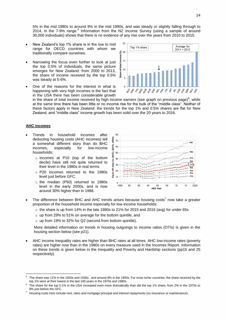
Very high incomes
There is considerable media and general public interest in the very high incomes that some individuals receive, and in the perceptions that the gap between these and the rest is increasing, and that this group is receiving an increasing share of total income.
One way of looking at the issue is to examine the trends in the income share received by the top 1%. The most reliable information on these very high incomes is from tax records.
4
The graph shows that, for New Zealand, the share received by the top 1% increased from
4 Source: the World Incomes and Wealth Database (formerly the World Top Incomes Database ) at the Paris School of
Economics (Alvaredo and colleagues, 2016). This database is the recognised source for international comparisons for very high income shares.
14
5% in the mid 1980s to around 9% in the mid 1990s, and was steady or slightly falling through to 2014, in the 7-9% range.
5 Information from the NZ Income Survey (using a sample of around
30,000 individuals) shows that there is no evidence of any rise over the years from 2010 to 2015.
New Zealand’s top 1% share is in the low to mid range for OECD countries with whom we traditionally compare ourselves.
Narrowing the focus even further to look at just the top 0.5% of individuals, the same picture emerges for New Zealand: from 2000 to 2013, the share of income received by the top 0.5% was steady at 5-6%.
One of the reasons for the interest in what is happening with very high incomes is the fact that in the USA there has been considerable growth in the share of total income received by high income earners (see graph on previous page)
6, while
at the same time there has been little or no income rise for the bulk of the “middle class”. Neither of these factors apply in New Zealand: the trends for the top 1% and 0.5% shares are flat for New Zealand, and “middle class” income growth has been solid over the 20 years to 2016.
AHC incomes
Trends in household incomes after deducting housing costs (AHC incomes) tell a somewhat different story than do BHC incomes, especially for low-income households:
o incomes at P10 (top of the bottom decile) have still not quite returned to their level in the 1980s in real terms
o P20 incomes returned to the 1980s level just before GFC.
o the median (P50) returned to 1980s level in the early 2000s, and is now around 30% higher than in 1988.
The difference between BHC and AHC trends arises because housing costs7 now take a greater
proportion of the household income especially for low-income households:
o the share is up from 14% in the late 1980s to 21% for 2015 and 2016 (avg) for under 65s
o up from 29% to 51% on average for the bottom quintile, and
o up from 19% to 32% for Q2 (second from bottom quintile).
More detailed information on trends in housing outgoings to income ratios (OTIs) is given in the housing section below (see p21).
AHC income inequality rates are higher than BHC rates at all times. AHC low-income rates (poverty rates) are higher now than in the 1980s on every measure used in the Incomes Report. Information on these trends is given below in the Inequality and Poverty and Hardship sections (pp15 and 25 respectively).
5 The share was 11% in the 1920s and 1930s , and around 8% in the 1950s. For most richer countries, the share received by the
top 1% were at their lowest in the last 100 years in the 1970s and 1980s. 6 The share for the top 0.1% in the USA increased even more dramatically than did the top 1% share, from 2% in the 1970s to
8% just before the GFC. 7 Housing costs here include rent, rates and mortgage principal and interest repayments (no insurance or maintenance).
15
Income inequality
There are many types of inequality that are of relevance to public policy formulation and debate, including inequalities in educational outcomes and access to health care and the justice system, wage inequality, wealth inequality and inequality in community outcomes, and so on. The focus in this section is on inequality of household incomes.
Household income inequality is about the gap between the better off and those not so well off: it is about having “less than” or “more than” others, and about how much incomes are spread out or dispersed. This is different from (income) poverty which is about household resources being too low to meet basic needs – about “not having enough” when assessed against a benchmark of “minimum acceptable standards”.
Several approaches are used to summarise in a single number the amount of income dispersion or inequality. No one statistic has emerged as the preferred or “best” one, mainly because each one captures a different aspect of the way the dispersion of incomes changes over time, and each one has its own value and limitations. It is now common internationally to report on more than one indicator and to compare and discuss the trends produced by each.
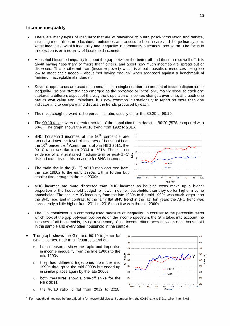
The most straightforward is the percentile ratio, usually either the 80:20 or 90:10.
The 90:10 ratio covers a greater portion of the population than does the 80:20 (80% compared with 60%). The graph shows the 90:10 trend from 1982 to 2016.
BHC household incomes at the 90th percentile are
around 4 times the level of incomes of households at the 10
th percentile.
8 Apart from a blip in HES 2011, the
90:10 ratio was flat from 2004 to 2016. There is no evidence of any sustained medium-term or post-GFC rise in inequality on this measure for BHC incomes.
The main rise in the (BHC) 90:10 ratio occurred from the late 1980s to the early 1990s, with a further but smaller rise through to the mid 2000s.
AHC incomes are more dispersed than BHC incomes as housing costs make up a higher proportion of the household budget for lower income households than they do for higher income households. The rise in AHC inequality from the late 1980s to the mid 1990s was much larger than the BHC rise, and in contrast to the fairly flat BHC trend in the last ten years the AHC trend was consistently a little higher from 2011 to 2016 than it was in the mid 2000s.
The Gini coefficient is a commonly used measure of inequality. In contrast to the percentile ratios which look at the gap between two points on the income spectrum, the Gini takes into account the incomes of all households, giving a summary of the income differences between each household in the sample and every other household in the sample.
The graph shows the Gini and 90:10 together for BHC incomes. Four main features stand out:
o both measures show the rapid and large rise in income inequality from the late 1980s to the mid 1990s
o they had different trajectories from the mid 1990s through to the mid 2000s but ended up in similar places again by the late 2000s
o both measures show a one-off spike for the HES 2011
o the 90:10 ratio is flat from 2012 to 2015,
8 For household incomes before adjusting for household size and composition, the 90:10 ratio is 5.3:1 rather than 4.0:1.

16
whereas the Gini consistently increased each survey in that period, but has come back nearer the trend line for 2016.
Some year-on-year volatility could be expected during and following the GFC, but the very different trends in the two measures from 2012 to 2015 suggest that some other factor is in play. Given the wide public interest in levels and trends in inequality, the special analysis from last year’s report is summarised here and extended to 2016.
One of the main differences between the 90:10 and the Gini is that the Gini uses all incomes, including those at the very top and at the very bottom. As outlined in the Introduction, there are challenges with the reliability of the data at the very top and bottom. The top graph shows the number of households with very high incomes, based on the HES for 2008 to 2016. These sampling fluctuations have a significant impact on the Gini value. For both 2011 and 2015 there was a sharp rise in the numbers of households with very high incomes, falling back a little in 2016. These are also the two years with historically high Gini numbers, as shown in the fluctuating top line in the second graph. The number and size of the negative incomes reported can have an impact on the Gini, but in practice this is a much smaller impact. Neither of these issues impact on the 90:10 figures as the issues occur either above P90 or below P10.
The upper line in the second graph shows the Gini with the negatives set to zero as is standard practice. The lower line shows the Gini with both the top 1% and negatives deleted. The fluctuations for this line are more muted and the 2015 and 2016 figures show a decline relative to 2014 rather than a rise then a fall.
The final graph on this page provides an independent check that the fluctuations in very high incomes captured in the HES are random and not a reflection of what is actually happening with very high incomes. The trend using tax data is reasonably flat from 2000 to 2013 (latest available), and the more recent trend using the Income Survey is also flat.
9 See above
on p13 for a longer term plot of the top 1% share.
For AHC incomes, the Gini (with both the top 1% and negatives deleted) shows a modest rising trend from HES 2007 to 2016.
Summing up
There is no evidence of any sustained rise or fall in BHC household income inequality in the last 10-15 years (90:10 ratio) or the last 20 years (Gini for 99% plus top 1% share) or the last 25 years (top 1% share from tax records).
AHC incomes are much more dispersed than BHC incomes and there is evidence of higher AHC income inequality in the last few years as compared with the mid 2000s and earlier.
9 The Income Survey has a sample of around 15,000 households (28,000 adults), much larger than the HES (5600 households
in HES 2015, but usually around 3500).

17
Income redistribution
New Zealand, like all OECD countries, has a tax and transfer system that redistributes market income (wages, salaries, investments, self-employment) and reduces the inequality and hardship that would otherwise exist. In interpreting the findings in this section it is important to note that market income is not the counterfactual or “natural state” that would exist if there was no government intervention. The existence of taxes, government expenditure and the apparatus of the welfare state (in some form) is a given, and influences citizens’ behaviour in relation to labour market participation, living arrangements, and so on. The analysis can be taken as an indication of the extent of redistribution given that we live in a redistributive welfare state.
“Government transfers” include working-age welfare benefits, New Zealand Superannuation (NZS), the Accommodation Supplement, Working for Families tax credits, special needs grants, and so on. The chart shows the distribution of these transfers across household income deciles, with NZS separated out. For example, decile 2 households receive 22% of all transfers and two thirds of that is NZS (HES 2015).
How the income inequality picture changes depending on the income concept used
The reported level of inequality or dispersion in the distribution of incomes depends on which income concept is used. The graph below shows the different levels of inequality that different income concepts produce, using the 80:20 percentile ratio as the measure. Inequality is lower when the focus moves from individuals to households (HHs). The 80:20 ratio falls from 5.8 for individual taxable income to 3.6 for HH gross taxable income. HH gross taxable income excludes all non-taxable components such as WFF tax credits, AS, and so on. When these are included, inequality drops further (HH gross). Taking personal income tax deductions into account further reduces the 80:20 ratio, as does the adjustment for household size and composition. The 80:20 ratio is more than halved in going from individual taxable income to equivalised disposable HH income. The latter is the most useful of these income concepts to use when using income to assess the material wellbeing of the population, and of subgroups within it.
80:20 percentile ratio for different income concepts, 2012-13 (HLFS for individuals, HES for households)
When the same group of individuals is followed over time (longitudinal data), and the income concept is the average household disposable income of the individual over, say, ten years rather than one, then measured inequality falls even further as a result of income mobility. For Australia the fall was around 15% for both the 90:10 ratio and the Gini from 2001 to 2010 and for the UK it was around 15% for the Gini for five year periods starting at various years in the 1990s. The right-hand bar above assumes a 15% reduction for illustrative purposes.
18
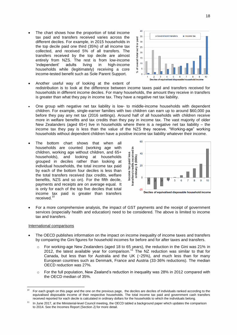
The chart shows how the proportion of total income tax paid and transfers received varies across the different deciles. For example, in 2015 households in the top decile paid one third (35%) of all income tax collected, and received 5% of all transfers. The transfers received by the top decile are almost entirely from NZS. The rest is from low-income ‘independent’ adults living in high-income households while (legitimately) receiving a core income-tested benefit such as Sole Parent Support.
Another useful way of looking at the extent of redistribution is to look at the difference between income taxes paid and transfers received for households in different income deciles. For many households, the amount they receive in transfers is greater than what they pay in income tax. They have a negative net tax liability.
One group with negative net tax liability is low- to middle-income households with dependent children. For example, single-earner families with two children can earn up to around $60,000 pa before they pay any net tax (2016 settings). Around half of all households with children receive more in welfare benefits and tax credits than they pay in income tax. The vast majority of older New Zealanders (aged 65+) live in households where there is a negative net tax liability – the income tax they pay is less than the value of the NZS they receive. “Working-age” working households without dependent children have a positive income tax liability whatever their income.
The bottom chart shows that when all households are counted (working age with children, working age without children, and 65+ households), and looking at households grouped in deciles rather than looking at individual households, the total income tax paid by each of the bottom four deciles is less than the total transfers received (tax credits, welfare benefits, NZS and so on). For the fifth decile, payments and receipts are on average equal. It is only for each of the top five deciles that total income tax paid is greater than transfers received.
10
For a more comprehensive analysis, the impact of GST payments and the receipt of government services (especially health and education) need to be considered. The above is limited to income tax and transfers.
International comparisons
The OECD publishes information on the impact on income inequality of income taxes and transfers by comparing the Gini figures for household incomes for before and for after taxes and transfers.
o For working-age New Zealanders (aged 18 to 65 years), the reduction in the Gini was 21% in 2012, the latest available year for comparison.
11 The NZ reduction was similar to that for
Canada, but less than for Australia and the UK (~25%), and much less than for many European countries such as Denmark, France and Austria (33-36% reductions). The median OECD reduction was 27%.
o For the full population, New Zealand’s reduction in inequality was 28% in 2012 compared with the OECD median of 35%.
10
For each graph on this page and the one on the previous page, the deciles are deciles of individuals ranked according to the equivalised disposable income of their respective households. The total income tax paid and government cash transfers received reported for each decile is calculated in ordinary dollars for the households to which the individuals belong.
11 In June 2017, at the Ministerial-level Council meeting, the OECD tabled a background paper which updates the comparison
to 2014. See the Incomes Report (Section J) for more detail.

19
Inclusive Growth
The idea of “Inclusive Growth” (IG) has gained traction in recent years, especially post GFC. At the heart of the IG notion is the goal of simultaneously promoting economic growth and reducing (or at least not increasing) various inequalities.
For example, the OECD launched its IG initiative in 2012 in association with the Ford Foundation, and defines IG as “economic growth that creates opportunity for all segments of the population and distributes the dividends of increased prosperity, both in monetary and non-monetary terms, fairly across society”.
By definition, the notion of inclusiveness requires a focus on individuals and households, not just on the system as a whole and “averages”. IG is also multi-dimensional, covering not only income and wealth, but also jobs, education, health and access to healthcare. Some include other dimensions too in a broader notion of “living standards”.
One of the motivations for the IG approach is the observation that, for many countries in the years leading up to the GFC, the dividends of economic growth were not fairly shared across the whole income distribution. In particular, in the US and the UK a small group of very high income earners vacuumed up the bulk of the new income coming from economic growth, leaving little or none for the rest to share.
The graphs below show one aspect of New Zealand’s IG experience from the mid 1990s to 2016 – the growth in real terms of household incomes (not equivalised) and Gross National Disposable Income per capita (GNDI pc).
12 They show that:
o median disposable household income tracked very closely with GNDI pc, showing “inclusive growth” (left hand graph)
o the P20 and P90 incomes tracked close to the median (P50), thus showing that the “inclusive growth” extended to higher and lower incomes (right hand graph)
o average wages (after tax) fell behind GNDI pc growth, consistent with lowish productivity growth or higher returns to capital than to labour, or both (and see the point made below the graphs)
o in the post GFC years, average wage growth (after tax) has been only a little less than the growth in median household incomes and GNDI per capita.
One of the reasons for the higher growth rate for household incomes compared with wages is the increase in total hours in paid employment per household for many multi-adult households. This to a large degree reflects the increased female labour force participation in the period.
For example, out of all two parent families that had at least one parent in FT employment, the proportion with two earners increased from 58% in 1994 to 67% in 2008 (69% in 2015).
12
GDP is a measure of the production of final goods and services in the domestic economy. The income available to the nation for consumption or investment is wider than GDP and includes net income flows with the rest of the world. GNDI measures this wider concept. It is a measure of the volume of goods and services New Zealand residents have command over. The per capita (ie per individual) measure is used as it is a rising per capita trend that indicates rising living standards. Straight GDP or GNDI can increase just because of population growth, and the increase may or may not indicate rising living standards.
20
o one consequence of this is that the ratio of median two parent income to median sole parent income has increased from 1.57 in 1994 to 1.66 in 2008 (1.67 in 2015).
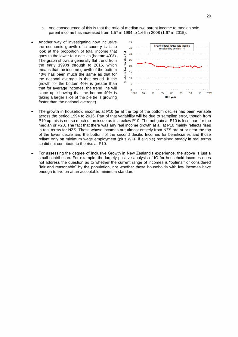
Another way of investigating how inclusive the economic growth of a country is is to look at the proportion of total income that goes to the lower four deciles (bottom 40%). The graph shows a generally flat trend from the early 1990s through to 2016, which means that the income growth of the bottom 40% has been much the same as that for the national average in that period. If the growth for the bottom 40% is greater than that for average incomes, the trend line will slope up, showing that the bottom 40% is taking a larger slice of the pie (ie is growing faster than the national average).
The growth in household incomes at P10 (ie at the top of the bottom decile) has been variable across the period 1994 to 2016. Part of that variability will be due to sampling error, though from P10 up this is not so much of an issue as it is below P10. The net gain at P10 is less than for the median or P20. The fact that there was any real income growth at all at P10 mainly reflects rises in real terms for NZS. Those whose incomes are almost entirely from NZS are at or near the top of the lower decile and the bottom of the second decile. Incomes for beneficiaries and those reliant only on minimum wage employment (plus WFF if eligible) remained steady in real terms so did not contribute to the rise at P10.
For assessing the degree of Inclusive Growth in New Zealand’s experience, the above is just a small contribution. For example, the largely positive analysis of IG for household incomes does not address the question as to whether the current range of incomes is “optimal” or considered “fair and reasonable” by the population, nor whether those households with low incomes have enough to live on at an acceptable minimum standard.

21
Housing costs and housing quality
Ongoing housing costs relative to income
High outgoings for housing costs relative to income are often associated with financial stress for low- to middle-income households. Low-income households especially can be left with insufficient income to meet other basic needs such as food, clothing, basic household operations, transport, medical care and education for household members.
Housing affordability can be measured in a number of ways. From the perspective of potential homeowners, the simplest measure is the ratio of average house price to annual household disposable income, which in effect gives the number of years needed to cover the purchase price of a house (on average). Other more sophisticated measures incorporate the cost of financing as well (eg Massey University’s Home Affordability Index). The recently released Housing Affordability Measure from the Ministry of Building Innovation and Employment uses a mix of administrative and survey data and covers both renters and aspiring first-home buyers. It is based on the notion of ‘residual income’ for households, very similar to this report’s income after deducting housing costs (AHC) measures.
This section on housing affordability takes the perspective of households already in their own homes or renting, and uses a measure which is relevant to both homeowners and renters. The ratio used is that of gross housing costs to household disposable income, in much the same way that home-loan lenders do for assessing risk. Housing costs are taken as rates, mortgage and rent. The ratio is called OTI for short (outgoings-to-income ratio).
Proportion of households with high OTIs
On average over HES 2015 and 2016 29% of households had high OTIs – that is, housing costs of more than 30% of their disposable (after tax) income. There has been little change in this rate since HES 2009.
For the bottom two income quintiles (Q1 and Q2), the proportions were 41% and 38% respectively in HES 2015 and 2016. While these are considerably higher than a decade earlier (34% and 27% respectively), the Q1 rate has plateaued and the Q2 rise has slowed.
Within the group of low-income (Q1) households spending more than 30% of their income on housing, there are many spending considerably more than 30%. For example, around one in four (24%) Q1 households spend more than half of their income on housing. This group makes up 60% of all those Q1 households with OTIs greater than 30%.
From 2007 to 2016, around 15% of all households had an OTI of more than 40% up from 5% in the late 1980s.
The figures above are national averages. There are regional differences that a relatively small sample survey like the HES cannot reliably report on when breaking down by both region and income quintile.

22
Average housing costs as a proportion of average income for different income quintiles
As is clear from the information above, housing costs now take a greater proportion of household income especially for low-income households:
o up from 14% in the late 1980s to 21% in HES 2015 and 2016 for under 65s overall
13
o up from 29% to 51% on average for the bottom quintile, and 19% to 32% for Q2.
Using MSD administrative data
In February 2016, 44% of Accommodation Supplement (AS) recipients were receiving the
maximum payment, up from 25% in February 2007.
In June 2016, almost all renters receiving the AS spent more than 30% of their income on housing costs, three in four spent more than 40% and half spent more than 50% (see Table below).
These figures were all up on what they were in June 2007 (90%, 67%, 40% respectively).
Housing stress for AS recipients using three OTI thresholds (30%, 40% and 50%)
Group
This group as a proportion of all who
receive AS
housing costs as a proportion of income
>30% >40% >50%
2007 2016 2007 2016 2007 2016 2007 2016
All 100 100 87 92 59 69 34 44
Renters 63 66 90 94 67 76 40 52
Single adult 45 55 90 94 65 73 40 50
2 parent with dependent children 11 9 74 89 40 56 21 29
One parent with one child 19 14 86 89 60 67 33 42
One parent with 2+ children 17 14 84 88 55 64 23 34
NZS/VP 9 13 81 86 48 54 23 27
Source: MSD Information Analysis Platform, iMSD
The provisions in the 2017 Budget package (higher incomes across most low to middle income households and higher AS rates and area changes) can be expected to improve these figures for the 2020 Incomes Report.
13
Statistics New Zealand reports that housing costs took up 16% of household income on average in the 2015 HES. The difference in the numbers occurs because (i) Statistics New Zealand uses gross (before tax) income whereas the Incomes Report uses income after tax and transfers, and (ii) the Statistics New Zealand figure is for all ages, rather than the under 65s as above. Both these factors lead to the Statistics New Zealand figure being lower than what is reported here.

23
Housing quality
Major problems with dampness and mould, difficulty with keeping the house warm, and overcrowding are all issues with housing quality that have impacts on health and wellbeing, especially for children.
Lack of contents insurance significantly reduces the ability for people to bounce back after a fire, flood, earthquake or other misfortune, and increases economic vulnerability.
Dampness and heating issues for private dwellings
In the HES surveys, starting with HES 2013, respondents are asked whether their accommodation had no problem, a minor problem or a major problem with (i) dampness or mould, and (ii) keeping it warm / heating it in winter.
On average over the three surveys from 2012-13 to 2014-15:
o 7% reported a major problem with dampness or mould
o 9% reported a major problem with heating it / keeping it warm in winter
o for children (aged 0-17 yrs), the figures for their households were:
- 10% for a major problem with dampness and mould (~110,000 children)
- 13% for a major problem with heating / keeping it warm in winter (~140,000)
- 7% reporting both issues (~75,000) .
The issues are much more prevalent in lower-income households than in middle and higher income households, and are especially concentrated in households with low MWI scores (bottom quintile) – these are households experiencing multiple deprivation across a range of basics:
o a third of these bottom MWI quintile households report “a major problem”
o around 65-70% of those reporting “major problems” are in this lowest material wellbeing quintile, 75-80% for children (0-17 years).
The issues are much more prevalent in rental accommodation than in owner-occupied dwellings:
o 70% of those reporting a major problem with either issue were in rental accommodation, 45% in private rental and 25% in HNZC homes
o in HNZC homes one in three are reported to be hard to heat or keep warm in winter.
In a related question, respondents were asked to what degree they had put up with feeling cold in the last 12 months as a result of being forced to keep costs down to pay for other basics. The options were “not at all”, “a little”, or “a lot”.
o Overall, 7% reported a serious problem on this issue (response = “a lot’).
o The rates were particularly high for sole parent and beneficiary-with-children homes (22% and 30% respectively), 10% for children in all households, and 4% those aged 65+.
o The rate for working families with children overall was only 6%, but controlling to some degree for income by looking only at the bottom income quintile (Q1), the rate is 15% for this group.
o As there are many more low-income working families than there are beneficiary families (overall and in Q1), the numbers reporting having to put up with the cold “a lot” are fairly similar for each group. This touches on a finding that comes up several times in the reports: there is good evidence of a group of “working poor” that is about the same size as the “beneficiary poor” group.

24
Crowding
Living in a crowded house greatly increases the risk of transmission and experience of communicable diseases and respiratory infection. It can also mean severely reduced personal space and privacy, inadequate space for children to do homework or study, and increases the chances of relational stress.
There is no internationally agreed measure of household crowding, but the Canadian index is used widely in New Zealand. This index uses a set of rules for determining who should and should not share a bedroom, with a crowded household being one that requires one or more extra bedrooms. A severe crowding measure uses a threshold of a need for two or more extra bedrooms.
The Census data shows a decline in household crowding from 13% in 1986 to 10% in 2001 (using the 1+ measure). The rate has plateaued at this level in the Censuses for 2006 and 2013.
Those of Pacific ethnicity report the highest crowding rate in 2013 (39%) though this was down from 50% in 1986. The rate for Maori declined from 35% to 19% in the same period.
Crowding is an issue for a good number of children:
o the rate in the 2013 Census was 16% (~130,000) for the less severe measure (1 or more extra bedrooms needed) , and 5% (~40,000) using the more severe 2+ measure
o 80% of those in crowded households are in households with children
o 38% of children in HNZC homes live in crowded accommodation (1+ needed).
Crowding often goes hand-in-hand with other material hardships. Around half of those reporting crowding are in the bottom MWI quintile – this figure applies to children and the population overall.
The 2016 HES reports that around 4% of children aged 6-17 years (~30,000) did not have separate beds – the bulk of these children (80%) live in households with MWI scores in the bottom quintile (20%).
Contents insurance
Lack of contents insurance significantly reduces the ability for people to bounce back after a fire, flood, earthquake or other misfortune. It increases economic vulnerability.
The top line on the chart shows that the proportion of people in households without contents insurance rose from 24% in 2007 to 2011 to almost 30% in 2014 to 2016 (two-year rolling average trend-line).
In low-income households (the bottom AHC quintile (20%)), 51% of those aged under 65 lived in households that had no contents insurance in 2007 and 2008 – this had risen to 58% in 2015 and 2016.
At first look, there appear to be grounds for attributing the rise in the numbers without contents insurance to a temporary response to tighter household budgets for some in the GFC and associated downturn, and that the next few surveys may show a decline. This explanation does not fit well however with the information in the bottom line which shows that there is an almost flat trend for those who say that they have no contents insurance “because of the cost” and the need to have money for other basics.
For older New Zealanders (aged 65+), the straight “no-insurance” rate (as in the top line) has been steady at 14-16% through the period. The change is occurring among those under 65.
The report will monitor and report trends over the next few surveys.
25
Poverty and material hardship
What the reports mean by poverty and material hardship
Poverty is essentially about household resources being insufficient to meet basic needs. In the
richer countries poverty is commonly defined as exclusion from a minimum acceptable standard of living in one’s own society because of inadequate household financial and material resources.
In practice, household incomes have traditionally been used to measure resources, with low incomes used as a measure of income poverty. The limitations of this approach are well-known and are briefly discussed in the opening section of this Overview (p4). Monitoring trends in low incomes is nevertheless an important exercise as many low-income households have very limited or no financial or other assets, and their income is therefore the main in-house resource available for survival.
Over the last two decades growing use has been made of non-income measures (NIMs) to more directly measure material standard of living, and material hardship.
Value judgments are needed to decide on what is “minimum acceptable” or “adequate” (ie where to draw the lines). This is an inescapable aspect of poverty measurement and debate, but does not mean that any measure will do nor that all measures are equally suspect. Some are clearly more reasonable and defensible than others. The NIMs report, for example, has a section producing evidence to support its choice of more and less severe thresholds. The Incomes Report uses a range of fairly standard measures used in richer countries. Both reports use several thresholds so that the fuller story can be told about trends at various depths.
“Poverty” is an awkward word, but its widespread use means that there is little chance of any other word gaining acceptance. The approach in the reports is to use the word, but to be very clear what is meant by it and what is not meant by it, and what measure is being used.
The causes, correlates and consequences of poverty and material hardship are all critical matters to understand and all need to be considered in addressing poverty and hardship, especially for children. Apart from a high-level reference to causes in the Framework (p4) and in the more elaborated version in Appendix Eight, these matters lie beyond the scope of the reports. Their focus is on the description of the core experience.
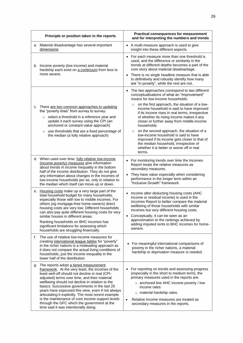
For monitoring and interpreting the trends and other figures relating to poverty and hardship, the reports use the guidelines and principles outlined in the table on the next page. In particular:
o note the use of anchored line low-income rates and of material hardship rates as the primary measures, and the rationale for this
o note that fully relative income measures are not used to monitor short to medium term trends in income poverty, but to look at longer-run changes in income inequality in the bottom half of the income distribution.
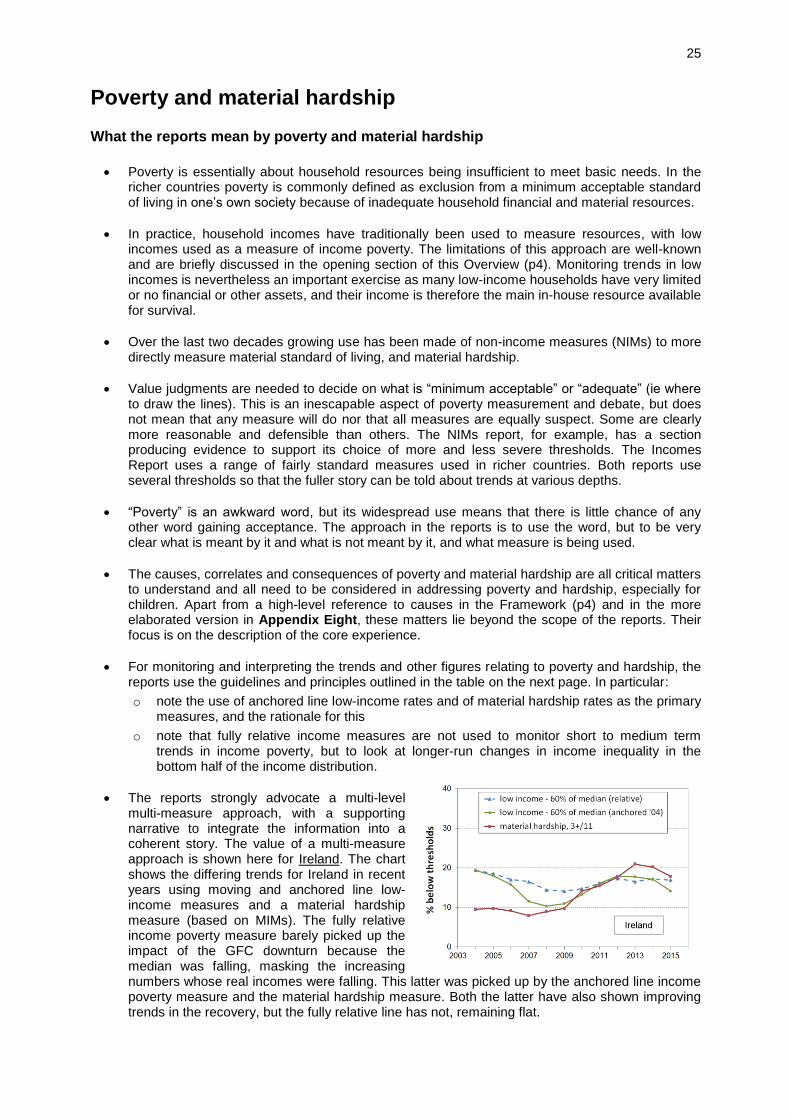
The reports strongly advocate a multi-level multi-measure approach, with a supporting narrative to integrate the information into a coherent story. The value of a multi-measure approach is shown here for Ireland. The chart shows the differing trends for Ireland in recent years using moving and anchored line low-income measures and a material hardship measure (based on MIMs). The fully relative income poverty measure barely picked up the impact of the GFC downturn because the median was falling, masking the increasing numbers whose real incomes were falling. This latter was picked up by the anchored line income poverty measure and the material hardship measure. Both the latter have also shown improving trends in the recovery, but the fully relative line has not, remaining flat.
26
Principle or position taken in the reports Practical consequences for measurement
and for interpreting the numbers and trends
a. Material disadvantage has several important dimensions.
A multi-measure approach is used to give insight into these different aspects.
b. Income poverty (low income) and material hardship each exist on a continuum from less to more severe.
For each measure more than one threshold is used, and the difference or similarity in the trends at different depths becomes a part of the core story about material disadvantage.
There is no single headline measure that is able to definitively and robustly identify how many are “in poverty”, while the rest are not.
c. There are two common approaches to updating the “poverty lines” from survey to survey:
o select a threshold in a reference year and update it each survey using the CPI (an anchored or constant-value approach)
o use thresholds that are a fixed percentage of the median (a fully relative approach)
The two approaches correspond to two different conceptualisations of what an “improvement” means for low-income households:
o on the first approach, the situation of a low-income household is said to have improved if its income rises in real terms, irrespective of whether its rising income makes it any closer or further away from middle-income households
o on the second approach, the situation of a low-income household is said to have improved if its income gets closer to that of the median household, irrespective of whether it is better or worse off in real terms.
d. When used over time, fully relative low-income (income poverty) measures give information about trends in income inequality in the bottom half of the income distribution. They do not give any information about changes in the incomes of low-income households per se, only in relation to the median which itself can move up or down.
For monitoring trends over time the Incomes Report treats the relative measures as secondary measures.
They have value especially when considering performance in the longer term within an “Inclusive Growth” framework.
e. Housing costs make up a very large part of the total household budget for many households, especially those with low to middle incomes. For others (eg mortgage-free home-owners) direct housing costs are very low. Different households can also pay quite different housing costs for very similar houses in different areas.
Ranking households on BHC incomes has significant limitations for assessing which households are struggling financially.
Income after deducting housing costs (AHC income or residual income) is used in the Incomes Report to better compare the material wellbeing of those households with similar incomes but very different housing costs.
Conceptually, it can be seen as an approximation to the rankings achieved by adding imputed rents to BHC incomes for home-owners.
f. The use of relative low-income measures for creating international league tables for “poverty” in the richer nations is a misleading approach as it does not compare the actual living conditions of households, just the income inequality in the lower half of the distribution.
For meaningful international comparisons of poverty in the richer nations, a material hardship or deprivation measure is needed.
g. The reports adopt a tiered measurement framework. At the very least, the incomes of the least well-off should not decline in real (CPI-adjusted) terms over time, and their material wellbeing should not decline in relation to the basics. Successive governments in the last 25 years have espoused this view, even if not always articulating it explicitly. The most recent example is the maintenance of core income support levels through the GFC which the government at the time said it was intentionally doing.
For reporting on trends and assessing progress (especially in the short to medium term), the primary measures used in the reports are:
o anchored line AHC income poverty / low income rates
o material hardship rates.
Relative income measures are treated as secondary measures in the reports.

27
Population as a whole
Low income (income poverty)
For monitoring trends in low incomes (income poverty), the report uses the after-deducting- housing-costs (AHC) “anchored” line measure as its primary indicator. The thresholds are set at 50% and 60% of the reference year median (2007), and adjusted by the CPI for inflation for other years. The thresholds are therefore held at a constant value (CV) in real terms from survey to survey. For short, the measures are sometimes referred to as AHC 50% CV-07 and so on. The 50% CV-07 measure is also used create a longer time series starting in 1982. The BHC trends are also included here for context.
There is no evidence of any rise in recent years in low-income (income poverty) trends using anchored line measures, either BHC or AHC. The trends are either flat or falling, depending on the start point or measure used.
Since the GFC, low-income BHC rates have fallen using the “anchored line” measures, more so for the 60% of median line than the more stringent 50% line. The falls reflect the improvement in household incomes in real terms for many low-income households. The lesser fall using the lower threshold (50% of median) reflects the fact that the bulk of households below this line have in recent years been either beneficiary households or minimum wage working households. Their incomes have remained steady in real terms, so the low-income rate fell only slightly in the period.
Starting with the pre-GFC years as the reference point, there was no measurable difference in the BHC low-income rate in 2015 using the 50% of median measure (steady at 7-8%). Another survey or two is needed to check whether the slightly lower 2016 figure is a real-world fall relative to pre-GFC days, or just a random fluctuation.
Similarly, for the AHC 50% CV-07 anchored line measure there is no evidence of change from before the GFC to 2015. The trend was flat (around 12%), apart from a brief rise in the recession.
For the AHC 60% CV-07 anchored line measure the low-income rate unambiguously fell from its pre-recession rate of 18% to 15-16% in HES 2015 and 2016.
Looking at the longer-term picture from 1982 the AHC population poverty rate more than doubled in a very short period from the late 1980s to early 1990s, reflecting rising unemployment, a falling average wage, demographic changes (more sole parent families) and the 1991 benefit cuts. It then steadily fell through to 2007 with improving employment, a rising average wage, rising female employment, the introduction of income-related rents and Working for Families. This fall in rate indicates that the AHC incomes of many low-income households were higher then (2007) than in the mid 1990s. Since 2007, the trend line for the AHC 50% CV-07 has been relatively flat, as any gains in BHC incomes at these low levels have generally been offset by increases in housing costs.

28
The different trajectories for BHC and AHC incomes show up as different trends for BHC and AHC low-income rates using anchored line measures. BHC household incomes for low-income households were higher in real terms from 2004 to 2015 than in the mid 1980s. This shows up in the dashed line in the graph in which BHC anchored line “poverty” rates from 2004 on are lower than in the 1980s. In recent years the rate has been ~7% compared with 12-14% in the 1980s. On the other hand, AHC “poverty” rates using the same measure are higher in recent years than in the mid 1980s (~12% compared with 8-9%). This reflects the fact that AHC incomes for low-income households were still lower in 2015-16 in real (inflation-adjusted) terms than in the 1980s, despite the real increase in BHC incomes. This is mainly because housing costs are now much higher relative to BHC incomes, especially for low-income households (see p22 above).
The three fully relative AHC trend lines show that whatever threshold is chosen, low-income rates at the different depths have tracked in reasonably similar ways over the last twenty years. These trend lines inform us about the degree of income inequality in the bottom half of the income distribution. This is valuable information, but it tells us nothing about trends in the number of New Zealanders with day-to-day real-life challenges to making ends meet. For that we need the information from the anchored line income graphs and from the material hardship graph below.
There is no evidence of any increasing depth of relative income poverty over the last two decades. Increasing depth means that for a given threshold, a greater proportion are further below the threshold than before. For example, increasing depth could show up as the 40% AHC relative line moving closer to the 50% relative line, showing an increasing number in very low income households (under 40%) compared with the numbers between the 40% and 50% lines.
Material hardship
Trends in material hardship rates are now available for HES 2007 to 2016. Up to and including HES 2012, the analysis used MSD’s ELSI measure, then from HES 2013 on it uses the material wellbeing index (MWI), the revised version of ELSI. See the NIMs report for detailed discussion and evidence in support of using an unbroken series.
The MWI gives the same figures and trends as MSD’s deprivation index (DEP-17) but it can also give more detailed / fine-grained information at the lower end. A description of the items used in these indices is given in Appendix Two.
Trends are shown in the chart for the whole population using a range of thresholds. The two thicker lines (for MWI scores of 9 or less and 5 or less) correspond fairly closely to the rates produced by the EU’s standard and severe hardship thresholds respectively.
14
For the more severe hardship measure the rate tracked at around 5% through to 2015, with possibly a slight rise through the GFC. It is too soon to say whether the reported slight fall to 2016 is a part of a small real-world downward trend or
14
Hardship rates using an MWI score of 9 or less are the same as when using a DEP-17 score of 7+/17. For an MWI score of 5 or less, the equivalent is 9+/17 for DEP-17. Note that for the MWI a lower score means lower living standards (higher deprivation), whereas for DEP-17 a higher score means higher deprivation.

29
just a statistical fluctuation. The 2017 survey should clarify that. There has certainly been no rise in the rate in 2016.
For the standard or less severe hardship measure, the impacts of the GFC and the recovery are very clear, with the rate first rising to 13% in HES 2011 then falling to 7-8% over the last two surveys, lower than before the GFC (10%).
The difference in trends for the different depths of hardship reflects the following:
o Almost all those in deeper hardship are working-age beneficiaries or low-waged workers with persistent low income – benefit rates and the minimum wage are generally pegged to the CPI so their incomes are steady in real terms and not likely to be greatly impacted by the state of the economy. For some, there are also factors either in addition to low income or contributing to their low income (or both) that lead to their being in deeper hardship (see the framework on page 4). Changes in the economy have little impact on this group.
o In contrast, the general state of the economy (wages and employment especially) has a rapid and noticeable impact on those in lesser hardship and those ”just getting by”. Households in this group can have their actual day-to-day living conditions significantly changed by even modest changes in income, whether increases or decreases.
The incomes of those in hardship
The pie chart shows the AHC household income bands for the 8% of the population who are identified as being in hardship using the less severe threshold (MWI score of 9 or less, DEP-17 score of 7+), using HES 2014-15 data.
Just under half (48%) have incomes below the 50% of median AHC line, 8% are in the 50%-60% band, and a further 27% have incomes above the 60% line but below the median. 17% of those in hardship have incomes above the median.
This wide range of household incomes for those identified as “in hardship” illustrates the point made in the framework used for the reports – that is, differences in actual living standards among households reflect not only the impact of differences in household income but also differences in financial assets and other economic resources; differences in special demands on the household budget (such as those arising from high debt servicing costs, high health-related costs, commitments to family and others outside the immediate household); and differences in abilities to use a given income to meet basic needs or to maximise the value of discretionary spending.
Trends in hardship rates for the “poor” and the “non-poor”
As illustrated above, one of the features of the relationship between income and material hardship is that, although living in a household with an income above a given low-income threshold (“poverty line”) reduces the risk of material hardship, it does not eliminate the risk. Some of the non-poor still experience material hardship, and some of the poor do not.
The ‘non-poor’ have much lower hardship rates than the ‘poor’. This is not a surprise. There are however many more ‘non-poor’ than there are ‘poor’, and the number in hardship in each group are broadly similar as shown in the bottom two lines in the chart.
The analysis uses the 60% AHC low income line and the material hardship line set at MWI ≤ 9 (ie 7+/17 on DEP-17).

30
An important finding from this analysis is that around 70% of the reduction in hardship since the peak in 2011 and 2012 has come from many ‘non-poor’ households moving out of hardship as their incomes improved through greater employment opportunities and wage growth in the recovery post-GFC. It is a reminder that there are households with incomes above even the relatively generous 60% of median AHC low-income line (the ‘near-poor’) whose financial circumstances can best be described as precarious. Relatively small changes in income or unexpected bills can make a significant difference to their day-to-day living conditions.
For those in the lowest MWI decile (the 10% with the lowest living standards), half report that they borrowed from family and friends more than twice in the previous year in order to meet everyday living costs for basics. For the second decile, a quarter report this. In contrast, for deciles 5 to 10 (the better-off 60%), the rate is close to zero. This illustrates the economic vulnerability of many in less well-off households, and also the value of networks of support. For those low-income households without these support networks, the chances of even a small shock tipping the balance and putting them into hardship (as measured here) is high.
Children
There is considerable public, media and political interest in the wellbeing of children, including their material wellbeing – how they are faring in accessing their material needs and the necessities of life. The special interest derives from two considerations:
o Children are very dependent on others for their survival, for having their material needs met and for the opportunities to grow and develop in a positive healthy way. Parents, the wider family, the community and the state all have a part to play. No one wants to see children missing out on the basics and being unable to participate in the childhood activities that our society expects and values for all children.
o Living in persistent low income and hardship as a child is not only a childhood experience that impacts negatively on children in the here and now, it also increases the chances of poor outcomes later in childhood and in adulthood. While much of the observed association between persistent low income and hardship (“poverty”) and poor outcomes can be explained by other factors that drive both the “poverty” and the other poor outcomes, not all of it can. There is now good evidence that childhood experience of persistent low income and material hardship can in itself have a negative impact later on. The impact operates through pathways such as:
- the more limited (financial) resources available for investment in children and their development
- the parental stress arising from the daily pressure of not being able to pay the bills, of having to make difficult trade-off decisions where solutions to one problem create problems of their own in another area, and from a sense of shame and disappointment of not being able to provide for the children, and
- the fact that the negative impacts show up across multiple domains and therefore contribute to a larger cumulative impact.
This is all costly, not only for the individual but also to society as a whole through higher health costs, lower employment, lower wages, lower tax revenue and lower productivity.
“There are no poor children, just poor families”
It is sometimes said that the idea of “child poverty” doesn’t make sense as it’s really about families with financial and material resources that are not adequate for meeting the basic needs of the family (ie it’s not poor children, it’s poor families).
In this report, when it is said that “the child poverty rate on a given measure is 18%”, this is a short-hand for “18% of children live in families whose total income is below the threshold used in the given measure”. It is too cumbersome to repeat this each time, so the shorthand version is used: “the child poverty rate is 18%”.

31
Low income (income poverty)
All the low-income graphs use a rolling two-year average (from 2008) to smooth the year-on-year volatility and thus give a better idea of the actual trends.
15 The latest point on the graphs is always
the least certain when it comes to identifying trends.
For the AHC 50% CV-07 measure the rolling average rate in 2015 (16%) was down on the peak in the GFC/recession (19%), but just a little lower than the pre-GFC rate (17%). The information from the next survey is needed before it is clear whether the reported fall to 14% in 2016 is a statistical blip or not. There is an unambiguous fall from the 2011 peak, and there is certainly no evidence of any increase over pre-GFC rates, most likely a small fall.
For the AHC 60% CV-07 measure the low-income rate for children fell from its GFC/recession peak of 25% to 22% in 2015, lower than the pre-GFC rate of 24%. The reported 2016 rate (20%) is even lower still, but the 2017 results are needed to remove uncertainty here. The fact of a decline from the pre-GFC rate is not in doubt, it’s just a matter of being more sure about the size of the fall.
Looking at the longer-term picture from 1982, the AHC anchored line poverty rate for children almost tripled in a very short period from the late 1980s to early 1990s, reflecting rising unemployment, a falling average wage, demographic changes (more sole parent families) and the 1991 benefit cuts. It then steadily fell through to 2007 with improving employment, a rising average wage, rising female employment, the introduction of income-related rents and Working for Families. This fall in poverty rate through to 2007 indicates that the AHC incomes of many low-income households with children were higher in 2007 than in the mid 1990s. As noted above, the 2017 survey will give clearer evidence as to whether there has been a measurable net decline from the pre-GFC level.
For the BHC anchored line measures (not shown), both the 50% and 60% measures show a fall from pre-GFC rates: from around 20% to 13% in 2016 for the 60% measure, and 12% to 7% for the 50% measure. Even allowing for the sampling uncertainties, these are unambiguous falls.
The longer-term BHC and AHC low-income trajectories are quite different, and show up as different trends for BHC and AHC child “poverty” rates using anchored line measures. Household incomes (BHC) for low-income households were higher in real terms from 2004 to 2016 than in the mid 1980s. This shows up in the dashed line in the graph in which BHC anchored line “poverty” rates from around 2004 on are lower than in the 1980s. In recent years the BHC rate has been 8-10% compared with 15-17% in the 1980s (use right-hand axis for the scale). On the other hand, AHC “poverty” rates using the same measure are higher in recent years than in the mid 1980s (14-16% compared with 11-12%). This reflects the fact that AHC incomes for low-income households with children are still lower now in real (inflation-adjusted) terms than in the 1980s, despite the real increase in BHC incomes. This is mainly because housing costs are now much higher relative to BHC incomes, especially for low-income households (see p22 above).
15
The main reports still provide tables with the actual year-by-year figures as well.

32
The three fully relative AHC trend lines (dashed lines on graph on previous page) show that low-income AHC rates for children have been fairly flat over the last 20-25 years, indicating no change in income inequality in the lower half of the AHC incomes distribution in that period. Over this period the AHC low-income rates have been around double what they were in the 1980s.
There is no evidence of any increasing depth of relative income poverty over the last two decades. One way that increasing depth would show up is that the 40% relative line would move closer to the 50% relative line, showing an increasing proportion in very low income households (under 40%) compared with the numbers between the 40% and 50% lines. This has not happened.
Low income (poverty) rates for children are always higher than for the population overall, in part because of the relatively low rates for older New Zealanders. This is illustrated in the AHC 50% CV-07 graph on the right.
Material hardship
Trends in material hardship rates for children (0-17 yrs) are now available for HES 2007 to 2016. Up to and including HES 2012, the analysis used MSD’s ELSI measure, then from HES 2013 on it uses the material wellbeing index (MWI), the revised version of ELSI. See the NIMs report for detailed discussion and evidence in support of using an unbroken series.
The MWI gives the same figures and trends as MSD’s deprivation index (DEP-17) but it can also give more detailed / fine-grained information at the lower end. A description of the items used in these indices is given in Appendix Two.
The chart shows trends in child hardship rates using a range of thresholds and two-year rolling averages.
16 The two thicker lines (for MWI scores
of 9 or less and 5 or less) correspond fairly closely to the rates produced by the EU’s standard and severe hardship thresholds respectively.
17
For the more severe hardship measure the rate tracked at around 8-9% through to 2014, with possibly a slight rise through the GFC. It looks as if there has been a fall at this more severe level from 2014 to 2016. It is not yet clear however whether the fall in 2016 is a statistical blip or part of a genuine downward trend. The 2017 survey should clarify that. There has certainly been no rise in this rate through to 2016.
As for the population as a whole, the trend for children using the less severe measure rose significantly during the GFC from 16% to a maximum of 20%, then fell to 14% in 2014 and 2015 and to 12% in 2016. The 2017 survey will clarify the size of this latter fall.
16
The latest point on the graphs is always the least certain when it comes to identifying trends. 17
Hardship rates using an MWI score of 9 or less are the same as when using a DEP-17 score of 7+/17. For an MWI score of 5 or less, the equivalent is 9+/17 for DEP-17. Note that for the MWI a lower score means lower living standards (higher deprivation), whereas for DEP-17 a higher score means higher deprivation.

33
Trends in hardship rates for the “poor” and the “non-poor”
As discussed above, one of the features of the relationship between income and material hardship is that although living in a household with an income above a given low-income threshold (“poverty line”) reduces the risk of material hardship, it does not eliminate the risk. Some of the non-poor still experience material hardship, and some of the poor do not.
Using the AHC 60% of median relative low-income measure to identify ‘the poor’, and the less severe hardship threshold to identify those in hardship, the hardship rate for ‘poor’ children is around 30% and 6% for the ‘non-poor’. There are however many more ‘non-poor’ children than there are ‘poor’ children, so the actual numbers in these two groups are similar. The graph shows the trend in the number in hardship for ‘non-poor’ and ‘poor’ children and for all children.
An important finding from this analysis is that around 60% of the reduction in the number of children in hardship since the peak in 2011 and 2012 has come from many ‘non-poor’ households moving out of hardship as their incomes improved through greater employment opportunities and wage growth in the recovery post-GFC.
It is a reminder that there are households with incomes above even the relatively generous 60% of median AHC low-income line (the ‘near-poor’) whose financial circumstances can best be described as precarious. Relatively small changes in income or unexpected bills can make a significant difference to their day-to-day living conditions.
Those in “deeper poverty” or “more severe hardship”
One of the features of the approach used in the Incomes and Non-incomes reports is to accept that there is no line that can definitively divide the population into the ‘poor’ and the ‘non-poor’. The reports use and advocate an approach that accepts that poverty and material hardship exist on a continuum from less to more severe. They use thresholds within a plausible and defensible range to give a comprehensive account of what is happening at the different depths.
There are three different conceptualisations of “deeper poverty” or “more severe hardship” used in the reports:
o those in households with very low AHC incomes (say, less than 40% of median AHC incomes)
o those in households with high deprivation scores (eg MWI ≤ 5 (≡ DEP-17 of 9+/17))
o those in households with both low income and experiencing material hardship.
The third conceptualisation (the overlap group) is used for the graph. Around 7% of children (80,000) live in households whose incomes are below the 60% of median AHC line and who are in hardship using the standard or less severe threshold (ie MWI ≤ 9, DEP-17 ≡ 7+/17). This is much lower than at the peak of the GFC/recession (12%) and much the same as in the pre-recession period (8%).
For those in hardship but with incomes reasonably above a low-income line there are grounds for expecting living standards to improve over time provided their incomes do not decline and that there are no on-going special demands on the budget (eg from high health costs, high debt servicing, and so on). However for those in hardship who also continue to have fairly low
34
incomes, there is very little chance of improvement of living standards until incomes rise and stay up.
Poverty and hardship composition for children (which children are poor or in hardship?) Low-income and material hardship rates for different sub-groups of children indicate the relative risks for children in the different groups. In many cases, however, the sub-groups with the highest rates are relatively small numerically. For example, sole parent families have much higher rates than two parent families, but there are around four times as many children in two parent families. It is therefore important to look at information on the composition of the poor or those in hardship, as well as the information on rates. Selected information is provided below:
Half of poor children are Maori/Pacific (34% of all children are Maori/Pacific.18
Half of poor children are from sole parent families and half from two parent (24% of all children are from sole parent families)
Half of poor children are from households where the highest educational qualification for parent(s) is school or less (31% of all children are in these families).
Seven out of ten poor children live in rental accommodation (20% HNZC, 50% in private rental).
A sizeable proportion of children identified as poor or in hardship come from working families (around 40%):
o AHC income poverty rates for children in working families are on average much lower than for those in beneficiary families (around 12% and 75% respectively), but 40% of poor children come from families where at least one adult is in full-time work or is self-employed
o this difference between rates (the proportion of children below a selected line) and composition (the proportion of children below the line who come from different groups) for these two groups arises because there are many times more working families than there are beneficiary families
o using material hardship measures gives a similar picture: around 50% of the children in hardship using the standard EU threshold are from working families, and around 33% using the more severe threshold
o the numbers of children in households reporting having to put up with feeling cold “a lot” because of money being needed for other basics are split fairly evenly between low-income beneficiary and low-income working families (see p23)
o whichever figure is used (33%, 40% or 50%), the issue of the working poor is evident – this is an OECD-wide issue and all countries now use an In-work Tax Credit or similar top-up to help address poverty and material hardship in low-income working families.
see Appendix Five for more detail on composition.
* * * * * * * * * * * * * * * * * * * * * * * * * * *
Care is needed in interpreting and summarising the low income and material hardship figures reported for children. Four fairly commonly-expressed misunderstandings are described and discussed in Appendix Seven.
18 This section uses the 60% of median AHC anchored line measure (60% AHC CV-07). There is very little difference when the
50% measure is used.
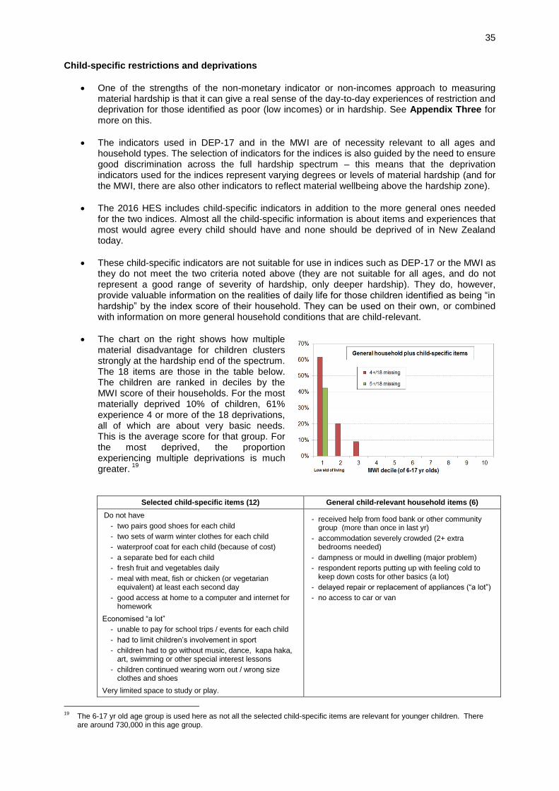
35
Child-specific restrictions and deprivations
One of the strengths of the non-monetary indicator or non-incomes approach to measuring material hardship is that it can give a real sense of the day-to-day experiences of restriction and deprivation for those identified as poor (low incomes) or in hardship. See Appendix Three for more on this.
The indicators used in DEP-17 and in the MWI are of necessity relevant to all ages and household types. The selection of indicators for the indices is also guided by the need to ensure good discrimination across the full hardship spectrum – this means that the deprivation indicators used for the indices represent varying degrees or levels of material hardship (and for the MWI, there are also other indicators to reflect material wellbeing above the hardship zone).
The 2016 HES includes child-specific indicators in addition to the more general ones needed for the two indices. Almost all the child-specific information is about items and experiences that most would agree every child should have and none should be deprived of in New Zealand today.
These child-specific indicators are not suitable for use in indices such as DEP-17 or the MWI as they do not meet the two criteria noted above (they are not suitable for all ages, and do not represent a good range of severity of hardship, only deeper hardship). They do, however, provide valuable information on the realities of daily life for those children identified as being “in hardship” by the index score of their household. They can be used on their own, or combined with information on more general household conditions that are child-relevant.
The chart on the right shows how multiple material disadvantage for children clusters strongly at the hardship end of the spectrum. The 18 items are those in the table below. The children are ranked in deciles by the MWI score of their households. For the most materially deprived 10% of children, 61% experience 4 or more of the 18 deprivations, all of which are about very basic needs. This is the average score for that group. For the most deprived, the proportion experiencing multiple deprivations is much greater.
19
Selected child-specific items (12) General child-relevant household items (6)
Do not have
- two pairs good shoes for each child
- two sets of warm winter clothes for each child
- waterproof coat for each child (because of cost)
- a separate bed for each child
- fresh fruit and vegetables daily
- meal with meat, fish or chicken (or vegetarian equivalent) at least each second day
- good access at home to a computer and internet for homework
Economised “a lot”
- unable to pay for school trips / events for each child
- had to limit children’s involvement in sport
- children had to go without music, dance, kapa haka, art, swimming or other special interest lessons
- children continued wearing worn out / wrong size clothes and shoes
Very limited space to study or play.
- received help from food bank or other community group (more than once in last yr)
- accommodation severely crowded (2+ extra bedrooms needed)
- dampness or mould in dwelling (major problem)
- respondent reports putting up with feeling cold to keep down costs for other basics (a lot)
- delayed repair or replacement of appliances (“a lot”)
- no access to car or van
19
The 6-17 yr old age group is used here as not all the selected child-specific items are relevant for younger children. There are around 730,000 in this age group.

36
While there is evidence here and elsewhere of some hardship in the next 10% (decile 2), there is no gradient across all the deciles reflecting what could be called “acceptable inequality”. The analysis shows that for those children in the most materially deprived households (~10% or so), life is undeniably very different from that experienced by the vast majority of New Zealand children. This finding is in line with what was found using similar indicators from the 2008 Living Standards Survey. It illustrates what it means in practice to be “excluded from the minimum acceptable way of life in one’s own society”, the high-level definition of poverty commonly used for richer countries and adopted in MSD reports.
The table compares the severity of the bunching of multiple material disadvantage in the bottom decile for three ways of ranking children’s households. The MWI and DEP-17 rankings give very similar results across all three columns. Ranking children by the BHC income of their households produces a much less intense clustering for the bottom 10%. This is in line with the findings reported earlier in the report that showed that many low-income households are not in hardship, and many who are in hardship are not in low-income households. It is consistent with the framework on page 4.
The charts below shift the focus from 6-17 year olds in the hardship zone to all 6-17 year olds, and show the proportion who are experiencing various numbers of the 12 selected child-specific deprivations (chart on the left) and these plus the 6 child-relevant household deprivations (chart on the right).
As noted above, as valuable as they are, child-specific
indicators alone do not give a full picture of day-to-day living conditions for children. Wider child-relevant household items are also needed for this.
Looking at the clustering of multiple disadvantage is important for our understanding of the depth or severity of hardship for children, but information from individual items is also relevant. Two are reported on here. The NIMs report gives a fuller analysis.
Postponement of visits to the doctor for children
Respondents were asked how often they postponed visits to the doctor for themselves to keep costs down to enable other basics to be purchased, and they were asked the same question about their child(ren), if any. The available responses were “not at all”, “a little”, and “a lot”.
11% of respondents said “a lot” for themselves, 58% for those in the lowest MWI decile. In contrast for their children almost none said “a lot”, including for households in the lowest MWI decile. For a less demanding response of “a little or a lot”, the adult figures were 27% and 79% respectively, with the child figure still very low at around 5%.
Access at home to a computer and the internet for homework
88% of children have good access at home to a computer and the internet for homework.
For children in the lowest MWI decile, only 57% have this access, with around 75% in deciles 2
and 3 and 95%+ for the rest.
% in bottom decile
Ranked by … 3+/18 4+/18 5+/18
MWI 72 62 42
DEP-17 77 67 48
BHC incomes 40 29 18

37
Older New Zealanders (aged 65+)
Older New Zealanders (aged 65+) currently make up 14% of the population (650,000). By 2028 this proportion is expected to be close to 20% (1.04m).
Incomes
The great majority of those aged 65+ are very dependent on NZS for their survival. For example:
o 40% of singles have virtually no other income source, 60% report less than $100 pw from non-government sources, and 75% have more than half their income from NZS (ie only 25% have other income that is greater than the gross single living alone NZS rate of $431 pw (2015)).
o The per capita income of couples is on average much higher than for singles – for example only 30% of couples report less than $100 per capita pw from non-government sources – but most couples are nevertheless still highly dependent on NZS, with 55% having more than half their income from NZS.
In 2016, the NZS married couple rate was close to the 66% floor relative to average earnings, as shown in the upper line in the graph.
o NZS declined in value relative to median household incomes from the mid 1990s to 2008. This is because median household income rose steadily in real terms, while the real value of NZS did not change greatly in real terms from the mid 1990s through to 2007.
o A rapidly rising household median income saw NZS briefly fall below 50% of the median before the income tax changes in 2008 and 2010 and rising after-tax wages pushed the ratio back up to 54% in 2013 (51% in 2016).
An emerging feature of the incomes of the 65+ cohort is the strong rise in incomes from employment and self-employment for the “younger” group (aged 65-70), especially couples, starting from the early 2000s:
o The graph illustrates this change with the trend for couples in their middle income quintile. Employment income in 2015 made up almost the same proportion of their total income as did government sources (~40%).
o For decile 7-9 couples, half their income is now from employment and a quarter from each of NZS and private investment income.
o There is some increase in employment income for singles but not for as many, and with lower per annum rates.
This increased employment income for some means increased income inequality among older New Zealanders, as shown by the Gini trend-line.

38
Income poverty and material hardship among older New Zealanders
Low income (income poverty) rates for older New Zealanders remain lower than those for other age groups when using AHC income measures. Hardship rates using non-income measures show the same pattern. The graphs and table show the details.
Income poverty and hardship rates for age groups (%): HES 2015
Age group ==> 0-17 18-24 25-44 45-64 65+ ALL
Income poverty (low income)
- AHC 60% anchored (CV-07) 21 20 15 14 8 16
- AHC 50% anchored (CV-07) 15 17 10 11 4 11
Material hardship
- MWI ≤11 (higher than usual threshold, but gives a population rate the same as for AHC 50 above)
18 11 11 8 4 11
- MWI ≤ 9 (standard) ≡ DEP-17 7+/17 14 8 9 6 3 8
- MWI ≤ 5 (more severe) ≡ DEP-17 9+/17 8 3 5 3 1 4
The lower AHC income poverty and low material hardship rates for older New Zealanders reflect the mix of universal public provision (mainly NZS) and the private provision built up by most of the current cohort over their lifetime. A key component of this private provision is mortgage-free home ownership, which is relatively high among the current cohort (72%).
Older New Zealanders score well overall on individual hardship items, though there is a small group that is struggling. For example, 4% report having to put up with feeling cold “a lot” because of costs, compared with 10% for households with children and 7% overall.
On self-assessed satisfaction with life, 87% say they are satisfied or very satisfied, compared with 82% for the whole population, while for those in the bottom quintile of material wellbeing, 20% say they are dissatisfied or very dissatisfied, compared with 18% overall for this quintile, and 6% for the whole population.
Most of those older New Zealanders with the low AHC incomes and high material hardship rates are, unsurprisingly, those who rent and who have NZS and little or no more to live off.
Declining mortgage-free home ownership for the cohorts coming through to “retirement” suggest that the low poverty and hardship rates may soon start to rise, unless this impact is mitigated by asset accumulation over the life course by means other than home ownership (eg KiwiSaver and similar savings schemes).
The increasing proportion of older New Zealanders in paid employment also has the potential to mitigate the impact of declining mortgage-free home ownership, provided these are the same people who need the extra income to pay the mortgage or the rent. The chances are though that in the main they will be non-manual white-collar workers who are more likely to be better off anyway.
The AHC low-income rate for older working-age adults living on their own (45-64 years) trebled from 1984 to 2007 and has remained high since (36% on average for 2014 and 2015 compared with 16% for the population overall, and second highest after sole-parents (55%), using the same 60% AHC anchored line measure). This also points to an increasing number of vulnerable older New Zealanders in the future as these figures indicate that many in this age-group have little freeboard to save.
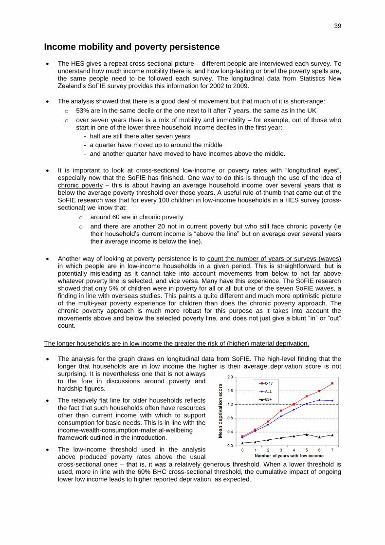
39
Income mobility and poverty persistence
The HES gives a repeat cross-sectional picture – different people are interviewed each survey. To understand how much income mobility there is, and how long-lasting or brief the poverty spells are, the same people need to be followed each survey. The longitudinal data from Statistics New Zealand’s SoFIE survey provides this information for 2002 to 2009.
The analysis showed that there is a good deal of movement but that much of it is short-range:
o 53% are in the same decile or the one next to it after 7 years, the same as in the UK
o over seven years there is a mix of mobility and immobility – for example, out of those who start in one of the lower three household income deciles in the first year:
- half are still there after seven years
- a quarter have moved up to around the middle
- and another quarter have moved to have incomes above the middle.
It is important to look at cross-sectional low-income or poverty rates with “longitudinal eyes”, especially now that the SoFIE has finished. One way to do this is through the use of the idea of chronic poverty – this is about having an average household income over several years that is below the average poverty threshold over those years. A useful rule-of-thumb that came out of the SoFIE research was that for every 100 children in low-income households in a HES survey (cross-sectional) we know that:
o around 60 are in chronic poverty
o and there are another 20 not in current poverty but who still face chronic poverty (ie their household’s current income is “above the line” but on average over several years their average income is below the line).
Another way of looking at poverty persistence is to count the number of years or surveys (waves) in which people are in low-income households in a given period. This is straightforward, but is potentially misleading as it cannot take into account movements from below to not far above whatever poverty line is selected, and vice versa. Many have this experience. The SoFIE research showed that only 5% of children were in poverty for all or all but one of the seven SoFIE waves, a finding in line with overseas studies. This paints a quite different and much more optimistic picture of the multi-year poverty experience for children than does the chronic poverty approach. The chronic poverty approach is much more robust for this purpose as it takes into account the movements above and below the selected poverty line, and does not just give a blunt “in” or “out” count.
The longer households are in low income the greater the risk of (higher) material deprivation.
The analysis for the graph draws on longitudinal data from SoFIE. The high-level finding that the longer that households are in low income the higher is their average deprivation score is not surprising. It is nevertheless one that is not always to the fore in discussions around poverty and hardship figures.
The relatively flat line for older households reflects the fact that such households often have resources other than current income with which to support consumption for basic needs. This is in line with the income-wealth-consumption-material-wellbeing framework outlined in the introduction.
The low-income threshold used in the analysis above produced poverty rates above the usual cross-sectional ones – that is, it was a relatively generous threshold. When a lower threshold is used, more in line with the 60% BHC cross-sectional threshold, the cumulative impact of ongoing lower low income leads to higher reported deprivation, as expected.

40
International comparisons Household income trends
In the seven years from just before the GFC impact (HES 2009), to HES 2016, household income growth was relatively even across the income spectrum at 11-13% in real terms, from the top of the bottom decile (P10) through to high incomes in the top decile.
New Zealand’s net gains in this period are better overall than for many OECD countries – the negative impact was more muted and the recovery has been stronger. For example: o the UK median fell through the GFC and has only just returned to its pre-GFC level o Italy, Spain, France and Germany were flat through the GFC and have remained so since o the US median and other middle incomes have been flat for many years.
Income inequality
The share of income received by the top 1% of tax payers has been reasonably steady in a 7-9% range since the early 1990s, up from 5% in the 1980s:
o New Zealand ranks in the low to mid range in the OECD for this statistic, similar to Australia, Spain and France
o the US (22%), Germany (14%), the UK (13%), and Canada (12%) all have much higher rates for the top 1% share (latest information is from around 2011 and 2012), and have experienced much greater rises than New Zealand since the 1980s.
Using measures like the 90:10 ratio and the Gini trend line, New Zealand’s income inequality is a little higher than the OECD average, around the same as Australia.
Wealth inequality
For OECD-type nations wealth inequality is usually around double the level of income inequality. The most wealthy 10% of New Zealand households hold a little more than 50% of all household wealth, whereas the top 10% of households receive a 25% share of all income.
NZ’s wealth inequality is about average for the OECD, similar to Canada, Norway and France. Poverty and material hardship
The OECD and EU publish international league tables that rank countries on their income poverty rates using 50% and 60% of median poverty lines respectively (BHC).
On the latest available figures (c 2012 for OECD and 2015 for the EU), New Zealand is in the middle of the rankings for both population poverty rates and child poverty rates.
These figures are really about income inequality in the lower half of the income distribution. They do not tell us anything about how actual living conditions differ from country to country as median incomes differ so much, depending largely on differences in GDP per capita. To properly compare countries for actual living conditions, non-income measures are needed.
Using an EU deprivation index (EU-13) with data from 2008 (NZ) and 2009 (EU), NZ ranks very well for older people (65+) but not so well for children – a finding consistent with the relativities produced within New Zealand using MWI and DEP-17 measures. Full updated comparisons are not yet available, but based on the hardship trends reported above using our own indices NZ figures based on the EU index are likely to be a little lower in 2015 and 2016 than in 2008. For 2008 and 2009:
o the population hardship rate was 11%, a little better than the EU median (13%)
o the hardship rate for children was 18%, just above the EU median (17%), but ranking NZ below most of the richer western European nations with whom we have traditionally compared ourselves (this “18%” is similar the “16%” reported above using NZ measures for 2008 – these measures now report 12-14% in 2015 and 2016)
o the hardship rate for those aged (65+) was 3%, ranking New Zealand near the top among EU nations – in the top five along with Norway, Sweden and Denmark.
OECD 50% EU 60%
All 0-17 All 0-17
NZ 10 13 18 20
OECD / EU 10 13 17 21

41
UN’s Sustainable Development Goals
On September 2015 all 193 UN member states formally adopted the 2030 Agenda for Sustainable Development which includes a new set of global goals (the Sustainable Development Goals (SDGs)) which replace the Millennium Development Goals (MDGs). One of the differences between the SDGs and MDGs is that the SDGs are universal rather than just focussing on “developing countries”.
The findings reported in this Overview and in the two main reports that the Overview draws on are relevant to two of the SDGs, one on poverty and the other on inequality.
The Poverty Goal (#1) is about “ending poverty in all its forms everywhere by 2030”. One of the sub-goals is to reduce at least by half the proportion of men, women and children of all ages living in poverty in all its dimensions “according to national definitions”. This gives scope for reporting using a suite of measures such as those that are available in the Overview (see pp27-38 above), though it is clearly easier to achieve a 50% reduction on some and more challenging on others.
The Inequality Goal (#10) is about reducing inequality within and between countries, and covers a wide range of inequalities. One of the recommended indicators for inequality reduction is the fully relative 50% of median low-income measure. This is sometimes used for international poverty comparisons (eg by the OECD), though the Incomes Report notes that when it is used for international comparisons it is more properly understood as a measure of inequality in the lower half of the income distribution. The UN’s decision to recommend use of this indicator in the Inequality section is line with this view.
Another target for Goal #10 is that member states “by 2030, progressively achieve and sustain income growth of the bottom 40% of the population at a rate higher than the national average” (Goal 10.1).
The graph shows the share of total household income (BHC) for the bottom 40% for New Zealand, 1982 to 2015. If the growth for the bottom 40% is greater than that for average incomes, the trend line will slope up, showing that the bottom 40% is taking a larger slice of the pie (ie is growing faster than the national average). The generally flat trend from the early 1990s through to 2015 shows that the income growth of the bottom 40% has been much the same as that for the national average in that period.
A limitation of this UN target is that it simply commits individual countries to improve on their base position, but unlike the “poverty” targets, there are as yet no guidelines or expectations about what an “acceptable” target range is for the ratio by 2030.

42
Appendix One
Where does your household fit on the income distribution?
The Incomes Report often ranks individuals by their household’s equivalised BHC disposable income
(ie by their household income, after adjusting for household size and composition). The tables below
give the annual (unequivalised) disposable income levels (BHC) of different household types in each
(equivalised) income decile. From these tables, most people will be able to locate where they and their
households fit on the income distribution.
To use these tables, select the column heading that best describes your household or family situation.
Go down the column until you find your household’s disposable income range (ie annual after-tax
income, including all social assistance from the state). The row gives the equivalised income decile for
your household income. For example, a household comprising a sole parent with two children with a
disposable income of $51,000 pa is in decile 4.20
Table 1A Where does your household fit in the overall household income distribution (BHC)?
HES 2016
Equivalised income decile
Ordinary dollars (ie not equivalised)
One person, no children
(reference HH)
Sole parent, one child
Sole parent, two children
Sole parent, three children
Sole parent, four children
Bottom decile
< $19,500 < $27,300 < $34,100 < $40,100 < $45,400
Decile 2 19,500 - 23,600 27,300 - 33,100 34,100 - 41,400 40,100 - 48,700 45,400 - 55,100
Decile 3 23,600 - 28,400 33,100 - 39,700 41,400 - 49,700 48,700 - 58,500 55,100 - 66,100
Decile 4 28,400 - 32,900 39,700 - 46,100 49,700 - 57,600 58,500 - 67,800 66,100 - 76,700
Decile 5 32,900 - 37,900 46,100 - 53,000 57,600 - 66,200 67,800 - 78,000 76,700 - 88,200
Decile 6 37,900 - 43,100 53,000 - 60,300 66,200 - 75,400 78,000 - 88,800 88,200 – 100,400
Decile 7 43,100 - 50,800 60,300 - 71,100 75,400 - 88,900 88,800 - 104,600 100,400 - 118,300
Decile 8 50,800 - 61,300 71,100 - 85,800 88,900 - 107,200 104,600 - 126,200 118,300 - 142,800
Decile 9 61,300 - 80,800 85,800 - 113,200 107,200 - 141,500 126,200 - 166,500 142,800 - 188,400
Top decile
> $80,800 > $113,200 > $141,500 > $166,500 > $188,400
Note: use disposable household income when using this table – that is, household income from all
sources after paying personal income tax and after receiving all tax credits (from Working for
Families) and other state transfers (eg NZS, AS, main benefits)
20
The calculations in the table assume that any children are aged around 8 to 10 years, but the figures are close enough if the children are younger or older.

43
Table 1B Where does your household fit in the overall household income distribution (BHC)?
HES 2016
Equivalised income decile
Ordinary dollars (ie not equivalised)
Couple or 2 adults sharing
Couple, one child
Couple, two children
Couple, three children
Couple, four children
Three adults, one child
Bottom decile
< $30,000 < $36,200 < $42,300 <$ 47,300 < $52,400 < $44,000
Decile 2 30,000 - 36,400 36,200 - 44,000 42,300 - 51,300 47,300 - 57,500 52,400 - 63,600 44,000 - 53,400
Decile 3 36,400 - 43,700 44,000 - 52,800 51,300 - 61,600 57,500 - 69,000 63,600 - 76,400 53,400 - 64,200
Decile 4 43,700 - 50,700 52,800 - 61,200 61,600 - 71,400 69,000 - 80,000 76,400 - 88,500 64,200 - 74,300
Decile 5 50,700 - 58,300 61,200 - 70,400 71,400 - 82,100 80,000 - 92,000 88,500 - 101,800 74,300 - 85,500
Decile 6 58,300 - 66,400 70,400 - 80,200 82,100 - 93,500 92,000 - 104,700 101,800 - 115,900 85,500 - 97,400
Decile 7 66,400 - 78,200 80,200 - 94,400 93,500 - 110,200 104,700 - 123,400 115,900 - 136,600 97,400 - 114,800
Decile 8 78,200 - 94,400 94,400 - 114,000 110,200 - 133,000 123,400 - 148,900 136,600 - 164,800 114,800 - 138,500
Decile 9 94,400 - 124,500 114,000 - 150,400 133,000 - 175,400 148,900 - 196,500 164,800 - 217,500 138,500 - 182,700
Top decile
> $124,500 > $150,400 > $175,400 > $196,500 > $217,500 > $182,700
Note: use disposable household income when using this table – that is, household income from all sources after
paying personal income tax and after receiving all tax credits (from Working for Families) and other state
transfers (eg NZS, AS, main benefits)
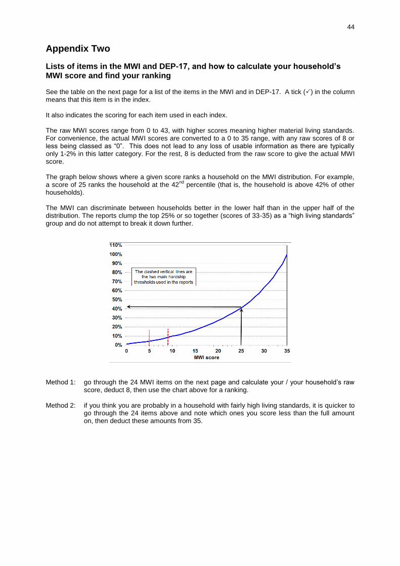
44
Appendix Two
Lists of items in the MWI and DEP-17, and how to calculate your household’s MWI score and find your ranking See the table on the next page for a list of the items in the MWI and in DEP-17. A tick () in the column means that this item is in the index. It also indicates the scoring for each item used in each index. The raw MWI scores range from 0 to 43, with higher scores meaning higher material living standards. For convenience, the actual MWI scores are converted to a 0 to 35 range, with any raw scores of 8 or less being classed as “0”. This does not lead to any loss of usable information as there are typically only 1-2% in this latter category. For the rest, 8 is deducted from the raw score to give the actual MWI score. The graph below shows where a given score ranks a household on the MWI distribution. For example, a score of 25 ranks the household at the 42
nd percentile (that is, the household is above 42% of other
households). The MWI can discriminate between households better in the lower half than in the upper half of the distribution. The reports clump the top 25% or so together (scores of 33-35) as a “high living standards” group and do not attempt to break it down further.
Method 1: go through the 24 MWI items on the next page and calculate your / your household’s raw
score, deduct 8, then use the chart above for a ranking. Method 2: if you think you are probably in a household with fairly high living standards, it is quicker to
go through the 24 items above and note which ones you score less than the full amount on, then deduct these amounts from 35.

45
The non-income items in the HES (from 2013 to 2015), the composition of the MWI and DEP-17, and how each item is scored for the two indices
Item description MWI DEP-17 Your MWI
scores
Ownership or participation (have/do, don’t have/do and enforced lack (EL))
For DEP-17, score an EL as 1, otherwise 0
For MWI, score an EL as a 0, otherwise 1
1 Two pairs of shoes in a good condition and suitable for daily activities
2 Suitable clothes for important or special occasions
3 Contents insurance
4 A meal with meat, fish or chicken (or vegetarian equivalent) at least each 2nd day
5 A good bed -
6 Presents for family/friends on special occasions
7 Holiday away from home at least once every year -
8 Overseas holiday at least once every three years -
Economising (not at all, a little, a lot) – to keep down costs to help in paying for (other) basic items (not just to be thrifty or to save for a trip or other non-essential)
For DEP-17, score ‘a lot’ as 1, otherwise 0
For MWI, score ‘not at all as 2, ‘a little’ as 1, and ‘a lot’ as 0
9 Gone without or cut back on fresh fruit and vegetables
10 Buy cheaper cuts of meat or bought less meat than you would like
11 Continued wearing worn out clothes -
12 Put up with feeling cold
13 Do without or cut back on trips to the shops or other local places
14 Delay replacing or repairing broken or damaged appliances
15 Spent less on hobbies or other special interests than you would like -
16 Postponed visits to the doctor
17 Postponed visits to the dentist
Housing problems (no problem, minor problem, major problem … in the last 12 months)
For MWI, score as 2, 1 and 0 respectively.
18 Dampness or mould -
19 Heating or keeping it warm in winter -
Freedoms/Restrictions
20
When buying, or thinking about buying, clothes or shoes for yourself, how much do you usually feel limited by the money available? (4 point response options: ‘not at all limited, a little limited, quite limited, very limited)
For DEP-17, score ‘very limited’ as 1, otherwise 0.
For MWI, score as 3, 2, 1 and 0 respectively.
21
$300 spot purchase for an ’extra’, not a necessity – how limited do you feel about buying it? (5 point response options: not at all limited, a little limited, quite limited, very limited, couldn’t buy it)
For MWI, score as 4, 3, 2, 1 and 0 respectively.
-
22
$500 unexpected unavoidable expense on an essential – can you pay in a month without borrowing? (yes/no)
For DEP-17, score ‘no’ as 1, and ‘yes’ as 0
For MWI, score ‘yes’ as 2 and ‘no’ as 0
Financial strain (in last 12 months) (not at all, once, more than once)
For DEP-17, score ‘more than once’ as 1, otherwise 0
For MWI, score ‘not at all’ as 2, ‘once’ as 1, ‘more than once’ as 0
23 Behind on rates or utilities
24 Behind on car registration, wof or insurance
25 Behind on rent or mortgage - - n/a
26 Borrowed from family or friends to meet everyday living costs - n/a
27 Received help in the form of food, clothes or money from a welfare or community organisation such as a church or food bank
- - n/a
Global self-ratings
28 Adequacy of income to cover basics of accommodation, food, clothing, etc - - n/a
29 Satisfaction with life - - n/a
Note: An EL is an enforced lack – an item that is wanted but not possessed because of the cost

46
Appendix Three
Profiles of living standards at different levels
The tables below give a multi-indicator profile of what day-to-day life is like across the material wellbeing spectrum, using both selected MWI items and some from outside the MWI.
Using selected MWI items, by MWI decile, HES 2014 and 2015 (avg %)
MWI decile 1 2 3 4 5 6 7 8 9 10 ALL
Positive association with MWI score
can pay an unexpected unavoidable $500 bill within a month without borrowing
12 36 56 74 85 91 96 95 98 100 76
delayed replacing or repairing appliances that were not working because of costs [not at all]
9 25 47 67 78 90 94 98 99 100 72
put off going to dentist because of costs [not at all] 4 21 31 42 53 68 79 90 96 100 60
spent less time on hobbies or special interests because of costs [not at all]
4 11 17 26 37 59 70 87 95 100 52
have a holiday overseas at least once every 3 yrs (<65) 5 17 25 35 44 51 60 67 69 80 43
not limited in $300 spot purchase of a non-essential 0 0 0 3 5 10 17 36 67 100 24
Negative association with MWI score
contents insurance [EL] 62 35 23 13 10 5 4 2 1 0 14
put up with feeling cold [a lot] 56 22 13 5 4 1 1 0 0 0 10
put off repairing or replacing broken appliances [a lot] 64 22 10 3 1 0 0 0 0 0 9
put off doctor’s visits [a lot] 48 20 8 3 2 1 0 0 0 0 7
went without fresh fruit and vegetables [a lot] 32 8 1 0 1 0 0 0 0 0 4
clothes for special or important occasions [EL] 28 8 1 0 0 0 0 0 0 0 3
2 pair of shoes in good condition for everyday activities [EL]
28 6 1 0 0 0 0 0 0 0 3
meal with meat, fish or chicken (or vegetarian equivalent) at least each second day [EL]
10 4 0 0 0 0 0 0 0 0 1
borrowed from family or friends to meet everyday living costs [more than once in last 12 months]
54 29 21 10 9 4 2 2 0 0 13
Using items not in the MWI, by MWI decile, HES 2014 and 2015 (avg %)
1 2 3 4 5 6 7 8 9 10 ALL
received help from food banks or other community groups
[at least once in last 12 months] 40 14 8 0 0 0 0 0 0 0 6
received help from food banks or other community groups [more than once in last 12 months]
26 8 4 0 0 0 0 0 0 0 4
have a get together with friends or extended family for a drink or a meal at least once a month
48 66 73 76 85 87 91 93 91 93 81
- want to, but don’t for reasons other than cost 15 17 14 11 11 9 7 6 7 6 10
access to computer and internet at home (0-64) 61 78 88 89 96 96 97 99 98 98 90
access to computer and internet at home (65+) 42 71 61 66 80 77 76 77 79 78 75
The final table shows how self-assessed life satisfaction (“taking all areas of life into account”) varies across the material wellbeing spectrum. There is a clear gradient across most of the ten deciles – it is particularly steep at the lower end.
Overall life satisfaction, by MWI decile, HES 2014 and 2015 (avg %)
1 2 3 4 5 6 7 8 9 10 ALL
satisfied or very satisfied with life right now, taking all areas into account
34 51 76 78 86 88 89 91 94 96 79

47
Appendix Four
Summary of special features of selected HES samples that potentially impact in a misleading way on trend lines, and the actions taken to address these in the analysis and reporting
As discussed in the main text, there are always uncertainties involved when carrying out analysis based on samples. The table below identifies particular features of the samples in recent surveys that, if not addressed, could lead to the published findings leaving misleading impressions or take-outs for the reader. It also outlines the measures taken to minimise the chances of this happening.
Special features of samples that impact on trend lines in a way which may mislead if not addressed
Actions taken to address the issues and eliminate or minimise chances of reporting misleading information
2014 HES
Incomes of some beneficiary families were implausibly low. The issue arose in association with the change in core benefit categories and names in July 2013.
This artificially reduced the dollar value of the bottom decile boundary (P10), and slightly inflated the 50% of BHC median low-income rate, as some beneficiary families have incomes a little above this line, when correctly reported.
The 2015 Incomes Report noted the issue and did not report on selected indicators such as:
- the 90:10 household income inequality ratio,
- the P10 value of the upper boundary of the lower decile
- the 50% of median BHC low-income measure.
2015 HES
The sample contained an unusually high number of households with very high incomes.
This artificially raised indicators such as the proportion of income received by the top decile and the income inequality rate as measured by the Gini (The 90:10 ratio remained steady as it was unaffected by the sampling issue).
The 2016 Incomes Report noted the issue and reported on Gini trends with the top 1% deleted, while at the same time reporting the flat trends in top 1% share from more reliable sources.
The Report advised readers and users to hold off any judgements about change in the trend line until the results of another survey or two were available.
The number of very high income households in the 2016 sample reduced to something closer to trend as did the Gini measure of income inequality (for the 2017 Report).
2016 HES
The sample contained an unusually low number of sole-parent households and beneficiary households with dependent children, and the standard Statistics New Zealand weights did not fully correct for this for the population estimates.
The two parent households in the sample were on average better off than in previous years.
These two factors worked in the same direction to lower the reported low-income rates and the material hardship rates for children in 2016, relative to the trend line.
For child poverty rates, the 2017 Incomes Report partially corrects for the lower-than-expected number of sole parent and beneficiary-with-children households by a three-step process:
- adjust the numbers of children from sole-parent families and reducing the numbers in two-parent families to match external benchmarks and also the numbers from HES years 2013 to 2015
- retain the low-income rates produced by the raw data for 2016 HES
- apply these rates to the adjusted numbers above to get the total number “in poverty” and the adjusted rate.
The adjusted rates are typically one to one-and-a-half percentage points higher.
The 2017 Report uses rolling two-year averages for reporting trends in the charts, smoothing the trend to make it clearer.
For the Non-income Measures report the 2016 figures use the Treasury’s Taxwell weights as these use a wider range of benchmarks that give population estimates for sole parents and beneficiary children that are closer to real-world numbers.
The 2017 NIMs report also uses rolling two-year averages for reporting trends.
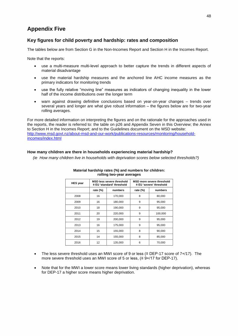
48
Appendix Five Key figures for child poverty and hardship: rates and composition
The tables below are from Section G in the Non-Incomes Report and Section H in the Incomes Report. Note that the reports:
use a multi-measure multi-level approach to better capture the trends in different aspects of material disadvantage
use the material hardship measures and the anchored line AHC income measures as the primary indicators for monitoring trends
use the fully relative “moving line” measures as indicators of changing inequality in the lower half of the income distributions over the longer term
warn against drawing definitive conclusions based on year-on-year changes – trends over several years and longer are what give robust information – the figures below are for two-year rolling averages.
For more detailed information on interpreting the figures and on the rationale for the approaches used in the reports, the reader is referred to: the table on p26 and Appendix Seven in this Overview; the Annex to Section H in the Incomes Report; and to the Guidelines document on the MSD website: http://www.msd.govt.nz/about-msd-and-our-work/publications-resources/monitoring/household-incomes/index.html How many children are there in households experiencing material hardship?
(ie How many children live in households with deprivation scores below selected thresholds?)
Material hardship rates (%) and numbers for children: rolling two-year averages
HES year MSD less severe threshold ≡ EU ‘standard’ threshold
MSD more severe threshold ≡ EU ‘severe’ threshold
rate (%) numbers rate (%) numbers
2008 16 170,000 8 80,000
2009 16 180,000 9 95,000
2010 18 190,000 9 95,000
2011 20 220,000 9 100,000
2012 19 200,000 9 95,000
2013 16 175,000 9 95,000
2014 15 155,000 8 90,000
2015 14 155,000 8 85,000
2016 12 135,000 6 70,000
The less severe threshold uses an MWI score of 9 or less (≡ DEP-17 score of 7+/17). The
more severe threshold uses an MWI score of 5 or less, (≡ 9+/17 for DEP-17).
Note that for the MWI a lower score means lower living standards (higher deprivation), whereas for DEP-17 a higher score means higher deprivation.
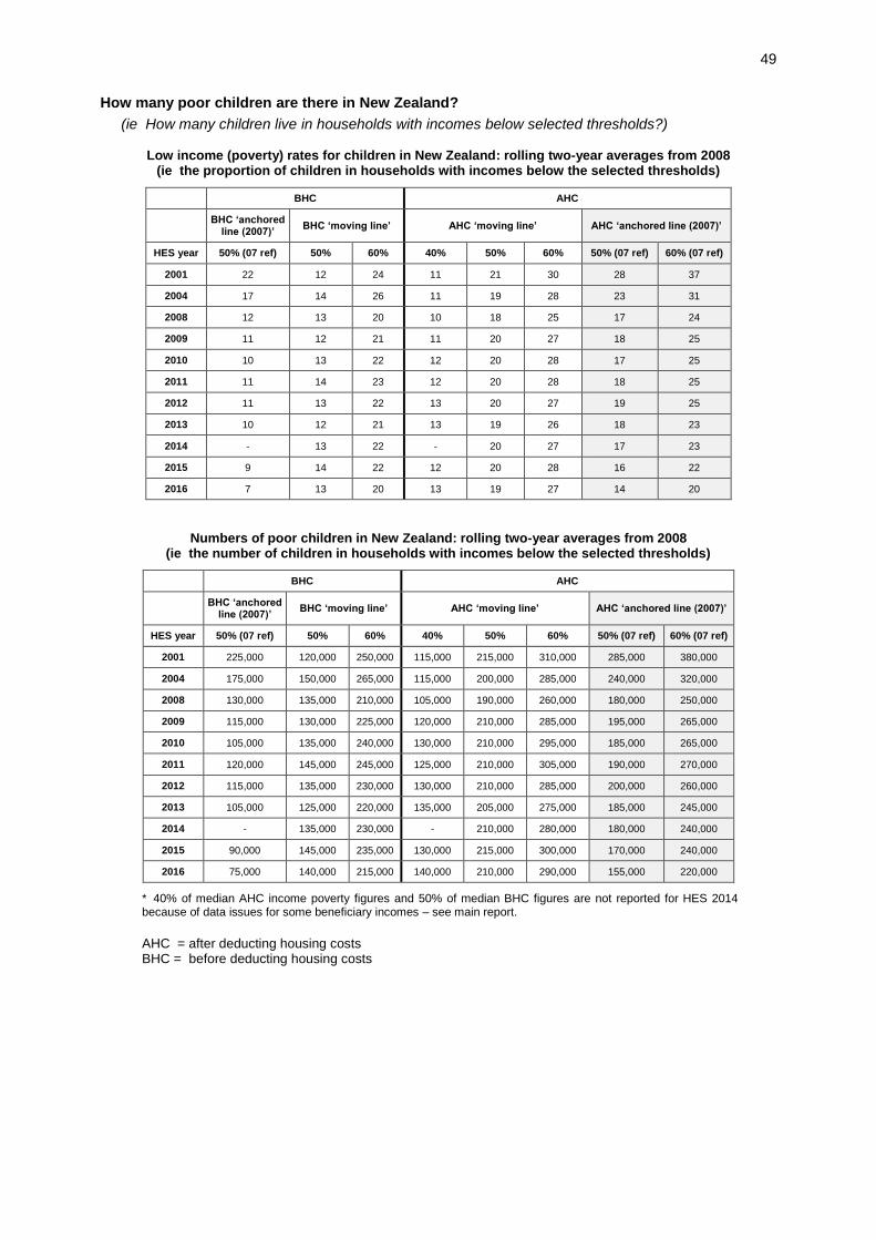
49
How many poor children are there in New Zealand?
(ie How many children live in households with incomes below selected thresholds?)
Low income (poverty) rates for children in New Zealand: rolling two-year averages from 2008 (ie the proportion of children in households with incomes below the selected thresholds)
BHC AHC
BHC ‘anchored
line (2007)’ BHC ‘moving line’ AHC ‘moving line’ AHC ‘anchored line (2007)’
HES year 50% (07 ref) 50% 60% 40% 50% 60% 50% (07 ref) 60% (07 ref)
2001 22 12 24 11 21 30 28 37
2004 17 14 26 11 19 28 23 31
2008 12 13 20 10 18 25 17 24
2009 11 12 21 11 20 27 18 25
2010 10 13 22 12 20 28 17 25
2011 11 14 23 12 20 28 18 25
2012 11 13 22 13 20 27 19 25
2013 10 12 21 13 19 26 18 23
2014 - 13 22 - 20 27 17 23
2015 9 14 22 12 20 28 16 22
2016 7 13 20 13 19 27 14 20
Numbers of poor children in New Zealand: rolling two-year averages from 2008 (ie the number of children in households with incomes below the selected thresholds)
BHC AHC
BHC ‘anchored
line (2007)’ BHC ‘moving line’ AHC ‘moving line’ AHC ‘anchored line (2007)’
HES year 50% (07 ref) 50% 60% 40% 50% 60% 50% (07 ref) 60% (07 ref)
2001 225,000 120,000 250,000 115,000 215,000 310,000 285,000 380,000
2004 175,000 150,000 265,000 115,000 200,000 285,000 240,000 320,000
2008 130,000 135,000 210,000 105,000 190,000 260,000 180,000 250,000
2009 115,000 130,000 225,000 120,000 210,000 285,000 195,000 265,000
2010 105,000 135,000 240,000 130,000 210,000 295,000 185,000 265,000
2011 120,000 145,000 245,000 125,000 210,000 305,000 190,000 270,000
2012 115,000 135,000 230,000 130,000 210,000 285,000 200,000 260,000
2013 105,000 125,000 220,000 135,000 205,000 275,000 185,000 245,000
2014 - 135,000 230,000 - 210,000 280,000 180,000 240,000
2015 90,000 145,000 235,000 130,000 215,000 300,000 170,000 240,000
2016 75,000 140,000 215,000 140,000 210,000 290,000 155,000 220,000
* 40% of median AHC income poverty figures and 50% of median BHC figures are not reported for HES 2014 because of data issues for some beneficiary incomes – see main report.
AHC = after deducting housing costs BHC = before deducting housing costs

50
Children from income-poor households: composition by their ethnicity and by selected household characteristics
The shaded column shows the proportion of poor children in the various sub-groups. Some sub-groups have high poverty rates but if there is a relatively small proportion of children in that sub-group overall, then the proportion of poor children coming from that sub-group is much lower than their poverty rate would suggest (and vice versa). For example:
o the poverty rate for children in sole-parent families living on their own is high at 69%, but only 45% of all poor children come from such families
o on the other hand, the poverty rate for children in two-parent families is much lower at 15%, yet 47% of poor children come from these families
o this difference arises from the fact that there are many more children in two-parent families than in sole-parent families living on their own (76% and 16% respectively).
Poverty rates and composition for children by their ethnicity and by characteristics of their households,
based on the 60% of median anchored line AHC measure (CV-07): average over three surveys, HES 2011 to HES 2013
Dependent children (0-17 yrs): 1,060,000
Children in income-poor households All children
What % of this category are poor?
What % of poor children are in this category?
What % of all children are in this category?
Poverty rate (%)
Composition of the poor (%)
Approximate composition for all
children (%)
Household type
Sole parent HH 64 47 18
Two parent HH 15 44 69
Multi-adult family HH 16 8 12
Family type
Sole parent families 53 53 24
- in SP family on own 69 45 16
- within a wider HH 23 8 8
Two parent families 15 47 76
# of children in the household
1 or 2 21 55 63
3+ 29 45 37
Ethnicity
Maori 34 34 24
Pacific 34 13 10
Other 27 14 12
Euro/Pakeha 17 38 54
Highest household educational qualification
No formal qualification 55 15 7
School qualification only 35 38 25
Post-school non-degree 21 33 38
Degree or post-graduate 12 14 30
Main source of income for HH
Benefit 75 63 22
Market 12 37 78
Tenure
HNZC 54 19 9
Private rental 38 53 33
Own home 12 28 59
Children overall 23 100 100

51
Appendix Six Measures used internationally for reporting on “poverty and material hardship”, especially for children – to assist in comparing apples with apples OECD
Low incomes
50% BHC relative (mainly)
60% BHC relative (this information is collected from members but is used less than the 50%)
sometimes they use an anchored line approach, but rarely
the OECD never uses AHC, mainly because many OECD countries do not collect housing costs in the same survey as they collect the income data so cannot do what we do
Material hardship
no hardship measures available from the OECD, partly because not enough member countries collect the relevant data
New Zealand children
using the 50% BHC relative measure, the low-income rate for NZ children is 13% (140,000 children), and the OECD median is 11% (HES 2013, latest available comparison)
EU (and Eurostat)
Low incomes
60% BHC relative
the EU never uses AHC, mainly because many EU countries do not collect housing costs in the same survey as they collect the income data so cannot do what we do
Material hardship
the relevant data is collected by all EU countries – the EU currently uses a 9-item index, and are about to approve a much improved 13-item index which is similar to our DEP-17
each index uses two thresholds (eg “standard” hardship 5+/13, “severe hardship” 7+/13)
we can replicate both indices using NZ data for 2008, and from the next HES will have updates
New Zealand children
using the 60% BHC relative measure, the low-income rate for NZ children is 22% (240,000 children), and the EU median is 21% (HES 2015, latest available comparison)
using the EU 13-item index, the 2008 rate for NZ children was18% (190,000) on the standard measure and 8% (85,000) on the severe measure – the EU medians were 16% and 7%
UNICEF (International Research Centre in Florence)
Low incomes
they use a range of approaches, depending on the purpose of the publication, but they have never used AHC, because there is no source for international comparisons using AHC incomes (see above on the OECD and the EU)
in Report Card 11 (2013) – 50% of median BHC relative plus a material hardship index
in Report Card 12 (2014) – 60% of median BHC anchored plus a material hardship index
in Report Card 13 (2016) – 50% of median BHC relative
Material hardship
UNICEF (Research Centre) recognises the value of this approach and would like to use it more, but only the EU countries and NZ can provide the analysis for international comparisons
UK – we can do AHC comparisons
the UK reports on a wide range of measures – BHC and AHC moving and anchored lines for low incomes, and also their own material hardship measures (in addition to the EU measures)
the New Zealand and UK figures using the AHC relative (or moving line) low income measures are almost identical for children:
o AHC 60% relative for children (UK = 29%, NZ = 28%(around 300,000)) o AHC 50% relative for children (UK = 19%, NZ = 20% (around 210,000)).
52
Appendix Seven Some common misunderstandings or misrepresentations of the low income and material hardship figures reported for children There are several fairly commonly-made claims about child poverty and hardship in New Zealand which directly or indirectly use some of the numbers from the reports, but which are claims that the reports do not in fact support. In some cases the reports explicitly show that the claims are misleading or incorrect. Four are noted and discussed below.
“There are [290,000, 150,000, 100,000, (choose own preferred number)] children in New Zealand below the poverty line / the bread line”
Such claims definitively declare how many thousand children are in (income) poverty in New Zealand as if it were a relatively straightforward, uncontested and binary statistic (“you’re under the line and in poverty or over it and not in poverty”), in the same category as declaring how many children of a certain age are taller than, say, 130 cm.
The reports show that there is no single low-income measure which satisfactorily divides children into the poor and the non-poor in the way that such claims seek to do. There is a range of plausible thresholds that can be used. There are also factors other than income which determine whether a household has the resources needed to achieve a minimum acceptable standard of living. The reports take the view that the most useful and productive approach is to focus on telling a more comprehensive story about trends at different depths, and on seeking to understand why different measures produce different trends and what all this means for policies to address poverty and hardship.
“There are [290,000, 150,000, 100,000, (choose own preferred number)] children in New Zealand below the poverty line: they don’t have a waterproof coat, shoes in good condition for daily activities, their own bed, a warm dry home, and they have to miss out on participation in sporting and other activities, and so on”
This claim works off the assumption that all “poor” (low-income) children lack all or most of the items used in the NIMs report to create the hardship indices or in the calibration exercise to select usable thresholds.
The assumption is not correct. For example, as discussed above, the reports show that not all low-income households are experiencing hardship: the overlap of the two groups is typically around 40-50% using standard thresholds. In addition, the proportion of low-income households lacking individual items, when taken one at a time, is even lower.
An example:
o the surveys show that around 10% of all children (110,000) live in homes that report a major problem with dampness and mould
o for children in households with incomes below the 60% AHC threshold (290,000), “only” 50,000 live in such homes (17% of the 290,000)
o though this is 50,000 more than what most would consider acceptable, it is a much smaller group than the 290,000.
This analysis is not saying that there is not an issue to address. There is, but exaggerations and misleading claims are not helpful for productive public and political debate.
“NZ has one of the highest child poverty rates in the (more developed / richer) nations”
This claim usually starts with the numbers produced using the 60% AHC relative low-income measure: around 27% (290,000) children live in low-income households with incomes below this threshold.
This relatively large number is then compared with the numbers in international league tables produced by the OECD and others. These tables use only BHC measures. The comparison is an

53
invalid apples-with-carrots comparison. For example, using the OECD’s 50% of median BHC measure the rate for both Australia and New Zealand is 13%, close to the OECD median and half the 27% figure above which uses a different measure. The only other country to regularly report AHC rates is the UK and for them the low-income rate for children is close to New Zealand’s using the same measure (28%).
In their Concluding Observations after the 2016 review of New Zealand the United Nations Committee on the Rights of the Child (UNCRoC) noted that it is “deeply concerned about the enduring high prevalence of poverty among children”. This conclusion was based on submissions by various New Zealand groups who used the apples-with-carrots approach.
This analysis is not saying that there is not an issue to address. There is, but exaggerations and misleading claims are not helpful for productive public and political debate.
“There is no child poverty in New Zealand”
Those who make the claim are usually referring to the extreme destitution of some children in “third-world” countries. Reference is made to distended bellies, flies crawling around large sad eyes, no clean water, no good sanitation and so on.
The “p” word is awkward, not only because of the complexity of the notion and the fact that different people have different perspectives on its meaning and its causes, but also because whenever and however it is used it is describing an unacceptable state-of-affairs which demands a remedy. However, no semantic niceties can change the reality that there are children in New Zealand who are going without the very basics, without items and experiences that virtually everyone would say that all children should have and none should be deprived of in New Zealand in 2017. This is shown in the section above (pp35-36). Some individual items tell the same story. For example:
o 8% of all children (90,000) live in households where the respondent reports that they put up with feeling cold “a lot” to keep costs down.
o 6% of all children (70,000) live in households which had to use foodbanks and the like “more than once in the last 12 months”
o 4-5% of 6-17 year olds (35-40,000) do not have fresh fruit or vegetables each day “because of the cost”, and the bulk of these children are in households with multiple other deprivations.
o 8% of households with 6-17 year olds do not have two pair of shoes in good condition, suitable for daily activities, for each child.
As with other exaggerated claims, the “no poverty” claim is not helpful for productive public and political debate, in the face of evidence of unacceptable material disadvantage for some children.

Appendix Eight
Material hardship for children: causes/drivers and consequences
neighbourhood and community social capital – this can impact especially on some of the individual factors
Low incomes BHC and AHC
Material hardship
Other outcomes
other aspects of current wellbeing
outcomes over the life course / life chances
Core benefits
FTC or similar
IWTC or
similar
Labour market
- HH hours worked - wage rates - minimum wage
Income
tax
Gross accommodation costs
Housing subsidies (AS, IRR)
- financial & physical assets (including basic household goods and appliances)
- local amenities and public transport - support from outside the household from
family, friends and NGOs - government services and subsidies (eg
ECE, GP visits, insulation, food-in-schools)
- hardship assistance (eg SNGs) - personal skills and abilities, including
home production, budgeting and ‘stretching the budget’
Household size and composition - who we live with makes a difference
- difficulty accessing available subsidies and services
- high (net) health and disability costs - high debt servicing - high transport costs - support for others outside the household - limited life-skills - poor lifestyle choices
(-)
(+)
The framework can be used for looking at poverty and hardship, independent of the threshold selected, including:
poverty and hardship ‘now’, a relatively static perspective (but impacted by dynamic factors)
poverty and hardship dynamics, including the persistence of low income and material hardship
life chances – linking poverty and hardship in childhood to other outcomes in childhood and as an adult
(Net) child-care costs A major demand on the budget that can either be a barrier to taking up employment or can lead to in-work material hardship
economic growth
productivity
suitable range of jobs
jobs with opportunity for progression
globalisation
returns on capital and labour
relative bargaining powers of employers and employees
Interventions to directly address poor outcomes and/or to mitigate poor outcomes that are consequences of poverty
discrimination
public perceptions of “poverty” and its causes
cultural norms and values, especially in relation to “individual responsibility” and “social solidarity”
PPL & PTC
work tests
targeted financial incentives
other expectations and institutional arrangements
degree of targeting of financial assistance
Some of the causes/drivers of poverty
also impact directly on other dimensions of
wellbeing
compulsive and addictive behaviours of parents
education and skill levels of parent(s) in the household
physical and mental health of parents
other personal qualities and lifestyle choices of parents
For some, the ongoing stress of the experience of
persistent low income / hardship can impact on their
ability to make decisions / plan for beyond the very
short-term