the good & the bad a powerpoint on powerpoints proof read, proof read, proof read! powerpoint...
TRANSCRIPT
The Good & The Bad
A PowerPoint on PowerPoints

Proof read, proof read, proof read!
PowerPoint Rubric

Proof your slides for: speling mistakes the use of of repeated wordsgrammatical errors you might have make
If English is not your first language, or you are bad at spelling, or you are anyone please have someone else check your presentation!
Spelling and Grammar

Use one - two slides per minute of your presentation
Write in point form, not complete sentencesInclude four - five points per slideAvoid wordiness: use key words and phrases
onlyLimit punctuation
Slide Structure – Good
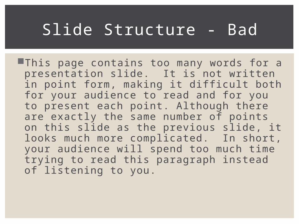
This page contains too many words for a presentation slide. It is not written in point form, making it difficult both for your audience to read and for you to present each point. Although there are exactly the same number of points on this slide as the previous slide, it looks much more complicated. In short, your audience will spend too much time trying to read this paragraph instead of listening to you.
Slide Structure - Bad
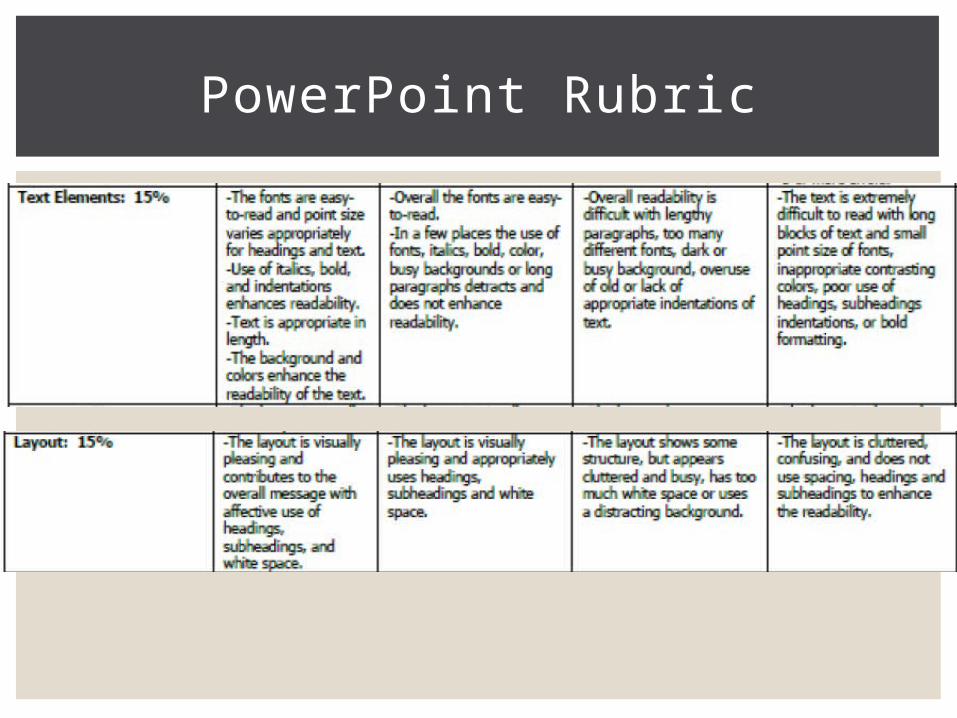
PowerPoint Rubric

Use at least an 28-point fontUse different size fonts for main points and
secondary pointsThis font is 24-point, the main point font is 28-
point, and the title font is 38-pointUse a standard font like Times New Roman
or ArialArial for the title and Times New Roman for the
body
Fonts - Good

I f you use a sma l l fon t , you r aud ience won ’ t be ab le to read wha t you have wr i t t en…remember some teachers a re o lde r than o the rs (Ex . Mr. War r and Mr. Koch)
CAPITALIZE ONLY WHEN NECESSARY. IT IS DIFFICULT TO READ…AND NO ONE LIKES TO BE YELLED AT!
Don’t use a complicated font
Fonts - Bad

Use a color of font that contrasts sharply with the backgroundEx: blue font on white backgroundDark font on white/light background or light font on
dark background
Use color to reinforce the logic of your structureEx: light green title and dark blue text or all same color
Use color to emphasize a pointBut only use this occasionally
Color - Good

Using a font color that does not contrast with the background color is hard to read
Using color for decoration is distracting and annoying
Using a different color for each point is unnecessaryUsing a different color for secondary points is also
unnecessaryTrying to be creative can also be bad
Color - Bad
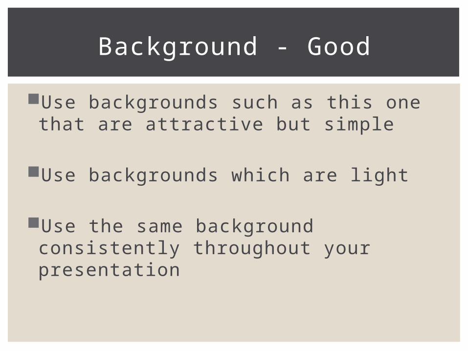
Use backgrounds such as this one that are attractive but simple
Use backgrounds which are light
Use the same background consistently throughout your presentation
Background - Good
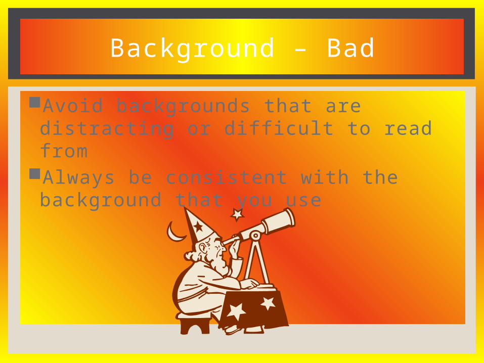
Avoid backgrounds that are distracting or difficult to read from
Always be consistent with the background that you use
Background – Bad

PowerPoint Rubric

Show one point at a time:Will help audience concentrate on what you are sayingWill prevent audience from reading aheadWill help you keep your presentation focused
If this is distracting for you while presenting it may be best to show all of the points at the beginning:Will help you concentrate on what you are saying and
not get off track
Slide Structure – Good
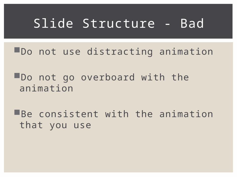
Do not use distracting animation
Do not go overboard with the animation
Be consistent with the animation that you use
Slide Structure - Bad
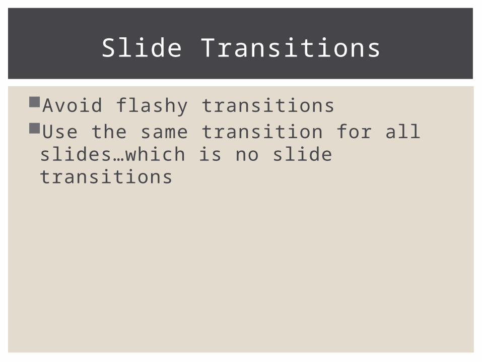
Avoid flashy transitionsUse the same transition for all slides…which is
no slide transitions
Slide Transitions

Use graphics that relate to the topic
Too much can distract from the presentation
Use only good quality graphics
Graphics - Good
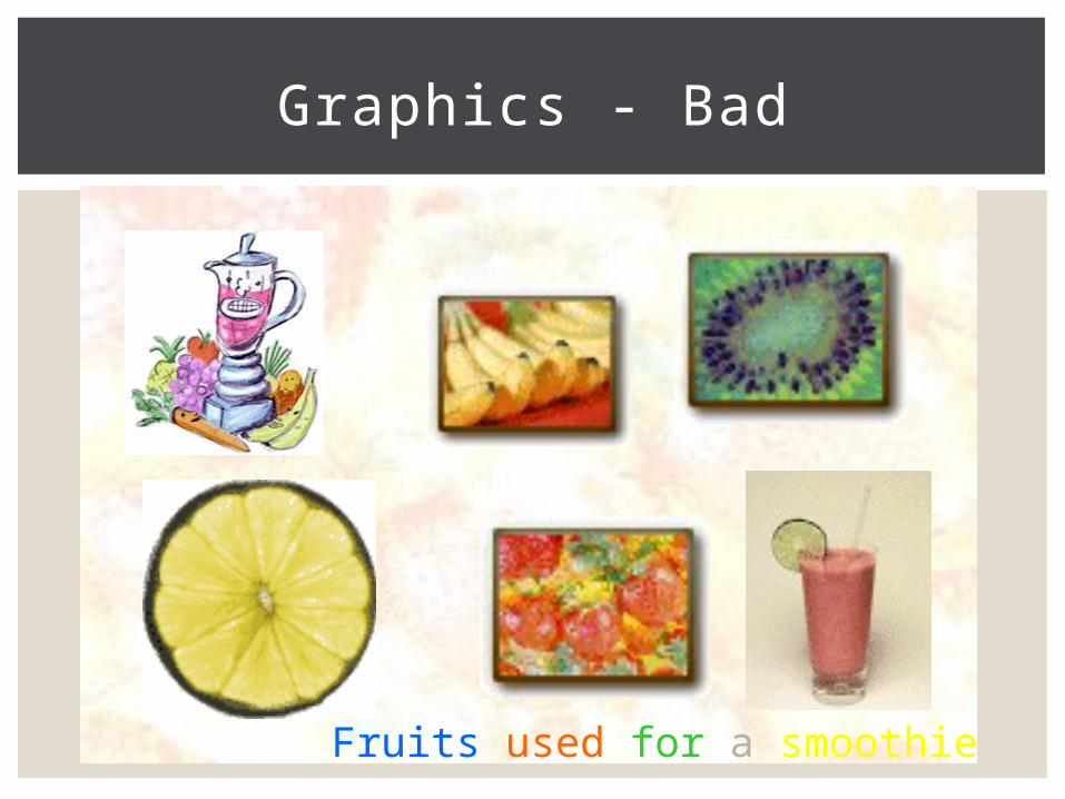
Graphics - Bad
Fruits used for a smoothie

PowerPoint Rubric
Only need to cite the following in your PowerPoint:Photos (except if a Google image that is public domain)Graphs
When citing need:Last name, Year (Bob, 2012)
Do not need a reference slide

Use graphs rather than just charts and wordsData in graphs is easier to comprehend and retain than is
raw dataTrends are easier to visualize in graph form
Always title your graphs
Always cite your graphs
Graphs - Good

Graphs - Good
Items Sold in First Quarter of 2002
0
10
20
30
40
50
60
70
80
90
100
January February March April
Blue Balls
Red Balls
(Bob, 2002)
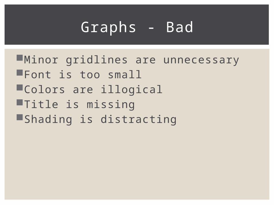
Minor gridlines are unnecessaryFont is too smallColors are illogicalTitle is missingShading is distracting
Graphs - Bad
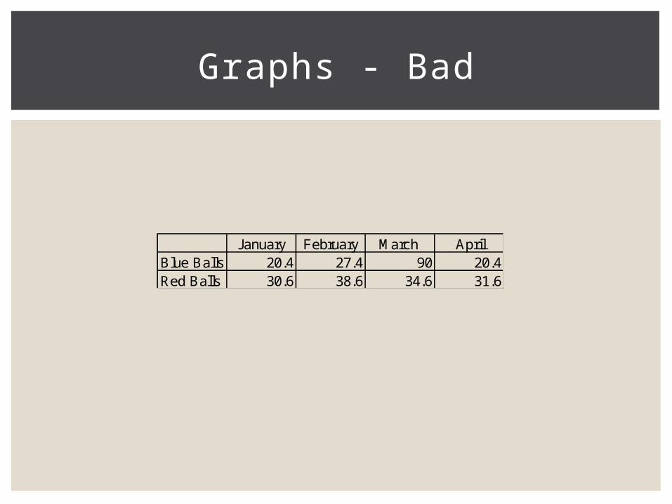
Graphs - Bad
January February March AprilBlue Balls 20.4 27.4 90 20.4Red Balls 30.6 38.6 34.6 31.6

Graphs - Bad
20.4
27.4
90
20.4
30.6
38.6
34.631.6
0
10
20
30
40
50
60
70
80
90
100
January February March April
Blue Balls
Red Balls

PowerPoint Rubric

BELL RINGER
What questions do you still have about the Senior Project PowerPoint?

BUNCH – TURNITIN.COM LOGIN
Class Class ID Password
1A 9645712 Bunch1A
3A 9645739 Bunch3A
4A 9645742 Bunch4A
1B 9645752 Bunch1B
2B 9645761 Bunch2B
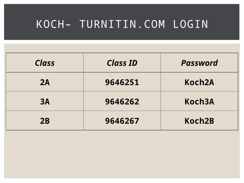
KOCH– TURNITIN.COM LOGIN
Class Class ID Password
2A 9646251 Koch2A
3A 9646262 Koch3A
2B 9646267 Koch2B

WARR– TURNITIN.COM LOGIN
Class Class ID Password
3A 9646235 Warr3A
2B 9646213 Warr2B

ZIMMER– TURNITIN.COM LOGIN
Class Class ID Password
1A 9645821 Zimmer1A
2A 9645836 Zimmer2A
3A 9645840 Zimmer3A
2B 9645854 Zimmer2B
3B 9645859 Zimmer3B
POWERPOINT COMPONENTS

Introduction
Title Slide Introduce yourself Introduce topic
QuoteDefinition Story
None of this is required in grade
All that should be
written on this slide
is your topic (title) and your name!

Policy Identification
Policy is identified Name and number Explain briefly in own words Local, state, federal, international Include key points
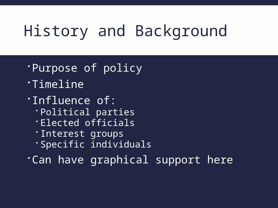
History and Background
Purpose of policy Timeline Influence of:
Political parties Elected officials Interest groups Specific individuals
Can have graphical support here

Current Situation
Effects and outcomes Research/Data
How policy is working Research/Data
Must have graphs, statistics, etc. here
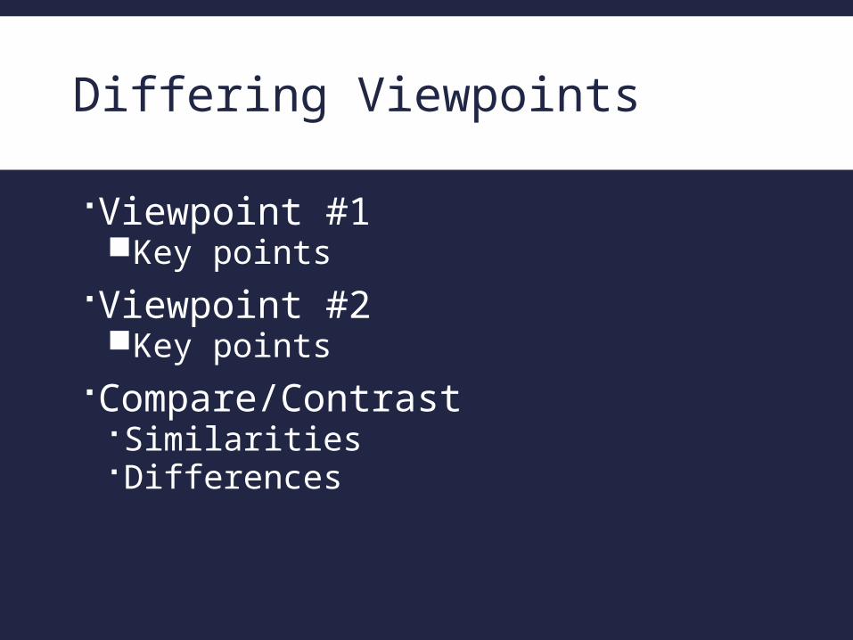
Differing Viewpoints
Viewpoint #1Key points
Viewpoint #2Key points
Compare/Contrast Similarities Differences
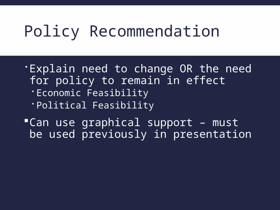
Policy Recommendation
Explain need to change OR the need for policy to remain in effect Economic Feasibility Political Feasibility
Can use graphical support – must be used previously in presentation

Conclusion
Use an effective and strong closing Your audience is likely to remember your last words
Use a conclusion slide to: Summarize the main points of your presentation
Identify policy History of policy Current situation Differing viewpoints
Restates policy recommendation

Closing
Options for last slide include:Blank slideReference slide
This is where you will be asking your panelists if they have any questions