the glass ceiling and the paper floor: gender …
TRANSCRIPT

NBER WORKING PAPER SERIES
THE GLASS CEILING AND THE PAPER FLOOR:GENDER DIFFERENCES AMONG TOP EARNERS, 1981–2012
Fatih GuvenenGreg Kaplan
Jae Song
Working Paper 20560http://www.nber.org/papers/w20560
NATIONAL BUREAU OF ECONOMIC RESEARCH1050 Massachusetts Avenue
Cambridge, MA 02138October 2014
This paper uses confidential data supplied by the Social Security Administration. The views expressedherein are those of the authors and not necessarily those of the Social Security Administration, theFederal Reserve Bank of Minneapolis, the Federal Reserve System, or the National Bureau of EconomicResearch.
At least one co-author has disclosed a financial relationship of potential relevance for this research.Further information is available online at http://www.nber.org/papers/w20560.ack
NBER working papers are circulated for discussion and comment purposes. They have not been peer-reviewed or been subject to the review by the NBER Board of Directors that accompanies officialNBER publications.
© 2014 by Fatih Guvenen, Greg Kaplan, and Jae Song. All rights reserved. Short sections of text,not to exceed two paragraphs, may be quoted without explicit permission provided that full credit,including © notice, is given to the source.

The Glass Ceiling and The Paper Floor: Gender Differences among Top Earners, 1981–2012Fatih Guvenen, Greg Kaplan, and Jae SongNBER Working Paper No. 20560October 2014JEL No. E24,E25,J31
ABSTRACT
We analyze changes in the gender structure at the top of the earnings distribution in the United Statesover the last 30 years using a 10% sample of individual earnings histories from the Social SecurityAdministration. Despite making large inroads, females still constitute a small proportion of the toppercentiles: the glass ceiling, albeit a thinner one, remains. We measure the contribution of changesin labor force participation, changes in the persistence of top earnings, and changes in industry andage composition to the change in the gender composition of top earners. A large proportion of theincreased share of females among top earners is accounted for by the mending of, what we refer toas, the paper floor – the phenomenon whereby female top earners were much more likely than maletop earners to drop out of the top percentiles. We also provide new evidence at the top of the earningsdistribution for both genders: the rising share of top earnings accruing to workers in the Finance andInsurance industry, the relative transitory status of top earners, the emergence of top earnings gendergaps over the life cycle, and gender differences among lifetime top earners.
Fatih GuvenenDepartment of EconomicsUniversity of Minnesota4-151 Hanson Hall1925 Fourth Street SouthMinneapolis, MN, 55455and [email protected]
Greg KaplanDepartment of EconomicsPrinceton UniversityFisher HallPrinceton, NJ 08544and [email protected]
Jae SongSocial Security AdministrationOffice of Disability Adjudicationand Review5107 Leesburg Pike, Suite 1400Falls Church, VA [email protected]
1 Introduction
The last three decades have seen tremendous changes in the distribution of earnings in the
United States. Among these changes, two of the most well known are the increasing share
of total earnings that accrues to top earners (i.e., individuals in the top 1 percent or top 0.1
percent of the earnings distribution) and the continued relative absence of females from this
top earning group.1 This latter phenomenon is commonly referred to as the glass ceiling,
the emergence of which has spurred both debate over the appropriate policy response, as
well as active research into its primary causes.2 However, progress on both fronts has
been hampered by a relative lack of good evidence on the gender structure at the top of the
earnings distribution.3 Our goal in this paper is to provide this necessary empirical evidence
on the glass ceiling, using newer and better data than has been previously available. In
doing so, we also revisit several important questions about top earners of both genders: the
dynamics of their earnings, their industry composition, their age and cohort composition,
and the evolution of earnings for lifetime top earners.
Our interest in top earners is motivated by their disproportionately large influence on the
aggregate economy. This influence operates through at least three channels. First, top
earners are crucial economic actors. In the United States, individuals in the top 1 percent
of the income distribution earn approximately 15% of aggregate before-tax income and
pay about 40% of individual income taxes – more than one and a half times the amount
paid by the bottom 90 percentiles – and 50% of all corporate income tax.4 Since this
group includes virtually all high-level managers and executives of U.S. businesses (both
public and private), top earners play a pivotal role in decisions about business investment,
employment creation, layoffs, and international trade. Second, top earners are key political
actors. Political scientists have argued that the increasing polarization of political discourse
in the United States can be partly attributed to the rising influence of top earners, through
political contributions that have in part been made possible by changes in campaign finance
regulations since the 1970s.5 Third, since the group of top earners includes a large fraction
of the economy’s top talent, understanding the distribution of top earners across gender,
1See Bertrand et al. (2010) and Gayle et al. (2012) for recent attempts to measure the gender compositionof top earners.
2The term “glass ceiling” was coined in the 1980s and is typically defined (for example, in Federal GlassCeiling Commission (1995)) as an “unseen, yet unbreachable barrier that keeps minorities and women fromrising to the upper rungs of the corporate ladder, regardless of their qualifications or achievements.”
3Existing evidence is based almost exclusively on nonrandom subsamples of top earners (CEOs andother top executives, billionaires from Forbes 400 lists, MBA graduates, etc.). We review this evidencebelow.
4Statistics are for 2010 from the Congressional Budget Office (2013, Table 3).5See, for example, Barber (2013); Baker et al. (2014).
1

industries, and cohorts helps us to better understand the allocation of human capital in the
economy.
The pivotal role of top earners has led to a burgeoning literature whose goal is to explicitly
model the thick Pareto tail at the top end of the earnings distribution and then either
evaluate alternative mechanisms that could give rise to top earners (e.g., Gabaix and Landier
(2008), Jones and Kim (2014)), study the allocation of top talent across occupations (e.g.,
Hsieh et al. (2013)), or ask how to best design fiscal policy in the presence of influential top
earners (e.g., Saez (2001); Badel and Huggett (2014); Guner et al. (2014); Kindermann and
Krueger (2014)). Therefore, one goal of this paper is to provide the empirical evidence that
this literature requires in order to address these issues – on gender differences, persistence,
mobility, age, and industry composition, and on the life-cycle dynamics of top earners. The
literature on optimal taxation of top earners has so far only considered the taxation of
individuals; as this literature moves toward studying the taxation of families, evidence on
gender differences among top earners of the type we provide will become essential.
Our data set is a 10% representative sample of individual earnings histories from the U.S.
Social Security Administration. Several features of these data are well suited for our goals.
The large number of observations enables us to study earnings within the top 1 percent,
including the earnings of those at the very top, the 0.1 percent, as well as the characteristics
of female top earners, who constitute only a small subset of top earners. The panel nature
of the data set enables us to track the same individuals over time and, hence, to perform our
analysis using both five-year average earnings as well as annual earnings. This is important
because of the relatively low probabilities of top earners remaining in the top percentiles
from year to year, as shown by Auten et al. (2013), and which we confirm and expand
on. The presence of Employer Identification Numbers (EIN) from W2 forms enables us to
obtain detailed industry information about each worker’s jobs, which we use to construct
a novel industry breakdown that is particularly useful for understanding what top earners
do. In particular, we separate workers in Finance and Insurance, Health services, Legal
services, and Engineering from executives in other service industries. The long time span of
our data (32 years) and the absence of attrition enable us to paint a sharper picture of how
top earners’ earnings evolve over their life cycles than has been possible in previous work.
Our findings on gender differences speak to three broad themes: (i) trends in top earnings
over the last three decades; (ii) the persistence and mobility of top earners; and (iii) the
characteristics of top earners.
First, regarding recent trends in top earnings, we find that although large strides have
been taken toward gender equality at the top of the distribution, very large differences
between males and females still remain. Since 1981, the share of females among top earners
2

has increased by more than a factor of 3. Yet in 2012, the earnings share of females still
comprised only 18% of the earnings of all individuals in the top 0.1 percent, and only 11%
of the earnings of the top 1 percent. The glass ceiling is still there, but it is thinner than it
was three decades ago. Moreover, among the top 0.1 percent, virtually all of the increase
came in the 1980s and 1990s; the last decade has seen almost no further improvement in
the last decade. We decompose the rise in the share of females among top earners into a
component that is due to changes in female participation in all parts of the distribution and
find that these compositional effects play little role in explaining the observed trend. This
finding reflects the fact that gender differences have narrowed much more in the bottom
99 percent of the distribution – where in 2012, females accounted for 49% of workers and
around 41% of earnings – than in the top percentiles.
For top earners of both genders, after several decades of rising earnings, a leveling off has
taken place during the last decade. Both the thresholds for membership and the average
earnings of workers in the top percentiles have remained relatively flat since 2000. It is too
soon to tell whether this represents a change in the increasing trend that has dominated
the last half century (Kopczuk et al. (2010)), or whether it is a temporary flattening due to
top earners suffering disproportionately large temporary falls in earnings during the 2000–2
and 2008–9 recessions (Guvenen et al. (2014b)).6
Second, regarding persistence and mobility at the top of the earnings distribution, we find
substantial turnover among top earners. The frequency with which workers enter and exit
the top earnings groups sounds a cautionary note to analyses of top earners that use only
data from annual cross sections. This high tendency for top earners to fall out of the top
earnings groups was particularly stark for females in the 1980s – a phenomenon we refer to
as the paper floor. But the persistence of top earning females has dramatically increased in
the last 30 years, so that today the paper floor has been largely mended. Whereas female
top earners were once around twice as likely as men to drop out of the top earning groups,
today they are no more likely than men to do so. Moreover, this change is not simply due
to females being more equally represented in the upper parts of the top percentiles; the
same paper floor existed for the top percentiles of the female earnings distribution, but this
paper floor has also largely disappeared. We use a decomposition to show that this change
in persistence accounts for a substantial fraction of the increase in the share of females
6See Section 3 and Appendix B for a reconciliation of this finding with results from other data sourcesand different samples that show a continued increase in the income share of the top 0.1 percent over thisperiod. The difference in these findings is not due to our focus on wage and salary income as opposed toa broader measure: in Appendix B we show that the slowdown in the growth of top incomes is presentfor total income (including capital gains), except at the very top of the distribution (above the 99.99thpercentile). Instead the difference in findings is mainly due to differences in the implied trends for thebottom 99 percent that arise because of the different units of analysis: individuals who satisfy a minimumearnings and age restriction, versus all taxpaying units.
3

among top earners that we observe during the last three decades.
As the persistence of top earning women was catching up with men during this period, the
persistence of top earning men was itself increasing, particularly after 2000. Throughout
the 1980s and 1990s, the probability that a male in the top 0.1 percent was still in the
top 0.1 percent one year later remained at around 45%, but by 2011 this probability had
increased to 57%. When combined with our finding that the share of earnings accruing to
the top 0.1 percent has leveled off since 2000, this implies a striking observation about the
nature of top earnings inequality: despite the total share of earnings accruing to the top
percentiles remaining relatively constant in the last decade, these earnings are being spread
among a decreasing share of the overall population. Top earner status is thus becoming
more persistent, with the top 0.1 percent slowly becoming a more entrenched subset of the
population.
These findings concern short-run earnings dynamics, but for many questions about top
earners (e.g., human capital accumulation or optimal taxation), long-run dynamics, as
reflected in lifetime earnings, are the more relevant consideration. However, due to the
previous lack of large, long panel data sets on earnings, little is currently known about
lifetime top earners. We analyze how male and female lifetime top earners differ over the
life cycle, where in the distribution these individuals start their working lives, and in which
parts of the distribution they spend the majority of their careers. We find that within the
top 1 percent of lifetime earnings, men and women display distinct lifecycle patterns, so
that the gender gap between these groups is inverse U-shaped over the life cycle, increasing
substantially in the 30s (presumably when some females’ careers are interrupted for family
reasons) and then declining toward retirement.
Third, regarding the characteristics of top earners, we find that the dominance of the
finance and insurance industry is staggering, for both males and females: in 2012, finance
and insurance accounted for around one-third of workers in the top 0.1 percent. However,
this was not the case 30 years ago, when the health care industry accounted for the largest
share of the top 0.1 percent. Since then, top earning health care workers have dropped
to the second 0.9 percent where, along with workers in finance and insurance, they have
replaced workers in manufacturing, whose share of this group has dropped by roughly half.
Perhaps surprisingly, these changes in industry structure do not play much of a role in
explaining either the level or the change in the share of females among top earners, because
the industry composition of the top percentiles is very similar for males and females.
To gain insight into possible future trends for the glass ceiling, we end the paper by exam-
ining the age and cohort composition of top earners. Top earners are older than average
and have become more so over time. In contrast with analyses of the gender structure of
4

corporate boards (e.g., Bertrand et al. (2012)), we do not find that female top earners are
younger than male top earners. Entry of new cohorts, rather than changes within existing
cohorts, account for most of the increase in the share of females among top earners. These
new cohorts of females are making inroads into the top 1 percent earlier in their life cycles
than previous cohorts. If this trend continues, and if these younger cohorts exhibit the same
trajectory as existing cohorts in terms of the share of females among top earners, then we
might expect to see further increases in the share of females in the overall top 1 percent
in coming years. However, this is not true for the top 0.1 percent. At the very top of the
distribution, young females have not made big strides: the share of females among the top
0.1 percent of young people in recent cohorts is no larger than the corresponding share of
females among the top 0.1 percent of young people in older cohorts.
Our results on the glass ceiling relate to a large and active literature. However, the bulk
of the existing empirical evidence has been relatively indirect and pertains to somewhat
specialized subsets of top earners, such as CEOs and other executives, members of corporate
boards, the list of billionaires compiled by Forbes magazine, or MBA graduates from a top
U.S. business school (e.g., Bell (2005), Wolfers (2006), Bertrand et al. (2010), Gayle et al.
(2012)). Although these analyses have revealed a wealth of interesting information, it is
not clear how relevant the conclusions from these analyses are for other top earning women.
For example, Wolfers (2006) reports that over a 15-year period starting in the early 1990s,
only 1.3% of ExecuComp CEOs were women – about 10 times smaller than the share of
women we find among the top 0.1 percent of earners in the 2000s.
Finally, this paper is also related to the literature initiated by Piketty and Saez (2003)
that aims to understand the evolution of top earnings. More recently, Parker and Vissing-
Jørgensen (2010) and Guvenen et al. (2014a) have studied the cyclicality of top earnings.
Our focus is on long-run trends rather than the cycle. Kopczuk et al. (2010), Bakija et al.
(2012), and Auten et al. (2013) are related papers that also use large representative samples
of individual-level data to study the trends and characteristics of top earners. Brewer et al.
(2007) is a complementary paper that analyzes the characteristics of high income individuals
in the United Kingdom. However, these papers do not focus on the glass ceiling or the paper
floor.
5
2 Data
Data set. We use a confidential panel data set of earnings histories from the U.S. Social
Security Administration (SSA) covering the period 1981 to 2012.7 The data set is con-
structed by drawing a 10% representative sample of the U.S. population from the SSA’s
Master Earnings File (MEF). The MEF is the main record of earnings data maintained by
the SSA and contains data on every individual in the United States who has a Social Secu-
rity number (SSN). The data set contains basic demographic characteristics, including date
of birth, sex, race, type of work (farm or nonfarm, employment or self-employment), em-
ployee earnings, self-employment taxable earnings, and the Employer Identification Number
(EIN) for each employer, which we use to link industry information. Employee earnings
data are uncapped (i.e., there is no top-coding) and include wages and salaries, bonuses,
and exercised stock options as reported on the W-2 form (Box 1). The data set grows
each year through the addition of new earnings information, which is received directly from
employers on the W-2 form.8 For more information on the MEF, see Panis et al. (2000)
and Olsen and Hudson (2009). We convert all nominal variables into 2012 dollars using the
personal consumption expenditure (PCE) deflator. For an individual born in year c, we
define their age in year t as t − c, which corresponds to their age on December 31 of that
year.
To construct the 10% representative sample from the MEF, we select all individuals with
the same last digit of (a transformation of) their SSN. Since the last four digits of the SSN
are randomly assigned to individuals, this generates a nationally representative panel. The
panel tracks the evolution of the U.S. population in the sense that each year, 10% of new
individuals who are issued SSN numbers enter our sample, and those who die each year are
eliminated (determined through SSA death records).
Sample Selection. For the analyses in Sections 3, 4, 7, and 8, in each year t we select
all individuals in our baseline 10% sample who satisfy the following two criteria:
1. The individual is between 25 and 60 years old.
7The data set contains earnings information going back to 1978. However, prior to 1981 the data are ofpoorer quality due to inconsistencies in complying with the switch from quarterly to annual wage reportingby employers, mandated by the SSA (see Olsen and Hudson (2009) and Leonesio and Del Bene (2011)).For large parts of the population, most of these reporting errors can be corrected. However, these methodsdo not work well for very high-earning individuals, who are the focus of this paper.
8The MEF also contains earnings information on self-employment income for sole proprietors (i.e.,income reported on form Schedule SE; see Olsen and Hudson (2009) for more information); however, thesedata are top-coded at the taxable limit for Social Security contributions prior to 1994. Because of thistop-coding, we focus our main analysis on wage and salary data. In Appendix H, we verify the robustnessof our findings to the inclusion of self-employment income for the period 1994-2012.
6

2. The individual has annual earnings that exceed a time-varying minimum threshold.
This threshold is equal to the earnings one would obtain by working for 520 hours (13
weeks at 40 hours per week) at one-half of the legal minimum wage for that year. In
2012, this corresponded to annual earnings of $1,885.
We impose these selection criteria in order to focus on workers with a reasonably strong
attachment to the labor market and to avoid issues that arise when taking the logarithm
of small numbers. These criteria also make our results comparable to the literature on
earnings dynamics and inequality, where imposing age and minimum earnings restrictions
is standard (see, e.g., Abowd and Card (1989), Juhn et al. (1993), Meghir and Pistaferri
(2004), Storesletten et al. (2004), and Autor et al. (2008)).
The MEF contains a small number of extremely high earnings observations each year. To
avoid potential problems with outliers, we cap (winsorize) observations above the 99.999th
percentile of the distribution of earnings for individuals who satisfy the above two selection
criteria in a given year. From 1981 to 2012, the mean and median 99.999th percentiles
across years were both $11.5 million, and the maximum was $25.4 million in 2000.
We report results using two definitions of earnings: annual earnings and five-year average
earnings. The former definition provides us with a snapshot of top earners in a given
year, but this group is likely to include some workers whose high earnings were a one-off
event (e.g., due to large onetime bonuses or other windfalls). Such workers would not
be considered as top earners under the latter definition, which by construction focuses on
individuals with more stable membership of the top earnings percentiles. Studying top
earners based on five-year average earnings is feasible because of the panel dimension of our
data.
For the analysis using annual earnings, in each year t = 1981, ..., 2012 we assign all individ-
uals who satisfy the two selection criteria to either the top 0.1 percent, second 0.9 percent
or bottom 99 percent based on their earnings in year t. For the analysis using five-year
average earnings, we construct a rolling panel for each year t = 1983, ..., 2010 that consists
of all individuals who satisfy the two selection criteria in at least three of the years from
t − 2, . . . , t + 2 , including the most recent year t + 2. For each of these individuals, we
compute their average annual earnings over the years t− 2, . . . , t + 2 that they satisfy the
selection criteria. We then assign individuals to either the top 0.1 percent, second 0.9 per-
cent or bottom 99 percent based on these five-year average earnings. For both definitions
of earnings, we keep all individuals in the top 0.1 percent and second 0.9 percent of the
distribution, and we take a 2% random sample of individuals in the bottom 99 percent.
In Section 6, we also analyze 30-year average earnings, which we refer to as lifetime earnings.
For the analysis in that section, we restrict attention to cohorts of individuals from ages 25
7

to 54 and include individuals in the sample if they satisfy the two selection criteria above for
a minimum of 15 years during that 30-year period. In Appendix C, we also report results
for cohorts of individuals from ages 30 to 59.
Privacy. To avoid possible privacy issues, we do not report any statistics for demographic
cells (for example, a given industry/gender/year/income group) with fewer than 30 indi-
viduals. Thanks to the large sample size, such cells are rarely encountered.
The remaining sections of the paper analyze gender differences among top earners along
a number of dimensions. But in order to first provide some context for the differences
and similarities between male and female top earners, we begin in Section 3 with a brief
summary of recent trends for all individuals at the top of the earnings distribution.
3 Recent Trends in Top Earnings
In 2012, a worker had to earn at least $1,018,000 to be included in the top 0.1 percent of
the earnings distribution and at least $291,000 to be included in the top 1 percent. For the
most recent five-year period covered by our data, 2008–12, a worker needed to have average
earnings above $918,000 to be included in the top 0.1 percent, and above $282,000 to be in
the top 1 percent. For comparison, in 2012 the mean and median annual earnings in our
data were $51,000 and $35,000; for average earnings over the five-year period 2008–12, the
mean and median were $53,000 and $38,000.9
These thresholds have increased substantially since 1981 but have been essentially flat over
the last decade, with most of the increase taking place in the first half of the 1980s and the
second half of the 1990s. The trends have been similar for the 0.1 percent threshold (Figure
1A) and the 1 percent threshold (Figure 1B), using either annual earnings or five-year
average earnings. The tapering off in the growth of top-earning thresholds since 2000 is likely
to be in part due to the 2001 and 2008–9 recessions hitting top earners disproportionately
hard.
The trends in these top-earning thresholds are not unique to our particular measure of
income (wage and salary earnings from W-2 forms), nor to our particular choice of sam-
9As described in Section 2, our earnings data comprise only wage and salary income reported on W-2forms. According to Statistics of Income (SOI) data from the Internal Revenue Service (IRS), in 2011, wageand salary income accounted for 45.6% of total income (excluding capital gains) for the top 0.1 percent oftaxpaying units, 62.3% for the second 0.4 percent, and 77.0% for the next 0.5 percent. The next biggestcomponent of income is entrepreneurial income, which consists of profits from S corporations, partnerships,and sole proprietorships (Schedule C income). In 2011, this accounted for 28.6% of income for the top 0.1percent of tax units, 28.4% for the second 0.4 percent, and 16.7% for the next 0.5 percent.
8

Figure 1 – Top earning thresholds
(A) 99.9th percentile400
600
800
1000
1200
$’0
00s
1980 1985 1990 1995 2000 2005 2010year
1 yr earnings 5 yr av earnings
(B) 99th percentile
150
200
250
300
$’0
00s
1980 1985 1990 1995 2000 2005 2010year
1 yr earnings 5 yr av earnings
(C) Ratio of top earning thresholds
2.5
33.5
4R
atio
1980 1985 1990 1995 2000 2005 2010year
1 yr earnings 5 yr av earnings
ple. In Appendix B, we plot the corresponding trends for the 99.9th percentile and 99th
percentile, under various definitions of income, using our data and data from aggregate tax
records. For all definitions of income, we see a significant tapering off in the growth of the
top-earning thresholds during the last decade.
Inequality within the top percentiles, as measured by the ratio of the 99.9th percentile to
the 99th percentile, has been flat (or even slightly declining) since the late 1980s. For five-
year average earnings, the ratio peaked at around 3.5 in 1997-2001 and was around 3.25
in 2008–12. For annual earnings there was an isolated peak in 2000, most likely due to
payouts related to the information technology boom pushing up earnings at the very top
of the distribution.10 The trend in this ratio (which is displayed in Figure 1C) suggests
10Consistent with this hypothesis, the 2000 peak in annual earnings for the 99.9th percentile is particu-larly prominent in the engineering sector (which, according to our definition, includes technology companies;see Section 7) and is much less prominent in other sectors.
9

Figure 2 – Average earnings among top earners
(A) Top earnings shares0
.02
.04
.06
.08
Share
1980 1985 1990 1995 2000 2005 2010year
1 yr earnings, top 0.1% 5 yr av earnings, top 0.1%
1 yr earnings, second 0.9% 5 yr av earnings, second 0.9%
(B) Average earnings in top 0.1 percent
500
1000
1500
2000
2500
3000
$’0
00s
1980 1985 1990 1995 2000 2005 2010year
1 yr earnings, top 0.1% 5 yr av earnings, top 0.1%
(C) Average earnings in second 0.9 percent
200
250
300
350
400
450
500
$’0
00s
1980 1985 1990 1995 2000 2005 2010year
1 yr earnings, second 0.9% 5 yr av earnings, second 0.9%
(D) Average earnings in bottom 99 percent
30
35
40
45
50
55
$’0
00s
1980 1985 1990 1995 2000 2005 2010year
1 yr earnings, bottom 99% 5 yr av earnings, bottom 99%
that inequality in labor earnings within the very top of the distribution has not risen as
dramatically as it has in other parts of the distribution during the past 25 years.
Top earnings inequality is commonly measured as the share of total earnings that accrues to
workers in the top percentiles (e.g., Piketty and Saez (2003)). In our data, the recent trend
in this measure of inequality (Figure 2A) is similar to the trend in top earnings thresholds.
For five-year average earnings, the shares have been roughly constant since the late 1990s,
at around 7% for earners in the second 0.9 percent, and at around 4% for earners in the
top 0.1 percent. For annual earnings, the shares are about 1 percentage point higher.
Average earnings in each part of the distribution have also followed similar qualitative
trends over this time period, with most of the increase in average earnings occurring in the
late 1990s (and in the early 1980s for the top 1 percent) and with relatively little earnings
growth in the last decade. However, there are large quantitative differences in the earnings
10

growth experienced by the three groups. Focusing on five-year averages, the growth in
average earnings from the period 1981–85 to the period 2008–12 was 139% for the top 0.1
percent (Figure 2B), 63% for the top 1 percent (Figure 2C), and only 22% for the bottom
99 percent (Figure 2D).
The trends in Figure 2 clearly illustrate the dramatic differences between the recent earnings
growth experienced by workers at the top of the earnings distribution compared with the
growth experienced by those in the bottom 99 percent. Yet they leave many important
questions unanswered. In the remaining sections of the paper, we address some of these
questions, starting first with the question of how equally females have shared in the rise of
earnings at the top of the distribution.
4 Cracks in the Glass Ceiling? Gender Composition
of Top Earners
We measure gender differences among top earners in two ways. First, we examine the gender
composition of the top earners in the overall distribution of earnings. Second, we compare
the earnings of the highest earning females with those of the highest earning males.
4.1 Gender Composition of Overall Top Earners
A striking increase in the share of females among top earners has taken place since the early
1980s, as illustrated by the trends shown in Figure 3A. In 1981–85, females constituted just
1.9% of the top 0.1 percent of earners based on average earnings over this five-year period
and just 3.3% of the second 0.9 percent of earners. In contrast, by 2008–12 the corresponding
shares of females had risen to 10.5% and 17.0%, respectively. The magnitude of this change
is even more striking when expressed in terms of the number of men for every woman in the
top percentiles (Figure 3B). In 1981–85, there were 50.6 men for every one woman in the
top 0.1 percent of earners, whereas in 2008–12 there were 8.5 men for every woman. Among
the second 0.9 percent of earners, in 1981–85 there were 29.3 men per woman, whereas in
2008–12 there were 4.9 men per woman.
The rising fraction of females among top earners has also translated into a corresponding
rise in the share of top earnings that accrues to females. This can be seen in Figure 3C,
which shows that the share of top earnings that accrues to females has risen almost as
rapidly as the fraction of females in these groups, suggesting that the women who have
entered the top percentiles are not disproportionately concentrated toward the bottom of
11

Figure 3 – Gender composition of top earners
(A) Share of females among top earners0
.05
.1.1
5.2
Share
1980 1985 1990 1995 2000 2005 2010year
1 yr earns, top 0.1% 5 yr av earns, top 0.1%
1 yr earns, second 0.9% 5 yr av earns, second 0.9%
(B) Ratio of males to females among top earners
010
20
30
40
50
Ratio
1980 1985 1990 1995 2000 2005 2010year
1 yr earns, top 0.1% 5 yr av earns, top 0.1%
1 yr earns, second 0.9% 5 yr av earns, second 0.9%
(C) Share of top earnings accruing to females
0.0
5.1
.15
.2S
hare
1980 1985 1990 1995 2000 2005 2010year
1 yr earns, top 0.1% 5 yr av earns, top 0.1%
1 yr earns, second 0.9% 5 yr av earns, second 0.9%
(D) Share of females among top earners, relativeto share of females among all workers
0.0
5.1
.15
.2.2
5S
hare
1980 1985 1990 1995 2000 2005 2010year
1 yr earns, top 0.1% 5 yr av earns, top 0.1%
1 yr earns, second 0.9% 5 yr av earns, second 0.9%
the top earner groups – which would have implied a slower growth in the earnings share
than in the population share.
Moreover, the increased representation of females among top earners is not simply a reflec-
tion of a higher female labor force participation rate in the overall earnings distribution.
From the period 1981–85 to the period 2008–2012, the share of females in the bottom 99
percent of earners increased from 44.0% to 49.2% (see Appendix D for the full time series).
So, in principle, part of the trends in Figures 3A, 3B, and 3C could be due to this broader
trend. But comparing the probability that a working woman is in a top earnings group,
with the corresponding probability for a working man,11 suggests that this effect is small.
Although the ratio of these probabilities is well below 1 (which is its expected value if
11We define individuals to be working if they satisfy the age and minimum earnings criteria describedin Section 2.
12
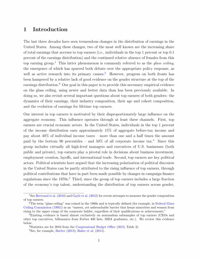
Table 1 – Decomposition of change in share of females among top earners
Annual earnings Five-year earningsTop 0.1% Second 0.9% Top 0.1% Second 0.9%
Change 0.09 0.13 0.09 0.14Fraction due to:- gender comp. of labor force 7% 9% 7% 7%- gender comp. of top percentiles 93% 91% 93% 93%
Notes: Change for annual earnings is from 1981 to 2012. Change for five-year earningsis from the period 1981–85 to the period 2008–12. See Appendix A for details ofdecomposition.
men and women satisfying our selection criteria were equally represented in all parts of the
earnings distribution), the ratio has risen substantially, from 0.026 in the period 1981–85
to 0.122 in the period 2008–12 for the top 0.1 percent (Figure 3D).
This conclusion is confirmed by a formal decomposition of the change in the share of females
in top percentiles into a component that is due to the changing gender composition of the
overall labor force and a component that is due to the changing gender composition of top
percentiles, beyond the change in the overall distribution. Full details of the methodology
underlying the decomposition are contained in Appendix A. The results of the decomposi-
tion, reported in Table 1, imply that only 7% to 9% of the increase in the female share of
top percentiles is due to changes in the overall female share of workers.
So far, the description of our empirical findings has painted a glass-half-full picture of recent
trends in gender differences among top earners: females have made substantial inroads
toward gender equality at the top. Today a working female is over four times more likely
to be in the top 0.1 percent of the earnings distribution than a working female was three
decades ago (Figure 3D). Yet, with the same data, it is also easy to paint a glass-half-empty
picture of these trends: despite the dramatic transformation of the gender composition of
top earners, women are still vastly underrepresented at the top of the earnings distribution.
Almost no increase in the share of females among the top 0.1 percent of earners has occurred
over the last decade (Figure 3A). Even in 2012, a working woman was only 12.2% as likely
to be in the top 0.1 percent of the earnings distribution as a working man was (Figure 3D),
and the shares of females in the top percentiles were below 15% for the top 0.1 percent, and
below 20% for the second 0.9 percent (Figure 3C).
13

Figure 4 – Male top earners versus female top earners
(A) Ratio of male to female top earningthresholds
1.5
22.5
33.5
44.5
Ratio
1980 1985 1990 1995 2000 2005 2010year
1 yr earnings, top 0.1% 5 yr av earnings, top 0.1%
1 yr earnings, top 1% 5 yr av earnings, top 1%
(B) Average earnings among top 0.1 percent ofmales and top 0.1 percent of females
01000
2000
3000
4000
5000
$’0
00s
1980 1985 1990 1995 2000 2005 2010year
1 yr earnings: males 5 yr av earnings: males
1 yr earnings: females 5 yr av earnings: females
(C) Average earnings among second 0.9 percentof males and second 0.9 percent of females
0200
400
600
800
$’0
00s
1980 1985 1990 1995 2000 2005 2010year
1 yr earnings: males 5 yr av earnings: males
1 yr earnings: females 5 yr av earnings: females
(D) Share of top 0.1 percent earnings in top 1 per-cent earnings for males and females
.15
.2.2
5.3
.35
.4.4
5S
hare
1980 1985 1990 1995 2000 2005 2010year
1 yr earnings: males 5 yr av earnings: males
1 yr earnings: females 5 yr av earnings: females
4.2 Top Earning Males Versus Top Earning Females
In the previous section, we measured gender inequality among top earners by comparing the
earnings of males and females in the top percentiles of the overall earnings distribution. In
this section, we consider an alternative approach in which we compare the earnings of the
highest earning males with those of the highest earning females. Rather than impose the
same threshold for males and females, this alternative approach defines top earners using
different thresholds for males and females, based on gender-specific earnings distributions.
In 2012, men had to earn roughly twice as much as women in order to be included in the top
1 percent of their respective gender-specific earnings distributions and nearly three times
as much in order to be included in the top 0.1 percent of their distributions. Comparing
14

the relative trends in these top earnings thresholds for males and females suggests that, by
this metric, a substantial closing of the top earnings gender gap has also occurred, but as
with the findings from overall top earners, large differences remain. These trends can be
seen in Figure 4A, in which we plot the ratio of the 99th and 99.9th percentiles of the male
earnings distribution to the corresponding percentiles of the female earnings distribution.
For five-year average earnings, the ratio for the top 0.1 percent peaked in the late 1980s at
around 4.1 and has declined monotonically since then to reach a level of 2.75 for the period
2008-12. This means that whereas two decades ago, a man at the 99.9th percentile of the
male distribution earned over four times as much as a woman at the same percentile of the
female distribution, today such a man earns less than three times as much as such a woman.
Although the gender differences in top earnings thresholds have narrowed in recent years,
the gap between the average earnings of top male earners and top female earners has actually
widened. This widening is evident in Figure 4B, which shows the average earnings of the top
0.1 percent of males and the top 0.1 percent of females, and in Figure 4C, which shows the
average earnings for the second 0.9 percent of males and the second 0.9 percent of females.
These two seemingly contradictory views of trends in the gap between the top ends of
the gender-specific distributions – thresholds versus average earnings – can be reconciled
by observing that inequality within the top 1 percent, as measured by the earnings share
of the top 0.1 percent in the top 1 percent, is higher for males than for females and has
remained relatively constant since the late 1990s (Figure 4D).
5 A Paper Floor? Gender Differences in the Likeli-
hood of Staying at the Top
Membership in the top percentiles of earners in any given year requires either moving to
these percentiles from the rest of the distribution or remaining in the top percentiles after
having been there in the past. Hence, to fully understand gender differences among top
earners, it is important to also understand the dynamics of earnings for top earners and
how mobility differs for males and females. However, measuring differences in the rate at
which males and females move in and out of the top percentiles requires the use of panel
data, and data limitations have meant that much of the existing literature on top earners
is restricted to looking at the composition of top earners in a given cross section.12 In this
section, we use the panel dimension of our data to fill this gap in the literature, starting
12There are, however, some exceptions. Kopczuk et al. (2010) and Auten et al. (2013) also documenttransition probabilities among top percentiles over one-, three-, and five-year horizons. However, neither ofthese papers studies gender differences in mobility nor mobility within the top 1 percent.
15

Table 2 – Transition probabilities across percentiles of earnings distribution
Panel A: Annual earnings, one-year transitionsTop 0.1% Second 0.9% Bottom 99% Exit Sample
Top 0.1% 0.57 0.31 0.07 0.05Next 0.9% 0.04 0.65 0.27 0.04Second 99% < 0.01 < 0.01 0.91 0.08
Panel B: Five-year earnings, five-year transitionsTop 0.1% Second 0.9% Bottom 99% Exit Sample
Top 0.1% 0.40 0.22 0.06 0.32Second 0.9% 0.05 0.46 0.24 0.25Bottom 99% < 0.01 < 0.01 0.72 0.27
Notes: One-year transition probabilities refer to the period 2011-12. Five-yeartransition probabilities refer to the period 2003-7 to the period 2008-12.
with the mobility of top earners overall and then examining gender differences in persistence
and how these differences contribute to the trends highlighted in Section 4.
5.1 Mobility of Overall Top Earners
We measure the mobility of top earners by examining the transition probabilities in and out
of the three earnings groups (top 0.1 percent, second 0.9 percent and bottom 99 percent)
over one-year and five-year periods. In Table 2 we report such transition matrices for the
most recent periods covered by our data. For annual earnings, these are one-year transition
probabilities between 2011 and 2012, and for five-year earnings these are five-year transition
probabilities between the period 2003-7 and the period 2008-12.
Membership of top earning groups is a relatively transitory state. As shown in Table 2,
only 57% of workers in the top 0.1 percent of the annual earnings distribution in 2011
were still in the top 0.1 percent one year later, whereas 31% had dropped to the second
0.9 percent and 7% had dropped out of the top 1 percent altogether. In addition, 5% of
workers left our sample, either through aging out of the 25- to 60-year age range or by
failing to meet the minimum earnings criteria. For workers in the second 0.9 percent of the
distribution of annual earnings in 2010, 69% were still in the top 1 percent (of which 4%
had moved up to the top 0.1 percent) and 27% had dropped down to the bottom 99 percent.
Conditional on remaining in the sample, the five-year transition probabilities based on five-
16
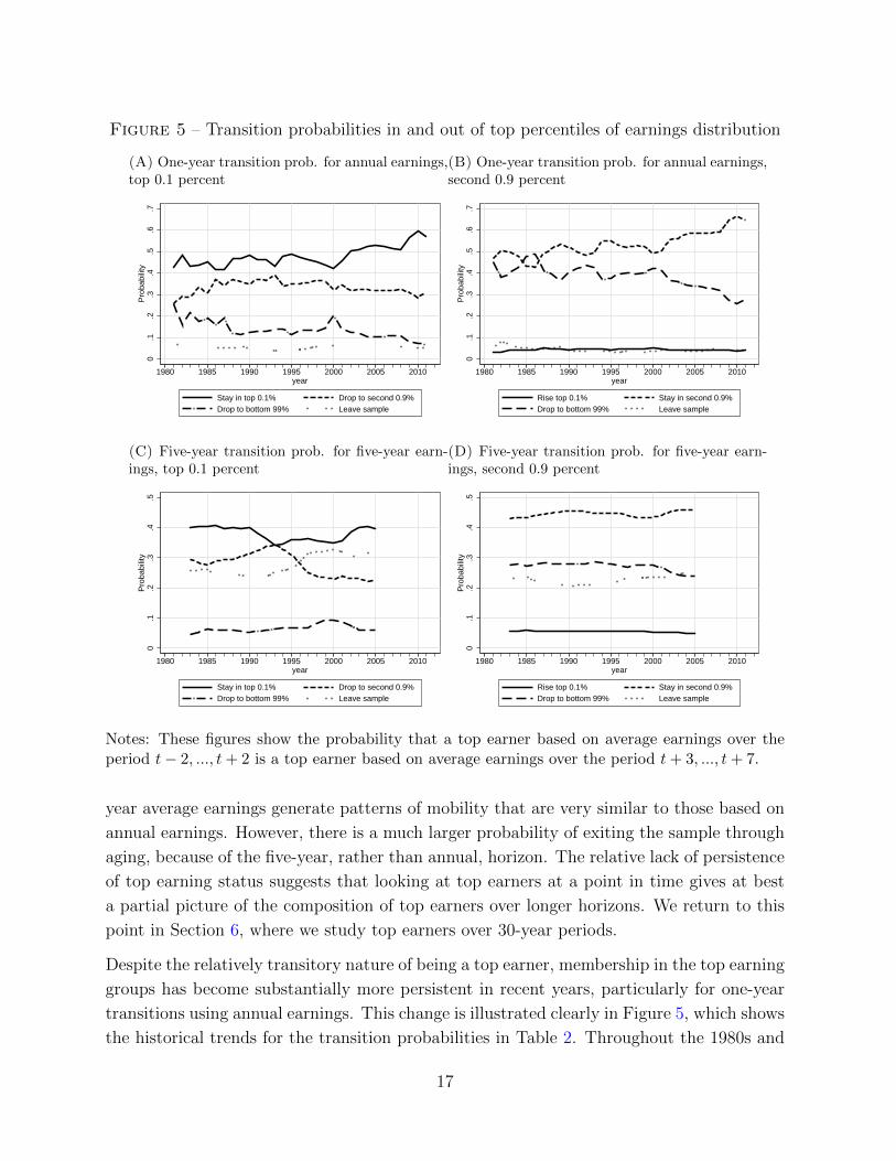
Figure 5 – Transition probabilities in and out of top percentiles of earnings distribution
(A) One-year transition prob. for annual earnings,top 0.1 percent
0.1
.2.3
.4.5
.6.7
Pro
babili
ty
1980 1985 1990 1995 2000 2005 2010year
Stay in top 0.1% Drop to second 0.9%
Drop to bottom 99% Leave sample
(B) One-year transition prob. for annual earnings,second 0.9 percent
0.1
.2.3
.4.5
.6.7
Pro
babili
ty
1980 1985 1990 1995 2000 2005 2010year
Rise top 0.1% Stay in second 0.9%
Drop to bottom 99% Leave sample
(C) Five-year transition prob. for five-year earn-ings, top 0.1 percent
0.1
.2.3
.4.5
Pro
babili
ty
1980 1985 1990 1995 2000 2005 2010year
Stay in top 0.1% Drop to second 0.9%
Drop to bottom 99% Leave sample
(D) Five-year transition prob. for five-year earn-ings, second 0.9 percent
0.1
.2.3
.4.5
Pro
babili
ty
1980 1985 1990 1995 2000 2005 2010year
Rise top 0.1% Stay in second 0.9%
Drop to bottom 99% Leave sample
Notes: These figures show the probability that a top earner based on average earnings over theperiod t− 2, ..., t + 2 is a top earner based on average earnings over the period t + 3, ..., t + 7.
year average earnings generate patterns of mobility that are very similar to those based on
annual earnings. However, there is a much larger probability of exiting the sample through
aging, because of the five-year, rather than annual, horizon. The relative lack of persistence
of top earning status suggests that looking at top earners at a point in time gives at best
a partial picture of the composition of top earners over longer horizons. We return to this
point in Section 6, where we study top earners over 30-year periods.
Despite the relatively transitory nature of being a top earner, membership in the top earning
groups has become substantially more persistent in recent years, particularly for one-year
transitions using annual earnings. This change is illustrated clearly in Figure 5, which shows
the historical trends for the transition probabilities in Table 2. Throughout the 1980s and
17

1990s, a worker in the top 0.1 percent in a given year had a probability of around 45% of
still being in the top 0.1 percent in the following year. But since 2000, this probability has
steadily risen, reaching over 57% in 2011 (Figure 5A). For individuals in the second 0.9
percent of the annual earnings distribution, the pattern is similar: in the 1980s and 1990s
the probability of remaining in the second 0.9 percent was around 50%, the probability of
dropping to the bottom 99 percent was around 40%, and the probability of rising to the
top 0.1 percent was around 5%. Over the last decade, the probability of staying in the
second 0.9 percent has risen to nearly 70%. This change is mostly accounted for by a large
reduction in the probability of dropping to the bottom 99 percent, from 40% to under 30%
(Figure 5B). Transition probabilities for five-year average earnings over five-year horizons,
which are displayed in Figures 5C and 5D, show qualitative trends similar to the one-year
transition probabilities based on one-year earnings, but the magnitude of the changes is
smaller.
The increase in the persistence of top earning status over the past decade sheds light on the
leveling off during this period of the annual top earning thresholds and annual top earner
shares, shown in Figure 1 and Figure 2. Although the total fraction of earnings that accrues
to the members of the top 0.1 percent or top 1 percent in a given year has remained constant
since 2000, the increased persistence implies that a smaller fraction of the population is being
included as members of these groups. Hence, top earners are slowly being entrenched as
a more persistent subset of the population than they were in the past. This observation
highlights the benefits of studying top earners through the lens of individual panel data.
5.2 Gender Differences in Mobility
The trends in mobility of top earners differ markedly between males and females. In the
early 1980s, there was a distinctive paper floor for female top earners: the probability of
a female in either top-earning group dropping into the bottom 99 percent within one year
was extremely high. In 1981 this probability was 64% for women in the top 0.1 percent and
74% for women in the second 0.9 percent. However, for men these probabilities were much
lower: 24% for the top 0.1 percent and 43% for the top 1 percent. This is the essence of
the paper floor: not only were women vastly underrepresented among top earners, but even
those who did have high earnings were much more likely than men to drop out of the top
earnings groups within a year.
However, the last three decades have seen a steady mending of the paper floor. This
mending can clearly be seen from the trends in Figure 6, which show the time path of
transition probabilities separately for males and females in the top percentiles of the overall
earnings distribution. The probability of females dropping out of the top percentiles has
18

Figure 6 – Transition probabilities in and out of top percentiles of earnings distribution,by gender
(A) One-year transition probabilities for annualearnings, top 0.1 percent
0.1
.2.3
.4.5
.6R
atio
1980 1985 1990 1995 2000 2005 2010year
Stay in top 0.1%, males Stay in top 0.1%, females
Drop to second 0.9%, males Drop to second 0.9%, females
Drop to bottom 99%, males Drop to bottom 99%, females
Leave sample, males Leave sample, females
(B) One-year transition probabilities for annualearnings, second 0.9 percent
0.1
.2.3
.4.5
.6.7
.8R
atio
1980 1985 1990 1995 2000 2005 2010year
Rise to top 0.1%, males Rise to top 0.1%, females
Stay in second 0.9%, males Stay in second 0.9%, females
Drop to bottom 99%, males Drop to bottom 99%, females
Leave sample, males Leave sample, females
(C) Five-year transition probabilities for five–yearearnings, top 0.1 percent
0.1
.2.3
.4.5
Ratio
1980 1985 1990 1995 2000 2005 2010year
Stay in top 0.1%, males Stay in top 0.1%, females
Drop to second 0.9%, males Drop to second 0.9%, females
Drop to bottom 99%, males Drop to bottom 99%, females
Leave sample, males Leave sample, females
(D) Five-year transition probabilities for five-yearearnings, second 0.9 percent
0.1
.2.3
.4.5
Ratio
1980 1985 1990 1995 2000 2005 2010year
Rise to top 0.1%, males Rise to top 0.1%, females
Stay in second 0.9%, males Stay in second 0.9%, females
Drop to bottom 99%, males Drop to bottom 99%, females
Leave sample, males Leave sample, females
Notes: These figures show the probability that a top earner based on average earnings over theperiod t − 2, ..., t + 2 is a top earner based on average earnings over the period t + 3, ..., t + 7,separately for male top earners (blue) and female top earners (pink).
fallen so sharply that today the gender gap in persistence has almost disappeared. In 2011,
the probability that a woman in the top 0.1 percent dropped to the bottom 99 percent one
year later was 8.1%, compared with 6.6% for males; and the probability that a woman in
the second 0.9 percent dropped to the bottom 99 percent one year later was 32%, compared
with 26% for males. Conversely, the probability that a woman in the second 0.9 percent
moved up to the top 0.1 percent the following year more than doubled, from 1.2% in 1981
to 3.2% in 2011, whereas the corresponding probability for a man in the second 0.9 percent
has increased only slightly over the same period, from 3.4% to 4.1%.
19

Table 3 – Decomposition of change in share of females among top earnersAnnual earnings
Top 0.1 percent Second 0.9 percentChange in female share 0.10 0.14Fraction due to:- change in transition probabilities 43% 58%- existing differences and persistence 57% 42%
Notes: Change in female share is for the period 1982-2012 rather than 1981-2012,since the decomposition requires an initial period in order to compute initial transitionprobabilities. See Appendix A for details.
In principle, the sharp increase in the probability that a female in the top 0.1 percent is still
in the top 0.1 percent one or five years later may simply reflect the possibility that females
are becoming more evenly distributed within the top 0.1 percent, whereas in the past they
were bunched just above the 99.9 percent threshold. If this were the case, then mean
reversion in earnings would naturally lead to an increasing probability of women remaining
in the top 0.1 percent. Two pieces of evidence suggest that this is not what is driving these
findings. First, the increasing persistence of top earner status is also apparent when we
instead classify workers as top earners based on gender-specific earnings distributions (see
Appendix E). The probability that a woman who was in the top 0.1 percent of the female
earnings distribution is still in the top 0.1 percent one or five years later has increased
sharply over the last 30 years, whereas the trend in the corresponding probabilities for
males has been much flatter. Second, the ratio of the earnings share of females in the top
0.1 percent to the population share of females in top 0.1 percent has barely changed over
this period (see Figure 3), suggesting that there has not been a dramatic change in the
average position of females within the top 0.1 percent. In fact, for both annual earnings
and five-year average earnings, the ratio of the average earnings of females to the average
earnings of males in the top 0.1 percent of the overall earnings distribution has remained
constant over the last 30 years, whereas the corresponding ratio for the second 0.9 percent
of the earnings distribution has actually decreased.
The dramatic increase in the persistence of female top earners has been an important factor
in accounting for the rise in the share of females among top earners. To measure the
contribution of changes in transition probabilities to the closing of the top earnings gender
gap, we decompose the change in the gender composition of each top earning group into
a component that is due to different trends in the transition probabilities in and out of
the top percentiles for males versus females, and a component that is due to pre-existing
20

differences in the transition probabilities in and out of the top percentiles for males versus
females. We describe our procedure for implementing this decomposition in Appendix A.
The former component measures the contribution of changes in persistence to the overall
change in gender composition, whereas the latter component measures the change in gender
composition that would have taken place absent any changes in the transition probabilities
over this period.13
The decomposition, which is reported in Table 3, shows that 43% of the increase in the
share of females among the top 0.1 percent, and 58% of the increase among the second 0.9
percent, is due to the fact that females are now less likely to drop out of the top percentiles
than they were in the past and so receive high earnings for longer periods of time. The
remainder of the increase is due to new females entering the top earning percentiles.
6 Top Earners for Life? Gender Differences among
Lifetime Top Earners
Our analysis has so far focused on gender differences among top earners in a given one-year
or five-year period. In this section, we turn our attention to gender differences among top
earners over a much longer period, 30 years, whom we refer to as lifetime top earners. Our
main reason for adopting a lifetime perspective is the sizable transitory component in top
earnings implied by the mobility analysis in Section 5. Moreover, our reliance on first-order
Markov transition matrices, which is standard in the literature, may mask richer life-cycle
effects and longer-run dynamics that characterize the earnings trajectories of top earners.
One solution would be to explicitly model the earning dynamics for workers in the top
percentiles. However, this is beyond the scope of this paper and would take us too far from
our main goal of understanding gender differences in top earners. Instead, by measuring
lifetime earnings directly, we can observe the cumulative impact of these earnings dynamics
and life-cycle trends with a single statistic. Our goals in this section are thus (i) to measure
the fraction of lifetime top earners that are female, (ii) to understand how lifetime top
earners differ from others in terms of the life-cycle evolution of their earnings, and (iii)
to examine how the timing of earnings over the life cycle differs between male and female
13Conceptually, the fraction of females in the top percentiles can change even if the transition matrixstayed constant, simply because of an earlier change in the transition matrix and the fact that it takestime for the implied Markov process to reach its new stationary distribution. Additionally, the fractionof females can change because of further changes in the transition matrix relative to the transition matrixfor men. We perform this decomposition only for one-year transition probabilities using annual earnings,because the overlapping nature of the five-year analysis makes an analogous decomposition for five-yearearnings difficult.
21

lifetime top earners. Because of the need for data on the full earnings histories of top earners
for this type of analysis, the existing literature offers little in the way of answers to these
questions.
We categorize people based on their earnings over the 30 years between ages 25 and 54.
Since our data cover the period 1981 to 2012, we have lifetime earnings information for
three cohorts of workers.14 We have chosen to focus on 30-year earnings, since this length
balances the objectives of a long horizon that approximates a working life with the need
to combine multiple cohorts in order to have a sufficiently large number of individuals in
the top 0.1 percent of lifetime earners. To construct lifetime earnings for the 25 to 54 age
range, we first select all individuals from the 1956, 1957, and 1958 birth cohorts who satisfy
the minimum earnings criteria described in Section 2 for a minimum of 15 years.15 We then
compute each individual’s total earnings over this age range and classify these individuals
as in either the top 0.1 percent, the second 0.9 percent, or the bottom 99 percent of the
distribution of lifetime earnings for individuals in these cohorts.
6.1 Lifetime Top Earners Overall
For the 1956–58 cohorts, the threshold for membership in the lifetime top 0.1 percent was
just over $19.1 million (see Table 4). This is equivalent to average annual earnings of around
$635,000, which is smaller than the average threshold for membership in the top 0.1 percent
based on annual earnings over the same period, $812,000. The threshold for membership
in the lifetime top 1 percent was $6.5 million, equivalent to average annual earnings of
$215,000, which is smaller than the average annual threshold of $242,000.
Lifetime top earners have high total earnings both because they work for a greater number of
years and because they have faster earnings growth than workers in the bottom 99 percent.
The top 1 percent of lifetime earners work an average of 2.5 years longer than the bottom 99
percent, but those in the top 0.1 percent work on average half a year less than those in the
second 0.9 percent (Table 4).16 However, these differences in the number of years worked are
insignificant when compared with the differential average earnings growth experienced by
the three earnings groups conditional on working, shown in Figure 7A. The higher average
14In Appendix C, we report analogous figures and tables for average earnings over the 30 years fromages 30 to 59. Those results yield essentially the same conclusions as those for the 25- to 54-year age range.
15Recall that the threshold for satisfying the minimum earnings criterion is equal to the earnings onewould obtain by working for 520 hours (13 weeks at 40 hours per week) at one-half of the legal minimumwage in that year.
16Here, we define individuals as working in a given year if they meet the minimum earnings criterion inthat year. Due to our imposed selection criteria, all individuals in the sample worked for a minimum of 15out of the 30 years.
22
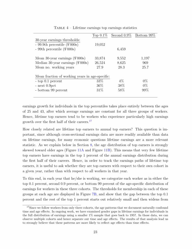
Table 4 – Lifetime earnings top earnings statistics
Top 0.1% Second 0.9% Bottom 99%30-year earnings thresholds:- 99.9th percentile ($’000s) 19,052- 99th percentile ($’000s) 6,459
Mean 30-year earnings ($’000s) 33,874 9,552 1,197Median 30-year earnings ($’000s) 26,524 8,625 969Mean no. working years 27.9 28.3 25.7
Mean fraction of working years in age-specific:- top 0.1 percent 33% 4% 0%- next 0.9pct 36% 38% 0%- bottom 99 percent 31% 58% 99%
earnings growth for individuals in the top percentiles takes place entirely between the ages
of 25 and 43, after which average earnings are constant for all three groups of workers.
Hence, lifetime top earners tend to be workers who experience particularly high earnings
growth over the first half of their careers.17
How closely related are lifetime top earners to annual top earners? This question is im-
portant, since although cross-sectional earnings data are more readily available than data
on lifetime earnings, for many economic questions lifetime earnings are a more relevant
statistic. As we explain below in Section 8, the age distribution of top earners is strongly
skewed toward older ages (Figure 11A and Figure 11B). This means that very few lifetime
top earners have earnings in the top 1 percent of the annual earnings distribution during
the first half of their careers. Hence, in order to track the earnings paths of lifetime top
earners, it is useful to ask whether they are top earners with respect to their own cohort in
a given year, rather than with respect to all workers in that year.
To this end, in each year that he/she is working, we categorize each worker as in either the
top 0.1 percent, second 0.9 percent, or bottom 99 percent of the age-specific distribution of
earnings for workers in these three cohorts. The thresholds for membership in each of these
groups at each age are displayed in Figure 7B, and show that the gap between the top 0.1
percent and the rest of the top 1 percent starts out relatively small and then widens from
17Since we follow workers from only three cohorts, the age patterns that we document naturally confoundtime and age effects. In ongoing work, we have examined gender gaps in lifetime earnings for individuals inthe full distribution of earnings using a smaller 1% sample that goes back to 1957. In those data, we canobserve multiple cohorts and hence separate out time and age effects. The results of that analysis lead usto strongly believe that these patterns are more likely to reflect age effects than time effects.
23

Figure 7 – Age profiles by 30-year top earning groups
(A) Mean earnings by age10
11
12
13
14
15
Log $
’000s
25 35 45 55age
Top 0.1% Second 0.9% Bottom 99%
(B) Age-specific top-earning thresholds
0500
1000
1500
$’0
00s
25 35 45 55age
Top 0.1% threshold Top 1% threshold
(C) Location of lifetime top 0.1 percent in age-specific distributions
0.2
.4.6
.81
25 35 45 55age
Top 0.1% Second 0.9%
Bottom 99% Not working
(D) Location of lifetime top 1 percent in age-specific distributions
0.2
.4.6
.81
25 35 45 55age
Top 0.1% Second 0.9%
Bottom 99% Not working
Notes: Figures refer to individuals from the 1956, 1957, and 1958 birth cohorts. Age-specific
top-earning thresholds and groups are computed using only these three cohorts.
ages 25 to 43.
When compared with members of their own cohort, lifetime top earners and annual top
earners are two very different groups. Typical members of the lifetime top 0.1 percent spend
nearly one-third of their working years in the bottom 99 percent of their cohort’s annual
earnings distribution. The remaining two-thirds of their working years are on average split
evenly between the top 0.1 percent and the second 0.9 percent of earners. The second 0.9
percent of lifetime earners spend over half of their working years as members of the bottom
99 percent of annual earnings and only 4% of their time in the top 0.1 percent. The average
breakdown of working years for lifetime top earners in each annual earnings group is shown
in the bottom three rows of Table 4.
24

The disconnect between annual top earners and lifetime top earners is particularly salient
early in the working life. This can be seen in Figure 7C and Figure 7D, which show,
respectively, the fraction of the lifetime top 0.1 percent and second 0.9 percent at each
age that are in the within-cohort annual top 0.1 percent, second 0.9 percent, and bottom
99 percent, as well as the fraction that are not working. At young ages, well over half
of both groups of lifetime top earners are in the bottom 99 percent, and even during the
peak earnings years during the mid-40s, around 40% of the second 0.9 percent of lifetime
top earners are in the bottom 99 percent of their within-cohort distribution. This pattern
of earnings growth – starting low and rising rapidly – is consistent with the predictions of
models of human capital accumulation in the presence of heterogeneity in abilities (see, e.g.,
Ben-Porath (1967), Guvenen and Kuruscu (2010), and Huggett et al. (2011)). Consequently,
identifying individuals as annual top earners may give at best a very noisy signal about their
long-term prospects as lifetime top earners.
6.2 Gender Differences in Lifetime Top Earners
Since the individuals in the top percentiles of the earnings distribution based on short hori-
zons are possibly a very different group of individuals compared with those that are in the
top percentiles based on lifetime earnings, gender differences among annual or five-year top
earners may or may not be informative about gender differences among lifetime top earn-
ers. In this section, we investigate these differences by measuring gender differences among
lifetime top earners directly. Analogously to our analysis of gender differences in Section
4, we approach the measurement of lifetime top earner gender gaps from two perspectives.
First, we compare males and females in the top percentiles of the overall lifetime earnings
distribution. Second, we compare males and females classified as top earners with respect
to their gender-specific lifetime earnings distribution.
Gender Composition of Overall Lifetime Top Earners
For the 1956–58 cohorts, about 12% of the top 0.1 percent of lifetime earners were females
(Panel A of Table 5). This compares with an average female share of the top 0.1 percent
of annual earners for this period of 8%. The fraction of the second 0.9 percent of lifetime
earners who were females was 13%, which was also the average female share of the second
0.9 percent of earners over this period.
Within the top 0.1 percent, average lifetime earnings are higher for males than females:
there is a 17 basis point difference in the log mean and a 7 basis point difference in the
log median. For the second 0.9 percent, these differences are both around 5 basis points.
25
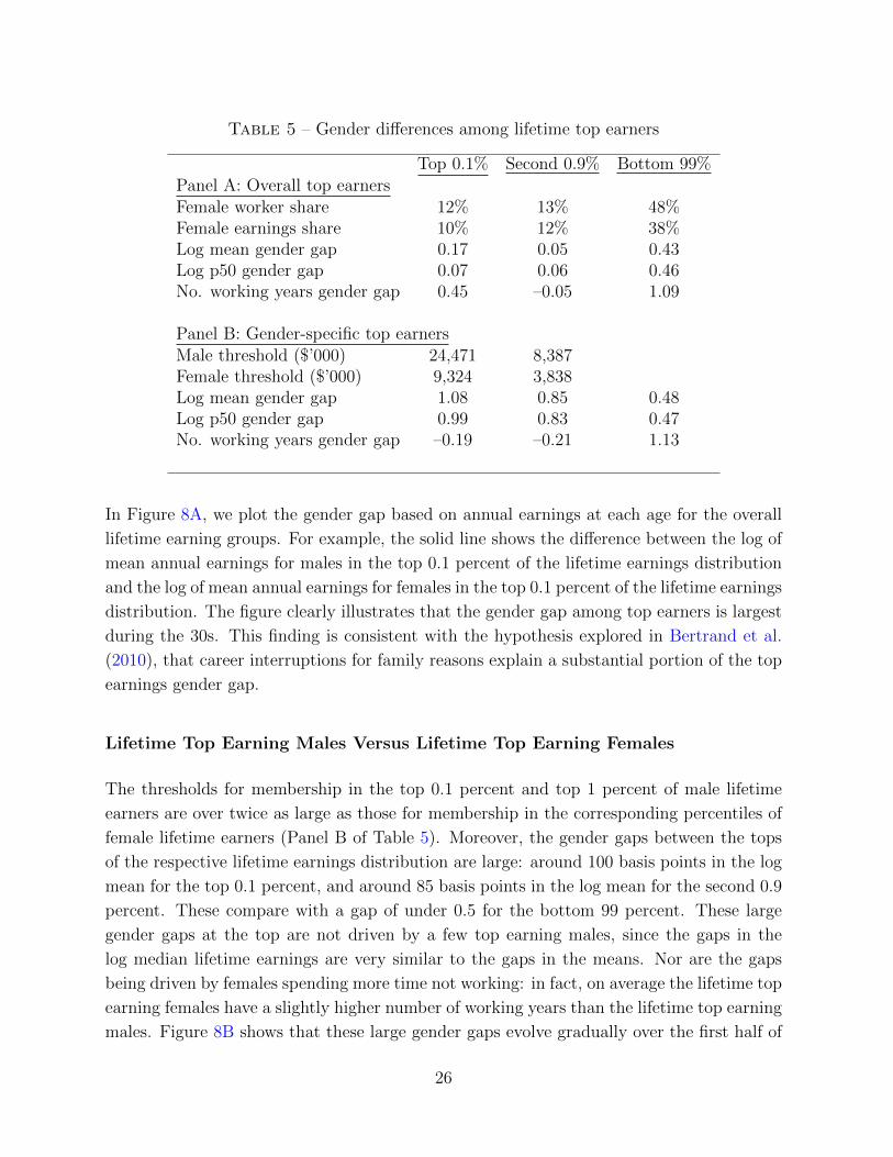
Table 5 – Gender differences among lifetime top earners
Top 0.1% Second 0.9% Bottom 99%Panel A: Overall top earnersFemale worker share 12% 13% 48%Female earnings share 10% 12% 38%Log mean gender gap 0.17 0.05 0.43Log p50 gender gap 0.07 0.06 0.46No. working years gender gap 0.45 –0.05 1.09
Panel B: Gender-specific top earnersMale threshold ($’000) 24,471 8,387Female threshold ($’000) 9,324 3,838Log mean gender gap 1.08 0.85 0.48Log p50 gender gap 0.99 0.83 0.47No. working years gender gap –0.19 –0.21 1.13
In Figure 8A, we plot the gender gap based on annual earnings at each age for the overall
lifetime earning groups. For example, the solid line shows the difference between the log of
mean annual earnings for males in the top 0.1 percent of the lifetime earnings distribution
and the log of mean annual earnings for females in the top 0.1 percent of the lifetime earnings
distribution. The figure clearly illustrates that the gender gap among top earners is largest
during the 30s. This finding is consistent with the hypothesis explored in Bertrand et al.
(2010), that career interruptions for family reasons explain a substantial portion of the top
earnings gender gap.
Lifetime Top Earning Males Versus Lifetime Top Earning Females
The thresholds for membership in the top 0.1 percent and top 1 percent of male lifetime
earners are over twice as large as those for membership in the corresponding percentiles of
female lifetime earners (Panel B of Table 5). Moreover, the gender gaps between the tops
of the respective lifetime earnings distribution are large: around 100 basis points in the log
mean for the top 0.1 percent, and around 85 basis points in the log mean for the second 0.9
percent. These compare with a gap of under 0.5 for the bottom 99 percent. These large
gender gaps at the top are not driven by a few top earning males, since the gaps in the
log median lifetime earnings are very similar to the gaps in the means. Nor are the gaps
being driven by females spending more time not working: in fact, on average the lifetime top
earning females have a slightly higher number of working years than the lifetime top earning
males. Figure 8B shows that these large gender gaps evolve gradually over the first half of
26
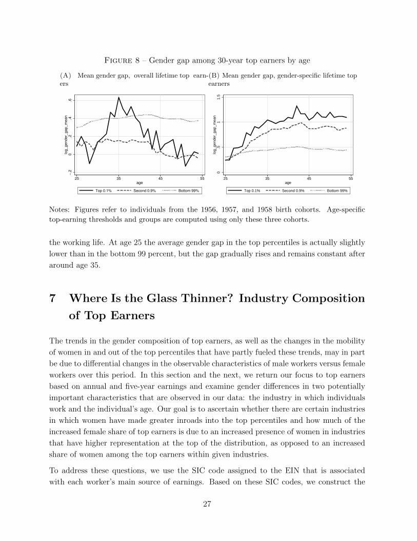
Figure 8 – Gender gap among 30-year top earners by age
(A) Mean gender gap, overall lifetime top earn-ers
−.2
0.2
.4.6
log_gender_
gap_m
ean
25 35 45 55age
Top 0.1% Second 0.9% Bottom 99%
(B) Mean gender gap, gender-specific lifetime topearners
0.5
11.5
log_gender_
gap_m
ean
25 35 45 55age
Top 0.1% Second 0.9% Bottom 99%
Notes: Figures refer to individuals from the 1956, 1957, and 1958 birth cohorts. Age-specific
top-earning thresholds and groups are computed using only these three cohorts.
the working life. At age 25 the average gender gap in the top percentiles is actually slightly
lower than in the bottom 99 percent, but the gap gradually rises and remains constant after
around age 35.
7 Where Is the Glass Thinner? Industry Composition
of Top Earners
The trends in the gender composition of top earners, as well as the changes in the mobility
of women in and out of the top percentiles that have partly fueled these trends, may in part
be due to differential changes in the observable characteristics of male workers versus female
workers over this period. In this section and the next, we return our focus to top earners
based on annual and five-year earnings and examine gender differences in two potentially
important characteristics that are observed in our data: the industry in which individuals
work and the individual’s age. Our goal is to ascertain whether there are certain industries
in which women have made greater inroads into the top percentiles and how much of the
increased female share of top earners is due to an increased presence of women in industries
that have higher representation at the top of the distribution, as opposed to an increased
share of women among the top earners within given industries.
To address these questions, we use the SIC code assigned to the EIN that is associated
with each worker’s main source of earnings. Based on these SIC codes, we construct the
27
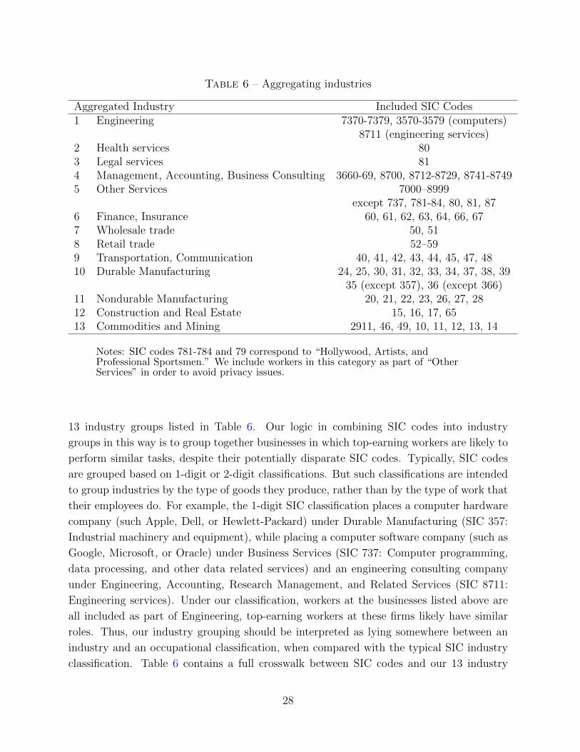
Table 6 – Aggregating industries
Aggregated Industry Included SIC Codes1 Engineering 7370-7379, 3570-3579 (computers)
8711 (engineering services)2 Health services 803 Legal services 814 Management, Accounting, Business Consulting 3660-69, 8700, 8712-8729, 8741-87495 Other Services 7000–8999
except 737, 781-84, 80, 81, 876 Finance, Insurance 60, 61, 62, 63, 64, 66, 677 Wholesale trade 50, 518 Retail trade 52–599 Transportation, Communication 40, 41, 42, 43, 44, 45, 47, 4810 Durable Manufacturing 24, 25, 30, 31, 32, 33, 34, 37, 38, 39
35 (except 357), 36 (except 366)11 Nondurable Manufacturing 20, 21, 22, 23, 26, 27, 2812 Construction and Real Estate 15, 16, 17, 6513 Commodities and Mining 2911, 46, 49, 10, 11, 12, 13, 14
Notes: SIC codes 781-784 and 79 correspond to “Hollywood, Artists, andProfessional Sportsmen.” We include workers in this category as part of “OtherServices” in order to avoid privacy issues.
13 industry groups listed in Table 6. Our logic in combining SIC codes into industry
groups in this way is to group together businesses in which top-earning workers are likely to
perform similar tasks, despite their potentially disparate SIC codes. Typically, SIC codes
are grouped based on 1-digit or 2-digit classifications. But such classifications are intended
to group industries by the type of goods they produce, rather than by the type of work that
their employees do. For example, the 1-digit SIC classification places a computer hardware
company (such Apple, Dell, or Hewlett-Packard) under Durable Manufacturing (SIC 357:
Industrial machinery and equipment), while placing a computer software company (such as
Google, Microsoft, or Oracle) under Business Services (SIC 737: Computer programming,
data processing, and other data related services) and an engineering consulting company
under Engineering, Accounting, Research Management, and Related Services (SIC 8711:
Engineering services). Under our classification, workers at the businesses listed above are
all included as part of Engineering, top-earning workers at these firms likely have similar
roles. Thus, our industry grouping should be interpreted as lying somewhere between an
industry and an occupational classification, when compared with the typical SIC industry
classification. Table 6 contains a full crosswalk between SIC codes and our 13 industry
28

groups. In Appendix 7 we report the SIC codes of selected large U.S. companies.
We assign each individual to the industry that corresponds to the SIC code of their main
employer in year t (i.e., the employer that contributes to the largest share of their annual
earnings). For five-year average earnings, we define their industry as the SIC code of their
main employer in the most recent year t + 2. To minimize the number of figures in the
main text, in this section we only report results based on five-year average earnings. The
analogous figures using annual earnings can be found in Appendix 7, and they yield similar
conclusions.
7.1 Industry Composition of All Top Earners
Finance and Insurance is by far the most highly represented industry among the highest
earners. For the five-year period 2008–12, 31% of individuals in the top 0.1 percent worked
for employers in the Finance and Insurance industries, and these workers received 32% of
the earnings of all individuals in the top 0.1 percent. Among the second 0.9 percent of
workers, Health services is the most highly represented industry, in terms of both numbers
of workers and share of earnings, with Finance and Insurance a close second. Together
these two industries accounted for 33% of workers in the second 0.9 percent in 2008–12 and
accounted for 34% of the earnings of the second 0.9 percent. The population shares and
earning shares of each of the 13 industry groups among top earners in 2008–12 can be seen
as the grey bars in Figure 9A and Figure 9C (top 0.1 percent), and in Figure 9B and Figure
9D (second 0.9 percent).
Interestingly, the industry share of top earners has not always looked his way. In the early
1980s, employers in the Health services industry represented a larger share of top earners
than Finance and Insurance, in terms of both number of workers and total earnings. In
addition, employers in Manufacturing, particularly those in Durable Manufacturing, had
a very strong presence at the top of the earnings distribution. Hence, over the last three
decades, the major change in the industry composition of top earners has been the rise in
earnings in the Finance and Insurance industry, offset by a relative decline in the earnings
of the highest paid doctors and, to a lesser extent, a relative decline for the highest earners
employed by manufacturing firms. These changes can be seen in the panels of Figure
9 by comparing the solid black bars, which show the population and earnings shares of
each industry group among top earners in 1981–85, with the grey bars, which show the
corresponding shares in 2008–12.
Finance and Insurance not only is the industry in which top earners are most likely to
work, but also is the industry that is most heavily composed of top earners. For example,
29

Figure 9 – Industry composition of top earners, five-year average earnings
(A) Population shares, top 0.1 percent
0.1
.2.3
Fin
ance
, Ins
uran
ce
Hea
lth
Lega
l
Eng
., S
oftw
are,
Com
p.
Mgm
t, A
cct,
Con
sulti
ngC
onst
r., R
eal E
stat
eC
omm
oditi
es, M
inin
gD
urab
le M
anuf
act.
Non
dura
ble
Man
ufac
t.W
hole
sale
Tra
deR
etai
l Tra
deTra
nsp.
, Com
mun
.O
ther
Ser
vice
s1981−85 2008−12
(B) Population shares, second 0.9 percent
0.0
5.1
.15
.2Fin
ance
, Ins
uran
ce
Hea
lth
Lega
l
Eng
., S
oftw
are,
Com
p.
Mgm
t, A
cct,
Con
sulti
ngC
onst
r., R
eal E
stat
eC
omm
oditi
es, M
inin
gD
urab
le M
anuf
act.
Non
dura
ble
Man
ufac
t.W
hole
sale
Tra
deR
etai
l Tra
deTra
nsp.
, Com
mun
.O
ther
Ser
vice
s
1981−85 2008−12
(C) Earnings shares, top 0.1 percent
0.1
.2.3
Fin
ance
, Ins
uran
ce
Hea
lth
Lega
l
Eng
., S
oftw
are,
Com
p.
Mgm
t, A
cct,
Con
sulti
ngC
onst
r., R
eal E
stat
eC
omm
oditi
es, M
inin
gD
urab
le M
anuf
act.
Non
dura
ble
Man
ufac
t.W
hole
sale
Tra
deR
etai
l Tra
deTra
nsp.
, Com
mun
.O
ther
Ser
vice
s
1981−85 2008−12
(D) Earnings shares, second 0.9 percent0
.05
.1.1
5.2
Fin
ance
, Ins
uran
ce
Hea
lth
Lega
l
Eng
., S
oftw
are,
Com
p.
Mgm
t, A
cct,
Con
sulti
ngC
onst
r., R
eal E
stat
eC
omm
oditi
es, M
inin
gD
urab
le M
anuf
act.
Non
dura
ble
Man
ufac
t.W
hole
sale
Tra
deR
etai
l Tra
deTra
nsp.
, Com
mun
.O
ther
Ser
vice
s
1981−85 2008−12
(E) Population shares, top 0.1 percent relative tobottom 99 percent
01
23
4Fin
ance
, Ins
uran
ce
Hea
lth
Lega
l
Eng
., S
oftw
are,
Com
p.
Mgm
t, A
cct,
Con
sulti
ngC
onst
r., R
eal E
stat
eC
omm
oditi
es, M
inin
gD
urab
le M
anuf
act.
Non
dura
ble
Man
ufac
t.W
hole
sale
Tra
deR
etai
l Tra
deTra
nsp.
, Com
mun
.O
ther
Ser
vice
s
1981 2008−12
(F) Population shares, second 0.9 percent relativeto bottom 99 percent
01
23
4Fin
ance
, Ins
uran
ce
Hea
lth
Lega
l
Eng
., S
oftw
are,
Com
p.
Mgm
t, A
cct,
Con
sulti
ngC
onst
r., R
eal E
stat
eC
omm
oditi
es, M
inin
gD
urab
le M
anuf
act.
Non
dura
ble
Man
ufac
t.W
hole
sale
Tra
deR
etai
l Tra
deTra
nsp.
, Com
mun
.O
ther
Ser
vice
s
1981 2008−12
30

in 2008–12, a worker in the top 0.1 percent of the earnings distribution was over four times
as likely to be working in Finance and Insurance as a worker in the bottom 99 percent of
the earnings distribution. This too was not always the case: in the early 1980s, a worker in
the top 0.1 percent was only around twice as likely to be working in Finance and Insurance
as one in the bottom 99 percent. Instead, in the 1980s the industry with the highest relative
likelihood of being in the top 0.1 percent was Legal services, for which the ratio has dropped
from 4.2 to around 2.6. These changes can be seen in Figure 9E, which shows how the share
of each industry in the top 0.1 percent relative to the share of that industry in the bottom 99
percent, has changed between the period 1981–85 and the period 2008–12. For the second
0.9 percent, Legal services was, and still are, the industry with the highest representation
relative to its representation in the bottom 99 percent (Figure 9F).
7.2 Gender Differences in Industry Composition
Surprisingly little variation can be seen across industries in the gender composition of overall
top earners. In 2008–12, the share of females varied from 6% in Health services to just
under 15% in Nondurable Manufacturing and Retail Trade for the top 0.1 percent (Figure
10A), and from just over 10% in Construction and Real Estate to 24% in Nondurable
Manufacturing for the second 0.9 percent (Figure 10B). Thus, although some variation can
be seen across industries, today there is no single industry, or subset of industries, in which
top earning females are disproportionately absent. Thirty years ago, however, the share of
females among top earning workers in Retail Trade and Other Services was substantially
higher compared with other industries.
The similarity across industries in terms of the gender composition of top earners suggests
that the large increase in the overall representation of females at the top of the earnings
distribution is not due to females disproportionately moving into high earning industries
like Finance and Health services. Moreover, the industry composition of top earners in the
most recent five-year period 2008–12, shown in Figures 10C and 10D, is almost identical
for males and females, suggesting that the remaining gender differences among top earners
are not due to an underrepresentation of females at the top of any one industry, but rather
are an across-the-board phenomenon.
The conclusion that gender differences in industry shares do not play a role in understanding
changes in the gender composition of top earners is confirmed by a formal decomposition.
In Appendix A, we explain our procedure for decomposing the change in the gender compo-
sition of top earners into (i) a component that is due to changes in the industry composition
of working females across the entire earnings distribution; (ii) a component that is due to
changes in the industry composition of top earners of both genders; and (iii) a component
31

Figure 10 – Top earners by industry and gender, five-year average earnings
(A) Share of females by industry within top0.1 percent
0.0
5.1
.15
Fin
ance
, Ins
uran
ce
Hea
lth
Lega
l
Eng
., S
oftw
are,
Com
p.
Mgm
t, A
cct,
Con
sulti
ngC
onst
r., R
eal E
stat
eC
omm
oditi
es, M
inin
gD
urab
le M
anuf
act.
Non
dura
ble
Man
ufac
t.W
hole
sale
Tra
deR
etai
l Tra
deTra
nsp.
, Com
mun
.O
ther
Ser
vice
s1981−85 2008−2012
(B) Share of females by industry within top 0.9percent
0.0
5.1
.15
.2.2
5Fin
ance
, Ins
uran
ce
Hea
lth
Lega
l
Eng
., S
oftw
are,
Com
p.
Mgm
t, A
cct,
Con
sulti
ngC
onst
r., R
eal E
stat
eC
omm
oditi
es, M
inin
gD
urab
le M
anuf
act.
Non
dura
ble
Man
ufac
t.W
hole
sale
Tra
deR
etai
l Tra
deTra
nsp.
, Com
mun
.O
ther
Ser
vice
s
1981−85 2008−2012
(C) Industry shares by gender within top 0.1 per-cent, 2008–12
0.1
.2.3
Fin
ance
, In
sura
nce
Health
Legal
Eng., S
oftw
are
, C
om
p.
Mgm
t, A
cct, C
onsu
lting
Const
r., R
eal E
state
Com
moditi
es,
Min
ing
Dura
ble
Manufa
ct.
Nondura
ble
Manufa
ct.
Whole
sale
Tra
de
Reta
il Tra
de
Tra
nsp
., C
om
mun.
Oth
er S
erv
ices
Males Females
(D) Industry shares by gender within second 0.9percent, 2008–12
0.0
5.1
.15
.2Fin
ance
, In
sura
nce
Health
Legal
Eng., S
oftw
are
, C
om
p.
Mgm
t, A
cct, C
onsu
lting
Const
r., R
eal E
state
Com
moditi
es,
Min
ing
Dura
ble
Manufa
ct.
Nondura
ble
Manufa
ct.
Whole
sale
Tra
de
Reta
il Tra
de
Tra
nsp
., C
om
mun.
Oth
er S
erv
ices
Males Females
that is due to changes in the gender composition of top earners within industries. The re-
sults of the decomposition, which are reported in Table 7, show that industry composition
plays no role whatsoever in accounting for the increased representation of females at the
top of the distribution. In fact, the contribution of the first two components is negative,
suggesting that on average over this period there was a shift of the industry composition of
working females toward industries that are slightly underrepresented in the top percentiles,
and a shift of the industry composition of top earners toward industries with less female
representation.
Although the last three decades have seen significant changes in the industry composition
of top earners overall, these changes have been relatively similar for males and females and
do not account for the changes in the gender structure of top earners over this period.
32

Table 7 – Decomposition of change in share of females among top earners
Annual earnings Five-year earningsTop 0.1% Second 0.9% Top 0.1% Second 0.9%
Change in share 0.09 0.14 0.09 0.14Fraction due to:- ind. comp. of females in labor force –3% –2% –1% 0%- ind. comp. of top earners 5% 5% 5% 6%- female share of top earners within ind 98% 97% 96% 94%
Notes: Change for annual earnings is 1981-2012, and change for five-year earnings is1983-2010 (centered five-year groups).
8 Looking Upward? Gender Differences in Top Earn-
ings by Age
Since earnings growth at young ages is a key driver of earnings later in life, we can gain
insight into possible future paths for gender differences among top earners by examining
how top earnings gender gaps vary by age. Hence, in this section we divide the population
of 25- to 60-year-olds into five-year age groups and study both the age distribution of top
earners as well as the composition of top earners among individuals of a given age. Our
goals are to ascertain whether top earning gender gaps already exist at the time of entry
into the labor market or whether they emerge slowly as a cohort ages, and to measure
how much of the increase in the share of females among top earners is due to shifts in the
gender composition of recently entered cohorts versus changes that have occurred within
older cohorts. To keep the presentation of the results manageable, in this section we only
report our findings for five-year average earnings. The analogous figures for annual earnings
lead to similar conclusions and are contained in Appendix G.18
8.1 Age and Gender Composition of Top Earners
Relative to the average age of the workforce, top earners are old and have become more
so since the 1980s. For earnings over the five-year period 2008–12, 58% of the individuals
in the top 0.1 percent were ages 47 to 58 in 2010 (we measure an individual’s age in the
middle of the five years used to construct average earnings), and 21% were ages 27 to 41.
18We analyze five-year earnings for five-year age groups. We denote each group by their age in themiddle of the five-year period. So, for example, the 27-31 age group over the period 2008-12 refers toaverage earnings during this period for individuals who were ages 27-31 in 2010.
33

Figure 11 – Age distribution of workers, five-year average earnings
(A) Age distribution of individuals in top 0.1 per-cent
0.0
5.1
.15
.2.2
5.3
27−31 32−36 37−41 42−46 47−51 52−58
1981−85 2008−12
(B) Age distribution of individuals in second 0.9percent
0.0
5.1
.15
.2.2
5.3
27−31 32−36 37−41 42−46 47−51 52−58
1981−85 2008−12
Notes: Age labels in figures refer to center year of five-year age ranges. For example, 27-31 refers
to the five-year age ranges 25-29, 26-30, ... 29-33.
By contrast, for earnings over the five-year period 1981–85, only 48% of individuals in the
top 0.1 percent of the earnings distribution were ages 47 to 58 in 1983, and more than 31%
were below 40. This aging of top earners can clearly be seen in Figure 11A, which shows the
fraction of top earners in each five-year age bin for these two five-year periods. A similar
pattern and trend is evident among the second 0.9 percent of earners (Figure 11B), as well
as for the share of top earnings that accrues to individuals of different age groups.
This large change in the age composition of top earners is a possible source of changes
in the gender composition of top earners. Since top earners overall have become older, if
female workers were on average initially older than male workers, then this would generate
an increase in the share of females among top earners. In 1981–85, working females were
indeed slightly older than males, although the difference is small. The aging of the labor
force over this period was more pronounced for females than males, which could also generate
an increase in the share of females among top earners (see Appendix G for figures illustrating
these features of the data). Thus, a plausible conjecture is that part of the increased share
of females among top earners is due to compositional effects related to the aging of the
workforce.
Indeed, a formal decomposition confirms that around 12% to 17% of the increased share of
females among top earners is due to age differences across males and females. In Appendix
A, we explain our procedure for decomposing the change in the gender composition of top
earners into (i) a component that is due to changes in the age composition of top earners
relative to the age composition of the bottom 99 percent; (ii) a component that is due to
34
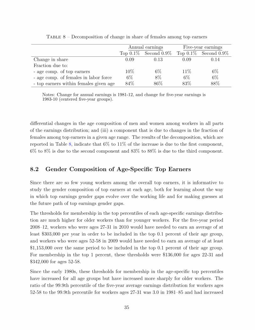
Table 8 – Decomposition of change in share of females among top earners
Annual earnings Five-year earningsTop 0.1% Second 0.9% Top 0.1% Second 0.9%
Change in share 0.09 0.13 0.09 0.14Fraction due to:- age comp. of top earners 10% 6% 11% 6%- age comp. of females in labor force 6% 8% 6% 6%- top earners within females given age 84% 86% 83% 88%
Notes: Change for annual earnings is 1981-12, and change for five-year earnings is1983-10 (centered five-year groups).
differential changes in the age composition of men and women among workers in all parts
of the earnings distribution; and (iii) a component that is due to changes in the fraction of
females among top earners in a given age range. The results of the decomposition, which are
reported in Table 8, indicate that 6% to 11% of the increase is due to the first component,
6% to 8% is due to the second component and 83% to 88% is due to the third component.
8.2 Gender Composition of Age-Specific Top Earners
Since there are so few young workers among the overall top earners, it is informative to
study the gender composition of top earners at each age, both for learning about the way
in which top earnings gender gaps evolve over the working life and for making guesses at
the future path of top earnings gender gaps.
The thresholds for membership in the top percentiles of each age-specific earnings distribu-
tion are much higher for older workers than for younger workers. For the five-year period
2008–12, workers who were ages 27-31 in 2010 would have needed to earn an average of at
least $303,000 per year in order to be included in the top 0.1 percent of their age group,
and workers who were ages 52-58 in 2009 would have needed to earn an average of at least
$1,153,000 over the same period to be included in the top 0.1 percent of their age group.
For membership in the top 1 percent, these thresholds were $136,000 for ages 22-31 and
$342,000 for ages 52-58.
Since the early 1980s, these thresholds for membership in the age-specific top percentiles
have increased for all age groups but have increased more sharply for older workers. The
ratio of the 99.9th percentile of the five-year average earnings distribution for workers ages
52-58 to the 99.9th percentile for workers ages 27-31 was 3.0 in 1981–85 and had increased
35

Figure 12 – Female population shares by age group and cohort, five-year average earnings
(A) Share of females among top 0.1 percent, byage group
0.0
5.1
.15
Share
1980 1985 1990 1995 2000 2005 2010year
27−31 32−36 37−41
42−46 47−51 52−58
(B) Share of females among second 0.9 percent, byage group
0.1
.2.3
Share
1980 1985 1990 1995 2000 2005 2010year
27−31 32−36 37−41
42−46 47−51 52−58
(C) Share of females among top 0.1 percent bycohort
0.0
5.1
.15
Share
1980 1985 1990 1995 2000 2005 2010year
1934 1939 1944 1949 1954
1959 1964 1969 1974 1979
(D) Share of females among second 0.9 percent bycohort
0.1
.2.3
Share
1980 1985 1990 1995 2000 2005 2010year
1934 1939 1944 1949 1954
1959 1964 1969 1974 1979
to 3.8 by 2008–12. See Appendix G for the full time series of top-earning thresholds for
each age group.
The share of females among the top 0.1 percent and second 0.9 percent of earners in a given
age group, shown in Figure 12A and Figure 12B respectively, is substantially higher for
younger workers. However, in recent years, the share of females among the top 0.1 percent
of young workers has increased substantially less than the share of females among the top
0.1 percent of older workers. This is in contrast to the second 0.9 percent, for which there
has been a steady increase in the share of females among top earners of all age groups.
Hence, the data show very different trends for the gender composition of young workers
in the second 0.9 percent versus those in the top 0.1 percent of the earnings distribution.
Whereas the share of females among the second 0.9 percent of workers ages 27-31 increased
36

by more than one-third between the period 1993–97 and the period 2008–12 (from 22% to
29%), the share of females among the top 0.1 percent of workers ages 27-31 barely changed
over the same period (from 12% to 14.0%).
Viewing these same trends from a cohort perspective rather than an age perspective reveals
a striking observation about the source of the increased female share of top earners: almost
all of the increase has come from the entry of successive cohorts with higher proportions
of females among top earners at all ages, rather than from an increase in the female share
within existing cohorts. This can be seen most clearly for the second 0.9 percent in Figure
12D, which plots the same data as in Figure 12B, but connects the data for individuals from
the same birth cohorts rather than individuals of the same age. Almost no increase has
occurred in the share of females among the second 0.9 percent of workers within cohorts,
and the female shares for the more recent cohorts have actually declined as these cohorts
have aged. However, a striking increase has occurred in the gender composition of top
earners across cohorts. The same trends are evident for the top 0.1 percent (Figure 12C),
with the exception of the 1948 and 1953 birth cohorts, which were unique in that the female
share increased as these cohorts aged.
If new cohorts continue to follow life-cycle trends for top earner gender shares that are
similar to those cohorts just older than them, then these figures imply that we may expect
to see a continued increase in the share of females in the second 0.9 percent of earners in
the next decade, but perhaps a leveling off of the share of females in the top 0.1 percent.
On the other hand, if these younger cohorts turn out to have trajectories for top earnings
shares that mirror more closely those of the baby boomer cohorts, the share of females may
continue to rise even at the very top of the earnings distribution.
9 Conclusions
Although we have intentionally remained relatively descriptive in this paper, our findings
potentially have important implications for a number of aspects of the U.S. economy. There-
fore, rather than concluding with a summary of our findings (for that, we refer readers to
the introduction), we will conclude by mentioning some areas in which our empirical obser-
vations suggest the need for complementary theoretical work and further empirical analysis
using other data sources.
We found that although the share of females among the top 1 percent has increased steadily
over the last 30 years, the fraction of females in the top 0.1 percent has barely increased
during the last decade, and the gender composition of both top earning groups is still very
37

different from the composition of the bottom 99 percent. These findings reinforce the need
for research into the factors that can account for both the glass ceiling and the paper floor.
Our analysis of lifetime top earners revealed that the timing of the emergence of the top
earnings gender gap is consistent with the hypothesis that career interruptions may be
an important consideration. Our finding that industry composition plays very little role in
explaining either the level or the change in the top earnings gender gap suggests that in this
respect, selection into particular firms or jobs may be more important than selection into
particular industries. Unfortunately, the SSA data lack many of the important variables
that would be required for a more complete answer to this question: children, marital status,
and work hours.
The large temporary component in top earners’ earnings, the increasing persistence of
top earner status, and the relatively weak relationship between annual top earners and
lifetime top earners, all suggest the need for a comprehensive analysis of the dynamics of top
earnings. Although an extensive literature has proposed and estimated various statistical
models that provide a good fit to the dynamics of earnings for the bulk of the distribution,
little is currently known about how well this class of models fits earnings dynamics for top
earners.
On the theory side, our findings suggest the need for progress in at least two areas. First,
there is the need to understand how and why the earnings distribution is characterized
by a Pareto tail. Most existing theories of Pareto-generating mechanisms, such as the
accumulation of random returns over long periods of time, can be adapted to explaining
right-tail inequality in the wealth distribution, which is accumulated over time and passed
down across generations. But for explaining right-tail inequality in earnings, new theories
are necessary, since human capital is less easily transmitted across generations and, as we
have shown, a large fraction of top earnings is accrued within a lifetime, often in just a few
years.
Second, the rise of the Finance and Insurance industry in accounting for top earners of both
genders suggests a need for better theories of labor compensation in this sector. Why is
such a large share of labor earnings concentrated in a single industry? Does this reflect the
extraordinarily high productivity of this industry? Or do these earnings reflect rents? And
if so, rents to what? A useful starting point would be to study the top of the distribution
of earnings across and within firms, within industries.
38

References
Abowd, J. M. and Card, D. (1989). On the covariance structure of earnings and hours
changes. Econometrica, 57(2):411–445.
Auten, G., Gee, G., and Turner, N. (2013). Income inequality, mobility, and turnover
at the top in the US, 1987-2010. American Economic Review, Papers & Proceedings,
103(3):168–172.
Autor, D. H., Katz, L. F., and Kearney, M. S. (2008). Trends in U.S. wage inequality:
Revising the revisionists. Review of Economics and Statistics, 90(2):300–323.
Badel, A. and Huggett, M. (2014). Taxing top earners: A human capital perspective.
Working paper, Georgetown University.
Baker, S. R., Bloom, N., Canes-Wrone, B., Davis, S. J., and Rodden, J. A. (2014). Why
has U.S. policy uncertainty risen since 1960? American Economic Review, Papers and
Proceedings, 104(5):56–60.
Bakija, J., Cole, A., and Heim, B. (2012). Jobs and income growth of top earners and
the causes of changing income inequality: Evidence from U.S. tax return data. Working
paper, Williams College.
Barber, M. (2013). Ideological donors, contribution limits, and the polarization of state
legislatures. Technical report, Brigham Young University.
Bell, L. A. (2005). Women-led firms and the gender gap in top executive jobs. Discussion
Paper 1689, Institute for the Study of Labor (IZA).
Ben-Porath, Y. (1967). The production of human capital and the life cycle of earnings.
Journal of Political Economy, 75(4):352–365.
Bertrand, M., Black, S., Jensen, S., and Lleras-Muney, A. (2012). Breaking the glass ceiling?
The effect of board quotas on female labor market outcomes in Norway. Working paper,
University of Chicago.
Bertrand, M., Goldin, C., and Katz, L. F. (2010). Dynamics of the gender gap for young
professionals in the financial and corporate sectors. American Economic Journal: Applied
Economics, 2(3):228–255.
Brewer, M., Sibieta, L., and Wren-Lewis, L. (2007). Racing away? income inequality and
the evolution of high incomes.
39

Congressional Budget Office (2013). The distribution of household income and federal taxes,
2010.
Federal Glass Ceiling Commission (1995). A solid investment: Making full use of the
nation’s human capital. Technical report, U.S. Department of Labor, Washington, D.C.
Gabaix, X. and Landier, A. (2008). Why has CEO pay increased so much? Quarterly
Journal of Economics, 123(1):49–100.
Gayle, G.-L., Golan, L., and Miller, R. A. (2012). Gender differences in executive compen-
sation and job mobility. Journal of Labor Economics, 30(4):829–872.
Guner, N., Lopez-Daneri, M., and Ventura, G. (2014). Heterogeneity and government
revenues: Higher taxes at the top? Working paper, Arizona State University.
Guvenen, F., Kaplan, G., and Song, J. (2014a). How risky are recessions for top earners?
American Economic Review, Papers and Proceedings, 104(5):148–153.
Guvenen, F. and Kuruscu, B. (2010). A quantitative analysis of the evolution of the U.S.
wage distribution: 1970-2000. In Acemoglu, D., Rogoff, K., and Woodford, M., edi-
tors, NBER Macroeconomics Annual 2009, Vol. 24, pages 227–276. University of Chicago
Press.
Guvenen, F., Ozkan, S., and Song, J. (2014b). The nature of countercyclical income risk.
Journal of Political Economy, 122(3):621–660.
Hsieh, C.-T., Hurst, E., Jones, C. I., and Klenow, P. J. (2013). The allocation of talent and
U.S. economic growth. Working paper, Stanford University.
Huggett, M., Ventura, G., and Yaron, A. (2011). Sources of lifetime inequality. American
Economic Review, 101(7):2923–2954.
Jones, C. I. and Kim, J. (2014). A Schumpeterian model of top income inequality. Working
paper, Stanford University.
Juhn, C., Murphy, K. M., and Pierce, B. (1993). Wage inequality and the rise in returns to
skill. Journal of Political Economy, 101(3):410–442.
Kindermann, F. and Krueger, D. (2014). The redistributive benefits of progressive labor
and capital income taxation. Working paper, University of Pennsylvania.
Kopczuk, W., Saez, E., and Song, J. (2010). Earnings inequality and mobility in the United
States: Evidence from Social Security data since 1937. Quarterly Journal of Economics,
125(1):91–128.
40

Leonesio, M. V. and Del Bene, L. (2011). The distribution of annual and long-run US
earnings, 1981-2004. Social Security Bulletin, 71(1):17–33.
Meghir, C. and Pistaferri, L. (2004). Income variance dynamics and heterogeneity. Econo-
metrica, 72(1):1–32.
Olsen, A. and Hudson, R. (2009). Social Security Administration’s master earnings file:
Background information. Social Security Bulletin, 69(3):29–46.
Panis, C., Euller, R., Grant, C., Bradley, M., Peterson, C. E., Hirscher, R., and Steinberg,
P. (2000). SSA Program Data User’s Manual. Social Security Administration, Baltimore,
MD.
Parker, J. A. and Vissing-Jørgensen, A. (2010). The increase in income cyclicality of high-
income households and its relation to the rise in top income shares. Brookings Papers on
Economic Activity, 41(2):1–70.
Piketty, T. and Saez, E. (2003). Income inequality in the United States, 1913-1998. Quar-
terly Journal of Economics, 118(1):1–39.
Saez, E. (2001). Using elasticities to derive optimal income tax rates. Review of Economic
Studies, 68(1):205–229.
Saez, E. (2012). Striking it richer: The evolution of top incomes in the United States.
Working paper, University of California at Berkeley.
Storesletten, K., Telmer, C. I., and Yaron, A. (2004). Cyclical dynamics in idiosyncratic
labor market risk. Journal of Political Economy, 112(3):695–717.
Wolfers, J. (2006). Diagnosing discrimination: Stock returns and CEO gender. Journal of
the European Economic Association, 4(2-3):531–541.
41