the dark knight - film poster analysis
TRANSCRIPT
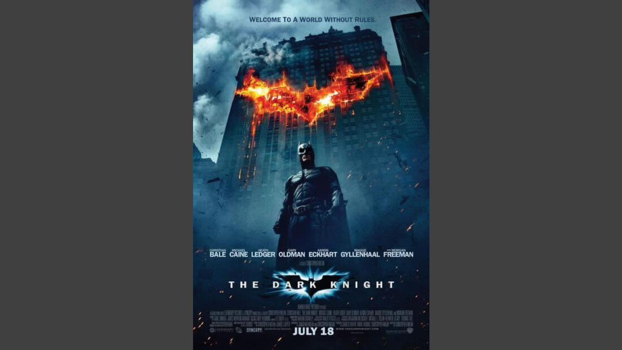
The next film poster I have chosen to analyse is ‘The Dark Knight’ which is an action-thriller film. The genre of the film is apparent due to the dark tones in colour used along with the Batman symbol which is depicted as being on fire. The text on the poster that is most prominent is the title of the film ‘The Dark Knight’, as it is bold and reasonably large, however this is not the only reason as to why, there is also the trademark Batman ident which is positioned behind the title. The use of the light around the outline of the bat illuminates the symbol making it appear attractive.From my research, I have found that on a majority of action film posters the writing of the title appears to be white, this is because the colour scheme of the poster is in a majority of very dark toned colours.
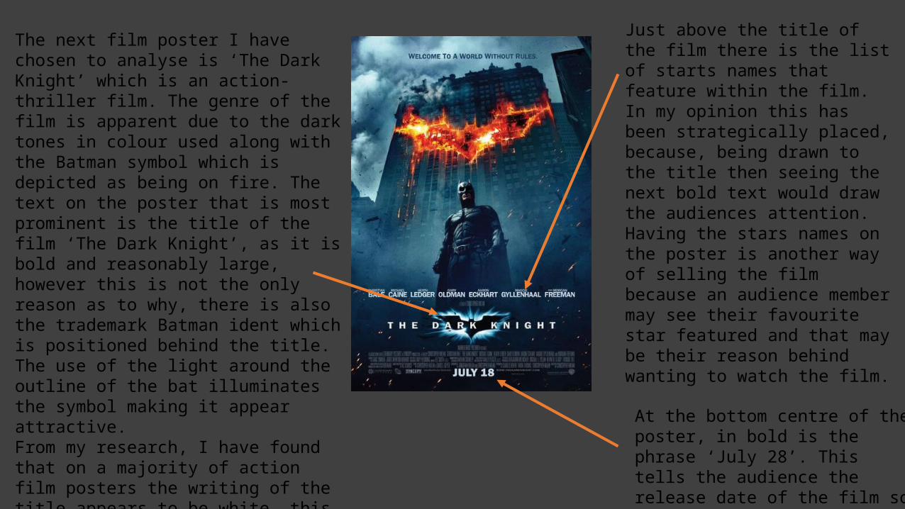
Just above the title of the film there is the list of starts names that feature within the film. In my opinion this has been strategically placed, because, being drawn to the title then seeing the next bold text would draw the audiences attention. Having the stars names on the poster is another way of selling the film because an audience member may see their favourite star featured and that may be their reason behind wanting to watch the film.
At the bottom centre of the poster, in bold is the phrase ‘July 28’. This tells the audience the release date of the film so that they are able to prepare to engage in the film.

On the poster there is the central image of the protagonist, Batman. The protagonist is framed in a low angle shot which makes him appear as a dominant and powerful figure (which is what the character of Batman is known for). The superiority of the character is supported by, the fact that he is positioned, firstly in the centre of the poster and also in the centre of what appears to be a crumbling building, this reinforces his dominance and shows his level of fear factor, 0. The protagonist is wearing an all in one black suit which amplifies his muscularity, along with a mask which shields his identity. The shielding of his identity makes this character more mysterious and the defined muscles show him to be powerful. As well as the character and the title of the film being key aspects of the poster, there is also two images of the trademark Batman ident which stand out significantly. The Bat symbol on the dishevelled building is portrayed as fire burning. This reinforces the genre of the film because it is a convention of the action genre which involves fire as a result of for example a battle, as fire connotes danger.
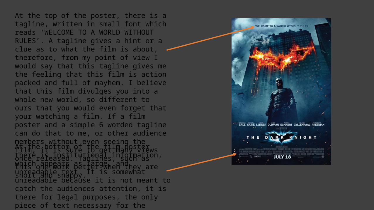
At the top of the poster, there is a tagline, written in small font which reads ‘WELCOME TO A WORLD WITHOUT RULES’. A tagline gives a hint or a clue as to what the film is about, therefore, from my point of view I would say that this tagline gives me the feeling that this film is action packed and full of mayhem. I believe that this film divulges you into a whole new world, so different to ours that you would even forget that your watching a film. If a film poster and a simple 6 worded tagline can do that to me, or other audience members without even seeing the film, it is sure to get many views once released. Taglines, such as this one work better when they are short and snappy.At the bottom of the film poster there is institutional information, which appears as large, and unreadable text. It is somewhat unreadable because it is not meant to catch the audiences attention, it is there for legal purposes, the only piece of text necessary for the audience to see is slightly lower, the release date, which is bold.
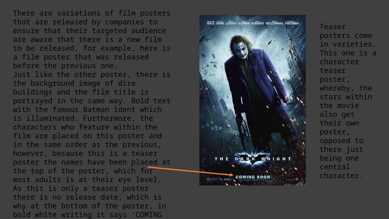
There are variations of film posters that are released by companies to ensure that their targeted audience are aware that there is a new film to be released, for example, here is a film poster that was released before the previous one.Just like the other poster, there is the background image of dire buildings and the film title is portrayed in the same way. Bold text with the famous Batman ident which is illuminated. Furthermore, the characters who feature within the film are placed on this poster and in the same order as the previous, however, because this is a teaser poster the names have been placed at the top of the poster, which for most adults is at their eye level.As this is only a teaser poster there is no release date, which is why at the bottom of the poster, in bold white writing it says ‘COMING SOON’. This text is almost illuminated which gives the impression that it is glowing, This stands out to the audience. The reason for this teaser poster, is so that the audience are aware that the film is not yet out, but they should keep an eye out because it will be released soon.
Teaser posters come in varieties. This one is a character teaser poster, whereby, the stars within the movie also get their own poster, opposed to there just being one central character.