the community and duke: changing health care delivery
TRANSCRIPT

THE COMMUNITY AND DUKE:
J. Lloyd Michener, MD
Professor and Chair
Department of Community and Family Medicine
Director, Duke Center for Community Research
Duke University Health System
American Association of Colleges of Osteopathic Medicine (AACOM)
April 9, 2010
DURHAM HEALTH INNOVATIONS Changing Health Care Delivery Systems –
Implications for Medical Education

Page 3
How do you start to fix the foundational issue around why our healthcare system is so expensive and yet so broken??
0
1000
2000
3000
4000
5000
6000
7000
1980
1982
1984
1986
1988
1990
1992
1994
1996
1998
2000
2002
2004
United StatesGermanyCanadaFranceAustraliaUnited Kingdom
Average spending on healthper capita ($US PPP)
Source: K. Davis, C. Schoen, S. Guterman, T. Shih, S. C. Schoenbaum, and I. Weinbaum, Slowing the Growth of U.S. Health Care Expenditures: What Are the Options?, The Commonwealth Fund, January 2007, updated with 2007 OECD data
Problem 1. Cost

Page 4
7681
88 84 89 8999 97
8897
109 106116 115 113
130 134128
115
65 71 71 74 74 77 80 82 82 84 84 90 93 96 101 103 103 104 110
0
50
100
150
Fran
ceJa
pan
Austra
liaSpa
in
Italy
Canad
aNor
wayNeth
erlan
dsSwed
enGre
ece
Austri
aGer
many
Finlan
dNew
Zeala
ndDen
mark
United
King
dom
Irelan
dPor
tuga
lUnit
ed S
tates
1997/98 2002/03
Countries’ age-standardized death rates, list of conditions considered amenable to health care Source: E. Nolte and C. M. McKee, Measuring the Health of Nations: Updating an Earlier Analysis, Health Affairs, January/February 2008, 27(1):58–71
USA worse/1937th by WHO
Problem 2. Quality

We are trying to provide care through a system designed for acute care
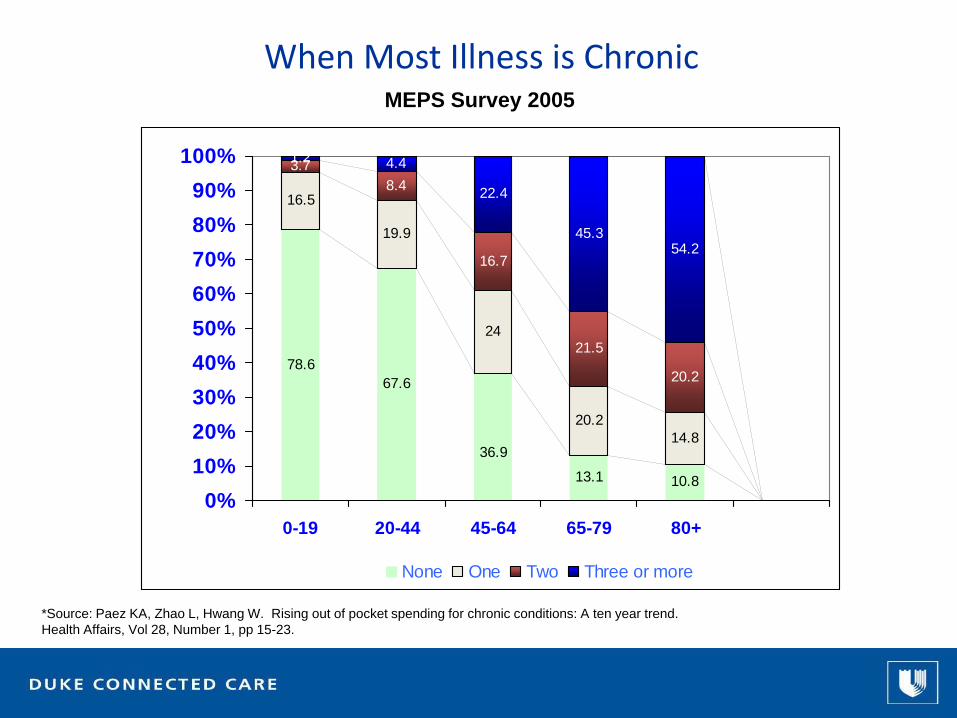
When Most Illness is Chronic
*Source: Paez KA, Zhao L, Hwang W. Rising out of pocket spending for chronic conditions: A ten year trend. Health Affairs, Vol 28, Number 1, pp 15-23.
MEPS Survey 2005
16.5
19.9
24
20.214.8
3.78.4
16.7
21.5
20.2
1.2 4.4
22.4
45.354.2
10.813.1
36.9
67.678.6
0%10%20%30%40%50%60%70%80%90%
100%
0-19 20-44 45-64 65-79 80+
None One Two Three or more

Most Causes of Illness are Related to Health Behaviors
Source: IFTF; Centers for Disease Control and Prevention.
Genetics(20%)
Access to care(10%)
Health Behaviors(50%)
Environment(20%)

1998
Obesity Trends* Among U.S. AdultsBRFSS, 1990, 1998, 2007(*BMI ≥30, or about 30 lbs. overweight for 5’4” person)
2007
1990
No Data <10% 10%–14% 15%–19% 20%–24% 25%–29% ≥30%
Source: CDC Behavioral Risk Factor Surveillance System

Green LA, Fryer GE Jr, Yawn BP, Lanier D, and Dovey SM. Ecology of Medical Care Revisited. NEJM 344:2021-205. June 28, 2001.
Most illness and care occurs in the community

Source: The Quality of Medical Care in the United States: A Report on the Medicare Program. The Dartmouth Atlas ofHealth Care 1999. The Center for the Evaluative Clinical Sciences Dartmouth Medical School
Disease Burden/Practice Patterns Vary

Percent African American (quantiles)
0%
0.1% - 14.9%
15% - 38.5%
38.6% - 81.5%
81.6% - 100%
Hypertension Patients06-07
Patterns of illness vary locally too

Source: American Association of Family Physicians (AAFP), March 2010
Interest in Primary Care
3265 32063096
2983 2940 28842782 2727
2621 26542555
2630
26972603
2363 23572239 2273 2292 2318 2313
24042329
2404
0
500
1000
1500
2000
2500
3000
3500
1999 2000 2001 2002 2003 2004 2005 2006 2007 2008 2009 2010
Positions Offered Positions Filled
Family MedicinePositions Offered & Filled

It’s (partially) the money...
159
172
176
184
185
393
439
0 100 200 300 400 500
Pediatrics
Family Medicine
Internal Medicine
Family Medicine w OB
Nurse Anesthetist
Cardiology
Orthopedics

And also time...
Type of Visit Hours/Day
AcuteChronicPreventiveTotal or mean
3.710.67.4
21.7
Time Required to Meet Clinical Guideline Recommendations
Data obtained from National Ambulatory Medical Care Survey, 2006
Source: Yarnall KSH, Ostbye T, Krause KM, Pollak KI, Gradison M, Michener JL. Family physicians as team leaders: “time” to share the care. Prev Chronic Dis 2009;6(2).

Yes...we can
Can We do Better?


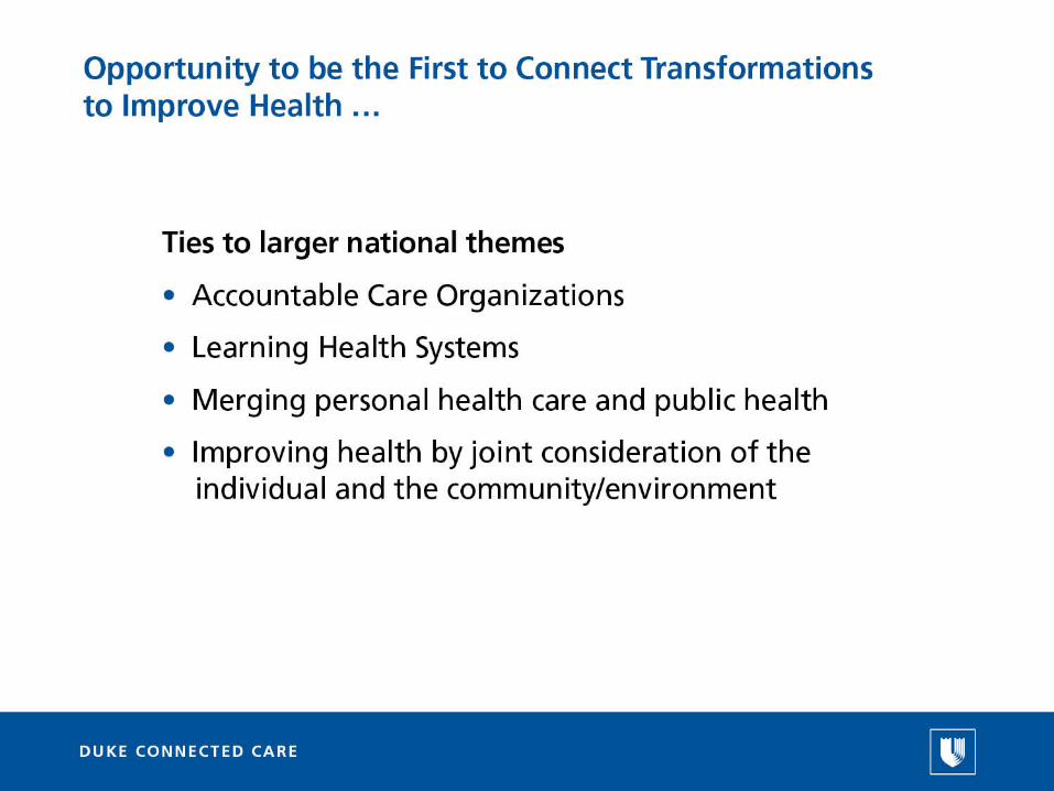


What will this require?Practice what we teach; teach what we practice; research how to do better
University• Coordinated placement/pipeline program
Professional Schools• Training and practice in teamwork
• Primary care leadership
PA, NP, PT
• Expansion of program size; teamwork
Residency
• Restructure around improving population health
• Clinical Leadership
Faculty and Staff• Classes, Grand Rounds, online training in community engagement
• Shift practice and research to improving community outcomes

