technical standards explained
DESCRIPTION
TRANSCRIPT

Technical standards explainedM = Mandatory BP = Best Practice
Browsers
M Content and navigation should display and function as intended in a broad range of browsers and operating systems
Browsers are based on compatibility with Blackboard. The MOE standard browser is Internet Explorer.Systems tested will include:PC: Internet Explorer 6 and above Firefox 1 and above Netscape 7.1 and above Consider testing on other Mozilla browsers and OperaMac: Firefox 1 and above Safari 1 and above Netscape 7.1 and above
Navigation
M No frames
Blackboard already works by the use of a frameset and therefore more frames are undesirable.
M Navigation does not rely on JavaScript
Although Blackboard cannot function without JavaScript, page navigation that relies on JavaScript can be problematic for users with visual or motor impairments. JavaScript and CSS can be used to change the appearance however, the navigation must still work w
M Navigation works without plug-ins or players
Users should not be required to use/download plug-ins for accessing content.
M Navigation does not rely on pictures/icons
Text must also be used – either within the picture and the alt attribute of the image or as HTML text beside the image. You must not assume that users will interpret what you mean correctly. E.g. Do not use an image of a pencil to signify a link to an activity without
text to support it.
[pencil image - no text, no alt] incorrect[pencil image with text and alt="Activity"] correct[pencil image – no text, alt=""] Activity correct
M Navigation is consistent across the course
On the initial visit, most people learn how to navigate a course. They examine the position of menus, headings, images and text and take note of language styles and key terms. Changing these features on subsequent pages is

confusing and, instead of focusing on the activities or content, learners first try to re-interpret the layout. (LP – Designing for consistency) E.g. previous/next links always appear in the same place, topic links
always appear in the same place and use the same colour schemes across the site etc.
M Internal links work
Check every single link of your site. Ensure link paths are relative to your pages and do not include references to your hard drive. E.g. Do not use links in this manner:
<a href="file:///C|/Projects/My%20web%20site/courseevaluation.htm">
M External links work
Avoid linking to unstable sites where content may constantly change or expire. Use a link check program if possible.
BP The target of each link is clearly identified
Link text should be short and meaningful. Do not use the text 'Click here' as it does not inform your user of what the hyperlink is about. 'Click here' does not encourage the learner to think about what is to come while the page is loading. (LP – Hyperlinks) E.g. Rather than 'click here' – make the link descriptive.
Click here to view the Technical Standards document ... – incorrectView the Technical Standards document ... – correct
BP A site map is provided for courses that have a structure of 2 or more levels
A site map is very useful for larger or complex course structures and allows users to find/relocate topics at glance. Site maps should be designed to show the hierarchical order of content. The text used should mirror the page headings. E.g. Sample site map
Scripting
M All JavaScript is works without a mouse
This allows access for users with motor/physical impairments or assistive technologies. Check that scripts work using a keyboard only. Use keyboard events as well as mouse events.
onFocus and onMouseOveronMouseDown and onKeyDown onMouseUp and onKeyUponClick and onKeypress
M JavaScript works as intended
Check that scripts work first time and (if applicable) reset and check again. Be aware that what works in one browser might not in another.

EQ Blackboard requirements
M Maximum page width of 600px (including margins)
Blackboard is best viewed with a screen resolution of 1024768 pixels or greater, however the minimum requirements are 800x600 screen resolution. Widths of tables and images should not be greater than 600 pixels to allow content to fit into Blackboard interface without horizontal scrolling. This applies to zipped/unpackaged files and learning unit items.
M Individual items in Blackboard have a maximum width of 570px
Blackboard has a standard minimum screen resolution of 800600 pixels. Widths of tables and images should not be greater than 570 pixels to allow content to fit into Blackboard interface without horizontal scrolling. This applies to Blackboard folders and items.
M Total file size of course is less than 50 MB
Blackboard has a standard course size of 50 MB. If you try to upload more than this you will not be able to. The 50 Mb limit includes everything in your course – the pages stored within Blackboard, all images uploaded to Blackboard, discussion forums and their associated threads. Make sure all unnecessary files and content is removed and all documents and images are optimised before uploading. (LP – Course size)
BP Individual file size of any course file is less than 2 MB, preferrably less than 1 MB
Avoid large file sizes (of any type). 2MB is the recommended maximum; however, files as small as 500k can be problematic for users with slow machines/internet connections, and in school lab–class situations where multiple students are accessing the same file at the same time – causing the lab network to hang. Always optimise files and include download details (see section, Non-html files).
M Individual file size of any course file must be than 5 MB
2MB is the recommended maximum. In exceptional circumstances only, files may be up to 5 MB maximum. These must not be “essential” to the content (i.e – if the user cannot download/view this file, they are not disadvantaged) and must be user controlled to download (i.e. do not embed these files in a page where it will automatically download). Always optimise files and include download details (see section, Non-html files).
M Page footer includes link to EQ disclaimer and link to EQ copyright statement
The correct disclaimer and copyright statements must be used. This should appear as:Disclaimer. Copyright The State of Queensland (Department of Education) YEAR.
BP External links open in a new browser window
This allows users to browse through external sites without losing their place within the course and also ensures the best viewable area for the user. It also ensures that your users are aware that they have left your course and are viewing external content. If possible use a script that will open all external sites in the same browser window to prevent many windows opening.

Images
M A logical alt attribute is included for each image
Ensure the images have appropriate captions that explain them.If images do not need an explanation like a spacer.gif insert an empty alt attribute.
M Alt text is included for each image map
Ensure image map links include the title of where the link is heading.
M Images use web-safe colours
Different browsers and different operating systems display colours differently. The web-safe colours ensure that your image appears as intended to everyone. Otherwise your image may lose meaning (if reliant on colour) or sufficient contrast between elements. Note: This applies to GIFs and other flat colour media such as flash, not photos (JPEGs).
M Images are optimised for use on the web
Image file sizes should be kept as small as possible without degrading the image. Images with large areas of flat colour should be in GIF format and complex images should be in JPEG format. All unnecessary colour information should be removed. E.g. GIF: diagrams, cartoon-like images
JPEG: photos.(compare GIFs – image optimised, same image not optimised – show file sizes)
M Sufficient contrast of image colours
Images use colour combinations that provide sufficient contrast to be understood by users with a colour deficit. E.g. (image, bad contrast, hard to clearly define elements) (same image,
better contrast)
BP Images are not used to represent text for navigation and headings
Using images instead of text unnecessarily adds to the file size of your pages. Images do not scale like text and may be difficult to read for users with visual impairments.
BP All diagrams are explained using text
Explain the diagram within the content or link to a text only equivalent html page. This allows visually impaired users to access the content of your diagram.
Multimedia
M All multimedia (animations/flash/audio/video) has user controls (stop/play).
Moving images and looped sounds can be problematic for users (particularly those with learning impairments) when they are concentrating on reading.

BP All multimedia (animations/flash/audio/video) has text only equivalents.
This is to ensure access for users without plug-ins and users with visual/auditory impairments. If multimedia content is already explained within the html content no extra text equivalent is required.You might explain a concept in the main text of a page and use an animation to reinforce the concept. This would not require a text equivalent.
Non-html files
M Download details are provided for non-html files.
Clearly advise the user of file type and size. You may use text or an icon to indicate the file type. Eg. Name of link (Microsoft ® Word document 34k) or
[icon alt=“Microsoft ® Word document”] Name of link (34k)
M PDF and Word files are optimised for use on the web.
Avoid unnecessary formatting and images – these will increase the file size of your documents. Large Word and PDF files (over 200k) can be problematic for users with slow machines/internet connections.
BP Avoid using PDF documents if HTML, Word or RTF format could be used.
PDF documents are inaccessible to screen readers. If possible create with Acrobat 5 and limit use to content of a 'visual' nature.
Text and colour
M Links are a different colour to the text
Menus and navigation should always be easily distinguishable from normal text.
M Underlining is reserved for links
This is a web convention. Don't use underlining for headings or emphasis.
M Bold text is reserved for headings navigation and keyword emphasis
Large blocks of bold text can be difficult to read on screen.
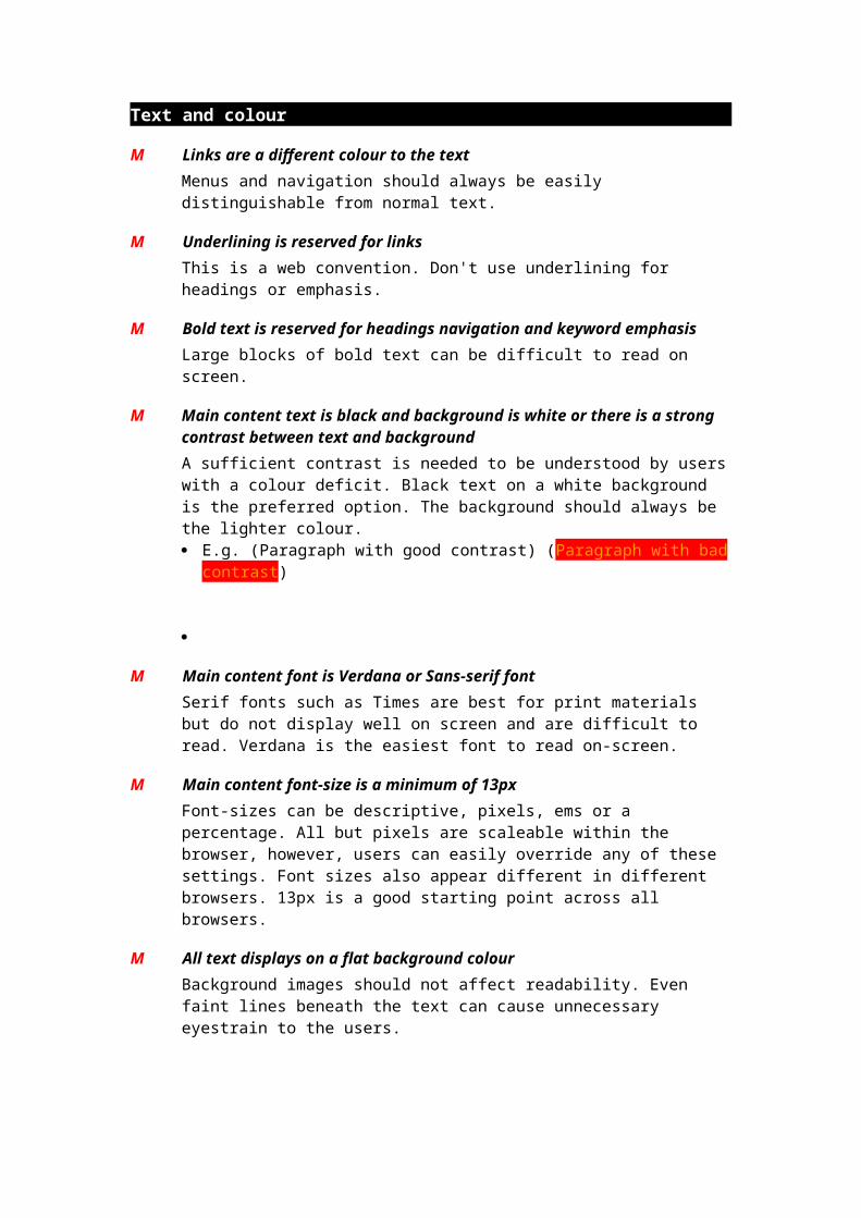
M Main content text is black and background is white or there is a strong contrast between text and background
A sufficient contrast is needed to be understood by users with a colour deficit. Black text on a white background is the preferred option. The background should always be the lighter colour. E.g. (Paragraph with good contrast) (Paragraph with bad contrast)
M Main content font is Verdana or Sans-serif font
Serif fonts such as Times are best for print materials but do not display well on screen and are difficult to read. Verdana is the easiest font to read on-screen.

M Main content font-size is a minimum of 13px
Font-sizes can be descriptive, pixels, ems or a percentage. All but pixels are scaleable within the browser, however, users can easily override any of these settings. Font sizes also appear different in different browsers. 13px is a good starting point across all browsers.
M All text displays on a flat background colour
Background images should not affect readability. Even faint lines beneath the text can cause unnecessary eyestrain to the users.
M Text does not sit flush against visible borders
Text that sits flush against visible borders can be difficult to read. There should always be a margin or padding around the text. E.g. A big long line of text with no padding
M Text align does not use 'justify'
Justified alignment does not display consistently across browsers and can difficult to read. Content is best aligned left.
BP Font tags are avoided
Font is a deprecated tag. (This means that the W3C has targeted this tag to become invalid in future versions of the html specification.) Using font tags for formatting text unnecessarily adds to the file size of your pages and can cause visual inconsistencies across your course. If possible use stylesheets to format text. E.g. (basic stylesheet showing body, p, h1, h2, h3, h4, li, td, th)
BP Links within the content are underlined
Links should always be easily distinguishable from normal text. E.g. A line of text with a link to a relevant document.
BP Italic text is reserved for citing
Italics do not display well on screen and can be difficult to read.
BP Headings use heading tags
Avoid using paragraph tags for headings. Screen readers need heading tags to differentiate headings from paragraph text. This also ensures font sizes and styles will remain consistent across your course.
E.g. <h1>Heading 1</h1><h2>Heading 2</h2><h3>Heading 3</h3>
A big long line of text with padding
Layout
M When style sheets are turned off the pages are still readable and usable
Sometimes users set their browser preferences to ignore stylesheets. Style sheets can be used to position a number of DIVs on the page. If the DIVs do not appear in a logical order in the code they will not appear in logical order on screen when stylesheets are ignored. Screen readers will also read content in the order of the code, not necessarily in the order on screen. E.g. (popup 1, 3 DIVs of content out of order in code, ordered by
stylesheets) (popup 2, same page without the stylesheet)
M If tables are used for layout, they make sense when read cell-by-cell, form left to right
Sometimes users set their browser preferences to ignore tables. If the content within the table cells do not appear in a logical order in the code they will not appear in logical order on screen when tables are ignored. Screen readers will also read content in the order of the code, not necessarily in the order on screen. E.g. (table that appears to make sense when read on screen) (Same
content not in table but in order of original code – does not make sense)
M Complex nested table layouts are avoided
Complex nested tables can become very confusing if tables are turned off or screen readers are used. This also can cause a dramatic increase in the time the page displays. Table layouts are best if designed to as few rows and columns as possible.
M Layout is consistent across the course
On the initial visit, most people learn how to navigate a course. They examine the position of menus, headings, images and text and take note of language styles and key terms. Changing these features on subsequent pages is confusing and, instead of focusing on the activities or content, learners first try to re-interpret the layout. (LP – Designing for consistency)
HTML code
BP HTML code should be free of unnecessary or redundant tags.Some html editors may leave a lot of unnecessary code behind. This adds to the file size of the page. If the amount of unnecessary or redundant tags is excessive, the code should be tidied up. E.g. (a paragraph of code with Word/FrontPage code) (Same paragraph
cleaned up)