task 8!
TRANSCRIPT

Task 8Alan Smith

Logo production This logo will be used as the final design. This was created by the
ideas in the planning stages and through the trial and error of the
experimental stage respectively.
It was transformed from the initial idea of the eye and wave. This
being behind the overall theme of looking after the oceans and
the eye symoblising this.
There were multiple editions of the
eye idea, starting off from a jar with
the acronym SAS in the tear drops.
As the design changed the colours
set out in the planning stages
remained as it was still aimed
towards a young audience.
Other ideas. These products have been created to show my understanding on the task and have reserve logo’s that I
can return to at a later date.
These products explore a large range of colours and
fonts. The idea on the right with the surf boards crossing
over was produced as it was in the planning stage.
The oval shaped emblem explores a difference in colour
to show that I have experimented with other shades
instead of keeping to the green and blue.
It also is looking on the text instead of objects. It is from
this experiment where I incorporated the font to the final
logo design.
The last logo design wanted to look at simplicity and make the logo more clear.
The eye is a good way to show how the organisation is watching over the
oceans, however by using an actual surfer in the logo can make this much more
clear.

Merchandise planning (Products)
Here I am exploring possible merchandise products aimed towards a younger audience. The products chosen are
important as they play a huge part in interacting with the younger demographic which ultimately makes the sales.
Something the audience will want to wear can be a great way of enticing them. The use of stickers or badges to
have on their shirts or coats, or even clothing such as quirky t-shirts or hats.
It is important that the merchandise created is of a cheap enough standard. Keeping the t-shirts white for example
can save money and keeping to a basic design or colour can allow more to be created.
Aiming towards a younger audience means that
the products should be simplistic.
The badges and stickers is something that can
be created to minimal cost, be the best to
multiply and allow the audience to use the
stickers on the membership form.
The products will have the logo or parts of the
logo incorporated in the design. Should the
campaign poster and membership forms be
created to a good standard and to the suitable
audience then the success of the merchandise
will be determined by this.
Offering some of the merchandise in the deal
with the membership can be an idea that is
used in the future. The clothing could also be
given out free in a beach clean to the
volunteers.
This should be advertised in the poster. This
gives the person much more incentive to
participate.
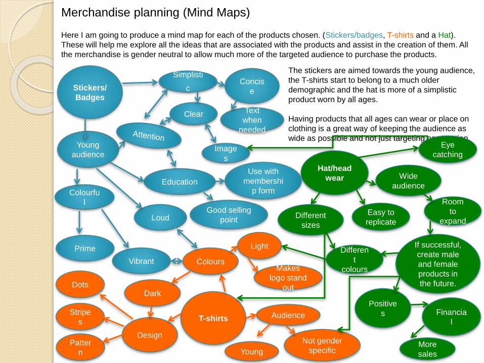
Merchandise planning (Mind Maps)
Here I am going to produce a mind map for each of the products chosen. (Stickers/badges, T-shirts and a Hat).
These will help me explore all the ideas that are associated with the products and assist in the creation of them. All
the merchandise is gender neutral to allow much more of the targeted audience to purchase the products.
Stickers/
Badges
Simplisti
c
Young
audience
Colourfu
l
Loud
Clear
Concis
e
Education
Prime
Vibrant
T-shirts
Design
Hat/head
wear
The stickers are aimed towards the young audience,
the T-shirts start to belong to a much older
demographic and the hat is more of a simplistic
product worn by all ages.
Having products that all ages can wear or place on
clothing is a great way of keeping the audience as
wide as possible and not just targeting one section.
Patter
n
Stripe
s
Dots
Colours
Dark
Light
Image
s
Text
when
needed
Good selling
point
Use with
membershi
p form
Makes
logo stand
out
Audience
Young
Not gender
specific
Different
sizes
Eye
catching
Wide
audience
Room
to
expand
Differen
t
colours
Easy to
replicate
If successful,
create male
and female
products in
the future.
Positive
s Financia
l
More
sales
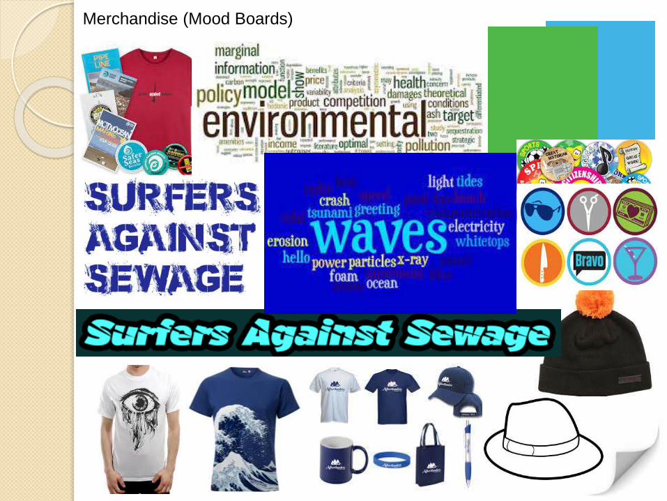
Merchandise (Mood Boards)

Here is a brief moodboard to explore
all the planned merchandise and the
overall theme of protecting the oceans
from marine litter and other harmful
substances.
This was created to gather more
understanding on the products before I
go into production.
Looking at existing products can give
me inspiration when producing my
own.
The font was looked upon at an earlier
stage, I have narrowed it down to two
styles taken from dafont.
The collection of words are to express
the concerns surrounding surfers
against sewage and how the
merchandise created must show that
buying them can help the cause.
Perhaps having text on the shirts with
information may allow this.The shirts gathered are to show existing t-shirts with eyes and waves on. Both of which are featured in my logo which will be
produced on the shirt in the later planning stages. The merchandise above is to show other things that can be created should the
early merchandise be a success. Creating pens, wristbands and bags can appeal to a much older audience.
There are many hats that could be used for the production, but again I have chosen two to look at. Mainly as they appeal best to
the audience I am targeting. Bobble and beach hats are suitable for the young demographic plus they have very low production
costs should the print on them be successful for the client.
The stickers and badges chosen on the right hand side are used to illustrate the age of the audience again, the use of the actual
Surfers against sewage merchandise package on the top left shows that the products such as t-shirts and badges can be a good
way in spreading the message as well as enticing more people to come, as part of a membership deal.
The colours kept throughout the planning stage are blue and green, this is because not only are they representing the
environment and the ocean but they are very clear and suitable for all age groups.


Rip Curl is a major Australian designer, manufacturer, and retailer of surfing sportswear. Looking into their products
can give me a greater knowledge on how to design my three items. It is clear they make a large amount of items
stretching from wallets, watches and stickers, to shoes, t-shirts and surfboards.
With all the products, the name ‘Rip Curl’ is featured. This can be replicated in mine. As my products are that of T-
shirts, badges/stickers and hats, I wanted to look at how a professional designer approached them.
There are three hats in this small
collection of images. Two flat caps, with
different patterns and different font styles
for the name. There is also one for a
more older audience seen on the left
hand side.
All have the name ‘Rip Curl’ on, however
it is portrayed in a different manner each
time.
House style is not something that
concerns itself with the design process,
however the colours used most are that
of black, blue, yellow and white.
This can prove to be valuable when
choosing the shades for mine. The
badges on the top right is something I
want to replicate.
Having many colours and varieties of the
same design. This can be easy to create
and distribute as well as working well in
terms of going with membership forms
and being a cheap alternative for
merchandise for the audience.
When researching into this designer, the products that caught my eye were that of the phone cases. This is
something I could create for Surfers Against Sewage. The wallet design is also something that could be created in
production stage. It would be something for all ages. The T-shirts looked at are similar to the hats. The idea that they
have the brand incorporated in, however it does differ in design. The image above of the dark t-shirt has only the
emblem, whereas the white t-shirt uses the same stripes as the hat on the right hand side does. These are all
aspects I can consider before the production process.

Merchandise (Experiments)
Here I have been experimenting with the
products. This is the first stage of production
and this is important to determine how I
approach the products separately.
The top right and bottom right are my initial
thoughts on how I plan to create the badge
and stickers. They will be adapted upon and
a variety of colours and shapes will be
created. The hat is created using the same technique as the others.
Incorporating the main logo as the full image. That hat was chosen
ahead of the others as it best expressed the ocean theme. With it
looking like an old detective, this added to the eye ball and that of
looking out for the sea and being part of Surfers Against Sewage.
The T-Shirt again uses this idea of the logo as the full shirt, as this is
just an idea stage, in the later production task the size and position of
the logo can be altered and adjusted accordingly.
The make the stickers much more believable I used the ‘Turn page’
effect making it look like it was pealing. This can be used in later
production and taken to an advanced level.
The text on the hat is just to show the position of it within the
overall composition. The colours of the merchandise has remained
the same as the logo, however when in production many versions
will be created to appeal to everyone, of all ages and genders.
The badges can be adapted upon, perhaps just using the logo and
the same with the stickers. The background is to make it stand out.
The hats can be of different size and style to appeal to each
audience aimed towards.

Here I am experimenting further with possible designs for t-shirts. The idea of using a hand to demonstrate
the ‘wave’ can be a good way in enticing the person to both buy the product and sign up to Surfers Against
Sewage.
I wanted to incorporate the logo into all the designs so there would be less need for text. The hashtag
‘WaveAwayWaste’ was designed in planning and is meant to be placed on the paper based products,
however in the experimental stage I wanted to gather a greater understanding on what the shirts would
look like with text on.
This use of social media as well the colours tie in with the targeted young audience. The vibrant green and
bright blue were the colours looked upon in the planning. The shirt on the right was all about simplicity and
position of the logo before I used redbubble.com to take the work further.
Having the logo on the work but in a corner can make it more appealing to those who want to support the
cause but don’t want to wear something loud and bold.
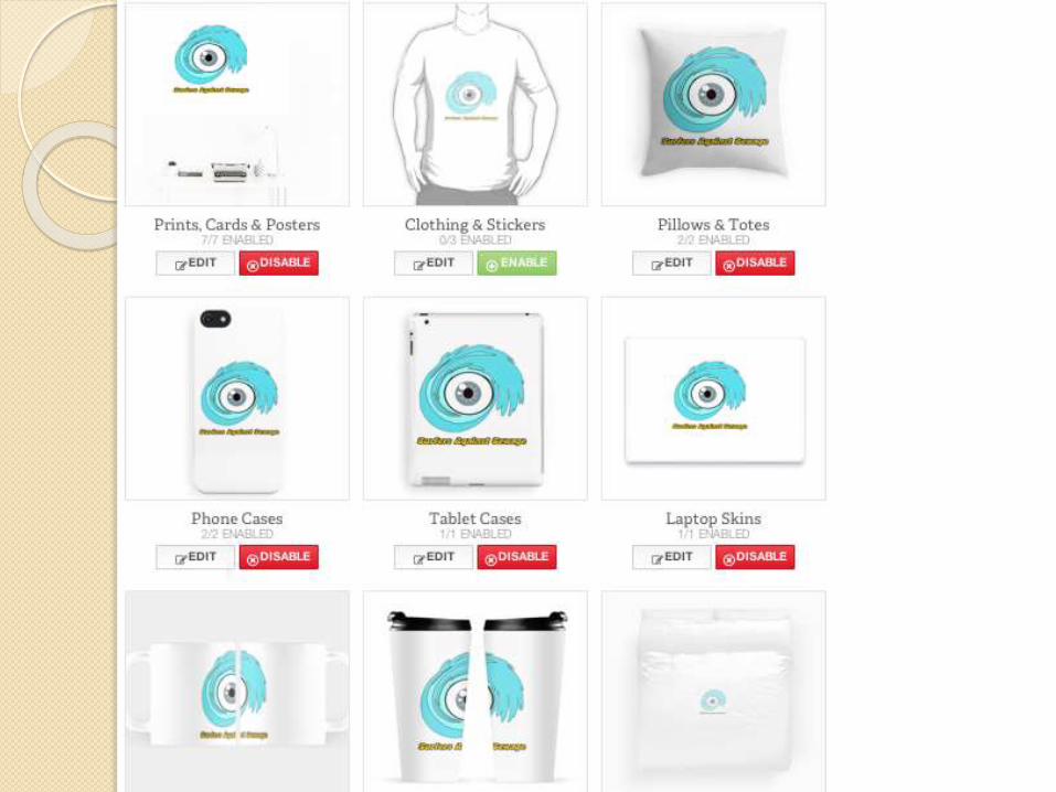
The logo on the next page looks good on the variety of products and is a step In the right direction. After
exploring existing surfing products by Rip Curl, I wanted to see how many products the logo would look
good on.