t2 appealing to an audience
TRANSCRIPT
Appealing to an Audience
Henry Buckham
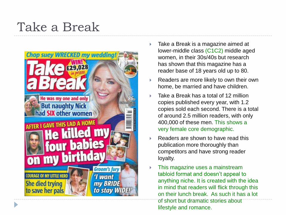
Take a Break Take a Break is a magazine aimed at
lower-middle class (C1C2) middle aged
women, in their 30s/40s but research
has shown that this magazine has a
reader base of 18 years old up to 80.
Readers are more likely to own their own
home, be married and have children.
Take a Break has a total of 12 million
copies published every year, with 1.2
copies sold each second. There is a total
of around 2.5 million readers, with only
400,000 of these men. This shows a
very female core demographic.
Readers are shown to have read this
publication more thoroughly than
competitors and have strong reader
loyalty.
This magazine uses a mainstream
tabloid format and doesn’t appeal to
anything niche. It is created with the idea
in mind that readers will flick through this
on their lunch break. As such it has a lot
of short but dramatic stories about
lifestyle and romance.

Target Audience
Take a Break is more aimed at the female demographic as evidenced by many of the stories focusing on the subject of relationship troubles and drama, with a lot of focus on gossip. These stories follow a pattern of being about children or men, something women can relate to as mothers and married women are a core demographic.
Often these stories rely on sensationalism (exaggerating certain aspects of the story to incite a feeling) in order to sell copies or encourage people to read. This includes emphasizing certain words or dominating more of the page with the story.
There is also content that review the soap operas on TV (shows that are mainly watched by middle-old aged women) and a large emphasis on the magazine’s own bingo game (a game with no major demographic but has a large housewife following)

Layout, Colours and Image Each Take a Break magazine is radically different in terms of
the styling/positioning of the front page’s content. While the familiar red logo is retained each time in the top left, there are multicoloured boxes of varying sizes and shapes that hold the snippets from each story, The bright and vibrant colours help to catch the reader’s eyes from a shelf.
Each copy features a large photograph of a middle aged woman on the right hand side, representing the majority reader base. This also be a ploy for women to feel more comfortable buying the magazine, as opposed to something with a photograph of a male.
Each issue also offers a lot of prizes and giveaway with rewards that are tailored for middle aged people, the target audience – cars, shopping trips and holidays. These types of gifts would be slightly out of place in a magazine tailored for younger people, where the prizes offered are normally cosmetics, electronics or video games.
The prizes offered are typically placed in the header bar, where they can be easily seen thanks to their proximity of the logo.

Page Layouts Each story of Take a Break is arranged in a typical
tabloid format but with coloured highlights that
indicate where the text begins, as well as tilted
photographs and stylized header that create a
casual atmosphere, as if the magazine was an
informal notice board. This contributes to the
magazine’s overall casual ‘laid back’ approach for
its readers.
Frequently in the middle of the columns, there are
small red boxes that contain a notable quote from
the story being told. This helps readers to get a
basic gist if they are just scanning over. This fits
with the target markets busy lifestyle, as they will
likely have a big family to care for and as such only
have a limited amount of time to settle down and
read.
Often these articles will contain a multitude of
different photos. They could consist of the event
itself, the person in particular, or photos that help to
set the story either by showing locations or people.
These photos are unique I that some don’t appear
to be professionally staged photos, but rather
photos that could be taken by anyone – humble
home or holiday photos. This allows readers to
easily integrate and relate with the people who are
sharing their stories.
The captions included in stories are often
extremely basic and merely describe the image as
seen below. This means that the audience can
understand the context of these images with ease
instead of trying to decipher culture references or
complex descriptions.
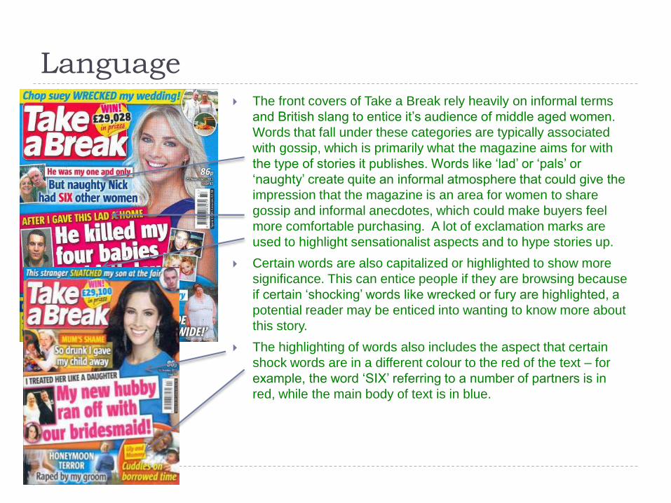
Language The front covers of Take a Break rely heavily on informal terms
and British slang to entice it’s audience of middle aged women.
Words that fall under these categories are typically associated
with gossip, which is primarily what the magazine aims for with
the type of stories it publishes. Words like ‘lad’ or ‘pals’ or
‘naughty’ create quite an informal atmosphere that could give the
impression that the magazine is an area for women to share
gossip and informal anecdotes, which could make buyers feel
more comfortable purchasing. A lot of exclamation marks are
used to highlight sensationalist aspects and to hype stories up.
Certain words are also capitalized or highlighted to show more
significance. This can entice people if they are browsing because
if certain ‘shocking’ words like wrecked or fury are highlighted, a
potential reader may be enticed into wanting to know more about
this story.
The highlighting of words also includes the aspect that certain
shock words are in a different colour to the red of the text – for
example, the word ‘SIX’ referring to a number of partners is in
red, while the main body of text is in blue.

Font Take a Break uses a variety of sans-serif fonts on
the front cover to depict its logo and the story
taglines. Serif fonts haven’t really been used as
this is a modern day magazine focusing on
present stories, and serif fonts would not really fit
this, as they are quite traditional looking. Sans
serif fonts are clear, bold and modern, meaning
they are well suited for the purpose applied here.
Different colours are used to separate stories from
one another and create a very colourful, eye
catching front cover.
The choice of sans serif fonts also gives off a
calm, friendly atmosphere about the magazine.
This entices more buyers, specifically the middle
aged female audience, as coupled with the bright
colours this can create a very warm, inviting and
eye catching combination.

Codes and Conventions Each issue of Take a Break includes the logo and headline in the top left. This helps
readers quickly identify the magazine by looking up here.
Each issue features its most prominent stories on the cover. These are arranged in an
untidy yet stylish format with bright colours used throughout. Occasionally, certain
words will be coloured differently to express their significance. Sometimes informal
language will be used to keep with the magazine’s casual styling.
Take a Break always includes an offer of prizes to be won at the top – usually cash
prizes, cars, or package bundles like trips or holidays. This is especially enticing for
young-middle aged adults who are looking to chill out and hopefully win something in
the process. The offer of a car as a prize shows the target audience – a car wouldn’t
be a very good prize in a magazine for young people.
Each issue features a large, doctored photograph of a smiling mid-aged woman on
the cover. This helps to promote the friendly, laid back image and to help female
purchasers feel more confident about buying the magazine.

Publisher Interaction Take a Break encourages readers
themselves to send in their stories for
print – many of the stories published are
from their readers. There is a tab on their
website that takes them directly to a
contact page for stories.
The magazine has both a Facebook and
Twitter account, in which fans and
readers can contact the publishers of the
magazine and voice their opinions, or
chat with fellow fans. They will also be
able to find updates and news on these
sites, updated directly by the publishers.
Out of the magazine’s 400,000 strong
readership, there are just 29,000 people
who like the mag’s Facebook page, and
even less on the Twitter account, with
just under 2,000 followers.
A section of their website is dedicated to
publisher communication, offering e-mail
addresses of many key members of
staff.

Motor Sport
Motor Sport is an automobile racing and event magazine
aimed at an older male audience in the upper middle to
upper class social group. 99.2% of readers are male,
making it a majority male dominated audience with only
0.8% of readers being female, or roughly 700 individuals. In
comparison, out of Take a Break’s 2.5 million readers,
400,000 are men.
The magazine has a circulation of 35,000 and a readership
of 89,000 compared to Take a Break’s 2.5 million readers,
highlighting how it is a much more niche but highly loyal
and specialized fanbase as 66% of readers spend two or
more hours reading each issue of the magazine.
A quarter of the magazine’s readership are high earners
with over 100k+ in income. 76% of readers own two or
more cars and 50% of readers regularly dine out and enjoy
fine wine.
The reader base is extremely invested in the hobby as over
90% of readers regularly attend historic meetings and
racing/GP events. 35% of the reader base own a classic
car. The magazine is not designed as a mainstream tabloid
publication and is designed for an up market audience who
have a firm interest in the hobby.

Target AudienceMotor Sport has a long and illustrious history as the
original magazine documenting racing events. First
published in 1924 the colours used and style of the
logo has remained the same, enforcing brand
loyalty and recognition. The magazine’s core
audience is middle-aged to elderly men with a firm
interest in classic automobiles and racing events.
Supporting the older audience is the fact that this
magazine has been in publication for almost 90
years, building up a strong fanbase over the years.
Those that read the magazine are wealthier than
those who read Take a Break, with a quarter of
readers having incomes of over 100k. This supports
the argument that many of its readers are those
who can afford to regularly attend motoring events
and own classic cars of their own as a hobby,
evidenced by the classifieds for restored classic
cars in the rear of the magazine.
The magazine is designed to be an outlet for news
regarding motoring and racing events, including
interview with drivers and crews, publication of
results from races, as well as reviews of vehicles
and news form the automobile industry. Unlike Take
a Break, which is designed to be picked up and
read for a couple of minutes, Motor Sport is a more
invested publication that assumes that readers will
be reading for much longer.

Layout, Colours and Image
Motor Sport follows a very uniform and standard style for its issues. Each
magazine cover features the familiar green banner at the top with the
publication’s logo, unchanged from 1924. Below, three quarters of the page is
dominated by a picture related to the issue’s big story. Usage of the green
banner and logo is used to help distinguish itself from other magazines to loyal
readers, who can instantly see the familiar green that has been used on all
previous issues.
Each issue features an image relating to motoring or racing which allows it to
be distinguished form other magazines that may appear visually similar.
Structuring of different elements follows a very geometric pattern and
everything is orientated on a straight line, compared to Take a Break’s brightly
coloured style of different sized boxes that are different for each issue. This is
because of Motor Sport’s more mature and invested audience compared to
Take a Break’s highly varied female audience. The cover of Motor Sport is not
plastered with offers and promotions and instead focuses entirely on the
subject it is covering on the basis that that is what the readers buy it for.
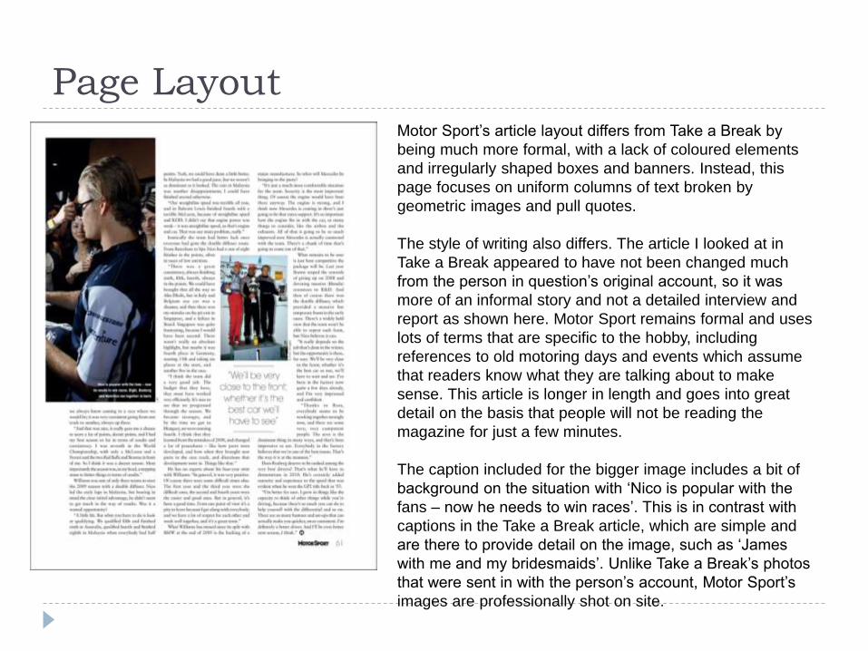
Page LayoutMotor Sport’s article layout differs from Take a Break by
being much more formal, with a lack of coloured elements
and irregularly shaped boxes and banners. Instead, this
page focuses on uniform columns of text broken by
geometric images and pull quotes.
The style of writing also differs. The article I looked at in
Take a Break appeared to have not been changed much
from the person in question’s original account, so it was
more of an informal story and not a detailed interview and
report as shown here. Motor Sport remains formal and uses
lots of terms that are specific to the hobby, including
references to old motoring days and events which assume
that readers know what they are talking about to make
sense. This article is longer in length and goes into great
detail on the basis that people will not be reading the
magazine for just a few minutes.
The caption included for the bigger image includes a bit of
background on the situation with ‘Nico is popular with the
fans – now he needs to win races’. This is in contrast with
captions in the Take a Break article, which are simple and
are there to provide detail on the image, such as ‘James
with me and my bridesmaids’. Unlike Take a Break’s photos
that were sent in with the person’s account, Motor Sport’s
images are professionally shot on site.

Language
Motor Sport’s language has a formal and informative
style that is tailored specifically older and more
mature readers. This is evidenced by constant usage
of bigger and synonymous words to tell the story, with
examples like ‘divulge’, ‘aspirations’ and
‘ambassadorial’ which is a lot different to the
conjunctions and informal slang used in Take a Break
like ‘lad’ and ‘hubby’, although ‘Merc’ is used to
describe a Mercedes, which is a common nickname.
Front pages of Motor Sport often use alliteration and
emotive words to describe certain events and stories.
The power of three is used to describe a Mercedes
car below, which helps to summarize the writer’s
opinion.
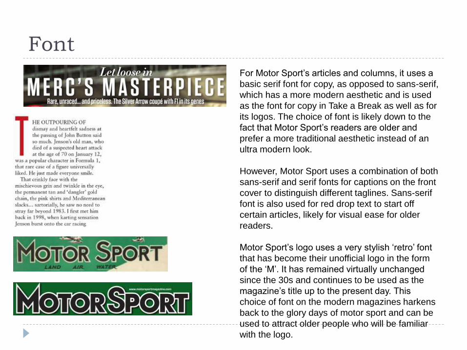
Font
For Motor Sport’s articles and columns, it uses a
basic serif font for copy, as opposed to sans-serif,
which has a more modern aesthetic and is used
as the font for copy in Take a Break as well as for
its logos. The choice of font is likely down to the
fact that Motor Sport’s readers are older and
prefer a more traditional aesthetic instead of an
ultra modern look.
However, Motor Sport uses a combination of both
sans-serif and serif fonts for captions on the front
cover to distinguish different taglines. Sans-serif
font is also used for red drop text to start off
certain articles, likely for visual ease for older
readers.
Motor Sport’s logo uses a very stylish ‘retro’ font
that has become their unofficial logo in the form
of the ‘M’. It has remained virtually unchanged
since the 30s and continues to be used as the
magazine’s title up to the present day. This
choice of font on the modern magazines harkens
back to the glory days of motor sport and can be
used to attract older people who will be familiar
with the logo.

Codes & Conventions Above and below the main title of the
magazine, the banner contains a row of different sections that it covers. The top row has their tagline, which reads ‘Passion, Independence, Perspective, Opinion, Authority.’ which references how the magazines operates by itself, is passionate about the interest, and has the leading voice on the market.
A leading story is covered mainly on the front page with a large picture that takes up ¾ of the space, with other stories in the issue confined to taglines nearer to the bottom.
The magazine’s address is located above the logo in the top right. This helps to provide more connection between the magazine and it’s areas and allow people to have an outlet to find out more about the magazine before a purchase.

Publisher Interaction Motor Sport has several pages on prominent
social media websites such as Facebook and
Twitter which are used to communicate to
readers and post updates or announcements.
Each profile also links to the other sites so that
their entire presence on the web is visible to
the audience. However, these sites do not
reach out to the entire audience of 89,000
people, with 12,000 likes on the Facebook
page and 35,000 followers on Twitter.
Both pages can be used by readers to
communicate directly with the writers and
editors, who have a strong presence and post
updates often.
Their official website features the contact
details of the editorial and writing staff for
direct communication, as well as a forums
where people can chat and discuss topics with
both other readers and the magazine staff.
Unlike Take a Break, Motor Sport is not
dependent on stories sent in by people as
they have a professional media team sent to
events relative to the subject.