supplementary materials smartr: an open-source platform for...
TRANSCRIPT

SupplementaryMaterials
SmartR:Anopen-sourceplatformforinteractivevisualanalyticsfortranslationalresearchdataSaschaHerzinger,WeiGu,VenkataSatagopam,SergeEifes,KavitaRege,AdrianoBarbosaDaSilva,ReinhardSchneider
HereweprovideafewexampleimplementationsofvisualanalyticsusingtheSmartRframework.Alltoolsshowninthefigurescanbeaccessedviathepublicserverathttp://smartR.lcsb.uni.lu
1)DynamicHeatMap:Foradetailedlistofthefeaturesforthisworkflow,pleaserefertotheassociatedpaper.Thisfigureisincludedforcompletenessandincludesalinktoavideothatdemonstratesthedynamicnatureoftheheatmap.
SFig.1Dynamicheatmap.Theshownheatmapisfullysortableandcontainsmanyinteractiveelementsthatarelistedindetailinthe
associatedpaper.VideoURL:https://youtu.be/kLRSOMbKuns

2)CorrelationAnalysis:Thisworkflowconsistsofascatterplot,histogramsfortherespectiveaxes,andalegendwithstatistics,suchascorrelationcoefficientandp-value.Thescatterplotallowsuserinteractionbyareaselection,whichtriggersthere-computationofthecorrelationstatistics,theregressionlineposition,andthehistograms.Thecontextmenu,availableviaright-click,revealstheoptionstozoom,resetorexcludetheselectedarea.
SFig.2CorrelationAnalysis.Shownisascatterplotwithhistogramsfortherespectiveaxes.
Statisticsandotherplotelementsadaptdynamicallytocertainuser-triggeredevents.VideoURL:https://youtu.be/IP7vBSQsaFA

3)LineGraph:Themainpurposeofthelinegraphistovisualizelongitudinaldata.Mainfeaturesarethemanuallysortablex-axis,whichisimportantincasethedataarenottime-annotated(unordered),hover-eventsthathighlightcertaindataorrevealdetailedinformation(s.SFig.3),andthepossibilitytoswitchinstantlybetweenseveraldisplaymodes(e.g.meanwithSEMerrorbars,medianwithSDerrorbars,orrawdata).
SFig.3Linegraph.Shownisaplotthatvisualizesmachinegeneratedtimeseriesdata.Besidesmanyvisualhelpersthataretriggeredby
mouse-overevents,thisvisualizationhasamanualsortablex-axisanddifferentmethodsfordefiningtheshowntimelines.VideoURL:https://youtu.be/GFCmJysbTyM

4)Boxplots:Thisworkflowfeaturesboxplotswithadiamond-likeshapethatrepresentsmeanwithstandarddeviation.Besidestheoptiontolog-transformyourdatabeforevisualization,itisworthmentioningthatthepossibilityexiststoselectandtreatsinglerowsofmicro-arraydataasnormalnumericalinputforthisworkflow.
SFig.4Boxplots.CurrentlythisistheonlyvisualizationthatisusingPlotly(PlotlyTechnologiesInc.Collaborativedatascience.Montréal,QC,2015.https://plot.ly.)asavisualizationlibrary.Thisisincludedforcompletenessandtodemonstratethattheframeworkisnotlimitedto
certainvisualizationlibraries.
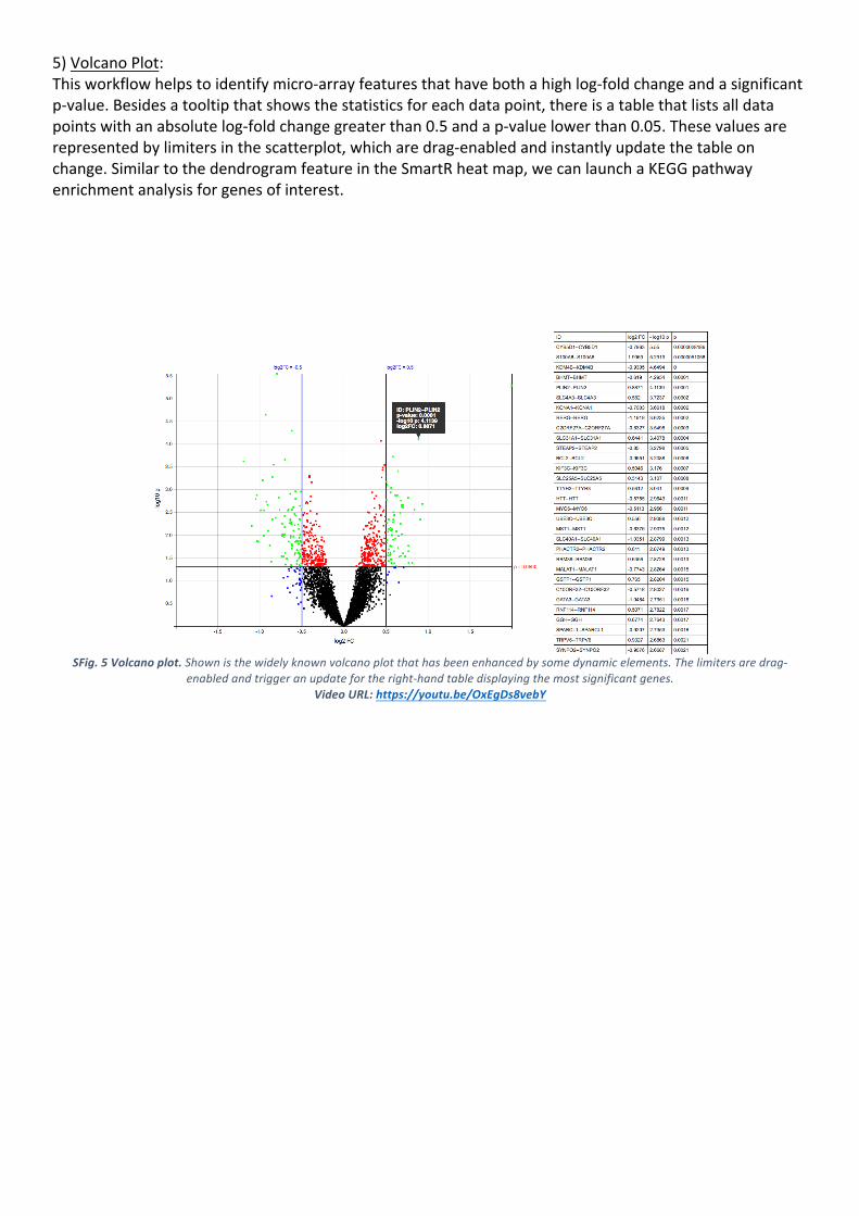
5)VolcanoPlot:Thisworkflowhelpstoidentifymicro-arrayfeaturesthathavebothahighlog-foldchangeandasignificantp-value.Besidesatooltipthatshowsthestatisticsforeachdatapoint,thereisatablethatlistsalldatapointswithanabsolutelog-foldchangegreaterthan0.5andap-valuelowerthan0.05.Thesevaluesarerepresentedbylimitersinthescatterplot,whicharedrag-enabledandinstantlyupdatethetableonchange.SimilartothedendrogramfeatureintheSmartRheatmap,wecanlaunchaKEGGpathwayenrichmentanalysisforgenesofinterest.
SFig.5Volcanoplot.Shownisthewidelyknownvolcanoplotthathasbeenenhancedbysomedynamicelements.Thelimitersaredrag-
enabledandtriggeranupdatefortheright-handtabledisplayingthemostsignificantgenes.VideoURL:https://youtu.be/OxEgDs8vebY
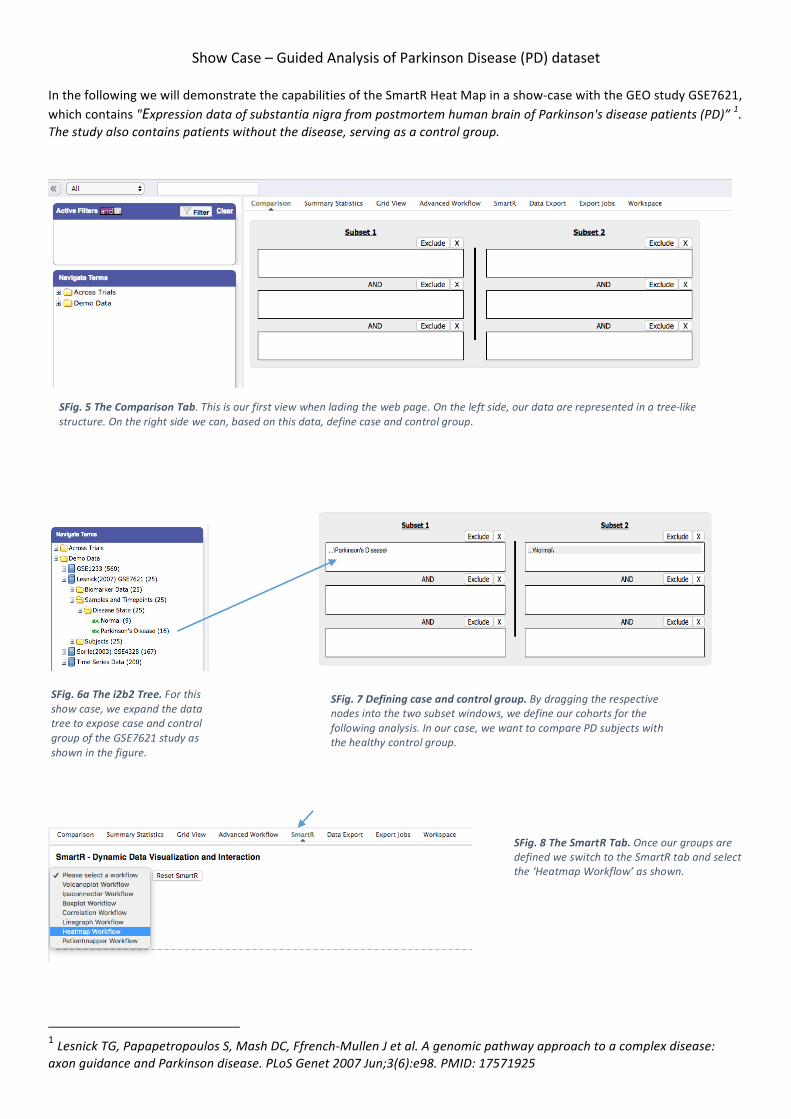
ShowCase–GuidedAnalysisofParkinsonDisease(PD)dataset
InthefollowingwewilldemonstratethecapabilitiesoftheSmartRHeatMapinashow-casewiththeGEOstudyGSE7621,whichcontains"ExpressiondataofsubstantianigrafrompostmortemhumanbrainofParkinson'sdiseasepatients(PD)”1.Thestudyalsocontainspatientswithoutthedisease,servingasacontrolgroup.
1LesnickTG,PapapetropoulosS,MashDC,Ffrench-MullenJetal.Agenomicpathwayapproachtoacomplexdisease:axonguidanceandParkinsondisease.PLoSGenet2007Jun;3(6):e98.PMID:17571925
SFig.5TheComparisonTab.Thisisourfirstviewwhenladingthewebpage.Ontheleftside,ourdataarerepresentedinatree-likestructure.Ontherightsidewecan,basedonthisdata,definecaseandcontrolgroup.
SFig.6aThei2b2Tree.Forthisshowcase,weexpandthedatatreetoexposecaseandcontrolgroupoftheGSE7621studyasshowninthefigure.
SFig.7Definingcaseandcontrolgroup.Bydraggingtherespectivenodesintothetwosubsetwindows,wedefineourcohortsforthefollowinganalysis.Inourcase,wewanttocomparePDsubjectswiththehealthycontrolgroup.
SFig.8TheSmartRTab.OnceourgroupsaredefinedweswitchtotheSmartRtabandselectthe‘HeatmapWorkflow’asshown.

SFig.9aTheFetchTab.Afterselectingaworkflow,wearepresentedwithseveralboxes.Theseboxescanbeusedtoassignrolestoourdatanodesfromthetreeontheleft.Inthisshowcaseweobviouslymustdefinetheexpressiondatawewishtoanalyze,butarefreetoincludeclinicaldata,aswewillseelater.
SFig.6bThei2b2Tree.Wefurtherexpandthetreetoshowthesubjectgenderandtheexpressiondata.
SFig.9bTheFetchTab.Again,byusingdrag-and-drop,wedefinewhatdatawewishtoincludeinouranalysis.Expressiondataaredraggedtotheleft-mostboxandthetwocategoricalgendernodesaredraggedtotheright-most.Aswewillseeinamoment,thiswillallowustorelatesubjectstotheirrespectivegender.
SFig.9cTheFetchTab.Nowwepressthebutton“FetchData”andwaitamomentuntilalldataareloadedandcanseeasmallsummaryofstatistics.Inthebackgroundthisstepfetchesthejustdefinednodesfromthedatabaseandassignsthesubjectstotheirrespectivecohortthatwedefinedearlier.
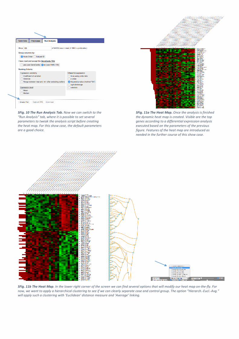
SFig.10TheRunAnalysisTab.Nowwecanswitchtothe“RunAnalysis”tab,whereitispossibletosetseveralparameterstotweaktheanalysisscriptbeforecreatingtheheatmap.Forthisshowcase,thedefaultparametersareagoodchoice.
SFig.11aTheHeatMap.Oncetheanalysisisfinishedthedynamicheatmapiscreated.Visiblearethetopgenesaccordingtoadifferentialexpressionanalysisexecutedbasedontheparametersofthepreviousfigure.Featuresoftheheatmapareintroducedasneededinthefurthercourseofthisshowcase.
SFig.11bTheHeatMap.Inthelowerrightcornerofthescreenwecanfindseveraloptionsthatwillmodifyourheatmapon-the-fly.Fornow,wewanttoapplyahierarchicalclusteringtoseeifwecanclearlyseparatecaseandcontrolgroup.Theoption“Hierarch.-Eucl.-Avg.”willapplysuchaclusteringwith‘Euclidean’distancemeasureand‘Average’linking.

SFig.12TheSubjectDendrogram.Abovetheheatmapwecanseeourcohorts,encodedinyellowandorangecolor,andthepreviouslyaddedgendernodes.Wecandeducetwofactsfromthisimage:1.Theclusteringcouldclearlyseparateourcohortsintotwogroups.2.Thesubjectgenderseemstohavenocorrelationastohowthedataaregrouped.
SFig.13TheRowDendrogram.Inasimilarfashionthegenesarewellseparatedintotwosubgroups.Forfurtheranalysis,wemightwanttoattempttoassociatethesegeneswithaKEGGpathway.Byclickingthemarkeddendrogramnodethecontainedleafs/genesaresendtoanexternalservicetohandlethistask(bioCompendium.Thehigh-throughputexperimentaldataanalysisplatform(2016).Retrievedfromhttp://biocompendium.embl.de/).

SFig.14BioCompendium.Sureenough,weseeanassociationofthesegeneswiththePDPathway.ClickingtheredflagontheleftsidewillbringustotheKEGGwebservice.
SFig.15KEGGPathway.Associatedgenesarehighlightedinanimageofthepathwayforfurtherinterpretationoranalysis.

SFig.16Statisticsrepresentation.Backintheheatmap,wehavealookattheredbarsontheleftside.Basedonouranalysisparameters,thesebarsinitiallyindicatetheadjustedp-valuefortherespectivegene.Onegeneshowsanextraordinarylowp-value,representedbyalongbar.
SFig.17aManualSorting.Byclickingthebuttonsaroundtheheatmap,wecanmanuallysortbycolumnsorrows.Sortingthecolumnsbasedontheexpressionvaluesforthissinglegeneseemstohavealmostnoimpact.
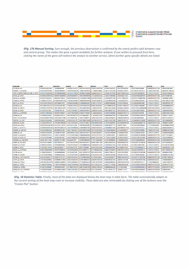
SFig.17bManualSorting.Sureenough,thepreviousobservationisconfirmedbythenearlyperfectsplitbetweencaseandcontrolgroup.Thismakesthegeneagoodcandidateforfurtheranalysis.Ifonewishestoproceedfromhere,clickingthenameofthegenewillredirecttheanalysttoanotherservice,wherefurthergenespecificdetailsarelisted.
SFig.18StatisticsTable.Finally,mostofthedataaredisplayedbelowtheheatmapintableform.Thetableautomaticallyadaptstothecurrentsortingoftheheatmaprowstoincreasevisibility.Thesedataarealsoretrievablebyclickingoneofthebuttonsnearthe“CreatePlot”button.