stylin' with css -...
TRANSCRIPT


Stylin’ with CSS: A Designer’s Guide
Third EditionC h a r l e s W y k e - s m i t h

Stylin’ with CSS: A Designer’s Guide, Third EditionCharles Wyke-Smith
New RidersFind us on the Web at: www.newriders.comTo report errors, please send a note to [email protected]
New Riders is an imprint of Peachpit, a division of Pearson Education
Copyright © 2013 by Charles Wyke-Smith
Project Editor: Nancy PetersonDevelopment Editor: Beth BastTechnical Editor: Curtis BlantonProduction Editor: Katerina MaloneProofreader: Darren MeissIndexer: Karin ArrigoniCompositor: Beth BastCover design: Aren StraigerInterior design: Mimi Heft
Notice of RightsAll rights reserved. No part of this book may be reproduced or transmitted in any form by any means, electronic, mechanical, photocopying, recording, or otherwise, without the prior written permission of the publisher. For information on getting permission for reprints and excerpts, contact [email protected].
Notice of LiabilityThe information in this book is distributed on an “As Is” basis without warranty. While every pre-caution has been taken in the preparation of the book, neither the author nor Peachpit shall have any liability to any person or entity with respect to any loss or damage caused or alleged to be caused directly or indirectly by the instructions contained in this book or by the computer software and hardware products described in it.
TrademarksMany of the designations used by manufacturers and sellers to distinguish their products are claimed as trademarks. Where those designations appear in this book, and Peachpit was aware of a trademark claim, the designations appear as requested by the owner of the trademark. All other product names and services identified throughout this book are used in editorial fashion only and for the benefit of such companies with no intention of infringement of the trademark. No such use, or the use of any trade name, is intended to convey endorsement or other affiliation with this book.
ISBN 13: 978-0-321-85847-4ISBN 10: 0-321-85847-6
9 8 7 6 5 4 3 2 1
Printed and bound in the United States of America

AcknowledgementsMy thanks and appreciation to the Peachpit team: Michael Nolan for encouraging me to write the third edition and getting it green-lighted, to my project editor Nancy Peterson for her guidance, insight, and patience, and to publisher Nancy Ruenzel for seven years of publishing my books.
On the development team, my thanks go to proofer Darren Meiss for his meticulous grammar, production editor Katerina Malone for her management skills, and Karin Arrigoni for the detailed work on the index.
A big thank you goes to my good friend and technical editor of this book, Curtis Blanton, for his detailed feedback and suggestions on the code and the explanations—a really great job, Curtis! Thanks also to programmers, Jeffrey Johnson and Isaac Shapira, for their advice and support.
Finally, a very special thanks goes to my wife Beth Bast who, as both development editor and compositor, has endlessly read and edited my drafts, created the book’s graphics, and laid out the entire book in InDesign. It has been an intense five months of work and her efforts and attention to detail are in every page of this book. Thanks, my love, I couldn’t have done it without you.
A big hug for my daughters, Jemma and Lucy, who have been very patient while their parents have focused on writing this book. We love you both.
— Charles Wyke-SmithCharleston, South Carolina, September 24, 2012
aC k n o W le d g e m e nt s iii

S t y li n ’ w ith C S Siv
About the AuthorCharles Wyke-Smith has been involved in media production for his entire career. In the mid-80s, he co-founded PRINTZ Electronic Design, an early, all-computerized design studio in San Francisco. He has worked in management and consulting roles at Wells Fargo, ESPN Videogames, and Benefitfocus, where he was Director of User Experience. In 2009, he co-founded PeopleMatter, an HR platform for the services industries. He is currently CEO of a new startup, Bublish, a book discovery platform.
Charles is a performing musician and author of several Web development books, including Stylin’ with CSS, Codin’ for the Web, Scriptin’ with AJAX, and Visual Stylin’ with CSS3. He lives in Charleston, South Carolina with his wife and two daughters.
Photo–kelly roper Photography, Charleston, sC

ContentsAcknowledgements • iii
About the Author • iv
Contents • v
Introduction • x
C hAp TE R 1 : h TM L MAR k u p AN D D o C u M E NT S T R u C T u R E • 1
The Basics of Markup • 2
Enclosing Tags for Text • 2
Non-Enclosing Tags for Referenced Content • 3
Attributes • 4
Headings and Paragraphs • 5
Compound Elements • 5
About Nested Tags • 6
Anatomy of an HTML Document • 7
An HTML Template • 7
Block and Inline Elements • 10
Nested Elements • 16
The Document Object Model • 20
Summary 22
C hAp TE R 2 : h o w C S S w o R k S • 23
The Anatomy of a CSS Rule • 24
CSS Rule Naming Conventions • 26
Contextual Selectors • 28
Specialized Contextual Selectors • 32
Child Selector > • 32
Adjacent Sibling Selector + • 33
General Sibling Selector ~ • 33
The Universal Selector * • 34
IDs and Classes • 35
The Class Attribute • 35
The ID Attribute • 38
ta b le o f C o nte nt s v

S t y li n ’ w ith C S Svi
When to Use an ID and When to Use a Class • 39
IDs and Classes Summary • 41
Attribute Selectors • 41
The Attribute Name Selector • 41
The Attribute Value Selector • 42
Summary of Attribute Selectors • 42
Pseudo-Classes • 43
UI Pseudo-Classes • 43
Structural Pseudo-Classes • 46
Pseudo-Elements • 47
Inheritance • 49
The Cascade • 50
Sources of Styles • 50
The Cascade Rules • 52
Calculating Specificity • 53
Rule Declarations • 55
Word Values • 55
Numerical Values • 56
Color Values • 57
Summary • 61
C hAp TE R 3 : p o S iTi o N i N G E LE M E NT S • 62
Understanding the Box Model • 62
Box Border • 63
Box Padding • 66
Box Margin • 67
Collapsing Margins • 68
Setting Units for Margins • 69
How Big Is a Box? • 70
Floating and Clearing • 75
The Float Property • 76
Three Ways to Enclose Floated Elements • 78
The Position Property • 85
Static Positioning • 86
Relative Positioning • 87

Absolute Positioning • 87
Fixed Positioning • 89
Positioning Context • 90
The Display Property • 92
Backgrounds • 93
CSS Background Properties • 94
Background Color • 95
Background Image • 95
Background Repeat • 96
Background Position • 97
Background Size • 99
Background Attachment • 100
Background Shorthand • 101
Other CSS3 Background Properties • 101
Multiple Background Images • 102
Background Gradients • 104
Summary • 107
C hAp TE R 4 : S T y Li N ’ Fo NT S AN D TE x T • 10 8
Fonts • 108
Font-Family Property • 109
Font-Size Property • 112
Font-Style Property • 115
Font-Weight Property • 116
Font-Variant Property • 116
Font Property • 117
Text Properties • 117
Text-Indent Property • 118
Letter-Spacing Property • 119
Word-Spacing Property • 121
Text-Decoration Property • 122
Text-Align Property • 122
Line-Height Property • 123
Text-Transform Property • 124
Vertical-Align Property • 125
ta b le o f C o nte nt s vii

S t y li n ’ w ith C S Sviii
Web Fonts Demystified • 126
Hosted Font Libraries • 127
Packaged @font-face Kit • 128
Generated @font-face Kit • 130
Stylin’ Text • 130
Basic Text Layout • 131
Stylin’ Text on a Grid • 135
An Exercise in Classic Typography • 141
Summary • 150
C hAp TE R 5 : pAG E L Ayo u T S • 151
Basic Layout Concepts • 151
Layout Height and Layout Width • 152
Creating Columns • 153
Setting Padding and Borders on Columns • 161
Three-Column, Fluid Center Layouts • 172
A Three-Column, Fluid Center Layout with Negative Margins • 172
A Three-Column, Fluid Center Layout with CSS3 Table Properties • 177
A Multi-Row, Multi-Column Layout • 179
Real-World CSS Selectors • 182
Inner Divs in Action • 184
Summary • 185
C hAp TE R 6 : i NTE R FAC E C o M p o N E NT S • 18 6
Creating Navigation Menus • 186
A Vertical Menu • 186
A Horizontal Menu • 189
Drop-Down Menus • 191
Forms • 201
The HTML Elements of a Form • 201
Form Markup Strategies • 209
Styling the Form • 210
A Search Form • 221
A Popup Overlay • 224
Stacking Context and z-index • 227
Summary • 230
C hAp TE R 7 : A C S S 3 - E NhAN C E D w E b pAG E • 231
Structuring the Page • 231
Planning the HTML • 232
Styling the Header • 236
The Title • 237
The Search Form • 239
The Menu • 242
The Feature Area • 249
Styling the Sign-In Form • 253
The Blog Links • 258
The Book Area • 260
The Footer • 268
Summary • 271
C hAp TE R 8 : R E S p o N S i v E D E S i G N • 272
Large Layouts on Small Devices • 272
Media Queries • 274
The @media Rule • 274
The Link Tag Media Attribute • 276
About Breakpoints • 277
The Viewport Meta Tag • 278
Optimizing the Layout for Tablets • 278
Optimizing the Layout for Smartphones • 282
Fine-Tuning for Portrait Format • 285
Finishing Touches • 287
The Scaling Bug in Safari Mobile • 287
Making the Drop-Down Menus Work on Touch Screens • 288
Conclusion • 290
AppE N D i x • 291
i N D E x • 29 9
ta b le o f C o nte nt s ix

S t y li n ’ w ith C S Sx
IntroductionThis is an exciting time to be a Web designer. The Web is now the way we consume almost all media, as cable TV, CDs, and DVDs are replaced by on-demand Web-delivered services like Hulu, Netflix, Pandora, and Spotify.
We also have a variety of devices on which to consume this media—desktop computers, laptops, tablets, smartphones, and massive 60-inch flat screen displays.
Supporting the delivery of content across all these different devices and media is an emerging technology standard—centered around browsers that use HTML5, CSS3, and JavaScript.
When I wrote the second edition of Stylin’ with CSS almost five years ago, a rigid and complex XML-based version of HTML, called XHTML, had become the standard. Because XHTML was unsuited to the free-wheeling and fast-moving world of Web development, Apple, Mozilla, and Opera formed the Web Hypertext Application Technology Working Group. The purpose of this organization was to revive the development of HTML that the World Wide Web Consortium had abandoned after HTML4 in favor of XHTML. The phoenix that arose from the ashes became known as HTML5, and in the last three years, the move from XHTML to HTML5 has occurred swiftly and with good reason.
HTML5 is designed for today’s multimedia Web, with a rich set of APIs (Application Programming Interfaces) that provide built-in support for video, audio, graphics, geo-location, data storage, and much more. HTML5 also offers many new elements for bet-ter of structuring documents (section, article, nav, and so on). Previously, semantically meaningless divs with identifying classes and IDs had been used for this purpose, which limited the portabil-ity and meaning of the markup.
During HTML’s transition from HTML4 to XHTML and then to HTML5, CSS3 has been steadily implemented by every browser. The visual-rendering toolbox that is CSS3 is a massive set of recom-mendations, so large that it has been divided into numerous mod-ules so that different teams can plan how each module will work.

Finally, you can utilize long-awaited CSS3 features, such as gradi-ents, transitions, transformations, shadows, and radiused corners, and be confident that the vast majority of users will see these fea-tures correctly rendered. For older browsers, where CSS3 is not fully supported, Modernizr, a JavaScript file that you link to your pages, enables you to detect support for specific CSS3 features. You can then provide fallbacks (alternative code) or polyfills (JavaScript code that simulates build-in CSS3 functionality) for those fea-tures. You can learn more about these fallbacks and polyfills in the Appendix section of this book.
Today, the Web is a much more user-friendly, and developer-friendly, place than it has ever been. Writing this latest version of Stylin’ with CSS has, as always, been a labor of hundreds of hours of coding and writing, countless late nights and endless cups of tea, but it has also felt like a kind of celebration. That’s because, behind the examples and exercises, this book describes a new state of the Web—the realization of a vision that has long been imagined. Thanks to the work and advocacy of Jeffrey Zeldman, Ian Hicks, and countless others, the long quest for Web standards appears to have been realized. It’s like inching your way up the side of a mountain and suddenly realizing you’re at the top. The fact that I no longer have to write (and waste pages of this book teaching you to write) hacks for older browsers for even the most simple layouts; that I can create shadows or radiused corners with a single line of CSS instead of using complex graphics and layers of divs; that every current browser displays my pages in a complete and consistent way—is a massive breakthrough.
So, in this book, I am looking forward to the future. Rather than spend pages showing you how to work around old browser incom-patibilities as I did in previous editions, I am focusing on the vast scope of what is possible now and in the future with HTML5, CSS3, and modern browsers. Internet Explorer 9 and up, and Firefox, Chrome, Safari, and Opera (which automatically update users to the latest versions) all behave in remarkably consistent ways. The number of users on older browsers (specifically IE8 and below) decreases every day. I provide information in the Technical Notes in the Appendix about how to work with older browsers, but the main narative of this book is to show you how CSS works today and in the future.
i nt r o d u C ti o n xi

S t y li n ’ w ith C S Sxii
A Focus on Essential TechniquesYou don’t need to be a brilliant artist or a computer programmer to be successful with CSS, although both those abilites can be put to good use. What you do need to do is have a solid grounding in the workings of HTML and CSS, and understand some key techniques and best practices. This book is designed to provide you with this understanding and provide a strong foundation for building your skills. CSS3 is so extensive that there are many features of it I didn’t even mention in this book. No matter, I believe that once you have read and worked thought the examples in this book, you will be able to rapidly extend your knowledge and skills—that at least is the sincere objective in what I have written here.
Download My Code, Don’t Rewrite itAll the code shown in this book is available for download at the book’s Web site, www.stylinwithcss.com. I recommend you use the download code rather than copying the code from the book; not only is it much quicker and easier to do that, but I will also update the download code to correct any errors that are found. I will also run an errata section on the site and post any reported inaccura-cies in the book. The site will have a new blog that I am starting, so please come by for information and maybe inspiration, and post comments and make suggestions for articles you would like to see.
Thanks for buying this book. I hope it’s a big help to you, and good luck with your Web endeavors.

C h a p t e r 4
Stylin’ Fonts and TextMuch of Web design deals with text, in paragraphs, headings, lists, menus, and forms, so understanding the CSS properties in this chapter is essential to making a site that looks professional. Almost more than any other factor, type makes the clearest visual state-ment about the quality of your site’s offerings. Graphics are the icing on the cake; typography is where good design begins.
In this chapter, you’ll learn about fonts and text, and the respective CSS properties you can use to style them. I’ll also introduce you to the wonderful world of Web fonts, which download to your user along with your pages. Now you no longer have to rely on the user having your font choices installed on his device, and you can be confident that every user will see your typography in the way you intend.
Let’s start with fonts.
FontsThe fonts you specify in your Web pages can come from three sources.
• The fonts that are installed on the user’s device. (Until recently, these have been the only fonts reliably available to your Web pages.)
• Fonts that are hosted on third-party sites, most notably Typekit and Google, and linked to your page using the link tag.
• Fonts that are hosted on your Web server and served to the user’s browser along with the page, using the @font-face rule.
In the font property descriptions that follow, the examples will show the first of these sources: the fonts that are installed on the user’s computer. See Web Fonts Demystified later in this chapter for a discussion of the other two sources.

s t y li n ’ fo nt s an d te x t 109
Now let’s look at the six properties that relate to font styling:
• font-family
• font-size
• font-style
• font-weight
• font-variant
• font (shorthand)
Font-Family PropertyExample: h2 {font-family:times, serif;}
font-family determines the font in which an element is displayed. Typically, you set a primary font for the entire page, and then only add font-family styles to elements that you want to display in a different font. To specify the font for the entire page, you set the font-family of the body element:
body {font-family:verdana, sans-serif;}
Aren’t Fonts and Text the Same Thing?the answer is “No,” and here’s why.
Fonts are the different kinds of typefaces. each font is a set of letters, numbers, and symbols with a unique visual appearance. Fonts are categorized into collections, based on their general look, such as serif, sans-serif, or mono-space. Fonts are made up of families, with names such as times and helvetica. a font family in turn can be bro-ken down into font faces, which are variations on the basic design of the font, such as times roman, times Bold, helvetica Condensed, and Bodoni Italic.
Text simply describes words and characters, like this sentence or the heading of a chapter, regardless of the font in which it is set.
CSS has a set of properties relating to fonts and a set of properties relating to text. Font properties relate to the size and appearance of collections of type. What is its family (times or helvetica, for example)? What size is it? Is it bold or italic? Text properties relate to the font’s treatment. What is its line height and letter spacing? Is it underlined or indented? and so on.
here’s a way I think about this perhaps seemingly subtle distinction. You can apply font styles, such as bold and italic, to a single character, but text properties, such as line height and text indent, only really make sense in the context of a block of text, such as a headline or a paragraph.

S t y li n ’ w ith C S S - Chap te r 4110
font-family is an inherited property, so its value is passed to all its descendants, which in the case of body is all the other elements in the markup.
Because fonts must either be on the user’s computer, or delivered over the Web, there is always a possibility that a particular font you specify might not be available to a page. For this reason, fonts are always specified in lists called font stacks.
S Pe c i F y i n g i n S TAlle d Fo nT S U S i n g Fo nT S TAc k S
Fonts are installed in the operating system of a device, which allows all resident applications to share them. Only a limited set of fonts come installed in the typical operating system, and fonts can be added and removed by the user, so you can never be absolutely certain what fonts will be available to display your pages. Because of this, when stating the font in which you want text to display, you must also list additional “fallback” fonts in case your first choice isn’t available on the user’s system. This list of choices is called a font stack.
In short, font stacks ensure that the user sees your page text in the intended font if it is installed on her device, and if it is not, then in a font that you specify as an acceptable substitute.
body {font-family:”trebuchet ms”, tahoma, sans-serif;}
This font stack effectively tells the browser “Display this document in Trebuchet MS, and if the system doesn’t have it, use Tahoma, and if neither is installed, use whatever generic sans-serif font is avail-able.” It is very important to make the last item of a font-family declaration a generic declaration, typically “serif” or “sans-serif”, as a final fallback.
There are five generic font-family names:
Serif—serif fonts have small details at the terminals (tips) of the characters (like this text)
Sans-serif—sans-serif fonts have no details at the terminals (like the headings of this book)
Monospace—every monospace font character occupies the same amount of horizontal space (like the code examples in this book)
Because the font name, Trebuchet MS, is more
than one word, it has to be in quotes.
From my own testing I’ve observed that
font-family names are not case sensitive, but do not alter the case of a font name generated by Google or another hosted font service or your font may not display.

s t y li n ’ fo nt s an d te x t 111
Cursive—cursive fonts look like handwriting (like the headline of The Hound of the Baskervilles example later in this chapter).
Fantasy—fonts that don’t fit the other categories (typically the strange and bizarre)
The purpose of these generic fonts is to ensure, that if none of your choices are available that, at a minimum, your document displays in the right type (no pun intended) of font.
It’s worth taking some care when selecting the fonts that you put in a font stack. For example, Dreamweaver offers a list of selectable font stacks that pop up every time you type font-family: in your CSS file, but these fonts are not ideal substitutes for one another. For example, here is a font stack that Dreamweaver offers:
verdana, arial, helvetica, sans-serif;
Verdana is a bulky font that has a much larger x-height than Arial, so if a user does not have Verdana installed, your page will be dis-played in Arial, a font that is smaller than the one you intended. More words will fit on each line, and the vertical height of text blocks may be shorter.
A good test is to view your pages with each font in the stack as the first choice so that you can see how the layout changes if it displays in one of the fallback fonts.
A better fallback for Verdana might be Tahoma, which has the same large x-height.
verdana, tahoma, sans-serif
For a stack of lighter sans-serif fonts, you might use
helvetica, arial, sans-serif
Here’s a stack of serif fonts starting with a font that the user may not have.
{font-family:“hoefler text”, georgia, times, serif;}
In a case like this, always complete the stack with fonts that are supplied with most computer’s operating systems, here Georgia and Times, and end with the generic, serif.
x-height is the main area of the letters, excluding
the ascenders and descenders of letters like d and p, which the letter x does not have, hence the name.
You can learn more about selecting fonts for
your font stacks at http://unitint-eractive.com/blog/2008/06/26/better-css-font-stacks.

S t y li n ’ w ith C S S - Chap te r 4112
Font-Size PropertyExample: h2 {font-size:18px;}
Every HTML text element has a default font-size set by the browser style sheet, so when you set an element’s font-size, you are changing its font size from that default. Font sizing can appear to act unpredictably if you don’t understand how the inheritance of font sizes down the hierarchy is affected by which font size units you use. There are two types of units that you can use to set the font-size: absolute units, such as pixels or points, and relative units, such as percentages or ems. Let me explain the difference between them.
font-size is an inherited property, so a change to the font size of an element will result in a proportional change of size in the font sizes of its descendant elements. This means that if you set the font-size of the body element to 200%, then the text of all the ele-ments on your page will double in size.
This effect occurs because in the browser style sheet, all element font sizes are set in the relative unit, em. For example, the h1
So, Which Fonts Are Available to All Users’ Browsers?that is a common question which has no definitive answer but you have a high probability that any Mac or pC will have these fonts installed:
Serif
Georgia
palatino/Book antiqua
times New roman
Sans-serif
arial
arial Black
arial Narrow
tahoma
trebuchet MS
Verdana
Monospace
Courier New
Lucida Console/Monaco
cursive
Comic Sans MS
Fantasy
Impact
Because of the often obscure fonts on today’s phones and tablets, it is more important than ever to include fallback generic font families in your font stacks. If you want to specify a specific font, use a hosted Web font or one that is downloaded from your Web server—see Web Fonts Demystified, later in the chapter.

s t y li n ’ fo nt s an d te x t 113
element is 2em, the h2 element is 1.5em, and p (paragraph) is 1em. By default, 1em is equivalent to 16 pixels—this is known as the font-size baseline. So by default, h1 is 32 pixels (16 × 2em = 32 pix-els), h2 is 24 pixels, and p is 16 pixels.
If you set the body text to 20px, you are resetting the baseline, so now h1 would be 40px (20 pixels × 2em = 40 pixels), h2 would be 30 pixels, and p would be 20 pixels. However, font-size inheritance will not occur in descendant elements that have been sized with absolute units such as pixels—these elements will always display at their specified size.
Let’s learn more about font sizing by looking at each method of siz-ing fonts in turn.
A B S o lU Te Fo nT S i z i n g
Sizing text with absolute units such as pixels, picas, or inches is simple; when you set the size of an element using absolute units, it stays that size no matter what font sizing is applied to its ancestors. The downside of absolute sizing is that if you decide to proportion-ally change the overall size of the text on your page, you have to change every absolute font-size in the style sheet; an absolutely-sized page requires more effort to fine tune.
In short, if you change the size of the body tag’s font, any abso-lutely-sized elements do not change size, but elements that have not been sized in your CSS will change proportionally to the size stated on body.
R e l ATi v e Fo nT S i z i n g
Sizing text with relative units such as percentages, ems, or rems is slightly more complex; when you set the size of an element using relative units, the size of the text is set relative to the size of the nearest “sized” ancestor.
Let’s consider this simple markup
<body>
<p>This is <strong>very important!</strong></p>
</body>
Fonts can also be sized using keywords such as
x-small, medium, and x-large. Medium is equal to the baseline size and the other keywords produce smaller or larger text. Because keywords produce a limited set of sizes, they are not widely used, but you can learn more about them at http://css-discuss.incutio.com/wiki/Using_Keywords.

S t y li n ’ w ith C S S - Chap te r 4114
and this CSS
p {font-size:.75em;}
strong {font-size:.75em;}
In this example, the p tag text would be 12 pixels (the body tag’s 16 pixel baseline × .75 = 12). Because strong is a child of p, its point size would be 9 points. What you see is that relative sizes com-pound down through the hierarchy—strong is 16 pixels × .75 × .75 = 9 pixels. Relative units can take practice to master, as unlike absolute sizes, changing the relative font size of an element also changes all the child elements by the same proportion.
However, with relative sizing, you have the ability to tweak the size of all elements proportionally by resizing body, or a number of elements by changing a shared ancestor element. This can be time saving as you experiment with your layout, but it also takes planning for the same reason; a change to an element’s font-size affects all its descendant elements, too.
You cannot tweak font sizes like this if you work in absolute font-size units—each absolutely-sized element must be resized indi-vidually. Of course, if you do size in absolute units, you can size an element without getting the often-unwanted “knock-on” effect of a change of size in its ancestors.
However, with today’s wide range of screen sizes, from massive monitors to tiny phones, the need for text that can be easily scaled makes relative sizing the preferred approach.
A n oTe o n R e M U n iT S
The new relative rem (root em) unit is a CSS3 addition that is gen-erating a lot of excitement in the Web community. When you size an element in rems, the size is relative, but only to the root HTML element. This gives you the best of both relative and absolute worlds; you can use relative sizing to proportionally change the overall font size by changing the font size of the HTML element, but unlike ems, font sizes are not compounded down through the hierarchy. Rems are supported by all the current browsers, but not by IE8 and earlier. The fallback is simple, however, and that is to provide absolute pixel sizing to browsers that don’t understand, and therefore ignore, rem declarations, like this
Set your font sizes working down the
hierarchy when using relative sizes.
If you want to use ems but also need to set
specific pixels sizes, a good trick is to set body’s font-size to 62.5%. By doing this, the baseline size is changed from 16 to 10 pix-els (16 × 62.5% = 10). Now it’s simple to translate ems to pixels: 1em equals 10px, 1.5em equals 15px, 2em equals 20px, and so on.
IE9 and earlier will only scale text set in relative
units (not absolute units such as pixels) when the user changes the text size of the layout using the browser’s View > text Size menu. This means that the minor down-side of using rems is that if IE7 and IE6 users want larger type, they have to use View > Zoom and increase the text size of the entire page. Just another reason for them to upgrade to a modern browser.

s t y li n ’ fo nt s an d te x t 115
p {font-size:14px; font-size:.875rem;}
Let’s now look at the other font-related CSS properties.
Font-Style PropertyValues: italic, oblique, normal
Example: h2 {font-style:italic;}
font-style determines whether a font is italicized or not. You can also write oblique instead of italic —the result is the same.
There are only two useful settings for the font-style property: italic to make regular text italicized, and normal to make a section within italicized type regular “upright” text. In this example
p {font-style:italic;}
span {font-style:normal;}
<p>This is italicized text with <span>a piece of non-italic text</span> in the middle.</p>
the code produces the result in Figure 4.1.
FI G u r e 4 .1 the normal value for the font-style property causes a specified section of text to appear normal within a bit of italicized text.
Note that the main purpose of italic text is to indicate emphasis, as in “It’s very hot today!” If you want to indicate emphasis, use the em tag, which styles the text as italic by default.
The normal valuenormal causes any of the possible effects of a property not to be applied. Why might you want to do this?
the reason this option is available is so you can selectively override a default or a global property you have set. headlines h1 through h6 are bold by default, so if you want to unbold the h3 element, for example, you need to write h3 {font-weight:normal;}. If your style sheet states a {font-variant:small-caps;} so that all links are in small caps, and you want one special set of links to be in regular upper- and lowercase type, you might write a declaration such as a.speciallink {font-variant:normal;}.
Ie8 and earlier use 14px

S t y li n ’ w ith C S S - Chap te r 4116
Font-Weight PropertyPossible values: 100, 200, and so on to 900, or lighter, normal, bold, and bolder.
Example: a {font-weight:bold;}
Despite all the numerical options listed here, browsers only dis-play two visual results for all font-weight values—bold or normal. Because interpretation of the numerical values differs among browsers, you’ll see the switch from normal to bold at various val-ues—typically around 400. It’s best to avoid using all values except bold and normal, as illustrated in Figure 4.2.
p.shows_weight {font-weight:bold;}
p.shows_weight span {font-weight:normal;}
<p class=”shows_weight”>This is bolded text with <span>a piece of non-bolded text</span> in the middle.</p>
FI G u r e 4 . 2 the normal value for the font-weight property causes a specified section of text to appear normal within the bolded text.
Note that the primary purpose of bold text is to indicate impor-tance, as in “Danger!” Mark up important text with the strong tag, which styles the text as bold by default.
Font-variant PropertyValues: small-caps, normal
Example: blockquote {font-variant:small-caps;}
This property accepts just one value (besides normal), and that is small-caps. This causes all lowercase letters to be set in small caps, like this:
h3 {font-variant:small-caps;}
The code above produces the result in Figure 4.3.
FI G u r e 4 . 3 here is a heading styled in small caps. Note the first letter of this text is in upper-case in the markup and remains unchanged.

s t y li n ’ fo nt s an d te x t 117
I often use small-caps with the ::first-line pseudo-element as I demonstrate in The Hound of the Baskervilles example at the end of this chapter. Use this styling sparingly because text in all uppercase is harder to read as it lacks the visual cues provided by the ascend-ers and descenders of lowercase type.
Font PropertyExample: p {font: bold italic small-caps .9em helvetica, arial, sans-serif;}
<p>Here’s a piece of text loaded up with every possible font property.</p>
The code above produces the result in Figure 4.4.
FI G u r e 4 .4 Bolded, italicized, small-capped, sized, and font-family specified—all in a single CSS rule.
The font property is a shorthand styling that lets you apply all of the font properties in a single declaration, reducing the amount of CSS you have to write. You must follow two rules, however, so that the browser can interpret the properties correctly.
Rule 1: Values for font-size and font-family must always be declared.
Rule 2: The sequence for the values is as follows:
1. font-weight, font-style, font-variant, in any order, then
2. font-size, then
3. font-family
Text PropertiesNow that you’ve looked at how to style font properties, it’s time to look at how to style text properties. If you want to indent a para-graph, create a superscript such as the 6 in 106, create more space between each letter of a headline, and many other type formatting tasks, you will use the CSS text properties.
Jumping ahead in this chapter somewhat, you
can write the font-size property to also include the line-height property (which is a text property rather than a font property) by writing the size as 12px/1.5 or similar. You’ll learn more about the line-height property in the “Text Properties” section next.

S t y li n ’ w ith C S S - Chap te r 4118
Here are the most useful text-related CSS properties:
• text-indent
• letter-spacing
• word-spacing
• text-decoration
• text-align
• line-height
• text-transform
• vertical-align
Text-indent PropertyValues: any length value (positive or negative)
Example: p {text-indent:3em;}
This property sets the start position of the text box in relation to the containing element. By default, that is the top-left corner of the container.
If you set a positive value to the text-indent, then the text moves to the right, creating an indented paragraph (Figure 4.5, example 1).
FI G u r e 4 . 5 these four examples illustrate the text-indent property.

s t y li n ’ fo nt s an d te x t 119
However, if you set a negative value for text-indent, the first line hangs out to the left of the containing element, so make sure that there is a place for it to go. If there’s an element to the left, the hanging text can overlap it, or if it’s close to the edge of the browser window, it is clipped (Figure 4.5, example 2). The way to avoid this problem is always to specify a positive left margin value greater than the specified negative indent. In Figure 4.5 example 2, the negative indent is –1.5 ems, but in Figure 4.5, example 3, there is also a left margin value of 2 ems. Here is how this is written.
p {text-indent:-1.5em; margin-left:2em; border:1px solid red;}
Indents can help give text a professionally-styled look and also give the reader clear visual entry points into the text blocks. Remember to set indents and related margins in ems, as I have done here, so that the indent remains proportional to the line length if the user (or you) changes the font size.
letter-Spacing PropertyValues: any length values (positive or negative)
Example: p {letter-spacing:.2em;}
Positive letter-spacing values increase the overall space between letters, while negative values decrease it. Always use relative values such as ems for letter spacing, even if you are setting the font size in pixels, so that the spacing remains proportional if the font size
inherited values are computed valuesOne more important note here: text-indent is inherited by child elements. For example, if you set a text-indent on a div, all the paragraphs inside the div will have that text-indent value. however, as with all inherited cSS values, it’s not the defined value that’s passed down but the computed value. here’s an example that explains the implications of this fact.
Let’s say you have a div containing text that’s 400 pixels wide with a 5 percent text indent. In this case, the indent for that text is 20 pixels (5 percent of 400). Within the div is a paragraph that’s 200 pixels wide. as a child element, the paragraph inherits any text-indent value, so it is indented too, but the value it inherits is the result of the calculation made on the parent, that is, 20 pixels, not the defined 5 percent. as a result, it too has a 20 pixel indent even though it’s half the width of the parent element. this ensures that all the paragraphs have nice matching indents, regardless of their widths. Of course, you can override this behavior by explicitly setting a different text-indent for child elements.

S t y li n ’ w ith C S S - Chap te r 4120
Meet the Text Snakea very important concept of how CSS manages text is that CSS puts an invisible box around the text inside an element. For example, if you put a block of text in a paragraph p element, CSS sees the actual text as a long line of text, even if it gets broken across multiple lines in order to fit in the container. to make this clear, in Figure 4.6, the border of the containing element (the paragraph) is in red, and the border of the text box is in green. text properties are applied to the green text box.
FI G u r e 4 . 6 text is contained within a long, skinny box that is often broken across multiple lines.
In this example, I mark up the text like this
<p><span>Here is a long paragraph…</span></p>
and apply the following styles
p {border:3px solid red;}
span {border:1px solid green;}
Note that the text box is broken across the lines and is only closed at the beginning of the first line and the end of the last line. Knowing this can help you get things looking the way you want faster. For example, if you want to indent the first line of a paragraph, you can use the text property text-indent, as I do in Figure 4.5, and then you are moving the start position of the text box. Subsequent lines are not indented because to CSS, it’s just one long piece of text.
If you want the whole paragraph indented, then you need to set the margin-left property of the paragraph; in other words, you have to push the whole container to the right. all you need to remember is that text properties are applied to the long, thin, snake-like inner text box, not the box of the containing element.

s t y li n ’ fo nt s an d te x t 121
changes. Examples are shown in Figure 4.7. letter-spacing con-trols tracking, which is the typographical term for the letter spacing applied to all characters in a block of text. This contrasts with kern-ing, which is the term for adjusting the space between two specific characters.
FI G u r e 4 .7 You can see how changing the letter-spacing value changes the look of your text.
The default letter spacing of a font appears looser as the text gets larger, so tightening the letter spacing of a headline adds refine-ment to your Web page. Note the text and headline I tightened in Figure 4.7 only have .05 em (a twentieth of an em) of letter spacing removed from between each character; much more and the letters would start to merge into each other.
Word-Spacing PropertyValues: any length values (positive or negative)
Example: p {word-spacing:.2em;}
Word spacing is very similar to letter spacing except, as you might imagine, the space changes between each word rather than between each letter. CSS treats any character or group of characters with white space around them as a word. Second, even more than letter spacing, word spacing can easily be overdone and result in some very hard-to-read text (Figure 4.8).
FI G u r e 4 . 8 paragraphs and headlines with normal, negative, and positive word spacing.
If you use wide letter spacing, then the spaces
between the words aren’t as easy to differentiate, so that’s a good time to add in a little word spac-ing, too.

S t y li n ’ w ith C S S - Chap te r 4122
Text-decoration PropertyValues: underline, overline, line-through, blink, none
Example: .retailprice {text-decoration:line-through;}
These values, with the exception of blink, are displayed in Figure 4.9. blink, which makes text flash on and off, is truly annoying, and should be used sparingly, or better yet, not at all.
FI G u r e 4 . 9 these are the vari-ous text-decoration values, but the most useful application is the control of underlining on links.
The primary application of text decoration is controlling the under-lining of links. Here’s an example that removes the underlining of links in a navigation bar, where the text is obviously clickable and underlining is just clutter, but adds it back when the user rolls over a link, providing a little tactile feedback.
nav a {text-decoration:none;}
a:hover {text-decoration:underline;}
Text-Align PropertyValues: left, right, center, justify
Example: p {text-align:right;}
There are only four values for this property: left, right, center, and justify. The text aligns horizontally within the element. Note that center will also center a smaller fixed-width element or image horizontally within a larger element. Figure 4.10 shows the four possible text-align values in action.
Note that Web users are so used to underlining
as the visual cue for links that you are setting them up for frustration and a lot of useless clicking if you underline text that is not in fact a link.

s t y li n ’ fo nt s an d te x t 123
FI G u r e 4 .10 the four text-align values.
line-Height PropertyValues: any numerical value (value type is optional)
Example: p {line-height:1.5;}
line-height is the CSS equivalent of leading (pronounced like the metal) in the world of print. Leading creates space between the lines of a block of text.
Line height is distributed above and below the text. For example, if you have a font size of 12 pixels and you set the line height to 20 pixels, the browser adds 4 pixels of space above and 4 pixels of space below to achieve the 20 pixel line height.
On a single line of text like a headline, line-height acts like another margin, and large headlines (h1 and h2, for example) have a sig-nificant amount of default line height. This is worth remembering, because sometimes you will find that even after removing mar-gins and padding, you still can’t eliminate all the space above and below a headline. To do this you need to reduce the line height also, sometimes to a height less than that of the text, i.e., less than 1.
In case you’re wonder-ing where the term
“leading” comes from, in the early days of printing, a strip of lead was used to space the lines of type.

S t y li n ’ w ith C S S - Chap te r 4124
FI G u r e 4 .11 a variation of the standard line height is a simple way to give a distinctive look to your pages.
As shown in Figure 4.11, the simplest way to change this default line height is to use the font shorthand property and write a compound value for both font-size and line-height in one. For example:
div#intro {font:1.2em/1.4 helvetica, arial, sans-serif;}
In this case, the leading is 1.4 times the font size of 1.2 ems. Note that you don’t need any units, such as ems or pixels, specified for the line-height part of the value, just a number. In this case, CSS simply takes the calculated size of whatever number of onscreen pixels 1.2 ems works out to be and multiplies it by 1.4 to arrive at the line height. If you later increase the font size to 1.5 ems, the line height (leading) is still 1.4 times the calculated amount of 1.5 ems. Note if you specify a line height in a fixed unit, such as pixels, and you increase the font size, then the lines of text may start to overlap one another.
Text-Transform PropertyValues: none, uppercase, lowercase, capitalize
Example: p {text-transform:capitalize;}
text-transform changes the capitalization of text within an ele-ment. You can force a line of text to have initial letters capitalized, all text uppercase, or all text lowercase. Figure 4.12 illustrates these options.
capitalize capitalizes the first letter of every word. This emulates the style of many headlines in ads, newspapers, and magazines, except that a human applying such styling tends to leave the capi-talization off minor words such as “of,” “as,” and “and,” as in “Tom
If you want large and small caps, then you
need font-variant:capitalize.

s t y li n ’ fo nt s an d te x t 125
and Jerry Go to Vegas.” CSS capitalization simply produces “Tom And Jerry Go To Vegas.”
FI G u r e 4 .12 text-transform lets you add newspaper-style headline formatting to text.
vertical-Align PropertyValues: any length value, sub, sup, top, middle, bottom
Example: span {vertical-align:60%;}
vertical-align moves text up or down with respect to the baseline, but note that it only affects inline elements. If you want to vertically align a block-level element, you must also set its display property to inline. One of the most common uses is for superscript and subscript numbers in formulas and mathematical expressions, such as x4–y-5 or N3O. It’s also the correct way to style asterisks and other markers within text to indicate footnotes. I don’t like the way most browsers style sub- and superscripts by default—the font size is too large and too high (or low, for subscript) for my liking. A little styling can render better, and more consistent cross-browser, pro-portions.
Here’s the HTML for this example
<h4>Default <code>sub</code> and <code>sup</code> styles</h4>
<p>Enjoy mountain spring H<sub>2</sub>O. It’s 10<sup>5</sup> times better than tap<sup>†</sup> water!</p>
<p class=”customsmall”><sup>†</sup><em>This means water provided through a municipal distribution system</em></p>
<h4>Custom <code>sub</code> and <code>sup</code> styles</h4>

S t y li n ’ w ith C S S - Chap te r 4126
<p class=”custom”>Enjoy mountain spring H<sub>2</sub>O. It’s 10<sup>5</sup> times better than tap<sup>†</sup> water!</p>
<p class=”customsmall”><sup>†</sup><em>This means water provided through a municipal distribution system</em></p>
and the CSS
p.custom sub {font-size:60%; vertical-align:-.4em;}
p.custom sup {font-size:65%; vertical-align:.65em;}
p.customsmall {font-size:.8em; vertical-align:1em;}
FI G u r e 4 .13 Superscripting and subscripting vary the vertical position and size of text.
While the HTML tags sup and sub create superscript or subscript text automatically, it’s worth using vertical-align and font-size in combination to produce a more pleasing result (Figure 4.13). This covers the font and text properties of CSS. Now let’s look at how fonts can be downloaded into your Web pages.
Web Fonts DemystifiedA now widely implemented CSS feature is the capability to embed downloadable fonts into your pages, using the @font-face rule.
@font-face gives designers greatly expanded font options beyond the basic system fonts. Now you can ensure that the fonts you specify are available to your user’s browser because they are down-loaded to the browser from a Web server and you no longer have to rely on your font choices being installed on the user’s device.
There are three ways to specify Web fonts:

s t y li n ’ fo nt s an d te x t 127
• Use a hosted font library that delivers fonts to your Web pages, such as Google Web Fonts or Adobe’s Typekit
• Use a pre-packaged @font-face kit
• Generate an @font-face kit from one of your own fonts using Font Squirrel
Let’s start with the easiest method—accessing a hosted font library.
Hosted Font librariesThe two largest hosted font libraries are Google Web Fonts, which offers free use of their 500-plus font collection, and Adobe’s Typekit, which offers subscription-based access to their collection of 739 font families. Both have easy-to-use interfaces.
Here’s how the process works on Google Web Fonts. Go to http://www.google.com/webfonts, find the font you want, click the Add to Collection button, then click Use at the bottom of the page (Figure 4.14). Google then generates a link tag with a reference to your selected fonts that you paste into the head of your HTML file.
FI G u r e 4 .14 the font, Niconne, is added to my collection so Google will generate a link to this font.

S t y li n ’ w ith C S S - Chap te r 4128
Multiple fonts can be linked in a single line of code. This link tag references the Anton, Niconne, and Prata fonts.
<link href=’http://fonts.googleapis.com/css? family=Anton|Niconne|Prata’ rel=’stylesheet’ type=’text/css’>
Once you have added the link in the head of the page, you can then use the fonts in the same way as you would use any other font. When your page is viewed, the font is served into your user’s page directly from Google. For example
h3 {font: 20px “Prata”, serif;}
displays as shown in Figure 4.15.
FI G u r e 4 .15 Your users now see the headline in prata.
Using a hosted font library offers a quick and reliable way to extend the otherwise limited palette of system fonts. You can add Google fonts to your pages in minutes, and by using them in your designs you can be virtually certain that your users will view your pages in the font that you intended.
Packaged @font-face kitThe second method of embedding fonts in your pages uses the @font-face rule, which requires that the fonts are accessible from your site’s, or a third-party, Web server. Fonts served in this way download to the browser when the first page that uses each font loads; after that, they are cached in the user’s browser and don’t have to download again. Note that the user can’t use the font for any purpose except to display Web pages that include that font.
The @font-face approach involves more effort, but offers the pos-sibility to use virtually any font you wish. Because of licensing restrictions, you must either purchase a font, or use a royalty-free font, that is licensed for embedding.
One issue with using @font-face is that different browsers require different font formats. The Firefox browser, and Webkit brows-ers such as Safari, Chrome, and mobile Safari iOS since v4.1, use OpenType (OTF) or TrueType (TTF) font formats. Internet Explorer uses the Embedded OpenType (EOT) format, and some other

s t y li n ’ fo nt s an d te x t 129
browsers, such as mobile Safari pre-iOS 4.1, use the Scalable Vector Graphics (SVG) format. However, the different font formats are available in ready-to-use kits, or can be readily generated from a font on your computer (again, ensure you have a license to use the font in this way).
Font Squirrel (www.fontsquirrel.com) offers an extensive library of fonts in ready-to-use “font kits.” Each font kit includes the font in all the required font formats, and the related CSS code to ensure that each browser is served the correct format. FontSquirrel also has a converter that allows you to upload and convert any font into a font kit.
Here is an example of Font Squirrel’s @font-face CSS code for the font Ubuntu Titling Bold, but this format will work for fonts from other sources, too.
@font-face {
font-family: ‘UbuntuTitlingBold’;
src: url(‘UbuntuTitling-Bold-webfont.eot’);
src: url(‘UbuntuTitling-Bold-webfont.eot?#iefix’) format(‘embedded-opentype’),
url(‘UbuntuTitling-Bold-webfont.woff’) format(‘woff’),
url(‘UbuntuTitling-Bold-webfont.ttf’) format(‘truetype’),
url(‘UbuntuTitling-Bold-webfont. svg#UbuntuTitlingBold’) format(‘svg’);
font-weight: normal;
font-style: normal;
}
Once this code is added to the page you can reference it with a font-family rule in the normal way, using the font-family name that is stated in the font-family value of the @font-face rule.
this is the font name that you reference in your font stack
There is also the inter-esting “smiley face”
variation of cross-browser @font-face code devised by Web maven, Paul Irish, which further ensures that in the unlikely event that a font with the same name is already installed on a user’s com-puter, it won’t be confused with the one you want that user to see (http://paulirish.com/2009/bul-letproof-font-face-implementa-tion-syntax).

S t y li n ’ w ith C S S - Chap te r 4130
generated @font-face kitSometimes, you need to use a specific font in your design—a typi-cal situation is that a client has a corporate font that you must use in the Web site you are designing. Today, as long as you have licens-ing rights to use that font as a Web font (check the font’s license agreement or check with the company that manufactured the font), you can convert that font into an @font-face kit at Font Squirrel (http://www.fontsquirrel.com/fontface/generator). Just follow the simple steps and in a few minutes, you will have downloaded an @font-face kit that is ready to go onto your server.
Before I move on to some examples of designing with type, I’ll make a couple of observations on embedded fonts. Until the day that all browsers manufacturers settle on one font format (which probably should be OpenType), you will have to deal with the com-plexities of multiple font formats. You can learn all about the pre-ceding multi-font @font-face syntax, and how it ensures Internet Explorer gets the required .eot format font, at Fontspring’s Blog (http://www.fontspring.com/blog/fixing-ie9-font-face-problems). Fontspring also sells fonts that are licensed for use with @font-face.
Since the inception of the Web, designers have been limited, except with great effort, to fonts that are generally available on the PC and Mac operating systems. The long-awaited implementation of @font-face in all modern browsers, including IE9 and later, finally gives Web designers the access to the same smorgasbord of fonts available to their print brethren. The fallback for older browsers that don’t support @font-face is simple: Those users simply get the next font listed in the font stack, so be sure to list other more com-mon fonts that are found on users’ systems after your preferred embedded ones.
Stylin’ TextIt’s time to put all your new-found knowledge about fonts and text into practice. I’m going to conclude this chapter with three examples of how you can create good-looking typography, from the quick and simple to the considered and sophisticated.
If you want to gain a greater understanding
of @font-face, I recommend you read Tim Brown’s blog article How to Use CSS @font-face (http://nicewebtype.com/notes/2009/10/30/how-to-use-css-font-face).

s t y li n ’ fo nt s an d te x t 131
There is the notion of rhythm in typography, that defines the regu-lar flow of the type down the page, generally achieved by working to an underlying grid. Good rhythm helps the eye move smoothly over the page.
Let’s start with some quick and basic text styling, and rather than use an underlying grid to organize our type, simply space each ele-ment proportionately to its type size. This exercise will allow you to see how to get a result fast if that’s what’s needed.
Basic Text layoutAs you saw in Chapter 1, the default browser stylings for headings, paragraphs, lists, and other text elements have a very wide range of sizes, and the vertical margins between them are too big. To illus-trate how to style these defaults into a more pleasing presentation, here’s markup with some commonly used text elements.
<article>
<h1>CSS</h1>
<p>CSS stands for Cascading Style Sheets. CSS controls the presentational aspects of your Web pages.</p>
<h2>Block-Level Elements</h2>
<p>Block-level elements stack down the page. They include:</p>
<ul>
<li><code>header</code></li>
<li><code>section</code></li>
<li><code>h1, h2, etc.</code></li>
</ul>
<h2>Inline Elements</h2>
<p>Inline elements sit next to each other, if there is room. They include:</p>
<ul>
<li><code>img</code></li>
<li><code>a</code></li>

S t y li n ’ w ith C S S - Chap te r 4132
<li><code>em</code></li>
</ul>
<blockquote>
<q>Typography maketh the Web site.</q><cite>CWS</cite>
</blockquote>
</article>
Figure 4.16 shows this markup displayed in a browser.
FI G u r e 4 .16 unstyled markup is not very attractive.
Here are some steps to quickly style this markup into a more pleas-ing layout. First, let’s remove the margins that are creating all the space between the elements, set the overall font, and style the article tag that encloses all the text elements into a visual con-tainer that surrounds the text and centers it on the page.
* {margin:0; padding:0;}
body {font:1.0em helvetica, arial, sans-serif;}
article {width:500px; margin:20px auto; padding:20px; border:2px solid #999;}
The font-size of 1em simply states the default
size, and doesn’t change anything yet, but I have to state a font size along with the font family in the font shorthand property. Also, because I am setting the type in a relative size, ems, if I later want to change the size of all the type on the page, I can make a single adjustment here.
remove all margins
set overall font size and family
a centered box

s t y li n ’ fo nt s an d te x t 133
Figure 4.17 shows the displayed result in the browser.
FI G u r e 4 .17 removing the default margins greatly reduces the vertical height of the content.
Next, there needs to be some strategically-placed vertical space between the elements. Also, with the margins gone, the list bullets hang into the margin so I’ll fix that, too.
h1, h2, h3, h4, h5, h6 {line-height:1.15em; margin-bottom:.1em;}
p, ul, blockquote {line-height:1.15em; margin-bottom:.75em;}
ul {margin-left:32px;}
FI G u r e 4 .18 Space has been added after the paragraphs.
indent on lists
space around headings
space around other text elements

S t y li n ’ w ith C S S - Chap te r 4134
As you can see in Figure 4.18, I have tightened up the line-height of all the elements, making each element’s line-height only slightly larger than the height of the text. This is because line-height is added equally above and below the text and I only want to add space below each element, which I do by applying margins. However, I have to leave some line-height or the adjacent lines of the paragraph text (and the headings if they run over to a second line) will touch.
Note there are only two settings for the margins, the exact amount of space of which is relative to each element’s font size. I give the headings very small bottom margins (equal to 15% of each one’s font size) so they sit close above elements that follow them. I give all the other text elements a larger bottom margin (equal to 75% of each one’s font size) to create white space after them in the layout.
As a final step, I want to get a better balance between the headings, so that the bigger headings stand out and the smallest ones don’t get lost, and also increase the size of the inline code elements.
h1 {font-size:1.9em;}
h2 {font-size:1.6em;}
h3 {font-size:1.4em;}
h4 {font-size:1.2em;}
h5 {font-size:1em;}
h6 {font-size:.9em;}
p {font-size:.9em;}
code {font-size:1.3em;}
While this example is quick and basic, it shows that some minimal text styling can greatly improve the appearance of the page and readability of the content (Figure 4.19). Let’s now look at how to achieve a more sophisticated look through the use of grids.
size heading text
size paragraph text
size code text (too small by default)

s t y li n ’ fo nt s an d te x t 135
FI G u r e 4 .19 Now with larger heading and code text, the page is more visually pleasing and helps the viewer understand the hierar-chy of the information.
Stylin’ Text on a gridUsing a grid to lay out your type provides a rhythm and visual flow to the page. Because I am looking at type in this chapter, I’ll focus on using a grid to create the vertical flow of text.
In this example, I’ll create a layout based on a vertical 18-pixel grid and every element will align with it. Because a graphic can be added into the background of an element, in this case body, I can temporarily add a simple spacing guide into the page.
Here I use Adobe Fireworks (you can use the graphics program of your choice) to make a white rectangle 100 by 18 pixels and add a 1 pixel gray line along the bottom. I save it in .png format (.jpg or .gif work just fine, too) with the name grid_18px.png. Figure 4.20 shows how it looks (shown on a pale blue background for clarity).
FI G u r e 4 . 20 the tile that I will use in the background of the page. a thin gray line runs along its bottom edge.
I add this image into the background of the body element
body {background-image:url(images/grid_18px.png);}
and it tiles itself across and down the page (Figure 4.21).
add the grid lines

S t y li n ’ w ith C S S - Chap te r 4136
FI G u r e 4 . 21 a tiled image added to the body element creates a ruled background on which type can be vertically aligned
With the horizontal lines of the grid in the background, I now start positioning the text elements, using the grid as a guide.
For this example, I use just a few common text elements but it’s easy, once you get the hang of how this works, to build a text style sheet with a full set of “grid-aligned” HTML text elements that you can use as the basis for all your sites.
I’ll start with a simple paragraph
<p>In traditional typography, text is composed…</p>
and this CSS
* {margin:0; padding:0;}
body {
background-image:url(images/grid_18px.png);
font:100% helvetica, arial, sans-serif;
margin:0 40px 0;
}
p {
font-size:13px;
line-height:18px;
}
Note that I match the text’s line-height to the grid distance: 18 pixels. With all default margins and padding removed, I now know every line will be 18 pixels apart (Figure 4.22).
add the grid lines
set the font
set the font size
large left and right margins create a crude column for this demo
set line-height equal to grid distance
remove padding and margins off all elements

s t y li n ’ fo nt s an d te x t 137
FI G u r e 4 . 22 the 18-pixel line height causes the spacing of the lines to match the grid distance.
Next I add 4 pixels of padding to the container, body, to push this element down and align the baseline of its text with the grid. Once this first element aligns to the grid, it will be easy to get the ele-ments that follow it to do the same. Actually, I’ll add 22 pixels (4 + 18) to also give an empty line of breathing space at the top, by add-ing this declaration to body.
padding-top:22px;
While I’m at it, I’ll add this declaration onto the paragraph:
p {
font-size:13px;
line-height:18px;
margin-bottom:18px;
}
This will create exactly one empty grid line between each para-graph. Adding another paragraph will help show the effect of these two changes (Figure 4.23).
FI G u r e 4 . 23 With padding added to body, the text now aligns perfectly with the grid.
set the font size
set line-height = to grid height

S t y li n ’ w ith C S S - Chap te r 4138
Now that the text and grid are aligned, and the paragraphs are cor-rectly spaced, I’ll set font sizes for the other text elements. I start with the h3 tag, which I set at 18 pixels. Of course, it too will have a line-height of 18 pixels so that it occupies exactly one line of the grid. To test its spacing, I’ll insert it in the markup between the two paragraphs.
<p>In traditional typography, text is composed…</p>
<h3>Type for Every Use</h3>
<p>The ubiquity of type has led typographers…</p>
Here’s the CSS for the new heading:
h3 {font-size:18px; line-height:18px;}
FI G u r e 4 . 24 the baseline of the h3 element’s text sits slightly below the grid line.
As you can see, the headline sits a couple of pixels below the base-line but, surprisingly, does not push the following paragraph down by the same amount (Figure 4.24). The reason is, that while the headline’s line-height is correct, at this size and with this font the text is slightly offset within it. Here’s how to correct this.
FI G u r e 4 . 25 a small negative top margin and an equal positive bottom margin pulls the headline up into perfect alignment on the grid.

s t y li n ’ fo nt s an d te x t 139
h3 {font-size:18px; line-height:18px; margin-top:-2px; margin-bottom:2px;}
The negative top margin pulls the type up, and the same amount of positive bottom margin offsets this change to keep the element that follows exactly where it was (Figure 4.25).
A second and similar alignment technique is needed for those ele-ments, usually headings, that are larger than the grid distance. To illustrate, I’ll next add a 24 pixel h1 headline. Obviously, 24-pixel text is going to occupy more than one line of the grid, so in this case I’ll set the line-height to span two lines—36 pixels. I’ll put the h1 element where it usually appears—the first element on the page.
<h1>Typography</h1>
<p>In traditional typography…</p>
Let’s start with this CSS:
h1 {font-size:24px; line-height:36px;}
FI G u r e 4 . 26 Because the line-height is equal to two lines of the grid, the type does not sit on a grid line.
This big headline sits uncomfortably between two lines (Figure 4.26). Its descenders will touch the paragraph text if I move it down onto the nearest line, so I’ll move it up instead. With a little trial and error, I determine this distance to be 13 pixels.
h1 {font-size:24px; line-height:36px; margin-top:-13px; margin-bottom:13px;}
This h1 now has some white space below it to set it off from the text (Figure 4.27). I could do this with the smaller headline too, but I think it looks better close to the element that follows it.
An alternative approach here would to be to
exactly position the baseline of this headline halfway between two grid lines. It can be a nice change of pace to do this, but be sure the next element is aligned to the grid again.

S t y li n ’ w ith C S S - Chap te r 4140
FI G u r e 4 . 27 the h1 headline now sits correctly on a grid line.
To finish this exercise, I’ll add some different sized headings, an unordered list, and a blockquote to show what a more complete page looks like once the grid is removed.
* {margin:0; padding:0;}
body {font:100% helvetica, arial, sans-serif; background-image:url(images/grid_18px.png); margin:0 20px 0; padding:21px;}
p {font-size:14px; line-height:18px; margin-bottom:18px;}
h1 {font-size:24px; line-height:36px; margin-top:-13px; margin-bottom:13px;}
h2 {font-size:18px; line-height:18px; margin-top:-2px; margin-bottom:2px;}
h3 {font-size:16px; line-height:18px; margin-top:-2px; margin-bottom:2px;}
ul {margin-bottom:18px;}
li {font-size:13px; list-style-type:none; padding:0 20px; line-height:18px;}
a {color:#777; text-decoration:none;}
blockquote {font-size:12px; line-height:18px; padding-top:2px; margin-bottom:16px;}
You can see the HTML for this exercise in the
download code at http://www.stylinwithcss.com.

s t y li n ’ fo nt s an d te x t 141
FI G u r e 4 . 28 a page layout based on an 18-pixel grid.
As you can see in Figure 4.28, there’s something pleasing about a page that’s laid out on a grid. From a technical perspective, if you style your type on a grid-based layout for a site where the content will be managed by others, then the page will always lay out nicely, regardless of the order of the elements.
An exercise in classic TypographyTo end this chapter, I’ll lay out a small excerpt of The Hound of the Baskervilles (edited for the purpose of this example), using many of the font and text properties you have seen in this chapter. You’ll see a number of techniques to achieve high-quality typography,

S t y li n ’ w ith C S S - Chap te r 4142
including the use of HTML entities, letter and word spacing, drop caps, a vertical grid (this time 24 pixels), and downloaded fonts.
The markup is quite simple: two headings, a number of para-graphs, and a blockquote.
<h2>an excerpt from</h2>
<h1>The Hound of the Baskervilles</h1>
<p>Holmes stretched out his hand for the manuscript and flattened it upon his knee. “You will observe, Watson, the alternative use of the long s and the short. It is one of several indications which enabled me to fix the date.” At the head was written: “Baskerville Hall,” and below in large, scrawling figures: “1742.”</p>
<p>“It appears to be a statement of some sort.”</p>
<p>“Yes—it is a statement of a certain legend which runs in the Baskerville family.”</p> <blockquote>
<q>Of the origin of the Hound of the Baskervilles there have been many statements, yet as I come in a direct line from Hugo Baskerville, and as I had the story from my father…</q>
</blockquote>
<p>When Dr. Mortimer had finished reading this singular narrative he pushed his spectacles up on his forehead and stared across at Mr. Sherlock Holmes.</p>
You can see in this markup that I have highlighted instances of the four different HTML entities that I am using for the punctuation, specifically left double-quote (“) to open dialogue, right double-quote (”) to close dialogue, ellipsis (…) for omission, and em dash (—) for the long dashes that indicate pauses or as a replacement for parentheses.
S Te P 1 – S e T Ti n g TH e Fo nT S An d TH e U n d e R ly i n g g R i d
I’m using the FontSquirrel font Crimson Roman for the overall text in this example. I downloaded the font kit, put it on my Web server

s t y li n ’ fo nt s an d te x t 143
(and also stored it locally for development), and I added the pro-vided @font-face rule to my style sheet. I can then specify it in a font-family rule.
@font-face {
font-family:’CrimsonRoman’;
src: url(‘fonts/Crimson-fontfacekit/Crimson-Roman-webfont. eot’);
src: url(‘fonts/Crimson-fontfacekit/Crimson-Roman-webfont. eot?#iefix’) format(‘embedded-opentype’),
url(‘fonts/Crimson-fontfacekit/Crimson-Roman-webfont. woff’) format(‘woff’),
url(‘fonts/Crimson-fontfacekit/Crimson-Roman-webfont. ttf’) format(‘truetype’),
url(‘fonts/Crimson-fontfacekit/Crimson-Roman-webfont. svg#CrimsonRoman’) format(‘svg’);
font-weight: normal;
font-style: normal;}
* {margin:0; padding:0;}
HTMl entity Referencethese Web sites provide tables that list the htML entities.
http://htmlhelp.com/reference/html40/entities/special.html
http://code.stephenmorley.org/html-and-css/character-entity-references-cheat-sheet
the first urL above includes both htML entity values, and the hex values that you need when adding entities as content in the ::before and ::after pseudo-elements. For example, a hex code shown in the table as “ (left double-quote) needs to be modified for pseudo-element content, like this
e::before {content:”\201C”;}
Note the backslash in front of the number. the hex value for the right double-quote is \201D.
Within the text of your htML content, you must always replace all ampersands and all < (less-than) symbols with their htML entities, which are & and > respectively. this is because “&” is reserved for the first character of htML entities, and “<” is reserved for the first character of htML tags. that’s what browsers expect to see when they encounter these characters.

S t y li n ’ w ith C S S - Chap te r 4144
body {font-family:”CrimsonRoman”, georgia, times, serif; background-color:#fff;
margin:0 10% 0; background-image:url(grid_24px.png);}
I follow my standard procedure of removing all margins and pad-ding, assigning the primary font, and adding left and right margins; I also add the temporary grid for aligning the type, as shown in Figure 4.29.
FI G u r e 4 . 29 text and grid are in place, ready to be aligned.
S Te P 2 — S T y li n g TH e H e Ad i n g S
I now work my way, element by element, down the page, aligning each element with the grid as I go. I want the first, minor headline to contrast with the main heading, which I plan to style in a large cursive font, so I’ll style this smaller heading in widely-spaced small capital letters.
body {font-family:”CrimsonRoman”, georgia, times, serif; background-color:#fff; margin:29px 10% 0; background-image:url(grid_24px.png);}
h2 {font-size:18px; line-height:24px; font-weight:bold; text-align:center; font-variant:small-caps; word-spacing:.5em; letter-spacing:.6em;}

s t y li n ’ fo nt s an d te x t 145
For this heading I first use the font-variant property to convert the text to small caps and then apply the word-spacing and letter-spacing properties to get the look I want (Figure 4.30).
FI G u r e 4 . 30 the small heading is now aligned with the grid and styled with a mix of font and text properties.
Next, I go to Google Web Fonts, where I find a cursive font called Pinyon that has a styling compatible with my subject matter. I copy the link tag generated by Google Web Fonts into the head of my HTML document so I can now reference the font in a font-family declaration. I again need my little negative/positive margin trick that I first showed in Figure 4.25 to pull the type into exact align-ment with the grid. Figure 4.31 shows the result.
<link href=’http://fonts.googleapis.com/css?family=Pinyon+Script’ rel=’stylesheet’ type=’text/css’>
h1 {font-size:60px; line-height:96px; font-family:”Pinyon Script”, cursive; margin:4px 0 -4px; text-align:center; font-weight:normal; position:relative;}
FI G u r e 4 . 31 the large headline is now styled and aligned with the grid.
Typography Resourceshttp://ilovetypography.com On this site you can follow the typographic musings of designer John Boardley and enjoy the unique typographic treatments on each page.
http://www.thinkingwithtype.com this is the Web site for the book, Thinking with Type by ellen Lupton. the site features beautiful and classic typographic examples along with information on letterforms and type families.
http://webtypography.net this site calls itself The Elements of Typographic Style Applied to the Web—A practi-cal guide to web typography. It is neatly organized by a table of Contents that lists common typographic consid-erations and tips.
Note the line-height is set to a four-times
multiple of the grid distance.

S t y li n ’ w ith C S S - Chap te r 4146
S Te P 3 — S T y li n g TH e PAR Ag R AP H An d TH e B lo c k q U oTe
The first paragraph is sitting a little high, so let’s set its font size, and most importantly, its line height.
p {font-size:18px; line-height:24px;}
FI G u r e 4 . 32 Setting the paragraph line-height aligns it with the grid.
While the first three paragraphs are now aligned with the grid, the subsequent paragraphs are not, because the line height of the block quote that follows the first paragraph also needs to be aligned (Figure 4.32). The blockquote text is wrapped in an inline q (quote) tag, which by default, adds quote marks at its beginning and end. I’ll indent the containing blockquote, but I’ll set the font size and line height on the child quote element, because it contains the text.
blockquote {margin:0px 20%;}
q {font-size:18px; font-style:italic; line-height:24px;}
FI G u r e 4 . 33 the block quote is now aligned with the grid.

s t y li n ’ fo nt s an d te x t 147
Indenting and italicizing the quotation adds variation to the page. Notice that with the blockquote correctly positioned, the subse-quent paragraphs fall into place, too (Figure 4.33).
S Te P 4 — Ad d i n g A d R o P c AP
Next, I’ll add a distinctive drop cap on the first character of the first paragraph. A drop cap is a large letter that starts a paragraph. There are a number of variations on drop caps, but in this case, I’ll align its top edge with the top of the first line of the paragraph and its bottom edge with the baseline of the third line.
Typically, when you see this technique, the first letter is wrapped in a span, but this is not feasible or reliable in a site where text is sup-plied from a content management system. The technique I show here requires no modification to the markup.
I need to select the first letter of the first paragraph that follows the h1 headline. I do this with a combination of two selectors: the ::first-letter pseudo-element in combination with a sibling + selector. Once selected, that character can be enlarged and floated into position.
h1 + p::first-letter {font-family:times, serif; font-size:90px; float:left; border:1px solid;}
FI G u r e 4 . 3 4 the border is turned on to show that the drop cap’s line-height is being inherited from the smaller line-height of the paragraph text.
The first letter is now enlarged, but is not where I want it to be positioned (Figure 4.34). I’ve turned on the pseudo-element’s bor-der as a guide, because what I really need to size and position is its box. The border shows me that this box is only large enough to force two lines of the paragraph to wrap around it because the box is inheriting its size and alignment from the paragraph. I need to set the pseudo-element’s line-height so its box encloses the drop cap.
I set line-height to less than 1 so that the drop
cap is tightly enclosed by its line height and will not force the fourth line of the paragraph to wrap.
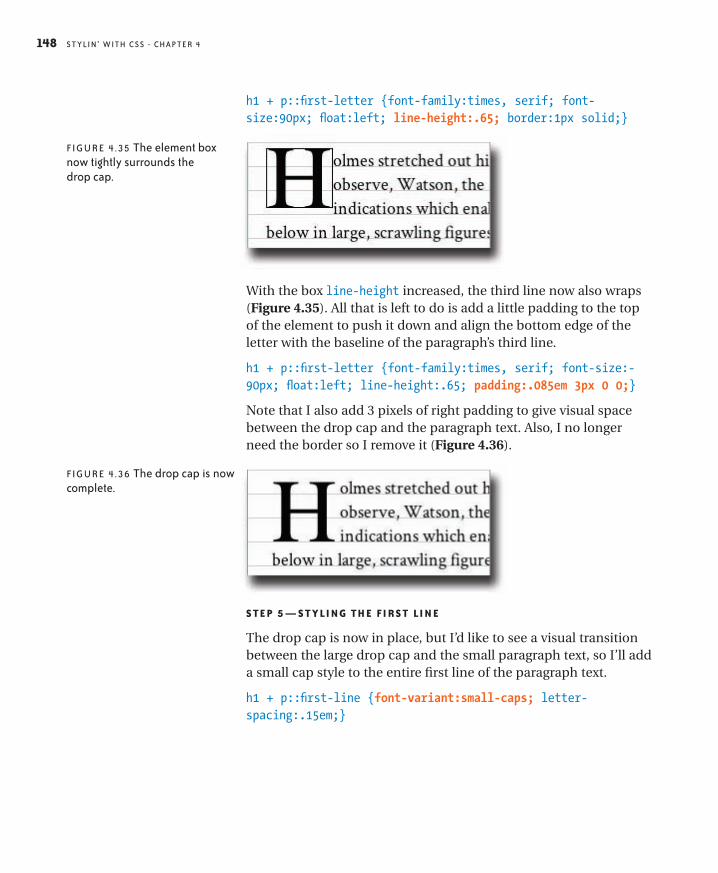
S t y li n ’ w ith C S S - Chap te r 4148
h1 + p::first-letter {font-family:times, serif; font-size:90px; float:left; line-height:.65; border:1px solid;}
FI G u r e 4 . 35 the element box now tightly surrounds the drop cap.
With the box line-height increased, the third line now also wraps (Figure 4.35). All that is left to do is add a little padding to the top of the element to push it down and align the bottom edge of the letter with the baseline of the paragraph’s third line.
h1 + p::first-letter {font-family:times, serif; font-size:-90px; float:left; line-height:.65; padding:.085em 3px 0 0;}
Note that I also add 3 pixels of right padding to give visual space between the drop cap and the paragraph text. Also, I no longer need the border so I remove it (Figure 4.36).
FI G u r e 4 . 3 6 the drop cap is now complete.
S Te P 5 — S T y li n g TH e Fi R S T li n e
The drop cap is now in place, but I’d like to see a visual transition between the large drop cap and the small paragraph text, so I’ll add a small cap style to the entire first line of the paragraph text.
h1 + p::first-line {font-variant:small-caps; letter-spacing:.15em;}

s t y li n ’ fo nt s an d te x t 149
FI G u r e 4 . 37 the first line of the paragraph is now set in small caps.
I again use the sibling selector, this time in combination with the ::first-line pseudo-element to set the first line of the paragraph in small caps. By using the pseudo-element, rather than just typing the first few words in capital letters, the capitalization will adjust if the line length changes. You can see how nicely this styling con-nects the drop cap with the rest of the paragraph in Figure 4.37.
S Te P 6 — Fi n i S H i n g To U c H e S
Without some space between the paragraphs, it’s hard to see where each one starts. In keeping with convention in books, rather than space the paragraphs apart, I’ll instead add a small indent to every paragraph that follows a paragraph; a paragraph that starts a sequence of paragraphs doesn’t need the indent. Also, I don’t like the anemic quotation marks around the quote, so I will update the default ::before and ::after pseudo-elements of the q tag and insert nicer ones from the Crimson font. Finally, I am done with the grid so I’ll remove that from the body tag (not shown).
p + p {text-indent:14px;}
q::before {content:”\201C”}
q::after {content:”\201D”}
Both these small changes are worth comment. The indents are achieved with the sibling selector, which cause only paragraphs that follow a paragraph to be indented. The paragraph that begins “When Dr. Mortimer...” follows the blockquote, not a paragraph, and so does not get the indent, giving a solid lead off to that para-graph by aligning it with the margin (Figure 4.38).
The quotation marks added by the ::before and ::after pseudo-elements have to be defined with hex entities. I cannot use the nor-mal HTML entities in the content value, as they don’t work in this situation; only hex entities work here, and only in a slightly modi-fied state. See the sidebar, HTML Entity Reference, earlier in this chapter, for details.
indent any paragraph that follows a paragraph
quotation marks before quote
quotation marks after quote

S t y li n ’ w ith C S S - Chap te r 4150
FI G u r e 4 . 3 8 here is the completed page.
With these final touches, the layout is complete. It may seem like a lot of work for a small excerpt like this, but of course, these styles could easily be applied to the entire book.
SummaryIn this chapter, you have seen the many CSS properties associated with fonts and text, seen the different ways that fonts can be speci-fied for your pages, and looked at various approaches to styling text. Next, I will expand the text layouts you have just seen, and look at techniques to create multi-column page layouts.

299I n d e x
Index+ (adjacent sibling selector), 33& (ampersand), 19, 142* (asterisk), 215> (child selector), 32–33> *(“child-star” selector), 166/ (forward slash), 2~ (general sibling selector), 33–34# (hash symbol), 38–39, 58* (star selector), 34–35, 166~ (tilde), 33* (universal selector), 34–35: (colon), 44, (comma), 27:: (double colon), 44. (period), 36, 38; (semicolon), 27< > (angle brackets), 2
A
a (anchor) tag, 9A (alpha) value, 61abbr tag, 20abbreviations, 20absolute positioning, 87–88absolute values, 56action attribute, 206Active state, 44adjacent sibling selector (+), 33Adobe Typekit, 127::after pseudo-element, 48–49alpha channels, 61alpha (A) value, 61alt attribute, 42alt attribute text, 4alt tags, 4, 42& entity, 19ampersand (&), 19ancestors, 21, 22anchor (a) tag, 9Android devices, 274angle brackets (< >), 2animation, 222APIs (Application Programming Interfaces), xApple Retina screens, 275Application Programming Interfaces (APIs), xarticle elements, 154, 182article tag, 2, 28–29asterisk (*), 215attribute name selector, 41–42
attribute selectors, 28, 41–43attribute value selector, 42attributes, 2
class, 35–41input, 208names, 41–42overview, 4type, 208
author style sheets, 51auto, 70
B
background images, 95–96, 102background properties, 94–103background-attachment property, 100–101background-break property, 102background-clip property, 102, 194background-color property, 95background-image property, 95–96background-origin property, 102background-position property, 97–99background-repeat property, 96–97backgrounds, 93–109
attached, 100–101color, 95fallbacks, 295–296gradients, 104–107multiple, 102position, 97–99properties, 94–107repeat options, 96–97shorthand, 101size, 99–100
background-size property, 99–100::before pseudo-element, 48–49block elements, 10–16, 93block property, 10–16block quotes, 146–147blockquote tag, 18–19blog links, 249, 258–260body element, 16, 112body tag, 8, 22, 110bold text, 20, 115, 116book area, 260–268, 281borderBoxModel.js polyfill, 298border property, 62, 63–66borders
boxes, 62, 63–66color, 95columns, 161–171transparent, 194, 229
box model, 62–70, 171

S t y li n ’ w ith C S S300
box-sizing property, 168boxes, 62–75
borders, 62, 63–66margins, 63, 67–70nesting, 16–18padding, 63, 66–67, 68shadows, 239, 241size, 70–75text, 118, 120unwidthed, 70–73widthed, 73–75
breakpoints, 277–278, 282, 285Brill, Ryan, 172browser sniffing, 295browsers
considerations, xiCSS3 and, xi, 295–298fallbacks, 295–296fonts and, 114, 128–129HTML5 and, 295–298media queries and, 274–278missing features, 296older, xi, 295–298Safari Mobile, 287smaller screens and, 272style sheet, 50support for, xi, 295–298
buttons, radio, 202, 204, 208–210, 217
C
captions, 224–229“Cascade” mechanism, 50–54Cascade rules, 52–54Cascading Style Sheets. See CSScentering elements, 244–246, 248, 271characters, typographical, 19Charlie’s Simple Cascade Summary, 54charset attribute, 8checkboxes, 203–204, 208, 210, 217child selector (>), 32–33children, 21, 22child-star selector, 166citation, 18cite tag, 19Clarke, Andy, 277class attribute, 35–41class selectors, 28, 36classes, 35–41
multiple, 37–38names, 35overuse of, 41pseudo-classes, 43–47
purpose of, 39, 41vs. IDs, 39–41when to use, 40–41
clear property, 75, 76, 80–85cleared elements, 75, 76, 80–85clearfix code, 81, 82, 84–85closing tags, 2, 3code. See also HTML code
debugging, 293–294example, xiitesting, 293–294
collapsing margins, 68–69colon (:), 44color
alpha channels, 61backgrounds, 95fonts, 27hexadecimal, 58, 60HSL, 59–60links, 40, 44names, 57–58opacity, 61percentages, 57, 59resources, 61RGB, 58–59, 60values, 55, 57–61Web-safe, 58
color keywords, 57–58color wheel, 59, 60columns
considerations, 151creating, 153–171CSS3 table properties, 177–179elastic layouts, 152faux columns technique, 176–177fixed-width layouts, 151–152, 154float property, 76–78fluid. See fluid layoutsmargins, 161, 172–177multi-row, multi-column layouts, 179–185padding/borders, 161–171width, 153, 163
comma (,), 27comments, 7, 23, 296comments tag, 7compound elements, 5–6conditional comments, 296content
considerations, 1non-enclosing tags for, 3non-text, 3pseudo-element, 48referenced, 3

301I n d e x
contextpositioning, 90–92stacking, 227–228
contextual selectors, 28–35, 41controls, 202, 207–208, 209CSS
“Cascade” mechanism in, 50–54fallbacks, 295–296how it works, 23–61methods for adding, 25order, 292organizing, 292–293purpose of, 1, 23selectors, 182-184testing code, 293–294writing, 291–293
CSS declarations. See declarationsCSS rules
anatomy of, 24–28Cascade mechanism, 52–54described, 24inheritance, 49–50multiple, 27–28naming conventions, 26–28order, 293organizing, 293sort rules, 52–54specificity, 52–54
CSS styles. See stylesCSS triangle, 228–230CSS3
browser support, xi, 295–298fallbacks, 295–296improved features, xipolyfills, 297–298table properties, 177–179transforms, 263, 264
CSS3 examplebook area, 260–268completed page, 232feature area, 249–260footers, 268–271headers, 236–248page structure, 231–236transitions, 221–223, 248web pages, 231–236
CSS3Pie polyfill, 297
D
debugging, 293–294declarations, 55–61
multiple, 27, 291–292
organizing, 292structure, 26–27weight of, 52
descendents, 21, 22devices. See smartphones; tabletsdisplay properties, 10–16display property, 62, 92–93displaying elements, 92–93DOCTYPE, 7document flow, 10Document Object Model. See DOMdocuments. See HTML documentsDOM (Document Object Model), 20–22DOM hierarchy, 21–22, 29–30don’t repeat yourself (DRY) principle, 268double colon (::), 44drop caps, 147–148drop-down menus
adding to menus, 246–248lists in, 191–201on touch screens, 288–289
DRY (don’t repeat yourself) principle, 268
E
elastic layouts, 152elements. See also tags
attributes, 2backgrounds, 93–109block, 10–16, 93boxes. See boxescentering, 244–246, 248, 271cleared, 75, 76, 80–85compound, 5–6display property, 92–93floated, 75, 76–85inline, 10–16, 93length, 56nested, 16–20, 236non-floated, 80–82order, 292oversized, 171positioning. See positioning elementspseudo-elements, 47–49, 149required, 7stacking order, 227–228visibility, 93
em (emphasis) tag, 6, 20, 31–32em value, 56, 57embedded styles, 25emphasis (em) tag, 6, 20, 31–32emphasis text, 20enclosing floated elements, 71

S t y li n ’ w ith C S S302
enclosing tags, 2–3error messages, 207, 215–216, 220, 258ex value, 56, 57
F
fallbacks, 295–296faux columns, 176feature area, 249–260, 281fieldset element, 206–207files. See HTML documentsFirebug, 294:first-child pseudo-class, 46::first-letter pseudo-element, 47::first-line pseudo-element, 47–48fixed positioning, 89fixed-width layouts, 151–152, 154float property, 62, 75, 76–85floated elements, 75, 76–85float-slip, 161fluid layouts
described, 152fluid center, 172–179smaller devices and, 274, 278–282
:focus pseudo-class, 45font libraries, 127–128font properties, 109–117font property, 117Font Squirrel, 127, 129font stacks, 110–111, 129@font-face kits, 127, 128–130@fontface rule, 126, 128font-family property, 109–112fonts, 108–117. See also text
browser issues, 114, 128–129color, 27generic, 110–111, 112Google Web Fonts, 127–128, 239inherited, 49–50, 110, 119installed, 110–112names, 110–111overview, 108size, 112–115, 132style, 115, 116variants, 116–117vs. text, 109Web, 126–130weight, 116x-height, 56, 111
font-size property, 112–115, 117font-style property, 115, 116font-variant property, 116–117font-weight property, 116
footers, 268–271form data, 201form element, 205–206, 212form elements, 205–209forms, 201–223
checkboxes, 203–204, 208, 210, 217considerations, 201controls, 202, 207–208, 209error messages, 207, 215–216, 220example, 201–206fields, 207fieldsets, 206–207HTML elements of, 201–209HTML5 and, 201labels, 202, 207–208, 209, 210legend, 202, 206–207, 212markup strategies, 209–210processing, 201, 206radio buttons, 202, 204, 208–210, 217required fields, 215–216resources, 201, 206search, 239–242search field, 221–223selects, 208, 209sign-in, 253–258styling, 210–220submitting, 206validating data, 201
forward slash (/), 2
G
general sibling selector (~), 33–34Google Web Fonts, 127–128, 239gradients
backgrounds, 104–107linear, 104–105radial, 104, 106–107
H
h1 tag, 21–22hash symbol (#), 38–39, 58hash tags, 38head tag, 8headers
example, 157–160smaller devices, 279–287styling, 236–248
headings, 3, 5, 12headlines, 8–10, 144–145hexadecimal notation, 58, 60Hicks, Ian, x

303I n d e x
hidden property, 93high-resolution screens, 275hooks, 182–183, 184hosted font libraries, 127–128hot area, 188–189Hover state, 43href (hyperlink reference) tag, 9href value, 38HSL color, 59–60HTML attributes. See attributesHTML code
considerations, 291debugging, 293–294hierarchy, 21testing, 293–294
HTML comments tag, 8HTML documents
anatomy of, 7–20document flow, 10structure of, 7
HTML elements. See elementsHTML entities, 19, 143HTML markup
basics, 2–6nesting examples, 18–20planning, 232–236presentational effect, 164purpose of, 1template, 7–10
html tag, 7HTML tags. See tagsHTML templates, 7–10HTML5
advantages of, x, 7“bare-bones” template, 7–10browser support, 295–298closing tags, 3considerations, 1–2, 253forms and, 201polyfills, 297–298syntax overview, 3
html5shiv.js polyfill, 297hue, 59–60hyperlink reference (href) tag, 9hyperlinks. See links
I
“ICE” formula, 53–54ID attribute, 35–41ID selectors, 28IDs, 35–41
in-page navigation links, 38
JavaScript-related, 39names, 35purpose of, 39, 41vs. classes, 39–41when to use, 39–40
IE9.js polyfill, 297image tag (img), 4, 9images
adding, 9–10, 13alternative text for, 4background, 95–96, 102failure to load, 4flexible, 274floating text around, 76–78as inline elements, 10, 13–15source of, 4
img (image tag), 4, 9!important declaration, 52inheritance, 49–50, 110, 119inherited values, 119inline element boxes, 16inline elements, 10–16, 93inline property, 10–16inline styles, 25inline-block value, 245inner divs, 164–168, 184–185in-page navigation links, 38input attributes, 208input element, 203, 208inset keyword, 241interface components, 186–230
considerations, 186forms. See formslists. See listsmenus. See menuspopup overlays (tooltips), 224–230, 263–268selection path, 200–201
iPad, 272–274, 278–282iPhone, 272–274, 275, 285–287Irish, Paul, 129, 171, 297italic text, 20, 115
J
JavaScript, 39, 295, 297jQuery functions, 289
K
keyword colors, 57–58

S t y li n ’ w ith C S S304
L
labels, 202, 207–208, 209, 210:last-child pseudo-class, 46layouts. See page layoutsleading, 123–124legends, 202, 206–207, 212letter-spacing property, 119–121line-height property, 117, 123–124, 134Link state, 43link tag, 276–277linked styles, 25links. See also URLs
blog, 249, 258–260color, 40, 44hot area, 188–189in-page navigation links, 38pseudo-links, 43–47states, 43–45underlining and, 122
listsin drop-down menus, 191–201in horizontal menus, 189–191hot areas, 188–189nested, 191–201ordered, 5–6unordered, 5, 258in vertical menus, 186–189
luminance, 59–60
M
Marcotte, Ethan, 274margins
auto, 271boxes, 63, 67–70columns, 161, 172–177
markup. See HTML markupmedia attribute, 276–277media queries, 272, 274–278@media rule, 274–276media types, 276menus, 186–201
centering, 244–246described, 186drop-down. See drop-down menusexample, 242–248horizontal, 189–191opacity, 247–248selection path highlight, 200–201submenus, 196–197third level, 197–200vertical, 186–189
meta tag, 8, 278method attribute, 206Meyer, Eric, 68mobile devices. See smartphones; tabletsModernizr, 101, 248, 288, 297multiple background images, 102multiple classes selector, 37–38
N
naming conventions, 26–28nav tag, 1–2navigation, 38, 234navigation menus, 186–201nested elements, 16–20, 236nested tags, 6, 16–20nesting examples, 18–20non-enclosing tags, 3non-floated elements, 80–82normal value, 115“not-first-child” selector, 187–188:nth-child pseudo-class, 46–47numbers, 35numerical values, 55, 56–57
O
opacity, 247–248opening tags, 2–3overflow:hidden, 79–80, 171
P
p tag, 21–22padding
boxes, 63, 66–67, 68columns, 161–171
page layouts, 151–185basic concepts, 151–153columns. See columnselastic layouts, 152fixed-width layouts, 151–152, 154fluid. See fluid layoutsinner divs, 184–185layout height/width, 152–153optimizing for smartphones, 282–287optimizing for tablets, 278–282templates, 7-10text layout example, 131–135
page styles, 25paragraphs, 5, 8–10, 12parent elements, 21, 22, 80percentage widths, 278

305I n d e x
percentages, 57, 59period (.), 36, 38pixels, 56polyfills, 170, 171, 288, 297–298popup overlays, 224–230, 263–268portrait format, 285–287position property, 62, 85–92positioning context, 90–92positioning elements, 62–107
absolute positioning, 87–88backgrounds. See backgroundsboxes. See boxescleared elements, 75, 76, 80–85display property, 92–93fixed positioning, 89floated elements, 75, 76–85position property, 85–92positioning context, 90–92relative positioning, 87static positioning, 86types of positioning, 86–92
-prefix-free polyfill, 298presentational markup, 164properties. See also specific properties
animated, 222background, 94–107font, 109–117normal value and, 115table, 177–179text, 109, 117–126
pseudo-classes, 43–47pseudo-elements, 47–49, 149
Q
quirks mode, 70quotation marks, 19, 149quotations, 18, 147
R
radial gradients, 106–107radio buttons, 202, 204, 208–210, 217radiused corners, 239, 240, 295referenced content, 3relative positioning, 87relative units, 56, 114rem (root em) units, 114–115reset.css style sheet, 68Respond.js polyfill, 298responsive design, 272–290
considerations, 272, 290elements of, 274
media queries, 272, 274–278portrait format, 285–287smartphones, 272–274, 282–287tablets, 272–274, 278–282touch screens, 288–289
returns, 291RGB color, 58–59, 60RGB percentages, 59root em (rem) units, 114–115root level tag, 7rows, 47, 179–185, 218rule declarations. See declarationsrules. See CSS rules
S
Safari Mobile scaling bug, 287saturation, 59–60scaling issues, 287search engines, 48search form, 221–223, 239–242section tag, 21, 22selection path, 200–201selectivizr polyfill, 297selectors. See also specific selectors
attribute, 28, 41–43class, 28, 36contextual, 28–35, 41grouping, 27ID, 28multiple, 27specificity of, 52–54structure, 26–28tips for using, 182–184
semantic markup, 1semicolon (;), 27shadows, 239, 241, 254Shapira, Isaac, 289shorthand styling, 64siblings, 21, 22, 33–34sign-in form, 253–258smartphones
optimizing layout for, 282–287overview, 272–274
SnapzProX, 278sort order, 52–54sort rules, 52–53spaces
nesting and, 18white space, 27, 291, 292
spacingletter, 119–121word, 121

S t y li n ’ w ith C S S306
span tag, 37specificity, 52–54stacking context, 227–228star selector (*), 34–35, 166states, links, 43–45static positioning, 86stop points, 105–106strong tag, 20structural pseudo-classes, 43, 46–47style attribute, 25style sheet styles, 25style sheets
author, 51linked, 25tips for, 293user, 51
style tag, 24, 26styles
adding to documents, 25considerations, 25embedded, 25fonts, 115, 116forms, 210–220inherited, 49–50inline, 25linked, 25page vs. style sheet, 25sources of, 50–51
stylinwithcss.com, xii, 23, 26, 183, 299symbols, 35
T
table properties, 177–179tables, 177–179tablets
optimizing layout for, 278–282overview, 272–274
tabs, 291tags. See also attributes; elements; specific tags
closing, 3considerations, 1enclosing, 2–3hierarchy, 21–22names, 2nested, 6, 16–20non-enclosing, 3opening, 2–3root level, 7
tag-with-class selector, 36–37:target pseudo-class, 45–46technical notes, 291–299testing code, 293–294
text, 117–150. See also fontsabbreviations, 20aligning horizontally, 122–123, 271aligning vertically, 125–126basic layout example, 131–135bold, 20, 115, 116browser issues, 114, 128–129capitalization, 116–117, 124–125captions, 224–229centering, 167, 271classic typography, 141–150decoration values, 122drop caps, 147–148enclosing tags for, 2–3floating around images, 76–78indent, 118–119, 120italics, 20, 115leading, 123–124letter spacing, 119–121line height, 117, 123–124, 134properties, 109, 117–126rotated, 263, 264shadows, 254superscript/subscript, 125–126underlined, 122using grids, 135–141vs. fonts, 109word spacing, 121word wrapping, 171
text boxes, 118, 120. See also boxestext snake, 120text-align property, 122–123, 271text-decoration property, 122text-indent property, 118–119text-transform property, 124–125tilde (~), 33title area, 232–236title attribute, 42title tag, 7tooltips, 224–230transform property, 263, 264transforms, 263, 264transitions, 221–223, 248transparent borders, 194type attributes, 208Typekit, 127typographical characters, 19typography resources, 145
U
UI components. See interface componentsUI pseudo-classes, 43–46

307I n d e x
universal selector (*), 34–35URLs, 44, 187. See also linksuser style sheets, 51
V
vendor specific prefixes (VSPs), 103vertical centering, 248vertical-align property, 125–126viewpoint meta tag, 278visibility property, 93, 248, 288Visited state, 43VSPs (vendor specific prefixes), 103
W
W3C site, 52web browsers
browser sniffing, 295considerations, xiCSS3 and, xi , 295–298fallbacks, 295–296fonts and, 114, 128–129HTML5 and, 295–298media queries and, 274–278missing features, 296older, xi, 295–298Safari Mobile, 287smaller screens and, 272support for, xi, 295–298
Web Developer extension, 14Web fonts, 126–130Web Inspector, 293-294web pages
book area, 260–268, 281CSS-enhanced, 231–271example, 231–236feature area, 249–260, 281footers, 268–271headers, 236–248optimizing for smartphones, 282–287optimizing for tablets, 278–282planning HTML markup, 232–236responsive design, 272–290on smartphones/tablets, 272–274structuring, 231–236title area, 232–236
Web sitesbox model resources, 63, 171color resources, 57, 61CSS3 transition resources, 222font resources, 111, 113, 127, 129, 130form resources, 201, 203, 206, 208
HTML entity resources, 143HTML resources, 4, 19menu resources, 289mobile device resources, 272, 274, 275–278polyfill resources, 288, 298–299pseudo-element information, 44quirks mode, 70reset.css style sheet, 68stylinwithcss.com, xii, 23, 26, 183, 299typography resources, 145VSP information, 103XHTML resources, 3
Webkit redraw problem, 288Web-safe color palette, 58white space, 27, 291, 292word values, 55–56word-spacing property, 121word-wrap, 171wrapper elements, 154–161, 172–177Wroblewski, Luke, 201
X
x-height, 56, 111XHTML, 3
Z
Zeldman, Jeffrey, x, 41z-index property, 227–228, 267