streamline your supply chain with data - tableau software
TRANSCRIPT

Streamline your Supply chain with data how visual analysis helps eliminate operational waste
emagazineOctober 2011

contents
3 Create a data-driven supply chain: 4 paths to insight
4 National Motor Club’s Matt Krysiak shares optimization insights
5 Better data visualization drives better operations at US Auto Parts
6 Visual reporting and analysis: seeing is knowing
7 Eliminating waste at Seattle Children’s
8 Real-timeanswerstofindinsight,reducesupply chain waste
9 5 best practices for creating effective dashboards
10 Optimize your supply chain with Tableau
editor’s noteDearsupplychainprofessional,
No one has to convince you that data is a blessing – and a curse. And the vast amount of data available to you is growing exponentially every day.
Whileyouknowvaluableinsightisintheresomewhere,gettingtoit can seem impossible. Disparate data sources and the need to provide multiple stakeholders with personalized dashboards are justtwochallengesstandingbetweenyouandamoreefficientsupply chain.
This Tableau eMagazine provides a guide to convert your data into actionable insight—no matter how many data sources you have and how many stakeholders you must satisfy.
You’lllearn4pathstobetterinsight,theimportanceof visualizing your data and 5 best practice recommendations for building great dashboards. You’ll also hear how companies as diverse as an autopartsretailer,achildren’shospitalanda roadside assistance leader used these techniques to drive time and cost out of their supply chains. Put your data to work to help optimize your operations.
Happyanalyzing, Malia Hardin Tableau Software

3
You’ve got one goal: optimize your supply chain. You know that data to accomplishthisexists,buthavingitatyourfingertipsisanothermatter. Fourpathshelpyouuseyourdataforamoreefficientsupplychain:
Combine disparate data for analysisYoursupplychaindata–scheduling,financials,suppliersandinventoryto name a few – lives throughout your organization. But you need to
combine elements of this information into a single dashboard to manage logisticsandfindwaystoeliminatewaste.
An agile business intelligence solution lets you quickly point at the data sources you need and combine them for analysis. By considering related factors across differentdatasets,youwillidentifyrelationshipsandopportunitiesimpossibletouncover when evaluating silos of data.
Interact with your dataNot all dashboards are created equal. Static information or views that leaveyouwithmorequestionsthananswersdoesn’tdriveefficiency,it
generates frustration.
Develop dashboards that let you interact directly with data so that when your analysissparksaquestion,youcandrillintogetananswer,abettersolutionoranewidea.Interactivityalsosatisfiesmultiplestakeholdersatoncebylettingthemfilterforrelevantinformation.Whybuildadashboardforeachdistributioncenter when you can build one that lets managers choose their own plant and see only the information they have permission to see?
Extend your dataOptimizing your supply chain isn’t a linear function and neither are the algorithmsbehindyouroperations.Asyoubuildinteractivedashboards,
incorporate sophisticated models that inform your decisions.
Byusingabusinessintelligencesolutionthatisflexibleenoughtoincorporateuser-definedcalculations,yourabilitytofindopportunitiestooptimizeyoursupply chain expands fast.
Provide access when & where it’s neededYourstakeholdersareinfactories,distributioncentersandontheroad.Provide actionable information when and where they need it so that
decisions translate into competitive differentiation.
Use a business intelligence solution that lets you adhere to your rigorous securitymandates,includinguser-levelsecurity,whileleveragingan“authoronce” model so that dashboards are the same whether a user is at a desk or on-the-go.
Following these four paths will get you on the path to converting the data you already have into the insight you need to optimize your supply chain.
article
create a data-driven supply chain:4 paths to insight
Product Bundle Planning Insight
This quantity-on-hand (QOH) dashboard combines inventory information with sales data to create a unified view into product bundles. Click on this dashboard to see how a manager could select a product bundle to see forecasted QOH trends and regional sales in one view.
1
2
3
4
Explore the dashboard

4
customer video
MattKrzysiakdescribeshisneedtoquicklyidentify“hotspots”andotheropportunitiestoimproveefficiencyforbettercustomerserviceandtoreducecosts.DescribingTableauasa“gamechanger,”Mattprovidesexamplesofimproved operations based on better insight into data.
“ there are cases where we have reduced costs by hundreds of thousands of dollars as a result of the information we gained out of tableau. ” – Matt Krzysiak, Chief Operating Officer, National Motor Club
3three minutes with
national motor club’s
matt KrySiaK Watch the video

5
uS Auto Parts’ business analytics team needed a way to bring key pieces ofdatatogether,establishmeaningfulmetricsandsharethemacrossthe
organization.Theywantedtoprovidevisibilityintodetailsofthebusiness,butlackedaneffective,efficientapproach. WithTableau,theteamwasabletoestablishstandardized,keymetricsthatwere easily shared throughout the organization. They then went one step further andcreatedananalyticsenvironmentthat“empowersbusinessunitstodotheirownanalysis.”Categorymanagers,forexample,nowinvestigatetheirbusinessbytimeorchannel,drillingdeepintothedatainreal-timetounderstandresultsbysubcategories,partsandSKUs. “Withsomanypartstomanage,thevisualizationshelpusquicklyidentifyimportanttrends,”explainsSarahGustafson,VicePresidentofBusinessAnalytics.“Youtypicallycan’tdothateasilywithstreamsofdata.”
case study
uS auto partsBetter data visualization drives better operations
– Sarah Gustafson, Vice president of Business analytics, uS auto parts
“ tableau has saved hours and hours of time pulling and manipulating data. we can focus more time on the activities that really matter – analyzing the data and serving up discoveries and recommendations to move the business forward. ”
Read the entire case study

6
white paper
V isualizingdata–intheformofcharts,mapsandothergraphs–isnolongerrestrictedtospecializedapplications.Further,usingdatavisualizationasa
standard part of analysis is enabling business users to better understand data and use it to their advantage. Incorporating data visualization into day-to-day analysis is prompting a culturalshifttowardmoreanalytic,data-drivenenvironmentsbyempoweringusers to explore data in a graphically inviting medium – data that was previously available only in tabular reports. ThisTDWIBestPracticesReport,basedonaWebsurveyofBIprofessionalsandinterviewswithBIpractitionersandexperts,findsthatdatavisualizationis in the middle of a remarkable growth phase. It also reveals that data visualization contributes impressively to improvements in business user insight andproductivityaswellastheusageofdashboards,thepreferredmediumfordata visualization.
Visual reporting and analysis:seeing is knowing
– tdwi research
“ nearly three-quarters (74%) of respondents to our survey rated the influence of data visualization on business insights as “very high” or “high. ”
Read the white paper

7
Whenyou’reanorganizationcommittedtosavinglives,themoreyouremovewaste from systems and processes the more resources become available to put towards patient care. Seattle Children’s—the 7th highest ranked children’s hospital in 2011 according to U.S. News & World Report—discovered ways to “virtuallyincreasebeds”andtreatmorepatients.
More People Turning Data into Insight, More Quickly ”Wearecontinuouslylookingfornewwaystoimproveourquality,safety,andprocessesfromthetimeapatientisadmittedtothetimethey’redischarged,”saysDrexelDeFord,SeniorVice-PresidentandChiefInformationOfficeratSeattleChildren’s.“Sowespendalotoftimeanalyzingdataassociatedwiththose visits.”
Tomorequicklyturnpatientandhospitaldataintoinsight,SeattleChildren’simplemented Tableau Software’s business intelligence application. Tableau fundamentally changed what Seattle Children’s could do with data by providingbrowser-based,easy-to-useanalyticstostakeholdersthroughouttheorganization,makingitintuitiveforindividualstousevisualizationstounderstand what the data means. “WithTableau,moreofourstaffareabletodevelopvisualsystemsontheirownresultingindashboardsandscorecardswhichreallyhelpusdefinewhatthestandardis,howareweachievingagainstit,andhowarewegrowingintothefuture.”explainsTedCorbett,DirectorofKnowledgeManagementatSeattleChildren’s. Shorter Wait Times Means Higher Through-put The Surgical Services team at Seattle Children’s started using Tableau to see if they could measure patient wait times. What they discovered were steps they could take to reduce wait times and increase the number of patients served at the hospital.
“Wewereabletosetupafantasticvisualizationthatshowedsomeoftherootcausesandcontributingfactorsforpatientwaiting,”explainsJio.“Forexample,we looked at some of our rooming practices and saw that delays early in the day cascaded to the rest of the day. It became very effective for us to really focusonon-timestarts,andwe’vealreadyseensignificantimprovementinpatient waiting overall.”
“Wehavetocontinuetobeabletotreatasmanykidsaspossible,”explainsDeFord.“Bymakingthoseprocessesmoreefficient,forallintentsandpurposeswecreatedmorebeds,eventhoughwedidn’tphysicallybuildthem.”
article
eliminating waste at Seattle children’s
“ So far we’ve saved $3 million out of the supply chain, and using Tableau we can find new ways to eke out more savings. ” – ted corbett, director of Knowledge management, Seattle children’s
Watch the video

8
interactive visualizations
Find insight, reduce supply chain waste Whenyoucombinerelevantdata,robustanalysisandamazingvisuals,you generate insight that reveals valuable information about your supply chain. Add on the ability to ask and answer questions about this data – in real-time – and what do you have? The
potential to identify ways to drive inefficienciesoutofyourorganizationlike never before. Make your data do everything it can tohelpyoucreatethemostefficientsupply chain possible. Whether it’s optimizingtransportroutes,managinginventoryoranythinginbetween,theanswers are available when you can interact directly with your information.
real-timeanswers
Best route in bad weather?
Comprehensive supply chain view
This dashboard connects a company’s network of fulfillment centers and retail locations with regional weather information from a Weather Mapping System (WMS). Click on this dashboard so see that the distance from the fulfillment center has been color coded, while size is based upon tonnage. A link to web based directions provided by Google is also included.
This dashboard combines sales metrics, geographic demographics and year-over-year change thresholds in one consolidated view. Select the dashboard and investigate the multiple tabs, each of which provided a different view into this business.
Explore the dashboard
Explore the dashboard
9
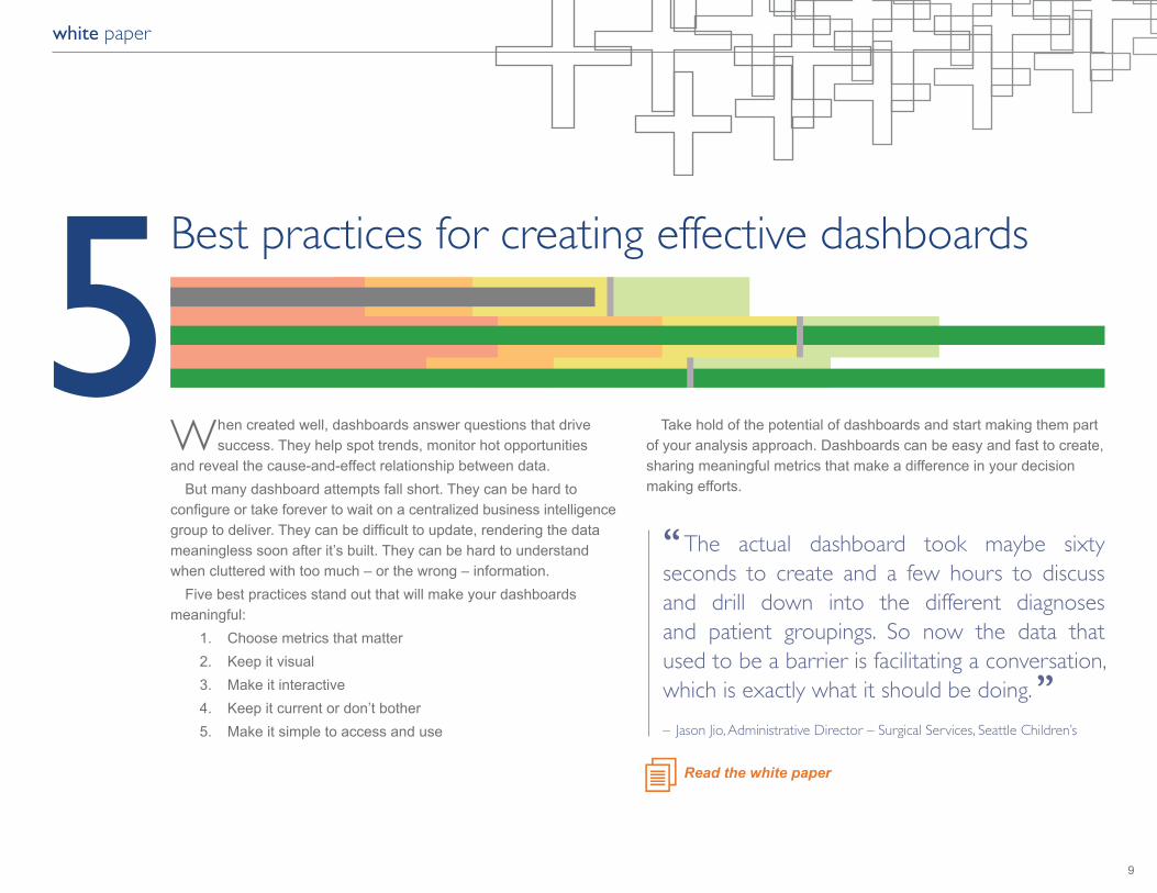
whencreatedwell,dashboardsanswerquestionsthatdrivesuccess.Theyhelpspottrends,monitorhotopportunities
and reveal the cause-and-effect relationship between data. But many dashboard attempts fall short. They can be hard to configureortakeforevertowaitonacentralizedbusinessintelligencegrouptodeliver.Theycanbedifficulttoupdate,renderingthedatameaningless soon after it’s built. They can be hard to understand when cluttered with too much – or the wrong – information. Five best practices stand out that will make your dashboards meaningful: 1. Choose metrics that matter 2. Keep it visual 3. Make it interactive 4. Keep it current or don’t bother 5. Make it simple to access and use
Take hold of the potential of dashboards and start making them part ofyouranalysisapproach.Dashboardscanbeeasyandfasttocreate,sharing meaningful metrics that make a difference in your decision making efforts.
white paper
5Best practices for creating effective dashboards
– Jason Jio, administrative director – Surgical Services, Seattle children’s
“ the actual dashboard took maybe sixty seconds to create and a few hours to discuss and drill down into the different diagnoses and patient groupings. So now the data that used to be a barrier is facilitating a conversation, which is exactly what it should be doing. ”
Read the white paper

10
about tableau
Converting your data into an optimized supply chain is within reach. Tableau lets you explore and optimize critical areas of your supply chain suchasshipping,inventoryplanning,transportationefficiencyandjust-in-timemetrics as well as modeling product forecasts and demand. By using an application that analyzes all relevant data in one place and facilitates interactionthatanswerskeyquestionsinrealtimesignificantlyimpactsyourabilitytoeliminatewasteandfindanswersforanoptimizedsupplychain. TableauSoftwarehelpspeopleseeandunderstanddata.RankedbyGartnerin2011astheworld’sfastestgrowingbusinessintelligencecompany,Tableauhelpsanyonequicklyandeasilyanalyze,visualizeandshareinformation. Morethan6,500customersacrossmostindustriesgetrapidresultswithTableauintheofficeandon-the-go.TensofthousandsofpeopleuseTableau to share data in their blogs and websites. See how Tableau can help optimize your supply chain.
Download the free trial
optimize your supply chain with tableau