strategic brand identity and symbolic design cues brand identity and symbolic design cues toni-matti...
TRANSCRIPT

Strategic Brand Identity and Symbolic Design Cues
Toni-Matti KARJALAINEN
Helsinki University of Technology, P.O.Box 9555, 02015 HUT, FINLAND
University of Art and Design Helsinki, [email protected]
Abstract: The importance of product and brand recognition has increased in numerous product fields. While
competitive products have converged in terms of technical performance, symbolic product functions have become
increasingly emphasised. Consequently, this calls for the creation of strategically proper “design language” for the
brand’s products that are the ultimate manifestations of the brand identity. This paper presents preliminary findings
of my doctoral research. The objective of the paper is to discuss the use of symbolic design cues in terms of their
embodied semantic references that support strategic brand identity. The research approach combines the perspectives
of product/design semantics and brand research. The empirical data has been gathered through qualitative case
studies, Volvo (passenger cars) and Nokia (mobile phones) representing the two in-depth cases of the research.
Personal interviews of companies’ designers and design managers have functioned as the primary method of data
collection. This has been supported by a rich variety of secondary data. The research clearly indicates the value of
strategically managed product design. In this regard, there seem to be two critical aspects. First, the definition of the
strategic brand identity requires well-grounded contemplation. Second, specific attention must be addressed also to
the design process through which the semantic transformation from brand attributes to physical design cues actually
takes place. Moreover, the various dissimilarities of Volvo and Nokia cases illustrate that the creation and
management of brand’s design language is eventually an utterly case-specific issue. Differences in brands’ heritages
and cultures, industrial environments, as well as companies’ business and product strategies may result in quite
different approaches to the use of symbolic design cues.
Key words: Brand identity, Product design, Product semantics, Car industry, Mobile phone industry
1. Conceptual Background
1.1 Introduction
In an increasing number of product categories, the overload of product supply, together with the overload of
stimuli that the people are faced to in the contemporary marketplace, has forced companies to find powerful way
to stand out from the crowd. In design-intensive fields, this calls for the creation of strategically proper “design
language” for the brand’s products.
This paper presents preliminary findings of my doctoral research. My doctoral research builds a conceptual
framework to combine the perspectives of brand-related research fields (brand management, corporate identity,
design management) and design/product semantics. The objective is to describe the potential of semantic
references in product design when evoking strategic brand associations. My study approaches these themes in a
qualitative manner through the in-depth cases of Volvo cars and Nokia mobile phones.
The prior data sources within the cases may be grouped into three categories. First, public documents and
internal company documents have been used to describe and analyse various representations of brand identity.
Second, the products under scrutiny and, in specific, their design features (as they occur) have been analysed.
Third, and most importantly, personal interviews have enabled potential insights of the design process as
experienced and described by designers themselves.
1.2 Strategic Brand Identity
To build awareness, to foster recognition, and to strive for distinctive offerings, companies are stressing
activities of strategic identity building. The metaphorical use of the notion of “identity” in the corporate context
suggests that, similarly to human beings, also companies can be described through specific characteristics.
Identity can be described as a set of attributes that distinguishes one entity from another [1]. The principal mission
of a company identity is to foster recognition [2].
The company’s identity is communicated to the external world through branding. A specific brand (name)
usually functions as the central manifestation of company’s identity. It involves the key identity attributes of the
company in a “condensed” form. In specific, the brand name functions as a sign, connoting specific meanings by
activating a network of associations, both intended and unpredictable.
The discussion around branding has evolved from a marketing-led product orientation into a holistic relational
paradigm [3]. Instead of focusing solely on specific aspects of meaning transmission, “brands can be defined as
unique, proprietary marketplace relationships that provide long-term strategic value to the organization. These
branded relationships are the core of the intangible assets of the new economy” [4]. The creation of shared
meanings within the interaction between the brand and the customer is at the core of this relational paradigm.
Through branding, companies can embody meaningful codes in their products and guide customer perception.
“Brand is shorthand for a customer-facing entity designed to be understandable” [5].
To a certain degree, brands are used as strategic devices to transmit intentional messages to customers. I use
this viewpoint in my study, however, being fully aware of the interactive reality of meaning creation. In fact,
transmission of embodied meanings and creation of shared meanings represent two different approaches to
symbolic communication [6]. The transmission view stresses the strategic aspect and considers the underlying
factors, such as brand heritage and company culture, as given. Nonetheless, a company should recognise the
issues affecting brand perception before successful communication can take place.
1.3 Evoking Strategic Associations
Brands usually possess certain key identity attributes through which the brand is recognised and associated.
“The lesson is to focus on a unique aspect of the brand that is easy for consumers to remember” [7]. This claim is
supported by the notion that usually only a small proportion of attributions is widely shared [8], meaning that only
a limited number of common associations (that are shared by a wide public) may be attached even to widely
recognised and strong brands. Most associations are shared only by smaller groups or are even idiosyncratic.
Associations may be more consistent and larger in quantity within the specific target segment of the brand than in
general public.
Many successful brands are thu characterised by few key associations. These may be characterised as
”competence associations” that are the company’s description of its main competencies as perceived by the
customer [9]. In a metaphorical sense, these may be regarded as forming the ”core identity” of the brand - the
most important elements of the brand’s strategic identity - that contains the associations that are most likely to
remain constant [10]. This core also includes the ”brand essence”, a single thought that captures the soul of the
brand [11], that functions as a glue that holds the core identity elements together [12]. It is crucial to find a
dimension that the target customers consider relevant. ”Brand excellence comes principally from customer
relevance” [13].
1.4 Communicative Product Design
As the idea of brand perception rests on associations, it then becomes crucial for companies to affect the
associative construction that creates meanings and value for their stakeholders. As long as it is out of reach for
companies to control customers’ subjective associations, identity management can only occur through tangible
identifiers. Part of the identity can be externalised
and further manipulated.
Product design is one of the central components
of the brand’s visual identity. Products function as
manifestations of brand identity by evoking certain
associations that, in an ideal situation, are aligned
to strategically defined message of the brand. A
product may be claimed to have a specific
“character” [14] that includes references to the
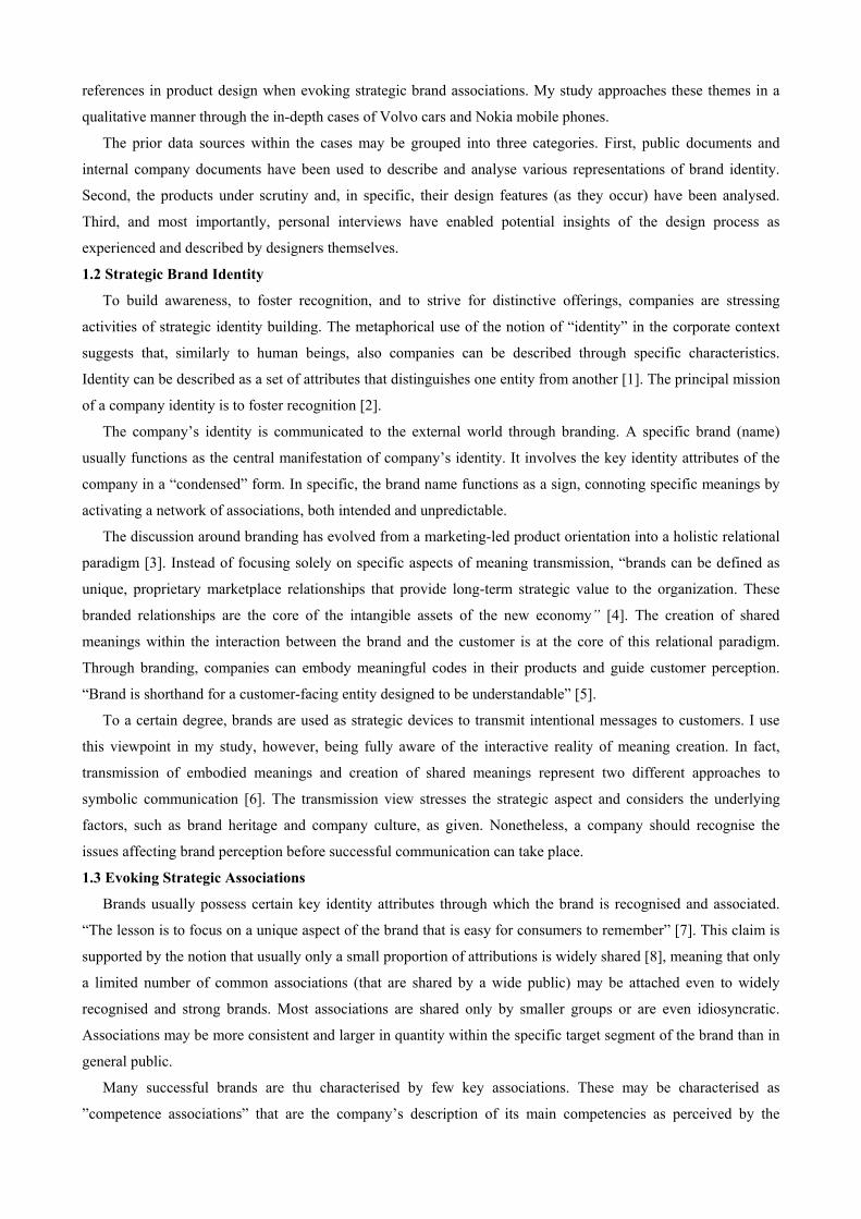
brand. As illustrated in figure 1, product character
is concretised, in the first place, on the level of
qualitative descriptions some of which can have a
direct connection to physical product qualities such as design elements. Within the interaction between the
product and the user, product character, physical product features perform various functions of which, from the
perspective of brand identity management, it is important to recognise particularly those functions that identity the
brand, make the product different from competitors’ offerings.
semantic product functions
physical manifestations
> Semantic product features
describtion exhortation expression
references: nic indexical
product character
> qualitative descriptions
identification
symbolic ico
Fig.1 Product’s semantic character
In terms of product functions – the viewpoint of products in their various use contexts – special interests lie in
distinguishing those functions that are typical for the respective brand. In specific, my attention is focused on
functions that have high semantic relevance. As an example, product functions into practical functions and
product language functions [15]. Alternatively, we may talk about communicative product functions [16].
Fundamentally, identification is a central task of these functions.
It is essential to recognise and define the physical product qualities that may have high semantic relevance in
terms of specific brand associations. Different product qualities - such as dimensions, features, and characters -
are often expressed by adjectival constructions [17]. We may say that a product looks (or feels) “harmonic”,
“modern”, “safe”, and so forth. In effect, products are often given a character in a similar manner as human
beings. This character refers to a coherent set of characteristics and attributes that apply to appearance and
behaviour alike, cutting across different functions, situations and value systems [18]. The character provides an
end-user with support for anticipation, interpretation, and interaction. In the brand context, certain characteristics
or attributes (for instance, supported by or embedded in specific design elements) signal to the user that while this
product “seems” to be a product of that specific brand, it is anticipated to have that certain character.
1.5 Brand-Specific Design Language
Descriptive qualities may be directly or indirectly manifest in physical manifestations of the product, such as
form elements, joining relationships, detail treatments, materials, colours and textures [19]. In terms of product
design elements, it is important to distinguish those elements that are typical for the brand.
Some of the tangible attributes that are specific to a brand may be explicitly defined. In terms of industrial
design, interest may be focused on recognising and creating so-called “traceable”, explicit design elements [20].
These elements may be deduced to basic-level ordering elements. Nonetheless, interpretation of design elements
are always subject to subjectivity, which means that they need to have a clear strategic connection to brand
identity. In other words, customers must be provided with relevant “codes” in order to nourish intentional
associations.
There appear different methods to analyse products and product families in reactive manner (to find and define
brand-specific cues) or in proactive manner (to create brand-specific design language) [21]. By performing such
analyses, a list of brand-specific references (and perhaps their relative weights) may be formed. Precise mappings
can also be problematic, while they offer favourable grounds for subjective interpretations. When searching for
brand identity references, it is often reasonable to adhere to specific “key” elements, “design cues” of the brand.
These cues may appear across the entire product portfolio or in selected “lead products” that incorporate the key
identity of the brand [22].
2. Volvo Case: Designing “Revolvolution”
The importance of branding and communicative product design has been stressed in the automotive industry
since long. An illustrative example is Volvo that had performed a radical redesign of its product language
(“Revolvolution”) in the 1990’s and become one of the most appraised brands within the automotive design.
2.1 Starting Point
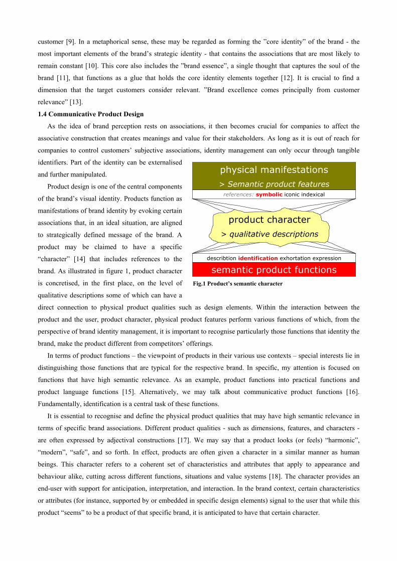
The Volvo brand has a long and consistent heritage of automotive safety and Scandinavian appearance. During
the 1980’s and the beginning of the 1990’s, Volvo was characterised by manufacturing boxy, robust vehicles that
drove at the front of safety development. After these years, a change towards more dynamic design language
started to occur in the beginning of the
1990’s, as the conservative boxy image was
considered not an appropriate strategy for
the future. The gradual change of the design
language through the models of the early
90’s and the actual “Revolvolution” -
foreseen in the ECC study of the 1992 and
eventually manifest in the S80 (launched
1998) - was orchestrated by Peter Horbury who started as Volvo’s Design Director in the Autumn of 1991.
Fig.2 Volvo 740 representing Volvo’s ”boxy” period (Source: Volvo)
Redesigning Volvo identity was Horbury’s prior intention right from the start. However, the restyling of Volvo
identity was not considered as the virtue in itself: It was important that the new design should preserve the strong
Volvo identity of the past. As Horbury noted in an interview: “We had to be very careful that we maintain the
recognition of Volvo, because it stood for a lot of things, even if it didn’t stand for beautiful design.” The starting
point for design modification was clear: designers were starting redesign with maintaining two basic things in
products - “Swedishness” and strong Volvo heritage.
2.2 ECC - Environmental Concept Car
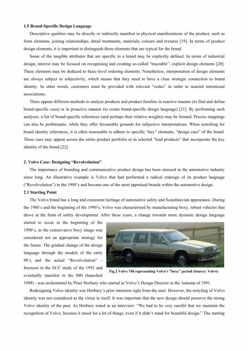
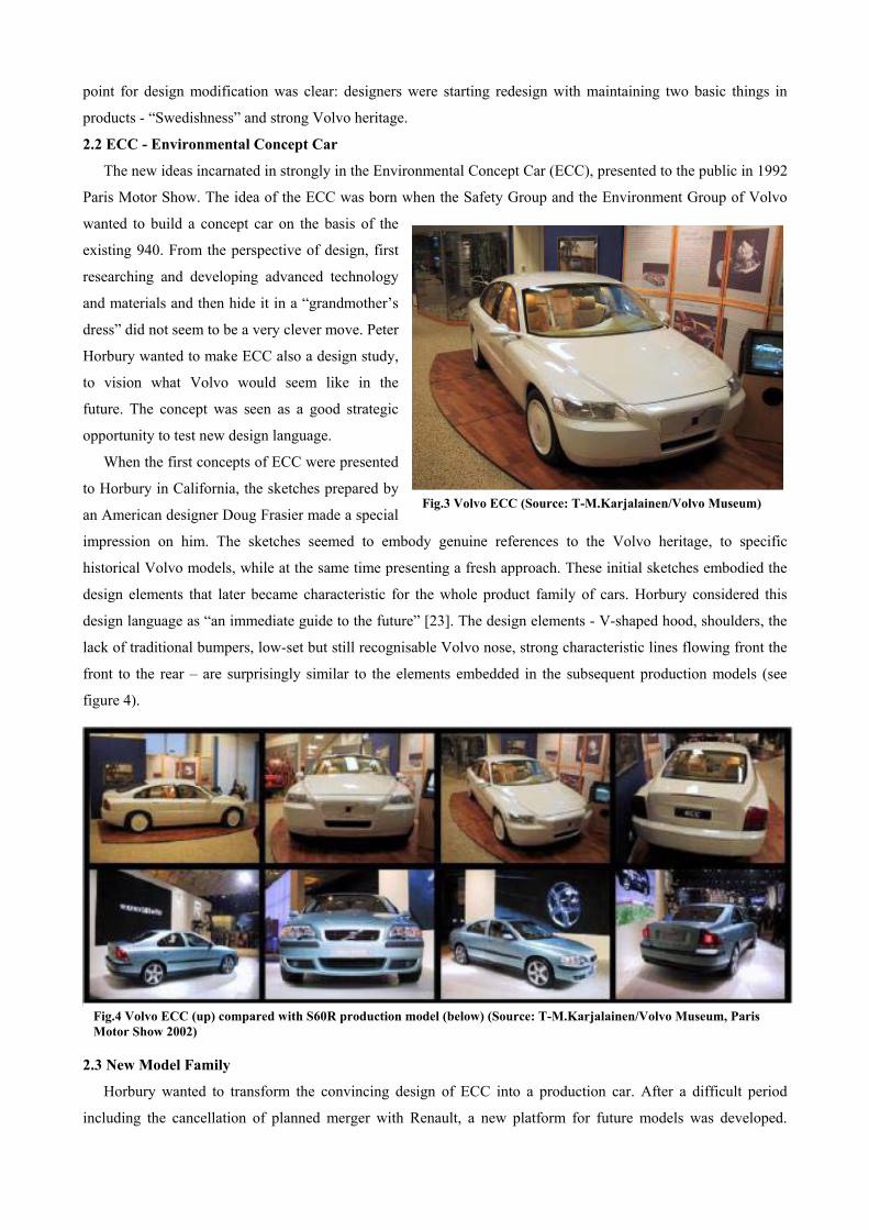
The new ideas incarnated in strongly in the Environmental Concept Car (ECC), presented to the public in 1992
Paris Motor Show. The idea of the ECC was born when the Safety Group and the Environment Group of Volvo
wanted to build a concept car on the basis of the
existing 940. From the perspective of design, first
researching and developing advanced technology
and materials and then hide it in a “grandmother’s
dress” did not seem to be a very clever move. Peter
Horbury wanted to make ECC also a design study,
to vision what Volvo would seem like in the
future. The concept was seen as a good strategic
opportunity to test new design language.
When the first concepts of ECC were presented
to Horbury in California, the sketches prepared by
an American designer Doug Frasier made a special
impression on him. The sketches seemed to embody genuine references to the Volvo heritage, to specific
historical Volvo models, while at the same time presenting a fresh approach. These initial sketches embodied the
design elements that later became characteristic for the whole product family of cars. Horbury considered this
design language as “an immediate guide to the future” [23]. The design elements - V-shaped hood, shoulders, the
lack of traditional bumpers, low-set but still recognisable Volvo nose, strong characteristic lines flowing front the
front to the rear – are surprisingly similar to the elements embedded in the subsequent production models (see
figure 4).
Fig.3 Volvo ECC (Source: T-M.Karjalainen/Volvo Museum)
Fig.4 Volvo ECC (up) compared with S60R production model (below) (Source: T-M.Karjalainen/Volvo Museum, Paris Motor Show 2002)
2.3 New Model Family
Horbury wanted to transform the convincing design of ECC into a production car. After a difficult period
including the cancellation of planned merger with Renault, a new platform for future models was developed.

Volvo had a business plan according to which S80 was
shortly to be accompanied by the new V70 estate
(including the cross-country version of it), the S60
saloon, and the XC90 SUV. It was clear that the design
language of ECC was to be used as a direct inspiration
for the S80 and following platform models. Another
point of emphasis was naturally the safety aspect. The
S80 project started officially in the early 1994 and the
final product was launched in summer 1998. The design
process of the S80 lasted two years. The subsequent
models were designed in a shorter time.
The new design language of Volvo may have been a
surprise for many, but eventually, it received positive
feedback, illustrated by several design awards. For
instance, it won the 1999 European Automotive Design
Award (voted by professional car designers and design
students from 33 countries). The justifications for the
selection included [24]: “Volvo S80 represents a radical
change without breaking the continuity of Volvo
design… S80 has been more successful in synthesising
the past and the future than any other car in 1998. It
integrates the typical Volvo design features, such as the
classic grille and large headlights and at the same time
provides a new concept of a prestigious four-door
saloon.”
The new design language appeared to be strategically
successful. The S80, and its followers - V70, S60, and
XC90 - were evidently appealing new customer with a
more emotional appearance while, at the same time,
preserving strong link to the brand heritage. The redesign
was carefully considered in terms of brand’s strategic
communication. Furthermore, the new design language
of Volvo has strong foundations when regarding the
semantic references of strong design elements and their
genuine relations to the core identity attributes of the
Volvo brand.
The design language is particularly visible through a
few strong design elements that have appeared in every model of the platform family (see figure 6). Designers are
specifically proud of the boot (smooth shift of material between the body and the back light). As Horbury has
stated: ”The rear end of the S80 has a very strong identity. No one will have any doubt about the car in front of
Fig.5 (from top:) Early sketch of S80 by Doug Frasher, 1:1 model of S80 by Frasher, frozen design of S80, S80 production model from back, S80 production model from front (Source: Volvo)

them” [25]. The design cues of Volvo
have been further evolved in recent
concept studies such as SCC (Safety
Concept Car) and VCC (Versatility
Concept Car) that seem to, although
stretching the limits of the design
language, still maintain the brand
recognition.
3. Nokia Case: “Definitely Yours”
The development of Nokia brand has
undoubtedly been one of the most
influential success stories of the recent
decade. Nokia became the biggest mobile phone
manufacturer in 1998 and has kept its position ever since.
The global leadership position has been reached, among
other things, through heavy emphasis on the product design
as a differentiating and competitive factor.
Fig.6 Volvo design cues illustrated by the S60
3.1 Personalisation as the Core Message
Nokia started heavy focus on mobile phones in the
middle of the 1990’s. The whole brand strategy was re-
created during the transition from traditional industries. For
this reason, Nokia does not have decades long heritage as a
brand, which is rather different from the case of Volvo. The
company became, however, the global leader in this
relatively new industry and have succeeded in creating an
extremely strong reputation for the brand. Clear
differentiation from competitors and strong emphasis on
personalisation and the “human aspect” were adopted as the
core approach early on (see figure 7).
“The increased cellular demand came both from private users and businesses. The trend was increased segmentation. Business users emphasize the importance of value-added services, data and advanced voice-based services. Private users preferwell-designed, easy-to-use, afford
able phones.”
(Nokia annual report 1995) “Technology has a face… For high-tech companiestechnological sophistication also includes knowledgeand appreciation of different cultures. Understandingtechnical equations is not enough. Technology has aface, and we must never forget people and differentcultural values. What do people really want, and why?Will they want that tomorrow? Equipment and servicesmust be reliable and easy-to-use. Service applicationsare not produced to wait passively on store shelves forcustomers. Our product and system development isalways carried out in close cooperation with thecustomer and based on the understanding of thechanging demands.” (Nokia Annual Report 1996) “Products, brand and design based on humantechnology: An essential part of the Nokia brand is ourdesign. It integrates our award-winning interfacesolutions with a style that combines ergonomics andaesthetics. Userfriendliness is becoming increasinglyimportant, as the technology is getting more and morecomplex and sophisticated owing to the trend of thedigital convergence of various key technologies. Ouraim is to combine the most sophisticated technologywith user-friendly interfaces. In this way users canconcentrate on utilizing the devices without needing tofocus on the equipment or technologies. We call thisapproach Human Technology: technology, which iseasily understood, accepted and learned.” (Nokia Annual Report 1998)
Fig.7 Extracts from Nokia Annual Reports
Personalisation means creating specific products for
specific customer segments. Holistic and strategy-based
segmentation has been the fundamental core of Nokia
strategy.
Personalisation and segmentation has impacted also the
requirements for design. Products of different categories
have been differentiated particularly through design and
software.
3.2 Nokia 3310
Nokia 3310 was developed primarily during 1999 and 2000 and launched in Autumn 2000. The phone was the
most important product of the Nokia in terms of sales volumes and expectations at the time it was launched. The
expectations and requirements for the 3310 were high. It was supposed to reach sales volumes of tens of millions.
The phone was the continuation of the most popular (i.e. biggest in terms of sales) “basic” category of Nokia. The
personalisation aspects in this category were considered particularly important, while basic products are meant
specifically for younger customers.
The starting point for the 3310 was to create a product
“for people with a social character”. It was not necessarily
meant for young but “young-minded” customers, and
particularly for those that don’t want to have a dull office
tool and pay big money for the product. In addition to
personalisation through software, design had to allow
personalisation. Traditionally, Nokia had been pioneering
in this functionality, specifically within the basic category,
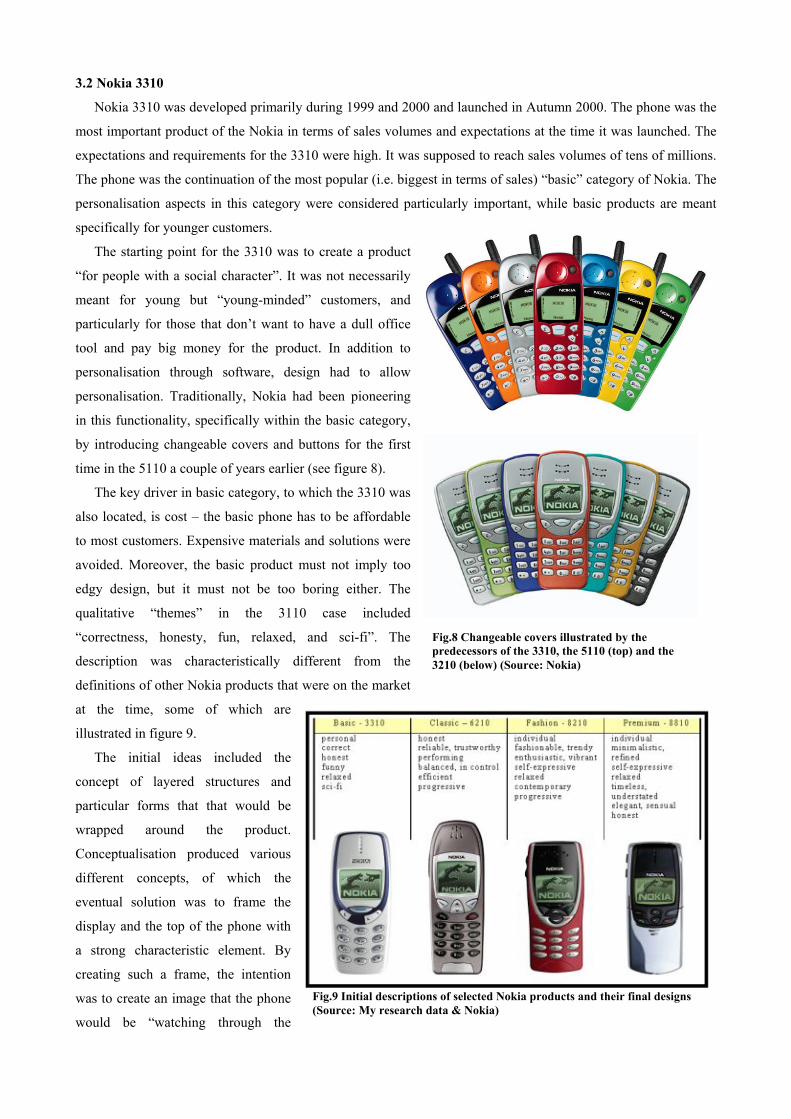
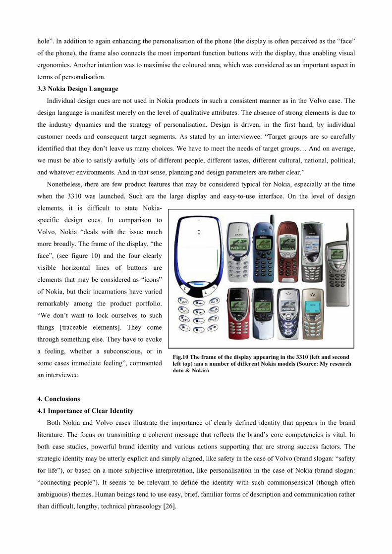
by introducing changeable covers and buttons for the first
time in the 5110 a couple of years earlier (see figure 8).
The key driver in basic category, to which the 3310 was
also located, is cost – the basic phone has to be affordable
to most customers. Expensive materials and solutions were
avoided. Moreover, the basic product must not imply too
edgy design, but it must not be too boring either. The
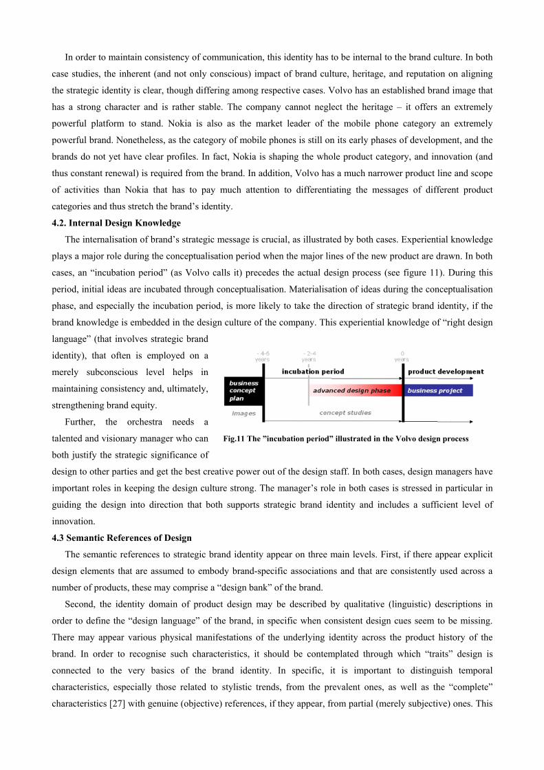
qualitative “themes” in the 3110 case included
“correctness, honesty, fun, relaxed, and sci-fi”. The
description was characteristically different from the
definitions of other Nokia products that were on the market
at the time, some of which are
illustrated in figure 9.
Fig.8 Changeable covers illustrated by the predecessors of the 3310, the 5110 (top) and the 3210 (below) (Source: Nokia)
The initial ideas included the
concept of layered structures and
particular forms that that would be
wrapped around the product.
Conceptualisation produced various
different concepts, of which the
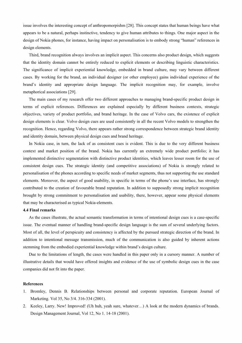
eventual solution was to frame the
display and the top of the phone with
a strong characteristic element. By
creating such a frame, the intention
was to create an image that the phone
would be “watching through the
Fig.9 Initial descriptions of selected Nokia products and their final designs (Source: My research data & Nokia)
hole”. In addition to again enhancing the personalisation of the phone (the display is often perceived as the “face”
of the phone), the frame also connects the most important function buttons with the display, thus enabling visual
ergonomics. Another intention was to maximise the coloured area, which was considered as an important aspect in
terms of personalisation.
3.3 Nokia Design Language
Individual design cues are not used in Nokia products in such a consistent manner as in the Volvo case. The
design language is manifest merely on the level of qualitative attributes. The absence of strong elements is due to
the industry dynamics and the strategy of personalisation. Design is driven, in the first hand, by individual
customer needs and consequent target segments. As stated by an interviewee: “Target groups are so carefully
identified that they don’t leave us many choices. We have to meet the needs of target groups… And on average,
we must be able to satisfy awfully lots of different people, different tastes, different cultural, national, political,
and whatever environments. And in that sense, planning and design parameters are rather clear.”
Nonetheless, there are few product features that may be considered typical for Nokia, especially at the time
when the 3310 was launched. Such are the large display and easy-to-use interface. On the level of design
elements, it is difficult to state Nokia-
specific design cues. In comparison to
Volvo, Nokia “deals with the issue much
more broadly. The frame of the display, “the
face”, (see figure 10) and the four clearly
visible horizontal lines of buttons are
elements that may be considered as “icons”
of Nokia, but their incarnations have varied
remarkably among the product portfolio.
“We don’t want to lock ourselves to such
things [traceable elements]. They come
through something else. They have to evoke
a feeling, whether a subconscious, or in
some cases immediate feeling”, commented
an interviewee.
4. Conclusions
4.1 Importance of Clear Identity
Both Nokia and Volvo cases illustrate the
literature. The focus on transmitting a coheren
both case studies, powerful brand identity and
strategic identity may be utterly explicit and sim
for life”), or based on a more subjective interp
“connecting people”). It seems to be relevant
ambiguous) themes. Human beings tend to use e
than difficult, lengthy, technical phraseology [2
Fig.10 The frame of the display appearing in the 3310 (left and second left top) ana a number of different Nokia models (Source: My research data & Nokia)
importance of clearly defined identity that appears in the brand
t message that reflects the brand’s core competencies is vital. In
various actions supporting that are strong success factors. The
ply aligned, like safety in the case of Volvo (brand slogan: “safety
retation, like personalisation in the case of Nokia (brand slogan:
to define the identity with such commonsensical (though often
asy, brief, familiar forms of description and communication rather
6].
In order to maintain consistency of communication, this identity has to be internal to the brand culture. In both
case studies, the inherent (and not only conscious) impact of brand culture, heritage, and reputation on aligning
the strategic identity is clear, though differing among respective cases. Volvo has an established brand image that
has a strong character and is rather stable. The company cannot neglect the heritage – it offers an extremely
powerful platform to stand. Nokia is also as the market leader of the mobile phone category an extremely
powerful brand. Nonetheless, as the category of mobile phones is still on its early phases of development, and the
brands do not yet have clear profiles. In fact, Nokia is shaping the whole product category, and innovation (and
thus constant renewal) is required from the brand. In addition, Volvo has a much narrower product line and scope
of activities than Nokia that has to pay much attention to differentiating the messages of different product
categories and thus stretch the brand’s identity.
4.2. Internal Design Knowledge
The internalisation of brand’s strategic message is crucial, as illustrated by both cases. Experiential knowledge
plays a major role during the conceptualisation period when the major lines of the new product are drawn. In both
cases, an “incubation period” (as Volvo calls it) precedes the actual design process (see figure 11). During this
period, initial ideas are incubated through conceptualisation. Materialisation of ideas during the conceptualisation
phase, and especially the incubation period, is more likely to take the direction of strategic brand identity, if the
brand knowledge is embedded in the design culture of the company. This experiential knowledge of “right design
language” (that involves strategic brand
identity), that often is employed on a
merely subconscious level helps in
maintaining consistency and, ultimately,
strengthening brand equity.
Further, the orchestra needs a
talented and visionary manager who can
both justify the strategic significance of
design to other parties and get the best creative power out of the design staff. In both cases, design managers have
important roles in keeping the design culture strong. The manager’s role in both cases is stressed in particular in
guiding the design into direction that both supports strategic brand identity and includes a sufficient level of
innovation.
Fig.11 The ”incubation period” illustrated in the Volvo design process
4.3 Semantic References of Design
The semantic references to strategic brand identity appear on three main levels. First, if there appear explicit
design elements that are assumed to embody brand-specific associations and that are consistently used across a
number of products, these may comprise a “design bank” of the brand.
Second, the identity domain of product design may be described by qualitative (linguistic) descriptions in
order to define the “design language” of the brand, in specific when consistent design cues seem to be missing.
There may appear various physical manifestations of the underlying identity across the product history of the
brand. In order to recognise such characteristics, it should be contemplated through which “traits” design is
connected to the very basics of the brand identity. In specific, it is important to distinguish temporal
characteristics, especially those related to stylistic trends, from the prevalent ones, as well as the “complete”
characteristics [27] with genuine (objective) references, if they appear, from partial (merely subjective) ones. This
issue involves the interesting concept of anthropomorpishm [28]. This concept states that human beings have what
appears to be a natural, perhaps instinctive, tendency to give human attributes to things. One major aspect in the
design of Nokia phones, for instance, having impact on personalisation is to embody strong “human” references in
design elements.
Third, brand recognition always involves an implicit aspect. This concerns also product design, which suggests
that the identity domain cannot be entirely reduced to explicit elements or describing linguistic characteristics.
The significance of implicit experiential knowledge, embedded in brand culture, may vary between different
cases. By working for the brand, an individual designer (or other employee) gains individual experience of the
brand’s identity and appropriate design language. The implicit recognition may, for example, involve
metaphorical associations [29].
The main cases of my research offer two different approaches to managing brand-specific product design in
terms of explicit references. Differences are explained especially by different business contexts, strategic
objectives, variety of product portfolio, and brand heritage. In the case of Volvo cars, the existence of explicit
design elements is clear. Volvo design cues are used consistently in all the recent Volvo models to strengthen the
recognition. Hence, regarding Volvo, there appears rather strong correspondence between strategic brand identity
and identity domain, between physical design cues and brand heritage.
In Nokia case, in turn, the lack of as consistent cues is evident. This is due to the very different business
context and market position of the brand. Nokia has currently an extremely wide product portfolio; it has
implemented distinctive segmentation with distinctive product identities, which leaves lesser room for the use of
consistent design cues. The strategic identity (and competitive associations) of Nokia is strongly related to
personalisation of the phones according to specific needs of market segments, thus not supporting the use standard
elements. Moreover, the aspect of good usability, in specific in terms of the phone’s use interface, has strongly
contributed to the creation of favourable brand reputation. In addition to supposedly strong implicit recognition
brought by strong commitment to personalisation and usability, there, however, appear some physical elements
that may be characterised as typical Nokia-elements.
4.4 Final remarks
As the cases illustrate, the actual semantic transformation in terms of intentional design cues is a case-specific
issue. The eventual manner of handling brand-specific design language is the sum of several underlying factors.
Most of all, the level of perspicuity and consistency is affected by the pursued strategic direction of the brand. In
addition to intentional message transmission, much of the communication is also guided by inherent actions
stemming from the embodied experiential knowledge within brand’s design culture.
Due to the limitations of length, the cases were handled in this paper only in a cursory manner. A number of
illustrative details that would have offered insights and evidence of the use of symbolic design cues in the case
companies did not fit into the paper.
References
1. Bromley, Dennis B. Relationships between personal and corporate reputation. European Journal of
Marketing. Vol 35, No 3/4. 316-334 (2001).
2. Keeley, Larry. New! Improved! (Uh huh, yeah sure, whatever…) A look at the modern dynamics of brands.
Design Management Journal, Vol 12, No 1. 14-18 (2001).

3. Louro, Maria João & Cunha, Paulo Vieira. Brand Management Paradigms. Journal of Marketing
Management, 17/2001. 849-875 (2001).
4. Speak, Karl D. Brand Stewarship. Design Management Journal. Vol 9 No 1. 32-37 (1998).
5. Keeley (2001)
6. Fornäs, Johan. Kulttuuriteoria. Tampere: Vastapaino (1998).
7. Farquhar, Peter H. “Managing Brand Equity”. Marketing Research, Sep 1989: 24-33 (1989).
8. Bromley (2001)
9. Conradi, Tomas. Build Brands on Competitive Associations. Differ Practice Paper (available through
www.brandchannel.com/papers, referred 23.10.2002) (2001).
10. Aaker, David A. Building Strong Brands. The Free Press, New York (1996).
11. Aaker (1996)
12. Aaker, David A. & Joachimsthaler Erich. Brand Leadership. The Free Press, New York (2000).
13. Keeley (2001)
14. Janlert, Lars-Erik & Stolterman, Erik. The character of things. Design Studies, 18. 297-314 (1997).
15. Gros, Jochen. Gründlagen einer Theorie der Produktsprache. Einführung, Heft 1. Hochschule für Gestaltung
am Main (1983).
See also: Steffen, Dagmar. Design als Produktsprache. Der “Offenbacher Ansatz” in Theorie und Praxis.
Verlag Form GmbH., Frankfurt an Main (2000).
16. Warell, Anders. Design syntactics: A Functional Approach to Visual Product Form. Chalmers University of
Technology (2001).
17. Krippendorf, Klaus. On the Essential Contexts of Artifacts or on the Proposition that ”Design is Making
Sense (of Things). Design Issues, Vol V No 2. 9-39 (1989).
18. Janlert & Stolterman (1997)
19. Chen, Kuohsiang & Owen, Charles L. Form language and style description. Design studies, 18. 249-274
(1997).
20. Karjalainen, Toni-Matti (2002). Semantic construction of brand's design DNA: Managing brand identity
through product design references. Conference proceedings of the 11th Academic Forum of Design
Management Research and Education, Boston MA, June 10-12 2002.
Karjalainen, Toni-Matti (2002). On semantic transformation: Product design elements as brand
manifestations. Proceedings of the "Common Ground" International Design Conference, London, September
5-8 2002.
21. Warell (2001)
22. Ealey, Lance & Troyano, Luis. Cars as Commodities. Automotive Industries. March 1997. 77-81 (1997).
23. Chapman, Giles. “Volvo – Six Screens, a Table and a Nice View”. In book by Bayley & Chapman (eds.),
Moving Objects – 30 Years of Vehicle Design at the Royal College of Arts. Eye-Q Ltd, London. 109-115
(1999).
24. Volvo news release, March 09 1999
25. Cinti, Fulvio. “Scandinavian Solution”, design story of the Volvo S80. Auti & Design, August/September
1998. 12-20 (1998).
26. Bromley (2001)
27. Janlert & Stolterman (1997)
28. Bromley (2001)
29. Karjalainen, Toni-Matti. When is a car like a drink? Metaphor as a means to distilling brand and product
identity. Design Management Journal, 12 (1). 66-71 (2001).