statistical exploration of climate data
TRANSCRIPT

© 2013 DIMACS/Mathematics of Planet Earth
Statistical Exploration of Climate Data
Tamra Carpenter Jon Kettenring
Robert Vanderbei
Student Module
Version 1 January 5, 2013
Version: January 2013 Page 1 of 18

© 2013 DIMACS/Mathematics of Planet Earth
Module Summary: The students will learn some basic concepts in statistical thinking about data, with emphasis on exploratory data analysis. The module will analyze daily temperature data collected over 55 years at a single location – McGuire Air Force Base (AFB) in southern New Jersey. The analysis explores the question, “Is there any observable temperature trend over this time period at McGuire AFB?” The challenge is to see a potentially small change within a data set that has both seasonal variability and high daily variability. We will do basic plots to help the students view data in different ways, introduce methods for removing seasonality, and use averaging to reduce day-to-day variability. This module might be viewed as a “case study” in data analysis. It will give students a taste of what it’s like to do “real world” data analysis. Students will work with a large noisy data set and look at it in different ways to try to answer a specific question. The module does not, however, provide an answer to the question on temperature change that it addresses – it is about the process of data analysis. Each individual analysis (corresponding to a figure in the module) leads us to a new set of questions, which in turn leads to further analyses. This is often the way data analysis proceeds in practice. As the adage goes, “It’s not the destination, it’s the journey.” This module is created in association with the Mathematics of Planet Earth project. Target Audience: Introductory undergraduate statistics students; students in a first course on exploratory data analysis. Prerequisites: Graphing, basic statistical ideas like averages, medians, and variance. It would be helpful for the students to be familiar with basic mathematical notation, such as summations and subscripting to denote terms in a series. Mathematical Fields: Statistics, specifically exploratory data analysis, graphical data analysis, and very basic ideas in viewing and working with time series data. Application Areas: Climate Analysis
Version: January 2013 Page 2 of 18

© 2013 DIMACS/Mathematics of Planet Earth
One of the many quotes (or possibly misquotes) attributed to Yogi Berra says, “You can see a lot just by observing.” This module applies that principle to data analysis. It examines daily average temperature data collected from January 1, 1955 to August 13, 2010 at a weather station located at McGuire AFB in southern New Jersey. The data set contains average temperature readings for a total of 20,309 days. This is a relatively large amount of data that presents a variety of real data analysis challenges. The module will walk through an approach for deciding how to view a relatively large amount of data containing seasonality and high day-to-day variability.
McGuire AFB
Throughout the module we use the McGuire AFB temperature data set to try to answer the question: Has it gotten warmer at McGuire AFB or not? Note that we are not trying to identify the causes for any change. We are simply asking whether we can see a change. Once you finish this module, you will see that Yogi Berra was correct – you really can see a lot just by observing. You can also use the same techniques to explore the same question at other locations. There are many weather sites around the world that collect similar information, so this same analysis can be repeated to answer the same question
Version: January 2013 Page 3 of 18

© 2013 DIMACS/Mathematics of Planet Earth
for locations all over the world. (You can learn more about the available data from the National Oceanographic and Atmospheric Administration website [5].) A good place to start is just plotting the data. A plot of the average temperature (in degrees Fahrenheit) at McGuire AFB by day is given in Figure 1.
Figure 1: Plot of average daily temperature at McGuire AFB over time
Discussion related to Figure 1: a) What can you learn from this plot? b) Is this enough to conclude that there has not been any change in temperature? There is a large amount of data plotted over a relatively small area, which makes it hard to see what if anything is happening on average. c) Can you suggest other ways to look at the data that might help see more clearly?
Version: January 2013 Page 4 of 18

© 2013 DIMACS/Mathematics of Planet Earth
One simple strategy might be to plot the daily temperatures for an early year in one color on top of the daily temperatures for a recent year in another color and see whether they appear offset or different in some way. Figure 2 does this for the years 1955 (in blue) and 2000 (in red).
Figure 2: Daily temperature at McGuire AFB, year 1955 (in blue) and 2000 (in red) Figure 2 discussion: What are some of the things that you see in this plot? We could repeat this type of analysis including additional years in different colors or for different pairs of years, but these methods are only looking at a small amount of the data. Also, the large seasonal effects in Figures 1 and 2 would overshadow any (much smaller) trend in temperature that may have occurred. The methods that we’ll look at next will give us less cluttered plots that are not dominated by seasonal variations, and they will use data over the entire 55-year period.
Version: January 2013 Page 5 of 18

© 2013 DIMACS/Mathematics of Planet Earth
Boxplots are one way to summarize data to get a sense of the overall distribution. They display the median, upper and lower quartiles, and maximum and minimum values of the data. (Inset 1 provides a quick review of distributions and their quantiles.) The basic structure of a boxplot is shown in Figure 3. The “box” is delimited by the upper and lower quartiles, and emanating from the box are “whiskers” to the extreme values in the data. The placement of the median within the box and the relative length of the whiskers give a sense of the spread and skewness (which describes asymmetry) in the data.
Figure 3: Anatomy of a boxplot
Inset 1: A Quickie on Quantiles. The quartiles and the median are special “quantiles” of a data distribution. The simplest way to think of a quantile is in terms of percentiles. When someone says their SAT score is at the 80th percentile, it means that they scored better than 80 percent of the people who took the test. The .8 quantile of a data set is a value such that 80% of the data values are below it and 20% are above it. If we let Q(p) for p ∈ (0,1) denote the pth quantile in the data then p*100% of the data values fall below Q(p) and (1-p)*100% are above it.
The median is the .5 quantile of the data set. It splits a data set so that there are an equal number of data values above and below it. The upper and lower quartiles are respectively the .75 and .25 quantiles in the data set. The interquartile range is defined to be the difference Q(.75) – Q(.25). Relating this to Figure 3, the interquartile range is depicted by the length of the box in the boxplot. We have based this discussion of quantiles on the material in [1], which provides a much greater context for using quantiles to explore data sets. See also [3] for related information.
Version: January 2013 Page 6 of 18

© 2013 DIMACS/Mathematics of Planet Earth
Figure 4 shows 55 boxplots of the McGuire AFB temperature data – one for each year. The plots are arranged sequentially, proceeding from 1955 (year 1 on the left) to 2009 (year 55 on the right).
Figure 4: Boxplots of McGuire AFB temperature data by year
The boxplots reduce the original data from 365 data points for each year to just 5: the median (shown in red), the quartiles delimiting the box, and the extreme values. This greatly reduces visual clutter. The sequential arrangement of the boxplots can help you get a rough sense of whether the distribution is changing over time. In particular, you can follow the red median “ticks” across the page to see whether you think the median is changing systematically over time. Related to our question of temperature change, there does not appear to be an obvious trend. The “boxes” show data variability, which also does not seem to be perceptibly changing over time. The length of the “whiskers” corresponding with the extremes values appear longer on the low side than on the high side, suggesting that the distribution has a heavier lower tail relative to the upper tail. Discussion related to Figure 4: a) Is Figure 4 helpful? b) Does Figure 4 show anything that helps answer our question on temperature change?
Version: January 2013 Page 7 of 18

© 2013 DIMACS/Mathematics of Planet Earth
Boxplots can be “embellished” to provide more detailed information as discussed in Inset 2 below and in [1].
Inset 2: The Basics on Boxplots. There are several variations on boxplots that can provide additional information about a dataset. Some boxplots give more detailed information about the distribution’s tails. In such cases, the black lines at the ends of the whiskers may not necessarily extend all the way to the most extreme values. These lines are called “fences”. Values beyond the fences are explicitly indicated in the boxplot and are called “outside values” (which may or may not be “outliers”). The fences are often defined to be the last data value within a window that extends above and below the interquartile range by a length that is a multiplicative factor of the interquartile range. In picture below, we used .5 as the multiplicative factor. More typically, that factor is 1.5.
A “notched” boxplot shows confidence intervals around the median. Thus, in comparing two datasets, if the notches about their medians do not overlap, then the medians are considered statistically significantly different.
When groups of boxplots are viewed together, still other variations can give a sense for the size of the respective datasets by adjusting the width of the respective boxes. Examples are shown in [1] and [4].
Another way to remove seasonality from data in a series through time is to compare points that should be the same with respect to seasonal effects. For instance, there should be no seasonal effect if you plot only the temperature readings taken on January 1 of each year or only those taken on August 17. This is another plot that you can try, but note that you would have 365 separate data sets. Let’s look for a more holistic approach. The temperature readings are a sequence of observations in time, or a time series. A characteristic property of a time series is that the observations are not independent over time. Seasonality is one example of this lack of independence – you would expect the temperature on August 17, 2010 to be more like the temperature on August 17, 1955, than to the temperature on February 15, 2010. A simple model of data in a time series is to view each observation as being the realization of a random variable made up of a trend through time, (one or more) seasonal effects, and remaining effects that are not a function of time.
Version: January 2013 Page 8 of 18

© 2013 DIMACS/Mathematics of Planet Earth
The temperature data has a seasonal component with a period of 365 days. Letting Tt denote the temperature reading at time t, the following differences remove the seasonal component:
Dt = Tt – Tt-365, (for t = 366, …, 20,309). These differences are plotted in Figure 5. The red line through the plot just shows the zero value. If there were no trend in temperature, you would expect the differences to be randomly distributed about zero. If there were a linear trend in temperature, then the differences should be randomly distributed about the average yearly change.
Figure 5: Plot of one year differences in McGuire AFB temperature data
Discussion related to Figure 5: a) Do you see evidence of a trend in Figure 5? b) Why might you not be able to see a trend in Figure 5, even if one exists? Perhaps the most striking feature in Figure 5 is that the range of the differences is large – there is roughly a ± 50 degree range. This is not due to seasonality, but simply reflects the large day to day variations in temperature. If there were no trend in the temperature over time, you would expect the average of the differences to be zero. The average of the differences is actually 0.0289 ºF. This seems small, but note that it is the average annual change. Viewed over the 55 years of observations, it translates into a 1.59 ºF increase in average daily temperature at McGuire
Version: January 2013 Page 9 of 18

© 2013 DIMACS/Mathematics of Planet Earth
AFB. Alternatively, it translates into an increase of 2.89ºF per century. (This, by the way, appears to be consistent with EPA analysis from 1901-2005: http://www.epa.gov/climatechange/science/recenttc_tempanom.html) Viewed another way, the 1.59 ºF change at McGuire AFB is about the same as the difference in average annual temperature between New York City and Philadelphia [6]. This may or may not be statistically significant, but it does suggest that something may be happening to the temperature at McGuire AFB; moreover, it illustrates how difficult it is to see small trends in highly variable data. We are searching for a small signal (in this case a temperature change), if any, within data that are very noisy (due to day to day variations). One way to smooth out some of this variability is to use averaging. Figure 6 plots yearly average temperature over time. (The red +’s are the annual average values.)
Figure 6: Plot of yearly average temperature at McGuire AFB
Discussion related to Figure 6: a) Do you see a trend in this plot? b) Why might you possibly be able to see a trend in this plot when you could not see one previously?
Version: January 2013 Page 10 of 18

© 2013 DIMACS/Mathematics of Planet Earth
To help us see whether there is a trend in Figure 6, we can overlay “trend lines” as shown in Figure 7. The solid red line in Figure 7 is the one that minimizes the sum of the absolute deviations between the line and the data values, and dashed line minimizes the sum of squared deviations. In both cases, the slope of the trend line indicates an increase of over 3 degrees per century. More specifically, the line that minimizes the absolute deviations has a trend of 3.23 degrees per century and the one that minimizes squared deviations has a trend of 3.68 degrees per century. The method for fitting these lines is beyond the scope of this module. We use them here only to help decide whether we see a trend.
Figure 7: Plot of yearly average temperature at McGuire AFB with regression lines overlaid Question related to Figure 7: Can you explain why minimizing squared differences would result in a line with greater trend? Both the boxplots in Figure 4 and the yearly averages in Figures 6 and 7 removed the annual seasonal effects by considering the data in one-year chunks. In “chunking” based on calendar year, they also greatly reduce the number of data points – the yearly averages replace 365 data points with a single point, while the boxplots represent a year with five observations as described above.
Version: January 2013 Page 11 of 18

© 2013 DIMACS/Mathematics of Planet Earth
There is no reason that we can only average a calendar year at a time. Taking moving averages is a common way to smooth out short-term fluctuations in a time series while still preserving the slowly varying trend. A moving average of order z, computes averages over “sequential chunks” of z observations moving through time. A moving average is itself a time series computed from the original series.
Inset 3: A Meander on Moving Averages. Moving averages are often used in looking at noisy sequential data, so let’s take a closer look at how they are computed. Let T denote the original time series and let Tt be the reading at time t. (In our case T is the series of temperature readings at McGuire AFB, so Tt is the average temperature on day t.) To compute the moving average series (call it M) of order 2s + 1, we’ll compute each value Mt as the average of the 2s+1 values of T centered at time t. In other words, to get Mt we compute the average of Tt together with the s readings before it and the s readings after it.
Thus, Mt = ∑−=
++
s
suutT
s 121 for t = s+1, …., n-s (where n is the length of T).
The figure below illustrates calculating selected elements of a moving average of order 5 (which is 2s+1 when s=2) in a data set with 17 observations.
To obtain the next point in the moving average, move the “time window” ahead to include the 2s + 1 data values centered at Tt+1. You could use the formula above to compute Mt+1, but note that as you slide the time window ahead to be centered on t+1 the “oldest” element leaves the window as a new one is added. Thus, the time windows for Mt and Mt+1 contain 2s common elements. This means that we can efficiently calculate Mt+1 from Mt as follows:
Mt+1 = Mt + ( )stst TTs −++ −+ 112
1
When you are done, the series Mt will contain 2s fewer values than the original data set, but the short term fluctuations will be smoothed out.
Version: January 2013 Page 12 of 18

© 2013 DIMACS/Mathematics of Planet Earth
The series of one-year moving averages for the McGuire AFB temperature data is plotted in Figure 8.
Figure 8: One year moving averages on the McGuire AFB temperature data Discussion related to Figure 8: a) What do you notice in this plot? b) Can you explain why this plot, in fact, contains all of the data points from the plot in Figure 6? Figure 9 shows the data points from Figure 6 on top of the one in Figure 8. You can observe that the moving average gives you a better sense of the temperature evolution between the red data points, and you can also see that the yearly averages don’t quite catch the temperature peaks such as the low average temperatures in 1977 and the highs in 2002.
Version: January 2013 Page 13 of 18

© 2013 DIMACS/Mathematics of Planet Earth
Figure 9: Annual average temperature (red) overlaying one-year moving averages (blue) We have come pretty far in exploring this data. Final discussion questions: a) Do you think you have a better sense for the data now than you did at the beginning? Explain. b) What questions about the data might you want to ask next? Final Projects: a) The module has not answered the question we began with: “Is there any observable temperature trend over this time period at McGuire AFB?” What do you think? Support your position with evidence from the graphs. b) Use data from another location to conduct a study similar to what was done for McGuire AFB. Do you think there is any observable temperature trend at this location?
Version: January 2013 Page 14 of 18

© 2013 DIMACS/Mathematics of Planet Earth
References [1] J. M. Chambers, W. S. Cleveland, B. Kleiner, and P. Tukey, “Graphical Methods for
Data Analysis,” Duxbury Press, Boston, MA, 1983. [2] M. Frigge, D. C. Hoaglin, B. Iglewicz, “Some Implementations of the Boxplot,” The
American Statistician, 43(1), pp. 50-54, 1989. [3] R.J. Hyndman and Y. Fan, “Sample Quantiles in Statistical Packages,” The American
Statistician, 50(4), pp. 361-365, 1996. [4] R. McGill, J. W. Tukey and W. A. Larsen, “Variations of Boxplots,” The American
Statistician, 32(1), pp. 12-16, 1978. [5] NOAA, Climate data format and download instruction, 2011.
ftp://ftp.ncdc.noaa.gov/pub/data/gsod/readme.txt. [6] NOAA, Data Tables, Normal Daily Mean Temperature, Degrees F,
http://www1.ncdc.noaa.gov/pub/data/ccd-data/nrmavg.txt. [7] R. J. Vanderbei, “Local Warming”, SIAM Review, 54(3), pp. 597-606, 2012.
Available on-line, http://www.princeton.edu/~rvdb/tex/LocalWarming/LocalWarmingSIREVrev.pdf.
Version: January 2013 Page 15 of 18

© 2013 DIMACS/Mathematics of Planet Earth
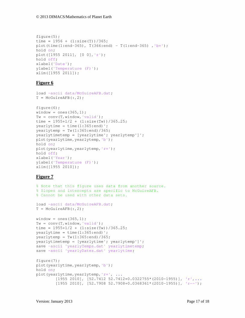
Appendix: MATLAB Files for Producing Figures in Text Figure 1 load -ascii data/McGuireAFB.dat; T = McGuireAFB(:,2); figure(1); time = 1955+1/2 + (1:size(T))/365.25; plot(time(1:end),T(1:end),'b+'); xlabel('Date'); ylabel('Avg. Temp. (F)'); title('Average Daily Temperatures'); xlim([1955 2011]); % You may want to stretch out the figure horizontally to see the seasonal patterns Figure 2 load -ascii data/McGuireAFB.dat; T = McGuireAFB(:,2); figure(2); time = (1:size(T)); j = 0; plot(time(1:365),T(j+1:j+365),'b+'); hold on; j = 19719; j = 16435; plot(time(1:365),T(j+1:j+365),'r+'); hold off; xlabel('Time (days from Jan. 1)'); ylabel('Avg. Temp. (F)'); xlim([1 365]); Figure 4 load -ascii data/McGuireAFB.dat; T = McGuireAFB(:,2); figure(4); TbyYear = reshape(T(1:55*365),365,55); boxplot(TbyYear); xlabel('Years After 1955'); ylabel('Temperature (F)'); %The figure may have overwritten x-axis labeling. %If that's the case, you can just stretch the figure to make it wider. Figure 5 load -ascii data/McGuireAFB.dat; T = McGuireAFB(:,2);
Version: January 2013 Page 16 of 18
© 2013 DIMACS/Mathematics of Planet Earth
figure(5); time = 1956 + (1:size(T))/365; plot(time(1:end-365), T(366:end) - T(1:end-365) ,'b+'); hold on; plot([1955 2011], [0 0],'r'); hold off; xlabel('Date'); ylabel('Temperature (F)'); xlim([1955 2011]); Figure 6 load -ascii data/McGuireAFB.dat; T = McGuireAFB(:,2); figure(6); window = ones(365,1); Tw = conv(T,window,'valid'); time = 1955+1/2 + (1:size(Tw))/365.25; yearlytime = time(1:365:end)'; yearlytemp = Tw(1:365:end)/365; yearlytimetemp = [yearlytime'; yearlytemp']'; plot(yearlytime,yearlytemp,'b'); hold on; plot(yearlytime,yearlytemp,'r+'); hold off; xlabel('Year'); ylabel('Temperature (F)'); xlim([1955 2010]); Figure 7 % Note that this figure uses data from another source. % Slopes and intercepts are specific to McGuireAFB. % Cannot be used with other data sets. load -ascii data/McGuireAFB.dat; T = McGuireAFB(:,2); window = ones(365,1); Tw = conv(T,window,'valid'); time = 1955+1/2 + (1:size(Tw))/365.25; yearlytime = time(1:365:end)'; yearlytemp = Tw(1:365:end)/365; yearlytimetemp = [yearlytime'; yearlytemp']'; save -ascii 'yearlyTemps.dat' yearlytimetemp; save -ascii 'yearlyDates.dat' yearlytime; figure(7); plot(yearlytime,yearlytemp,'b'); hold on; plot(yearlytime,yearlytemp,'r+', ... [1955 2010], [52.7412 52.7412+0.0322755*(2010-1955)], 'r',... [1955 2010], [52.7908 52.7908+0.0368361*(2010-1955)], 'r--');
Version: January 2013 Page 17 of 18

© 2013 DIMACS/Mathematics of Planet Earth
Version: January 2013 Page 18 of 18
hold off; xlabel('Year'); ylabel('Temperature (F)'); title('Regressions: Least Abs. Dev. (solid) and Least Squares (dashed)'); xlim([1955 2010]); Figure 8 load -ascii data/McGuireAFB.dat; T = McGuireAFB(:,2); figure(8); window = ones(365,1); Tw = conv(T,window,'valid'); time = 1955+1/2 + (1:size(Tw))/365.25; plot(time(1:end),Tw(1:end)/365); xlabel('Date'); ylabel('Temperature (F)'); xlim([1955 2010.8]); Figure 9 load -ascii data/McGuireAFB.dat; T = McGuireAFB(:,2); figure(9); window = ones(365,1); Tw = conv(T,window,'valid'); time = 1955+1/2 + (1:size(Tw))/365.25; plot(time(1:end),Tw(1:end)/365,'b'); hold on; window = ones(365,1); Tw = conv(T,window,'valid'); time = 1955+1/2 + (1:size(Tw))/365.25; plot(time(1:365:end),Tw(1:365:end)/365,'r+'); hold off; xlabel('Date'); ylabel('Temperature (F)'); xlim([1955 2010]);