starling social app case study
TRANSCRIPT

starling

THE OPPORTUNITY The brief was to add functionality to an existing brand. We chose to leverage Twitter's ubiquity and ease-of-use to create a NYC crowd-sourced app that will allow users to share what is happening around them, and for others to discover nearby events.

MY ROLE Involved in all phases of research, lead feature ideation (aka Chief White Board Officer), responsible for wireframes, prototypes and animation.

BUSINESS RESEARCH To learn how Twitter worked, our research included reading Hatching Twitter (fascinating but not very helpful) and the Twitter Design Guide. We also created a Twitter site map and flowcharts for their onboarding and content selection paths.

We then looked at Facebook, Foursquare, Instagram, Snapchat and Vine. Each app gave us insight into how users interact with popular apps similar to Starling:
The onboarding process for Foursquare is a cautionary tale. The user is asked a series of incrementally intrusive questions, which allows for multiple opportunities for user drop-off.
We also researched geofencing and core location frameworks to ensure our app would be able to do what we wanted it to do. We chose to go with Google Earth's functionality for the MVP, and would look into other options further in development.
Snapchat allows users to tell (and view) a story of local experiences through photo and video uploads, but this
process is hidden, and known only to power users.
BUSINESS RESEARCH (CONT’D)
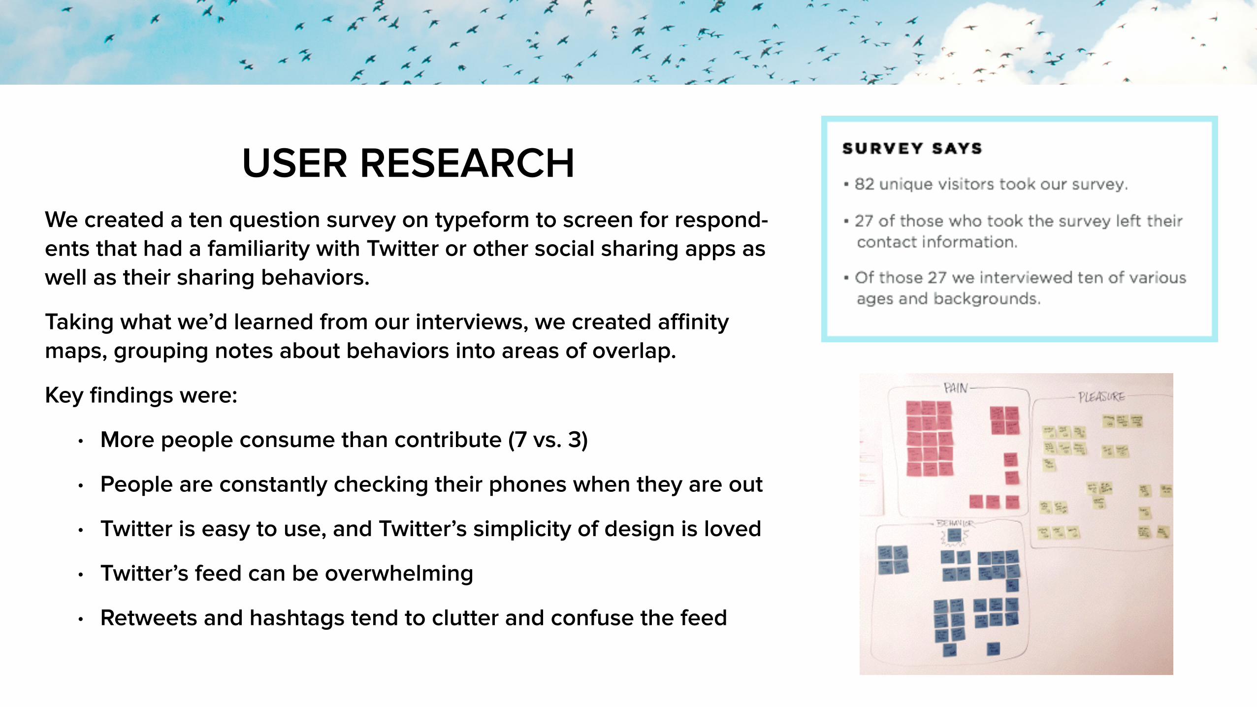
USER RESEARCH We created a ten question survey on typeform to screen for respond-ents that had a familiarity with Twitter or other social sharing apps as well as their sharing behaviors.
Taking what we’d learned from our interviews, we created affinity maps, grouping notes about behaviors into areas of overlap.
Key findings were:
• More people consume than contribute (7 vs. 3)
• People are constantly checking their phones when they are out
• Twitter is easy to use, and Twitter’s simplicity of design is loved
• Twitter’s feed can be overwhelming
• Retweets and hashtags tend to clutter and confuse the feed
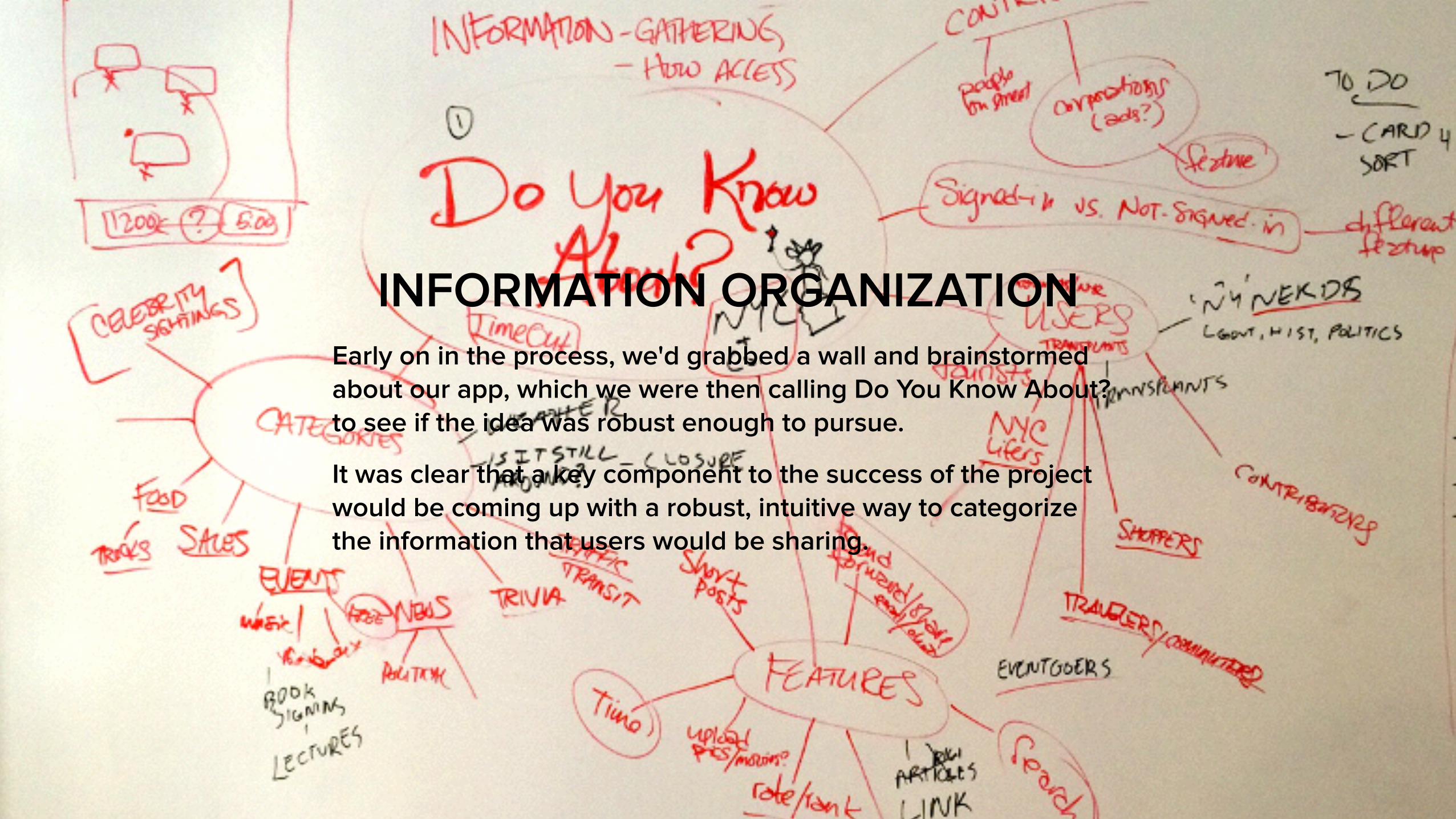
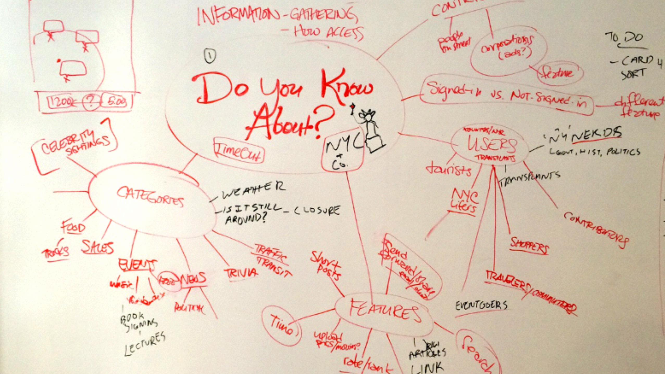
INFORMATION ORGANIZATION Early on in the process, we'd grabbed a wall and brainstormed about our app, which we were then calling Do You Know About? to see if the idea was robust enough to pursue.
It was clear that a key component to the success of the project would be coming up with a robust, intuitive way to categorize the information that users would be sharing.

CARD SORTING To gather data on information organization schemes, we created sixty different notification examples, such as "Ferry accident at Pier 11." "Surprise sale at Donna Reese in SoHo!" and "[Photo of two dogs sitting together outside an italian restaurant.]" We performed ten open card sorts and five closed card sorts.
Key Takeaways:
• People wanted few, large general categories like “News” and “Events.”
• Time-based categories were common
• People wanted "actionable" information
• “Free” was a category created by 7 of 10 open sorters

PERSONAS We created four personas from data culled from our user research. They broke down to two pairs: April and Martin were the Consumers, more interested in receiving information, and Cynthia and Tyler were the Contributors, more interested in broadcasting information.

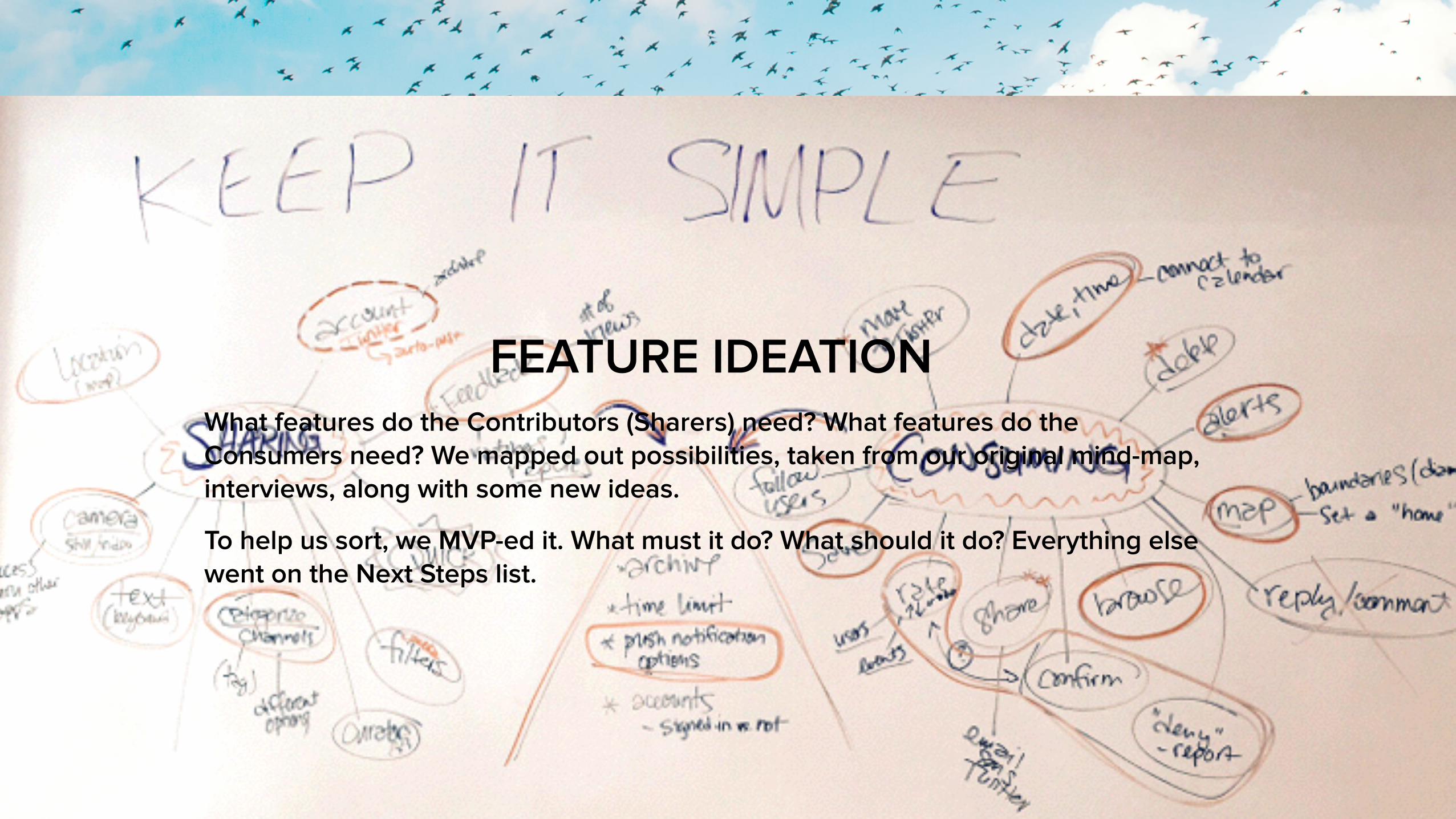
FEATURE IDEATION What features do the Contributors (Sharers) need? What features do the Consumers need? We mapped out possibilities, taken from our original mind-map, interviews, along with some new ideas.
To help us sort, we MVP-ed it. What must it do? What should it do? Everything else went on the Next Steps list.
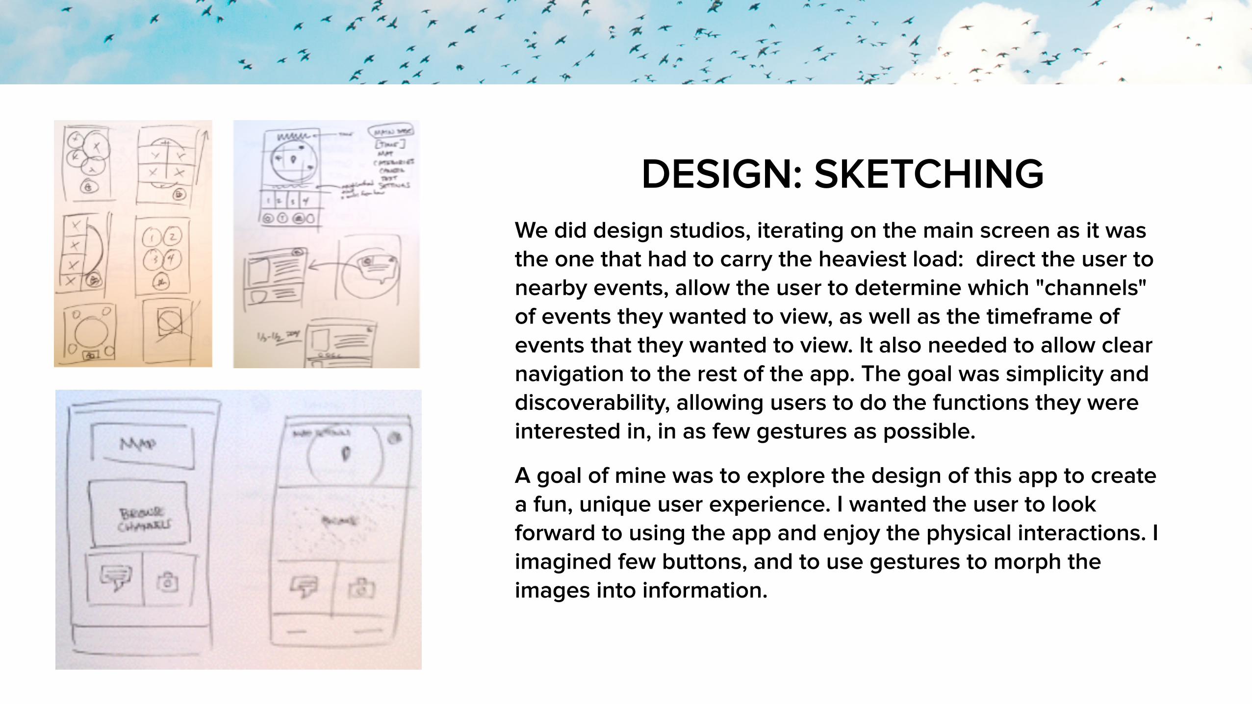
DESIGN: SKETCHING We did design studios, iterating on the main screen as it was the one that had to carry the heaviest load: direct the user to nearby events, allow the user to determine which "channels" of events they wanted to view, as well as the timeframe of events that they wanted to view. It also needed to allow clear navigation to the rest of the app. The goal was simplicity and discoverability, allowing users to do the functions they were interested in, in as few gestures as possible.
A goal of mine was to explore the design of this app to create a fun, unique user experience. I wanted the user to look forward to using the app and enjoy the physical interactions. I imagined few buttons, and to use gestures to morph the images into information.

DESIGN: WIREFRAMES I move quickly from sketching to wireframing, as I find it easier to iterate digitally. Some of the first wireframes had two big buttons that would allow Contributors to quickly post a text or take a photo. Above it, the map and list of channels (missing the NY Moments channel) was for the Consumers to find local events.
During testing, users found this set of designs confusing as it separated text and image, implying that you could do one or the other but not both. They understood the map, and preferred the smaller, vertically-oriented channels info/selectors.
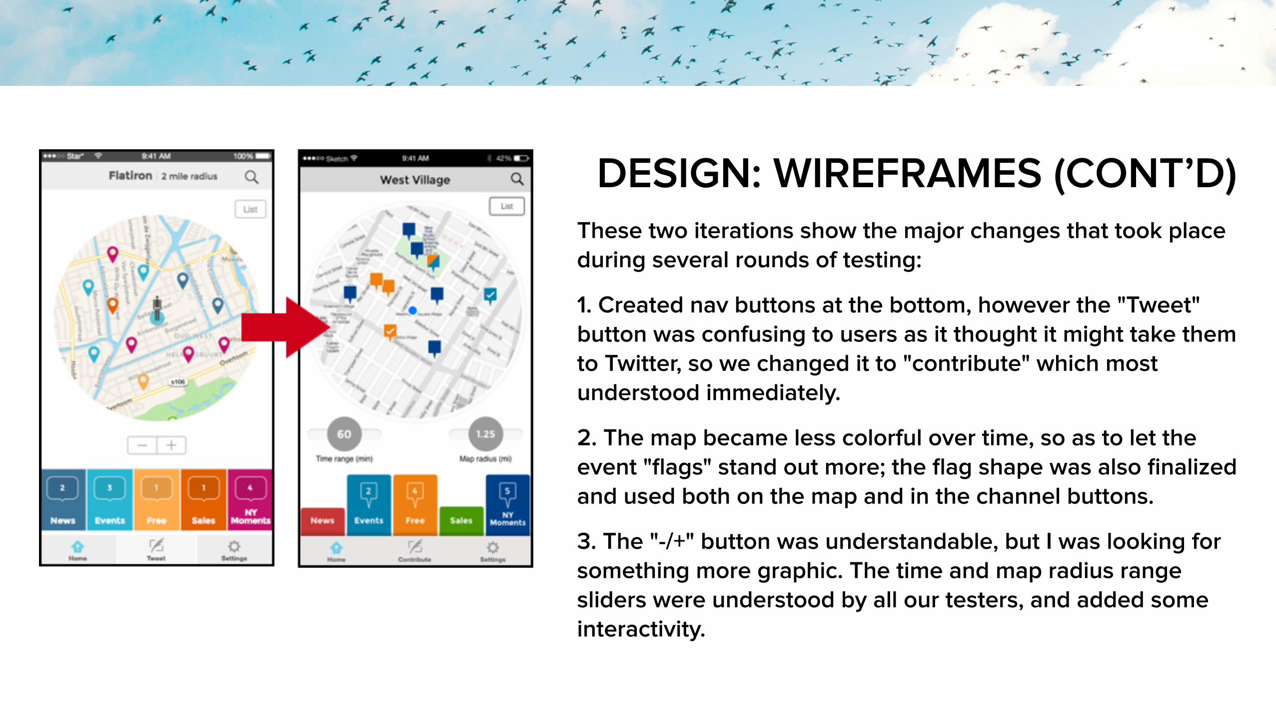
DESIGN: WIREFRAMES (CONT’D) These two iterations show the major changes that took place during several rounds of testing:
1. Created nav buttons at the bottom, however the "Tweet" button was confusing to users as it thought it might take them to Twitter, so we changed it to "contribute" which most understood immediately.
2. The map became less colorful over time, so as to let the event "flags" stand out more; the flag shape was also finalized and used both on the map and in the channel buttons.
3. The "-/+" button was understandable, but I was looking for something more graphic. The time and map radius range sliders were understood by all our testers, and added some interactivity.

CONCLUSION Starling was a mixture of successes and failures. While the prototype is functional and addresses most of the features we intended, the interface ended up somewhat cluttered and cramped. Simplicity and fun got pushed further aside as we needed to make it "just work." However, you can see on the Starling site map that every function is within a few gestures of the main screen, which is what we'd planned.
I would like to revisit the basic design structure of the interface someday.
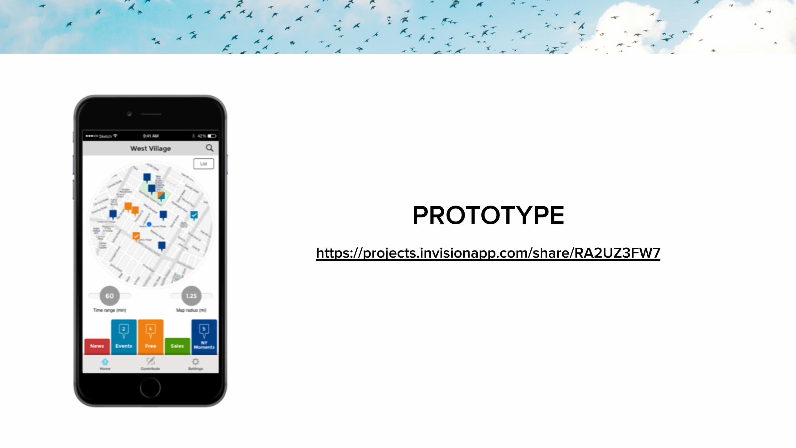
https://projects.invisionapp.com/share/RA2UZ3FW7
PROTOTYPE