stardock windowblinds 3 customize the look … · stardock windowblinds 3 customize the look and...
TRANSCRIPT
STARDOCK WINDOWBLINDS 3 Customize the look and feel of Windows
Skinning Guide
WindowBlinds
3

WindowBlinds Skinning Guide
Stardock Corporation 17292 Farmington Road • Livonia • MI 48152 Phone (734) 762-0687 • Fax (734) 762-0690

Table of Contents
Introduction ..................................................1 Breaking down a skin...................................2 An introduction to graphics.........................4
Transparency................................................4 An introduction to UIS .................................6
UIS 1++ vs. UIS 2 .........................................6 An example...................................................7
Skin definition ..............................................8 [TitlebarSkin].................................................8
Personality..................................................10 [Personality] ................................................10 The frame ...................................................11 Text.............................................................13 Backgrounds...............................................14
Menus..........................................................15 [MENUBACKGROUND]..............................16 [MENUITEM]...............................................17
Buttons .......................................................19 Action Buttons.............................................20 System & Plugin Buttons ............................24 MDI Buttons ................................................25 Other Button Stuff .......................................26 Animated Buttons .......................................27
The taskbar.................................................29 The taskbar.................................................29 The Start button ..........................................30
Windows XP ................................................31 The XP Start menu .....................................31 Menu & MenuItem ......................................32 Separators ..................................................33 The User Pane............................................34 The Program List ........................................35 The Places List ...........................................36 The Bottom Bar...........................................36 The XP Taskbar..........................................37 The Start Button..........................................37 Taskbar Buttons..........................................38 Rebars ........................................................40 The XP System Tray...................................40 Tab Backgrounds........................................42
Controls ......................................................43 Toolbars......................................................43 Scrollbars....................................................44 Groupboxes ................................................47
Progress Bars ............................................ 48 Tabs........................................................... 49 Headerbars ................................................ 50 Status Bars ................................................ 50 Rebars ....................................................... 51 Combo Buttons .......................................... 51
Presets ....................................................... 53 Windows Colors ......................................... 53 Standard WindowBlinds Colours................ 54 Standard WindowBlinds Fonts ................... 54 Font Layouts .............................................. 58
Advanced skills.......................................... 60 Multiple Skins............................................. 60 Metrics ....................................................... 61 Smartbuttons.............................................. 61 Using TGA Graphics .................................. 66
The Windows User Interface..................... 68 The Frame and TitleBar ............................. 68 Toolbars and Menus .................................. 69 StatusBars and Resize Grips ..................... 70 The Start Menu and TaskBar ..................... 70 Buttons....................................................... 70 Lists ........................................................... 71 Other controls ............................................ 72
Additional resources ................................. 73 Getting WindowBlinds skins....................... 73 UIS Code guides........................................ 73 SkinStudio.................................................. 73
W I N D O W B L I N D S S K I N N I N G G U I D E
1
Introduction Why this guide exists and what you can expect from it
he reason for this manual existing is clear if you’ve ever has the desire to create your own WindowBlinds skins. WindowBlinds is incredibly powerful, from which it follows that there are many options which you can set and configure.
Like a web page, a WindowBlinds skin is a text file which is interpreted in order to produce the desired effect. Like a web page there are 2 ways to create this file:
a) The hardcore programmer way. Open up a text editor like Object Edit and type until your fingers bleed
b) The lightweight way. Use an editor built for the purpose like SkinStudio!
This document is not a guide to using SkinStudio but is designed to introduce you to the concepts of skinning using WindowBlinds, so that if and when you choose to use SkinStudio, there will not be much of a learning curve. There is no reason to use a text editor if there is a tool to make things easier, but then again, unless you understand the power of the WindowBlinds skin language (UIS) you will never get the most out of WindowBlinds.
The first key thing to remember is that WindowBlinds is not an ‘all-or-nothing’ solution. As you build a skin, you can save it as you go along and ask WindowBlinds to use that skin. WindowBlinds will skin those areas which you have defined, and will use defaults for those areas not defined. This means you can see how your skin is looking and check you are happy with it before you go any further.
The one thing this guide cannot give you is creativity. It’s all well and good to understand how a skin is constructed, but it helps if you have a little flair. Having said that, with a paint package and enough desire, almost any user can make an attractive skin. I know - I am that user!
If you have a recommendations for this guide or would like to make any other comments then please email me: [email protected]
Chapter
1
T

2
Breaking down a skin Before starting, it is important you understand the composition of a skin. By gaining this understanding things will start to look a lot less daunting.
y breaking down a skin into it’s component parts you will see how it is made up, and realize you don’t have to do it all at once. You can build up a skin gradually, see it evolving, and before you know it you will have a fully functional WindowBlinds skin.
In this tutorial we will dissect a skin by Alexandrie, one of the very best skin authors. If we’re going to look at an example it may as well be the best!
If you are not too familiar with the different elements in the Windows user interface, the before you get going, a good starting point would be Appendix A.
Chapter 3: An introduction to graphics A very brief introduction to the type of graphic files required in order to make a skin, how to define transparent areas, and the definition of multiple ‘states’ in a single graphic.
Chapter 4: An introduction to UIS This outlines the construction of a skin and the key sections that you will work through in the following chapters.
Chapter 5: Skin Definition The first very short section to complete is where you give the skin its name, identify yourself as the author, and add any special notes about the skin.
Chapter 6: Personality In this key section you add the main graphical frame for your window, and set up some of the basic parameters.
Chapter
2
B

3
Chapter 7: Menus In this section we will also define the appearance of menus in your skin.
Chapter 8: Buttons Here we will look at how to add buttons to your skin. Not only can your buttons do what normal windows buttons do, they can do much more, increasing your productivity.
Chapter 9: The Taskbar This section shows you how to skin the Start Button and Taskbar.
Chapter 10: Windows XP This section describes the extra skinning options available to you under Windows XP.
Chapter 11: Controls You now have at your disposal an understanding of how graphics are used in a WindowBlinds skin. Armed with this knowledge you should have no trouble defining the appearance of other Windows controls such as scrollbars, tabs, progress bars and toolbar buttons.
Chapter 12: Presets Within your skin, you can set colors for elements not actually skinned by graphics just as you can define color schemes in Windows. Within this section we will also look at Presets where you can define styles for colors, fonts and text layouts that you can refer to from elsewhere within the skin.
Chapter 13: Advanced skills This section will discuss other more advanced features that you can use in your skin to enhance the appearance and productivity.
Appendix A: The Windows User Interface This section provides an introduction to the different elements of the Windows User Interface to increase your familiarity with them.
Appendix B: Additional resources Examine this section if you want to find other sources of information regarding WindowBlinds and WindowBlinds skins.

4
An introduction to graphics A very brief introduction to the type of graphic files required in order to make a skin, how to define transparent areas, and the definition of multiple ‘states’ in a single graphic.
ost WindowBlinds skins are made up Bitmap (BMP) graphics files. The latest versions of WindowBlinds also support the use of TGA files. You can use any graphics package to develop your skins, as long as it is capable of exporting the appropriate file.
T R A N S P A R E N C Y
Windows which are skinned by WindowBlinds don’t have to be completely rectangular; in fact they can be almost any shape you can imagine. The same is true for the buttons and controls you create. Bitmap files that you save however, must be rectangular, so how do you indicate areas that need to be transparent?
The solution is actually very simple. WindowBlinds has been designed to interpret the presence of a set color (magenta) as a request for transparency.
Any time WindowBlinds encounters this precise shade in a graphic it defines that area as being transparent. This does of course mean that you cannot use precisely this color in a skin, but even the smallest change in hue
(e.g. R:254, G:0, B:255) will be visible. This in itself raises another point which you should beware of.
Anti-aliasing is a technique by which the edges of objects are softened by gradually blending them into the background. While designing a skin, you need to be aware that anti-aliasing can cause problems because it softens edges by changing the surrounding hue.
On the face of it the circles on the left are fairly similar, but looking at them closely reveals the
Chapter
3
M

5
effect of anti-aliasing. The circle on the right will work perfectly as a WindowBlinds graphic, as the edges are crisp and it is surrounded by pure Magenta allowing transparency to work effectively. The circle on the left, if used, would have a purple ring around it regardless of what color it was placed over, as the edges which are not ‘pure’ will not be interpreted as transparent but rather the ‘impure’ color they are in the picture.
The other thing you need to know about graphics is that graphics used for WindowBlinds often consist of multiple ‘States’. What do I mean by this? Well, the appearance of most controls in Windows varies depending on how you are interacting with them. For example below is a graphic used for the Close button in a WindowBlinds skin.
You can see that the actual button appears to be repeated 6 times. This is because this one graphic contains all 6 potential ‘States’ in
which the Close button can appear. The first set of 3 relate to the active window (i.e. the one you are currently working in), and the second set of 3 relate to all inactive windows (i.e. other windows on your desktop that you are not working in currently).
In each set of 3, the first image is how the Close button normally looks. The second is how the Close button looks when you press it, and the third is how it looks when you move your mouse over it.
Different controls can have different numbers of States and these will be discussed when we get to them.
For now, you are armed with everything you need to know about graphics, so it’s onto the UIS file.

6
An introduction to UIS This outlines the construction of a skin and the key sections that you will work through in the following chapters.
f you choose to use SkinStudio to build your skins then, to some extent, you are shielded from the UIS file. It is however good that you understand it, as it is then easier to quickly modify files. You will also find that as features are built into WindowBlinds it can take a little while before they are available in SkinStudio. It’s
usually not long but if you don’t understand the UIS you don’t get to play with these new features until SkinStudio has caught up.
U I S 1 + + V S . U I S 2
As WindowBlinds has developed, so has the UIS skinning language. At this time there are two versions of the language, UIS 1++ and UIS2, both of which can be interpreted by WindowBlinds. Don’t worry, this doesn’t complicate things. If you want a very simple skin with limited functionality you may find that UIS 1++ does the job for you. It is designed for simplicity and makes it really easy to build as skin, and is also optimized for speed.
UIS2 is more advanced, though it is still not complicated, and has far more functionality. You could consider UIS as the “Professional” version of the UIS language.
This document focuses primarily on the advanced features of UIS2. A separate document deals with the UIS1++ format.
Chapter
4
I

7
A N E X A M P L E
Below you can see a section of a UIS file. You don’t have to understand it, as all I’m trying to demonstrate is the fact that it is simple plain English that you need not be afraid of.
[Button0] Align=1 XCoord=24 YCoord=3 Action=0 ButtonImage=XPCobalt\C-Close.bmp
This is actually the code for a Close button. All it does it is set the alignment of the button relative to the window (in this case 1 which equals Top Right), and offsets horizontally and vertically from that place.
There is an action which defines what the button does (in this case 0 equals ‘close the window’), and there is a line which tells WindowBlinds which graphic is used for the Close button. That’s it!
As we go through the sections we will explain the appropriate lines in the UIS code.

8
Skin definition The first very short section to complete is where you give the skin its name, identify yourself as the author, and add any special notes about the skin.
he [TitlebarSkin] section within the UIS file is where you identify the skin and your role in it’s creation. If you look below you can see this information for the skin we are studying.
[ T I T L E B A R S K I N ]
SkinName=Aquarium This is where you give your skin a name
SkinAuthor=Johanne Chainé AKA Alexandrie Here you identify yourself as the skin author so you can receive the credit you deserve
[email protected] Enter your e-mail address here so people can correspond with you
AuthorsURL=http://www.pixtudio.com Here you can enter the address of your website.
Generator=SkinStudio ver 1.4.1, Build 377 - http://www.skinstudio.net If you use software to create your skin, it can enter information in this parameter which identifies the editor used
WBVer=200 This is where you can specify the version of windows for which this skin is intended: 200 = WindowBlinds 2.x 300 = WindowBlinds 3.x
Chapter
5
T

9
The first two values are compulsory. If you don’t specify a SkinName and a SkinAuthor then WindowBlinds will not recognize the skin, and it will not be listed in the list which can be selected by the user.
There are some other attributes which allow you to make notes:
SpecialNotes= Enter any notes or message you wish to about your skin here
EditorNotes=copyright Pixtudio.com Editors such as SkinStudio can display a message when you load the skin for editing. Enter here anything you would like to appear in this message.

10
Personality In this key section you add the main graphical frame for your window, and set up some of the basic parameters.
his is a key section in defining your skin and it’s basic parameters and graphics. Before you get into the detail of the skin there are two lines you can specify which can make your skin more efficient if it meets the appropriate criteria.
[ P E R S O N A L I T Y ]
NoShape=1 Earlier in this document I explained that you could use transparency and have non-rectangular frames for your windows. If your skin does not have a non-rectangular frame, which uses transparency of this sort you can add this line for optimization.
UsesTran=0 Similarly, if the buttons which you place on the frame do not use transparency then you can add this line for optimization purposes.
By looking at a SkinStudio preview as shown on the left, you can quite easily see the makeup and the key elements of a skin.
This also shows you how the final Aquarium skin looks.
Chapter
6
T

11
T H E F R A M E
The first thing we are going to look at is the skin Frame, which is made up of Top, Bottom, Left and Right components as can be seen in the diagram below.
What you must remember is that there are two types of window state, the Active and the Inactive window, both of which must be skinned.
You can click the toggle button to switch the Preview that is visible to you.
As explained in Chapter 3, graphics can contains the image for both active and inactive states.
The code used to specify the four images, one for each side of the frame, is placed in the [Personality] section as is the code in the rest of this chapter.
Top=Aquarium\top.bmp Left=Aquarium\left_.bmp Right=Aquarium\right_.bmp Bottom=Aquarium\bottom_.bmp
A standard bitmap for the frame contains the images for both the active and inactive window states, as you would see above. If you look at the actual bitmap used you will see that there are many more frames. This is because in the Aquarium theme uses an animated image for the active window.
This is reflected in the following line of code.
TopFrame=15 LeftFrame=15 RightFrame=15 BottomFrame=15
These lines are necessary even if the skin does not require animation as the value reflects how the source graphic is made up, by reflecting the number of ‘images’ displayed.
1 (one image) = all windows have this image 2 (two images) = active windows have first image, and inactive windows have second 3 (three images) = as above, third image is for disabled windows 4+ (4 or more images) = animated window image and inactive window in final image

12
The image above would have the code TopFrame=2, but the actual image used has the code TopFrame=15 because there a 14 images making up the active window animation and a single final image to represent the inactive window state. It is important to remember that even if only one side of the window frame is animated all the sides of the frame must contain the same number of images.
You also need to specify the speed of the animation. The line below specifies the time interval between images of the animation in milliseconds; i.e. in this case there is 0.3 seconds between each image. An AniRate of 0 means that there is no animation.
AniRate=300
For optimization purposes, another command is required to specify whether all frames of the image or the same shape. If all the frames are the same shape (i.e. the same areas of transparency), then WindowBlinds can function more efficiently. To clarify this, use the following line:
DynamicFrame=0
If your frames were different shapes, then you would set the value to 1.
At this time the animation won’t work properly because you need to add a special ‘Animation button’ to provide the functionality, but we will come onto that in the Buttons section.
Because all windows on you desktop can change size, WindowBlinds needs informing how to scale these images. Each side of the frame has TopHeight, BotHeight, and Stretch parameters as you can see below.
TopTopHeight=52 TopBotHeight=109 TopStretch=1 LeftTopHeight=27 LeftBotHeight=6 LeftStretch=0 RightTopHeight=27 RightBotHeight=6 RightStretch=0 BottomTopHeight=0 BottomBotHeight=0 BottomStretch=1
The image contains a section at each end, and then a section in the middle which is resized depending on the window size. For each edge, the TopHeight value is the number of pixels from the left (top or bottom frame), or the top (left or right frame). In this case the image up to 52 pixels is the left segment.
The BotHeight value is the number of pixels from the right (top or bottom frame), or the bottom (left or right frame). In this case the right 109 pixels are the Right segment.
13
The rest in the centre can be scaled in 2 different ways. This is what the Stretch parameter is for on each side of the frame. You can either Tile the image repeating it side by side, or you can Stretch the image meaning that the centre image is resized until it fits the size required by the window. Stretch parameters have the following options:
0 = means stretch 1 = means tile 2 = means tile horizontally and stretch vertically 3 = means stretch horizontally and tile vertically 4 = means the middle bit in the middle and fill the rest with the top left colour
T E X T
It is within the [Personality] section where you can also set the color of text used in the frame.
Throughout the creation of a WindowBlinds skin, colors are usually broken down into their Red, Green and Blue components, each of which ranges from 0 (none / darkest) to 255 (full / brightest).
The following lines set text in active windows to be white (255, 255, 255), and text in inactive windows to be a grey/blue color (210, 219, 223).
ActiveTextR=255 ActiveTextG=255 ActiveTextB=255 InactiveTextR=210 InactiveTextG=219 InactiveTextB=223
Without WindowBlinds, your windows are constrained to having their text at the left edge of the windows and the ‘buttons’ on the right. With WindowBlinds you have the flexibility to change this depending on your preference. For example, if you are a left handed user, at may be more natural to have buttons on the left. This emphasizes how WindowBlinds is not pure ‘eye-candy’. It goes beyond the standard Windows interface, and other clones of the interface that rely on the Microsoft Visual Styles, and provides additional functionality.
The first thing to do is to define the position of the text.
TextAlignment=0
This line allows you to determine whether the text is positioned on the left, in the centre, or on the right of the window. You have 3 choices: 0 = left justified 1 = centre justified

14
2 = right justified
To qualify this, you can also specify horizontal and vertical offsets to allow you flexibility, and avoid the text butting into any graphics or buttons at the edges of the frame.
TextShift=21 TextShiftVert=-1 TextRightClip=73
The TextShift command specifies how many pixels the text is offset from the left margin, and the TextRightClip parameter is the distance from the right margin. The TextShiftVert parameter shifts the text vertically from the centre of the graphic, in this case 1 pixel down.
B A C K G R O U N D S
The final code you need to consider in the [Personality] section is the code for window backgrounds. You can specify backgrounds for Windows explorer, dialogue boxes, and MDI windows. If you don’t know what MDI windows are then here goes. Some programs allow you to open several files at once. Each file will open as a separate window within that application. These ‘windows within windows’ are called MDI windows.
The code is simple in each case. All you need to do as specify the image, and this image will be tiled until it fills the appropriate window.
ExplorerBmp=Aquarium\explore.bmp DialogBmp=Aquarium\dialog.bmp MDIBmp=Aquarium\mdi.bmp

15
Menus In this section we will also define the appearance of menus in your skin.
enus consist of the menu titles in a window, and the menus which appear when these titles are clicked. Both can be configured using WindowBlinds.
When your cursor goes over a menu title, the color of the text behind this title changes to reflect this selection. The following 3 lines define the Red, Green and Blue elements of this highlight.
MenuR=129 MenuG=118 MenuB=94
You can also define the actual color of the text that appears in menus. This is done using similar Red, Green, and Blue parameters. The fourth parameter in this list (MenuLeftTile) is a command that allows you to offset the text that appears by a number of pixels in a horizontally direction. Aquarium chooses not to do this; therefore this parameter has a value of 0.
MenuTextR=0 MenuTextG=0 MenuTextB=0 MenuLeftTile=0
You can place an image behind the top level text of menus, as highlighted by the red box in the image on the right. The parameters to achieve this are as follows:
MenuBar=Aquarium\menu.bmp TileMenu=1 TileLeftMenu=0 TileRightMenu=0
The first line specifies the image, which is a two part image; one for the active window and one
Chapter
7
M

16
for the inactive window. As with the frame images, the image can be split into three sections. There are 2 sides which can be specified and an area in the centre which can be tiled or stretched. The TileMenu parameter with a value of 1 indicates that the centre area should be tiled, and the TileLeftMenu and TileRightMenu parameters indicate the number of pixels at the edges which are unmodified. The Aquarium skin sets these to 0 as it tiles the entire image.
With WindowBlinds you can substantially improve the actual appearance of menu contents. This is done via the MenuBorders parameter, and the [MENUBACKGROUND] and [MENUITEM] sections.
The MenuBorders parameter specifies a graphic from which a 3 pixel border is derived to surround the menu. All you need to do is specify a graphic, and then WindowBlinds uses the outside 3 pixels on all sides of the image regardless of the actual image size.
MenuBorders=Aquarium\menuborder.bmp
The [MENUBACKGROUND] section sits outside the [PERSONALITY] section and is used to define the background image used on menus.
The Aquarium skin chooses to cleverly use the same image as is used by the MenuBorders parameter. This can be seen below in the IMAGE parameter.
To isolate the actual background image 4 parameters are used to specify a margin on each side. Here you can see that the RightWidth, LeftWidth, TopHeight, and BottomHeight parameters are all set to a value of 3. This works alongside the MenuBorders parameter which uses these excluded areas for the border.
The final parameter, Tile, is used as in previous sections to define whether the central area is tiled or stretched. The value of 0 means that the image is stretched. A value of 1 would have meant that the central area was tiled.
[ M E N U B A C K G R O U N D ]
IMAGE=Aquarium\menuborder.bmp RightWidth=3 LeftWidth=3 TopHeight=3 BottomHeight=3 Tile=0

17
[ M E N U I T E M ]
IMAGE=Aquarium\menutool.bmp
The [MENUITEM] section defines how individual menu items look on top of the menu background. The first parameter, IMAGE, specifies the source graphic to be used.
Again, you can define multiple ‘states’ in the source graphic, 5 in this case.
1. The Normal section is the image you wish to place over menu items that are clickable, and not disabled. In this skin it is set to transparent so the entire background shows through
2. The Separator is the line that appears between groups of items on the menu
3. The Disabled section is the image that appears behind disabled items, which again is totally transparent in this skin
4. The Mouse Over image is the image that is placed behind the menu item that the mouse cursor is currently positioned over
5. Default is the image used behind a menu item that is specified as the default item
As with most images, you can specify edges that remain unaffected by different sizes of menu, and a centre piece that can be tiled or stretched. These definitions can be seen below.
BottomHeight=5 TopHeight=3 LeftWidth=7 RightWidth=4 Tile=0
As was the case when designing the frames of the window, you can specify the Trans parameter to specify whether ‘magic pink’ is used to define areas of transparency in the image. A value of ‘1’ shows that it is used.
Trans=1

18
In addition to the ‘magic pink’ which is activated by the above statement, you can define the degree to which the [MENUITEM] image is transparent, and the [MENUBACKGROUND] image is visible through it. This is done via the Alpha parameter, which can range from 0 to 254. Where the value is 0, the [MENUITEM] image is totally transparent and the [MENUBACKGROUND] image is totally visible. At the other extreme as in this case the opposite applies.
Alpha=254
The final set of changes you can make is to define both the font style and color of the different type of menu items that exist. These make reference to the presets that are defined as explained in Chapter 12.
You can see here that on most occasions [Font2] is used, except when a menu item is the Default item of the mouse cursor is over the item where [Font1] is used.
NormalFont=2 PressedFont=2 DisabledFont=2 FocusFont=1 DefaultFont=2 MouseOverFont=1
You can also see that in every case the color used for menu items is that defined as [Colour0].
NormalColour=0 PressedColour=0 DisabledColour=0 FocusColour=0 DefaultColour=0 MouseOverColour=0

19
Buttons Here we will look at how to add buttons to your skin. Not only can your buttons do what normal windows buttons do, they can do much more, increasing your productivity.
here are 2 types of buttons that you need to support in Windows; those in the frame (e.g. Maximize, Close etc), and the buttons used within applications including radio buttons and check buttons.
While we were dealing with the frame of the window in the [Personality] section I alluded to the fact we would come back to the buttons of the frame so here we are. In fact, ‘buttons’ is a bit of a misnomer as all graphics in the frame with ‘actions’ attributed to them are referred to as ‘buttons’. The way these ‘buttons’ are defined is that some commands are placed within the [Personality] section, and then each button has a section of it’s own like [Button0].
We will start by looking at the commands that need placing within the [Personality] section.
ButtonCount=7 Here you specify the number buttons in the frame, each of which has its own section; in this case from [Button0] to [Button6].
RightClickAction=4 Previously it was mentioned how WindowBlinds can add functionality beyond standard Windows functionality. You can specify here a command that can be performed when the user right clicks on the title bar. The list of options is as follows:
0 = Close window 1 = Maximize/Restore window 2 = Minimize window 3 = Help button 4 = Rollup/Unroll window 6 = Force window to be 'always on top'
Chapter
8
T

20
7 = Attach window to the desktop (Always on bottom) 8 = Keep window visible always - LiteStep only 9 = Prevent window from being sized or moved 10 = Start screensaver 11 = Show system icon default window menu 21 = Send to bottom of z-order 24 = Minimize to Sys Tray
(Windows2000 only - Unsupported Experimental Code) 25 = Make window transparent
(Windows 2000 only - Unsupported Experimental Code) -2 = Disable Action
(Windows 2000 only - Unsupported Experimental Code)
RollupSize=33 When you specify that any of the buttons has ‘rollup’ functionality you must specify the size to which the window resizes. This is the height in pixels that the window will be after being rolled up.
TripleImages=1 This command is used to specify whether in your buttons use a source graphic that contains images just for the active window (0), or whether images are included for inactive windows as well (1).
MouseOver=1 This determines that the images used for buttons also contain an image that is shown when the mouse cursor is over the button. You will study the structure of the source graphics for buttons in the later sections.
We will now actually go through the buttons and examine the code.
A C T I O N B U T T O N S
Each button requires a section [ButtonX] where X is the number of the button. Below is the code for 4 buttons which have a similar structure. After the code we will go through each common line to examine its purpose
[Button1] XCoord=22 YCoord=6 Align=1 Action=0 ButtonImage=Aquarium\exit.bmp Visibility=0 InSound=Aquarium\close.wav [Button2] XCoord=40 YCoord=6 Align=1 Action=22

21
Visibility=20 ButtonImage=Aquarium\max.bmp InSound=Aquarium\Restore.wav [Button3] XCoord=58 YCoord=6 Align=1 Action=23 Visibility=22 ButtonImage=Aquarium\min.bmp InSound=Aquarium\Minimize.wav
[Button5] XCoord=40 YCoord=6 Align=1 Action=22 Visibility=21 ButtonImage=Aquarium\max.bmp InSound=Aquarium\Restore.wav Alpha=180 [Button6] XCoord=58 YCoord=6 Align=1 Action=23 Visibility=23 ButtonImage=Aquarium\min.bmp InSound=Aquarium\Minimize.wav Alpha=180
That is the code, now for the breakdown:
Align=1 This specifies an alignment for your button and is the first sign that WindowBlinds is much more flexible that normal windows. The value you give this parameter is taken from the list below.
0 = relative to top left of window 1 = relative to the top right of window 2 = relative to bottom left of window 3 = relative to bottom right of window 4 = middle of top edge. Does not permit the button to be pressed in. 5 = middle of bottom edge. Does not permit the button to be pressed in. 6 = middle of left edge. Does not permit the button to be pressed in. 7 = middle of right edge. Does not permit the button to be pressed in. 8 = left of caption text. 9 = right of caption text. 10 = align top border 11 = align bottom border 12 = align left border

22
13 = align right border
XCoord=22 To fine tune the setting you gave in the Align parameter you can horizontally offset the button from this position. Where the button is placed in a corner, a positive value offsets the button towards the centre of the window, and a negative value away from the centre. In this example, the button is offset from the top right corner of the window by 22 pixels towards the centre of the top frame.
YCoord=6 This is the complimentary parameter to XCoord and offsets vertically relative to the position set by Align.
Action=0 This is the one you’ve been waiting for, defining what the button actually does. The value of this parameter is selected from the list below. This button has a value of 0 indicating that it performs the ‘Close window’ function.
-6 = Do nothing. Just show an image. Passes mouse messages to the titlebar. -5 = dll button. Non clickable. Treated as an integral part of the titlebar. -4 = dll button. Click handled by plugin, drawing done by WindowBlinds. -3 = dll button. For use with external plugin -2 = Do nothing. Just show an image. Does intercept mouse messages. -1 = Do nothing. Just show an image. Does not intercept mouse messages. 0 = Close window 1 = Maximize window - Shows Disabled State 2 = Minimize window - Shows Disabled State 3 = Help button 4 = Rollup / Unroll window 5 = Execute command associated to this button. 6 = Force Window to be Always on Top 7 = Attach window to the desktop (Always on bottom) 8 = Keep window visible always - LiteStep only 9 = Prevent window from being sized or moved 10 = Start screensaver 11 = System Icon (default icon as shown in normal window) 12 = Show System Menu (functions as System Icon w/ specific image) 13 = Size window from the top 14 = Size window from the bottom 15 = Size window from the left 16 = Size window from the right 17 = Size window from top left 18 = Size window from the top right 19 = Size window from the bottom left 20 = Size window from the bottom right 21 = Send window to bottom of z-order 22 = Maximize Button - with MouseOver 23 = Minimize Button - with MouseOver 24 = Minimize to Systray

23
(Windows2000 only - Unsupported Experimental Code) 25 = Make window transparent
(Windows 2000 only - Unsupported Experimental Code) 40 = 'Link-To' Toggle - for use with visibility='Link-To'
*Note: This button should not have visibility='Link-To'}
ButtonImage=Aquarium\exit.bmp This is the source image for the button. The image again contains all of the required states in a single image. The first 3 are for the normal window, and the last optional 3 are for the inactive windows.
1. Normal 2. Pressed 3. Disabled / Mouse over 4. Inactive Normal (optional) 5. Pressed (optional) 6. Disabled / Mouse over (optional)
Visibility=0 This command determines under which circumstances a button is visible. The code can be chosen from those in the list below. If you require, you can use up to 10 codes at once by separating them with AND, for example 5 AND 9 AND 24.
0 = Always show button 1 = Show if window is active 2 = Show if window is inactive 3 = Show if window is maximized 4 = Show if window is NOT maximized 5 = Show if window is rolled up 6 = Show if window is NOT rolled up 7 = Show if window has 'Always on top' set 8 = Show if window is NOT set as 'Always on top' 9 = Show if attached to desktop 10 = Show if NOT attached to desktop 11 = Show if 'Keep this window visible always' 12 = Show if NOT 'Keep this window visible always' 13 = Show if window has help button (WS_EX_CONTEXTHELP) 14 = Show if window does NOT have help button 15 = Show if window does NOT have max or min button and is NOT maximized 16 = Hide button if a maximize button exists or a minimize button exists 17 = Show if window does NOT have either minimize or maximize button 18 = Show if window is a MDI child 19 = Show if window is NOT a MDI child 20 = Show if window has a maximize button 21 = Show if window does NOT have a maximize button 22 = Show if window has a minimize button 23 = Show if window does NOT have a minimize button 24 = Show if window is sizable

24
25 = Show if window is NOT sizable 26 = Show if either a maximize or minimize button exists 27 = Show if window has a default icon 28 = Show if window does NOT have a default icon 29 = Show if window text exist 30 = Show if window text DOES NOT exist 31 = Show if mouse is over the button specified in the LinkedTo line 32 = Show if button specified in the Link-To line is pressed in 33 = Show if button specified in the Link-To line is pressed in or ‘mouse over’ 40 = Show if 'Link-To' button is toggled on
{requires a button to have the 'Link-To' Toggle button action code} 41 = Show if 'Exclusive Link-To' button is toggled on
{requires a button to have the 'Exclusive Link-To' Toggle button action code} 50 = Show if WindowBlinds is in Advanced mode (default) (Advanced skins only) 51 = Show if WindowBlinds is in Simple mode (Advanced skins only) 52 = Show if window is a Tool Window (Basic skins only) 53 = Show if window is not a Tool Window (Basic skins only) 54 = Show when window is enabled 55 = Show when window is disabled
InSound=Aquarium\close.wav WindowBlinds allows you to allocate sound effects to actions. The InSound parameter allows you to specify a sound file that will be played which the button is clicked. In fact the InSound file plays when the mouse button is pressed in, and you can optionally specify an additional OutSound parameter to play a sound when the mouse button is released. All you need to do is specify a WAV file path relative to the WindowBlinds directory.
In order to use sounds in WindowBlinds you need to add an additional line to the [Personality] section of the skin. The line is SoundEnabled=1.
S Y S T E M & P L U G I N B U T T O N S
Buttons don’t have to contain graphics and perform traditional maximize / minimize type functions. There are two buttons in this skin which do other things. The first is likely to be a button that you want in most skins that you create, as it displays the program icon which Windows normally displays in the top left corner. All you need to specify are it’s location via the Align, XCoord and YCoord parameters. The final parameter is the Action parameter which we also examined earlier, using the value of 11 which the list above defines as ‘System Icon (default icon as shown in normal window)’.
[Button4] XCoord=7 YCoord=5 Align=0 Action=11

25
Earlier, while discussing the animated frame I indicated that the animation would not work at that stage. The reason was the lack of the plugin that allows animation. The way to implement the plugin is via a button. Below is the code for the button containing the animation plugin ([Button0]).
[Button0] XCoord=0 YCoord=0 Align=0 Action=-3 Width=0 Height=0 DllName=anim.dll
The first 4 parameters will now be familiar to you. The Width and Height parameters are optional parameters that indicate the width and height of the button (surprisingly!) and are set to 0 just to ensure the button is not visible.
The final parameter specifies the plugin to be used, but entering a file path relative to the WindowBlinds directory. The anim.dll file is the plugin that enables the animation on the window frame. Other plugins exist for such things as a clock and scrolling text.
M D I B U T T O N S
It’s already been shown that WindowBlinds can skin the background of MDI windows, but these windows have their own buttons and WindowBlinds can skin those too.
As you can see the code is very simple, all you have to do is specify the image to be used and whether the image contains images for the Mouse Over state.
The states are as follows:
1. Minimize button enabled 2. Minimize button presses 3. Minimize button disabled 4. Minimize button mouse over 5. Maximize button enabled 6. Maximize button presses 7. Maximize button disabled 8. Maximize button mouse over 9. Close button enabled 10. Close button presses 11. Close button disabled 12. Close button mouse over

26
[MdiControls] Image=Aquarium\button-mdi.bmp MouseOver=1
O T H E R B U T T O N S T U F F
OK, so that covers the buttons in the frame, but there are other buttons that you need to deal with. This code gets its own section in the UIS file – the [Buttons] section. Here we will go through this section line by line.
[Buttons] CheckButton=Aquarium\checkbox.bmp
Here you specify your source graphic for check buttons within your skin. Again the graphic contains multiple states. The image structure is made up as follows:
1. Not Selected 2. Selected 3. Not Selected (Disabled) 4. Selected (Disabled)
RadioButton=Aquarium\radio.bmp Here you specify your source graphic for radio buttons within your skin. Again the graphic contains multiple states. The image structure is made up as follows:
1. Not Selected 2. Selected 3. Not Selected (Disabled) 4. Selected (Disabled)
Bitmap=Aquarium\button.bmp
This is where you specify the graphic to be used for command buttons in Windows. This doesn’t skin the Taskbar buttons which these are dealt with elsewhere, but all the buttons within application. The image structure is made up as follows:
1. Normal 2. Pressed 3. Disabled 4. Focus 5. Default
The actual image has twice as many states because the MouseOver parameter has a value of 1 which means that states 6 to 10 replicate states 1 to 5 when the mouse cursor is over the button.

27
MouseOver=1 WindowBlinds can use a different image when the mouse cursor is over a button. As stated above this skin uses this and therefore this parameter has a value of 1.
TopHeight=5 BottomHeight=5 LeftWidth=5 RightWidth=5
These 4 parameters allow you, as you have done previously, to exclude the perimeters of the image from being stretched when a button is sized.
Trans=1 As per previous examples, you can specify the Trans parameter to specify whether ‘magic pink’ is used to define areas of transparency in the image. A value of ‘1’ shows that it is used.
Alpha=254 In addition to the ‘magic pink’ which is activated by the above statement, you can define the degree to which the button is transparent, and the window is visible through it. This is done via the Alpha parameter, which can range from 0 to 254. Where the value is 0, the [MENUITEM] image is totally transparent and the [MENUBACKGROUND] image is totally visible. At the other extreme as in this case the opposite applies.
A N I M A T E D B U T T O N S
Again, WindowBlinds is not content with standard Windows functionality and so you can use animation on your button. You specify the number of frames in the graphic, the gap between frames of the animation, and then which frames are animated in different circumstances.
FrameCount=10 This parameter allows you to specify how many frames are in the source image.
AnimTimerRate=250 This specifies the time in milliseconds between frames in the animation used.
MouseEnterStartFrame=4 This is the first frame that is displayed when the mouse cursor enters the button area. The MouseOver animation will then start. The frame count starts at 0 so this is actually the fifth image.
MouseLeaveMode=1 This defines how WindowBlinds should deal with the animation when the mouse moves away from the button. You have two options:

28
0. Stop animating immediately 1. Finish the complete animation cycle
MouseOverStartFrame=5 This is the first frame that is used in the animation when the mouse moves over the button. The frame count starts at 0 so this is actually the sixth image.
MouseOverStopFrame=9 This is the last frame that is used in the animation when the mouse moves over the button. The frame count starts at 0 so this is actually the tenth image.
NormalFont=0 PressedFont=0 DisabledFont=0 FocusFont=2 DefaultFont=2 MouseOverFont=2
Text is typically displayed on command buttons, and WindowBlinds allows you to specify a different font style depending on the button state. These commands specify the fonts and the font code relating to this is expanded on in Chapter 12.
Now you should know everything that you need to create your own buttons.
29
The taskbar This section shows you how to skin the Start Button and Taskbar.
his is where operating system specifics come into play. Windows XP introduced a more elaborate start menu than was available in previous versions of Windows. WindowBlinds 3 can take advantage of the new Start Menu, and skinning this is dealt with in Chapter 10, but here we will look at
skinning the standard taskbar and Start Menu.
T H E T A S K B A R
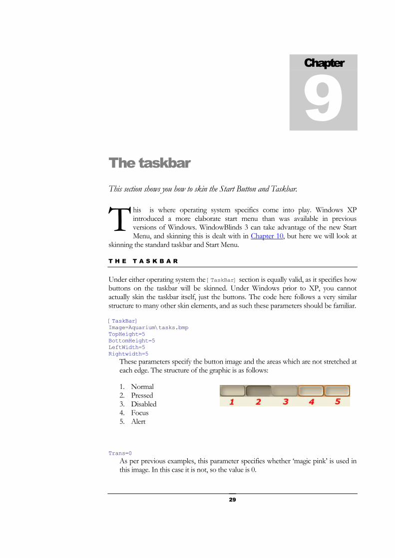
Under either operating system the [TaskBar] section is equally valid, as it specifies how buttons on the taskbar will be skinned. Under Windows prior to XP, you cannot actually skin the taskbar itself, just the buttons. The code here follows a very similar structure to many other skin elements, and as such these parameters should be familiar.
[TaskBar] Image=Aquarium\tasks.bmp TopHeight=5 BottomHeight=5 LeftWidth=5 Rightwidth=5
These parameters specify the button image and the areas which are not stretched at each edge. The structure of the graphic is as follows:
1. Normal 2. Pressed 3. Disabled 4. Focus 5. Alert
Trans=0 As per previous examples, this parameter specifies whether ‘magic pink’ is used in this image. In this case it is not, so the value is 0.
Chapter
9
T
30
NormalFont=0 PressedFont=0 DisabledFont=0 FocusFont=0 DefaultFont=0 MouseOverFont=0
These specify the font presets which are used for the button text in a range of circumstances. In each case [Font0] is used.
T H E S T A R T B U T T O N
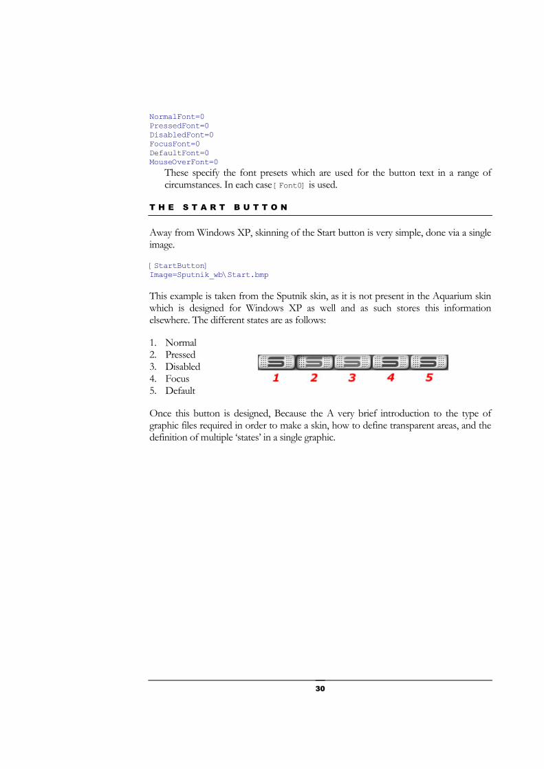
Away from Windows XP, skinning of the Start button is very simple, done via a single image.
[StartButton] Image=Sputnik_wb\Start.bmp
This example is taken from the Sputnik skin, as it is not present in the Aquarium skin which is designed for Windows XP as well and as such stores this information elsewhere. The different states are as follows:
1. Normal 2. Pressed 3. Disabled 4. Focus 5. Default
Once this button is designed, Because the A very brief introduction to the type of graphic files required in order to make a skin, how to define transparent areas, and the definition of multiple ‘states’ in a single graphic.

31
Windows XP This section describes the extra skinning options available to you under Windows XP.
indows XP offers extra opportunities for skinning under WindowBlinds 3 as there is an entirely new area to skin, the XP start menu and taskbar. You can also skin the backgrounds of tab controls.
WindowBlinds chooses to keep XP specific code in a separate file. This increases efficiency because if you are not using Windows XP then it doesn’t need to be loaded. In order to specify where WindowBlinds can find this information you need to enter the below code into the UIS file.
[XPTaskbar] File=Aquarium\xpstuff.xp
T H E X P S T A R T M E N U
The first thing to do is to understand the different components to the Start menu which can be skinned.
Chapter
10
W

32
We will now go through these sections one at a time.
M E N U & M E N U I T E M
These two items function subtly differently to the menus which were covered previously.
[StartPanel.Menu] Image=Aquarium\spmenu.bmp LeftWidth=3 TopHeight=3 RightWidth=3 BottomHeight=3
The Menu graphic is specified, as are the non stretched boundaries.
ContentLeft=2 ContentTop=3 ContentRight=2 ContentBottom=3
The four Content parameters define how far from the edges of the menus content within the menu should actually be placed.

33
TextFont=4 TextColour=0 TextColourOver=2
The final three parameters specify the color and font presets which should be used for the actual menu text.
The structure of the MenuItem graphic for the XP Start Menu is as follows:
1. Normal 2. Pressed 3. Disabled 4. Focus 5. Default
[StartPanel.MenuItem] Image=Aquarium\spmenuitem.bmp Trans=1 Alpha=254
The graphic is specified and the transparency parameters are specified as has been done in many other sections.
LeftWidth=8 TopHeight=3 RightWidth=12 BottomHeight=3
The boundaries which are not stretched are defined.
ContentLeft=3 ContentTop=0 ContentRight=3 ContentBottom=0
As per the above section, these four parameters specify how far in from the edge the content should start.
TextFont=4 TextColour=0 TextColourOver=0
These are the presets for the font and the font colors, again as have been used previously.
S E P A R A T O R S
There are two separators to deal with, one each for the Programs list and the Places list.
[StartPanel.ProgListSeparator] Image=Aquarium\progsep.bmp LeftWidth=10 RightWidth=10 Trans=1 Alpha=254

34
The graphic is defined and the required boundaries are set (only left and right are needed with this source graphic), and transparency for the source graphic is set.
[StartPanel.PlacesListSeparator] Image=Aquarium\placesep.bmp
All that is required here is to specify the source graphic.
T H E U S E R P A N E
At the top of the Start Menu is a solid block containing a graphic on which sits the graphic specified by the currently logged on user.
The picture is defined in the section below, the code for which should be familiar by now.
[StartPanel.UserPicture] Image=Aquarium\userpic.bmp Trans=1 Alpha=254 LeftWidth=13 TopHeight=13 RightWidth=13 BottomHeight=13
The picture sits in top of a solid bar. The bar is defined in the section below as is the way the users name is written.
[StartPanel.UserPane] TextFont=6 TextColour=0
The username is displayed using a preset font in a preset color.
Image=Aquarium\toppanel.bmp Trans=0 LeftWidth=10 TopHeight=3 RightWidth=10 BottomHeight=5 ContentLeft=5 ContentTop=5 ContentRight=5 ContentBottom=8 Tile=0
Familiar settings are used to define the actual bar. You specify the graphic, whether is contains the ‘magic pink’ for transparency and the edges and content boundaries. You specify whether to tile or stretch the remaining graphic via the Tile parameter. All these parameters should be fairly familiar to you.

35
T H E P R O G R A M L I S T
The left hand side of the Start Menu contains two sections; the main list of programs (both those pinned to the Start Menu and the most recently used), and the More Programs section.
[StartPanel.ProgList] Image=Aquarium\mfuback.bmp Tile=1 Trans=0 TextFont=4 TextColour=0 TextColourOver=2 LeftWidth=10 RightWidth=0 TopHeight=0 BottomHeight=0 ContentLeft=8 ContentTop=8 ContentRight=8 ContentBottom=8
What you see here is all familiar code. There is a single image for the graphic and the usual code for transparency and boundaries. There is also code for the text style and color which are again chosen from presets.
Underneath the Program List is the section for More Programs. This consists of two skinable components; the background (including the text style), and the button to pop up the menu.
[StartPanel.MorePrograms] Image=Aquarium\moreback.bmp Trans=0 Tile=1 TextFont=4 TextColour=0 TextColourOver=2 LeftWidth=10 TopHeight=0 RightWidth=0 BottomHeight=0 ContentLeft=8 ContentTop=3 ContentRight=8 ContentBottom=3
This code has the same structure as the Program Section. Obviously you can specify an entirely different graphic and font style.
Here, underneath the Program List is the section for More Programs. This consists of two skinable components; the background (including the text style), and the button to pop up the menu.
The image consists of three states:

36
1. Normal 2. Pressed 3. Mouse Over
[StartPanel.MoreProgramsArrow] Image=Aquarium\marrow.bmp Tile=1 Trans=0 TopHeight=1 BottomHeight=1
This code again specifies the image, whether transparency is used, the boundaries (on the top and bottom), and whether the centre of the image should be tiled or stretched.
T H E P L A C E S L I S T
The Places List makes up the right side of the Start Menu and the code is identical in structure to the Program List that was covered earlier.
[StartPanel.PlacesList] Image=Aquarium\places.bmp Tile=1 Trans=0 TextFont=4 TextColour=0 TextColourOver=2 LeftWidth=0 TopHeight=0 RightWidth=10 BottomHeight=0 ContentLeft=8 ContentTop=8 ContentRight=8 ContentBottom=8 T H E B O T T O M B A R
This is the block at the bottom of the Start Menu that contains the buttons for logging off and closing down the computer. The code below is again similar, detailing the graphic, its borders and the text style to be used.
[StartPanel.BottomBar] Image=Aquarium\logoff.bmp Trans=0 TextFont=4 TextColour=0 TextColourOver=2 LeftWidth=10 TopHeight=4 RightWidth=10 BottomHeight=3 ContentLeft=8 ContentTop=6 ContentRight=8

37
ContentBottom=2
T H E X P T A S K B A R
The first thing to remember is that the taskbar can be docked against any side of the screen and therefore your skin must cater for both horizontal and vertical taskbars. In the following code sections you will frequently find sections replicated for each, with the same parameters applying to each.
The first sections to deal are for the taskbar itself, and the ‘resize handle that allows you to adjust the height (for taskbars on the top/bottom of the screen), and the width (for taskbars on the left/right of screen).
[Taskbar.Horz] Image=Aquarium\taskbar.bmp LeftWidth=3 TopHeight=3 RightWidth=3 BottomHeight=3 Tile=0
This code simply specifies the single graphic to be used, the borders, and whether the central part is stretched or tiled; in this case ‘stretched’.
[Taskbar.SizeHorz] Image=Aquarium\taskbarsize.bmp Tile=1
If the taskbar is not locked, then you will see a resize handle which is specified by this section of code. All you need to do is specify the graphic and whether to stretch or tile this along the length of the taskbar.
The below code replicates the above for vertical taskbars on the left or right edge of the screen.
[Taskbar.Vert] Image=Aquarium\taskbarvert.bmp LeftWidth=3 TopHeight=3 RightWidth=3 BottomHeight=3 Tile=1 [Taskbar.SizeVert] Image=Aquarium\taskbarsizevert.bmp Tile=1
T H E S T A R T B U T T O N
The Start Button is very simple to create, and this can be expanded on quite easily if you intend to animate the button.

38
The button can contain as many frames as you want, although the first five must represent the following states:
1. Normal 2. Pressed 3. Disabled 4. Focus 5. Default
If you examine the actual image used in the Aquarium skin you will see that there are many more frames. These are for the animate as we saw in the frames, and the animation code is very similar. Remember that references to frame numbers start at 0 not 1.
[Taskbar.StartButton] Image=Aquarium\start.bmp TopHeight=0 BottomHeight=0 LeftWidth=0 RightWidth=0 Tile=0 Trans=1 Alpha=254
Here we have standard code for the image, tiling/stretching and transparency.
FrameCount=18 AnimTimerRate=300 MouseEnterStartFrame=5 MouseOverStartFrame=7 MouseOverStopFrame=16 MouseLeaveMode=1
As per the frame animation, this code details the number of frames in the image, the interval between frames in the animation, and then the frames to be used in different circumstances and the way the animation should end.
T A S K B A R B U T T O N S
The button code consists of three key elements; defining the image and boundaries, the presets for colors and fonts, and any animation. The code again needs to be replicated for both horizontal and vertical taskbars.
[Taskbar.ButtonHorz] Image=Aquarium\taskbutton.bmp LeftWidth=15 TopHeight=16 RightWidth=7 BottomHeight=9 Trans=1 Alpha=254 ContentLeft=0 ContentTop=4 ContentRight=0

39
ContentBottom=4 Here we have standard code for the image, tiling/stretching and transparency and the Content boundaries as explained previously.
NormalColour=0 PressedColour=0 FocusColour=0 FocusPressedColour=0 DisabledColour=0 NormalFont=4 FocusFont=4 DisabledFont=4 PressedFont=4 FocusPressedFont=4 GroupFont=2 GroupColour=0
The Presets code for fonts and color is exactly as the same as we have seen before, with the exception of two new parameters (GroupFont and GroupColour). Under Windows XP where the user has several instances of the same program open at once, they can be grouped into a single button. A number indicates how many instances of that application are open. It is this number that these two parameters refer to.
FrameCount=11 AnimTimerRate=250 MouseEnterStartFrame=7 MouseOverStartFrame=7 MouseOverStopFrame=10 MouseLeaveMode=1
This is the same structure of animation code that is used in the Start Button.
Below is the companion code for the buttons in vertical taskbars.
[Taskbar.ButtonVert] Image=Aquarium\taskbuttonv.bmp LeftWidth=17 TopHeight=15 RightWidth=9 BottomHeight=8 Trans=1 Alpha=254 ContentLeft=0 ContentTop=4 ContentRight=0 ContentBottom=4 FrameCount=11 AnimTimerRate=250 MouseEnterStartFrame=7 MouseOverStartFrame=7 MouseOverStopFrame=10 MouseLeaveMode=1

40
R E B A R S
Where a taskbar is not locked, rebars allow you to resize individual toolbars within the taskbar such as the Quick Launch, Application, and Language taskbars.
[Taskbar.RebarHorz] Image=Aquarium\taskrebar.bmp LeftWidth=0 TopHeight=5 RightWidth=0 BottomHeight=4 Tile=1 Trans=1 Alpha=254 NormalColour=0
Again, we have standard code for the image, tiling/stretching and transparency and a preset for any text used in the toolbars.
[Taskbar.RebarVert] Image=Aquarium\taskrebarv.bmp LeftWidth=2 TopHeight=0 RightWidth=2 BottomHeight=0 Tile=1 Trans=1 Alpha=254 NormalColour=0
T H E X P S Y S T E M T R A Y
The system tray is also highly customizable by WindowBlinds. The final XP specific area first thing to do is to understand the different components to the Start menu which can be skinned. The code is standard and you will have seen it all before.
[Taskbar.TrayHorz] Image=Aquarium\tray.bmp LeftWidth=33 TopHeight=21 RightWidth=10 BottomHeight=6 Tile=0 Trans=1 Alpha=254 ContentLeft=19 ContentTop=0 ContentRight=0 ContentBottom=0 [Taskbar.TrayVert] Image=Aquarium\trayvert.bmp LeftWidth=21 TopHeight=33 RightWidth=6 BottomHeight=10

41
Tile=0 Trans=1 Alpha=254 ContentLeft=6 ContentTop=19 ContentRight=5 ContentBottom=3
The clock can also be given a preset font style and color to increase consistency within your theme.
[Taskbar.Clock] TextColour=2 TextFont=5
The final element of the tray which needs to be skinned is a new feature in Windows XP. Under Windows XP the system tray can expand and contract to minimize the space it takes. There is an arrow button next to the tray that enables you to do this manually.
There are three states for the contracted button (which should be clicked to expand the tray), and 3 for the button when the tray is expanded.
1. Contracted Normal 2. Contracted Mouse Over 3. Contracted Pressed 4. Expanded Normal 5. Expanded Mouse Over 6. Expanded Pressed
The code below will be very familiar, and is replicated for both horizontal and vertical states.
[Taskbar.ButtonArrow] Image=Aquarium\taskbararrow.bmp TopHeight=0 BottomHeight=0 LeftWidth=0 RightWidth=0 Tile=0 Trans=1 Alpha=254 [Taskbar.ButtonArrowVert] Image=Aquarium\taskbararrowv.bmp TopHeight=0 BottomHeight=0 LeftWidth=0 RightWidth=0 Tile=0 Trans=1 Alpha=254

42
T A B B A C K G R O U N D S
Tab control backgrounds can now be skinned under Windows XP. A lot of applications tend to fill this area with the dialog color so often this image is not seen. Aquarium does not use this feature, but the code is standard image, tiling/stretching and transparency code as used in sections such as the [Taskbar.ButtonArrow] section.

43
Controls You now have at your disposal an understanding of how graphics are used in a WindowBlinds skin. Armed with this knowledge you should have no trouble defining the appearance of other Windows controls such as scrollbars, tabs, progress bars and toolbar buttons.
ow you will be familiar enough with the way that UIS code works that you should be able to quickly skin all the other controls within Windows.
We will go through them all at a fair pace, so don’t be afraid to look back at earlier code samples if you need to check the meaning of something.
T O O L B A R S
Buttons which are in the toolbar are skinned by this section. The code is now familiar, and you will notice that these buttons are also animated here. The only parameter you are likely to be unfamiliar with is the NoPaintFirstFrame parameter. If you are using Windows XP, then you can set the value of this parameter to 1. This will improve speed if you use toolbar backgrounds.
The states within this image are as follows:
1. Normal 2. Pressed 3. Disabled 4. Focus 5. Default
Because of the animation, there are actually more frames than this, but the first five frames are as above.
[ToolBars] Image=Aquarium\toolbar.bmp
Chapter
11
N

44
TopHeight=4 BottomHeight=4 LeftWidth=6 Rightwidth=6 NoPaintFirstFrame=0 Alpha=254 Trans=1 FrameCount=10 AnimTimerRate=250 MouseEnterStartFrame=4 MouseOverStartFrame=5 MouseOverStopFrame=9 MouseLeaveMode=1
S C R O L L B A R S
Scrollbars can be both horizontal and vertical and you need to design for both. For each you need to define both the background and the actual scrollbar slider. The other section required is to define the arrows at either end of the scrollbars.
The image structure is as follows:
1. Normal Left 2. Pressed Left 3. Disabled Left 4. Mouse Over Left 5. Normal Right 6. Pressed Right 7. Disabled Right 8. Mouse Over Right 9. Normal Up 10. Pressed Up 11. Disabled Up 12. Mouse Over Up 13. Normal Down 14. Pressed Down 15. Disabled Down 16. Mouse Over Down 17. Normal Horizontal Dot 18. Pressed Horizontal Dot 19. Mouse Over Horizontal Dot 20. Normal Vertical Dot 21. Pressed Vertical Dot 22. Mouse Over Vertical Dot 23. Corner
All these should make sense with exception of the ‘dots’ and ‘corner’. The dots are actually the handle that can be displayed on the center of each scrollbar slider. Where a
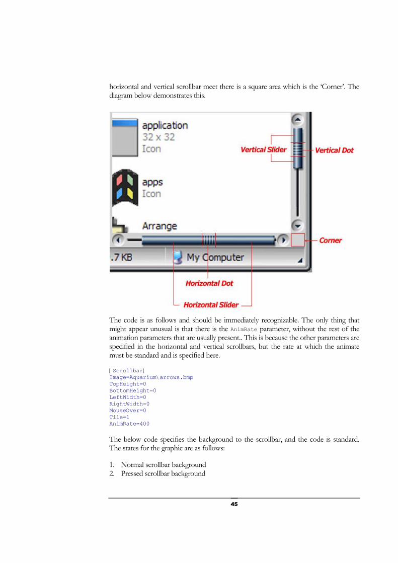
45
horizontal and vertical scrollbar meet there is a square area which is the ‘Corner’. The diagram below demonstrates this.
The code is as follows and should be immediately recognizable. The only thing that might appear unusual is that there is the AnimRate parameter, without the rest of the animation parameters that are usually present.. This is because the other parameters are specified in the horizontal and vertical scrollbars, but the rate at which the animate must be standard and is specified here.
[Scrollbar] Image=Aquarium\arrows.bmp TopHeight=0 BottomHeight=0 LeftWidth=0 RightWidth=0 MouseOver=0 Tile=1 AnimRate=400
The below code specifies the background to the scrollbar, and the code is standard. The states for the graphic are as follows:
1. Normal scrollbar background 2. Pressed scrollbar background

46
3. Disabled scrollbar background 4. Mouse Over scrollbar background (currently non-functional)
[HorzScroll] Image=Aquarium\hscroll_back.bmp TopHeight=0 BottomHeight=15 LeftWidth=4 RightWidth=4 Tile=0
The actual scrollbar slider is described in the section below. The structure of the graphic is given below, and where a ‘dot’ has been specified and the slider is large enough it will be placed in the centre.
1. Normal 2. Pressed 3. Mouse Over
[HorzScrollThumb] Image=Aquarium\hscroll_bar.bmp TopHeight=0 BottomHeight=15 LeftWidth=10 RightWidth=11
This is the image and the boundaries.
ShowDot=0 This parameter in the skin allows you to specify if a ‘dot’ should be drawn. In this case it is not done, but a value of 1 would draw the image specified in the [scrollbar] image.
Tile=1 TileTop=1 TileBottom=1 TileLeft=0 TileRight=0
In the scrollbar, you can specify individually whether the areas of the sides within the boundaries are tiled or stretched.
Alpha=180 Trans=1
These settings indicate that the image should have transparency applied, and the degree to which it is applied.
FrameCount=9 Earlier, an [AnimRate] was specified which means that the image will be animated. There are 3 states required and additional frames are used for the animation. As there are 9 frames in this image, the final 6 will be used for the animation.
The two sections below are the complimentary sections for the vertical scrollbar.

47
[VertScroll] Image=Aquarium\vscroll_back.bmp TopHeight=4 BottomHeight=4 LeftWidth=0 RightWidth=15 Tile=0 [VertScrollThumb] Image=Aquarium\vscroll_bar.bmp TopHeight=11 BottomHeight=10 LeftWidth=0 RightWidth=15 ShowDot=0 Tile=1 TileTop=0 TileBottom=0 TileLeft=1 TileRight=1 Alpha=180 Trans=1 FrameCount=9
G R O U P B O X E S
There are two sections for GroupBoxes. The first is the background, and the second is the header which goes behind any text labeling the box.
The background simply has 2 states; the first is for a labeled box, and the second for an unlabelled box. The code specifies the boundaries and the Trans parameter indicates that ‘Magic pink’ is used specify transparent areas.
[GroupBoxEdge] Image=Aquarium\groupbox.bmp TopHeight=9 BottomHeight=4 LeftWidth=4 RightWidth=4 Trans=1
The [GroupBox] section specifies the image which goes behind any text labeling the box.
[GroupBox] Image=Aquarium\groupboxheader.bmp LeftWidth=7 RightWidth=8 TopHeight=7 BottomHeight=5
The image that is to be placed behind text is specified here, and boundaries are set.
BackgroundAlignment=1 BackgroundLeftShift=-4 BackgroundRightShift=-4

48
This specifies how the background image should be aligned in relation to the text. The alignment choice is taken from the below options:
1. Left Justified 2. Centered 3. Right Justified
The BackgroundLeftShift and BackgroundRightShift parameters specify how far the image extends either side of the text. A negative value extends the image from the edge of the text away from the centre of the text.
NormalLayout=0 PressedLayout=0 DisabledLayout=0 FocusLayout=0 DefaultLayout=0 MouseOverLayout=0
The way that the text is placed in the area is predefined by a preset layout which is described in Chapter 12.
NormalFont=1 PressedFont=1 DisabledFont=1 FocusFont=1 DefaultFont=1 MouseOverFont=1 NormalColour=2 PressedColour=2 DisabledColour=2 FocusColour=2 DefaultColour=2 MouseOverColour=2
Here the font style and colors are set to preset values.
P R O G R E S S B A R S
Progress bars are displayed when the computer is performing a function that takes a period of time such as downloading a file from the Internet. The image consists of two halves. The first is the background, and the second is the actual bar.
The code is standard apart from the tiling parameters. The Tile parameter specifies whether to Stretch or Tile the Progress Bar image. If you choose to Tile, you must use the advanced TileMode parameter. This parameter is a specialized command which allows choices for stretching/tiling of the two parts of the image to be specified in a single parameter:

49
0 = Tile Background / Tile Bar 1 = Stretch Background / Tile Bar 2 = Tile Background / Stretch Bar
[Progress] Bitmap=Aquarium\progress.bmp TopHeight=2 BottomHeight=2 LeftWidth=3 RightWidth=3 Tile=0 TileMode=2
T A B S
Tabs are skinned much like many other controls. The first thing you will notice is that you need to specify two images. The first is the border of the tabbed dialogue, and the second is to specify the actual tabs themselves.
The Border is a single graphic, and the tab Image contains five states:
1. Normal 2. Pressed 3. Disabled 4. Focus 5. Default
It is this tab Image that the border and tiling parameters apply to. The Preset fonts and colors apply to the text on the tab.
[Tabs] Border=Aquarium\tabborder.bmp Image=Aquarium\tabs.bmp RightWidth=4 LeftWidth=4 BottomHeight=3 TopHeight=4 Tile=0 TileTop=0 TileBottom=0 TileLeft=0 TileRight=0 NormalFont=2 PressedFont=3 DisabledFont=2 FocusFont=2 DefaultFont=2 MouseOverFont=2 NormalColour=0 PressedColour=0 DisabledColour=0 FocusColour=0 DefaultColour=0
50
MouseOverColour=0
H E A D E R B A R S
Lists in Windows often have header bars, which typically indicate the data in the column beneath them. You can also skin these using WindowBlinds.
The image actually contains five states, though only the first two are currently used. The first fifth of the image should contain the Normal state, and the second fifth should contain the ‘Pressed’ state.
[Headerbar] Image=Aquarium\header.bmp BottomHeight=2 LeftWidth=2 RightWidth=2 TopHeight=3 Tile=0 TileBottom=0 TileLeft=1 TileRight=1 TileTop=0 Trans=0
These are standard image, border and transparency settings.
ContentBottom=3 ContentLeft=3 ContentRight=3 ContentTop=3 NoTextShift=0
The first four parameters specify how far from each edge the content should appear. If you were to set the fifth parameter to a value of 1 this would prevent text being shifted away from its normal position.
DefaultColour=0 DisabledColour=0 FocusColour=0 MouseOverColour=0 NormalColour=0 PressedColour=0 DefaultFont=2 DisabledFont=0 FocusFont=2 MouseOverFont=2 NormalFont=0 PressedFont=2
Here the font style and colors are set to preset values.
S T A T U S B A R S
Status bars appear at the bottom of many application windows and hold important information (usually!). They are very simple to skin. All you have to do is set three states:

51
1. Sunk 2. Raised 3. Flat
The code below is all very standard.
[StatusBarEdges] Image=Aquarium\status.bmp Tile=0 BottomHeight=1 LeftWidth=0 RightWidth=1 TopHeight=1 TileBottom=0 TileLeft=0 TileRight=0 TileTop=0 Trans=0
R E B A R S
Toolbars can be moved around using Rebar grips. All you need to do to skin them is to specify the image, and the transparency settings you want to use.
[REBARGRIP] IMAGE=Aquarium\grip.bmp Alpha=254 Trans=1
C O M B O B U T T O N S
Combo buttons are made up of three sections which work together to make up the entire image. The first is the actual ‘sunken area’ in which the text appears, the second is the drop down button, and the third is the arrow on the button.
In each case the parameters are all ones you know. All you need to know are the different states.
SunkEdge States:
1. Normal 2. Pressed 3. Disabled 4. Mouse Over

52
[SunkEdge] BottomHeight=2 LeftWidth=3 RightWidth=2 TopHeight=3 Image=Aquarium\SunkEdge.bmp
ComboButton States:
1. Normal 2. Pressed 3. Disabled 4. Mouse Over
[ComboButton] Image=Aquarium\combo.bmp Tile=0 BottomHeight=4 LeftWidth=5 RightWidth=3 TopHeight=4
SunkEdge States:
1. Normal 2. Pressed 3. Disabled 4. Mouse Over 5. Status Bar Resize Grip
It seems bizarre that the StatusBar resize grip is in this section, but there it is! This is the area that can be grabbed to resize windows.
[ExtraImages] Image=Aquarium\combo-Arrows.bmp Alpha=254 Trans=1

53
Presets Within your skin, you can set colors for elements not actually skinned by graphics just as you can define color schemes in Windows. Within this section we will also look at Presets where you can define styles for colors, fonts and text layouts that you can refer to from elsewhere within the skin.
here are four distinct areas to cover here, two relating to colors and two relating to fonts. As has been alluded to earlier in this tutorial, you can set defined colors and fonts which can be referred to elsewhere in the skin to avoid having to define each parameter every time.
The other color section to cover is that WindowBlinds allows you to define the standard Windows colors as will in order to create consistency with your theme. This is the section we will deal with first.
W I N D O W S C O L O R S
For those who have experimented with the standard Windows colors in the Windows Display Colors dialogue (and I expect that’s most of you!), you will know that there is a list of the elements whose color you can amend, together with the color. This color is (as previously) made up of Red, Green, and Blue components. The below code which makes up the [Colours] section should look very familiar, simply being a list of these components together with the RGB color that element should be.
[Colours] Scrollbar=176 165 141 Background=21 31 42 ActiveTitle=0 61 93 InactiveTitle=128 117 94 Menu=176 165 141 Window=255 255 255 WindowFrame=0 0 0 MenuText=0 0 0 WindowText=0 0 0 TitleText=255 255 255 ActiveBorder=176 165 141 InactiveBorder=176 165 141 AppWorkspace=0 61 93
Chapter
12
T

54
Hilight=107 180 223 HilightText=0 0 0 ButtonFace=176 165 141 ButtonShadow=148 135 107 GrayText=129 124 111 ButtonText=0 0 0 InactiveTitleText=85 77 60 ButtonHilight=190 183 167 ButtonDkShadow=47 40 22 ButtonLight=199 187 163 InfoText=0 0 0 InfoWindow=222 214 190 ButtonAlternateFace=176 165 141 HotTrackingColour=0 0 255 GradientActiveTitle=0 61 93 GradientInactiveTitle=128 117 94 MenuHilight=129 118 94 MenuBar=129 118 94
S T A N D A R D W I N D O W B L I N D S C O L O U R S
For those who have experimented with the standard Windows colors in the Windows how to define transparent areas, and the definition of multiple ‘states’ in a single graphic.
[Colour0] B=0 G=0 R=0 [Colour1] B=128 G=128 R=128 [Colour2] B=255 G=255 R=255
S T A N D A R D W I N D O W B L I N D S F O N T S
For those who have experimented with the standard Windows colors in the Windows
[Text] Use3DText=2
Traditional Windows text is flat, but WindowBlinds allows you to specify additional effects to your text; a shadow or an outline. This parameter allows you to specify your preference.
0 = Normal text (no effect) 1 = Shadowed text (the text casts a shadow) 2 = Outlined text (the text is outlined by a ‘glow’ effect.)

55
ShadowTextR=0 ShadowTextG=61 ShadowTextB=93
These three parameters compliment the above Use3DText parameter. They specify the RGB color of the effect if there is one. In this case the ‘outline’ will be white.
ShadowOffset=1 This is the distance by which the effect specified in the Use3DText parameter will be offset from the actual text.
NoShadowInactiveText=0 This parameter allows you to specify whether the effect is visible in the inactive application windows. A value of 0 enables the effect, while a value of 1 disables the effect.
The next section, [Fonts], allows you to specify the text style for the titlebar of applications. The first 2 parameters specify the font and font size.
[Fonts] Fontname=Comic Sans MS FontHeight=16 FontWeight=600
This parameter specifies how ‘bold’ the font is. Rather than just ‘Bold’, you have several options:
100 = Thin 200 = Ultra Light 300 = Light 400 = Normal 500 = Medium 600 = Semi Bold 700 = Bold 800 = Ultra Bold 900 = Heavy
As mentioned at the beginning of this section, you can make preset fonts that are referred to elsewhere in the skin using commands such as NormalFont=0 and MouseOverFont=2. You can have several predefined fonts, and these have a section each entitled [FontX] where X is a number. The NormalFont=0 command refers to the font described in the [Font0] section and the MouseOverFont=2 parameter would refer to the font described in the [Font2] section.
[Font0] FontAngle=0
WindowBlinds allows you to rotate the text. This is the amount you wish to rotate the text. Increments are of 0.1° and therefore a 90° rotation would require a value of 900.

56
AntiAlias=0 Specifying a value of 1 here would enable anti-aliasing which would smooth the edge of fonts, though this may not be necessary as Windows may do this for you using a feature such as ClearType.
FontName=Comic Sans MS Here you specify the font you want to use for your skin. It is advisable that you either choose a font that is standard on Windows systems, or distribute information on where to get the font.
FontHeight=14 This is the font size
Italics=0 As with Windows you can choose to italicize the font used. Specifying a value of 1 here will set the font to an italic style.
Underline=0 You can underline the font by specifying a value of 1 here.
FontWeight=400 This parameter specifies how ‘bold’ the font is as described above. Values range from 100 to 900.
DrawingStyle=0 This is similar to the Use3DText parameter specified above and allows you to apply a 3D effect to the text. The options available are below:
0 = Normal text (no effect) 1 = Shadowed text (the text casts a shadow) 2 = Outlined text (the text is outlined by a ‘glow’ effect.)
ShadowB=128 ShadowG=128 ShadowR=128 ShadowOffset=1
As per the [Text] section, these parameters define the color of any 3D effect and the distance it is offset from the text.
The rest of the fonts follow a similar structure.
[Font1] FontAngle=0 AntiAlias=0 FontName=Comic Sans MS FontHeight=14 Italics=0 Underline=0 FontWeight=600 ShadowB=111 ShadowG=82
57
ShadowR=47 ShadowOffset=2 DrawingStyle=1 [Font2] FontAngle=0 AntiAlias=0 FontName=Comic Sans MS FontHeight=14 Italics=0 Underline=0 FontWeight=400 ShadowB=120 ShadowG=137 ShadowR=145 ShadowOffset=1 DrawingStyle=1 [Font3] FontAngle=0 AntiAlias=0 FontName=Comic Sans MS FontHeight=14 Italics=0 Underline=0 FontWeight=600 ShadowB=47 ShadowG=148 ShadowR=200 ShadowOffset=1 DrawingStyle=1 [Font4] FontAngle=0 AntiAlias=0 FontName=Comic Sans MS FontHeight=14 Italics=0 Underline=0 FontWeight=600 ShadowB=123 ShadowG=151 ShadowR=164 ShadowOffset=2 DrawingStyle=1 [Font5] FontAngle=0 AntiAlias=0 FontName=Comic Sans MS FontHeight=16 Italics=0 Underline=0 FontWeight=600 ShadowB=165 ShadowG=129 ShadowR=73 ShadowOffset=1 DrawingStyle=2
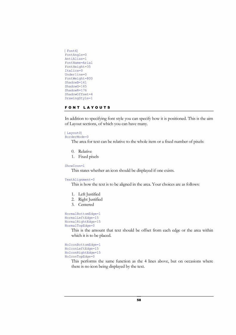
58
[Font6] FontAngle=0 AntiAlias=1 FontName=Arial FontHeight=35 Italics=0 Underline=0 FontWeight=800 ShadowB=141 ShadowG=165 ShadowR=176 ShadowOffset=4 DrawingStyle=1
F O N T L A Y O U T S
In addition to specifying font style you can specify how it is positioned. This is the aim of Layout sections, of which you can have many.
[Layout0] BorderMode=0
The area for text can be relative to the whole item or a fixed number of pixels:
0. Relative 1. Fixed pixels
ShowIcon=1 This states whether an icon should be displayed if one exists.
TextAlignment=0 This is how the text is to be aligned in the area. Your choices are as follows:
1. Left Justified 2. Right Justified 3. Centered
NormalBottomEdge=1 NormalLeftEdge=15 NormalRightEdge=15 NormalTopEdge=0
This is the amount that text should be offset from each edge or the area within which it is to be placed.
NoIconBottomEdge=1 NoIconLeftEdge=15 NoIconRightEdge=15 NoIconTopEdge=0
This performs the same function as the 4 lines above, but on occasions where there is no icon being displayed by the text.

59

60
Advanced skills This section will discuss other more advanced features that you can use in your skin to enhance the appearance and productivity.
n this section we will gradually add more and more items detailing the more advanced features.
M U L T I P L E S K I N S
It is actually quite simple to bundle multiple skins in a single skin. What you do is create a ‘master’ UIS file which contains code like that below. What it actually does is indicate how many skins are bundled, and then for each of them you need to specify the ‘sub design’ name and the file containing its UIS code. Each of these files is then just a UIS file as you have created previously.
[SkinStyles] Number = 3 [SkinStyle0] Name = XP Cobalt Skin = XPCobalt.uis [SkinStyle1] Name = XP Cobalt Yellow Skin = XPCobaltY.sss [SkinStyle2] Name = XP Cobalt Green Skin = XPCobaltG.sss
Chapter
13
I

61
M E T R I C S
WindowBlinds allows you to specify the size of certain windows elements in order to increase flexibility (especially under UIS1+ skins). You simply add a section called [Metrics] and add any or all of the 4 options below to specify the item you want to size. All 4 are effective in UIS1+ skins, only the last 2 in UIS2 skins. All measurements are in pixels.
[Metrics] CaptionHeight = (height of the title bar) ToolCaptionHeight = (height of tool window captions) MenuHeight = (height of menubar) ScrollWidth = (width of vertical scrollbar) / (height of horizontal scrollbar)
Of course you will probably also need to adjust your frame margins to accommodate this, and you may want to adjust other items such as buttons, but it overcomes the previous lack of flexibility that UIS1 had in this area. The screenshots below demonstrate the sort of effect that you can achieve from this.
S M A R T B U T T O N S
SmartButtons are a great addition to any skin as they provide the user with additional flexibility. There are 2 key benefits to SmartButtons:
1) The presence of normal buttons in a skin is determined by the skin creator, but a skin author can add SmartButtons and then the user can choose whether or not they wish them to be visible.
2) SmartButtons introduce plug-ins which provide additional functionality to your skin

62
The plug-ins which are installed by default with WindowBlinds :
• Always on top – your window will always remain on top of others (aot . wbp) • Quicklaunch – display contents of your Quick Launch folder (quickl . wbp) • Rollup – roll up the window to minimize the space taken (rollup . wbp) • URL – launch a specific URL (url . wbp)
The first things you need to consider are the graphics for your SmartButtons. WindowBlinds provides a default graphic for each plug-in, but you can add code to specify an alternative graphic. You need to specify code for each plug-in but it is very simple.
The format is: [smartbutton.PLUGINNAME] Image=IMAGEFILE
e.g. [SmartButton.rollup] Image=MySkinDirectory\rollup.bmp
In addition to sections for each of the 4 built in plug-ins, you can also have a [SmartButton.generic] section which caters for any other plug-ins you may have.
The format for these images is a ten-state image:
• Active Normal • Active Pressed • Active Mouse over • Active State • Active State Pressed • Active State Mouse over • Inactive Normal • Inactive Mouse over • Inactive State • Inactive State Mouse over

63
The next thing you need to do is create a plug-in button for each SmartButton you want to create just as you did earlier.
[Button17] Align=1 XCoord=97 YCoord=6 ALpha=254 Width=19 Height=18 Action=-3 ShiftAction=0 CtrlAction=0 DllName=smart.dll SmartButtonNumber=0 Visibility=14 OutSound=Logika\roll.wav
[Button18] Align=1 XCoord=115 YCoord=6 ALpha=254 Width=19 Height=18 Action=-3 ShiftAction=0 CtrlAction=0 DllName=smart.dll SmartButtonNumber=1 Visibility=14 OutSound=Logika\roll.wav
The only line that you may find unfamiliar is the SmartButtonNumber reference. This is simply a pointer to the section of code you see below and ties the button to the specific SmartButton code.
[SmartButton0] Enabled=1 WIDTH0=20 NAME0=URL Button DLL0=url.wbp Author0=Neil Banfield
[SmartButton1] Enabled=1 WIDTH0=20 NAME0=Quicklaunch Button DLL0=quickl.wbp Author0=Neil Banfield
Each SmartButton has a section of its own entitled [SmartButtonX] where X is the number given is the above SmartButtonNumber reference.
The code lines are actually fairly self explanatory:
Enabled= Set this to 1 to enable the button, 0 to disable it WIDTH0= Give the button a width NAME0= Give the button a name for reference DLL0= Specify which plug-in (.wbp) the SmartButton should use Author0= Enter the plug-in author (optional)
That is all the code you need. Your SmartButtons should now be visible in your skin and the functionality will be built in.

64
Now that the SmartButtons are created the user can customize them in the WindowBlinds Advanced Configuration dialog. In Windows XP this is accessible by clicking the WindowBlinds button on the Appearance tab (where you normally select your skins) of the Display Control Panel.

65
When your skin is loaded, the SmartButtons section will display information about the plug-ins in your skin.
Clicking the Configure button will allow you to edit any options that exist for the plug-in. Once you have selected the SmartButton you wish to edit, clicking Configure brings up a dialog which allows you to specify whether you actually wish to edit the settings, or change the button to use a completely different plug-in.
For example, configuring the URL Button will allow you to specify which web address you wish to be launched when the button is clicked.
If you then go on to configure, you can specify the web page to be launched.
That’s all you need to know to make your own SmartButtons.

66
U S I N G T G A G R A P H I C S
TGA source graphics increase the options available to skin developers.
Per pixel alpha blending is supported in most 'standard' objects (i.e. if there is a .wbd file).
To use TGA source files just refer to the TAG file instead of the .bmp file as you normally would. You must use 32bit, uncompressed TGA's.
You should also add PerPixel=1 and Trans=1 to the appropriate section of the .uis file too (and wipe the .wbd's before you reload the skin).
Per pixel alpha transparency is only supported by Windows 2000 and XP, but the TGA's will load and work on 98/ME.
In recent builds, the XPPlatinum skin included uses a sample button.tga.
U I S 1 B O R D E R S
For skins using the UIS1 format, a new series of parameters allow far greater flexibility in the style of frame borders that you can use.
[Borders] ShapeFrameCount = number of images in the shape bitmaps.
Each 'row' is the height same height as the titlebar image (linked to the titlebar caption height)
Then we have the 2 images (width of each can be different. Heights must be = shapeFrameCount * height of each titlebar image row)
ShapeLeftImage = crux_remake\rgn.bmp ShapeRightImage = crux_remake\rgn2.bmp
Then we tell WB which 'row' to use for each state. There are a number of options. 0 would be the first row, 1 = 2nd, 2 = 3rd etc
ShapeNormalActiveFrame = ShapeNormalInactiveFrame = ShapeNormalDisabledFrame = ShapeMDIActiveFrame = ShapeMDIInactiveFrame = ShapeMDIDisabledFrame = ShapeToolActiveFrame = ShapeToolInactiveFrame =

67
ShapeToolDisabledFrame = ShapeNonSizableActiveFrame = ShapeNonSizableInactiveFrame = ShapeNonSizableDisabledFrame = ShapeNonSizableToolActiveFrame = ShapeNonSizableToolInactiveFrame = ShapeNonSizableToolDisabledFrame =
Basically WB allows you to have different shapes for 15 different window styles / states.
Example bits to add to the UIS file of a UIS1+ skin
; modify the path here obviously! ShapeLeftImage = crux_remake\rgn.bmp ShapeRightImage = crux_remake\rgn2.bmp ShapeNormalActiveFrame = 0 ShapeNormalInActiveFrame = 1 ShapeFrameCount= 5

68
The Windows User Interface This section provides an introduction to the different elements of the Windows User Interface to increase your familiarity with them.
or those of you not entirely familiar with the names of the different parts of the Windows interface, this brief introduction should tell you enough to make skinning much easier. Before we start I will raise one caveat. Though Microsoft is very keen on the standardization of its Windows User Interface, it is not
always the best at sticking to its own rules. WindowBlinds focuses heavily on using precise code and sticks to rules. This enables WindowBlinds to be stable, work effectively, and in some cases work faster than the Windows User Interface. Unfortunately, this means that where applications use non-standard controls, they cannot be skinned. For example, the scrollbars in Internet Explorer, and the menus and toolbars in the Office XP applications are non-standard, and are therefore not skinned.
T H E F R A M E A N D T I T L E B A R
Most of the time you are focused on the contents of the Window, not the area around the edge. The frame is the area around the edge, and is made up of the left, right, top and bottom sides.
The only additional things shown in this image are contained within the TitleBar. The TitleBar is the area at the top which contains the name of the application running and the buttons which you will be familiar with that are conventionally used for minimizing, maximizing and closing the application.
Appendix
A
F

69
T O O L B A R S A N D M E N U S
Underneath the TitleBar you get an area or menus and toolbars. Though the precise contents of these items vary between applications, most applications have menus and toolbars.
In the image you can see that there is a list of menu titles (on a plain background). One of these titles is highlighted, a menu is displayed and one of these items is highlighted.
Underneath the menu is an example of a toolbar. Applications will typically have only one menu, but may have several toolbars, aligned either horizontally or vertically.

70
S T A T U S B A R S A N D R E S I Z E G R I P S
The other item which you will typically see at the bottom edge of the frame is the status bar. This is an information area which is typically present in applications.
If the window is not maximized you will also see a resize grip in the bottom right hand corner which enables you to change the size of your application window.
T H E S T A R T M E N U A N D T A S K B A R
One persistent element on your screen is usually the combination of the Start Menu and the TaskBar. The ways these appear vary depending on your operating system.
The taskbar appearance may vary with versions of Windows, but the structure is fairly standard:
A Start button at the end, when clicked will display the Start Menu. The Start Menu structure has been standard for years, but Windows XP allows a new style of Start Menu. This document discusses the skinning of both.
A series of toolbar areas which are separated by Rebars which allow you to move them around. The most important of these toolbars is …
The TaskBar; a list of running applications displayed on TaskBar buttons
A System tray area which displays background tasks and a clock. On Windows XP this area also has an arrow which allows you to expand and contract the System Tray
B U T T O N S
Apart from toolbars, there are three type of button controls used within windows; the command button, checkboxes and radio buttons.
Command buttons are the buttons used to execute actions.
Checkboxes allow you to select options. This image shows a GroupBox within which there are several options to choose from, from which you can choose as many as you want.

71
Radio buttons function like checkboxes, but you can only choose one within the group. Selecting one radio button automatically deselects the others within the group.
L I S T S
There are two different types of list within Windows; the regular list box and the drop-down or Combo list box.
The regular list box displays a list of options with scrollbars if necessary to allow access to the full list. There may also be a headerbar which provides titles for the data.
A drop-down or combo list box save space by only displaying the options when the arrow at the end of the box is clicked. The two types differ in that a drop-down allows you to only select from the list, and combo allows you to select from the list or type your own value in the box. Functionally they are different, but visually they are the same.

72
O T H E R C O N T R O L S
The final few controls are as follows:
Tabs – are like pages on which you can display text or controls. By using tabs applications can group information logically and minimize the space taken to do so.
Scrollbars – allow the user to move around an area horizontally or vertically as appropriate to see all the content within a given area.
Progress Bars – display how far through a given exercise the system is. Where a task is expected to take a long period of time, the system will display a progress bar to manage the users expectations.
MDI Applications – are those which allow several files to be open at once; hence the name MDI (Multiple Document Interface). On the left is the state where all the open files are visible, but if you maximize one of them you will see the special MDI buttons, as shown on the right, which are different to the traditional frame buttons to avoid confusion.

73
Additional resources Examine this section if you want to find other sources of information regarding WindowBlinds and WindowBlinds skins.
his is intended to be the first of a series of documents to assist in maximizing your ability to develop WindowBlinds skins. However, there are many resources online which will assist you.
G E T T I N G W I N D O W B L I N D S S K I N S
Your primary source of WindowBlinds skins should be WinCustomize which has a thriving community including many WindowBlinds users.
Library of WindowBlinds skins Library of WindowBlinds skins optimized for Windows XP
U I S C O D E G U I D E S
If this document were to contain every parameter possible using WindowBlinds it would cost rainforests if printed, therefore you can see comprehensive guides online.
UIS 1+ Guide UIS 2 Guide Latest UIS 2 Updates
S K I N S T U D I O
SkinStudio is the best way to intuitively create a skin. You may need to finish the coding by hand if you need to add the newest commands, but SkinStudio is packed with features that will get you started much quicker.
SkinStudio Homepage SkinStudio Tutorial Buy SkinStudio
Appendix
B
T