special purpose control charts in statgraphics centurion purpose control... · · 2015-05-21–c...
TRANSCRIPT
Special Purpose
Control Charts in
Statgraphics
Centurion
Presented by Dr. Neil W. Polhemus

Control Charts
A control chart:
Plots a statistic versus time.
Contains control limits to detect unusual values.
Used for 2 primary purposes:
To determine whether a process is in a state of statistical control. (Phase 1 or initial study)
To monitor that process to detect deviations from pre-established parameters. (Phase 2 or control to standard)

Common Control Charts
• For variable data:
– X-bar and R, X-bar and S, X and MR
– Median and MR
– Moving average and EWMA
– Cumulative sum charts
• For attribute data:
– P or NP for binomial proportions and counts
– C or U for Poisson rates and counts
– P-prime and U-prime charts for overdispersed
data

Special Purpose Control Charts
1. ARIMA charts
2. Acceptance charts
3. Toolwear charts
4. Charts for rare events
5. Cuscore charts

Usual Model for Variable Data
Let Xt be measurement made at time t. Then
𝑋𝑡 = 𝜇 + 𝜀𝑡
where m is the process mean and the deviations et are assumed to be NID(0,s2).
Assumptions:
– Stationarity of mean and variance.
– Independence of successive measurements.
– Normal distribution for deviations from mean.

ARIMA Control Charts
• Used for data that are serially correlated
(successive observations are not independent).
• Very common when measurements are taken
close together in time from a continuous
process.
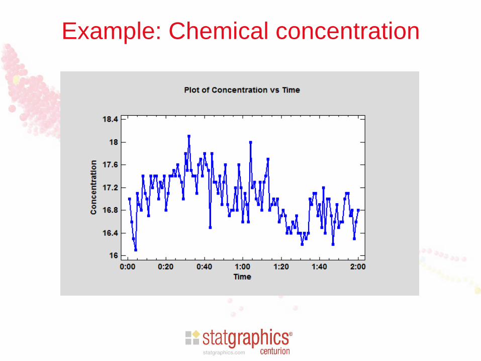
Example: Chemical concentration

Standard Phase 1 X Chart

ARIMA Charts Model
• Relax the assumption that successive
observations are independent.
• Instead, assume that the process can be
described by an autoregressive moving average
model.

Autoregressive Models
• AR(1)
𝑋𝑡 = 𝜇 + 𝜙1(𝑋𝑡−1−𝜇) + 𝜀𝑡
• AR(2)
𝑋𝑡 = 𝜇 + 𝜙1(𝑋𝑡−1−𝜇) + 𝜙2(𝑋𝑡−2−𝜇) + 𝜀𝑡

Moving Average Models
• MA(1)
𝑋𝑡 = 𝜇 + 𝜀𝑡 − 𝜃1𝜀𝑡−1
• MA(2)
𝑋𝑡 = 𝜇 + 𝜀𝑡 − 𝜃1𝜀𝑡−1 − 𝜃2𝜀𝑡−2

ARMA Models
• ARMA(1,1)
𝑋𝑡 = 𝜇 + 𝜙1 (𝑋𝑡−1−𝜇) + 𝜀𝑡 − 𝜃1𝜀𝑡−1

Selecting the Best ARIMA Model
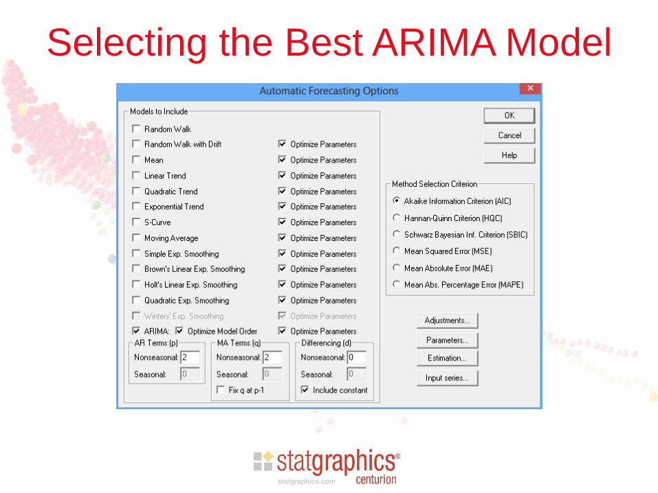
Selecting the Best ARIMA Model

Selecting the Best ARIMA Model

Selected Model
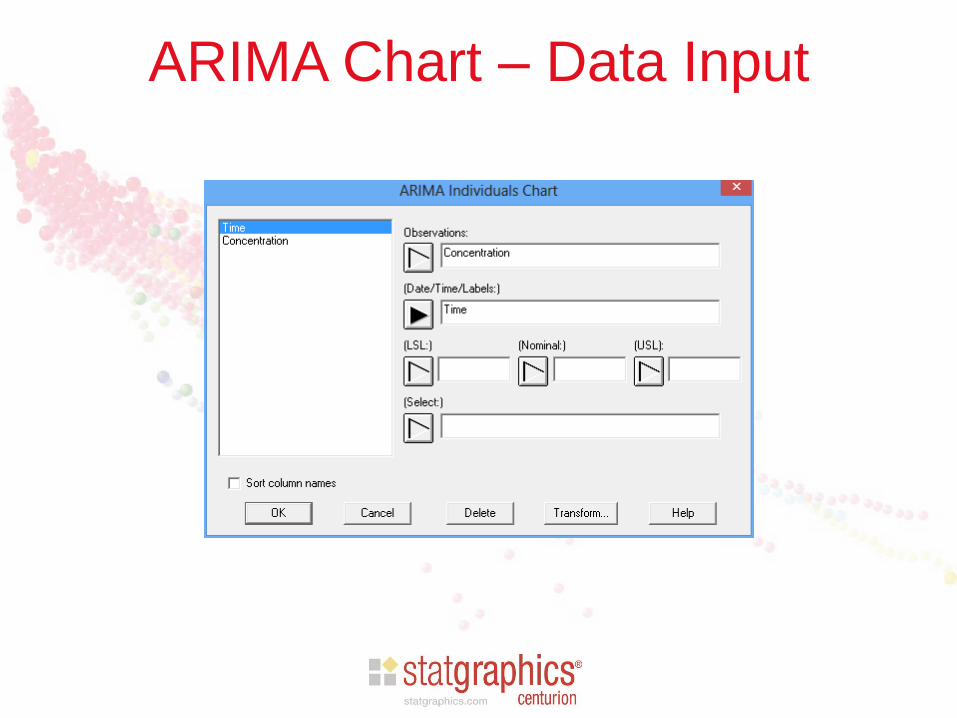
ARIMA Chart – Data Input
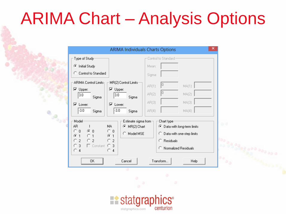
ARIMA Chart – Analysis Options

Data with Long-Term Limits

Data with One-Step Limits
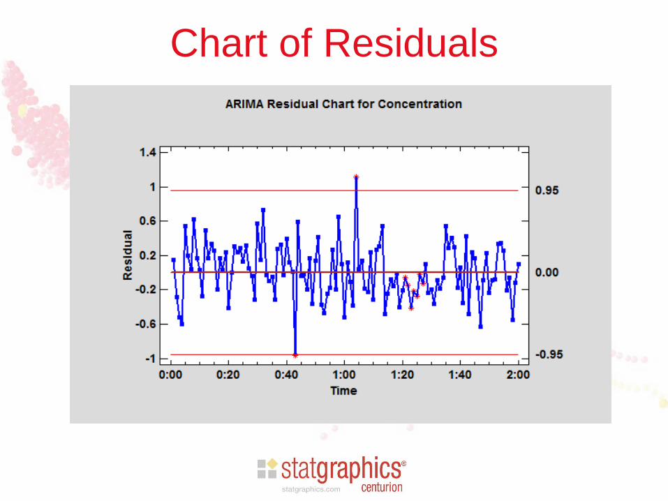
Chart of Residuals

MR(2) Chart for Residuals

Acceptance Control Charts
• Used to insure that product remains within
specification limits.
• Position control limits with respect to the
specifications rather than the process mean.
• Useful for high Cpk processes which can tolerate
some wandering of the process mean.

Sample Data

X Chart

Acceptance Charts
• Begin by specifying f, the maximum allowable
fraction of nonconforming items.
• Find most extreme values of process mean that
would yield no more than f nonconformities:
Largest allowable mean: mU = USL – Zds
Smallest allowable mean: mL = LSL + Zds
• Position control limits with respect to these
extremes.

Positioning Limits
• Sigma multiple method: add “3-sigma” to the extreme values for the mean.
UCL = mU + 3s
LCL = mL - 3s
Note: Montgomery calls these “modified control limits”.
• Beta risk method: specify b, probability of not generating an out of control signal. Position control limits at:
UCL = mU - Zbs
LCL = mL + Zbs

Acceptance Chart – Data Input
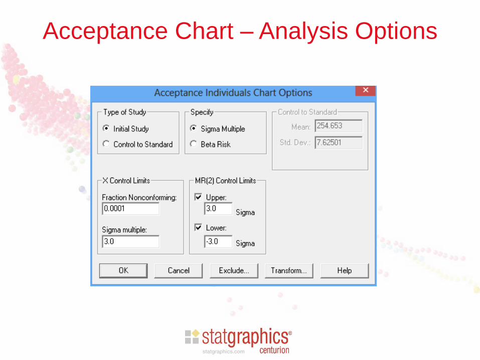
Acceptance Chart – Analysis Options
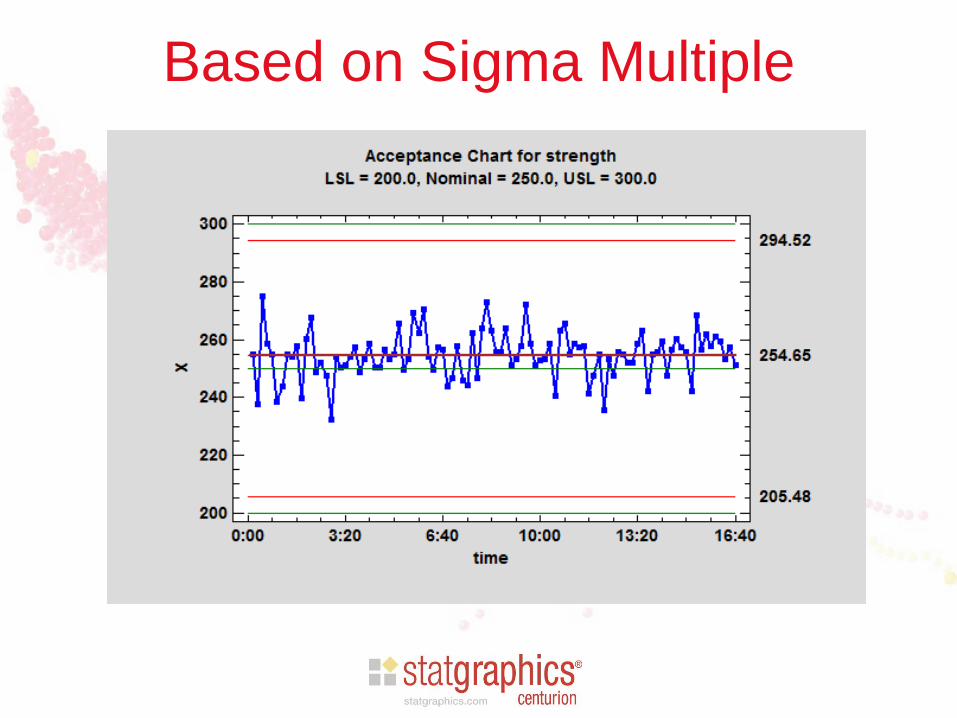
Based on Sigma Multiple

Based on Beta Risk

Toolwear Control Charts
• Used for data that do not have a constant mean,
such as measurements affected by wear on a
tool.
• Used to determine whether mean is changing at
a constant or expected rate.
• Can also add specification limits to help
determine when tool should be changed.

Sample Data (from Duncan)
• Specification: 0.255 to 0.265 inches

Toolwear Chart Model
Let Xt,j be measurement on jth sample made at
time t. Then
𝑋𝑡,𝑗 = 𝛼 + 𝛽𝑡 + 𝜀𝑡,𝑗
where m = a + b t is the process mean and the
deviations et are assumed to be NID(0,s2).

Toolwear Chart – Data Input
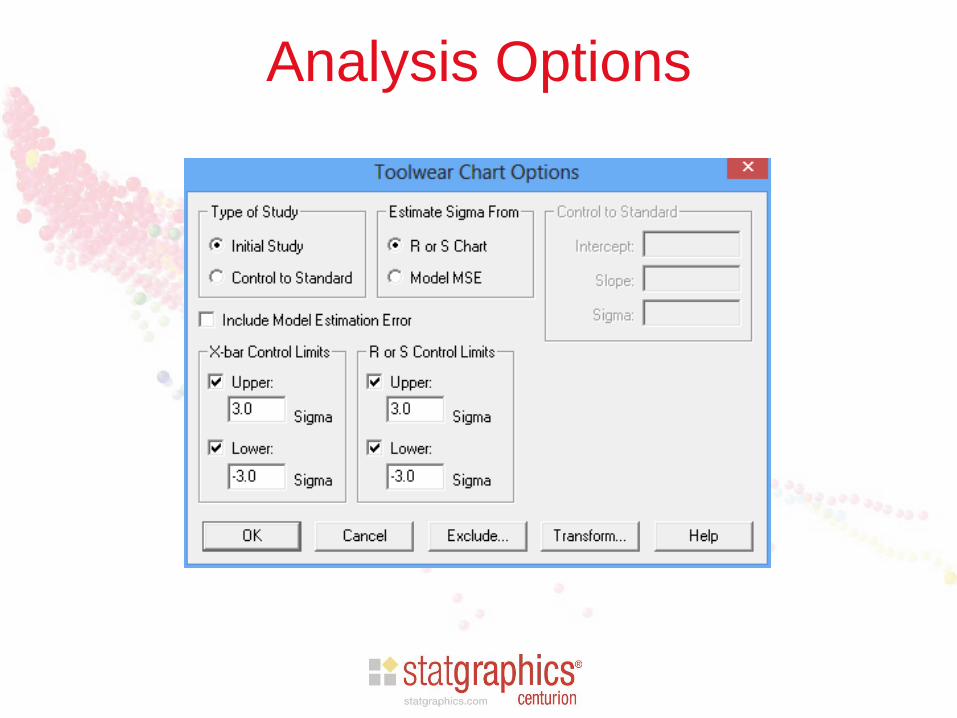
Analysis Options

Toolwear Chart

Charts for Rare Events
• Used for monitoring occurrence of rare events
– Hospital infections
– Factory or mining accidents
– Unexpected shutdowns
• Two primary charts
– t chart: for events recorded in continuous time
– g chart: for events recorded in discrete time

Examples

Time Between Events
• When events are rare, standard charts such as a C chart
will have many 0’s.
• Better approach than plotting counts is to plot the times
between consecutive events.
• For a continuous time process, the interevent times are
modeled by a Weibull distribution.
• For a discrete time process, the interevent times are
modeled by a geometric distribution.

Scatterplots

t Chart Data Input
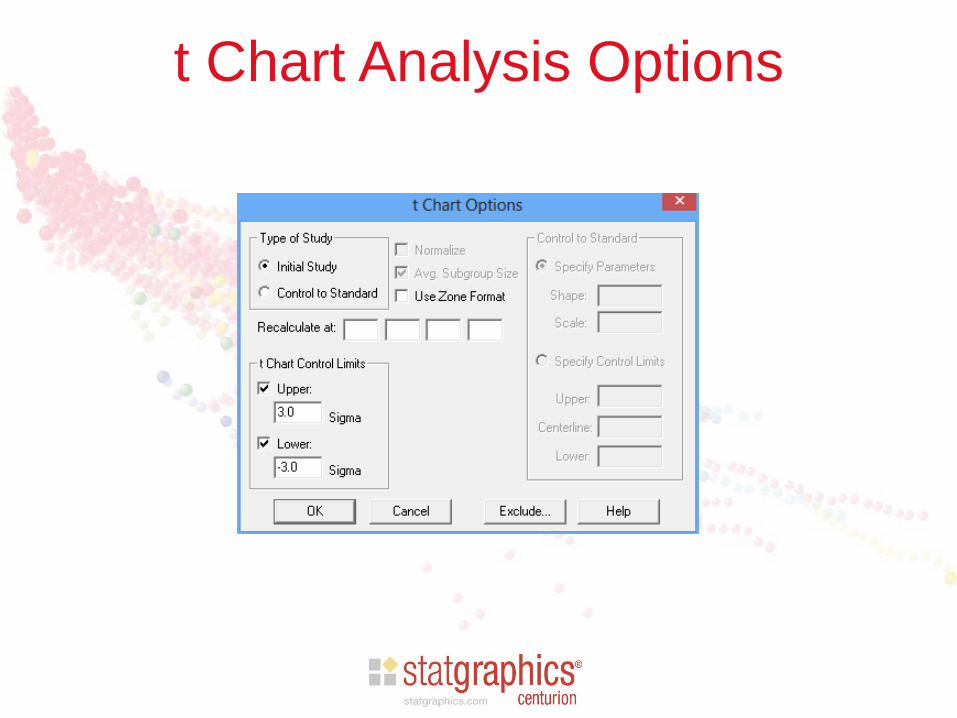
t Chart Analysis Options

t Chart

g Chart Data Input
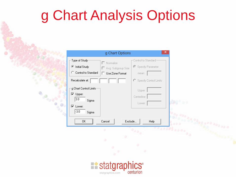
g Chart Analysis Options
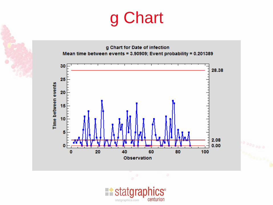
g Chart
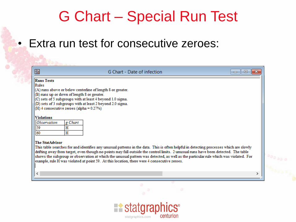
G Chart – Special Run Test
• Extra run test for consecutive zeroes:

Cuscore Charts
• Designed to detect specific types of disturbances:
– Spike
– Ramp
– Bump
– Step change
– Exponential increase
– Sine wave
• Automatically selects the best type of control chart to
detect that pattern

Example: sine wave plus noise

Signal and Noise

Signal Plus Noise

Q Score Statistic
• Cuscore chart plots a cumulative “Q score”
statistic defined by:
𝑄𝑡 = 𝑎 𝑖𝑟𝑖
𝑡
𝑖=1
where the ri values come from a “detector”
series specifically designed to detect the
presence of the expected disturbance and the ai
values are the residuals from an ARIMA model.

Cuscore Chart – Data Input
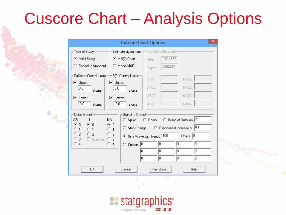
Cuscore Chart – Analysis Options

Cuscore Chart

References
• Introduction to Statistical Quality Control (7th
edition) by Douglas Montgomery (2012)
• Quality Control and Industrial Statistics (5th
edition) by Acheson Duncan (1986)
• Statistical Control by Monitoring and Adjustment
(2nd edition) by George Box, Alberto Luceño, and
Maria del Carmen Paniagua-Quinones (2009)

More Information
Go to www.statgraphics.com
– Click on “Learn” and then “Instructional
Videos”.
Go to www.youtube.com
– Search for “Statgraphics control charts”.