software infrastructure for exploratory visualization and ... · software infrastructure for...
TRANSCRIPT
Software Infrastructure for exploratory visualization
and data analysis: Past, present, and future
Claudio T. Silva1,2 and Juliana Freire2
1Scientific Computing and Imaging Institute, University of Utah, Salt Lake City, UT 84112,USA2School of Computing, University of Utah, Salt Lake City, UT 84112, USA
E-mail: [email protected], [email protected]
Abstract. Future advances in science depend on our ability to comprehend the vast amountsof data being produced and acquired, and scientific visualization is a key enabling technology inthis endeavor. We posit that visualization should be better integrated with the data explorationprocess instead of being done after the fact – when all the science is done – simply to generatepresentations of the findings. An important barrier to a wider adoption of visualization iscomplexity: the design of effective visualizations is a complex, multistage process that requiresdeep understanding of existing techniques, and how they relate to human cognition. We envisionvisualization software tools evolving into “scientific discovery” environments that support thecreative tasks in the discovery pipeline, from data acquisition and simulation to hypothesistesting and evaluation, and that enable the publication of results that can be reproduced andverified.
1. IntroductionAs scientists need to deal with large volumes of heterogeneous data, such as medical MRIand CT scans, water salinity measurements, engine temperature measurements, and resultsof computational experiments, there is an increasing need for techniques and usable tools tohelp them analyze and make sense out of these data. Although the term “visualization”is somewhat recent, generally accepted to having been coined for the 1987 NSF report onscientific visualization, visualization has been used as a means of “data understanding by visualrepresentation or other visual means” for hundreds of years. What separates the old from thenew is the availability of advanced computing capabilities, including modern computer graphicstechniques, which form the backbone of modern visualization research.
While computer graphics techniques are an integral and important part of visualization, it isimportant to contrast the two fields. In the more traditional computer graphics, used to makemovies or games, the goal is to produce visually engaging (beautiful) imagery that “appearsplausible.” In visualization, accuracy is more important than aesthetics. As such, users must beaware of errors and uncertainty present in the visualizations so that they are not misled by theresulting images [1]. Furthermore, the process of extracting insight from data goes beyond thegeneration of imagery and needs to encompass the complete scientific discovery pipeline [2–4].
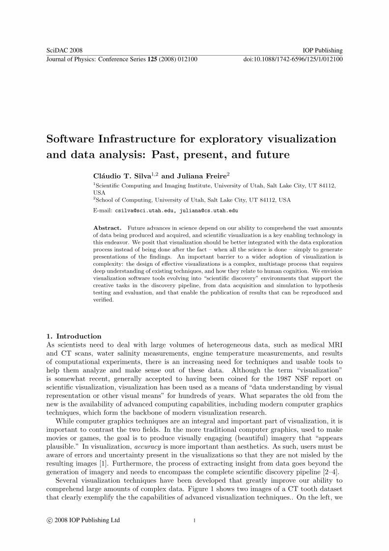
Several visualization techniques have been developed that greatly improve our ability tocomprehend large amounts of complex data. Figure 1 shows two images of a CT tooth datasetthat clearly exemplify the the capabilities of advanced visualization techniques.. On the left, we
SciDAC 2008 IOP PublishingJournal of Physics: Conference Series 125 (2008) 012100 doi:10.1088/1742-6596/125/1/012100
c© 2008 IOP Publishing Ltd 1
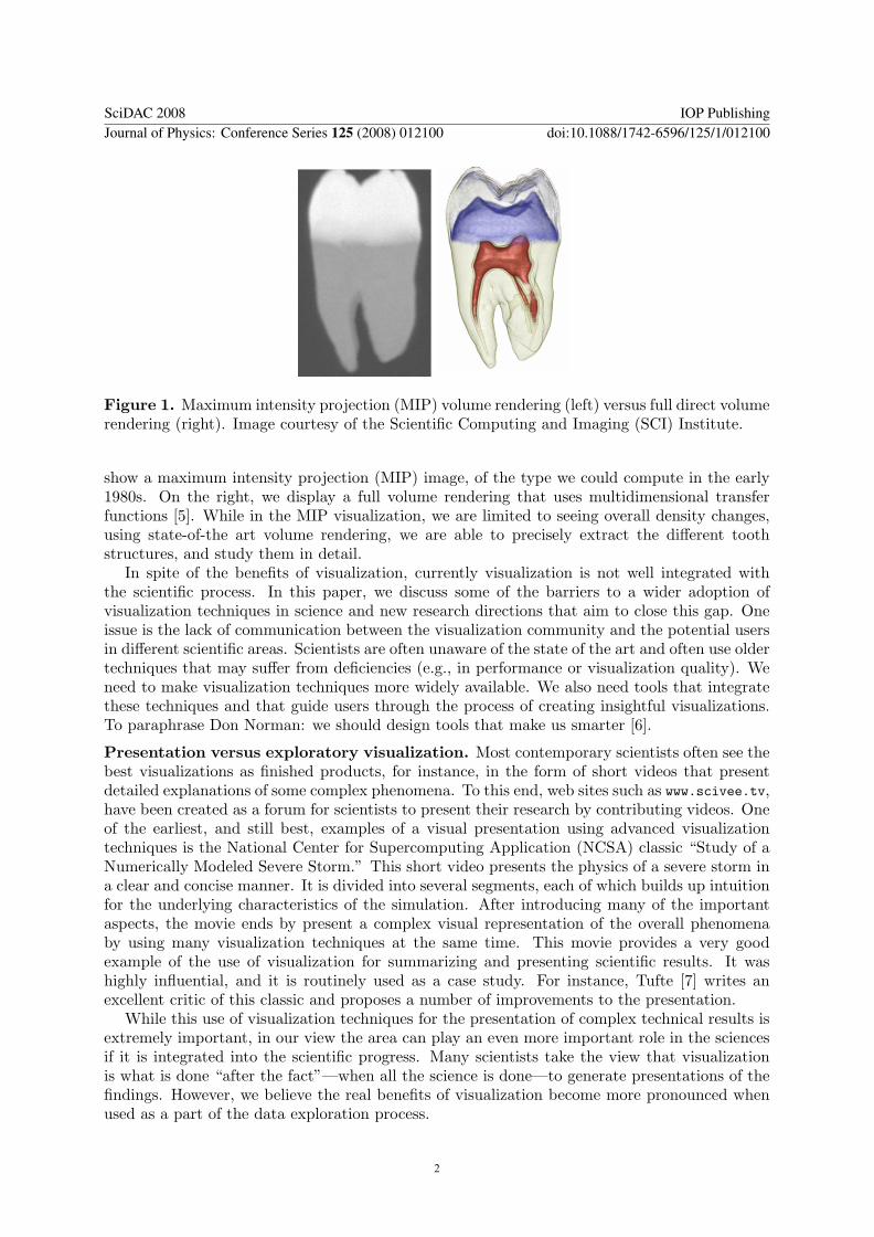
Figure 1. Maximum intensity projection (MIP) volume rendering (left) versus full direct volumerendering (right). Image courtesy of the Scientific Computing and Imaging (SCI) Institute.
show a maximum intensity projection (MIP) image, of the type we could compute in the early1980s. On the right, we display a full volume rendering that uses multidimensional transferfunctions [5]. While in the MIP visualization, we are limited to seeing overall density changes,using state-of-the art volume rendering, we are able to precisely extract the different toothstructures, and study them in detail.
In spite of the benefits of visualization, currently visualization is not well integrated withthe scientific process. In this paper, we discuss some of the barriers to a wider adoption ofvisualization techniques in science and new research directions that aim to close this gap. Oneissue is the lack of communication between the visualization community and the potential usersin different scientific areas. Scientists are often unaware of the state of the art and often use oldertechniques that may suffer from deficiencies (e.g., in performance or visualization quality). Weneed to make visualization techniques more widely available. We also need tools that integratethese techniques and that guide users through the process of creating insightful visualizations.To paraphrase Don Norman: we should design tools that make us smarter [6].
Presentation versus exploratory visualization. Most contemporary scientists often see thebest visualizations as finished products, for instance, in the form of short videos that presentdetailed explanations of some complex phenomena. To this end, web sites such as www.scivee.tv,have been created as a forum for scientists to present their research by contributing videos. Oneof the earliest, and still best, examples of a visual presentation using advanced visualizationtechniques is the National Center for Supercomputing Application (NCSA) classic “Study of aNumerically Modeled Severe Storm.” This short video presents the physics of a severe storm ina clear and concise manner. It is divided into several segments, each of which builds up intuitionfor the underlying characteristics of the simulation. After introducing many of the importantaspects, the movie ends by present a complex visual representation of the overall phenomenaby using many visualization techniques at the same time. This movie provides a very goodexample of the use of visualization for summarizing and presenting scientific results. It washighly influential, and it is routinely used as a case study. For instance, Tufte [7] writes anexcellent critic of this classic and proposes a number of improvements to the presentation.
While this use of visualization techniques for the presentation of complex technical results isextremely important, in our view the area can play an even more important role in the sciencesif it is integrated into the scientific progress. Many scientists take the view that visualizationis what is done “after the fact”—when all the science is done—to generate presentations of thefindings. However, we believe the real benefits of visualization become more pronounced whenused as a part of the data exploration process.
SciDAC 2008 IOP PublishingJournal of Physics: Conference Series 125 (2008) 012100 doi:10.1088/1742-6596/125/1/012100
2
Figure 2. A model for exploratory visualization. Adapted from J. van Wijk [2].
We take the view that future advances in science depend on the ability to comprehend thevast amounts of data being produced and acquired. Visualization is a key enabling technology inthis endeavor: it helps people explore and explain data through software systems that providea static or interactive visual representation. A basic premise of visualization is that visualinformation can be processed at a much higher rate than raw numbers and texr – as the clichegoes: “A picture is worth a thousand words.”
Despite the promise that visualization can serve as an effective enabler of advances in otherdisciplines, the application of visualization technology is non-trivial. The design of effectivevisualizations is a complex process that requires deep understanding of existing techniques, andhow they relate to human cognition. Although there have been enormous advances in the area,the use of advanced visualization techniques is still limited.
Challenges in exploring data through visualization. Data exploration throughvisualization requires scientists to go through several steps. To successfully analyze and validatevarious hypotheses, one must pose several queries, correlate disparate data, and create insightfulvisualizations of both the simulated processes and observed phenomena.
As illustrated in figure 2, a scientist needs to assemble and execute complex workflows thatconsist of data set selection, specification of series of operations that need to be applied tothe data, and the creation of appropriate visual representations, before finally viewing andanalyzing the results. Often, insight comes from comparing the results of multiple visualizationscreated during the exploration process, for example, by applying a given visualization process tomultiple datasets generated in different simulations, by varying the values of certain visualizationparameters, or by applying different variations of a given process (e.g., which use differentvisualization algorithms) to a dataset.
The challenge of this exploration process is that for a visualization to be insightful, it needsto be both effective and efficient. This requires a combination of art, technology, and science toreveal information that is otherwise obscured. Assessing the value of an insight or measuringhow much insight is required in the analysis of the data is a difficult task because the scientistmay not even know what aspects or features the data contains [8]. Therefore, visualization canbe regarded as an open-ended problem with no single answer.
The process is further complicated when viewed in the larger context of reproducible science.In particular, scientists and engineers need to expend substantial effort managing data (e.g.,scripts that encode computational tasks, raw data, data products, images, and notes) toensure that the visualizations are reproducible by themselves as well as others in the scientificcommunity.
Despite the enormous progress in scientific visualization research, existing tools do notsupport the analytical reasoning process that scientists use in their work. There is little orno support for linking data, visualizations, and knowledge. For instance, as insight is generated
SciDAC 2008 IOP PublishingJournal of Physics: Conference Series 125 (2008) 012100 doi:10.1088/1742-6596/125/1/012100
3
over time, the findings are not linked to supporting evidence, and scientific publications to alarge extend stand on their own with little hard evidence of the scientific facts.
2. Incomplete history of scientific visualization toolsTo see where we stand today in terms of visualization and data analysis tools for scientificdiscovery, it is useful to take a look at some of the tools that have been developed by thevisualization community over the past two decades.
The Application Visualization System (AVS) [9] was one of the earliest and most influentialvisualization environments developed in the 1980s. It was based on a dataflow model and aimedto provide an easy-to-use, powerful system for supporting the filter/map/render pipeline. TheIBM Data Explorer (DX) [10] and the IRIS Explorer are two other systems from the same period.Each system had its own innovations; e.g., IBM DX had a very flexible data model. Testimonyto their effectiveness, these dataflow-based visualizations systems are still widely used today,over 20 years since they were originally developed; and they can be seen as precursors of currentscientific workflow systems.
A dataflow is a directed graph where nodes represent computations and edges representstreams of data: each node or module corresponds to a procedure that is applied on the inputdata and generates some output as a result. The flow of data in the graph determines the order inwhich the processing nodes are executed. In the dataflow model, a change in one variable forcesthe recalculation of other connected variables (similar to inter-dependent cells in a spreadsheet).Furthermore, computation is stateless: the output of a module is functionally determined bythe module and its inputs. In visualization, it is common to refer to a dataflow network as a“visualization pipeline.” The actual computation is performed by the modules by operating onthe input data. It is sometimes useful to think of the modules as performing different parts ofthe computation. Common types include modules that generate data (sources), consume data(sinks), and operate on data by applying algorithms to the data (processes). In their mostgeneral form, each module has a set of inputs, a set of outputs, a set of parameters, and, incertain systems, some form of GUI that can be used for interacting with the modules. Ttheseinputs and outputs are often referred to as “ports.” It is useful to enforce “types” in thesesystems, allowing connections only between ports of compatible types.
A “visualization pipeline” provides a means to create visual representations of raw data. Itis fairly common to break up (at least, conceptually) the visualization pipeline into three mainphases that each data item needs to pass through to be visualized: filter, map, and render. Inpractice, there might be steps that need to happen before (e.g., reading the data from disk anduncompressing it) or after (e.g., image delivery). Also, depending on the exact visualizationalgorithm being applied, one can think of “skipping” a step. This “3-stage pipeline” is a bit toosimplistic but, despite its potential faults, serves as the basis of a general framework for settingup visualization pipelines.
The goal of the filtering phase is to prepare data for visualization. It takes the raw simulatedor sensored data and transforms it into another form that is more informative or less voluminous.It might also generate auxiliary information that is not readily available but is necessary forlater processing steps. For instance, it might do data resampling, interpolation, or gradientcalculation. The mapping phase will turn the filtered data into geometric primitives that can berendered. For instance, it can generate OpenGL display lists from triangulated models or createpolygonalized versions of glyphs. The rendering phase takes the outputs of the map phase andcreates images, taking advantage of graphics hardware when possible.
The early 1990s brought us Kitware’s Visualization Toolkit (VTK) [11], which is an opensource, object-oriented toolkit based on the dataflow programming model. For efficiency, thecore components of the system are written in a compiled language (C++). For flexibility andextensibility, an interpreted language (e.g., Python, Tcl, or Java) can be used for higher-level
SciDAC 2008 IOP PublishingJournal of Physics: Conference Series 125 (2008) 012100 doi:10.1088/1742-6596/125/1/012100
4
applications. This scripting capability and a large core set of algorithms have promoted VTKto its current status as one of the most popular visualization packages for researchers. VTKis widely used around the world, and many tools have been developed on top of it. Its open-source license has enabled the development of a number of influential end-user visualizationtools. Two such tools developed under DOE funding are ParaView and VisIt. The ParaViewproject started by James Ahrens at Los Alamos National Laboratory [12] was aimed not onlyat extending VTK into a parallel framework but also at developing a turnkey end-user toolthat did not require users to explicitly build dataflow graphs. VisIt [13] had a similar goal, butits design was dictated by the visualization needs of Lawrence Livermore National Laboratory.In particular, the development team led by Hank Childs decided to keep the look and feel ofLLNL’s MeshTV visualization tool.
In the 1990s, we also saw the start of the movement toward integrating scientific computing,parallelism, and visualization. SCIRun [14] and GRASPARC (GRAphical Support for PARallelComputing) [15] are two great examples of systems developed during this time. For the mostpart, other than the ability to generate complex visualizations, these systems lacked otherfeatures that were explicitly aimed at supporting the scientific process. One notable exceptionis that as part of their pioneering work on the GRASPARC system, Brodlie and colleaguesproposed the use of a history mechanism that allowed scientists to steer an ongoing simulationby backtracking a few steps, changing parameters, and resuming execution.
3. Building tools to support scientific discoveryWhile visualizations in the form of plots, pictures, animations, and interactive 3-D applicationsare very important to generate insight, recently there has been a new research trend that isbased on the premise that it is possible to do more to help humans be more effective at scientificdiscovery [3, 4, 16]. Pirolli and Card [17, 18] study the sensemaking process (i.e., the process oflooking for meaning in a body of data with the intent of solving particular problems). Theypropose categories for the overall process and explore opportunities where software can help.The goal is to “enhance” the discovery process by providing software tools that support existingtasks, for example, better organization tools that improve the utilization of working memory.Social data analysis, a process by which multiple people collectively analyze data, has recentlybeen proposed as a means to uncover new paths of discovery, and tools have been proposed thatare aimed at facilitating collaboration and knowledge reuse.
Very recently, Schrinivasan and van Wijk [16] proposed Aruvi, a system for supporting theanalytical reasoning process. Their system is based on three main components: a data view,where a user can interact with visual representations of the data (this is effectively what isavailable in traditional visualization systems, such as the ones that were discussed in the previoussection and the main visualization supported in their system is the scatterplot), a navigationview which provides a visual representation of the exploration process itself, basically it recordsthe history of exploration; and a knowledge view, where users can maintain analysis artifacts(e.g., hypothesis, conclusions) with direct links to the plots that support those conclusions.While the type of analysis that can be done with Aruvi is somewhat limited, the system clearlyshows the potential for building tools that can be used for improving the support for discovery.
Social Web sites and web-based communities (e.g., Flickr, Facebook, Yahoo! Pipes), whichfacilitate collaboration and sharing between users, are becoming increasingly popular. Animportant benefit of these sites is that they enable users to leverage the wisdom of the crowds.For example, in Flickr, users, in a mass collaboration approach, tag large volumes of pictures.These tags, in turn, help them to more easily find pictures they are looking for. A notablesocial data analysis system is IBM’s ManyEyes. This system is based on the blog paradigm andenables a large number of users to collaboratively analyze data. Users can upload datasets intothe site and create visualizations from a dozen or so predefined types. Anyone can modify the
SciDAC 2008 IOP PublishingJournal of Physics: Conference Series 125 (2008) 012100 doi:10.1088/1742-6596/125/1/012100
5
existing visualizations (always in a nondestructive manner) and comment on each other’s work,just as in a normal blog. The discussions are persistent, and they provide a log that can beused for understanding any conclusions reached by the participants. It has been reported thatManyEyes gets over 500,000 visits a month, clearly highlighting the appeal of open discussion.
While it would be interesting to use the same technology for supporting scientific discovery,there are many challenges [19]. The heterogeneity of the data, its size, and its location greatlycomplicate the data analysis pipelines. Whereas existing “social data analysis” (SDA) systemsrequire that data be uploaded to a central location for analysis, in many scientific applicationsthat manipulate large volumes of data, this is not feasible. Furthermore, the visualization processis likely to require staged processing and a larger variety of underlying visualization techniquesthan what is currently supported by systems such as ManyEyes. Data analysis generates moredata (e.g., graphs, visualizations) that add to the overflow of information scientists need to dealwith. Thus, ad hoc approaches to data exploration, which are widely used in the scientificcommunity, have serious limitations. In particular, scientists and engineers need to expendsubstantial effort managing data (e.g., scripts that encode computational tasks, raw data, dataproducts, images, and notes) and to record provenance information so that basic questions canbe answered, such as: Who created a data product and when? When was it modified and bywhom? What was the process used to create the data product? Were two data products derivedfrom the same raw data? Not only is the process time-consuming but also error-prone. Theabsence of provenance makes it hard (and sometimes impossible) to reproduce and share results,to solve problems collaboratively, to validate results with different input data, to understandthe process used to solve a particular problem, and to reuse the knowledge involved in thedata analysis process. In addition, it greatly limits the longevity of the data products–withoutprecise and sufficient information about how the data product was generated, its value is greatlydiminished. SDA systems aimed at the scientific domain need to provide a flexible frameworkthat not only enables scientists to perform complex analyses over large data but also capturesdetailed provenance of the analysis process.
4. VisTrails: provenance and data explorationData exploration is an inherently creative process that requires users to locate relevant data, tovisualize these data and discover relationships, to collaborate with peers while exploring differentsolutions, and to disseminate results. Given the size of data and complexity of analyses that arecommon in scientific exploration, new tools are needed and existing tools should be extended tobetter support creativity [3, 4].
The ability to systematically capture provenance is a key requirement for these tools. Theprovenance (also referred to as the audit trail, lineage, and pedigree) of a data productcontains information about the process and data used to derive the data product. Theimportance of keeping provenance information for data products is well recognized in thescientific community [20–27]. Provenance provides important documentation that is key topreserving the data, to determining the data’s quality and authorship, and to reproducing aswell as validating the results. In addition, the availability of provenance supports reflectivereasoning, allowing users to store temporary results, to make inferences from stored knowledge,and to follow chains of reasoning backward and forward [6].
VisTrails (www.vistrails.org) is an open-source system that was designed to supportexploratory computational tasks such as visualization, data mining, and integration. VisTrailsprovides comprehensive provenance management infrastructure and can be easily combinedwith existing tools and libraries. A new concept we introduced with VisTrails is the notionof provenance of workflow evolution [28]. In contrast to previous workflow and visualizationsystems that maintain provenance only for derived data products, VisTrails treats the workflows(or pipelines) as first-class data items and keeps their provenance. In Section 4.1, we discuss
SciDAC 2008 IOP PublishingJournal of Physics: Conference Series 125 (2008) 012100 doi:10.1088/1742-6596/125/1/012100
6
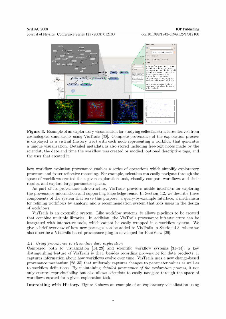
Figure 3. Example of an exploratory visualization for studying cellestial structures derived fromcosmological simulations using VisTrails [30]. Complete provenance of the exploration processis displayed as a vistrail (history tree) with each node representing a workflow that generatesa unique visualization. Detailed metadata is also stored including free-text notes made by thescientist, the date and time the workflow was created or modied, optional descriptive tags, andthe user that created it.
how workflow evolution provenance enables a series of operations which simplify exploratoryprocesses and foster reflective reasoning. For example, scientists can easily navigate through thespace of workflows created for a given exploration task, visually compare workflows and theirresults, and explore large parameter spaces.
As part of its provenance infrastructure, VisTrails provides usable interfaces for exploringthe provenance information and supporting knowledge reuse. In Section 4.2, we describe threecomponents of the system that serve this purpose: a query-by-example interface, a mechanismfor refining workflows by analogy, and a recommendation system that aids users in the designof workflows.
VisTrails is an extensible system. Like workflow systems, it allows pipelines to be createdthat combine multiple libraries. In addition, the VisTrails provenance infrastructure can beintegrated with interactive tools, which cannot be easily wrapped in a workflow system. Wegive a brief overview of how new packages can be added to VisTrails in Section 4.3, where wealso describe a VisTrails-based provenance plug-in developed for ParaView [29].
4.1. Using provenance to streamline data explorationCompared both to visualization [14, 29] and scientific workflow systems [31–34], a keydistinguishing feature of VisTrails is that, besides recording provenance for data products, itcaptures information about how workflows evolve over time. VisTrails uses a new change-basedprovenance mechanism [28, 35] that uniformly captures changes to parameter values as well asto workflow definitions. By maintaining detailed provenance of the exploration process, it notonly ensures reproducibility but also allows scientists to easily navigate through the space ofworkflows created for a given exploration task.
Interacting with History. Figure 3 shows an example of an exploratory visualization using
SciDAC 2008 IOP PublishingJournal of Physics: Conference Series 125 (2008) 012100 doi:10.1088/1742-6596/125/1/012100
7
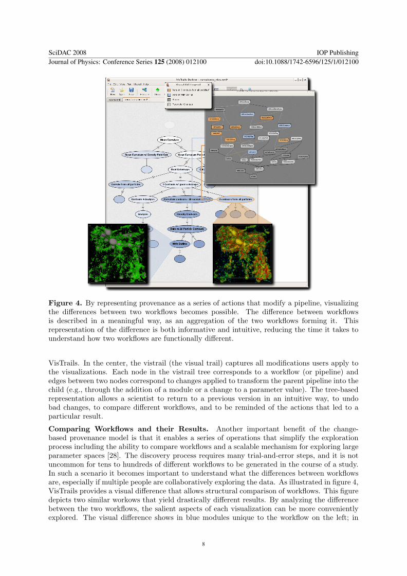
Figure 4. By representing provenance as a series of actions that modify a pipeline, visualizingthe differences between two workflows becomes possible. The difference between workflowsis described in a meaningful way, as an aggregation of the two workflows forming it. Thisrepresentation of the difference is both informative and intuitive, reducing the time it takes tounderstand how two workflows are functionally different.
VisTrails. In the center, the vistrail (the visual trail) captures all modifications users apply tothe visualizations. Each node in the vistrail tree corresponds to a workflow (or pipeline) andedges between two nodes correspond to changes applied to transform the parent pipeline into thechild (e.g., through the addition of a module or a change to a parameter value). The tree-basedrepresentation allows a scientist to return to a previous version in an intuitive way, to undobad changes, to compare different workflows, and to be reminded of the actions that led to aparticular result.
Comparing Workflows and their Results. Another important benefit of the change-based provenance model is that it enables a series of operations that simplify the explorationprocess including the ability to compare workflows and a scalable mechanism for exploring largeparameter spaces [28]. The discovery process requires many trial-and-error steps, and it is notuncommon for tens to hundreds of different workflows to be generated in the course of a study.In such a scenario it becomes important to understand what the differences between workflowsare, especially if multiple people are collaboratively exploring the data. As illustrated in figure 4,VisTrails provides a visual difference that allows structural comparison of workflows. This figuredepicts two similar workows that yield drastically different results. By analyzing the differencebetween the two workflows, the salient aspects of each visualization can be more convenientlyexplored. The visual difference shows in blue modules unique to the workflow on the left; in
SciDAC 2008 IOP PublishingJournal of Physics: Conference Series 125 (2008) 012100 doi:10.1088/1742-6596/125/1/012100
8
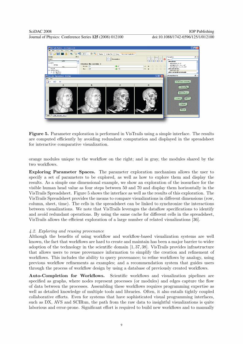
Figure 5. Parameter exploration is performed in VisTrails using a simple interface. The resultsare computed efficiently by avoiding redundant computation and displayed in the spreadsheetfor interactive comparative visualization.
orange modules unique to the workflow on the right; and in gray, the modules shared by thetwo workflows.
Exploring Parameter Spaces. The parameter exploration mechanism allows the user tospecify a set of parameters to be explored, as well as how to explore them and display theresults. As a simple one dimensional example, we show an exploration of the isosurface for thevisible human head value as four steps between 50 and 70 and display them horizontally in theVisTrails Spreadsheet. Figure 5 shows the interface as well as the results of this exploration. TheVisTrails Spreadsheet provides the means to compare visualizations in different dimensions (row,column, sheet, time). The cells in the spreadsheet can be linked to synchronize the interactionsbetween visualizations. We note that VisTrails leverages the dataflow specifications to identifyand avoid redundant operations. By using the same cache for different cells in the spreadsheet,VisTrails allows the efficient exploration of a large number of related visualizations [36].
4.2. Exploring and reusing provenanceAlthough the benefits of using workflow and workflow-based visualization systems are wellknown, the fact that workflows are hard to create and maintain has been a major barrier to wideradoption of the technology in the scientific domain [1, 37, 38]. VisTrails provides infrastructurethat allows users to reuse provenance information to simplify the creation and refinement ofworkflows. This includes the ability to query provenance; to refine workflows by analogy, usingprevious workflow refinements as examples; and a recommendation system that guides usersthrough the process of workflow design by using a database of previously created workflows.
Auto-Completion for Workflows. Scientific workflows and visualization pipelines arespecified as graphs, where nodes represent processes (or modules) and edges capture the flowof data between the processes. Assembling these workflows requires programming expertise aswell as detailed knowledge of multiple tools and libraries. Often, it also entails tightly coupledcollaborative efforts. Even for systems that have sophisticated visual programming interfaces,such as DX, AVS and SCIRun, the path from the raw data to insightful visualizations is quitelaborious and error-prone. Significant effort is required to build new workflows and to manually
SciDAC 2008 IOP PublishingJournal of Physics: Conference Series 125 (2008) 012100 doi:10.1088/1742-6596/125/1/012100
9
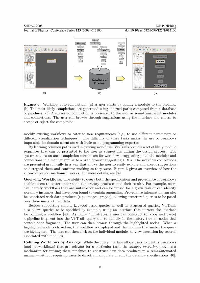
Figure 6. Workflow auto-completion: (a) A user starts by adding a module to the pipeline.(b) The most likely completions are generated using indexed paths computed from a databaseof pipelines. (c) A suggested completion is presented to the user as semi-transparent modulesand connections. The user can browse through suggestions using the interface and choose toaccept or reject the completion.
modify existing workflows to cater to new requirements (e.g., to use different parameters ordifferent visualization techniques). The difficulty of these tasks makes the use of workflowsimpossible for domain scientists with little or no programming expertise.
By learning common paths used in existing workflows, VisTrails predicts a set of likely modulesequences that can be presented to the user as suggestions during the design process. Thesystem acts as an auto-completion mechanism for workflows, suggesting potential modules andconnections in a manner similar to a Web browser suggesting URLs. The workflow completionsare presented graphically in a way that allows the user to easily explore and accept suggestionsor disregard them and continue working as they were. Figure 6 gives an overview of how theauto-completion mechanism works. For more details, see [39].
Querying Workflows. The ability to query both the specification and provenance of workflowsenables users to better understand exploratory processes and their results. For example, userscan identify workflows that are suitable for and can be reused for a given task or can identifyworkflow instances that have been found to contain anomalies. Provenance information can alsobe associated with data products (e.g., images, graphs), allowing structured queries to be posedover these unstructured data.
Besides supporting simple, keyword-based queries as well as structured queries, VisTrailsalso allows queries to be specified by example, using an interface that mirrors the interfacefor building a workflow [40]. As figure 7 illustrates, a user can construct (or copy and paste)a pipeline fragment into the VisTrails query tab to identify in the history tree all nodes thatcontain that fragment. The user can then browse through the highlighted nodes. When ahighlighted node is clicked on, the workflow is displayed and the modules that match the queryare highlighted. The user can then click on the individual modules to view execution log recordsassociated with modules.
Refining Workflows by Analogy. While the query interface allows users to identify workflows(and subworkflows) that are relevant for a particular task, the analogy operation provides amechanism for reusing these pipelines to construct new data products in a semi-automatedmanner—without requiring users to directly manipulate or edit the dataflow specifications [40].
SciDAC 2008 IOP PublishingJournal of Physics: Conference Series 125 (2008) 012100 doi:10.1088/1742-6596/125/1/012100
10
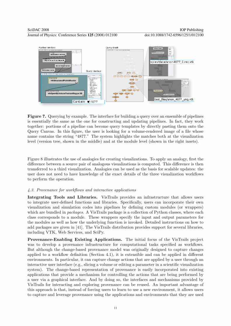
Figure 7. Querying by example. The interface for building a query over an ensemble of pipelinesis essentially the same as the one for constructing and updating pipelines. In fact, they worktogether: portions of a pipeline can become query templates by directly pasting them onto theQuery Canvas. In this figure, the user is looking for a volume-rendered image of a file whosename contains the string “4877.” The system highlights the matches both at the visualizationlevel (version tree, shown in the middle) and at the module level (shown in the right insets).
Figure 8 illustrates the use of analogies for creating visualizations. To apply an analogy, first thedifference between a source pair of analogous visualizations is computed. This difference is thentransferred to a third visualization. Analogies can be used as the basis for scalable updates: theuser does not need to have knowledge of the exact details of the three visualization workflowsto perform the operation.
4.3. Provenance for workflows and interactive applications
Integrating Tools and Libraries. VisTrails provides an infrastructure that allows usersto integrate user-defined functions and libraries. Specifically, users can incorporate their ownvisualization and simulation codes into pipelines by defining custom modules (or wrappers)which are bundled in packages. A VisTrails package is a collection of Python classes, where eachclass corresponds to a module. These wrappers specify the input and output parameters forthe modules as well as how the underlying function is invoked. Detailed instructions on how toadd packages are given in [41]. The VisTrails distribution provides support for several libraries,including VTK, Web Services, and SciPy.
Provenance-Enabling Existing Applications. The initial focus of the VisTrails projectwas to develop a provenance infrastructure for computational tasks specified as workflows.But although the change-based provenance model was originally designed to capture changesapplied to a workflow definition (Section 4.1), it is extensible and can be applied in differentenvironments. In particular, it can capture change actions that are applied by a user through aninteractive user interface (e.g., slicing a volume or editing a parameter in a scientific visualizationsystem). The change-based representation of provenance is easily incorporated into existingapplications that provide a mechanism for controlling the actions that are being performed bya user via a graphical interface. And by doing so, the interfaces and mechanisms provided byVisTrails for interacting and exploring provenance can be reused. An important advantage ofthis approach is that, instead of forcing users to learn to use a new environment, it allows usersto capture and leverage provenance using the applications and environments that they are used
SciDAC 2008 IOP PublishingJournal of Physics: Conference Series 125 (2008) 012100 doi:10.1088/1742-6596/125/1/012100
11
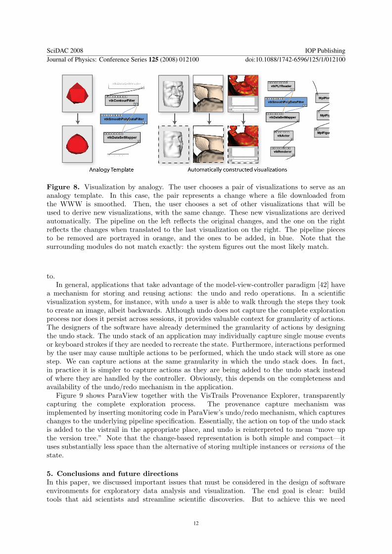
Figure 8. Visualization by analogy. The user chooses a pair of visualizations to serve as ananalogy template. In this case, the pair represents a change where a file downloaded fromthe WWW is smoothed. Then, the user chooses a set of other visualizations that will beused to derive new visualizations, with the same change. These new visualizations are derivedautomatically. The pipeline on the left reflects the original changes, and the one on the rightreflects the changes when translated to the last visualization on the right. The pipeline piecesto be removed are portrayed in orange, and the ones to be added, in blue. Note that thesurrounding modules do not match exactly: the system figures out the most likely match.
to.In general, applications that take advantage of the model-view-controller paradigm [42] have
a mechanism for storing and reusing actions: the undo and redo operations. In a scientificvisualization system, for instance, with undo a user is able to walk through the steps they tookto create an image, albeit backwards. Although undo does not capture the complete explorationprocess nor does it persist across sessions, it provides valuable context for granularity of actions.The designers of the software have already determined the granularity of actions by designingthe undo stack. The undo stack of an application may individually capture single mouse eventsor keyboard strokes if they are needed to recreate the state. Furthermore, interactions performedby the user may cause multiple actions to be performed, which the undo stack will store as onestep. We can capture actions at the same granularity in which the undo stack does. In fact,in practice it is simpler to capture actions as they are being added to the undo stack insteadof where they are handled by the controller. Obviously, this depends on the completeness andavailability of the undo/redo mechanism in the application.
Figure 9 shows ParaView together with the VisTrails Provenance Explorer, transparentlycapturing the complete exploration process. The provenance capture mechanism wasimplemented by inserting monitoring code in ParaView’s undo/redo mechanism, which captureschanges to the underlying pipeline specification. Essentially, the action on top of the undo stackis added to the vistrail in the appropriate place, and undo is reinterpreted to mean “move upthe version tree.” Note that the change-based representation is both simple and compact—ituses substantially less space than the alternative of storing multiple instances or versions of thestate.
5. Conclusions and future directionsIn this paper, we discussed important issues that must be considered in the design of softwareenvironments for exploratory data analysis and visualization. The end goal is clear: buildtools that aid scientists and streamline scientific discoveries. But to achieve this we need
SciDAC 2008 IOP PublishingJournal of Physics: Conference Series 125 (2008) 012100 doi:10.1088/1742-6596/125/1/012100
12
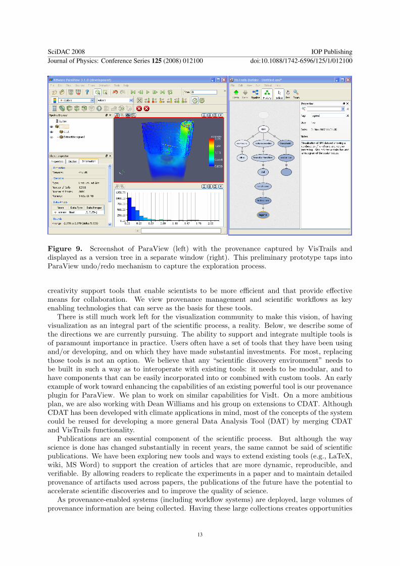
Figure 9. Screenshot of ParaView (left) with the provenance captured by VisTrails anddisplayed as a version tree in a separate window (right). This preliminary prototype taps intoParaView undo/redo mechanism to capture the exploration process.
creativity support tools that enable scientists to be more efficient and that provide effectivemeans for collaboration. We view provenance management and scientific workflows as keyenabling technologies that can serve as the basis for these tools.
There is still much work left for the visualization community to make this vision, of havingvisualization as an integral part of the scientific process, a reality. Below, we describe some ofthe directions we are currently pursuing. The ability to support and integrate multiple tools isof paramount importance in practice. Users often have a set of tools that they have been usingand/or developing, and on which they have made substantial investments. For most, replacingthose tools is not an option. We believe that any “scientific discovery environment” needs tobe built in such a way as to interoperate with existing tools: it needs to be modular, and tohave components that can be easily incorporated into or combined with custom tools. An earlyexample of work toward enhancing the capabilities of an existing powerful tool is our provenanceplugin for ParaView. We plan to work on similar capabilities for VisIt. On a more ambitiousplan, we are also working with Dean Williams and his group on extensions to CDAT. AlthoughCDAT has been developed with climate applications in mind, most of the concepts of the systemcould be reused for developing a more general Data Analysis Tool (DAT) by merging CDATand VisTrails functionality.
Publications are an essential component of the scientific process. But although the wayscience is done has changed substantially in recent years, the same cannot be said of scientificpublications. We have been exploring new tools and ways to extend existing tools (e.g., LaTeX,wiki, MS Word) to support the creation of articles that are more dynamic, reproducible, andverifiable. By allowing readers to replicate the experiments in a paper and to maintain detailedprovenance of artifacts used across papers, the publications of the future have the potential toaccelerate scientific discoveries and to improve the quality of science.
As provenance-enabled systems (including workflow systems) are deployed, large volumes ofprovenance information are being collected. Having these large collections creates opportunities
SciDAC 2008 IOP PublishingJournal of Physics: Conference Series 125 (2008) 012100 doi:10.1088/1742-6596/125/1/012100
13
to explore provenance in novel ways. But it also presents several challenges. Just collectingprovenance information does not bring major benefits. For the data to be truly useful, we needeffective and efficient ways to analyze it. As provenance collections grow, new mechanisms areneeded to deal with a potential information overload. The problem of mining and extractingknowledge from provenance data, however, has been largely unexplored. We are interested in“provenance analytics,” which we define to be a new area aimed at investigating new techniquesfor mining, visualizing and reusing provenance of computational tasks.
AcknowledgmentsWe thank our students and collaborators for contributing to this work, and the anonymousreviewers for comments that helped us to improve our manuscript. Our research has been fundedthe Department of Energy SciDAC (VACET and SDM centers), the National Science Foundation(grants IIS-0746500, CNS-0751152, IIS-0713637, OCE-0424602, IIS-0534628, CNS-0514485, IIS-0513692, CNS-0524096, CCF-0401498, OISE-0405402, CCF-0528201, CNS-0551724), and IBMFaculty Awards (2005, 2006, and 2007).
References[1] Johnson C R, Moorhead R, Munzner T, Pfister H, Rheingans P and Yoo T S 2006 NIH-NSF Visualization
Research Challenges (IEEE Computer Society) http://tab.computer.org/vgtc/vrc/index.html[2] van Wijk J 2005 Proceedings of IEEE Visualization[3] Shneiderman B 2007 Commun. ACM 50 20–32[4] Shneiderman B 2002 Commun. ACM 45 31–34[5] Kniss J, Kindlmann G and Hansen C 2002 IEEE Transactions on Visualization and Computer Graphics 8
270–285[6] Norman D A 1994 Things That Make Us Smart: Defending Human Attributes in the Age of the Machine
(Addison Wesley)[7] Tufte E R 1997 Visual Explanations: Images and Quantities, Evidence and Narrative (Graphics Press)[8] Plaisant C 2004 Proceedings of the working conference on Advanced visual interfaces (ACM) pp 109–116[9] Upson et al C 1989 IEEE Computer Graphics and Applications 9 30–42
[10] IBM OpenDX http://www.research.ibm.com/dx[11] Schroeder W, Martin K and Lorensen B 2003 The Visualization Toolkit An Object-Oriented Approach To 3D
Graphics (Kitware)[12] Law C C, Henderson A and Ahrens J 2001 IEEE Symposium on Parallel and Large-data Visualization and
Graphics 2001 pp 125–128[13] Childs H, Brugger E S, Bonnell K S, Meredith J S, Miller M, Whitlock B J and Max N 2005 IEEE
Visualization 2005 pp 190–198[14] Parker S G and Johnson C R 1995 Proceedings of Supercomputing p 52[15] Brodlie K, Poon A, Wright H, Brankin L, Banecki G and Gay A 1993 IEEE Visualization 1993 pp 102–109[16] Shrinivasan Y B and van Wijk J J 2008 ACM SIGCHI 2008 pp 1237–1246[17] Pirolli P and Card S 1999 Psychological Review 106 643–675[18] Pirolli P and Card S 2005 International Conference on Intelligence Analysis[19] Freire J and Silva C 2008 CHI Social Data Analysis Workshop[20] Freire J, Koop D, Santos E and Silva C T 2008 Computing in Science and Engineering 10 11–21[21] Davidson S B and Freire J 2008 Proceedings of ACM SIGMOD pp 1345–1350[22] Davidson S B, Boulakia S C, Eyal A, Ludascher B, McPhillips T M, Bowers S, Anand M K and Freire J
2007 IEEE Data Eng. Bull. 30 44–50[23] Miles S, Groth P, Branco M and Moreau L 2006 The requirements of using provenance in e-science
experiments Tech. rep. ECS, University of Southampton[24] Bose R and Frew J 2005 ACM Computing Surveys 37 1–28[25] Simmhan Y L, Plale B and Gannon D 2005 SIGMOD Record 34 31–36[26] Moreau L, Ludascher B, Altintas I, Barga R S, Bowers S, Callahan S, Chin Jr G, Clifford B, Cohen S,
Cohen-Boulakia S, Davidson S, Deelman E, Digiampietri L, Foster I, Freire J, Frew J, Futrelle J, GibsonT, Gil Y, Goble C, Golbeck J, Groth P, Holland D A, Jiang S, Kim J, Koop D, Krenek A, McPhillipsT, Mehta G, Miles S, Metzger D, Munroe S, Myers J, Plale B, Podhorszki N, Ratnakar V, Santos E,Scheidegger C, Schuchardt K, Seltzer M, Simmhan Y L, Silva C, Slaughter P, Stephan E, Stevens R, TuriD, Vo H, Wilde M, Zhao J and Zhao Y 2007 Concurrency and Computation: Practice and Experience
SciDAC 2008 IOP PublishingJournal of Physics: Conference Series 125 (2008) 012100 doi:10.1088/1742-6596/125/1/012100
14
[27] Freire J, Miles S and Moreau L 2007 Second provenance challengehttp://twiki.ipaw.info/bin/view/Challenge/SecondProvenanceChallenge
[28] J Freire, C T Silva, S P Callahan, Santos E, Scheidegger C E and Vo H T 2006 International Provenanceand Annotation Workshop (IPAW) LNCS 4145 pp 10–18
[29] Kitware Paraview http://www.paraview.org[30] Anderson E W, Ahrens J, Heitmann K, Habib S and Silva C 2008 Computing in Science and Engineering
10 30–37[31] The Kepler Project http://kepler-project.org[32] The Taverna Project http://taverna.sourceforge.net[33] The Triana Project http://www.trianacode.org[34] Ailamaki A, Ioannidis Y E and Livny M 1998 Proc. of the Conference on Scientific and Statistical Database
Management pp 190–199[35] Callahan S, Freire J, Santos E, Scheidegger C, Silva C and Vo H 2006 IEEE Workshop on Workflow and
Data Flow for Scientific Applications (SciFlow)[36] Bavoil L, Callahan S, Crossno P, Freire J, Scheidegger C, Silva C and Vo H 2005 Proceedings of IEEE
Visualization pp 135–142[37] Maechling P, Chalupsky H, Dougherty M, Deelman E, Gil Y, Gullapalli S, Gupta V, Kesselman C, Kim J,
Mehta G, Mendenhall B, Russ T, Singh G, Spraragen M, Staples G and Vahi K 2005 SIGMOD Rec. 3424–30
[38] Schopf J, Coleman I, Procter R and Voss A 2006 Report of the user requirements and web based access foreresearch workshop Tech. Rep. UKeS-2006-07 UK National e-Science Centre
[39] Koop D, Scheidegger C, Callahan S, Freire J and Silva C 2008 IEEE Transactions on Visualization andComputer Graphics Accepted with minor revisions.
[40] Scheidegger C, Koop D, Vo H, Freire J and Silva C 2007 IEEE Transactions on Visualization and ComputerGraphics
[41] VisTrails Packages http://www.vistrails.org/index.php/UsersGuideVisTrailsPackages[42] Krasner G E and Pope S T 1988 Journal of Object-Oriented Programming 1(3) 26–49
SciDAC 2008 IOP PublishingJournal of Physics: Conference Series 125 (2008) 012100 doi:10.1088/1742-6596/125/1/012100
15