sites designed for conversions (aka: the 7 sins of site design) dr veit u.b. schenk
TRANSCRIPT

Sites Designed For Conversions
(aka: The 7 Sins Of Site Design)Dr Veit U.B. Schenk


Err, … “Build A Site?”• What the heck do you put on the site?• Spun Content?• Outsourced Content?• Even worse: What about the DESIGN & Layout?• How do I stop them from BOUNCING Off my site?• Today all about Layout & Design!


Sin #1: No CLEARY Identifiable Target Audience!
• We see it in Headlines all the time!• Because it WORKS!• Put it on your site!

Design & Layout• First thing that jumps into your eye!• Must make clear IMMEDIATELY whom it’s for!

“The One Stop Destination For Bargain Lovers”

Christmas Decorating Ideas For SAHMs

The Online Grocery For Health Nuts

Tablescape Ideas For Busy Mums

Sin #2: Multiple Objectives!• Trying to achieve several things:– Signup to list– Buy stuff– Get engagement– SEO (links galore)

Design & Layout• REMOVE all distractions!• Forces you to be crystal clear about WHO is
visiting this particular page!

The Objective is clear: click
the link

What is the objective?

What is the objective?

What is the objective?

Sin #3: “The Novice Salesperson”• Novice Salespeople TALK. • A LOT!• And confuse the prospect!

Design & Layout• Right after (or INCLUDING) WHOM it’s for,
explain WHAT it is!

“The Place Where Bargain Lovers Get The Biggest Discounts”

Cheap/Unusual/Impressive/… Christmas Decorating Ideas For SAHMs

The Only Online Grocery Where Health Nuts Get Truly Healthy Nuts

5-min “Million-Dollar-Look” Tablescape Ideas For Busy Mums
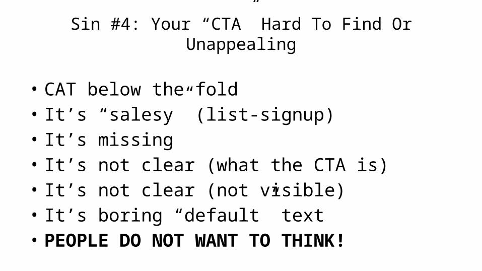
Sin #4: Your “CTA” Hard To Find Or Unappealing
• CAT below the fold• It’s “salesy” (list-signup)• It’s missing• It’s not clear (what the CTA is)• It’s not clear (not visible)• It’s boring “default” text• PEOPLE DO NOT WANT TO THINK!

Design & Layout• Put the CTA above the fold!• Only ONE CTA per page• Make it compelling (“I”-language on buttons?)• Make it clear• Make it STAND OUT!

“Scroll Down To Use The Best Bargain-Hunting Tool On The Web”


???

Check out our “health-nut nut-finder” to find the perfect nut for you!

???
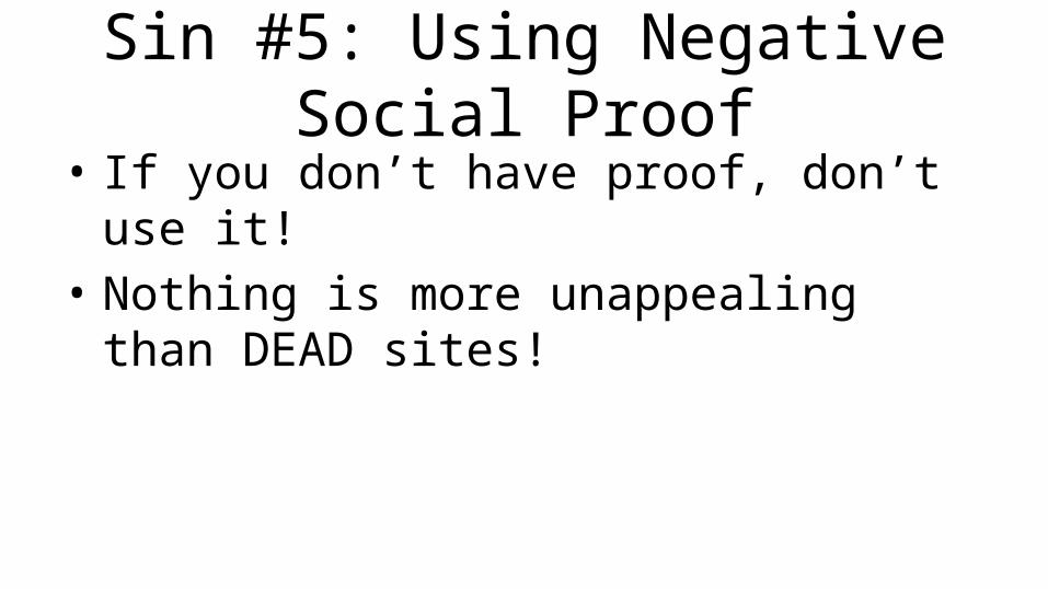
Sin #5: Using Negative Social Proof• If you don’t have proof, don’t use it!• Nothing is more unappealing than DEAD sites!
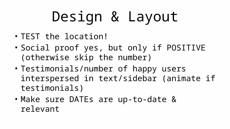
Design & Layout• TEST the location!• Social proof yes, but only if POSITIVE (otherwise
skip the number)• Testimonials/number of happy users interspersed
in text/sidebar (animate if testimonials)• Make sure DATEs are up-to-date & relevant


Sin #6: Not working with the visual system
• Content placed randomly all over the page• Not using FACES to capture attention• Not using well known symbols, or ‘contrast’
(arrows, red, green, orange shopping cart)

Layout & Design• Capture them top left, guide towards bottom
(right)• Faces trump everything• Give it a visual ‘flow’; always ask: where do I
want them to look next?


Sin #7: “Flying below the radar” (aka: I’ve got something to hide)
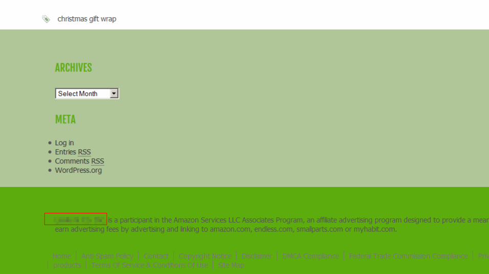
• No TOS• No Privacy Policy• No About Us page (the real people)• No phone-number

Layout & Design• ‘standard’ location for TOS & Privacy Policy: at
bottom of page• About: near top• Phone: near top

Nil Points


Get A Product, Build a Site, Apply Some SEO…
• Watch them NOT Bounce Off, but Engage Instead…
• … and heck, even send you referrals (aka: ‘viral’ traffic)
• All you need now is ‘compelling’ content;-)
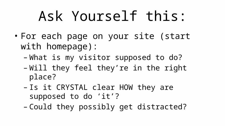
Ask Yourself this:• For each page on your site (start with
homepage):– What is my visitor supposed to do?– Will they feel they’re in the right place?– Is it CRYSTAL clear HOW they are supposed to do
‘it’?– Could they possibly get distracted?