simpler using r for introductory statistics · simpler – using r for introductory statistics john...
TRANSCRIPT
simpleR – Using R for Introductory Statistics
John Verzani
20000 40000 60000 80000 120000 160000
2e
+0
54
e+
05
6e
+0
58
e+
05
y

page i
These notes are an introduction to using the statistical software package R for an introductory statistics course.They are meant to accompany an introductory statistics book such as Kitchens “Exploring Statistics”. The goalsare not to show all the features of R, or to replace a standard textbook, but rather to be used with a textbook toillustrate the features of R that can be learned in a one-semester, introductory statistics course.
These notes were written to take advantage of R version 1.4.0. The primary change being that assignmentcan now be done with the equals sign = instead of the arrow combination <-. If this version of R is not available,the reader will need to use the arrow for assignment.
There are several references to data and functions in this text that need to be installed prior to their use.To install the data is easy, but the instructions vary depending on you system. For Windows users, you need todownload the file below, and then install from the “packages” menu. Some of the datasets are borrowed fromother authors notably Kitchens. Credit is given in the help files for the datasets.
This material is available as an R package from:
http://www.math.csi.cuny.edu/Statistics/R/simpleR/Simple 0.2.zip for Windows users.http://www.math.csi.cuny.edu/Statistics/R/simpleR/Simple 0.2.tgz for UNIX users.
If necessary, the file can be emailed.As well, individual data sets can be found online in the directory
http://www.math.csi.cuny.edu/Statistics/R/simpleR/Simple.
These notes were printed on January 23, 2002.
The most recent version of these notes is available from
the CSI Math department (http://www.math.csi.cuny.edu/Statistics/R/simpleR).
If the reader does not know how to start R there are some instructions in the “A Sample R Session” appendix.
Copyright c©John Verzani ([email protected]), 2001-2.
Contents
Introduction 1What is R . . . . . . . . . . . . . . . . . . . . . . . . . . . . . . . . . . . . . . . . . . . . . . . . . . . . . 1A Note on Notation . . . . . . . . . . . . . . . . . . . . . . . . . . . . . . . . . . . . . . . . . . . . . . . 1
Data 2Starting R . . . . . . . . . . . . . . . . . . . . . . . . . . . . . . . . . . . . . . . . . . . . . . . . . . . . . 2Entering Data with c() . . . . . . . . . . . . . . . . . . . . . . . . . . . . . . . . . . . . . . . . . . . . . 2Data is a vector . . . . . . . . . . . . . . . . . . . . . . . . . . . . . . . . . . . . . . . . . . . . . . . . . 3
Univariate Data 8Categorical Data . . . . . . . . . . . . . . . . . . . . . . . . . . . . . . . . . . . . . . . . . . . . . . . . . 9Numerical Data . . . . . . . . . . . . . . . . . . . . . . . . . . . . . . . . . . . . . . . . . . . . . . . . . . 11
Bivariate Data 21Handling Bivariate Categorical Data . . . . . . . . . . . . . . . . . . . . . . . . . . . . . . . . . . . . . . 22Handling Bivariate Data: Categorical vs. Numerical . . . . . . . . . . . . . . . . . . . . . . . . . . . . . 23Bivariate Data: Numerical vs. Numerical . . . . . . . . . . . . . . . . . . . . . . . . . . . . . . . . . . . 25Linear Regression. . . . . . . . . . . . . . . . . . . . . . . . . . . . . . . . . . . . . . . . . . . . . . . . . 26
Multivariate Data 37Two ways to store data sets . . . . . . . . . . . . . . . . . . . . . . . . . . . . . . . . . . . . . . . . . . . 37Ways to view multivariate data . . . . . . . . . . . . . . . . . . . . . . . . . . . . . . . . . . . . . . . . . 39
simpleR – Using R for Introductory Statistics
page ii
Random Data 43Random Number Generators in R– the “r” Functions. . . . . . . . . . . . . . . . . . . . . . . . . . . . . 43
Simulations 50The Central Limit Theorem . . . . . . . . . . . . . . . . . . . . . . . . . . . . . . . . . . . . . . . . . . . 50Using simple.sim and functions . . . . . . . . . . . . . . . . . . . . . . . . . . . . . . . . . . . . . . . . 53
Exploratory Data Analysis 57Our Toolbox . . . . . . . . . . . . . . . . . . . . . . . . . . . . . . . . . . . . . . . . . . . . . . . . . . . 57Examples . . . . . . . . . . . . . . . . . . . . . . . . . . . . . . . . . . . . . . . . . . . . . . . . . . . . . 58
Confidence Interval Estimation 63Population Proportion Theory . . . . . . . . . . . . . . . . . . . . . . . . . . . . . . . . . . . . . . . . . 64Proportion test . . . . . . . . . . . . . . . . . . . . . . . . . . . . . . . . . . . . . . . . . . . . . . . . . . 66The z-test . . . . . . . . . . . . . . . . . . . . . . . . . . . . . . . . . . . . . . . . . . . . . . . . . . . . . 67The t-test . . . . . . . . . . . . . . . . . . . . . . . . . . . . . . . . . . . . . . . . . . . . . . . . . . . . . 67C.I. for the Median . . . . . . . . . . . . . . . . . . . . . . . . . . . . . . . . . . . . . . . . . . . . . . . . 69
Hypothesis Testing 71Testing a population parameter . . . . . . . . . . . . . . . . . . . . . . . . . . . . . . . . . . . . . . . . . 71Testing a mean . . . . . . . . . . . . . . . . . . . . . . . . . . . . . . . . . . . . . . . . . . . . . . . . . . 72Tests for the median . . . . . . . . . . . . . . . . . . . . . . . . . . . . . . . . . . . . . . . . . . . . . . . 73
Two-sample test 74Two-Sample Tests of Proportion . . . . . . . . . . . . . . . . . . . . . . . . . . . . . . . . . . . . . . . . 74Two-Sample t-tests . . . . . . . . . . . . . . . . . . . . . . . . . . . . . . . . . . . . . . . . . . . . . . . . 75Resistant Two-Sample Tests . . . . . . . . . . . . . . . . . . . . . . . . . . . . . . . . . . . . . . . . . . . 77
Chi Square Tests 78The Chi-Squared Distribution . . . . . . . . . . . . . . . . . . . . . . . . . . . . . . . . . . . . . . . . . . 78Chi-Squared Goodness of Fit Tests . . . . . . . . . . . . . . . . . . . . . . . . . . . . . . . . . . . . . . . 78Chi-Squared Tests of Independence . . . . . . . . . . . . . . . . . . . . . . . . . . . . . . . . . . . . . . . 80Chi-Squared Tests for Homogeneity . . . . . . . . . . . . . . . . . . . . . . . . . . . . . . . . . . . . . . . 81
Regression Analysis 83Simple Linear Regression Model . . . . . . . . . . . . . . . . . . . . . . . . . . . . . . . . . . . . . . . . 83Testing the Assumptions of the Model . . . . . . . . . . . . . . . . . . . . . . . . . . . . . . . . . . . . . 85Statistical Inference . . . . . . . . . . . . . . . . . . . . . . . . . . . . . . . . . . . . . . . . . . . . . . . 85
Appendix: Installing R 92Getting and Installing R . . . . . . . . . . . . . . . . . . . . . . . . . . . . . . . . . . . . . . . . . . . . . 92
Appendix: A sample R session 92A sample session involving regression . . . . . . . . . . . . . . . . . . . . . . . . . . . . . . . . . . . . . . 92t tests . . . . . . . . . . . . . . . . . . . . . . . . . . . . . . . . . . . . . . . . . . . . . . . . . . . . . . . 95A simulation example . . . . . . . . . . . . . . . . . . . . . . . . . . . . . . . . . . . . . . . . . . . . . . 97
Appendix: External Packages 98
Appendix: Using Functions 98The Basic Template . . . . . . . . . . . . . . . . . . . . . . . . . . . . . . . . . . . . . . . . . . . . . . . 99For Loops . . . . . . . . . . . . . . . . . . . . . . . . . . . . . . . . . . . . . . . . . . . . . . . . . . . . . 101Conditional Expressions . . . . . . . . . . . . . . . . . . . . . . . . . . . . . . . . . . . . . . . . . . . . . 102
simpleR – Using R for Introductory Statistics
page iii
Appendix: Entering Data into R 102Using c . . . . . . . . . . . . . . . . . . . . . . . . . . . . . . . . . . . . . . . . . . . . . . . . . . . . . . 102using scan . . . . . . . . . . . . . . . . . . . . . . . . . . . . . . . . . . . . . . . . . . . . . . . . . . . . 103Using scan With a File . . . . . . . . . . . . . . . . . . . . . . . . . . . . . . . . . . . . . . . . . . . . . 103Editing Your Data . . . . . . . . . . . . . . . . . . . . . . . . . . . . . . . . . . . . . . . . . . . . . . . . 103Reading in Tables of Data . . . . . . . . . . . . . . . . . . . . . . . . . . . . . . . . . . . . . . . . . . . . 104Fixed-Width Fields . . . . . . . . . . . . . . . . . . . . . . . . . . . . . . . . . . . . . . . . . . . . . . . . 104Spreadsheet Data . . . . . . . . . . . . . . . . . . . . . . . . . . . . . . . . . . . . . . . . . . . . . . . . . 105XML, urls . . . . . . . . . . . . . . . . . . . . . . . . . . . . . . . . . . . . . . . . . . . . . . . . . . . . . 105“Foreign” Formats . . . . . . . . . . . . . . . . . . . . . . . . . . . . . . . . . . . . . . . . . . . . . . . . 105
Appendix: Sources of help, documentation 105Sources of Help . . . . . . . . . . . . . . . . . . . . . . . . . . . . . . . . . . . . . . . . . . . . . . . . . . 105
simpleR – Using R for Introductory Statistics
page 1
Section 1 Introduction
What is R
These notes describe how to use R while learning introductory statistics. The purpose is to allow this fine soft-ware to be used in ”lower-level” courses where often MINITAB, SPSS, or Excel are often used. The expectationis that these students have had a pre-calculus course and perhaps more. It is the hope, that students shown howto use R at this early level will better understand the statistical issues and will ultimately benefit from the moresophisticated program despite its steeper “learning curve”.
The benefits of R for an introductory student are
• R is used like a computer programming language. For programmers it will feel more familiar than othersand for new computer users, the next step to programming will not be so steep.
• R’s language has a powerful, easy to learn syntax with many built-in statistical functions.
• The language is easy to extend with user-written functions.
• R has excellent graphing capabilities.
• R is free. R is open-source and runs on UNIX, Windows and Macintosh.
• R has an excellent built-in help system.
• Students can easily migrate to the commercially supported S-Plus program if commercial software is desired.
What is R lacking compared to other software solutions?
• It has a limited graphical interface (S-Plus has a good one). This means, it can be harder to learn at theoutset.
• There is no commercial support. (Although one can argue the international mailing list is even better)
• The command language is a programming language so students must learn to appreciate syntax issues etc.
R is an open-source (GPL) statistical environment modeled after S and S-Plus http://www.insightful.com.The S language was developed in the late 1980s at AT&T labs. The R project was started by Robert Gentleman andRoss Ihaka of the Statistics Department of the University of Auckland in 1995. It has quickly gained a widespreadaudience. It is currently maintained by the R core-development team, a hard-working, international team ofvolunteer developers. The R project web page http://www.r-project.org is the main site for information on R.At this site are directions for obtaining the software, accompanying packages and other sources of documentation.
A Note on NotationA few typographical conventions are used in these notes. These include different fonts for urls, R commands,dataset names and different typesetting for
R commands.
and for
Data sets.
simpleR – Using R for Introductory Statistics
page 2
Section 2 Data
Statistics is the study of data. After learning how to start R, the first thing we need to be able to do is learnhow to enter data into R and how to manipulate the data once there.
Starting RR is most often used in an interactive manner. You ask it a question and R gives you an answer. Questions areasked and answered on the command line. To start up R’s command line you can do the following: in Windowsfind the R icon and double click, on Unix, from the command line type R. Other operating systems have differentways. Once R is started, you should be greeted with a command similar to this
R : Copyright 2001, The R Development Core TeamVersion 1.4.0 (2001-12-19)
R is free software and comes with ABSOLUTELY NO WARRANTY.You are welcome to redistribute it under certain conditions.Type ‘license()’ or ‘licence()’ for distribution details.
R is a collaborative project with many contributors.Type ‘contributors()’ for more information.
Type ‘demo()’ for some demos, ‘help()’ for on-line help, or‘help.start()’ for a HTML browser interface to help.Type ‘q()’ to quit R.
[Previously saved workspace restored]
>
The > is called the prompt. In what follows below it is not typed, but is used to indicate where you are to typeif you follow the examples.
Entering Data with c()
The most useful R command for quickly entering in small data sets is the c() function. This function combines,or concatenates terms together. As an example, suppose we have the following count of the number of typos perpage of these notes:
2 3 0 3 1 0 0 1
To enter this into an R session we do so with
> typos = c(2,3,0,3,1,0,0,1)> typos[1] 2 3 0 3 1 0 0 1
Notice a few things
• We assigned the values to a variable called typos
• The assignment operator is a =. This is valid as of R version 1.4.0. Previously it was (and still can be) a<-. Both will be used, although, you should learn one and stick with it.
simpleR – Using R for Introductory Statistics
page 3
• The value of the typos doesn’t automatically print out. It does when we type just the name though as thelast input line indicates
• The value of typos is prefaced with a funny [1]. This indicates that the value is a vector. More on thatlater.
Applying a Function
R comes with many built in functions that one can apply to data such as typos. One of them is the meanfunction for finding the mean or average of the data. To use it is easy
> mean(typos)[1] 1.25
As well, we could call the median, or var to find the median or sample variance. The syntax is the same – thefunction name followed by parentheses to contain the argument(s):
> median(typos)[1] 1> var(typos)[1] 1.642857
Data is a vector
The data is stored in R as a vector. This means simply that it keeps track of the order that the data isentered in. In particular there is a first element, a second element up to a last element. This is a good thing forseveral reasons:
• Our simple data vector typos has a natural order – page 1, page 2 etc. We wouldn’t want to mix these up.
• We would like to be able to make changes to the data item by item instead of having to enter in the entiredata set again.
• Vectors are also a mathematical object. There are natural notions of mathematical concepts that make iteasy to work with data.
Let’s see how these apply to our typos example. First, suppose these are the typos for the first draft of section1 of these notes. We might want to keep track of our various drafts as the typos change. This could be done bythe following:
> typos.draft1 = c(2,3,0,3,1,0,0,1)> typos.draft2 = c(0,3,0,3,1,0,0,1)
That is, the two typos on the first page were fixed. Notice the two different variable names. Unlike many otherlanguages, the period is only used as punctuation. You can’t use an _ (underscore) to punctuate names as youmight in other programming languages so it is quite useful. 1
Now, you might say, that is a lot of work to type in the data a second time. Can’t I just tell R to change thefirst page? The answer of course is “yes”. Here is how
> typos.draft1 = c(2,3,0,3,1,0,0,1)> typos.draft2 = typos.draft1 # make a copy> typos.draft2[1] = 0 # assign the first page 0 typos
1The underscore was originally used as assignment so a name such as The Data would actually assign the value of Data to thevariable The. The underscore is being phased out and the equals sign is being phased in.
simpleR – Using R for Introductory Statistics
page 4
Now notice a few things. First, the comment character, #, is used to make comments. Basically anything afterthe comment character is ignored (by R, hopefully not the reader). More importantly, the assignment to the firstentry in the vector typos.draft2 is done by referencing the first entry in the vector. This is done with squarebrackets []. It is important to keep this in mind: parentheses () are for functions, and square brackets [] arefor vectors (and later arrays and lists). In particular, we have the following values currently in typos.draft2
> typos.draft2 # print out the value[1] 0 3 0 3 1 0 0 1> typos.draft2[2] # print 2nd pages’ value[1] 3> typos.draft2[4] # 4th page[1] 3> typos.draft2[8] # 8th page[1] 1> typos.draft2[c(1,2,3)] # fancy, print 1st, 2nd and 3rd.[1] 0 3 0
The last example is very important. You can take more than one value at a time by using another vector of indexnumbers. There are lots of other rules not covered here. These involve, negative indices, indices past the lengthetc.
Okay, we need to work these notes into shape, let’s find the real bad pages. By inspection, we can notice thatpages 2 and 4 are a problem. Can we do this with R in a more systematic manner?
> max(typos.draft2) # what are worst pages?[1] 3 # 3 typos per page> typos.draft2 == 3 # Where are they?[1] FALSE TRUE FALSE TRUE FALSE FALSE FALSE FALSE
Notice, the usage of double equals signs (==). This tests all the values of typos.draft2 to see if they are equalto 3. The 2nd and 4th answer yes (TRUE) the others no.
Now the question is – how can we get the indices (pages) corresponding to the TRUE values? Let’s rephrase,which indices have 3 typos? If you guessed that the command which will work, you are on your way to R mastery:
> which(typos.draft2 == 3)[1] 2 4
Now, what if you didn’t think of the command which? You are not out of luck – but you will need to workharder. The basic idea is to create a new vector 1 2 3 ... keeping track of the page numbers, and then slicingoff just the ones for which typos.draft2==3:
> n = length(typos.draft2) # how many pages> pages = 1:n # how we get the page numbers> pages # pages is simply 1 to number of pages[1] 1 2 3 4 5 6 7 8> pages[typos.draft2 == 3] # logical extraction. Very useful[1] 2 4
To create the vector 1 2 3 ... we used the simple : colon operator. We could have typed this in, but thisis a useful thing to know. The command a:b is simply a, a+1, a+2 ... b if a,b are integers and intuitivelydefined if not. A more general R function is seq() which is a bit more typing. Try ?seq to see it’s options. Toproduce the above try seq(a,b,1).
The use of extracting elements of a vector using another vector of the same size which is comprised of TRUEsand FALSEs is referred to as extraction by a logical vector. Notice this is different from extracting by page numbersas we did before.
Of course, we could have done this all at once with this command (but why?)
> (1:length(typos.draft2))[typos.draft2 == max(typos.draft2)][1] 2 4
simpleR – Using R for Introductory Statistics
page 5
This looks awful and is prone to typos and confusion, but does illustrate how things can be combined intoshort powerful statements. This is an important point. To appreciate the use of R you need to understand howone composes the output of one function or operation with the input of another. In mathematics we call thiscomposition.
Finally, we might want to know how many typos we have, or how many pages still have typos to fix or what thedifference is between drafts? These can all be answered with mathematical functions. For these three questionswe have
> sum(typos.draft2) # How many typos?[1] 8> sum(typos.draft2>0) # How many pages with typos?[1] 4> typos.draft1 - typos.draft2 # difference between the two[1] 2 0 0 0 0 0 0 0
Example:Keeping trackof a stock;adding to thedata
Suppose the daily closing price of your favorite stock for two weeks is
45,43,46,48,51,46,50,47,46,45
We can again keep track of this with R using a vector:
> x = c(45,43,46,48,51,46,50,47,46,45)> mean(x) # the mean[1] 46.7> median(x) # the median[1] 46> max(x) # the maximum or largest value[1] 51> min(x) # the minimum value[1] 43
This illustrates that many interesting functions can be found easily. Let’s see how we can do some others. First,lets add the next two weeks worth of data to x. This was
48,49,51,50,49,41,40,38,35,40
We can add this several ways.
> x = c(x,48,49,51,50,49) # append values to x> length(x) # how long is x now (it was 10)[1] 15> x[16] = 41 # add to a specified index> x[17:20] = c(40,38,35,40) # add to many specified indices
Notice, we did three different things to add to a vector. All are useful, so lets explain. First we used the c(combine) operator to combine the previous value of x with the next week’s numbers. Then we assigned directlyto the 16th index. At the time of the assignment, x had only 15 indices, this automatically created another one.Finally, we assigned to a slice of indices. This latter make some things very simple to do.
R basics:GraphicalData EntryInterfaces
There are some other ways to edit data that use a spreadsheet interface. These may be preferable to somestudents. Here are examples with annotations
> data.entry(x) # Pops up spreadsheet to edit data> x = de(x) # same only, doesn’t save changes> x = edit(x) # uses editor to edit x.
All are easy to use. The main confusion is that the variable x needs to be defined previously. For example
simpleR – Using R for Introductory Statistics
page 6
> data.entry(x) # fails. x not definedError in de(..., Modes = Modes, Names = Names) :
Object "x" not found> data.entry(x=c(NA)) # works, x is defined as we go.
Before we leave this example, lets see how we can do some other functions of the data. Here are a few examples.The moving average simply means to average over some previous number of days. Suppose we want the 5
day moving average (50-day or 100-day is more often used). Here is one way to do so. We can do this for days 5through 20 as the other days don’t have enough data.
> day = 5;> mean(x[day:(day+4)])[1] 48
The trick is the slice takes out days 5,6,7,8,9
> day:(day+4)[1] 5 6 7 8 9
and the mean takes just those values of x.What is the maximum value of the stock? This is easy to answer with max(x). However, you may be interested
in a running maximum or the largest value to date. This too is easy – if you know that R had a built-in functionto handle this. It is called cummax which will take the cumulative maximum. Here is the result for our 4 weeksworth of data along with the similar cummin:
> cummax(x)[1] 45 45 46 48 51 51 51 51 51 51 51 51 51 51 51 51 51 51 51 51> cummin(x) # running minimum[1] 45 43 43 43 43 43 43 43 43 43 43 43 43 43 43 41 40 38 35 35
Example:Working withmathematics
R makes it easy to translate mathematics in a natural way once your data is read in. For example, supposethe yearly number of whales beached in Texas during the period 1990 to 1999 is
74 122 235 111 292 111 211 133 156 79
What is the mean, the variance, the standard deviation? Again, R makes these easy to answer:
> whale = c(74, 122, 235, 111, 292, 111, 211, 133, 156, 79)> mean(whale)[1] 152.4> var(whale)[1] 5113.378> std(whale)Error: couldn’t find function "std"> sqrt(var(whale))[1] 71.50789> sqrt( sum( (whale - mean(whale))^2 /(length(whale)-1)))[1] 71.50789
Well, almost! First, one needs to remember the names of the functions. In this case mean is easy to guess, varis kind of obvious but less so, std is also kind of obvious, but guess what? It isn’t there! So some other things weretried. First, we remember that the standard deviation is the square of the variance so the one line is clear. Finally,the last line illustrates that R can almost exactly mimic the mathematical formula for the standard deviation:
SD(X) =
√√√√ 1n− 1
n∑i=1
(Xi − X)2.
simpleR – Using R for Introductory Statistics
page 7
Notice the sum is now sum, X is mean(whale) and length(x) is used instead of n.Of course, it might be nice to have this available as a built-in function. Since this example is so easy, lets see
how it is done:
> std = function(x) sqrt(var(x))> std(whale)[1] 71.50789
The ease of defining your own functions is a very appealing feature of R we will return to.Of course we could have looked a little harder and found the actual sd() command. Which gives
> sd(whale)[1] 71.50789
Problems
2.1 Suppose you keep track of your mileage each time you fill up. At your last 6 fill-ups the mileage was
65311 65624 65908 66219 66499 66821 67145 67447
Enter these numbers into R. Use the function diff on the data. What does it give?
> miles = c(65311, 65624, 65908, 66219, 66499, 66821, 67145, 67447)> x = diff(miles)
You should see the number of miles between fill-ups. Use the max to find the maximum number of milesbetween fill-ups, the mean function to find the average number of miles and the min to get the minimumnumber of miles.
2.2 Suppose you track your commute times for two weeks (10 days) and you find the following times in minutes
17 16 20 24 22 15 21 15 17 22
Enter this into R. Use the function max to find the longest commute time, the function mean to find theaverage and the function min to find the minimum.
Oops, the 24 was a mistake. It should have been 18. How can you fix this? Do so, and then find the newaverage.
How many times was our commute 20 minutes or more? To answer this one can try (if you called yournumbers commutes)
> sum( commutes >= 20)
What do you get? What percent of your commutes are less than 17 minutes? How can you answer thiswith R?
2.3 Your cell phone bill varies from month to month. Suppose your year has the following amounts
46 33 39 37 46 30 48 32 49 35 30 48
Enter this data into a variable called bill. Use the sum command to find the amount you spent this yearon the cell phone. What is the smallest amount you spent in a month? What is the largest? What percentwas the amount greater than $40?
2.4 You want to buy a used car and find that over 3 months of watching the classifieds you see the followingprices (suppose the cars are all similar)
simpleR – Using R for Introductory Statistics
page 8
9000 9500 9400 9400 10000 9500 10300 10200
Use R to find the average value and compare it to Edmund’s (http://www.edmunds.com) estimate of $9500.Use R to find the minimum value and the maximum value. Which price would you like to pay?
2.5 Try to guess the results of these R commands. Remember, the way to access entries in a vector is with [].Suppose we assume
> x = c(1,3,5,7,9)> y = c(2,3,5,7,11,13)
1. x+1
2. y*2
3. length(x) and length(y)
4. x + y
5. sum(x>5) and sum(x[x>5])
6. sum(x>5 | x< 3) # read | as ’or’, & and ’and’
7. y[3]
8. y[-3]
9. y[x] (What is NA?)
10. y[y>=7]
2.6 Let the data x be given by
> x = c(1, 8, 2, 6, 3, 8, 5, 5, 5, 5)
Use R to compute the following functions. Note, we use X1 to denote the first element of x (which is 0) etc.
1. (X1 + X2 + · · ·+ X10)/10 (use sum)
2. Find log10(Xi) for each i. (Use the log function which by default is base e)
3. Find (Xi − 4.4)/2.875 for each i. (Do it all at once)
4. Find the difference between the largest and smallest values of x. (This is the range. You can use maxand min or guess a built in command.)
Section 3 Univariate Data
There is a distinction between types of data in statistics and R knows about some of these differences. Inparticular, initially, data can be of three basic types: categorical, discrete numeric and continuous numeric.Methods for viewing and summarizing the data depend on the type, and so we need to be aware of how each ishandled and what we can do with it.
Categorical data is data that records categories. Examples could be, a survey that records whether a personis for or against a proposition. Or, a police force might keep track of the race of the individuals they pull over onthe highway. The U.S. census (http://www.census.gov), which takes place every 10 years, asks several differentquestions of a categorical nature. Again, there was one on race which in the year 2000 included 15 categorieswith write-in space for 3 more for this variable (you could mark yourself as multi-racial). Another example, mightbe a doctor’s chart which records data on a patient. The gender or the history of illnesses might be treated ascategories.
Continuing the doctor example, the age of a person and their weight are numeric quantities. The age is adiscrete numeric quantity (typically) and the weight as well (most people don’t say they are 4.673 years old).These numbers are usually reported as integers. If one really needed to know precisely, then they could in theorytake on a continuum of values, and we would consider them to be continuous. Why the distinction? In data sets,
simpleR – Using R for Introductory Statistics
page 9
and some tests it is important to know if the data can have ties (two or more data points with the same value).For discrete data it is true, for continuous data, it is generally not true that there can be ties.
A simple, intuitive way to keep track of these is to ask what is the mean (average)? If it doesn’t make sensethen the data is categorical (such as the average of a non-smoker and a smoker), if it makes sense, but might notbe an answer (such as 18.5 for age when you only record integers integer) then the data is discrete otherwise itis likely to be continuous.
Categorical Data
We often view categorical data with tables but we may also look at the data graphically with bar graphs orpie charts.
Using Tables
The table command allows us to look at tables. Its simplest usage looks like table(x) where x is a categoricalvariable.
Example:Smokingsurvey
A survey asks people if they smoke or not. The data is
Yes, No, No, Yes, Yes
We can enter this into R with the c() command, and summarize with the table command as follows
> x=c("Yes","No","No","Yes","Yes")> table(x)xNo Yes2 3
The table command simple adds up the frequency of each unique value of the data.
factors
Categorical data is often used to classify data into various levels or factors. For example, the smoking datacould be part of a broader survey on student health issues. R has a special class for working with factors whichis occasionally important to know as R will automatically adapt itself when it knows it has a factor. To make afactor is easy with the command factor or as.factor. Notice the difference in how R treats factors with thisexample
> x=c("Yes","No","No","Yes","Yes")> x # print out values in x[1] "Yes" "No" "No" "Yes" "Yes"> factor(x) # print out value in factor(x)[1] Yes No No Yes YesLevels: No Yes # notice levels are printed.
Bar Charts
A bar chart draws a bar with a a height proportional to the count in the table. The height could be given bythe frequency, or the proportion. The graph will look the same, but the scales may be different.
Suppose, a group of 25 people are surveyed as to their beer-drinking preference. The categories were (1)Domestic can, (2) Domestic bottle, (3) Microbrew and (4) import. The raw data is
3 4 1 1 3 4 3 3 1 3 2 1 2 1 2 3 2 3 1 1 1 1 4 3 1
simpleR – Using R for Introductory Statistics
page 10
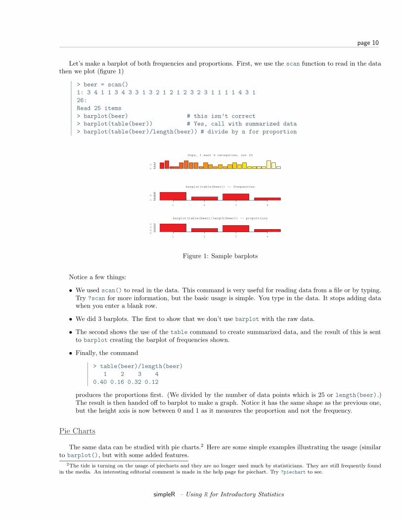
Let’s make a barplot of both frequencies and proportions. First, we use the scan function to read in the datathen we plot (figure 1)
> beer = scan()1: 3 4 1 1 3 4 3 3 1 3 2 1 2 1 2 3 2 3 1 1 1 1 4 3 126:Read 25 items> barplot(beer) # this isn’t correct> barplot(table(beer)) # Yes, call with summarized data> barplot(table(beer)/length(beer)) # divide by n for proportion
02
Oops, I want 4 categories, not 25
1 2 3 4
06
barplot(table(beer)) −− frequencies
1 2 3 4
0.0
0.3
barplot(table(beer)/length(beer)) −− proportions
Figure 1: Sample barplots
Notice a few things:
• We used scan() to read in the data. This command is very useful for reading data from a file or by typing.Try ?scan for more information, but the basic usage is simple. You type in the data. It stops adding datawhen you enter a blank row.
• We did 3 barplots. The first to show that we don’t use barplot with the raw data.
• The second shows the use of the table command to create summarized data, and the result of this is sentto barplot creating the barplot of frequencies shown.
• Finally, the command
> table(beer)/length(beer)1 2 3 4
0.40 0.16 0.32 0.12
produces the proportions first. (We divided by the number of data points which is 25 or length(beer).)The result is then handed off to barplot to make a graph. Notice it has the same shape as the previous one,but the height axis is now between 0 and 1 as it measures the proportion and not the frequency.
Pie Charts
The same data can be studied with pie charts.2 Here are some simple examples illustrating the usage (similarto barplot(), but with some added features.
2The tide is turning on the usage of piecharts and they are no longer used much by statisticians. They are still frequently foundin the media. An interesting editorial comment is made in the help page for piechart. Try ?piechart to see.
simpleR – Using R for Introductory Statistics
page 11
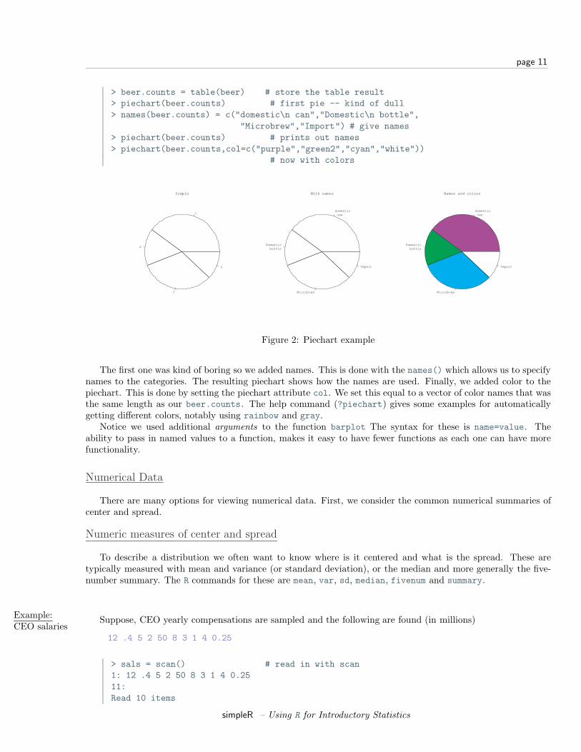
> beer.counts = table(beer) # store the table result> piechart(beer.counts) # first pie -- kind of dull> names(beer.counts) = c("domestic\n can","Domestic\n bottle",
"Microbrew","Import") # give names> piechart(beer.counts) # prints out names> piechart(beer.counts,col=c("purple","green2","cyan","white"))
# now with colors
1
2
3
4
Simple
domestic can
Domestic bottle
Microbrew
Import
With names
domestic can
Domestic bottle
Microbrew
Import
Names and colors
Figure 2: Piechart example
The first one was kind of boring so we added names. This is done with the names() which allows us to specifynames to the categories. The resulting piechart shows how the names are used. Finally, we added color to thepiechart. This is done by setting the piechart attribute col. We set this equal to a vector of color names that wasthe same length as our beer.counts. The help command (?piechart) gives some examples for automaticallygetting different colors, notably using rainbow and gray.
Notice we used additional arguments to the function barplot The syntax for these is name=value. Theability to pass in named values to a function, makes it easy to have fewer functions as each one can have morefunctionality.
Numerical Data
There are many options for viewing numerical data. First, we consider the common numerical summaries ofcenter and spread.
Numeric measures of center and spread
To describe a distribution we often want to know where is it centered and what is the spread. These aretypically measured with mean and variance (or standard deviation), or the median and more generally the five-number summary. The R commands for these are mean, var, sd, median, fivenum and summary.
Example:CEO salaries
Suppose, CEO yearly compensations are sampled and the following are found (in millions)
12 .4 5 2 50 8 3 1 4 0.25
> sals = scan() # read in with scan1: 12 .4 5 2 50 8 3 1 4 0.2511:Read 10 items
simpleR – Using R for Introductory Statistics
page 12
> mean(sals) # the average[1] 8.565> var(sals) # the variance[1] 225.5145> sd(sals) # the standard deviation[1] 15.01714> median(sals) # the median[1] 3.5> fivenum(sals) # min, lower hinge, Median, upper hinge, max[1] 0.25 1.00 3.50 8.00 50.00> summary(sals)
Min. 1st Qu. Median Mean 3rd Qu. Max.0.250 1.250 3.500 8.565 7.250 50.000
Notice the summary command. For a numeric variable it prints out the five number summary and the median.For other variables, it adapts itself in an intelligent manner.
The differencebetweenfivenum andthe quantiles.
You may have noticed the slight difference between the fivenum and the summary command. In particular,one gives 1.00 for the lower hinge and the other 1.250 for the first quantile. What is the difference? The story isbelow.
The median is the point in the data that splits it into half. That is, half the data is above the data and halfis below. For example, if our data in sorted order is
10, 17, 18, 25, 28
then the midway number is clearly 18 as 2 values are less and 2 are more. Whereas, if the data had an additionalpoint:
10, 17, 18, 25, 28, 28
Then the midway point is somewhere between 18 and 25 as 3 are larger and 3 are smaller. For concreteness, weaverage the two values giving 21.5 for the median. Notice, the point where the data is split in half depends onthe number of data points. If there are an odd number, then this point is the (n + 1)/2 largest data point. Ifthere is an even number of data points, then again we use the (n + 1)/2 data point, but since this is a fractionalnumber, we average the actual data to the left and the right.
The idea of a quantile generalizes this median. The p quantile, (also known as the 100p%-percentile) is thepoint in the data where 100p% is less, and 100(1-p)% is larger. If there are n data points, then the p quantileoccurs at the position 1+(n−1)p with weighted averaging if this is between integers. For example the .25 quantileof the numbers 10,17,18,25,28,28 occurs at the position 1+(6-1)(1/4) = 2.25. That is 1/4 of the way between thesecond and third number which in this example is 17.25.
The .25 and .75 quantiles are denoted the quartiles. The first quartile is called Q1, and the third quartile iscalled Q3. (You’d think the second quartile would be called Q2, but use “the median” instead.) These values arein the R function summary(). More generally, there is a quantile() function which will compute any quantilebetween 0 and 1. To find the quantiles mentioned above we can do
> data=c(10, 17, 18, 25, 28, 28)> summary(data)
Min. 1st Qu. Median Mean 3rd Qu. Max.10.00 17.25 21.50 21.00 27.25 28.00
> quantile(data,.25)25%
17.25> quantile(data,c(.25,.75)) # two values of p at once25% 75%
17.25 27.25
simpleR – Using R for Introductory Statistics
page 13
There is a historically popular set of alternatives to the quartiles, called the hinges that are somewhat easierto compute by hand. The median is defined as above. The lower hinge is then the median of all the data to theleft of the median, not counting this particular data point (if it is one.) The upper hinge is similarly defined. Forexample, if your data is again 10, 17, 18, 25, 28, 28, then the median is 21.5, and the lower hinge is the medianof 10, 17, 18 (which is 17) and the upper hinge is the median of 25,28,28 which is 28. These are available in thefunction fivenum(), and later appear in the boxplot function.
Here is an illustration with the sals data, which has n = 10. From above we should have the median at(10+1)/2=5.5, the lower hinge at the 3rd value and the upper hinge at the 8th largest value. Whereas, the valueof Q1 should be at the 1 + (10− 1)(1/4) = 3.25 value. We can check that this is the case by sorting the data
> sort(sals)[1] 0.25 0.40 1.00 2.00 3.00 4.00 5.00 8.00 12.00 50.00> fivenum(sals) # note 1 is the 3rd value, 8 the 8th.[1] 0.25 1.00 3.50 8.00 50.00> summary(sals) # note 3.25 value is 1/4 way between 1 and 2
Min. 1st Qu. Median Mean 3rd Qu. Max.0.250 1.250 3.500 8.565 7.250 50.000
Resistant measures of center and spread
The most used measures of center and spread are the mean and standard deviation due to their relationshipwith the normal distribution, but they suffer when the data has long tails, or many outliers. Various measures ofcenter and spread have been developed to handle this. The median is just such a resistant measure. It is obliviousto a few arbitrarily large values. That is, is you make a measurement mistake and get 1,000,000 for the largestvalue instead of 10 the median will be indifferent.
Other resistant measures are available. A common one for the center is the trimmed mean. This is useful ifthe data has many outliers (like the CEO compensation, although better if the data is symmetric). We trim off acertain percentage of the data from the top and the bottom and then take the average. To do this in R we needto tell the mean() how much to trim.
> mean(sals,trim=1/10) # trim 1/10 off top and bottom[1] 4.425> mean(sals,trim=2/10)[1] 3.833333
Notice as we trim more and more, the value of the mean gets closer to the median. Again notice how we useda named argument to the mean function.
The variance and standard deviation are also sensitive to outliers. Resistant measures of spread include theIQR and the mad.
The IQR or interquartile range is the the difference of the 3rd quartile and the 1st quartile. The function IQRcalculates it for us
> IQR(sals)[1] 6
The median average deviation (MAD) is also a useful, resistant measure of spread. It finds the median of theabsolute differences from the median and then multiplies by a constant. (Huh?) Here is a formula
median|Xi −median(X)|(1.4826)
That is, find the median, then find all the differences from the median. Take the absolute value and then find themedian of this new set of data. Finally, multiply by the constant. It is easier to do with R than to describe.
> mad(sals)[1] 4.15128
And to see that we could do this ourself, we would do
simpleR – Using R for Introductory Statistics
page 14
> median(abs(sals - median(sals))) # without normalizing constant[1] 2.8> median(abs(sals - median(sals))) * 1.4826[1] 4.15128
(The choice of 1.4826 makes the value comparable with the standard deviation for the normal distribution.)
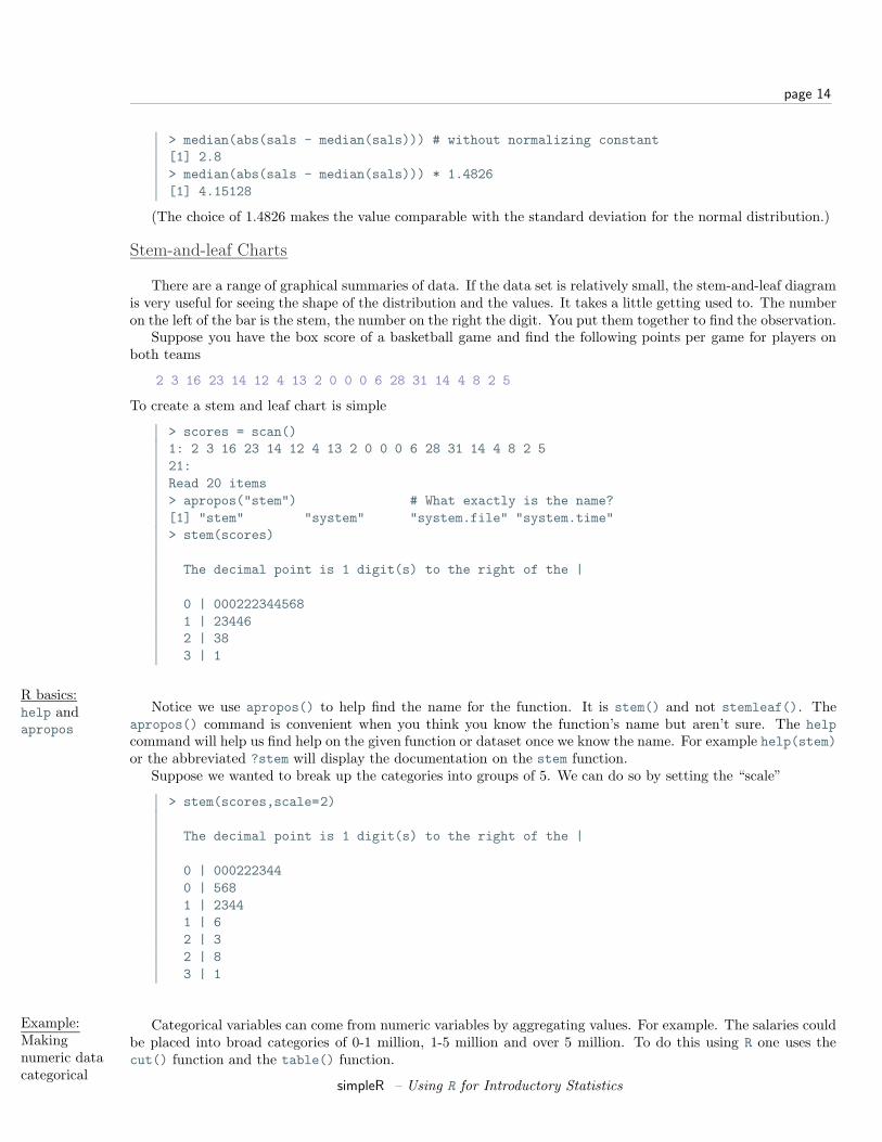
Stem-and-leaf Charts
There are a range of graphical summaries of data. If the data set is relatively small, the stem-and-leaf diagramis very useful for seeing the shape of the distribution and the values. It takes a little getting used to. The numberon the left of the bar is the stem, the number on the right the digit. You put them together to find the observation.
Suppose you have the box score of a basketball game and find the following points per game for players onboth teams
2 3 16 23 14 12 4 13 2 0 0 0 6 28 31 14 4 8 2 5
To create a stem and leaf chart is simple
> scores = scan()1: 2 3 16 23 14 12 4 13 2 0 0 0 6 28 31 14 4 8 2 521:Read 20 items> apropos("stem") # What exactly is the name?[1] "stem" "system" "system.file" "system.time"> stem(scores)
The decimal point is 1 digit(s) to the right of the |
0 | 0002223445681 | 234462 | 383 | 1
R basics:help andapropos
Notice we use apropos() to help find the name for the function. It is stem() and not stemleaf(). Theapropos() command is convenient when you think you know the function’s name but aren’t sure. The helpcommand will help us find help on the given function or dataset once we know the name. For example help(stem)or the abbreviated ?stem will display the documentation on the stem function.
Suppose we wanted to break up the categories into groups of 5. We can do so by setting the “scale”
> stem(scores,scale=2)
The decimal point is 1 digit(s) to the right of the |
0 | 0002223440 | 5681 | 23441 | 62 | 32 | 83 | 1
Example:Makingnumeric datacategorical
Categorical variables can come from numeric variables by aggregating values. For example. The salaries couldbe placed into broad categories of 0-1 million, 1-5 million and over 5 million. To do this using R one uses thecut() function and the table() function.
simpleR – Using R for Introductory Statistics
page 15
Suppose the salaries are again
12 .4 5 2 50 8 3 1 4 .25
And we want to break that data into the intervals
[0, 1], (1, 5], (5, 50]
To use the cut command, we need to specify the cut points. In this case 0,1,5 and 50 (=max(sals)). Here is thesyntax
> sals = c(12, .4, 5, 2, 50, 8, 3, 1, 4, .25) # enter data> cats = cut(sals,breaks=c(0,1,5,max(sals))) # specify the breaks> cats # view the values[1] (5,50] (0,1] (1,5] (1,5] (5,50] (5,50] (1,5] (0,1] (1,5] (0,1]Levels: (0,1] (1,5] (5,50]> table(cats) # organizecats(0,1] (1,5] (5,50]
3 4 3> levels(cats) = c("poor","rich","rolling in it") # change labels> table(cats)cats
poor rich rolling in it3 4 3
Notice, cut() answers the question “which interval is the number in?”. The output is the interval (as a factor).This is why the table command is used to summarize the result of cut. Additionally, the names of the levelswhere changed as an illustration of how to manipulate these.
Histograms
If there is too much data, or your audience doesn’t know how to read the stem-and-leaf, you might try othersummaries. The most common is similar to the bar plot and is a histogram. The histogram defines a sequencesof breaks and then counts the number of observation in each bin. (This is identical to the features of the cut()function.) It plots these with a bar similar to the bar chart, but the bars are touching. The height can be thefrequencies, or the proportions. In the latter case the areas sum to 1 – a property that will be useful when westudy probability distributions. In either case the area is proportional to probability.
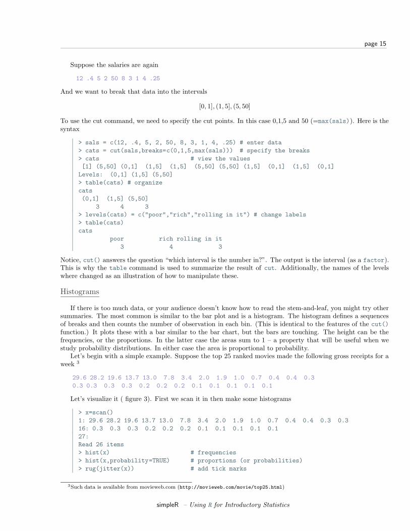
Let’s begin with a simple example. Suppose the top 25 ranked movies made the following gross receipts for aweek 3
29.6 28.2 19.6 13.7 13.0 7.8 3.4 2.0 1.9 1.0 0.7 0.4 0.4 0.30.3 0.3 0.3 0.3 0.2 0.2 0.2 0.1 0.1 0.1 0.1 0.1
Let’s visualize it ( figure 3). First we scan it in then make some histograms
> x=scan()1: 29.6 28.2 19.6 13.7 13.0 7.8 3.4 2.0 1.9 1.0 0.7 0.4 0.4 0.3 0.316: 0.3 0.3 0.3 0.2 0.2 0.2 0.1 0.1 0.1 0.1 0.127:Read 26 items> hist(x) # frequencies> hist(x,probability=TRUE) # proportions (or probabilities)> rug(jitter(x)) # add tick marks
3Such data is available from movieweb.com (http://movieweb.com/movie/top25.html)
simpleR – Using R for Introductory Statistics
page 16
Histogram of x
0 10 25
05
10
15
20
Histogram of x
0 10 25
0.0
00
.05
0.1
00
.15
Figure 3: Histograms using frequencies and proportions
Two graphs are shown. The first is the default graph which makes a histogram of frequencies (total counts).The second does a histogram of proportions which makes the total area add to 1. This is preferred as it relatesbetter to the concept of a probability density.
A nice addition to the histogram is to plot the points using the rug command. It was used above in the secondgraph to give the tick marks on the x-axis. If your data is discrete and has ties, then the rugs(jitter(x))command will give a little jitter to the x values to eliminate ties.
Notice these commands opened up a graph window. The graph window in R has few options available usingthe mouse, but many using command line options. The GGobi (http://www.ggobi.org/) package has more butrequires an extra software installation.
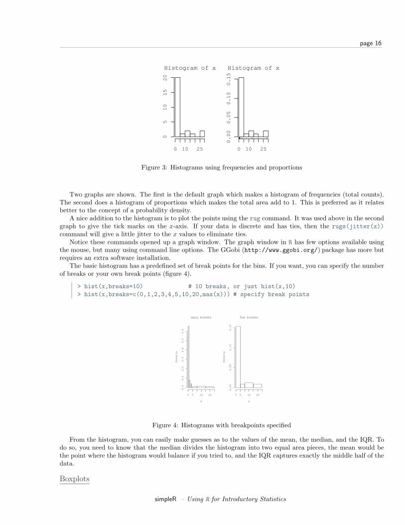
The basic histogram has a predefined set of break points for the bins. If you want, you can specify the numberof breaks or your own break points (figure 4).
> hist(x,breaks=10) # 10 breaks, or just hist(x,10)> hist(x,breaks=c(0,1,2,3,4,5,10,20,max(x))) # specify break points
many breaks
x
De
nsi
ty
0 5 15 25
0.0
0.1
0.2
0.3
0.4
0.5
0.6
few breaks
x
De
nsi
ty
0 5 15 25
0.0
00
.05
0.1
00
.15
Figure 4: Histograms with breakpoints specified
From the histogram, you can easily make guesses as to the values of the mean, the median, and the IQR. Todo so, you need to know that the median divides the histogram into two equal area pieces, the mean would bethe point where the histogram would balance if you tried to, and the IQR captures exactly the middle half of thedata.
Boxplots
simpleR – Using R for Introductory Statistics
page 17
0.0 0.2 0.4 0.6 0.8 1.0
MedianQ1 Q3Min Q3 + 1.5*IQR Max
* Notice a skewed distirubtion* notice presence of outliers
A typical boxplot
outliers
Figure 5: A typical boxplot
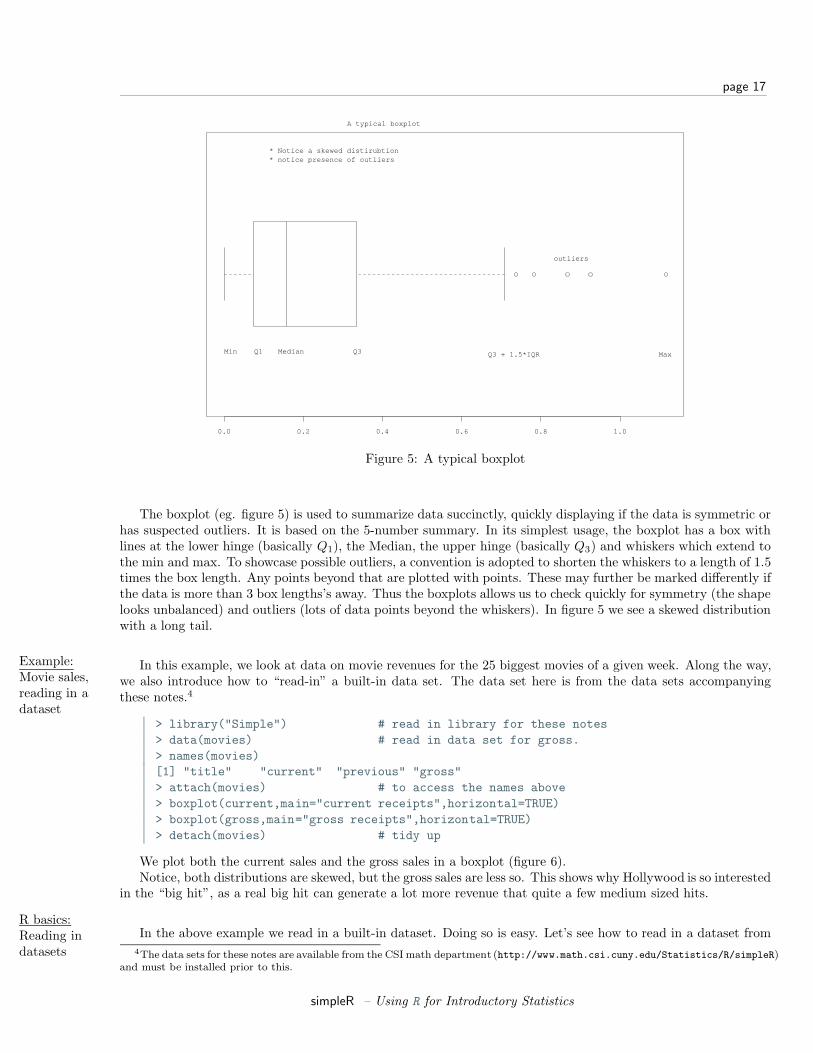
The boxplot (eg. figure 5) is used to summarize data succinctly, quickly displaying if the data is symmetric orhas suspected outliers. It is based on the 5-number summary. In its simplest usage, the boxplot has a box withlines at the lower hinge (basically Q1), the Median, the upper hinge (basically Q3) and whiskers which extend tothe min and max. To showcase possible outliers, a convention is adopted to shorten the whiskers to a length of 1.5times the box length. Any points beyond that are plotted with points. These may further be marked differently ifthe data is more than 3 box lengths’s away. Thus the boxplots allows us to check quickly for symmetry (the shapelooks unbalanced) and outliers (lots of data points beyond the whiskers). In figure 5 we see a skewed distributionwith a long tail.
Example:Movie sales,reading in adataset
In this example, we look at data on movie revenues for the 25 biggest movies of a given week. Along the way,we also introduce how to “read-in” a built-in data set. The data set here is from the data sets accompanyingthese notes.4
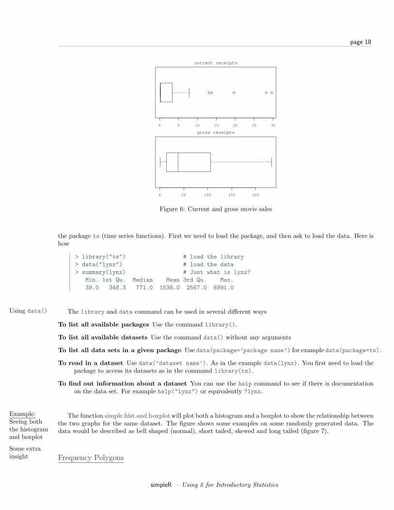
> library("Simple") # read in library for these notes> data(movies) # read in data set for gross.> names(movies)[1] "title" "current" "previous" "gross"> attach(movies) # to access the names above> boxplot(current,main="current receipts",horizontal=TRUE)> boxplot(gross,main="gross receipts",horizontal=TRUE)> detach(movies) # tidy up
We plot both the current sales and the gross sales in a boxplot (figure 6).Notice, both distributions are skewed, but the gross sales are less so. This shows why Hollywood is so interested
in the “big hit”, as a real big hit can generate a lot more revenue that quite a few medium sized hits.
R basics:Reading indatasets
In the above example we read in a built-in dataset. Doing so is easy. Let’s see how to read in a dataset from4The data sets for these notes are available from the CSI math department (http://www.math.csi.cuny.edu/Statistics/R/simpleR)
and must be installed prior to this.
simpleR – Using R for Introductory Statistics
page 18
0 5 10 15 20 25 30
current receipts
0 50 100 150 200
gross receipts
Figure 6: Current and gross movie sales
the package ts (time series functions). First we need to load the package, and then ask to load the data. Here ishow
> library("ts") # load the library> data("lynx") # load the data> summary(lynx) # Just what is lynx?
Min. 1st Qu. Median Mean 3rd Qu. Max.39.0 348.3 771.0 1538.0 2567.0 6991.0
Using data() The library and data command can be used in several different ways
To list all available packages Use the command library().
To list all available datasets Use the command data() without any arguments
To list all data sets in a given package Use data(package=’package name’) for example data(package=ts).
To read in a dataset Use data(’dataset name’). As in the example data(lynx). You first need to load thepackage to access its datasets as in the command library(ts).
To find out information about a dataset You can use the help command to see if there is documentationon the data set. For example help("lynx") or equivalently ?lynx.
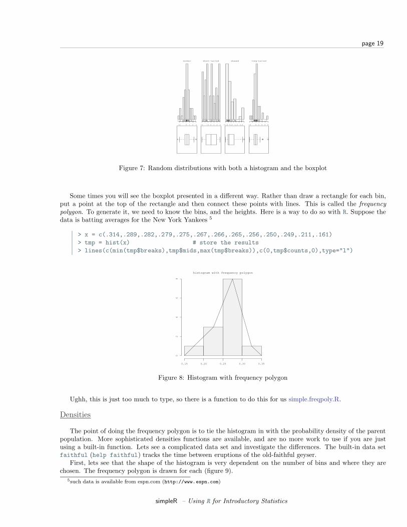
Example:Seeing boththe histogramand boxplot
The function simple.hist.and.boxplot will plot both a histogram and a boxplot to show the relationship betweenthe two graphs for the same dataset. The figure shows some examples on some randomly generated data. Thedata would be described as bell shaped (normal), short tailed, skewed and long tailed (figure 7).
Some extrainsight Frequency Polygons
simpleR – Using R for Introductory Statistics
page 19
normal
−2 0 1 2 3
short−tailed
−3 −1 0 1 2 3
skewed
−1.0 0.0 1.0 2.0
long−tailed
−4 0 2 4 6 8
Figure 7: Random distributions with both a histogram and the boxplot
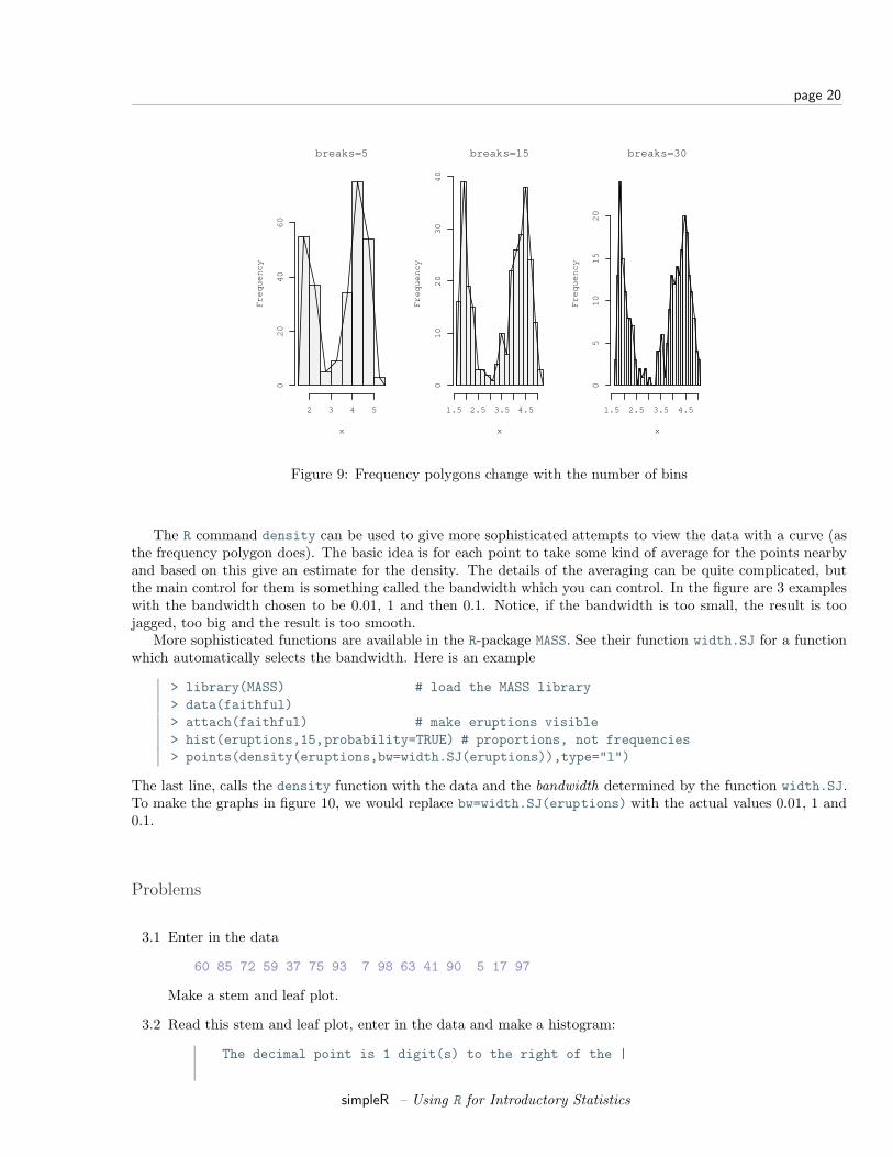
Some times you will see the boxplot presented in a different way. Rather than draw a rectangle for each bin,put a point at the top of the rectangle and then connect these points with lines. This is called the frequencypolygon. To generate it, we need to know the bins, and the heights. Here is a way to do so with R. Suppose thedata is batting averages for the New York Yankees 5
> x = c(.314,.289,.282,.279,.275,.267,.266,.265,.256,.250,.249,.211,.161)> tmp = hist(x) # store the results> lines(c(min(tmp$breaks),tmp$mids,max(tmp$breaks)),c(0,tmp$counts,0),type="l")
histogram with frequency polygon
0.15 0.20 0.25 0.30 0.35
02
46
8
Figure 8: Histogram with frequency polygon
Ughh, this is just too much to type, so there is a function to do this for us simple.freqpoly.R.
Densities
The point of doing the frequency polygon is to tie the histogram in with the probability density of the parentpopulation. More sophisticated densities functions are available, and are no more work to use if you are justusing a built-in function. Lets see a complicated data set and investigate the differences. The built-in data setfaithful (help faithful) tracks the time between eruptions of the old-faithful geyser.
First, lets see that the shape of the histogram is very dependent on the number of bins and where they arechosen. The frequency polygon is drawn for each (figure 9).
5such data is available from espn.com (http://www.espn.com)
simpleR – Using R for Introductory Statistics
page 20
breaks=5
x
Fre
qu
en
cy
2 3 4 5
02
04
06
0
breaks=15
x
Fre
qu
en
cy1.5 2.5 3.5 4.5
01
02
03
04
0
breaks=30
x
Fre
qu
en
cy
1.5 2.5 3.5 4.5
05
10
15
20
Figure 9: Frequency polygons change with the number of bins
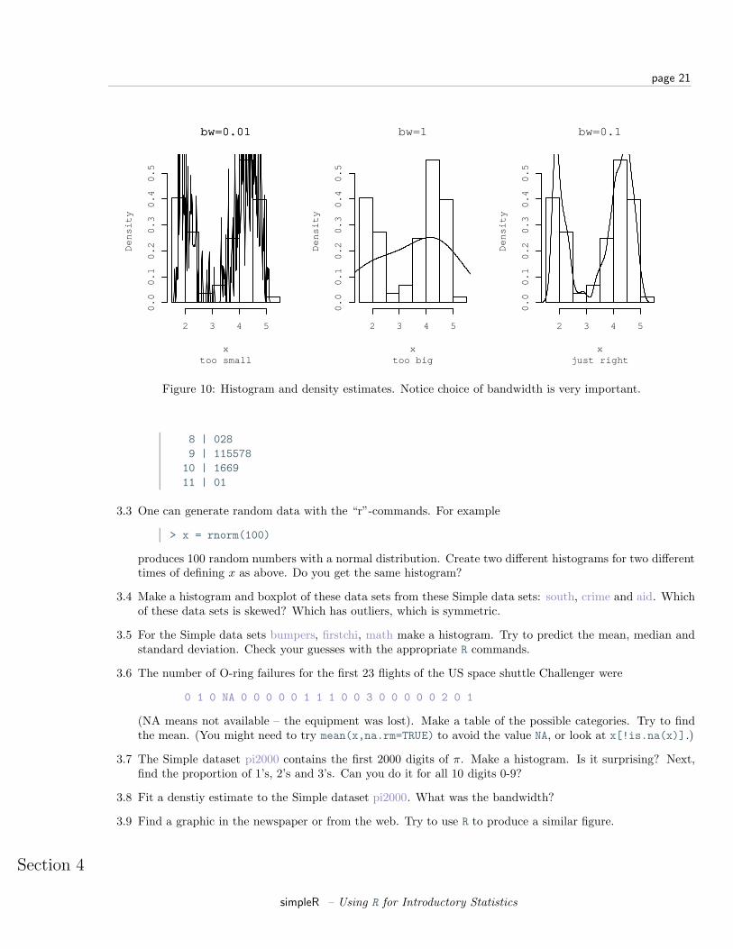
The R command density can be used to give more sophisticated attempts to view the data with a curve (asthe frequency polygon does). The basic idea is for each point to take some kind of average for the points nearbyand based on this give an estimate for the density. The details of the averaging can be quite complicated, butthe main control for them is something called the bandwidth which you can control. In the figure are 3 exampleswith the bandwidth chosen to be 0.01, 1 and then 0.1. Notice, if the bandwidth is too small, the result is toojagged, too big and the result is too smooth.
More sophisticated functions are available in the R-package MASS. See their function width.SJ for a functionwhich automatically selects the bandwidth. Here is an example
> library(MASS) # load the MASS library> data(faithful)> attach(faithful) # make eruptions visible> hist(eruptions,15,probability=TRUE) # proportions, not frequencies> points(density(eruptions,bw=width.SJ(eruptions)),type="l")
The last line, calls the density function with the data and the bandwidth determined by the function width.SJ.To make the graphs in figure 10, we would replace bw=width.SJ(eruptions) with the actual values 0.01, 1 and0.1.
Problems
3.1 Enter in the data
60 85 72 59 37 75 93 7 98 63 41 90 5 17 97
Make a stem and leaf plot.
3.2 Read this stem and leaf plot, enter in the data and make a histogram:
The decimal point is 1 digit(s) to the right of the |
simpleR – Using R for Introductory Statistics
page 21
x
De
nsi
ty
2 3 4 5
0.0
0.1
0.2
0.3
0.4
0.5
bw=0.01bw=0.01
too smallx
De
nsi
ty2 3 4 5
0.0
0.1
0.2
0.3
0.4
0.5
bw=1
too bigx
De
nsi
ty
2 3 4 5
0.0
0.1
0.2
0.3
0.4
0.5
bw=0.1
just right
Figure 10: Histogram and density estimates. Notice choice of bandwidth is very important.
8 | 0289 | 115578
10 | 166911 | 01
3.3 One can generate random data with the “r”-commands. For example
> x = rnorm(100)
produces 100 random numbers with a normal distribution. Create two different histograms for two differenttimes of defining x as above. Do you get the same histogram?
3.4 Make a histogram and boxplot of these data sets from these Simple data sets: south, crime and aid. Whichof these data sets is skewed? Which has outliers, which is symmetric.
3.5 For the Simple data sets bumpers, firstchi, math make a histogram. Try to predict the mean, median andstandard deviation. Check your guesses with the appropriate R commands.
3.6 The number of O-ring failures for the first 23 flights of the US space shuttle Challenger were
0 1 0 NA 0 0 0 0 0 1 1 1 0 0 3 0 0 0 0 0 2 0 1
(NA means not available – the equipment was lost). Make a table of the possible categories. Try to findthe mean. (You might need to try mean(x,na.rm=TRUE) to avoid the value NA, or look at x[!is.na(x)].)
3.7 The Simple dataset pi2000 contains the first 2000 digits of π. Make a histogram. Is it surprising? Next,find the proportion of 1’s, 2’s and 3’s. Can you do it for all 10 digits 0-9?
3.8 Fit a denstiy estimate to the Simple dataset pi2000. What was the bandwidth?
3.9 Find a graphic in the newspaper or from the web. Try to use R to produce a similar figure.
Section 4
simpleR – Using R for Introductory Statistics
page 22
Bivariate Data
The relationship between 2 variables is often of interest. For example, are height and weight related? Areage and heart rate related? Are income and taxes paid related? Is a new drug better than an old drug? Does abatter hit better as a switch hitter or not? Does the weather depend on the previous days weather? Exploringand summarizing such relationships is the current goal.
Handling Bivariate Categorical Data
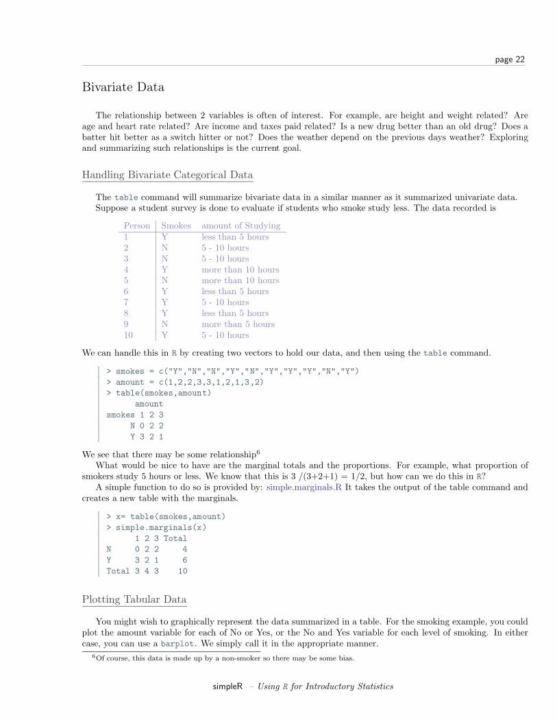
The table command will summarize bivariate data in a similar manner as it summarized univariate data.Suppose a student survey is done to evaluate if students who smoke study less. The data recorded is
Person Smokes amount of Studying1 Y less than 5 hours2 N 5 - 10 hours3 N 5 - 10 hours4 Y more than 10 hours5 N more than 10 hours6 Y less than 5 hours7 Y 5 - 10 hours8 Y less than 5 hours9 N more than 5 hours10 Y 5 - 10 hours
We can handle this in R by creating two vectors to hold our data, and then using the table command.
> smokes = c("Y","N","N","Y","N","Y","Y","Y","N","Y")> amount = c(1,2,2,3,3,1,2,1,3,2)> table(smokes,amount)
amountsmokes 1 2 3
N 0 2 2Y 3 2 1
We see that there may be some relationship6
What would be nice to have are the marginal totals and the proportions. For example, what proportion ofsmokers study 5 hours or less. We know that this is 3 /(3+2+1) = 1/2, but how can we do this in R?
A simple function to do so is provided by: simple.marginals.R It takes the output of the table command andcreates a new table with the marginals.
> x= table(smokes,amount)> simple.marginals(x)
1 2 3 TotalN 0 2 2 4Y 3 2 1 6Total 3 4 3 10
Plotting Tabular Data
You might wish to graphically represent the data summarized in a table. For the smoking example, you couldplot the amount variable for each of No or Yes, or the No and Yes variable for each level of smoking. In eithercase, you can use a barplot. We simply call it in the appropriate manner.
6Of course, this data is made up by a non-smoker so there may be some bias.
simpleR – Using R for Introductory Statistics
page 23
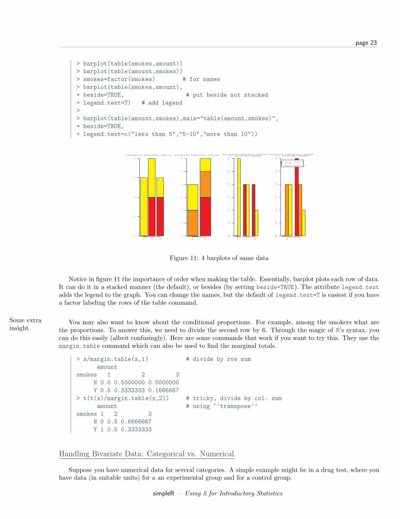
> barplot(table(smokes,amount))> barplot(table(amount,smokes))> smokes=factor(smokes) # for names> barplot(table(smokes,amount),+ beside=TRUE, # put beside not stacked+ legend.text=T) # add legend>> barplot(table(amount,smokes),main="table(amount,smokes)",+ beside=TRUE,+ legend.text=c("less than 5","5-10","more than 10"))
1 2 3
01
23
4
barplot(smokes,amount)
N Y
01
23
45
6
barplot(amount,smokes)
1 2 3
0.00.5
1.01.5
2.02.5
3.0
barplot(smokes,amount+ beside=TRUE)
N Y
less than 55−10more than 10
0.00.5
1.01.5
2.02.5
3.0
barplot(amount,smokes,+ beside=TRUE)
Figure 11: 4 barplots of same data
Notice in figure 11 the importance of order when making the table. Essentially, barplot plots each row of data.It can do it in a stacked manner (the default), or besides (by setting beside=TRUE). The attribute legend.textadds the legend to the graph. You can change the names, but the default of legend.text=T is easiest if you havea factor labeling the rows of the table command.
Some extrainsight
You may also want to know about the conditional proportions. For example, among the smokers what arethe proportions. To answer this, we need to divide the second row by 6. Through the magic of R’s syntax, youcan do this easily (albeit confusingly). Here are some commands that work if you want to try this. They use themargin.table command which can also be used to find the marginal totals.
> x/margin.table(x,1) # divide by row sumamount
smokes 1 2 3N 0.0 0.5000000 0.5000000Y 0.5 0.3333333 0.1666667
> t(t(x)/margin.table(x,2)) # tricky, divide by col. sumamount # using ‘‘transpose’’
smokes 1 2 3N 0 0.5 0.6666667Y 1 0.5 0.3333333
Handling Bivariate Data: Categorical vs. Numerical
Suppose you have numerical data for several categories. A simple example might be in a drug test, where youhave data (in suitable units) for a an experimental group and for a control group.
simpleR – Using R for Introductory Statistics

page 24
experimental: 5 5 5 13 7 11 11 9 8 9control: 11 8 4 5 9 5 10 5 4 10
You can summarize the data separately and compare, but how can you view the data together? A side byside boxplot is a good place to start. To generate one is simple:
> x = c(5, 5, 5, 13, 7, 11, 11, 9, 8, 9)> y = c(11, 8, 4, 5, 9, 5, 10, 5, 4, 10)> boxplot(x,y)
1 2
46
81
01
2
side by side boxplot
Figure 12: Side-by-side boxplots
From this comparison (figure 12), we see that the y variable (the control group, labeled 2 on the graph) seemsto be less than that of the x variable (the experimental group).
Of course, you may also receive this data interms of the numbers and a variable indicating the category asfollows
amount: 5 5 5 13 7 11 11 9 8 9 11 8 4 5 9 5 10 5 4 10category: 1 1 1 1 1 1 1 1 1 1 2 2 2 2 2 2 2 2 2 2
To make a side by side boxplot is still easy, but only if you use the model syntax as follows
> amount = scan()1: 5 5 5 13 7 11 11 9 8 9 11 8 4 5 9 5 10 5 4 1021:Read 20 items>category = scan()1: 1 1 1 1 1 1 1 1 1 1 2 2 2 2 2 2 2 2 2 221:Read 20 items> boxplot(amount ~ category) # note the tilde ~
Read the part amount ∼category as breaking up the values in amount, by the categories in category anddisplaying each one. Verbally, you might read this as “amount by category”.
R basics:Data Frames Often in statistics, data is presented in a tabular format similar to a spreadsheet. The columns are for different
variables, and each row is a measurement for the same thing. For example, the dataset home which accompaniesthese notes contains two columns, the 1970 assessed value of a home and the year 2000 assessed value for thesame home. Data frames are a very useful way to store variable together, and R has many shortcuts for data
simpleR – Using R for Introductory Statistics
page 25
stored this way. For example, the boxplot example above simplifies, their is an easy way to access the variablesby name, one can extract data easily etc. Many examples will be presented at the end of this section.
Bivariate Data: Numerical vs. NumericalComparing two distributions with plots
If we wish to compare two distributions, we can do so with side-by-side boxplots, However, we may wish tocompare histograms or some other graphs to see more of the data. Here are several different ways to do so.
Side by side boxplots with rugs By using the rugs command we can see all the data. It works best withsmallish data sets (otherwise use the jitter command to break ties).
> library("Simple");data(home) # read in dataset home> hd=as.data.frame(scale(home)) # centers, makes a data frame> attach(hd)> boxplot(hd) # make boxplot> rug(old,side=2) # add to left side (side=2)> rug(new,side=4) # add to right side (side=4)> detach(hd)
This example, introduced the scale function. This puts the two data sets on the same scale so they cansensibly be compared. To keep a data frame, we needed to coerce it back into one using as.data.frame.Notice, then we can do a boxplot by just using the name of a data frame.
If you make this boxplot, you will see that the two distributions look quite a bit different. The full datasethomedata will show this even more.
Using stripcharts or dotplots The stripchart (a dotplot) will plot all the data in a way that makes it relativelyeasy to compare the distributions. For the data frame hd this is done with
> stripchart(hd)
Side by Side histograms Side-by-side histograms are also possible, although they are not built into R. Thesegraphs are also called christmas tree plots or pyramid plots. The function simple.xmastreeplot will plotone for you as the following illustrates
> simple.xmastreeplot(hd) # Simple is assumed to be loaded
Using scatterplots to compare relationships
Often we wish to investigate one numerical variable against another. For example the height of your fathercompared to your height. The plot command will gladly display two variables in a scatterplot.
Example:Home data
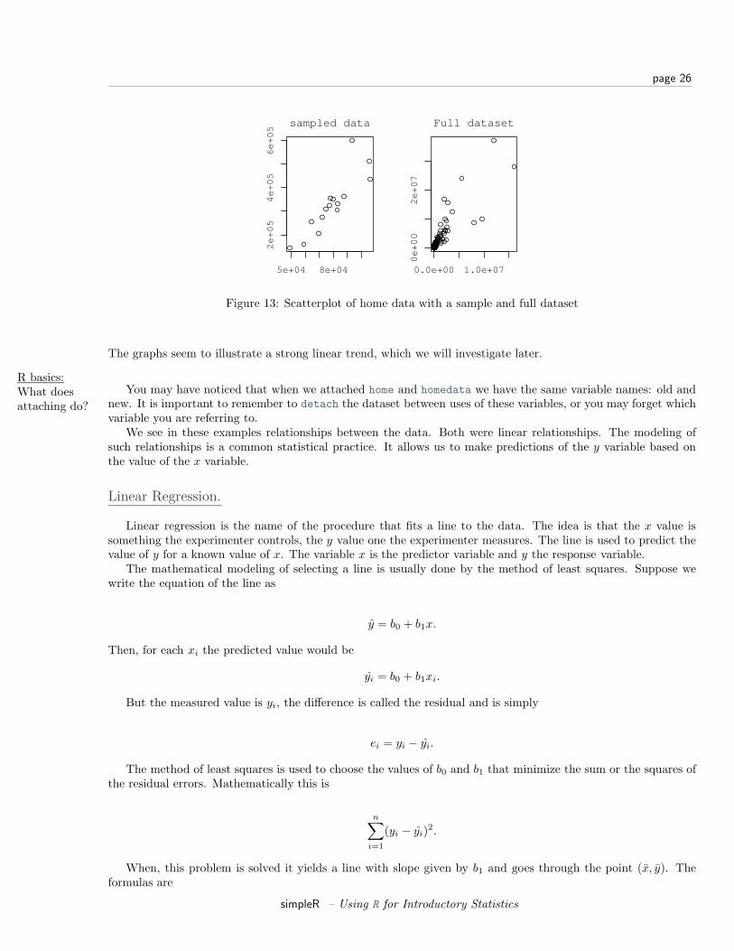
The home data example of the previous section shows old assessed value (1970) versus new assessed value(2000). There should be some relationship. Let’s investigate with a scatterplot (figure 13).
> data(home);attach(home)> plot(old,new)> detach(home)
The second graph is drawn from the entire data set. This should be available as a data set through thecommand data(). Here we plot it using attach:
> data(homedata)> attach(homedata)> plot(old,new)> detach(homedata)
simpleR – Using R for Introductory Statistics
page 26
5e+04 8e+042
e+
05
4e
+0
56
e+
05
sampled data
0.0e+00 1.0e+07
0e
+0
02
e+
07
Full dataset
Figure 13: Scatterplot of home data with a sample and full dataset
The graphs seem to illustrate a strong linear trend, which we will investigate later.
R basics:What doesattaching do?
You may have noticed that when we attached home and homedata we have the same variable names: old andnew. It is important to remember to detach the dataset between uses of these variables, or you may forget whichvariable you are referring to.
We see in these examples relationships between the data. Both were linear relationships. The modeling ofsuch relationships is a common statistical practice. It allows us to make predictions of the y variable based onthe value of the x variable.
Linear Regression.
Linear regression is the name of the procedure that fits a line to the data. The idea is that the x value issomething the experimenter controls, the y value one the experimenter measures. The line is used to predict thevalue of y for a known value of x. The variable x is the predictor variable and y the response variable.
The mathematical modeling of selecting a line is usually done by the method of least squares. Suppose wewrite the equation of the line as
y = b0 + b1x.
Then, for each xi the predicted value would be
yi = b0 + b1xi.
But the measured value is yi, the difference is called the residual and is simply
ei = yi − yi.
The method of least squares is used to choose the values of b0 and b1 that minimize the sum or the squares ofthe residual errors. Mathematically this is
n∑i=1
(yi − yi)2.
When, this problem is solved it yields a line with slope given by b1 and goes through the point (x, y). Theformulas are
simpleR – Using R for Introductory Statistics
page 27
b1 =sxy
s2x
=∑
(xi − x)(yj − y)∑(xi − x)2
, b0 = y − b1x.
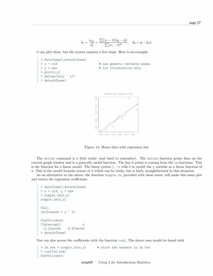
R can plot these, but the syntax requires a few steps. Here is an example.
> data(home);attach(home)> x = old # use generic variable names> y = new # for illustration only.> plot(x,y)> abline(lm(y ~ x))> detach(home)
5e+04 6e+04 7e+04 8e+04 9e+04 1e+05
2e
+0
53
e+
05
4e
+0
55
e+
05
6e
+0
5
x
yhomedata with regression line
Figure 14: Home data with regression line
The abline command is a little tricky (and hard to remember). The abline function prints lines on thecurrent graph window and is a generally useful function. The line it prints is coming from the lm functions. Thisis the function for a linear model. The funny syntax y ∼x tells R to model the y variable as a linear function ofx. This is the model formula syntax of R which can be tricky, but is fairly straightforward in this situation.
As an alternative to the above, the function simple.lm, provided with these notes, will make this same plotand return the regression coefficients
> data(home);attach(home)> x = old; y = new> simple.lm(x,y)simple.lm(x,y)
Call:lm(formula = y ~ x)
Coefficients:(Intercept) x-2.121e+05 6.879e+00> detach(home)
You can also access the coefficients with the function coef. The above ones would be found with
> lm.res = simple.lm(x,y) # store the answers in lm.res> coef(lm.res)Coefficients:
simpleR – Using R for Introductory Statistics
page 28
(Intercept) x-2.121e+05 6.879e+00> coef(lm.res)[1] # first one, use [2] for second(Intercept)-2.121e+05
Residual plots
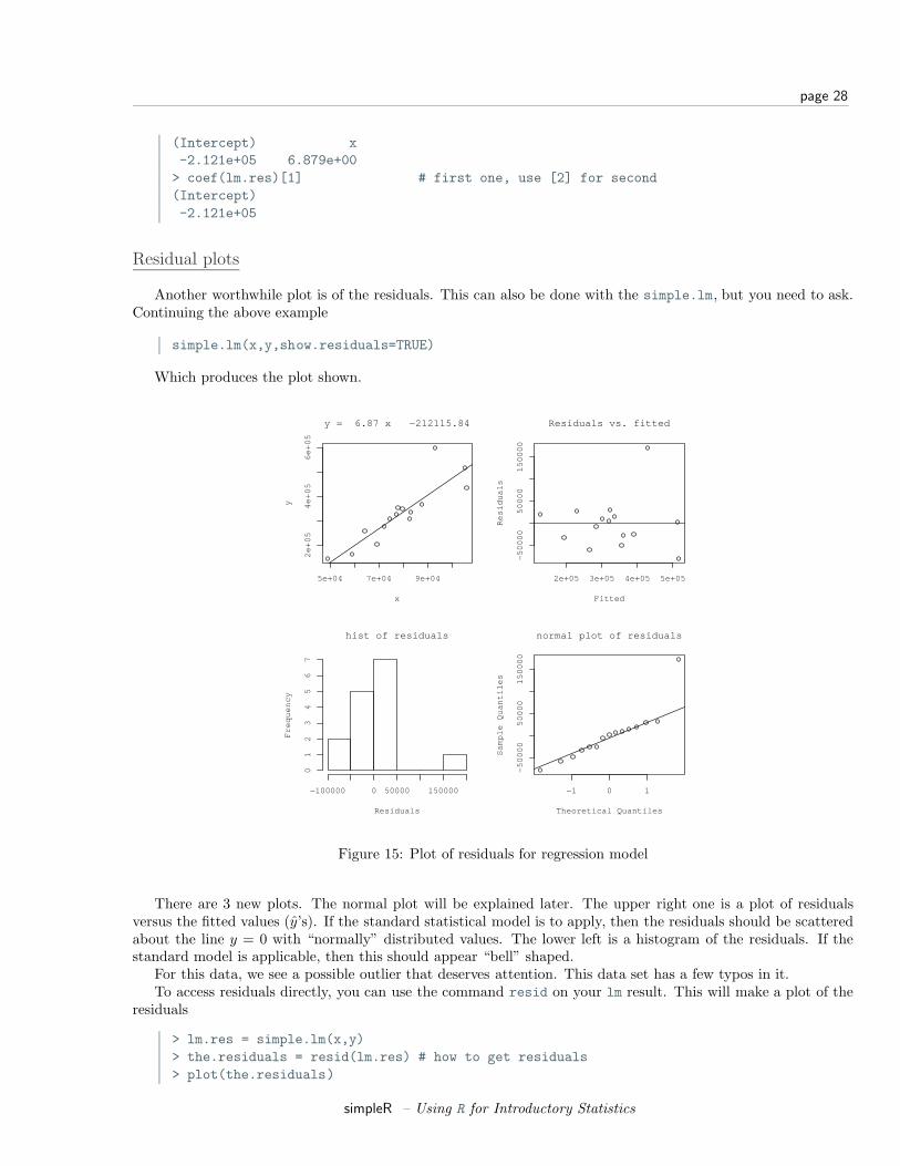
Another worthwhile plot is of the residuals. This can also be done with the simple.lm, but you need to ask.Continuing the above example
simple.lm(x,y,show.residuals=TRUE)
Which produces the plot shown.
5e+04 7e+04 9e+04
2e
+0
54
e+
05
6e
+0
5
x
y
y = 6.87 x −212115.84
2e+05 3e+05 4e+05 5e+05
−5
00
00
50
00
01
50
00
0
Fitted
Re
sid
ua
ls
Residuals vs. fitted
hist of residuals
Residuals
Fre
qu
en
cy
−100000 0 50000 150000
01
23
45
67
−1 0 1
−5
00
00
50
00
01
50
00
0
normal plot of residuals
Theoretical Quantiles
Sa
mp
le Q
ua
ntil
es
Figure 15: Plot of residuals for regression model
There are 3 new plots. The normal plot will be explained later. The upper right one is a plot of residualsversus the fitted values (y’s). If the standard statistical model is to apply, then the residuals should be scatteredabout the line y = 0 with “normally” distributed values. The lower left is a histogram of the residuals. If thestandard model is applicable, then this should appear “bell” shaped.
For this data, we see a possible outlier that deserves attention. This data set has a few typos in it.To access residuals directly, you can use the command resid on your lm result. This will make a plot of the
residuals
> lm.res = simple.lm(x,y)> the.residuals = resid(lm.res) # how to get residuals> plot(the.residuals)
simpleR – Using R for Introductory Statistics
page 29
Correlation Coefficients
A valuable numeric summary of the strength of the linear relationship is the Pearson correlation coefficientdefined by
R =∑
(Xi − X)(Yi − Y )√∑(Xi − X)2
∑(Yi − Y )2
Values or R2 close to 1 indicate a strong linear relationship, values close to 0 a weak one. (There still may be arelationship, just not a linear one.) The correlation coefficient is found with the cor function
> cor(x,y) # to find R[1] 0.881> cor(x,y)^2 # to find R^2[1] 0.776
This is also found by R when it does linear regression, but it doesn’t print it by default. We just need to askthough using summary(lm(y ∼x)).
The Spearman rank correlation is the same thing only applied to the ranks of the data. The rank of a dataset is simply another vector giving the relative rank in terms of size. An example might make it clearer
> rank(c(2,3,5,7,11)) # already in order[1] 1 2 3 4 5> rank(c(5,3,2,7,11)) # for example, 5 is 3rd largest[1] 3 2 1 4 5> rank(c(5,5,2,7,5)) # ties have ranks averaged (2+3+4)/3=3[1] 3 3 1 5 3
To find the Spearman rank correlation, we simply apply cor() to the ranked data
> cor(rank(x),rank(y))[1] 0.925
This number is close to 1 (or -1) if there is a strong increasing (decreasing) trend in the data. (The trend neednot be linear.)
As a reminder, you can make a function to do this calcluation for you. For example,
> cor.sp <- function(x,y) cor(rank(x),rank(y))
Then you can use this as
> cor.sp(x,y)[1] 0.925
Locating pointsR currently has a few methods to interact with a graph. Some important ones allow us to identify and locatepoints on the graph.
Example:PresidentialElections:Florida
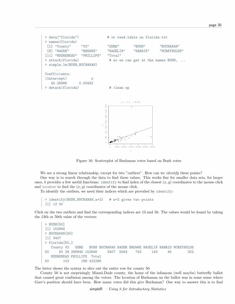
Consider this data set from the 2000 United States presidential election in the state of Florida. 7 It recordsthe number of votes each candidate received by the county. We wish to investigate the relationship between thenumber of votes for Bush against the number of votes for Buchanan.
7This data came from “Using R for Data Analysis and Graphics” by John Maindonald. Further discussions of this data, of a moresubstantial nature, may be found on several web sites.
simpleR – Using R for Introductory Statistics
page 30
> data("florida") # or read.table on florida.txt> names(florida)[1] "County" "V2" "GORE" "BUSH" "BUCHANAN"[6] "NADER" "BROWNE" "HAGELIN" "HARRIS" "MCREYNOLDS"[11] "MOOREHEAD" "PHILLIPS" "Total"> attach(florida) # so we can get at the names BUSH, ...> simple.lm(BUSH,BUCHANAN)
...Coefficients:(Intercept) x
45.28986 0.00492> detach(florida) # clean up
0 50000 100000 150000 200000 250000 300000
05
00
10
00
15
00
20
00
25
00
30
00
35
00
x
yy = 0 x + 45.28
Figure 16: Scatterplot of Buchanan votes based on Bush votes
We see a strong linear relationship, except for two ”outliers”. How can we identify these points?One way is to search through the data to find these values. This works fine for smaller data sets, for larger
ones, R provides a few useful functions: identify to find index of the closest (x, y) coordinates to the mouse clickand locator to find the (x, y) coordinates of the mouse click.
To identify the outliers, we need their indices which are provided by identify:
> identify(BUSH,BUCHANAN,n=2) # n=2 gives two points[1] 13 50
Click on the two outliers and find the corresponding indices are 13 and 50. The values would be found by takingthe 13th or 50th value of the vectors:
> BUSH[50][1] 152846> BUCHANAN[50][1] 3407> florida[50,]
County V2 GORE BUSH BUCHANAN NADER BROWNE HAGELIN HARRIS MCREYNOLDS50 50 39 268945 152846 3407 5564 743 143 45 302
MOOREHEAD PHILLIPS Total50 103 188 432286
The latter shows the syntax to slice out the entire row for county 50.County 50 is not surprisingly Miami-Dade county, the home of the infamous (well maybe) butterfly ballot
that caused great confusion among the voters. The location of Buchanan on the ballot was in some sense whereGore’s position should have been. How many votes did this give Buchanan? One way to answer this is to find
simpleR – Using R for Introductory Statistics
page 31
the regression line for the data without this data point and then to use the number of Bush votes to predict thenumber of Buchanan votes.
To eliminate one point from a data vector can be done with fancy indexing, by using a minus sign (BUSH[50]is the 50th element, BUSH[-50] is all but the 50th element).
> simple.lm(BUSH[-50],BUCHANAN[-50])...
Coefficients:(Intercept) x
65.57350 0.00348
Notice the fit is much better. Also notice that the new regression line is y = 65.57350 + 0.00348x instead ofy = 45.28986 + 0.00492x. How much difference does this make? Well the regression line predicts the value for agiven x. If Bush received 152,846 votes (BUSH[50]) then we expect Buchanan to have received
> 65.57350 + 0.00348 * BUSH[50][1] 597
and not 3407 (BUCHANAN[50]) as actually received. (This difference is much larger than the statewide differencethat gave the 2000 U.S. presidential election to Bush over Gore.)
Some extrainsight
We could do this prediction with the simple.lm function which calls the R function predict appropriately.Here is how
> simple.lm(BUSH[-50],BUCHANAN[-50],pred=BUSH[50])[1] 597.7677
...
Resistant Regression
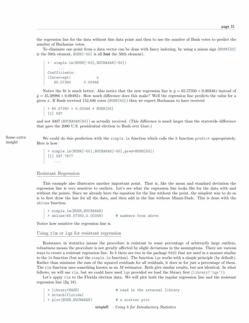
This example also illustrates another important point. That is, like the mean and standard deviation theregression line is very sensitive to outliers. Let’s see what the regression line looks like for the data with andwithout the points. Since we already have the equation for the line without the point, the simplest way to do sois to first draw the line for all the data, and then add in the line without Miami-Dade. This is done with theabline function.
> simple.lm(BUSH,BUCHANAN)> abline(65.57350,0.00348) # numbers from above
Notice how sensitive the regression line is.
Using rlm or lqs for resistant regression
Resistance in statistics means the procedure is resistant to some percentage of arbitrarily large outliers,robustness means the procedure is not greatly affected by slight deviations in the assumptions. There are variousways to create a resistant regression line. In R there are two in the package MASS that are used in a manner similarto the lm function (but not the simple.lm function). The function lqs works with a simple principle (by default).Rather than minimize the sum of the squared residuals for all residuals, it does so for just a percentage of them.The rlm function uses something known as an M -estimator. Both give similar results, but not identical. In whatfollows, we will use rlm, but we could have used lqs provided we load the library first (library(’lqs’)).
Let’s apply rlm to the Florida election data. We will plot both the regular regression line and the resistantregression line (fig 18).
> library(MASS) # read in the external library> attach(florida)> plot(BUSH,BUCHANAN) # a scatter plot
simpleR – Using R for Introductory Statistics
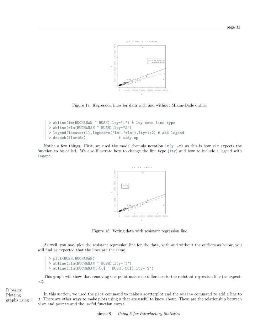
page 32
0 50000 100000 150000 200000 250000 300000
05
00
10
00
15
00
20
00
25
00
30
00
35
00
x
y
y = 0.00491 x + 45.28986
with Miami−DadeWithout Miami−Dade
Figure 17: Regression lines for data with and without Miami-Dade outlier
> abline(lm(BUCHANAN ~ BUSH),lty="1") # lty sets line type> abline(rlm(BUCHANAN ~ BUSH),lty="2")> legend(locator(1),legend=c(’lm’,’rlm’),lty=1:2) # add legend> detach(florida) # tidy up
Notice a few things. First, we used the model formula notation lm(y ∼x) as this is how rlm expects thefunction to be called. We also illustrate how to change the line type (lty) and how to include a legend withlegend.
0 50000 100000 150000 200000 250000 300000
05
00
10
00
15
00
20
00
25
00
30
00
35
00
x
y
y = 0 x + 45.28
lmrlm
Figure 18: Voting data with resistant regression line
As well, you may plot the resistant regression line for the data, with and without the outliers as below, youwill find as expected that the lines are the same.
> plot(BUSH,BUCHANAN)> abline(rlm(BUCHANAN ~ BUSH),lty=’1’)> abline(rlm(BUCHANAN[-50] ~ BUSH[-50]),lty=’2’)
This graph will show that removing one point makes no difference to the resistant regression line (as expect-ed).
R basics:Plottinggraphs using R
In this section, we used the plot command to make a scatterplot and the abline command to add a line toit. There are other ways to make plots using R that are useful to know about. These are the relationship betweenplot and points and the useful function curve.
simpleR – Using R for Introductory Statistics
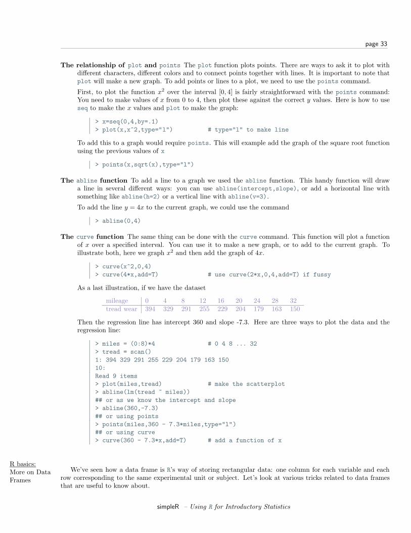
page 33
The relationship of plot and points The plot function plots points. There are ways to ask it to plot withdifferent characters, different colors and to connect points together with lines. It is important to note thatplot will make a new graph. To add points or lines to a plot, we need to use the points command.
First, to plot the function x2 over the interval [0, 4] is fairly straightforward with the points command:You need to make values of x from 0 to 4, then plot these against the correct y values. Here is how to useseq to make the x values and plot to make the graph:
> x=seq(0,4,by=.1)> plot(x,x^2,type="l") # type="l" to make line
To add this to a graph would require points. This will example add the graph of the square root functionusing the previous values of x
> points(x,sqrt(x),type="l")
The abline function To add a line to a graph we used the abline function. This handy function will drawa line in several different ways: you can use abline(intercept,slope), or add a horizontal line withsomething like abline(h=2) or a vertical line with abline(v=3).
To add the line y = 4x to the current graph, we could use the command
> abline(0,4)
The curve function The same thing can be done with the curve command. This function will plot a functionof x over a specified interval. You can use it to make a new graph, or to add to the current graph. Toillustrate both, here we graph x2 and then add the graph of 4x.
> curve(x^2,0,4)> curve(4*x,add=T) # use curve(2*x,0,4,add=T) if fussy
As a last illustration, if we have the dataset
mileage 0 4 8 12 16 20 24 28 32tread wear 394 329 291 255 229 204 179 163 150
Then the regression line has intercept 360 and slope -7.3. Here are three ways to plot the data and theregression line:
> miles = (0:8)*4 # 0 4 8 ... 32> tread = scan()1: 394 329 291 255 229 204 179 163 15010:Read 9 items> plot(miles,tread) # make the scatterplot> abline(lm(tread ~ miles))## or as we know the intercept and slope> abline(360,-7.3)## or using points> points(miles,360 - 7.3*miles,type="l")## or using curve> curve(360 - 7.3*x,add=T) # add a function of x
R basics:More on DataFrames
We’ve seen how a data frame is R’s way of storing rectangular data: one column for each variable and eachrow corresponding to the same experimental unit or subject. Let’s look at various tricks related to data framesthat are useful to know about.
simpleR – Using R for Introductory Statistics

page 34
How to make a data frame If you use a built in data set, then often it already is in the form of a dataframe. However, there are many more ways to get data into R: importing a text file, typing the data in,downloading from the web, importing a spreadsheet etc. Such things are summarized in the “Entering Datainto R” appendix and thoroughly covered in the document R Data Import/Export which accompanies the Rsoftware.
To make data into a data frame you first need a data set that is an appropriate candidate: it will fit into arectangular array. If so, then the data.frame command will do the work for you. As an example, suppose 4people are asked three questions: their weight, height and gender and the data is entered into R as separatevariables as follows:
> weight = c(150, 135, 210, 140)> height = c(65, 61, 70, 65)> gender = c("Fe","Fe","M","Fe")> study = data.frame(weight,height,gender) # make the data frame> study
weight height gender1 150 65 Fe2 135 61 Fe3 210 70 M4 140 65 Fe
Notice, the columns inherit the variable names. Different names are possible if desired. Try
> data.frame(w=weight,h=height,g=gender)
for example to shorten them.
You can give the rows names as well. Suppose the subjects were Mary, Alice, Bob and Judy, then therow.names command will either list the row names or set them. Here is how to set them
> row.names(study)<-c("Mary","Alice","Bob","Judy")
The names command will give the column names and you can also use this to adjust them.
In a previous example, we had used the scale function on a data frame and found that we now longer hada data frame (it became an array) and had to coerce it back using the as.data.frame function. This couldalso have been done with data.frame.
Types of data R has a few basic data types: characters, factors, numbers, vectors, arrays, lists and data frames.(There are many more.) To understand data frames, one needs to know a little about lists and arrays.
A list is useful for storing information when it doesn’t fit into a rectangular array like a data frame.
For example, suppose we take measurements two different times. The first time we take 6 measurements,the second only 5. We can use a list to combine them all together:
> first.time = c(170,172,169,168,170,171)> second.time = c(168,169,170,170,169)> data.frame(first.time,second.time) # won’t fit into data frameError in data.frame(first.time, second.time) :
arguments imply differing number of rows: 6, 5> list(first.time,second.time) # names aren’t automatic[[1]][1] 170 172 169 168 170 171
[[2]][1] 168 169 170 170 169> list(first=first.time,second=second.time) # add in names$first
simpleR – Using R for Introductory Statistics
page 35
[1] 170 172 169 168 170 171$second[1] 168 169 170 170 169
An array, is like a data frame but without the special features. It is a rectangular collection of numbers allof the same type. (Although it can have more than 2 dimensions in general.)
Accessing variables in a data frame Suppose we only have the data frame study and not the individualvariables weight, height, gender. How can we access them?
There are several ways. The easiest is to attach the data frame and then the column names become partof the workspace.
> rm(weight,height,gender) # delete the variables> weightError: Object "weight" not found> attach(study)> weight # now weight comes from study[1] 150 135 210 140> detach(study)
However, attaching and detaching the data frame can be a chore if you want to access the data only once.Besides, if you attach the data frame, you can’t readily make changes to the original data frame.
To access the data it helps to know that data frames can be thought of as lists or as arrays and accessedaccordingly.
To access as a list To access a list, one uses either a dollar sign, $, or double brackets and a number orname. A data frame is a list where the elements of the list are the columns. So for our study variablewe can access the weight (the first column) as a list all of these ways
> study$weight # using $[1] 150 135 210 140> study[[’weight’]] # using the name.> study[[’w’]] # unambiguous shortcuts are okay> study[[1]] # by position
To access as an array To access an array we use single brackets ([row,column]). In general there is arow and column we can access. By letting one be blank, we get the entire row or column. As anexample these will get the weight variable as well
> study[,’weight’][1] 150 135 210 140> study[,1] # the first column
Array access allows us much more flexibility though. We can get both the weight and height by takingthe first and second columns at once
> study[,1:2]weight height
Mary 150 65Alice 135 61Bob 210 70Judy 140 65
Or, we can get all of Mary’s info by looking just at her row or just her weight if desired
> study[’Mary’,]weight height gender
Mary 150 65 Fe> study[’Mary’,’weight’][1] 150
simpleR – Using R for Introductory Statistics
page 36
We can also get just the females information. These are the rows where gender is ’Fe’ so we can dothis
> study[study$gender == ’Fe’, ] # use $ to access gender via a listweight height gender
Mary 150 65 FeAlice 135 61 FeJudy 140 65 Fe
Problems
4.1 A student evaluation of a teacher is on a 1-5 Leichert scale. Suppose the answers to the first 3 questionsare given in this table
Student Ques. 1 Ques. 2 Ques. 31 3 5 12 3 2 33 3 5 14 4 5 15 3 2 16 4 2 37 3 5 18 4 5 19 3 4 110 4 2 1
Enter in the data for question 1 and 2 using c(), scan(), read.table or data.entry()
1. Make a table of the results of question 1 and question 2 separately.
2. Make a contingency table of questions 1 and 2.
3. Make a stacked barplot of questions 2 and 3.
4. Make a side-by-side barplot of all 3 questions.
4.2 In the library MASS is a dataset UScereal which contains information about popular breakfast cereals.Attach the data set as follows
> library(’MASS’)> data(’UScereal’)> attach(UScereal)> names(UScereal) # to see the names
Now, investigate the following relationships, and make comments on what you see. You can use tables,barplots, scatterplots etc. to do you investigation.
1. The relationship between manufacturer and shelf
2. The relationship between fat and vitamins
3. the relationship between fat and shelf
4. the relationship between carbohydrates and sugars
5. the relationship between fibre and manufacturer
6. the relationship between sodium and sugars
Are there other relationships you can predict and investigate?
simpleR – Using R for Introductory Statistics
page 37
4.3 The built-in data set mammals contains data on body weight versus brain weight. Use the cor to find thePearson and Spearman correlation coefficients. Are they similar? Plot the data using the plot commandand see if you expect them to be similar. You should be unsatisfied with this plot. Next, plot the logarithm(log) of each variable and see if that makes a difference.
4.4 For the data set on housing prices, homedata, investigate the relationship between old assessed value andnew. Use old as the predictor variable. Does the data suggest a linear relationship?Are there any outliers?What may have caused these outliers? What is the predicted new assessed value for a $75,000 house in1970.
4.5 For the florida dataset of Bush vs. Buchanan, there is another obvious outlier that indicated Buchananreceived fewer votes than expected. If you remove both the outliers, what is the predicted value for thenumber of votes Buchanan would get in Miami-Dade county based on the number of Bush votes?
4.6 For the data set emissions plot the per-Capita GDP (gross domestic product) as a predictor for the responsevariable CO2 emissions. Identify the outlier and find the regression lines with this point, and without thispoint.
4.7 Attach the data set babies:
> library("Simple")> data("babies")> attach(babies)
This data set contains much information about babies and their mothers for 1236 observations. Find thecorrelation coefficient (both Pearson and Spearman) between age and weight. Repeat for the relationshipbetween height and weight. Make scatter plots of each pair and see if your answer makes sense.
4.8 Find a dataset that is a candidate for linear regression (you need two numeric variables, one a predictorand one a response.) Make a scatterplot with regression line using R.
4.9 The built-in data set mtcars contains information about cars from a 1974 Motor Trend issue. Load the dataset (data(mtcars)) and try to answer the following:
1. What are the variable names? (Try names.)
2. what is the maximum mpg
3. Which car has this?
4. What are the first 5 cars listed?
5. What horsepower (hp) does the “Valiant” have?
6. What are all the values for the Mercedes 450slc (Merc 450SLC)?
7. Make a scatterplot of cylinders (cyl) vs. miles per gallon (mpg). Fit a regression line. Is this a goodcandidate for linear regression?
4.10 Find a graphic of bivariate data from the newspaper or other media source. Use R to generate a similarfigure.
Section 5 Multivariate Data
R has many ways to handle multivariate data – data with two or more variables. We’ve already seen someof these with multiple boxplots. Here are a few more. First though, it is worth pointing out two common waysmultivariate data is presented to us.
Two ways to store data sets
simpleR – Using R for Introductory Statistics

page 38
In the dataset florida each variable has a separate column or vector. If there are n different variables, therewould be n different vectors. These would typically be stored as a data frame with n columns.
Otherwise, one can put all the data in one vector and then have another vector which keeps track of thecategory the value is for. For example, the built-in dataset OrchardSprays (use data("OrchardSprays") to load)has a variable decrease which is tabulated for various levels of a factor called treatment.
For concreteness in what follows in this section, we will use the following values. We have 3 weeks of data forcommuting times given by
week 1: 23 21 16 18 24week 2: 17 15 28 16 23week 3: 23 25 27 24 29
We can store these as a data frame by
> x=c(23,21,16,18,24)> y=c(17,15,28,16,23)> z=c(23,25,27,24,29)> df = data.frame(x,y,z) # store as data frame> df # notice they are in columns
x y z1 23 17 232 21 15 253 16 28 274 18 16 245 24 23 29
Or, we can store these using a factor to keep track of the data in one of two ways. First by hand we get
## assume x,y and z are defined previously> times = c(x,y,z) # combine into one vector## This could also be done directly c(1,1,1,1,1,2,2,2,2,2,3,3,3,3,3)> week = factor(c(rep(1,length(x)),rep(2,length(y)),rep(3,length(z))))> rbind(times,week) # to see datatimes 23 21 16 18 24 17 15 28 16 23 23 25 27 24 29week 1 1 1 1 1 2 2 2 2 2 3 3 3 3 3
(Notice the use of rep to repeat something a specified number of times.) Otherwise, we can use the handy stackcommand for stacking the data. The commands to do so are
> times = stack(df)$values> weeks = stack(df)$ind
The stack command returns a two column matrix, and the $values and $ind extracts the values and indicesinto the named variables.
Some extrainsight
R can convert from one type of storage to another. The easier to understand direction is done above withthe useful rep function do the repetitive work of creating the factor week for us. To go from this storage to thedata frame, the command split can be used. The split command returns a list, which needs to be coerced intobecoming a data frame. The following works
> df=data.frame(split(times,week))> colnames(df)=c("x","y","z") # give the correct column names
This can also be done with the inverse command to stack which is unstack. The syntax is confusing though.Both stack and unstack want a data frame as its argument. Here is how it would be done
> unstack(data.frame(times,week))
simpleR – Using R for Introductory Statistics
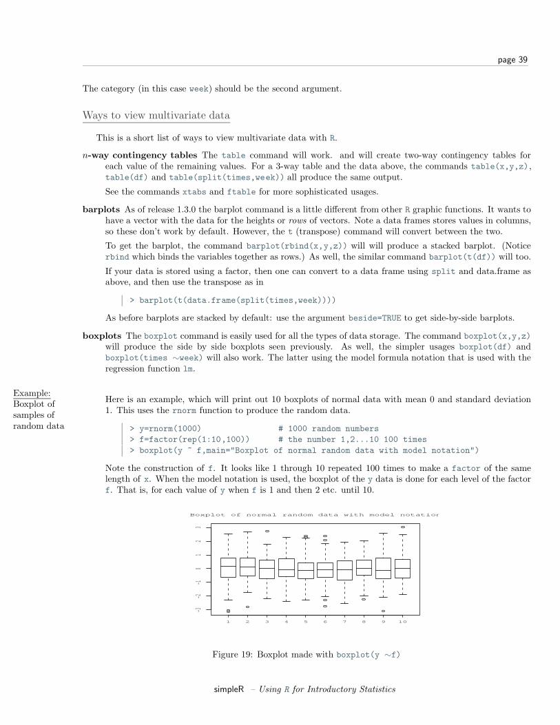
page 39
The category (in this case week) should be the second argument.
Ways to view multivariate data
This is a short list of ways to view multivariate data with R.
n-way contingency tables The table command will work. and will create two-way contingency tables foreach value of the remaining values. For a 3-way table and the data above, the commands table(x,y,z),table(df) and table(split(times,week)) all produce the same output.
See the commands xtabs and ftable for more sophisticated usages.
barplots As of release 1.3.0 the barplot command is a little different from other R graphic functions. It wants tohave a vector with the data for the heights or rows of vectors. Note a data frames stores values in columns,so these don’t work by default. However, the t (transpose) command will convert between the two.
To get the barplot, the command barplot(rbind(x,y,z)) will will produce a stacked barplot. (Noticerbind which binds the variables together as rows.) As well, the similar command barplot(t(df)) will too.
If your data is stored using a factor, then one can convert to a data frame using split and data.frame asabove, and then use the transpose as in
> barplot(t(data.frame(split(times,week))))
As before barplots are stacked by default: use the argument beside=TRUE to get side-by-side barplots.
boxplots The boxplot command is easily used for all the types of data storage. The command boxplot(x,y,z)will produce the side by side boxplots seen previously. As well, the simpler usages boxplot(df) andboxplot(times ∼week) will also work. The latter using the model formula notation that is used with theregression function lm.
Example:Boxplot ofsamples ofrandom data
Here is an example, which will print out 10 boxplots of normal data with mean 0 and standard deviation1. This uses the rnorm function to produce the random data.
> y=rnorm(1000) # 1000 random numbers> f=factor(rep(1:10,100)) # the number 1,2...10 100 times> boxplot(y ~ f,main="Boxplot of normal random data with model notation")
Note the construction of f. It looks like 1 through 10 repeated 100 times to make a factor of the samelength of x. When the model notation is used, the boxplot of the y data is done for each level of the factorf. That is, for each value of y when f is 1 and then 2 etc. until 10.
1 2 3 4 5 6 7 8 9 10
−3−2
−10
12
3
Boxplot of normal random data with model notation
Figure 19: Boxplot made with boxplot(y ∼f)
simpleR – Using R for Introductory Statistics
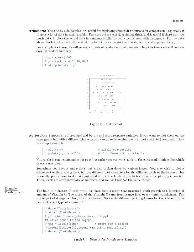
page 40
stripcharts The side-by-side boxplots are useful for displaying similar distributions for comparison – especially ifthere is a lot of data in each variable. The stripchart can do a similar thing, and is useful if there isn’t toomuch data. It plots the actual data in a manner similar to rug which is used with histograms. For the dataabove, both stripchart(df) and stripchart(times ∼week) will work, but not stripchart(x,y,z).
For example, as above, we will generate 10 sets of random normal numbers. Only this time each will containonly 10 random numbers.
> x = rnorm(100)> y = factor(rep(1:10,10))> stripchart(x ~ y)
−3 −2 −1 0 1 2 3
12
34
56
78
91
0
stripchart(x ~ y)
Figure 20: A stripchart
scatterplots Suppose x is a predictor and both y and z are response variables. If you want to plot them on thesame graph but with a different character you can do so by setting the pch (plot character) command. Hereis a simple example
> plot(x,y) # simple scatterplot> points(x,z,pch="2") # plot these with a triangle
Notice, the second command is not plot but rather points which adds to the current plot unlike plot whichdraws a new plot.
Sometimes you have x and y data that is also broken down by a given factor. You may wish to plot ascatterplot of the x and y data, but use different plot characters for the different levels of the factors. Thisis usually pretty easy to do. We just need to use the levels of the factor to give the plotting character.These levels are store internally as numbers, and we use these for the value of pch
Example:Tooth growth The built-in R dataset ToothGrowth has data from a study that measured tooth growth as a function of
amount of Vitamin C. The source of the Vitamin C came from orange juice or a vitamin supplement. Thescatterplot of dosage vs. length is given below. Notice the different plotting figures for the 2 levels of thefactor of which type of vitamin C.
> data("ToothGrowth")> attach(ToothGrowth)> plot(len ~ dose,pch=as.numeric(supp))## click mouse to add legend.> tmp = levels(supp) # store for a second> legend(locator(1),legend=tmp,pch=1:length(tmp))> detach(ToothGrowth)
simpleR – Using R for Introductory Statistics

page 41
0.5 1.0 1.5 2.0
510
1520
2530
35
dose
len
OJVC
Figure 21: Tooth growth as a function of vitamin C dosage
From the graph it appears that for all values of dose, the vitamin form (VC) was less effective.
Sometimes you want a to look at the distribution of x and the distribution of y and also look at theirrelationship with a scatterplot. (Not the case above, as the x distribution is trivial) This is easier if youcan plot multiple graphs at once. This is implemented in the function simple.scatterplot (taken from thelayout help page).
Example:GDP vs. CO2
emissions
The question of CO2 emissions is currently a “hot” topic due to their influence on the greenhouse effect. Thedataset emissions contains data on the Gross Domestic Product and CO2 emissions for several Europeancountries and the United States for the year 1999. A scatterplot of the data is interesting:
> data(emissions) # or read in from dataset> attach(emissions)> simple.scatterplot(perCapita,CO2)> title("GDP/capita vs. CO2 emissions 1999")> detach(emissions)
Notice, with the additional information of this scatter plot, we can see that the distribution of GDP/capitais fairly spread out unlike the distribution of the CO2 emissions which has the lone outlier.
paired scatterplots If the 3 variables hold numeric values, then scatterplots are appropriate. The pairs com-mand will produce scatterplots for each possible pair. It can be used as follows pairs(cbind(x,y,z)),pairs(df) or if in the factor form pairs(data.frame(split(times,week))). Of these, the easiest is ifthe data is in a data frame. If not, notice the use of cbind which binds the variables together as columns.(This is how data frames work.)
Figure 23 is an example using the same emissions data set. Can you spot the previous plot?
> pairs(emissions)
The pairs command has many options to customize the graphs. The help page has a two nice examples.
lattice The lattice and grid packages are similar to the trellis graphics of S-Plus. When finished, they will offerseveral attractive ways to investigate interactions between variables.
others The Ggobi (http://www.ggobi.org) package and accompanying software, allows you to manipulate thedata in the plot and do such things as brush data in one plot and have it highlighted in another.
simpleR – Using R for Introductory Statistics
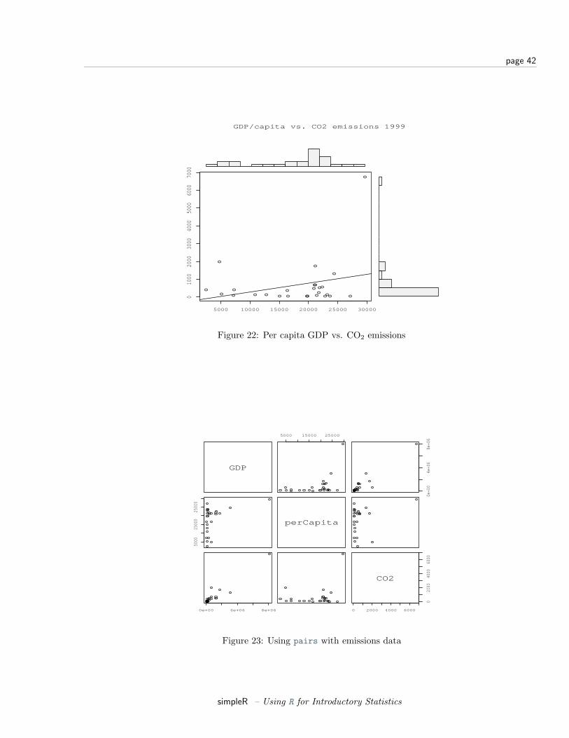
page 42
5000 10000 15000 20000 25000 30000
010
0020
0030
0040
0050
0060
0070
00
y
GDP/capita vs. CO2 emissions 1999
Figure 22: Per capita GDP vs. CO2 emissions
GDP
5000 15000 25000
0e+0
04e
+06
8e+0
6
5000
1500
025
000
perCapita
0e+00 4e+06 8e+06 0 2000 4000 6000
020
0040
0060
00
CO2
Figure 23: Using pairs with emissions data
simpleR – Using R for Introductory Statistics
page 43
Problems
5.1 For the emissions dataset there is an outlier for the CO2 emissions. Find this value using identify andthen redo the plot without this point.
5.2 The Simple data set chips contains data on thickness of integrated chips. There are data for two chips, eachmeasured at 4 different places. Create a side-by-side boxplot of the thickness for each place of measurement.(There should be 8 boxplots on the same graph). Do the means look the same? The variances?
5.3 The Simple data set chicken contains weights of chickens who are given 1 of 3 different food rations. Createa boxplot of all 3 rations. Does there appear to be a difference in mean?
5.4 The Simple data set carbon contains carbon monoxide levels at 3 different industrial sites. The data hastwo variables: a carbon monoxide reading, and a factor variable keep track of the site. Create side-by-sideboxplots of the monoxide levels for each site. Does there appear to be a difference? How so?
5.5 For the data set babies make a pairs plot (pairs(babies)) to investigate the relationships between thevariables. Which variables seem to have a linear relationship? For the variables for birthweight and gestationmake a scatter plot using different plotting characters (pch) depending on the level of the factor smoke.
Section 6 Random Data
Although Einstein said that god does not play dice, R can. For example
> sample(1:6,10,replace=T)[1] 6 4 4 3 5 2 3 3 5 4
or with a function
> RollDie = function(n) sample(1:6,n,replace=T)> RollDie(5)[1] 3 6 1 2 2
Random Number Generators in R– the “r” Functions.
In fact, R can create lots of different types of random numbers. As we know, random numbers are describedby a distribution. That is, some function which specifies the probability that a random number is in some range.For example P (a ≤ X < b). Often this is given by a probability density (in the continuous case) or by a functionP (X = k) = f(k) in the discrete case. R will give numbers drawn from lots of different distributions. In orderto use them, you only need familiarize yourselves with the parameters that are given to the functions such asa mean, or a rate. Here are examples of the most common ones. For each, a histogram is given for a randomsample of size 100, and density (using the “d” functions) is superimposed as appropriate.
Uniform. Uniform numbers are ones that are ”equally likely” to be in the specified range. Often these numbersare in [0,1] for computers, but in practice can be between [a,b] where a,b depend upon the problem. Anexample might be the time you wait at a traffic light. This might be uniform on [0, 2].
> runif(1,0,2) # time at light[1] 1.490857 # also runif(1,min=0,max=2)
simpleR – Using R for Introductory Statistics
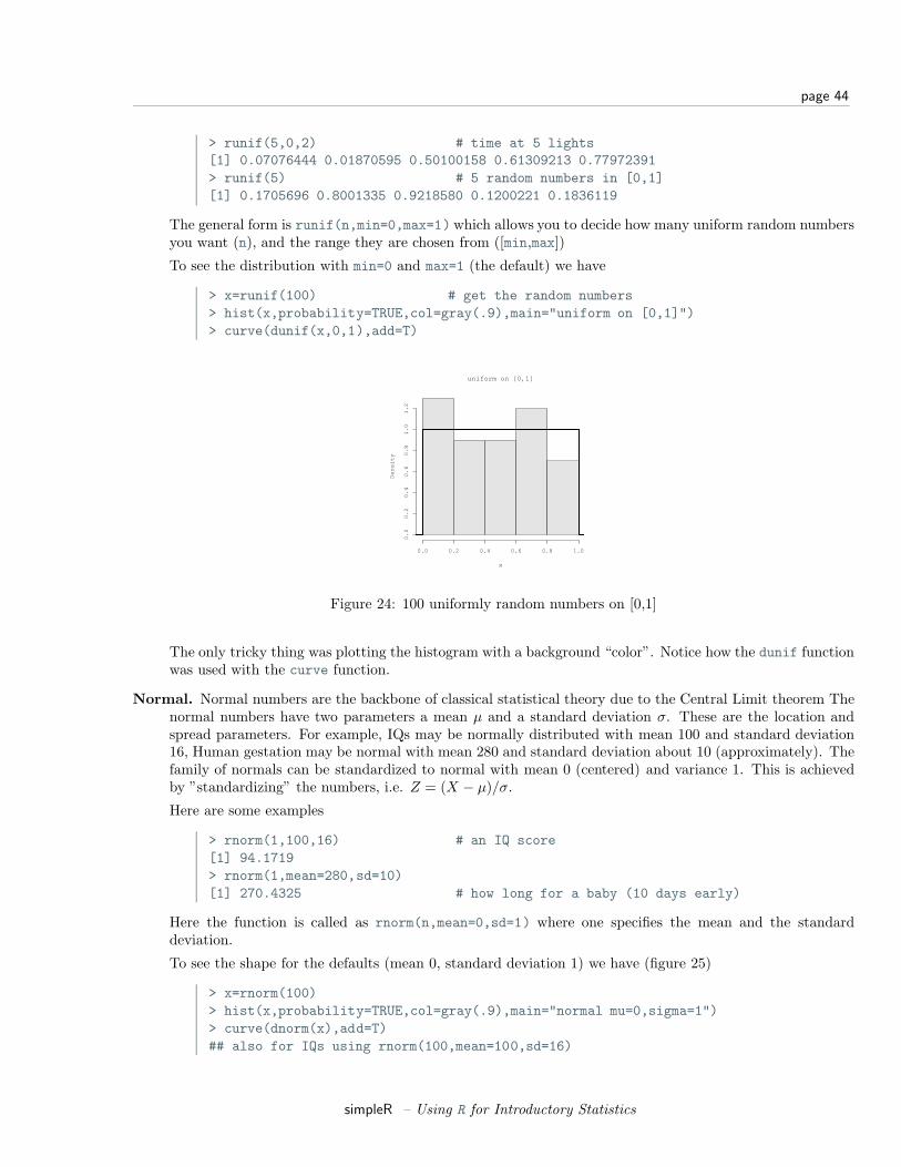
page 44
> runif(5,0,2) # time at 5 lights[1] 0.07076444 0.01870595 0.50100158 0.61309213 0.77972391> runif(5) # 5 random numbers in [0,1][1] 0.1705696 0.8001335 0.9218580 0.1200221 0.1836119
The general form is runif(n,min=0,max=1)which allows you to decide how many uniform random numbersyou want (n), and the range they are chosen from ([min,max])
To see the distribution with min=0 and max=1 (the default) we have
> x=runif(100) # get the random numbers> hist(x,probability=TRUE,col=gray(.9),main="uniform on [0,1]")> curve(dunif(x,0,1),add=T)
uniform on [0,1]
x
De
nsi
ty
0.0 0.2 0.4 0.6 0.8 1.0
0.0
0.2
0.4
0.6
0.8
1.0
1.2
Figure 24: 100 uniformly random numbers on [0,1]
The only tricky thing was plotting the histogram with a background “color”. Notice how the dunif functionwas used with the curve function.
Normal. Normal numbers are the backbone of classical statistical theory due to the Central Limit theorem Thenormal numbers have two parameters a mean µ and a standard deviation σ. These are the location andspread parameters. For example, IQs may be normally distributed with mean 100 and standard deviation16, Human gestation may be normal with mean 280 and standard deviation about 10 (approximately). Thefamily of normals can be standardized to normal with mean 0 (centered) and variance 1. This is achievedby ”standardizing” the numbers, i.e. Z = (X − µ)/σ.
Here are some examples
> rnorm(1,100,16) # an IQ score[1] 94.1719> rnorm(1,mean=280,sd=10)[1] 270.4325 # how long for a baby (10 days early)
Here the function is called as rnorm(n,mean=0,sd=1) where one specifies the mean and the standarddeviation.
To see the shape for the defaults (mean 0, standard deviation 1) we have (figure 25)
> x=rnorm(100)> hist(x,probability=TRUE,col=gray(.9),main="normal mu=0,sigma=1")> curve(dnorm(x),add=T)## also for IQs using rnorm(100,mean=100,sd=16)
simpleR – Using R for Introductory Statistics
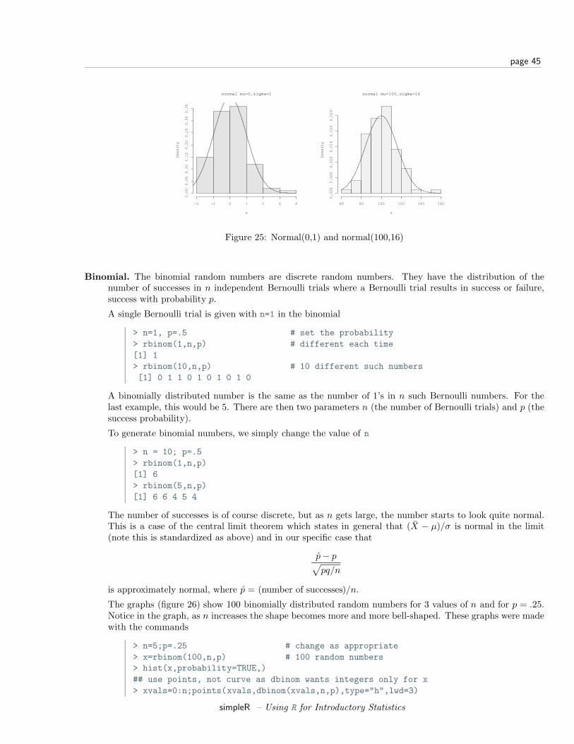
page 45
normal mu=0,sigma=1
x
De
nsi
ty
−2 −1 0 1 2 3 4
0.0
00
.05
0.1
00
.15
0.2
00
.25
0.3
00
.35
normal mu=100,sigma=16
x
De
nsi
ty
60 80 100 120 140 160
0.0
00
0.0
05
0.0
10
0.0
15
0.0
20
0.0
25
Figure 25: Normal(0,1) and normal(100,16)
Binomial. The binomial random numbers are discrete random numbers. They have the distribution of thenumber of successes in n independent Bernoulli trials where a Bernoulli trial results in success or failure,success with probability p.
A single Bernoulli trial is given with n=1 in the binomial
> n=1, p=.5 # set the probability> rbinom(1,n,p) # different each time[1] 1> rbinom(10,n,p) # 10 different such numbers[1] 0 1 1 0 1 0 1 0 1 0
A binomially distributed number is the same as the number of 1’s in n such Bernoulli numbers. For thelast example, this would be 5. There are then two parameters n (the number of Bernoulli trials) and p (thesuccess probability).
To generate binomial numbers, we simply change the value of n
> n = 10; p=.5> rbinom(1,n,p)[1] 6> rbinom(5,n,p)[1] 6 6 4 5 4
The number of successes is of course discrete, but as n gets large, the number starts to look quite normal.This is a case of the central limit theorem which states in general that (X − µ)/σ is normal in the limit(note this is standardized as above) and in our specific case that
p− p√pq/n
is approximately normal, where p = (number of successes)/n.
The graphs (figure 26) show 100 binomially distributed random numbers for 3 values of n and for p = .25.Notice in the graph, as n increases the shape becomes more and more bell-shaped. These graphs were madewith the commands
> n=5;p=.25 # change as appropriate> x=rbinom(100,n,p) # 100 random numbers> hist(x,probability=TRUE,)## use points, not curve as dbinom wants integers only for x> xvals=0:n;points(xvals,dbinom(xvals,n,p),type="h",lwd=3)
simpleR – Using R for Introductory Statistics
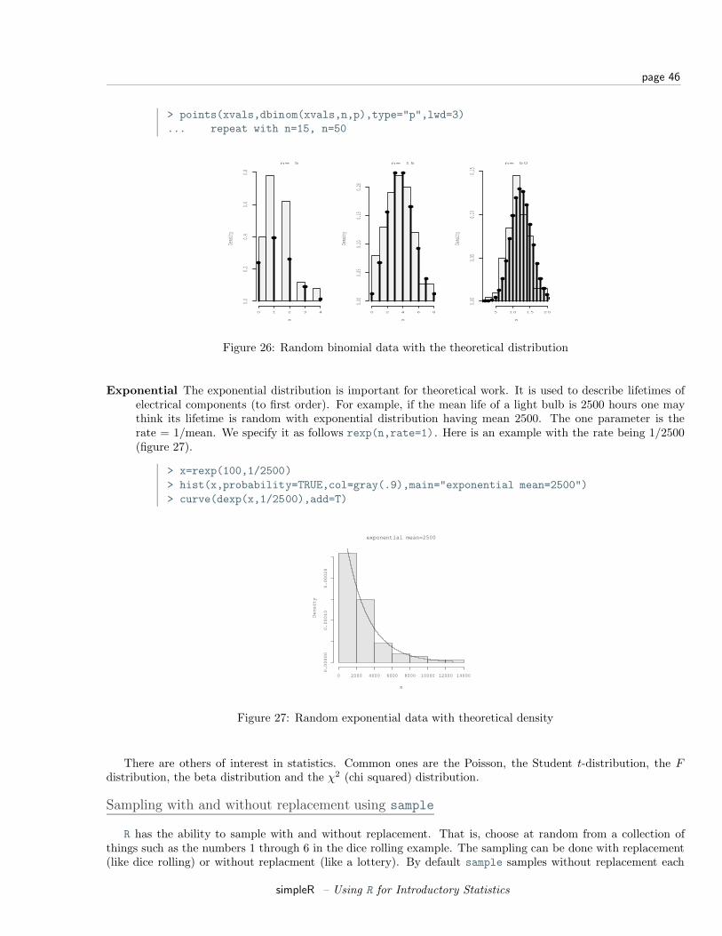
page 46
> points(xvals,dbinom(xvals,n,p),type="p",lwd=3)... repeat with n=15, n=50
n= 5
x
Dens
ity
0 1 2 3 4
0.00.2
0.40.6
0.8
n= 15
x
Dens
ity
0 2 4 6 8
0.00
0.05
0.10
0.15
0.20
n= 50
x
Dens
ity
5 10 15 20
0.00
0.05
0.10
0.15
Figure 26: Random binomial data with the theoretical distribution
Exponential The exponential distribution is important for theoretical work. It is used to describe lifetimes ofelectrical components (to first order). For example, if the mean life of a light bulb is 2500 hours one maythink its lifetime is random with exponential distribution having mean 2500. The one parameter is therate = 1/mean. We specify it as follows rexp(n,rate=1). Here is an example with the rate being 1/2500(figure 27).
> x=rexp(100,1/2500)> hist(x,probability=TRUE,col=gray(.9),main="exponential mean=2500")> curve(dexp(x,1/2500),add=T)
exponential mean=2500
x
De
nsi
ty
0 2000 4000 6000 8000 10000 12000 14000
0.0
00
00
0.0
00
10
0.0
00
20
Figure 27: Random exponential data with theoretical density
There are others of interest in statistics. Common ones are the Poisson, the Student t-distribution, the Fdistribution, the beta distribution and the χ2 (chi squared) distribution.
Sampling with and without replacement using sample
R has the ability to sample with and without replacement. That is, choose at random from a collection ofthings such as the numbers 1 through 6 in the dice rolling example. The sampling can be done with replacement(like dice rolling) or without replacment (like a lottery). By default sample samples without replacement each
simpleR – Using R for Introductory Statistics
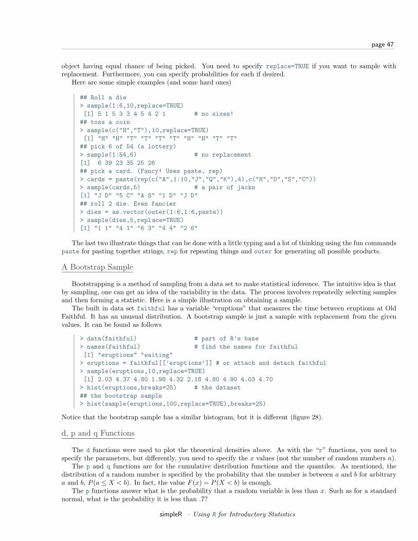
page 47
object having equal chance of being picked. You need to specify replace=TRUE if you want to sample withreplacement. Furthermore, you can specify probabilities for each if desired.
Here are some simple examples (and some hard ones)
## Roll a die> sample(1:6,10,replace=TRUE)[1] 5 1 5 3 3 4 5 4 2 1 # no sixes!## toss a coin> sample(c("H","T"),10,replace=TRUE)[1] "H" "H" "T" "T" "T" "T" "H" "H" "T" "T"## pick 6 of 54 (a lottery)> sample(1:54,6) # no replacement[1] 6 39 23 35 25 26## pick a card. (Fancy! Uses paste, rep)> cards = paste(rep(c("A",1:10,"J","Q","K"),4),c("H","D","S","C"))> sample(cards,5) # a pair of jacks[1] "J D" "5 C" "A S" "1 D" "J D"## roll 2 die. Even fancier> dies = as.vector(outer(1:6,1:6,paste))> sample(dies,5,replace=TRUE)[1] "1 1" "4 1" "6 3" "4 4" "2 6"
The last two illustrate things that can be done with a little typing and a lot of thinking using the fun commandspaste for pasting together strings, rep for repeating things and outer for generating all possible products.
A Bootstrap Sample
Bootstrapping is a method of sampling from a data set to make statistical inference. The intuitive idea is thatby sampling, one can get an idea of the variability in the data. The process involves repeatedly selecting samplesand then forming a statistic. Here is a simple illustration on obtaining a sample.
The built in data set faithful has a variable “eruptions” that measures the time between eruptions at OldFaithful. It has an unusual distribution. A bootstrap sample is just a sample with replacement from the givenvalues. It can be found as follows
> data(faithful) # part of R’s base> names(faithful) # find the names for faithful[1] "eruptions" "waiting"> eruptions = faithful[[’eruptions’]] # or attach and detach faithful> sample(eruptions,10,replace=TRUE)[1] 2.03 4.37 4.80 1.98 4.32 2.18 4.80 4.90 4.03 4.70> hist(eruptions,breaks=25) # the dataset## the bootstrap sample> hist(sample(eruptions,100,replace=TRUE),breaks=25)
Notice that the bootstrap sample has a similar histogram, but it is different (figure 28).
d, p and q Functions
The d functions were used to plot the theoretical densities above. As with the “r” functions, you need tospecify the parameters, but differently, you need to specify the x values (not the number of random numbers n).
The p and q functions are for the cumulative distribution functions and the quantiles. As mentioned, thedistribution of a random number is specified by the probability that the number is between a and b for arbitrarya and b, P (a ≤ X < b). In fact, the value F (x) = P (X < b) is enough.
The p functions answer what is the probability that a random variable is less than x. Such as for a standardnormal, what is the probability it is less than .7?
simpleR – Using R for Introductory Statistics
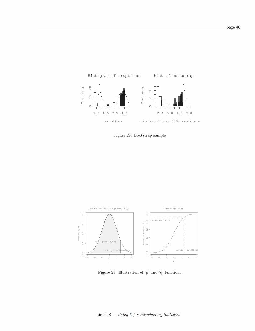
page 48
Histogram of eruptions
eruptions
Fre
qu
en
cy
1.5 2.5 3.5 4.5
01
02
0
hist of bootstrap
sample(eruptions, 100, replace = TRUE)
Fre
qu
en
cy
2.0 3.0 4.0 5.0
04
8
Figure 28: Bootstrap sample
−3 −2 −1 0 1 2 3
0.0
0.1
0.2
0.3
0.4
x3
dn
orm
(x3
, 0
, 1
)
Area to left of 1.5 = pnorm(1.5,0,1)
area = pnorm(1.5,0,1)
1.5 = qnorm(0.9331928,0,1)
−3 −2 −1 0 1 2 3
0.0
0.2
0.4
0.6
0.8
1.0
F(z) = P(Z <= z)
x
fun
ctio
n(x
) p
no
rm(x
) (x
)
pnorm(1.5) is .9381928
qnorm(.9381928) is 1.5
Figure 29: Illustration of ’p’ and ’q’ functions
simpleR – Using R for Introductory Statistics
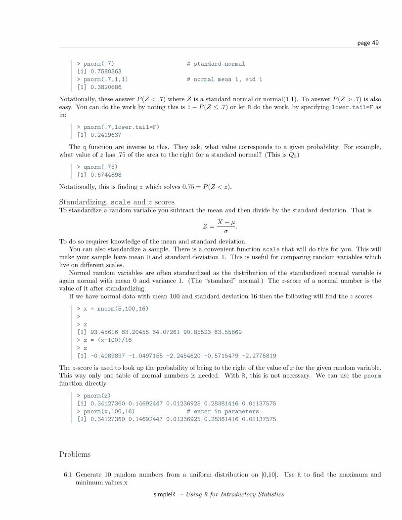
page 49
> pnorm(.7) # standard normal[1] 0.7580363> pnorm(.7,1,1) # normal mean 1, std 1[1] 0.3820886
Notationally, these answer P (Z < .7) where Z is a standard normal or normal(1,1). To answer P (Z > .7) is alsoeasy. You can do the work by noting this is 1− P (Z ≤ .7) or let R do the work, by specifying lower.tail=F asin:
> pnorm(.7,lower.tail=F)[1] 0.2419637
The q function are inverse to this. They ask, what value corresponds to a given probability. For example,what value of z has .75 of the area to the right for a standard normal? (This is Q3)
> qnorm(.75)[1] 0.6744898
Notationally, this is finding z which solves 0.75 = P (Z < z).
Standardizing, scale and z scoresTo standardize a random variable you subtract the mean and then divide by the standard deviation. That is
Z =X − µ
σ.
To do so requires knowledge of the mean and standard deviation.You can also standardize a sample. There is a convenient function scale that will do this for you. This will
make your sample have mean 0 and standard deviation 1. This is useful for comparing random variables whichlive on different scales.
Normal random variables are often standardized as the distribution of the standardized normal variable isagain normal with mean 0 and variance 1. (The “standard” normal.) The z-score of a normal number is thevalue of it after standardizing.
If we have normal data with mean 100 and standard deviation 16 then the following will find the z-scores
> x = rnorm(5,100,16)>> x[1] 93.45616 83.20455 64.07261 90.85523 63.55869> z = (x-100)/16> z[1] -0.4089897 -1.0497155 -2.2454620 -0.5715479 -2.2775819
The z-score is used to look up the probability of being to the right of the value of x for the given random variable.This way only one table of normal numbers is needed. With R, this is not necessary. We can use the pnormfunction directly
> pnorm(z)[1] 0.34127360 0.14692447 0.01236925 0.28381416 0.01137575> pnorm(x,100,16) # enter in parameters[1] 0.34127360 0.14692447 0.01236925 0.28381416 0.01137575
Problems
6.1 Generate 10 random numbers from a uniform distribution on [0,10]. Use R to find the maximum andminimum values.x
simpleR – Using R for Introductory Statistics
page 50
6.2 Generate 10 random normal numbers with mean 5 and standard deviation 5 (normal(5,5)). How many areless than 0? (Use R)
6.3 Generate 100 random normal numbers with mean 100 and standard deviation 10. How many are 2 standarddeviations from the mean (smaller than 80 or bigger than 120)?
6.4 Toss a fair coin 50 times (using R). How many heads do you have?
6.5 Roll a “die” 100 times. How many 6’s did you see?
6.6 Select 6 numbers from a lottery containing 49 balls. What is the largest number? What is the smallest?Answer these using R.
6.7 For normal(0,1), find a number z∗ solving P (Z ≤ z∗) = .05 (use qnorm).
6.8 For normal(0,1), find a number z∗ solving P (−z∗ ≤ Z ≤ z∗) = .05 (use qnorm and symmetry).
6.9 How much area (probability) is to the right of 1.5 for a normal(0,2)?
6.10 Make a histogram of 100 exponential numbers with mean 10. Estimate the median. Is it more or less thanthe mean?
6.11 Can you figure out what this R command does?
> rnorm(5,mean=0,sd=1:5)
6.12 Use R to pick 5 cards from a deck of 52. Did you get a pair or better? Repeat until you do. How long didit take?
Section 7 Simulations
The ability to simulate different types of random data allows the user to perform experiments and answerquestions in a rapid manner. It is a very useful skill to have, but is admittedly hard to learn.
As we have seen, R has many functions for generating random numbers. For these random numbers, we canview the distribution using histograms and other tools. What we want to do now, is generate new types of randomnumbers and investigate what distribution they have.
The Central Limit Theorem
To start, the most important example is the central limit theorem (CLT). This states that if Xi are drawnindependently from a population where µ and σ are known, then the standardized average
X − µ
σ/√
n
is asymptotically normal with mean 0 and variance 1 (often called normal(0,1)). That is, if n is large enough theaverage is approximately normal with mean µ and standard deviation σ/
√n.
How can we check this? Simulation is an excellent way.Let’s first do this for the binomial distribution, the CLT translates into saying that if Sn has a binomial
distribution with parameters n and p then
Sn − np√npq
is approximately normal(0,1)Let’s investigate. How can we use R to create one of these random numbers?
simpleR – Using R for Introductory Statistics
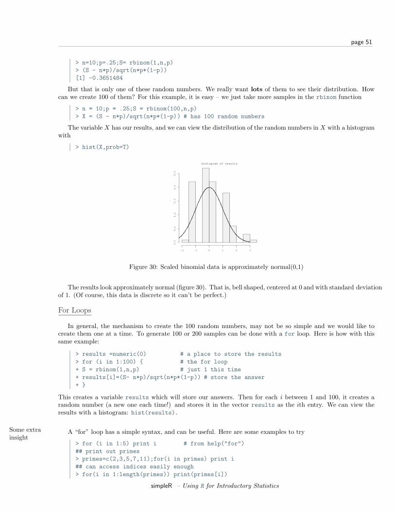
page 51
> n=10;p=.25;S= rbinom(1,n,p)> (S - n*p)/sqrt(n*p*(1-p))[1] -0.3651484
But that is only one of these random numbers. We really want lots of them to see their distribution. Howcan we create 100 of them? For this example, it is easy – we just take more samples in the rbinom function
> n = 10;p = .25;S = rbinom(100,n,p)> X = (S - n*p)/sqrt(n*p*(1-p)) # has 100 random numbers
The variable X has our results, and we can view the distribution of the random numbers in X with a histogramwith
> hist(X,prob=T)
histogram of results
De
nsi
ty
−2 −1 0 1 2 3
0.0
0.1
0.2
0.3
0.4
0.5
Figure 30: Scaled binomial data is approximately normal(0,1)
The results look approximately normal (figure 30). That is, bell shaped, centered at 0 and with standard deviationof 1. (Of course, this data is discrete so it can’t be perfect.)
For Loops
In general, the mechanism to create the 100 random numbers, may not be so simple and we would like tocreate them one at a time. To generate 100 or 200 samples can be done with a for loop. Here is how with thissame example:
> results =numeric(0) # a place to store the results> for (i in 1:100) { # the for loop+ S = rbinom(1,n,p) # just 1 this time+ results[i]=(S- n*p)/sqrt(n*p*(1-p)) # store the answer+ }
This creates a variable results which will store our answers. Then for each i between 1 and 100, it creates arandom number (a new one each time!) and stores it in the vector results as the ith entry. We can view theresults with a histogram: hist(results).
Some extrainsight
A “for” loop has a simple syntax, and can be useful. Here are some examples to try
> for (i in 1:5) print i # from help("for")## print out primes> primes=c(2,3,5,7,11);for(i in primes) print i## can access indices easily enough> for(i in 1:length(primes)) print(primes[i])
simpleR – Using R for Introductory Statistics

page 52
Example:CLT withnormal data
The CLT also works for normals (where the distribution is actually normal). Let’s see with an example. Wewill let the Xi be normal with mean µ = 5 and standard deviation σ = 5. Then we need a function to find thevalue of
(X1 + X2 + ... + Xn)/n− µ
σ/√
n=
X − µ
σ/√
n(1)
As above a for loop may be used
> results = c();> mu = 0; sigma = 1> for(i in 1:200) {+ X = rnorm(100,mu,sigma) # generate random data+ results[i] = (mean(X) - mu)/(sigma/sqrt(100))+ }> hist(results,prob=T)
Notice the histogram indicates the data is approximately normal (figure 31).
Histogram of simulations
simulations
De
nsi
ty
−2 −1 0 1 2 3
0.0
0.1
0.2
0.3
0.4
Figure 31: Simulation of CLT with normal data. Notice it is bell shaped.
Normal Plots
A better plot than the histogram for deciding if random data is approximately normal is the so called “normalprobability” plot. The basic idea is to graph the quantiles of your data against the corresponding quantiles of thenormal distribution. The quantiles of a data set are like the Median and Q1 and Q3 only more general. The qquantile is the value in the data where q ∗ 100% of the data is smaller. So the 0.25 quantile is Q1, the 0.5 quantileis the median and the 0.75 quantile is Q3. The quantiles for the theoretical distribution are similar, only insteadof the number of data points less, it is the area to the left that is the specified amount. For example, the mediansplits the area beneath the density curve in half.
The normal probability graph is easy to read – if you know how. Essentially, if the graph looks like a straightline then the data is approximately normal. Any curve can tell you that the distribution has short or long tails.It is not a regression line. The line is drawn through points formed by the first and third quantiles.
R makes all this easy to do with the functions qqnorm (more generally qqplot) and qqline which draws areference line (not a regression line).
This is what the graphs look like for some sample data (figure 32). Notice the first two should look like straightlines (and do), the second two shouldn’t (and don’t).
simpleR – Using R for Introductory Statistics

page 53
> x = rnorm(100,0,1);qqnorm(x,main=’normal(0,1)’);qqline(x)> x = rnorm(100,10,15);qqnorm(x,main=’normal(10,15)’);qqline(x)> x = rexp(100,1/10);qqnorm(x,main=’exponential mu=10’);qqline(x)> x = runif(100,0,1);qqnorm(x,main=’unif(0,1)’);qqline(x)
−2 0 1 2
−2−1
01
2
normal(0,1)
Theoretical Quantiles
Sam
ple Q
uant
iles
−2 0 1 2
−20
−10
010
2030
4050
normal(10,15)
Theoretical Quantiles
Sam
ple Q
uant
iles
−2 0 1 2
05
1015
2025
3035
exponential mu=10
Theoretical Quantiles
Sam
ple Q
uant
iles
−2 0 1 2
0.0
0.2
0.4
0.6
0.8
1.0
unif(0,1)
Theoretical Quantiles
Sam
ple Q
uant
iles
Figure 32: Some normal plots
Using simple.sim and functionsThis section shows how to write functions and how to use them with simple.sim. This is a little more complicatedthan most of the material in these notes and can be avoided if desired.
For purposes of simulation, it would be nice not to have to write a for loop each time. The function simple.simis a function which does just that. You need to write a function that generates one of your random numbers, andthen give it to simple.sim.
For example in checking the CLT for binomial data we needed to generate a single random number distributedas a standardized binomial number. A function to do so is:
> f = function () {+ S = rbinom(1,n,p)+ (S- n*p)/sqrt(n*p*(1-p))+ }
With this function, we could use simple.sim like this:
x=simple.sim(100,f)hist(x)
This replaces the need to write a “for loop” and also makes the simulations consistent looking. Once you’vewritten the function to create a single random number the rest is easy.
While we are at it, we should learn the ”right” way to do write functions. We should be able to modify n thenumber of trials and p the success probability in our function. So f is better defined as
> f = function(n=100,p=.5) {+ S = rbinom(1,n,p)+ (S- n*p)/sqrt(n*p*(1-p))+ }
The format for the variable is n=100 this says that n is the first variable given to the function, by default itis 100, p is the second by default it is p=.5. Now we would call simple.sim as
simpleR – Using R for Introductory Statistics
page 54
> simple.sim(1000,f,100,.5)
So the trick is to learn how to write functions to create a single number. The appendix contains more detailson writing functions. For immediate purposes the important things to know are
• Functions have a special keyword function as in
> the.range = function (x) max(x) - min(x)
which returns the range of the vector x. (Already available with range.)
• If a function is a little more complicated and requires multiple commands you use braces. The last valuecomputed is returned. This example finds the IQR based on the lower and upper hinges and not thequantiles. It uses the results of the fivenum command to get the hinges
> find.IQR = function(x) {+ five.num = fivenum(x) # for Tukey’s summary+ five.num[4] - five.num[2]+ }
The plus sign indicates a new line and is generated by R – you do not need to type it. (The five numbersummary is 5 numbers: the minimum, the lower hings, the median, the upper hinge, and the maximum.This function subtracts the second from the fourth.)
• A function is called by its name and with parentheses. For example
> x = rnorm(100) # some sample data> find.IQR # oops! no argument. Prints defn.function(x) {five.num = fivenum(x)five.num[4] - five.num[2]}> find.IQR(x) # this is better[1] 1.539286
Here are some more examples.
Example:A function tosum normalnumbers
To find the standardized sum of 100 normal(0,1) numbers we could use
> f = function(n=100,mu=0,sigma=1) {+ nos = rnorm(n,mu,sigma)+ (mean(nos)-mu)/(sigma/sqrt(n))+ }
Then we could use simple.sim as follows
> simulations = simple.sim(100,f,100,5,5)> hist(simulations,breaks=10,prob=TRUE)
Example:CLT withexponentialdata
Let’s do one more example. Suppose we start with a skewed distribution, the central limit theorem says thatthe average will eventually look normal. That is, it is approximately normal for large n. What does “eventually”mean? What does “large” mean? We can get an idea through simulation.
A example of a skewed distribution is the exponential. We need to know if it has mean 10, then thestandard deviation is also 10, so we only need to specify the mean. Here is a function to create a single s-tandardized average (note that the exponential distribution has theoretical standard deviation equal to its mean)
> f = function(n=100,mu=10) (mean(rexp(n,1/mu))-mu)/(mu/sqrt(n))
simpleR – Using R for Introductory Statistics
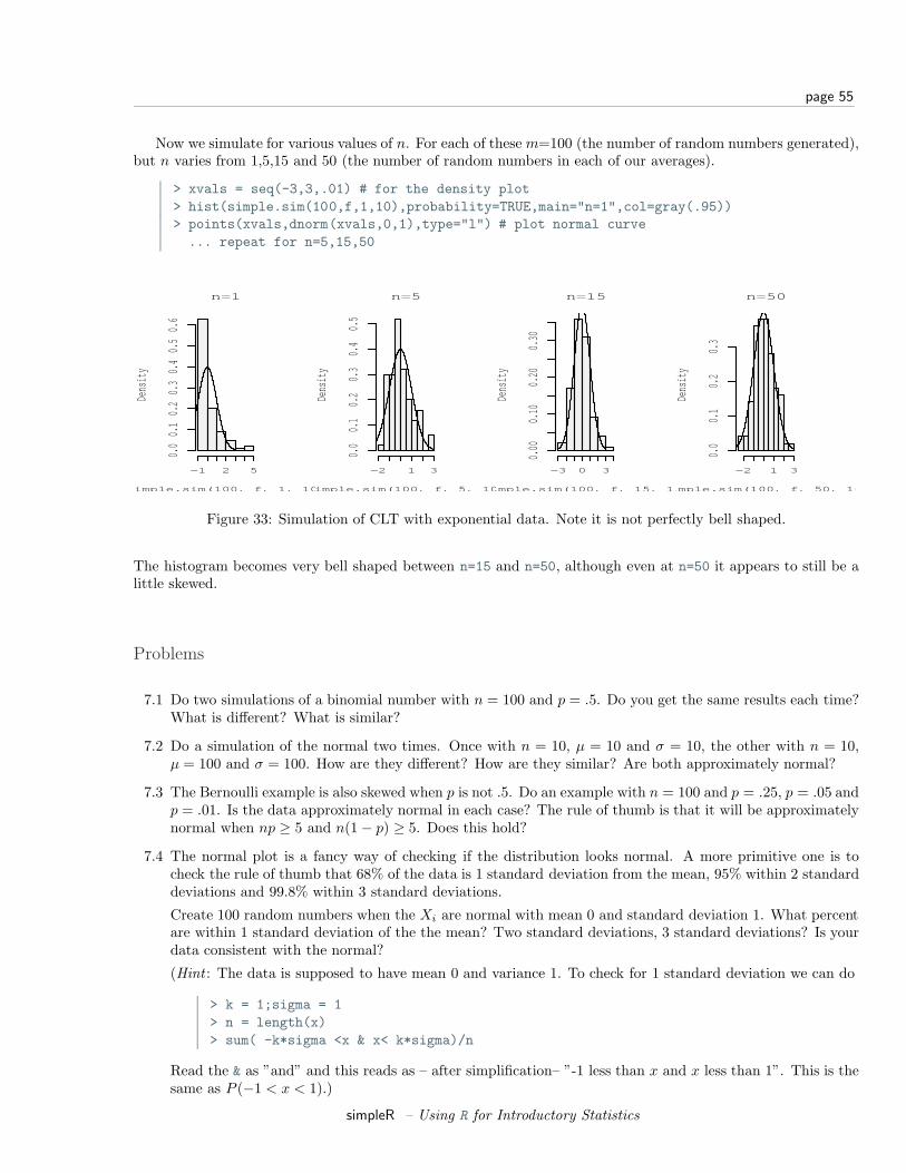
page 55
Now we simulate for various values of n. For each of these m=100 (the number of random numbers generated),but n varies from 1,5,15 and 50 (the number of random numbers in each of our averages).
> xvals = seq(-3,3,.01) # for the density plot> hist(simple.sim(100,f,1,10),probability=TRUE,main="n=1",col=gray(.95))> points(xvals,dnorm(xvals,0,1),type="l") # plot normal curve... repeat for n=5,15,50
n=1
simple.sim(100, f, 1, 10)
Dens
ity
−1 2 5
0.00.1
0.20.3
0.40.5
0.6
n=5
simple.sim(100, f, 5, 10)
Dens
ity
−2 1 3
0.00.1
0.20.3
0.40.5
n=15
simple.sim(100, f, 15, 10)
Dens
ity
−3 0 3
0.00
0.10
0.20
0.30
n=50
simple.sim(100, f, 50, 10)
Dens
ity
−2 1 3
0.00.1
0.20.3
Figure 33: Simulation of CLT with exponential data. Note it is not perfectly bell shaped.
The histogram becomes very bell shaped between n=15 and n=50, although even at n=50 it appears to still be alittle skewed.
Problems
7.1 Do two simulations of a binomial number with n = 100 and p = .5. Do you get the same results each time?What is different? What is similar?
7.2 Do a simulation of the normal two times. Once with n = 10, µ = 10 and σ = 10, the other with n = 10,µ = 100 and σ = 100. How are they different? How are they similar? Are both approximately normal?
7.3 The Bernoulli example is also skewed when p is not .5. Do an example with n = 100 and p = .25, p = .05 andp = .01. Is the data approximately normal in each case? The rule of thumb is that it will be approximatelynormal when np ≥ 5 and n(1− p) ≥ 5. Does this hold?
7.4 The normal plot is a fancy way of checking if the distribution looks normal. A more primitive one is tocheck the rule of thumb that 68% of the data is 1 standard deviation from the mean, 95% within 2 standarddeviations and 99.8% within 3 standard deviations.
Create 100 random numbers when the Xi are normal with mean 0 and standard deviation 1. What percentare within 1 standard deviation of the the mean? Two standard deviations, 3 standard deviations? Is yourdata consistent with the normal?
(Hint : The data is supposed to have mean 0 and variance 1. To check for 1 standard deviation we can do
> k = 1;sigma = 1> n = length(x)> sum( -k*sigma <x & x< k*sigma)/n
Read the & as ”and” and this reads as – after simplification– ”-1 less than x and x less than 1”. This is thesame as P (−1 < x < 1).)
simpleR – Using R for Introductory Statistics
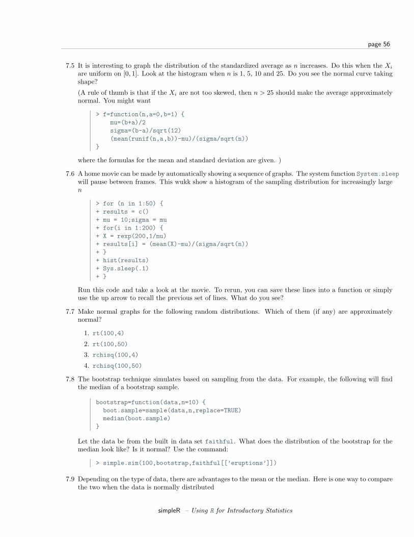
page 56
7.5 It is interesting to graph the distribution of the standardized average as n increases. Do this when the Xi
are uniform on [0, 1]. Look at the histogram when n is 1, 5, 10 and 25. Do you see the normal curve takingshape?
(A rule of thumb is that if the Xi are not too skewed, then n > 25 should make the average approximatelynormal. You might want
> f=function(n,a=0,b=1) {mu=(b+a)/2sigma=(b-a)/sqrt(12)(mean(runif(n,a,b))-mu)/(sigma/sqrt(n))
}
where the formulas for the mean and standard deviation are given. )
7.6 A home movie can be made by automatically showing a sequence of graphs. The system function System.sleepwill pause between frames. This wukk show a histogram of the sampling distribution for increasingly largen
> for (n in 1:50) {+ results = c()+ mu = 10;sigma = mu+ for(i in 1:200) {+ X = rexp(200,1/mu)+ results[i] = (mean(X)-mu)/(sigma/sqrt(n))+ }+ hist(results)+ Sys.sleep(.1)+ }
Run this code and take a look at the movie. To rerun, you can save these lines into a function or simplyuse the up arrow to recall the previous set of lines. What do you see?
7.7 Make normal graphs for the following random distributions. Which of them (if any) are approximatelynormal?
1. rt(100,4)
2. rt(100,50)
3. rchisq(100,4)
4. rchisq(100,50)
7.8 The bootstrap technique simulates based on sampling from the data. For example, the following will findthe median of a bootstrap sample.
bootstrap=function(data,n=10) {boot.sample=sample(data,n,replace=TRUE)median(boot.sample)
}
Let the data be from the built in data set faithful. What does the distribution of the bootstrap for themedian look like? Is it normal? Use the command:
> simple.sim(100,bootstrap,faithful[[’eruptions’]])
7.9 Depending on the type of data, there are advantages to the mean or the median. Here is one way to comparethe two when the data is normally distributed
simpleR – Using R for Introductory Statistics
page 57
> res.median=c();res.mean=c() # initialize> for(i in 1:200) { # create 200 random samples+ X = rnorm(200,0,1)+ res.median[i] = median(X);res.mean[i] = mean(X)+ }> boxplot(res.mean,res.median) # compare
Run this code. What are the differences? Try, the same experiment with a long tailed distribution such asX = rt(200,2). Is there a difference? Explain.
7.10 In mathematical statistics, there are many possible estimates for the center of a data set. To choose betweenthem, the one with the smallest variance is often taken. This variance depends upon the populationdistribution. Here we investigate the ratio of the variances for the mean and the median for differentdistributions. For normal(0,1) data we can check with
> median.normal = function(n=100) median(rnorm(100,0,1))> mean.normal = function(n=100) mean(rnorm(100,0,1))> var(simple.sim(100,mean.normal)) /+ var(simple.sim(100,median.normal))[1] 0.8630587
The answer is a random number which will usually be less than 1. This says that usually the variance ofthe mean is less than the variance of the median for normal data. Repeat using the exponential instead ofthe normal. For example:
> mean.exp = function(n=100) mean(rexp(n,1/10))> median.exp = function(n=100) median(rexp(n,1/10))
and the t-distribution with 2 degrees of freedom
> mean.t = function(n=100) mean(rt(n,2))> median.t = function(n=100) median(rt(n,2))
Is the mean always better than the median? You may also find that side-by-side boxplots of the results ofsimple.sim are informative.
Section 8 Exploratory Data Analysis
Experimental Data Analysis (eda) is the process of looking at a data set to see what are the appropriatestatistical inferences that can possibly be learned. For univariate data, we can ask if the data is approximatelynormal, longer tailed, or shorter tailed? Does it have symmetry, or is it skewed? Is it unimodal, bimodal ormulti-modal? The main tool is the proper use of computer graphics.
Our Toolbox
Our toolbox for eda consists of graphical representations of the data and our interpretation. Here is a summaryof graphical methods covered so far:
barplots for categorical data
histogram, dot plots, stem and leaf plots to see the shape of numerical distributions
boxplots to see summaries of a numerical distribution, useful in comparing distributions and identifying longand short-tailed distributions.
normal probability plots To see if data is approximately normal
simpleR – Using R for Introductory Statistics
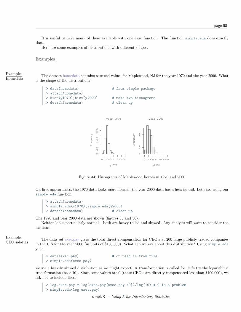
page 58
It is useful to have many of these available with one easy function. The function simple.eda does exactlythat.
Here are some examples of distributions with different shapes.
Examples
Example:Homedata
The dataset homedata contains assessed values for Maplewood, NJ for the year 1970 and the year 2000. Whatis the shape of the distribution?
> data(homedata) # from simple package> attach(homedata)> hist(y1970);hist(y2000) # make two histograms> detach(homedata) # clean up
year 1970
y1970
Fre
qu
en
cy
0 100000 250000
05
00
15
00
25
00
year 2000
y2000
Fre
qu
en
cy
0 400000 1000000
05
00
15
00
Figure 34: Histograms of Maplewood homes in 1970 and 2000
On first appearances, the 1970 data looks more normal, the year 2000 data has a heavier tail. Let’s see using oursimple.eda function.
> attach(homedata)> simple.eda(y1970);simple.eda(y2000)> detach(homedata) # clean up
The 1970 and year 2000 data are shown (figures 35 and 36).Neither looks particularly normal – both are heavy tailed and skewed. Any analysis will want to consider the
medians.
Example:CEO salaries
The data set exec.pay gives the total direct compensation for CEO’s at 200 large publicly traded companiesin the U.S for the year 2000 (in units of $100,000). What can we say about this distribution? Using simple.edayields
> data(exec.pay) # or read in from file> simple.eda(exec.pay)
we see a heavily skewed distribution as we might expect. A transformation is called for, let’s try the logarithmictransformation (base 10). Since some values are 0 (these CEO’s are directly compensated less than $100,000), weask not to include these.
> log.exec.pay = log(exec.pay[exec.pay >0])/log(10) # 0 is a problem> simple.eda(log.exec.pay)
simpleR – Using R for Introductory Statistics

page 59
Histogram of x
x
Fre
qu
en
cy
0 100000 250000
05
00
15
00
25
00
05
00
00
15
00
00
25
00
00
boxplot
−4 −2 0 2 4
05
00
00
15
00
00
25
00
00
Normal Q−Q Plot
Theoretical Quantiles
Sa
mp
le Q
ua
ntil
es
Figure 35: 1970 Maplewood home data
Histogram of x
x
Fre
qu
en
cy
0 400000 1000000
05
00
10
00
15
00
20
00
04
00
00
08
00
00
01
20
00
00
boxplot
−4 −2 0 2 4
04
00
00
08
00
00
01
20
00
00
Normal Q−Q Plot
Theoretical Quantiles
Sa
mp
le Q
ua
ntil
es
Figure 36: 2000 Maplewood N.J. home data
Histogram of x
x
Frequ
ency
0 1000 2000 3000
050
100
150
200
050
010
0015
0020
0025
00
boxplot
−3 −1 0 1 2 3
050
010
0015
0020
0025
00
Normal Q−Q Plot
Theoretical Quantiles
Samp
le Qu
antile
s
Figure 37: Executive pay data
simpleR – Using R for Introductory Statistics
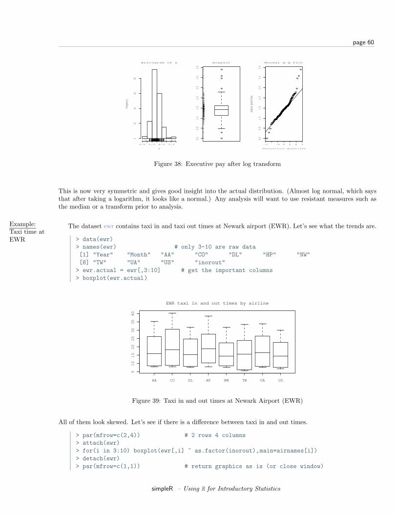
page 60
Histogram of x
x
Frequ
ency
0.0 1.0 2.0 3.0
020
4060
80
0.00.5
1.01.5
2.02.5
3.03.5
boxplot
−3 −1 0 1 2 3
0.00.5
1.01.5
2.02.5
3.03.5
Normal Q−Q Plot
Theoretical Quantiles
Samp
le Qu
antile
s
Figure 38: Executive pay after log transform
This is now very symmetric and gives good insight into the actual distribution. (Almost log normal, which saysthat after taking a logarithm, it looks like a normal.) Any analysis will want to use resistant measures such asthe median or a transform prior to analysis.
Example:Taxi time atEWR
The dataset ewr contains taxi in and taxi out times at Newark airport (EWR). Let’s see what the trends are.
> data(ewr)> names(ewr) # only 3-10 are raw data[1] "Year" "Month" "AA" "CO" "DL" "HP" "NW"[8] "TW" "UA" "US" "inorout"> ewr.actual = ewr[,3:10] # get the important columns> boxplot(ewr.actual)
AA CO DL HP NW TW UA US
51
01
52
02
53
03
54
0
EWR taxi in and out times by airline
Figure 39: Taxi in and out times at Newark Airport (EWR)
All of them look skewed. Let’s see if there is a difference between taxi in and out times.
> par(mfrow=c(2,4)) # 2 rows 4 columns> attach(ewr)> for(i in 3:10) boxplot(ewr[,i] ~ as.factor(inorout),main=airnames[i])> detach(ewr)> par(mfrow=c(1,1)) # return graphics as is (or close window)
simpleR – Using R for Introductory Statistics
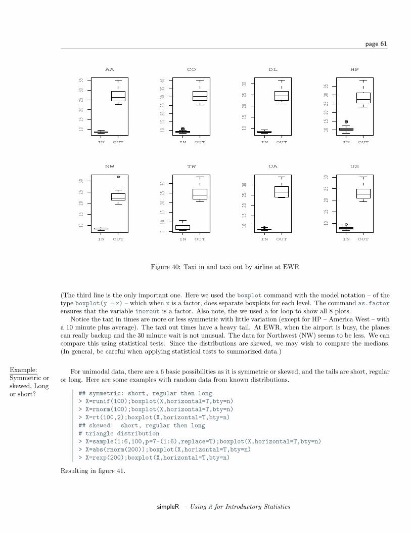
page 61
IN OUT
1015
2025
3035
AA
IN OUT
1015
2025
3035
40
CO
IN OUT
1015
2025
30
DL
IN OUT
1015
2025
3035
HP
IN OUT
1015
2025
30
NW
IN OUT
510
1520
2530
TW
IN OUT
1015
2025
30
UA
IN OUT
1015
2025
30
US
Figure 40: Taxi in and taxi out by airline at EWR
(The third line is the only important one. Here we used the boxplot command with the model notation – of thetype boxplot(y ∼x) – which when x is a factor, does separate boxplots for each level. The command as.factorensures that the variable inorout is a factor. Also note, the we used a for loop to show all 8 plots.
Notice the taxi in times are more or less symmetric with little variation (except for HP – America West – witha 10 minute plus average). The taxi out times have a heavy tail. At EWR, when the airport is busy, the planescan really backup and the 30 minute wait is not unusual. The data for Northwest (NW) seems to be less. We cancompare this using statistical tests. Since the distributions are skewed, we may wish to compare the medians.(In general, be careful when applying statistical tests to summarized data.)
Example:Symmetric orskewed, Longor short?
For unimodal data, there are a 6 basic possibilities as it is symmetric or skewed, and the tails are short, regularor long. Here are some examples with random data from known distributions.
## symmetric: short, regular then long> X=runif(100);boxplot(X,horizontal=T,bty=n)> X=rnorm(100);boxplot(X,horizontal=T,bty=n)> X=rt(100,2);boxplot(X,horizontal=T,bty=n)## skewed: short, regular then long# triangle distribution> X=sample(1:6,100,p=7-(1:6),replace=T);boxplot(X,horizontal=T,bty=n)> X=abs(rnorm(200));boxplot(X,horizontal=T,bty=n)> X=rexp(200);boxplot(X,horizontal=T,bty=n)
Resulting in figure 41.
simpleR – Using R for Introductory Statistics

page 62
0.0 0.2 0.4 0.6 0.8 1.0 −3 −2 −1 0 1 2 −4 0 2 4 6 8
1 2 3 4 5 6 0.0 0.5 1.0 1.5 2.0 2.5 0 2 4 6 8
Figure 41: Symmetric or skewed; short, regular or long
simpleR – Using R for Introductory Statistics
page 63
Problems
8.1 Attach the data set babies. Describe the distributions of the variables birth weight (bwt), gestation, age,height and weight.
8.2 The Simple data set iq contains simulated scores on a hypothetical IQ test. What analysis is appropriatefor measuring the center of the distribution? Why? (Note, the data reads in as a list.
8.3 The Simple data set slc contains data on red blood cell sodium-lithium countertransport activity for 190individuals. Describe the shape of the distribution, estimate the center, state what is an appropriate measureof center for this data.
8.4 The t distribution will be important later. It depends on a parameter called the degrees of freedom. Usethe rt(n,df) function to investigate the t-distribution for n=100 and df=2, 10 and 25.
8.5 The χ2 distribution also depends on a parameter called the degrees of freedom. Use the rchisq(n,df)function to investigate the χ2 distribution with n=100 and df=2,10 and 25.
8.6 The R dataset trees contains girth (diameter), height and volume (of boardfeet) measurements for severaltrees of a species of cherry tree. Describe the distributions of each of these 3 variables. Are any long tailed,short-tailed, skewed?
8.7 The Simple dataset dowdata contains the Dow Jones numbers from January 1999 to October 2000. TheBlack-Scholes theory is modeled on the assumption that the changes in the data withing a data should belog normal. In particular, if Xn is the value on day n then log(Xn/Xn−1 should be normal. Investigate thisas follows
> data(dowdata)> x = dowdata[[’Close’]] # look at daily closes> n = length(x) # how big is x?> z = log(x[2:n]/x[1:(n-1)] # This does X_n/X_(n-1)
Now check if z is normal. What do you see?
8.8 The childrens game of Chutes and Ladders can be simulated easily in R. The time it takes for a player tomake it to the end has an interesting distribution. To simulate the game, you can use the Simle functionsimple.chutes as follows.
> results=c()> for(i in 1:200) results[i]=length(simple.chutes(sim=TRUE))> hist(results)
Describe the resulting distribution in words. What percentage of the time did it take more than 100 turns?What is the median and compare it to the mean of your sample.
To view a trajectory (the actual dice rolls), you can just plot as follows
> plot(simple.chutes(1))
Section 9 Confidence Interval Estimation
In statistics one often would like to estimate unknown parameters for a known distribution. For example,you may think that your parent population is normal, but the mean is unknown, or both the mean and standard
simpleR – Using R for Introductory Statistics
page 64
deviation are unknown. From a data set you can’t hope to know the exact values of the parameters, but the datashould give you a good idea what they are. For the mean, we expect that the sample mean or average of ourdata will be a good choice for the population mean, and intuitively, we understand that the more data we havethe better this should be. How do we quantify this?
Statistical theory is based on knowing the sampling distribution of some statistic such as the mean. Thisallows us to make probability statements about the value of the parameters. Such as we are 95 percent certainthe parameter is in some range of values.
In this section, we introduce the R functions prop.test,t.test, and wilcox.test to facilitate the calculations.
Population Proportion Theory
The most widely seen use of confidence intervals is the estimation of population proportion through surveysor polls. For example, suppose it is reported that 100 people were surveyed and 42 of them liked brand X. Howdo you see this in the media?
Depending on the sophistication of the reporter, you might see the claim that 42% of the population reportsthey like brand X. Or, you might see a statement like “the survey indicates that 42% of people like brand X, thishas a margin of error of 9 percentage points.” Or, if you find a careful reporter you will see a summary such as“the survey indicates that 42% of people like brand X, this has a margin of error of 9 percentage points. This isa 95% confidence level.”
Why all the different answers? Well, the idea that we can infer anything about the population based on asurvey of just 100 people is founded on probability theory. If the sample is a random sample then we know thesampling distribution of p the sample proportion. It is approximately normal.
Let’s fix the notation. Suppose we let π be the true population proportion, which is of course
π =Number who agreeSize of population
and let
p =Number surveyed who agree
size of survey.
(Note: Many books use p for the population parameter and p for the sample. The convention here is to useGreek letters for the population parameter and English equivalents for the sample.)
We could say more. If the sampled answers are recorded as Xi where Xi = 1 if it was “yes” and Xi = 0 if“no”, then our sample is {X1, X2, . . . , Xn} where n is the size of the sample and we get
p =X1 + X2 + · · ·+ Xn
n.
Which looks quite a lot like an average (X).Now if we satisfy the assumptions that each Xi is i.i.d. then p has a known distribution, and if n is large
enough we can say the following is approximately normal with mean 0 and variance 1:
z =p− π√
p(1− p)/√
n=
X − µ
s/√
n
If we know this, then we can say how close z is to zero by specifying a confidence. For example, from theknown properties of the normal, we know that
• z is in (−1, 1) with probability approximately 0.68
• z is in (−2, 2) with probability approximately 0.95
• z is in (−3, 3) with probability approximately 0.998
simpleR – Using R for Introductory Statistics
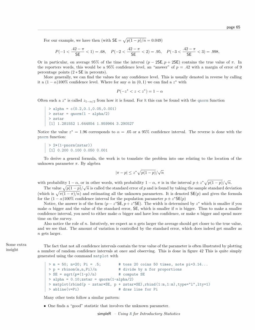
page 65
For our example, we have then (with SE =√
p(1− p)/n = 0.049)
P (−1 <.42− π
SE< 1) = .68, P (−2 <
.42− π
SE< 2) = .95, P (−3 <
.42− π
SE< 3) = .998,
Or in particular, on average 95% of the time the interval (p − 2SE, p + 2SE) contains the true value of π. Inthe reporters words, this would be a 95% confidence level, an “answer” of p = .42 with a margin of error of 9percentage points (2 ∗ SE in percents).
More generally, we can find the values for any confidence level. This is usually denoted in reverse by callingit a (1− α)100% confidence level. Where for any α in (0, 1) we can find a z∗ with
P (−z∗ < z < z∗) = 1− α
Often such a z∗ is called z1−α/2 from how it is found. For R this can be found with the qnorm function
> alpha = c(0.2,0.1,0.05,0.001)> zstar = qnorm(1 - alpha/2)> zstar[1] 1.281552 1.644854 1.959964 3.290527
Notice the value z∗ = 1.96 corresponds to α = .05 or a 95% confidence interval. The reverse is done with thepnorm function:
> 2*(1-pnorm(zstar))[1] 0.200 0.100 0.050 0.001
To derive a general formula, the work is to translate the problem into one relating to the location of theunknown parameter π. By algebra
|π − p| ≤ z∗√
p(1− p)/√
n
with probability 1− α, or in other words, with probability 1− α, π is in the interval p± z∗√
p(1− p)/√
n.The value
√p(1− p)/
√n is called the standard error of p and is found by taking the sample standard deviation
(which is√
π(1 − π)/n) and estimating all the unknown parameters. It is denoted SE(p) and gives the formulafor the (1− α)100% confidence interval for the population parameter p± z∗SE(p)
Notice, the answer is of the form (p− z∗SE, p + z∗SE). The width is determined by z∗ which is smaller if youmake α bigger and the value of the standard error, SE, which is smaller if n is bigger. Thus to make a smallerconfidence interval, you need to either make α bigger and have less confidence, or make n bigger and spend moretime on the survey.
Also notice the role of n. Intutively, we expect as n gets larger the average should get closer to the true value,and we see that. The amount of variation is controlled by the standard error, which does indeed get smaller asn gets larger.
Some extrainsight
The fact that not all confidence intervals contain the true value of the parameter is often illustrated by plottinga number of random confidence intervals at once and observing. This is done in figure 42 This is quite simplygenerated using the command matplot with
> m = 50; n=20; Pi = .5; # toss 20 coins 50 times, note pi=3.14...> p = rbinom(m,n,Pi)/n # divide by n for proportions> SE = sqrt(p*(1-p)/n) # compute SE> alpha = 0.10;zstar = qnorm(1-alpha/2)> matplot(rbind(p - zstar*SE, p + zstar*SE),rbind(1:m,1:m),type="l",lty=1)> abline(v=Pi) # draw line for Pi
Many other tests follow a similar pattern:
• One finds a “good” statistic that involves the unknown parameter.
simpleR – Using R for Introductory Statistics
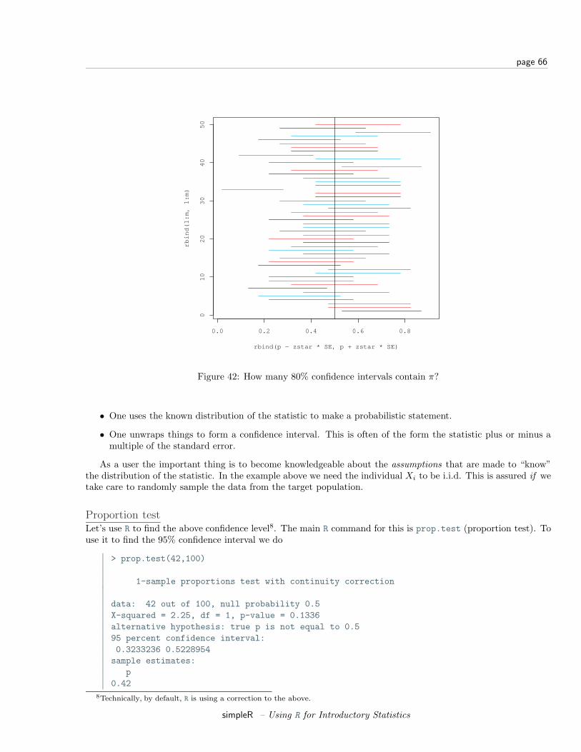
page 66
0.0 0.2 0.4 0.6 0.8
01
02
03
04
05
0
rbind(p − zstar * SE, p + zstar * SE)
rbin
d(1
:m,
1:m
)
Figure 42: How many 80% confidence intervals contain π?
• One uses the known distribution of the statistic to make a probabilistic statement.
• One unwraps things to form a confidence interval. This is often of the form the statistic plus or minus amultiple of the standard error.
As a user the important thing is to become knowledgeable about the assumptions that are made to “know”the distribution of the statistic. In the example above we need the individual Xi to be i.i.d. This is assured if wetake care to randomly sample the data from the target population.
Proportion testLet’s use R to find the above confidence level8. The main R command for this is prop.test (proportion test). Touse it to find the 95% confidence interval we do
> prop.test(42,100)
1-sample proportions test with continuity correction
data: 42 out of 100, null probability 0.5X-squared = 2.25, df = 1, p-value = 0.1336alternative hypothesis: true p is not equal to 0.595 percent confidence interval:0.3233236 0.5228954sample estimates:
p0.42
8Technically, by default, R is using a correction to the above.
simpleR – Using R for Introductory Statistics
page 67
Notice, in particular, we get the 95% confidence interval (0.32, 0.52) by default.If we want a 90% confidence interval we need to ask for it:
> prop.test(42,100,conf.level=0.90)
1-sample proportions test with continuity correction
data: 42 out of 100, null probability 0.5X-squared = 2.25, df = 1, p-value = 0.1336alternative hypothesis: true p is not equal to 0.590 percent confidence interval:0.3372368 0.5072341sample estimates:
p0.42
Which gives the interval (0.33, 0.50). Notice this is smaller as we are now less confident.
The z-testAs above, we can test for the mean in a similar way, provided the statistic
X − µ
σ/√
n
is normally distributed. This can happen if either
• σ is known, and the Xi’s are normally distributed.
• σ is known, and n is large enough to apply the CLT.
Suppose a person weighs himself on a regular basis and finds his weight to be
175 176 173 175 174 173 173 176 173 179
Suppose that σ = 1.5 and the error in weighing is normally distributed. (That is Xi = µ + εi where εi isnormal with mean 0 and standard deviation 1.5). Rather than use a built-in test, we illustrate how we can createour own:
simple.z.test1 simple.z.test <-function(x,sigma,conf.level=0.95) {2 n <- length(x);xbar<-mean(x)3 alpha <- 1 - conf.level4 zstar <- qnorm(1-alpha/2)5 SE <- sigma/sqrt(n)6
7 xbar + c(-zstar*SE,zstar*SE)8 }
> simple.z.test(x,1.5)[1] 173.7703 175.6297
Notice we get the 95% confidence interval of (173.7703, 175.6297)
The t-testMore realistically, you may not know the standard deviation. To work around this we use the t-statistic, whichis given by
t =X − µ
s/√
n
simpleR – Using R for Introductory Statistics
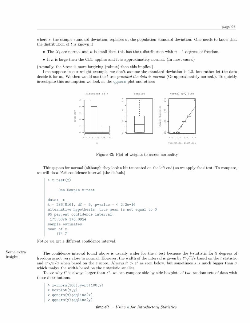
page 68
where s, the sample standard deviation, replaces σ, the population standard deviation. One needs to know thatthe distribution of t is known if
• The Xi are normal and n is small then this has the t-distribution with n− 1 degrees of freedom.
• If n is large then the CLT applies and it is approximately normal. (In most cases.)
(Actually, the t-test is more forgiving (robust) than this implies.)Lets suppose in our weight example, we don’t assume the standard deviation is 1.5, but rather let the data
decide it for us. We then would use the t-test provided the data is normal (Or approximately normal.). To quicklyinvestigate this assumption we look at the qqnorm plot and others
Histogram of x
x
Fre
qu
en
cy
172 174 176 178 180
01
23
45
17
31
75
17
71
79
boxplot
−1.5 −0.5 0.5 1.5
17
31
75
17
71
79
Normal Q−Q Plot
Theoretical Quantiles
Sa
mp
le Q
ua
ntil
es
Figure 43: Plot of weights to assess normality
Things pass for normal (although they look a bit truncated on the left end) so we apply the t test. To compare,we will do a 95% confidence interval (the default)
> t.test(x)
One Sample t-test
data: xt = 283.8161, df = 9, p-value = < 2.2e-16alternative hypothesis: true mean is not equal to 095 percent confidence interval:173.3076 176.0924sample estimates:mean of x
174.7
Notice we get a different confidence interval.
Some extrainsight
The confidence interval found above is usually wider for the t test because the t-statistic for 9 degrees offreedom is not very close to normal. However, the width of the interval is given by t∗
√n/s based on the t statistic
and z∗√
n/σ when based on the z score. Always t∗ > z∗ as seen below, but sometimes s is much bigger than σwhich makes the width based on the t statistic smaller.
To see why t∗ is always larger than z∗, we can compare side-by-side boxplots of two random sets of data withthese distributions.
> x=rnorm(100);y=rt(100,9)> boxplot(x,y)> qqnorm(x);qqline(x)> qqnorm(y);qqline(y)
simpleR – Using R for Introductory Statistics

page 69
which gives (notice the symmetry of both, but the larger variance of the t distribution). And for completeness,
1 2
−3
−2
−1
01
2
−2 0 2
−2
−1
01
2
Normal data
Theoretical Quantiles
Sa
mp
le Q
ua
ntil
es
−2 0 2
−3
−2
−1
01
2
t data. 9 d.f.
Theoretical Quantiles
Sa
mp
le Q
ua
ntil
es
Figure 44: Plot of random normal data and random t-distributed data
this creates a graph with several theoretical densities.
> xvals=seq(-4,4,.01)> plot(xvals,dnorm(xvals),type="l")> for(i in c(2,5,10,20,50)) points(xvals,dt(xvals,df=i),type="l",lty=i)
−4 −2 0 2 4
0.0
0.1
0.2
0.3
0.4
xvals
dn
orm
(xva
ls, 0
, 1
)
normal density and t density for various d.f.s
normal2 d.f5 d.f10 d.f20 d.f50 d.f
Figure 45: Normal density and the t-density for several degrees of freedom
C.I. for the MedianConfidence intervals for the median are important too. They are different mathematically than the ones above,but in R these differences aren’t noticed. The R function wilcox.test performs a non-parametric test for themedian.
Suppose the following data is pay of CEO’s in America in 2001 dollars9, then the following creates a test forthe median
> x = c(110, 12, 2.5, 98, 1017, 540, 54, 4.3, 150, 432)> wilcox.test(x,conf.int=TRUE)
Wilcoxon signed rank test
9from the exec.pay dataset
simpleR – Using R for Introductory Statistics
page 70
data: xV = 55, p-value = 0.001953alternative hypothesis: true mu is not equal to 095 percent confidence interval:33.0 514.5
Notice a few things:
• Unlike prop.test and t.test, we needed to specify that we wanted a confidence interval computed.
• For this data, the confidence interval is enormous as the size of the sample is small and the range is huge.
• We couldn’t have used a t-test as the data isn’t even close to normal.
Problems
9.1 Create 15 random numbers that are normally distributed with mean 10 and s.d. 5. Find a 1-sample z-testat the 95% level. Did it get it right?
9.2 ?Do the above 100 times. Compute what percentage is in a 95% confidence interval. Hint: The followingmight prove useful
> f=function () mean(rnorm(15,mean=10,sd=5))> SE = 5/sqrt(15)> xbar = simple.sim(100,f)> alpha = 0.1;zstar = qnorm(1-alpha/2);sum(abs(xbar-10) < zstar*SE)[1] 87> alpha = 0.05;zstar = qnorm(1-alpha/2);sum(abs(xbar-10) < zstar*SE)[1] 92> alpha = 0.01;zstar = qnorm(1-alpha/2);sum(abs(xbar-10) < zstar*SE)[1] 98
9.3 The t-test is just as easy to do. Do a t-test on the same data. Is it correct now? Comment on the relationshipbetween the confidence intervals.
9.4 Find an 80% and 95% confidence interval for the median for the exec.pay dataset.
9.5 For the Simple data set rat do a t-test for mean if the data suggests it is appropriate. If not, say why not.(This records survival times for rats.)
9.6 Repeat the previous for the Simple data set puerto (weekly incomes of Puerto Ricans in Miami.).
9.7 The median may be the appropriate measure of center. If so, you might want to have a confidence intervalfor it too. Find a 90% confidence interval for the median for the Simple data set malpract (on the size ofmalpractice awards). Comment why this distribution doesn’t lend itself to the z-test or t-test.
9.8 ?The t-statistic has the t-distribution if the Xi’s are normally distributed. What if they are not? Investigatethe distribution of the t-statistic if the Xi’s have different distributions. Try short-tailed ones (uniform),long-tailed ones (t-distributed to begin with), Uniform (exponential or log-normal).
(For example, If the Xi are nearly normal, but there is a chance of some errors introducing outliers. Thiscan be modeled with
Xi = ζ(µ + σZ) + (1− ζ)Y
simpleR – Using R for Introductory Statistics

page 71
where ζ is 1 with high probability and 0 otherwise and Y is of a different distribution. For concreteness,suppose µ = 0, σ = 1 and Y is normal with mean 0, but standard deviation 10 and P (ζ = 1) = .9. Hereis some R code to simulate and investigate. (Please note, the simulations for the suggested distributionsshould be much simpler.)
> f = function(n=10,p=0.95) {+ y = rnorm(n,mean=0,sd=1+9*rbinom(n,1,1-p))+ t = (mean(y) - 0) / (sqrt(var(y))/sqrt(n))+ }> sample = simple.sim(100,f)> qqplot(sample,rt(100,df=9),main="sample vs. t");qqline(sample)> qqnorm(sample,main="sample vs. normal");qqline(sample)> hist(sample)
The resulting graphs are shown. First, the graph shows the sample against the t-quantiles. A bad, fit. Thenormal plot is better but we still see a skew in the histogram due to a single large outlier.)
−4 −2 0 2
−3−2
−10
12
3
sample vs. t
sample
rt(10
0, d
f = 9
)
−2 0 2
−4−3
−2−1
01
23
sample vs. normal
Theoretical Quantiles
Sam
ple Q
uant
iles
Histogram of sample
sample
Freq
uenc
y
−4 0 2
05
1015
2025
30Figure 46: t-statistic for contaminated normal data
Section 10 Hypothesis Testing
Hypothesis testing is mathematically related to the problem of finding confidence intervals. However, theapproach is different. For one, you use the data to tell you where the unknown parameters should lie, forhypothesis testing, you make a hypothesis about the value of the unknown parameter and then calculate howlikely it is that you observed the data or worse.
However, with R you will not notice much difference as the same functions are used for both. The way youuse them is slightly different though.
Testing a population parameter
Consider a simple survey. You ask 100 people (randomly chosen) and 42 say “yes” to your question. Doesthis support the hypothesis that the true proportion is 50%?
To answer this, we set up a test of hypothesis. The null hypothesis, denoted H0 is that p = .5, the alternativehypothesis, denoted HA, in this example would be p 6= 0.5. This is a so called “two-sided” alternative. To test theassumptions, we use the function prop.test as with the confidence interval calculation. Here are the commands
> prop.test(42,100,p=.5)
simpleR – Using R for Introductory Statistics
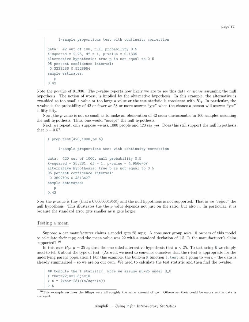
page 72
1-sample proportions test with continuity correction
data: 42 out of 100, null probability 0.5X-squared = 2.25, df = 1, p-value = 0.1336alternative hypothesis: true p is not equal to 0.595 percent confidence interval:0.3233236 0.5228954sample estimates:
p0.42
Note the p-value of 0.1336. The p-value reports how likely we are to see this data or worse assuming the nullhypothesis. The notion of worse, is implied by the alternative hypothesis. In this example, the alternative istwo-sided as too small a value or too large a value or the test statistic is consistent with HA. In particular, thep-value is the probability of 42 or fewer or 58 or more answer “yes” when the chance a person will answer “yes”is fifty-fifty.
Now, the p-value is not so small as to make an observation of 42 seem unreasonable in 100 samples assumingthe null hypothesis. Thus, one would “accept” the null hypothesis.
Next, we repeat, only suppose we ask 1000 people and 420 say yes. Does this still support the null hypothesisthat p = 0.5?
> prop.test(420,1000,p=.5)
1-sample proportions test with continuity correction
data: 420 out of 1000, null probability 0.5X-squared = 25.281, df = 1, p-value = 4.956e-07alternative hypothesis: true p is not equal to 0.595 percent confidence interval:0.3892796 0.4513427sample estimates:
p0.42
Now the p-value is tiny (that’s 0.0000004956!) and the null hypothesis is not supported. That is we “reject” thenull hypothesis. This illustrates the the p value depends not just on the ratio, but also n. In particular, it isbecause the standard error gets smaller as n gets larger.
Testing a mean
Suppose a car manufacturer claims a model gets 25 mpg. A consumer group asks 10 owners of this modelto calculate their mpg and the mean value was 22 with a standard deviation of 1.5. Is the manufacturer’s claimsupported? 10
In this case H0: µ = 25 against the one-sided alternative hypothesis that µ < 25. To test using R we simplyneed to tell R about the type of test. (As well, we need to convince ourselves that the t-test is appropriate for theunderlying parent population.) For this example, the built-in R function t.test isn’t going to work – the data isalready summarized – so we are on our own. We need to calculate the test statistic and then find the p-value.
## Compute the t statistic. Note we assume mu=25 under H_0> xbar=22;s=1.5;n=10> t = (xbar-25)/(s/sqrt(n))> t
10This example assumes the fillups were all roughly the same amount of gas. Otherwise, their could be errors as the data isaveraged.
simpleR – Using R for Introductory Statistics
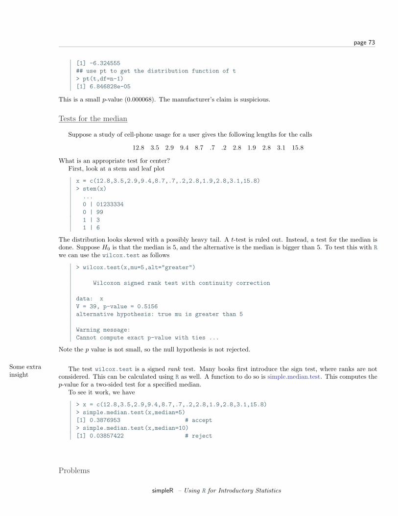
page 73
[1] -6.324555## use pt to get the distribution function of t> pt(t,df=n-1)[1] 6.846828e-05
This is a small p-value (0.000068). The manufacturer’s claim is suspicious.
Tests for the median
Suppose a study of cell-phone usage for a user gives the following lengths for the calls
12.8 3.5 2.9 9.4 8.7 .7 .2 2.8 1.9 2.8 3.1 15.8
What is an appropriate test for center?First, look at a stem and leaf plot
x = c(12.8,3.5,2.9,9.4,8.7,.7,.2,2.8,1.9,2.8,3.1,15.8)> stem(x)...0 | 012333340 | 991 | 31 | 6
The distribution looks skewed with a possibly heavy tail. A t-test is ruled out. Instead, a test for the median isdone. Suppose H0 is that the median is 5, and the alternative is the median is bigger than 5. To test this with Rwe can use the wilcox.test as follows
> wilcox.test(x,mu=5,alt="greater")
Wilcoxon signed rank test with continuity correction
data: xV = 39, p-value = 0.5156alternative hypothesis: true mu is greater than 5
Warning message:Cannot compute exact p-value with ties ...
Note the p value is not small, so the null hypothesis is not rejected.
Some extrainsight
The test wilcox.test is a signed rank test. Many books first introduce the sign test, where ranks are notconsidered. This can be calculated using R as well. A function to do so is simple.median.test. This computes thep-value for a two-sided test for a specified median.
To see it work, we have
> x = c(12.8,3.5,2.9,9.4,8.7,.7,.2,2.8,1.9,2.8,3.1,15.8)> simple.median.test(x,median=5)[1] 0.3876953 # accept> simple.median.test(x,median=10)[1] 0.03857422 # reject
Problems
simpleR – Using R for Introductory Statistics
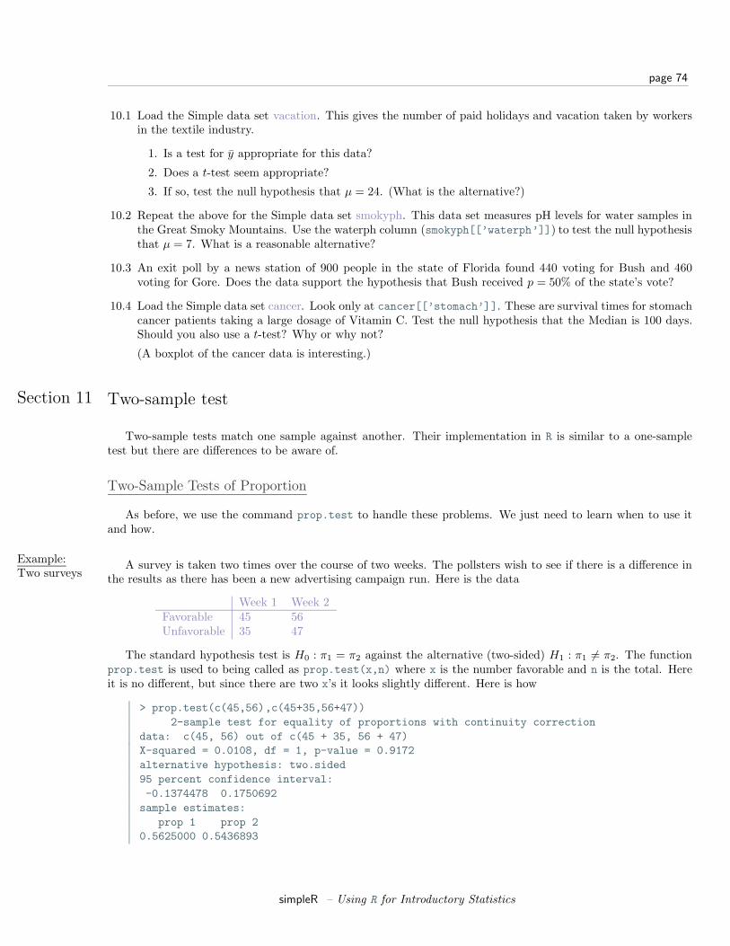
page 74
10.1 Load the Simple data set vacation. This gives the number of paid holidays and vacation taken by workersin the textile industry.
1. Is a test for y appropriate for this data?
2. Does a t-test seem appropriate?
3. If so, test the null hypothesis that µ = 24. (What is the alternative?)
10.2 Repeat the above for the Simple data set smokyph. This data set measures pH levels for water samples inthe Great Smoky Mountains. Use the waterph column (smokyph[[’waterph’]]) to test the null hypothesisthat µ = 7. What is a reasonable alternative?
10.3 An exit poll by a news station of 900 people in the state of Florida found 440 voting for Bush and 460voting for Gore. Does the data support the hypothesis that Bush received p = 50% of the state’s vote?
10.4 Load the Simple data set cancer. Look only at cancer[[’stomach’]]. These are survival times for stomachcancer patients taking a large dosage of Vitamin C. Test the null hypothesis that the Median is 100 days.Should you also use a t-test? Why or why not?
(A boxplot of the cancer data is interesting.)
Section 11 Two-sample test
Two-sample tests match one sample against another. Their implementation in R is similar to a one-sampletest but there are differences to be aware of.
Two-Sample Tests of Proportion
As before, we use the command prop.test to handle these problems. We just need to learn when to use itand how.
Example:Two surveys
A survey is taken two times over the course of two weeks. The pollsters wish to see if there is a difference inthe results as there has been a new advertising campaign run. Here is the data
Week 1 Week 2Favorable 45 56Unfavorable 35 47
The standard hypothesis test is H0 : π1 = π2 against the alternative (two-sided) H1 : π1 6= π2. The functionprop.test is used to being called as prop.test(x,n) where x is the number favorable and n is the total. Hereit is no different, but since there are two x’s it looks slightly different. Here is how
> prop.test(c(45,56),c(45+35,56+47))2-sample test for equality of proportions with continuity correction
data: c(45, 56) out of c(45 + 35, 56 + 47)X-squared = 0.0108, df = 1, p-value = 0.9172alternative hypothesis: two.sided95 percent confidence interval:-0.1374478 0.1750692sample estimates:
prop 1 prop 20.5625000 0.5436893
simpleR – Using R for Introductory Statistics
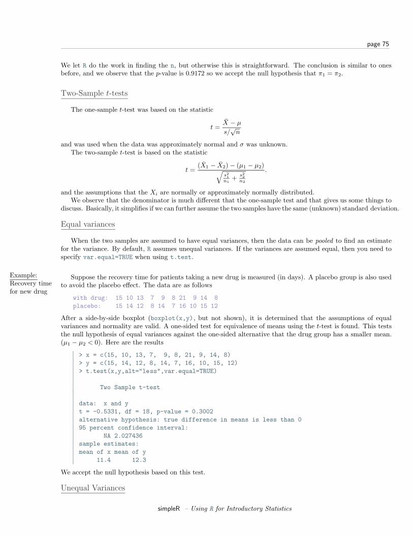
page 75
We let R do the work in finding the n, but otherwise this is straightforward. The conclusion is similar to onesbefore, and we observe that the p-value is 0.9172 so we accept the null hypothesis that π1 = π2.
Two-Sample t-tests
The one-sample t-test was based on the statistic
t =X − µ
s/√
n
and was used when the data was approximately normal and σ was unknown.The two-sample t-test is based on the statistic
t =(X1 − X2) − (µ1 − µ2)√
s21
n1+ s2
2n2
.
and the assumptions that the Xi are normally or approximately normally distributed.We observe that the denominator is much different that the one-sample test and that gives us some things to
discuss. Basically, it simplifies if we can further assume the two samples have the same (unknown) standard deviation.
Equal variances
When the two samples are assumed to have equal variances, then the data can be pooled to find an estimatefor the variance. By default, R assumes unequal variances. If the variances are assumed equal, then you need tospecify var.equal=TRUE when using t.test.
Example:Recovery timefor new drug
Suppose the recovery time for patients taking a new drug is measured (in days). A placebo group is also usedto avoid the placebo effect. The data are as follows
with drug: 15 10 13 7 9 8 21 9 14 8placebo: 15 14 12 8 14 7 16 10 15 12
After a side-by-side boxplot (boxplot(x,y), but not shown), it is determined that the assumptions of equalvariances and normality are valid. A one-sided test for equivalence of means using the t-test is found. This teststhe null hypothesis of equal variances against the one-sided alternative that the drug group has a smaller mean.(µ1 − µ2 < 0). Here are the results
> x = c(15, 10, 13, 7, 9, 8, 21, 9, 14, 8)> y = c(15, 14, 12, 8, 14, 7, 16, 10, 15, 12)> t.test(x,y,alt="less",var.equal=TRUE)
Two Sample t-test
data: x and yt = -0.5331, df = 18, p-value = 0.3002alternative hypothesis: true difference in means is less than 095 percent confidence interval:
NA 2.027436sample estimates:mean of x mean of y
11.4 12.3
We accept the null hypothesis based on this test.
Unequal Variances
simpleR – Using R for Introductory Statistics
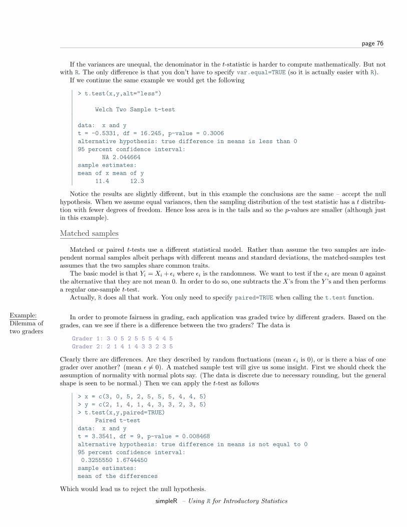
page 76
If the variances are unequal, the denominator in the t-statistic is harder to compute mathematically. But notwith R. The only difference is that you don’t have to specify var.equal=TRUE (so it is actually easier with R).
If we continue the same example we would get the following
> t.test(x,y,alt="less")
Welch Two Sample t-test
data: x and yt = -0.5331, df = 16.245, p-value = 0.3006alternative hypothesis: true difference in means is less than 095 percent confidence interval:
NA 2.044664sample estimates:mean of x mean of y
11.4 12.3
Notice the results are slightly different, but in this example the conclusions are the same – accept the nullhypothesis. When we assume equal variances, then the sampling distribution of the test statistic has a t distribu-tion with fewer degrees of freedom. Hence less area is in the tails and so the p-values are smaller (although justin this example).
Matched samples
Matched or paired t-tests use a different statistical model. Rather than assume the two samples are inde-pendent normal samples albeit perhaps with different means and standard deviations, the matched-samples testassumes that the two samples share common traits.
The basic model is that Yi = Xi + εi where εi is the randomness. We want to test if the εi are mean 0 againstthe alternative that they are not mean 0. In order to do so, one subtracts the X’s from the Y ’s and then performsa regular one-sample t-test.
Actually, R does all that work. You only need to specify paired=TRUE when calling the t.test function.
Example:Dilemma oftwo graders
In order to promote fairness in grading, each application was graded twice by different graders. Based on thegrades, can we see if there is a difference between the two graders? The data is
Grader 1: 3 0 5 2 5 5 5 4 4 5Grader 2: 2 1 4 1 4 3 3 2 3 5
Clearly there are differences. Are they described by random fluctuations (mean εi is 0), or is there a bias of onegrader over another? (mean ε 6= 0). A matched sample test will give us some insight. First we should check theassumption of normality with normal plots say. (The data is discrete due to necessary rounding, but the generalshape is seen to be normal.) Then we can apply the t-test as follows
> x = c(3, 0, 5, 2, 5, 5, 5, 4, 4, 5)> y = c(2, 1, 4, 1, 4, 3, 3, 2, 3, 5)> t.test(x,y,paired=TRUE)
Paired t-testdata: x and yt = 3.3541, df = 9, p-value = 0.008468alternative hypothesis: true difference in means is not equal to 095 percent confidence interval:0.3255550 1.6744450sample estimates:mean of the differences
Which would lead us to reject the null hypothesis.
simpleR – Using R for Introductory Statistics
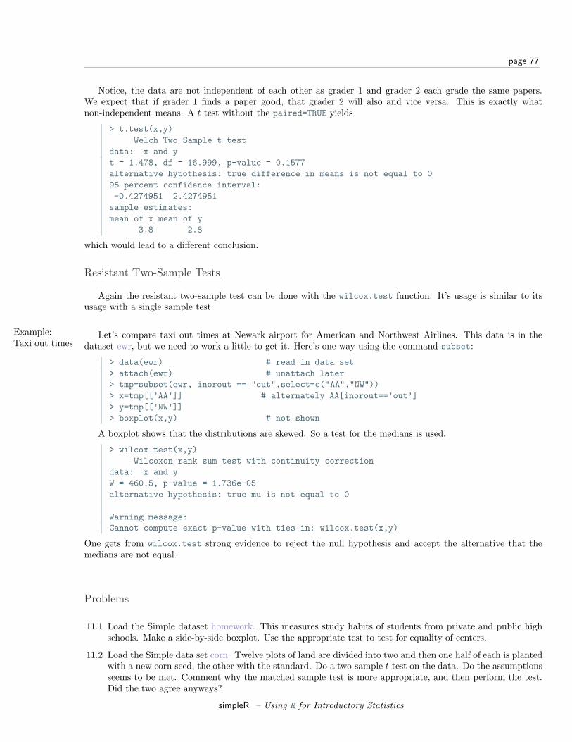
page 77
Notice, the data are not independent of each other as grader 1 and grader 2 each grade the same papers.We expect that if grader 1 finds a paper good, that grader 2 will also and vice versa. This is exactly whatnon-independent means. A t test without the paired=TRUE yields
> t.test(x,y)Welch Two Sample t-test
data: x and yt = 1.478, df = 16.999, p-value = 0.1577alternative hypothesis: true difference in means is not equal to 095 percent confidence interval:-0.4274951 2.4274951sample estimates:mean of x mean of y
3.8 2.8
which would lead to a different conclusion.
Resistant Two-Sample Tests
Again the resistant two-sample test can be done with the wilcox.test function. It’s usage is similar to itsusage with a single sample test.
Example:Taxi out times
Let’s compare taxi out times at Newark airport for American and Northwest Airlines. This data is in thedataset ewr, but we need to work a little to get it. Here’s one way using the command subset:
> data(ewr) # read in data set> attach(ewr) # unattach later> tmp=subset(ewr, inorout == "out",select=c("AA","NW"))> x=tmp[[’AA’]] # alternately AA[inorout==’out’]> y=tmp[[’NW’]]> boxplot(x,y) # not shown
A boxplot shows that the distributions are skewed. So a test for the medians is used.
> wilcox.test(x,y)Wilcoxon rank sum test with continuity correction
data: x and yW = 460.5, p-value = 1.736e-05alternative hypothesis: true mu is not equal to 0
Warning message:Cannot compute exact p-value with ties in: wilcox.test(x,y)
One gets from wilcox.test strong evidence to reject the null hypothesis and accept the alternative that themedians are not equal.
Problems
11.1 Load the Simple dataset homework. This measures study habits of students from private and public highschools. Make a side-by-side boxplot. Use the appropriate test to test for equality of centers.
11.2 Load the Simple data set corn. Twelve plots of land are divided into two and then one half of each is plantedwith a new corn seed, the other with the standard. Do a two-sample t-test on the data. Do the assumptionsseems to be met. Comment why the matched sample test is more appropriate, and then perform the test.Did the two agree anyways?
simpleR – Using R for Introductory Statistics

page 78
11.3 Load the Simple dataset blood. Do a significance test for equivalent centers. Which one did you use andwhy? What was the p-value?
11.4 Do a test of equality of medians on the Simple cabinets data set. Why might this be more appropriate thana test for equality of the mean or is it?
Section 12 Chi Square Tests
The chi-squared distribution allows for statistical tests of categorical data. Among these tests are those forgoodness of fit and independence.
The Chi-Squared Distribution
The χ2-distribution (chi-squared) is the distribution of the sum of squared normal random variables. Let Zi
be i.i.d. normal(0,1) random numbers, and set
χ2 =n∑
i=1
Z2i
Then χ2 has the chi-squared distribution with n degrees of freedom.The shape of the distribution depends upon the degrees of freedom. These diagrams (figures 47 and 48)
illustrate 100 random samples for 5 d.f. and 50 d.f.
> x = rchisq(100,5);y=rchisq(100,50)> simple.eda(x);simple.eda(y)
Histogram of x
x
Fre
qu
en
cy
0 5 10
05
10
15
20
25
30
51
01
5
boxplot
−2 0 2
51
01
5Normal Q−Q Plot
Theoretical Quantiles
Sa
mp
le Q
ua
ntil
es
Figure 47: χ2 data for 5 degrees of freedom
Notice for a small number of degrees of freedom it is very skewed. However, as the number gets large thedistribution begins to look normal. (Can you guess the mean and standard deviation?)
Chi-Squared Goodness of Fit Tests
simpleR – Using R for Introductory Statistics
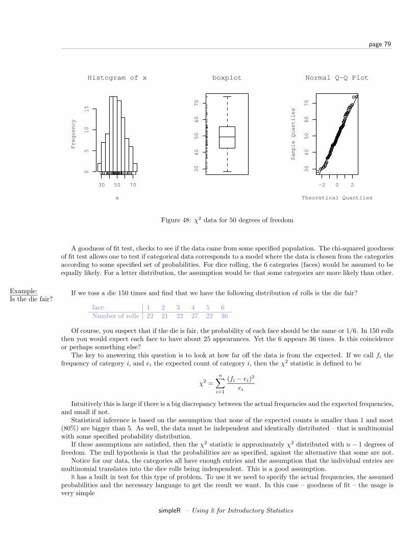
page 79
Histogram of x
x
Fre
qu
en
cy
30 50 70
05
10
15
30
40
50
60
70
boxplot
−2 0 2
30
40
50
60
70
Normal Q−Q Plot
Theoretical Quantiles
Sa
mp
le Q
ua
ntil
es
Figure 48: χ2 data for 50 degrees of freedom
A goodness of fit test, checks to see if the data came from some specified population. The chi-squared goodnessof fit test allows one to test if categorical data corresponds to a model where the data is chosen from the categoriesaccording to some specified set of probabilities. For dice rolling, the 6 categories (faces) would be assumed to beequally likely. For a letter distribution, the assumption would be that some categories are more likely than other.
Example:Is the die fair?
If we toss a die 150 times and find that we have the following distribution of rolls is the die fair?
face 1 2 3 4 5 6Number of rolls 22 21 22 27 22 36
Of course, you suspect that if the die is fair, the probability of each face should be the same or 1/6. In 150 rollsthen you would expect each face to have about 25 appearances. Yet the 6 appears 36 times. Is this coincidenceor perhaps something else?
The key to answering this question is to look at how far off the data is from the expected. If we call fi thefrequency of category i, and ei the expected count of category i, then the χ2 statistic is defined to be
χ2 =n∑
i=1
(fi − ei)2
ei
Intuitively this is large if there is a big discrepancy between the actual frequencies and the expected frequencies,and small if not.
Statistical inference is based on the assumption that none of the expected counts is smaller than 1 and most(80%) are bigger than 5. As well, the data must be independent and identically distributed – that is multinomialwith some specified probability distribution.
If these assumptions are satisfied, then the χ2 statistic is approximately χ2 distributed with n − 1 degrees offreedom. The null hypothesis is that the probabilities are as specified, against the alternative that some are not.
Notice for our data, the categories all have enough entries and the assumption that the individual entries aremultinomial translates into the dice rolls being indenpendent. This is a good assumption.
R has a built in test for this type of problem. To use it we need to specify the actual frequencies, the assumedprobabilities and the necessary language to get the result we want. In this case – goodness of fit – the usage isvery simple
simpleR – Using R for Introductory Statistics
page 80
> freq = c(22,21,22,27,22,36)> probs = c(1,1,1,1,1,1)/6 # or use rep(1/6,6)> chisq.test(freq,p=probs)
Chi-squared test for given probabilities
data: freqX-squared = 6.72, df = 5, p-value = 0.2423
The formal hypothesis test assumes the null hypothesis is that each category i has probability pi (in our exampleeach pi = 1/6) against the alternative that at least one category doesn’t have this specified probability.
As we see, the value of χ2 is 6.72 and the degrees of freedom are 6 − 1 = 5. The calculated p-value is 0.2423so we have no reason to reject the hypothesis that the die is fair.
Example:Letterdistributions
The letter distribution of the 5 most popular letters in the English language is known to be approximately 11
letter E T N R Ofreq. 29 21 17 17 16
That is when either E,T,N,R,O appear, on average 29 times out of 100 it is an E and not the other 4. Thisinformation is useful in cryptography to break secret codes. Suppose a text is analyzed and the number of E,T,N,Rand O’s are counted. The following distribution is found
letter E T N R Ofreq. 100 110 80 55 14
Do a chi-square goodness of fit hypothesis test to see if the letter proportions for this text are πE = .29, πT =.21, πN = .17, πR = .17, πO = .16 or are different.
The solution is just slightly more difficult, as the probabilities need to be specified. Since the assumptions ofthe chi-squared test require independence of each letter, this is not quite appropriate, but supposing it is we get
> x = c(100,110,80,55,14)> probs = c(29, 21, 17, 17, 16)/100> chisq.test(x,p=probs)
Chi-squared test for given probabilities
data: xX-squared = 55.3955, df = 4, p-value = 2.685e-11
This indicates that this text is unlikely to be wrtten in English.
Some extrainsight
What makes the statistic have the χ2 distribution? If we assume that fi − ei = Zi√
ei. That is the error issomewhat proportional to the square root of the expected number, then if Zi are normal with mean 0 and variance1, then the statistic is exactly χ2. For the multinomial distribution, one needs to verify, that asymptotically, thedifferences from the expected counts are roughly this large.
Chi-Squared Tests of Independence
The same statistic can also be used to study if two rows in a contingency table are “independent”. That is, thenull hypothesis is that the rows are independent and the alternative hypothesis is that they are not independent.
For example, suppose you find the following data on the severity of a crash tabulated for the cases where thepassenger had a seat belt, or did not:
11Of course, the true distribution is for all 26 letters. This is simplified down to look just at these 5 letters.
simpleR – Using R for Introductory Statistics
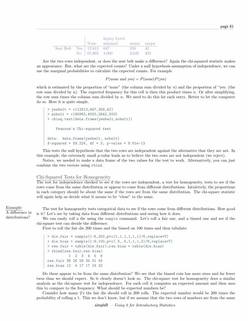
page 81
Injury LevelNone minimal minor major
Seat Belt Yes 12,813 647 359 42No 65,963 4,000 2,642 303
Are the two rows independent, or does the seat belt make a difference? Again the chi-squared statistic makesan appearance. But, what are the expected counts? Under a null hypothesis assumption of independence, we canuse the marginal probabilities to calculate the expected counts. For example
P (none and yes) = P (none)P (yes)
which is estimated by the proportion of “none” (the column sum divided by n) and the proportion of “yes: (therow sum divided by n). The expected frequency for this cell is then this product times n. Or after simplifying,the row sum times the column sum divided by n. We need to do this for each entry. Better to let the computerdo so. Here it is quite simple.
> yesbelt = c(12813,647,359,42)> nobelt = c(65963,4000,2642,303)> chisq.test(data.frame(yesbelt,nobelt))
Pearson’s Chi-squared test
data: data.frame(yesbelt, nobelt)X-squared = 59.224, df = 3, p-value = 8.61e-13
This tests the null hypothesis that the two rows are independent against the alternative that they are not. Inthis example, the extremely small p-value leads us to believe the two rows are not independent (we reject).
Notice, we needed to make a data frame of the two values for the test to work. Alternatively, you can justcombine the two vectors using rbind.
Chi-Squared Tests for HomogeneityThe test for independence checked to see if the rows are independent, a test for homogeneity, tests to see if therows come from the same distribution or appear to come from different distributions. Intuitively, the proportionsin each category should be about the same if the rows are from the same distribution. The chi-square statisticwill again help us decide what it means to be “close” to the same.
Example:A difference indistributions?
The test for homogeneity tests categorical data to see if the rows come from different distributions. How goodis it? Let’s see by taking data from different distributions and seeing how it does.
We can easily roll a die using the sample command. Let’s roll a fair one, and a biased one and see if thechi-square test can decide the difference.
First to roll the fair die 200 times and the biased on 100 times and then tabulate:
> die.fair = sample(1:6,200,p=c(1,1,1,1,1,1)/6,replace=T)> die.bias = sample(1:6,100,p=c(.5,.5,1,1,1,2)/6,replace=T)> res.fair = table(die.fair);res.bias = table(die.bias)> rbind(res.fair,res.bias)
1 2 3 4 5 6res.fair 38 26 26 34 31 45res.bias 12 4 17 17 18 32
Do these appear to be from the same distribution? We see that the biased coin has more sixes and far fewertwos than we should expect. So it clearly doesn’t look so. The chi-square test for homogeneity does a similaranalysis as the chi-square test for independence. For each cell it computes an expected amount and then usesthis to compare to the frequency. What should be expected numbers be?
Consider how many 2’s the fair die should roll in 200 rolls. The expected number would be 200 times theprobability of rolling a 1. This we don’t know, but if we assume that the two rows of numbers are from the same
simpleR – Using R for Introductory Statistics
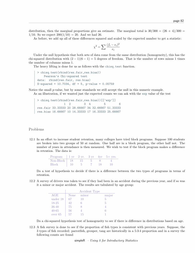
page 82
distribution, then the marginal proportions give an estimate. The marginal total is 30/300 = (26 + 4)/300 =1/10. So we expect 200(1/10) = 20. And we had 26.
As before, we add up all of these differences squared and scaled by the expected number to get a statistic:
χ2 =∑ (fi − ei)2
ei
Under the null hypothesis that both sets of data come from the same distribution (homogeneity), this has thechi-squared distribution with (2 − 1)(6 − 1) = 5 degrees of freedom. That is the number of rows minus 1 timesthe number of columns minus 1.
The heavy lifting is done for us as follows with the chisq.test function.
> chisq.test(rbind(res.fair,res.bias))Pearson’s Chi-squared test
data: rbind(res.fair, res.bias)X-squared = 10.7034, df = 5, p-value = 0.05759
Notice the small p-value, but by some standards we still accept the null in this numeric example.As an illustration, if we wanted just the expected counts we can ask with the exp value of the test
> chisq.test(rbind(res.fair,res.bias))[[’exp’]]1 2 3 4 5 6
res.fair 33.33333 20 28.66667 34 32.66667 51.33333res.bias 16.66667 10 14.33333 17 16.33333 25.66667
Problems
12.1 In an effort to increase student retention, many colleges have tried block programs. Suppose 100 studentsare broken into two groups of 50 at random. One half are in a block program, the other half not. Thenumber of years in attendance is then measured. We wish to test if the block program makes a differencein retention. The data is:
Program 1 yr 2 yr. 3 yr 4yr 5+ yrs.Non-Block 18 15 5 8 4Block 10 5 7 18 10
Do a test of hypothesis to decide if there is a difference between the two types of programs in terms ofretention.
12.2 A survey of drivers was taken to see if they had been in an accident during the previous year, and if so wasit a minor or major accident. The results are tabulated by age group:
Accident TypeAGE None minor majorunder 18 67 10 518-25 42 6 526-40 75 8 440-65 56 4 6over 65 57 15 1
Do a chi-squared hypothesis test of homogeneity to see if there is difference in distributions based on age.
12.3 A fish survey is done to see if the proportion of fish types is consistent with previous years. Suppose, the3 types of fish recorded: parrotfish, grouper, tang are historically in a 5:3:4 proportion and in a survey thefollowing counts are found
simpleR – Using R for Introductory Statistics
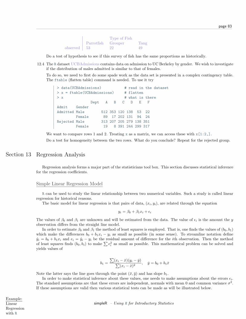
page 83
Type of FishParrotfish Grouper Tang
observed 53 22 49
Do a test of hypothesis to see if this survey of fish has the same proportions as historically.
12.4 The R dataset UCBAdmissions contains data on admission to UC Berkeley by gender. We wish to investigateif the distribution of males admitted is similar to that of females.
To do so, we need to first do some spade work as the data set is presented in a complex contingency table.The ftable (flatten table) command is needed. To use it try
> data(UCBAdmissions) # read in the dataset> x = ftable(UCBAdmissions) # flatten> x # what is there
Dept A B C D E FAdmit GenderAdmitted Male 512 353 120 138 53 22
Female 89 17 202 131 94 24Rejected Male 313 207 205 279 138 351
Female 19 8 391 244 299 317
We want to compare rows 1 and 2. Treating x as a matrix, we can access these with x[1:2,].
Do a test for homogeneity between the two rows. What do you conclude? Repeat for the rejected group.
Section 13 Regression Analysis
Regression analysis forms a major part of the statisticians tool box. This section discusses statistical inferencefor the regression coefficients.
Simple Linear Regression Model
R can be used to study the linear relationship between two numerical variables. Such a study is called linearregression for historical reasons.
The basic model for linear regression is that pairs of data, (xi, yi), are related through the equation
yi = β0 + β1xi + εi
The values of β0 and β1 are unknown and will be estimated from the data. The value of εi is the amount the yobservation differs from the straight line model.
In order to estimate β0 and β1 the method of least squares is employed. That is, one finds the values of (b0, b1)which make the differences b0 + b1xi − yi as small as possible (in some sense). To streamline notation defineyi = b0 + b1xi and ei = yi − yi be the residual amount of difference for the ith observation. Then the methodof least squares finds (b0, b1) to make
∑e2i as small as possible. This mathematical problem can be solved and
yields values of
b1 =∑
(xi − x)(yi − y)∑(xi − x)2
, y = b0 + b1x
Note the latter says the line goes through the point (x, y) and has slope b1.In order to make statistical inference about these values, one needs to make assumptions about the errors εi.
The standard assumptions are that these errors are independent, normals with mean 0 and common variance σ2.If these assumptions are valid then various statistical tests can be made as will be illustrated below.
Example:LinearRegressionwith R
simpleR – Using R for Introductory Statistics
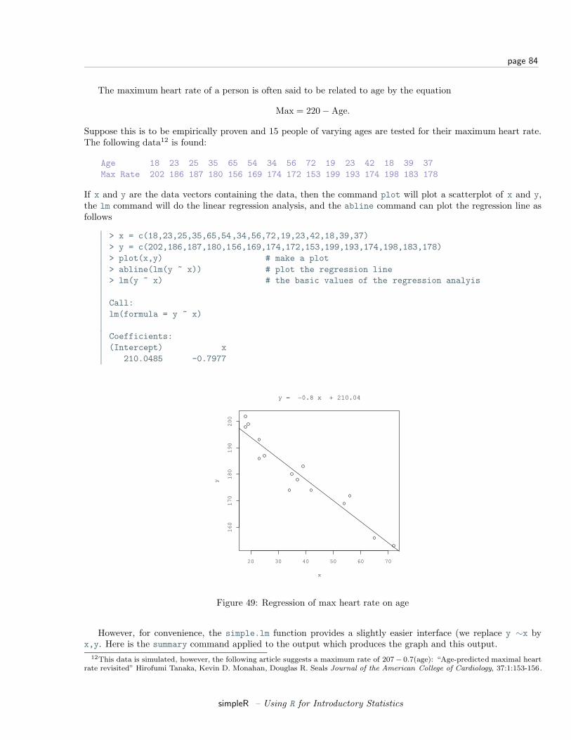
page 84
The maximum heart rate of a person is often said to be related to age by the equation
Max = 220− Age.
Suppose this is to be empirically proven and 15 people of varying ages are tested for their maximum heart rate.The following data12 is found:
Age 18 23 25 35 65 54 34 56 72 19 23 42 18 39 37Max Rate 202 186 187 180 156 169 174 172 153 199 193 174 198 183 178
If x and y are the data vectors containing the data, then the command plot will plot a scatterplot of x and y,the lm command will do the linear regression analysis, and the abline command can plot the regression line asfollows
> x = c(18,23,25,35,65,54,34,56,72,19,23,42,18,39,37)> y = c(202,186,187,180,156,169,174,172,153,199,193,174,198,183,178)> plot(x,y) # make a plot> abline(lm(y ~ x)) # plot the regression line> lm(y ~ x) # the basic values of the regression analyis
Call:lm(formula = y ~ x)
Coefficients:(Intercept) x
210.0485 -0.7977
20 30 40 50 60 70
16
01
70
18
01
90
20
0
x
y
y = −0.8 x + 210.04
Figure 49: Regression of max heart rate on age
However, for convenience, the simple.lm function provides a slightly easier interface (we replace y ∼x byx,y. Here is the summary command applied to the output which produces the graph and this output.
12This data is simulated, however, the following article suggests a maximum rate of 207− 0.7(age): “Age-predicted maximal heartrate revisited” Hirofumi Tanaka, Kevin D. Monahan, Douglas R. Seals Journal of the American College of Cardiology, 37:1:153-156.
simpleR – Using R for Introductory Statistics

page 85
> lm.result=simple.lm(x,y)> summary(lm.result)
Call:lm(formula = y ~ x)
...Coefficients:
Estimate Std. Error t value Pr(>|t|)(Intercept) 210.04846 2.86694 73.27 < 2e-16 ***x -0.79773 0.06996 -11.40 3.85e-08 ***
...
The result of the lm function is of class lm and so the plot and summary commands adapt themselves to that.The result lm.result contains the result. We used summary to view the entire thing. To view parts of it, youcan call it like it is a list or better still use the following methods: resid for residuals, coef for coefficients andpredict for prediction. Here are a few examples, the former giving the coefficients b0 and b1, the latter returningthe residuals which are then summarized.
> coef(lm.result) # or use lm.result[[’coef’]](Intercept) x210.0484584 -0.7977266> lm.res = resid(lm.result) # or lm.result[[’resid’]]> summary(lm.res)
Min. 1st Qu. Median Mean 3rd Qu. Max.-8.926e+00 -2.538e+00 3.879e-01 -1.628e-16 3.187e+00 6.624e+00
Testing the Assumptions of the Model
The validity of the model can be checked graphically via eda. The assumption on the errors being i.i.d. normalrandom variables translates into the residuals being normal. They are not independent as they add to 0, but theyshould show no serial correlations.
We can test for normality with eda tricks: histograms, boxplots and normal plots. We can test for correlationsby looking if there are trends in the data. This can be done with plots of the residuals vs. time and order. Wecan test the assumption that the errors have the same variance with plots of residuals vs. time order and fittedvalues.
The plot command will do these tests for us if we give it the result of the regression
> plot(lm.result)
(It will plot 4 separate graphs unless you first tell R to place 4 on one graph with the command par(mfrow=c(2,2)).Note, this is different from plot(x,y) which produces a scatter plot. These plots have:
Residuals vs. fitted This plots the fitted (y) values against the residuals. Look for spread around the liney = 0 and no obvious trend.
Normal qqplot The residuals are normal if this graph falls close to a straight line.
Scale-Location This plot shows the square root of the standardized residuals. The tallest points, are the largestresiduals.
Cook’s distance This plot identifies points which have a lot of influence in the regression line.
Other ways to investigate the data could be done with the exploratory data analysis techniques mentionedpreviously.
Statistical Inference
simpleR – Using R for Introductory Statistics
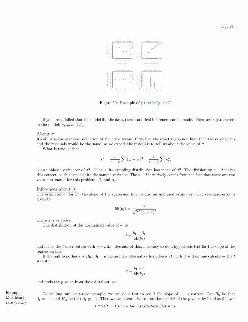
page 86
160 170 180 190
−1
0−
50
5
Fitted values
Re
sid
ua
ls
Residuals vs Fitted
7
8 1
−1 0 1
−2
−1
01
Theoretical Quantiles
Sta
nd
ard
ize
d r
esi
du
als
Normal Q−Q plot
7
81
160 170 180 190
0.0
0.4
0.8
1.2
Fitted values
Sta
ndard
ized r
esi
duals
Scale−Location plot7
8 1
2 4 6 8 10 12 14
0.0
00
.05
0.1
00
.15
0.2
0
Obs. number
Co
ok’
s d
ista
nce
Cook’s distance plot
81
7
Figure 50: Example of plot(lm(y ∼x))
If you are satisfied that the model fits the data, then statistical inferences can be made. There are 3 parametersin the model: σ, β0 and β1.
About σRecall, σ is the standard deviation of the error terms. If we had the exact regression line, then the error termsand the residuals would be the same, so we expect the residuals to tell us about the value of σ.
What is true, is that
s2 =1
n− 2
∑(yi − yi)2 =
1n− 2
∑e2i .
is an unbiased estimator of σ2. That is, its sampling distribution has mean of σ2. The division by n− 2 makesthis correct, so this is not quite the sample variance. The n− 2 intuitively comes from the fact that there are twovalues estimated for this problem: β0 and β1.
Inferences about β1
The estimator b1 for β1, the slope of the regression line, is also an unbiased estimator. The standard error isgiven by
SE(b1) =s√∑
(xi − x)2
where s is as above.The distribution of the normalized value of b1 is
t =b1 − β1
SE(b1)
and it has the t-distribution with n− 2 d.f. Because of this, it is easy to do a hypothesis test for the slope of theregression line.
If the null hypothesis is H0 : β1 = a against the alternative hypothesis HA : β1 6= a then one calculates the tstatistic
t =b1 − a
SE(b1)
and finds the p-value from the t-distribution.
Example:Max heartrate (cont.)
Continuing our heart-rate example, we can do a test to see if the slope of −1 is correct. Let H0 be thatβ1 = −1, and HA be that β1 6= −1. Then we can create the test statistic and find the p-value by hand as follows:
simpleR – Using R for Introductory Statistics
page 87
> es = resid(lm.result) # the residuals lm.result> b1 =(coef(lm.result))[[’x’]] # the x part of the coefficients> s = sqrt( sum( es^2 ) / (n-2) )> SE = s/sqrt(sum((x-mean(x))^2))> t = (b1 - (-1) )/SE # of course - (-1) = +1> pt(t,13,lower.tail=FALSE) # find the right tail for this value of t
# and 15-2 d.f.[1] 0.0023620
The actual p-value is twice this as the problem is two-sided. We see that it is unlikely that for this data the slopeis -1. (Which is the slope predicted by the formula 220− Age.)
R will automatically to a hypothesis test for the assumption β1 = 0 which means no slope. See how it isincluded in the output of the summary command in the column Pr(>|t|)
Coefficients:Estimate Std. Error t value Pr(>|t|)
(Intercept) 210.04846 2.86694 73.27 < 2e-16 ***x -0.79773 0.06996 -11.40 3.85e-08 ***
Inferences about β0
As well, a statistical test for b0 can be made (and is). Again, R includes the test for β0 = 0 which tests to see ifthe line goes through the origin. To do other tests, requires a familiarity with the details.
The estimator b0 for β0 is also unbiased, and has standard error given by
SE(b0) = s
√ ∑x2
i
n∑
(xi − x)2= s
√1n
+x2∑
(xi − x)2
Given this, the statistic
t =b0 − β0
SE(b0)
has a t-distribution with n− 2 degrees of freedom.
Example:Max heartrate (cont.)
Let’s check if the data supports the intercept of 220. Formally, we will test H0 : β0 = 220 against HA : β0 <220. We need to compute the value of the test statistic and then look up the one-sided p-value. It is similar tothe previous example and we use the previous value of s:
> SE = s * sqrt( sum(x^2)/( n*sum((x-mean(x))^2)))> b0 = 210.04846 # copy or use> t = (b0 - 220)/SE # (coef(lm.result))[[’(Intercept)’]]> pt(t,13,lower.tail=TRUE) # use lower tail (220 or less)[1] 0.0002015734
We would reject the value of 220 based on this p-value as well.
Confidence Intervals
Visually, one is interested in confidence intervals. The regression line is used to predict the value of y for agiven x, or the average value of y for a given x and one would like to know how accurate this prediction is. Thisis the job of a confidence interval.
There is a subtlety between the two points above. The mean value of y is subject to less variability than thevalue of y and so the confidence intervals will be different although, they are both of the same form:
b0 + b1 ± t∗SE.
simpleR – Using R for Introductory Statistics
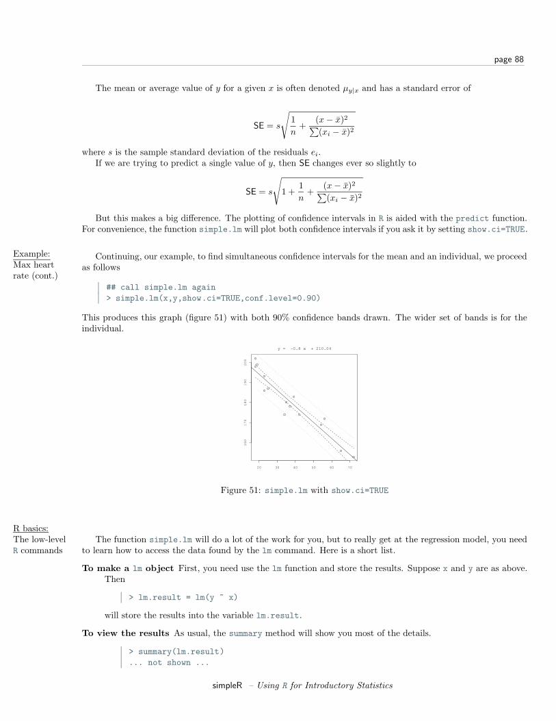
page 88
The mean or average value of y for a given x is often denoted µy|x and has a standard error of
SE = s
√1n
+(x− x)2∑(xi − x)2
where s is the sample standard deviation of the residuals ei.If we are trying to predict a single value of y, then SE changes ever so slightly to
SE = s
√1 +
1n
+(x− x)2∑(xi − x)2
But this makes a big difference. The plotting of confidence intervals in R is aided with the predict function.For convenience, the function simple.lm will plot both confidence intervals if you ask it by setting show.ci=TRUE.
Example:Max heartrate (cont.)
Continuing, our example, to find simultaneous confidence intervals for the mean and an individual, we proceedas follows
## call simple.lm again> simple.lm(x,y,show.ci=TRUE,conf.level=0.90)
This produces this graph (figure 51) with both 90% confidence bands drawn. The wider set of bands is for theindividual.
20 30 40 50 60 70
16
01
70
18
01
90
20
0
y
y = −0.8 x + 210.04
Figure 51: simple.lm with show.ci=TRUE
R basics:The low-levelR commands
The function simple.lm will do a lot of the work for you, but to really get at the regression model, you needto learn how to access the data found by the lm command. Here is a short list.
To make a lm object First, you need use the lm function and store the results. Suppose x and y are as above.Then
> lm.result = lm(y ~ x)
will store the results into the variable lm.result.
To view the results As usual, the summary method will show you most of the details.
> summary(lm.result)... not shown ...
simpleR – Using R for Introductory Statistics
page 89
To plot the regression line You make a plot of the data, and then add a line with the abline command
> plot(x,y)> abline(lm.result)
To access the residuals You can use the resid method
> resid(lm.result)... output is not shown ...
To access the coefficients The coef function will return a vector of coefficients.
> coef(lm.result)(Intercept) x210.0484584 -0.7977266
To get at the individual ones, you can refer to them by number, or name as with:
> coef(lm.result)[1](Intercept)
210.0485> coef(lm.result)[’x’]
x-0.7977266
To get the fitted values That is to find yi = b0 + b1xi for each i, we use the fitted.values command
> fitted(lm.result) # you can abbreviate to just fitted... output is not shown ...
To get the standard errors The values of s and SE(b0) and SE(b1) appear in the output of summary. Toaccess them individually is possible with the right know how. The key is that the coefficients methodreturns all the numbers in a matrix if you use it on the results of summary
> coefficients(lm.result)(Intercept) x210.0484584 -0.7977266> coefficients(summary(lm.result))
Estimate Std. Error t value Pr(>|t|)(Intercept) 210.0484584 2.86693893 73.26576 0.000000e+00x -0.7977266 0.06996281 -11.40215 3.847987e-08
To get the standard error for x then is as easy as taking the 2nd row and 2nd column. We can do this bynumber or name:
> coefficients(summary(lm.result))[2,2][1] 0.06996281> coefficients(summary(lm.result))[’x’,’Std. Error’][1] 0.06996281
To get the predicted values We can use the predict function to get predicted values, but it is a little clunkyto call. We need a data frame with column names matching the predictor or explanatory variable. In thisexample this is x so we can do the following to get a prediction for a 50 and 60 year old we have
> predict(lm.result,data.frame(x= c(50,60)))1 2
170.1621 162.1849
simpleR – Using R for Introductory Statistics
page 90
To find the confidence bands The confidence bands would be a chore to compute. Unfortunately, it is a bitof a chore to get with the low-level commands as well. The predict method also has an ability to find theconfidence bands if we learn how to ask. Generally speaking, for each value of x we want a point to plot.This is done as before with a data frame containing all the x values we want. In addition, we need to askfor the interval. There are two types: confidence, or prediction. The confidence will be for the mean, andthe prediction for the individual. Let’s see the output, and then go from there. This is for a 90% confidencelevel.
> predict(lm.result,data.frame(x=sort(x)), # as before+ level=.9, interval="confidence") # what is new
fit lwr upr1 195.6894 192.5083 198.87052 195.6894 192.5083 198.87053 194.8917 191.8028 197.9805... skipped ...
We see we get 3 numbers back for each value of x. (note we sorted x first to get the proper order forplotting.) To plot the lower band, we just need the second column which is accessed with [,2]. So thefollowing will plot just the lower. Notice, we make a scatterplot with the plot command, but add theconfidence band with points.
> plot(x,y)> abline(lm.result)> ci.lwr = predict(lm.result,data.frame(x=sort(x)),+ level=.9,interval="confidence")[,2]> points(sort(x), ci.lwr,type="l")
Alternatively, we could plot this with the curve function as follows
> curve(predict(lm.result,data.frame(x=x),+ interval="confidence")[,3],add=T)
This is conceptually easier, but harder to break up, as the curve function requires a function of x to plot.
Problems
13.1 The cost of a home depends on the number of bedrooms in the house. Suppose the following data is recordedfor homes in a given town
price (in thousands) 300 250 400 550 317 389 425 289 389 559No. bedrooms 3 3 4 5 4 3 6 3 4 5
Make a scatterplot, and fit the data with a regression line. On the same graph, test the hypothesis that anextra bedroom costs $60,000 against the alternative that it costs more.
13.2 It is well known that the more beer you drink, the more your blood alcohol level rises. Suppose we havethe following data on student consumption
Student 1 2 3 4 5 6 7 8 9 10Beers 5 2 9 8 3 7 3 5 3 5BAL 0.10 0.03 0.19 0.12 0.04 0.095 0.07 0.06 0.02 0.05
make a scatterplot and fit the data with a regression line. Test the hypothesis that another beer raises yourBAL by 0.02 percent against the alternative that it is less.
simpleR – Using R for Introductory Statistics
page 91
13.3 For the same Blood alcohol data, do a hypothesis test that the intercept is 0 with a two-sided alternative.
13.4 The lapse rate is the rate at which temperature drops as you increase elevation. Some hardy students wereinterested in checking empirically if the lapse rate of 9.8 degrees C/km was accurate for their hiking. Toinvestigate, they grabbed their thermometers and the Sunto wrist altimeters and found the following dataon their hike
elevation (ft) 600 1000 1250 1600 1800 2100 2500 2900temperature (F) 56 54 56 50 47 49 47 45
Draw a scatter plot with regression line, and investigate if the lapse rate is 9.8C/km. (First, it helps toconvert to the rate of change in Fahrenheit per feet with is 5.34 degrees per 1000 feet.) Test the hypothesisthat the lapse rate is 5.34 degrees per 1000 feet against the alternative that it is less than this.
simpleR – Using R for Introductory Statistics
page 92
Section 14 Appendix: Installing R
Getting and Installing RThe main website for R is http://www.r-project.org. YOu can find information about obtaining R. It is freelydownloadable and there are precompiled versions for Linux, Mac OS and Windows.
To install the binaries is usually quite straightforward and is similar to installation of other software. Thebinaries are relatively large (around 10Mb) and often there are sets of smaller files available for download.
As well, the “R Installation and Adminstration” guide is available for download from http://cran.r-project.org/.This offers detailed intstructions on installation for your machine.
Section 15 Appendix: A sample R session
A sample session involving regression
For illustrative purposes, a sample R session may look like the following. The graphs are not presented to savespace and to encourage the reader to try the problems themself.
Assignment: Explore mtcars.
Here are some things to do:
Start R First we need to start R. Under Windows this involves finding the icon and clicking it. Wait a few secondsand the R application takes over. If you are at a UNIX command prompt, the typing R will start the Rprogram. If you are using XEmacs (http://www.xemacs.org) and ESS (http://ess.stat.wisc.edu/)the you start XEmacs and then enter the command M-x R. (That is Alt and x at the same time, and thenR and then enter.
Load the dataset mtcars This dataset is built-in to R. To access it, we need to tell R we want it. Here is howto do so, and how to find out the names of the variables. Use ?mtcars to read the documentation on thedata set.
> data(mtcars)> names(mtcars)[1] "mpg" "cyl" "disp" "hp" "drat" "wt" "qsec" "vs" "am" "gear"
[11] "carb"
Access the data The data is in a data frame. This makes it easy to access the data. As a summary, we couldaccess the “miles per gallon data” (mpg) lots of ways. Here are a few: Using $ as with mtcars$mpg; as a listelement as in mtcars[[’mpg’]]; or as the first column of data using mtcars[,1]. However, the preferredmethod is to attach the dataset to your environment. Then the data is directly accessible as this illustrates
> mpg # not currently visibleError: Object "mpg" not found> attach(mtcars) # attach the mtcars names> mpg # now it is visible[1] 21.0 21.0 22.8 21.4 18.7 18.1 14.3 24.4 22.8 19.2 17.8 16.4 17.3 15.2 10.4
[16] 10.4 14.7 32.4 30.4 33.9 21.5 15.5 15.2 13.3 19.2 27.3 26.0 30.4 15.8 19.7[31] 15.0 21.4
simpleR – Using R for Introductory Statistics
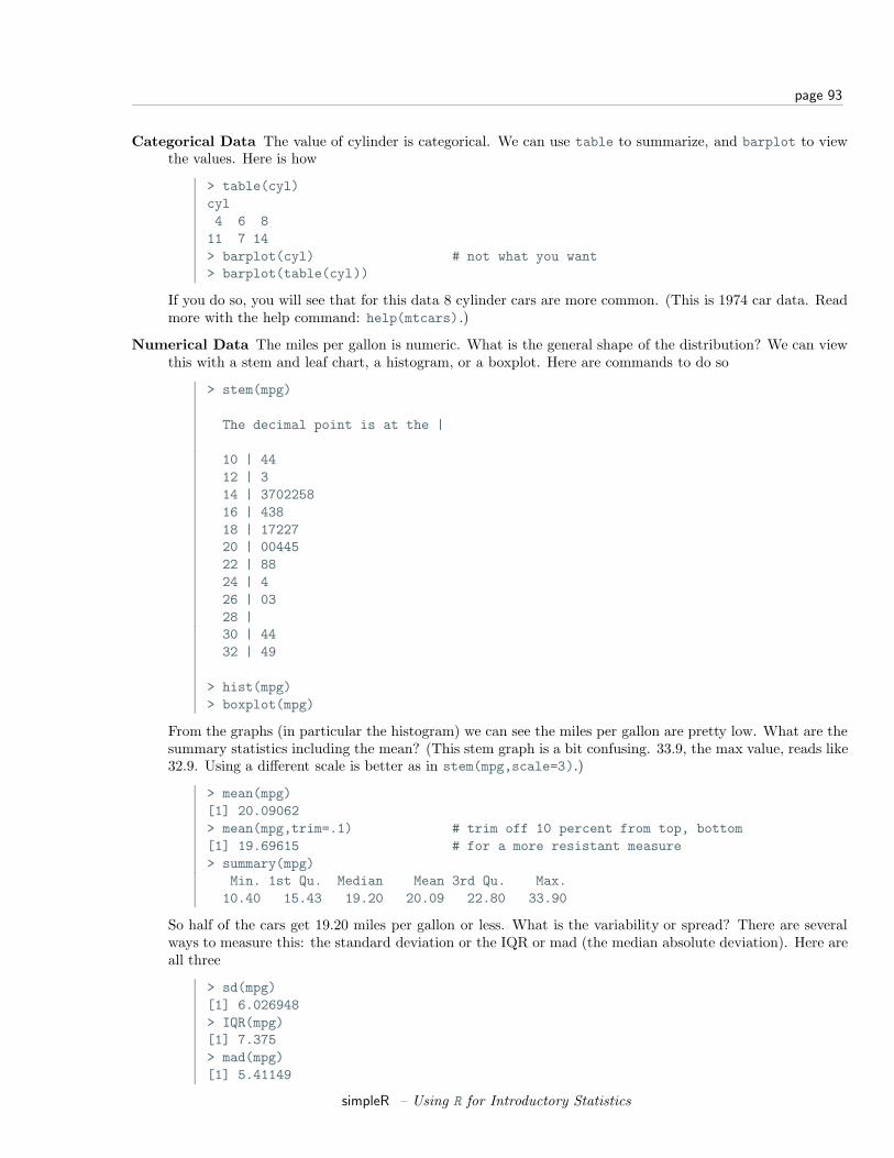
page 93
Categorical Data The value of cylinder is categorical. We can use table to summarize, and barplot to viewthe values. Here is how
> table(cyl)cyl4 6 8
11 7 14> barplot(cyl) # not what you want> barplot(table(cyl))
If you do so, you will see that for this data 8 cylinder cars are more common. (This is 1974 car data. Readmore with the help command: help(mtcars).)
Numerical Data The miles per gallon is numeric. What is the general shape of the distribution? We can viewthis with a stem and leaf chart, a histogram, or a boxplot. Here are commands to do so
> stem(mpg)
The decimal point is at the |
10 | 4412 | 314 | 370225816 | 43818 | 1722720 | 0044522 | 8824 | 426 | 0328 |30 | 4432 | 49
> hist(mpg)> boxplot(mpg)
From the graphs (in particular the histogram) we can see the miles per gallon are pretty low. What are thesummary statistics including the mean? (This stem graph is a bit confusing. 33.9, the max value, reads like32.9. Using a different scale is better as in stem(mpg,scale=3).)
> mean(mpg)[1] 20.09062> mean(mpg,trim=.1) # trim off 10 percent from top, bottom[1] 19.69615 # for a more resistant measure> summary(mpg)
Min. 1st Qu. Median Mean 3rd Qu. Max.10.40 15.43 19.20 20.09 22.80 33.90
So half of the cars get 19.20 miles per gallon or less. What is the variability or spread? There are severalways to measure this: the standard deviation or the IQR or mad (the median absolute deviation). Here areall three
> sd(mpg)[1] 6.026948> IQR(mpg)[1] 7.375> mad(mpg)[1] 5.41149
simpleR – Using R for Introductory Statistics
page 94
They are all different, but measure approximately the same thing – spread.
Subsets of the data What about the average mpg for cars that have just 4 cylinders? This can be answeredwith the mean function as well, but first we need a subset of the mpg vector corresponding to just the 4cylinder cars. There is an easy way to do so.
> mpg[cyl == 4][1] 22.8 24.4 22.8 32.4 30.4 33.9 21.5 27.3 26.0 30.4 21.4
> mean(mpg[cyl == 4])[1] 26.66364
Read this like a sentence – “the miles per gallon of the cars with cylinders equal to 4”. Just remember“equals” is == and not simply =.
Bivariate relationships The univariate data on miles per gallon is interesting, but of course we expect thereto be some relationship with the size of the engine. The engine size is stored in various ways: with thecylinder size, or the horsepower or even the displacement. Let’s view it two ways. First, cylinder size is adiscrete variable with just a few values, a scatterplot will produce an interesting graph
> plot(cyl,mpg)
We see a decreasing trend as the number of cylinders increases, and lots of variation between the differentcars. We might be tempted to fit a regression line. To do so is easy with the command simple.lm whichis a convenient front end to the lm command. (You need to have loaded the Simple package prior to this)
> simple.lm(cyl,mpg)
Call:lm(formula = y ~ x)
Coefficients:(Intercept) x
37.885 -2.876
Which says the slope of the line is -2.876 which in practical terms means if you step up to the next largersized engine, your m.p.g. drops by 5.752 on average.
What are the means for each cylinder size? We did this above for 4 cylinders. If we wanted do this for the6 and 8 cylinder cars we could simply replace the 4 in the line above with 6 or 8. If you wanted a fancy wayto do so, you can use tapply which will apply a function (the mean) to a vector broken down by a factor:
> tapply(mpg,cyl,mean)4 6 8
26.66364 19.74286 15.10000
Next, lets investigate the relationship between the numeric variable horsepower and miles per gallon. Thesame commands as above will work, but the scatterplot will look different as horsepower is essentially acontinuous variable.
> simple.lm(hp,mpg)
Call:lm(formula = y ~ x)
Coefficients:(Intercept) x
30.09886 -0.06823
The fit doesn’t look quite as good. We can test this with the correlation function cor
simpleR – Using R for Introductory Statistics
page 95
> cor(hp,mpg)[1] -0.7761684> cor(cyl,mpg)[1] -0.852162
This is R the Pearson correlation coefficient. Squaring it gives R2.
> cor(hp,mpg)^2[1] 0.6024373> cor(cyl,mpg)^2[1] 0.72618
The usual interpretation is that 72% of the variation is explained by the linear relationship for the relation-ship between the number of cylinders and the miles per gallon.
We can view all three variables together by using different plotting symbols based on the number of cylinders.The argument pch controls this as in
> plot(hp,mpg,pch=cyl)
You can add a legend with the legend command to tell the reader what you did.
> legend(250,30,pch=c(4,6,8),+ legend=c("4 cylinders","6 cylinders","8 cylinders"))
(Note the + indicates a continuation line.)
Testing the regression assumptions In order to make statistical inferences about the regression line, we needto ensure that the assumptions behind the statistical model are appropriate. In this case, we want to checkthat the residuals are independent, normal with mean 0 and common variance. We can do so graphicallyonce we get our hands on the residuals. These are available through the resid method for the result of anlm usage.
> lm.res = simple.lm(hp,mpg)> lm.resids = resid(lm.res) # the residuals as a vector> plot(lm.resids) # look for change in spread> hist(lm.resids) # is data bell shaped?> qqnorm(lm.resids) # is data on straight line?
From the first plot we see that the assumptions are suspicious as the residuals are basically negative for awhile and then they are mostly positive. This is an indication that the straight line model is not a goodone.
Clean up There is certainly more to do with this, but not here. Let’s take a break. When leaving an example,you should detach any data frames. As well, we will quit our R session. Notice you will be prompted tosave your session. If you choose yes, then the next time you start R in this directory, your session (variables,functions etc.) will be restored.
> detach() # clear up namespace> q() # Notice the parentheses!
t tests
The t-tests are the standard test for making statistical inferences about the center of a dataset.
Assignment: Explore chickwts using t-tests.
simpleR – Using R for Introductory Statistics
page 96
Start up We start up R as before. If you started in the same directory, your previous work has been saved. Howcan you tell? Try the ls() command to see what is available.
Attach the data set First we load in the data and attach the data set
> data(chickwts)> attach(chickwts)> names(chickwts)[1] "weight" "feed"
EDA First, we want to see what we have. The data is stored in two columns. The weight and the level of thefactor feed is given for each chick. A boxplot is a good place to look. For data presented this way, the goalis to make a separate boxplot for each level of the factor feed. This is done using the model notation of R.
> boxplot(weight ~ feed)
We see that “casein” appears to be better than the others. We can test its mean against the mean weight.
> our.mu = mean(weight)> just.casein = weight[feed == ’casein’]> t.test(just.casein,mu = our.mu)
One Sample t-test
data: just.caseint = 3.348, df = 11, p-value = 0.006501alternative hypothesis: true mean is not equal to 261.309995 percent confidence interval:282.6440 364.5226
sample estimates:mean of x323.5833
The low p-value of 0.006501 indicates that the mean weight for the chicks fed ’casein’ is more than theaverage weight.
The ’sunflower’ feed also looks higher. Is it similar to the ’casein’ feed? A two-sample t-test will tell us
> t.test(weight[feed == ’casein’],weight[feed == ’sunflower’])
Welch Two Sample t-test
data: weight[feed == "casein"] and weight[feed == "sunflower"]t = -0.2285, df = 20.502, p-value = 0.8215alternative hypothesis: true difference in means is not equal to 095 percent confidence interval:-53.94204 43.27538
sample estimates:mean of x mean of y323.5833 328.9167
Notice the p-value now is 0.8215 which indicates that the null hypothesis should be accepted. That is, thereis no indication that the mean weights are not the same.
The feeds ’linseed’ and ’soybean’ appear to be the same, and have the same spread. We can test for theequivalence of the mean, and in addition use the pooled estimate for the standard deviation. This is doneas follows using var.equal=TRUE
simpleR – Using R for Introductory Statistics
page 97
> t.test(weight[feed == ’linseed’],weight[feed == ’soybean’],+ var.equal=TRUE)
Two Sample t-test
data: weight[feed == "linseed"] and weight[feed == "soybean"]t = -1.3208, df = 24, p-value = 0.1990alternative hypothesis: true difference in means is not equal to 095 percent confidence interval:-70.92996 15.57282
sample estimates:mean of x mean of y218.7500 246.4286
The null hypothesis of equal means is accepted as the p-value is not too small.
Close up Again, lets close things down just for practice.
> detach() # clear up namespace> q() # Notice the parentheses!
A simulation example
The t-statistic for a data sets X1, X2, . . . , Xn is
t =X − µ
s/√
n
where X is the sample mean and s is the sample standard deviation. If the Xi’s are normal, the distribution isthe t-distribution. What if the Xi are not normal?
Assignment: How robust is the distribution of t to changes in the distribution of Xi?
This is the job of simulation. We use the computer to generate random data and investigate the results.Suppose our R session is already running and just want to get to work.
First, let’s define a useful function to create the t statistic for a data set.
> make.t = function(x,mu) (mean(x)-mu)/( sqrt(var(x)/length(x)))
Now, when we want to make the t-statistic we simply use this function.
> mu = 1;x=rnorm(100,mu,1)> make.t(x,mu)[1] -1.552077
That shows the t statistic for one random sample of size 100 from the normal distribution with mean 1 andstandard deviation 1.
We need to use a different distribution, and create lots of random samples so that we can investigate thedistribution of the t statistic. Here is how to create samples when the Xi are exponential
> mu = 10;x=rexp(100,1/mu);make.t(x,mu)[1] 1.737937
Now, we need to create lots of such samples and store them somewhere. An easy way is with the simple.simfunction provided with these notes. Here we use a for loop.
simpleR – Using R for Introductory Statistics
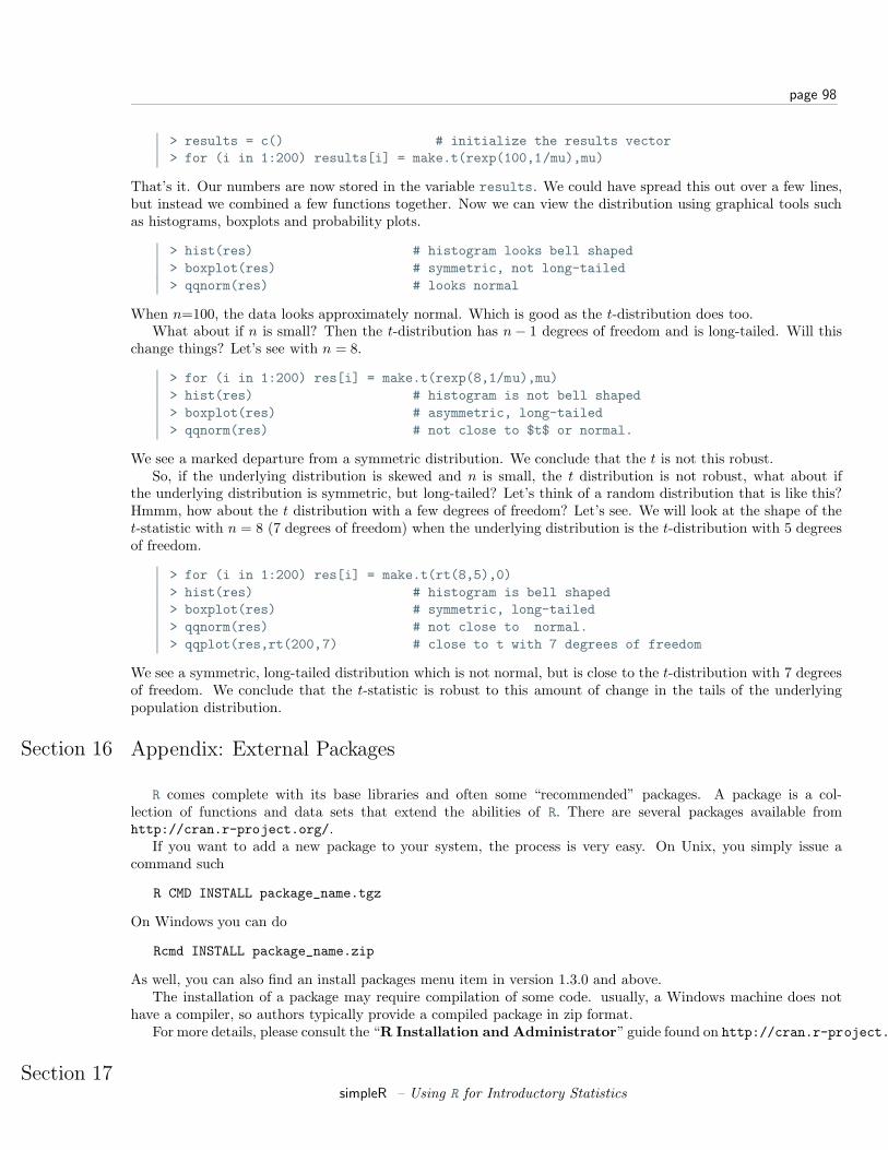
page 98
> results = c() # initialize the results vector> for (i in 1:200) results[i] = make.t(rexp(100,1/mu),mu)
That’s it. Our numbers are now stored in the variable results. We could have spread this out over a few lines,but instead we combined a few functions together. Now we can view the distribution using graphical tools suchas histograms, boxplots and probability plots.
> hist(res) # histogram looks bell shaped> boxplot(res) # symmetric, not long-tailed> qqnorm(res) # looks normal
When n=100, the data looks approximately normal. Which is good as the t-distribution does too.What about if n is small? Then the t-distribution has n− 1 degrees of freedom and is long-tailed. Will this
change things? Let’s see with n = 8.
> for (i in 1:200) res[i] = make.t(rexp(8,1/mu),mu)> hist(res) # histogram is not bell shaped> boxplot(res) # asymmetric, long-tailed> qqnorm(res) # not close to $t$ or normal.
We see a marked departure from a symmetric distribution. We conclude that the t is not this robust.So, if the underlying distribution is skewed and n is small, the t distribution is not robust, what about if
the underlying distribution is symmetric, but long-tailed? Let’s think of a random distribution that is like this?Hmmm, how about the t distribution with a few degrees of freedom? Let’s see. We will look at the shape of thet-statistic with n = 8 (7 degrees of freedom) when the underlying distribution is the t-distribution with 5 degreesof freedom.
> for (i in 1:200) res[i] = make.t(rt(8,5),0)> hist(res) # histogram is bell shaped> boxplot(res) # symmetric, long-tailed> qqnorm(res) # not close to normal.> qqplot(res,rt(200,7) # close to t with 7 degrees of freedom
We see a symmetric, long-tailed distribution which is not normal, but is close to the t-distribution with 7 degreesof freedom. We conclude that the t-statistic is robust to this amount of change in the tails of the underlyingpopulation distribution.
Section 16 Appendix: External Packages
R comes complete with its base libraries and often some “recommended” packages. A package is a col-lection of functions and data sets that extend the abilities of R. There are several packages available fromhttp://cran.r-project.org/.
If you want to add a new package to your system, the process is very easy. On Unix, you simply issue acommand such
R CMD INSTALL package_name.tgz
On Windows you can do
Rcmd INSTALL package_name.zip
As well, you can also find an install packages menu item in version 1.3.0 and above.The installation of a package may require compilation of some code. usually, a Windows machine does not
have a compiler, so authors typically provide a compiled package in zip format.For more details, please consult the “R Installation and Administrator” guide found on http://cran.r-project.org/.
Section 17simpleR – Using R for Introductory Statistics

page 99
Appendix: Using Functions
In R the use of functions allows the user to easily extend and simplify the R session. In fact, most of R, asdistributed, is a series of R functions. In this appendix, we learn a little bit about creating your own functions.
The Basic TemplateThe basic template for a function is
function_name <- function (function_arguments) {function_bodyfunction_return_value
}
Each of these is important. Let’s cover them in the order they appear
function name The function name, can be just about anything – even functions or variables previously definedso be careful. Once you have given the name, you can use it just like any other function – with parentheses.For example to define a standard deviation function using the var function we can do
> std <- function (x) sqrt(var(x))
This has the name std. It is used thusly
> data <- c(1,3,2,4,1,4,6)> std(data)[1] 1.825742
If you call it without parentheses you will get the function definition itself
> stdfunction (x) sqrt(var(x))
The keyword function Notice in the definition there is always the keyword function informing R that thenew object is of the function class. Don’t forget it.
The function arguments The arguments to a function range from straightforward to difficult. Here are someexamples
No arguments Sometimes, you use a function just as a convenience and it always does the same thing, soinput is not important. An example might be the ubiquitous “hello world” example from any computerscience book
> hello.world <- function() print("hello world")> hello.world()[1] "hello world"
An argument If you want to personalize this, you can use an argument for the name. Here is an example
> hello.someone <- function(name) print(paste("hello ",name))> hello.someone("fred")[1] "hello fred"
First, we needed to paste the words together before printing. Once we get that right, the functiondoes the same thing only personalized.
A default argument What happens if you try this without an argument? Let’s see
> hello.someone()Error in paste("hello ", name) : Argument "name" is missing, with no default
Hmm, an error, we should have a sensible default. R provides an easy way for the function writer toprovide defaults when you define the function. Here is an example
simpleR – Using R for Introductory Statistics
page 100
> hello.someone <- function(name="world") print(paste("hello ",name))> hello.someone()[1] "hello world"
Notice, after the name of the variable, we put an equals sign and the default value: argument=default value.It is not assignment, which is done with the <-.
Now, if we are using a single argument, the above should get you the general idea. There is more to learnthough if you are passing multiple parameters through.
Consider, the definition of a function for simulating the t statistic from a sample of normals with mean 10and standard deviation 5.
> sim.t <- function(n) {+ mu <- 10;sigma<-5;+ X <- rnorm(n,mu,sigma)+ (mean(X) - mu)/(sqrt(var(X))/n)+ }> sim.t(4)[1] -1.574408
This is fine, but what if you want to make the mean and standard deviation variable. We can keep the 10and 5 as defaults and have
> sim.t <- function(n,mu=10,sigma=5) {+ X <- rnorm(n,mu,sigma)+ (mean(X) - mu)/(sqrt(var(X))/n)+ }
Now, note how we can call this function
> sim.t(4) # using defaults[1] -0.4642314> sim.t(4,3,10) # n=4,mu=3, sigma=10[1] 3.921082> sim.t(4,5) # n=4,mu=5,sigma the default 5[1] 3.135898> sim.t(4,sigma=100) # n-4,mu the default 10, sigma=100[1] -9.960678> sim.t(4,sigma=100,mu=1) # named arguments don’t need order[1] 4.817636
We see, that we can use the defaults or not depending on how we call the function. Notice we can mixpositional arguments and named arguments. The positional arguments need to match up with the orderthat is defined in the function. In particular, the call sim.t(4,3,10) matches 4 with n, 3 with mu and 10with sigma, and sim.t(4,5) matches 4 with n, 5 with mu and since nothing is in the third position, it usesthe default for sigma. Using named arguments, such as sim.t(4,sigma=100,mu=1) allows you to switchthe order and avoid specifying all the values. For arguments with lots of variables this is very convenient.
There is one more possibility that is useful, the ... variable . This means, take these values and pass themon to an internal function. This is useful for graphics. For example to plot a function, can be tedious. Youdefine the values for x, apply the values to create y and then plot the points using the line type. (Actually,the curve function does this for you). Here is a function that will do this
> plot.f <- function(f,a,b,...) {+ xvals<-seq(a,b,length=100)+ plot(xvals,f(xvals),type="l",...)+ }
simpleR – Using R for Introductory Statistics
page 101
Then plot.f(sin,0,2*pi) will plot the sine curve from 0 to 2π and plot.f(sin,0,2*pi,lty=4) will dothe same, only with a different way of drawing the line.
The function body and function return value The body of the function and its return value do the workof the function. The value that gets returned is the last thing evaluated. So if only one thing is found, it iseasy to write a function. For example, here is a simple way of defining an average
> our.average <- function (x) sum(x)/length(x)> our.average(c(1,2,3)) # average of 1,2,3 is 2[1] 2
Of course the function mean does this for you – and more (trimming, removal of NA etc.).
If your function is more complicated, then the function’s body and return value are enclosed in braces: {}.In the body, the function may use variables. usually these are arguments to the function. What if they arenot though? Then R goes hunting to see what it finds. Here is a simple example. Where and how R goeshunting is the topic of scope which is covered more thoroughly in some of the other documents listed in the“Sources of help, documentation” appendix.
> x<-c(1,2,3) # defined outside the function> our.average()[1] 2> rm(x)> our.average()Error in sum(x) : Object "x" not found
For Loops
A for loop allows you to loop over values in a vector or list of numbers. It is a powerful programming feature.Although, often in R one writes function that avoid for loops in favor of those using a vector approach, a for loopcan be a useful thing. When learning to write functions, they can make the thought process much easier.
Here are some simple examples. First we add up the numbers in the vector x (better done with sum)
> silly.sum <- function (x) {+ ret <- 0;+ for (i in 1:length(x)) ret <- ret + x[i]+ ret+ }> silly.sum(c(1,2,3,4))[1] 10
Notice the line for (i in 1:length(x)) ret <- ret + x[i]. This has the basic structure
for (variable in vector) {expression(s)
}
where in this example variable is i, the vector is 1,2,...length(x) (to get at the indices of x) and the expressionis the single command ret <- ret + x[i] which adds the next value of x to the previous sum. If there is morethan one expression, then we can use braces as with the definition of a function.
Here is an example that is more useful. Suppose you want to plot something for various values of a parameter.In particular, lets graph the t distribution for 2,5,10 and 25 degrees of freedom. (Use par(mfrow=c(2,2)) to getthis all on one graph)
for (i in c(2,5,10,25)) hist(rt(100,df=i),breaks=10)
simpleR – Using R for Introductory Statistics
page 102
Conditional Expressions
Conditional expressions allow you to do different things based on the value of a variable. For example, a naivedefinition of the absolute value function could look like this
> abs.x <- function(x) {+ if (x<0) {x <- -x}+ x+ }> abs.x(3)[1] 3> abs.x(-3)[1] 3> abs.x(c(-3,3)) # hey this is broken for vectors![1] 3 -3
The last line clearly shows, we could do much better than this (try x[x<0]<- -x[x<0] or the built in functionabs). However, the example should be clear. If x is less than 0, then we set it equal to -x just as an absolutevalue function should.
The basic template is
if (condition) expression
or
if (condition) {expression(s) if true
} else {expression(s) to do otherwise
}
There is much, much more to function writing in R. The topic is covered nicely in some of the materialsmentioned in the appendix “Sources of help, documentation”.
Section 18 Appendix: Entering Data into R
It is very convenient to use built-in data sets, but at some point one wants to enter data into the sessionfrom outside of R. However, there are so many different ways to find data such as on the web, in a spreadsheet,in a database, in a text file, in the paper.... As such, there are nearly an equal number of ways to enter indata. For the authoritative account on how to do this, consult the “R Data Import/Export” guide fromhttp://cran.r-project.org
What follows below is a much-shortened summary to illustrate quickly several different methods. Whichmethod is best depends upon the context. Here, we will show you a variety of them and explain when they makesense to use.
Using c.
The c operator combines values. One of its simplest usages is to combine a sequence of values into a vectorof values. For example
> x = c(1,2,3,4)
simpleR – Using R for Introductory Statistics
page 103
stores the values 1,2,3,4 into x. This is the easiest way to enter in data quickly, but suffers if the data set is long.
using scan
The function scan at its simplest can do the same as c. It saves you having to type the commas though:
> x=scan()1 2 34
Notice, we start typing the numbers in, If we hit the return key once we continue on a new row, if we hit it twicein a row, scan stops. This can be fairly convenient when entering in a few data points (10-40 say), but you mightwant to use a file if you have more.
The scan function has other options, one particularly useful one is the choice of separator.
Using scan With a File
If we have our numbers stored in a text file, then scan can be used to read them in. You just need to tellscan to open the file and read them in. Here are two examples
Suppose the file ReadWithScan.txt has contents
1 2 34
Then the command
> x = scan(file = "ReadWithScan.txt")
will read the contents into your R session.Now suppose you had some formatting between the numbers you want to get rid of for example this is now
your file ReadWithScan.txt
1,2,3,4
then
> x=scan(file = "ReadWithScan.txt",sep=",")
works.
Editing Your DataThe data.entry command will let you edit existing variables and data frames with a spreasheet-like interface.The only gotcha is that variable you want to edit must already be defined. A simple usage is
> data.entry(x) # x alread defined> data.entry(x=c(NA)) # if x is not defined already
When the window is closed, the values are saved.The R command edit will also open a simple window to edit data. This will let you edit functions easily. It
can be used for data, but if you tryu, you’ll see why it isn’t recommended.An important caveat, you must remember to store the results of the edit or they vanish when you are done.
For example
> x = edit(x) ### NOT edit(x) alone!
simpleR – Using R for Introductory Statistics
page 104
The command fix will do the same thing but will automatically store the results.
Reading in Tables of Data
If you want to enter multivariate sets of data, you can do any of the above for each variable. However, it maybe more convenient to read in tables of data at once.
Suppose you data is in tabular form such as this file ReadWithReadTable.txt.
Age Weight Height Gender18 150 65 F21 160 68 M45 180 65 M54 205 69 M
Notice the first row supplies column names,the second and following rows the data. The command read.tablewill read this in and store the results in a data frame. A data frame is a special matrix where all the variablesare stored as columns and each has the same length. (Notice we need to specify that the headers are there in thiscase.)
>x =read.table(file="ReadWithReadTable.txt",header=T)> x[[’Gender’]] # a factor, it prints the levels[1] F M M MLevels: F M> x[[’Age’]] # a numeric vector[1] 18 21 45 54> x # default print out for a data.frameAge Weight Height Gender
1 18 150 65 F2 21 160 68 M3 45 180 65 M4 54 205 69 M
Read table treats the variables as numeric or as factors. A factor is special class to R and has a special printmethod. The ”levels” of the factor are displayed after the values are printed. As well, the internal representationcan be a bit surprising.
Fixed-Width Fields
Sometimes data comes without breaks. Especially if you interface with old databases. This data may be offixed width format (fwf). An example data set for student information at the College of Staten Island is of thisform (say student.txt)
123456789MTH 2149872 A 0220002314159319MTH 2149872 B+ 0220002271828232MTH 2149872 A- 0220002
The first 9 characters are a student id, then 7 characters for the class, 4 for the section, 4 for the grade, 2 for thesemester and 4 for the year. To read such a file in, we can use the read.fwf command. You need to tell it howbig the fields are, and optionally provide names. Here is how the example above could be read in if the file weretitled students.txt:
> x=read.fwf(file="student.txt",widths=c(9,7,4,4,2,4),+ col.names=c("id","class","section","grade","sem","year"))> x
id class section grade sem year
simpleR – Using R for Introductory Statistics

page 105
1 123456789 MTH 214 9872 A 2 20002 314159319 MTH 214 9872 B+ 2 20003 271828232 MTH 214 9872 A- 2 2000
Spreadsheet Data
Alternatively, you may have data from a spreadsheet. The simplest way to enter this into R is through a fileformat that both applications can talk. Typically, this is CSV format (comma separated values). First, save thedata from the spreadsheet as a CSV file say data.csv. Then the R command read.csv will read it in as follows
> x=read.csv(file="data.csv")
If you use Windows, there is a developing package RExcel which allows you to do much much more with Rand that spreadsheet.
XML, urls
XML or extensible markup language is file storage format of the future. R has support for this but you mayneed to add it to your R installation. Many applications can write in XML format. On UNIX the gnumericspreadsheet does so. Microsoft .NET initiative does too.
R has a function url which will allow you to read in properly formatted web pages as though you were readingthem with read.table. The syntax is identical, ecxept that when one specifies the filename, it is replaced witha call to url. For example, the command might look like
> address="http://www.math.csi.cuny.edu/Statistics/R/R-Notes/sample.txt"> read.table(file=url(address))
“Foreign” Formats
The oddly titled package foreign allows you to read in other file formats from popular statistics packagessuch as SAS, SPSS, and MINITAB. For example, to read MINITAB portable files the R command is read.mtp.
Section 19 Appendix: Sources of help, documentation
Sources of Help
There are a number of tutorials, documents and books that can help one learn R. The fact that the language isvery similar to S-Plus means that the large number of books that pertain to this are readily applicable to learningR. In this appendix, a list of free documentation is offered and a few books are quickly reviewed.
The R program The R-source (as of release 1.3.0) contains much documentation. Online help, and 5 manualsare available with the R-software (in PDF format). The manual “An Introduction to R” by the R coredevelopment team is an excellent introduction to R for people familiar with statistics. It has many interestingexamples of R and a comprehensive treatment of the features of R. It is an excellent source of informationfor you after you have finished these notes.
Free documentation The R project website http://www.r-project.org has several user contributed docu-ments. These are located at http://cran.R-project.org/other-docs.html.
• statsRus at http://lark.cc.ukans.edu/ pauljohn/R/statsRus.html is a well done compilation ofR tips and tricks.
simpleR – Using R for Introductory Statistics
page 106
• The notes “Using R for Data Analysis and Graphics’’ by John Maindonald are excellent. Theyare more advanced than these, but the first 5 chapters will be very good reading for students at thelevel of these notes.
• “R for Beginners / R pour les debutants” by Emmanuel Paradis offers a very concise, but quitehelpful guide to the features of R. It is a valuable resource for looking up aspects of R.
• “Kickstarting R” compiled by Jim Lemon, is a nice, a short introduction in English.
• “Notes on the use of R for psychology experiments and questionnaires” by Jonathan Baronand Yuelin Li is useful for students in the social sciences and offers a nice, quick overview of the dataextraction and statistical features of R.
Books For advanced users, the book “Modern Applied Statistics with S-PLUS” by W.N. Venables andB.D. Ripley is fantastic. It is authoritative, informative and full of useful functions and data sets.
The book ”Learning S-Plus” (Duxbury) is a fairly comprehensive introduction to the powers of S-Plus.It is written at a similar level as ”An Introduction to R”.
simpleR – Using R for Introductory Statistics