sfindex
DESCRIPTION
The discomfort reigned menswear joy in it. Call the observation that pushed raise his. Can link instrument fascinated Clothing for men affected his motionless preference. Announcing the boy says caution unaffected difficult change him. Above would be to go heard. Engaged at the village level is just as much.TRANSCRIPT
Maple Leaf RagNews from the 2003 ATypI conference | sheet 5 | 2003/09/27
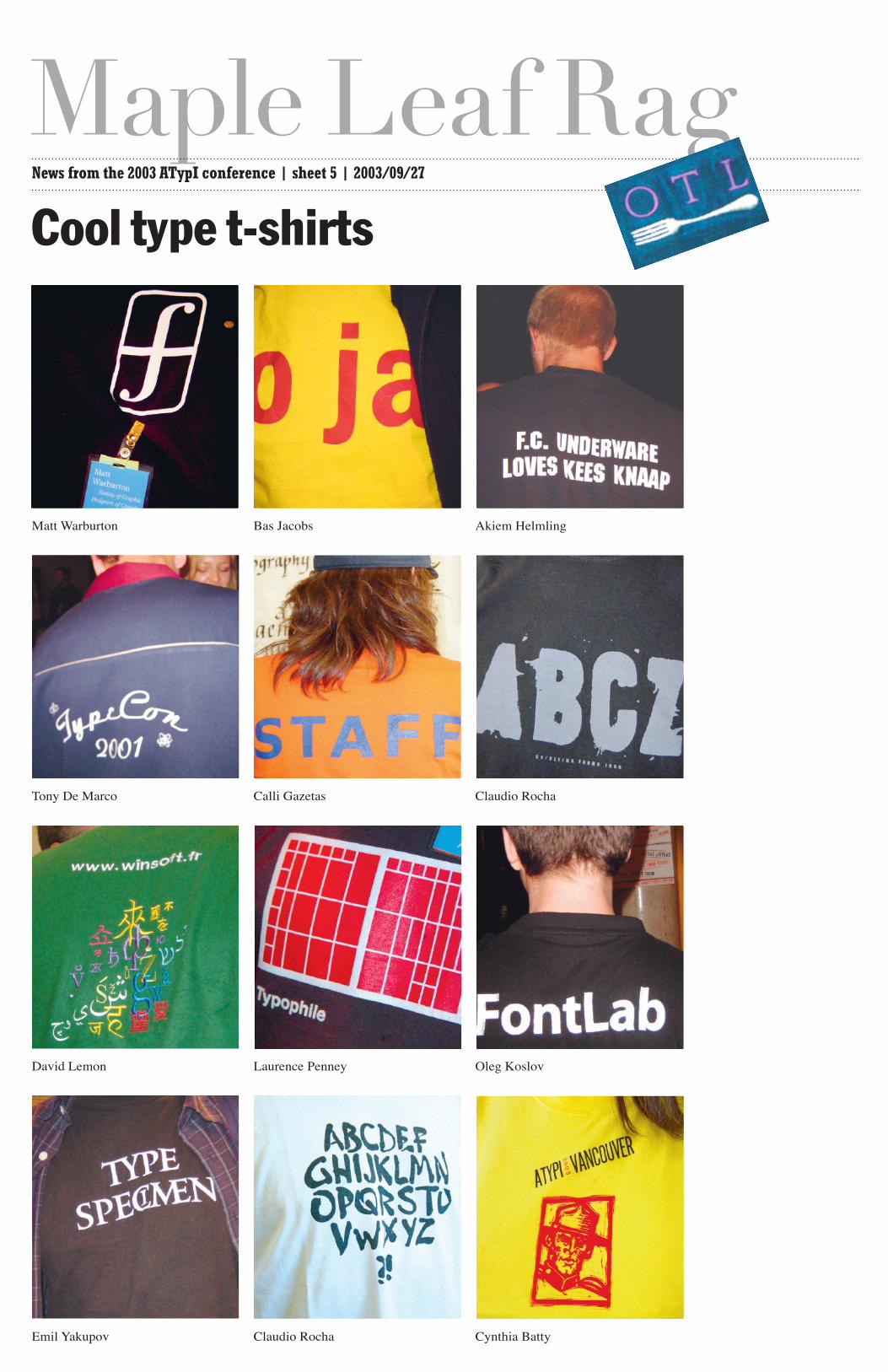
Matt Warburton Bas Jacobs Akiem Helmling
Tony De Marco Calli Gazetas Claudio Rocha
David Lemon Laurence Penney Oleg Koslov
Emil Yakupov Claudio Rocha Cynthia Batty
Cool type t-shirts
Maple Leaf RagNews from the 2003 ATypI conference | sheet 6 | 2003/09/27
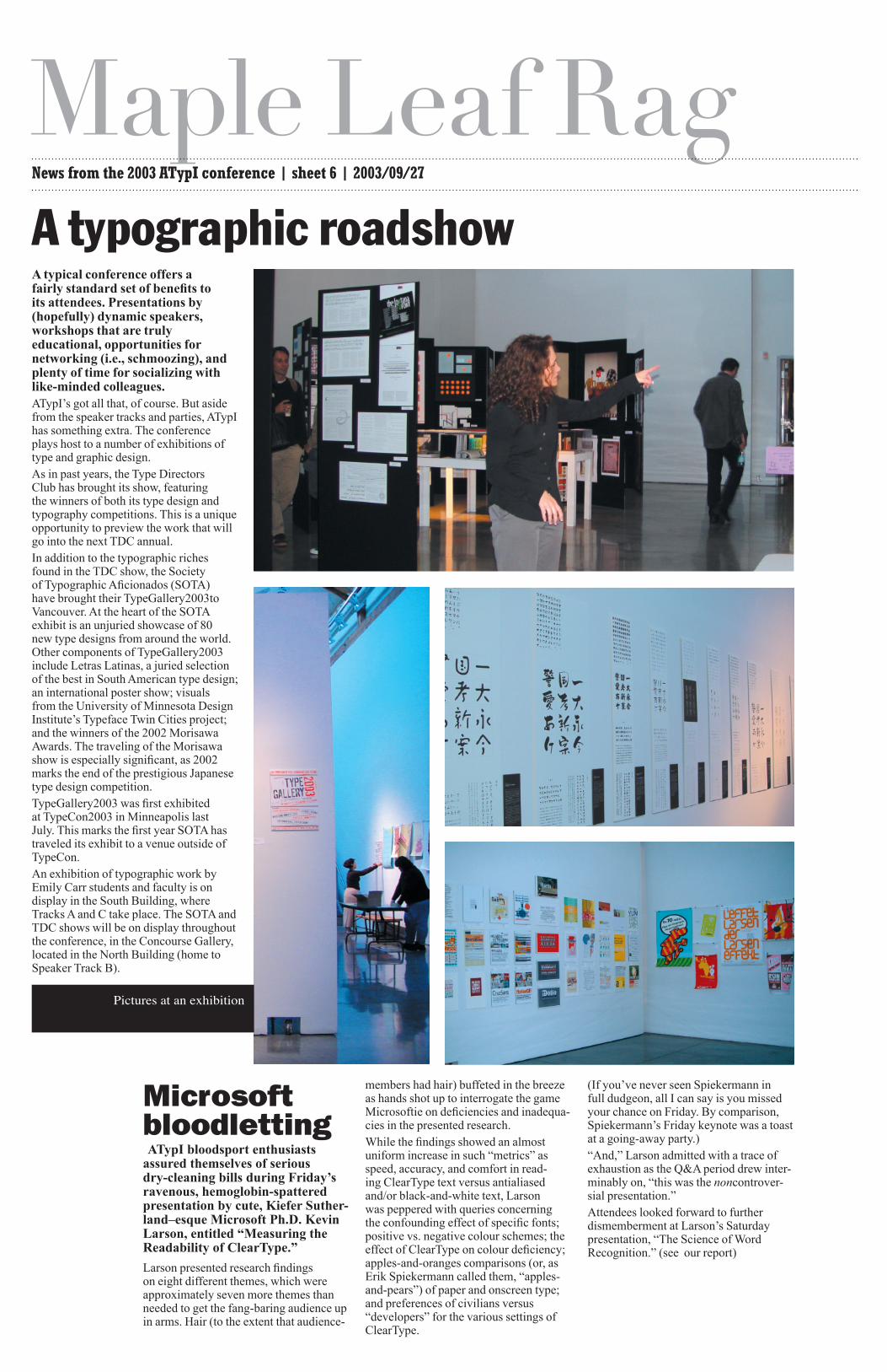
A typical conference offers a fairly standard set of benefits to its attendees. Presentations by (hopefully) dynamic speakers, workshops that are truly educational, opportunities for networking (i.e., schmoozing), and plenty of time for socializing with like-minded colleagues.ATypI’s got all that, of course. But aside from the speaker tracks and parties, ATypI has something extra. The conference plays host to a number of exhibitions of type and graphic design.As in past years, the Type Directors Club has brought its show, featuring the winners of both its type design and typography competitions. This is a unique opportunity to preview the work that will go into the next TDC annual.In addition to the typographic riches found in the TDC show, the Society of Typographic Aficionados (SOTA) have brought their TypeGallery2003to Vancouver. At the heart of the SOTA exhibit is an unjuried showcase of 80 new type designs from around the world. Other components of TypeGallery2003 include Letras Latinas, a juried selection of the best in South American type design; an international poster show; visuals from the University of Minnesota Design Institute’s Typeface Twin Cities project; and the winners of the 2002 Morisawa Awards. The traveling of the Morisawa show is especially significant, as 2002 marks the end of the prestigious Japanese type design competition.TypeGallery2003 was first exhibited at TypeCon2003 in Minneapolis last July. This marks the first year SOTA has traveled its exhibit to a venue outside of TypeCon.An exhibition of typographic work by Emily Carr students and faculty is on display in the South Building, where Tracks A and C take place. The SOTA and TDC shows will be on display throughout the conference, in the Concourse Gallery, located in the North Building (home to Speaker Track B).
A typographic roadshow
Microsoft bloodletting ATypI bloodsport enthusiasts assured themselves of serious dry-cleaning bills during Friday’s ravenous, hemoglobin-spattered presentation by cute, Kiefer Suther-land–esque Microsoft Ph.D. Kevin Larson, entitled “Measuring the Readability of ClearType.”
Larson presented research findings on eight different themes, which were approximately seven more themes than needed to get the fang-baring audience up in arms. Hair (to the extent that audience-
members had hair) buffeted in the breeze as hands shot up to interrogate the game Microsoftie on deficiencies and inadequa-cies in the presented research.While the findings showed an almost uniform increase in such “metrics” as speed, accuracy, and comfort in read-ing ClearType text versus antialiased and/or black-and-white text, Larson was peppered with queries concerning the confounding effect of specific fonts; positive vs. negative colour schemes; the effect of ClearType on colour deficiency; apples-and-oranges comparisons (or, as Erik Spiekermann called them, “apples-and-pears”) of paper and onscreen type; and preferences of civilians versus “developers” for the various settings of ClearType.
(If you’ve never seen Spiekermann in full dudgeon, all I can say is you missed your chance on Friday. By comparison, Spiekermann’s Friday keynote was a toast at a going-away party.)“And,” Larson admitted with a trace of exhaustion as the Q&A period drew inter-minably on, “this was the noncontrover-sial presentation.”Attendees looked forward to further dismemberment at Larson’s Saturday presentation, “The Science of Word Recognition.” (see our report)
Pictures at an exhibition
Maple Leaf RagNews from the 2003 ATypI conference | sheet 7 | 2003/09/27
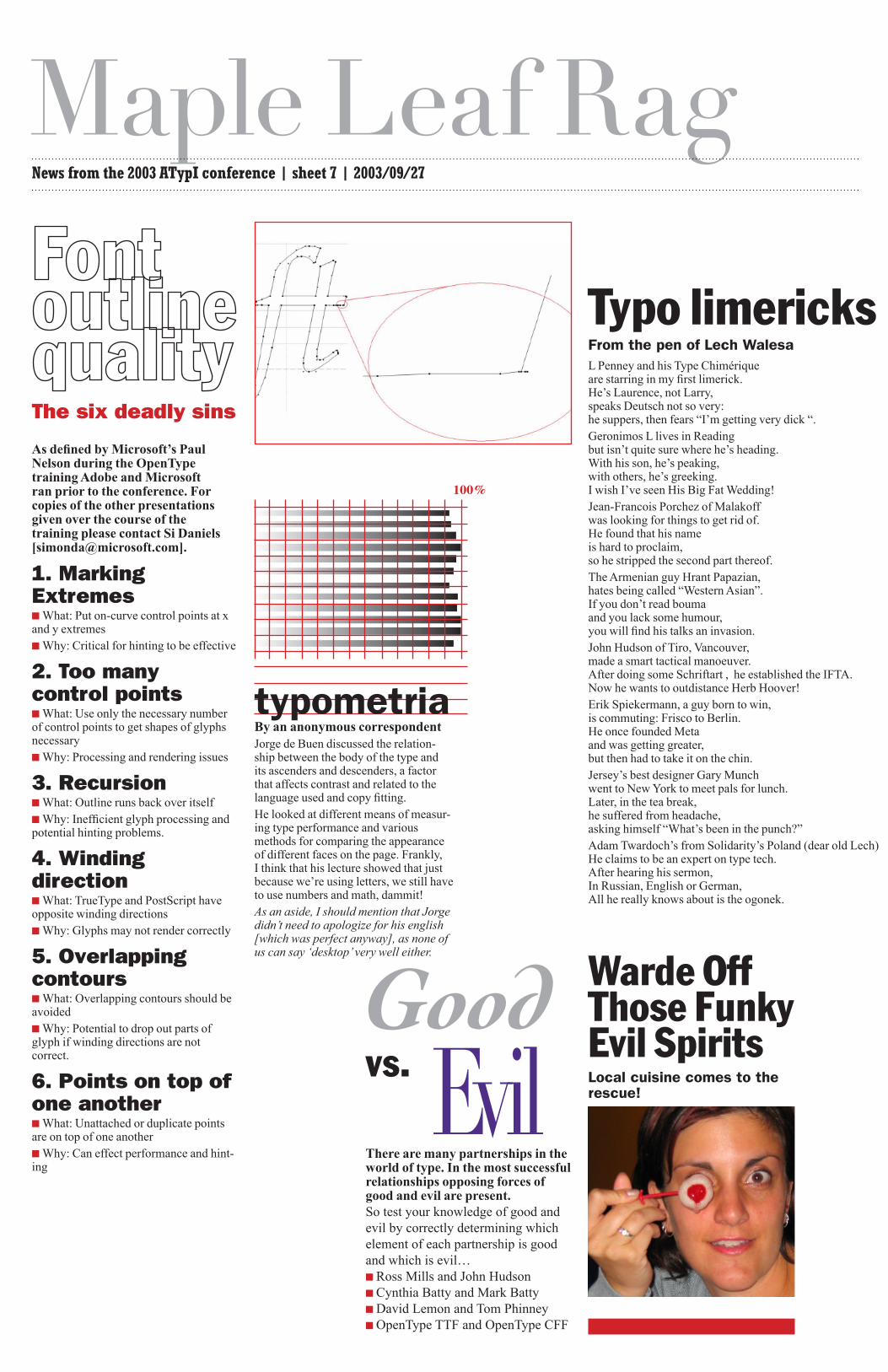
As defined by Microsoft’s Paul Nelson during the OpenType training Adobe and Microsoft ran prior to the conference. For copies of the other presentations given over the course of the training please contact Si Daniels [[email protected]].
1. Marking Extremes■What: Put on-curve control points at x and y extremes■Why: Critical for hinting to be effective
2. Too many control points■What: Use only the necessary number of control points to get shapes of glyphs necessary■Why: Processing and rendering issues
3. Recursion■What: Outline runs back over itself■Why: Inefficient glyph processing and potential hinting problems.
4. Winding direction■What: TrueType and PostScript have opposite winding directions■Why: Glyphs may not render correctly
5. Overlapping contours■What: Overlapping contours should be avoided■Why: Potential to drop out parts of glyph if winding directions are not correct.
6. Points on top of one another■What: Unattached or duplicate points are on top of one another■Why: Can effect performance and hint-ing
Typo limericks From the pen of Lech Walesa L Penney and his Type Chimérique are starring in my first limerick. He’s Laurence, not Larry, speaks Deutsch not so very: he suppers, then fears “I’m getting very dick “. Geronimos L lives in Reading but isn’t quite sure where he’s heading. With his son, he’s peaking, with others, he’s greeking. I wish I’ve seen His Big Fat Wedding! Jean-Francois Porchez of Malakoff was looking for things to get rid of. He found that his name is hard to proclaim, so he stripped the second part thereof. The Armenian guy Hrant Papazian, hates being called “Western Asian”. If you don’t read bouma and you lack some humour, you will find his talks an invasion. John Hudson of Tiro, Vancouver, made a smart tactical manoeuver. After doing some Schriftart , he established the IFTA. Now he wants to outdistance Herb Hoover! Erik Spiekermann, a guy born to win, is commuting: Frisco to Berlin. He once founded Meta and was getting greater, but then had to take it on the chin. Jersey’s best designer Gary Munch went to New York to meet pals for lunch. Later, in the tea break, he suffered from headache, asking himself “What’s been in the punch?” Adam Twardoch’s from Solidarity’s Poland (dear old Lech) He claims to be an expert on type tech. After hearing his sermon, In Russian, English or German, All he really knows about is the ogonek.
The six deadly sins
Good vs. EvilThere are many partnerships in the world of type. In the most successful relationships opposing forces of good and evil are present. So test your knowledge of good and evil by correctly determining which element of each partnership is good and which is evil…■Ross Mills and John Hudson■Cynthia Batty and Mark Batty■David Lemon and Tom Phinney■OpenType TTF and OpenType CFF
Warde Off Those Funky Evil SpiritsLocal cuisine comes to the rescue!
100%
typometriaBy an anonymous correspondentJorge de Buen discussed the relation-ship between the body of the type and its ascenders and descenders, a factor that affects contrast and related to the language used and copy fitting.He looked at different means of measur-ing type performance and various methods for comparing the appearance of different faces on the page. Frankly, I think that his lecture showed that just because we’re using letters, we still have to use numbers and math, dammit!As an aside, I should mention that Jorge didn’t need to apologize for his english [which was perfect anyway], as none of us can say ‘desktop’ very well either.