sellerdeck 2014 responsive design...
TRANSCRIPT

_______________________________________________________________________________________________
SellerDeck 2014 Responsive Design | 1
SellerDeck 2014 Responsive Design Guide
Version: 1.0.0

_______________________________________________________________________________________________
SellerDeck 2014 Responsive Design | 2
ContentsContentsContentsContents Introduction ......................................................................................................................................................................3
Themes and Wireframe ....................................................................................................................................................4
Classic Theme................................................................................................................................................................4
Smart Theme.................................................................................................................................................................5
Wireframe.....................................................................................................................................................................6
How the Responsive Design Works ..................................................................................................................................7
Tablet: .......................................................................................................................................................................8
How can you customise the SellerDeck 2014 Responsive Designs?.................................................................................9
Company Logo...............................................................................................................................................................9
Colour Scheme ............................................................................................................................................................10
Fonts............................................................................................................................................................................11
Changing Element Positions........................................................................................................................................12
What positions can you change to?........................................................................................................................ 12
Changing number of sidebars .....................................................................................................................................13
Fixing Widths...............................................................................................................................................................14
Turning off the Responsive part of the site ....................................................................................................................15

_______________________________________________________________________________________________
SellerDeck 2014 Responsive Design | 3
IntroductionIntroductionIntroductionIntroduction SellerDeck 2014 has two new themes and a new wireframe. All three themes are responsive.
This document will cover:
- The differences between each theme and the wireframe
- How the responsive design works
- How you can customise the SellerDeck 2014 Responsive Designs
This document will not cover the new features of SellerDeck 2014 or GFS.

_______________________________________________________________________________________________
SellerDeck 2014 Responsive Design | 4
Themes and WireframeThemes and WireframeThemes and WireframeThemes and Wireframe There are two responsive themes in SellerDeck 2014, the Classic Theme and the Smart Theme.
Classic ThemeClassic ThemeClassic ThemeClassic Theme The classic theme is all based on right angles, squares and rectangles.
_______________________________________________________________________________________________
SellerDeck 2014 Responsive Design | 5
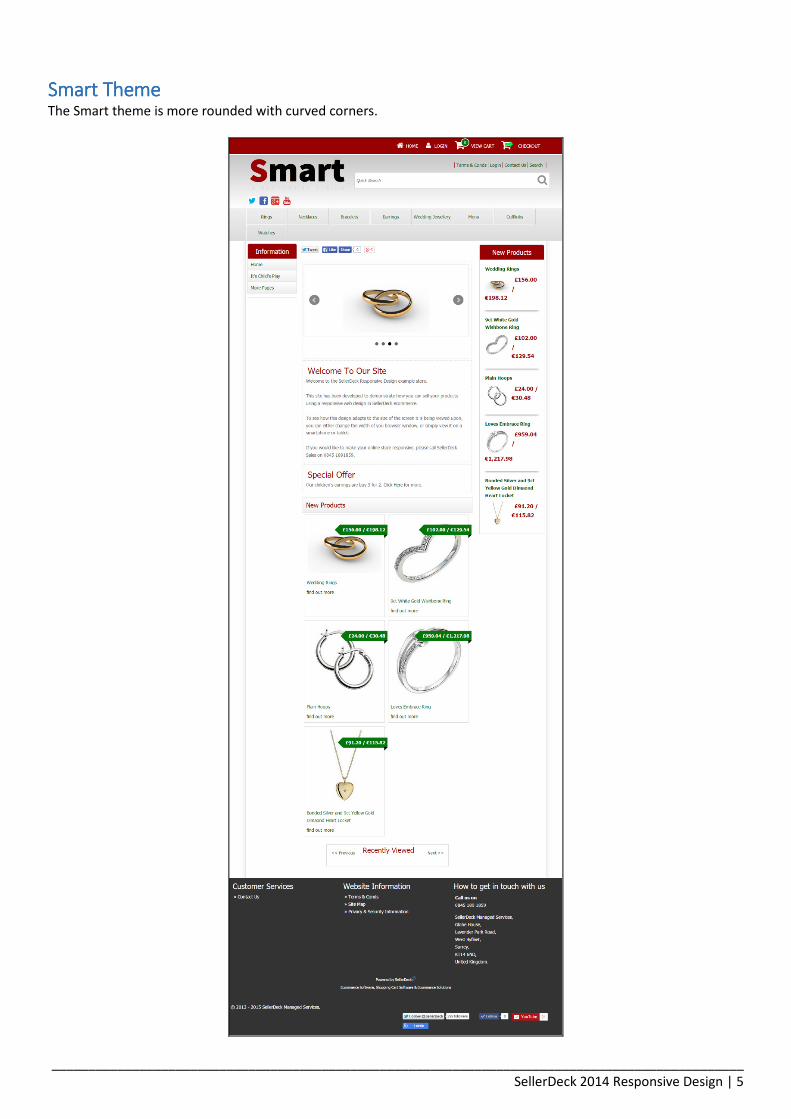
Smart ThemeSmart ThemeSmart ThemeSmart Theme The Smart theme is more rounded with curved corners.

_______________________________________________________________________________________________
SellerDeck 2014 Responsive Design | 6
WireframeWireframeWireframeWireframe The Wireframe was built so that you can create your own design and have it responsive. You are able to add the CSS
design to any of the elements.
These are the only real differences between each theme. The functionality is the same for each of them.

_______________________________________________________________________________________________
SellerDeck 2014 Responsive Design | 7
How the Responsive Design WorksHow the Responsive Design WorksHow the Responsive Design WorksHow the Responsive Design Works The responsive design works with the use of CSS.
The Cascading Style Sheet (CSS) is what tells the site design what it is going to look like, what colour it is and what
size things are displayed at. There are areas within the CSS that are called Media Queries, these are what make the
design display differently at different sizes.
The best way to understand how this works is to open up one of our responsive sites. Grab one of the side edges of
the browser and bring it in to make the width of the site smaller. As you do this you will notice that elements of the
page will move, change size and change appearance completely. For example, as you make the width of the site
smaller, the menu will suddenly change from the Mega Menu, to a drop down menu at tablet stage. You will also
find that the two side bars will move to appear in one column under the main content.
With Mega Menu:

_______________________________________________________________________________________________
SellerDeck 2014 Responsive Design | 8
With Tablet:

_______________________________________________________________________________________________
SellerDeck 2014 Responsive Design | 9
How can you customise the SellerDeck 2014 Responsive Designs?How can you customise the SellerDeck 2014 Responsive Designs?How can you customise the SellerDeck 2014 Responsive Designs?How can you customise the SellerDeck 2014 Responsive Designs? This section will take you through a number of customisations you are able to do to the responsive design.
- Logo Change
- Colour Scheme
- Fonts
Company LogoCompany LogoCompany LogoCompany Logo To be able to change your company logo, go to:
Design > Themes > Corporate Logo

_______________________________________________________________________________________________
SellerDeck 2014 Responsive Design | 10
Colour SchemeColour SchemeColour SchemeColour Scheme To be able to change your colour scheme of your site go to:
Design > Themes > Advanced Theme Configuration > Color Scheme
The three main colours you need to take note of are:
- Palette Color 1
- Palette Color 2
- Palette Color 3
These are what control your main colours on the site.
Other Colours Explained
- Background: The area outside of the website content
- Text: Main content text such as the product full description
- Required Field: Changes the text of fields required to be filled in by the customer (such as ‘Name’ in the
checkout)
- Link: the colour of hyperlinks
- Visited Link: the colour of hyperlinks once visited (E.g. Google links turn Purple)
- Active Link: the colour of hyperlinks when being viewed in another tab in the browser
- Mouse Hover Over: the colour of hyperlinks when hovered over by the mouse
- Form Background: the background colour in the checkout
- Form Emphasis: The checkout header colours
- Search Highlight: the text will change to this colour when searched for
- Error Highlight: the colour of the text in an error message.
- Palette Background: The background of the main content area.

_______________________________________________________________________________________________
SellerDeck 2014 Responsive Design | 11
FontsFontsFontsFonts Like previous versions of SellerDeck, you are able to change the Fonts of SellerDeck to set families.
To be able to choose the font-family you wish to use, go to:
Settings > Site Options > General > Scroll down to ‘Appearance Settings’ > Default Font for Heading / Default Font for
the Store.
You have a number of options pre-programmed into the software:

_______________________________________________________________________________________________
SellerDeck 2014 Responsive Design | 12
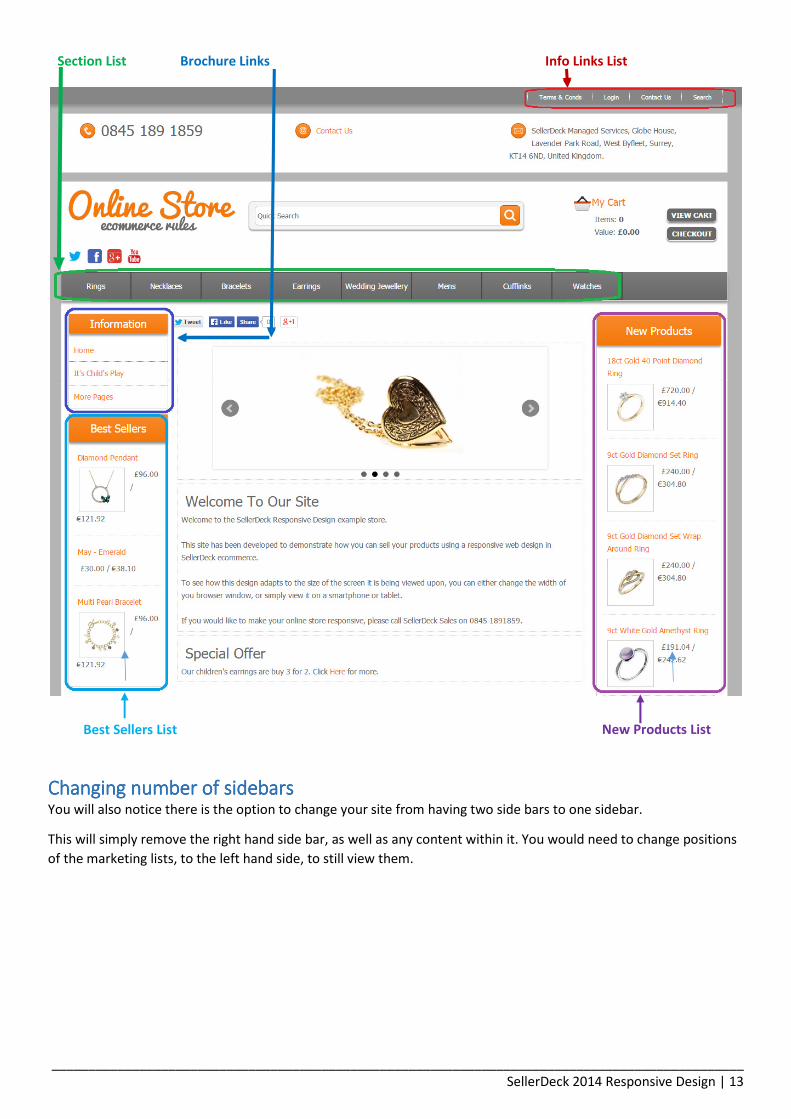
Changing Element PositionsChanging Element PositionsChanging Element PositionsChanging Element Positions There are a number of main elements as part of a SellerDeck site:
- Section List
- Brochure Links
- New Product List
- Best Sellers List
- Info Links List
You are able to easily move the positions of these elements. Go to:
Settings > Site Options > Design Wizard
On the next page is a screen shot to show you what each name is referencing.
What positions can you change to?What positions can you change to?What positions can you change to?What positions can you change to?
- Section List: Left Sidebar, Main Menu Bar and Right Side Bar
- Brochure Links: Left Sidebar, Main Menu Bar and Right Side Bar
- New Product List: Left Sidebar and Right Sidebar
- Best Sellers List: Left Sidebar and Right Sidebar
- Info Links List: Top and Sub Header
_______________________________________________________________________________________________
SellerDeck 2014 Responsive Design | 13
Changing number of sidebarsChanging number of sidebarsChanging number of sidebarsChanging number of sidebars You will also notice there is the option to change your site from having two side bars to one sidebar.
This will simply remove the right hand side bar, as well as any content within it. You would need to change positions
of the marketing lists, to the left hand side, to still view them.
Info Links List Section List Brochure Links
New Products List Best Sellers List
_______________________________________________________________________________________________
SellerDeck 2014 Responsive Design | 14
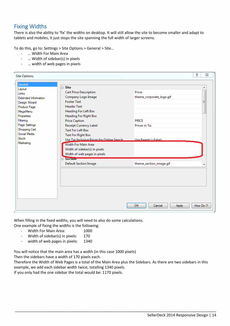
Fixing WidthsFixing WidthsFixing WidthsFixing Widths There is also the ability to ‘fix’ the widths on desktop. It will still allow the site to become smaller and adapt to
tablets and mobiles, it just stops the site spanning the full width of larger screens.
To do this, go to: Settings > Site Options > General > Site…
- … Width For Main Area
- … Width of sidebar(s) in pixels
- … width of web pages in pixels
When filling in the fixed widths, you will need to also do some calculations.
One example of fixing the widths is the following:
- Width For Main Area: 1000
- Width of sidebar(s) in pixels: 170
- width of web pages in pixels: 1340
You will notice that the main area has a width (in this case 1000 pixels)
Then the sidebars have a width of 170 pixels each.
Therefore the Width of Web Pages is a total of the Main Area plus the Sidebars. As there are two sidebars in this
example, we add each sidebar width twice, totalling 1340 pixels.
If you only had the one sidebar the total would be: 1170 pixels.

_______________________________________________________________________________________________
SellerDeck 2014 Responsive Design | 15
Turning off the Responsive part of the siteTurning off the Responsive part of the siteTurning off the Responsive part of the siteTurning off the Responsive part of the site You also have the ability to turn off the responsive part of the website.
Go to: Settings > Site Options > General > Scroll down to Appearance Settings > Change the ‘Adapt Page Layouts to
Screen Size’ to ‘False’.