self-service design - eye-tracking findings that will help you design forms that everyone can use
TRANSCRIPT
(Self-)service design!Eye-tracking Findings That Will Help You Design Forms That Everyone Can Use!!!Caitlin Rinn, University of Baltimore!Noël Alton, University of Baltimore!Kathryn Summers, University of Baltimore!Kath Straub, Usability.org!!
Why forms?
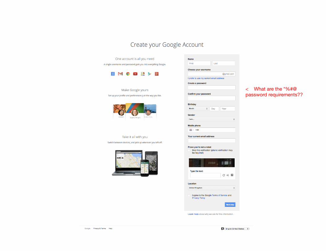
< What are the *%#@ password requirements??

7
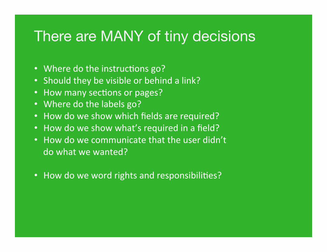
There are MANY of tiny decisions • Where do the instruc.ons go? • Should they be visible or behind a link? • How many sec.ons or pages? • Where do the labels go? • How do we show which fields are required? • How do we show what’s required in a field? • How do we communicate that the user didn’t do what we wanted?
• How do we word rights and responsibili.es?
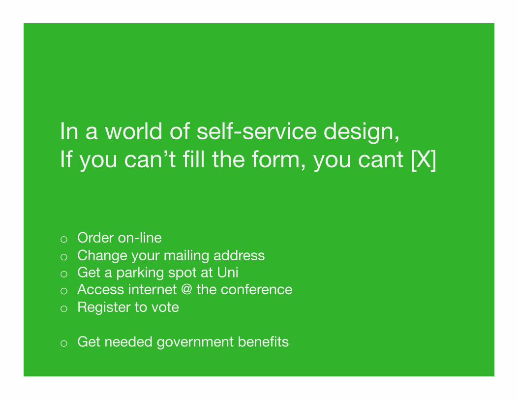
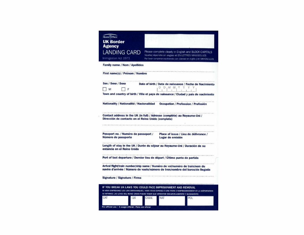
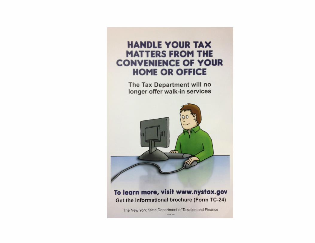
In a world of self-service design, If you can’t fill the form, you cant [X] o Order on-line o Change your mailing address o Get a parking spot at Uni o Access internet @ the conference o Register to vote
o Get needed government benefits
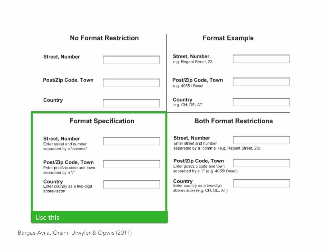
Bargas-Avila, Orsini, Urwyler & Opwis (2011)
Use this
Use this
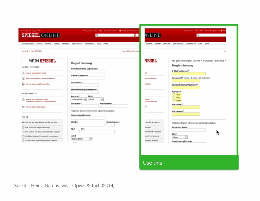
Seckler, Heinz, Bargas-avila, Opwis & Tuch (2014)
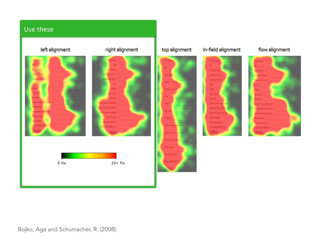
Bojko, Aga and Schumacher, R. (2008).
Use these
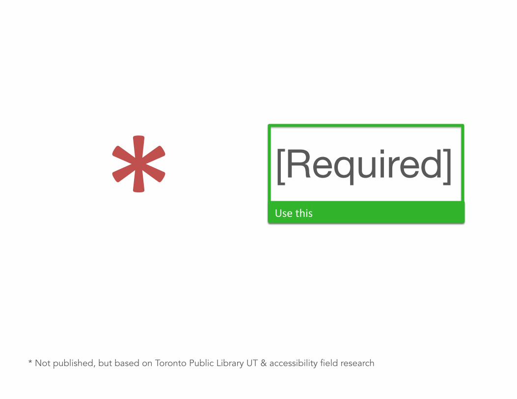
* Use this
[Required]
* Not published, but based on Toronto Public Library UT & accessibility field research
Our studies … • Where do the instruc.ons go? • Should they be visible or behind a link? • How many sec.ons or pages? • Where do the labels go? • How do we show which fields are required? • How do we show what’s required in a field? • How do we communicate that the user didn’t do what we wanted?
• How do we word rights and responsibili.es?
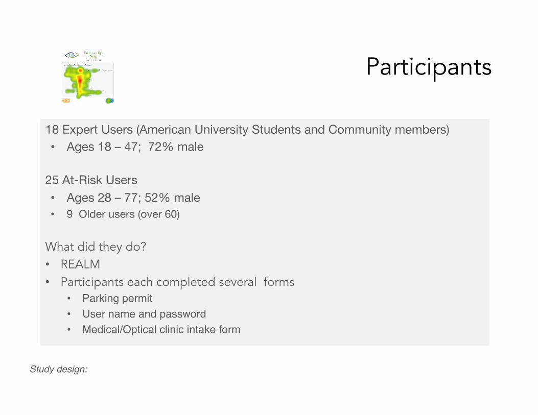
Participants
18 Expert Users (American University Students and Community members) • Ages 18 – 47; 72% male
25 At-Risk Users • Ages 28 – 77; 52% male • 9 Older users (over 60)
What did they do? • REALM • Participants each completed several forms
• Parking permit"• User name and password"• Medical/Optical clinic intake form"
Study design:! ""
Participants
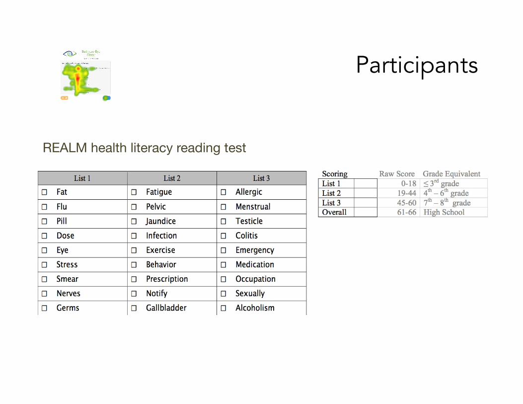
REALM health literacy reading test
Participants
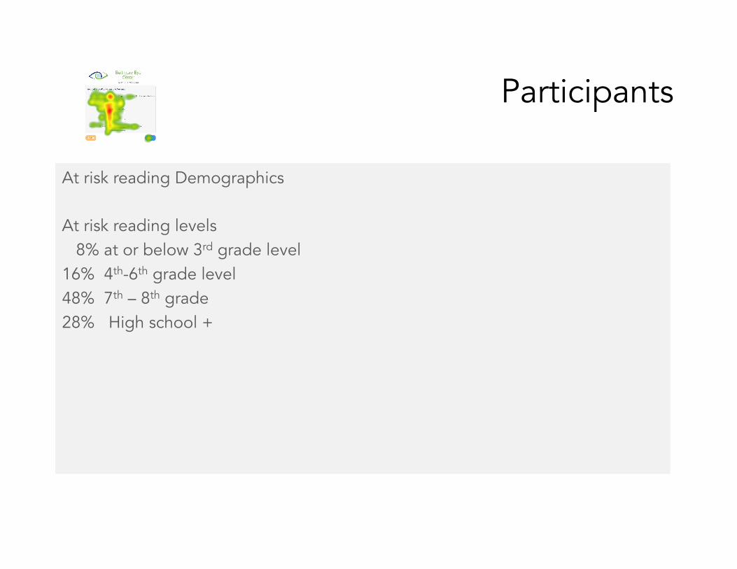
At risk reading Demographics At risk reading levels 8% at or below 3rd grade level 16% 4th-6th grade level 48% 7th – 8th grade 28% High school +
Method
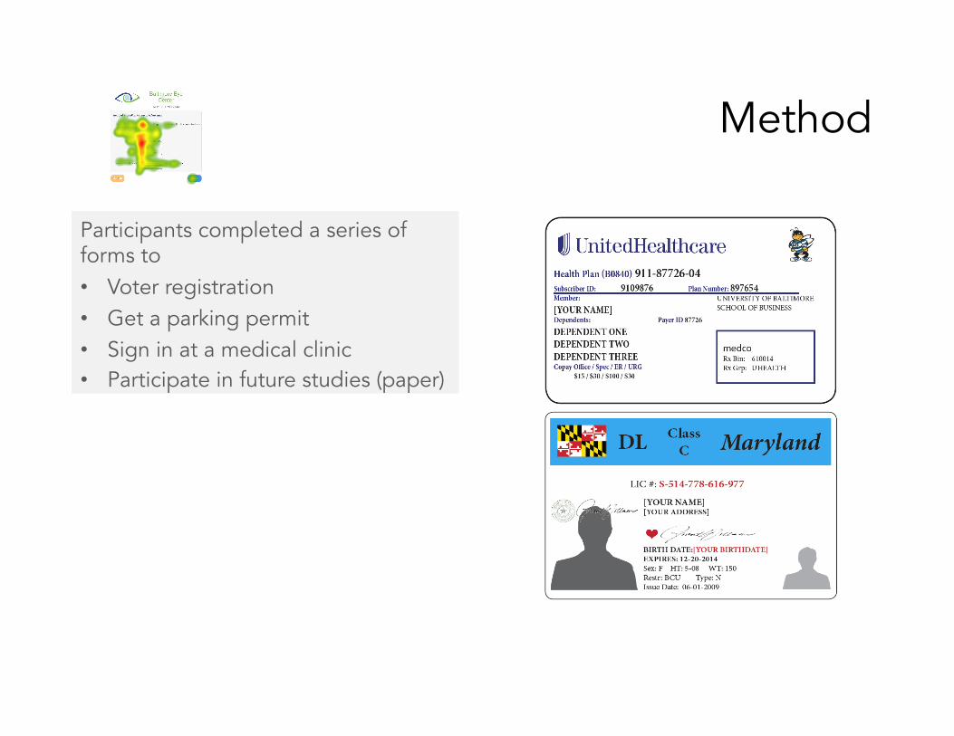
Participants completed a series of forms to • Voter registration • Get a parking permit • Sign in at a medical clinic • Participate in future studies (paper)
Method
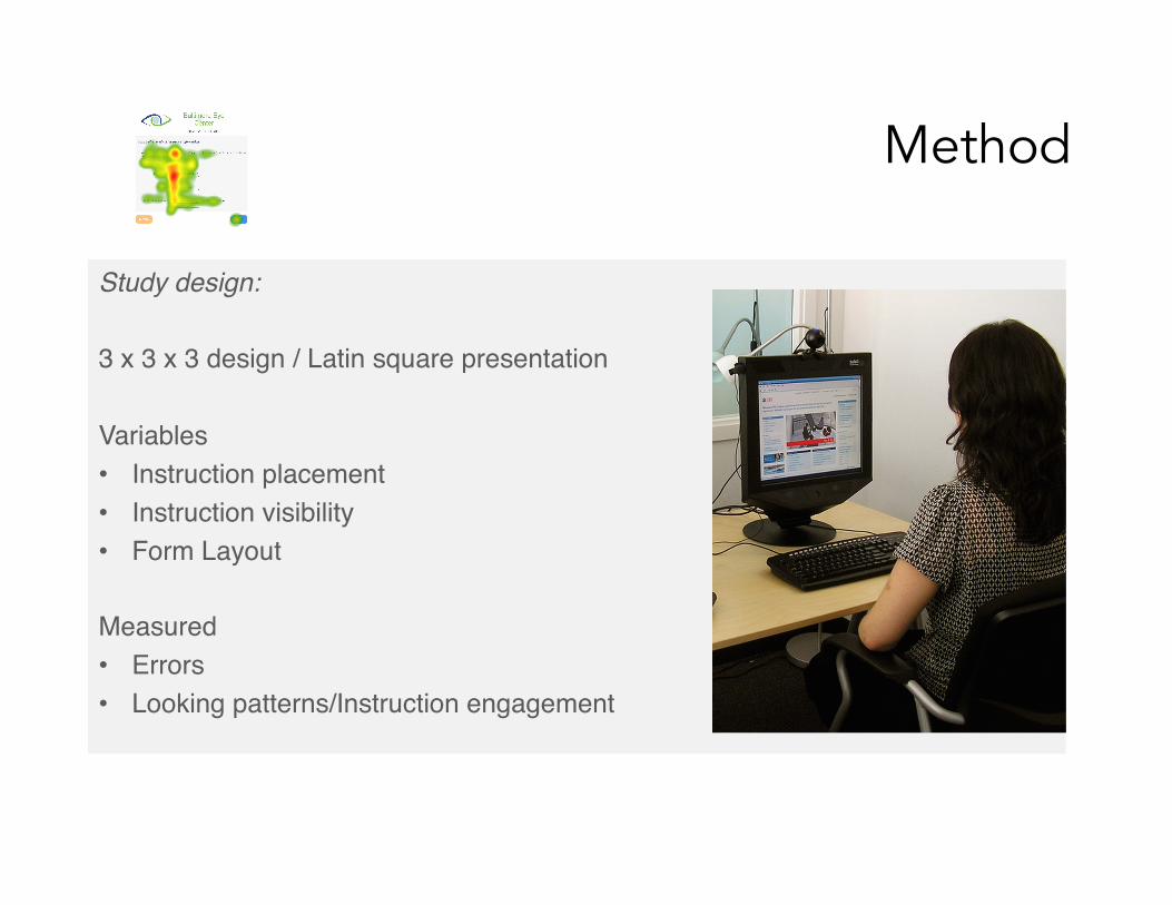
Study design:!"3 x 3 x 3 design / Latin square presentation""Variables"• Instruction placement"• Instruction visibility"• Form Layout"
Measured"• Errors"• Looking patterns/Instruction engagement"
""" ""
Method
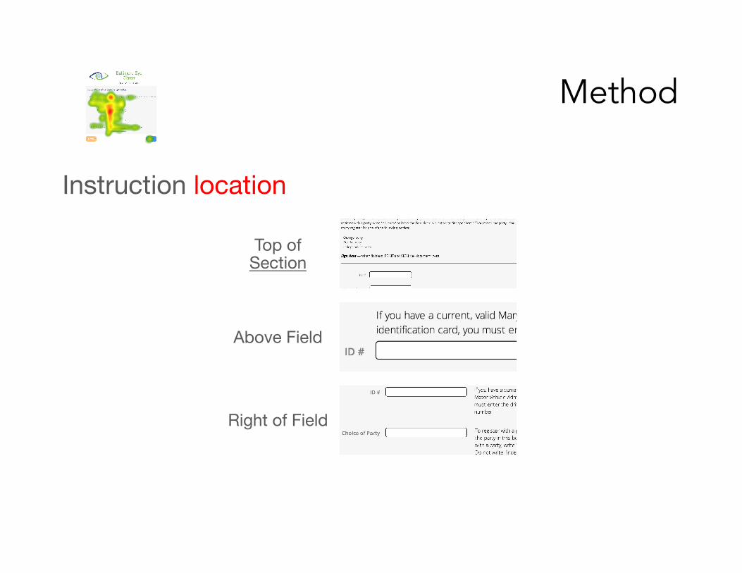
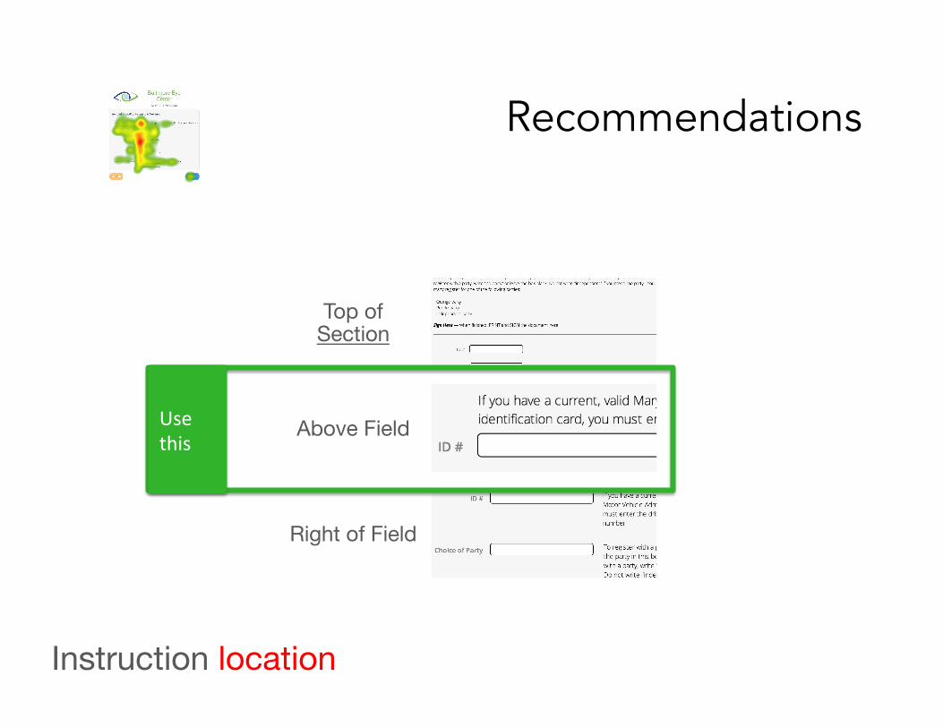
Instruction location """ ""
Top of Section
Above Field
Right of Field
Method
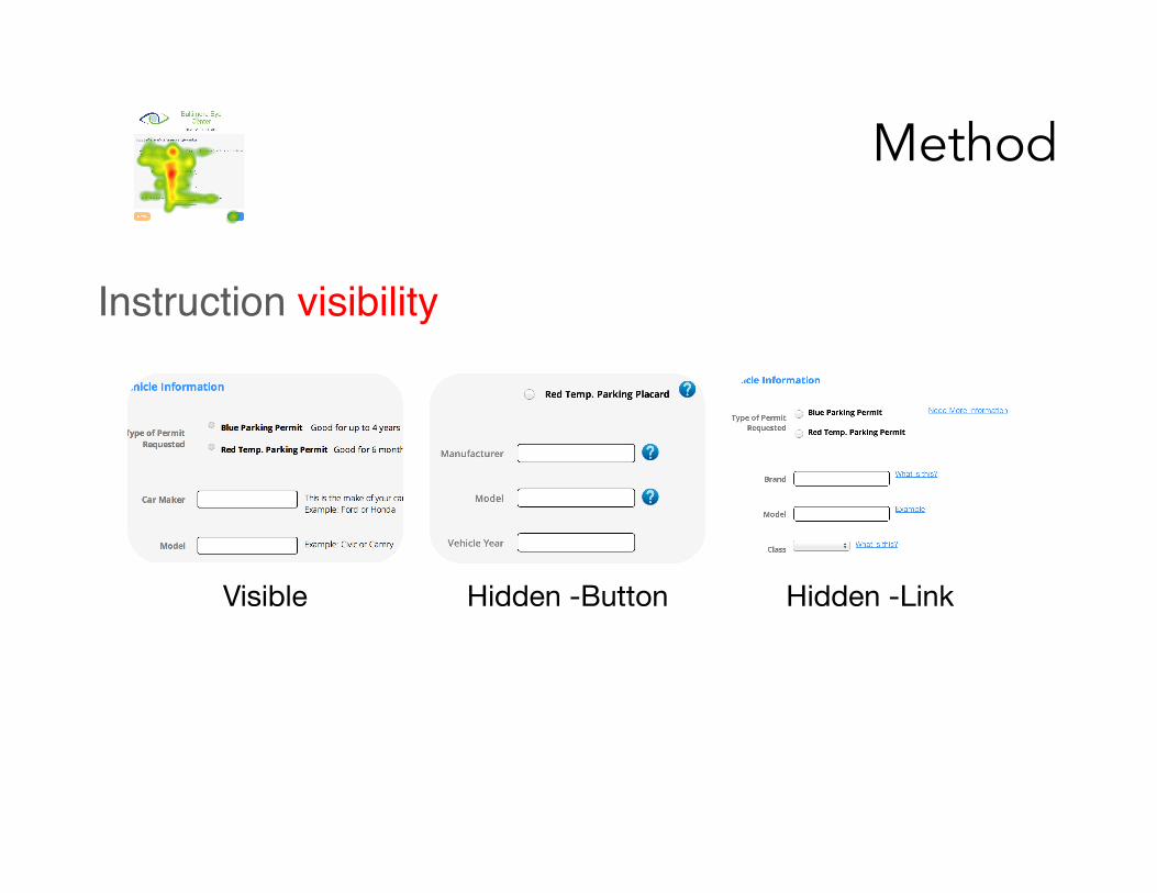
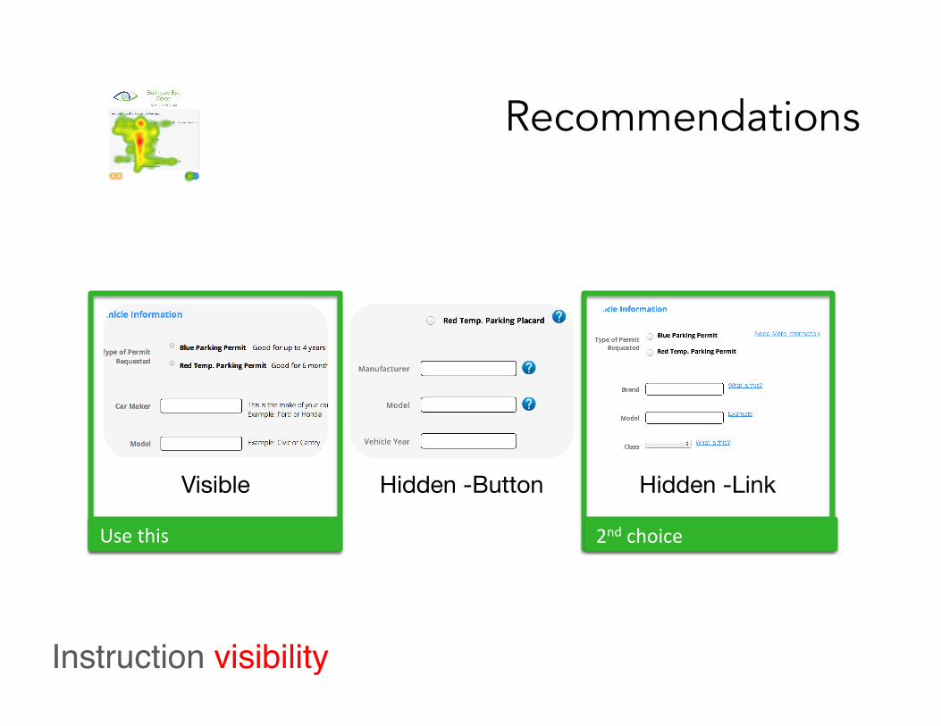
Instruction visibility"""" "" Visible Hidden -Button Hidden -Link
Method
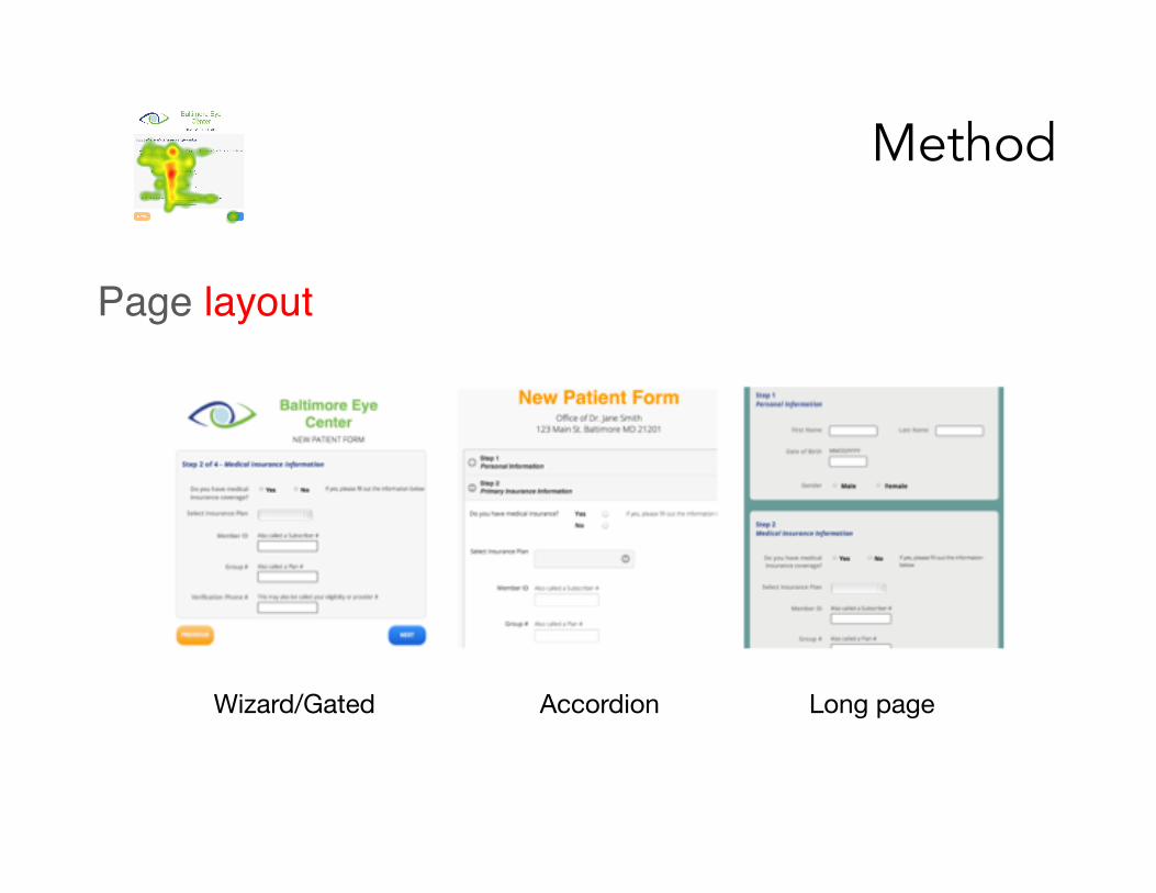
Wizard/Gated Accordion Long page
Page layout"""" ""
Findings
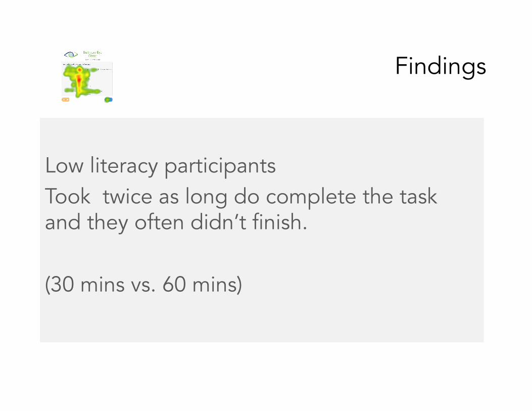
Low literacy participants Took twice as long do complete the task and they often didn’t finish. (30 mins vs. 60 mins)
Findings
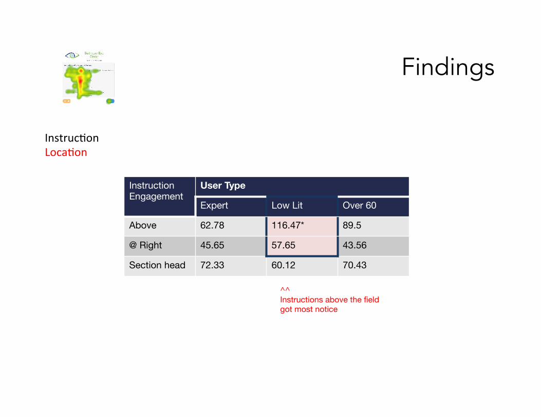
^^ Instructions above the field got most notice
Instruc.on Loca.on
Instruction Engagement
User Type
Expert Low Lit Over 60
Above 62.78 116.47* 89.5
@ Right 45.65 57.65 43.56
Section head 72.33 60.12 70.43
Findings
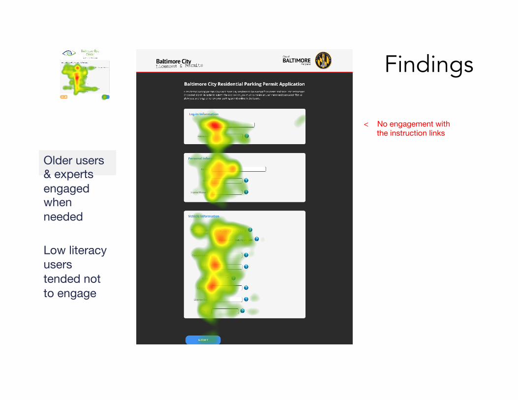
Older users & experts engaged when needed Low literacy users tended not to engage
< No engagement with the instruction links
Findings
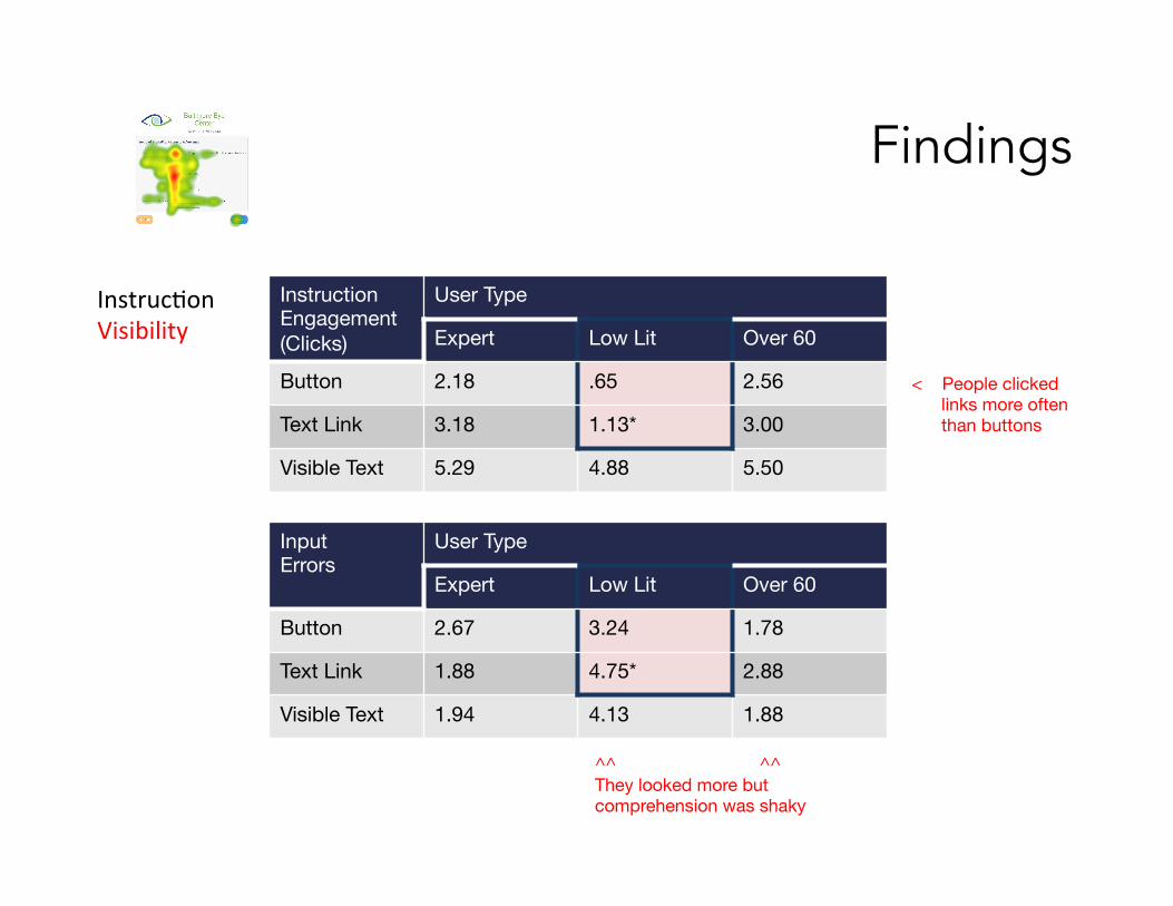
Instruction Engagement (Clicks)
User Type
Expert Low Lit Over 60
Button 2.18 .65 2.56
Text Link 3.18 1.13* 3.00
Visible Text 5.29 4.88 5.50
Input Errors
User Type
Expert Low Lit Over 60
Button 2.67 3.24 1.78
Text Link 1.88 4.75* 2.88
Visible Text 1.94 4.13 1.88
^^ ^^ They looked more but comprehension was shaky
< People clicked links more often than buttons
Instruc.on Visibility
Findings
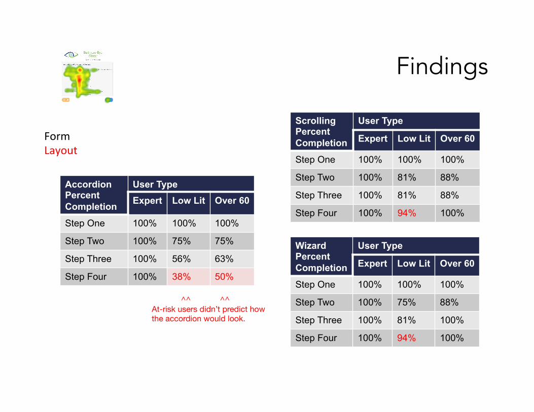
^^ ^^ At-risk users didn’t predict how the accordion would look.
Form Layout
Accordion Percent Completion
User Type Expert Low Lit Over 60
Step One 100% 100% 100%
Step Two 100% 75% 75%
Step Three 100% 56% 63%
Step Four 100% 38% 50%
Wizard Percent Completion
User Type
Expert Low Lit Over 60
Step One 100% 100% 100%
Step Two 100% 75% 88%
Step Three 100% 81% 100%
Step Four 100% 94% 100%
Scrolling Percent Completion
User Type
Expert Low Lit Over 60
Step One 100% 100% 100%
Step Two 100% 81% 88%
Step Three 100% 81% 88%
Step Four 100% 94% 100%
Findings
Low literacy findingsLow literacy participants were often surprised by new sections of the page opening up.
Findings
Low literacy findingsParticipants had ideas and expectations about how the interaction might work, but tended not to try them spontaneously. Usernames and passwords were foreign to them. Most didn’t have an email. Low engagement with help information • Didn’t look at buttons / links • If they did, they tended not to engage
Findings
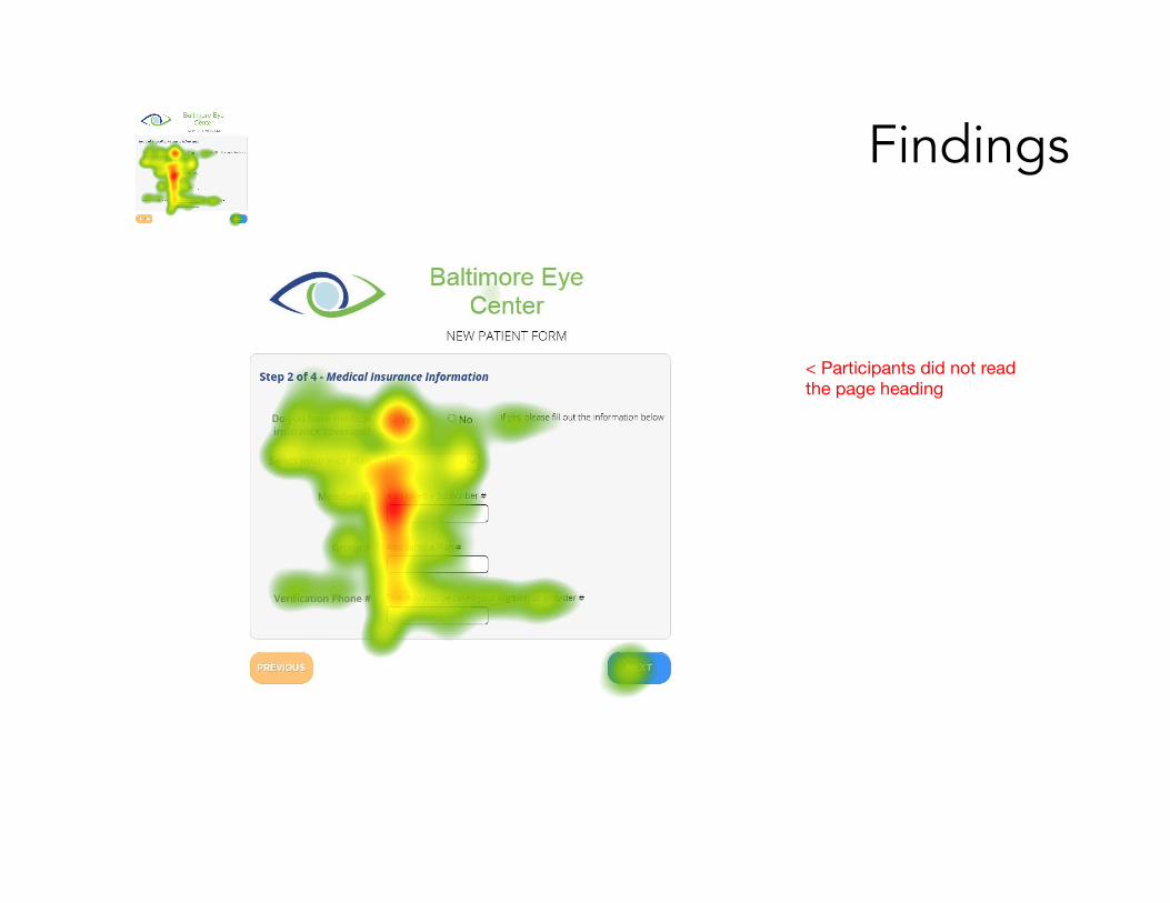
< Participants did not read the page heading
Findings
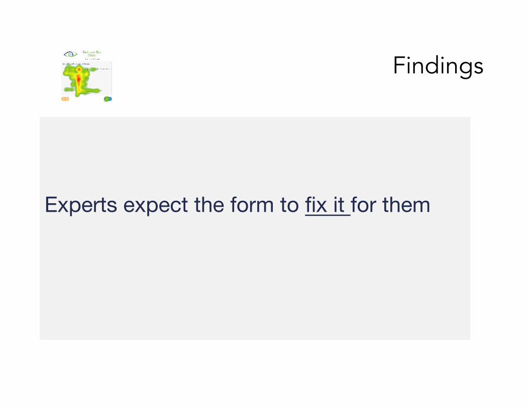
Experts expect the form to fix it for them
Recommendations
Instruction location """ ""
Top of Section
Above Field
Right of Field
Use this
Recommendations
Instruction visibility"""" ""
Visible Hidden -Button Hidden -Link
2nd choice Use this
Recommendations
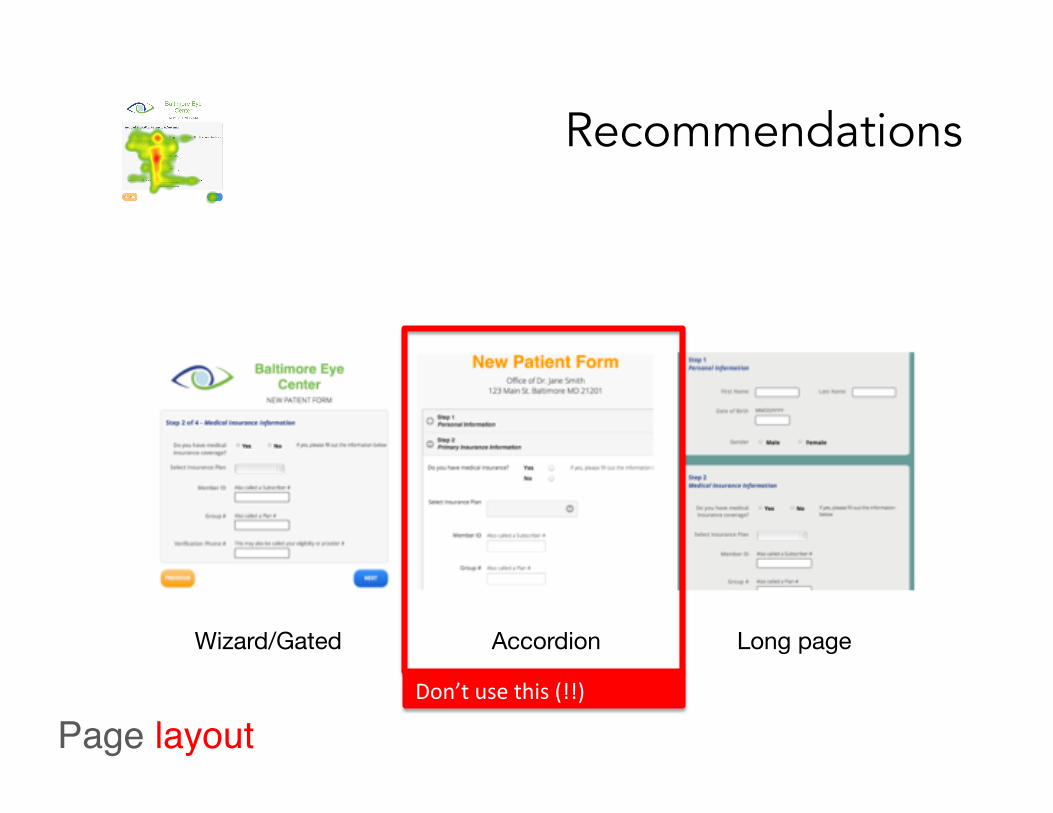
Page layout"""" ""
Wizard/Gated Accordion Long page
Don’t use this (!!)
Work in progress
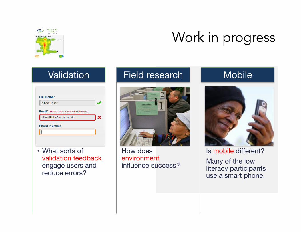
• What sorts of validation feedback engage users and reduce errors?
Validation
How does environment influence success?
Field research
Is mobile different? Many of the low literacy participants use a smart phone.
Mobile
Thanks! Questions? For questions later, contact [email protected]