secondary national strategy handling data graphs and charts created by j lageu, ks3 ict consultant...
TRANSCRIPT
Secondary National StrategyHandling Data
Graphs and charts
Created by J Lageu, KS3 ICT Consultant – Coventry
Based on the Framework for teaching mathematics pages 248 - 275

KS3 Handling Data
Graphs & charts a handy guide
Click on the required choice
Types of data
Types of graph or chart
Return to last slide viewed
Return to category menu

KS3 Handling Data
Data types
Categorical
Discrete
Continuous
Grouped discrete
Grouped continuous
Means

KS3 Handling Data
Categorical
data is broken into categories, there is no order to the categories eg
– gender - male, female
– transport method – walk, bus, train etc
possible graph & chart choices
– pie chart
– bar chart
– compound bar chart
– bar line graph
– pictogram

KS3 Handling Data
Discrete
data is numerical with separate values
– counted eg no of letters in a word, no on a dice
– ordered but not counted eg school year group, size of shoe
possible graph & chart choices
– pie chart
– bar chart
– compound bar chart
– bar line graph
– pictogram

KS3 Handling Data
Continuous
data is numerical and is measured
– length, weight, time etc.
– even if there is rounding, say to the nearest hour, it is still continuous. We are approximating, but there is still meaning to in between points.
– digital clock is continuous because it approximates.
– exception - shoe size is discrete because it is labelling a type of shoe. There are only ever a certain number of shoe sizes and there is no shoe size between 3 & 3½.
possible graph & chart choices
– frequency diagram
– frequency polygon
– line graph
– scatter graph
– cumulative frequency diagram

KS3 Handling Data
Grouped discrete
discrete data grouped into suitable class intervals
– intervals should be equal
– there should be no overlap eg 0-5, 5-10 etc is wrong, where does 5 go?
– unequal intervals makes the data categorical eg ages: 0-5, 6-10, 11-16, 17-21, over 21
possible graph & chart choices
– bar chart
– compound bar chart

KS3 Handling Data
Grouped continuous
continuous data grouped into suitable class intervals
– intervals usually equal
– there should be no overlap eg 0 < t < 5, 5 <= t < 10
– un-equal intervals need histograms, post KS3
possible graph & chart choices
– frequency diagram
– frequency polygon
– line graph
– cumulative frequency diagram
KS3 Handling Data
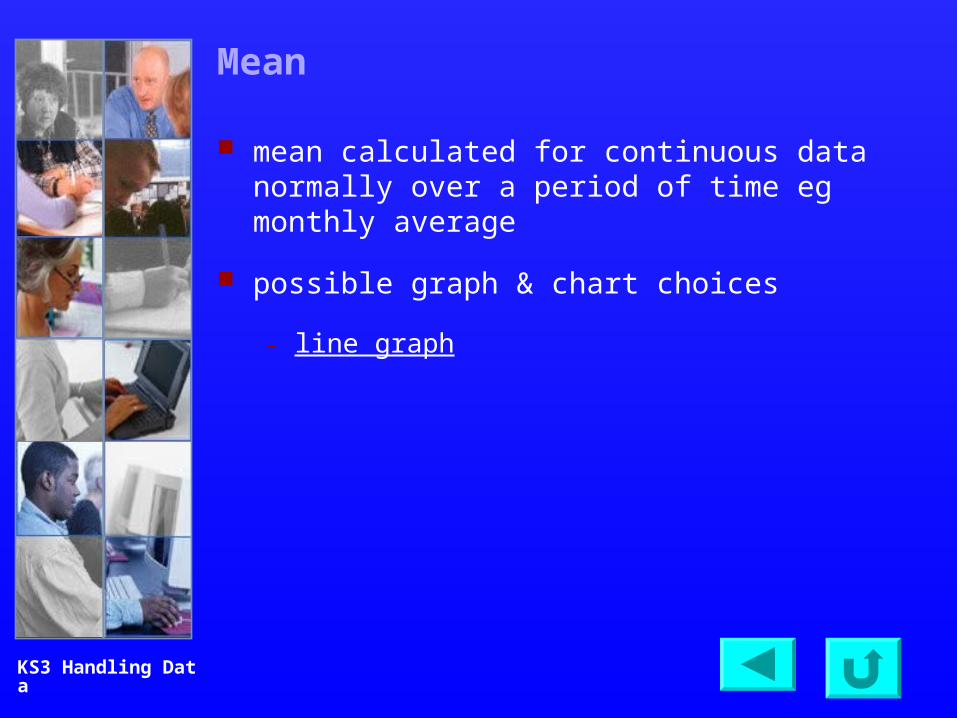
Mean
mean calculated for continuous data normally over a period of time eg monthly average
possible graph & chart choices
– line graph
KS3 Handling Data
Types of graph and chart
Pie chart
Bar chart
Compound bar chart
Bar-line graph
Pictogram
Frequency diagram
Frequency polygon
Line graphs
Scatter graph
Cumulative frequency diagram

KS3 Handling Data
Pie chart
3D distorted are not strictly correct, because the angle should be proportional to the frequency
Walk Car Other Train Minibus Taxi Public bus School bus Bicycle28% 39% 1% 2% 1% 1% 10% 15% 3%
Journeys to and from school: Year 7 pupils
Walk
Car
Other
Train
Minibus
Taxi
Public bus
School bus
Bicycle
Are you using the power of technology?
I 'm on the
I nternet
I 'm not!
avoid unless you have a
specific purpose
KS3 Handling Data
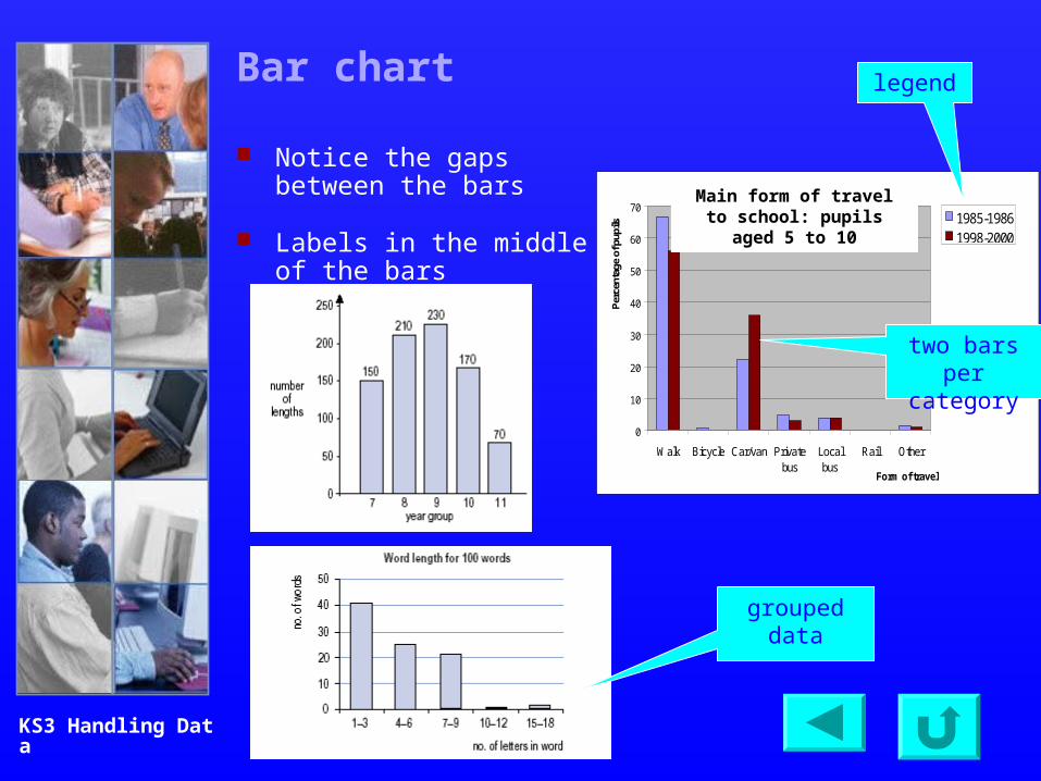
Bar chart
Notice the gaps between the bars
Labels in the middle of the bars
0
10
20
30
40
50
60
70
Walk Bicycle Car/van Privatebus
Localbus
Rail Other
Form of travel
Per
cent
age
of p
upils
1985-19861998-2000
Main form of travel to school: pupils aged 5 to 10
two bars per category
grouped data
legend

KS3 Handling Data
Compound bar chart
Notice the gaps between the bars
key
labels on bars

KS3 Handling Data
Bar-line graph
The length of the bar represents the frequency.
What is being counted or measured (the independent variable) is placed on the horizontal axis, and the count or measure (the dependent variable) on the vertical axis.
It is not appropriate to join the tops of the bars.

KS3 Handling Data
Pictogram
all symbols should be the same size & shape
fitness for purpose may justify differences, but size must be the same
scale
half picture=1
identical pictures
mathematically incorrect

KS3 Handling Data
Frequency diagram
Notice there are no gaps between the bars
indicating non-zero
start
labels start & end of bars
see frequencypolygon

KS3 Handling Data
Frequency polygon
Points are plotted at the middle of the range if grouped
see frequencydiagram

KS3 Handling Data
Line graph
data point middle month & year labels

KS3 Handling Data
Scatter graph – two variables
line of best fit

KS3 Handling Data
Cumulative frequency diagram
median