screen shots
DESCRIPTION
Screen shotsTRANSCRIPT

Here is the main base for my magazine. As you can see it doesn’t look like the best start for a magazine. I have inserted my brushes that will be used simply for frames throughout the magazine. I like the brushes as they have a noisy effect which is what I want for this magazine.
Now I have started to clean up my front cover a bit. I have inserted my Masthead and frames around the magazine and my barcode. I really like the rough effect and noisy effect I feel that I have portrayed really well.

Here as you can see, I have inserted my main image and my bottom cover line. You can see here that I have added a purple glow effect around my main image. This is because it gives readers the feel that she’s untouchable which is another effect I wanted to portray which again I feel I have completed well.
Here is my completed magazine. I have inserted my main cover lines and pull quote. The effect I wanted came out nicely which is the inverted quote on the main image which I think works really well. I am over all proud of how my magazine came out and has the house style I wanted for my main target audience.

And finally I have made some minor adjustments to my magazine front cover. I have added some more cover lines because my front cover looked a bit empty so I decided to place some more cover lines as I feel it fits in nicely with the magazine. Also it gives me the chance to insert some different colours to my front cover which blend in with the purple background nicely and it with the different variety of colours used it makes my magazine more enjoyable to look at, and also makes it eye catching to the audience. And another minor adjustment I’ve made is I’ve made the strap line smaller because it gives my model a bit more space and looks less noisy.
Here is the main base for my contents page. As you can see I have kept the same style as the front cover by having the same background as I want to have a house style throughout my magazine. The yellow box is the skyline which is where the mastheads will be placed. I have gone for a yellow glow effect as I feel the yellow mixes well with the purple background.

Here I have added in more effects. As you can see yet again I have added a frame to the magazine simply because I want to keep the house style the same. I have taken a copy of the original masthead and inserted it onto my contents page. For the page numbers you can see I have added a outer glow to the font, this is because I want to make the writing stand out so I simply added a slight glow to do that.
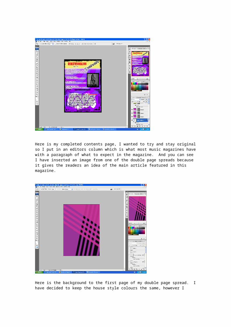
Here is my completed contents page, I wanted to try and stay original so I put in an editors column which is what most music magazines have with a paragraph of what to expect in the magazine. And you can see I have inserted an image from one of the double page spreads because it gives the readers an idea of the main article featured in this magazine.
Here is the background to the first page of my double page spread. I have decided to keep the house style colours the same, however I wanted to change the colours a bit more to give my magazine more than just one colour so it would be more interesting to look at.
Here is when I have inserted the text. I copied the ‘Edma’ text from my front cover as I wanted to keep the same font but add some other effects in it as a faint glow around the outside. For the font I wanted to give it a nice effect, so I inserted glow around the outside. I do feel however I have kept with the house style for my double page spread as I want to have a noisy effect and rough look which I feel I have done for both pages.

Here is my completed first page spread. I have inserted 3 images for this because as you can see the pull quote says ‘There’s two sides to me’ and as you can see the two small pictures at either side have a different look to her. So I wanted to anchor the pull quote and the images together.
Here is the second page of my double page spread. Again I have tried to keep the colours as similar as possible to keep a house style going. I have inserted a light effect which will be used for my images later on.

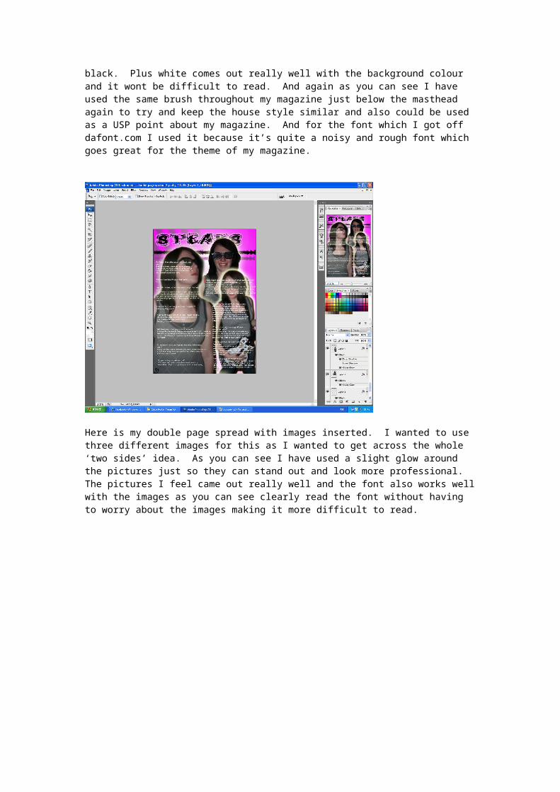
Here I have inserted my masthead and text for my interview. I used a white font because I wanted to use a different colour other than black. Plus white comes out really well with the background colour and it wont be difficult to read. And again as you can see I have used the same brush throughout my magazine just below the masthead again to try and keep the house style similar and also could be used as a USP point about my magazine. And for the font which I got off dafont.com I used it because it’s quite a noisy and rough font which goes great for the theme of my magazine.
Here is my double page spread with images inserted. I wanted to use three different images for this as I wanted to get across the whole ‘two sides’ idea. As you can see I have used a slight glow around the pictures just so they can stand out and look more professional. The pictures I feel came out really well and the font also works well with the images as you can see clearly read the font without having to worry about the images making it more difficult to read.
I decided that I would take out one of my images off this page because it looked too crowded before, whereas now I feel that nothing looks out of place. And also it brings more attention to the font and not so much the images.