scientific poster design
TRANSCRIPT
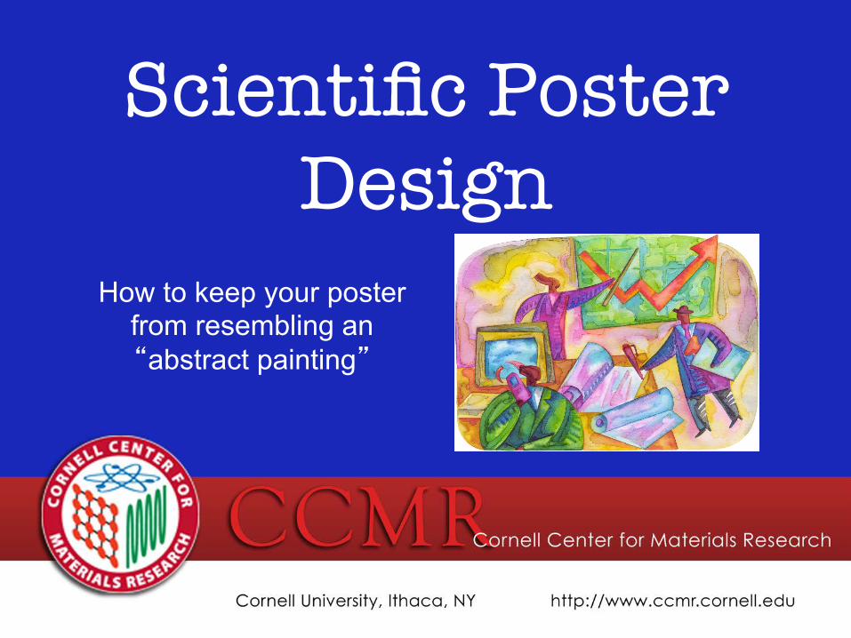
Scientific Poster Design
How to keep your poster from resembling an “abstract painting”
A poster can be better than giving a talk
More efficient because:
• you totally bomb at giving talks
• can be viewed while you nap
• can hang in the department for years
• can reach folks not in your field of research
Posters serve as…
Kool, wow!, check this out!, you must be smart!
An advertisement of your hard work
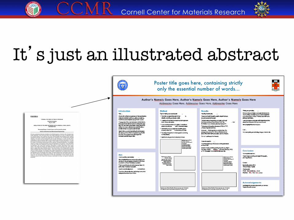
It’s just an illustrated abstract
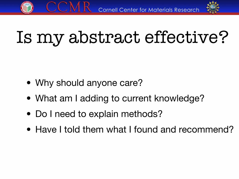
Is my abstract effective?
• Why should anyone care?
• What am I adding to current knowledge?
• Do I need to explain methods?
• Have I told them what I found and recommend?
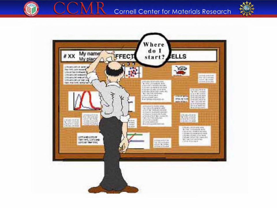
A portrait of a �grad student
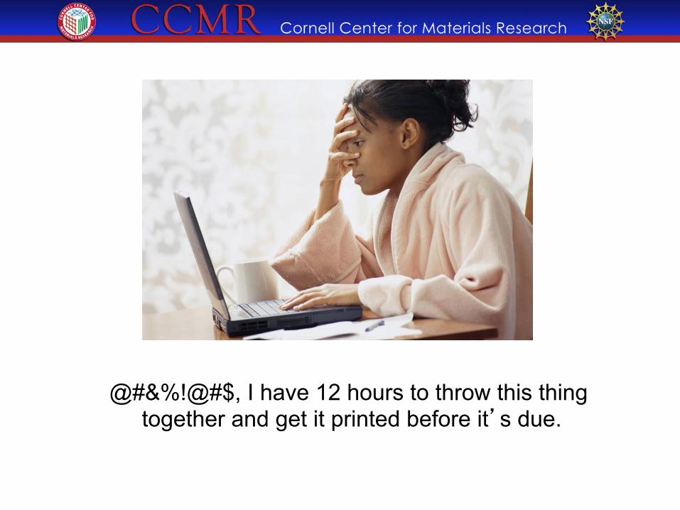
@#&%!@#$, I have 12 hours to throw this thing together and get it printed before it’s due.
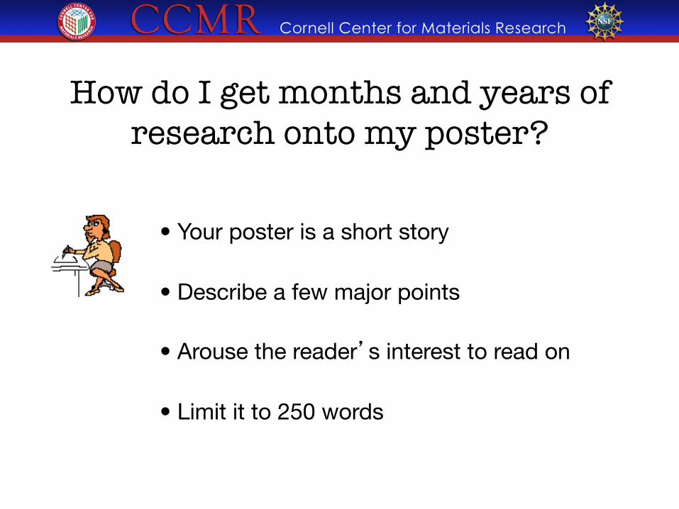
How do I get months and years of research onto my poster?
• Your poster is a short story • Describe a few major points • Arouse the reader’s interest to read on • Limit it to 250 words
Recite after me, Less is best!
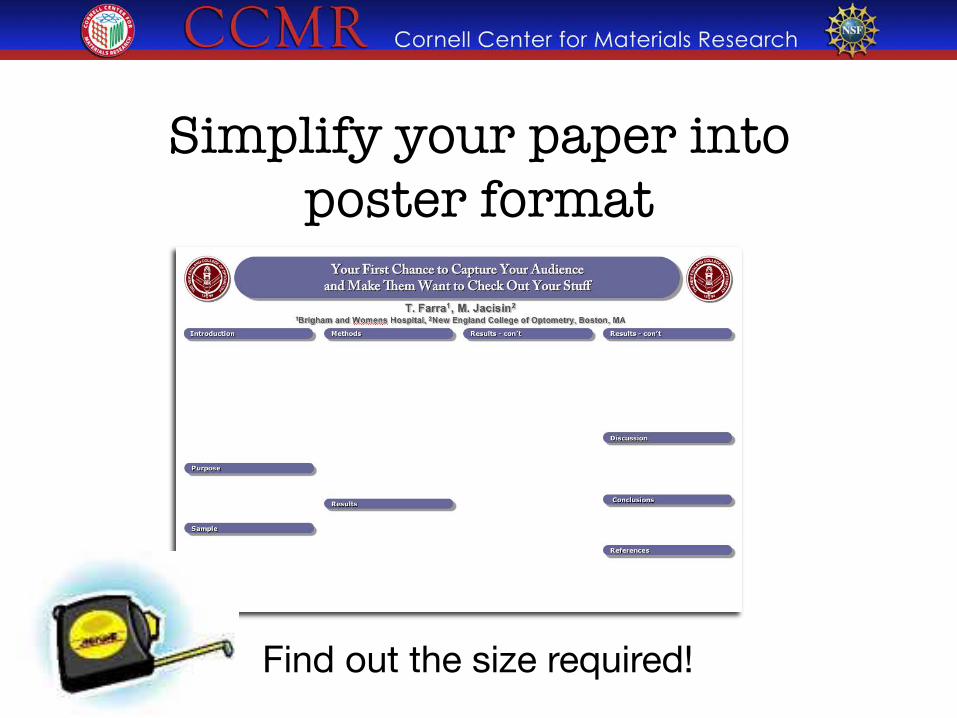
Simplify your paper into poster format
Find out the size required!
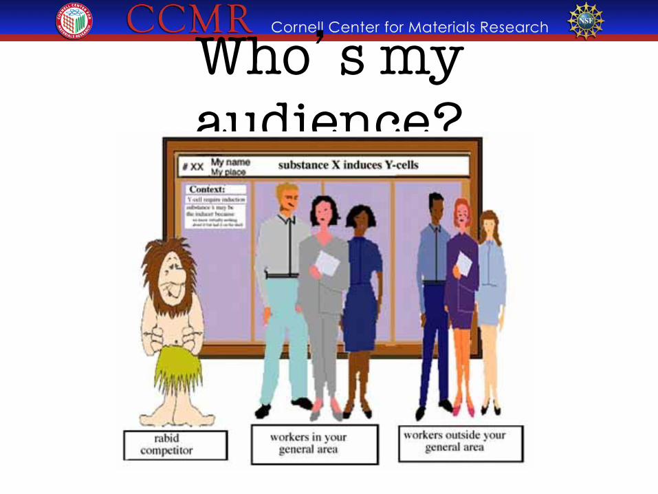
Who’s my audience?
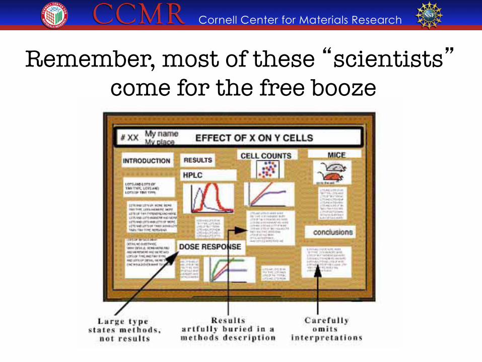
Remember, most of these “scientists” come for the free booze
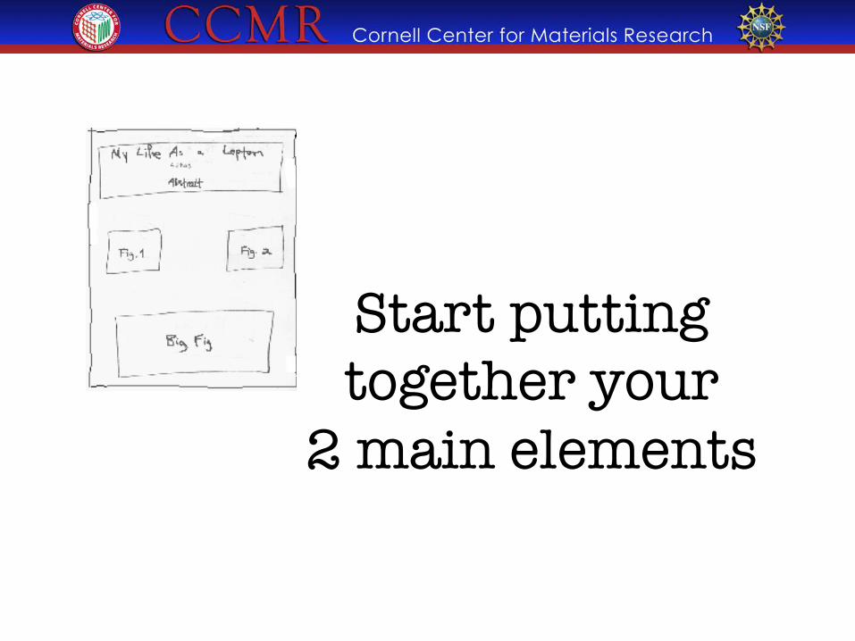
Start putting �together your �
2 main elements
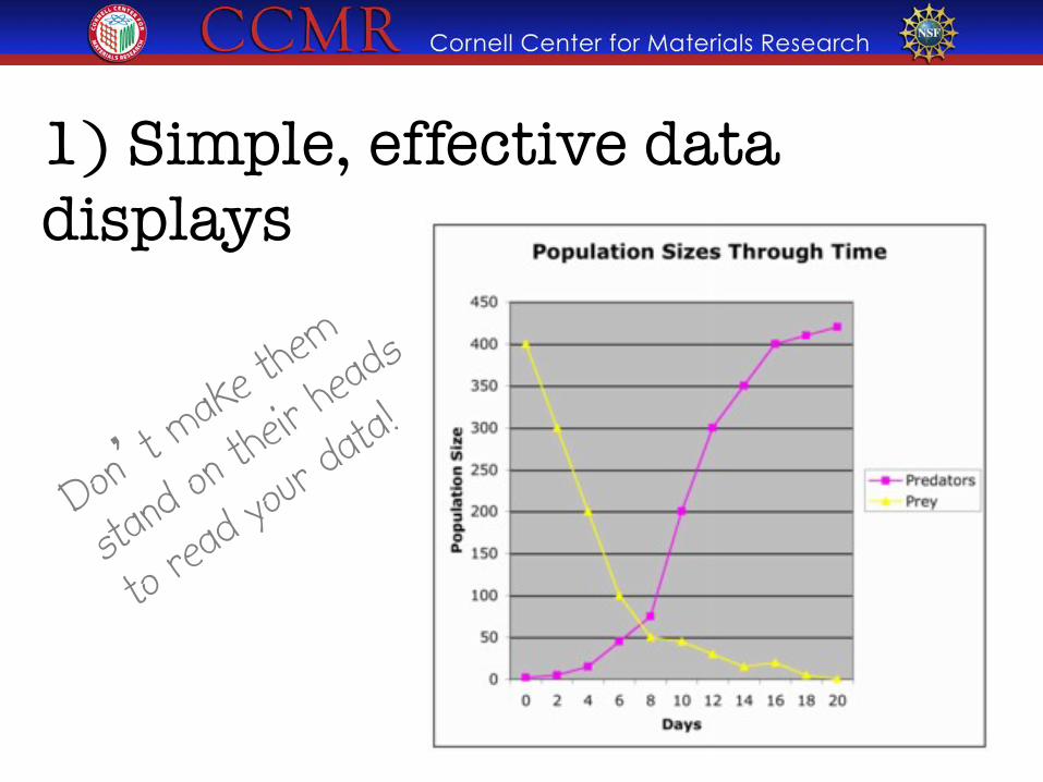
1) Simple, effective data displays
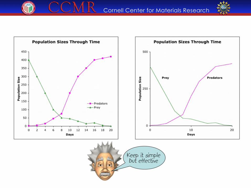
Keep it simple but effective
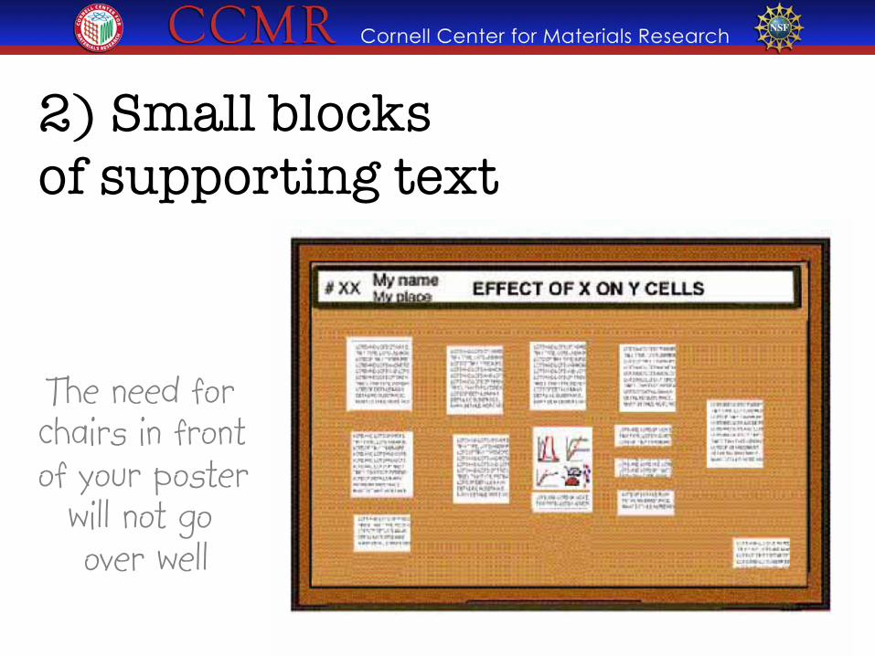
2) Small blocks �of supporting text
The need for chairs in front of your poster
will not go over well
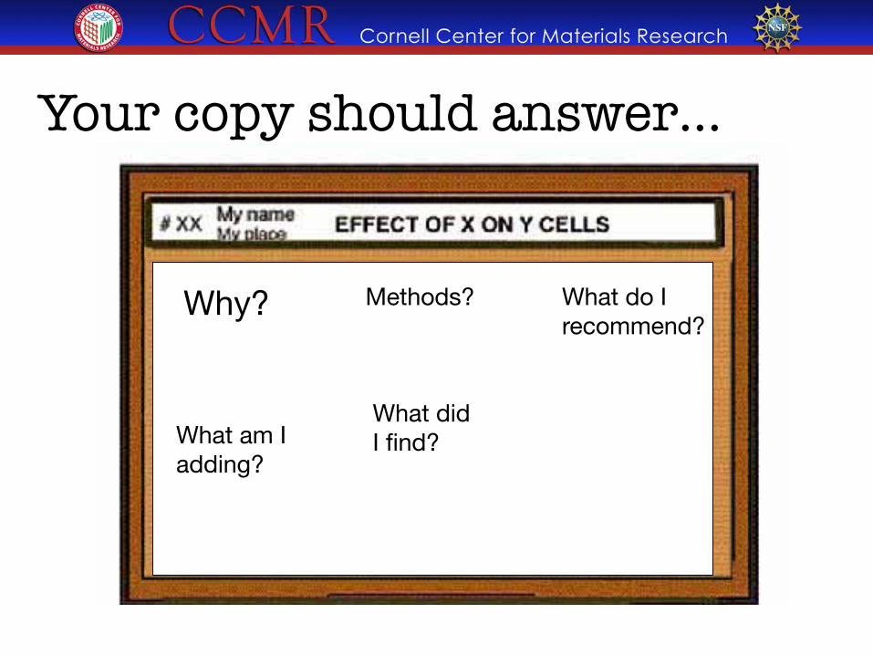
Your copy should answer…
What am I adding?
Methods?
What did I find?
Why?
What do I recommend?
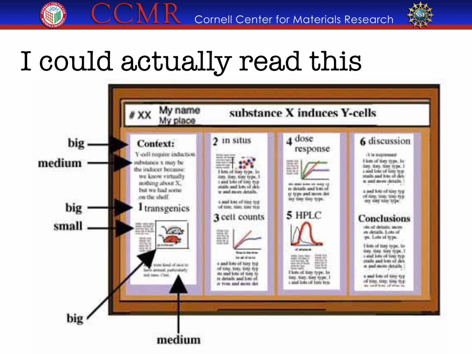
I could actually read this
.;i Cornell Center for Materials Research -$
Pick a software program Although you’ll probably gravitate towards PowerPoint,
consider a true design program.

" • OK, but the colors will fool you"
" • Easy to use"
" • Inflexible" " • Designed for overhead projection
PowerPoint
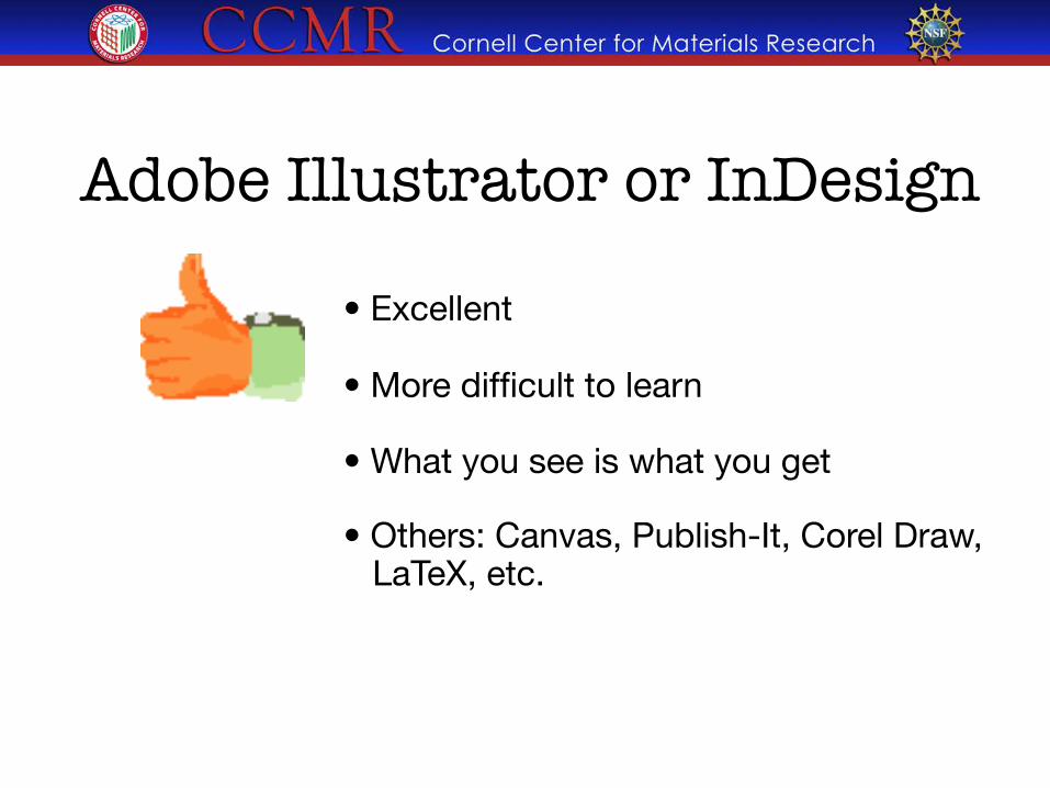
• Excellent""
• More difficult to learn""
• What you see is what you get""
• Others: Canvas, Publish-It, Corel Draw, LaTeX, etc.
Adobe Illustrator or InDesign
Let’s design a poster!
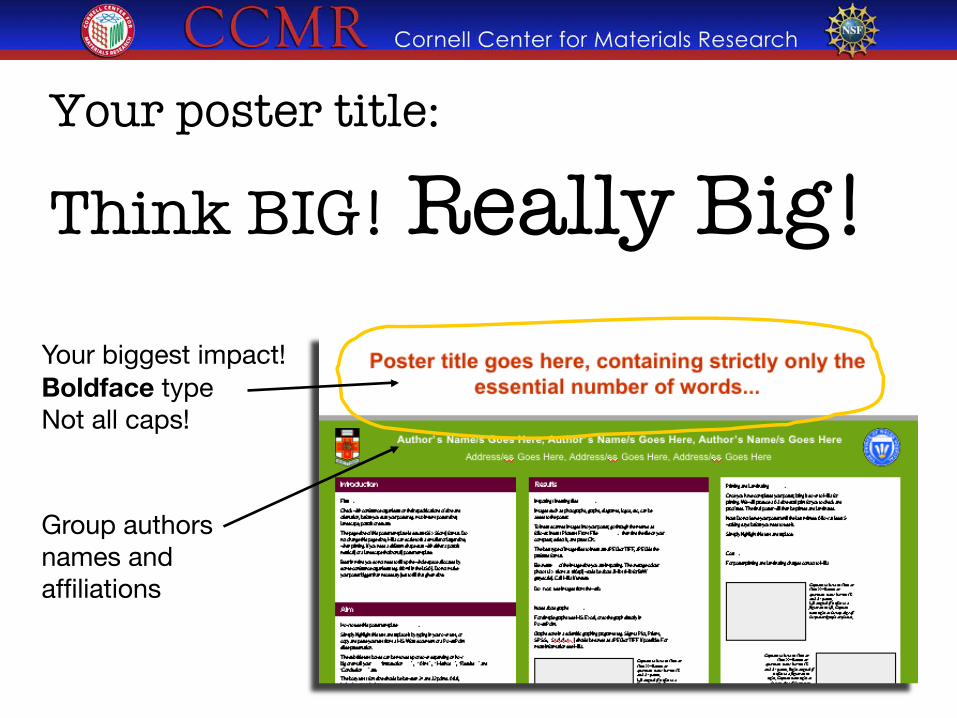
Your poster title: ��Think BIG! Really Big! �
Group authors names and affiliations
Your biggest impact! Boldface type Not all caps!
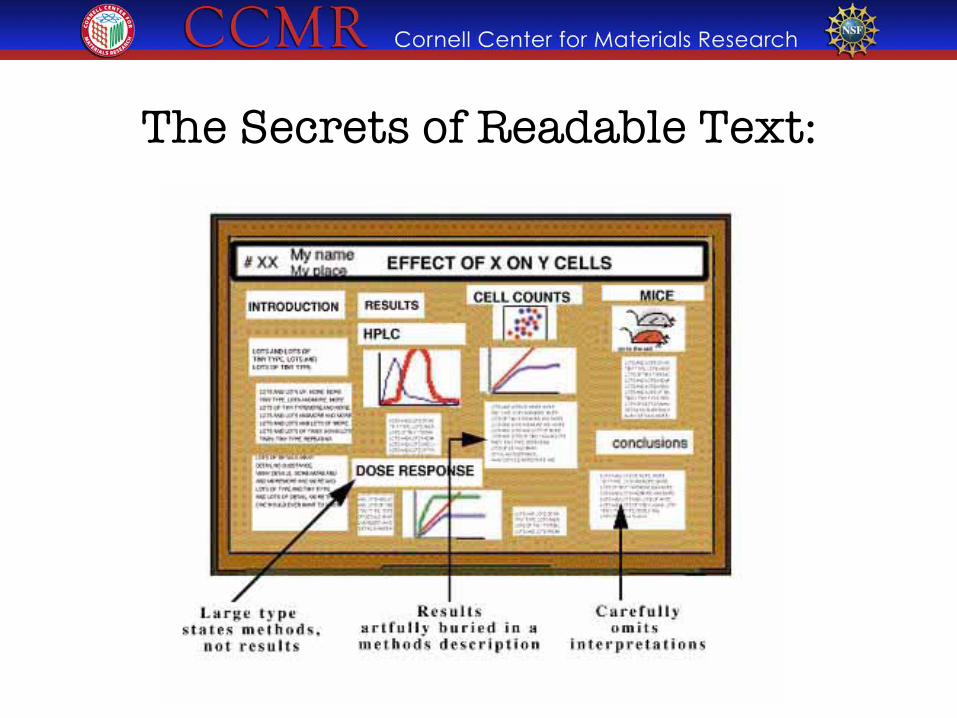
The Secrets of Readable Text:
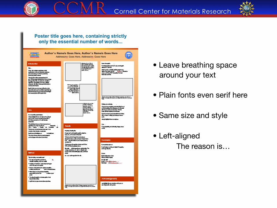
• Leave breathing space around your text • Plain fonts even serif here • Same size and style • Left-aligned The reason is…
Hi there, my name is mitch collinsworth and I would like to tell you about myself and how I got this job at cornell. Well you see, my uncle had a friend who knew my cousin on the other side and his daughter worked for facilities. I was down on my luck and my sister told me she knew a guy who’s nephew’s wife’s kid worked for this guys father and what can I say , he hired me with no questions asked and just told me to keep my mouth shut. So here I am at CCMR.
Hi there, my name is mitch collinsworth and I would like to tell you about myself and how I got this job at cornell. Well you see, my uncle had a friend who knew my cousin on the other side and his daughter worked for facilities. I was down on my luck and my sister told me she knew a guy who’s nephew’s wife’s kid worked for this guys father and what can I say, he hired me with no questions asked and just told me to keep my mouth shut. So here I am at CCMR.
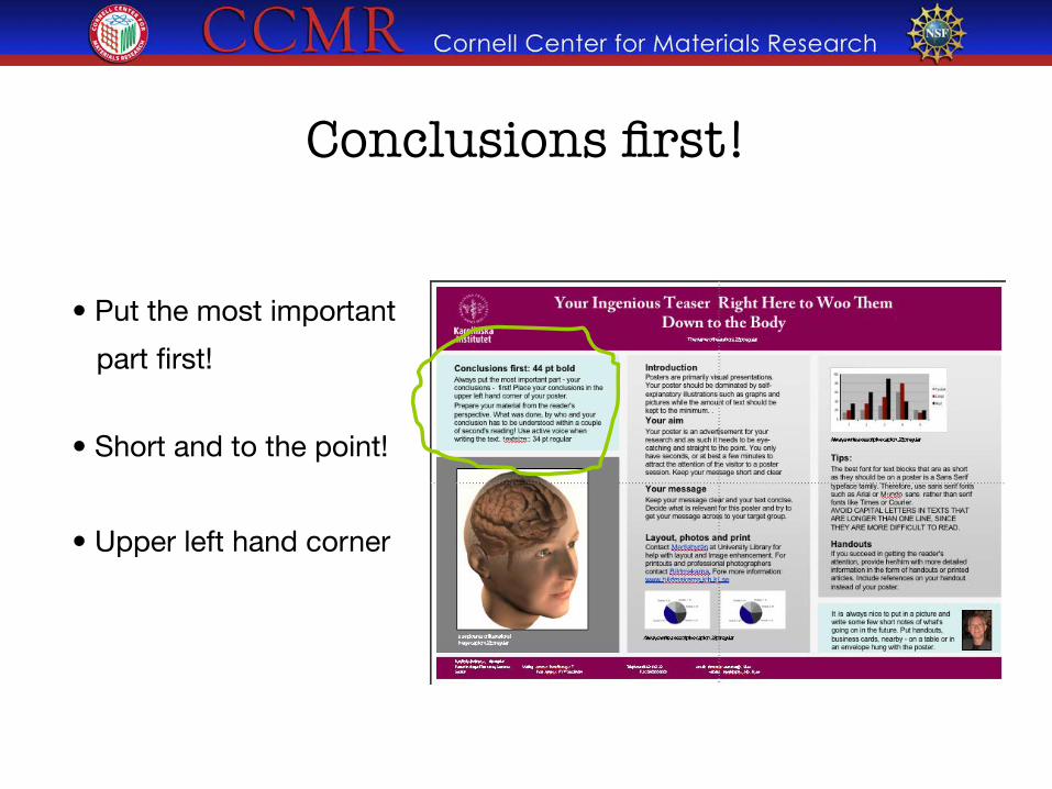
• Put the most important
part first!
• Short and to the point!
• Upper left hand corner
Conclusions first!
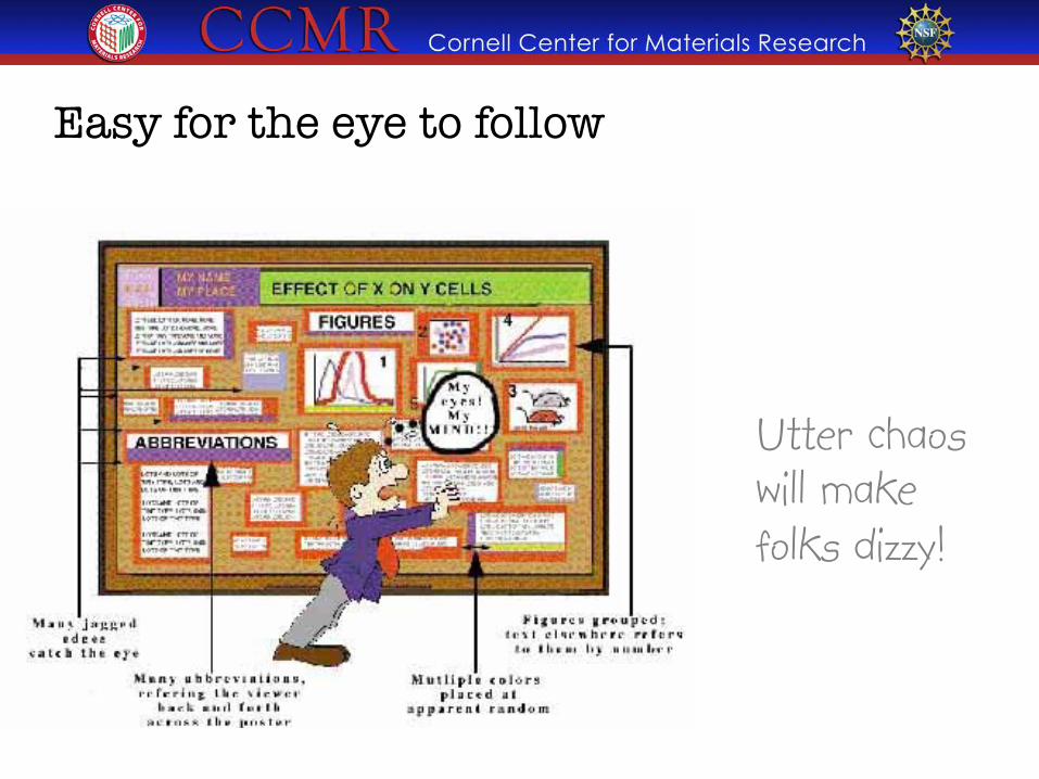
Easy for the eye to follow
Utter chaos will make folks dizzy!
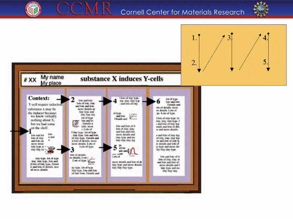
-;' Cornell Center for Materials Research -$ 1. 3 4.
5.
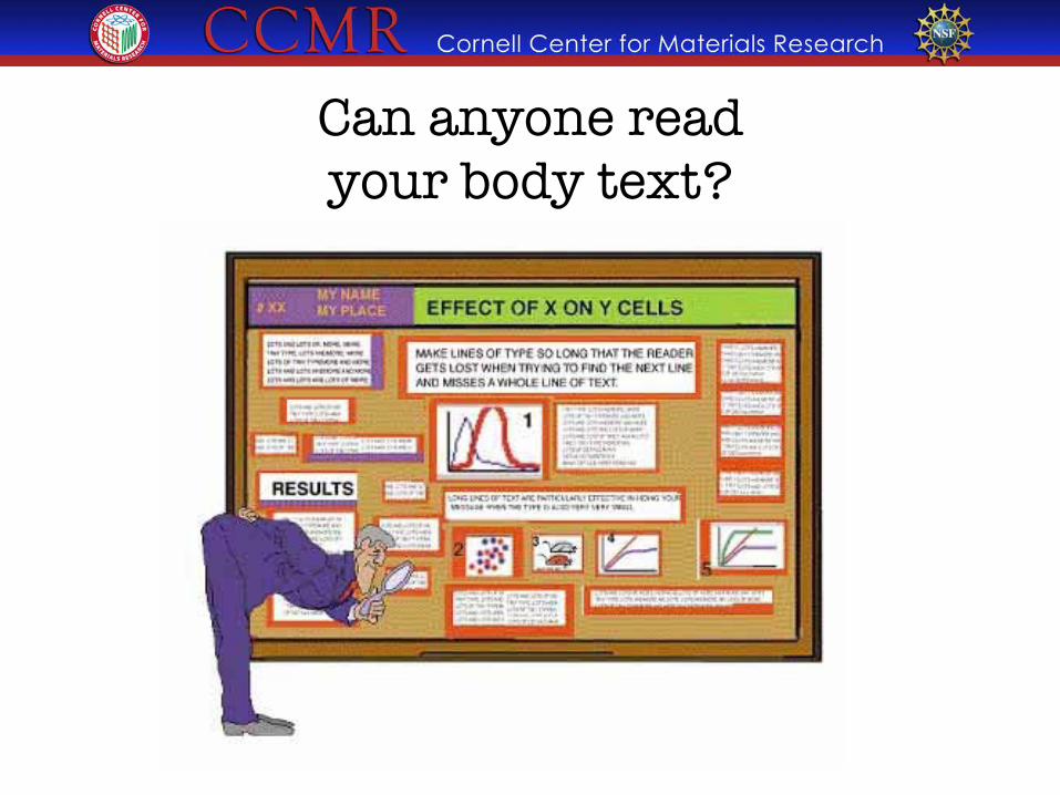
Can anyone read �your body text?
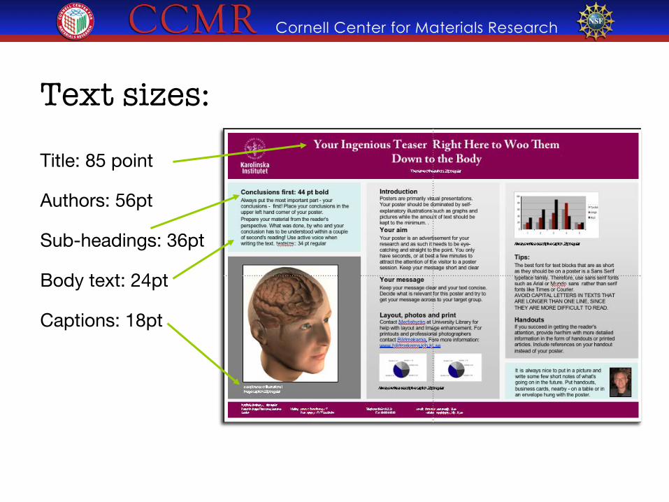
Title: 85 point
Authors: 56pt
Sub-headings: 36pt
Body text: 24pt
Captions: 18pt
Text sizes:
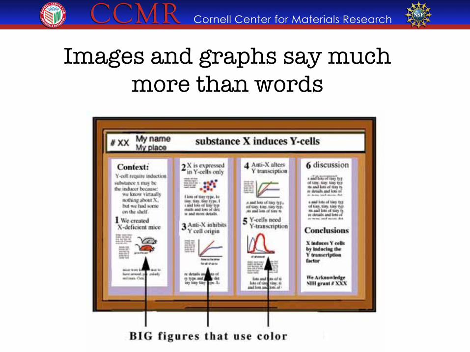
Images and graphs say much more than words
Should be readable from 1-2 meters
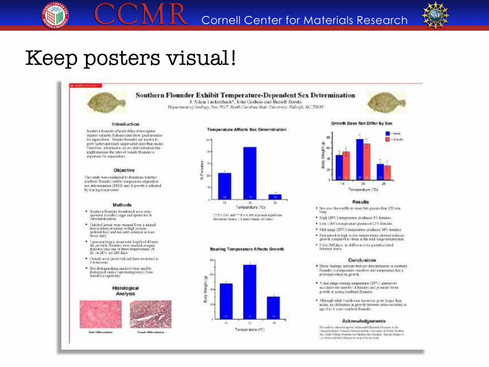
Keep posters visual!
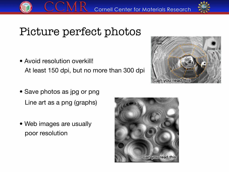
Picture perfect photos
• Avoid resolution overkill!"
At least 150 dpi, but no more than 300 dpi
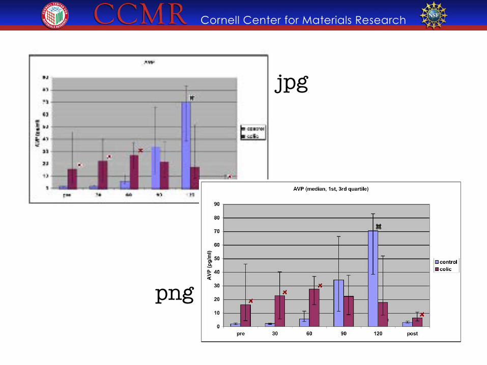
• Save photos as jpg or png
Line art as a png (graphs)
• Web images are usually "
poor resolution
jpg
png
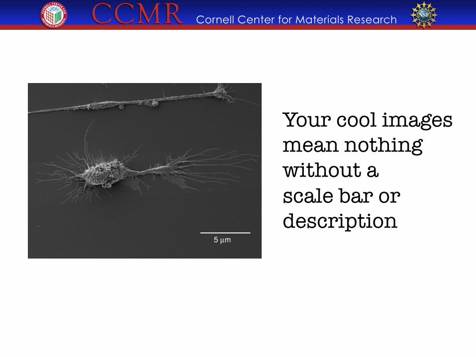
Your cool images mean nothing without a �scale bar or description
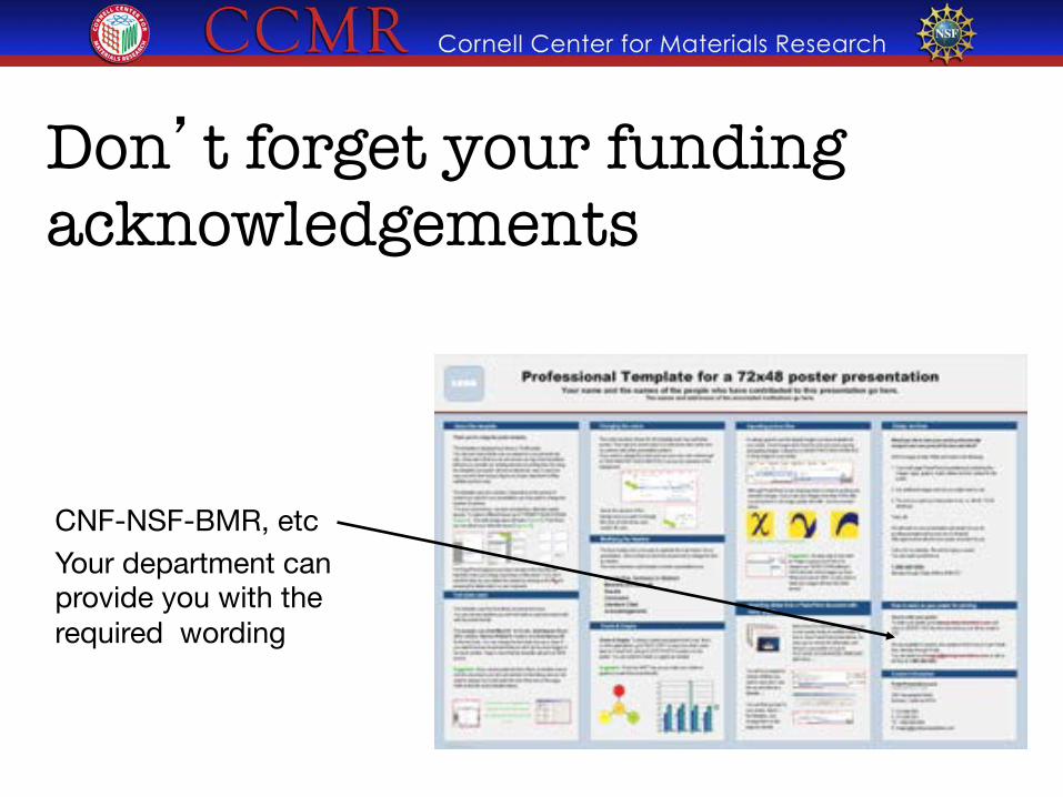
Don’t forget your funding acknowledgements
CNF-NSF-BMR, etc Your department can provide you with the required wording
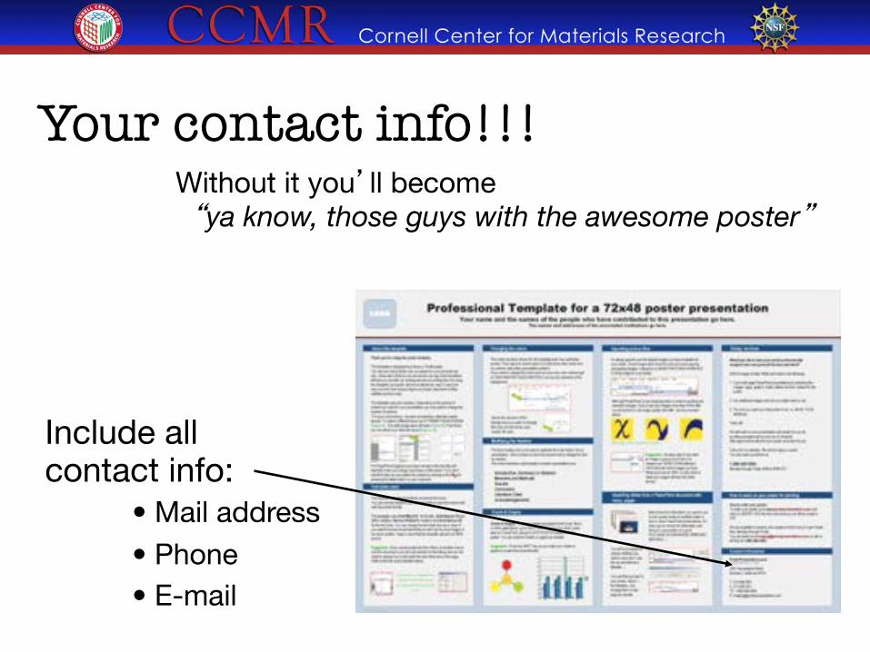
Your contact info!!!
Include all contact info:
• Mail address
• Phone • E-mail
Without it you’ll become " “ya know, those guys with the awesome poster”
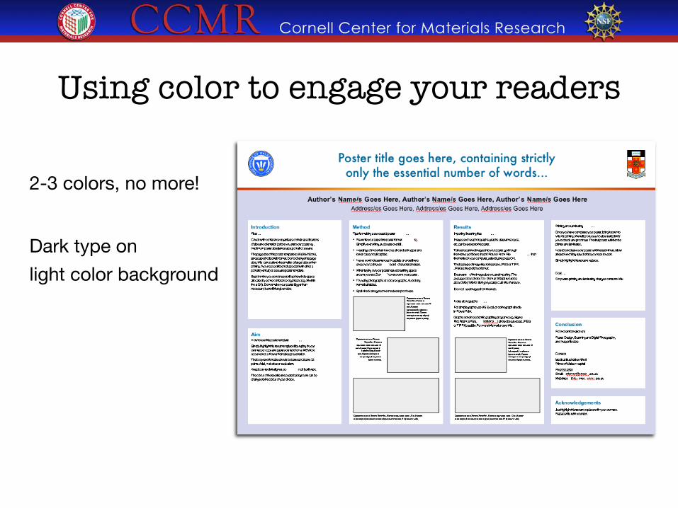
Using color to engage your readers
2-3 colors, no more!
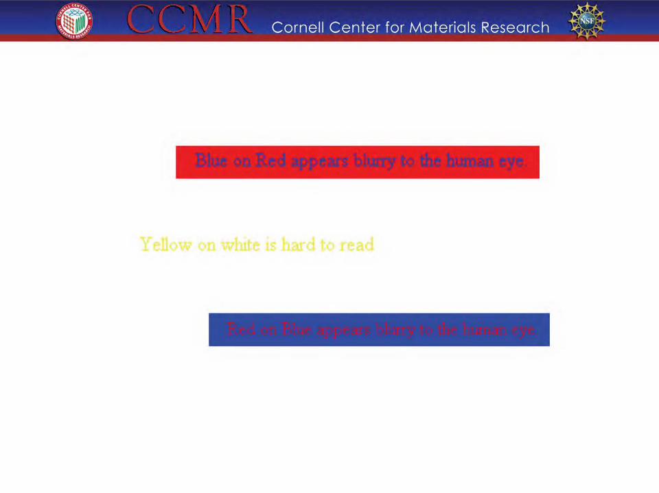
Dark type on
light color background
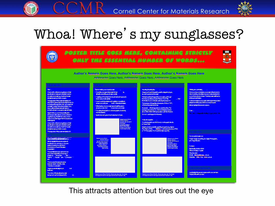
This attracts attention but tires out the eye
Whoa! Where’s my sunglasses?
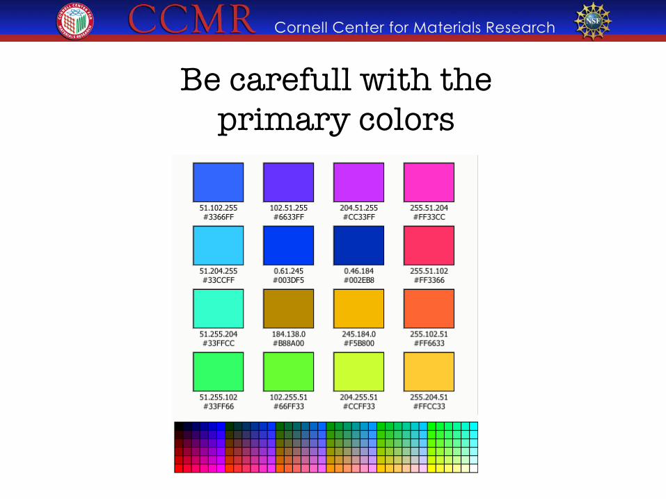
Be carefull with the �primary colors
.) Cornell Center for Materials Research -$
Yellow on white is hard to read
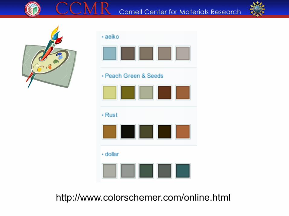
http://www.colorschemer.com/online.html
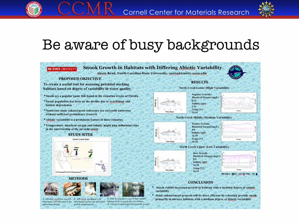
Be aware of busy backgrounds
!f;' Cornell Center for Materials Research -$
oulbem FlolDld r :dlibit Trotperaturt--Dep<"odent Sex Detumiuatioo
lntrodudi<lCI
' un • n ,,.._., ,, • ., na ''"'' .&.·.·-•·••••~••• .lf)ft1o, 't "Nf'11l li•.Uto• ilt4 ..... J"'.l't ,H.t••
4 ., ... ,,, •• ft..., .... ,,,, ... t-:. '" LJt•••• tf"l' 14•'-:r u4tl'lU1 uar uttt ·~ tttli rtAik.t
•tt.,.. . ..,., ~Itt ut~ t• •U •• '- U.;-o •h•t ••tlfu. 'tr;f.C. ., ........ ~ ,, ...... !U»>k ..,....,.., ,. .,.,_.. •• r .... ,..,,.,..~
!r11• ••·" , ... , ..... a:-x4l· .l••rn '"'"~''' ,.•f•u· ll< ttl--J r-\U'• •t~tu•••·•",..,t,.,. _, b"W'm.t:• •ll"t't tn. 'I ~1"t1 .- tlhdut ... t• •• ,., • - ••••
Uethods . ............... , .. ,.. . .,, .... _, ... , .. , ... I"IIIC'Oiilltu-41f• l r-. ... AI.ty.Uflftrl"' rlol"'llrf'.tr;ub""
I ~g.;, W'"' -..n "'""'" ,...,... • UllnJ ........... ~ ........... . ... ,. l'·••h• ~!~;-!,~ J ••I ul ,.,1 u ,._., t J • l•u•
' I r••• liM"\: I IUYU-II! .. It'i:,t•l , .... 1 S.. 1• Ml I (1. •tWO! #If"'- '""-' l~J ~~ IIJUI ·h~t· '"" r-v ., ....,..... "'"rar•,.n• 11 ll ••••• , •• ~ ......... • - ........ If • •• .,ow, ft•INI loti(HII !ftUIIIll
• ~~i•L•pt...tl.•a u•1.n >Aut. t~c:J\ .a • ..., .. :•••utl•• t'P'•• .... ._ ..... '"'' ..... , .. ,t-··~·
I ~''"'"' lu. "-' h• • J. ,, (1 ... 1v. •n 11 t:u,. ·l •"' l>rp""''"'ttttJh .. •'•\:..,-. ,,, :VI"! Mrl'l ' ':ur·rl•tt4 ttfr t•,_,.,.,..rt.r ''•"'"1'•··'(-~~<~-.J<
-..,.,! t•l ... •••••• .............. , ..... ....
·""''•' .. ., ''''' ln,.•tll.....,.,,,nLit•
..
RH tt .. I ,..,U • h ••Itt .. Ill u" lt4t t ltl•t lhtt ~~~ tl I
• • J :t :>"' 1 ,,.x,..,,, rr,-.Jilll.<'' t ltn •
• t. • i lC~ 'Jifrt .... ·atat tp...atrr. !..:' I •r ''"'
• 'I I 111 '' r:,t, 1 u~,xT..-k• • d.a.n. u·· IUJlh: . ,,..,.,~.,, .. ,., ......... &!~. '''"' ,, ..... h•t•uJ w--tl • nC'f'"•l • "'•' "1 l:f't" n.l rtAJI' •·•~' ••
• I,, •.&;Ju• ''Mr.,..,, •in 1 .. .-.tt.n14=1
····~· ··"·"
• lt~ ... , rr.;t~p • .-otr-r•t~"' •~o#·n•"'"Cii l• .. r.._n :.Ootkl: •t:"ttfiiLA"'" ..,,.,,, ... t-.llfr'tt-utl'lrf•.,.•
lr"~~••tnf• lh.f•1t..,. ~·•
• '. .,.., r.r.- ru.-.tt ""f'r.t.••• :.H' ·~~,.,l• '' l->#nt"'l!t• tl!l \I" ~ 4 ht.__,,... • 1• uu'lc , .. u c:,_•tt 1 .,., •• c ,..,...,n ,...__ ... ~.,
• '.In uri .. t t r. ,.,L-..,., \la•n• .- .. 1111 ~••" 11 u ,, . :m~t~c_ t1 II"J''I'• ~"ftl ~ ,...._ e'lU::IIIII
'C'f"•11o:. f '''' •ulr•tfuerd;
AdlnO'.wllldgen>enls t1 ...... .,.. .... ., I ...... ._, • ...,._ .. h ...... ··~lttt .. a. •••o '"-'• ,; .. uti.. - '4 · 11 ..... ~ ... ~~ .... -...fl•tt• ,, ..... ~ ... lAo..-
.. • ..... •rt• • I t ll t t ol
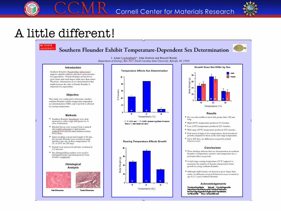
A little different!
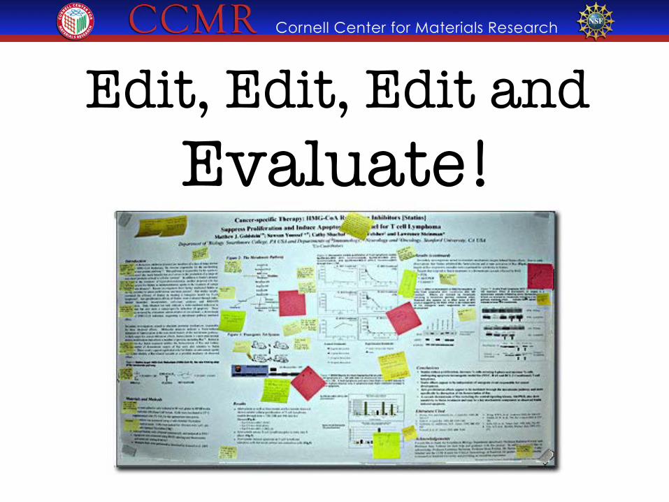
Edit, Edit, Edit and�Evaluate!
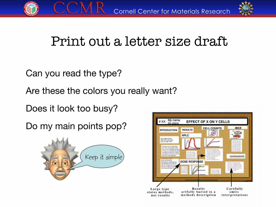
Can you read the type?
Are these the colors you really want?
Does it look too busy?
Do my main points pop?
Print out a letter size draft
Keep it simple
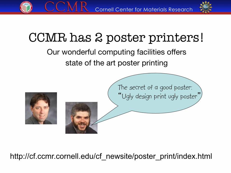
CCMR has 2 poster printers! Our wonderful computing facilities offers "
state of the art poster printing"
The secret of a good poster: “Ugly design print ugly poster”
http://cf.ccmr.cornell.edu/cf_newsite/poster_print/index.html
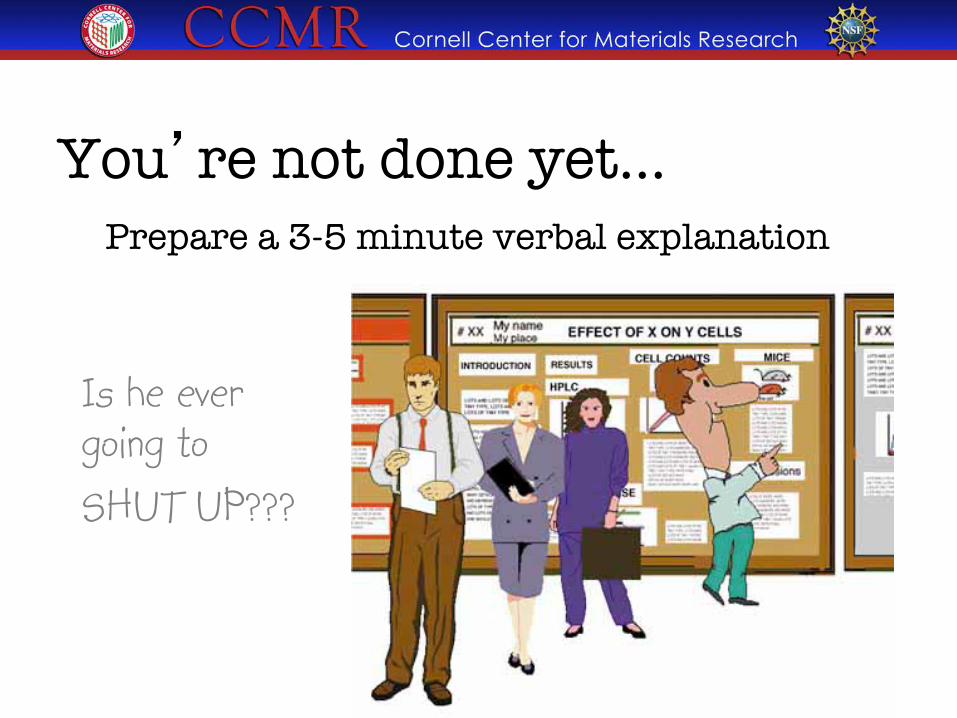
You’re not done yet… � Prepare a 3-5 minute verbal explanation
Is he ever going to SHUT UP???
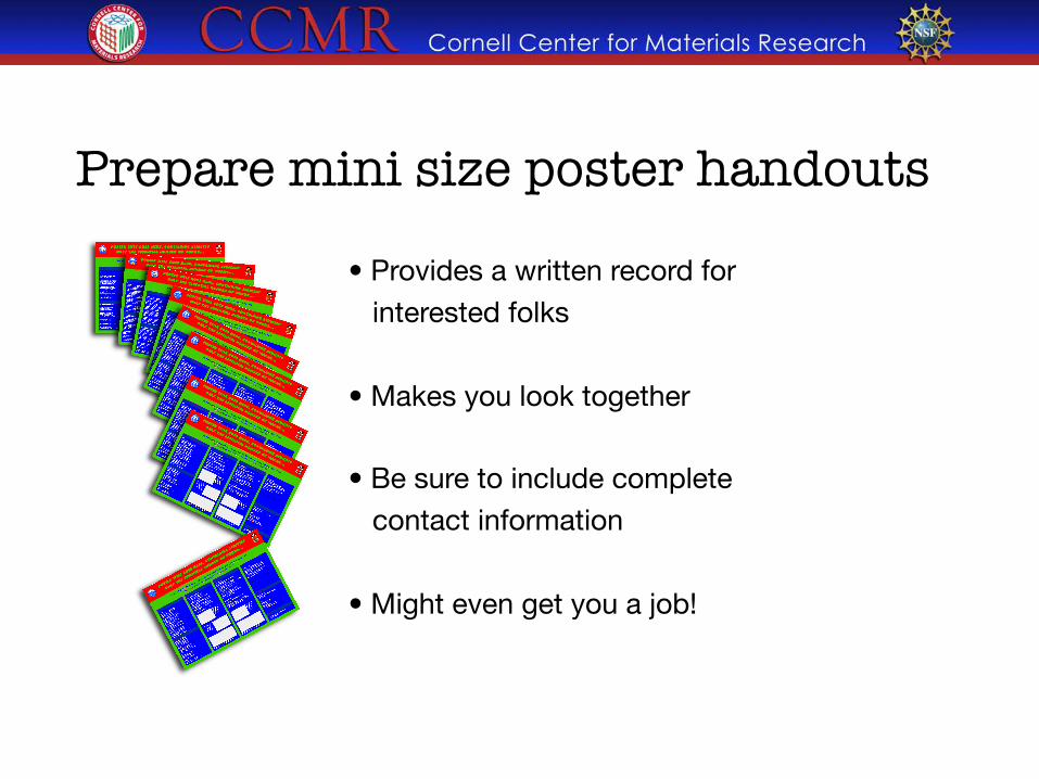
Prepare mini size poster handouts • Provides a written record for interested folks • Makes you look together • Be sure to include complete contact information • Might even get you a job!
Let’s judge some designs�and see what you’ve learned
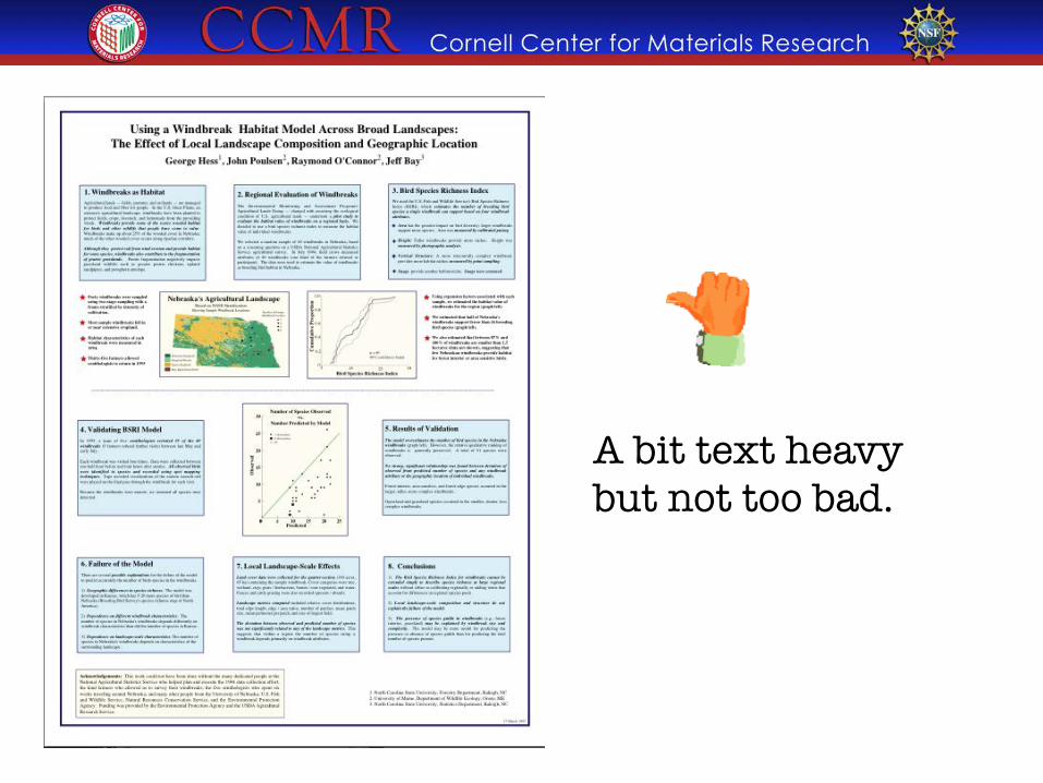
A bit text heavy but not too bad.
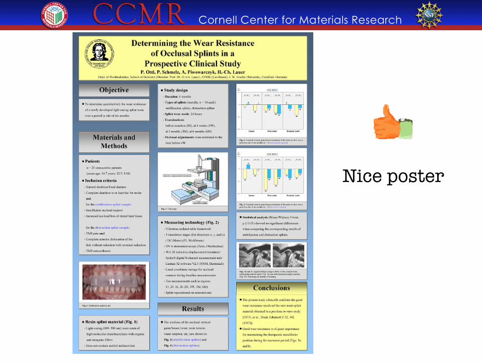
Nice poster
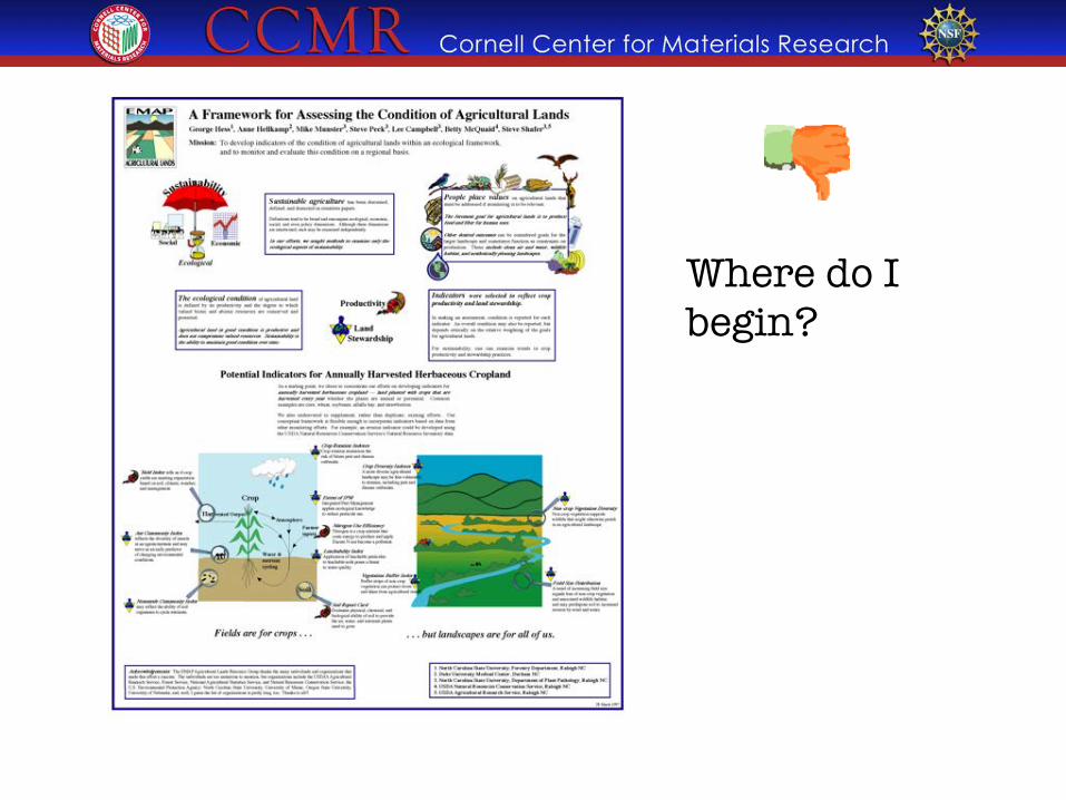
Where do I begin?
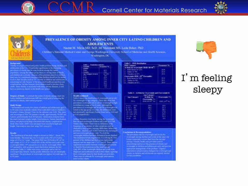
I’m feeling sleepy
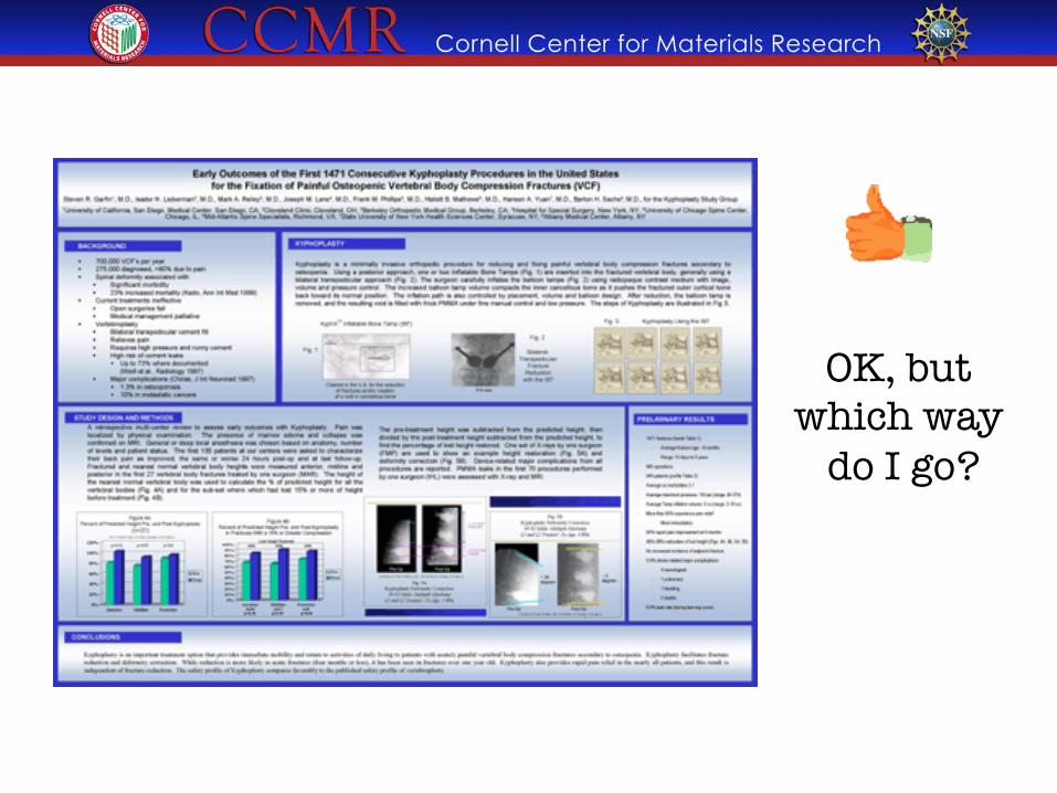
OK, but which way
do I go?
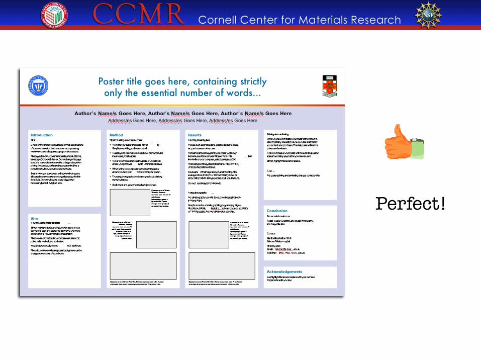
Perfect!
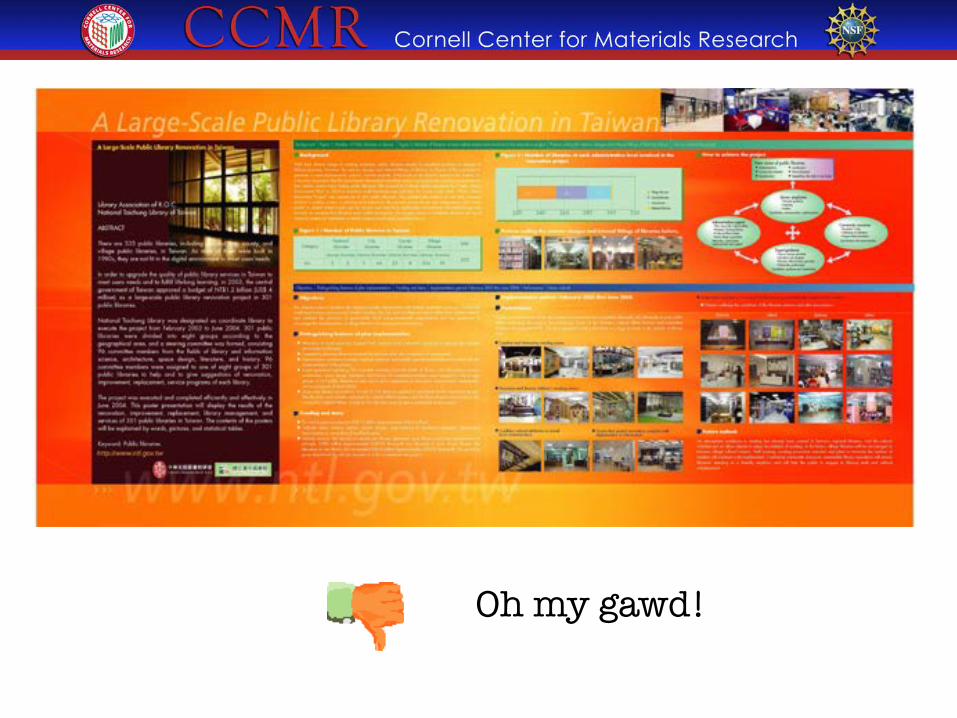
Oh my gawd!
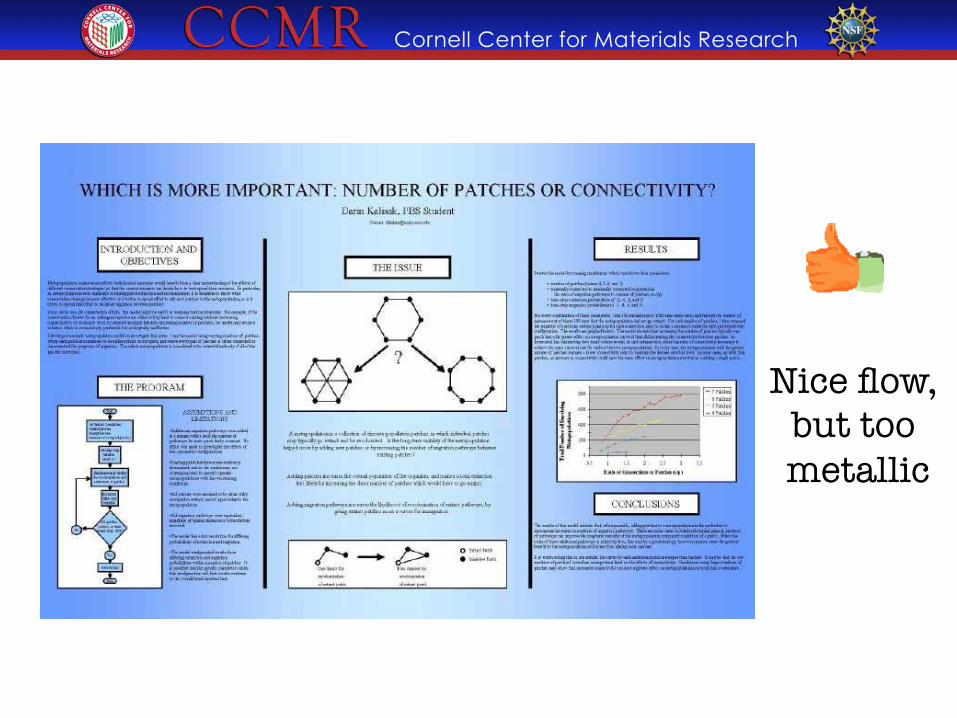
Nice flow, �but too metallic
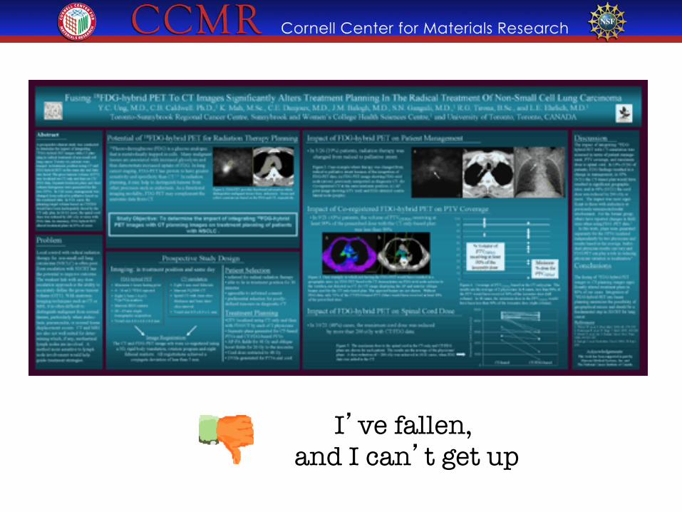
I’ve fallen, �and I can’t get up
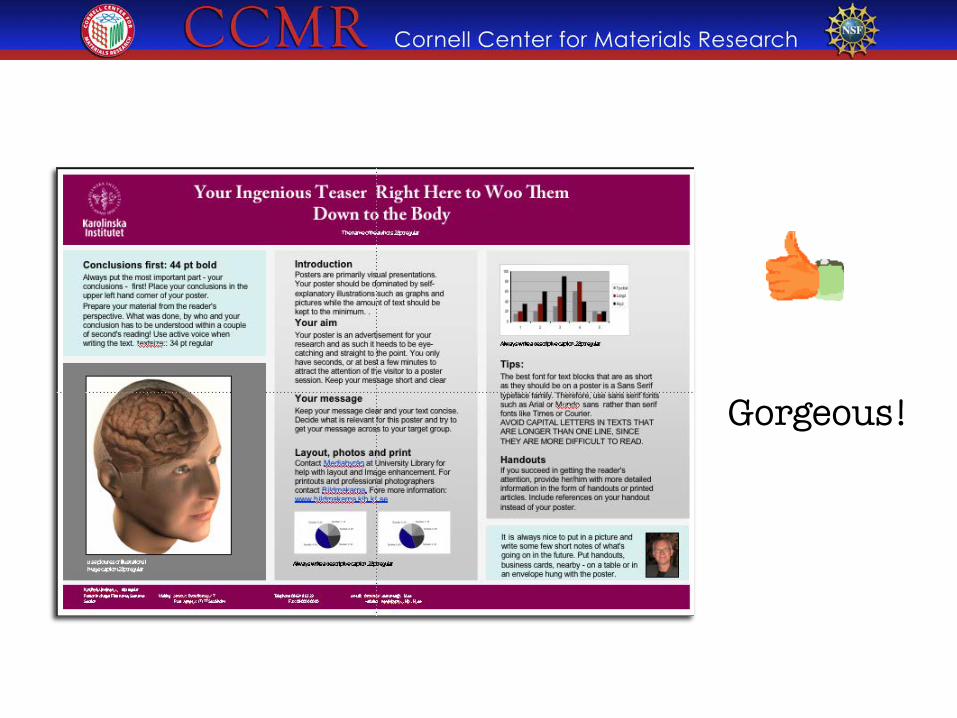
Gorgeous!
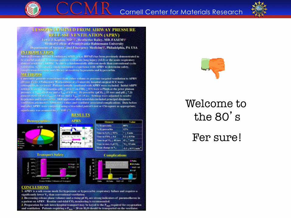
Welcome to �the 80’s
Fer sure!

This works!
http://colinpurrington.com/tips/academic/posterdesign
http://www.ncsu.edu/project/posters/NewSite/
Helpful sites on poster presentations:
LiLynn Graves �Web and Graphic Designer, CCMR