science and machine learning part 1: explore valuation and ... filetrademarks social power,...
TRANSCRIPT

© Copyright IBM Corporation 2017 TrademarksSocial power, influence, and performance in the NBA, Part1: Explore valuation and attendance using data science andmachine learning
Page 1 of 22
Social power, influence, and performance in the NBA,Part 1: Explore valuation and attendance using datascience and machine learningPython, pandas, and a touch of R
Noah Gift August 31, 2017
In this tutorial series, learn how to analyze how social media affects the NBA using Python,pandas, Jupyter Notebooks, and a touch of R. Here in Part 1, learn the basics of data scienceand machine learning around the teams in the NBA.
View more content in this series
Getting started
In this tutorial series, learn how to analyze how social media affects the NBA using Python,pandas, Jupyter Notebooks, and a touch of R. Here in Part 1, learn the basics of data science andmachine learning around the teams in the NBA. The players of the NBA are the subject of Part 2.
What is data science, machine learning, and AI?
There is a lot of confusion around the terms data science, machine learning, and artificialintelligence. Often used interchangeably, but from a high level:
• Data science is a philosophy of thinking scientifically about data.• Machine learning is a technique in which computers learn without explicitly being instructed to
learn.• Artificial intelligence is intelligence exhibited by machines. (Machine learning is one example
of an AI technique; another example is optimization.)
80/20 machine learning in practice
An overlooked part of machine learning is the 80/20 rule in which approximately 80 percent ofthe time is spent getting and manipulating the data, and 20 percent is devoted to the fun stuff likeanalyzing data, modeling the data, and coming up with predictions.

developerWorks® ibm.com/developerWorks/
Social power, influence, and performance in the NBA, Part1: Explore valuation and attendance using data science andmachine learning
Page 2 of 22
Figure 1. 80/20 Machine learning in practice
A problem of data manipulation that isn't obvious is getting the data in the first place. It is one thingto experiment with a publicly available data set; it is another entirely to scrape the internet, callAPIs, and get the data in usable shape. Even beyond those issues, a problem that can be evenmore challenging is getting the data into production.
Figure 2. Full-stack data science
Rightfully so, a lot of attention is paid to machine learning and the skills required to model: appliedmath, domain expertise, and knowledge of tooling. To get a production machine-learning systemdeployed is a whole other matter. This is covered at a high level in this tutorial series with the hopethat it will inspire you to create machine-learning models and deploy them into production.

ibm.com/developerWorks/ developerWorks®
Social power, influence, and performance in the NBA, Part1: Explore valuation and attendance using data science andmachine learning
Page 3 of 22
What is machine learning?
Beyond a high-level description, there's a hierarchy to machine learning. At the top is supervisedlearning and unsupervised learning. There are two types of supervised learning techniques:classification problems and regression problems that have a training set with labeled data.
An example of a supervised regression machine-learning problem is predicting future housingprices from historical sales data. An example of a supervised classification problem is using ahistorical repository of images to classify objects in images: cars, houses, shapes, etc.
Unsupervised learning involves modeling where data is not labeled. The correct answer might notbe known and needs to be discovered. A common example is clustering. An example of clusteringis to find groups of NBA players with things in common and label those clusters manually — forexample, top scorer, top rebounders, etc.
Phrasing the problem: What is the relationship between social influence andthe NBA?
With the basics out of the way, it is time to dig in:
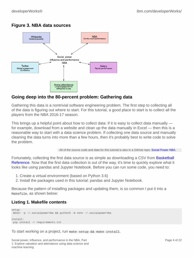
• Does individual player performance affect a team's wins?• Does on-the-court performance correlate with social media influence?• Does engagement on social media correlate with popularity on Wikipedia?• Is follower count or engagement a better predictor of popularity on Wikipedia?• Does salary correlate with on-the-court performance?• Does salary correlate with social media performance?• Does winning bring more fans to games?• What drives the valuation of teams: attendance, local real estate market?
To answer these questions and others, it is necessary to retrieve several categories of data:
• Wikipedia popularity• Twitter engagement• Arena attendance• NBA performance data• NBA salary data
developerWorks® ibm.com/developerWorks/
Social power, influence, and performance in the NBA, Part1: Explore valuation and attendance using data science andmachine learning
Page 4 of 22
Figure 3. NBA data sources
Going deep into the 80-percent problem: Gathering data
Gathering this data is a nontrivial software engineering problem. The first step to collecting allof the data is figuring out where to start. For this tutorial, a good place to start is to collect all theplayers from the NBA 2016-17 season.
This brings up a helpful point about how to collect data: If it is easy to collect data manually —for example, download from a website and clean up the data manually in Excel — then this is areasonable way to start with a data science problem. If collecting one data source and manuallycleaning the data turns into more than a few hours, then it's probably best to write code to solvethe problem.
All of the source code and data for this tutorial is also in a GitHub repo: Social Power NBA.
Fortunately, collecting the first data source is as simple as downloading a CSV from BasketballReference. Now that the first data collection is out of the way, it's time to quickly explore what itlooks like using pandas and Jupyter Notebook. Before you can run some code, you need to:
1. Create a virtual environment (based on Python 3.6)2. Install the packages used in this tutorial: pandas and Jupyter Notebook.
Because the pattern of installing packages and updating them, is so common I put it into aMakefile, as shown below:
Listing 1. Makefile contents
setup: mkdir -p ~/.socialpowernba && python3 -m venv ~/.socialpowernba
install: pip install -r requirements.txt
To start working on a project, run make setup && make install.

ibm.com/developerWorks/ developerWorks®
Social power, influence, and performance in the NBA, Part1: Explore valuation and attendance using data science andmachine learning
Page 5 of 22
Another trick is to create an alias so that when you want to work on a particular project, youautomatically source the virtualenv when you cd into the project. The contents of the .zshrc filewith this alias inside look like:
alias nbatop="cd ~/src/socialpowernba && source ~/.socialpowernba/bin/activate"
To start the virtual environment, type nbatop. You will cd into the checkout and start your virtualenv.
To inspect the data set you downloaded or used from the GitHub repo:
Start Jupyter Notebook: Jupyter notebook. Running this launches a web browser in which you canexplore existing notebooks or create new ones.
If you are using the files in the GitHub repo, look for basketball_reference.ipynb, which is a simplenotebook that looks at the data inside.
You can create your notebook using the menu on the web or load the notebook in the GitHub repocalled basketball_reference. To perform an initial validation and exploration, load a CSV file into apandas data frame. Loading a CSV file into pandas is easy, but there are two caveats:
• The columns in the CSV file must have names.• The rows of each column are equal length.
Listing 2 shows how to load the file into pandas.
Listing 2. Jupyter Notebook basketball reference exploration
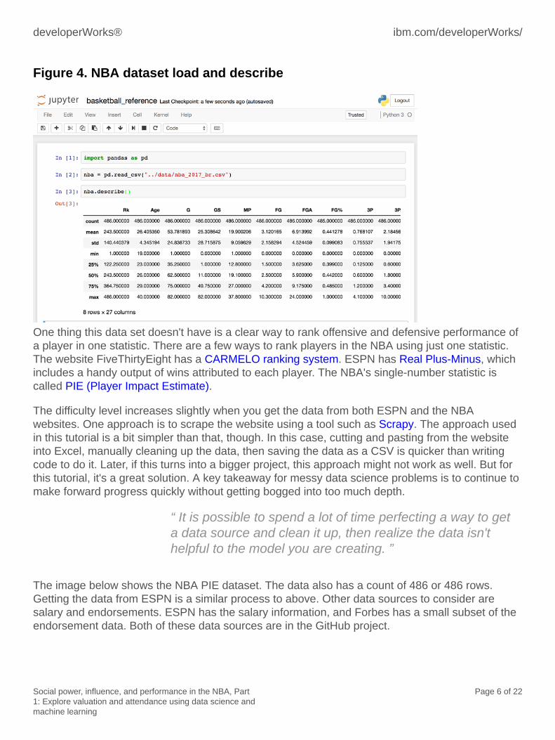
import pandas as pdnba = pd.read_csv("../data/nba_2017_br.csv")nba.describe()
The following image shows the result of the data loaded. The describe function on a pandas dataframe provides descriptive statistics, including the number of columns. In your data, and shownbelow, the number of columns is 27, and the median (this is the 50-percent row) for each column.At this point, it might be a good idea to play around with the Jupyter Notebook you created and seewhat insight you can observe. To learn more about what pandas can do, see the official pandastutorial page.
developerWorks® ibm.com/developerWorks/
Social power, influence, and performance in the NBA, Part1: Explore valuation and attendance using data science andmachine learning
Page 6 of 22
Figure 4. NBA dataset load and describe
One thing this data set doesn't have is a clear way to rank offensive and defensive performance ofa player in one statistic. There are a few ways to rank players in the NBA using just one statistic.The website FiveThirtyEight has a CARMELO ranking system. ESPN has Real Plus-Minus, whichincludes a handy output of wins attributed to each player. The NBA's single-number statistic iscalled PIE (Player Impact Estimate).
The difficulty level increases slightly when you get the data from both ESPN and the NBAwebsites. One approach is to scrape the website using a tool such as Scrapy. The approach usedin this tutorial is a bit simpler than that, though. In this case, cutting and pasting from the websiteinto Excel, manually cleaning up the data, then saving the data as a CSV is quicker than writingcode to do it. Later, if this turns into a bigger project, this approach might not work as well. But forthis tutorial, it's a great solution. A key takeaway for messy data science problems is to continue tomake forward progress quickly without getting bogged into too much depth.
“ It is possible to spend a lot of time perfecting a way to geta data source and clean it up, then realize the data isn'thelpful to the model you are creating. ”
The image below shows the NBA PIE dataset. The data also has a count of 486 or 486 rows.Getting the data from ESPN is a similar process to above. Other data sources to consider aresalary and endorsements. ESPN has the salary information, and Forbes has a small subset of theendorsement data. Both of these data sources are in the GitHub project.

ibm.com/developerWorks/ developerWorks®
Social power, influence, and performance in the NBA, Part1: Explore valuation and attendance using data science andmachine learning
Page 7 of 22
Figure 5. NBA PIE dataset
In Table 1, there is a listing of the data sources by name and location. In short order, we havemany items from many different data sources.
Table 1. NBA data sources
Data source Filename Rows Summary
Basketball-Reference nba_2017_attendance.csv 30 Stadium attendance
Forbes nba_2017_endorsements.csv 8 Top players
Forbes nba_2017_team_valuations.csv 30 All teams
ESPN nba_2017_salary.csv 450 Most players
NBA nba_2017_pie.csv 468 All players
ESPN nba_2017_real_plus_minus.csv 468 All players
Basketball-Reference nba_2017_br.csv 468 All players
FiveThirtyEight nba_2017_elo.csv 30 Team rank
There is still a lot of work to do to get all of the data downloaded and transformed into a unifieddata set. To make things even worse, collecting the data thus far was easy. There is still a bigjourney ahead. In looking at the shape of the data, a good place to start is to take the top eightplayers' endorsements and see if there is a pattern to tease out. Before that though, explore thevaluation of teams in the NBA. From there, you can determine what impact a player has on thetotal value of an NBA franchise.
Exploring team valuation for the NBA
The first order of business is to create a new Jupyter Notebook. Luckily for you, the JupyterNotebook is already created. You'll find it in the GitHub repo: exploring_team_valuation_nba.
Next, import a common set of libraries that are typically used to explore data in a JupyterNotebook.
developerWorks® ibm.com/developerWorks/
Social power, influence, and performance in the NBA, Part1: Explore valuation and attendance using data science andmachine learning
Page 8 of 22
Listing 3. Common Jupyter Notebook initial imports
import pandas as pdimport statsmodels.api as smimport statsmodels.formula.api as smfimport matplotlib.pyplot as pltimport seaborn as snscolor = sns.color_palette()%matplotlib inline
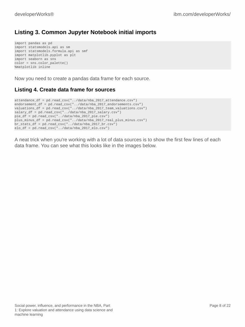
Now you need to create a pandas data frame for each source.
Listing 4. Create data frame for sources
attendance_df = pd.read_csv("../data/nba_2017_attendance.csv")endorsement_df = pd.read_csv("../data/nba_2017_endorsements.csv")valuations_df = pd.read_csv("../data/nba_2017_team_valuations.csv")salary_df = pd.read_csv("../data/nba_2017_salary.csv")pie_df = pd.read_csv("../data/nba_2017_pie.csv")plus_minus_df = pd.read_csv("../data/nba_2017_real_plus_minus.csv")br_stats_df = pd.read_csv("../data/nba_2017_br.csv")elo_df = pd.read_csv("../data/nba_2017_elo.csv")
A neat trick when you're working with a lot of data sources is to show the first few lines of eachdata frame. You can see what this looks like in the images below.

ibm.com/developerWorks/ developerWorks®
Social power, influence, and performance in the NBA, Part1: Explore valuation and attendance using data science andmachine learning
Page 9 of 22
Figure 6. Endorsement data frames section A

developerWorks® ibm.com/developerWorks/
Social power, influence, and performance in the NBA, Part1: Explore valuation and attendance using data science andmachine learning
Page 10 of 22
Figure 7. Endorsement data frames section B
Now, merge the team valuation data with attendance data and create a plot. Listing 5 provides thecode for merging the pandas data frames.
Listing 5. Merging pandas data frames
attendance_valuation_df = attendance_df.merge(valuations_df, how="inner", on="TEAM")attendance_valuation_df.head()
The image below shows the output of the merge.

ibm.com/developerWorks/ developerWorks®
Social power, influence, and performance in the NBA, Part1: Explore valuation and attendance using data science andmachine learning
Page 11 of 22
Figure 8. Attendance valuation data frame merge head
To get a better feel for the data you just merged, do a couple of quick visualizations. The first stepis to tell the notebook to display wider graphs, then to do a Seaborne pairplot, as shown below.
Listing 6. Seaborn pairplot
from IPython.core.display import display, HTMLdisplay(HTML("<style>.container { width:100% !important; }</style>"))sns.pairplot(attendance_valuation_df, hue="TEAM")
Looking at the plots, notice the relationship between average attendance and player valuation.There is a strong linear relationship between the two features, as represented by the almoststraight line formed by the points.

developerWorks® ibm.com/developerWorks/
Social power, influence, and performance in the NBA, Part1: Explore valuation and attendance using data science andmachine learning
Page 12 of 22
Figure 9. Seaborn pairplot NBA attendance versus valuation
Another way to look at this data is a correlation plot. To create a correlation plot, use the codeprovided below and the following image shows the output.
Listing 7. Seaborn correlation plot
corr = attendance_valuation_df.corr()sns.heatmap(corr, xticklabels=corr.columns.values, yticklabels=corr.columns.values)

ibm.com/developerWorks/ developerWorks®
Social power, influence, and performance in the NBA, Part1: Explore valuation and attendance using data science andmachine learning
Page 13 of 22
Figure 10. Seaborn correlation plot NBA attendance versus valuation
The correlation plot shows a relationship to value in millions of dollars (of an NBA team),percentage of average capacity of the stadium that is filled (PCT), and average attendance. Aheatmap showing average attendance numbers versus valuation for every team in the NBA willhelp you dive into this a bit more. To generate a heatmap in Seaborn, it is necessary to reshapethe data into a pivot table (much like what is available in Excel). A pivot table allows the Seaborncharting to pivot, among three values and shows how each of the three columns relates to theother two. The code below shows how to reshape the data into a pivot shape.
Listing 8. Seaborn heatmap plot
valuations = attendance_valuation_df.pivot("TEAM", "AVG", "VALUE_MILLIONS")plt.subplots(figsize=(20,15))ax = plt.axes()ax.set_title("NBA Team AVG Attendance vs Valuation in Millions: 2016-2017 Season")sns.heatmap(valuations,linewidths=.5, annot=True, fmt='g')
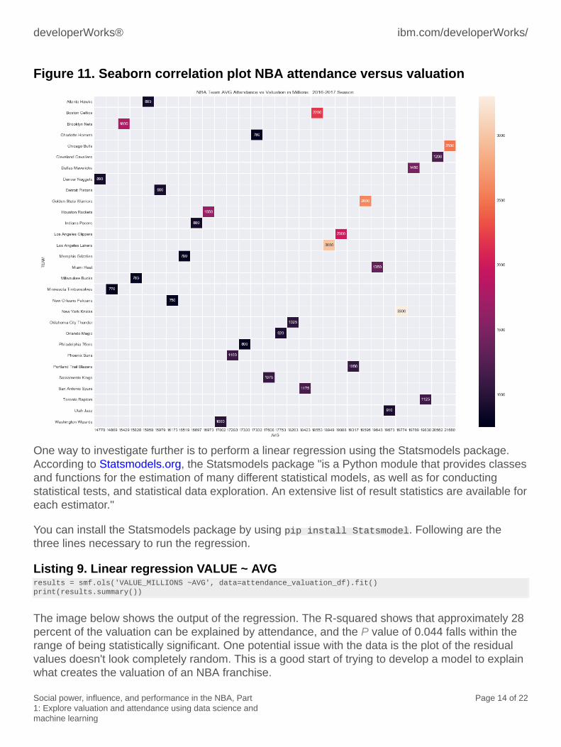
Figure 11 shows some interesting outliers, for example, the Brooklyn Nets are valued at $1.8billion, yet they have one of the lowest average attendance rates in the NBA. This is worth a look.
developerWorks® ibm.com/developerWorks/
Social power, influence, and performance in the NBA, Part1: Explore valuation and attendance using data science andmachine learning
Page 14 of 22
Figure 11. Seaborn correlation plot NBA attendance versus valuation
One way to investigate further is to perform a linear regression using the Statsmodels package.According to Statsmodels.org, the Statsmodels package "is a Python module that provides classesand functions for the estimation of many different statistical models, as well as for conductingstatistical tests, and statistical data exploration. An extensive list of result statistics are available foreach estimator."
You can install the Statsmodels package by using pip install Statsmodel. Following are thethree lines necessary to run the regression.
Listing 9. Linear regression VALUE ~ AVGresults = smf.ols('VALUE_MILLIONS ~AVG', data=attendance_valuation_df).fit()print(results.summary())
The image below shows the output of the regression. The R-squared shows that approximately 28percent of the valuation can be explained by attendance, and the P value of 0.044 falls within therange of being statistically significant. One potential issue with the data is the plot of the residualvalues doesn't look completely random. This is a good start of trying to develop a model to explainwhat creates the valuation of an NBA franchise.

ibm.com/developerWorks/ developerWorks®
Social power, influence, and performance in the NBA, Part1: Explore valuation and attendance using data science andmachine learning
Page 15 of 22
Figure 12. Regression with residual plot
One way to potentially add more to the model is to add in the ELO numbers of each team.According to Wikipedia, "The ELO rating system is a method for calculating the relative skill levelsof players in competitor-versus-competitor games such as chess." The ELO rating system is alsoused in sports.
ELO numbers have more information than a win/loss record because they rank according to thestrength of the opponent played against. It seems like a good idea to investigate whether howgood a team is affects the valuation.
To do that, merge the ELO data into this data as shown below.
developerWorks® ibm.com/developerWorks/
Social power, influence, and performance in the NBA, Part1: Explore valuation and attendance using data science andmachine learning
Page 16 of 22
Listing 10. Plotting ELO
attendance_valuation_elo_df = attendance_df.merge(elo_df, how="inner", on="TEAM")attendance_valuation_elo_df.head()attendance_valuation_elo_df.to_csv("../data/nba_2017_att_val_elo.csv")corr_elo = attendance_valuation_elo_df.corr()plt.subplots(figsize=(20,15))ax = plt.axes()ax.set_title("NBA Team Correlation Heatmap: 2016-2017 Season (ELO, AVG Attendance, VALUATION IN MILLIONS)")sns.heatmap(corr_elo, xticklabels=corr_elo.columns.values, yticklabels=corr_elo.columns.values)corr_eloax = sns.lmplot(x="ELO", y="AVG", data=attendance_valuation_elo_df, hue="CONF", size=12)ax.set(xlabel='ELO Score', ylabel='Average Attendance Per Game', title="NBA Team AVG Attendance vs ELO Ranking: 2016-2017 Season")attendance_valuation_elo_df.groupby("CONF")["ELO"].median()attendance_valuation_elo_df.groupby("CONF")["AVG"].median()
After the merge, there are two charts to create. The first, shown in Figure 13, is a new correlationheatmap. There are some positive correlations to examine more closely. In particular, attendanceand ELO seem worth plotting out. In the heatmap below, the lighter the color, the more highlycorrelated two columns are. If the matrix shows the same value compared against itself, then thecorrelation is 1, and the square is beige. In the case of TOTAL and ELO, there appears to be a 0.5correlation.

ibm.com/developerWorks/ developerWorks®
Social power, influence, and performance in the NBA, Part1: Explore valuation and attendance using data science andmachine learning
Page 17 of 22
Figure 13. ELO correlation heatmap
Figure 14 plots ELO versus attendance. There does appear to be a weak linear relationshipbetween how good a team is (ELO RANK) versus the attendance. The plot below colors the eastand west scatter plots separately, along with a confidence interval. The weak linear relationship isrepresented by the straight line going through the points in the X,Y space.

developerWorks® ibm.com/developerWorks/
Social power, influence, and performance in the NBA, Part1: Explore valuation and attendance using data science andmachine learning
Page 18 of 22
Figure 14. ELO versus attendance
A linear regression will help further examine this relationship shown in the plot.
Listing 11. Linear regression AVG ~ ELO
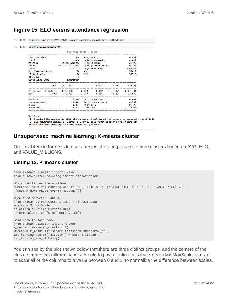
results = smf.ols('AVG ~ELO', data=attendance_valuation_elo_df).fit()print(results.summary())
The output of the regression (see Figure 15) shows an R-squared of 8 percent and a P-value of0.027, so there is a statistically significant signal here as well, but it is very weak.
ibm.com/developerWorks/ developerWorks®
Social power, influence, and performance in the NBA, Part1: Explore valuation and attendance using data science andmachine learning
Page 19 of 22
Figure 15. ELO versus attendance regression
Unsupervised machine learning: K-means cluster
One final item to tackle is to use k-means clustering to create three clusters based on AVG, ELO,and VALUE_MILLIONS.
Listing 12. K-means cluster
from sklearn.cluster import KMeansfrom sklearn.preprocessing import MinMaxScaler
#Only cluster on these valuesnumerical_df = val_housing_win_df.loc[:,["TOTAL_ATTENDANCE_MILLIONS", "ELO", "VALUE_MILLIONS", "MEDIAN_HOME_PRICE_COUNTY_MILLONS"]]
#Scale to between 0 and 1from sklearn.preprocessing import MinMaxScalerscaler = MinMaxScaler()print(scaler.fit(numerical_df))print(scaler.transform(numerical_df))
#Add back to DataFramefrom sklearn.cluster import KMeansk_means = KMeans(n_clusters=3)kmeans = k_means.fit(scaler.transform(numerical_df))val_housing_win_df['cluster'] = kmeans.labels_val_housing_win_df.head()
You can see by the plot shown below that there are three distinct groups, and the centers of theclusters represent different labels. A note to pay attention to is that sklearn MinMaxScaler is usedto scale all of the columns to a value between 0 and 1, to normalize the difference between scales.

developerWorks® ibm.com/developerWorks/
Social power, influence, and performance in the NBA, Part1: Explore valuation and attendance using data science andmachine learning
Page 20 of 22
Figure 16. Team clusters
The image below shows the membership of cluster 1. The main takeaways from this cluster arethat they are both the best teams in the NBA and teams that have the highest average attendance.Where things break apart is on total valuation. For example, the Utah Jazz is a very good teamaccording to the ELO, and they have very good attendance, but they are not valued as high asother members of the cluster. This may mean there is an opportunity for the Utah Jazz to makesmall changes that significantly raise the valuation of the team.

ibm.com/developerWorks/ developerWorks®
Social power, influence, and performance in the NBA, Part1: Explore valuation and attendance using data science andmachine learning
Page 21 of 22
Figure 15. Cluster membership
Conclusion
In Part 1 of this two-part series, you learned the basics of data science and machine learning,and started to explore the relationship of valuation, attendance, and winning NBA teams. Thetutorial's code was kept in a Jupyter Notebook you can reference here. Part 2 leaves the teamsand explores individual athletes in the NBA. Endorsement data, true on-the-court performance,and social power with Twitter and Wikipedia is explored.
The lessons learned so far from the data exploration are:
• Valuation of an NBA team is affected by average attendance.• ELO ranking (strength of team's record) is related to attendance. Generally speaking, the
better a team is, the more fans attend games.• The Eastern Conference has lower median attendance and ELO ratings.

developerWorks® ibm.com/developerWorks/
Social power, influence, and performance in the NBA, Part1: Explore valuation and attendance using data science andmachine learning
Page 22 of 22
Related topics
• Streaming analytics basics for Python developers• Data Science and Cognitive Computing courses• Data Science Fundamentals learning path• Solve problems quickly with Journeys for analytics
© Copyright IBM Corporation 2017(www.ibm.com/legal/copytrade.shtml)Trademarks(www.ibm.com/developerworks/ibm/trademarks/)