scattergrams a scattergram a type of graph that is used to try to find a relationship between two...
TRANSCRIPT

ScattergramsA scattergram a type of graph that is used to try to find a relationship between two variables (things)
Here is an example of how the information about AGE and AMOUNT OF MONEY SPENT AT THE WEEKEND is put onto a scattergram.
People were asked:
What is your age?
How much money did you spend this weekend?
Their answers were recorded in a table like this:

I’m 18 and
I spent £25
Age 18 16
Amount 25 10
I’m 16 and I spent
£10
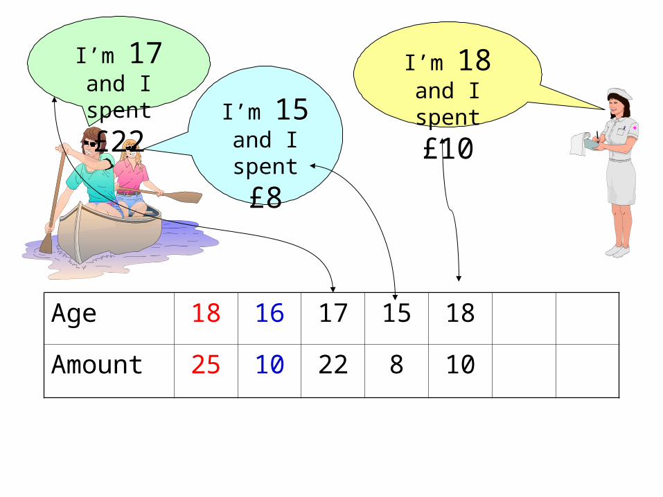
Age 18 16 17 15 18
Amount 25 10 22 8 10
I’m 18 and I
spent £10
I’m 17 and
I spent £22I’m 15
and I
spent £8
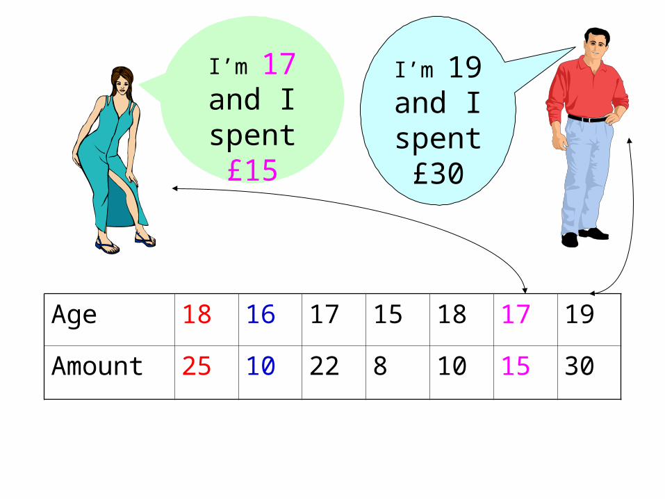
Age 18 16 17 15 18 17 19
Amount 25 10 22 8 10 15 30
I’m 17
and I spent £15
I’m 19
and I spent £30

Age x 18 16 17 15 18 17 19
Amount y 25 10 22 8 10 15 30
Age - Amount Spent
05
101520253035
0 5 10 15 20
Age
Am
ou
nt
Sp
en
t
This graph needs to be rescaled.

Age 18 16 17 15 18 17 19
Amount 25 10 22 8 10 15 30
Age - Amount Spent
05
101520253035
12 14 16 18 20
Age
Am
ou
nt
Sp
en
t
This graph is clearer due to a better scale.

This line is called the line of best fit.
If it goes up in this direction, it has a positive correlation.
Age - Amount Spent
05
101520253035
12 14 16 18 20
Age
Am
ou
nt
Sp
en
t
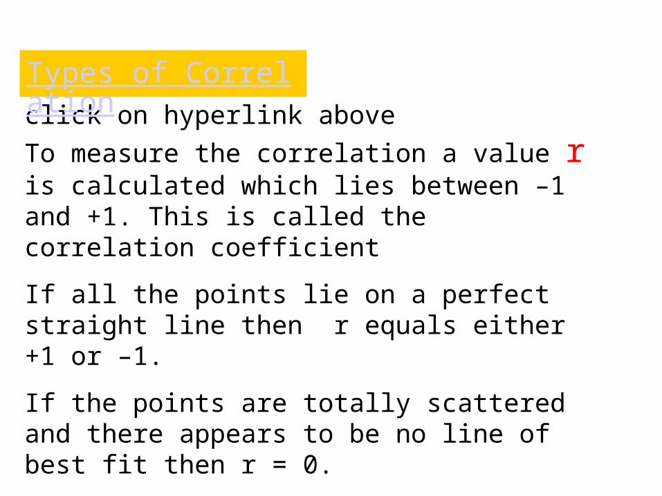
click on hyperlink above
To measure the correlation a value r is calculated which lies between –1 and +1. This is called the correlation coefficient
If all the points lie on a perfect straight line then r equals either +1 or –1.
If the points are totally scattered and there appears to be no line of best fit then r = 0.
Other values of r indicate a degree of correlation – strong, medium or weak.
Types of Correlation

Perfect positive correlation
r = 1
Moderate positive correlation
r = 0.6
Very weak positive correlation
r = 0.1
No correlation
r = 0
Quite strongnegative correlation
r = –0.7
Perfect negative correlation
r = –1

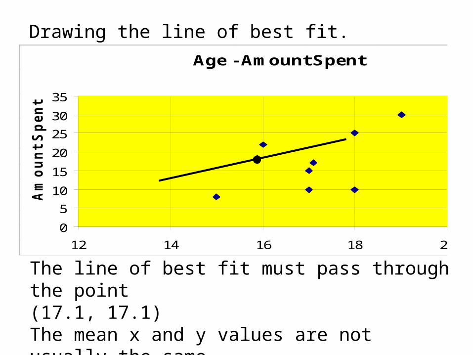
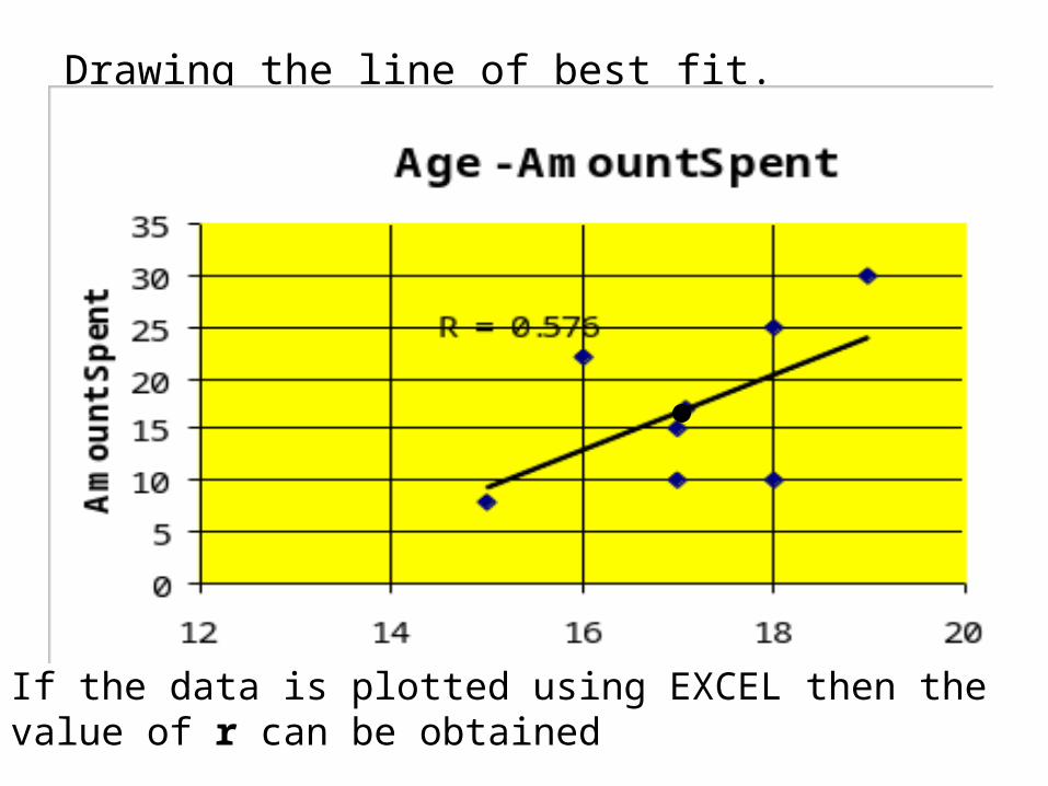
Drawing the line of best fit.
Age - Amount Spent
05
101520253035
12 14 16 18 20
Age
Am
ou
nt
Sp
en
t
The line of best fit must pass through the:
Mean x value and the mean y value

Finding the mean x and y value
Age x 18 16 17 15 18 17 19
Amount y 25 10 22 8 10 15 30
To find the mean x value add up all the ages and divide by how many there are
Total age = 18+16+17+15+18+17+19 = 120
Number of values = 7
Mean Age = 120
17.17

Finding the mean x and y value
Age x 18 16 17 15 18 17 19
Amount y 25 10 22 8 10 15 30
To find the mean y value add up all the money and divide by how many there are
Total age = 25+10+22+8+10+15+30 = 120
Number of values = 7
Mean Age = 120
17.17
Drawing the line of best fit.Age - Amount Spent
0
5
10
15
20
25
30
35
12 14 16 18 20
Age
Am
ou
nt
Sp
en
t
Series1
The line of best fit must pass through the point(17.1, 17.1) The mean x and y values are not usually the same
Drawing the line of best fit.
If the data is plotted using EXCEL then the value of r can be obtained
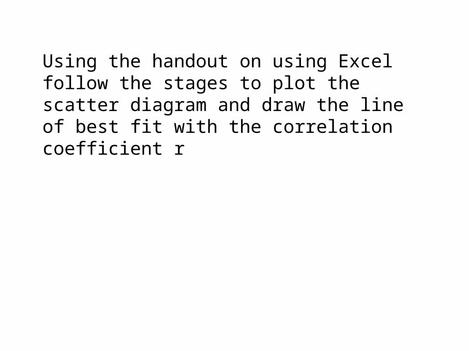
Using the handout on using Excel follow the stages to plot the scatter diagram and draw the line of best fit with the correlation coefficient r
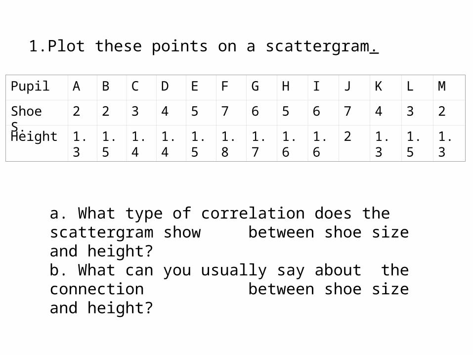
1.Plot these points on a scattergram.
Pupil A B C D E F G H I J K L M
Shoe S. 2 2 3 4 5 7 6 5 6 7 4 3 2
Height 1.3 1.5 1.4 1.4 1.5 1.8 1.7 1.6 1.6 2 1.3 1.5 1.3
a. What type of correlation does the scattergram show between shoe size and height?
b. What can you usually say about the connection between shoe size and height?
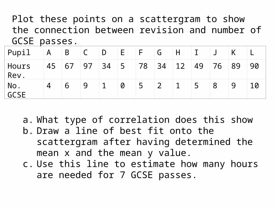
Plot these points on a scattergram to show the connection between revision and number of GCSE passes.
Pupil A B C D E F G H I J K L
Hours Rev.
45 67 97 34 5 78 34 12 49 76 89 90
No. GCSE
4 6 9 1 0 5 2 1 5 8 9 10
a. What type of correlation does this showb. Draw a line of best fit onto the scattergram after
having determined the mean x and the mean y value. c. Use this line to estimate how many hours are needed
for 7 GCSE passes.