russell craig, altered states exhibition
DESCRIPTION
survey exhibition presenting prints, drawings and works on paper by Russell Craig.TRANSCRIPT

RUSSELL CRAIG
Essay by Dr. Anne Kirker

“What we need more of is slow art: art that holds time as a vase holds water; art that grows out of modes of perception and making whose skill and doggedness make you think and feel; art that isn’t merely sensational, that doesn’t get its message across in ten seconds, that isn’t falsely iconic, that hooks onto something deep-running in our natures.”Art Critic Robert Hughes as presented at the Royal Academy Annual Dinner, June 2004.
“Moving back and forth through di!erent modes of expression is usual in my art practice. The best way I can describe these impulsive shifts is that I am merely responding to the experiences that are unfolding in my life; and ‘hooking onto something deep-running in my nature’. Of course, this is often shaped by travel, relationships, nature, collective history and current a!airs.” Russell Craig July 2011
The Artwork of Russell CraigMoreton Bay Region Art Collection in Perspective

A survey exhibition presenting prints, drawings and works on paper by Russell Craig.
Redcli!e City Art Gallery1 December to 24 December 2011
Coloured face 1, 1989Monoprint on fabriano paper, 86 x 61
ALTERED STATES

fsaasdfdasfdsafdasPid magnam, cus sequi remperia ad ma vel et harum quos dolor sectusd aeriatem am a sunt ut utatemo lecus, occus.Tum que non comnien dandus aspedi quas volut ut evenihit voluptatur sanditescia quia nostia eatum eumquo es eosandae quis mossi rescias im expel is sequam et lacillamus dolupta velliquae volo occae volutat ecerum et lam quiam inullum volorem ut eos nem qui velit, o!cto con et et o!cium nobit ut qui adipsum ipsamendis si testiis exerferferum doloriame solent laborpos simus, everro velestruntio molupta temquunt.Tium, cum experchillab ipit o!cienis esti dus et voluptas eossequibus.Piento que sed ut et magnati tenihiciis enis dolorem dolorro que et apiciur, ipsant apis cusant, sum vent imaximus, quaes as ex eat.Gent quatempor aut volo volum et, aliquo tem. Andenihilis et fuga. Nequis nus modigenimodi in cora volorerum et eosandipiet debitatem que sunt, iustrum quo ex exped ulpa doluptatur?Sam que ea porem re destrum ex eius santis expla ab initiis aute et ma quas intus quae nessit laccuptas aborestibus ipit aboreprende omnis es aboriore nus seque que sunture nobitiam ditia qui a consend anditat endisti aliquam hillaniet hici abo. Am volorporepta desequaspit doluptae plit am de alignis et ipistiaerrum erumquunt harum inctiam erfero bea voluptas simuste nisque nobit aut eariasi omnis natem que aspicie nditibus eum volor senis consequia voluptae volorro doluptur? Quistem fuga. Oremped ut voloriti diosam repuditae et dipic totassimpore consed ma nihillaborae nimus earchil ibuscimusa dolendi tinctemod ut et harcide liquidunt adiatur?Pudis et atias molupta quamus con nonsequam velia qui te nectota quisque comnis cone sequis et ipsam, expliqu iberes quid quiam utemporrum imintus untus aut optatum quod quatium repuda cum lias mincte sa volore et fuga. Am, omnimus destium et atur? Luptiorem. Harit endi dollor accab illam volorehent hitint.Caectur, veles doles accumquia verunte quibus.Sequo odionsequi reprate dolupta tiusapi tionsed et od mi, nienti untem as exceate proviti onemolorit, imodi que vendandae. Im veria consequo blatibusci o!cipsae estrum soluptat.Uptatur arum dolor maxim res eos maio. O!catquis cum quam fuga. Rum con ra que volorum et escid minumquati ipsunt, sum rae. Lor apelignis ad que volesecerunt
For thirty years Queensland artist Russell Craig has pursued a career that explores image-making through printmaking and drawing allowing for “free "ow” of his creativity. For while the substrate of paper is always maintained, the possibilities of mark-making upon it are diverse and testify to a talent that refuses to stick to a signature style.
The scope of this distinguished artist’s work ranges from lithographs, monoprints and digital prints, to wash drawings and large-scale charcoal images. The lineage of them covers the 1970s through to the 2000s and they are informed as much by his conceptual concerns at any particular time as his experiences as a master printer and teacher, his travels and cross-cultural engagements. While his personality is quiet and unassuming, it recognises the richness of dialogue with other cultures and the lessons that can be learned from them. Not surprisingly then that Japan, a nation with a strong tradition in printmaking, should especially attract him, from 1999 to the present time. He was instrumental in organising exchange exhibitions (Inter Image 2006 and Hashi Hashi 2008-9) between the Tokyo National University of Fine Arts (Geidai) and the Queensland College of Art, where he teaches. Furthermore, on one trip to Tokyo Craig made contact with Satoru Itazu, a printmaker he had befriended while studying collaborative lithography at the Tamarind Institute in Albuquerque in 1985. The brainchild of the indomitable June Wayne, Tamarind is renowned for the quality of master printers it produces. It is also the world’s preeminent centre for lithography.
Craig entered the Tamarind program with the intention of “testing the waters” to see whether he would set himself up as a specialist in processing the lithographs of others. At the same time, as an artist, this training in the United States was a way of learning the process in the best possible conditions. In 1985, like Itazu, he cultivated an exacting eye and sensitivity to the notoriously #ckle technique of `planographic’ printing using limestone as well as metal plates. Artists are attracted to it for the soft crayon-like e!ects it allows and the soft washes made by tusche, which emulates watercolour and gouache. They also
enjoy the alchemical wizardry that needs to occur to #x an image in place for printing. During the 1980s, drawings appeared in his oeuvre that went past the extraordinary skill of his 1979 charcoal copies after iconic paintings such as Caravaggio’s Bacchus and also #rmed up his preference for black and white imagery; a preference borne out in his lithography. For although the joyous `Colour Series’ of a few years earlier, when the artist was a student in Melbourne, shows him to be a #ne colourist, the tonal nuances of the former kept beckoning him back.
It is the chiaroscuro e!ect of conveying intense depth through to light that drew him to Caravaggio, not only the Italian’s exactitude in rendering form. The variation in line, shadowy richness and tactile quality of Craig’s characteristic works on paper started to emerge in the mid 1980s. Often these charcoals and lithographs were based on the face; one in the current exhibition is of a marble bust of a woman, another, deliberately subdued, is a Self Portrait (1987). The woman has her original smooth surface scarred with lines as though referring to the vicissitudes of time, markings that curiously reinforce the Greek’s devotion to a human ideal in carving their statuary. On the other hand, Craig’s interpretation of himself through lithography is mysterious and gently poetic. In preparation, lithographic transfer paper (in this case, not limestone) has been deliberately scored and scraped with the #nal image transferred to a lithographic plate, processed and printed on grey BFK Rives paper. The head appears totally “at one” with the matrix and paper support. It eschews unnecessary facial details and hovers between this world and another. This particular lithograph reminds me of the metaphysical etchings of Mimmo Paladino and Craig himself has expressed his admiration for the Italian and others from the Transavantgarde movement that swept through Europe in the late 1970s as a backlash to conceptual art, stating:
“I do admit having infatuations with various artists and their aesthetic languages. Caravaggio, Paladino, Clementi and Tapies are among those who have to some extent in!uenced my practice. However, there are other reasons for resisting a set “style”. Because I
4
Introduction

have dedicated a large part of my life to teaching art at tertiary level, I have endeavoured to be receptive to all manner of approaches and anyway my generation was free of pursuing a set ideology for the full term of his or her career. In fact, if you were educated in Melbourne in the early 1970s postmodern eclecticism was very much part of your DNA.” 1
When Craig does engage with colour in his drawing and printmaking it is at full-throttle. Take the joyous Beside the Obi Obi in yellow (1983), for instance, where the ground is worked in rich yellow and #gured in conté with lively sketch-like lines as though the artist is recalling a dream, one where there is no horizon and forms spin out around and across it. His Coloured face 1 (1989) is haunting in the sense that the mask-like visage shifts from gravity even though the background of this multi-colour monoprint (or “one o!” print) is earth brown. The work keeps compelling our attention as the rudimentary face, brush-drawn with its vivid green, blue and yellow interjections, overlays another similar shape printed red. This print in fact plays on the notion of “palimpsest”, evoking a sense of past and present histories for the personage. The particular monoprint method used was one taught at Tamarind “ to show
artists a speedy printing process that combines the expressive spontaneity of painting and the brilliance of lithographic coloured ink pressed into rag paper using the litho press.”
Craig returned to a softly meditative approach for portrait works with his Visage (1992), one of the artist’s charcoals. Here, the sculptural form nestles against an arm or a torso projecting a feeling that is tender and intimate. The image has not been “dashed o!” rather, it is deeply re"ective and is in accordance with the quote given above by Robert Hughes on ‘slow art’, making one want to linger and caress with the eyes. The same is true of lithographs of the nude, such as Figure 2 (1989), which is portrayed, sideways to emphasise the arching back of the body as it stands on one leg, bolstered by the other.
In the early 1990s, the artist responded to the laser print phenomenon with individualistic verve. In preparation, he painted sheets of paper with expressionistic brush-marks before cutting them up into shards and composing collages. Many of these compositions are of #gures in movement, including Two coloured standing Figures (1992). After laying each collage on a platen press (Xerox
5
Russell Craig, Glass House Mountains 2011

or such-like) the electronic processing produced an undi!erentiated “"at” image that nonetheless was enlivened by the original paint marks and rich palette. Through this new print medium Craig was recalling the painting aspect of his art school days, of which he states:
“ I acknowledge my drawing ability provides an indication of a pro"ciency and skill in making a certain type of art, particularly in graphic media. However, I was trained as a painter under the in!uence of abstract expressionism and neo-expressionism and I found it liberating to work in a loose, !uid manner with paint, collage and expressive physical gestures.”
These two dancing #gures, male and female, are interwoven in equal measure with their background of jostling cut shapes. Despite their abstract vocabulary, each has a speci#c personality; the female’s light elegance counter-posed with her partner’s muscular strength and raw-hued limbs. Landscape references have increasingly taken a place alongside Craig’s interest in the #gure and this can be seen through drawings emanating from his travels in Southeast Asia as much as East Asia. A six-week long residency in Vietnam (at the Hanoi University of Fine Arts) resulted in Halong Bay (1996), a charcoal drawing with a linear schema suggesting rows of handwriting punctuated by shadowy passages. Rather than respond to this famous tourist attraction with verisimilitude, he has acknowledged the vastly di!erent culture hosting him as much as the awe-inspiring spectacle of limestone mountains rising up out of the sea. It would not have been lost on the artist that traditional lithography relies upon the antipathy between oil and water to create an image or that limestone is the favoured matrix of lithographers, albeit cumbersome in weight and growing in scarcity.
Paper types are critical to artists who make imagery using it as a substrate. Hahnemühle art stock has been used for Halong Bay and is readily found through out the world. It is heavy enough to take extensive workings with the charcoal stick paper, while also lends texture when #ngertips deliberately smudge the drawing. Other favourite stocks appearing in Craig’s oeuvre of graphic work are Fabriano, Arches and Saunders. The sheet is after-all the tabula rasa for an artist and carries
with it aesthetic qualities (according to weight, texture, hue and light-emitting ability) which in turn prompts particular responses to an idea, or otherwise receives and conveys that idea to itsfullest realization.
When on residencies in Japan, France, and also in Thailand during the mid and late 2000s, Craig’s work with charcoal was mostly carried on Hahnemühle paper. The paper provided the large scale he needed and was robust enough to tear around a shape when the image demanded it. The German stock also has a deckle edge, lending itself to host details of ancient masonry and wood, indecipherable scripts, ceramic vessels and remote locations in eye-tricking amalgams. We are in a cross-cultural terrain here with these drawings as well as in an arena where, as Sasha Grishin noted in 2009, “ the laws of chance and serendipity have been given primacy over logic and reason”. Exactitude in rendering knarred planks of a humble building in one charcoal titled un ami pour la vie is coupled by crevices and strange shadows that take the drawing into surreal expression and give it a metaphysical gravity. The same “double-take” occurs with Chiang Mai craft, a monumental-scaled drawing that is one of Craig’s meditations on the rural environment of Chiang Mai province. Here a simple boat placed on reed-hatched surface speaks volumes of a past life spent on Mae Ping River.
Elsewhere in these huge drawings from the artist’s ‘Mana’ (a sacred spiritual force) (2009) series he marries frottage e!ects with immaculately observed details from life. Ceramic pots, simple in shape, stand for the naked human form, irrespective of gender, as well as for the Thai culture they represent. Their juxtapositions with weathered stonewalls and foliage also give the impression of ancient Greece being in conversation with Southeast Asia, and a personal and respectful engagement with the natural environment. The symbolic weight of these drawings extends to scrolls, such as Freefall scape 2 where tribal Aboriginal shields are evoked in the over-all composition, housing allusions to elements such as #re and air. One drawing, titled Tree protection, shaped to resemble an enlarged neck amulet with a taut rope fraying below as though on the verge of breaking, has delicate winged seeds airborne above. It is divided into two sections and actually has its genesis in the wrapped trees Craig observed in gardens
6

surrounding Tokyo and intricate hair combs he saw in a shop window in the geisha district of Kyoto. Such is the suggestive and mysterious quality of the charcoals that they invite multiple readings.
These authoritative drawings by Craig are accompanied in a special section of this exhibition by examples of the many wash sketches he has made outdoors at Queensland’s Glasshouse Mountains, north of Brisbane. Over the years, he has taken students from Queensland College of Art on excursions to this National Park and drawn along side them. The products are lively and spontaneous reactions to the volcanic outcrops surrounded by native bush. Spindly eucalypts have been rendered with #ne lines against a broad sweep of grey wash while the mountains them selves either hover in the background to Craig’s impressions or they feature centre-stage as primeval sentinels. Occasionally a "ash of colour, such as ultramarine blue, is introduced to stand for the sky. These animated sketches show yet a further side to this artist’s considerable talent and is a #tting coda to this #ne survey. For as Russell Craig writes:
“Each drawing and print technique has its own place in my repertoire. Deep and rich blacks, bulbous forms, silky transitions from black to white, sometimes scraped and vigorously altered surfaces, calligraphic !uency, changes in scale and seductive accidental surfaces, are all a part of the mix.”
Dr. Anne KirkerAdjunct Associate Professor Queensland College of Art, Gri!th University.
1 Russell Craig in e-mail conversation with Anne Kirker 7 July 2011. Unless speci#ed otherwise, all quotes by the artist are from this source.
7
Hatchet, 1996Charcoal on Saunders paper, 114 x 163.5

8
Woman’s face, 1992Charcoal on fabriano paper, 100 x 70

9
The girl’s a#iction, 1981Screen print on Fabriano paper, 100 x 70 (bleed image) Printer: Peter Trail

10
Jo-Anne, 1981Coloured pastel on paper, 141 x 104.5, Moreton Bay Region Art Collection

Vase,1996 Charcoal on hahnemuhle paper, 67 x 91
11

12
Standing "gure, 1996 Coloured monoprint on fabriano paper, 85 x 65 (bleed image)

13
Visage, 1992Charcoal on fabriano, 100 x 70 (bleed image)

14
Water and the spirit of things, 2011 White conte and blue ink on hahnemuhle paper, 78.5 x 106.5 (bleed image) one part of a triptych

Micro view 2 (ear), 1999Charcoal on hahnemuhle paper, 78.5 x 106.5
15

16
Landscape in green, 1983Acrylic, pastel and conte on Arches paper, (one part of diptych) each work 106.5 x 158 (bleed image)

17
Beside the Obi Obi in yellow, 1983Pastel, conte on hahnemuhle paper, 107 x 78 (bleed image)

18
Close to the water, 2009Charcoal on shaped Hahnemuhle paper, 105 x 78

Standing #gure, Coloured monoprint on fabriano, 85 X 65
Crookneck, Glasshouse Mts., 2009 Ink wash, charcoal and pencil on hahnemuhle paper, 78.5 x 10⁷
19
Walls sometimes speak #1, 1980Watercolour, handmade paperwork, 43 x 83

20
Sticks & stones, 2009Charcoal on Arches paper, 105.5 x 75 (bleed image)

21
Untitled (colour series 1), 1976Coloured pencil on Arches paper, 76.5 x 56.5 (bleed image)

Coloured standing "gure, 1992Colour lazer print on Japanese mulberry paper, 71 x 33
22

Glasshouse, blue sky (1), 2000Ink wash and charcoal on Fabriano paper, 70 x 100
23

24
Messages of hope, 2010Charcoal on Velin Arches paper, 122 x 80

25
Self Portrait, 1987Lithograph on grey BFK Rives paper, 76.5 x 57.5

26
Girl with a coptic textile (artist’s Grandmother), 1974Photographic screenprint, coloured pencil on Fabriano paper,53 x 48
Acknowledgements:Russell Craig would like to thank the following individuals and institutions for their valued contribution to this exhibition project.
Redcli!e City Art GalleryMoreton Bay Regional CouncilQueensland College of Art, Gri$th UniversityKaren TylerJo D’HageEugene D’Hage-Craig& Dr. Anne Kirker
27
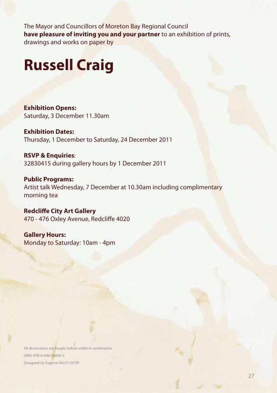
Exhibition Opens: Saturday, 3 December 11.30am
Exhibition Dates: Thursday, 1 December to Saturday, 24 December 2011
RSVP & Enquiries:32830415 during gallery hours by 1 December 2011
Public Programs:Artist talk Wednesday, 7 December at 10.30am including complimentary morning tea
Redcli!e City Art Gallery 470 - 476 Oxley Avenue, Redcli!e 4020
Gallery Hours: Monday to Saturday: 10am - 4pm
Russell Craig
The Mayor and Councillors of Moreton Bay Regional Council have pleasure of inviting you and your partner to an exhibition of prints, drawings and works on paper by
All dimensions are height before width in centimetres
ISBN: 978-0-646-56839-3
Designed by Eugene 0422110739
