ripple effect
DESCRIPTION
Design PortfolioTRANSCRIPT


ripple effect
Design Portfolio of Kana SeKine
introDuction
pa
ge
_ 002/003
rip
pl
e e
ff
ec
t _
Kana SeKine
<<
<
<<

m y m e s s a g e s w i l l h av e a r i p p l e e f f e c t _ My goal as a graphic designer is to visualize messages that expand to the masses. i believe those messages will impact people’s feelings and even change some behavior to something more positive. this book contains my selected creative work which shows how i solve certain problems and how i communicate through my designs.

table of contentS
pa
ge
_ 004/005
rip
pl
e e
ff
ec
t _
Kana SeKine
<<
<
<<
008 _ 029030 _ 053054 _ 077078 _ 089090 _ 111112 _ 119120 _ 131132 _ 151152 _ 157
p r o j e c t 01 _ touchy Subjectp r o j e c t 0 2 _ Who are you? p r o j e c t 0 3 _ Well-Groundedp r o j e c t 0 4 _ aversion to introversionp r o j e c t 0 5 _ Water Water everywherep r o j e c t 0 6 _ ersatizfactionp r o j e c t 0 7 _ city bikerp r o j e c t 0 8 _ Swaddling Happinessp r o j e c t 0 9 _ identity collection
pa
ge
_ 006/007
rip
pl
e e
ff
ec
t _
Kana SeKine
<<
<
<<


01toucHy Subject
pa
ge
_ 008/009
rip
pl
e e
ff
ec
t _
Kana SeKine
<<
<
<<

c a t e g o r y
ProDuct ProMotion
f o r m a t
booK
PoSter
cD
t y p e f a c e
HiraGino MincHo
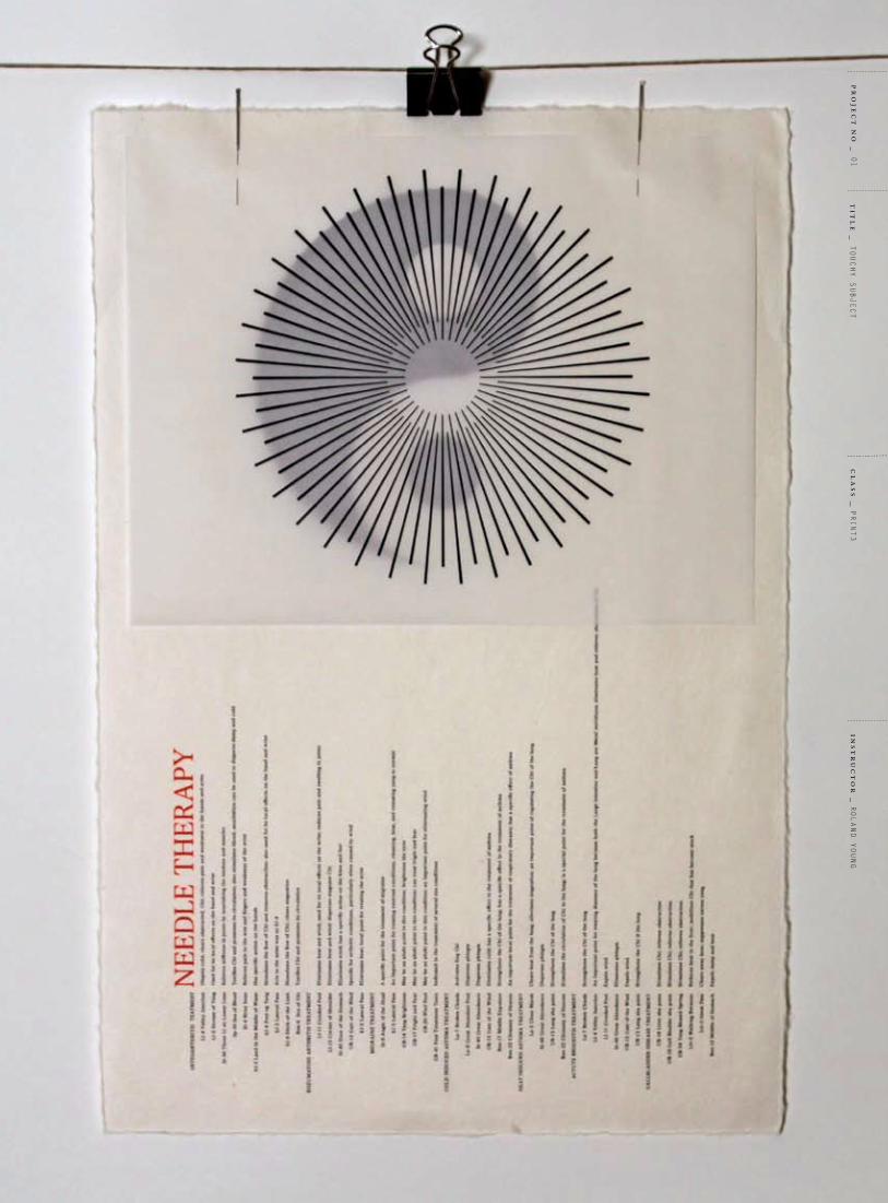
o bj e c t i v e _ to promote japanese press tack needle for acupuncture which is called empishin in the u.S. this needle is not so well-known but has very unique functions and effects. this campaign educates audiences about this needle, including the needle comparison between chinese and japanese practice and also the comparison between Modern science and chinese medicine through a book, posters and cD.
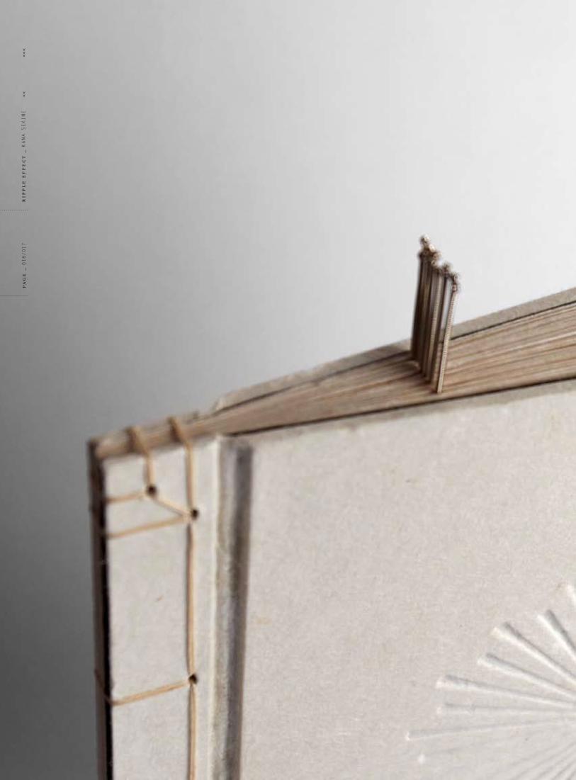
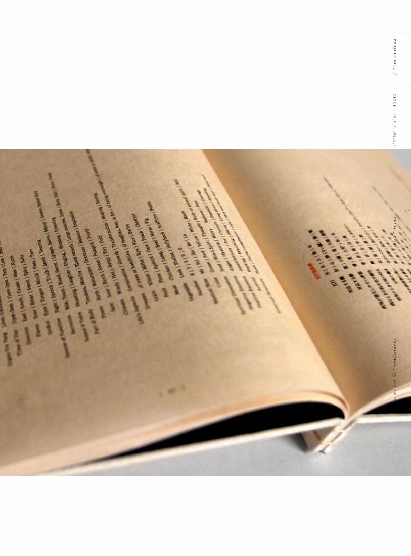
s o l u t i o n _ Since japanese acupuncture was developed as an occupation for blind people, palpation was the most important diagnosis. i focused on the matter of “being blind” for my design. blind people have a more acute tactile sense. for that reason, the concept for this product promotion is touch and feel by using subtle textures which are using different surfaces of papers and different printing methods.
cl
as
s _
Print3
pr
oje
ct
no
_ 01
ins
tr
uc
to
r _
rolanD younG
tit
le
_ toucHy Subject
pa
ge
_ 010/011
rip
pl
e e
ff
ec
t _
Kana SeKine
<<
<
<<

cl
as
s _
Print3
pr
oje
ct
no
_ 01
ins
tr
uc
to
r _
rolanD younG
tit
le
_ toucHy Subject

pa
ge
_ 012/013
rip
pl
e e
ff
ec
t _
Kana SeKine
<<
<
<<

cl
as
s _
Print3
pr
oje
ct
no
_ 01
ins
tr
uc
to
r _
rolanD younG
tit
le
_ toucHy Subject
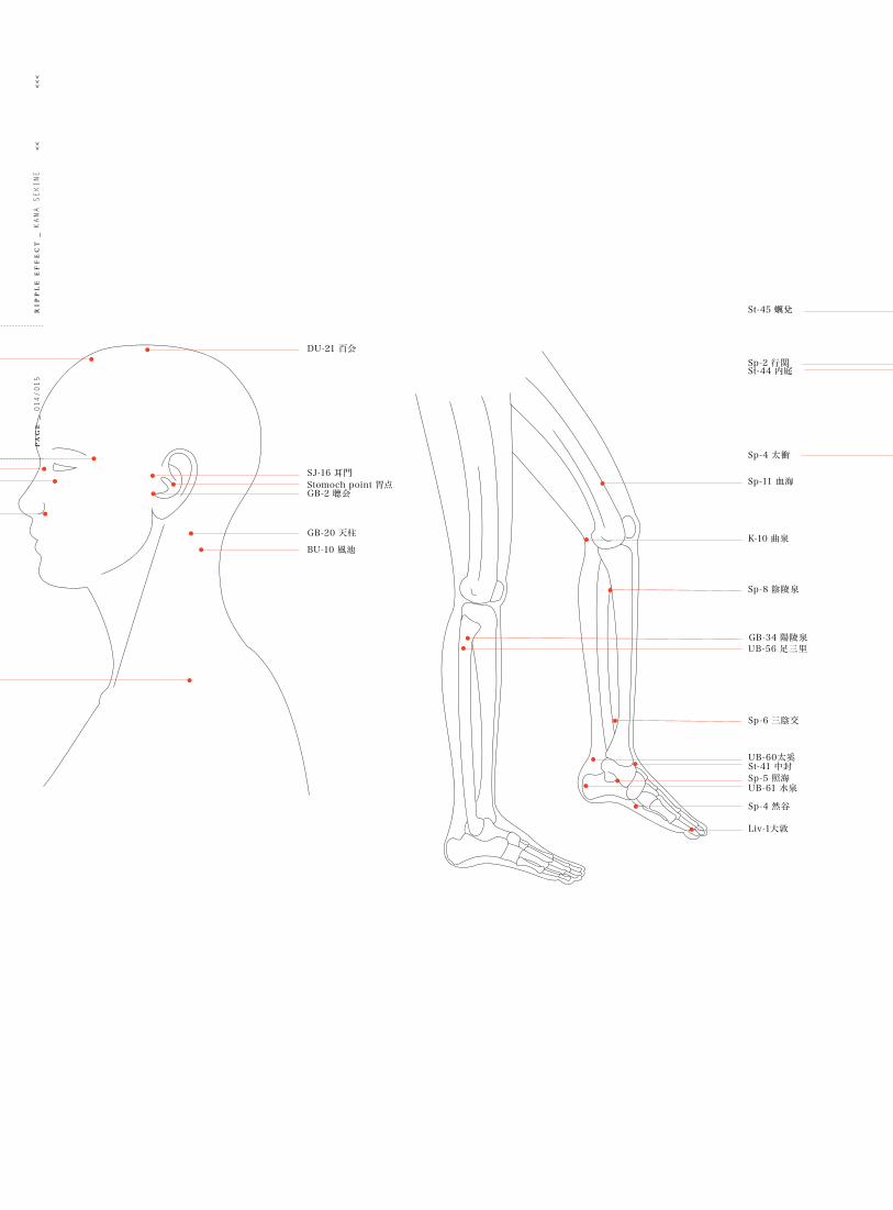
DU-21 百会
sj-16 耳門stomoch point 胃点
GB-20 天柱
GB-2 聴会
BU-10 風池
DU-23 上星
st-1 四白
LI20 迎香
taiyang 太陽UB-1 睛明
GB-21 肩井
sp-2 行関st-44 内庭
st-45 蠣兌
sp-4 太衝
sp-11 血海
K-10 曲泉
sp-8 陰陵泉
GB-34 陽陵泉UB-56 足三里
sp-6 三陰交
UB-60太奚st-41 中封sp-5 照海UB-61 水泉
sp-4 然谷
Liv-1大敦
pa
ge
_ 014/015
rip
pl
e e
ff
ec
t _
Kana SeKine
<<
<
<<

Lu-10 合谷Lu-11 少商
Lu-5 曲池
Lu-6 手三里 H-3 小海
sI-7 支正
P-7 陽池
H-8 中渚
Du-14 大椎
UB-12 肺喩Du-13 身柱UB-13 厥陰喩UB-14 心喩
UB-17 膈喩
UB-18 肝喩
UB-19 脾喩
UB-20 胃喩UB-21 三焦喩
UB-22 腎喩
UB-26 大腸喩
UB-53 小腸喩UB-54 膀胱喩
sp-2 行関st-44 内庭
st-45 蠣兌
sp-4 太衝
cl
as
s _
Print3
pr
oje
ct
no
_ 01
ins
tr
uc
to
r _
rolanD younG
tit
le
_ toucHy Subject
pa
ge
_ 016/017
rip
pl
e e
ff
ec
t _
Kana SeKine
<<
<
<<

cl
as
s _
Print3
pr
oje
ct
no
_ 01
ins
tr
uc
to
r _
rolanD younG
tit
le
_ toucHy Subject

pa
ge
_ 018/019
rip
pl
e e
ff
ec
t _
Kana SeKine
<<
<
<<

cl
as
s _
Print3
pr
oje
ct
no
_ 01
ins
tr
uc
to
r _
rolanD younG
tit
le
_ toucHy Subject

pa
ge
_ 020/021
rip
pl
e e
ff
ec
t _
Kana SeKine
<<
<
<<

cl
as
s _
Print3
pr
oje
ct
no
_ 01
ins
tr
uc
to
r _
rolanD younG
tit
le
_ toucHy Subject

pa
ge
_ 022/023
rip
pl
e e
ff
ec
t _
Kana SeKine
<<
<
<<
cl
as
s _
Print3
pr
oje
ct
no
_ 01
ins
tr
uc
to
r _
rolanD younG
tit
le
_ toucHy Subject

pa
ge
_ 024/025
rip
pl
e e
ff
ec
t _
Kana SeKine
<<
<
<<
cl
as
s _
Print3
pr
oje
ct
no
_ 01
ins
tr
uc
to
r _
rolanD younG
tit
le
_ toucHy Subject

pa
ge
_ 026/027
rip
pl
e e
ff
ec
t _
Kana SeKine
<<
<
<<

cl
as
s _
Print3
pr
oje
ct
no
_ 01
ins
tr
uc
to
r _
rolanD younG
tit
le
_ toucHy Subject

pa
ge
_ 028/029
rip
pl
e e
ff
ec
t _
Kana SeKine
<<
<
<<

cl
as
s _
Print3
pr
oje
ct
no
_ 01
ins
tr
uc
to
r _
rolanD younG
tit
le
_ toucHy Subject

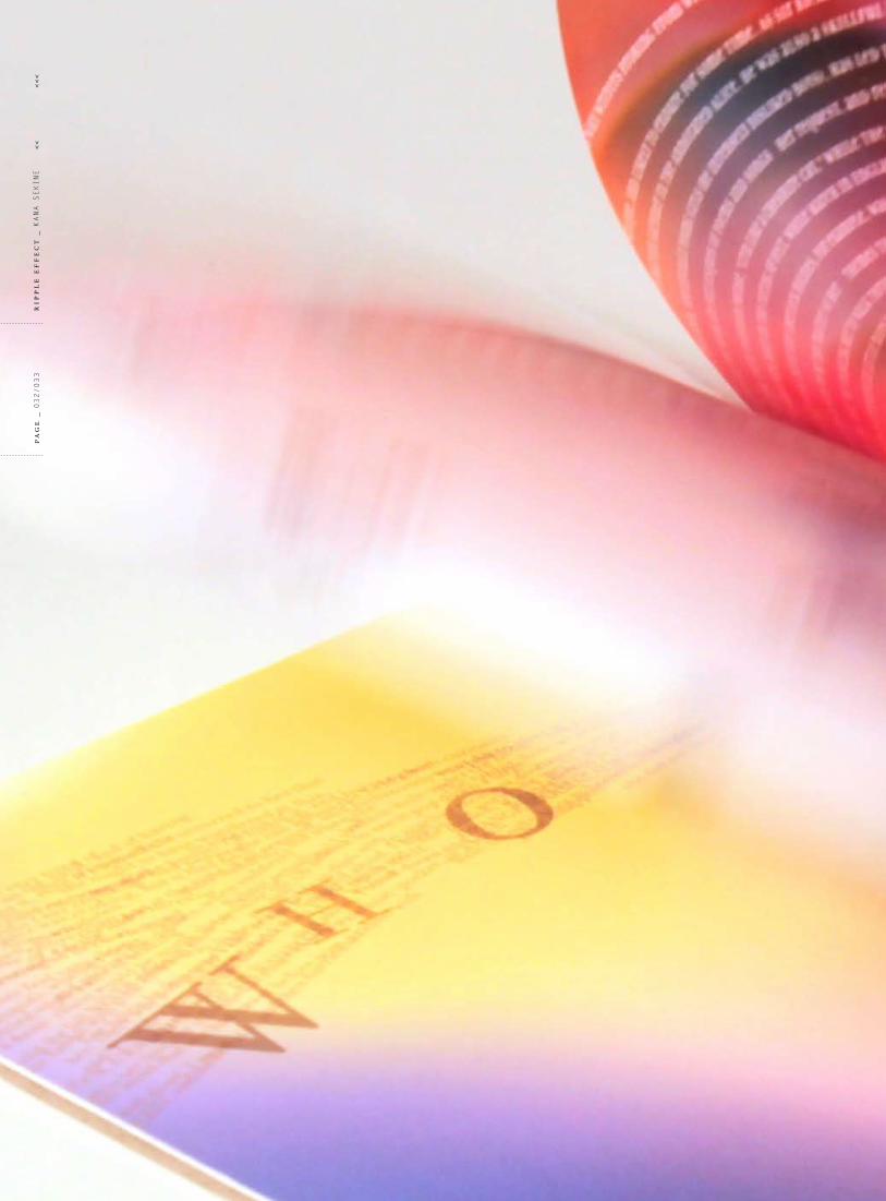
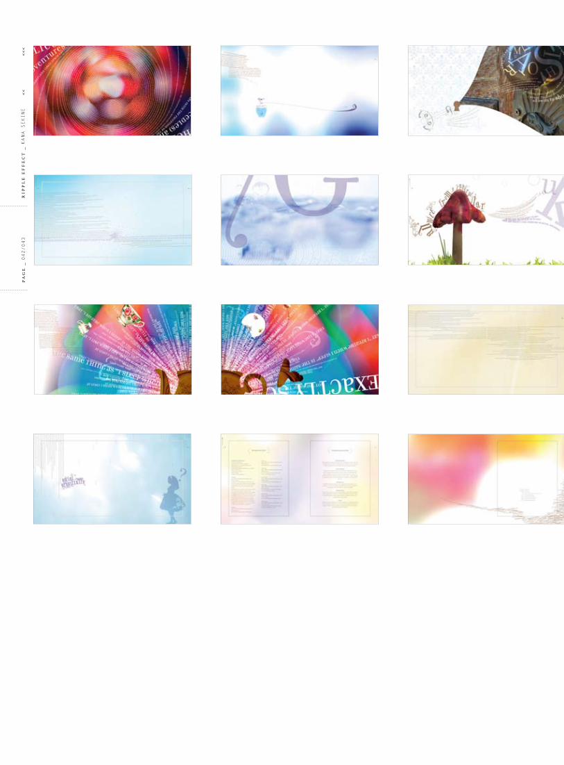
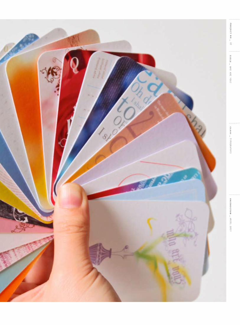
02WHo are you?
pa
ge
_ 030/031
rip
pl
e e
ff
ec
t _
Kana SeKine
<<
<
<<

o bj e c t i v e _ to promote one of the curious Paper collections called identity by producing a promotional book and paper swatch cards. the promotion contains a message of identifying yourself and educational information.
s o l u t i o n _ to achieve the objective, i created an analysis of alice in Wonderland which talked about the symbolism of the story. in the story she meets a lot of characters and eventually figures out her identity. identifying yourself links to the name of the paper line. the design of the project contains a combination of traditional and experimental typography with several typefaces and also a symbolic and mysterious atmosphere. a lot of visual elements are designed by illustrating using typeface Missionary.
c a t e g o r y
PaPer coMPany ProMotion
f o r m a t
booK
SWatcH carDS
t y p e f a c e s
filoSofia
tarzana narroW
MiSSionary
cl
as
s _
tyPoGraPHy3
pr
oje
ct
no
_ 02
ins
tr
uc
to
r _
ariel Grey
tit
le
_ WHo are you?
pa
ge
_ 032/033
rip
pl
e e
ff
ec
t _
Kana SeKine
<<
<
<<

cl
as
s _
tyPoGraPHy3
pr
oje
ct
no
_ 02
ins
tr
uc
to
r _
ariel Grey
tit
le
_ WHo are you?

pa
ge
_ 034/035
rip
pl
e e
ff
ec
t _
Kana SeKine
<<
<
<<

cl
as
s _
tyPoGraPHy3
pr
oje
ct
no
_ 02
ins
tr
uc
to
r _
ariel Grey
tit
le
_ WHo are you?

pa
ge
_ 036/037
rip
pl
e e
ff
ec
t _
Kana SeKine
<<
<
<<

cl
as
s _
tyPoGraPHy3
pr
oje
ct
no
_ 02
ins
tr
uc
to
r _
ariel Grey
tit
le
_ WHo are you?

pa
ge
_ 038/039
rip
pl
e e
ff
ec
t _
Kana SeKine
<<
<
<<

cl
as
s _
tyPoGraPHy3
pr
oje
ct
no
_ 02
ins
tr
uc
to
r _
ariel Grey
tit
le
_ WHo are you?

pa
ge
_ 040/041
rip
pl
e e
ff
ec
t _
Kana SeKine
<<
<
<<

bad habits we have as well as the ego’s and
cl
as
s _
tyPoGraPHy3
pr
oje
ct
no
_ 02
ins
tr
uc
to
r _
ariel Grey
tit
le
_ WHo are you?
pa
ge
_ 042/043
rip
pl
e e
ff
ec
t _
Kana SeKine
<<
<
<<

cl
as
s _
tyPoGraPHy3
pr
oje
ct
no
_ 02
ins
tr
uc
to
r _
ariel Grey
tit
le
_ WHo are you?

pa
ge
_ 044/045
rip
pl
e e
ff
ec
t _
Kana SeKine
<<
<
<<

cl
as
s _
tyPoGraPHy3
pr
oje
ct
no
_ 02
ins
tr
uc
to
r _
ariel Grey
tit
le
_ WHo are you?

diar
ies,
Car
roll
has n
ever
mad
e an
y re
fere
nce
to th
e us
e of
dru
gs.
whet
her o
r not
acc
iden
tally
. How
ever
, it w
as d
ef n
itel
y no
t Car
roll’
s int
enti
on to
writ
e a
book
abo
ut d
rugs
: he
want
ed to
ent
erta
in a
litt
le g
irl w
hom
he
love
d. N
o ev
iden
ce h
as e
ver b
een
foun
d th
at li
nked
Car
roll
to d
rug
use.
Eve
n in
his
Ther
e is
inde
ed o
ne p
art i
n th
e bo
ok th
at m
ay d
escr
ibe
the
use
of d
rugs
: the
hoo
kah
smok
ing
Cate
rpill
ar w
ho a
dvis
es A
lice
to e
at fr
om th
e m
ushr
oom
. But
wit
h th
e st
ory
Carr
oll m
ade
fun
of a
ll as
pect
s of s
ocie
ty, a
nd it
may
be
poss
ible
that
he
was j
ust r
ef e
ctin
g th
e ag
e wi
th th
is p
art (
note
that
this
cha
pter
was
n’t e
ven
part
of t
he o
rigin
al st
ory,
but
was
add
ed la
ter!
). In
the
Vict
oria
n er
a th
ere
were
no
drug
laws
like
we
know
them
. Opi
um, c
ocai
ne, a
nd la
udan
um (a
pain
kille
r tha
t con
tain
ed o
pium
) wer
e us
ed fo
r med
icin
al p
urpo
ses,
and
cou
ld b
e ob
tain
ed fr
om a
pha
rmac
ist.
Min
d th
at LS
D wa
s not
eve
n in
vent
ed y
et! S
o in
Car
roll’
s day
s it w
as n
ot u
ncom
mon
to e
xper
ienc
e th
e ef
fect
of b
eing
‘hig
h’,
pa
ge
_ 046/047
rip
pl
e e
ff
ec
t _
Kana SeKine
<<
<
<<

cl
as
s _
tyPoGraPHy3
pr
oje
ct
no
_ 02
ins
tr
uc
to
r _
ariel Grey
tit
le
_ WHo are you?

pa
ge
_ 048/049
rip
pl
e e
ff
ec
t _
Kana SeKine
<<
<
<<
cl
as
s _
tyPoGraPHy3
pr
oje
ct
no
_ 02
ins
tr
uc
to
r _
ariel Grey
tit
le
_ WHo are you?

The most obvious theme that can be found in Alice’s Adventures
in Wonderland is the theme of growing up.Lewis Carroll adored the unprejudiced and innocent way young children approach the world. With Alice’s Adventures in Wonderland,
he wanted to describe how a child sees our adult world, including
all of the (in the eyes of a child
silly and
arbitrary) rules and social
etiquette we created for ourselves, as well
as the ego’s and bad
habits we have developed
during our lives.
weightsWove available in 24lb and 26.6lb
writting,80lb Text and 111lb Cover. Laid available in 24lb Writing,80lb Text and 80lb Cover. Cx22 available
in 26.6lb Writing, 70lb Text,80lb and118lb Cover.
environmental30% post consumer waste and 20-
30% pre consumer waste. All papersare 100% acid free and use elemental
chlorine free pulp.
printing découvrez papers perform
well with offset lithography and silkscreening. They are also
suitable for blind embossing, foil-stamping, thermography and die-
stamping,although these techniquesmay compromise laser compatibility.
Exactly so
Exactly so
Exactly soExactly so
Exactly so
lb/gsmM
weightgrainbox or wrap/sheetssheets/carton
natural whitebrilliant whitediam
ond white
WRITING
TEXTCOVER
26.6/10013.3L
B/50002,500
XXX 8.5x11(216x279mm)
8.5x11(216x279mm)
8.5x11(216x279mm)
8.5x11(216x279mm)
35x23(889x584mm)
35x23(584x889mm)
35x23(584x889mm)
35x23(584x889mm)
26.6/100114.5
LB/5001,000
XXX
70/11013.8L
B/5002,500
XXX
70/110119L
B/5001,000
XXX
80/220248L
W/100400X
118/32042.5L
B/1001,000
X
118/320366.3
LW
/100400X
80/22028.8L
B/5001,000
X
DÉCOUVREZ
pa
ge
_ 050/051
rip
pl
e e
ff
ec
t _
Kana SeKine
<<
<
<<

oot
he
rc
re
aat
ur
eei
ssC
nvv
en
ti
on
,aaaa
nd
is
ta
kaa
so
up
ca
ll
ed
kkT
ur
tl
ee”
so
up
wh
ic
hh
sn
ot
,i
nf
ac
t,
onn
ttaa
in
aan
yytt
uurr
tlll
e
oooffffttthhh
eerrrr
kkTTTTHHHHH
EEEEEIIIRRR
hhhhooww
sshhee
woouu
llldfffeee
eeellllwwww
iittoohhhhooooooffff
aa ffff tttl ttthhhhll hhh
tthhee
ppplleea
surre
inall
llt
dddhhh
ngg ddddtthhh
ee
Th
e
lo
ng
gr
as
sr u
s tl e
da t
he r
tttthhhhhhiiiee
sss
Rab
bi t
hurr
ied
byth
efr
ighgg
tene
dbbyyMtthh ohhee
ueese
s th
ooooofffffff
ooo
hhhhhhhsssttoo
t dd hhhhtttt hhhhhhhhhhhhhhhhhhhhhhhhhhhhhhhhhhhhhhhhhhhhhhhhh
fffff
hhhh
fffffffffffffffffffffffffffffffffffffffffffffffffffffffffffffffffffffffffffffffffffffff
nggeee
ttooo
Q
Q
Off heaDSwith
their
cl
as
s _
tyPoGraPHy3
pr
oje
ct
no
_ 02
ins
tr
uc
to
r _
ariel Grey
tit
le
_ WHo are you?

pa
ge
_ 052/053
rip
pl
e e
ff
ec
t _
Kana SeKine
<<
<
<<

cl
as
s _
tyPoGraPHy3
pr
oje
ct
no
_ 02
ins
tr
uc
to
r _
ariel Grey
tit
le
_ WHo are you?
03Well-GrounDeD
pa
ge
_ 054/055
rip
pl
e e
ff
ec
t _
Kana SeKine
<<
<
<<

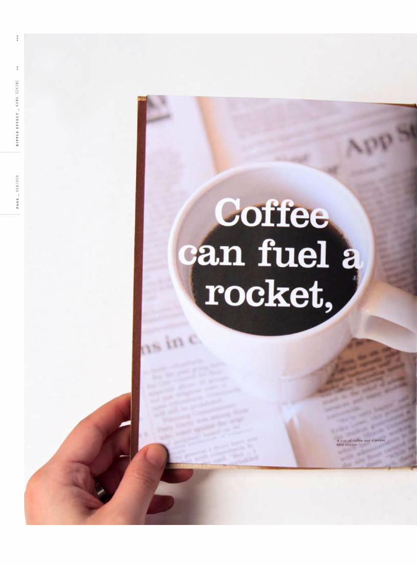
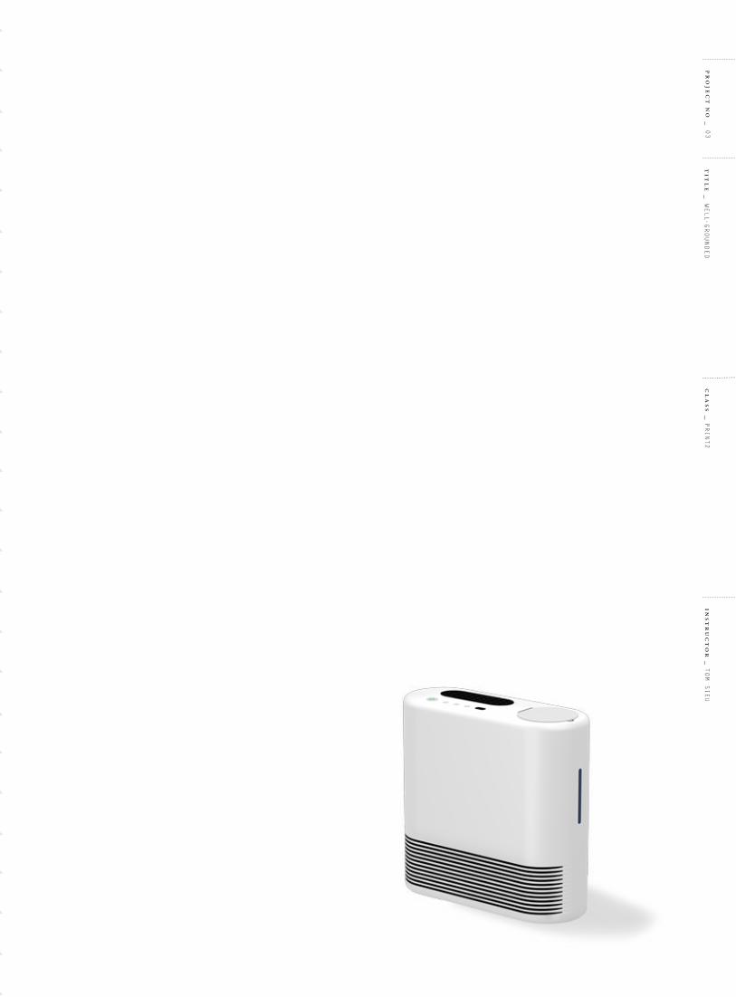
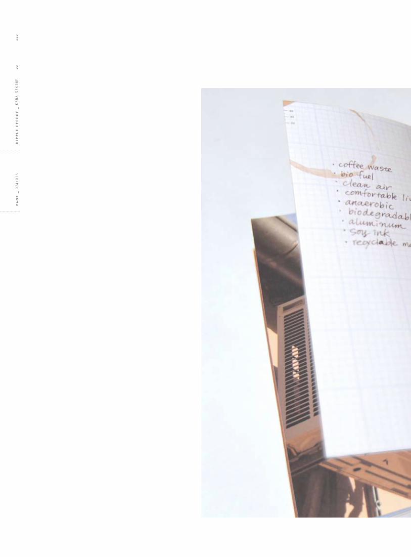
o bj e c t i v e _ as a coffee drinker, i sometimes feel guilty about dumping coffee grounds in the garbage every single day. i came across the fact that coffee waste can provide a cheap, abundant, environmentally friendly source of biodiesel fuel. i designed a book to show this sustainable product which can affect our lifestyle and behavior.
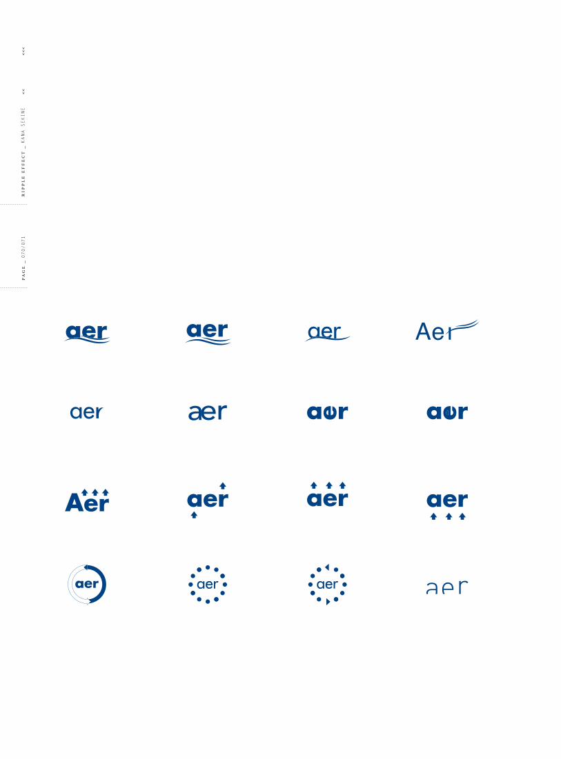
s o l u t i o n _ Heating Ventilating air conditioning (HVac) is a very useful and essential device for people today. but it is said that HVac gives off carbon dioxide and contributes to global-warming. i designed a HVac device that uses coffee-based biofuel as its energy source to achieve sustainable objectives. the product also is introducing a new ecological lifestyle by reusing coffee grounds. i named the product “aer” pronounced like “air” because the product relates to the quality of air on the earth and also aer is an acronym of an aerobic bacteria which produces the biofuel. the name has two meanings behind it.
c a t e g o r y
ProDuct ProMotion
f o r m a t
booK
ProDuct
iDentity
t y p e f a c e s
clarenDon
Serifa
cl
as
s _
Print2
pr
oje
ct
no
_ 03
ins
tr
uc
to
r _
toM Sieu
tit
le
_ Well-
GrounDeD

pa
ge
_ 056/057
rip
pl
e e
ff
ec
t _
Kana SeKine
<<
<
<<

cl
as
s _
Print2
pr
oje
ct
no
_ 03
ins
tr
uc
to
r _
toM Sieu
tit
le
_ Well-
GrounDeD
pa
ge
_ 058/059
rip
pl
e e
ff
ec
t _
Kana SeKine
<<
<
<<

cl
as
s _
Print2
ins
tr
uc
to
r _
toM Sieu
tit
le
_ Well-
GrounDeD
pr
oje
ct
no
_ 03

pa
ge
_ 060/061
rip
pl
e e
ff
ec
t _
Kana SeKine
<<
<
<<

r3 is an organization that promotes sustainable design by identifying new product opportunities within emerging Green Design solutions. each product redesign considers form and function as well as new technology and recyclability of materials. More importantly, each book published by r3 will focus on progressive thinking and social-consciousness.
cl
as
s _
Print2
ins
tr
uc
to
r _
toM Sieu
tit
le
_ Well-
GrounDeD
pr
oje
ct
no
_ 03
pa
ge
_ 062/063
rip
pl
e e
ff
ec
t _
Kana SeKine
<<
<
<<

cl
as
s _
Print2
ins
tr
uc
to
r _
toM Sieu
tit
le
_ Well-
GrounDeD
pr
oje
ct
no
_ 03
pa
ge
_ 064/065
rip
pl
e e
ff
ec
t _
Kana SeKine
<<
<
<<

-90%1product
cl
as
s _
Print2
ins
tr
uc
to
r _
toM Sieu
tit
le
_ Well-
GrounDeD
pr
oje
ct
no
_ 03

pa
ge
_ 066/067
rip
pl
e e
ff
ec
t _
Kana SeKine
<<
<
<<

cl
as
s _
Print2
ins
tr
uc
to
r _
toM Sieu
tit
le
_ Well-
GrounDeD
pr
oje
ct
no
_ 03

pa
ge
_ 068/069
rip
pl
e e
ff
ec
t _
Kana SeKine
<<
<
<<

cl
as
s _
Print2
ins
tr
uc
to
r _
toM Sieu
tit
le
_ Well-
GrounDeD
pr
oje
ct
no
_ 03
aeraerAer aer
pa
ge
_ 070/071
rip
pl
e e
ff
ec
t _
Kana SeKine
<<
<
<<

Aer
Aer aer
aer
aer
cl
as
s _
Print2
ins
tr
uc
to
r _
toM Sieu
tit
le
_ Well-
GrounDeD
pr
oje
ct
no
_ 03

pa
ge
_ 072/073
rip
pl
e e
ff
ec
t _
Kana SeKine
<<
<
<<
cl
as
s _
Print2
ins
tr
uc
to
r _
toM Sieu
tit
le
_ Well-
GrounDeD
pr
oje
ct
no
_ 03
pa
ge
_ 074/075
rip
pl
e e
ff
ec
t _
Kana SeKine
<<
<
<<

cl
as
s _
Print2
ins
tr
uc
to
r _
toM Sieu
tit
le
_ Well-
GrounDeD
pr
oje
ct
no
_ 03

back
h
i
front
top a
c d e f g
b
pa
ge
_ 076/077
rip
pl
e e
ff
ec
t _
Kana SeKine
<<
<
<<

j
k
Side
l
a _ Solar Panel charges the battery to run the control panel which starts up the system. b _ coffee Waste insert Slot is where the coffee waste enters.c _ Power button turns the system on and off. d _ Heating button is where the temperature is set for the heat. e _ air conditioning button is where the temperature is set for the cool. f _ Ventilating button is set to a fan mode. you can either choose aroma option or without. g _ temperature Display Panel tells the current temperature of the room. h _ recycled aluminum is the primary material for aer. i _ Vent is where the air blows out of. j _ Handle gives you the ability to carry around from room to room. k _ intake Vent vacuums the air from the environment which produces the controlled air. l _ fuel Gauge monitors the level of the fuel.
cl
as
s _
Print2
ins
tr
uc
to
r _
toM Sieu
tit
le
_ Well-
GrounDeD
pr
oje
ct
no
_ 03

04aVerSion to introVerSion
pa
ge
_ 078/079
rip
pl
e e
ff
ec
t _
Kana SeKine
<<
<
<<

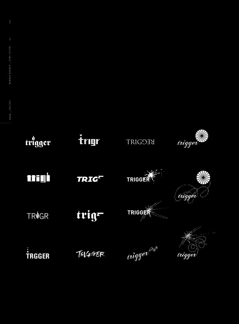
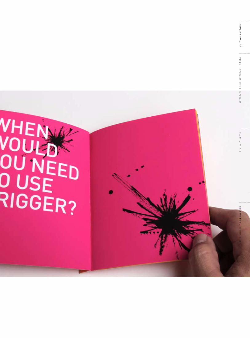
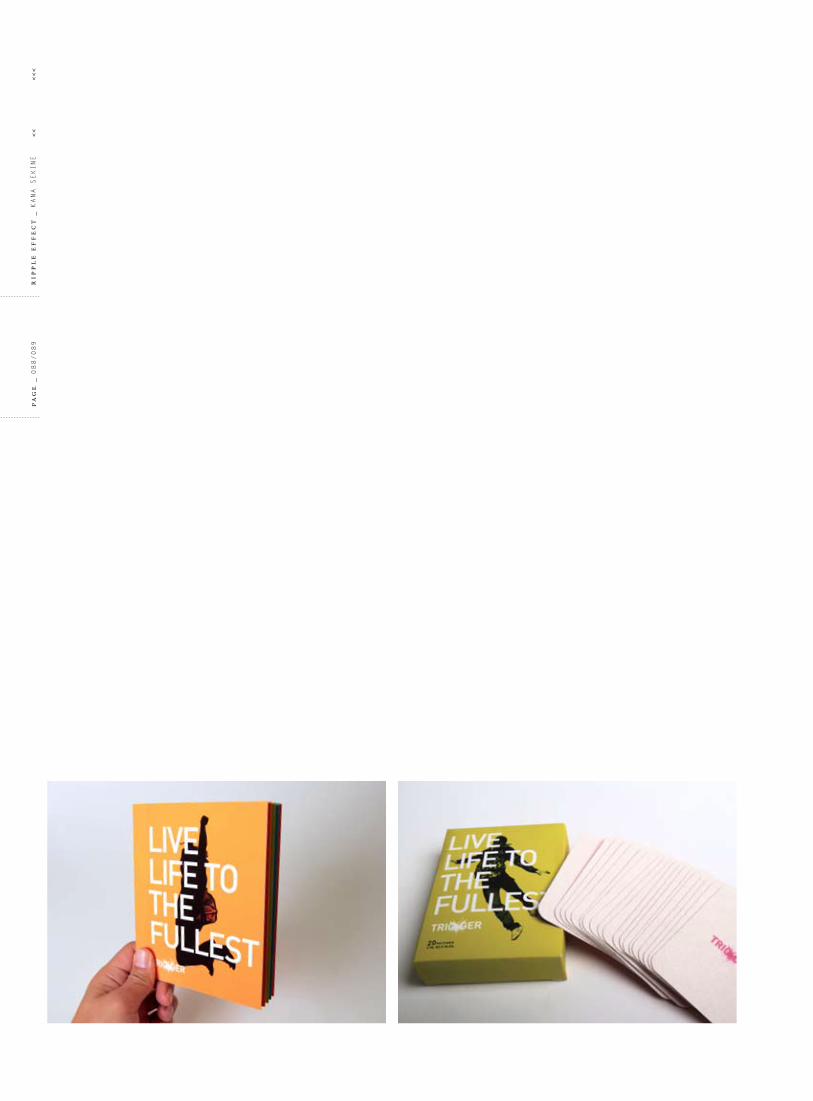
o bj e c t i v e _ to create a product which will be derived from my personal experience. i always wish i had a little more courage in certain situations, like meeting new people and making a presentation. My shyness prevents all kinds of possibilities. i created a patch which makes people confident, making their mind open and positive. the promotion included creating an identity, a brochure and a poster.
s o l u t i o n _ i named the product trigger to give you a trigger to step forward. Since the product is created by my own experiences, i tried to fit the personality that i desire which is more confident, uplifting and uninhibited. i revealed this by using hot colors and a masculine typesetting that i normally hesitate to use but i still feel comfortable.
c a t e g o r y
ProDuct ProMotion
f o r m a t
brocHure
PoSter
ProDuct
iDentity
t y p e f a c e
Din
cl
as
s _
Print1
pr
oje
ct
no
_ 04
ins
tr
uc
to
r _
jereMy Stout
tit
le
_ aVerSion to introVerSion

pa
ge
_ 080/081
rip
pl
e e
ff
ec
t _
Kana SeKine
<<
<
<<

cl
as
s _
Print1
ins
tr
uc
to
r _
jereMy Stout
tit
le
_ aVerSion to introVerSion
pr
oje
ct
no
_ 04
TRIG
REG
TRGGER
trig
pa
ge
_ 082/083
rip
pl
e e
ff
ec
t _
Kana SeKine
<<
<
<<

TRIG GER
cl
as
s _
Print1
ins
tr
uc
to
r _
jereMy Stout
tit
le
_ aVerSion to introVerSion
pr
oje
ct
no
_ 04

pa
ge
_ 084/085
rip
pl
e e
ff
ec
t _
Kana SeKine
<<
<
<<
cl
as
s _
Print1
ins
tr
uc
to
r _
jereMy Stout
tit
le
_ aVerSion to introVerSion
pr
oje
ct
no
_ 04

pa
ge
_ 086/087
rip
pl
e e
ff
ec
t _
Kana SeKine
<<
<
<<

cl
as
s _
Print1
ins
tr
uc
to
r _
jereMy Stout
tit
le
_ aVerSion to introVerSion
pr
oje
ct
no
_ 04
pa
ge
_ 088/089
rip
pl
e e
ff
ec
t _
Kana SeKine
<<
<
<<

cl
as
s _
Print1
ins
tr
uc
to
r _
jereMy Stout
tit
le
_ aVerSion to introVerSion
pr
oje
ct
no
_ 04

05Water Water eVeryWHere
pa
ge
_ 090/091
rip
pl
e e
ff
ec
t _
Kana SeKine
<<
<
<<
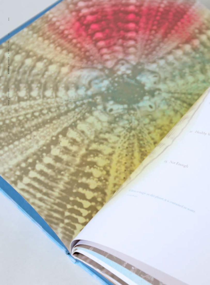
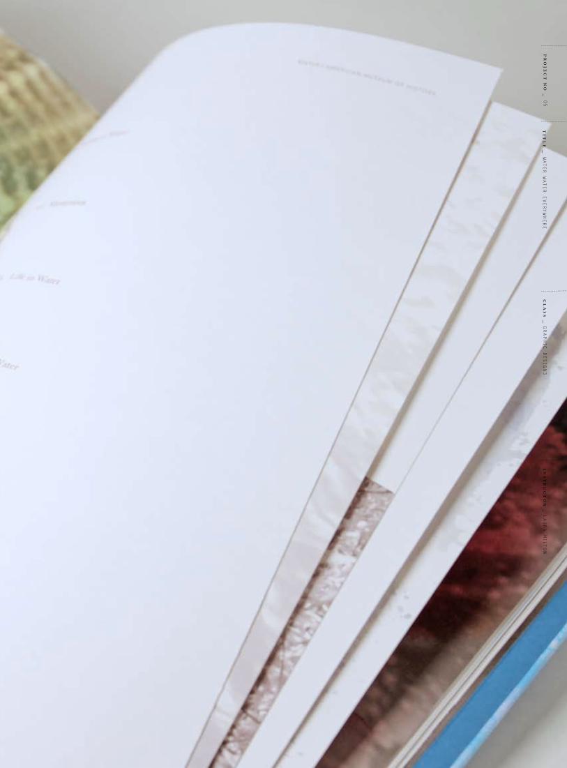
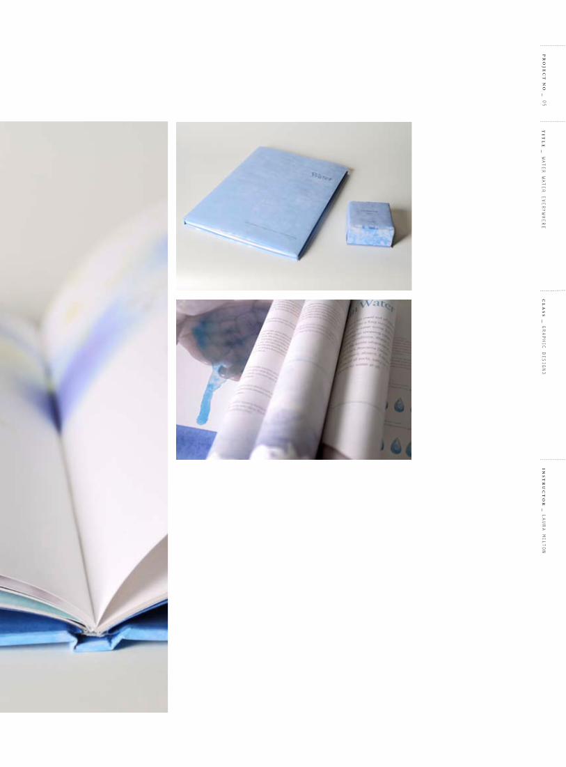
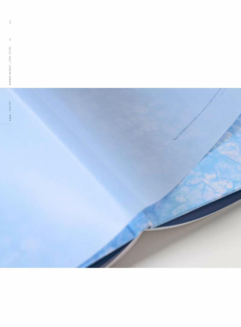
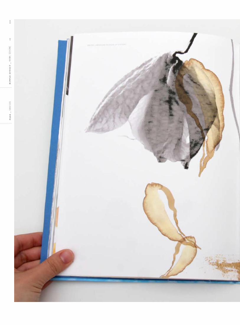
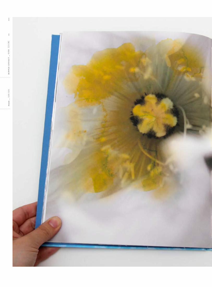
o bj e c t i v e _ to choose a museum exhibition and create a unified set of communications for the exhibit; a ticket, a poster, a promotional item and a brochure. this project promotes Water exhibition at the Museum of natural History. all the elements of this promotion will not only draw the publish in, but educate them.
s o l u t i o n _ the Water exhibition includes various kind of topics which are the basic scientific information about water, creatures in nature and environmental problems of water and so on. to unify this information visually, i combined monochromatic photographs and watercolor images. Watercolor images create a mood of the subtle but absolute power of water.
c a t e g o r y
exHibition ProMotion
f o r m a t
brocHure
PoSter
cD
ProMotion iteM
t y p e f a c e s
Granjon
aVenir
cl
as
s _
GraPHic DeSiGn3
ins
tr
uc
to
r _
laura Milton
tit
le
_ Water Water eVeryWHere
pr
oje
ct
no
_ 05
pa
ge
_ 092/093
rip
pl
e e
ff
ec
t _
Kana SeKine
<<
<
<<
cl
as
s _
GraPHic DeSiGn3
ins
tr
uc
to
r _
laura Milton
tit
le
_ Water Water eVeryWHere
pr
oje
ct
no
_ 05

pa
ge
_ 094/095
rip
pl
e e
ff
ec
t _
Kana SeKine
<<
<
<<
cl
as
s _
GraPHic DeSiGn3
ins
tr
uc
to
r _
laura Milton
tit
le
_ Water Water eVeryWHere
pr
oje
ct
no
_ 05

Water
Water
WATER
WaterO
H H
W A T E R
H2OW A T E R
H2OW A T E R
w ter
water
H2O
pa
ge
_ 096/097
rip
pl
e e
ff
ec
t _
Kana SeKine
<<
<
<<

cl
as
s _
GraPHic DeSiGn3
ins
tr
uc
to
r _
laura Milton
tit
le
_ Water Water eVeryWHere
pr
oje
ct
no
_ 05
pa
ge
_ 098/099
rip
pl
e e
ff
ec
t _
Kana SeKine
<<
<
<<

cl
as
s _
GraPHic DeSiGn3
ins
tr
uc
to
r _
laura Milton
tit
le
_ Water Water eVeryWHere
pr
oje
ct
no
_ 05
pa
ge
_ 100/101
rip
pl
e e
ff
ec
t _
Kana SeKine
<<
<
<<

cl
as
s _
GraPHic DeSiGn3
ins
tr
uc
to
r _
laura Milton
tit
le
_ Water Water eVeryWHere
pr
oje
ct
no
_ 05

pa
ge
_ 102/103
rip
pl
e e
ff
ec
t _
Kana SeKine
<<
<
<<

cl
as
s _
GraPHic DeSiGn3
ins
tr
uc
to
r _
laura Milton
tit
le
_ Water Water eVeryWHere
pr
oje
ct
no
_ 05
pa
ge
_ 104/105
rip
pl
e e
ff
ec
t _
Kana SeKine
<<
<
<<

cl
as
s _
GraPHic DeSiGn3
ins
tr
uc
to
r _
laura Milton
tit
le
_ Water Water eVeryWHere
pr
oje
ct
no
_ 05

pa
ge
_ 106/107
rip
pl
e e
ff
ec
t _
Kana SeKine
<<
<
<<

cl
as
s _
GraPHic DeSiGn3
ins
tr
uc
to
r _
laura Milton
tit
le
_ Water Water eVeryWHere
pr
oje
ct
no
_ 05

pa
ge
_ 108/109
rip
pl
e e
ff
ec
t _
Kana SeKine
<<
<
<<

cl
as
s _
GraPHic DeSiGn3
ins
tr
uc
to
r _
laura Milton
tit
le
_ Water Water eVeryWHere
pr
oje
ct
no
_ 05

pa
ge
_ 110/111
rip
pl
e e
ff
ec
t _
Kana SeKine
<<
<
<<

cl
as
s _
GraPHic DeSiGn3
ins
tr
uc
to
r _
laura Milton
tit
le
_ Water Water eVeryWHere
pr
oje
ct
no
_ 05

06erSatizfaction
pa
ge
_ 112/113
rip
pl
e e
ff
ec
t _
Kana SeKine
<<
<
<<

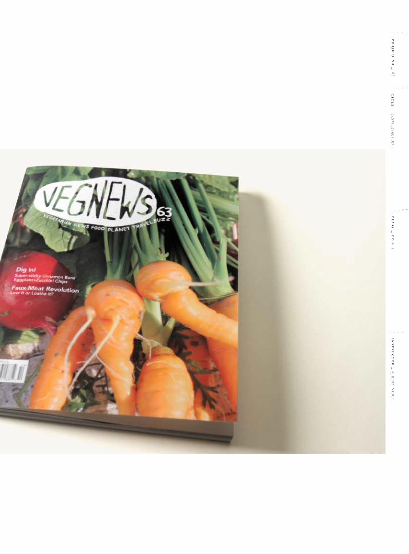
o bj e c t i v e _ to redesign the magazine Vegnews which is for vegetarians. i want to create a magazine which catches the attentions of not only people who are vegetarian but also non vegetarians. and also i want to refresh the overall look.
s o l u t i o n _ creating the masthead by using potato stamping which represents friendliness and freshness. the unique masthead will stand out enough against the competitors. the feature article is talking about faux meat. i incorporate “fake” plants which are created by animal parts to represent this subject matter.
c a t e g o r y
MaGazine reDeSiGn
f o r m a t
MaGazine
t y p e f a c e s
rocKWell
HelVetica
cl
as
s _
Print1
pr
oje
ct
no
_ 06
ins
tr
uc
to
r _
jereMy Stout
tit
le
_ erSatizfaction

pa
ge
_ 114/115
rip
pl
e e
ff
ec
t _
Kana SeKine
<<
<
<<

cl
as
s _
Print1
pr
oje
ct
no
_ 06
ins
tr
uc
to
r _
jereMy Stout
tit
le
_ erSatizfaction

VegNews
VegNews
VegNews
VegNews
VegNews
pa
ge
_ 116/117
rip
pl
e e
ff
ec
t _
Kana SeKine
<<
<
<<

cl
as
s _
Print1
pr
oje
ct
no
_ 06
ins
tr
uc
to
r _
jereMy Stout
tit
le
_ erSatizfaction

pa
ge
_ 118/119
rip
pl
e e
ff
ec
t _
Kana SeKine
<<
<
<<
cl
as
s _
Print1
pr
oje
ct
no
_ 06
ins
tr
uc
to
r _
jereMy Stout
tit
le
_ erSatizfaction

07city biKer
pa
ge
_ 120/121
rip
pl
e e
ff
ec
t _
Kana SeKine
<<
<
<<

o bj e c t i v e _ Schwinn is the most recognizable american bicycle manufacturer. the objective is to redesign their brand identity from a dated look to a modern urban feeling for the biker.
s o l u t i o n _ the shape of the symbol has an angle to represent fast motion. the colors and shape of the logo create a modern, energetic and innovative feeling.
c a t e g o r y
reDeSiGn branD iDentity
f o r m a t
iDentity
aPPlicationS
t y p e f a c e s
uniVerS
GouDy
cl
as
s _
iDentity1
pr
oje
ct
no
_ 07
ins
tr
uc
to
r _
Hunter WiMMer
tit
le
_ city biKer

pa
ge
_ 122/123
rip
pl
e e
ff
ec
t _
Kana SeKine
<<
<
<<

cl
as
s _
iDentity1
ins
tr
uc
to
r _
Hunter WiMMer
tit
le
_ city biKer
pr
oje
ct
no
_ 07

pa
ge
_ 124/125
rip
pl
e e
ff
ec
t _
Kana SeKine
<<
<
<<

cl
as
s _
iDentity1
ins
tr
uc
to
r _
Hunter WiMMer
tit
le
_ city biKer
pr
oje
ct
no
_ 07
SCHWINNSCHWINN SCHWINN
SCHWINN SCHWINN
SCHWINN
SCHWINN
SCHWINN SCHWINN

pa
ge
_ 126/127
rip
pl
e e
ff
ec
t _
Kana SeKine
<<
<
<<
icon + loGotyPe
icon
loGotyPe
cl
as
s _
iDentity1
ins
tr
uc
to
r _
Hunter WiMMer
tit
le
_ city biKer
pr
oje
ct
no
_ 07

pa
ge
_ 128/129
rip
pl
e e
ff
ec
t _
Kana SeKine
<<
<
<<

cl
as
s _
iDentity1
ins
tr
uc
to
r _
Hunter WiMMer
tit
le
_ city biKer
pr
oje
ct
no
_ 07

pa
ge
_ 130/131
rip
pl
e e
ff
ec
t _
Kana SeKine
<<
<
<<

cl
as
s _
iDentity1
ins
tr
uc
to
r _
Hunter WiMMer
tit
le
_ city biKer
pr
oje
ct
no
_ 07

08SWaDDlinG HaPPineSS
pa
ge
_ 132/133
rip
pl
e e
ff
ec
t _
Kana SeKine
<<
<
<<

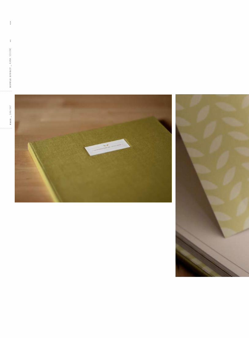
o bj e c t i v e _ to redesign a brand identity and products. i picked california baby, which is a skin care product brand for infants. their products are made by all-natural and organic ingredients. although california baby products are specialized for babies, about 40 percent of users are adults. for that reason, the objective is to redesign the brand identity with a more contemporary, trendy and sophisticated look. it’s also important to tell the audience that all their products are fresh, safe and reliable.
s o l u t i o n _ the symbol is created by the initial of california baby “c” and “b”, and they are formed as an apple shape. the logo’s colors and shape represent the freshness and soothing nature of the infant skin care products of california baby. the entire brand image also represents the same qualities.
c a t e g o r y
branD iDentity reDeSiGn
f o r m a t
iDentity
aPPlicationS
t y p e f a c e s
filoSofia
uniVerS
cl
as
s _
iDentity2
pr
oje
ct
no
_ 08
ins
tr
uc
to
r _
tHoMaS Mcnulty
tit
le
_ SWaDDlinG HaPPineSS

pa
ge
_ 134/135
rip
pl
e e
ff
ec
t _
Kana SeKine
<<
<
<<
cl
as
s _
iDentity2
pr
oje
ct
no
_ 08
ins
tr
uc
to
r _
tHoMaS Mcnulty
tit
le
_ SWaDDlinG HaPPineSS

pa
ge
_ 136/137
rip
pl
e e
ff
ec
t _
Kana SeKine
<<
<
<<

cl
as
s _
iDentity2
pr
oje
ct
no
_ 08
ins
tr
uc
to
r _
tHoMaS Mcnulty
tit
le
_ SWaDDlinG HaPPineSS

pa
ge
_ 138/139
rip
pl
e e
ff
ec
t _
Kana SeKine
<<
<
<<

3.5˝
2˝
1.4˝
0.46˝
{ Manager }
Kana SeKine { tel }
415.123. 2229 { web }
californiababy.com{ address }
1050 Gayley ave Los angeles, Ca 90024
{ Manager }
Kana SeKine { tel }
415.123. 2229 { web }
californiababy.com{ address }
1050 Gayley ave Los angeles, Ca 90024
0.35˝
0.46˝
8.5˝
11˝{ Manager } Kana SeKine { adders }
1050 Gayley ave Los angeles, Ca 90024
MrS. SeiKo TaKada152 roMe ST San FranCiSCo, Ca 94112
0.3˝
0.55˝
9.5˝
4.125˝
cl
as
s _
iDentity2
pr
oje
ct
no
_ 08
ins
tr
uc
to
r _
tHoMaS Mcnulty
tit
le
_ SWaDDlinG HaPPineSS

pa
ge
_ 140/141
rip
pl
e e
ff
ec
t _
Kana SeKine
<<
<
<<

cl
as
s _
iDentity2
pr
oje
ct
no
_ 08
ins
tr
uc
to
r _
tHoMaS Mcnulty
tit
le
_ SWaDDlinG HaPPineSS

pa
ge
_ 142/143
rip
pl
e e
ff
ec
t _
Kana SeKine
<<
<
<<

B o d y w a s h8 . 5 o z
L o t i o n6 . 5 o z
cl
as
s _
iDentity2
pr
oje
ct
no
_ 08
ins
tr
uc
to
r _
tHoMaS Mcnulty
tit
le
_ SWaDDlinG HaPPineSS

Present this card every purchase at California Baby. it cannot be redeemed or returned
for cash or applied as payment to any account unless required by law. Please protect
this card and treat as you would cash. it cannot be replaced if lost or stolen.
Number
Further information
californiababy.com
Name
pa
ge
_ 144/145
rip
pl
e e
ff
ec
t _
Kana SeKine
<<
<
<<

abcdefghijk lMnopqrstu v w x yz abcdefghijk lmnopqrstuv w x yz1234567890!?@$%*() _ +
a bcdefghijklmnopqrstu v w x y z abcdefghijk lmnopqrstuv w x yz1234567890!?@$%*()_+
FiLoSoFia UniCaSe
FiLoSoFia reGUL ar
abcdefghijklmnopqrstuvwxyz
abcdefghijklmnopqrstuvwxyz
1234567890!?@$%*()_+
aBCdeFGhijKLMnoPqrSTUvwxyz abcdefghijklmnopqrstuvwxyz1234567890!?@$%*()_+
UniverS roMan
UniverS LiGhT
cl
as
s _
iDentity2
pr
oje
ct
no
_ 08
ins
tr
uc
to
r _
tHoMaS Mcnulty
tit
le
_ SWaDDlinG HaPPineSS
pa
ge
_ 146/147
rip
pl
e e
ff
ec
t _
Kana SeKine
<<
<
<<

cl
as
s _
iDentity2
pr
oje
ct
no
_ 08
ins
tr
uc
to
r _
tHoMaS Mcnulty
tit
le
_ SWaDDlinG HaPPineSS
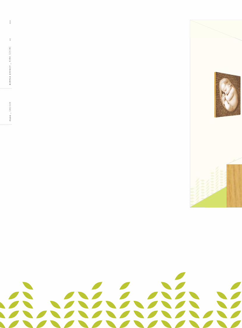
for silky skin
pa
ge
_ 148/149
rip
pl
e e
ff
ec
t _
Kana SeKine
<<
<
<<

for silky skin
cl
as
s _
iDentity2
pr
oje
ct
no
_ 08
ins
tr
uc
to
r _
tHoMaS Mcnulty
tit
le
_ SWaDDlinG HaPPineSS

pa
ge
_ 150/151
rip
pl
e e
ff
ec
t _
Kana SeKine
<<
<
<<

cl
as
s _
iDentity2
pr
oje
ct
no
_ 08
ins
tr
uc
to
r _
tHoMaS Mcnulty
tit
le
_ SWaDDlinG HaPPineSS

09iDentity collection
pa
ge
_ 152/153
rip
pl
e e
ff
ec
t _
Kana SeKine
<<
<
<<

this section of the book shows that i have created in different projects; some of them are introduced in previous chapters while others aren’t. each brand identity has a particular story and meaning behind it.
c a t e g o r y
n/a
f o r m a t
iDentity
t y p e f a c e s
n/a
pr
oje
ct
no
_ 09
tit
le
_ iDentity collection

TRIG GER
Fi LLs t u d i o
pa
ge
_ 154/155
rip
pl
e e
ff
ec
t _
Kana SeKine
<<
<
<<
A U A R I U M OF T H E BAY
pr
oje
ct
no
_ 09
tit
le
_ iDentity collection

TRIG GER
Fi LLs t u d i o
pa
ge
_ 156/157
rip
pl
e e
ff
ec
t _
Kana SeKine
<<
<
<<
A U A R I U M OF T H E BAY
pr
oje
ct
no
_ 09
tit
le
_ iDentity collection

tHanK you
thank you to everyone for belilieving in me throughout the years. i would not be here without all your warm support and love.
pa
ge
_ 158/159
rip
pl
e e
ff
ec
t _
Kana SeKine
<<
<
<<
fa m i l y _ My Mother / My father /My husband / Haru / My brother / My Parents-in-law / Mama cora / yuko / David / Saya
fa c u l t y _ Mary Scott / roland young / carolina de bartolo / thomas Mcnulty / Max Spector / jeremy Stout / Hunter Wimmer / rose Hodges / laura Milton / tom Sieu / ariel Grey / Monica Dengo / renee D’arcy / Scot crisp
f r i e n d _ Misa / Peizhu / Won / ingrid / tateshita / Seiko / adam / florian / jane / Sachiko / naoko / Sunhye / yujin / Ken / rose / nicole / jayde / caitlyn / emily / Victoria / erik / Karen / ryan / eisuke / eunice / joanne / lauren
s e r v i c e _ the Key Printing & binding / Plotnet / bPS / copy central / Paper Source / calumet / flax / arch

bfa design port fol io _ Kana Sekinecl a ss _ Senior Portfolio Spring 2010i nst ruc tor _ Mary Scottbook t i t l e _ ripple effectfor m at _ 8.5x11.5 inchesdesign & w r i t i ng _ Kana Sekinepa pe r _ neenah / classic crest / 100text / Solar Whitet y pogr a ph y _ letter Gothic / Sabonsof t wa r e _ adobe creative Suite3 / aperturec a m e r a _ canon 7dphotogr a ph y _ Kana Sekinesc a n n e r _ canoScan lide90pr i n t e r _ Plotnet / 415.762.0200bi n de ry _ the Key Printing & binding / 510.595.3311
coloPHon
pa
ge
_ 160
rip
pl
e e
ff
ec
t _
Kana SeKine
<<
<
<<