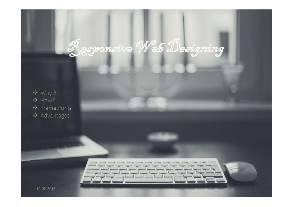
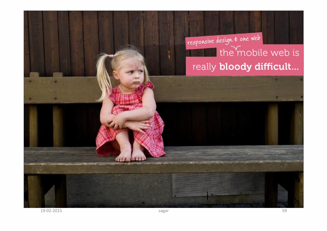
responsive web desing
TRANSCRIPT
19-02-2015 sagar 1
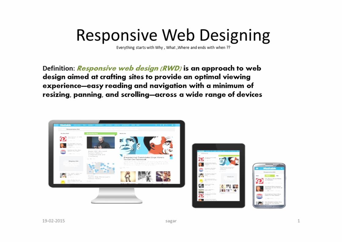
19-02-2015 sagar 2
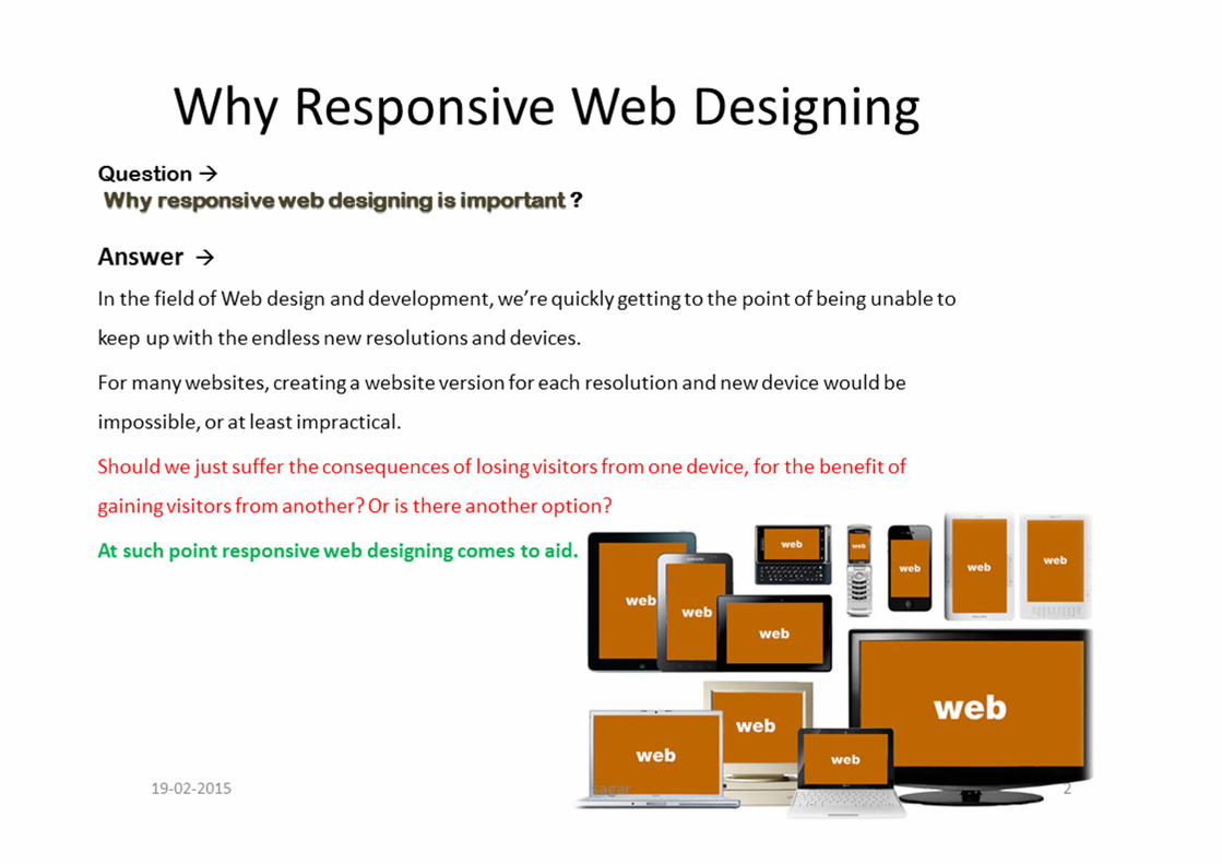
19-02-2015 sagar 3
sagar 419-02-2015
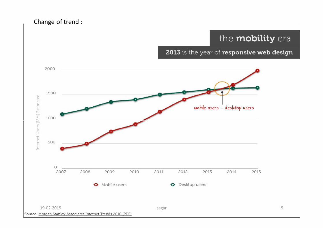
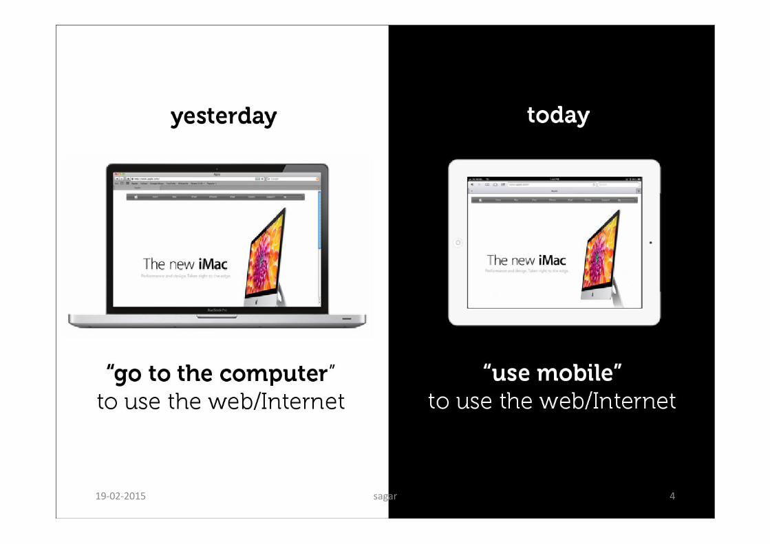
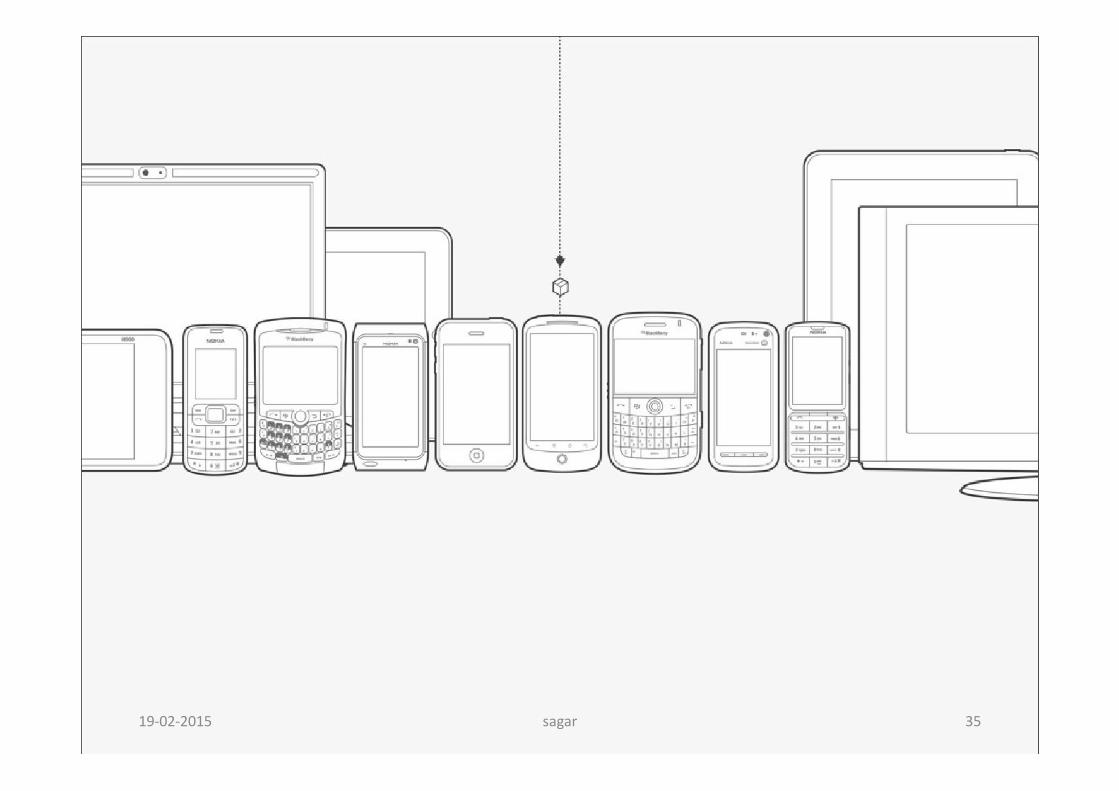
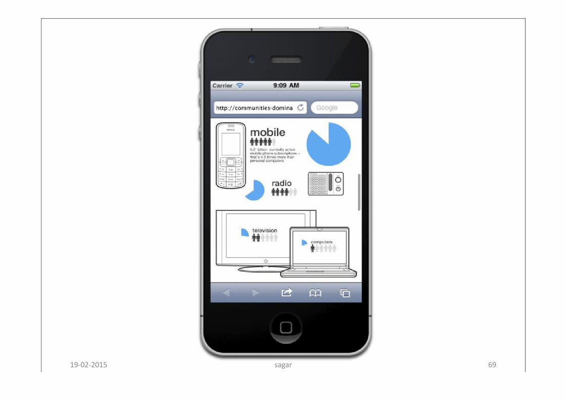
Change of trend :
sagar 519-02-2015
sagar 619-02-2015
sagar 719-02-2015

sagar 819-02-2015

sagar 919-02-2015
sagar 1019-02-2015
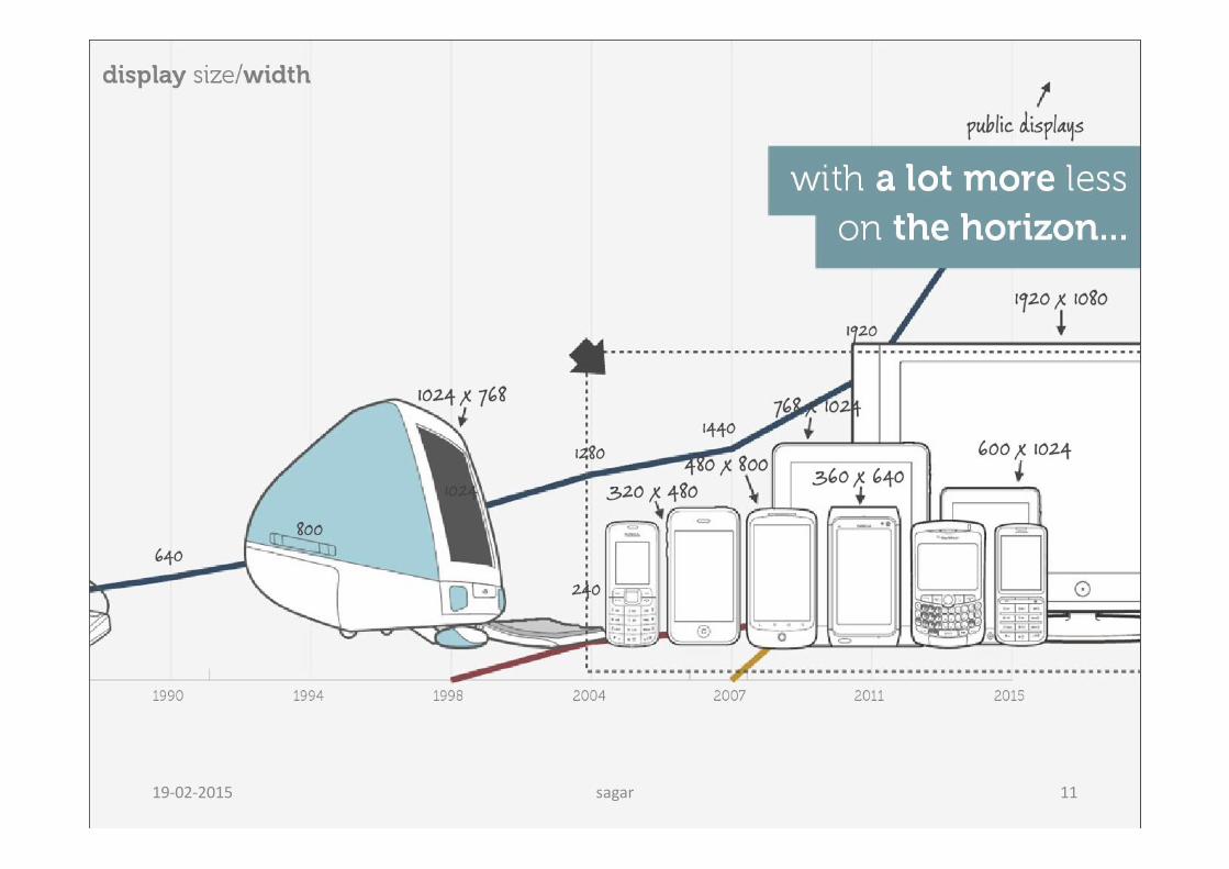
sagar 1119-02-2015
sagar 1219-02-2015

sagar 1319-02-2015

sagar 1419-02-2015
sagar 1519-02-2015
sagar 1619-02-2015
sagar 1719-02-2015
sagar 1819-02-2015

sagar 1919-02-2015

sagar 2019-02-2015
sagar 2119-02-2015
sagar 2219-02-2015

sagar 2319-02-2015

sagar 2419-02-2015

sagar 2519-02-2015
sagar 2619-02-2015
sagar 2719-02-2015
sagar 2819-02-2015
sagar 2919-02-2015
sagar 3019-02-2015
sagar 3119-02-2015

sagar 3219-02-2015
sagar 3319-02-2015
sagar 3419-02-2015
sagar 3519-02-2015
sagar 3619-02-2015
sagar 3719-02-2015

sagar 3819-02-2015

sagar 3919-02-2015
sagar 4019-02-2015
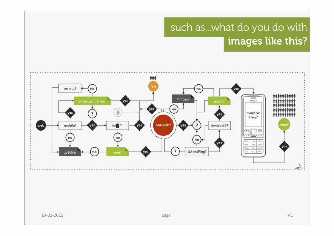
sagar 4119-02-2015
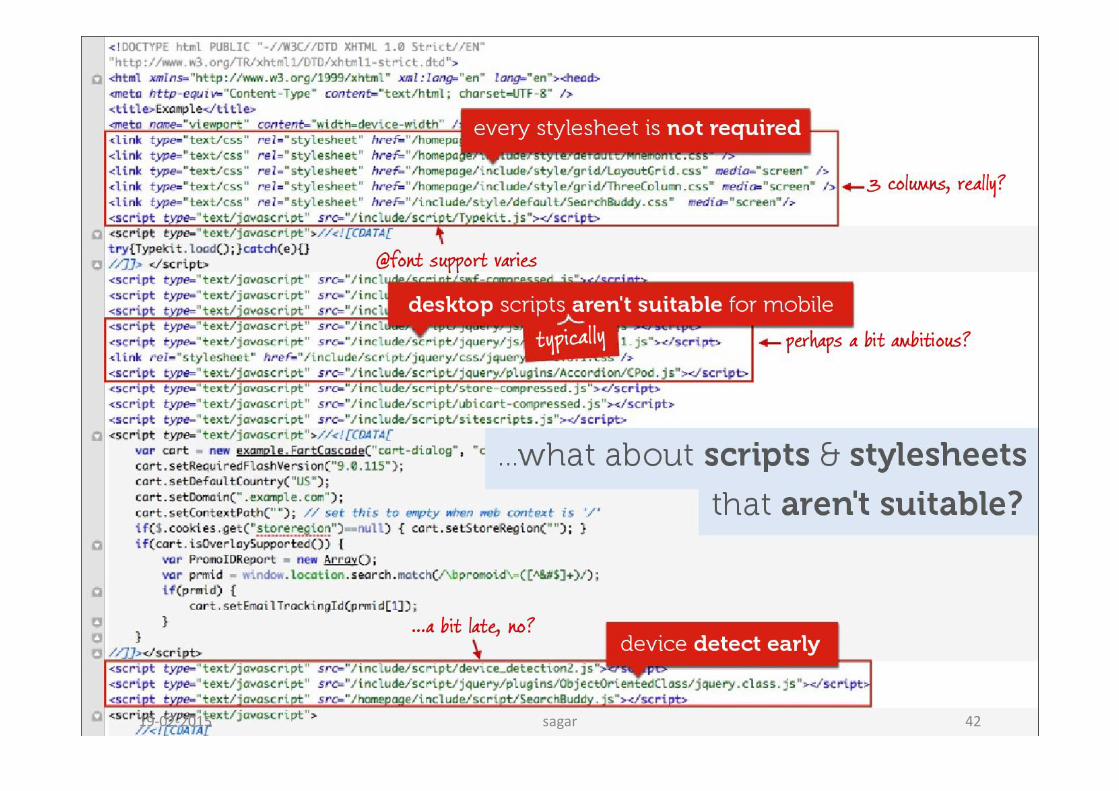
sagar 4219-02-2015
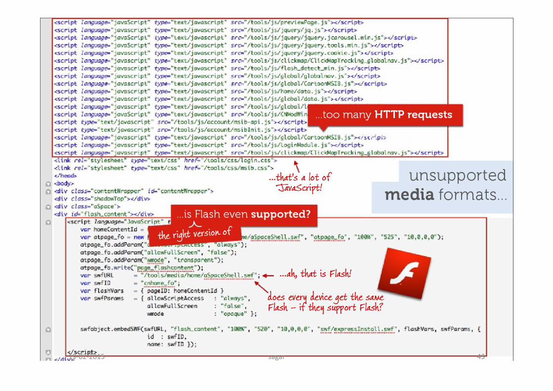
sagar 4319-02-2015
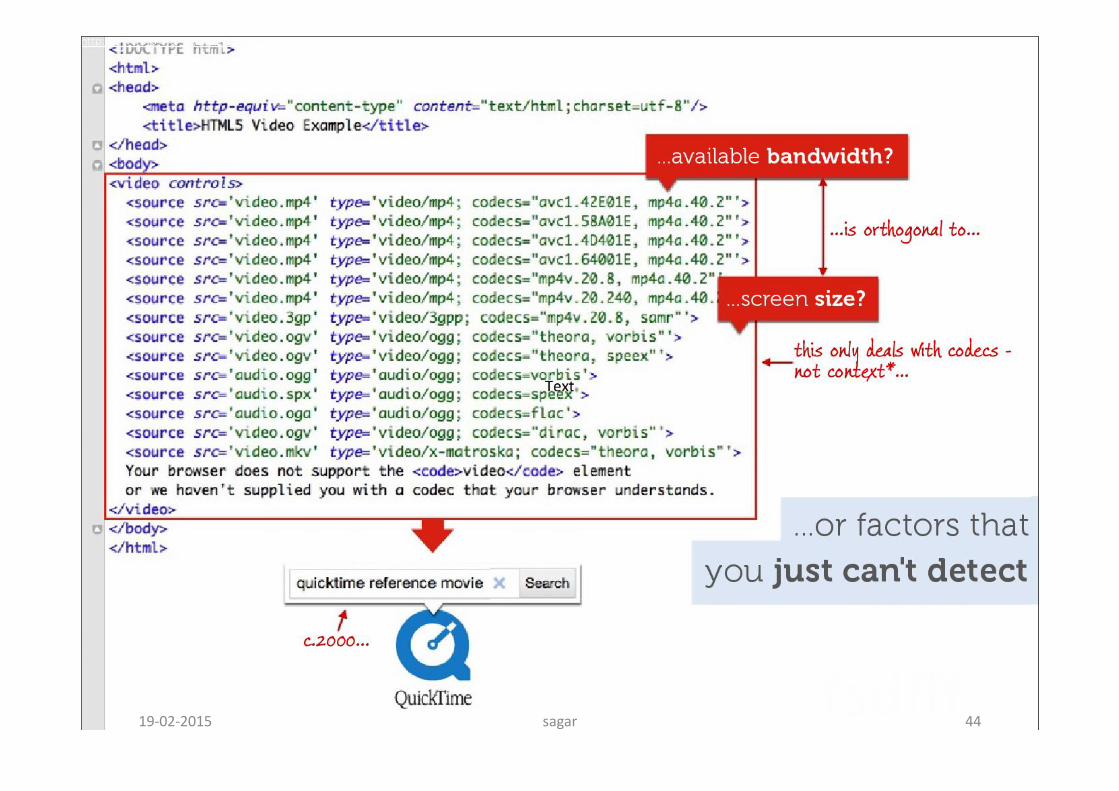
sagar 4419-02-2015
sagar 4519-02-2015
sagar 4619-02-2015
sagar 4719-02-2015

sagar 4819-02-2015

sagar 4919-02-2015

sagar 5019-02-2015
sagar 5119-02-2015

sagar 5219-02-2015
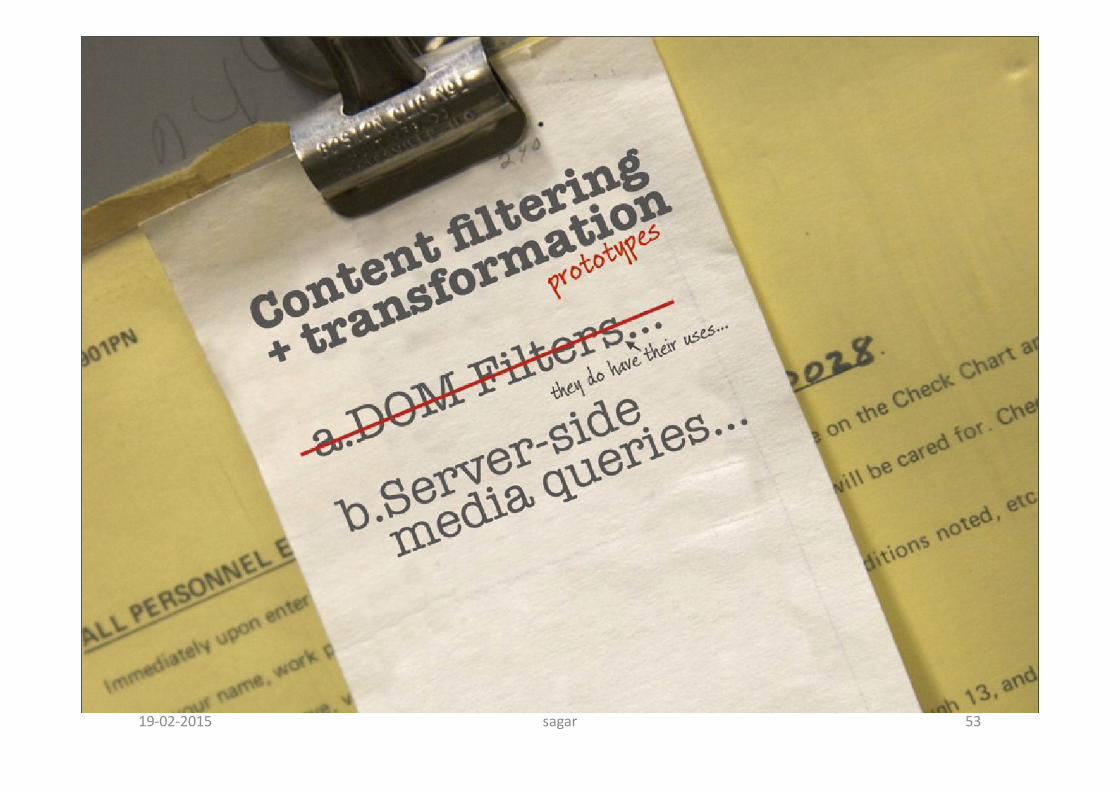
sagar 5319-02-2015

sagar 5419-02-2015

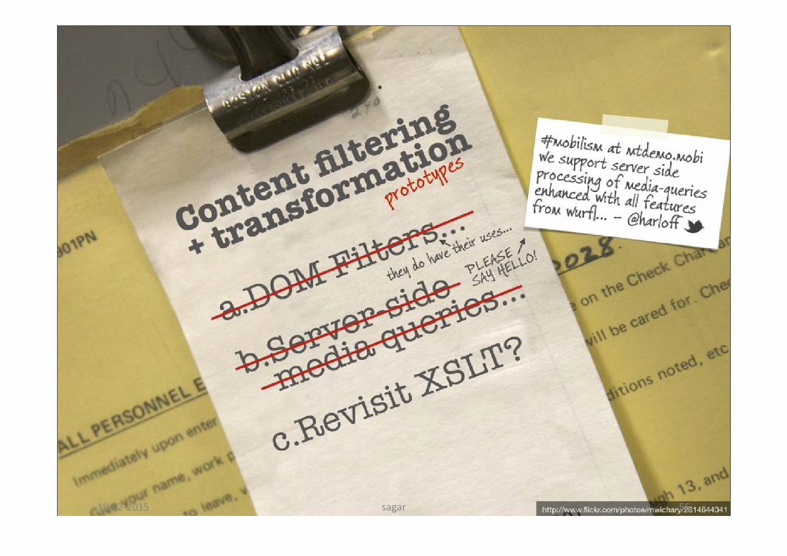
sagar 5519-02-2015
sagar 5619-02-2015

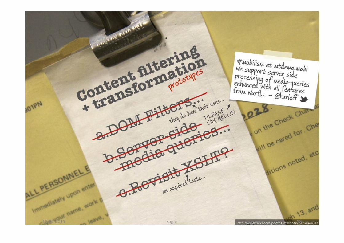
sagar 5719-02-2015
sagar 5819-02-2015
sagar 5919-02-2015

sagar 6019-02-2015

sagar 6119-02-2015

sagar 6219-02-2015

sagar 6319-02-2015
sagar 6419-02-2015

sagar 6519-02-2015
sagar 6619-02-2015
sagar 6719-02-2015
sagar 6819-02-2015
sagar 6919-02-2015

sagar 7019-02-2015
sagar 7119-02-2015
sagar 7219-02-2015

sagar 7319-02-2015
sagar 7419-02-2015

sagar 7519-02-2015
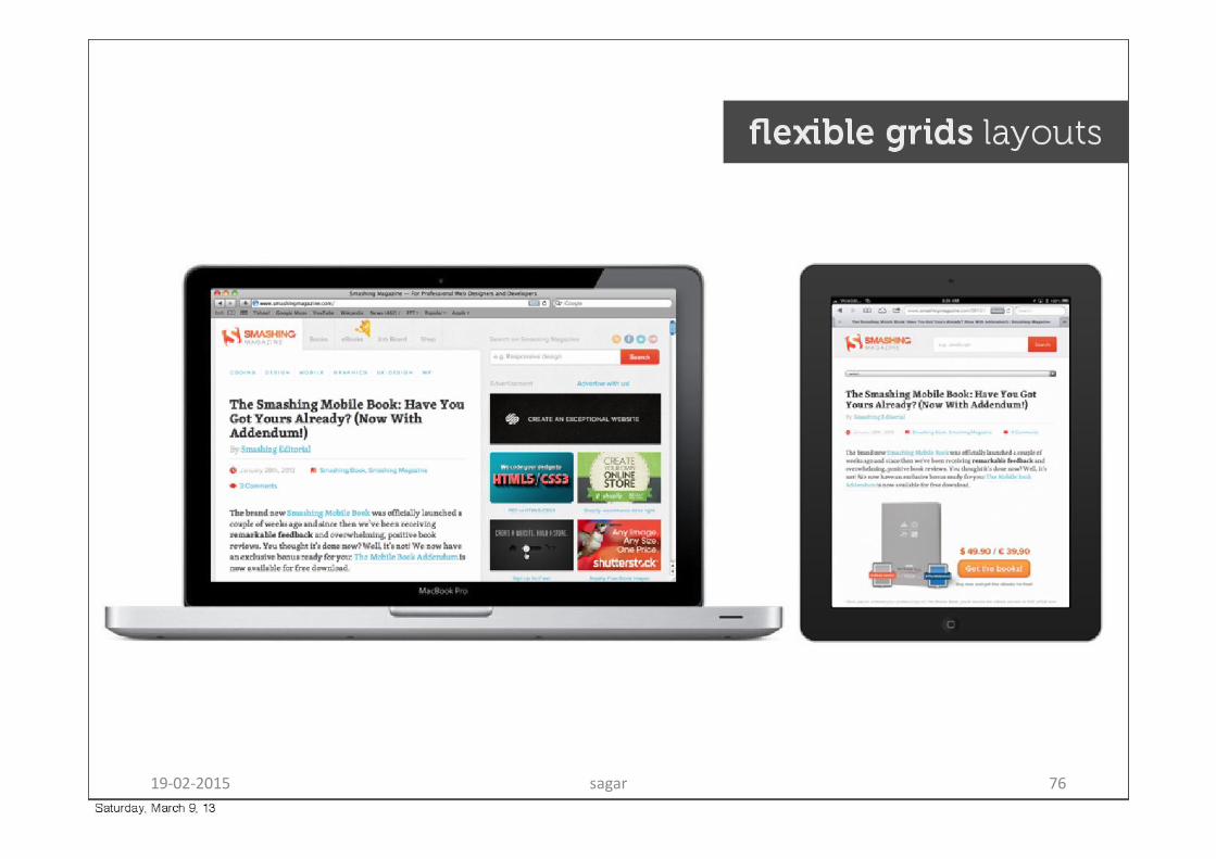
sagar 7619-02-2015
sagar 7719-02-2015
sagar 7819-02-2015
sagar 7919-02-2015
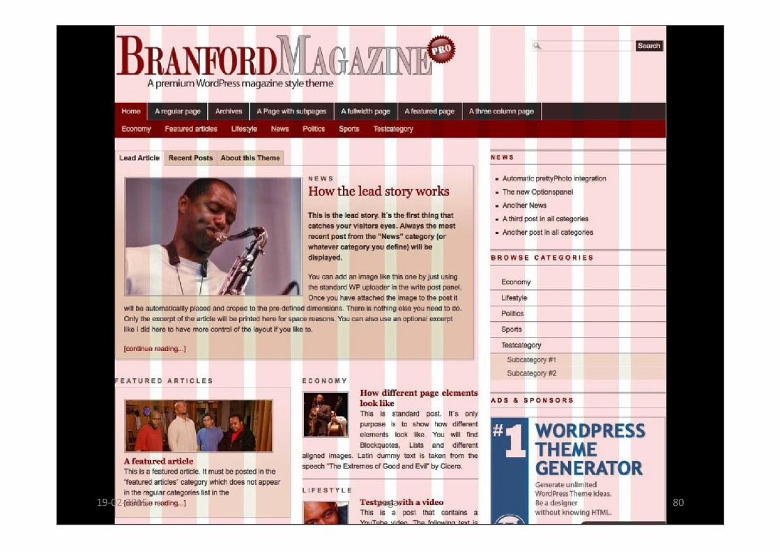
sagar 8019-02-2015
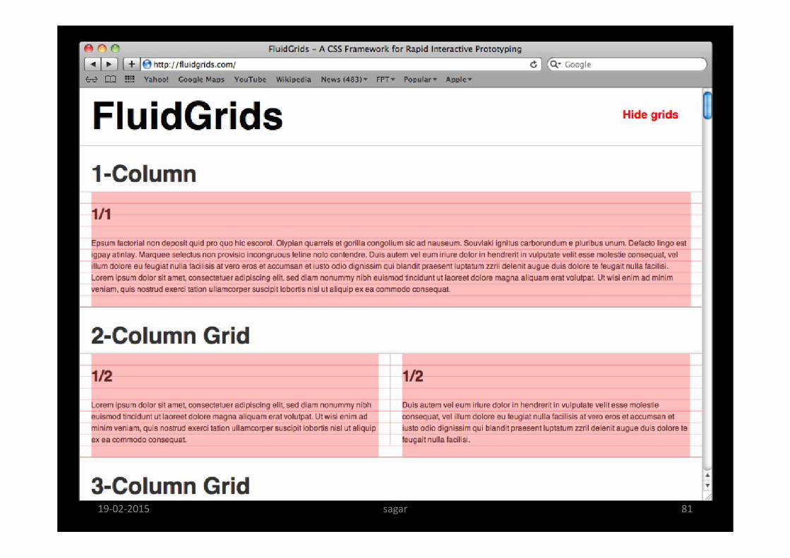
sagar 8119-02-2015
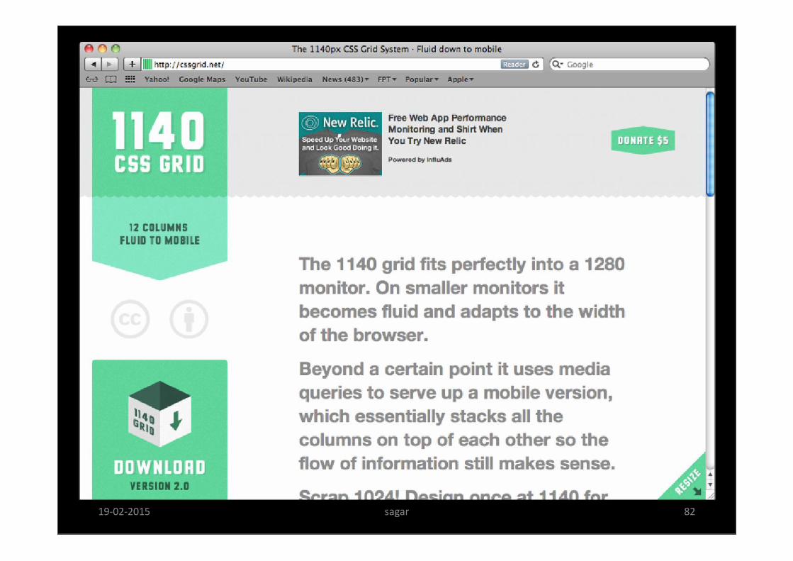
sagar 8219-02-2015
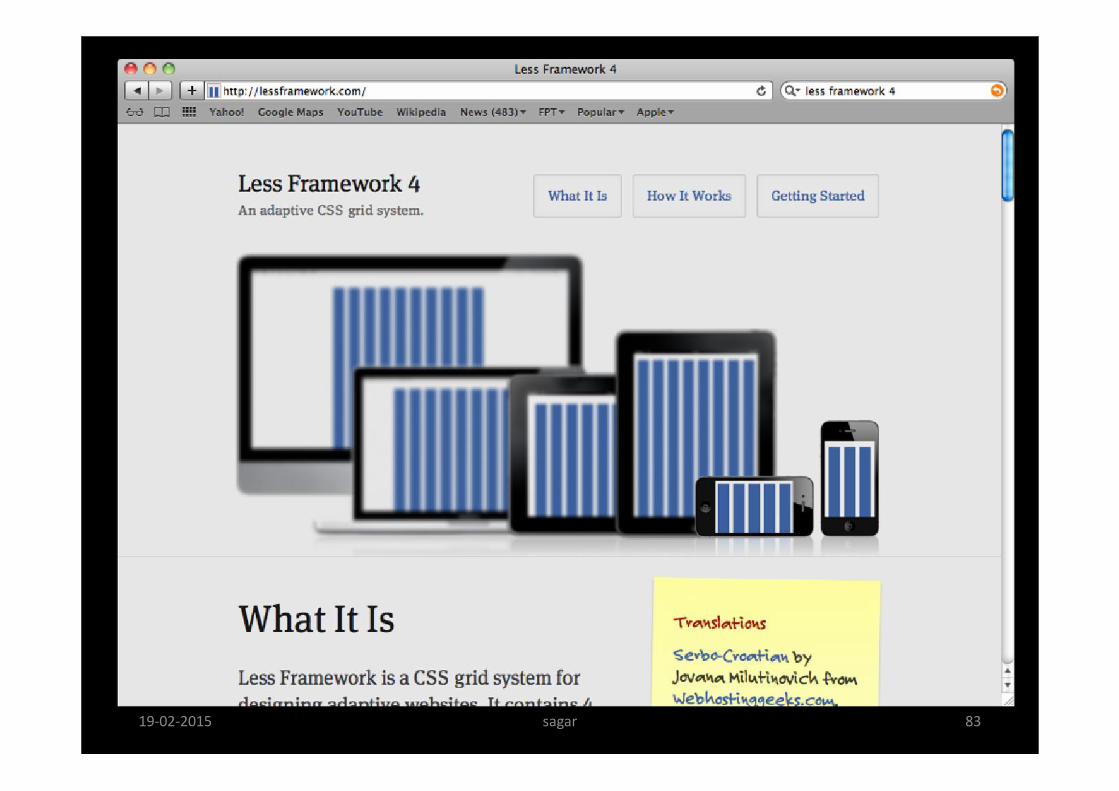
sagar 8319-02-2015
sagar 8419-02-2015

sagar 8519-02-2015
sagar 8619-02-2015
sagar 8719-02-2015
sagar 8819-02-2015

sagar 8919-02-2015
sagar 9019-02-2015
sagar 9119-02-2015
sagar 9219-02-2015

sagar 9319-02-2015
sagar 9419-02-2015

sagar 9519-02-2015

sagar 9619-02-2015
sagar 9719-02-2015
sagar 9819-02-2015
sagar 9919-02-2015
sagar 10019-02-2015

sagar 10119-02-2015

sagar 10219-02-2015
sagar 10319-02-2015
sagar 10419-02-2015
sagar 10519-02-2015
sagar 10619-02-2015
sagar 10719-02-2015

sagar 10819-02-2015
sagar 10919-02-2015
19-02-2015 sagar 110

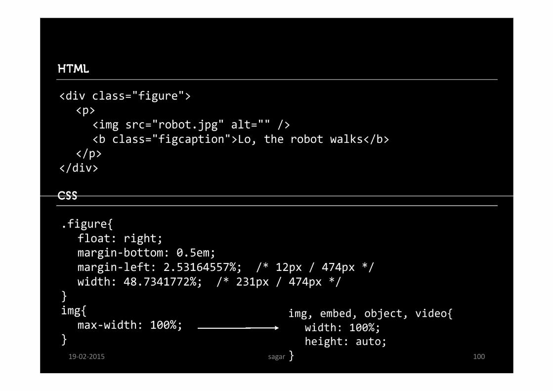
img { max-width: 100%; height: auto; }
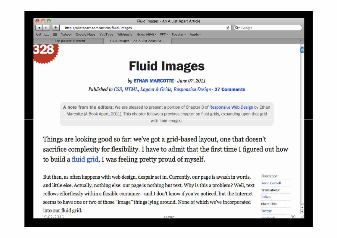
Fluid Images One way around this is to size images in relative units, rather than absolutepixel dimensions.
The most common relative solution is to set the max-width at the image at 100%and the data-fullsrc attribute
sagar 11119-02-2015
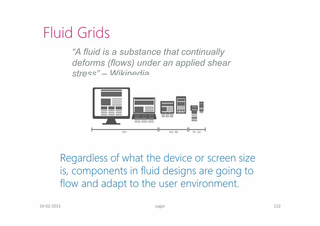
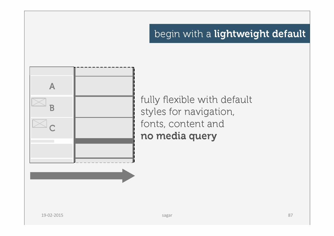
Fluid Grids “A fluid is a substance that continually deforms (flows) under an applied shear stress” – Wikipedia
Regardless of what the device or screen size is, components in fluid designs are going to flow and adapt to the user environment.
sagar 11219-02-2015
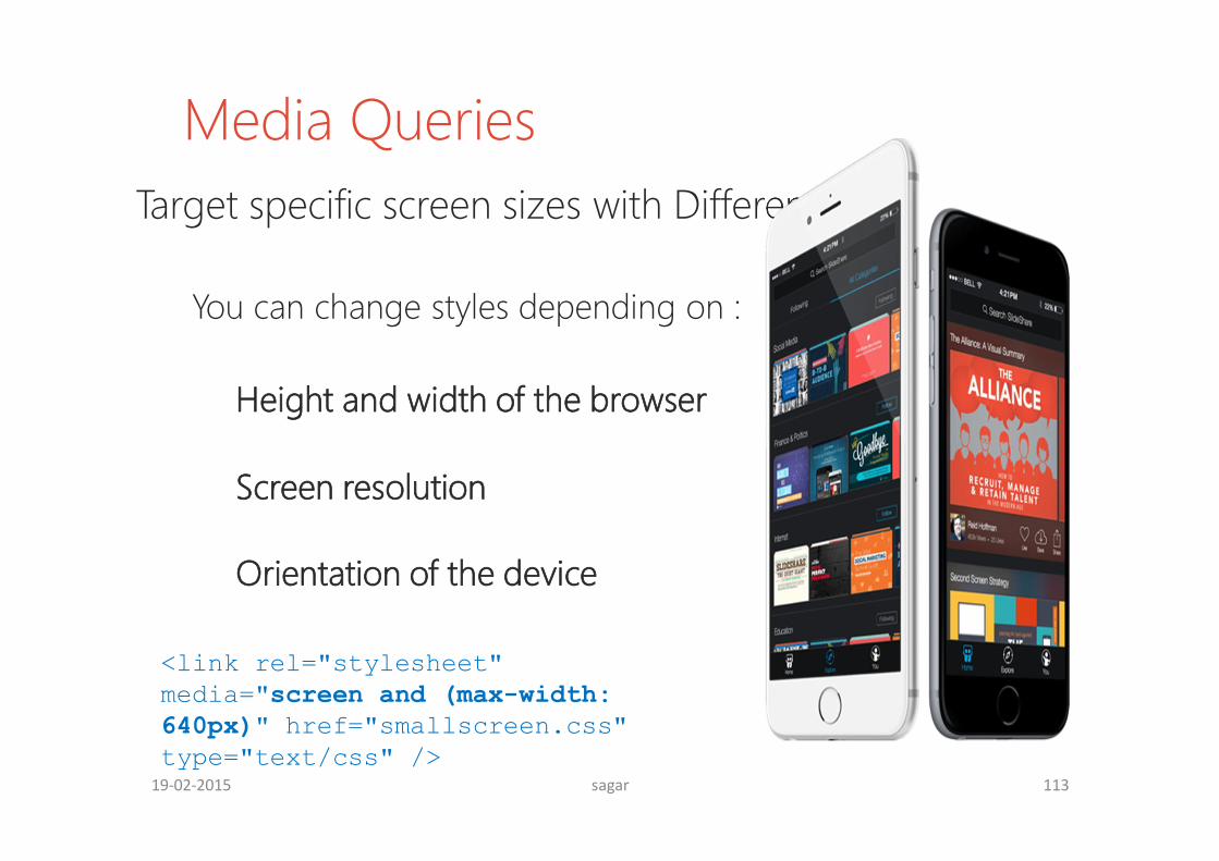
Media Queries
<link rel="stylesheet" media="screen and (max-width: 640px)" href="smallscreen.css" type="text/css" />
Target specific screen sizes with Different styles
You can change styles depending on :
Height and width of the browser
Screen resolution
Orientation of the device
sagar 11319-02-2015
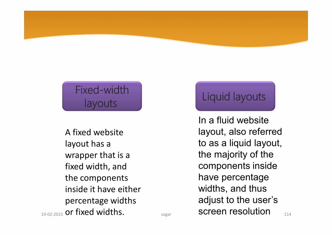
In a fluid website layout, also referred to as a liquid layout, the majority of the components inside have percentage widths, and thus adjust to the user’s screen resolution
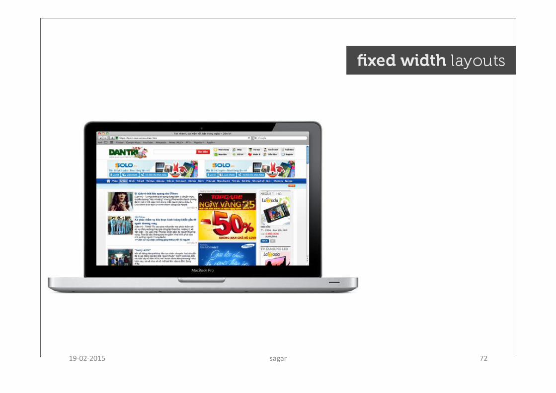
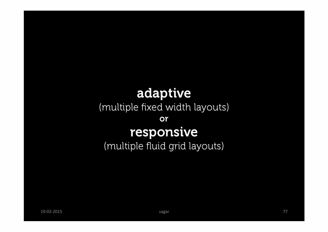
Fixed-width layouts Liquid layouts
A fixed website layout has a wrapper that is a fixed width, and the components inside it have either percentage widths or fixed widths. sagar 11419-02-2015
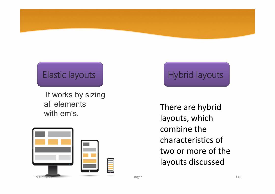
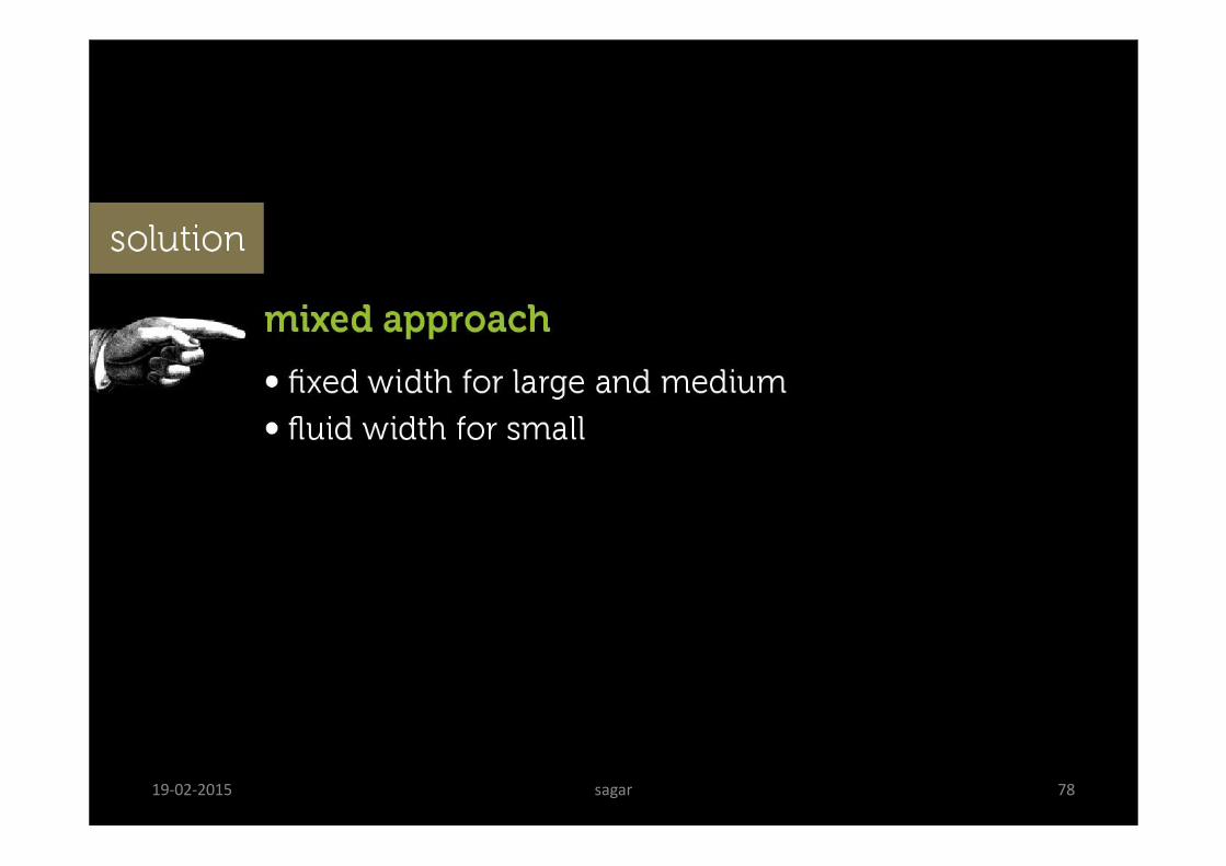
Elastic layouts Hybrid layouts
There are hybrid layouts, which combine the characteristics of two or more of the layouts discussed
It works by sizing all elements with em‘s.
sagar 11519-02-2015
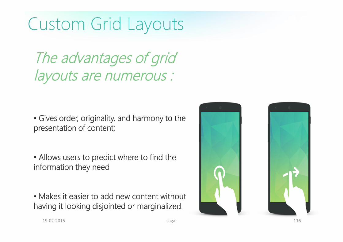
The advantages of grid layouts are numerous :
• Gives order, originality, and harmony to the presentation of content;
• Allows users to predict where to find the information they need
• Makes it easier to add new content without having it looking disjointed or marginalized.
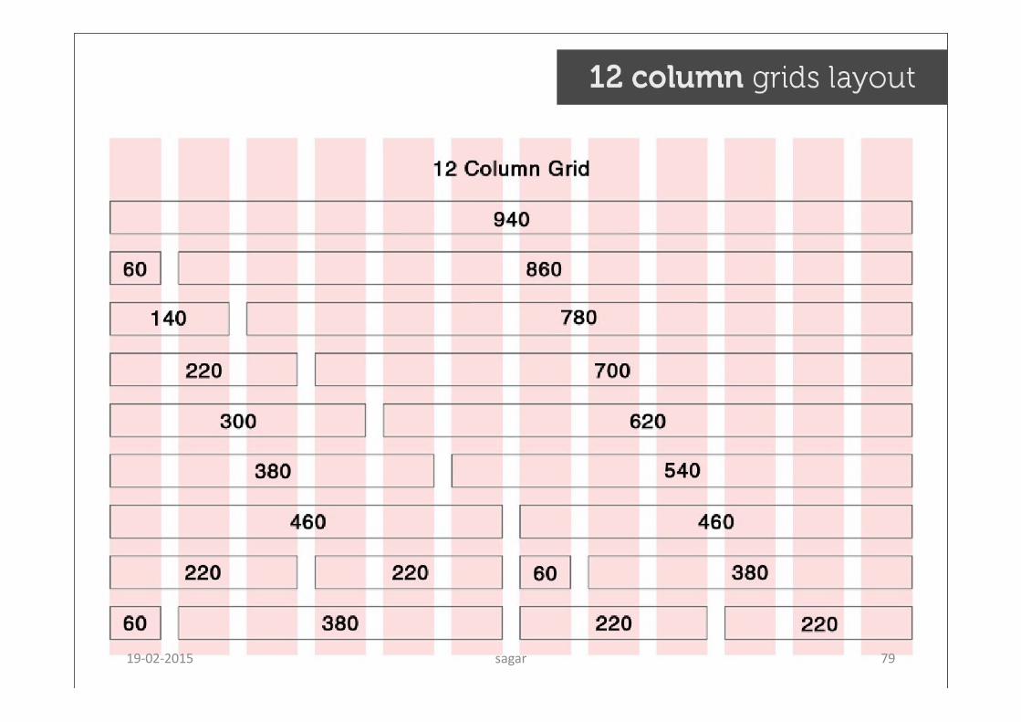
Custom Grid Layouts
sagar 11619-02-2015
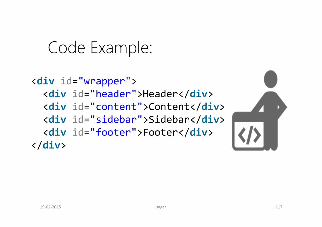
<div id="wrapper"><div id="header">Header</div><div id="content">Content</div><div id="sidebar">Sidebar</div><div id="footer">Footer</div>
</div>
Code Example:
sagar 11719-02-2015
sagar 11819-02-2015

sagar 11919-02-2015

sagar 12019-02-2015
sagar 12119-02-2015
sagar 12219-02-2015
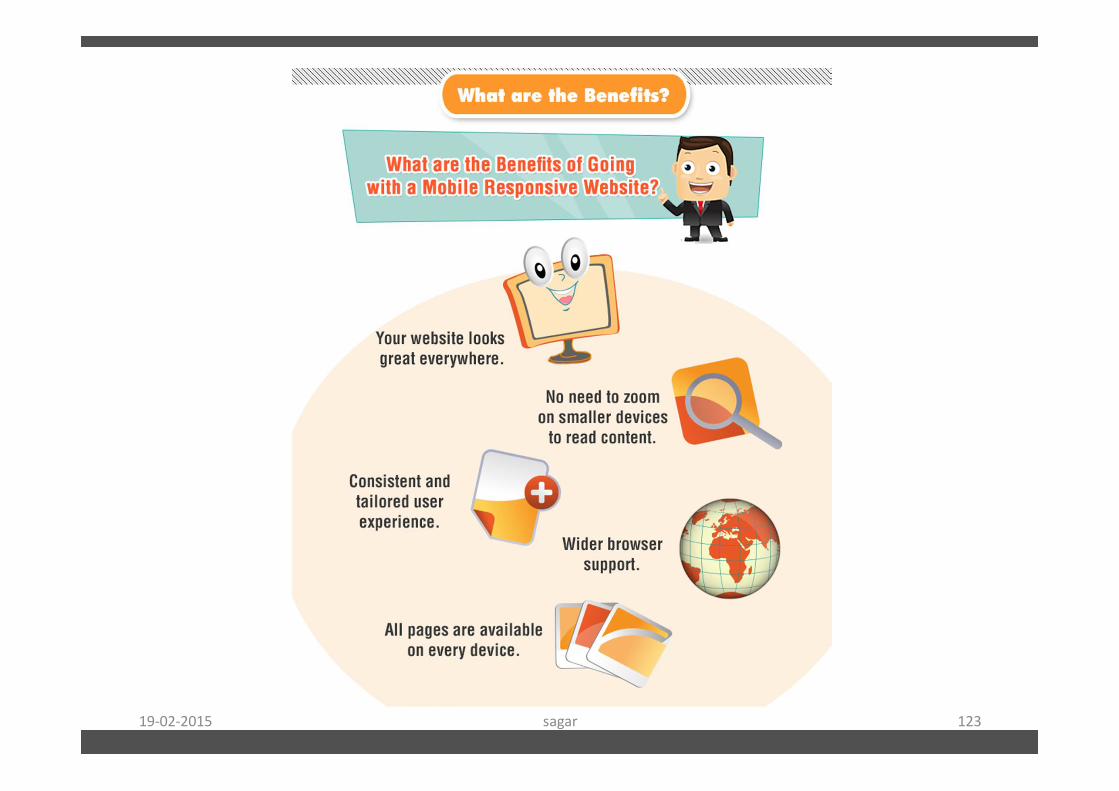
sagar 12319-02-2015
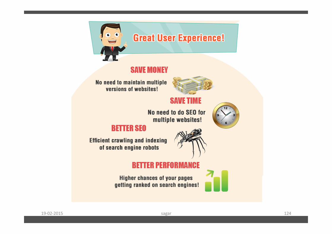
sagar 12419-02-2015
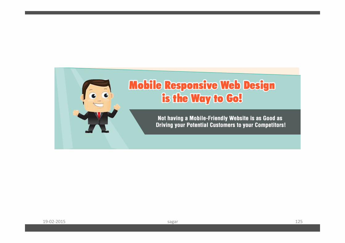
sagar 12519-02-2015

sagar 12619-02-2015
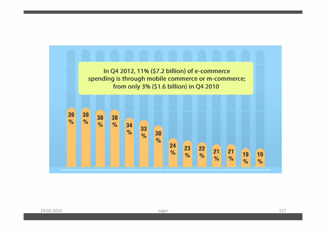
sagar 12719-02-2015
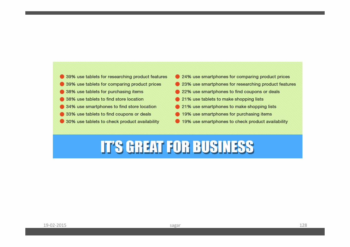
sagar 12819-02-2015
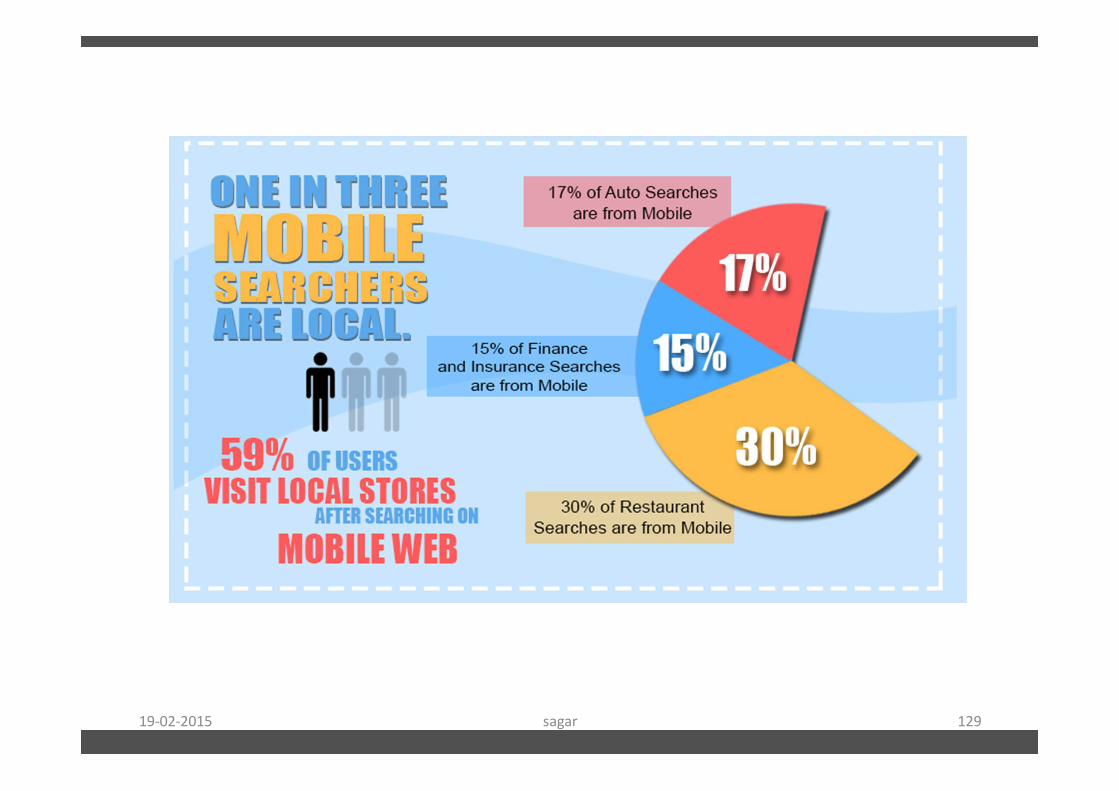
sagar 12919-02-2015

sagar 13019-02-2015

sagar 13119-02-2015
sagar 13219-02-2015

sagar 13319-02-2015