responsive web design - smashing...
TRANSCRIPT

S!"#$%&' B(() 5
Real-LifeResponsiveWeb Design

Published 2015 by Smashing Magazine GmbH, Freiburg, Germany.Printed in the EU. ISBN: 978-3-945749-21-0
Cover Design by Jessica Hische. Cover Illustrations by Guillaume Kurkdjian.Layout and Typesetting by Markus Seyfferth.Editing and Quality Control by Vitaly Friedman. Copyedit and Proofread by Owen Gregory.eBook Production by Cosima Mielke.Typefaces used: Elena and Ideal Sans.
The book has been written and reviewed by Andrew Clarke, Ben Callahan, Bram Stein, Chris Coyier, Dan Mall, Dmitry Baranovskiy, Eileen Webb, Emily Gray, Fabio Carneiro, Jake Archibald, James Williamson, John Allsopp, Lisa Maria Martin, Marko Dugonjić, Matt Gaunt, Patrick Hamann, Sara Soueidan, Tom Maslen, Viljami Salminen, Vitaly Friedman, Yoav Weiss, Zach Leather-man and Zoe Mickley Gillenwater.

TABLE OF CONTENTS
A Responsive Way Forward 9by Vitaly Friedman
The Modern Responsive Designer’s Workflow 11by Dan Mall
Responsive Design Patterns and Components 47 by Vitaly Friedman
Content Choreography in RWD 99by Eileen Webb
Mastering SVG For Responsive Web Design 127by Sara Soueidan
Building Advanced Responsive Modules With Flexbox 209by Zoe Gillenwater
Web Fonts Performance 279by Bram Stein
Responsive Images 321by Yoav Weiss
Testing and Debugging Responsive Web Design 361by Tom Maslen Responsive Email Design 431by Fabio Carneiro
Beyond Responsive: Optimizing For O!ine 495by John Allsopp and Matt Gaunt
Counting Stars: Creativity Over Predictability 543by Andrew Clarke
Responsive Process 585 by Ben Callahan
Performance Optimization Roadmap 627 by Vitaly Friedman

By Vitaly Friedman FOREWORD
9
FOREWORD · BY VITALY FRIEDMAN
A RESPONSIVE WAY FORWARD
ESPONSIVE DESIGN HASN’T MADE THINGS EASIER, has it? The flour-ishing diversity of web landscape — from form factors to connection types to input modes to browsers — has only amplified the unpre-
dictability of user experiences on the web. This unpredictability is remarkably difficult to tackle unless you embrace the inherent fluidity of the web as a guiding principle in your work. In many cases, going responsive seems like the most reasonable strategy for covering the entire spectrum of user experiences, ranging from tiny viewports to ultra-wide HD screens, with a wonderfully con-venient, and often deceptively sneaky one-codebase-for-everything approach.
We’ve learned by now that responsive design is much more than that. Responsive design affects everything and everybody in the design process, and in practice, a few media queries, fluid grids and flexible images aren’t enough. Screen considerations alone aren’t enough either. We have to entirely rethink and relearn our design practices, tools and processes; we have to adapt new technologies and break down complexity of UI components; we also have to deal with performance issues and hostile rendering environments and apply content choreography to keep priorities and structure intact.
R

10
FOREWORD Responsive Way Forward
As a result, the craft of designing and building websites has become complex and elaborate, often difficult to estimate, test and support; and it seems that everybody is still trying to figure out just the right techniques within just the right design workflow to create fast, scalable and flexible design systems. Responsive design ain’t easy, but it doesn’t mean that it has to be difficult — if you have a good process in place, with a knowledgeable team, and a versatile set of reliable design patterns.
When we set out to create this book, we wanted to explore just that: design workflows, front-end techniques, UX strategies and design patterns that would help web designers and developers get better results, faster. The result lies in your hands now: a compendium of techniques, strategies and patterns that work well in real-life responsive designs — written by well-respected designers and developers spending every day crafting and maintaining responsive websites on both small and large scale. Think of it as a handbook with practical guidelines and precise pointers that will help you tackle any level of complexity in responsive design, intelligently and efficiently.
As you can see, the book isn’t particularly small, and we hope that you’ll discover quite a few useful gems in here. All links mentioned in the book are also collected on www.smashing-links.com. We hope that by the time you flip over the last page, you’ll feel empowered to craft accessible, fast and flexible responsive websites that will stand the test of time and unpredictability — whatever devices come next. Happy reading!
Vitaly, editor-in-chief of Smashing Magazine


By Vitaly Friedman CHAPTER 2
49
CHAPTER TWO · BY VITALY FRIEDMAN
RESPONSIVE DESIGN PATTERNS AND COMPONENTS
E’VE ALL BEEN THERE: RESPONSIVE DESIGN IS MANAGEABLE, but it isn’t straightforward; its premise shines through once it’s designed and built, but throughout the process it poses hidden challenges
and stumbling blocks. Consequently, the workflow often feels remarkably slow and painful. In fact, responsive design prompts us to reshape our mindset and refine our practices, but also to explore new interaction patterns across a wide variety of screens, input modes and connection types. However, we don’t have to reinvent the wheel every single time we stumble on a design problem. That’s what good ol’ design patterns — essentially common techniques for tackling common issues — are pretty useful for.
Yet just as design patterns can be helpful and convenient, they can also be misleading, driving us to generic and soulless designs, mostly because we often lack context when applying them. More often than not, we don’t know the rationale or the objectives, the failures, usability tests, the impact on conversion rates and all the decisions made along the way, so we have to make our decisions merely trusting other decisions in other, possibly unrelated contexts.
W

50
CHAPTER 2 Responsive Design Patterns and Components
Now, obviously, every project is different. Every project poses unique challenges, with different audiences, goals, requirements, constraints and objectives. So it shouldn’t be surprising that sometimes applying design patterns directly will work just fine, while other times it will fail miserably when validated in the face of reality. That’s a risky undertaking indeed; with design patterns thorough testing isn’t just important, but crucial for getting things right.
We’ve all learned from our own experiences that responsive design isn’t just a set of media queries used to patch broken layouts. It’s much more difficult than that: in our work we see it as a complex multi-dimensional graph with dimensions ranging from typography to performance. As designers, we have to put just the right dots at just the right spots across these dimensions to ensure that we create a scalable and maintainable multi-device system. Usually it’s not simple nor straightforward.
In fact, while design is often seen as a continuous process, going from start to finish in a series of smooth, successive iterations, I find that more often it’s a meticulous series of sprints — finding solutions, refining them in iterations, hitting dead ends, and starting over again and again — until you find a solution that works well within the context of a design, which eventually brings you to your next design problem. The main issue is that those dead ends are really expensive. This is when you lose most time, and when recovery can be very difficult and frustrating. Design patterns help you recover from hitting these dead ends; they can reroute your decision-making process efficiently. They can also allow room for creativity as long as you don’t follow them blindly.
When crafting responsive experiences, we have to consider a number of dimensions at once: not only design constraints such as typography, navigation or performance, but also strategic decisions such as hostile browsers, narrow screens, touch input or maintenance. To tackle this complexity, we have to shift our focus towards designing resilient and reliable design systems.

By Vitaly Friedman CHAPTER 2
51
Design process is tricky and unpredictable. It’s not a continuous process with successive iterations, but rather hitting and overcoming dead ends over and over again. Image credit: Julie Zhuo.1
Over the last few years, I’ve been spending quite some time in small and large companies, solving responsive design problems, primarily related to UX and front-end performance. I’ve seen a number of design solutions emerging, evolv-ing and flourishing, and others getting shot down in merciless user interviews or performance audits. I rarely found unique and obscure solutions suddenly coming out of thin air, though; more often they were built on top of already ex-isting (and seemingly established) design patterns, supported and informed by trial and error, and fine-tuned by permanent, ongoing design iterations. Ideas don’t come out of nowhere, they are built on top of others; I believe this holds true for design patterns as well.
What does this mean for a design process? Well, I’d argue that it’s perfectly fine to choose design patterns wisely and build your own on top of them. When coming into a company to work on a project, our team can’t afford losing time because we have just a week or two to produce meaningful results, mostly func-tional prototypes. We can’t spend too much time on high fidelity mock-ups or on complex custom cross-browser components which might take weeks of devel-opment. To stay efficient, we can’t spend a lot of time on high fidelity in the pro-totyping stage. In most cases, we have to be pragmatic, efficient and selective; to achieve that, we explore design patterns and test them against reality with actual users — early, quickly and often. Rinse, iterate, repeat.
1 https://medium.com/the-year-of-the-looking-glass/junior-designers-vs-senior-designers-fbe483d3b51e

52
CHAPTER 2 Responsive Design Patterns and Components
During prototyping, we often use CloudFour’s elements spreadsheet2 that lists a number of components against frameworks and large pattern libraries. If we need a very specific component, we might find it in there and build a prototype very quickly. It doesn’t mean that this is just the right solution for our problem, though, and it doesn’t mean that we are going to use this piece of code in production either. But for prototyping, it can be extremely useful.
In these situations, patterns (among other things) prove to be extremely handy time-savers — again, not because they always work everywhere but because they give you a sturdy foundation, and as you keep working on the design they often help you converge toward the final solution much quicker than if you started from scratch. Of course, sometimes you have to start from scratch after all, but knowing solutions that worked (or failed) in real-life projects helps you better shape and guide your decision-making, and limits your options, which I find extremely powerful and liberating in the design process.
2 http://smashed.by/elements
A reference spreadsheet containing components and popular frame-works or pattern libraries in a handy overview.

By Vitaly Friedman CHAPTER 2
53
That’s exactly what this chapter is about: clever design solutions, obscure techniques and smart strategies that I’ve seen working or failing in actual projects, and which could be applied to your projects, too. You might not be able to use all of them, but hopefully you’ll get a good enough idea of just what kinds of solution might work well in common situations when designing or building responsive websites. Let’s start. Fasten your seat belts. It’s going to be quite a journey.
Navigation Patterns Surprisingly, making navigation work well across a large variety of devices often proves to be one of the most challenging and involved undertakings in responsive design. And it’s often not just a matter of organizing all existing content but rather reducing existing complexity and setting priorities well.
PRIORITY LISTS FOR CONTENT AND FUNCTIONALITY Priorities are often tough to agree on, though. While asking clients what is and is not important rarely yields meaningful results, listing important pages in a spreadsheet and asking clients to assign priorities to them often does the trick. As one of the first steps in the content audit, we prompt the client to assess and state priorities by marking pages (or features) which are of primary, sec-ondary or tertiary importance. This classification helps group items accordingly and shifts the focus of the experience toward more crucial tasks or content, or at least prioritizes them in the navigation later.
You can actually suggest priorities (“user” view) in a spreadsheet as well, and if they aren’t quite right you will surely be corrected by the client. The client’s assessment is likely to reflect business objectives (“client” view) which then have to be weighed up and balanced with the user needs you indicated. Even if you don’t get a clear overview of what content or features matter most this way, you still introduce the notion of priorities into the conversation which can be helpful to drive the design process in the right direction — towards focused multiscreen experiences, with the focus on content and how it’s organized, of course.

54
CHAPTER 2 Responsive Design Patterns and Components
THE CONTENT IS FOR EVERYONE: CONTENT PARITYHaving clear priorities is useful, but it doesn’t justify removing or dismissing any piece of content or functionality altogether for any screen — just because users expect everything to be available everywhere. That’s why, over the years, content parity has become an established paradigm for delivering content to users. Obviously, content parity doesn’t mean that every experience is going to be identical for every user (it can’t be), but all pieces of content should always remain available, whatever settings and input modes the user uses.3
In other words, you don’t have to show all content or navigation options at once, but they should remain accessible on every device, perhaps appearing on a tap in an accordion or via click-through in the navigation drawer.
WorldWildLife.org is a good example for this pattern: in a large view, we see a series of drop-downs (actually, every single navigation item is a drop-down), which get reduced to two main call-to-action buttons and a navigation icon (the infamous hamburger icon) in smaller views. Once you click or tap on the navi-gation icon in a smaller view, you don’t see all the navigation levels at once, but only primary navigation items. These links take you to a page containing further navigation options, unlike the links in a drop-down or multilevel accordion, which are all presented at once. In fact, sometimes you don’t need to show all
3 http://www.lukew.com/ff/entry.asp?1684 and Scott Jehl in “Responsive and Responsible.”
In a narrow view, WWF reduces the entire navigation to three critical items: two calls to action and a navigation icon, leading to primary navigation.

By Vitaly Friedman CHAPTER 2
55
options at once; for mobile, prioritization is both crucial and necessary to avoid a cluttered and inefficient interface.
A multilevel accordion could be a useful solution in some contexts, but it’s worth testing to see if your visitors actually access a fifth-level navigation item via an accordion or just use search instead. Obviously, it depends on the task, too, but polluting HTML with five levels of navigation or send-ing AJAX requests to fetch more navigation might be unnecessary.
In some situations, it might be worth deviating from this principle by showing context-sensitive content, based on assumptions derived from screen width, touch support and geolocation. For example, if you provide online banking and your application isn’t responsive just yet, you might want to show a link to the mobile banking login, as well as opening hours and the closest branch nearby, like KiwiBank4 does. The information should be available in the other views as well, but it could be presented differently.
4 http://www.kiwibank.co.nz/
On KiwiBank, all content is consistently available everywhere, but priorities change depending on the viewport. That’s a risky undertaking, but it could be worth testing at times.

56
CHAPTER 2 Responsive Design Patterns and Components
A restaurant could show directions, distance from your current geographical position and expected arrival time, as well as reservation options taking that timing into account — e.g. on tap, in an accordion. Obviously you could argue that these pieces of content would be equally important for desktop experiences, too, but perhaps you’d need to display them differently. Priorities matter: and thinking about them up front can often go quite a long way to help establish a consistent, good user experience.
FANCY HAMBURGERS, OBSCURE CANVASES AND SNEAKY WORDINGSWhen it comes to priorities, actual content always deserves special attention. Since the focus of the user experience should always lie on content, everything else has to get out of the way, and this holds true for navigation, too. That’s where the infamous off-canvas pattern with the at least equally infamous ham-burger icon comes into play.
StarWars.com probably has the most unusual “hamburger” navigation, with three horizontal lines turning into lightsaber on click — and a navigation drawer sliding in from the left side.

By Vitaly Friedman CHAPTER 2
57
You know how it works: in a narrow view, users might see a few main navigation options (such as Search, Cart or Menu buttons), but they don’t see all available navigation options right away. These options are revealed via a naviga-tion drawer on click or tap on Menu, sliding in from the left, the right, the top or sometimes sliding in between the logo and the main content area. What sounds like a pretty much established and widely accepted paradigm doesn’t necessar-ily work flawlessly in every context. We noticed that navigation items hidden behind an icon almost certainly result in a (much) lower engagement ratio when compared with links displayed on the page — and consequently produce fewer clicks. Besides, if critical items of your interface (such as a shopping cart or login) are hidden off-canvas, users can get impatient and frustrated. Such nav-igation items would be better off displayed on the page, perhaps with a notice-able icon, in a tab, as a button or as a simple link.
It’s not just about engagement, though. We’ve also noticed that when using the off-canvas pattern we always ended up with an uncomfortable viewport range between the standalone hamburger icon on very narrow views and a fully fledged navigation menu on larger views. The problem: when exactly do you start displaying full navigation? Or, the other way around, when exactly do you start hiding full navigation behind an icon? And what exactly should happen on screens which are neither narrow nor particularly wide? Well, usually it’s dismissed as an edge case, so navigation items are displayed only if they fit entirely on one line, although we might have enough space to show something usable. That’s suboptimal at best.
And then, of course, the issue of internationalization comes along: what if, on top of the existing uncomfortable viewport range, you need to accommo-date navigation for a dozen languages? To keep your codebase maintainable in the long term, you can’t keep creating media queries based on every supported language (e.g. by adding classes on the <body> element); you’d have to create a mess of additional classes, or even style sheets that would need to be revisited once the navigation changes dramatically.

58
CHAPTER 2 Responsive Design Patterns and Components
You could use a little JavaScript snippet to measure dynamically howmuch space you have and either turn a search box into a search icon, or turn navigation items into a menu icon when there is no space left forthe container to be fully displayed within the current viewport width.Libraries like makeFit5 do just that by observing the resize event andadjusting the layout accordingly. We tend to use JavaScript as a method of last resort though.
Of course, you could solve some of these issues with iconography, but icons aren’t always universally understood and often it’s just not an option: what icon would you choose to display “Our philosophy” or “Delivery times”? Not surpris-ing, then, that in many scenarios the off-canvas pattern seems like the simplest and safest strategy to keep navigation options out of the way, yet still accessible and unobtrusive, so the navigation won’t break or pollute an existing layout, independent of the languages you choose to support in the future.
Another thing we noticed is that, when implemented without a thorough content inventory, the off-canvas drawer might end up containing many unnec-essary secondary items and many nested levels of navigation. Sometimes it’s
5 https://github.com/aaronbarker/makefit
The uncomfortable range. All navigation items could potentially be displayed on narrow views, but instead, they are hiding behind the infamous icon.

By Vitaly Friedman CHAPTER 2
59
required and expected, but more often it isn’t. Therefore, when we start working on a project, we always look into options of focusing on primary navigation alone. If search is provided, we explore what happens if we remove secondary navigation altogether, both on desktop and on mobile, and how user experience deteriorates as a result. If the result is suboptimal, we add one level of navi-gation and measure again. If we still notice a UX problem, we keep repeating the process. And if there is a lot of content to organize, sometimes we look into providing something like a step-by-step guide from general to specific naviga-tion items, very much like the GOV.UK homepage. When required, different nested levels in mega drop-downs could be accommodated via accordions, although they might not be absolutely necessary if search provides autocom-plete or uses the type-ahead pattern.
So what are we going to do with these hamburgers and canvases? Off-canvas is a good option, but it’s not a golden bullet. In fact, there are other ways to keep navigation out of the way yet still accessible and user-friendly; meet the first one, the shiny Priority+ pattern.
On gov.uk, di"erent levels of navigation are displayed as layers, so all sections are available right away, with one click.

60
CHAPTER 2 Responsive Design Patterns and Components
SHOW WHEN YOU CAN AND HIDE WHEN YOU CAN’TWith the Priority+ pattern, instead of hiding important navigation items in smaller views, we use all available space to show as many items as possible, prioritized from left to right in LTR interfaces, and from right to left in RTL in-terfaces. At the end of the navigation list, you then provide an interface element to toggle the view of all navigation options, via accordion, an expandable area, or a discrete modal window. Obviously, the “More” link or full navigation icon would need to be aligned right in LTR interfaces and left in RTL interfaces. As Brad Frost rightfully states6,
“ This ability to scan these labels left-to-right and feed right into the overflow ‘more’ link feels like a more natural discovery flow compared to everything hiding beneath an ambiguous icon.”
You could even go as far as displaying navigation options next to the logo,not using any additional vertical space for navigation at all. In that case,making your logo responsive — delivering different logo variants to dif-ferent views — would be helpful as well, either via an SVG sprite or mediaqueries within SVG to adjust some elements in the design. Obviously, it depends on the complexity of the logo, but using responsive iconography to save precious vertical space on the screen for content could be worth considering for icons with a high level of detail.
The Guardian and Google Docs are good examples of the pattern in action. In every view, users see something: a few navigation items which hopefully are sorted according to their usage and priority. Because you prioritize important items, critical actions will always be reachable and visible, potentially driving more direct traffic to those important sections or features of the site. This could be particularly useful for cases with a large amount of heavily used navigation sections, such as an online shop which accommodates a mega drop-down in large views.
6 http://bradfrost.com/blog/post/revisiting-the-priority-pattern/

By Vitaly Friedman CHAPTER 2
61
However, it’s not always clear what navigation icon to choose for a given scenario. In a few projects targeting elderly users, we found that the hamburger icon wasn’t widely understood and sometimes led to confusion. You could argue that it’s just a matter of time until the hamburger icon becomes accepted, but it’s a safe bet to avoid any iconography altogether and use a clear label (“Menu”) with a clear affordance as a button just like Luke Wroblewski recommends7.
Historically, we used to place the icon in the upper corners of the screen, but larger screens made it difficult (if not impossible) to reach those interface controls with a thumb alone, which is a preferred mode of use by a large majority of users; it might be a good idea to place them as tabs at the bottom of the screen instead, or as a floating navigation icon in the bottom-right corner.
The transparency of the icon could increase as the user keeps scrolling down the page, making it noticeable but unobtrusive, and still providing options on tap. Obviously, you wouldn’t want to embark on a hideous journey of SRVLWLRQ�À[HG bug fixing, but there are some workarounds, e.g. position:sticky polyfill8.
7 https://twitter.com/lukew/status/4434402510426767378 https://github.com/filamentgroup/fixed-sticky
The Guardian shows as many items as possible in a horizontal bar, prioritized based on what’s most popular, and the rest is accessible in the “all” menu.

62
CHAPTER 2 Responsive Design Patterns and Components
If we do use the off-canvas pattern, we always tend to cover three critical use cases. First, when users tap on an icon or button to open the navigation drawer, they shouldn’t have to move their mouse or finger to close it again; the interface should display the button to close the navigation in exactly the same spot where it initially displayed the menu button. We found out that just as visitors use navigation to jump to the specific content they need, sometimes they want to explore available options without jumping deep into specific areas of the site.
Second, we tend to bring in a more detailed navigation drawer sliding from the left or right, while we slide more focused or shorter navigation between the logo and the content.
Third, we tend to maximize the amount of content displayed on the screen, so we remove as much secondary content as possible including navigation, logo and any supplemental items. The content deserves room to breathe and the closer we can get to all of the space being reserved for content, the better the experience will be. It often means that the logo gets smaller in narrow viewports and the navigation button either disappears or floats with scrolling, while fixed headers, footers or pop-ups are avoided at all costs. Medium9, for example,
9 https://medium.com/
If you have a lot of navigation, as Al Jazeera does, o"-canvas is often a bulletproof solution. For less navigation, something as simple as content sliding in might be a better option, as shown on IsraelHayom.co.il.

By Vitaly Friedman CHAPTER 2
63
removes the entire navigation when a user starts to scroll down and reveals it again once a user scrolls back up. This technique might work for overviews of products as well as long reads, although we’ve never had a chance to test it in an actual project.
YOUR CONTENT SHOULD LIVE IN A PERFECT RECTANGLEWe spend a lot of time adding horizontal media queries to adjust layouts, but I’d argue that in many cases vertical media queries would be well suited for any layout adjustments as well. Since users prefer to use mobile devices in portrait mode (90%) and their screen height is usually smaller than a desk-top’s screen height,10 you could take into account the viewport area and try to ensure that users always see enough content, so the font size would depend on both width and height. In fact, you could easily automate the font size ad-justment by embedding vh and vw units in your size calculation; for instance, article { font-size: calc(2em + 0.7vw - 0.3vh); } could work well for a single-column layout, but might break a multicolumn layout, so choose a value for vw and vh units with caution.
10 http://www.uxmatters.com/mt/archives/2013/02/how-do-users-really-hold-mobile-devices.php
If you have many navigation options, you could use vertical media queries to show fewer items if there isn’t enough space to show them all.
64
CHAPTER 2 Responsive Design Patterns and Components
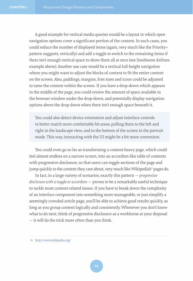
A good example for vertical media queries would be a layout in which open navigation options cover a significant portion of the content. In such cases, you could reduce the number of displayed items (again, very much like the Priority+ pattern suggests, vertically) and add a toggle to switch to the remaining items if there isn’t enough vertical space to show them all at once (see Southwest Airlines example above). Another use case would be a vertical full-height navigation where you might want to adjust the blocks of content to fit the entire content on the screen. Also, paddings, margins, font sizes and icons could be adjusted to tame the content within the screen. If you have a drop-down which appears in the middle of the page, you could review the amount of space available in the browser window under the drop-down, and potentially display navigation options above the drop-down when there isn’t enough space beneath it.
You could also detect device orientation and adjust interface controls to better match more comfortable hit areas, pulling them to the left and right in the landscape view, and to the bottom of the screen in the portrait mode. This way, interacting with the UI might be a bit more convenient.
You could even go so far as transforming a content-heavy page, which could feel almost endless on a narrow screen, into an accordion-like table of contents with progressive disclosure, so that users can toggle sections of the page and jump quickly to the content they care about, very much like Wikipedia’s11 pages do.
In fact, in a large variety of scenarios, exactly this pattern — progressive disclosure with a toggle or accordion — proves to be a remarkably useful technique to tackle most content-related issues. If you have to break down the complexity of an interface component into something more manageable, or just simplify a seemingly crowded article page, you’ll be able to achieve good results quickly, as long as you group content logically and consistently. Whenever you don’t know what to do next, think of progressive disclosure as a workhorse at your disposal — it will do the trick more often than you think.
11 http://www.wikipedia.org/

By Vitaly Friedman CHAPTER 2
65
BREAKING DOWN THE WALLS WITH ENCAPSULATED VIEWSBreaking down complexity is probably the most common undertaking when implementing responsive navigation, yet the main mistake we often make is showing all options at once on all screens, basically carrying over a vast amount of navigation overhead from the desktop to mobile experiences (or from mo-bile to desktop experiences when building mobile first). The problem becomes apparent when the navigation isn’t compact and straightforward.
What happens if you are running an e-commerce site with a number of filters for selecting size, color and shape, and you want your users to be able to quickly switch to categories and perhaps compare products? Furthermore, to avoid unnecessary interactions, you’d like to update content automatically in the background when a user selects a filter, without them having to click on the “Submit” button every now and again. If you choose to show all filters at once, users might not see any content at all, so it will be loading in the background but users will have to scroll all the way down to see the content. You could reveal the filters by tapping on an icon in the uper-right corner, but once users have selected a filter and scrolled down to see the content, they will have to scroll back up again to adjust the filters. Both scenarios aren’t particularly user-friendly. So, what do you do?
A wireframe of an e-commerce page with a few filters. In a narrow view, users would see exactly zero content, even with selected filters. Image credit: Daniel Wiklund, https://medium.com/@danielwi/view-mode-approach-to-responsive-web-design-914c7d3795#

66
CHAPTER 2 Responsive Design Patterns and Components
The simplest strategy would be to break down the single, large filters section into multiple detached, smaller sections. We then could show them at the bottom of the screen as three to four separate tabs instead of just one large block in the header of the page. Each of the tabs would need to have a clear label (e.g. “Color”, “Size”, “Price range”), and once tapped or clicked, reveal appropri-ate filters. Another option would be to have the filters float on the side as users explore the products they have filtered. A slightly more interesting option would be to hide the filters behind an icon in the upper-right corner and display them on tap or click as a persistent layer. This layer would cover a part of the screen (on narrow views, obviously, the less screen it covers, the better), while the content would appear in a semitransparent layer beneath the filters layer. So if users have relatively wide screens, they’ll see both the filters and the content.
That’s also the reason why the layer is persistent: if users choose to close the filters section, they must have made up their minds, so (almost) the entire screen will be dedicated to the content and not filters; otherwise they might need to repeatedly open and close the filter drawer.
With encapsulated views, we can show both the content and the navigation — as far as possible. In nar-row views, we could use a persistent layer covering a part of the screen on the right, and on larger views, the filters could appear on the right side as well, for consistency. Image credit: Daniel Wiklund, https://medium.com/@danielwi/view-mode-approach-to-responsive-web-design-914c7d3795#

By Vitaly Friedman CHAPTER 2
67
This pattern is called the view mode pattern because the features and content of a website are divided into individual, encapsulated views (or cards, or layers) and connected within your interface. This way, you can recoup space even in smaller viewports while gaining the ability to update and process user input (which would need to happen asyn-chronously, causing a bit of perfor-mance overhead). This resembles the off-canvas pattern but could be used for more than just displaying naviga-tion. For instance, you could provide autocomplete search functionality in this way, or even design your entire checkout with each step sliding in from the side, showing the actual product being purchased during the entire checkout.
The pattern can be remarkably helpful for complex components, and it could be further improved by allowing users to easily switch between multiple layers by just tapping on them. This technique is used by the Danish Cancer Society12 to enable users to both browse through the different levels of navigation (on the
12 http://www.cancer.dk
On CottonBureau.com, the checkout experience is designed with the “view mode” pattern in mind. Each step in the checkout is sliding o"-canvas from the right, showing both the content and the checkout as far as the space allows for it.

68
CHAPTER 2 Responsive Design Patterns and Components
right) and see the content of the selected section (on the left) at the same time. In fact, the pattern passed usability studies with flying colors, and it’s still being used now almost a year later.
THE ALMIGHTY FOLD AND NASTY CAROUSELSAlmost every single meeting I find myself sitting in involves an uncomfortable, toxic ingredient with a lingering and irritating bitter aftertaste. Yes, somebody sparks an endlessly painful conversation about the almighty fold, or more specifically, important interface elements that should stay above the fold. These conversations are remarkably misleading and counter-productive, and usual-ly lack any user research data to prove… well, pretty much anything. When somebody raises a question about the fold and call-to-action buttons, it’s usually a warning sign that things are about to go south. Whenever it happens, (rather than freaking out and leaving the room) you could question the validity of their arguments and request actual data.
As it happens, quite often above the fold isn’t as important as below the fold. As Luke Wroblewski stated in one of his talks, “The hardest thing on mobile
View mode pattern used on Cancer.dk to reveal navigation options while showing content on the left side. When users browse through navigation options, the content area is updated automatically.

By Vitaly Friedman CHAPTER 2
69
is figuring out the right time and place to display an action” (“Conversions@Google 2014”)13 — displaying a call-to-action button very early at the top of the page is often neither the right time nor place to encourage that action.
Crazy Egg’s14 recent redesign showed that short, concise landing pages don’t necessarily result in higher conversion rates when compared with longer pages. In the redesign, the challenger design was 20 times longer than the control but caused a 30% increase in conversion15, simply because the design team added testimonials and feature highlights that made a convincing argument at the right time and the right place. Again, to quote Luke from the same talk, “the issue wasn’t whether the call to action was visible, but rather whether the call to action was visible at the point when someone has become convinced to take action.”
But how do you identify this point? Well, you rely on research. According to a recent Chartbeat study, “Scroll behavior across the web16” by Josh Schwartz, the very first thing many people do when they encounter a website is scroll down. This is primarily because they can often find the logo, navigation, search field and ads at the very top of the page, occasionally accompanied by a window encouraging
13 “Conversions@Google 2014”, Luke Wroblewski, https://youtu.be/Y-FMTPsgy_Y14 http://www.crazyegg.com15 http://www.conversion-rate-experts.com/crazy-egg-case-study/16 http://blog.chartbeat.com/2013/08/12/scroll-behavior-across-the-web/
Perhaps “above the fold” isn’t the most lucrative area anymore — just above and just below the fold are.
70
CHAPTER 2 Responsive Design Patterns and Components
users to download an app — often there is just no useful content at the top of the page. In fact, some users start to scroll down a page before it finishes loading.
The most viewed area of the page is just above the fold, at about 550px, with just over 80% viewership. The area between 750px and 1,500px is viewed nearly three times as long as the top portion of the page, with the peak at 750px seen by over 80% of visitors for an average of 13 seconds. This is where most people spend most of their time and where a call-to-action button would be best placed, provided that the work of convincing the user has already been done.
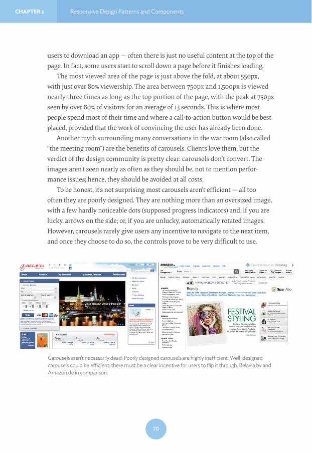
Another myth surrounding many conversations in the war room (also called “the meeting room”) are the benefits of carousels. Clients love them, but the verdict of the design community is pretty clear: carousels don’t convert. The images aren’t seen nearly as often as they should be, not to mention perfor-mance issues; hence, they should be avoided at all costs.
To be honest, it’s not surprising most carousels aren’t efficient — all too often they are poorly designed. They are nothing more than an oversized image, with a few hardly noticeable dots (supposed progress indicators) and, if you are lucky, arrows on the side; or, if you are unlucky, automatically rotated images. However, carousels rarely give users any incentive to navigate to the next item, and once they choose to do so, the controls prove to be very difficult to use.
Carousels aren’t necessarily dead. Poorly designed carousels are highly ine$cient. Well-designed carousels could be e$cient: there must be a clear incentive for users to flip it through. Belavia.by and Amazon.de in comparison.

By Vitaly Friedman CHAPTER 2
71
Carousels can be designed better, though. Recently, Amazon adjusted its carousels by adding a vertical bar on the right-hand side to better highlight all items within the carousel using small thumbnails of the products and a descrip-tive caption of the offers, in effect creating a tabbed widget that is easy to tap and click. Still, the images in the carousel rotate automatically, but the experience isn’t obtrusive at all, providing helpful hints for valuable deals that users might indeed find helpful, without obscure dots or navigation arrows. When users click on one of the thumbnails, they know what to expect and they have a good reason to engage with the carousel. Amazon didn’t share any numbers publicly, but after initial testing it has been rolling out the new design on every category page, so the results are likely not to be disappointing.
OPTIMIZING FOR LARGER SCREENSLooking back at the last few years, most of the projects we spent a lot of time on turned out to be redesigns; designing and building a responsive website often boils down to somehow adapting the desktop experience to the mobile space. Consequently, if a component can be resized and squeezed into a narrow view-port then it’s usually the first option that is considered. However, mobile often requires an entirely different approach; optimizing for narrow views is a matter not just of scaling down, but also rethinking the user interaction and coming up with an entirely different, better suited interface pattern for that interaction.
And just as we have to rethink for narrow views, we have to rethink for larger screens as well. Quite often responsive websites appear to be designed with a maximal screen width in mind, so while they work well from views up to approximately 1,750px, the design feels lost on larger screens, with content stuck either in the middle of the viewport or aligned to one side of the screen.
If you have a robust visual design, you could enlarge the width of the container and increase the font size of its elements for larger views while adjusting the background image or background color of the site. This way, you create an illusion of filled space, like the Institut Choiseul17 does.
17 http://choiseul.info/

72
CHAPTER 2 Responsive Design Patterns and Components
If you don’t have a strong visual design in place, you could either display different pieces of content separately and prominently in multiple columns, perhaps as over-laying content areas; or shift one of the content areas to the left or to the right. An interesting example for that would be a search page; when users with large viewports click on one of the items in your search, the content could appear on the right with the search results still present on the left, and on narrow screens only the requested page could be displayed. That’s what the Kremlin website18 does, always accommodat-ing the available space intelligently.
18 http://kremlin.ru/
For larger views, you could center the layout and play with the background color to create an illusion of filled space.
On narrow viewports, the Kremlin site shows either the content or the navigation.

By Vitaly Friedman CHAPTER 2
73
This pattern could be applied in other scenarios as well; for example, if you have a gallery in your article or product page, in larger views the images could float to the right, next to the article; or slide into designated areas in narrow views. The same goes for comments, surveys, and any other supporting content.
TABLES ARE TOO USEFUL TO DIEThere are a few well-established navigation patterns that could be tweaked for specific contexts, but what about more rigid interface components, such as tables? While navigation menus are often merely lists of anchors, pieces of con-tent residing within tables often have firm relationships, manifested by their position and their column and row headings. When it comes to displaying ta-bles, we should not only present the content but also respect these relationships. This causes a few headaches when designing for narrow views simply because tabular data requires some space to be fully displayed.
If we display a table as it comes, the content will likely be hard to scan and read; tables are regularly rendered either too small for comfortable reading, or too large for comfortable navigation. What do we do, then? The few reliable options we have depend on changing the orientation of the table from horizon-tal to vertical, or displaying tabular data and relationships in fragments.
The first option isn’t difficult to achieve: we could either flip the headings to the left or right, or just turn all table cells into block elements and show them in a single column with corresponding table headings serving as labels. This works
If there is enough screen to fit multiple pieces of content at the same time (e.g. both the search results page and the actual search result), you could show both at the same time.

74
CHAPTER 2 Responsive Design Patterns and Components
well for small tables, but becomes unwieldy for more complex tables, creating long, potentially annoying pages which are difficult to scan. We already know what works well in most scenarios, though: accordions! To keep the <datalist> shorter and more compact, you could turn single blocks of content into a series of accordi-ons and reveal content on tap or on click.
Certain tables call for specific and sometimes creative solutions. For instance, if you’re designing a table to allow users to select a flight, with outgoing flight options lined up horizontally, and return flight options lined up vertically, you might end up with a table in which every cell contains a radio button. While
SwissAir.ch provides many interesting subtle examples of a smart responsive design. One of them is a flight selection table, changing orientation from horizontal to vertical between large and narrow views.
Sometimes you might want to tilt headings a little bit to regain horizontal space by sacrificing some vertical space. It really depends on the nature of the table. Credit: http://codepen.io/anon/pen/WbzbbQ
By Vitaly Friedman CHAPTER 2
75
radio buttons often require a very predictable amount of space to be clickable or tappable, headings in such scenarios would usually occupy more horizontal space, making the table unnecessarily wide. In this case, you could tilt column headings a little (perhaps 45–65 degrees) to regain some of the horizontal space at the expense of some vertical space.
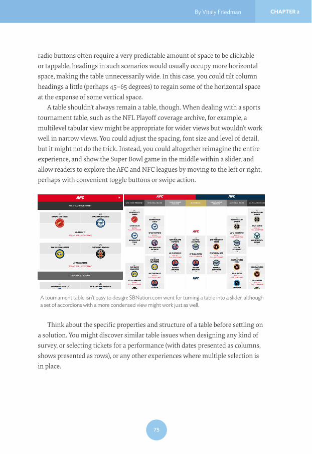
A table shouldn’t always remain a table, though. When dealing with a sports tournament table, such as the NFL Playoff coverage archive, for example, a multilevel tabular view might be appropriate for wider views but wouldn’t work well in narrow views. You could adjust the spacing, font size and level of detail, but it might not do the trick. Instead, you could altogether reimagine the entire experience, and show the Super Bowl game in the middle within a slider, and allow readers to explore the AFC and NFC leagues by moving to the left or right, perhaps with convenient toggle buttons or swipe action.
Think about the specific properties and structure of a table before settling on a solution. You might discover similar table issues when designing any kind of survey, or selecting tickets for a performance (with dates presented as columns, shows presented as rows), or any other experiences where multiple selection is in place.
A tournament table isn’t easy to design: SBNation.com went for turning a table into a slider, although a set of accordions with a more condensed view might work just as well.

76
CHAPTER 2 Responsive Design Patterns and Components
Another option would be, again, to display some columns as cropped en-capsulated views or layers, as mentioned earlier. That’s exactly what SwissAir’s website19 does. If one of the table columns is particularly important, you could also keep it fixed while making the other columns scrollable, so when users start reading the table, they always have a clear association between the content that they read and the row where it belongs.
If the data in your table is mostly numerical, you could visualize it as a graph or chart in both narrow and desktop views, and provide a link to a full table view for users who wish to see the tabular data instead (as well as a “graph” view for users wishing to see a chart on desktop views).
These solutions work well but they aren’t always applicable. Content can be incoherent, data relationships could be strict and the table might not have any consistent structure. In these cases, displaying tabular data in fragments — again, reducing the complexity of the component — can work remark-ably well. The idea is simple: since we can’t make any assumptions about the columns or rows that users would or would not like to see, we could allow them to select columns of interest while at the same time providing an option to show all columns as well.
19 http://www.swissair.com/
On narrow views, SwissAir.ch shows a condensed view with radio buttons aligned vertically; on a larger view they appear as layers. Notice how breadcrumbs change between views.

By Vitaly Friedman CHAPTER 2
77
The way you could design this experience would be by adding a few buttons above the table: perhaps a “Display all” button that, once activated, shows the entire table at once; and a “Display” drop-down, with all columns listed as checkboxes. If users are interested in specific columns, they can select them and dismiss the others, thereby reducing the amount of content to display and potentially fitting it well in both narrow and wide views. You’d need to choose the columns to displayed by default and this selection might change depending on the available viewport width (or height).
Such a design pattern is quite manageable; but what happens when the user is interested in seeing all the columns at once? We’re back to square one, with a poor initial experience: zoom in, zoom out, add a dash of horizontal scrolling. That’s simply not acceptable. In usability tests we noticed that users often feel lost in such complex tables, especially when data is mainly numerical. Users aren’t quite sure whether the value they are looking at actually corresponds to the column and row headings that they were interested in at first. To tackle this problem, tapping or clicking could visually highlight either a column or a row or both, and establish a clear relationship between the fragment of data the user is reading and the column and row it belongs to.
Another option is to show the first few columns first, and display a stepper control to enable users to move easily between sets of displayed columns. When a viewport accommodates four columns of a ten-column table whose first column comprises table headings, you could keep the headings column fixed and show
We can’t make assumptions, and often it’s perfectly fine to just ask users what they’d like to see. Perhaps with a “focus” view to highlight data rela-tionships. Source: http://gergeo.se/RWD-Table-Patterns/

78
CHAPTER 2 Responsive Design Patterns and Components
the next three columns first, revealing subsequent columns on click or tap, and so on. For a narrower viewport, you could reveal two columns in each step, with the headings column remaining static. Additionally, an indicator could present how many items are currently in view, very much like we do in carousels.
FilamentGroup has released Tablesaw20, a comprehensive group of small JavaScript libraries for managing tables. Among other things, it covers many use cases highlighted in this chapter.
These last solutions often seem more appropriate for tables than just turning tabular data into a <datalist>, unless the nature of the table requires all columns to be present at all times. In an overview of pricing options, insurance plans or a car comparison, different columns and rows might have different weight for users, so allowing them to select columns or rows of interest could work well. But when it comes to flight selection, seat selection in a theater or checkout in an online shop, the integrity of a table is vital. There, a <datalist> (potentially with an integrated accordion if there is a lot of data to show) might be a more appropriate solution.
PULL CONTENT OUT, BREAK IT DOWN, PUT IT BACK AGAINWhile these approaches work well for tables and data grids, they won’t necessar-ily work for calendars: with days of the week lined up horizontally, for example, and time of day lined up vertically. We could decide to drop all Fridays as well as a specific time range (such as 12pm–2pm for lunch breaks) but it would pretty much ruin the purpose of a calendar. It might be even more difficult if we de-cide to lay out days of the month against days of the week. A <datalist> option would, again, potentially end up with an annoyingly tall page or an overwhelm-ing number of accordions all at once; and what if a user wants to see a cross-col-umn/row selection after all (for example, all Friday evenings in a given month)? Retrieving this information would require them to open four accordions, for every Friday in a month. That’s not user-friendly.
20 https://github.com/filamentgroup/tablesaw

By Vitaly Friedman CHAPTER 2
79
In this and similar scenarios, we should take a step back and look into options of reducing the fidelity and complexity of the initially displayed content. Do we need all icons in the calendar? Do we provide any meta information that could be displayed separately? Can we use ellipses to shorten the amount of text? What else can we remove to keep the calendar focused and retain its integrity on narrow views as well?
That’s the exercise we run through as a team every time we encounter not only calendars, but pretty much any complex component that can’t be modified easily without compromising user experience. By simplifying content fragments within the component, we can always break down its complexity and focus on the core content it contains.
Ultimately, there is always the option of pulling the content out of the component, identifying and grouping content fragments logically, and presenting them as separate encapsulated views within a few subsequent sections on a page. For a calendar, you could choose to pull highlight-ed items and present them in a smaller, focused tabular view in narrow viewports, while all the other items could be displayed in a <datalist> underneath the table. If you need to design a city map with numbered markers within the map and detailed hints about specific locations displayed on tap or hover, you could reduce the fidelity of a map in narrow views, and pull out the content beneath the map as a <datalist>.
What if you are designing a platform for selling tickets to any kinds of event, be they concerts, baseball games or cinema screenings? You’d like venue owners to submit a seating map for their venue to you, along with an overview of the
You could also integrate a mini map and combine it with a selection of columns the user wants to see. https://github.com/filamentgroup/tablesaw

80
CHAPTER 2 Responsive Design Patterns and Components
most expensive and most affordable areas, so buyers can visit your site and purchase a ticket to the show. Visitors should be able to select an area where they want to sit, but beyond that they should be able to zoom in to the area of interest and select both the row and, once zoomed in again, the actual seat they’d like. Obviously, the entire interface should be fully responsive, too.
One way of solving this would be to introduce what is known as the assistant pattern — complexity is reduced by asking users to set some preferences first (the pricing range or the seating area, for example) to lower the level of detail required on the map and remove markers that aren’t useful. We then get a more manageable map, perhaps with slightly larger dots to comfortably accom-modate 44×44px hit areas. Underneath the map we could provide an overview of options listed either by seating area or price — adjustable by users. When users choose to explore an option, they are zoomed in to the area of interest and receive further details about the seating in the information area beneath the map. Moving back through the list of options would zoom out the map view. Alternatively, you could also use a slider to enable visitors to define precisely the level of detail they’d like to see.
A calendar doesn’t have to look like a calendar across all screens. You could use the content from a calendar and display it in two separate views on narrow screens, like Muse (http://objectivelogistics.com) does.

By Vitaly Friedman CHAPTER 2
81
This experience could translate to both narrow and wide views, and we could take advantage of available space to display a more detailed map in larger views. Again, the strategy of breaking down complexity and creating a few smaller and more manageable content fragments could go a long way in pretty much every responsive design issue you’ll encounter.
ADJUSTING MICRO!COMPONENTSBreaking down complexity isn’t always necessary. Components can be relatively simple with pretty straightforward ways to make them work for the whole range of screens — if you have the right idea of how to adjust their design and behavior.
Progress StepsFor example, think about the progress steps or breadcrumbs in a checkout. If a checkout takes four or five steps in total to complete, displaying the entire user path through these steps would require way too much vertical space in narrow viewports. Instead, we could use the content property with a pseudo-class in CSS to display the current step as plain text, with arrows pointing to the previous and next steps (see Hrvatski Telekom screenshot for comparison). A very simple adjustment that doesn’t require a lot of work, but produces a perfectly sensible result.
Hrvatski Telekom (https://hrvatskitelekom.hr ) shows a fully fledged breadcrumbs navigation in large views and turns them into plain text in narrow views. Image credit: Marko Dugonjić.

82
CHAPTER 2 Responsive Design Patterns and Components
TimelinesFor timelines — either horizontal or vertical — marking important milestones or dates on either side, an almost natural solution would be to flip the timeline to a vertical view and perhaps display the content for each milestone via a toggle.
Graphs and ChartsWhen it comes to graphs and charts, you could create highly sophisti-cated, and perhaps even animated, responsive charts with SVG and CSS using Chartist.js21; you might need to reduce the fidelity of the chart and tweak the appearance and position of labels to keep them readable in nar-row views (also, see the responsive data charts at Informed Design22).
21 https://gionkunz.github.io/chartist-js/22 http://www.informed-design.com/responsive/chart/
A timeline: horizontal orientation in a large view, vertical orientation in a narrow view. Nothing spectacular, really.
Responsive graphs aren’t easy to manage, as long as you create them with SVG, and not as static images. For example, with Chartist.

By Vitaly Friedman CHAPTER 2
83
MapsIf your chart accompanies a map and you use polygons on the map for user input, sometimes the map’s fidelity can’t be reduced without making inter-action inconvenient for users. For example, an SVG map of the United States, every state a polygon, could allow users to click or tap on polygons to select a state (perhaps as a filter for specific items related to that state); but the further the map is scaled down, the more difficult it becomes to select a state. A bulletproof solution would be to use a simple drop-down in a narrow view, with progressive enhancements up to a fully interactive map when the space allows for it.
The solution isn’t as straightforward, though, when you need to display a large preview of the entire map and not only a cropped region of it. First of all, we could use Thierry Koblentz’s padding-bottom hack23 to create a fluid map that preserves aspect ratio24 to keep the focal point of the map centered25.
In usability studies, we noticed that embedding Google Maps or any kind of iframe often leads to confusion: when users decide to scroll down a page, they get dragged into the map and find themselves scrolling the iframe instead. The only way out is to tap an area outside the iframe and keep scrolling there; but if the iframe could take up a lot of vertical space, and so getting out of it can be painfully difficult.
23 http://alistapart.com/article/creating-intrinsic-ratios-for-video24 http://daverupert.com/2012/04/uncle-daves-ol-padded-box/25 http://codepen.io/bradfrost/pen/vwInb
Travois uses progressive enhancement to turn a simple, accessible drop-down into an interactive SVG map for larger views. http://travois.com/projects/

84
CHAPTER 2 Responsive Design Patterns and Components
In such cases, you can use two workarounds to improve user experience. First, for every map embedded in your site, you can create a semi-transparent <div> overlay that would cover up the entire map, like a layer of ice covering a river on cold winter nights (poetic, right?). When users scroll down through the page, they will slide over the empty <div>. If they do decide to access the actual map, they need to click or tap the map first, so the <div> will be removed from the DOM via JavaScript. Users without JavaScript support would receive a link to the Google Map page via <noscript>.
A slightly better pattern to achieve almost the same experience is exhibited by adaptive maps26, where we load a basic text link to Google Maps by default and additionally load either a static map image for small screens (preview) or a full iframe map for larger screens — preferably conditionally, so we don’t have a performance overhead in either case.
LightboxesThe same adaptive logic could also be applied to lightboxes which so often break user flow on narrow views. Quite a few websites simply squish a lightbox as a fullscreen overlay, with heavy lightbox scripts and tiny interface controls. However, this behavior goes against the logic of why lightboxes exist in the first place. As Jordan Moore so eloquently wrote27: “the purpose of a lightbox is to display a larger image corresponding to the selected thumbnail version while keeping the user on the same page instead of linking directly to a page showing the full image. […] In fact you may argue that a lightbox shouldn’t even exist on small displays”.
Which hits the nail on the head. But if a lightbox shouldn’t exist on small displays, how do we deal with it? Actions that happen in a lightbox on large views are often best handled as separate pages on smaller screens28, so if you have an interaction that requires user input, dedicating an entire page to it in narrow views might be a good idea.
26 http://bradfrost.com/blog/post/adaptive-maps/27 http://www.jordanm.co.uk/post/26207088124/pattern-translations28 http://www.lukew.com/ff/entry.asp?1390

By Vitaly Friedman CHAPTER 2
85
When your lightboxes contain only photos (a product gallery, for instance), you could present them within a swipeable area in narrow views, or you could simply link to the image file directly by default. Opening an image “allows the user to pinch and zoom to read what could otherwise be entirely illegible.29” Then you could detect the screen size and decide whether to load a lightbox script or not, and if the screen is large enough to accommodate the lightbox, inject the script on the fly. Again, no performance overhead and a better expe-rience for everyone.
Footnotes and SidenotesWhen working with magazines publishing long reads, you might end up with situations when an article features a number of sidenotes, footnotes or pull quotes. You could try to squeeze the sidenotes within the article, perhaps right after the paragraphs which they relate to, but if they are lengthy they might interrupt reader’s flow. On the other hand, with footnotes dis-played as <sup>-links, users will have to jump to the foot of the page, read the footnote and then jump back to the reference, which is fine but a bit noisy and creates extra work for the user.
An interesting way of dealing with these issues is by using inline footnotes as pop-overs. You could use BigFoot.js30 to automatically detect the footnote link and content, turn the link into a large enough button, and open a pop-over when the reader clicks on the footnote button. Of course, the pop-over has to be posi-tioned on the top or bottom of the button automatically (based on the amount
29 http://bradfrost.com/blog/post/conditional-lightbox/30 http://www.bigfootjs.com/
Instead of putting sidenotes within the text, or footnotes at the foot of the paragraph, we could introduce inline notes and pop-overs, enhanced with JavaScript, e.g. with BigFoot.js.

86
CHAPTER 2 Responsive Design Patterns and Components
of space available), should update its location as the viewport changes size, and should never scroll offscreen. You could apply this technique to sidenotes as well: just turn them into inline footnotes at the end of every paragraph, with a different CSS styling to keep them distinguishable, and display them fully on click or tap.
PDFYes, you read it correctly: PDF. We spend a lot of time talking about removing all render-blocking resources from the critical rendering path, but I believe we don’t spend enough time discussing how to deal with good old-fashioned PDFs. PDFs are often very heavy in file size, sometimes uncompressed, and difficult to read on a mobile screen. If your users happen to be on a slow connection, the chanc-es are high that they won’t even bother downloading a PDF file because they won’t be able to read anything from it until it’s been completely downloaded — unless the PDF is opened in a smart browser with an integrated PDF viewer. But what if a user knows that the content she needs is on page 17? There is no way of access-ing it before the first 16 pages have been downloaded and rendered.
Now, we could generate different versions of the PDF for different views and serve them conditionally to different screens, but it’s inconvenient and involves unnecessary work. Instead, we could generate a (relatively) large thumbnail version of each PDF page, save it highly compressed and provide an overview of all pages to the user, as well as a PDF file. If users want to jump to page 17, they
Instead of providing only a link to PDF, we could generate thumbnail preview for all pages and make them available to users additionally to the PDF view.

By Vitaly Friedman CHAPTER 2
87
can do it via a thumbnail view. The image received will not look particularly im-pressive, but it will load fast and it will contain the information users need. And if they decide to download the PDF file after all, that option is always available. This is exactly what Energy Made Clear31 does, and it does it very well indeed.
Custom Responsive ElementsSometimes the nature of a website requires you to get quite creative when searching for a solution, so relying on more common components like the ones listed above won’t really help. What if you’ve been asked to design a fully responsive site for living sheet music and guitar tablature with interactive nota-tion and tabs, for example?
Well, you start exploring. In such rare cases, you would need to figure out how to create custom responsive elements, perhaps with SVG or in <canvas>, and then decide how the content should be adjusted to be properly displayed at different screen resolutions. The front-end engineers behind Soundslice32 had exactly this problem, and the way they solved it was by introducing adaptive
31 http://www.energymadeclear.com/ 32 https://www.soundslice.com/
Interaction music notation, with chords and tablature adjusting depending on the screen size. With a bit of SVG, <canvas>, JavaScript and media queries.

88
CHAPTER 2 Responsive Design Patterns and Components
notation in which the displayed size and thickness of chords and pauses is recal-culated and redrawn in <canvas> when a window is resized. I’d argue that if you can make sheet music responsive, you can make pretty much anything respon-sive, wouldn’t you agree?
DEALING WITH COMPLEX VISUAL DESIGNWell, you probably would agree, unless you have a very complex visual design to deal with. Coping with an abundance of visual content is often one of the rea-sons why responsive projects become frustrating, with the designs becoming generic, flat and oversimplified. In terms of workflow in such cases, different viewports often require intense art direction to keep the design consistent, with different visuals and different layouts for those visuals in place. In practice, it requires a bit too much extra effort, so it’s generally more convenient to settle for a slightly simpler and more minimalistic design in a narrow viewport, and then add visuals only for larger viewports. It’s not the only option, though.
Japanese and Chinese websites are a good primer for heavy visual responsive websites with a consistent design across viewports; in many ways they feel very advanced and thought-through. Not only hero photos or product images are art-directed; also complex infographics, step-by-step guides, video backgrounds and supporting visuals along with animations and transitions are properly directed and adjusted for tap, click and hover. Of course, these pages are quite heavy at times, but the visual consistency is very apparent in most cases.
It’s not just the culture that demands a lot of visual language in Asian countries. Because web fonts would need to support thousands ofglyphs, loading them just isn’t viable, so text is embedded into images;and because mobile is dominating Asia, text has to be perfectly readable on narrow screens, so different versions of images are sent to different screens. Owing to this, Asian websites are almost inherently preparedfor the art direction use case: there is just no way around it. Not surprising then that it’s an interesting space to explore design patterns for dealing with visuals.
By Vitaly Friedman CHAPTER 2
89
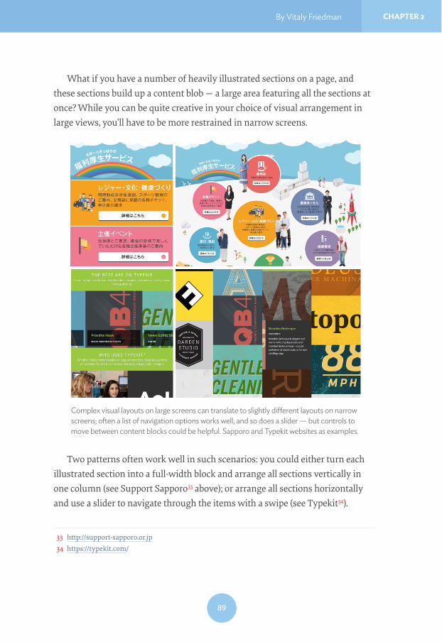
What if you have a number of heavily illustrated sections on a page, and these sections build up a content blob — a large area featuring all the sections at once? While you can be quite creative in your choice of visual arrangement in large views, you’ll have to be more restrained in narrow screens.
Two patterns often work well in such scenarios: you could either turn each illustrated section into a full-width block and arrange all sections vertically in one column (see Support Sapporo33 above); or arrange all sections horizontally and use a slider to navigate through the items with a swipe (see Typekit34).
33 http://support-sapporo.or.jp34 https://typekit.com/
Complex visual layouts on large screens can translate to slightly di"erent layouts on narrow screens; often a list of navigation options works well, and so does a slider — but controls to move between content blocks could be helpful. Sapporo and Typekit websites as examples.

90
CHAPTER 2 Responsive Design Patterns and Components
In the first case, you could use accordions if the sections are content-heavy; in the second case, it might be a good idea to ensure that a portion of the next section is always displayed (the overflow pattern), or, even better, add toggles in the top-right corner to let users easily navigate to the previous and next sections without having to swipe very precisely.
Davide Calignano has recently published a simple technique35 to keep a portion of the next section always visible with calc. Worth looking into.
So what can we learn from Japanese or Chinese websites? In many cases, background images have repeated patterns and are stretched for larger screens; secondary visual assets are dismissed in narrow views, but primary visual assets are more prominent than on larger views. More than usual you’ll need to fit images within the container or a grid, either with background-size for background images or with REMHFW�ÀW for foreground images. Photography will often require art direction via the <picture> element, and heavy iconography might call for responsive icons.
BETTER, SMARTER RESPONSIVE WEB FORMSNobody loves filling in web forms; however, they are perhaps the most common yet least enjoyable interaction on the web. Going from one input field to another and typing in data feels like such an outdated paradigm, but there isn’t much we can do to move away from it. Nevertheless, we could make the experience with web forms slightly better, in particular in responsive websites: we just need to figure out how to minimize user input and how to present required input fields intelligently, for narrow and wide screens.
Stacking input fields, text areas and drop-downs beneath one another for better mobile experiences isn’t a particularly adventurous undertaking. But it’s the micro-interactions taking place between these input fields that could improve the experience. Ideally, we’d love users to be able to focus on one thing and do it fast: typing. It shouldn’t be necessary to move the mouse cursor or tap
35 http://davidecalignano.it/css-trick-to-reproduce-glimpse-on-native-scroll/

By Vitaly Friedman CHAPTER 2
91
with a finger on an input field — users should be able to stay on the keyboard comfortably, without diverting their attention to anything else. Of course, the WDELQGH[ should still be appropriately set, so when users decide to switch to the next field via Tab on their keyboard, they can; but moving between the input fields might not necessarily require it.
Focus on Typing the DataSwissair’s36 responsive forms are a very good example of achieving exactly this goal well. When users make a selection (in a drop-down, for example, or in a calen-dar), they automatically move on to the next field and can continue typing right away, unlike most interfaces where you have to manually move to the next field when you’ve finished with the current input field. Just such a paradigm is central to web form patterns suggested by Type-form37: the user always sees only one large input field at a time and can use keyboard shortcuts to make a selection or confirm input — by pressing “Enter” they move on to the next field. No drop-downs are used, no <select> menus employed — the entire experience is focused entirely on typing in data without any distractions. It works well on desktop, but it’s still a bit annoying on mobile where you will see the keyboard popping up/out again after every input.
36 http://www.swissair.com/37 http://www.typeform.com/
“One-input-field-at-a-time”-experience on Type-form allows users to fill in forms by focusing on only what they have to do: typing data. Everything else is taken care of automatically.
92
CHAPTER 2 Responsive Design Patterns and Components
You could apply quite a few very subtle yet very handy tweaks in your form design pretty quickly:
• When a user arrives on a search page, be it related to booking flights, online shopping or a list of FAQs, activate the search box by default with the autofocus attribute.
• Provide valuable metadata to browsers by wisely assigning autocomplete attributes on input fields, helping browsers (and users!) prefill the entire form accurately automatically.
• Vertically adjust a WH[WDUHD based on user input. Instead of reserving four rows for the input, you could stipulate just two and increase the height of the element dynamically so the scrollbar never appears.
• When a user has a lengthy address, allow them to dynamically add ano-ther input field for an optional second address line, instead of displaying it by default.
• Ask for a ZIP code first to potentially prefill state, city and sometimes even a street from it alone.
• To ensure users never lose any data, temporarily store the input during a session in localStorage. When a user accidentally hits “Refresh” or closes the window, the next time they open the window, all data will be preser-ved until the input has been successfully completed.
Not only the design of input elements matters, but also the choice of input elements, too. In our projects, we tend to spend a lot of time thinking about ways to remove input fields and drop-downs altogether and replace them with slightly more comfortable input methods, such as sliders, toggles or reasonably sized radio buttons.
The Right Input Element for the Right InputSome input elements are more suited for specific inputs than others. T-shirt size might be easier to select with a few buttons rather than a drop-down menu. This could also act as a filter: once size is selected, other sizing options could dis-appear from the overview behind a semitransparent “All sizes” button. A price

By Vitaly Friedman CHAPTER 2
93
range would work better as a slider; the number of nights in a hotel, or any other discrete numerical input, would be better off with a simple stepper control — to increment a value, users can just keep tapping on a button instead of typing.
A flight’s class with only a few options (first, business, economy) could be presented as tabs — segmented controls — with only one tap required to provide input. Special dietary requirements, for example, or any on/off states could be designed as a toggle. Such details make up the entire experience, so before we design (or redesign) a form, the first thing we do is conduct an interface inventory of all the input elements within the form. Chances are that the choice of input elements will have to change significantly.
Steppers and SlidersSteppers and sliders are, however, the most convenient types of input for quan-tities (almost silver bullet techniques in form design!) and they could be used extensively in a variety of scenarios.
The main advantage of steppers is that they require exactly one tap to increase or decrease the value. This makes them helpful in checkouts (number of the same item in the shopping cart), or defining settings and preferences (number of travellers on a hotel booking website), or any other selection of discrete values. Steppers aren’t very helpful when the range of values isn’t re-stricted to a few items: they wouldn’t be a good fit when selecting the color of a T-shirt or the brand of running shoes a customer wants; a filter list might work better in this and similar scenarios.
Segmented control for a donation form: with a few items provided, instead of a large drop down or input field. Image credit: Brad Frost, http://bradfrost.com/blog/post/designing-an-e"ective-donate-form/

94
CHAPTER 2 Responsive Design Patterns and Components
Steppers adjust a specific value quickly and precisely; sliders can help adjust a large set of values quickly, but not as precisely. Depending on the task, we can use a single slider with just one value (say, a specific date in history), or a double slider with a range of values (a min/max price range for a home). For predefined values, such as clothing size, we could use discrete sliders with fixed values that users can snap to easily; for indeterminate values such as price or temperature, we could use continuous sliders which don’t have any fixed values at all.
One caveat: if users can select any range of their choice, they might end up with empty results pages which are at best disappointing and not particularly helpful. To avoid this issue, you could extend a slider with additional metadata about the number of available products in specific ranges, creating a histogram slider, or inventory slider. You could design this by simply adding a bar chart above the slider, showing the number of available items at a given value, such as a price point. That’s what Airbnb designers decided to use for the price range of available apartments. This way you clearly indicate which range is most populated with results, and where they shouldn’t expect many results.
Tackling Common Pain Points in Web FormsThe patterns described above could serve as nice enhancements for specific scenarios, but there are a few common pain points that could be resolved with a few less obvious techniques.
One of them is to ask users to verify their input, be it a password or email. There is no need to ask for a password twice: you could just use a toggle button to show or hide a password if necessary, and it’s a good idea to label it “Show” or “Hide” rather than relying on an ambiguous icon38. Instead of asking for email verification, you could use email autocomplete to autofill email addresses based
38 “Mobile Design Details: Hide/Show Passwords”, http://www.lukew.com/ff/entry.asp?1653
A histogram slider on Airbnb provides some metadata about the number of available apartments at a given price range.

By Vitaly Friedman CHAPTER 2
95
on common email providers, or automatically correct them. It’s also a good idea to let new users verify their email address before sending a message via the contact form, so they have a chance to correct it before sending the data, and you won’t end up with incorrect or mistyped email addresses.
To tame a web form’s height, we sometimes use input placeholders as labels to indicate what kind of data is required. However, if the input is lengthy or users are interrupted, they might lose the context of what exactly they were supposed to type in. That’s where the floating label pattern is useful: the labels exist as placehold-ers but when users start typing, the labels float above the field in a slightly smaller font size. It’s a nice way to keep both the input and context in place without losing too much space. If you can’t move the label to the top but a field is wide enough to accom-modate it, you could float the label to the right or left in the narrow view as well.
Some sites insist users are over a certain age to access the content. The owners of these sites honestly don’t care about the actual day and month and year when users were born, they care mostly about the age. But most visitors lie when challenged by this question, so why don’t we make it easier for them to lie? Instead of asking for a specific date of birth, ask if the user was born in “1990 or earlier”, or any relevant year, and use it as the input instead. It might not be feasible in every country but it’s worth looking into. It also goes for credit
“Floating label” pattern in action: when users start typing in data, input placeholders turn into labels and float above the input field. Users see both: the label and their input. Source: http://mds.is/float-label-pattern/

96
CHAPTER 2 Responsive Design Patterns and Components
card input which shouldn’t require card type since it can be automatically detected.
And then there is the king of <select> drop-downs: the almighty country selector. Depending on your country of residence and your current geographical location, often users just don’t know where to look for their country. Will it be prioritized and displayed at the top of the list? Will it appear in alphabetical order? Will it appear in their language or in English? If you come from the Netherlands, should you look for “Holland”, “Nether-lands” or “The Netherlands”? As a result, the drop-down becomes an endless, tiresome journey through known and obscure countries. Not the best form of travel.
Instead of providing a drop-down, ask people to type what country they are from and show suggestions to help select the country. You could define synonyms for common input values to make your field smarter:
whether a user types in “DE”, “Germany” or “Deutschland”, they’d get the same suggested value; the same goes for “NL”, “Holland”, “Nederland” “Nether-lands”, or “The Netherlands”. More typing, but also more convenience for the user.
Obviously, if you care most about a specific input, such as email, or telephone input, your
efforts should focus on that input. You could search for specific JavaScript libraries that would support and manage this input, like an email autocomple-tion library or telephone formatting library. Don’t go over the top with libraries, of course, but the right tool in the right context can be just what you need to get things done well and tackle common pain points in no time.
Less smart and smart country selector. Asking a user to type the first characters of their country might be easier than scrolling through an almost endless list of countries.

By Vitaly Friedman CHAPTER 2
97
ConclusionPhew, that was quite a journey but, frankly, this journey wasn’t particularly comprehensive. There is a plethora of good, smart solutions to be discovered — it’s just up to us to look for and find them. Explore foreign responsive websites, because you’ll likely be confronted with unique interactions and patterns that you haven’t encountered before. Chances are high that your problem has already been solved.
In some circles, responsive design has a reputation for being difficult, complex, tiring and inefficient. Well, it isn’t. It isn’t if you have a good team around you, a good process in place, and a set of design patterns on which you can build your solution every now and again.
I hope you’ve found a few gems in this chapter that you’ll be able to apply to your project right away once you flip over this page. You will fail, and you will start over, but you will eventually succeed and achieve better and smarter results much faster than you used to.
ABOUT THE AUTHORVitaly loves beautiful content and complex challenges, and does not give up easily. He co-founded Smashing Magazine back in September 2006 and since then spends pretty much every day trying to make it better, faster and more useful. He runs responsive design training and workshops and loves solving complex UX, performance and front-end problems in large and small companies.

98
CHAPTER 2 Responsive Design Patterns and Components
ABOUT THE REVIEWERAndrew Clarke is an art director and web designer at the UK website design studio Stu! and Nonsense. There he designs websites and applications for clients from around the world. Based in North Wales, Andrew’s also the author of two web design books, Transcending CSS and Hardboiled Web Design and is well known for his presentations and over ten years of contributions to the web design industry. He also wrote the last chapter of this book.
ABOUT THE REVIEWERViljami Salminen is a web designer living in Helsinki, Fin-land. He has worked in the web industry for over a decade and have designed websites and applications for start-ups and companies of all sizes. His core belief is that all con-tent on the web should be accessible to anyone using any kind of device to access the internet. He has created tools such as Responsive Nav, Responsive Slides and Remote Preview.
ABOUT THE REVIEWERMarko Dugonjić is a designer, frequent speaker, author and editor at Smashing Magazine. He co-founded Creative Nights, a design consultancy specialized in user experi-ence design, typography and web standards, where he improves customers’ digital experiences for international clients. He also contributed a chapter on web typography for the Smashing Book 4.