responsive web design : a quality of the web not a tactic
TRANSCRIPT
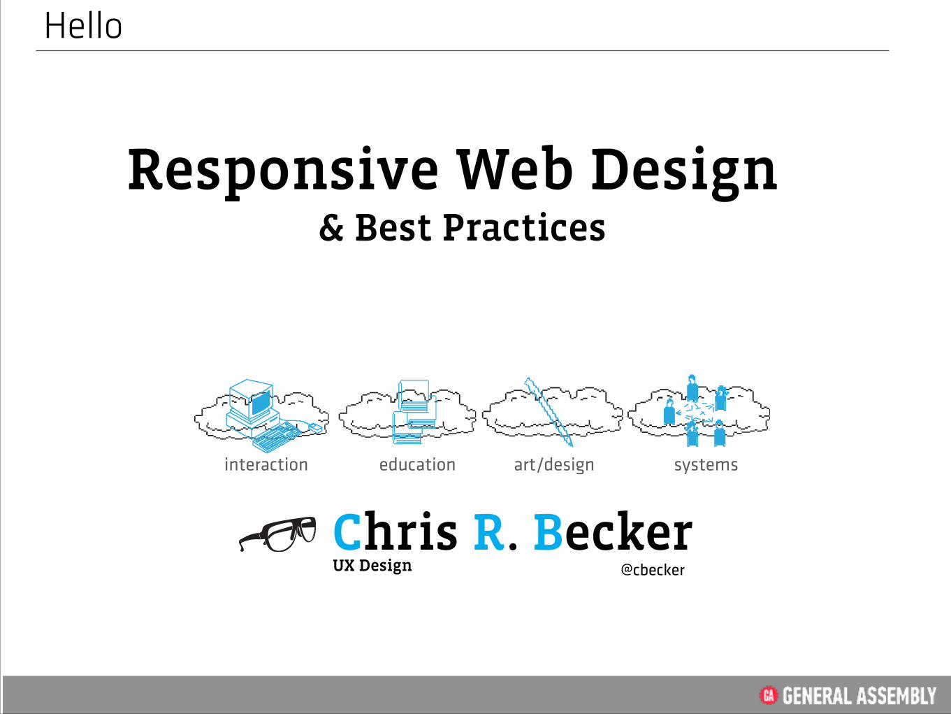
& Best Practices Responsive Web Design
Hello
interaction education systemsart/design
Chris R. Becker
UX Design @cbecker

• Credentials • A vocabulary buffer • Responsive Web Design • What is the Problem? • A brief web history • A crude Timeline • Why is matters • Some Media Theory • The Screen is our medium • Responsive as a Quality • Its Trending • Multiscreen • Media Queries • The Grid • Responsive CSS Frameworks • Case Studies • Best Practices • Advertising • Q & A
Agenda
@cbecker <1>UX Design
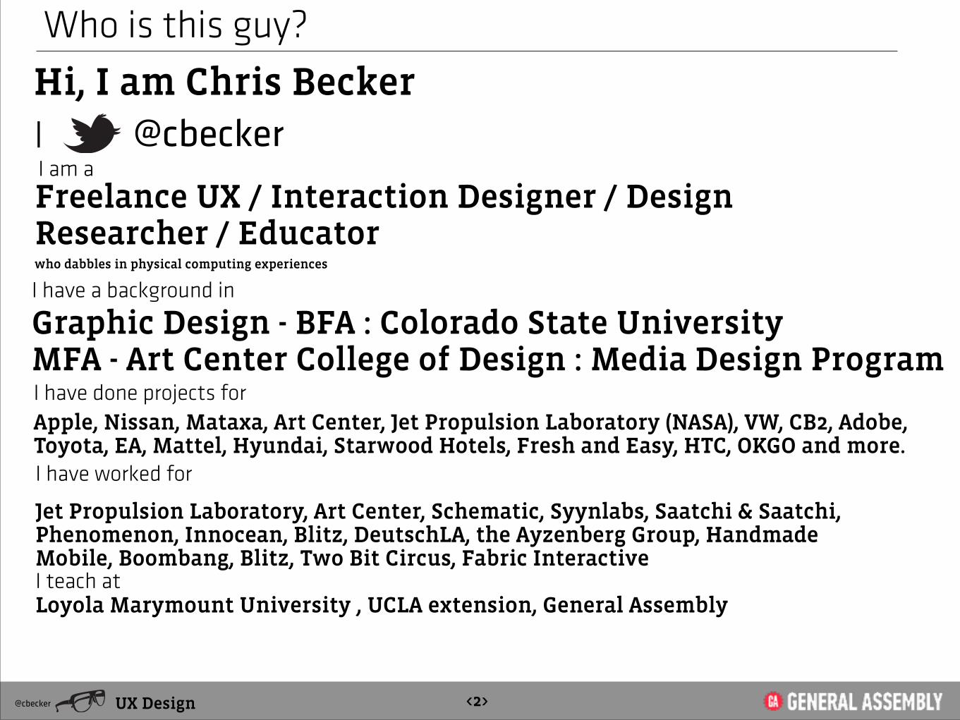
Hi, I am Chris Becker
Who is this guy?
@cbecker
I have a background in
I have done projects for
Graphic Design - BFA : Colorado State University MFA - Art Center College of Design : Media Design Program
Apple, Nissan, Mataxa, Art Center, Jet Propulsion Laboratory (NASA), VW, CB2, Adobe, Toyota, EA, Mattel, Hyundai, Starwood Hotels, Fresh and Easy, HTC, OKGO and more.
I am a Freelance UX / Interaction Designer / Design Researcher / Educator
I have worked for
Jet Propulsion Laboratory, Art Center, Schematic, Syynlabs, Saatchi & Saatchi, Phenomenon, Innocean, Blitz, DeutschLA, the Ayzenberg Group, Handmade Mobile, Boombang, Blitz, Two Bit Circus, Fabric Interactive !Loyola Marymount University , UCLA extension, General Assembly
I
@cbecker <2>UX Design
who dabbles in physical computing experiences
I teach at
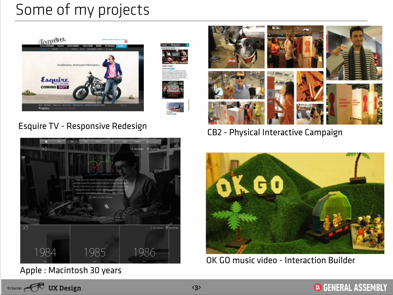
Some of my projects
Esquire TV - Responsive RedesignCB2 - Physical Interactive Campaign
UX Design@cbecker <3>
Apple : Macintosh 30 years OK GO music video - Interaction Builder

Vocabulary BufferAffordance: a quality of an object, or an environment, which allows an individual to perform an action. For
example, a knob affords twisting, and perhaps pushing, while a cord affords pulling.
HTML 5:
CSS 3 is divided into several separate documents called "modules". Each module adds new capabilities or extends features defined in CSS 2 !is a CSS3 module allowing to adapt the rendering of webpages based on conditions such as screen resolution (eg. smartphone vs. high definition screen). It was first drafted in 2001 by the W3C and became a recommended standard in June 2012. It is a cornerstone technology to Responsive Web Design.
CSS3 :
Media Queries:
Best Practices: is a method or technique that has consistently shown results superior to those achieved with other means, and that is used as a benchmark
W3C: The World Wide Web Consortium (W3C) is the main international standards organization for the World Wide Web (abbreviated WWW or W3).
markup language for structuring and presenting content for the World Wide Web, and is a core technology of the Internet. It is the fifth revision of the HTML standard.
HTML5 is not software that has to be installed but rather a new version of the language HTML. Web browsers must support this new version of HTML in order to correctly display web pages using HTML5 functions. It is upon the developers of browsers to update their software to use HTML5; users simply must allow these updates to be done on their computers, but do not have to install additional software.
Frameworks: A “boilerplate” set of code templates that include the js libraries and code processes for building HTML 5 concepts
Java Script (JS):
UX Design@cbecker <4>
is a prototype-based scripting language that is dynamic, weakly typed and has first-class functions. It is a multi-paradigm language, supporting object-oriented, imperative, and functional programming styles.
Responsive Web Design (RWS): is an approach to web design in which a designer intends to provide an optimal viewing experience—easy reading and navigation with a minimum of resizing, panning, and scrolling—across a wide range of devices (from desktop computer monitors to mobile
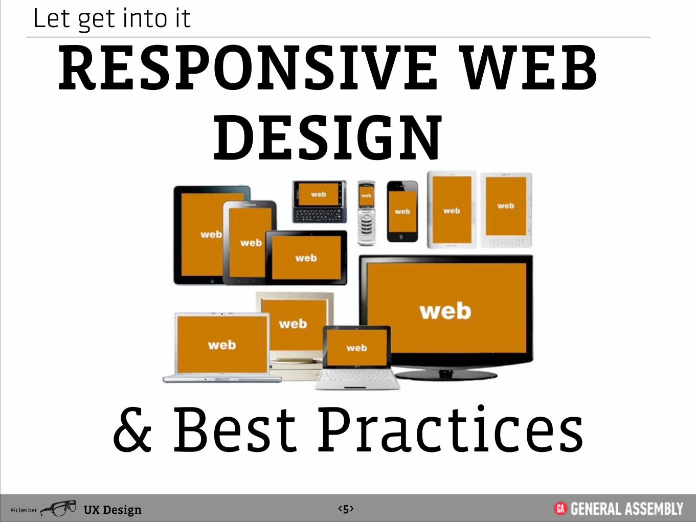
Let get into it
RESPONSIVE WEB DESIGN
UX Design@cbecker <5>
& Best Practices

RWD
What is the Problem?
UX Design@cbecker <6>
A considered User Experience
But the Media Space Reality is :
Across Multi Platforms
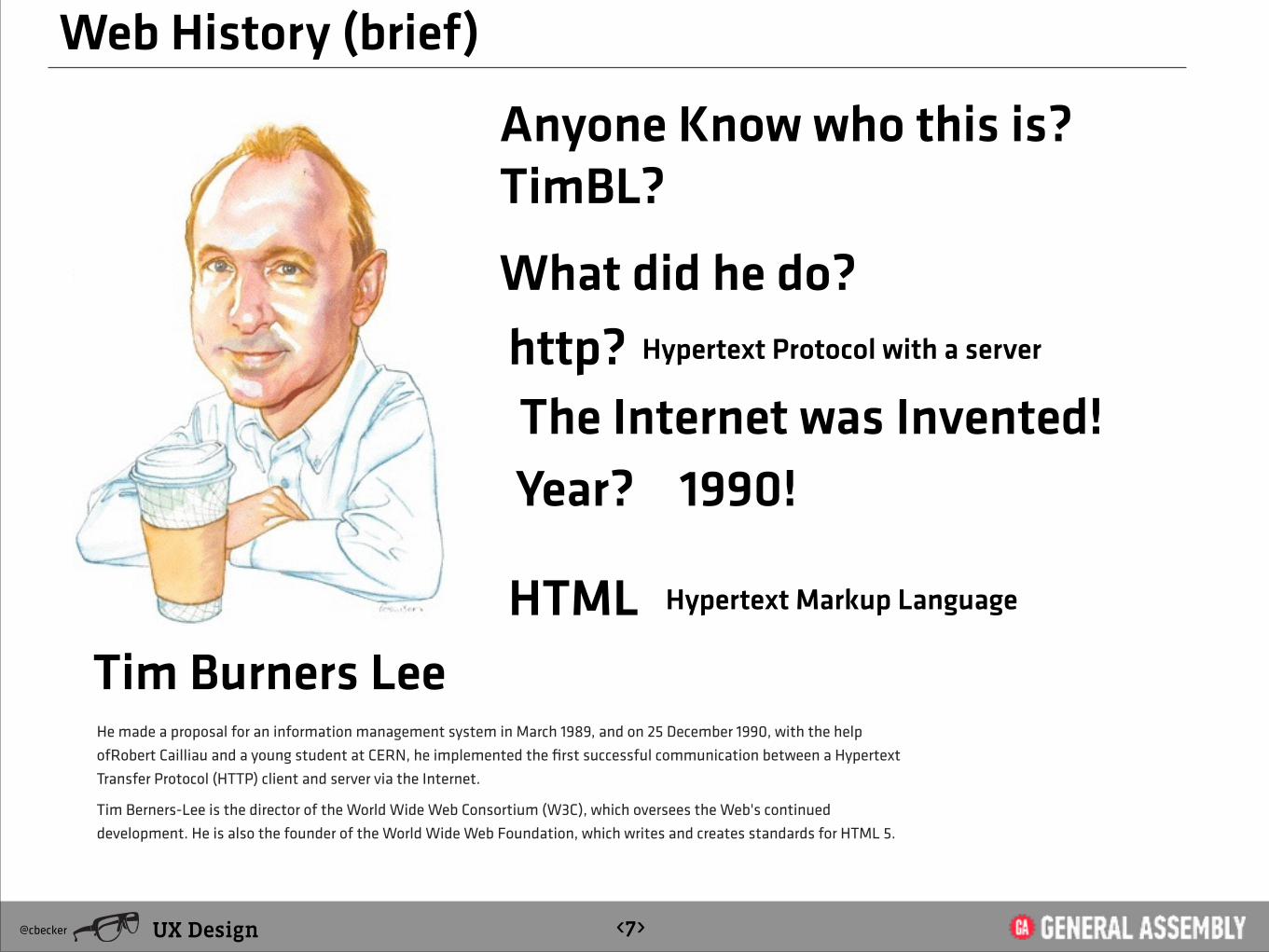
Web History (brief)
TimBL?
http?
Tim Burners LeeHe made a proposal for an information management system in March 1989, and on 25 December 1990, with the help ofRobert Cailliau and a young student at CERN, he implemented the first successful communication between a Hypertext Transfer Protocol (HTTP) client and server via the Internet.
Tim Berners-Lee is the director of the World Wide Web Consortium (W3C), which oversees the Web's continued development. He is also the founder of the World Wide Web Foundation, which writes and creates standards for HTML 5.
1990!
UX Design@cbecker <7>
Hypertext Protocol with a server
HTML Hypertext Markup Language
The Internet was Invented! Year?
Anyone Know who this is?
What did he do?
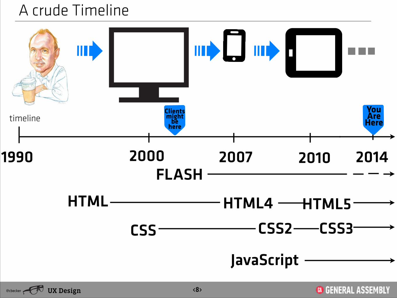
A crude Timeline
UX Design@cbecker <8>
1990 2000 2007 2010
HTML HTML5
2014
CSS
JavaScript
CSS3
HTML4
FLASH
timeline You Are
HereClients might
be here
CSS2

Interaction Space
Why does RWD matter?
UX Design@cbecker <9>
Interaction Cycle & User Experience Concerns

Some Media Theory
We shape our tools and then our tools shape Us
UX Design@cbecker <10>
-Marshall McCluhan
Herbert Marshall McLuhan, (July 21, 1911 – December 31, 1980) was a Canadian philosopher of communication theory. His work is viewed as one of the cornerstones of the study of media theory, as well as having practical applications in the advertising and television industries.
McLuhan is known for coining the expressions the medium is the message and the global village, and for predicting the World Wide Web almost thirty years before it was invented.

The Screen is our Medium
We Invent these tools
UX Design@cbecker <11>
The Screen is our MEDIUM

What is Responsive
RESPONSIVE
UX Design@cbecker <12>
Can be a tacticor it can be an
QUALITY

What is Responsive
UX Design@cbecker <13>
Just as elastic is a quality of a rubberband, Responsive can be a quality of the sites
you design

Let get into it
Its trending
UX Design@cbecker <14>

Why is it Necessary
It’s Hot right now
UX Design@cbecker <15>
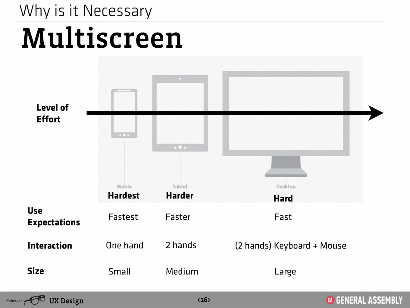
Why is it Necessary
Multiscreen
UX Design@cbecker <16>
Hardest Harder
Level of Effort
Hard
Interaction One hand 2 hands (2 hands) Keyboard + Mouse
Fastest Faster FastUse Expectations
Size Small Medium Large

Let get into it
Media QueriesCSS3 Media Queries are an extension of the CSS2-3 media type property and allow
several different rule sets based on the browser’s capabilities, including width and
height of the browser window and device, screen orientation, and resolution. This gives
you context-specific control over the layout of your content, allowing you to optimize
layout and design for specific browsers and device capabilities.
UX Design@cbecker <17>

Is all about
THE GRID“Well designed grid systems can make your designs not only more beautiful and legible, but more usable.” [ Mark Boulton ]
http://www.thegridsystem.org/
UX Design@cbecker <18>

UX Design@cbecker <19>
Is all about
RESPONSIVE CSS FRAMEWORKS
http://webexpedition18.com/articles/responsive-css-frameworks/

UX Design@cbecker <19>
Is all about
RESPONSIVE CSS FRAMEWORKS
http://www.awwwards.com/what-are-frameworks-22-best-responsive-css-frameworks-for-web-design.html
1. Responsive System
2. Twitter Bootstrap
3. Foundation 3
4. Groundwork
http://www.responsivegridsystem.com/
twitter.github.com/bootstrap
foundation.zurb.com
groundwork.sidereel.com
http://goldengridsystem.com/
5. Golden Grid

UX Design@cbecker <19>
Is all about
Twitter Bootstrap

Let get into it
Case Studies
UX Design@cbecker <20>
http://narrowdesign.com/

Let get into it
Case Studies
UX Design@cbecker <21>
http://www.stinkdigital.com/
parallax + RWD
Let get into it
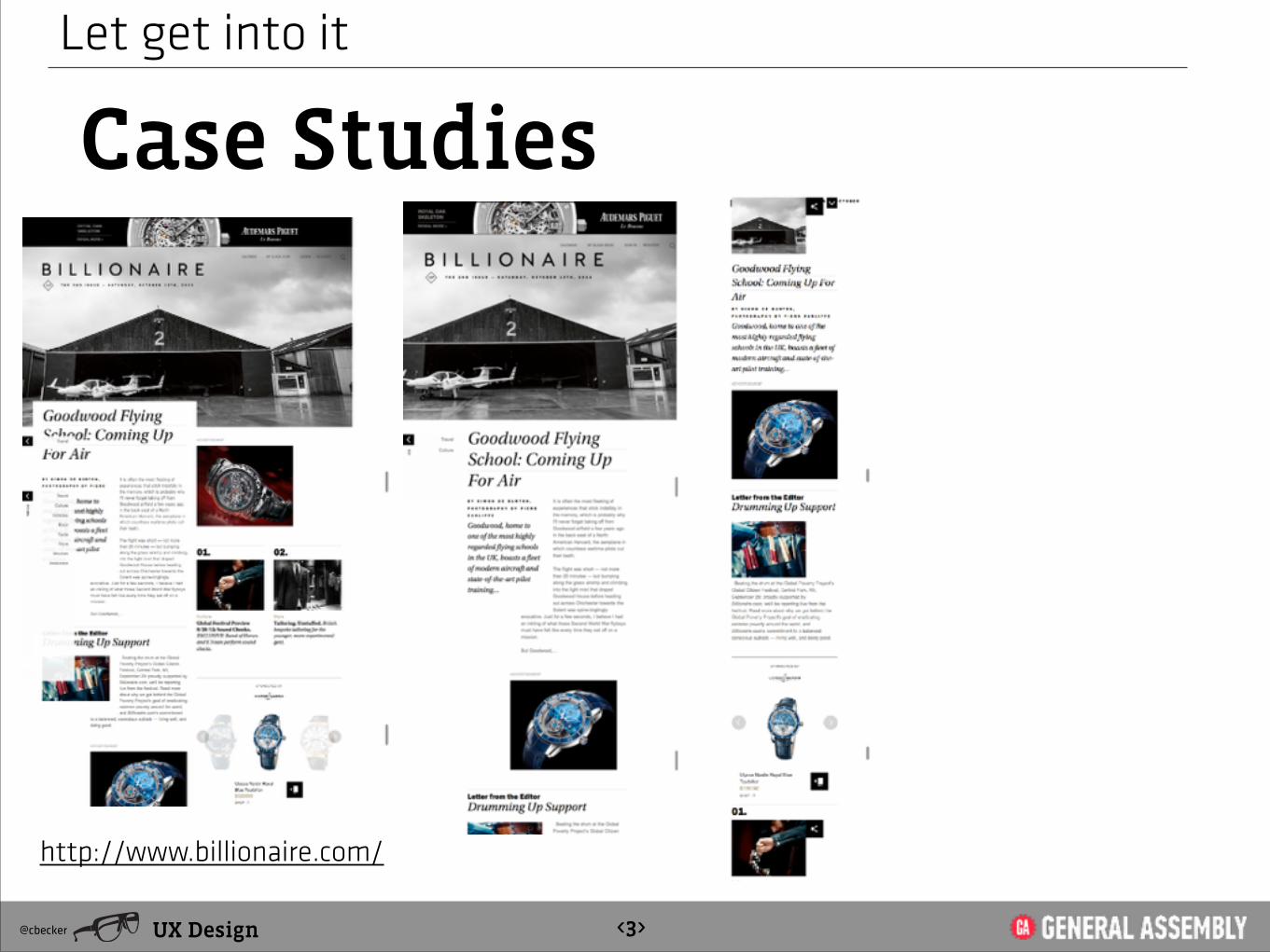
Case Studies
UX Design@cbecker <3>
http://www.billionaire.com/
http://www.billionaire.com/

RWD still has to follow
UX Design@cbecker <23>
Best Practices
Goals + Common Sense + Interaction Principles +
Testing & ValidationBackground Information
Page Layout
Browser Compatibility
Navigation
Color and Graphics
!Multimedia
Content Presentation
Functionality
Accessibility
http://terrymorris.net/bestpractices/
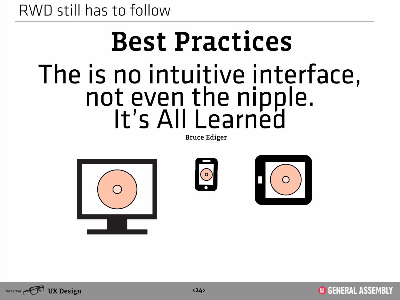
RWD still has to follow
UX Design@cbecker <24>
Best PracticesThe is no intuitive interface,
not even the nipple. It’s All Learned
Bruce Ediger
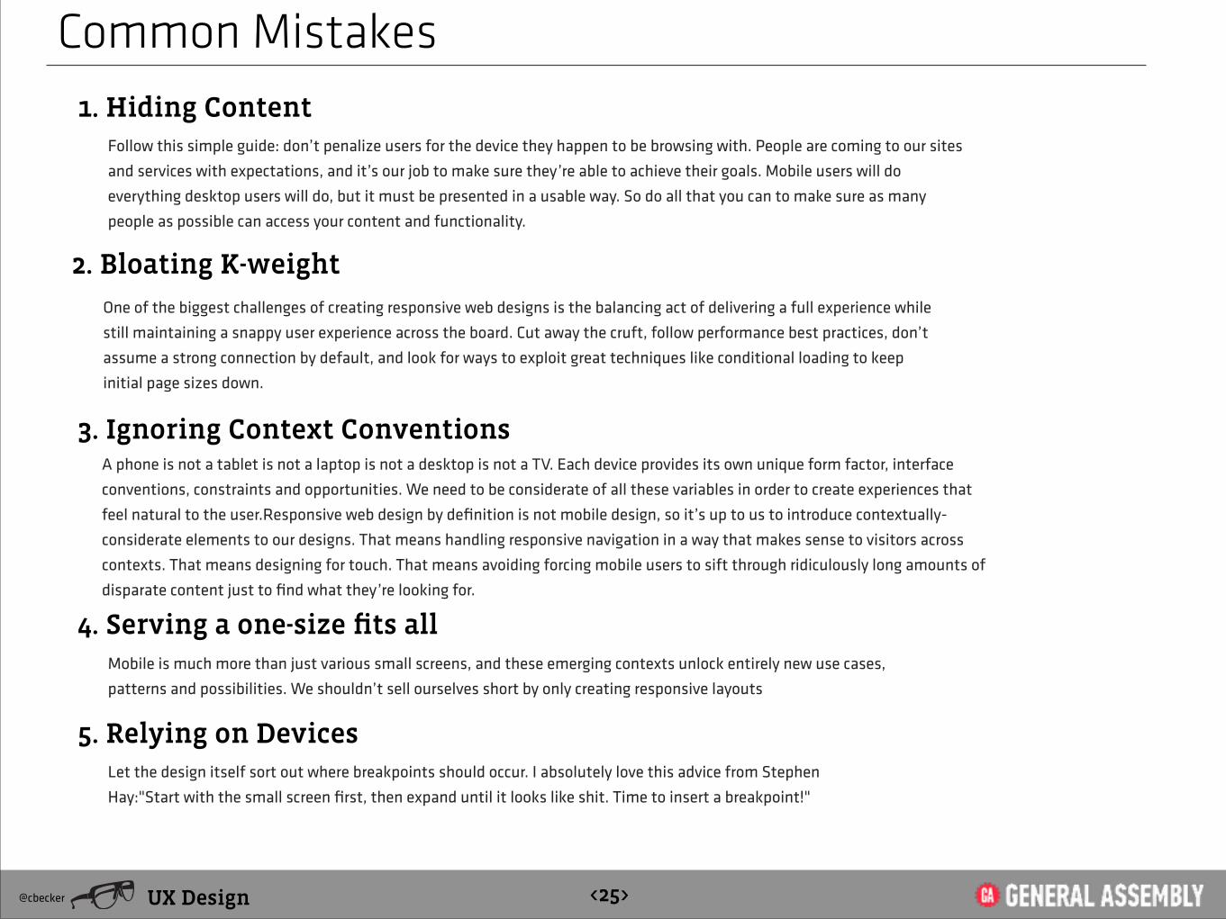
Common Mistakes1. Hiding Content
UX Design@cbecker <25>
2. Bloating K-weight
3. Ignoring Context Conventions
Follow this simple guide: don’t penalize users for the device they happen to be browsing with. People are coming to our sites
and services with expectations, and it’s our job to make sure they’re able to achieve their goals. Mobile users will do
everything desktop users will do, but it must be presented in a usable way. So do all that you can to make sure as many
people as possible can access your content and functionality.
One of the biggest challenges of creating responsive web designs is the balancing act of delivering a full experience while
still maintaining a snappy user experience across the board. Cut away the cruft, follow performance best practices, don’t
assume a strong connection by default, and look for ways to exploit great techniques like conditional loading to keep
initial page sizes down.
A phone is not a tablet is not a laptop is not a desktop is not a TV. Each device provides its own unique form factor, interface
conventions, constraints and opportunities. We need to be considerate of all these variables in order to create experiences that
feel natural to the user.Responsive web design by definition is not mobile design, so it’s up to us to introduce contextually-
considerate elements to our designs. That means handling responsive navigation in a way that makes sense to visitors across
contexts. That means designing for touch. That means avoiding forcing mobile users to sift through ridiculously long amounts of
disparate content just to find what they’re looking for.
4. Serving a one-size fits allMobile is much more than just various small screens, and these emerging contexts unlock entirely new use cases,
patterns and possibilities. We shouldn’t sell ourselves short by only creating responsive layouts
5. Relying on DevicesLet the design itself sort out where breakpoints should occur. I absolutely love this advice from Stephen
Hay:"Start with the small screen first, then expand until it looks like shit. Time to insert a breakpoint!"
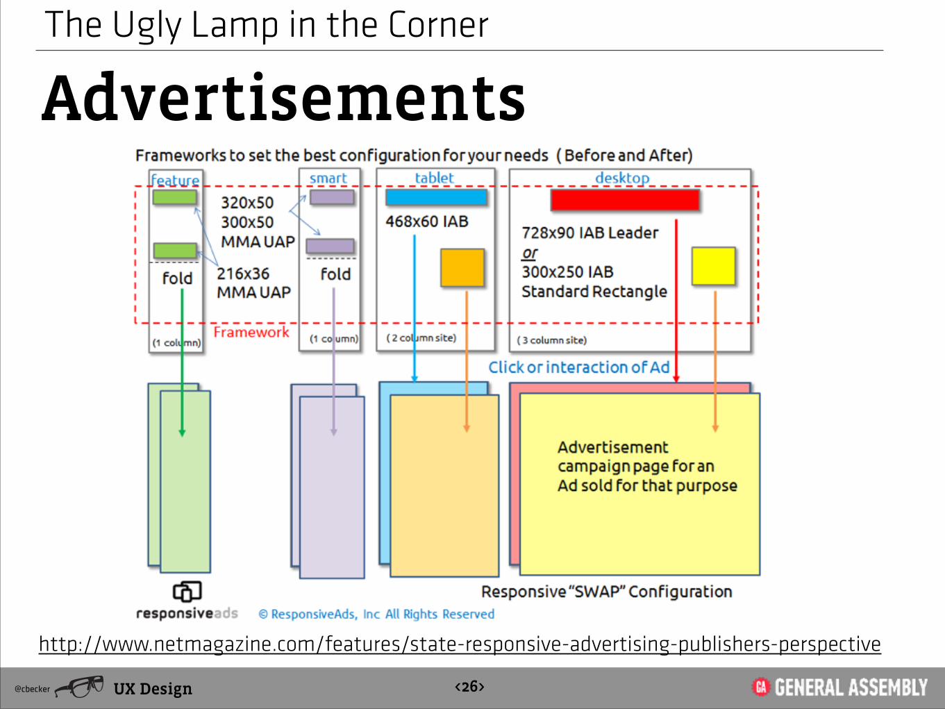
The Ugly Lamp in the Corner
Advertisements
UX Design@cbecker <26>
http://www.netmagazine.com/features/state-responsive-advertising-publishers-perspective

The Ugly Lamp in the Corner
Advertisements
UX Design@cbecker <27>

Working on it
UX Design@cbecker <27>
http://adcade.com/

Some Links
UX Design@cbecker <28>
http://mobile.smashingmagazine.com/2013/06/18/adapting-to-a-responsive-design-case-study/
http://webdesignledger.com/inspiration/21-fresh-examples-of-responsive-web-design? utm_source=dlvr.it&utm_medium=linkedin
http://matthewjamestaylor.com/blog/responsive-banner-ads
http://designshack.net/articles/css/5-really-useful-responsive-web-design-patterns/
http://msdn.microsoft.com/en-us/magazine/hh653584.aspx
http://www.lukew.com/ff/entry.asp?1514
http://responsive.is/grillroyal.com
http://wdn.unl.edu/responsive/viewer/
Conversation
Q
UX Design@cbecker <28>
A&(not quality assurance)
Thank you
UX Design@cbecker <3>
UX Design @cbecker