numeracy4life.wikispaces.comnumeracy4life.wikispaces.com/file/view/student+resource... · web...
TRANSCRIPT

Features of and How to Construct a range of graphs
Contents
1. Line Graphs page 2
2. Column Graphs 4
3. Bar graphs 6
4. Sector Graphs 8
5. Divided Bar Graphs 12
6. Sorting Data 14
7. Histograms 15
8. Frequency Polygons 16
9. Histograms & Frequency Polygons 18
10. Population Pyramids 19
1

Line Graphs
Why use a line graph?
1. The line graph conveys more information than most graphs, and is often quite detailed.
2. It shows trends and relationships clearly.3. The line graph has a large variety of forms and applications. (Travel graphs,
conversion graphs, graphs describing physical phenomena, step graphs, lines of best fit, number plane graphs).
4. Line graphs also give meaningful information about the in-between values of particular data. In other words we can say that a line graph is best used for continuous data.
Temperature change during the day
A titlea
A title
Vertical AxisLabelled
Axis evenly Horizontal Axisscaled labelled
Features:
When constructing line graphs they must be drawn on graph paper and include:
1. a title2. a horizontal axis that is evenly scaled and labelled (usually as time)3. a vertical axis that is evenly scaled and labelled4. a line or smooth curve that joins successive plotted points.
Example Line Graphs2

The line graph below represents the hours of sport played by Year 8 students per week.
1. What were the maximum and minimum hours of sport played per week?
Maximum = 5 hours (highest graph point)
Minimum = 1 hour (frequency value of 3 corresponds to 1 hour)
2. How many students play at least 6 hours of sport per week?
There are 15 students who played at least 6 hours of sport per week.
3. How many students were included in the survey?
Total: =3+8+10+12+16+8+7 +…. (Add each of the frequencies to find the total) = 64
64 students were surveyed.
3

Column Graphs
FeaturesWhen constructing column graphs, they should be drawn on graph paper and have:
1. a title2. labelled axes which are clearly and evenly scaled3. columns of the same width4. an even gap between each column5. the first column beginning half a unit (that is, half the column width) from the
vertical axis.
Year 8 Blue’s favourite pets
Title
labelled vertical axis
Even gap between columns
Why use a column graph?
The graph allows comparisons to be made at a glance. The column graph shows more detail than most other graphs A column graph may be used to display numerical or non-numerical
data.
4
Columns the samewidth
Even Scale
labelled horizontal axis

Example
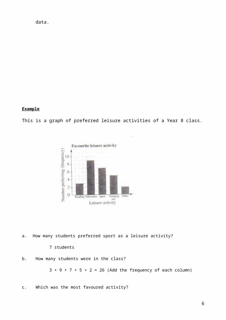
This is a graph of preferred leisure activities of a Year 8 class.
a. How many students preferred sport as a leisure activity?
7 students
b. How many students were in the class?
3 + 9 + 7 + 5 + 2 = 26 (Add the frequency of each column)
c. Which was the most favoured activity?
Television (Highest frequency)
d. How many more students preferred Sport to ‘Hanging Out’?
7 – 5 = 2 (subtract frequencies of Sport and ‘Hanging Out’)
e. How many times more popular than reading was watching television?
Television : 9Reading : 3
:. 9 ÷ 3 = 3
:. Television was 3 times more popular.
Text
1) Maths Quest 8 for New South Wales (Jacaranda).
2) Signpost Maths Year 8 (Longman).
Bar Graphs5
Why use a horizontal bar graph?
The graph allows comparisons to be made at a glance. The horizontal bar graph shows more detail than most other graphs. It may be used to display numerical or non-numerical data.
Title
Features:
When constructing bar graphs, they should be drawn on graph paper and have:
1. a title2. labelled axes which are clearly and evenly scaled3. horizontal bars of the same width4. an even gap between each horizontal bar5. the first horizontal bar beginning half a unit (that is, half the bar width) above the
horizontal axis.
Example
6
Labelled
vertical axis
columns the same width
labelled horizontal axis

The graph represents the favourite television shows of 500 teenagers aged between 13 and 15.
a. What percentage of the teenagers preferred watchingcomedy television shows?
10% of the teenagers (Read the ‘Comedy’ bar)
b. How many of the teenagers in the sample preferredto watch Science fiction television shows?
8% of 500 = 8 x 500 = 40 100
40 teenagers preferred Science
c. What was the least favoured television show?
The least favoured shows are the documentariesand lifestyle programs.
d. What were the two most popular television shows?
The two most popular shows are cartoons andpolice dramas.
e. Which television show is three times more popular than the news?
News = 6%
Required % = 3 x 6 = 18% Soaps = 18%
f. Which television show did 10% of the teenagers watch?
Comedy and thriller shows are preferredby 10% of the teenagers.
g. What scale has been used on the horizontal axis?
Scale is 1 cm = 5% (from the graph each cm represents 5%)
7

Sector Graphs
Why use a sector graph?
1. The sector graph is uncomplicated and appeals to people because it’s like cutting up a pie.
2. In a sector graph, one whole (3600 at the centre) is divided into parts according to the size of the categories.
3. Sizes of categories are easily compared.
4. The sector graph is attractive yet takes up little space.
5. A sector graph is best used to represent categorical data.
Features
A sector graph must have a title or heading. No axes are necessary. Each sector should be labelled or colour coded with an appropriate key provided.
8
Title
Sectors labelled

Examples
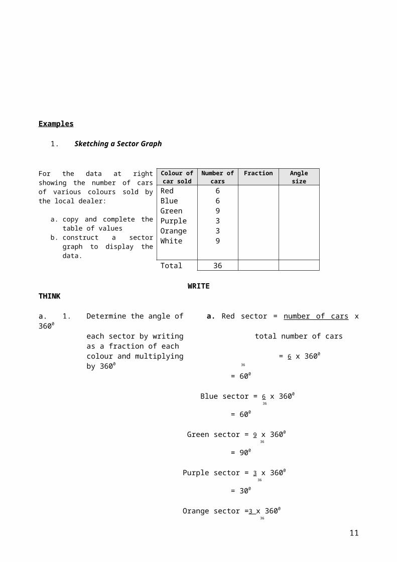
1. Sketching a Sector Graph
For the data at right showing the number of cars of various colours sold by the local dealer:
a. copy and complete the table of values
b. construct a sector graph to display the data.
Colour of car sold
Number of cars
Fraction Angle size
RedBlueGreenPurpleOrangeWhite
669339
Total 36
WRITETHINKTHINK
a.a. 1. Determine the angle of a. Red sector = number of cars x 3600
each sector by writing total number of carsas a fraction of eachcolour and multiplying = 6 x 3600
by 3600 36
= 600
Blue sector = 6 x 3600
36
= 600
Green sector = 9 x 3600
36
= 900
Purple sector = 3 x 3600
36
= 300
Orange sector =3 x 3600
36
= 300
White sector = 9 x 3600
36
= 900
2. Add each of the angles Total = 600 + 600 + 900 + 300 + 300 + 900
to obtain the total sum = 3600
and enter in the table.Note: The sum should equal3600
3. Enter all results into the table.
Colour of car sold
Number of cars
Fraction Angle represented by
fraction
Red 6 1 600
9

6Blue 6 1
6600
Green 9 14
900
Purple 3 112
300
Orange 3 112
300
White 9 14
900
Total 36 1 3600
b.b.1. Use a compass to draw a
circle and clearly mark the centre.
2. Draw a horizontal line extendingfrom the centre of the circle to therim of the circle.
3. Measure the angle of the redsector calculated in part a a (thatis, 600) and mark this on the diagram.
4. Label this sector as red, shade itand place the number 6 ( that is, the number of red cars) in brackets next to the word ‘red’.
5. Repeat these steps for the remaining sectors
10
2. Interpreting a Sector Graph
The sector graph shows the method of travel to school by a group of 60students.
Method of travel to school
a. Measure the sector angle for each category.
b. What fraction of the students travel by:i) bus; ii) train; iii) car; iv) walk;v) bicycle?
c. How many students travel by:i) bus; ii) train; iii) car; iv) walk;v) bicycle?
a. Measure each of the sector angles with a protractor
b. Hence, the fraction of students who travel by:
i bus = 180 ii train = 60 360 360
= 1 =1 2 6
iii car = 48 iv walk = 42 v bicycle = 30 360 360 360
= 2 =7 = 1 15 60 12
c. Hence, the number of students who travel by
i bus = 180 x 60 = 30 360
ii train = 60 x 60 = 10 360
iii car = 48 x 60 = 8 360
iv walk = 42 x 60 = 7 360
v bicycle = 30 x 60 = 5 360
Total: = 60
Category Sector angle
bustraincar
walkbicycle
1800
600
480
420
300
Total-------------
3600
----------------------
11

Divided Bar Graph
Why use a divided Bar Graph?1. The bar graph makes use of a rectangle.2. The bar graph is uncomplicated in its appearance and takes up little
space.3. It shows how the whole is divided into its parts. The large “bar” is divided up
according to the size of its parts.4. You can compare the sizes of the categories easily.5. It doesn’t attempt to communicate detail except through percentages which may
be given on the graph.
Religion in Liberia (Ivory Coast) 1983
Traditional African57%
Muslim18%
Christian25%
3.99 cm 1.26 cm 1.75cm
7 cm
Features
1. The bar graph must have a title or heading.
2. No axes are necessary.
3. When drawing the graph decide on a length for the bar
* (10 cm is a desirable length) and use mathematics to find the length of each part.
* Find what fraction or percentage a category is of the whole, then give that fraction or percentage
of the bar to that category.
Example:
In a survey, 50 salesmen were asked the country of manufacture of their car. The results were:
Country Australia Japan Korea Germany OtherFrequency 17 19 6 3 5
a. Calculate the percentage of cars manufactured in each country.
b. Hence, draw a divided bar graph to illustrate this data.
__________________________________________________________________________________
a.Country Frequency Percentage of total
12

Australia
Japan
Korea
Germany
Other
17
19
6
3
5
17 x 100% = 34%50
19 x 100% = 38%50
6 x 100% = 12%50
3 x 100% = 6%50
5 x 100% = 10%50
Total 50
b.b. Step 1: Draw a rectangular bar of convenient length, i.e. one that can easily be divided intopercentages. (100 mm is a convenient length).
Step 2: Divide the bar into parts in the proportion of the percentages found above, that is, length of part representing
Australia = 34% of 100mm = 34 mmJapan = 38% of 100 mm = 38 mmKorea = 12% of 100 mm = 12 mmGermany = 6% of 100 mm = 6 mmOther = 10% of 100 mm = 10 mm
Hence. the divided bar graph is
Country of manufacture of cars
13

Sorting DataThe Frequency Distribution Table
When a large amount of data has been collected, it is usually fairly useless until it has been sorted in some way and presented in a form that is easily read. A common method of sorting data involves using a frequency distribution table.
Example
Elizabeth surveyed the 30 students in her class to determine the number of children in each family. This resulted in the following data:
2 3 1 2 5 4 1 2 3 32 4 6 4 4 2 3 1 1 32 1 5 3 3 2 1 2 4 2
If the data is organised in a frequency distribution table, it looks like this:
Score Tally Frequency123456
IIII IIIII IIIIIIII IIIIIIIII
697521
Total: 30
Features
The Score column shows the possible data. The Tally column used is for recording the data, one entry at a time. The Frequency is the total tally for each sore. The Total of the frequencies should be the same as the number of scores.
14

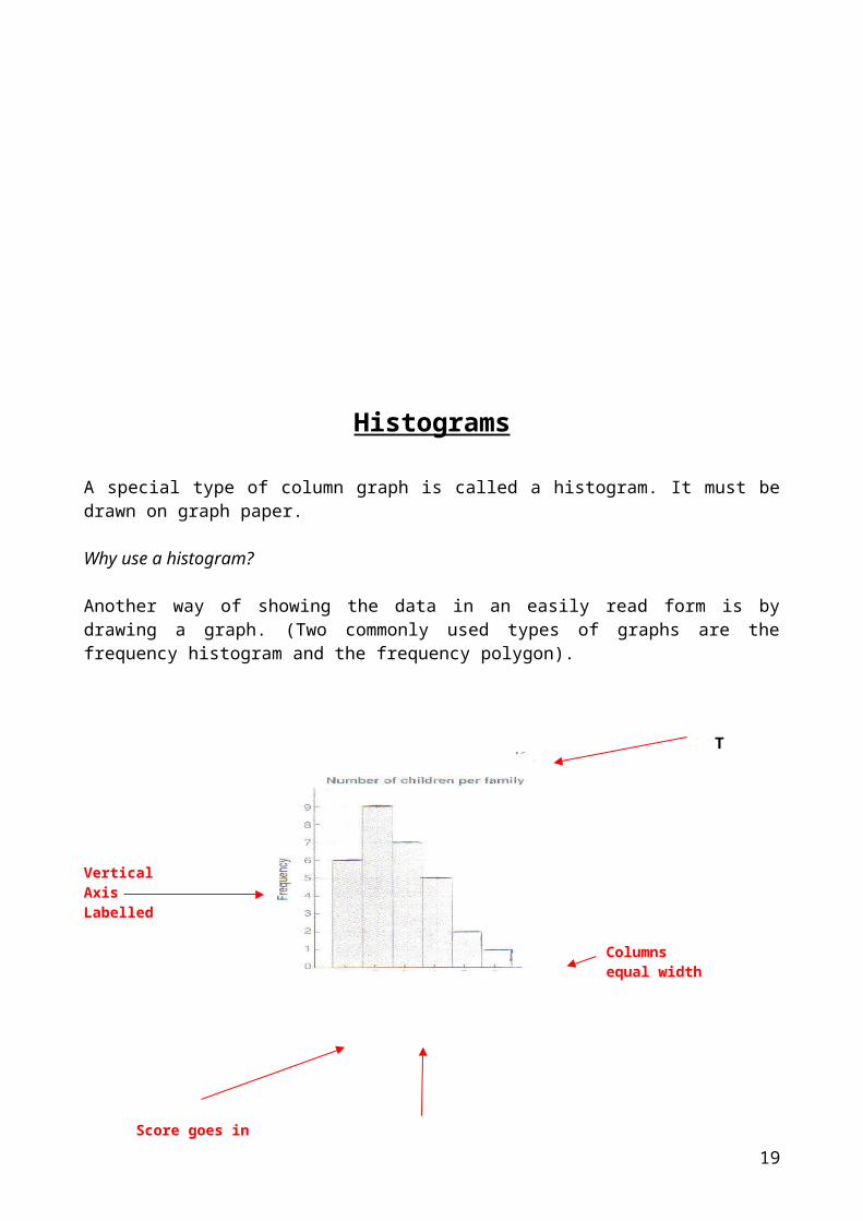
Histograms
A special type of column graph is called a histogram. It must be drawn on graph paper.
Why use a histogram?
Another way of showing the data in an easily read form is by drawing a graph. (Two commonly used types of graphs are the frequency histogram and the frequency polygon).
T Title of graph
Vertical AxisLabelled
Columns equal width
Score goes inthe middle of the Horizontal Axis Labelled
column
Features:
1. Each axis is labelled.
2. The graph has a title.
3. All columns are of equal width.
4. No gaps are left between columns
5. Each column ‘straddles’ an x-axis score; that is, the column starts and finishes halfway between scores.
6. Usually a half-interval is left at the beginning and end of the graph. That is, the first score is one unit in
from the frequency (y)-axis.
Frequency Polygons
15

Why use a frequency polygon?
Another way of showing the data in an easily read form is by drawing a graph.
Number of children per family
Ti Title
VerticalAxisLabelled
horizontal axis labelled
Features:
This is a type of line graph. Note that the axes are the same as for the histogram. You should note the following features:
Each axis is labelled.
The graph has a title.
The midpoints of the tops of the histogram columns are joined by straight intervals.
The dots showing the data are joined by straight lines.
The first and last dot are connected to the horizontal axis as shown.
The first score is one unit in from the vertical axis.
Histograms and frequency polygonsIn this section we will use our knowledge of column and line graphs to create two similar types of graphs: the histogram and the frequency polygon.
16

HistogramsA special type of column graph is called a histogram. It must be drawn on graph paper and has the following characteristics:
1. All columns are of equal width.2. No gaps are left between columns.3. Each column ‘straddles’ an x-axis score; that is, the column starts and finishes
halfway between scores.4. Usually a half-interval is left at the beginning and end of the graph. That is, the
first score is one unit in from the frequency (y)-axis.
The histogram at right displayed Children in familythe data collected in a survey conducted to find the number of children in a family. The data collected for 20 families is shownin the table below.
Score Tally Frequency012345
IIIIIIIIIIII IIIII
I
457301
Total 20
Frequency polygonsA special type of line graph, calleda frequency polygon, has the followingcharacteristics.
1. The frequency polygon uses the same scaled axes as the histogram.2. The midpoints of the tops of the histogram columns are joined by straight intervals.3. The polygon is closed by drawing lines at each end down to the score (x)-axis.
The data presented in the histogram above can be used to create a frequency polygon.
THINKTHINK
c 1c 1 Use frequency distribution table to determine the smallest frequency value and which score it corresponds to.
22 Answer the question.
dd Add all of the frequencies which
WRITE
c The smallest frequency value of 3 corresponds to 1 hour of sport being played per week.The least common hours of sport played per week is 1 hour.
dd At least 6 hours: 8 + 7 = 15.
17

correspond to at least 6 hours of sport being played per week (that is, 6 and 7 hours) and answer the question.
ee Add all of the frequencies which correspond to, at most, 3 hours of sport being played per week (that is 1, 2 and 3 hours) and answer the question.
f 1f 1 Add each of the frequencies to determine the total number of students surveyed.
22 Answer the question.
g 1g 1 Mark the midpoints of the tops of the columns obtained in the histogram from part a.a.
22 Join the midpoints by straight line intervals.
33 Close the polygon by drawing lines at each end down to the score (x) axis.
4 The frequency polygon may be left overlayed on the histogram or
may be transferred to a separate set of axes.
There are 15 students who played at least 6 hours of sport per week.
ee At most, 3 hours: 3 + 8 + 10 = 21.There are 21 students who played, at most, 3 hours of sport per week.
ff Total = 3 + 8 + 10 + 12 + 16 + 8 + 7 = 64
64 students were surveyed.
gg
Population Pyramids
Why use a population pyramid?
Population pyramids are also known as age, sex pyramids They show graphical data about the age and sex structure of a population Geographers, economists, government departments and planners use population
pyramids
18
Age pyramids are a very effective way of showing change in a country’s age structure over time, or for comparing different countries
Features
Title: short and descriptive Vertical axis: shows the age groups in five year age groups eg. 0-4, 5-9 Horizontal axis: is divided into males on the left and females on the right Scale: the horizontal axis shows the percentage of the total population- left for male
and right for female Space: equal space is left in between columns as in a column graph Population graphs: are 2 column graphs turned on their sides, they are share the
vertical axis.
Examples
INDIGENOUS POPULATION — 2001
TOTAL AUSTRALIAN POPULATION — 2001
19

Source: Australian Demographic Statistics, September 2002 (cat. no. 3101.0)
http://www.abs.gov.au/websitedbs/cashome.nsf/Home/Entry%20Page.es
Constructing a population pyramidWhen constructing a population pyramid use Handout 1 A short descriptive title usually a location and year eg, Total Australian Population
2001 Use a pencil and ruler Half the row horizontally Only shade the bottom half of each row to the measured percentage, this will allow for
the column graph effect
Handout 1. Population Pyramid
20

Location: ____________________________ Year: ____________________
Male Female95+Yrs.90-94Yrs.85-89Yrs.80-84Yrs.75-79Yrs.70-74Yrs.65-69yrs.60-64Yrs.55-59Yrs.50-54Yrs.45-49Yrs.40-44Yrs.35-39Yrs.30-34Yrs.25-29Yrs.20-24Yrs.15-19Yrs.10-14Yrs.5-9Yrs.0-4Yrs.
10 9 8 7 6 5 4 3 2 1 0 1 2 3 4 5 6 7 8 9 10 PERCENT PERCENT
21