resource guide - engravers network · resource guide color byte rip 9 ... crop marks, only...
TRANSCRIPT
RESOURCE GUIDE
Color Byte RIP 9
Direct Color Systems
Volume
1

DIRECT COLOR SYSTEMS
ADVANCED RESOURCE GUIDE
Direct Color Systems 99 Hammer Mill Road Rocky Hill, CT 06067
Phone 860-829-2244 • www.DirectColorSystems.com

Table of Contents
I N H E R E N T R E L A T I O N S H I P S W I T H I N T H E R I P
1
INHERENT
RELATIONSHIPS
WITHIN THE RIP
RIP stands for Raster Image Processor. The RIP is the intermediary program that takes a file and converts it into a language the printer can understand. Taking the time to have an advanced knowledge of the RIP will benefit in the long run.
he RIP will be much easier to understand if the user thinks of it as an inherent system. Making changes to settings at one level will affect settings in another. However, this also means that making changes at some level will not affect settings in another. This makes understanding the levels of the
RIP essential to being successful.
Print Queues - Defined
The RIP, sometimes referred to as the queue or back-end, uses queues as its foundation. Queues help to categorize jobs based on print order or substrate selection. Each Queue has its own properties and therefore becomes the first level at which settings can be changed and overridden.
Changing Queue Properties
Within the Queue Properties there are Print Mode Override options. It is recommended that the user DOES NOT change these as it usually leads to confusion when printing.
Print Modes – Defined
Print Modes work together with the queues to give the user a starting point with regards to print settings. Each queue has a default print mode. If Print Mode
Chapter
1
T

I N H E R E N T R E L A T I O N S H I P S W I T H I N T H E R I P
2
Overrides within the queue Properties have not been overridden (see Changing Queue Properties) any job that is imported into the queue will automatically have the settings of the default print mode. The default print mode can be changed by the user if desired. However, it is important to realize that once the default print mode has been changed in a queue, a job has to be re-imported for the new print mode to take effect.
Just because there is a default print mode assigned to the queue does not mean other print modes cannot be used within that queue. Every job in the queue can have its own print mode assigned to it. There is a hierarchy of print modes that will be described in detail later in this guide. Print Modes are the most important part of the RIP as they determine print order and therefore need to be looked at very closely as they have a direct impact on output.
Print Jobs – Defined
A print job is defined as any file that is brought into the RIP with the intention of outputting to the printer. As stated before, when a print job is brought into the RIP it will either receive the settings of the default print mode assigned to that Queue or it will take on the settings of the Queue that have been overridden by the user.
Here we see our 3rd level of changing settings. Before the job is ripped it can be opened and the settings assigned to that job can be seen. These settings can be altered at this point and will only take affect for that particular job. Changing settings on a job level is helpful when running tests to try and achieve a particular output. Settings can be easily altered and re-altered until the output is acceptable and then those settings can be saved into a new print mode. That print mode can then be set as the default print mode of the Queue and every job that is sent to that Queue will initially have those settings assigned to it.
Inherent Relationship Summary
We have now defined the three levels at which we can change settings; Queue, Print Mode and Job. Changing settings on one level may not mean change settings on another. It is good practice to only change settings at one level, and usually this will not be at the Queue level. Understanding these relationships is very important to getting the correct output. Nine times out of ten users will believe they have all the settings correct but they are actually being overridden at some other level.
Navigating the RIP
Now that we have covered the main levels or parts of the RIP, let’s take a look at them and how to access them. Figure 1.12 is a cropped screen shot of what the main UI of the RIP looks like. The tabs on the Top (labeled Color Only, White with

I N H E R E N T R E L A T I O N S H I P S W I T H I N T H E R I P
3
Color etc.) are the Print Queues. Within that Queue is a job called ProfileTestChart which has the print mode Color Only Production Speed assigned to it.
Accessing Queue Properties
As stated before, it is not recommended that the user change settings on the Queue level. However, the queue settings do serve other purposes and the user should know how to access these if necessary.
1. Simply Double-Click the Queue Tab to access Queue Settings and/or With the desired queue selected go to Queue > Properties (ALT + Q) (see Figure 1.11)
After double-clicking, the dialog box in Figure 1.12 will appear. There are three sections within Queue Properties; Settings, Print Mode Overrides and Other. As stated before, it is not recommended that the user change any Print Mode Overrides at this point. Therefore, we will discuss the various categories under Settings and Other.
F I G U R E 1 . 1 1
F I G U R E 1 . 1 2

I N H E R E N T R E L A T I O N S H I P S W I T H I N T H E R I P
4
Note
If you do not see all these settings go to Tools > Options > Show Advanced Settings and Options.
Understanding Queue Properties
Settings Categories…
- General: Default Print Mode can be changed in this location, unless Layer Profiles (discussed later) are turned on.
- Hot Folders: Allows the user to set up a folder where a file can be dropped into and imported directly into the RIP and into a template if required.
- Media Setup: While the media size is defaulted to the maximum print size, the user can create templates and add other media sizes if needed.
I N H E R E N T R E L A T I O N S H I P S W I T H I N T H E R I P
5
- Layout Manager: Provides a list of options on how the RIP handles jobs when imported. These options include, but are not limited to, mirroring, rotating or cropping the job on import.
- Printer Status: Printer maintenance functions can be set to execute at certain times, determined by the user. The printer and rip must be connected and on for this to be affective.
- Job Reserve: Job Reserve will be turned on as a default. When on, the job will stay spooled after printing, cutting down on RIP times before each job. Note that if there are a large amount of jobs in the RIP this will take up hard drive space on the computer and could cause inefficiencies.
- Crop Marks: Crop marks, only available in Color Byte Rip 9.1 Build 3, give the user the ability to print labels on jobs. This can be useful when comparing different output.
Other Categories…
- Costing: The costing function calculates ink usage per job. Inputting Liter prices for ink will output a cost for the job that was ripped. Jobs DO NOT have to be printed for the costing feature to output data.
- Log: Information used by DCS Technicians only.
- History: Calculates rip and print times along with error reporting. Shows the total amount of prints and time printer has been printing.
Accessing Print Modes
Print Modes are what really drives the RIP and the output from the printer. The print modes that install have been carefully crafted by Direct Color

I N H E R E N T R E L A T I O N S H I P S W I T H I N T H E R I P
6
Systems and aim to give the user a broad selection when deciding how to output their job.
1. Go to Devices > Manage Print Modes
If there are multiple Devices installed the user can change devices by selecting the Show Print Modes For: drop down menu.
Understanding Print Modes
See Chapter 2
Accessing Job Properties
Double-Click the job in the Queue (Refer to Figure 1.11). The job must be opened to access the job properties. Right-Click the job and select Open Page if it is not open already.
F I G U R E 1 . 1 3
A N A L Y Z I N G A N D U N D E R S T A N D I N G P R I N T M O D E S
7
ANALYZING AND
UNDERSTANDING
PRINT MODES
Print Modes determine the output of the printer and output measures success. Comprehending print modes and what settings make each mode unique is the key to that success.
efault print modes are provided but may need to be altered based on substrate, production requirements, quality, color matching, cost etc.
Print Mode Names
All print modes use the same naming system. The first part is the queue in which the print mode belongs. For example: White with Color print modes should only be used for jobs that are in the White with Color queue. It is important to remember that the RIP will not prevent a user from using a White with Color print mode in a Color Only queue. So, it is up to the user to keep their jobs and print modes organized.
The second part of the print mode name is the quality setting or the definition of hierarchy. For example: White with Color Production Speed. Production Speed implies a print mode that is fast but maintains higher quality than a High Speed print mode.
Chapter
2
D
U N D E R S T A N D I N G A N D A N A L Y Z I N G P R I N T M O D E
Print Modes & the Quality Model
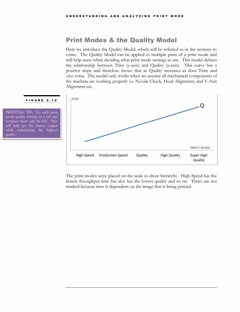
Here we introduce the Quality Model, which will be referred to in the sections to come. The Quality Model can be applied to multiple parts of a print mode and will help users when deciding what print mode settings to use. This model defines the relationship between Time (y-axis) and Quality (x-axis). This curve has a positive slope and therefore shows that as Quality increases as does Time and vice-versa. The model only works when we assume all mechanical components of the machine are working properly i.e. Nozzle Check, Head Alignment, and Y-Axis Alignment etc.
The print modes were placed on the scale to show hierarchy. High Speed has the fastest throughput time but also has the lowest quality and so on. Times are not marked because time is dependent on the image that is being printed.
0
1
2
3
4
5
6
High Speed Production Speed Quality High Quality Super High Quality
F I G U R E 2 . 1 0
PRINTING TIP: Try each print mode quality setting on a job and compare them side by side. This will help get the fastest output while maintaining the highest quality.
Q
TIME
PRINT MODE
U N D E R S T A N D I N G A N D A N A L Y Z I N G P R I N T M O D E
Print Mode Structure
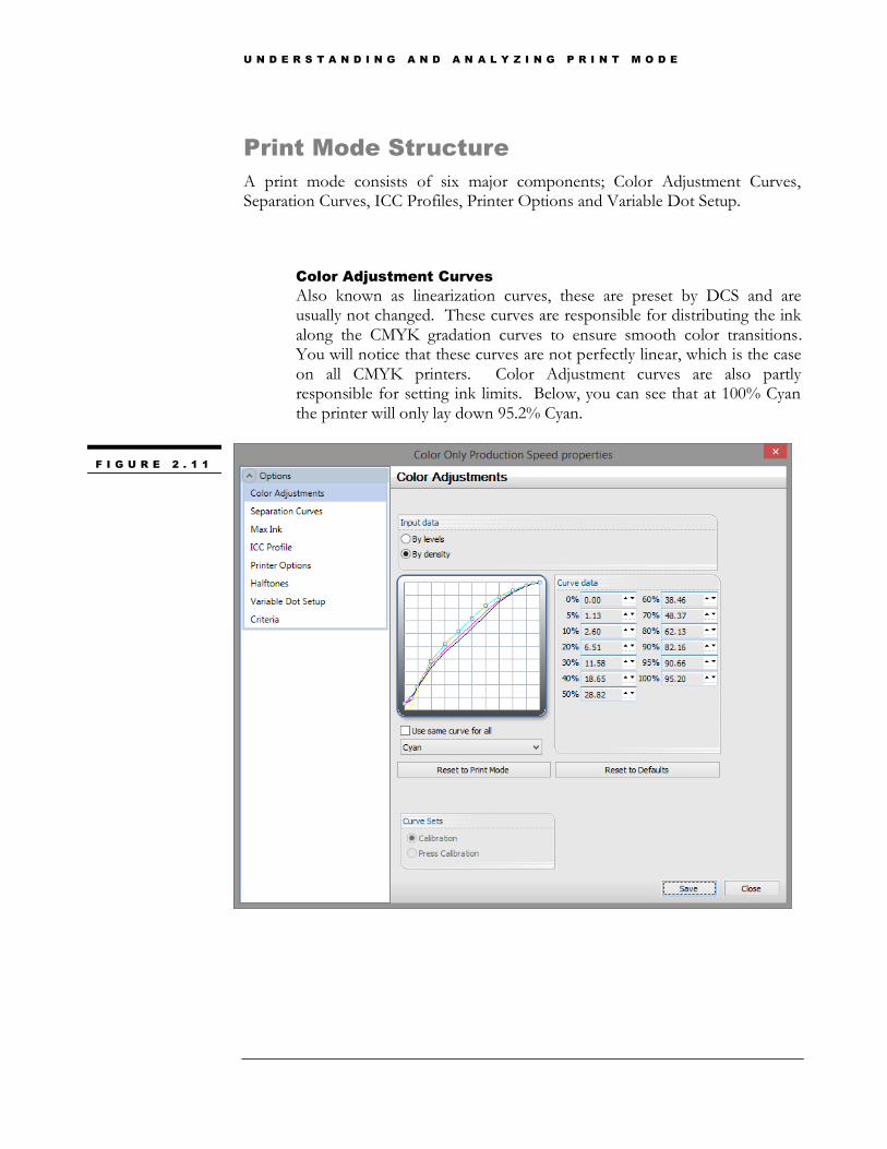
A print mode consists of six major components; Color Adjustment Curves, Separation Curves, ICC Profiles, Printer Options and Variable Dot Setup.
Color Adjustment Curves
Also known as linearization curves, these are preset by DCS and are usually not changed. These curves are responsible for distributing the ink along the CMYK gradation curves to ensure smooth color transitions. You will notice that these curves are not perfectly linear, which is the case on all CMYK printers. Color Adjustment curves are also partly responsible for setting ink limits. Below, you can see that at 100% Cyan the printer will only lay down 95.2% Cyan.
F I G U R E 2 . 1 1

U N D E R S T A N D I N G A N D A N A L Y Z I N G P R I N T M O D E
Separation Curves
The separation curves are just like the color adjustment curves but for spot colors, in this case Clear and White. Because these two spot colors do not directly affect color output, they remain linear at all times. These curves control the volume of clear and white ink that goes down in the print.
Figure 2.12 shows the Clear separation curve for this print mode. As we know, the machine has two clear channels and here the one curve controls both channels. Later in this guide we explain the relationship between clear and the other channels as it is a very involved process. Putting these two channels on one curve means that we are actually working with 200% ink volume at 100%. Having the curve at 50% will output 50% of clear from each channel or the equivalent of 100% clear from one channel. The White works the same way.
The only numbers we are really concerned with here are the values at 0% and 100%. The value at 0% should always remain 0%, unless a flood of clear is desired, and the value at 100% will be the amount of the spot color that will output.
F I G U R E 2 . 1 2
PRINTING TIP: Try adding more clear to get a glossier finish on your images or more white for a more opaque primer.

U N D E R S T A N D I N G A N D A N A L Y Z I N G P R I N T M O D E
Max Ink
Max Ink is another method of setting ink limits. The maximum ink volume is 400% (100% of Yellow, Magenta, Cyan and Black). Changing this setting after the fact will mean changing the color output and restricting the gamut the printer can achieve. The print mode selected here as a Max Ink of 280, which is preset by DCS during the profiling process.
F I G U R E 2 . 1 3
U N D E R S T A N D I N G A N D A N A L Y Z I N G P R I N T M O D E
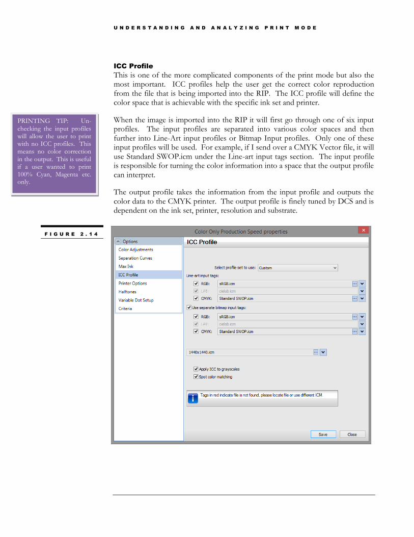
ICC Profile
This is one of the more complicated components of the print mode but also the most important. ICC profiles help the user get the correct color reproduction from the file that is being imported into the RIP. The ICC profile will define the color space that is achievable with the specific ink set and printer.
When the image is imported into the RIP it will first go through one of six input profiles. The input profiles are separated into various color spaces and then further into Line-Art input profiles or Bitmap Input profiles. Only one of these input profiles will be used. For example, if I send over a CMYK Vector file, it will use Standard SWOP.icm under the Line-art input tags section. The input profile is responsible for turning the color information into a space that the output profile can interpret.
The output profile takes the information from the input profile and outputs the color data to the CMYK printer. The output profile is finely tuned by DCS and is dependent on the ink set, printer, resolution and substrate.
F I G U R E 2 . 1 4
PRINTING TIP: Un-checking the input profiles will allow the user to print with no ICC profiles. This means no color correction in the output. This is useful if a user wanted to print 100% Cyan, Magenta etc. only.
U N D E R S T A N D I N G A N D A N A L Y Z I N G P R I N T M O D E
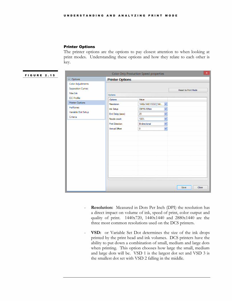
Printer Options
The printer options are the options to pay closest attention to when looking at print modes. Understanding these options and how they relate to each other is key.
- Resolution: Measured in Dots Per Inch (DPI) the resolution has a direct impact on volume of ink, speed of print, color output and quality of print. 1440x720, 1440x1440 and 2880x1440 are the three most common resolutions used on the DCS printers.
- VSD: or Variable Set Dot determines the size of the ink drops printed by the print head and ink volumes. DCS printers have the ability to put down a combination of small, medium and large dots when printing. This option chooses how large the small, medium and large dots will be. VSD 1 is the largest dot set and VSD 3 is the smallest dot set with VSD 2 falling in the middle.
F I G U R E 2 . 1 5
U N D E R S T A N D I N G A N D A N A L Y Z I N G P R I N T M O D E
- Ink Setup: This determines the order in which the channels are printed. Refer to Figure 3.13 to see these ink setups in more detail.
- End Delay (secs): Some jobs require multiple passes and therefore there is an end delay to give the print table time to reverse and enter into the print home state before sending the next job. If you are only running one pass jobs, feel free to turn this down to 5 secs.
- Nozzle Count: Nozzle count only applies to non-inline print modes. A 100% nozzle count means that all 180 nozzles will be used when printing. Moving the nozzle count from 100% to 85% will increase our time because now the print head will only use 153 nozzles.
- Print Direction: This setting is changed most often by users who are looking to either increase quality or decrease time. It is a simple concept and easy to alter.
o Bi-Directional: The print head will jet ink when it indexes in both directions. Time is cut in half compared to uni-directional printing. Difficult to get dot placement perfect because dots are being jetted in two different directions. Also, can show UV Banding.
o Uni-Directional (Left to Right): The print head will jet ink only when it indexes from the left side to the right side of the print engine. Placement of dots stays more constant as the ink is laid down only going one way. However, the time doubles from Bi-Directional as the print head has to do double the amount of passes.
- Vertical Offset: Because of inline printing, different nozzle counts and various resolutions being used on the DCS machine, not all the start points in each print mode are exactly the same. The vertical offset function is a way to line up certain print modes with each other. Numbers range from 0 inches to 1 inch with .001” increments. The higher the offset the further down the table the start point will be. For example, if the Color Only print mode had a vertical offset of 0.150” and the start point was 0.005” above the White with Color print mode that had a 0.350” vertical offset, the user has two choices. Decrease the color only print mode vertical offset to 0.145” or increase the White with Color vertical offset to 0.355”. It is important to note that there are 3 printer options that change vertical offsets; Resolution, Ink Setup and Nozzle Count.
DO NOT TURN THE END DELAY TO ZERO SECONDS AS THIS WILL CAUSE PRINTER ERRORS

U N D E R S T A N D I N G A N D A N A L Y Z I N G P R I N T M O D E
Variable Dot Setup
Not to be confused with Variable Set Dot explained earlier, the Variable Dot Setup is where the user can change the distribution of Small, Medium and Large dots that are used. This feature has a lot of benefits but the user must be cautious.
First we will talk about Variable Dot Setup in terms of ink volumes. To put it simply, to increase the saturation or ink volume, use more large dots and vice-versa. When changing dot settings on CMYK remember that the print mode was originally profiled with the default variable dot setup and making any changes will change the color output. Changing dot settings works very well when try to control ink volumes with spot colors (white and clear) as these do not fall victim to the same color shift. The user has the ability to use multiple dot profiles; technically each channel can have its own dot profile. By putting clear and white on a second dot profile, we can change their dot profile distribution without moving CMYK and getting different color output.
We can also discuss Variable Dot Setup in terms of print quality. Using large dots is good to increase ink volume, however when printing small text or graphics larger dots can decrease the quality of the print. Eliminating the large dots and increasing the amount of small dots can give the user sharp crisp fine point text.
To change the amount of small, medium and large dots, slide the bars or input numbers into the Fence point values section.
F I G U R E 2 . 1 6

U N D E R S T A N D I N G A N D A N A L Y Z I N G P R I N T M O D E
Print Mode Options
1024UVHS/1024UVMVP
Name Resolution Print Direction
High Speed 1440x720 Bi
Production Speed 1440x1440 Bi
Quality 1440x720 Uni
High Quality 1440x1440 Uni
Super High Quality
2880x1440 Uni
1014UV/1024UV
Name Resolution Print Direction
High Speed 1440x720 Uni
Production Speed 1440x1440 Bi
Quality 1440x1440 Uni
High Quality 2880x1440 Bi
Super High Quality
2880x1440 Uni
Our Quality Model gets a little more complex when we add in more variables. Print Direction and Resolution are the two overpowering factors when it comes to time and quality; 1440x1440 Bi-Directional is actually a lower quality than 1440x720 uni-Directional even though the resolution is higher the increase in quality due to uni-directional printing overcomes that. This is also file and user dependent, one image may look better to the user when it is printed at 1440x1440 Bi-Directional. It is all about finding the balance here to decide what print mode works best.

U N D E R S T A N D I N G A N D A N A L Y Z I N G P R I N T M O D E
The Quality Model Revisited
We now have a better understanding of the settings and can add more variables to our quality model. Now, the relationship has to be between Time, Resolution, Print Direction and how all of those things relate to Quality.
The Y-Axis is still Time but the X-Axis is now Resolution instead of print mode. We can draw our Quality curve to show the relationship between time and resolution. After drawing the Quality curve, we can make a Bi-Directional and Uni-Directional Quality curve. There is an overall shift of the curve because it has been determined that all Uni-Directional prints at the same resolution will be higher quality than Bi-Directional prints at the same resolution.
Drawing the curve like this allows us to see relationships between four factors; Time, Print Direction, Resolution and Quality. The only setting that is not included in this model is nozzle count. Nozzle Count, or the amount of nozzles used, can be added to the model in the same way Print Direction was. A decrease in the amount of nozzles used will shift the quality curve upwards. Let’s take a look at some of those relationships…
As resolution increases so does Time
As resolution increases so does Quality
Uni modes have equivalent times to Bi modes in the next highest resolution. Refer to the dotted lines on the graph 1440x720 Uni is the same time as 1440x1440 Bi.
Print Direction and Nozzle Count will shift the entire Quality curve
0
1
2
3
4
5
6
7
8
720x360 720x720 1440x720 1440x1440 2880x1440 5760x1440
F I G U R E 2 . 1 7
Quni
Qbi
TIME
RESOLUTION (dpi)
PRINTING TIP: The key here is to find a point on the curve that has acceptable quality and time. 1440x720 Uni takes the same amount of time as 1440x1440 Bi…but which one looks better?

U N D E R S T A N D I N G A N D A N A L Y Z I N G P R I N T M O D E
Inline Printing
Inline printing is a unique process developed by Direct Color Systems. Knowing what is really happening when printing inline is important.
nline printing is method of controlling the nozzles and separating them to print different sections of nozzles and channels simultaneously. This function allows for faster through put times and more accurate registration between layers of ink. Also, this has allowed for new features such as
Texured3D and ADA printing to be commercialized.
Inline Options
The inline method is built into the color models or ink setup feature that we went over previously. Print modes are separated into sets based on the order in which they lay down ink. For Example, a White with Color print mode will output white ink with CMYK on the top. There are multiple inline options…
White with Color
Color with White
Finish with Color
Color with Finish
Inline Texture
White with Color with Finish
Finish with White with Color
I

U N D E R S T A N D I N G A N D A N A L Y Z I N G P R I N T M O D E
How Inline Works
As stated before, Inline printing separates the head into sections and prints with different amounts of nozzles in different positions to achieve the desired output. An important rule to remember is that a channel cannot be used twice in the inline process. You cannot print 2 channels of white then CMYK then the 2 channels of white again.
Figure 3.11 is a graphical representation of the print head with the UV light source marked for a better understanding. The lines represent each channel, from left to right; Yellow, Magenta, Cyan, Black, Clear1, Clear2, White1 and White 2. In reality, these would not be lines but 180 tiny little holes called nozzles. Marked is nozzle 1 and nozzle 180. Printing begins at with Nozzle 1 or the leading edge of the print head.
When printing Color Only or any non-inline mode all 180 nozzles are being used to output all channels simultaneously. This is why non-inline print modes are faster, there are more nozzles available which requires less passes. Figure 3.12 shows how a White with Color inline mode would work. The red boxes show how the print head is segmented for this mode. The printer is going to start printing at Nozzle 1 (see Figure 3.11) and it will print the 2 white channels from nozzle 1 to nozzle 90 (Set #1) and then it will print CMYK and 2 clear channels from nozzle 90 to nozzle 180 (Set #2). The end result is CMYKCL1CL2 on top of WH1 and WH2.
F I G U R E 3 . 1 1
F I G U R E 3 . 1 2
NOZZLE 180
NOZZLE 1
NOZZLE 90

U N D E R S T A N D I N G A N D A N A L Y Z I N G P R I N T M O D E
At its most simplified level, that is Inline Printing. Here we can also start to see the relationship between inline print modes and time. We are using half the amount of nozzles we would for a non-inline mode (90 instead of 180) and therefore the printer has to do two times the amount of passes to make up for it. Therefore, inline modes will be double non-inline modes, if resolution and print direction are held constant.
Channel Sets
With the amount of inline modes available, understanding which channels go where is vital. Notice that some of the inline mode names in the left hand column are also the names of the queues in the RIP. Focus on the relationship of the clear ink to the other channels. When at all possible, clear ink is jetted simultaneously with CMYK. The footnotes help to explain the clear relationship in more detail.
Photo Quality Color Only
1 C M Y K CL1 CL2 WH1 WH22 - -
Photo Quality White with Color
2 WH1 WH2 C M Y K CL1 CL2 -
Economy Color Only 1 C M Y K CL1 CL2 WH1 WH23 - -
Economy White with Color
2 WH1 WH2 C M Y K CL1 CL2 -
Finish With Color 2 CL1 C M Y K CL2 WH1 WH2 -
Color with Finish 2 C M Y K CL1 CL2 -
Spot White 1 C M Y K CL1 CL2 WH1 WH24 - -
Color with Highlight White
1 C M Y K CL1 CL2 WH1 WH25 - -
Finish with White with Color
3 CL1 WH1 WH2 C M Y K CL2
White with Color with Finish
3 WH1 WH2 C M Y K CL1 CL2
ADA Base 1 C M Y K CL1 CL2 WH1 WH2 -
1 2 channels of clear will print with CMYK data only. If there is a spot white it will not receive any clear ink. 2 Same as Footnote 1 3 Same as Footnote 1 4 2 channels of clear will only print with a spot white. If there is CMYK data it will not receive
clear ink. 5 1 channel of Clear will go down with CMYK data and 1 channel of clear will go down with White
data.
F I G U R E 3 . 1 3
Ink Setup / Name # of Channel Sets
Set #1 Set #2 Set #3
Color Only 1 C M Y K CL1 CL2 WH1 WH21 - -
White with Color 2 WH1 WH2 C M Y K CL1 CL2 -
Color with White 2 C M Y K CL1 WH1 WH2 CL2 -
Inline Texture 2 WH1 WH2 CL1 C M Y K CL2 -
Inline Texture 2 2 WH1 WH2 CL1 CL2 C M Y K

U N D E R S T A N D I N G A N D A N A L Y Z I N G P R I N T M O D E
ADA Top 2 WH1 WH2 C M Y K CL1 CL2 -
U N D E R S T A N D I N G A N D A N A L Y Z I N G P R I N T M O D E
Color Management
Maybe one of the hardest concepts for new users to grasp is color management/matching, due to the complexity and subjective nature of the process.
ets approach this section by first laying down some ground rules. Color matching is extremely subjective and there is no right or wrong way to go about it. Some approaches are easier and have been proven to work better but they are not set in stone. This will attempt to educate and guide you
along the path but ultimately the color output has to be signed off by someone and what looks good to one person may look completely different to the one who has to sign off on it.
What is color management?
Color Management is a system that allows input devices, display devices and printers to speak a universal language. Each of these devices uses different technologies (or different color languages) to reproduce color. They also have different color ranges (or gamuts), so one device may be able to produce colors that the other devices can’t. A color management workflow will help you achieve consistent and more predictable color reproduction.
How does it work?
A color management system translates the different technologies used by your input, display, and printer using ICC profiles. These profiles describe the behavior (range or gamut) of each device. The color management system uses this information to accurately reproduce colors among all of the profiled devices.
Chapter
4
L
U N D E R S T A N D I N G A N D A N A L Y Z I N G P R I N T M O D E
The Variables
You have already had exposure to most of these variables but have not seen how they relate to color output. The variables that have an impact on color output include…
- Resolution | Color Adjustment Curves | Max Ink | Variable Dot Set | Variable Dot Setup
o All of these can be grouped together as they all work with each other. All of these tools within the print mode are used to set ink limits and control color output. During the profiling process these are all set and changing any of them will have a drastic impact on color output. We will, for the most part, hold these constant when color matching.
- Embedded, Input and Output Profiles o We will take a closer look at input profiles and embedded
profiles. The output profile will remain constant when color matching.
- Media: o This is a very important variable to consider when color
matching. Colors look extremely different on different substrates. When profiling a machine there is a white point as the base and anytime that white point is changed, colors have the ability to change as well.
Where to Start
The first thing to do is establish a benchmark. Preferably this is a tangible object in which output can be measured or assessed against. Too many times users will use the color on their monitor as the benchmark. This is not a good way to go about color matching. Monitors have the ability to show colors that are not achievable on CMYK printers and are usually not calibrated well enough to produce an accurate viewing environment for color. The benchmark also cannot be an idea of a color. There are an infinite amount of “reds” that the mind can think up, having a CMYK value for Red will get you to the correct color much quicker. Throughout this section remember that each print mode has the potential to output different colors. Determine what print mode you want to use and keep the print mode consistent through the color matching process.
Know Your Image
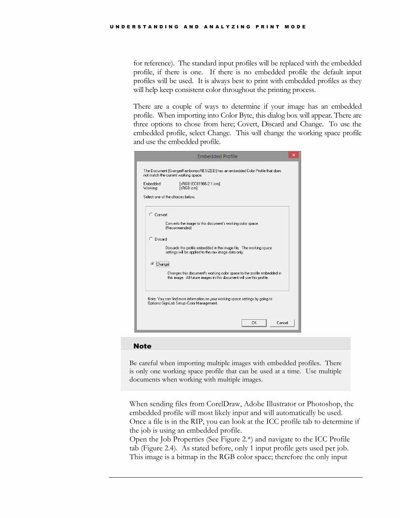
Determine if your image has an embedded profile associated with it. The image is going to go through an input profile before printing (see Figure 2.14
U N D E R S T A N D I N G A N D A N A L Y Z I N G P R I N T M O D E
for reference). The standard input profiles will be replaced with the embedded profile, if there is one. If there is no embedded profile the default input profiles will be used. It is always best to print with embedded profiles as they will help keep consistent color throughout the printing process.
There are a couple of ways to determine if your image has an embedded profile. When importing into Color Byte, this dialog box will appear. There are three options to chose from here; Covert, Discard and Change. To use the embedded profile, select Change. This will change the working space profile and use the embedded profile.
Note
Be careful when importing multiple images with embedded profiles. There is only one working space profile that can be used at a time. Use multiple
documents when working with multiple images.
When sending files from CorelDraw, Adobe Illustrator or Photoshop, the embedded profile will most likely input and will automatically be used. Once a file is in the RIP, you can look at the ICC profile tab to determine if the job is using an embedded profile. Open the Job Properties (See Figure 2.*) and navigate to the ICC Profile tab (Figure 2.4). As stated before, only 1 input profile gets used per job. This image is a bitmap in the RGB color space; therefore the only input
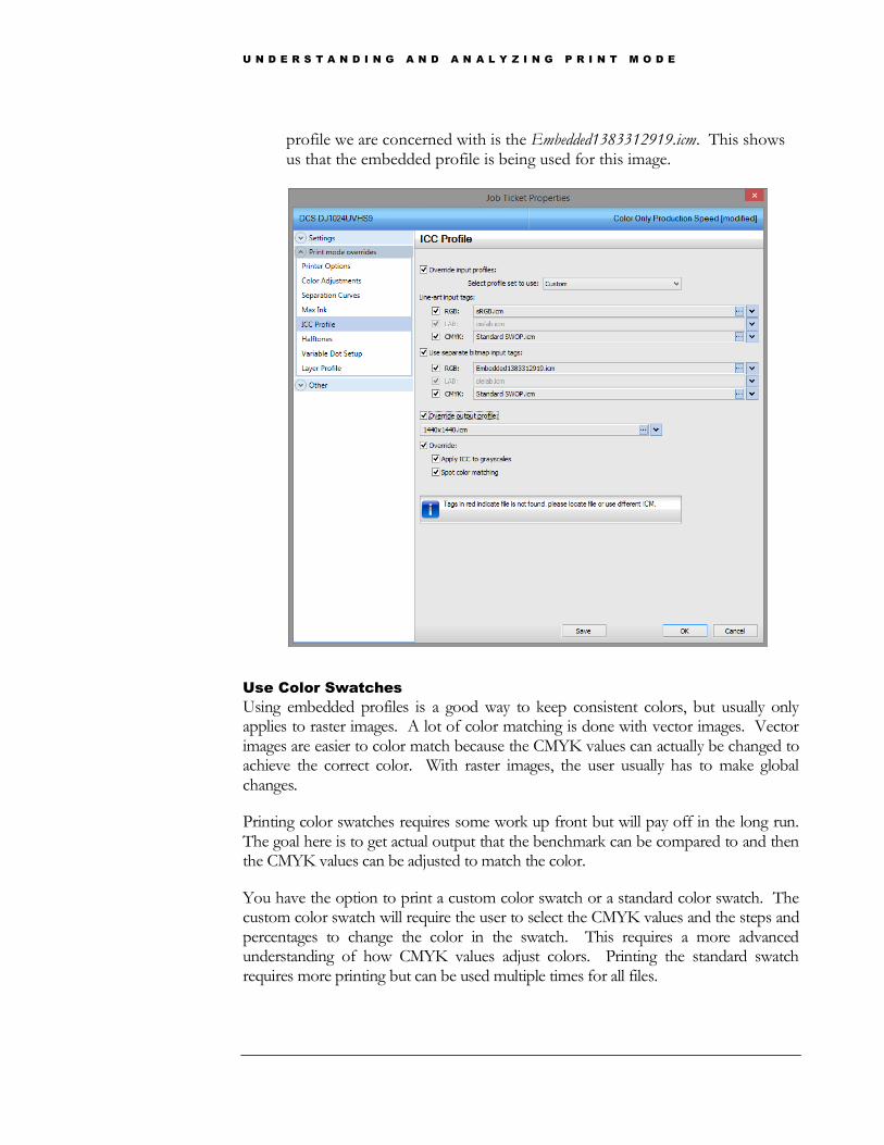
U N D E R S T A N D I N G A N D A N A L Y Z I N G P R I N T M O D E
profile we are concerned with is the Embedded1383312919.icm. This shows us that the embedded profile is being used for this image.
Use Color Swatches
Using embedded profiles is a good way to keep consistent colors, but usually only applies to raster images. A lot of color matching is done with vector images. Vector images are easier to color match because the CMYK values can actually be changed to achieve the correct color. With raster images, the user usually has to make global changes.
Printing color swatches requires some work up front but will pay off in the long run. The goal here is to get actual output that the benchmark can be compared to and then the CMYK values can be adjusted to match the color.
You have the option to print a custom color swatch or a standard color swatch. The custom color swatch will require the user to select the CMYK values and the steps and percentages to change the color in the swatch. This requires a more advanced understanding of how CMYK values adjust colors. Printing the standard swatch requires more printing but can be used multiple times for all files.

U N D E R S T A N D I N G A N D A N A L Y Z I N G P R I N T M O D E
In the Front End of Color Byte go to File > Color Swatches and select Standard CMYK.
Figure 4.3 shows all the standard color charts that need to be printed. While this is not the entire color gamut, printing these charts will help narrow down specific CMYK values.
Knowing how to read the chart is important. This is the 20% Yellow page, every square of color has 20% yellow in it. Magenta is on the X-Axis and Cyan is on the Y-Axis, both stepped by 10%. The black is added into the smaller squares by a value of 5%, 10%, 20% and 30%.
The highlighted color would have the CMYK value of…. Yellow - 20% Magenta- 30% Cyan- 5% Black- 20%
Custom color swatches can also be created. Input the CMYK value to start with and then how you want to step vertically and horizontally (Yellow and Magenta respectively). There may be some trial and error with this method.
F I G U R E 4 . 3
F I G U R E 4 . 4
PRINTING TIP: Make sure Dimensions and Notes is turned on in the Print and Cut setup menu. If this is not turned on the percentages will not be printed next to the colors.
U N D E R S T A N D I N G A N D A N A L Y Z I N G P R I N T M O D E
Color Management – Summary
Using embedded profiles and/or color swatches will guarantee better color matching. While the printer cannot print every color, the gamut is wide and knowing how to output colors all over the gamut is crucial.

U N D E R S T A N D I N G A N D A N A L Y Z I N G P R I N T M O D E
Designing With Spot
Colors – Sending from
3rd
Party Apps.
One of the new features found in RIP 9 is the ability to print from third party applications, CorelDraw, Adobe Illustrator and Adobe Photoshop.
Overview
Spot colors are additional color channels in the printer such as White, Clear, Orange, Green, Red etc. The DCS machine only supports White and Clear spot colors. Cyan, Magenta, Yellow and Black are not spot colors, as these makeup your basic CMYK process color space. The way you work with spot colors can be quite different, depending how the spot color is used. You wouldn’t print Clear and White as part of the process color and instead want some direct control over how and where these print. For example, printing a white underbase under an image on a black substrate.
File Types to use for Spot Colors
PDF and PostScript files (including EPS) both have a very high level of support for working with spot colors and if you are working with products such as Adobe Illustrator and CorelDraw, you will generally find these the best formats to use. PDF and PostScript support both vector and bitmap (images) in the same file format and can be used to print most design objects with spot colors. When printing just a bitmap format, its best to use TIF or PSD as these support something called transparency and Alpha channels, you can also use PNG, but it is limited to RGB color space and doesn't support Alpha channels. If in doubt, we recommend using TIF.
Chapter
5
U N D E R S T A N D I N G A N D A N A L Y Z I N G P R I N T M O D E
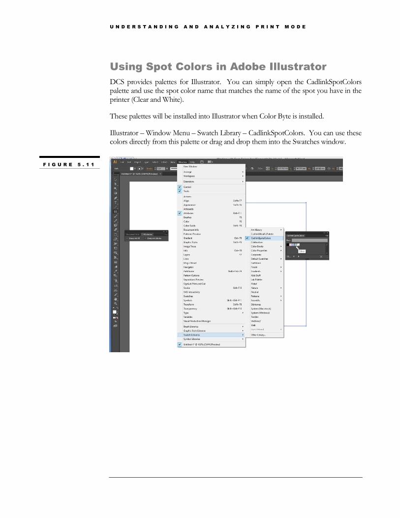
Using Spot Colors in Adobe Illustrator
DCS provides palettes for Illustrator. You can simply open the CadlinkSpotColors palette and use the spot color name that matches the name of the spot you have in the printer (Clear and White).
These palettes will be installed into Illustrator when Color Byte is installed.
Illustrator – Window Menu – Swatch Library – CadlinkSpotColors. You can use these colors directly from this palette or drag and drop them into the Swatches window.
F I G U R E 5 . 1 1

U N D E R S T A N D I N G A N D A N A L Y Z I N G P R I N T M O D E
Send To and the Overprint Attribute
Normally when you draw one object over the top of another object it’s going to knockout the object below it and only print the top object. The overprint attribute is used to tell the RIP you don’t want the top object to knockout the object behind it and instead print both objects.
To set an object as an overprint, open the attributes window and with the object selected you can click on a check box to overprint the fill or the stroke (it is has one).
Above shows a white box (changed color for viewing purposes) overprinting a process yellow square, the area shared by both squares will print with process color and white.
You can get an overprint preview in Illustrator form the view- overprint preview option. Any object type (fill and stroke) can have this attribute applied to it.
Note
Overprint doesn’t have any effect on the order of the actual output, this is all controlled by the RIP.
Once the overprints are set you can send the file via the File > Send to VPM > Send To… Then select the queue (print order) that has the spot color that was assigned to the object. For example, the file in Figure 5.2 can be sent to White with Color or Color with White.
F I G U R E 5 . 1 2

U N D E R S T A N D I N G A N D A N A L Y Z I N G P R I N T M O D E
Send with Underbase
There is a special printing plug-in option available in Illustrator for the RIP called Send with Underbase.
This option is designed for printing with White or Clear ink where you want to automatically create these color channels form existing image data. The resulting white or clear layer from this option would look like this… \ There is nothing you have to add to the design for this to work, just use the special plug-in to send the job to the RIP. There are a number of options you can configure in the RIP for this (see Bitmap Processing Options in the Layer Profiles section) that can alter the way this prints for different purposes, to optimize it for Clear or white.
F I G U R E 5 . 1 3
F I G U R E 5 . 1 4

U N D E R S T A N D I N G A N D A N A L Y Z I N G P R I N T M O D E
Using Spot Colors in CorelDraw
DCS provides palettes for CorelDraw. You can simply open the CadlinkSpotColors palette and use the spot color name that matches the name of the spot you have in the printer (Clear and White).
These palettes will be installed into CorelDraw when Color Byte is installed.
You can access these through the normal palette menu available in CorelDraw strokes and fills color selection, click on palettes – then select palette libraries – Spot and you should see the CadlinkSpotColors (the X5 in the name means they are suitable for CorelDraw X5 and X6), different palette formats are used for earlier versions of CorelDraw.
You can also open these palettes in the main Corel window to use from the main design. From the context menu of your default palette (>) select Palette – Open, these palettes are installed in different locations depending on the CorelDraw version, for example X6 it is C:\Program\Files\Corel\CorelDRAW Graphics Suite X6\Color\Palettes\Spot.
These palettes are also available in the install directory, C:\ColorByte91\ColorByteVMP\Palettes\Corel
F I G U R E 5 . 1 5
F I G U R E 5 . 1 6
U N D E R S T A N D I N G A N D A N A L Y Z I N G P R I N T M O D E
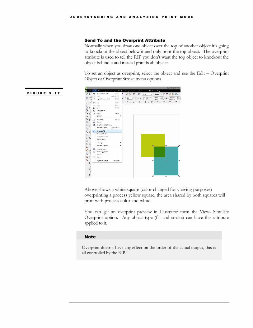
Send To and the Overprint Attribute
Normally when you draw one object over the top of another object it’s going to knockout the object below it and only print the top object. The overprint attribute is used to tell the RIP you don’t want the top object to knockout the object behind it and instead print both objects.
To set an object as overprint, select the object and use the Edit – Overprint Object or Overprint Stroke menu options.
Above shows a white square (color changed for viewing purposes) overprinting a process yellow square, the area shared by both squares will print with process color and white. You can get an overprint preview in Illustrator form the View- Simulate Overprint option. Any object type (fill and stroke) can have this attribute applied to it.
Note
Overprint doesn’t have any effect on the order of the actual output, this is all controlled by the RIP.
F I G U R E 5 . 1 7
U N D E R S T A N D I N G A N D A N A L Y Z I N G P R I N T M O D E
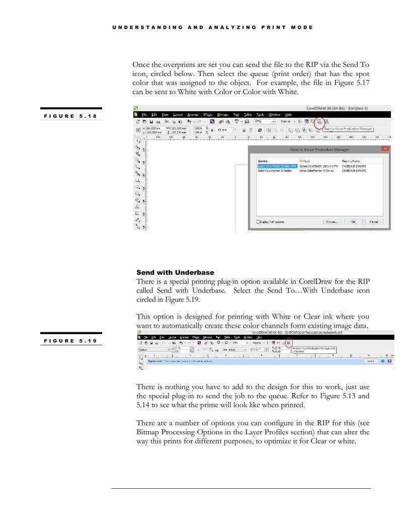
Once the overprints are set you can send the file to the RIP via the Send To icon, circled below. Then select the queue (print order) that has the spot color that was assigned to the object. For example, the file in Figure 5.17 can be sent to White with Color or Color with White.
Send with Underbase
There is a special printing plug-in option available in CorelDraw for the RIP called Send with Underbase. Select the Send To…With Underbase icon circled in Figure 5.19.
This option is designed for printing with White or Clear ink where you want to automatically create these color channels form existing image data.
There is nothing you have to add to the design for this to work, just use the special plug-in to send the job to the queue. Refer to Figure 5.13 and 5.14 to see what the prime will look like when printed. There are a number of options you can configure in the RIP for this (see Bitmap Processing Options in the Layer Profiles section) that can alter the way this prints for different purposes, to optimize it for Clear or white.
F I G U R E 5 . 1 8
F I G U R E 5 . 1 9

U N D E R S T A N D I N G A N D A N A L Y Z I N G P R I N T M O D E
Using Spot Colors in ColorByte
The Front End of ColorByte has White and Clear spot colors on the default palette and on the default primer palette.
Adding Spot Colors
To add new Spot Colors, double-click on any color in the shop palette.
1. In the Color Type, select SF
2. Enter the name (case sensitive) of the new spot color
3. Adjust CMYK values
4. Add to create the new spot channel
Tints of Spot Colors
Tints can be created just as easily as a spot color, just double-click on the SF on you want to adjust. Set the tint you want to use via the text box or slider and click add.
F I G U R E 5 . 2 0
F I G U R E 5 . 2 1
PRINTING TIP: Changing the Tint on a spot white will print white at different percentages. For example, if I wanted only 50% white I could make a new spot white that has a 50% tint.
U N D E R S T A N D I N G A N D A N A L Y Z I N G P R I N T M O D E
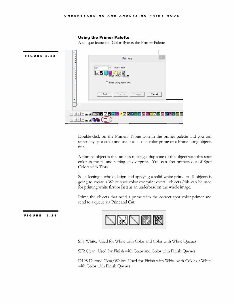
Using the Primer Palette
A unique feature in Color Byte is the Primer Palette
Double-click on the Primer: None icon in the primer palette and you can select any spot color and use it as a solid color prime or a Prime using objects tint.
A primed object is the same as making a duplicate of the object with this spot color as the fill and setting an overprint. You can also primers out of Spot Colors with Tints.
So, selecting a whole design and applying a solid white prime to all objects is going to create a White spot color overprint overall objects (this can be used for printing white first or last) as an underbase on the whole image.
Prime the objects that need a prime with the correct spot color primer and send to a queue via Print and Cut.
SF1 White: Used for White with Color and Color with White Queues
SF2 Clear: Used for Finish with Color and Color with Finish Queues
D198 Dutone Clear/White: Used for Finish with White with Color or White with Color with Finish Queues
F I G U R E 5 . 2 2
F I G U R E 5 . 2 3

U N D E R S T A N D I N G A N D A N A L Y Z I N G P R I N T M O D E
Texture Printing
Unique feature offered by Direct Color Systems. Using the inline feature and design tools, create textured images on your products.
Overview
Texture printing can appear to be complicated at first but DCS has worked to make this process more user friendly. At its root, texture printing is a simple white with color inline pass. The print mode is designed to output a large volume of white ink to build the texture. There are multiple texture print modes that will be reviewed in more detail later in this section. Along with the print mode is the file that is sent to the RIP. This file is very unique, so most of the work happens in the front end of the Color Byte software.
The Texture Wizard
In the previous section we discussed overprints. Texture printing works off this same concept. Before the job is sent to the RIP the user will have the original image with a texture layer overprinted on the top. Remember that even though this texture layer is on the top, it is the RIP that determines in what order to print the layers. The texture print modes are designed to print the texture layer first and the color layer on the top.
Unless your image requires a very complicated/custom texture layer, the Texture Wizard will provide you with all the tools necessary to create texture. The texture wizard only works with raster images. To be sure your image will work properly with the Texture Wizard, render the image to a bitmap before creating texture
Transform > Render to Bitmap. Use Full Color, 600dpi and Transparency for the settings and click Apply.
Chapter
6
F I G U R E 6 . 1 1
U N D E R S T A N D I N G A N D A N A L Y Z I N G P R I N T M O D E
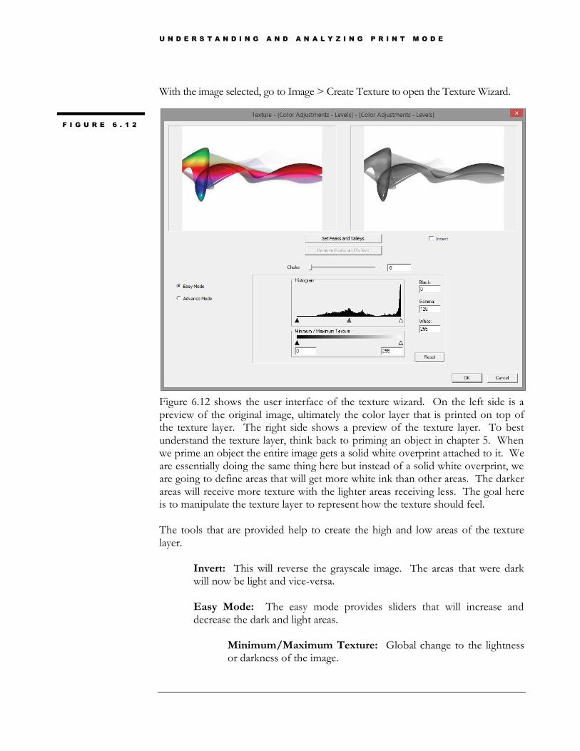
With the image selected, go to Image > Create Texture to open the Texture Wizard.
Figure 6.12 shows the user interface of the texture wizard. On the left side is a preview of the original image, ultimately the color layer that is printed on top of the texture layer. The right side shows a preview of the texture layer. To best understand the texture layer, think back to priming an object in chapter 5. When we prime an object the entire image gets a solid white overprint attached to it. We are essentially doing the same thing here but instead of a solid white overprint, we are going to define areas that will get more white ink than other areas. The darker areas will receive more texture with the lighter areas receiving less. The goal here is to manipulate the texture layer to represent how the texture should feel. The tools that are provided help to create the high and low areas of the texture layer.
Invert: This will reverse the grayscale image. The areas that were dark will now be light and vice-versa. Easy Mode: The easy mode provides sliders that will increase and decrease the dark and light areas.
Minimum/Maximum Texture: Global change to the lightness or darkness of the image.
F I G U R E 6 . 1 2
U N D E R S T A N D I N G A N D A N A L Y Z I N G P R I N T M O D E
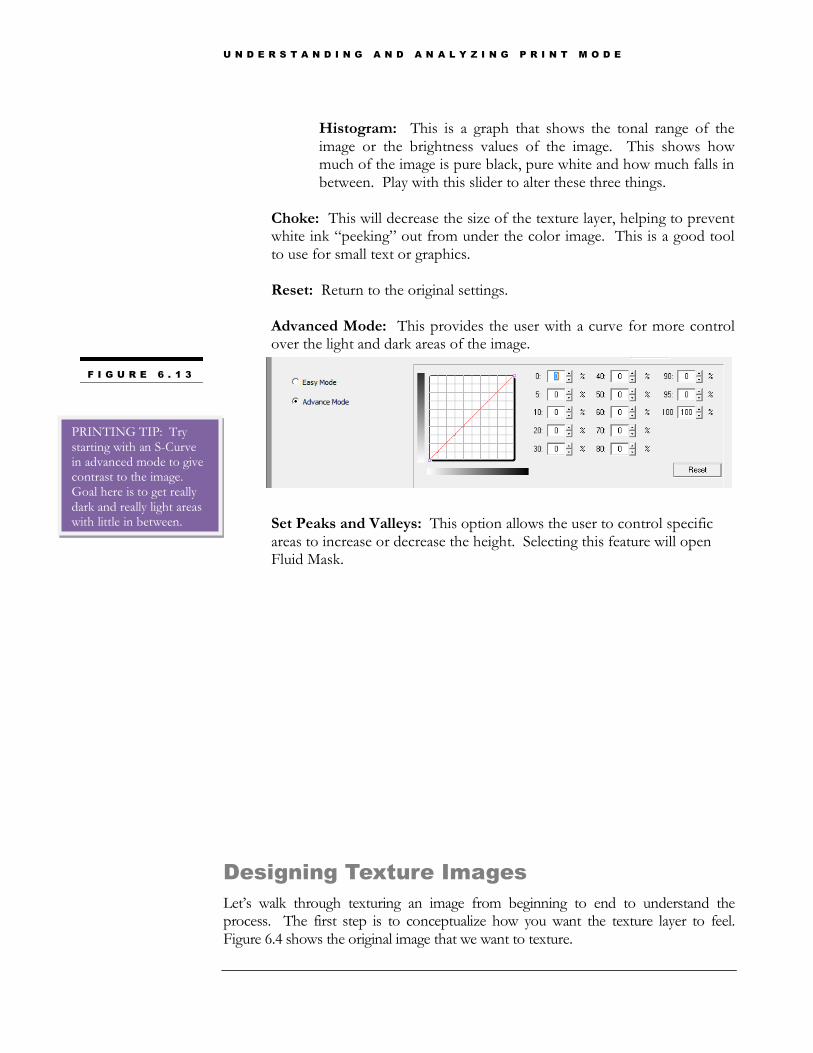
Histogram: This is a graph that shows the tonal range of the image or the brightness values of the image. This shows how much of the image is pure black, pure white and how much falls in between. Play with this slider to alter these three things.
Choke: This will decrease the size of the texture layer, helping to prevent white ink “peeking” out from under the color image. This is a good tool to use for small text or graphics. Reset: Return to the original settings. Advanced Mode: This provides the user with a curve for more control over the light and dark areas of the image.
Set Peaks and Valleys: This option allows the user to control specific areas to increase or decrease the height. Selecting this feature will open Fluid Mask.
Designing Texture Images
Let’s walk through texturing an image from beginning to end to understand the process. The first step is to conceptualize how you want the texture layer to feel. Figure 6.4 shows the original image that we want to texture.
F I G U R E 6 . 1 3
PRINTING TIP: Try starting with an S-Curve in advanced mode to give contrast to the image. Goal here is to get really dark and really light areas with little in between.

U N D E R S T A N D I N G A N D A N A L Y Z I N G P R I N T M O D E
Let’s take a closer look at the elements of this image and how we want the final texture layer to look…
1. Combination of Vector and Raster Images: The image of the leaf is a raster image but the green rectangles and text are vector, which means we cannot select this entire image and use the Texture Wizard. However, I want to work with the vector objects separate from the leaf. Therefore, I will select the leaf image and go through the Texture Wizard but will work with the other objects by themselves later.
2. Custom Texture Layer: We want the texture layer to have the veins in the leaf raised but the larger veins to be more textured than the smaller veins. This will require use of the Set Peaks and Valleys feature.
3. Texturing Vectors: We want to work with the vector objects separately and therefore will have to use the primer function. However, we will want these objects to be varying heights so we will have to create our own White primer with a tint.
Texture Wizard (Texturing the leaf)
We have brought the leaf image into the Texture Wizard and used a couple of the tools to get close to the desired output.
Step 1
First, inverting the image turned the veins darker and the darker green background lighter.
F I G U R E 6 . 1 4

U N D E R S T A N D I N G A N D A N A L Y Z I N G P R I N T M O D E
Step 2
Next, by altering the advanced mode curve we can increase the contrast and make dark veins and an even lighter background image.
Step 3
Now, we want to use the Set Peaks and Valleys feature to make the largest veins textured the most or have the most height when printed.
F I G U R E 6 . 1 5
F I G U R E 6 . 1 6
F I G U R E 6 . 1 7

U N D E R S T A N D I N G A N D A N A L Y Z I N G P R I N T M O D E
This feature will open a tool called Fluid Mask. Fluid Mask is designed to delete or mask out certain parts of an image. For example, mask out a background and leave just the object in the foreground. Using Fluid Mask in the Texture Wizard is a little different.
Step 3a: Achieve proper sections.
We see the original image sectioned off by blue lines. These lines separate the image by color hue. The option in the top right of the screen Edge Finding allows the user to define more or fewer sections. Play with this slider and notice how the blue sections become more or less defined. Increasing the slider to define a higher percentage of edges will help when colors are similar.
Step 3b: Select Your Peaks
We will use the Keep Local brush to paint the peaks of the image. The peaks in this case will be the large veins. Select the green (keep) brush and select inside the sections of the large veins. At this point you may realize your sections are not working and may need to re-visit Step 3a. If you highlight an area by accident use Ctrl+Z to undo the selection.
U N D E R S T A N D I N G A N D A N A L Y Z I N G P R I N T M O D E
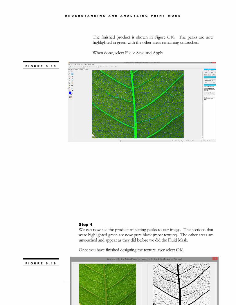
The finished product is shown in Figure 6.18. The peaks are now highlighted in green with the other areas remaining untouched. When done, select File > Save and Apply
Step 4
We can now see the product of setting peaks to our image. The sections that were highlighted green are now pure black (most texture). The other areas are untouched and appear as they did before we did the Fluid Mask.
Once you have finished designing the texture layer select OK.
F I G U R E 6 . 1 8
F I G U R E 6 . 1 9
U N D E R S T A N D I N G A N D A N A L Y Z I N G P R I N T M O D E
Note
Once the OK button is selected the Texture Layer is overprinted onto the original image. Sometimes this will view as a white checkered box over the image but some images will not show that checkered box. There are two ways to determine if an image has a texture layer. 1. Select the image and go to Image > Create Texture. If the Create Texture feature is grayed out this image has a texture layer. 2. Select the image and select Ungroup All. You should now be able to pull an invisible layer off the top of the original image. This is the texture layer. Place it directly on top of the original image and group the two.
Step 5
We now have our texture layer built on the leaf image but need to decide what to do with the vector objects. If we do not want any texture under these objects then we could move straight to Step **. However, here we want a small amount of texture under the green rectangles.
As stated before, Texture printing is simply a white with color inline setup. Therefore, priming an object with a white primer will put a consistent coat of white under that object. For example, if I want the maximum amount of white under an object I can just prime with the White Primer on the primer palette.
U N D E R S T A N D I N G A N D A N A L Y Z I N G P R I N T M O D E
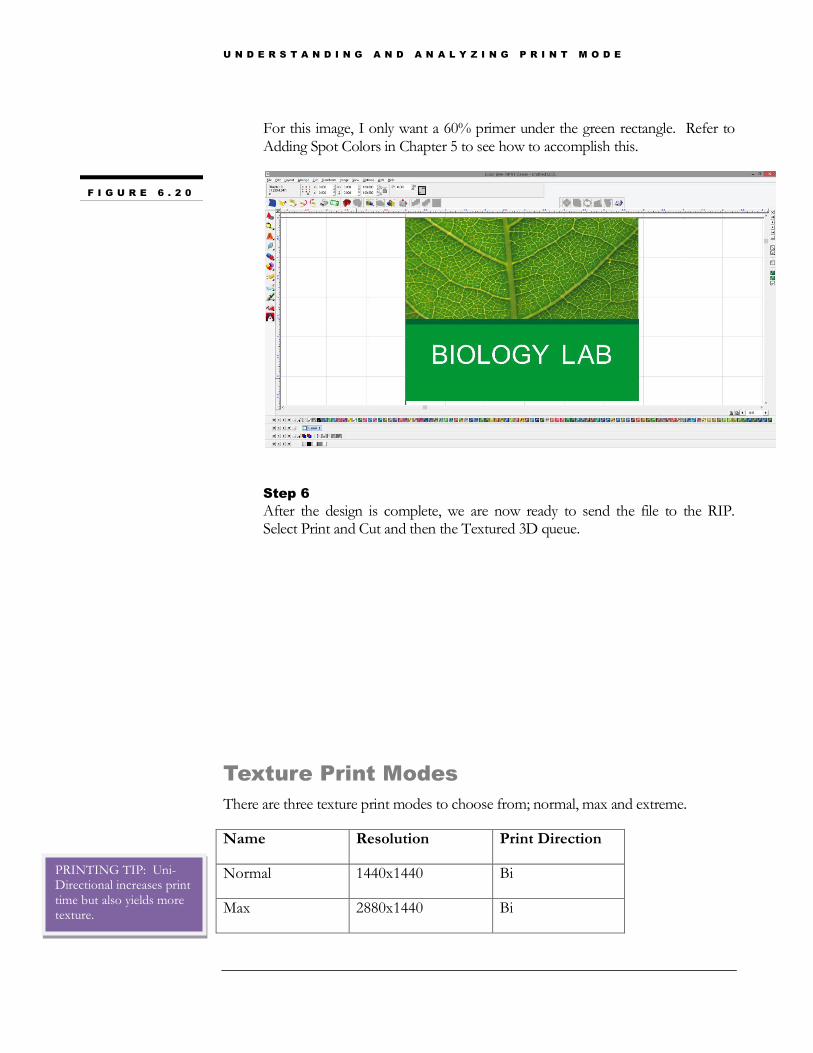
For this image, I only want a 60% primer under the green rectangle. Refer to Adding Spot Colors in Chapter 5 to see how to accomplish this.
Step 6
After the design is complete, we are now ready to send the file to the RIP. Select Print and Cut and then the Textured 3D queue.
Texture Print Modes
There are three texture print modes to choose from; normal, max and extreme.
Name Resolution Print Direction
Normal 1440x1440 Bi
Max 2880x1440 Bi
F I G U R E 6 . 2 0
PRINTING TIP: Uni-Directional increases print time but also yields more texture.

U N D E R S T A N D I N G A N D A N A L Y Z I N G P R I N T M O D E
Extreme 2880x1440 Uni
The Normal print mode will be the fastest but will also put down the least amount of texture. Max will put down more texture than Normal but will also be a slower print mode. Extreme will put down the most amount of texture but will also be the slowest of the three print modes. Again, finding that balance between quality, texture height and time is important.
The relationship with clear is important here. Refer to Figure 3.3 to see how the channel sets are set up on these print modes. Normal and Extreme modes use Inline Texture 2 and the Max mode uses Inline Texture. Notice how Normal and Extreme modes use two channels of white and two channels of clear to help build more texture which means no clear is going down with CMYK. Max uses one channel of clear with the whites to build texture and one clear channel goes down with CMYK.
U N D E R S T A N D I N G A N D A N A L Y Z I N G P R I N T M O D E
ADA Printing
The DCS machines offer a unique way to print ADA compliant signs.
Disclaimer
While the components of the ADA signage, produced on Direct Jet 1024UVHS printers, have tested to be in compliance with federal USA ADA signage guidelines outlined in the 2010 ADA Standards for Accessible Design (Department of Justice – September 15, 2010 – www.ADA.gov), it is the responsibility of the signage manufacturer to ensure compliance with the governing local, state and federal authorities.
Overview
ADA similar to Texture printing may seem complicated and confusing at first but now that you have a basic understanding of how the system works it should be easier to comprehend. The most important thing to know about ADA printing is that the ADA queues are designed to output two passes. The first pass, ADA Base, is a color only pass to build height and the second pass, ADA Top, is an inline white with color pass (refer to the ADA Base and ADA Top ink setups in Figure 3.13).
Chapter
7

U N D E R S T A N D I N G A N D A N A L Y Z I N G P R I N T M O D E
ADA Queues
There are four ADA queues, knowing the differences between these queues and when to use them is important to receiving the proper output with your ADA sign.
ADA 2 pass without Background
Layer 1: ADA Base Print Mode - 2880x1440 Color Only print. Six of the eight channels will be used to build height. This will output a greenish looking image due to the six channels being used.
Layer 2: ADA Top Print Mode - 1440x1440 White with Color Inline print. Refer to White with Color Channel Set in Figure 3.3 to see how the channels are separated. The two white channels are used to cover up the green image that was printed first and create a white base to put down the color on the top surface.
ADA 2 Pass with Background:
Layer 1: ADA Base Print Mode - 2880x1440 Color Only print. Six of the Eight channels will be used to build height. This will output a greenish looking image due to the six channels being used.
Layer 2: ADA Top with Background Print Mode- 1440x1440 White with Color Inline print. Refer to White with Color Channel Set in Figure 3.3 to see how the channels are separated. The two white channels are used to cover up the green image that was printed first and create a white base to put down the color on the top surface. The two clear channels will go down with the color in this mode.
ADA Clear Braille Dots
Layer 1: Clear Braille Dots Print Mode – 2880x1440 Color Only print with only 2 channels of clear printing.
Layer 2: Clear Braille Dots Print Mode – 2880x1440 Color Only print with only 2 channels of clear printing.
ADA Flat Top Objects
Layer 1-5: Flat Top Objects Print Mode: 2880x1440 White with Color inline – no CMYK printing
Layer 6: Flat Top Objects Print Mode: 2880x1440 White with Color Inline – CMYK printed.

U N D E R S T A N D I N G A N D A N A L Y Z I N G P R I N T M O D E
Sending to 2 Pass without Background
This queue is designed for printing ADA objects only (Pictogram, Text and/or Braille) no backgrounds.
Here we have a Men’s room sign that we want to send to the 2 Pass without Background Queue. We are going to use the primer function before sending this to the RIP.
Step 1
Determine what objects require what heights. 100% white primer will output an image that his 0.032” (0.813mm). The primer palette at the bottom of the screen has 10% - 100% primers (these were created with tints discussed earlier in this guide).
Step 2
We are going to prime the Pictogram and Text with 100% primer. The Braille dots only need to be 0.026” in height so we will prime the dots with a 40% primer. This will give us the difference in height between the text and Braille dots. Hover over the primers to show what percentages they are. The right side of the screen shows the primers that are being used in this file.

U N D E R S T A N D I N G A N D A N A L Y Z I N G P R I N T M O D E
Step 3
After designing and priming is complete we can select Print and Cut. Before sending to the RIP though, certain settings need to be changed. Select SETUP in the Print and Cut dialog box. Be sure “Selected Objects Only” and “Edge of Sign Blank” are checked on.
Under the Primers tab, add a choke to the image. The first pass of the ADA process lays down a considerable amount of ink and therefore is more susceptible to bleeding. This will cause the bottom layer to show underneath the top layer. Try a choke of 0.005” or higher.
Next, turn on the shape coat option in the Finish Coat tab. This is necessary for the ADA driver to output the correct channels.
Note
Once these options are set once, they will remain on for all jobs sent to the RIP.
Step 4
The RIP will use Layer Profiles (explained later in this guide) to output the two layers of the job automatically. Turn on the Yellow auto return button on your control panel to be sure the table rewinds for the second pass.
PRINTING TIP: If you still see the first pass peaking out you may need to adjust your vertical offset. Refer to Vertical offsets in Chapter 2.
U N D E R S T A N D I N G A N D A N A L Y Z I N G P R I N T M O D E
Sending to 2 Pass with Background
This queue is designed for printing ADA objects with a background image. An important thing to keep in mind here is that the “background” image is going to be laid down in the second pass even though it is technically the background. Users often get confused by this.
The goal with the first pass is to build the height under the objects that will be raised and then the second pass will print the background image, white and color on top of the first pass.
We will use the same Men’s room sign as we did in the previous example, with all the same primers attached, but this time we will add a background.
Step 1
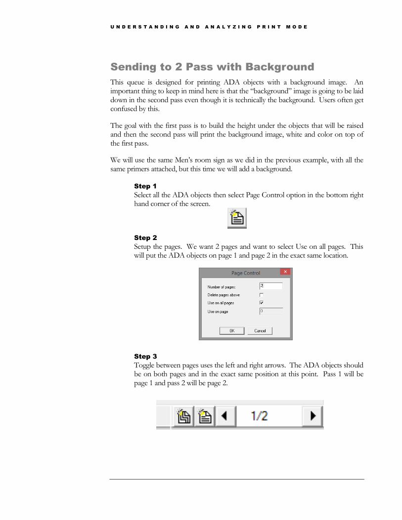
Select all the ADA objects then select Page Control option in the bottom right hand corner of the screen.
Step 2
Setup the pages. We want 2 pages and want to select Use on all pages. This will put the ADA objects on page 1 and page 2 in the exact same location.
Step 3
Toggle between pages uses the left and right arrows. The ADA objects should be on both pages and in the exact same position at this point. Pass 1 will be page 1 and pass 2 will be page 2.
U N D E R S T A N D I N G A N D A N A L Y Z I N G P R I N T M O D E
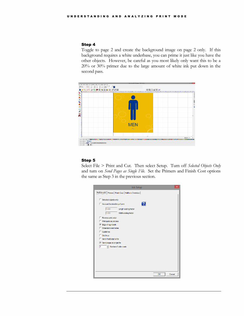
Step 4
Toggle to page 2 and create the background image on page 2 only. If this background requires a white underbase, you can prime it just like you have the other objects. However, be careful as you most likely only want this to be a 20% or 30% primer due to the large amount of white ink put down in the second pass.
Step 5
Select File > Print and Cut. Then select Setup. Turn off Selected Objects Only and turn on Send Pages as Single File. Set the Primers and Finish Cost options the same as Step 3 in the previous section.

U N D E R S T A N D I N G A N D A N A L Y Z I N G P R I N T M O D E
Step 6
The RIP will use Layer Profiles (explained later in this guide) to output the two layers of the job automatically. Page 1 print first followed by Page 2. Turn on the Yellow auto return button on your control panel to be sure the table rewinds for the second pass. See Layer Profiles and Multiple Layers/Pages to understand how the Queue is set up to receive this data.
Printing White Text and Braille
Printing white ADA objects is slightly different than printing with color. The objects do not need to be primed but instead need to be assigned a Spot White for the Text and Picotgram and a Spot White with a tint for the Braille.
Above the primer palette is the default shop palette. At the end of this palette are all the Spot Whites that the primers were made from, hover over the Spot Whites to see the tint percentages associated with them.
Make the pictogram and text using the SF1 and the Braille the SF 40%.
Printing Clear Braille
Make the Braille SF2 Clear and Send to the Clear Braille queue. Make sure there are no primers attached to the Braille dots. This will require a separate job and passes. It cannot be printed with other objects.

U N D E R S T A N D I N G A N D A N A L Y Z I N G P R I N T M O D E
Printing Flat Top Objects
Follow the steps for 2 pass without background but exclude any Braille dots and send to the Flat Top Objects queue.
U N D E R S T A N D I N G A N D A N A L Y Z I N G P R I N T M O D E
Layer Profiles
Layer Profiles change the status quo from previous versions. While most users will not need to use them, all users should understand what they do.
Overview
Layer profiles are activated in printer package version 5.100 and higher. Layer profiles are used for a few different reasons. Any job being sent to the queue via Print with Underbase (see Chapter 5) needs a layer profile (more importantly bitmap processing options) activated to properly underbase the objects in the job. Layer profiles are also used when it is necessary to print multiple passes, like we do with ADA printing.
We talked about inherent relationships within the RIP in Chapter 1. We see those again when discussing Layer Profiles. Layer profiles can be changed on the Queue and Job levels. Depending on the changes we are making we will want to change them for the Queue or just for the job.
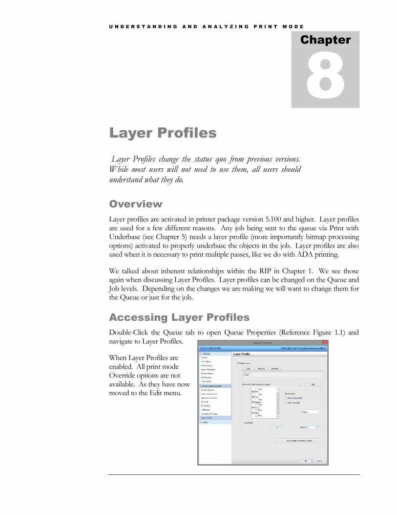
Accessing Layer Profiles
Double-Click the Queue tab to open Queue Properties (Reference Figure 1.1) and navigate to Layer Profiles.
When Layer Profiles are enabled. All print mode Override options are not available. As they have now moved to the Edit menu.
Chapter
8

U N D E R S T A N D I N G A N D A N A L Y Z I N G P R I N T M O D E
Understanding Layer Profiles
We have opened the White with Color queue properties and are viewing the layer profile associated with this queue. Because this is an inline queue, there is only 1 layer enabled. Jobs in this queue print white with color simultaneously (see Chapter 4 – Inline Printing). The real reason layer profiles are enabled for this queue is the fact that when layer profiles are enabled, Bitmap Processing Options are also enabled.
Bitmap processing options are used when sending to the RIP via print with underbase. Therefore, layer profiles are enabled for inline queues so we can have one queue that supports print and cut and print with underbase from any application. Layer profiles are not enabled for the Color Only or Texture Queues as the user must only go through Print and Cut to send to these queues.

U N D E R S T A N D I N G A N D A N A L Y Z I N G P R I N T M O D E
Layer Profiles and Print Modes
The biggest difference between a queue or job with layer profiles enabled and one without layer profiles enabled is where to make print mode selection changes and print mode edits. The default print mode for the queue or job appears in the below dialog box. In this case, White with Color Production Speed.
To change a print mode for a job that has layer profiles enabled, double-click the job, and go down to Layer Profile and select the ellipsis (…) icon. This will open the Manage Print Modes dialog box and from here the print mode can be changed.
Changing this print mode on the Queue Level will change it for every job imported into the RIP from that point forward. Changing the print mode on the job level will only change the mode for that job.
To edit the print mode for the particular job, select Edit and the print mode overrides will appear. Think back to Chapter 1, on the Queue Level these are the print mode overrides that we did not want to change if we could avoid it. Same applies here, use these edits on the Job Level only.
U N D E R S T A N D I N G A N D A N A L Y Z I N G P R I N T M O D E
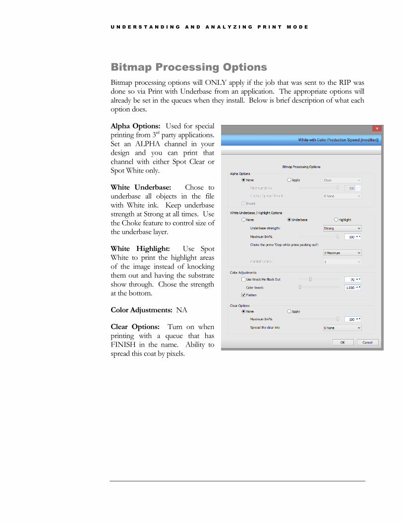
Bitmap Processing Options
Bitmap processing options will ONLY apply if the job that was sent to the RIP was done so via Print with Underbase from an application. The appropriate options will already be set in the queues when they install. Below is brief description of what each option does.
Alpha Options: Used for special printing from 3rd party applications. Set an ALPHA channel in your design and you can print that channel with either Spot Clear or Spot White only.
White Underbase: Chose to underbase all objects in the file with White ink. Keep underbase strength at Strong at all times. Use the Choke feature to control size of the underbase layer.
White Highlight: Use Spot White to print the highlight areas of the image instead of knocking them out and having the substrate show through. Chose the strength at the bottom.
Color Adjustments: NA
Clear Options: Turn on when printing with a queue that has FINISH in the name. Ability to spread this coat by pixels.
U N D E R S T A N D I N G A N D A N A L Y Z I N G P R I N T M O D E
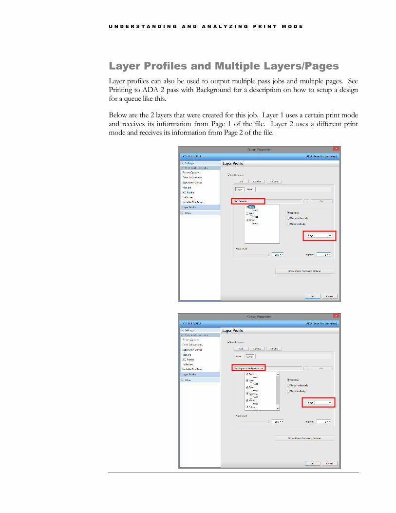
Layer Profiles and Multiple Layers/Pages
Layer profiles can also be used to output multiple pass jobs and multiple pages. See Printing to ADA 2 pass with Background for a description on how to setup a design for a queue like this.
Below are the 2 layers that were created for this job. Layer 1 uses a certain print mode and receives its information from Page 1 of the file. Layer 2 uses a different print mode and receives its information from Page 2 of the file.
U N D E R S T A N D I N G A N D A N A L Y Z I N G P R I N T M O D E
FAQ
Frequently Asked Questions
Overview
Studying and applying the information in this guide is a very good way to learn. However, seeing how to troubleshoot certain problems will take your knowledge one step further. Sometimes the user can know all the information but knowing how it relates to certain workflows, files, etc is important to solve problems on their own.
FAQs
The question will be presented and then a
Q1. Why isn’t there a white prime under my image?
A1. First, view the raw data on your image (Chapter **). Is there a white layer? If so, your issue may be with your nozzles. Raw data will show the exact information the printer is going to receive. If there is a white layer, the printer will print a white layer. If there is not a white layer when you view the raw data think about how the image was sent to the RIP. If the image was sent via Print and Cut from ColorByte be sure you have added a white primer to the object. If the image was sent via Send To from Illustrator or CorelDraw confirm that you have added a white overprint to the object. If the image was sent via Print with Underbase from ColorByte or Send with Underbase from Illustrator or CorelDraw, be sure you have sent it to a queue that has layer profiles enabled and the bitmap processing options handle the white as an underbase (Chapter 8). This answer is the same if the White is intended to be on top of the color.
Chapter
9

U N D E R S T A N D I N G A N D A N A L Y Z I N G P R I N T M O D E
Q2. Why is the Create Texture feature grayed out? A2.
Remember back to Chapter 6 that the create texture feature only works with raster images. If there is any vector object in the selection the feature will be grayed out. The only other time the feature would be grayed out is if the selection already has a texture layer attached to it, review the Note in Chapter 6 about how to determine if there is a texture layer attached. If the create texture feature is not visible at all there is most likely a license file issue. You can try updating your license files by going to Help > Update License Files and restarting the software.
Q3. How do I eliminate the clear box that prints around my image? A3.
This most likely has to do with the transparency or lack thereof, associated with a raster image. As you know, clear ink is printed simultaneously with CMYK data when possible, review Figure 3.13. Depending on how the transparency was created, the RIP may pick up some data in this area and therefore print clear ink. If there isn’t a transparency at all, if your image has a white box around it, you need to create one by knocking out the white area. The best way to ensure no clear ink will print in this area is to use the Contour Cut and clipping features in Color Byte.
Q4. How do I get more white ink behind my image? A4.
Putting down more white ink under your image can help boost colors and opacity. There are quite a few places where the white ink can be increased (Separation Curves and Variable Dot Setup see Chapter 2). Most print modes are already putting down 100% white ink in the separation curves but this does not mean full saturation is being achieved. Use the variable dot setup and increase the white channel to use larger dots.

U N D E R S T A N D I N G A N D A N A L Y Z I N G P R I N T M O D E
Q5. Why doesn’t the color I see on the screen match the color output? A5.
Color matching is one of the most important parts of digital printing (see chapter 4). Users are constantly asked to match specific colors. All DCS machines have been profiled for their specific ink sets but this does not mean color matching won’t have to be performed from time to time. One of the great things about the DCS UV printer is that it can print to a variety of different substrates. Different substrates yield different colors and it is not realistic to think that all these substrates can be profiled on. Chapter 4 reviews some of the tools that can be used to color match, the most effective one being Color Swatches. This will give the user a physical output to view when trying to match colors. Avoid at all costs matching colors using your monitor.
Q6. Why does my RIP keep crashing? A6.
The RIP can crash for a couple reasons but the most frequent reason is right-clicking and aborting a job during the end delay, or when the job says 99% but has not dropped down to the bottom holding space in the queue. Refrain from aborting a job while it is at 99%. If you would like to change the end delay to a shorter duration review Chapter 2.
Q7. Why does the ink smear when I wipe it with my finger? A7.
Printing clear ink simultaneously helps to keep this from happening. There is something called surface cure when printing with UV inks. Clear ink helps to strengthen the surface cure and trap some of the pigment that does not get cured from the CMYK inks. Highlight areas are more susceptible to improper surface cure. Try moving to a higher resolution print mode (Quality Model in Chapter 2) so the UV light performs more passes over the image. Also, you can try increasing the amount of clear going down (Review Separation Curves in Chapter 2). Lastly, make sure the mode you are in has clear going down with CMYK data (Figure 3.13 in chapter 3).
Q8. When I go to print my job it says “Holding Error” A8.
Most likely the port settings are not correct. Be sure the USB calbe is plugged in on the printer and computer. Go to Queue > Manage Queues and be sure the correct USB port is selected.
U N D E R S T A N D I N G A N D A N A L Y Z I N G P R I N T M O D E
Q9. When I go to print my job a dialog box appears asking to Save a File. A9.
When queues install, the port settings are set to FILE by default. Because USB port settings are printer and computer specific, the port settings cannot be set before the queues are distributed. Go to Queue > Manage Queues to change the port settings to the appropriate USB port. Printing to FILE is a useful tool however. If you type in a name to save the file under the RIP will create a .PRN file that can be used with the Direct to Port feature. Technical support may ask for a PRN file when troubleshooting issues. If I took a PRN file from your computer and printed it through Direct to Port on my printer it would be the same as hooking your computer up to my printer and printing the job. This helps to rule out variables when troubleshooting.
Q10. How can I remove the white background from my bitmap? A10.
We saw in question 3 that it is important to remove this white space as the clear ink will most likely print in this area. There are three ways of doing this in Color Byte; contour cut, fluid mask and knock me color.
Q11. Can I get a glossy finish on the top of my image? A11.
By their very nature DCS UV printers generate a matte finish. There is a Color with Finish queue available that will put a clear coat on the top of the image. Using this queue and using larger dots on the clear channel (Chapter 2) will help give a glossier look to the image. Also, bi-directional print modes sometimes yield glossier finishes.
Q12. I see banding in my prints. A12.
Banding can be caused by many different things. The print modes that will eliminate this banding are the Photo Quality Print Modes. These modes are designed specifically for images that show banding the most i.e. solid color prints, dark photographic images etc. Banding can also be cause by Bi-Directional printing. Bi-Directional printing can show a “lawn-mower” effect due to the curing and setup up of the UV lamp in the machine. Try using a Photo Quality mode or changing your print mode to Uni-Directional.

U N D E R S T A N D I N G A N D A N A L Y Z I N G P R I N T M O D E
Q13. How can I cancel a job while printing? A13.
The best way to cancel a job while printing is to cut off USB communication. You can do this by right-clicking the job and select ABORT. The machine will do a few more movements and the job will clear out of the printer’s memory. After this happens you must right-click the job again and clear the error and unlock the port.
Q14. I don’t see all the queues in the RIP, how can I get more queues? A14.
Not all queues install with the current printer package. There are .quepmzpaks available to install into the RIP. Navigate to C:\Color Byte RIP 91 Dealer\color byte VPM\Queues. In this location will be the folders of the queues that are already installed (Color Only, White with Color, Color with White, Textured 3D and nozzle check) and the .quepmzpaks of the queues that are available for install. .quepmzpaks contain the queue and the print modes associated with that queue. Simply drag and drop the .quepmzpak onto the RIPs main UI and click OK to the dialog box and the queue and print modes will be installed.
Q15. I have multiples of all my queues.
A15. When a new printer package is installed, all the queues are updated and the old queues need to be deleted. Check the version of your device package and the version on the queue name. Delete the queues that do not match the version number of the device package/printer package.