report sharp shooter user guide - perpetuum · pdf file4 perpetuum software preface this...
TRANSCRIPT

Report Sharp-Shooter User Guide
Last modified on: July 27, 2011
2
www.perpetuumsoft.com PERPETUUM software
Table of Contents Table of Contents ...................................................................................................... 2
Preface ..................................................................................................................... 4
Template objects ....................................................................................................... 5
Classification .......................................................................................................... 5
Bands ................................................................................................................... 5
Visual elements ...................................................................................................... 7
User Guide................................................................................................................ 9
Template ............................................................................................................... 9
Page ................................................................................................................... 12
Objects‟ Controls .................................................................................................. 16
Objects‟ Properties ............................................................................................... 17
Text Output ......................................................................................................... 38
List ..................................................................................................................... 44
Grouping ............................................................................................................. 53
Horizontal List and Table ....................................................................................... 57
SideBySide Bands ................................................................................................. 59
Pivot Table .......................................................................................................... 60
Image ................................................................................................................. 67
Using Shapes ....................................................................................................... 71
Barcodes ............................................................................................................. 73
Parameters .......................................................................................................... 75
Hyperlinks and Report Navigation ........................................................................... 76
Using subreports .................................................................................................. 80
Zip code .............................................................................................................. 86
Master-Report ...................................................................................................... 87
Creation of Reports Using Wizard ........................................................................... 88
Interface ............................................................................................................... 102
Tabs .................................................................................................................. 102
Contextual Tabs .................................................................................................. 110

3
www.perpetuumsoft.com PERPETUUM software
Application Menu ................................................................................................. 120
Binding Bar ......................................................................................................... 121
Quick Access Toolbar ........................................................................................... 122
Context Menu ..................................................................................................... 124
Docking .............................................................................................................. 129
Editors ............................................................................................................... 132
Wizards .............................................................................................................. 147
Status Bar .......................................................................................................... 154
Hotkeys .............................................................................................................. 155

4
www.perpetuumsoft.com PERPETUUM software
Preface This user guide contains detailed information on how to create and design templates of the
various report types using Report Sharp-Shooter. The guide also contains description of
Report Designer Interface as well as information about report-elements, their properties and
usage scenarios.
This user guide is prepared by Perpetuum Software team for Report Sharp-Shooter users.

5
www.perpetuumsoft.com PERPETUUM software
Template objects
Classification All the report elements can be divided into two types:
Bands (DataBand, PageHeader, PageFooter, Header, Footer, GroupBand, PageOverlay,
CrossBand, BandContainer, SideBySide, SubReport, Content, PivotTable)
Visual elements (TextBox, AdvancedText, Picture, Shape, ZipCode, BarCode, RichText,
WinFormsControl)
Bands The bands are containers for other elements; they don‟t have a graphical presentation in
the report and serve for defining output methods of included elements. Bands are often
used as containers for other bands. In this case, output methods of a contained element
depend on all the container bands of the element. Band width is a permanent value and
always equals page width. The location of the elements on the page is defined during report
generation and depends on band order in the report, bands content and the properties of
the Render group.
(More information about band properties)
DataBand
The band for a multiple output of embedded components. Every line corresponds to one
record in the data source. Data source for DataBand is specified by the DataSource
property. If the data source is not specified, a number of repetitions are set in
InstanceCount property.
The following bands can be used as container for DataBand: Page, DataBand,
BandContainer, GroupBand and SideBySide.
(More information about using DataBand for building lists)
Detail
The band provides access to the data from the data source of a container band and for
output visual elements in various bands. It specifies the height that should be left for the
output of the elements embedded into this band.
The following bands can be used as container for Detail: Page, DataBand, BandContainer,
GroupBand and SideBySide.
(More information about Detail)
PageHeader and PageFooter
The bands are used for creating top and bottom headlines of a page. These elements are
containers and the spaces before and after the embedded elements in the final report will
be specified by the space between these elements and top\bottom border of a band in a
template. The location of PageHeader and PageFooter does not influence the location of the
elements in the final report.
Only Page can be a container for PageHeader and PageFooter.
(More information about headlines usage for page design)
Header and Footer
The bands allow creating a headline and a lower half of a page for the lists output by the
DataBand and GroupBands. The contents of a Header will be displayed in the beginning of a
list output by a GroupBand or in a headline of every group. The contents of Footer will be
displayed at the end of a list or a group.

6
www.perpetuumsoft.com PERPETUUM software
DataBand and GroupBand can be used as containers for Header and Footers.
(More information about the output of header and footer for the lists and grouped data)
GroupBand
The band is used for grouping data depending on a specified expression that is calculated
during the report generation.
DataBand and GroupBand can be used as containers for GroupBand.
(More information about lists grouping)
PageOverlay
The band allows creating a bottom layer of a page. The space between the embedded
elements and the beginning of a page in the final report is set by the indent of the top
border of the band in the template. PageOverlay does not influence the location of other
elements that allow locating elements over each other.
Only Page can be used as a container for PageOverlay.
(More information about page design using page overlay)
CrossBand
The band allows output of the embedded elements as a line LTR. The number of repetitions
is specified either by the InstanceCount property or by a number of records in a
DataSource. CrossBand band can be used for tables building.
The following bands can be used as containers for CrossBand: Header, Footer and Detail.
(More information about building horizontal lists and tables)
BandContainer
The band outputs its content once. Used for merging several bands in one connected
SideBySide for the various variants of band merge.
The following bands can be used as containers for BandContainer: Page, DataBand,
BandContainer, GroupBand and SideBySide.
SideBySide
The band is used for horizontal SideBySide output of the elements from different bands.
The following bands can be used as containers for SideBySide: Page, DataBand,
BandContainer, GroupBand and SideBySide.
(More information about SideBySide report)
SubReport
The band allows adding embedded reports that will be generated together. Only bands
(DataBand, Detail, etc.) will be added from template used as subreport.
The following bands can be used as containers for SubReport: Page, DataBand,
BandContainer, GroupBand, and SideBySide.
(More information about building subreports)
Content
The band used in parental reports. This element specifies the place to locate the content of
filial report.
The following bands can be used as containers for Content: Page, DataBand,
BandContainer, GroupBand and SideBySide.
(More information about building master-reports)
7
www.perpetuumsoft.com PERPETUUM software
PivotTable
The PivotTable band is used for creating cross reports based on static data and also for
building aggregate tables. The result of using PivotTable element is a block in a report that
contains visual presentation of a described cross table.
There is a special visual editor of a cross table that allows specifying data used for
calculation. Scripts can be used for creating rules of calculation. This gives great
opportunities for table settings starting from summing up of several fields from the data
source and ending with various variants of grouping in the perspectives of required report.
The following bands can be used as containers for PivotTable: Page, DataBand,
BandContainer, GroupBand and SideBySide.
(More information about building pivot tables)
Visual elements The elements that have graphical presentation in a report. Its location is specified by the
containing bands. Size and displaying of the elements are specified by the properties.
(More information about element properties)
TextBox
The element outputs textual information. The information can either be static or be
generated during the generation of a report.
(More information about text output)
AdvancedText
The element allows output of the information as a formatted text. There are options setting
paragraph and text styles and using expressions directly in the marked text. Formatted text
can be set using HTML-alike markup language and the subset of RTF format. Formatted
Text Editor is used for this purpose. Static RTF text can be loaded. AdvancedText supports
only some subset of RTF.
(More information about formatted text output)
Picture
The element allows output of an image. The images can be loaded from a hard driver or a
data source.
(More information about image output)
Shape
The element allows output of various geometric figures.
More information about figures output)
ZipCode
The element allows output of a zip-code.
(More information about zip-codes output)
BarCode
The element allows output of barcodes of different types. There are several settings
depending on a type of a used barcode.
(More information about barcodes output)

8
www.perpetuumsoft.com PERPETUUM software
RichText
The element allows output of a text in RTF format. The editor allows choosing an RTF file.
(More information about RTF-text output)
WinFormsControl
The element allows including Windows Forms control element into the report. Only the
image of a control element will be included into the report; it is not available for using its
functions.
9
www.perpetuumsoft.com PERPETUUM software
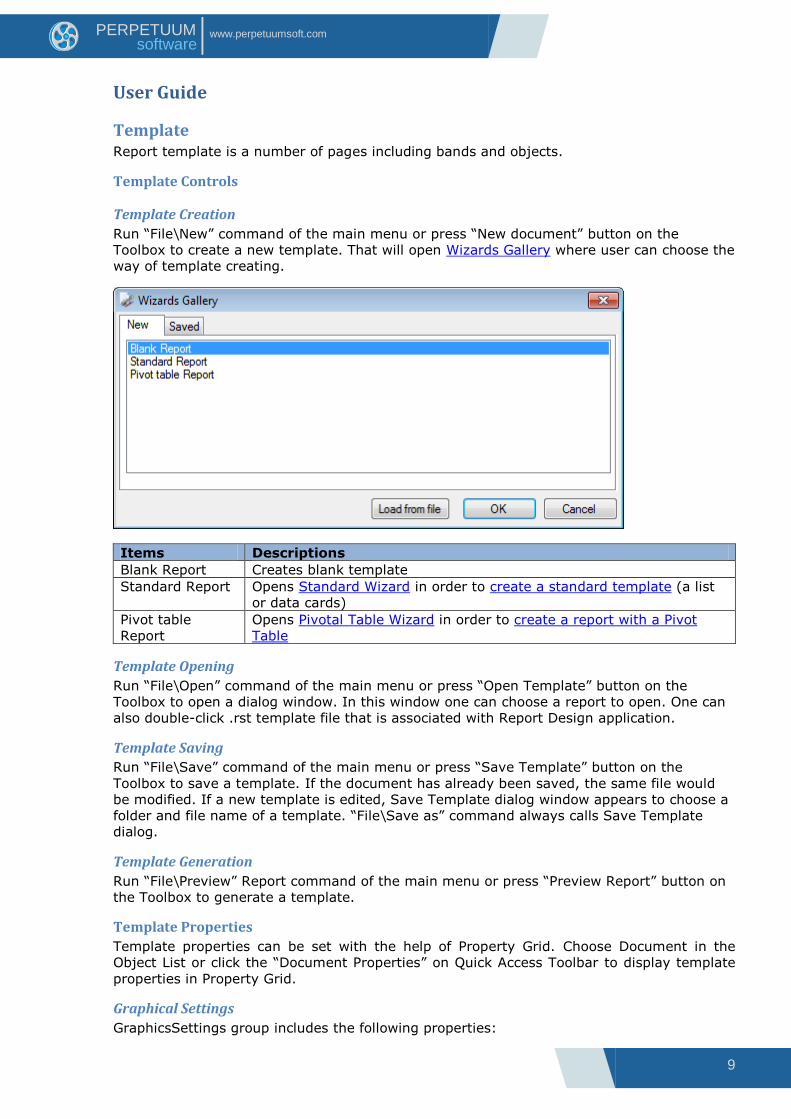
User Guide
Template Report template is a number of pages including bands and objects.
Template Controls
Template Creation
Run “File\New” command of the main menu or press “New document” button on the
Toolbox to create a new template. That will open Wizards Gallery where user can choose the
way of template creating.
Items Descriptions
Blank Report Creates blank template
Standard Report Opens Standard Wizard in order to create a standard template (a list
or data cards)
Pivot table
Report
Opens Pivotal Table Wizard in order to create a report with a Pivot
Table
Template Opening
Run “File\Open” command of the main menu or press “Open Template” button on the
Toolbox to open a dialog window. In this window one can choose a report to open. One can
also double-click .rst template file that is associated with Report Design application.
Template Saving
Run “File\Save” command of the main menu or press “Save Template” button on the
Toolbox to save a template. If the document has already been saved, the same file would
be modified. If a new template is edited, Save Template dialog window appears to choose a
folder and file name of a template. “File\Save as” command always calls Save Template
dialog.
Template Generation
Run “File\Preview” Report command of the main menu or press “Preview Report” button on
the Toolbox to generate a template.
Template Properties
Template properties can be set with the help of Property Grid. Choose Document in the
Object List or click the “Document Properties” on Quick Access Toolbar to display template
properties in Property Grid.
Graphical Settings
GraphicsSettings group includes the following properties:
10
www.perpetuumsoft.com PERPETUUM software
Properties Descriptions
CompositingQuality set quality level, using in the compositing
process
InterpolationMode set interpolation mode
SmoothingMode set smoothing mode
TextRenderingHint set text visualization mode
Elements Displaying and Grid
ShowObjectBounds property allows setting display elements borders in the template.
Property Report Template
ShowGrid property defines if the Grid is displayed or not, GridStep property sets grid
wideness.
Property Report Template
SnapToGrid property is used for “sticking” elements to the grid when ones are created or
when their sizes and location are changed.
One can use the corresponding buttons on the ToolBar for editing of these properties.
Measurement Units
MetricUnit property is used for setting measurement units for the whole template.
Template Data Sources
Application can be a data source, but there is an opportunity to set the data sources for the
current template in Report Designer using the collection of built-in data sources –
11
www.perpetuumsoft.com PERPETUUM software
Document.DataSources property. In order to set this property Document Data Sources
editor is used.
Template Parameters
Report parameters can be set with the help of Parameters collection.

12
www.perpetuumsoft.com PERPETUUM software
Page Report template is a set of pages. Every page contains elements displaying information. A
default empty report contains one page.
Page Properties
Page Properties can be set with the help of Property Grid. Select Page in the Object List to
display template properties in Property Grid.
Page Size
PaperKind property is used to set page size; it allows you to choose one of the standard
page formats, e.g. A4 (default size), B5, Letter, etc. Page layout can be set for those page
sizes – vertical or horizontal. In this case Size and TemplateSize properties gain chosen
format settings and the properties cannot be edited.
Select “Custom” value of the PaperKind property and set page size parameters of the
Custom Size property if you want to create a non-standard paper size.
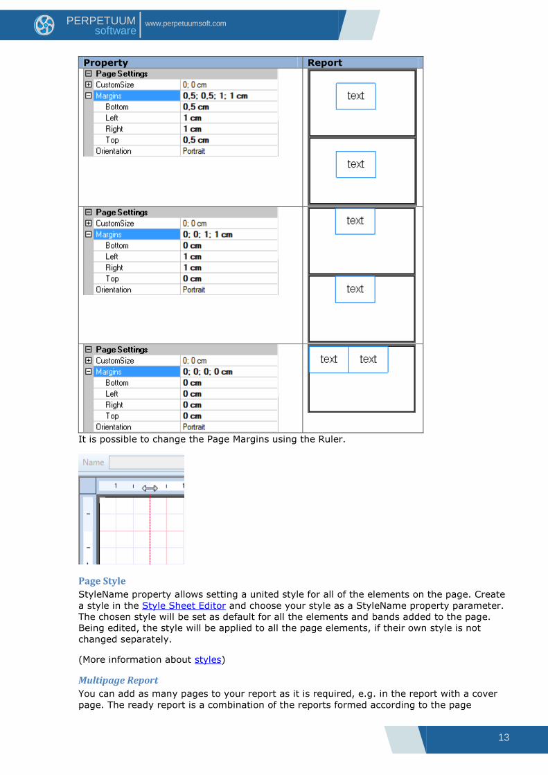
Page Margins
Page Margins set the indent between page limits and the elements placed in the bands –
containers. Margins property sets page margins. Margins are marked with the red line in the
template.
Sample demonstrating use of Page Margins:
Report template:
crossBand1.InstanceCount = 2
13
www.perpetuumsoft.com PERPETUUM software
Property Report
It is possible to change the Page Margins using the Ruler.
Page Style
StyleName property allows setting a united style for all of the elements on the page. Create
a style in the Style Sheet Editor and choose your style as a StyleName property parameter.
The chosen style will be set as default for all the elements and bands added to the page.
Being edited, the style will be applied to all the page elements, if their own style is not
changed separately.
(More information about styles)
Multipage Report
You can add as many pages to your report as it is required, e.g. in the report with a cover
page. The ready report is a combination of the reports formed according to the page
14
www.perpetuumsoft.com PERPETUUM software
templates. Parts of the report will be displayed in the same order as the pages order in the
template.
Click the “New Page” button on the “Insert” tab to add a page to the report. When the page
is removed, all the objects contained on this page are removed too. One can switch
between pages using the tabs in the bottom left corner of the Report Designer.
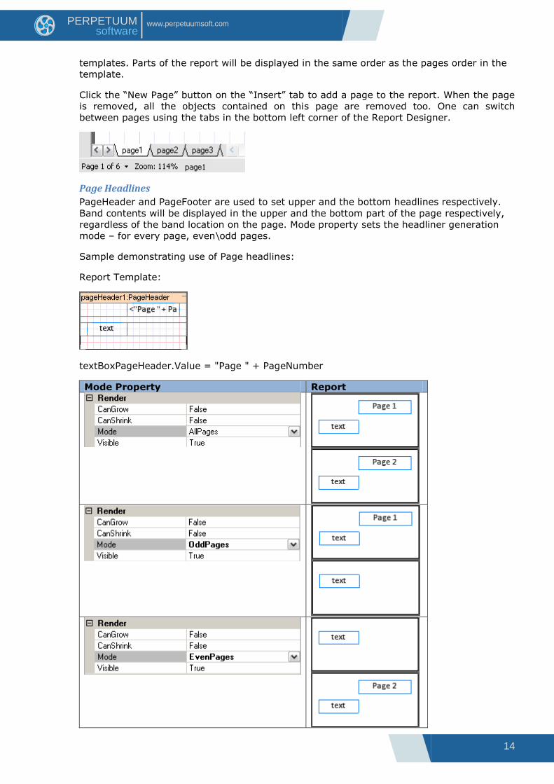
Page Headlines
PageHeader and PageFooter are used to set upper and the bottom headlines respectively.
Band contents will be displayed in the upper and the bottom part of the page respectively,
regardless of the band location on the page. Mode property sets the headliner generation
mode – for every page, even\odd pages.
Sample demonstrating use of Page headlines:
Report Template:
textBoxPageHeader.Value = "Page " + PageNumber
Mode Property Report
15
www.perpetuumsoft.com PERPETUUM software
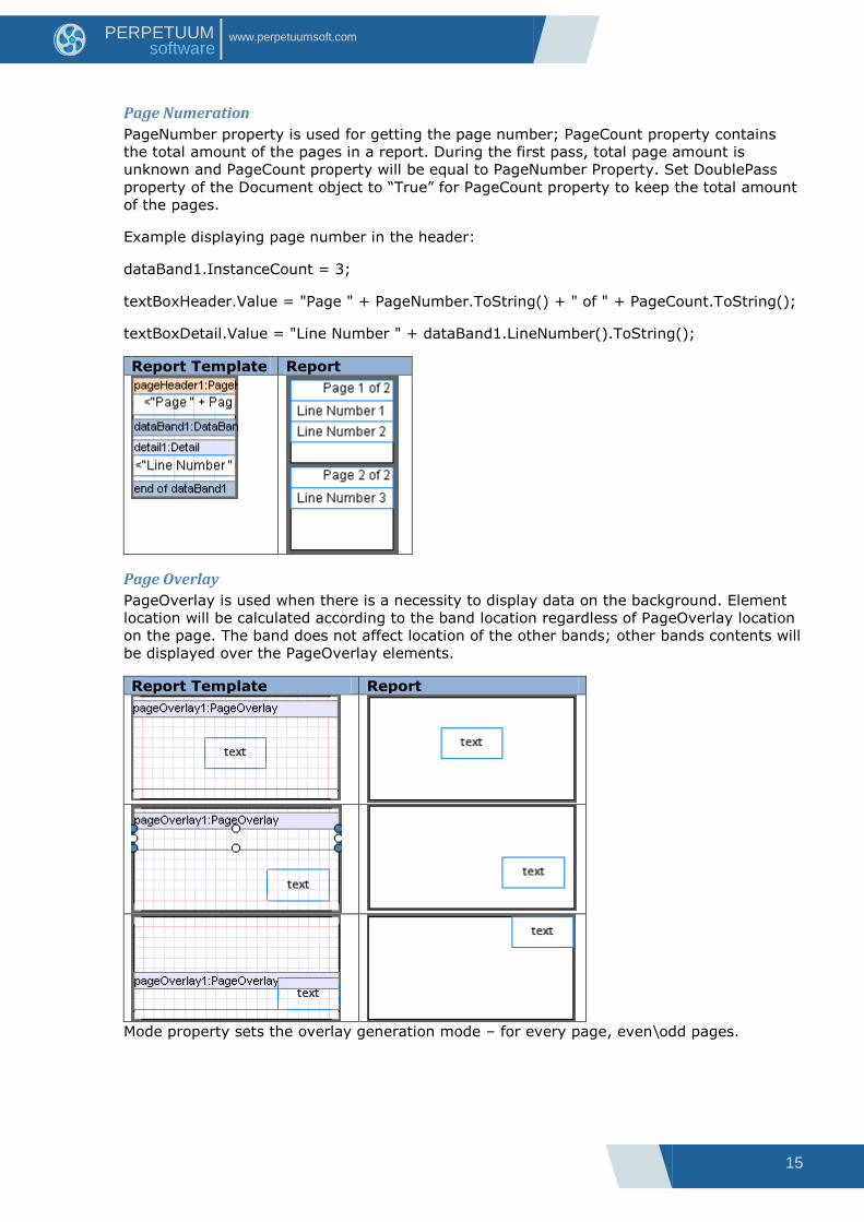
Page Numeration
PageNumber property is used for getting the page number; PageCount property contains
the total amount of the pages in a report. During the first pass, total page amount is
unknown and PageCount property will be equal to PageNumber Property. Set DoublePass
property of the Document object to “True” for PageCount property to keep the total amount
of the pages.
Example displaying page number in the header:
dataBand1.InstanceCount = 3;
textBoxHeader.Value = "Page " + PageNumber.ToString() + " of " + PageCount.ToString();
textBoxDetail.Value = "Line Number " + dataBand1.LineNumber().ToString();
Report Template Report
Page Overlay
PageOverlay is used when there is a necessity to display data on the background. Element
location will be calculated according to the band location regardless of PageOverlay location
on the page. The band does not affect location of the other bands; other bands contents will
be displayed over the PageOverlay elements.
Report Template Report
Mode property sets the overlay generation mode – for every page, even\odd pages.

16
www.perpetuumsoft.com PERPETUUM software
Objects’ Controls
Object Addition
The “Insert” tab is used to add objects. Then set the mouse pointer on the page and left-
click to add an object. If you click on some band, the program checks if this band can
contain the object you try to add (More information about available band containers). If the
band can contain this object, it is added to the template, inside the band, otherwise an error
message is shown.
TextBox elements for data source outlet can be added to the template by drag and drop of
the appropriate element from the Data Tree of the Tool Window from the Data Sources tab.
TextBox.Value will be set automatically.
Object Deletion
There are several ways to delete an object: left-click (or select it in the Object list or in the
Document Tree in the Tool Window) and press “Delete” button on the keyboard (or use the
contextual menu item). When you delete a band, all the contained objects will be deleted
too.
Object Properties
Object properties can be set with the help of Property Grid. Select the object in the template
to see its properties displayed in the Property Grid. Property Grid shows common properties
of the elements when several of them are selected.
(More information about objects‟ properties)
Document Tree
Document Tree contains the list of all document objects and shows its structure. One can
select and delete object, change hierarchy (dragging the object to the different band) and
change object order in the Document Tree.
Objects’ Location
Objects‟ location in the template is set with the Size property. The higher object is displayed
when two overlay each other. Click “Edit\Arrange” main menu item or use the buttons on
the Toolbar to change objects order. Use Align Editor to align several objects relatively to
each other.
One can change the location of several chosen objects included into the same container
simultaneously with the mouse pointer.
It is possible to change object position with the navigation buttons on the keyboard. Pressed
Ctrl key prevents objects from “sticking” to the grid.
17
www.perpetuumsoft.com PERPETUUM software
Objects’ Properties Object properties define object appearance and behavior when generating reports. Object
properties can be set by Property Grid. To display object properties in the Property Grid one
needs to select an element in a template with left mouse button click or select it in the
Object List. Properties default values have regular font, edited properties values are
displayed in bold. One may select several objects by pressing the Shift button. This way
there are general properties of the selected objects on Property Grid. All object properties
may be divided into several groups:
Groups Descriptions
Appearance properties defining objects display and appearance
Data properties defining data processing
Design properties defining objects display when editing a template in Report
Designer
Layout properties defining objects location and size
Misc properties for objects which are built in the report
Navigation properties which allow reports navigation creation
PageSetting page properties
Render properties defining rules of objects behavior during reports
generation
Script scripts – objects processing
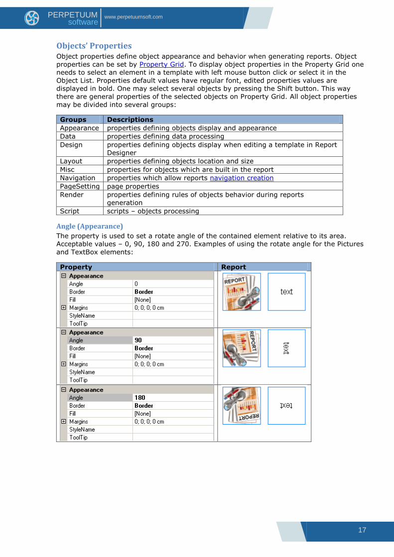
Angle (Appearance)
The property is used to set a rotate angle of the contained element relative to its area.
Acceptable values – 0, 90, 180 and 270. Examples of using the rotate angle for the Pictures
and TextBox elements:
Property Report

18
www.perpetuumsoft.com PERPETUUM software
Border (Appearance)
The property allows setting the display of element borders and lines draw style – type,
thickness and color (Border Editor).
Border examples for the TextBox element:
Fill (Appearance)
The property allows setting color and style of object area fill. In order to edit the property
one may use the fill editor where one may set fill type, color, transparence and additional
parameters.
Examples of using fill for the TextBox element:
19
www.perpetuumsoft.com PERPETUUM software
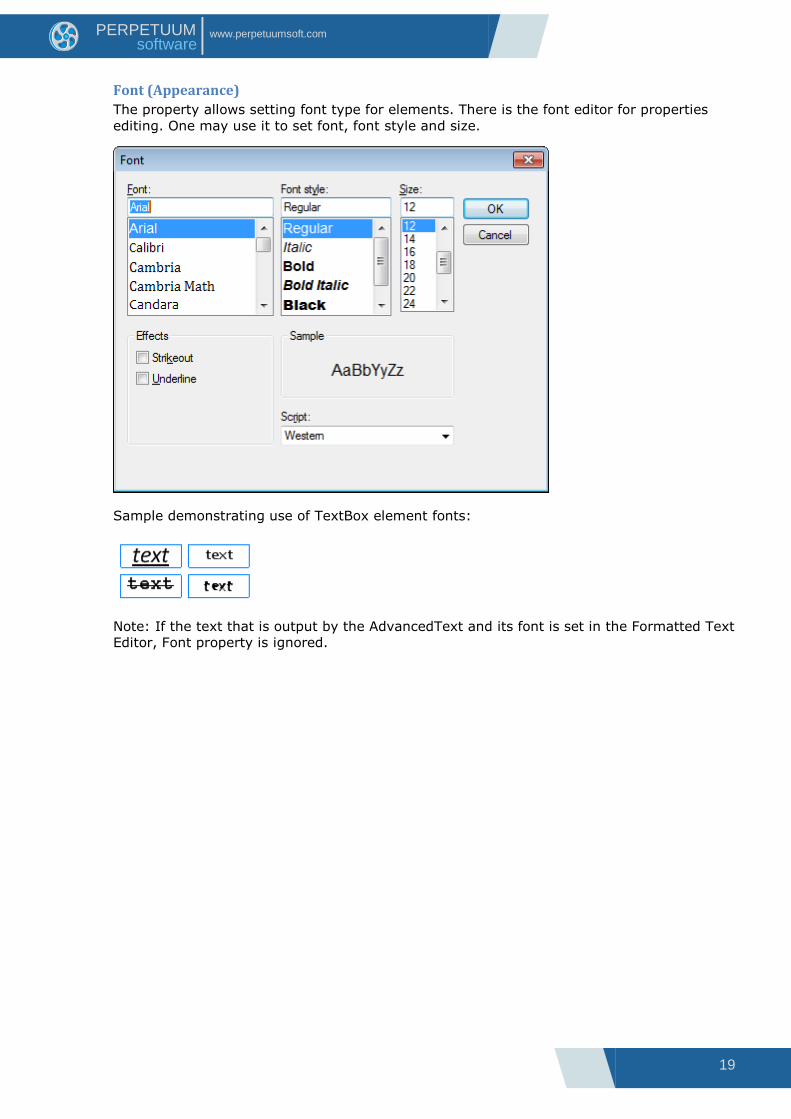
Font (Appearance)
The property allows setting font type for elements. There is the font editor for properties
editing. One may use it to set font, font style and size.
Sample demonstrating use of TextBox element fonts:
Note: If the text that is output by the AdvancedText and its font is set in the Formatted Text
Editor, Font property is ignored.
20
www.perpetuumsoft.com PERPETUUM software
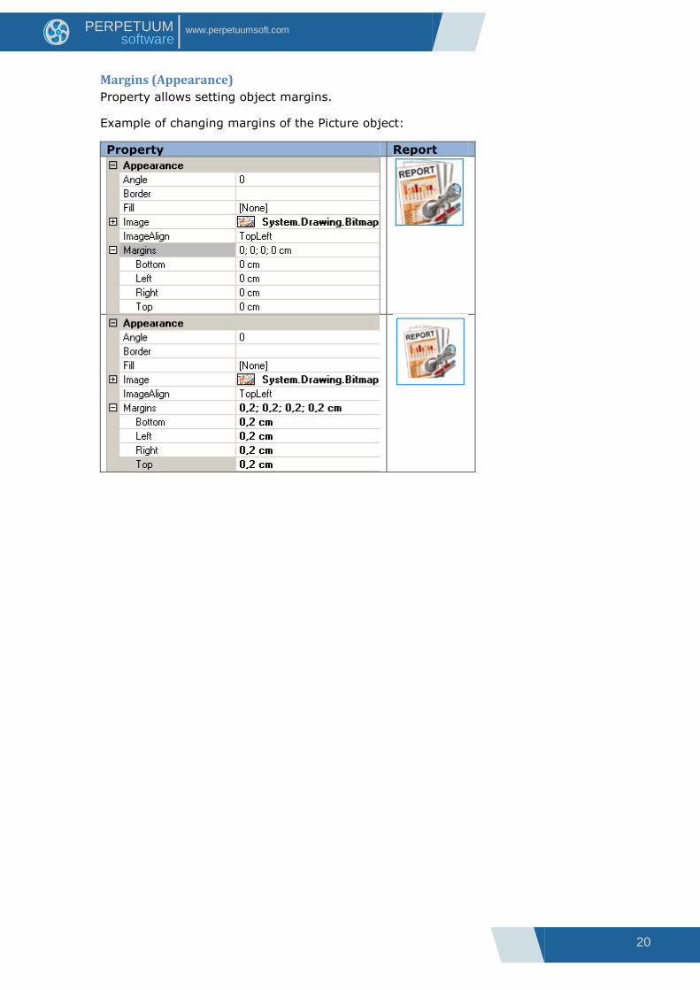
Margins (Appearance)
Property allows setting object margins.
Example of changing margins of the Picture object:
Property Report
21
www.perpetuumsoft.com PERPETUUM software
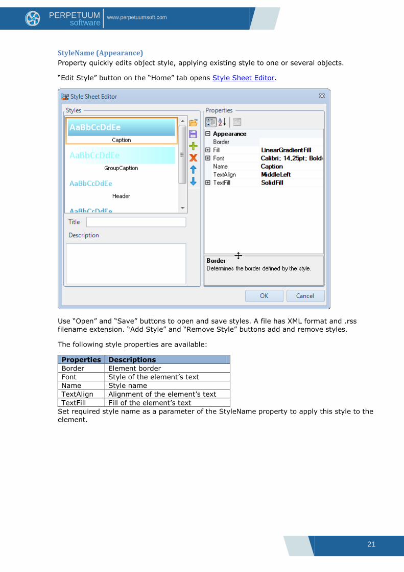
StyleName (Appearance)
Property quickly edits object style, applying existing style to one or several objects.
“Edit Style” button on the “Home” tab opens Style Sheet Editor.
Use “Open” and “Save” buttons to open and save styles. A file has XML format and .rss
filename extension. “Add Style” and “Remove Style” buttons add and remove styles.
The following style properties are available:
Properties Descriptions
Border Element border
Font Style of the element‟s text
Name Style name
TextAlign Alignment of the element‟s text
TextFill Fill of the element‟s text
Set required style name as a parameter of the StyleName property to apply this style to the
element.

22
www.perpetuumsoft.com PERPETUUM software
Example demonstrating use of StyleName property for TextBox and Shape elements.
Report Template Created style
Property
Note 1: When a style is applied to a container, it applies to all the contained objects.
Appropriate properties of the objects receive the same values the style has (only if they
have default value, i.e. not changed manually). The values different from the default are
marked with the bold font.
Note 2: If the text that is output by the AdvancedText and its font is set in the Formatted
text editor, Font property is ignored.
TextAlign (Appearance)
Property aligns text relatively to the object space.
TextBox element alignment example:
Property Report

23
www.perpetuumsoft.com PERPETUUM software
TextFill (Appearance)
Property sets the text fill.
Fill editor helps to set the properties of the fill. Fill type, colors, transparency and additional
parameters are available.
Examples demonstrating text fill for the TextBox element:
Note: If the text that is output by the AdvancedText and its font is set in the Formatted Text
Editor, Font property is ignored.

24
www.perpetuumsoft.com PERPETUUM software
TextFormat (Appearance)
Property changes text in the set format: number, currency, date format, time format and
percentage. Custom format can be created.
Setting text format in Format editor.
Example demonstrating text format applied to the TextBox element:
Property Report
25
www.perpetuumsoft.com PERPETUUM software
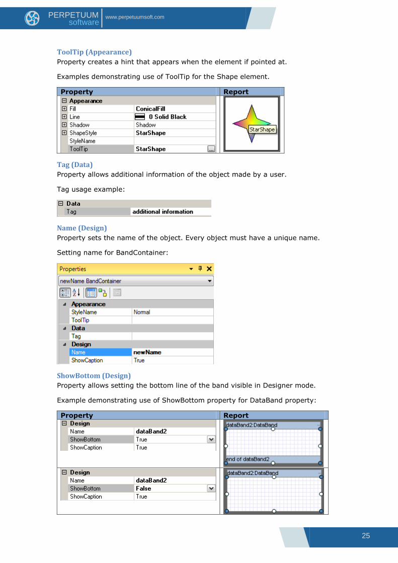
ToolTip (Appearance)
Property creates a hint that appears when the element if pointed at.
Examples demonstrating use of ToolTip for the Shape element.
Property Report
Tag (Data)
Property allows additional information of the object made by a user.
Tag usage example:
Name (Design)
Property sets the name of the object. Every object must have a unique name.
Setting name for BandContainer:
ShowBottom (Design)
Property allows setting the bottom line of the band visible in Designer mode.
Example demonstrating use of ShowBottom property for DataBand property:
Property Report
26
www.perpetuumsoft.com PERPETUUM software
ShowCaption (Design)
Property sets band header visibility in Designer mode.
Example demonstrating use of ShowCaption property for DataBand property:
Property Report
Location (Layout)
Property sets upper left corner of the object relatively to the container.
Element position can be changed with the mouse pointer or on the Property grid.
Example of the changing element position for Shape element:
Property Report
Note 1: X coordinate equals 0 and cannot be changed.
Note 2: “Snap to Grid” option defines if the object “sticks” to the grid or not when its
position is changed with the mouse pointer. Click the button on the Toolbar to turn on\off
this option.

27
www.perpetuumsoft.com PERPETUUM software
Size (Layout)
Property sets object size.
Property changes when object borders are moved with the mouse pointer or from the
Property grid.
Example of changing the element size for the Shape element:
Property Report
Note 1: X coordinate for band equals 0 and does not vary.
Note 2: “Snap to Grid” option defines if the object snaps to the grid when its position
changes or not. Use the appropriate button to turn on\off this option.
CanBreak (Render)
Property allows the object‟s contents to break between pages and columns in case the
object exceeds page size.
Example of a CanBreak property of Detail and AdvancedText element.
Property Report
Note: when one sets a property CanBreak of the object that is located inside the other
section, CanBreak property must be set for the container band in order for its content to
break up into pages.
28
www.perpetuumsoft.com PERPETUUM software
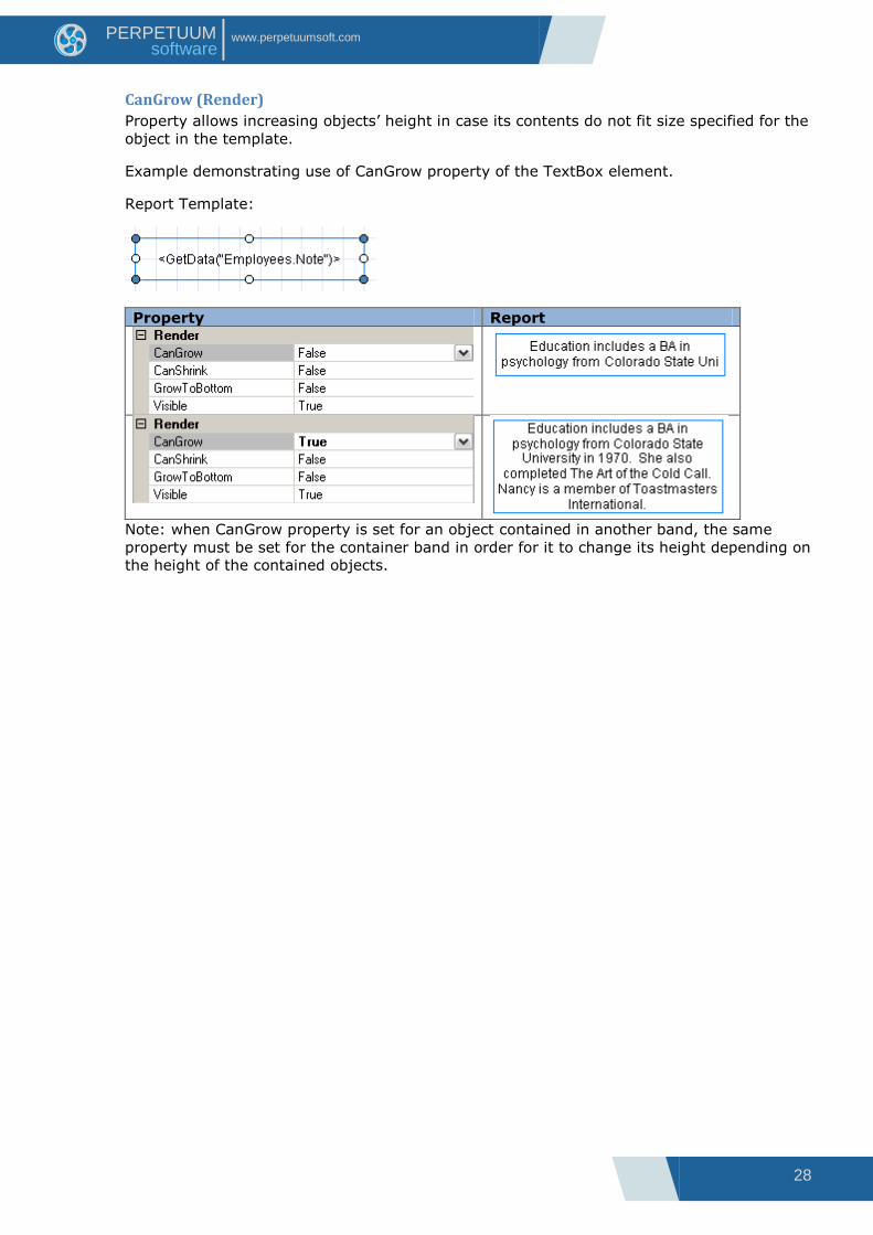
CanGrow (Render)
Property allows increasing objects‟ height in case its contents do not fit size specified for the
object in the template.
Example demonstrating use of CanGrow property of the TextBox element.
Report Template:
Property Report
Note: when CanGrow property is set for an object contained in another band, the same
property must be set for the container band in order for it to change its height depending on
the height of the contained objects.

29
www.perpetuumsoft.com PERPETUUM software
CanShrink (Render)
Property allows decreasing objects‟ height in case the content inserted during the report
generation has smaller size than that set for the container.
Example demonstrating use of “CanShrink” property of the TextBox element.
Report Template:
Property Report
Note: when CanShrink property is set for an object contained in another band, the same
property must be set for the container band in order for it to change its height depending on
the height of the contained objects.

30
www.perpetuumsoft.com PERPETUUM software
MinSpaceAfter (Render)
The property sets minimal space between lower border of the band and lower field of the
page.
Sample of using MinSpaceAfter for the Detail band displaying list.
Report Template:
Property Report

31
www.perpetuumsoft.com PERPETUUM software
Mode (Render)
Property allows setting headlines and overlay generation and defines elements display on
even, odd or all the pages.
Example demonstrating use of Mode property of the PageHeader:
Report Template:
Property Report
32
www.perpetuumsoft.com PERPETUUM software
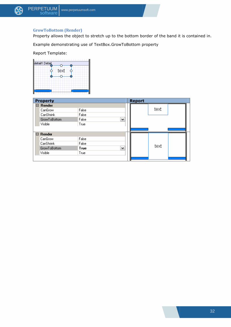
GrowToBottom (Render)
Property allows the object to stretch up to the bottom border of the band it is contained in.
Example demonstrating use of TextBox.GrowToBottom property
Report Template:
Property Report

33
www.perpetuumsoft.com PERPETUUM software
NewColumnAfter (Render)
Property sets if a new column is inserted after the band contents.
Example of adding a new column after the Detail contents:
Report Template:
Property Report

34
www.perpetuumsoft.com PERPETUUM software
NewColumnBefore (Render)
Property sets if a new column is inserted before the band contents.
Example of adding a new column before the Detail contents (detail4):
Report Template:
Property Report

35
www.perpetuumsoft.com PERPETUUM software
NewPageAfter (Render)
Property sets if a new page is inserted after the band contents.
Example of adding a new page after the Detail contents:
Report Template:
Property Report

36
www.perpetuumsoft.com PERPETUUM software
NewPageBefore (Render)
Property sets if a new page is inserted before the section contents.
Example of adding a new page before the Detail contents (detail3):
Report Template:
Property Report

37
www.perpetuumsoft.com PERPETUUM software
Visible (Render)
Property sets visibility of the object in the report.
Example of visibility property of Textbox element with “2” digit:
Report Template:
Property Report
Note: if a container section is invisible, all the containing objects are not displayed also.
38
www.perpetuumsoft.com PERPETUUM software
Text Output The following elements are used in Report Sharp-Shooter for text input:
Elements Descriptions
TextBox Element allows input of simple text information and has text
displaying adjustments.
AdvancedText Element outputs formatted text
RichText Element to output RTF text
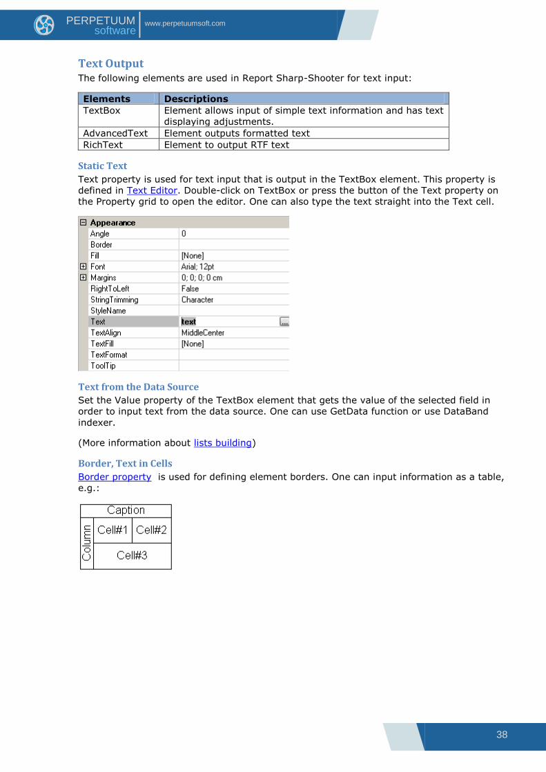
Static Text
Text property is used for text input that is output in the TextBox element. This property is
defined in Text Editor. Double-click on TextBox or press the button of the Text property on
the Property grid to open the editor. One can also type the text straight into the Text cell.
Text from the Data Source
Set the Value property of the TextBox element that gets the value of the selected field in
order to input text from the data source. One can use GetData function or use DataBand
indexer.
(More information about lists building)
Border, Text in Cells
Border property is used for defining element borders. One can input information as a table,
e.g.:
39
www.perpetuumsoft.com PERPETUUM software
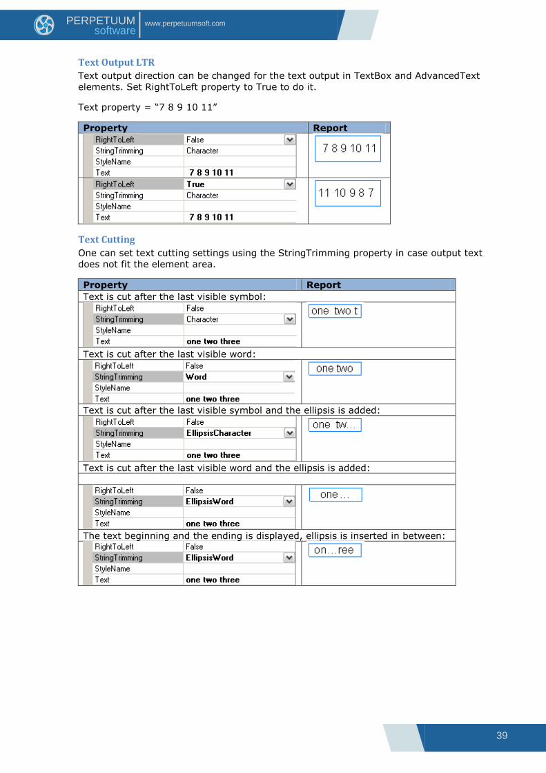
Text Output LTR
Text output direction can be changed for the text output in TextBox and AdvancedText
elements. Set RightToLeft property to True to do it.
Text property = “7 8 9 10 11”
Property Report
Text Cutting
One can set text cutting settings using the StringTrimming property in case output text
does not fit the element area.
Property Report
Text is cut after the last visible symbol:
Text is cut after the last visible word:
Text is cut after the last visible symbol and the ellipsis is added:
Text is cut after the last visible word and the ellipsis is added:
The text beginning and the ending is displayed, ellipsis is inserted in between:
40
www.perpetuumsoft.com PERPETUUM software
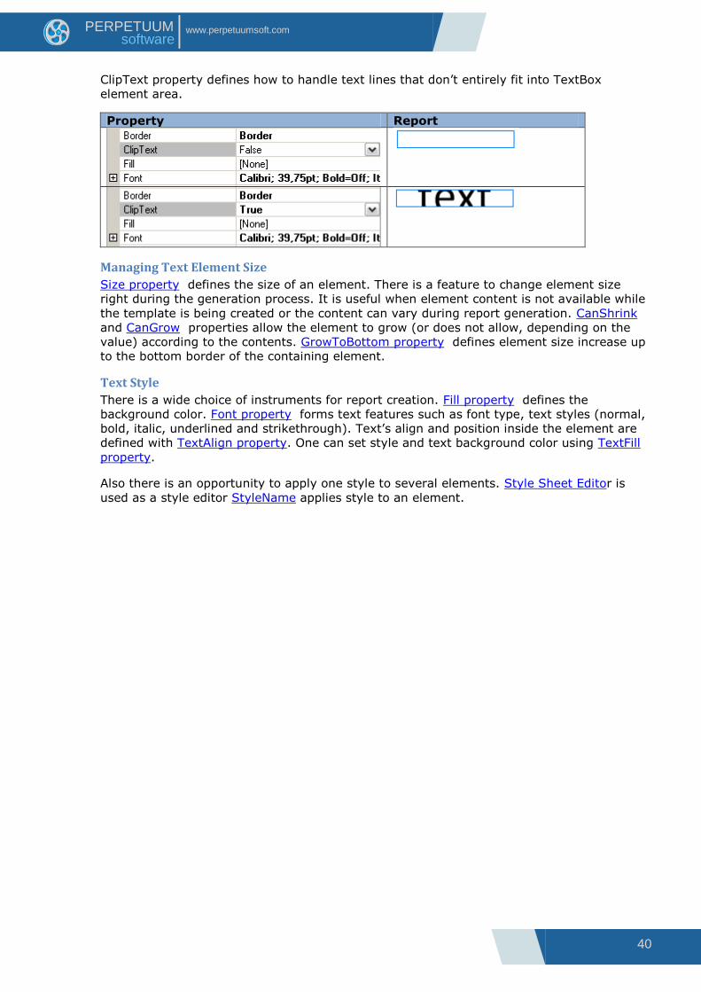
ClipText property defines how to handle text lines that don‟t entirely fit into TextBox
element area.
Property Report
Managing Text Element Size
Size property defines the size of an element. There is a feature to change element size
right during the generation process. It is useful when element content is not available while
the template is being created or the content can vary during report generation. CanShrink
and CanGrow properties allow the element to grow (or does not allow, depending on the
value) according to the contents. GrowToBottom property defines element size increase up
to the bottom border of the containing element.
Text Style
There is a wide choice of instruments for report creation. Fill property defines the
background color. Font property forms text features such as font type, text styles (normal,
bold, italic, underlined and strikethrough). Text‟s align and position inside the element are
defined with TextAlign property. One can set style and text background color using TextFill
property.
Also there is an opportunity to apply one style to several elements. Style Sheet Editor is
used as a style editor StyleName applies style to an element.
41
www.perpetuumsoft.com PERPETUUM software
Text Format
TextFormat property can be used to display text in a special format. There are several text
formats available in Format editor: general, number, currency, date and time, percentage.
User format is also available.
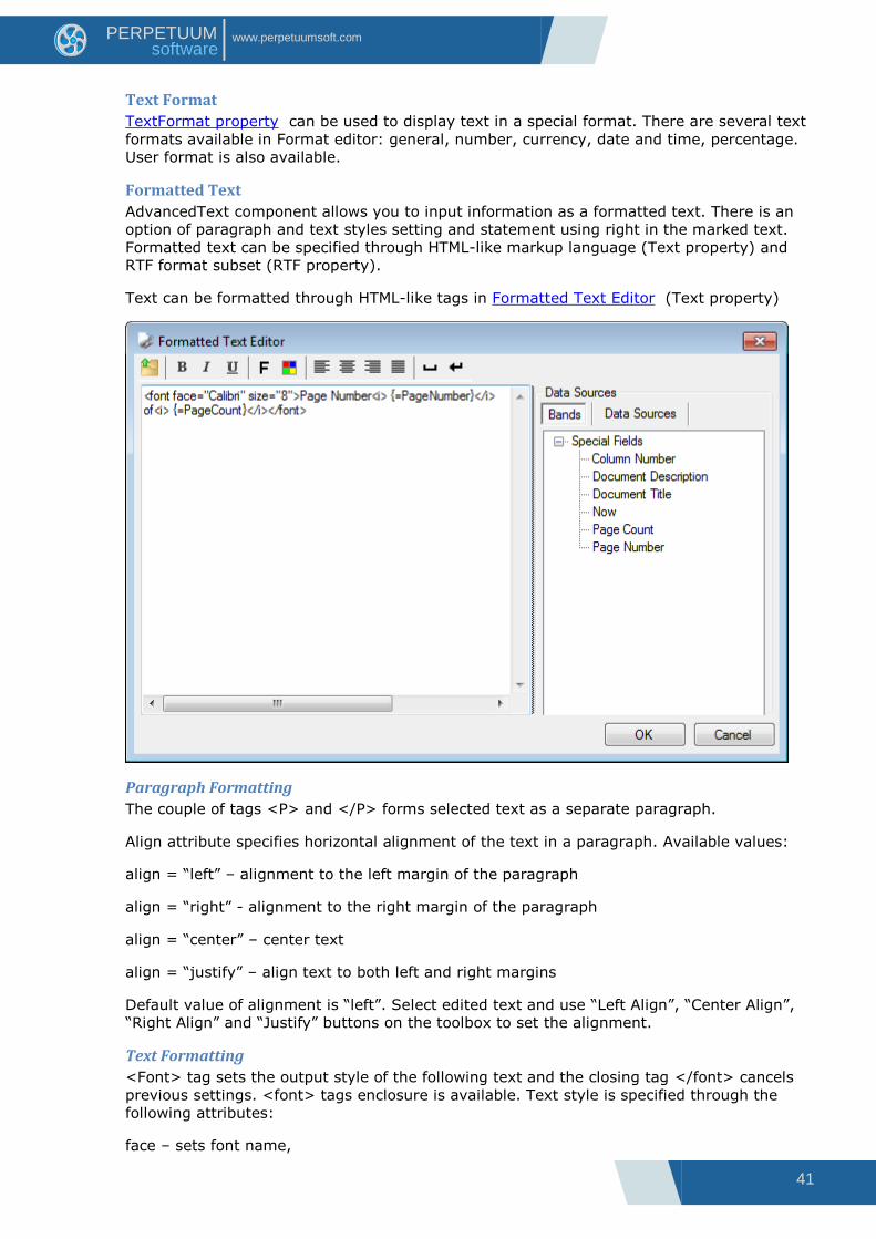
Formatted Text
AdvancedText component allows you to input information as a formatted text. There is an
option of paragraph and text styles setting and statement using right in the marked text.
Formatted text can be specified through HTML-like markup language (Text property) and
RTF format subset (RTF property).
Text can be formatted through HTML-like tags in Formatted Text Editor (Text property)
Paragraph Formatting
The couple of tags <P> and </P> forms selected text as a separate paragraph.
Align attribute specifies horizontal alignment of the text in a paragraph. Available values:
align = “left” – alignment to the left margin of the paragraph
align = “right” - alignment to the right margin of the paragraph
align = “center” – center text
align = “justify” – align text to both left and right margins
Default value of alignment is “left”. Select edited text and use “Left Align”, “Center Align”,
“Right Align” and “Justify” buttons on the toolbox to set the alignment.
Text Formatting
<Font> tag sets the output style of the following text and the closing tag </font> cancels
previous settings. <font> tags enclosure is available. Text style is specified through the
following attributes:
face – sets font name,
42
www.perpetuumsoft.com PERPETUUM software
size – sets font size.
Press “Font” button to open style editor for quick style definition.
color – sets font color.
Available values: color name (e.g. color=”red”), hexadecimal format of separate color
components in RGB (e.g. color=”#FF0000”). Press “Color” button to open ColorPicker for
quick color choice.
Tag <B> - the following text will be of a bold type. Closing tag </B> cancels this setting.
(“Bold” button).
Tag <I> - the following text will be of an italic type. Closing tag </I> cancels this setting.
(“Italic” button)
Tag <U> - the following text will be underlined. Closing tag </U> cancels this setting.
(“Underline” button)
Tag <BR> - lines folding in a paragraph. (“Insert line break” button).
Symbol Insert
“ ” – space (“Insert space” button),
“&” –„&‟ symbol,
“<” - „<‟ symbol,
“&#ddd;” - symbol with ddd code.
Note: If the text is not marked as a paragraph, alignment settings according to the
TextAlign property are applied. If there are no evident font settings, the settings according
to Font property are applied. If text color is not specified, TextFill property is applied. The
following is ignored during the text handling: line breaks, several spaces, in succession and
unknown tags and attributes. Case in tag names doesn‟t matter.
Using Expressions
One can use statements (the result of those will be inserted in the text) directly in the
marked text. It is possible to use expressions which calculation result will be set into the
text can be used directly inside marked up text. The expression specifies as
{=<Statement>}. {=<Statement>} – expression on the set script language. All the
available types and objects can be used in the expression. Formatting according to the
mask specified in the Format property is applied to the expression result before it is inserted
in the text. In case an error occurs, error message is inserted in the text as an expression
result.
DataSources section adds special properties to the documents and Data Source fields.
Using RTF Property
RTF format subset is used for text formatting. The following constructions from the RTF
format are used: font table, color table, comments, paragraph format operators (“\par”,
“\pard”, “\ql”, “\qr”,“\qc”, “\qj”, “\line”), text format operators (“\fxx”, “\fsxx”, “\cfxx”, “\b”,
“\i”, “\u”). All the rest constructions and operators will be ignored. Rtf property is designed
to write only. Rtf property is connected to the Text property: when Rtf property is specified,
Text property value specifies automatically.
Press “Open RTF document” button to load text from the RTF file.
Breaking Text between Pages
AdvancedText element allows to output text from one element to one or more pages.
CanBreak property is used for it.

43
www.perpetuumsoft.com PERPETUUM software
RTF Text
RichText element is used for RTF-text output. Text loads from file through RichText Editor.

44
www.perpetuumsoft.com PERPETUUM software
List
Simple List
DataBand is used for lists building. The band repeatedly outputs elements embedded into it.
Visual elements output as a list must be contained in the Detail inside DataBand. Detail sets
row height. InstanceCount property sets the amount of repetitions.
<DataBand name>.LineNumber() statement is used for getting line number.
Example of a list that outputs line number in the list:
dataBand1.InstanceCount = 5;
textBox.Value = "line number = " + dataBand1.LineNumber().ToString() + " of " +
dataBand1.InstanceCount.ToString();
Report Template Report
List from the Data Source
DataBand allows building a list based on the data from the source. Data source is set in
DataSource property. Note: the number of output lines depends on the amount of lines in
the data source, ignoring InstanceCount property.
In order to get access to the current element that has to be output, either GetData(“<Data
source name>.<Field name>”) or <DataBand name>[“<Field name>”] script is used.
Textual information can be output by dragging the corresponding field from the document
tree on the Data Sources tab into Detail (located in DataBand).
Example of a list that outputs employees‟ names:
45
www.perpetuumsoft.com PERPETUUM software
dataBand.DataSource = Employees;
textBox.Value = dataBand["EmployeeName"];
Report Template Report
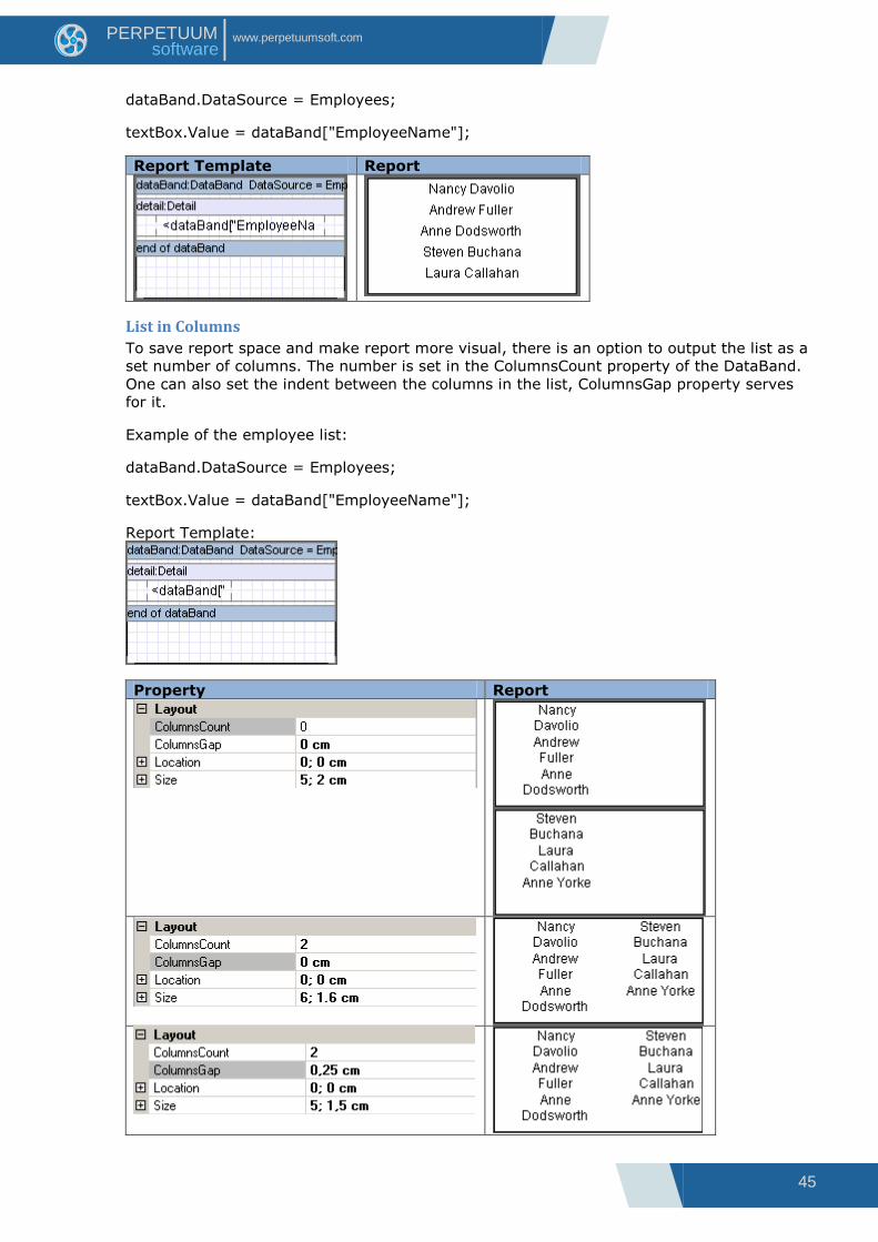
List in Columns
To save report space and make report more visual, there is an option to output the list as a
set number of columns. The number is set in the ColumnsCount property of the DataBand.
One can also set the indent between the columns in the list, ColumnsGap property serves
for it.
Example of the employee list:
dataBand.DataSource = Employees;
textBox.Value = dataBand["EmployeeName"];
Report Template:
Property Report
46
www.perpetuumsoft.com PERPETUUM software
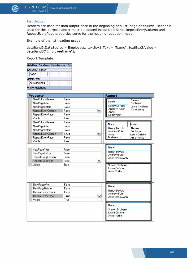
List Header
Headers are used for data output once in the beginning of a list, page or column. Header is
used for this purpose and it must be located inside DataBand. RepeatEveryColumn and
RepeatEveryPage properties serve for the heading repetition mode.
Example of the list heading usage:
dataBand3.DataSource = Employees; textBox1.Text = "Name"; textBox2.Value =
dataBand3("EmployeeName");
Report Template:
Property Report

47
www.perpetuumsoft.com PERPETUUM software
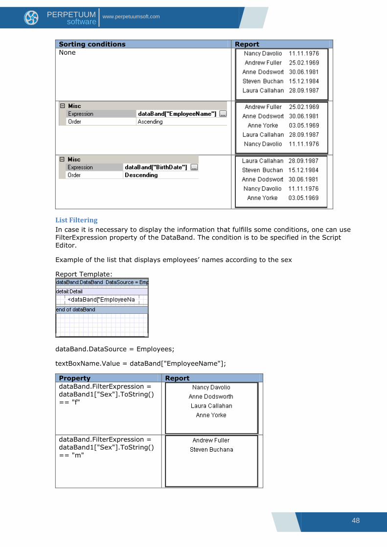
List Sorting
DataBand outputs entries in the same order they are saved in the data source. Sort
property of DataBand sets the special output order. Collection Editor is used for the property
definition. Expression property is used for setting the expression of the sorting (the script
must be used as an expression); Order property defines the order of the sorting (ascending
or descending).
Example of a list that outputs names and birthdates of the employees according to the
sorting condition:
Report Template:
dataBand.DataSource = Employees;
textBoxName.Value = dataBand["EmployeeName"];
textBoxDate.Value = dataBand["BirthDate"];
48
www.perpetuumsoft.com PERPETUUM software
Sorting conditions Report
None
List Filtering
In case it is necessary to display the information that fulfills some conditions, one can use
FilterExpression property of the DataBand. The condition is to be specified in the Script
Editor.
Example of the list that displays employees‟ names according to the sex
Report Template:
dataBand.DataSource = Employees;
textBoxName.Value = dataBand["EmployeeName"];
Property Report
dataBand.FilterExpression =
dataBand1["Sex"].ToString()
== "f"
dataBand.FilterExpression =
dataBand1["Sex"].ToString()
== "m"

49
www.perpetuumsoft.com PERPETUUM software
Final List Values
One can use aggregated lists when it is necessary to count the totals of the list. The list of
the aggregate functions for the data output in the DataBand can be specified in the Totals
property with the help of Collection Editor.
AggregateFunction property specifies the aggregated function. The aggregated expression is
set by the Expression property. The name of the function is to be specified in the Name
property. GetTotal("<aggregate name>") script is used for calling the function and getting
the sum; GetRunningTotal("<aggregate name>") is used in order to get current cumulative
value. One can get arrogated data before the output of the aggregated values. GetTotal
result does not depend on the location of the caller element: before or after. It is
recommended to output GetRunningTotal value in the Detail; calling from the Header is
useless because there are no accumulated values; GetRunningTotal value called from the
Footer will coincide with GetTotal value.
Report generator supports 12 built-in aggregate functions.
Example of the aggregate functions operating:
Report Template:
dataBand.DataSource = Numbers; textBox1.Value = dataBand["Value"]; textBox.Value =
GetTotal("Func");

50
www.perpetuumsoft.com PERPETUUM software
Property Report
Total:
Arithmetic mean:
Minimal element:
Maximal element:
Elements amount:
Standard Deviation:
Estimate of Standard Deviation:
Variance:
Estimate of variance:

51
www.perpetuumsoft.com PERPETUUM software
Median:
Skewness :
Kurtosis:
Entries Amount on the Page
Total property of the DataBand can be used in order to count the entries located on the
page. One can define count function in the Collection Editor in the following way:
PageFooter including Textbox element is used in order to output entries amount. Text
property is set in PageFooter.GenerateScript:
if (Engine.IsDoublePass)
{
textBoxFooter.Text = "Records " + dataBand5.GetPageTotal("Count") + "
of " + dataBand5.GetTotal("Count");
}
One should set DoublePass property of the document to True in order to calculate entries.
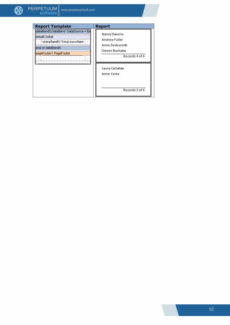
52
www.perpetuumsoft.com PERPETUUM software
Report Template Report
53
www.perpetuumsoft.com PERPETUUM software
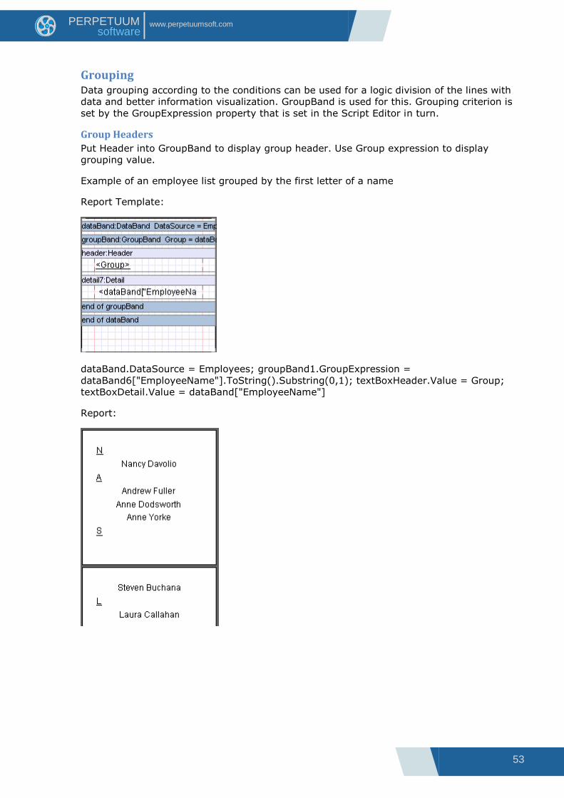
Grouping Data grouping according to the conditions can be used for a logic division of the lines with
data and better information visualization. GroupBand is used for this. Grouping criterion is
set by the GroupExpression property that is set in the Script Editor in turn.
Group Headers
Put Header into GroupBand to display group header. Use Group expression to display
grouping value.
Example of an employee list grouped by the first letter of a name
Report Template:
dataBand.DataSource = Employees; groupBand1.GroupExpression =
dataBand6["EmployeeName"].ToString().Substring(0,1); textBoxHeader.Value = Group;
textBoxDetail.Value = dataBand["EmployeeName"]
Report:

54
www.perpetuumsoft.com PERPETUUM software
Sorting in Groups
GroupBand outputs the entries into the report in the same order they are saved in the data
source. Order property of the GroupBand sets the output order. There are 3 values of this
property available: KeepOriginal – initial entries order, Ascending – the ascending sort of
the entries, Descending - the descending sort of the entries.
SortExpression property sets sorting criterion.
Example of an ordered employee list grouped by the first letter of the name:
dataBand.DataSource = Employees; groupBand.GroupExpression =
dataBand["EmployeeName"].ToString().Substring(0,1); groupBand.Order = Ascending;
textBoxHeader.Value = Group; textBoxDetail.Value = dataBand["EmployeeName"]
Report Template Report

55
www.perpetuumsoft.com PERPETUUM software
Cascading Grouping
There is an option of creating a report with a complex structure of grouping. Several
GroupBands nested into each other bands are used for this.
Example of an employee list grouped by countries first and then by cities:
dataBand.DataSource = Employees; groupBandCounty.GroupExpression =
dataBand["Country"]; groupBandCity.GroupExpression = dataBand["City"];
textBoxDetail.Value = dataBand["EmployeeName"].
Report Template Report
56
www.perpetuumsoft.com PERPETUUM software
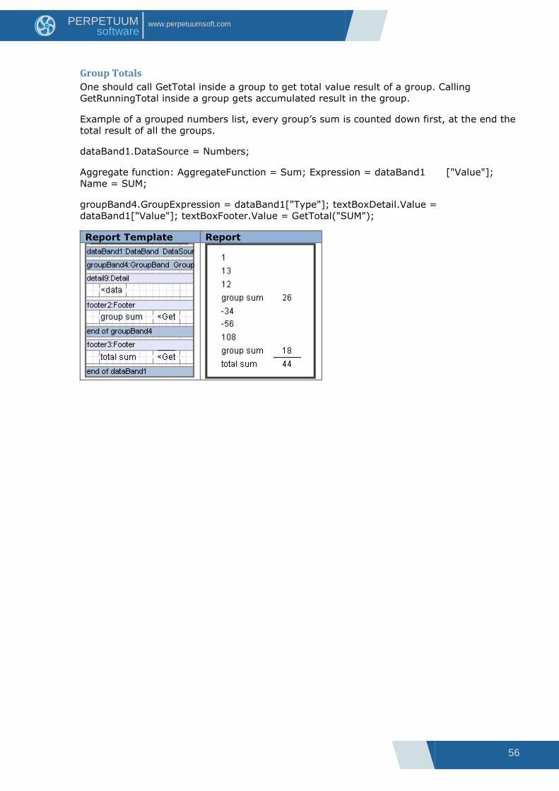
Group Totals
One should call GetTotal inside a group to get total value result of a group. Calling
GetRunningTotal inside a group gets accumulated result in the group.
Example of a grouped numbers list, every group‟s sum is counted down first, at the end the
total result of all the groups.
dataBand1.DataSource = Numbers;
Aggregate function: AggregateFunction = Sum; Expression = dataBand1 ["Value"];
Name = SUM;
groupBand4.GroupExpression = dataBand1["Type"]; textBoxDetail.Value =
dataBand1["Value"]; textBoxFooter.Value = GetTotal("SUM");
Report Template Report

57
www.perpetuumsoft.com PERPETUUM software
Horizontal List and Table
Horizontal List
CrossBand is used for horizontal lists building. Band repeatedly outputs included elements
LTR. CrossBand must be located in Detail, Header or Footers that define CrossBand location
in a report. Repetition amount is defined by the InstanceCount property.
<CrossBand name>. LineNumber() statement is used in order to get entry number. If all
the entries output by CrossBand don‟t fit into one line, the list continues from a new page.
Example of a horizontal list that outputs an entry number:
crossBand1.InstanceCount = 4;
textBox.Value = crossBand1.LineNumber().ToString + " of " +
crossBand1.InstanceCount().ToString;
Report Template Report
Horizontal List from the Data Source
CrossBand allows building a horizontal list based on the data from the data source. Data
source is set in the DataSource property; amount of output entries depends on a number of
entries in a source and InstanceCount property is ignored.
GetData(“<Data source name>.<Field name>”) script is used in order to get access to the
current element that is to be output.
Example of a horizontal list that outputs a row of numbers:
crossBand1.DataSource = Numbers; textBox.Value = GetData("Numbers.Value")
Report Template Report

58
www.perpetuumsoft.com PERPETUUM software
Table
Using CrossBand included into DataBand one can output data as a table.
Example of a calendar output:
dataBand.InstanceCount = 5; crossBand. InstanceCount = 7; textBox.Value =
(crossBand.LineNumber + ((dataBand.LineNumber - 1) *
7))>31?"":(crossBand.LineNumber + ((dataBand.LineNumber - 1) * 7)).ToString();
Report Template Report
59
www.perpetuumsoft.com PERPETUUM software
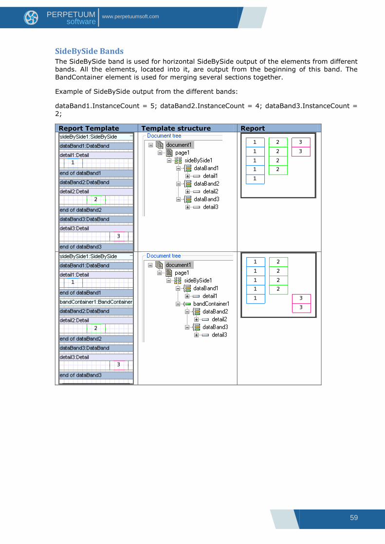
SideBySide Bands The SideBySide band is used for horizontal SideBySide output of the elements from different
bands. All the elements, located into it, are output from the beginning of this band. The
BandContainer element is used for merging several sections together.
Example of SideBySide output from the different bands:
dataBand1.InstanceCount = 5; dataBand2.InstanceCount = 4; dataBand3.InstanceCount =
2;
Report Template Template structure Report

60
www.perpetuumsoft.com PERPETUUM software
Pivot Table Pivot tables are used for structured data output and calculation of the total values. The
PivotTable is used for the creation of pivot tables. The DataSource property sets the data
source for the pivot table.
The Layout property sets the rows and columns values of the result table. The property can
be edited in Sources Fields.
The list of fields from data source is displayed on the left of the Source fields‟ area. The
DataCube fields section is intended for data assignment in the pivot table. The fields of the
table horizontal headline are set in X dimension fields list. The fields of the table vertical
headline are set in Y dimension fields list. The Facts fields list includes fields for the cells
with data. Property Grid is located to the left. It is used to set cells properties.

61
www.perpetuumsoft.com PERPETUUM software
Table Titles
The TableCaption property sets the table caption.
Property Report
The captions of the table rows and columns can be set in the Layout property editor of the
PivotTable. The Caption property is used for this purpose. The TotalLabel sets the title for
the column and row with total values. If this property is not set the total values are
identified as Total.
Property Report

62
www.perpetuumsoft.com PERPETUUM software
The DimensionOnEveryPage property of the PivotTable sets the output of pivot table header
on each page.
Property Report
It is possible to set the display of fact column title using the ShowSingleFact property.
Property Report
63
www.perpetuumsoft.com PERPETUUM software
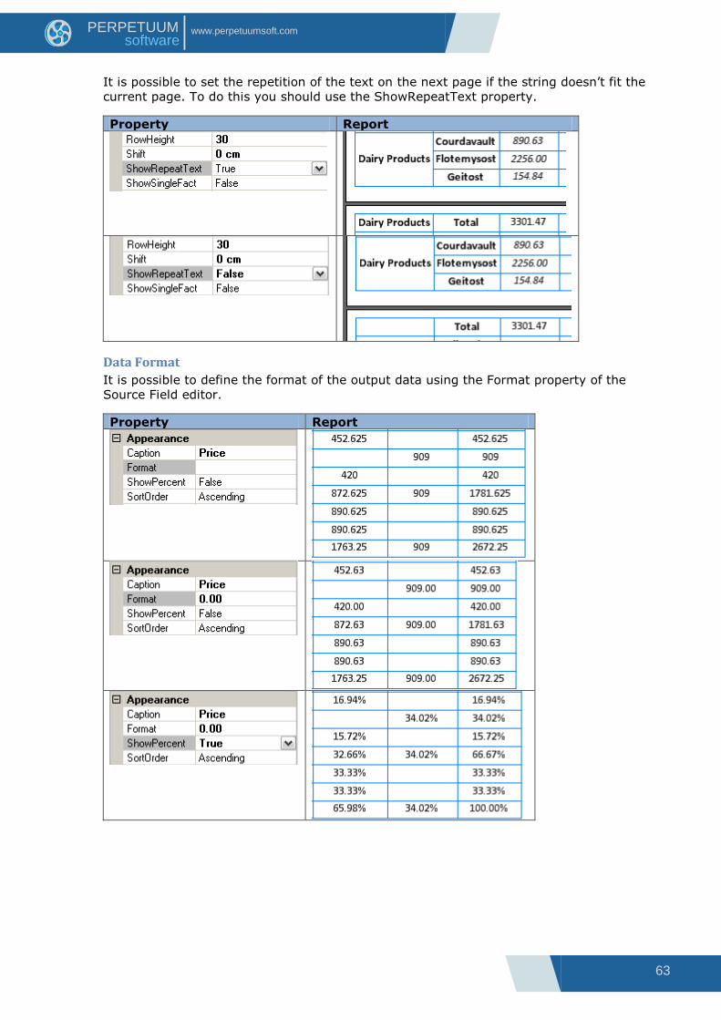
It is possible to set the repetition of the text on the next page if the string doesn‟t fit the
current page. To do this you should use the ShowRepeatText property.
Property Report
Data Format
It is possible to define the format of the output data using the Format property of the
Source Field editor.
Property Report

64
www.perpetuumsoft.com PERPETUUM software
The ShowZeroValues property is responsible for display of NULL values in a report.
Property Report
Ability to hide/show Total
It is possible to hide the “Total” columns or rows of a pivot table using the ShowTotal
property of the fields. The Source Field editor allows the setting of this property.
Property Report
Data Sorting
The order of sorting is set in the SortOrder property. Ascending (direct order) and
Descending (reversed order) are available.
Data Filtering
Filtering is used when you need to output data which address some specific conditions. The
FilterExpression property is used to set the conditions. The expression is set by the script.
The result of calculation of this expression will define data for the table.
Property Report
Not set
FilterExpression=”(double)G
etData("Sales.Discount") >=
0.1”

65
www.perpetuumsoft.com PERPETUUM software
Table Size
The table cell size is defined automatically according to the table data size by default. The
AutoColumnWidth (setting of column width) and AutoRowHeight (setting of rows height) are
used for this. In order to set arbitrary row height you should select “None” value in the
AutoRowHeight property and indicate the height value in pixels in the RowHeight property.
Left margins are set by the Shift property.

66
www.perpetuumsoft.com PERPETUUM software
Table Styles
The StyleName property sets the table style. The Style Sheet Editor is used for styles
creation.
It is possible to set separate styles for each cell type using the Style properties group.
Property Report
Pivot Table Saving
The Layout property sets expressions and position of fields in pivot table. It can be saved to
the file for further use and quick return to the initial pivot table form. You can use the
“Save” and “Open” buttons of the Layout property editor for saving and loading of the table
parameters. The file has the XML format and .dcl extension.

67
www.perpetuumsoft.com PERPETUUM software
Image The Picture element is used for images display.
The Image property sets the image. In order to select file you should press the button near
the Image property or double click with left mouse button on the area of Picture element. It
is possible to upload the image of the following formats: *.bmp, *.gif, *.jpg, *.jpeg, *.png,
*.ico, *.emf, *.wmf.
Size and Scale of the Image
The Size property sets the size of the Picture element. If the image size doesn‟t fit Picture
element size during the output, you can use the SizeMode property to change sizes.
The image extension – the image changes the proportions depending on the elements sizes:
Property Report
The image cutting – the image saves its natural size and is cut according to the
element‟s size:
Auto size – the element‟s size is changed according to the image size and is not
edited:
Uniform – the image is resized to maximum size inside element bounds, image‟s
aspect ratio is preserved:

68
www.perpetuumsoft.com PERPETUUM software
Image Alignment
If “Normal” or “Uniform” size mode is chosen, then the ImageAlign property will define the
image position within bounds of the element.
Property Report

69
www.perpetuumsoft.com PERPETUUM software
Dynamic Image Loading
When it is needed to load the image in the process of report generation, you can open the
Bindings properties and use the Image property. Use the following script when it is needed
to load image from file:
System.Drawing.Image.FromFile("<path to the file>")
Report Template Report
dataBand.DataSource = Employees;
textBox.Value = dataBand["EmployeeName"];
picture.Image =
System.Drawing.Image.FromFile
("C:\\Data\\Pictures\\"+dataBand["EmployeeNa
me"]. ToString()+".png");
picture.SizeMode = AutoSize;

70
www.perpetuumsoft.com PERPETUUM software
Image from Data Source
To output images from data source you should put the Picture element to Detail which is
located in the DataBand with the set data source, and then set the Image property on the
Bindings tab. In this case the images are stored in the data source in byte representation.
Report Template Report
dataBand.DataSource =
Employees;
textBox.Value =
dataBand["EmployeeName"];
picture.Image =
dataBand["Picture"];
picture.SizeMode = AutoSize;

71
www.perpetuumsoft.com PERPETUUM software
Using Shapes Shape element can be used to output various graphical figures.
Shape Types
ShapeStyle property defines the type of a figure. The following types are available:
Shape Styles Report
RectangleShape – figure draws a rectangle.
TriangleShape – figure draws an isosceles triangle. Direction property sets triangle
orientation.
CrossShape – figure draws a cross.
DiamondShape – figure draws a diamond.
StarShape – figure draws a star. InternalRadius property sets a radius of an
inscribed circle, KeepRoundForm property defines star shape – ellipse or a circle,
Points property sets number of the rays, StartAngle property sets the rotation angle
of a star.
ArrowShape – figure draws an arrow. Direction property sets the direction of an
arrow.
RectTriangleShape – figure draws a pentagon. Direction property sets the direction
of a figure.
72
www.perpetuumsoft.com PERPETUUM software
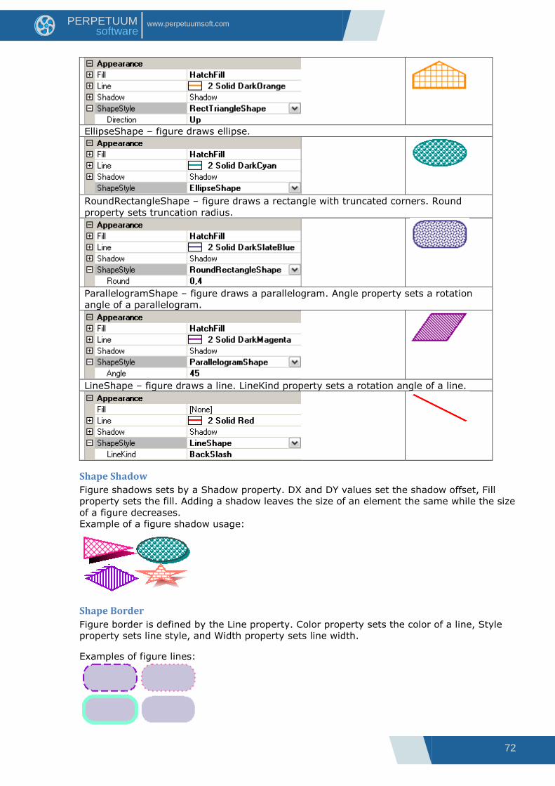
EllipseShape – figure draws ellipse.
RoundRectangleShape – figure draws a rectangle with truncated corners. Round
property sets truncation radius.
ParallelogramShape – figure draws a parallelogram. Angle property sets a rotation
angle of a parallelogram.
LineShape – figure draws a line. LineKind property sets a rotation angle of a line.
Shape Shadow
Figure shadows sets by a Shadow property. DX and DY values set the shadow offset, Fill
property sets the fill. Adding a shadow leaves the size of an element the same while the size
of a figure decreases.
Example of a figure shadow usage:
Shape Border
Figure border is defined by the Line property. Color property sets the color of a line, Style
property sets line style, and Width property sets line width.
Examples of figure lines:

73
www.perpetuumsoft.com PERPETUUM software
Barcodes BarCode element is used to create barcodes. Code for barcode is set in the Code property.
Digits can be used for the most types of barcodes; Latin symbols can be used for some
advanced barcode types.
Property Report
Barcode ratio is set in the BarRatio property.
Barcode Types
Type of the code is set in the CodeType property. The following linear barcode types are
available: Code_2_5_interleaved, Code_2_5_industrial, Code_2_5_matrix, Code39 (default
value), Code39Extended, Code128A, Code128B, Code128C, Code93, Code93Extended,
CodeMSI, CodePostNet, CodeCodabar, CodeEAN8, CodeJAN8, CodeEAN13, CodeJAN13,
CodeUPC_A, CodeUPC_E0, CodeUPC_E1, CodeUPC_Supp2, CodeUPC_Supp5, CodeEAN128A,
CodeEAN128B, CodeEAN128C.
2D barcodes are use with additional settings:
PDF417, PDF417Compact. Settings for these barcode types are in the Pdf417Settings
properties group:
QRCode. QRCodeSettings property group:
74
www.perpetuumsoft.com PERPETUUM software
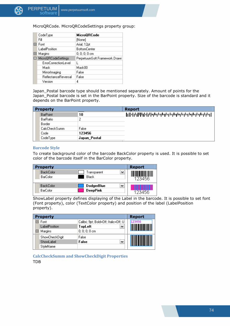
MicroQRCode. MicroQRCodeSettings property group:
Japan_Postal barcode type should be mentioned separately. Amount of points for the
Japan_Postal barcode is set in the BarPoint property. Size of the barcode is standard and it
depends on the BarPoint property.
Property Report
Barcode Style
To create background color of the barcode BackColor property is used. It is possible to set
color of the barcode itself in the BarColor property.
Property Report
ShowLabel property defines displaying of the Label in the barcode. It is possible to set font
(Font property), color (TextColor property) and position of the label (LabelPosition
property).
Property Report
CalcCheckSumm and ShowCheckDigit Properties
TDB

75
www.perpetuumsoft.com PERPETUUM software
Parameters Parameters property is used to set report parameters. Collection Editor is an editor of this
property.
DefaulValue property sets parameter value. Name property sets name to refer to parameter
value in subreport. ParameterType property sets type of the parameter (string type is used
by default for all parameters).
To get parameter value in subreport the following expression is used:
GetParameter("<ParameterName>")
TBD
76
www.perpetuumsoft.com PERPETUUM software
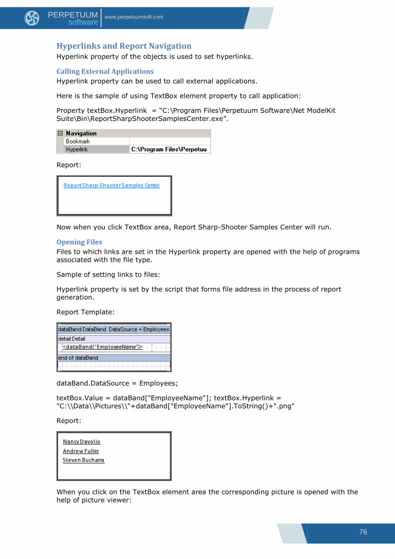
Hyperlinks and Report Navigation Hyperlink property of the objects is used to set hyperlinks.
Calling External Applications
Hyperlink property can be used to call external applications.
Here is the sample of using TextBox element property to call application:
Property textBox.Hyperlink = “C:\Program Files\Perpetuum Software\Net ModelKit
Suite\Bin\ReportSharpShooterSamplesCenter.exe”.
Report:
Now when you click TextBox area, Report Sharp-Shooter Samples Center will run.
Opening Files
Files to which links are set in the Hyperlink property are opened with the help of programs
associated with the file type.
Sample of setting links to files:
Hyperlink property is set by the script that forms file address in the process of report
generation.
Report Template:
dataBand.DataSource = Employees;
textBox.Value = dataBand["EmployeeName"]; textBox.Hyperlink =
"C:\\Data\\Pictures\\"+dataBand["EmployeeName"].ToString()+".png"
Report:
When you click on the TextBox element area the corresponding picture is opened with the
help of picture viewer:

77
www.perpetuumsoft.com PERPETUUM software
Hyperlinks to Internet Resources and Emails
To get hyperlinks to Internet resources in the Hyperlink property it is necessary to set URL.
For example, textBox.Hyperlink = “http://www.perpetuumsoft.com/”
When you click on the TextBox element area in the final document, hyperlink is opened with
the help of browser.
To make email client open when you click the link, Hyperlink property should contain mailto
hyperlink, for example, textBox.Hyperlink = “mailto:[email protected]”. Then click
on the element will open email client to send message to the set address. The same with
the parameters (subject, body, cc, bcc,); it is possible to set subject, content of the
message, emails to send CC and BCC. For example, hyperlink
“mailto:[email protected]?subject=Suggestion&Body=Hello!%0DI%20have%20so
me%20ideas%20for%20you.&[email protected]” opens email client with
the following data:
Bookmarks
To make navigation through the report easier, it is possible to use Bookmark property. This
property creates a bookmark that allows you to go to this object from any place of the

78
www.perpetuumsoft.com PERPETUUM software
report with the help of Content tree in Report Viewer. Name of the bookmark should start
with # symbol, otherwise Bookmark property value will be ignored.
Report Template:
textBoxHeader.Bookmark = #Begin;
picture.Bookmark = #logo;
Report in the Report Viewer:
Bookmark tree is located on the left. “Show content” button is used to display/hide the tree.
When you select some item in the Content area, report area containing element for which
the corresponding bookmark is set will be opened.

79
www.perpetuumsoft.com PERPETUUM software
Joint Use of Hyperlinks and Bookmarks for Report Navigation
Bookmarks can be used as to go to them via hyperlinks. It is necessary to set bookmark
name in the Hyperlink property.
Report Template:
picture.Bookmark = #logo;
textBoxToLogo.Hyperlink = #logo
Report in the Report Viewer:
When you click on the TextBox element area with the text “To logo” report part containing
logo will open.
To get back to the previous report area, it is possible to use “Back” hyperlink.

80
www.perpetuumsoft.com PERPETUUM software
Using subreports Mechanism of using subreports is used when it is necessary to join several reports in a
single one. SubReport is used for this purpose. It defines included subreport and its location
in the template. Subreport template should be located in the ReportManager current
template is located in.
To set subreport template, TemplateName property of the SubReport is used. Property
combo box contains report names contained in the current ReportManager (if ReportName
property for ReportSlot is not set in the ReportManager, template is not displayed in the
list).
Template of master report Subreport template Report
Property
subReport.TemplateName =
Report1
Final report contains only those elements that are located inside bands (DataBand, Detail
etc.). If style is not set for subreport elements, style of the master template or SubReport
band is applied to them.
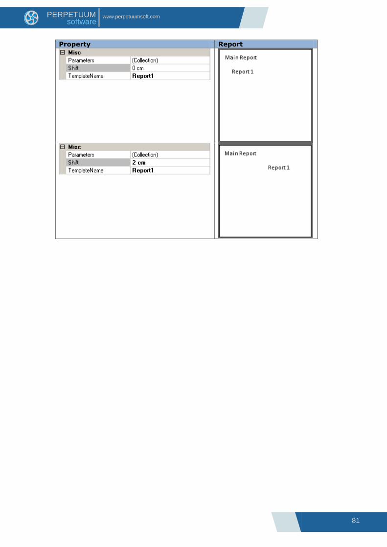
In order to set shift from the left report border Shift property of the SubReport is used.
Report Template:
81
www.perpetuumsoft.com PERPETUUM software
Property Report

82
www.perpetuumsoft.com PERPETUUM software
Complex Report
Any amount of subreports can be added to a single report.
Master report template Subreport template Report
Properties:
subReport1.TemplateName
= Report1
subReport2.TemplateName
= Report2
Report1
Report2

83
www.perpetuumsoft.com PERPETUUM software
It is possible to use nested reports.
Master report template Subreport template Report
Property:
subReport1.TemplateName
= Report1
Report1
Property
subReport1.TemplateName =
Report2
Report2

84
www.perpetuumsoft.com PERPETUUM software
Passing Parameters to Subreport
Parameters property of the SubReport can be used to pass parameters from master report
to subreport. Collection Editor is editor of this property.
Expression property sets expression which calculation result will be passed as a parameter.
Name property sets name used to refer to parameter value in subreport.
To get parameter value in subreport GetParameter("<ParameterName>") expression is
used.
Sample of a template displaying employees list. Names and sequence numbers are
displayed in subreport
Master Report Template:
Property subReport1.TemplateName = Report1
Two parameters are added to the subReport1.Parameters collection. First parameter:
Expression = dataBand1.LineNumber, Name = Number. Second parameter: Expression =
dataBand1["EmployeeName"]. Name = Name.
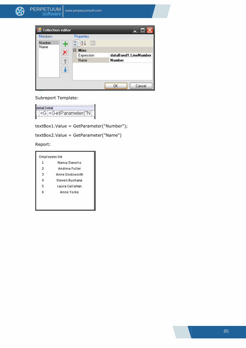
85
www.perpetuumsoft.com PERPETUUM software
Subreport Template:
textBox1.Value = GetParameter("Number");
textBox2.Value = GetParameter("Name")
Report:
86
www.perpetuumsoft.com PERPETUUM software
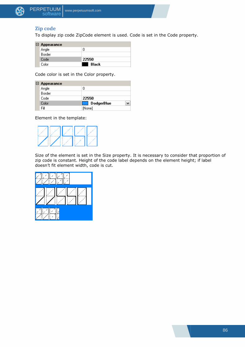
Zip code To display zip code ZipCode element is used. Code is set in the Code property.
Code color is set in the Color property.
Element in the template:
Size of the element is set in the Size property. It is necessary to consider that proportion of
zip code is constant. Height of the code label depends on the element height; if label
doesn‟t fit element width, code is cut.
87
www.perpetuumsoft.com PERPETUUM software
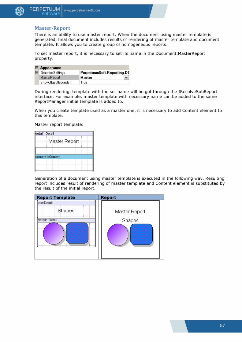
Master-Report There is an ability to use master report. When the document using master template is
generated, final document includes results of rendering of master template and document
template. It allows you to create group of homogeneous reports.
To set master report, it is necessary to set its name in the Document.MasterReport
property.
During rendering, template with the set name will be got through the IResolveSubReport
interface. For example, master template with necessary name can be added to the same
ReportManager initial template is added to.
When you create template used as a master one, it is necessary to add Content element to
this template.
Master report template:
Generation of a document using master template is executed in the following way. Resulting
report includes result of rendering of master template and Content element is substituted by
the result of the initial report.
Report Template Report
88
www.perpetuumsoft.com PERPETUUM software
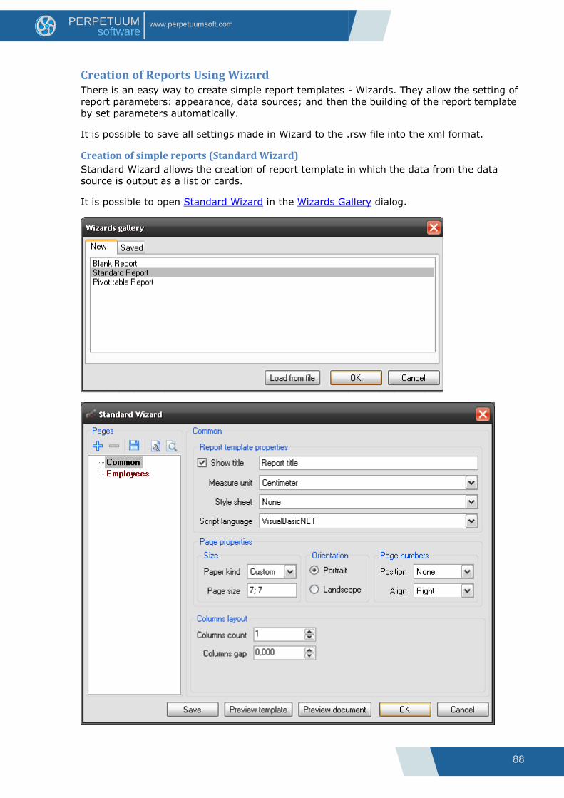
Creation of Reports Using Wizard There is an easy way to create simple report templates - Wizards. They allow the setting of
report parameters: appearance, data sources; and then the building of the report template
by set parameters automatically.
It is possible to save all settings made in Wizard to the .rsw file into the xml format.
Creation of simple reports (Standard Wizard)
Standard Wizard allows the creation of report template in which the data from the data
source is output as a list or cards.
It is possible to open Standard Wizard in the Wizards Gallery dialog.
89
www.perpetuumsoft.com PERPETUUM software
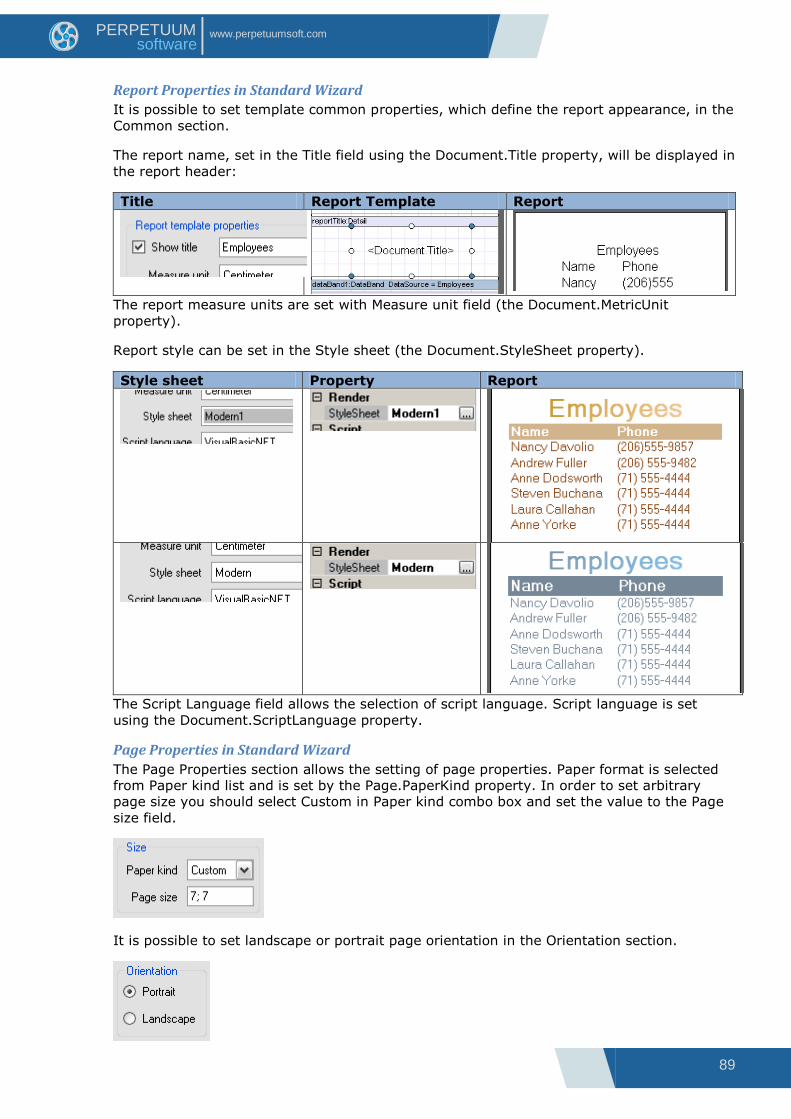
Report Properties in Standard Wizard
It is possible to set template common properties, which define the report appearance, in the
Common section.
The report name, set in the Title field using the Document.Title property, will be displayed in
the report header:
Title Report Template Report
The report measure units are set with Measure unit field (the Document.MetricUnit
property).
Report style can be set in the Style sheet (the Document.StyleSheet property).
Style sheet Property Report
The Script Language field allows the selection of script language. Script language is set
using the Document.ScriptLanguage property.
Page Properties in Standard Wizard
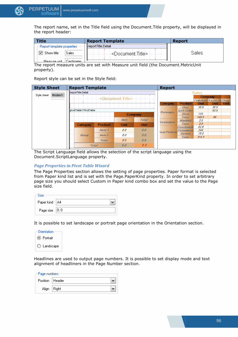
The Page Properties section allows the setting of page properties. Paper format is selected
from Paper kind list and is set by the Page.PaperKind property. In order to set arbitrary
page size you should select Custom in Paper kind combo box and set the value to the Page
size field.
It is possible to set landscape or portrait page orientation in the Orientation section.
90
www.perpetuumsoft.com PERPETUUM software
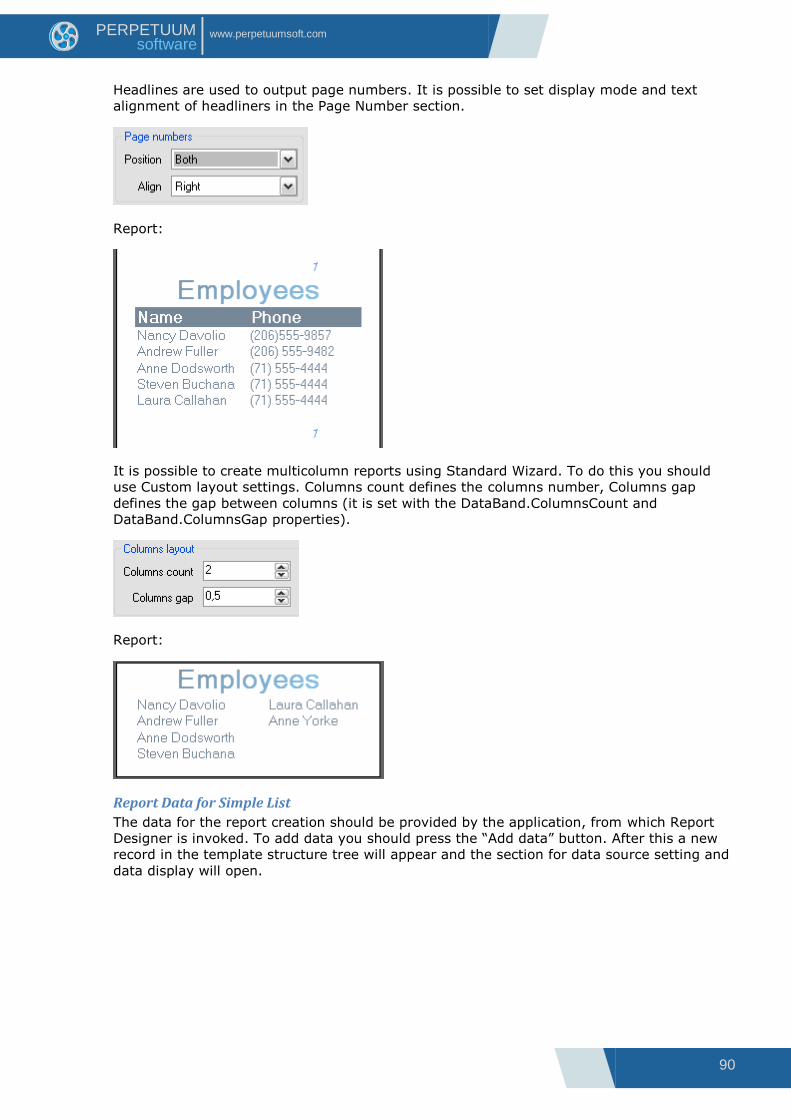
Headlines are used to output page numbers. It is possible to set display mode and text
alignment of headliners in the Page Number section.
Report:
It is possible to create multicolumn reports using Standard Wizard. To do this you should
use Custom layout settings. Columns count defines the columns number, Columns gap
defines the gap between columns (it is set with the DataBand.ColumnsCount and
DataBand.ColumnsGap properties).
Report:
Report Data for Simple List
The data for the report creation should be provided by the application, from which Report
Designer is invoked. To add data you should press the “Add data” button. After this a new
record in the template structure tree will appear and the section for data source setting and
data display will open.

91
www.perpetuumsoft.com PERPETUUM software
Data source is set in the Data Source field.
The fields of the data source, which is selected in the Data Source field, are displayed in All
Fields list. It is possible to add field from the list to the table on the Visible tab using control
buttons. It is possible to edit title, width and set aggregation function for each field.

92
www.perpetuumsoft.com PERPETUUM software
Report Template Report
Field layout list allows the selection of data view in the report: in the form of a list or cards.
Field layout Report Template Report
List
Cards
Grouping data
For creation of reports with grouping it is needed to transfer the grouping field to the table
on the Groups tab from All fields tree.

93
www.perpetuumsoft.com PERPETUUM software
Report Template Report
Several Data Sources
Data from several data sources can be output in the report sequentially. To do this you
should add data source to the template structure tree and transfer the needed fields to
Visible fields.
Report Template Report
94
www.perpetuumsoft.com PERPETUUM software
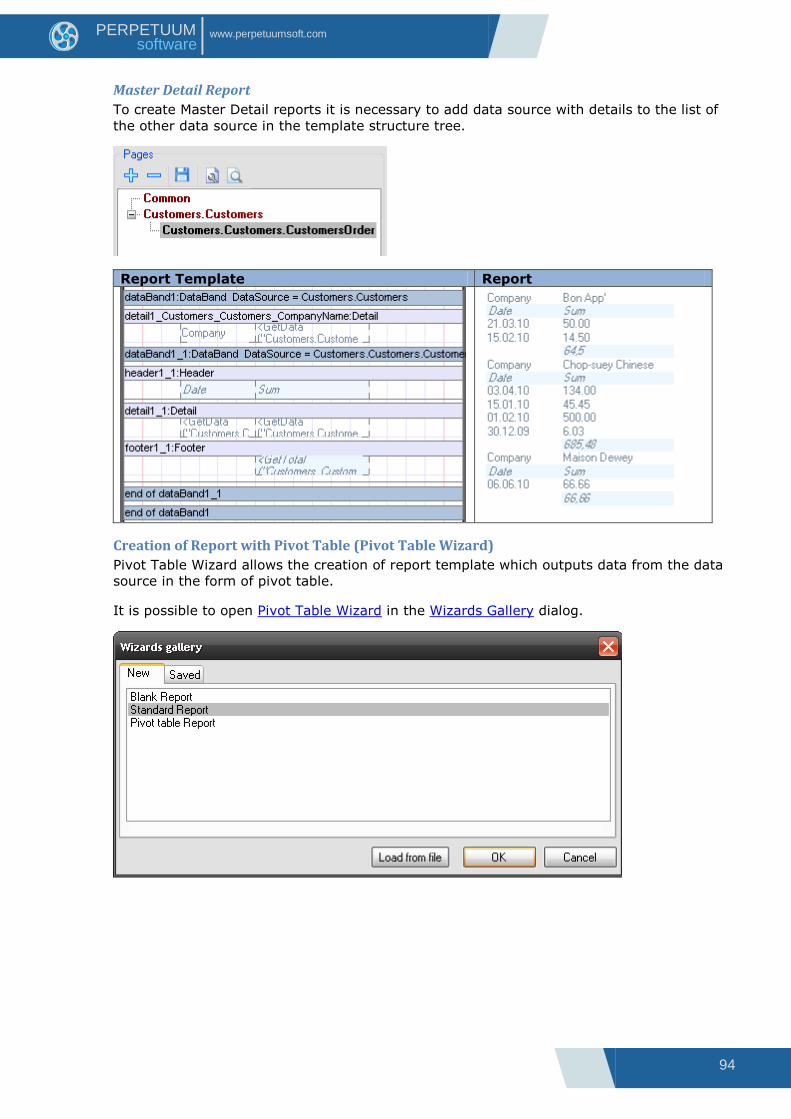
Master Detail Report
To create Master Detail reports it is necessary to add data source with details to the list of
the other data source in the template structure tree.
Report Template Report
Creation of Report with Pivot Table (Pivot Table Wizard)
Pivot Table Wizard allows the creation of report template which outputs data from the data
source in the form of pivot table.
It is possible to open Pivot Table Wizard in the Wizards Gallery dialog.
95
www.perpetuumsoft.com PERPETUUM software
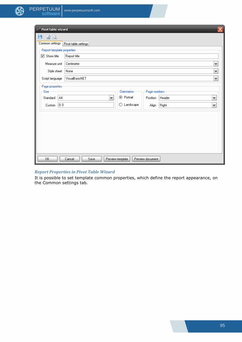
Report Properties in Pivot Table Wizard
It is possible to set template common properties, which define the report appearance, on
the Common settings tab.
96
www.perpetuumsoft.com PERPETUUM software
The report name, set in the Title field using the Document.Title property, will be displayed in
the report header:
Title Report Template Report
The report measure units are set with Measure unit field (the Document.MetricUnit
property).
Report style can be set in the Style field:
Style Sheet Report Template Report
The Script Language field allows the selection of the script language using the
Document.ScriptLanguage property.
Page Properties in Pivot Table Wizard
The Page Properties section allows the setting of page properties. Paper format is selected
from Paper kind list and is set with the Page.PaperKind property. In order to set arbitrary
page size you should select Custom in Paper kind combo box and set the value to the Page
size field.
It is possible to set landscape or portrait page orientation in the Orientation section.
Headlines are used to output page numbers. It is possible to set display mode and text
alignment of headliners in the Page Number section.

97
www.perpetuumsoft.com PERPETUUM software
Data for the Table
The data and table appearance are defined with the settings on the Pivotal table settings
tab.
The data source is set in the Data source field. To adjust the pivot table cells you should
open Source Fields editor with the “Configure layout” button. (More information about data
in the pivot table)
It is possible to set pivot table caption in the Table caption field.

98
www.perpetuumsoft.com PERPETUUM software
The Rendering group of properties allows the setting of such properties of the PivotTable as:
ShowRepeatText, ShowSingleFact, and DementionOnEveryPage.
The size of cells of the pivot table can be set in the Formatting section. It is possible to set
the PivotTable.AutoColumnWidth, PivotTable.RowHeight and PivotTable.AutoRowHeight
properties.
(More information about pivot table properties)

99
www.perpetuumsoft.com PERPETUUM software
Creation of Report using Table Wizard
Table Wizard allows a user to create different tables in a few clicks.
Open a report template and press “Table” button on the Insert tab in the Tables Container.
Selecting fields in Table Wizard
1 – Data source contains the list of available data sources in the document.
2 – Available fields contains the list of fields from the selected data source.
3 – Selected fields contains the list of selected fields from the selected data source.
4 – “>” adds selected field to the Selected fields list.
5 – “>>” adds all available fields to the Selected fields list.
6 – “<” removes the selected field from the Selected fields list.
7 – “<<” removes all available fields from the Selected fields list.
8 – “Next >” opens the next window of the Table Wizard.
9 – “Cancel” closes the Table Wizard and cancels the adding of a new table.
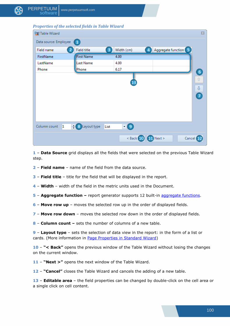
100
www.perpetuumsoft.com PERPETUUM software
Properties of the selected fields in Table Wizard
1 – Data Source grid displays all the fields that were selected on the previous Table Wizard
step.
2 – Field name – name of the field from the data source.
3 – Field title – title for the field that will be displayed in the report.
4 – Width – width of the field in the metric units used in the Document.
5 – Aggregate function – report generator supports 12 built-in aggregate functions.
6 – Move row up – moves the selected row up in the order of displayed fields.
7 – Move row down – moves the selected row down in the order of displayed fields.
8 – Column count – sets the number of columns of a new table.
9 – Layout type – sets the selection of data view in the report: in the form of a list or
cards. (More information in Page Properties in Standard Wizard)
10 – “< Back” opens the previous window of the Table Wizard without losing the changes
on the current window.
11 – “Next >” opens the next window of the Table Wizard.
12 – “Cancel” closes the Table Wizard and cancels the adding of a new table.
13 – Editable area – the field properties can be changed by double-click on the cell area or
a single click on cell content.

101
www.perpetuumsoft.com PERPETUUM software
Sorting in Table Wizard
1 – Available fields contains the list of fields from the selected data source.
2 – Sort by fields contains the list of filelds by which the table will be sorted.
3 – Field name – name of the selected field from the data source.
4 – Sort direction – defines the sorting order (ascending or descending).
5 – “>” adds the selected field to the sorting list.
6 – “>>” adds all available fields to the sorting list.
7 – “<” removes the selected field from the sorting list.
8 – “<<” removes all available fields from the sorting list.
9 – Move row up – moves the selected row up in the sorting order.
10 – Move row down – moves the selected row down in the sorting order.
11 – “< Back” opens the previous window of the Table Wizard without losing the changes
on the current window.
12 – “Finish” closes the Table Wizard and adds generated table to the report.
13 – “Cancel” closes the Table Wizard and cancels the adding of a new table.

102
www.perpetuumsoft.com PERPETUUM software
Interface This chapter describes Ribbon Report Designer Interface.
Tabs
Home Tab
This tab contains the most frequently used commands.
Clipboard Group
This group contains buttons for working with the clipboard.
The “Paste Objects” button pastes the contents of the Clipboard into the selected area.
The “Cut Objects” button cuts the selected objects and put it on the Clipboard.
The “Copy Objects” button copies the selected objects and put it on the Clipboard.
The “Delete Objects” button deletes the selected objects.
Font Group
This group contains controls for working with Font property.
The “Font Name” list contains available styles (sets the Font.FamilyName property).
The “Font Size” list contains size values and allows the setting of arbitrary size (sets the
Font.Size property).
The “Bold” button sets bold font for the text (sets the Font.Bold property).
The “Italic” button sets italic font for the text (sets the Font.Italic property).
The “Underline” button sets underlined font for the text (sets the Font.Underline property).
The “Increase Font Size” button increase font size (sets the Font.Size property).
The “Decrease Font Size” button decrease font size (sets the Font.Size property).
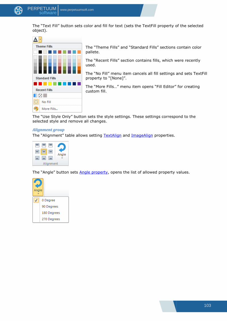
103
www.perpetuumsoft.com PERPETUUM software
The “Text Fill” button sets color and fill for text (sets the TextFill property of the selected
object).
The “Theme Fills” and “Standard Fills” sections contain color
pallete.
The “Recent Fills” section contains fills, which were recently
used.
The “No Fill” menu item cancels all fill settings and sets TextFill
property to “[None]”.
The “More Fills…” menu item opens “Fill Editor” for creating
custom fill.
The “Use Style Only” button sets the style settings. These settings correspond to the
selected style and remove all changes.
Alignment group
The “Alignment” table allows setting TextAlign and ImageAlign properties.
The “Angle” button sets Angle property, opens the list of allowed property values.

104
www.perpetuumsoft.com PERPETUUM software
Border & Fill Group
The “Fill” button sets color and fill for background (sets the Fill property).
The “Theme Fills” and “Standard Fills” sections contain color
pallete.
The “Recent Fills” section contains fills, which were recently
used.
The “No Fill” menu item cancels all fill settings and sets Fill
property to “[None]”.
The “More Fills…” menu item opens “Fill Editor” for creating
custom fill.
The “Border” button sets border (sets the Border property).
1 – This menu items set borders lines location.
2 – This submenu items set border lines style and color: the “Line
Color” submenu contains color palette; the “Line Style” submenu
contains line types.
3 – The “More Borders…” menu item opens “Border Editor”.
The “Margins” button opens “Margins Editor” for setting Margins property.

105
www.perpetuumsoft.com PERPETUUM software
Styles Group
The “Styles Gallery” includes preview of the template‟s styles. Click on style‟s preview
applies this style to the selected object (sets StyleName property).
The “Save Selection as a New Style” menu Item
opens “Create New Style from Formatting”
dialog for setting name of new style and saves
the style of selected object.
The “Select Controls with Similar Style” menu
item selects all objects on the current page,
which StyleName property is set to the style of
selected object.
The “Edit Style” button opens “Style Sheet Editor”.
Select Group
The “Select” button switches the Select Mode on.

106
www.perpetuumsoft.com PERPETUUM software
Insert Tab
This tab allows adding objects to a template. Buttons are divided into groups.
1 – The “Page” group contains buttons, which allow adding new pages, PageHeader, Page
Overlay and PageFooter bands.
2 – The “Text” group contains buttons, which allow adding text output elements: TextBox,
AdvancedText and RichText.
3 – The “Illustration” group contains buttons, which allow adding various visual elements:
Picture, Shape, ZipCode, BarCode, ChartControl, Widget and WinFormsControl.
4 – The “Container” group contains buttons, which allow adding various bands: DataBand,
GroupBand, BandContainer, SideBySide, CrossBand, Header, Detail, Footer, SubReport,
Content and PivotTable bands.
5 – The “Obsolete” group contains buttons, which allow adding GroupHeader and
GroupFooter bands, which are obsolete and needed for backward versions compatibility. But
it is not recommended to use these components to create new reports. GroupBand together
with Header and Footers should be used.
(Read more about Template Objects)

107
www.perpetuumsoft.com PERPETUUM software
Layout Tab
This tab contains controls that affect the page layout, spacing and positioning objects.
1 – The “Page Layout” group contains buttons, which allow setting page properties:
The “Orientation” button sets Page.Orientation property. It opens the list of property‟s
values.
The “Size” button sets Page.PaperKind property. It opens the list of property‟s values. The
“Custom” menu item opens “Paper Size Editor” to set custom page size.
2 – The “Arrangement” group allows management of object size and position:
The “Size to Grid” button changes size of selected object to snap it to grid.
The “Align” button opens the “Align” Editor for objects alignment setting.
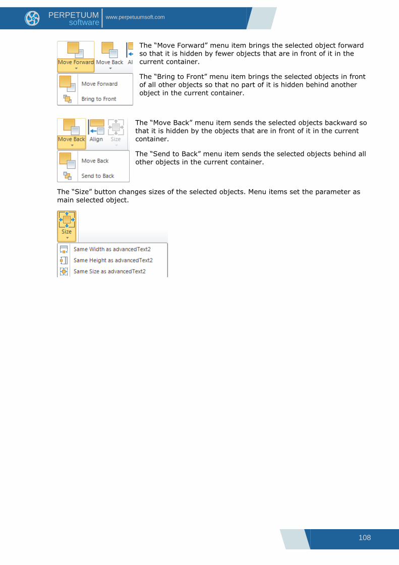
108
www.perpetuumsoft.com PERPETUUM software
The “Move Forward” menu item brings the selected object forward
so that it is hidden by fewer objects that are in front of it in the
current container.
The “Bring to Front” menu item brings the selected objects in front
of all other objects so that no part of it is hidden behind another
object in the current container.
The “Move Back” menu item sends the selected objects backward so
that it is hidden by the objects that are in front of it in the current
container.
The “Send to Back” menu item sends the selected objects behind all
other objects in the current container.
The “Size” button changes sizes of the selected objects. Menu items set the parameter as
main selected object.
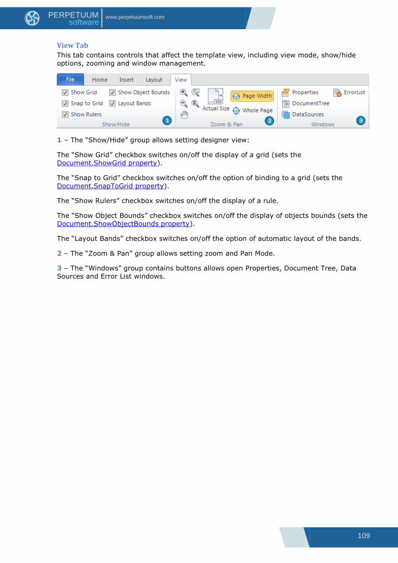
109
www.perpetuumsoft.com PERPETUUM software
View Tab
This tab contains controls that affect the template view, including view mode, show/hide
options, zooming and window management.
1 – The “Show/Hide” group allows setting designer view:
The “Show Grid” checkbox switches on/off the display of a grid (sets the
Document.ShowGrid property).
The “Snap to Grid” checkbox switches on/off the option of binding to a grid (sets the
Document.SnapToGrid property).
The “Show Rulers” checkbox switches on/off the display of a rule.
The “Show Object Bounds” checkbox switches on/off the display of objects bounds (sets the
Document.ShowObjectBounds property).
The “Layout Bands” checkbox switches on/off the option of automatic layout of the bands.
2 – The “Zoom & Pan” group allows setting zoom and Pan Mode.
3 – The “Windows” group contains buttons allows open Properties, Document Tree, Data
Sources and Error List windows.

110
www.perpetuumsoft.com PERPETUUM software
Contextual Tabs Contextual tabs are used to display a collection of commands that are relevant only when
particular object is selected.
TextBox Tab Set
The TextBox tab set includes “Format” tab.
The “Format” tab for TextBox includes following groups:
1 – The “Render” group contains Checkboxes for setting Render properties: CanGrow,
CanShrink, GrowToBottom and Visible.
2 – The “TextFormat” group sets TextFormat property. The list contains available property‟s
values. The buttons allow set Currency, Percentage and Number format quickly.
3 – The “Font” group allows setting Font property.
4 – The “Alignment” group allows setting TextAlign property.
5 – The “Appearance” group contains buttons for setting Appearance properties: Angle,
Border, Fill and Margins.
6 – The “Styles” group allows setting StyleName property.
AdvancedText Tab Set
The AdvancedText tab set includes “Format” tab.
The “Format” tab for AdvancedText includes following groups:
1 – The “Render” group contains Checkboxes for setting Render properties: CanBreak,
CanGrow, CanShrink, GrowToBottom and Visible.
2 – The “TextFormat” group sets TextFormat property. The list contains available property‟s
values. The buttons allow set Currency, Percentage and Number format quickly.
3 – The “Font” group allows setting Font property.
4 – The “Alignment” group allows setting TextAlign property.
5 – The “Appearance” group contains buttons for setting Appearance properties: Angle,
Border, Fill and Margins.
6 – The “Styles” group allows setting StyleName property.

111
www.perpetuumsoft.com PERPETUUM software
RichText Tab Set
The RichText tab set includes “Format” tab.
The “Format” tab for RichText includes following groups:
1 – The “Render” group contains Checkboxes for setting Render properties: CanGrow,
CanShrink, GrowToBottom and Visible.
2 – The “Appearance” group contains buttons for setting Appearance properties: Angle,
Border, Fill and Margins.
3 – The “Styles” group allows setting StyleName property.
Picture Tab Set
The Picture tab set includes “Format” tab.
The “Format” tab for Picture includes following groups:
1 – The “Render” group contains Checkboxes for setting Render properties: GrowToBottom
and Visible.
2 – The “Alignment” group sets ImageAlign property.
3 – The “Settings” group contains the “Size Mode” button, which sets SizeMode property,
opens the list of allowed property values.
4 – The “Appearance” group contains buttons for setting Appearance properties: Angle,
Border, Fill and Margins.
5 – The “Styles” group allows setting StyleName property.

112
www.perpetuumsoft.com PERPETUUM software
Shape Tab Set
The Shape tab set includes “Format” tab.
The “Format” tab for Shape includes following groups:
1 – The “Render” group contains Checkboxes for setting Render properties: GrowToBottom
and Visible.
2 – The “Appearance” group contains buttons for setting Appearance properties: Fill, Line
and Shadow.
The “Line” button allows setting the line of shape: Line Color, Width and Style.
The “Line Color” menu item contains color palette; the “Line Style”
submenu contains line types.
The “Shadow” button sets the shadow of shape.
2.1 – The area for setting shadow location.
2.2 – The “Fill” menu item opens color palette for setting shadow
fill.
2.3 – The “Custom Shadow” menu item opens Shadow Editor for setting shadow properties.

113
www.perpetuumsoft.com PERPETUUM software
3 – The “Styles” group allows setting StyleName property.
ZipCode Tab Set
The ZipCode tab set includes “Format” tab.
The “Format” tab for ZipCode includes following groups:
1 – The “Render” group contains Checkboxes for setting Render properties: GrowToBottom
and Visible.
2 – The “Appearance” group contains buttons for setting Appearance properties: Angle,
Border, Fill, Margins and Color, which sets ZipCode.Color property.
3 – The “Styles” group allows setting StyleName property.
BarCode Tab Set
The BarCode tab set includes “Format” tab.
The “Format” tab for BarCode includes following groups:
1 – The “Render” group contains Checkboxes for setting Render properties: GrowToBottom
and Visible.
2 – The “Font” group allows setting Font property.
3 – The “BarCode Settings” group contains is for setting special BarCode‟s properties:
The “Label” list contains LabelPosition property values and “None” value for setting
ShowLabel property to “False”.
The “Back Color”, “Bar Color” and “Text Color” buttons set BackColor, BarColor and
TextColor properties.

114
www.perpetuumsoft.com PERPETUUM software
4 – The “Appearance” group contains buttons for setting Appearance properties: Angle,
Border, Fill and Margins.
5 – The “Styles” group allows setting StyleName property.
ChartControl Tab Set
The ChartControl tab set includes “Format” tab.
The “Format” tab for ChartControl includes following groups:
1 – The “Render” group contains Checkboxes for setting Render properties: GrowToBottom
and Visible.
2 – The “Data Settings” group contains control for setting DataSource property.
3 – The “Appearance” group contains buttons for setting Appearance properties: Angle,
Border, Fill and Margins.
5 – The “Styles” group allows setting StyleName property.
Widget Tab Set
The Widget tab set includes “Format” tab.
The “Format” tab for Widget includes following groups:
1 – The “Render” group contains Checkboxes for setting Render properties: GrowToBottom
and Visible.
2 – The “Appearance” group contains buttons for setting Appearance properties: Angle,
Border, Fill and Margins.

115
www.perpetuumsoft.com PERPETUUM software
3 – The “Styles” group allows setting StyleName property.
WinFormsControl Tab Set
The WinFormsControl tab set includes “Format” tab.
The “Format” tab for WinFormsControl includes following groups:
1 – The “Render” group contains Checkboxes for setting Render properties: GrowToBottom
and Visible.
2 – The “Appearance” group contains buttons for setting Appearance properties: Angle,
Border, Fill and Margins.
3 – The “Styles” group allows setting StyleName property.
DataBand Tab Set
The DataBand tab set includes “Format” tab.
The “Format” tab for DataBand includes following groups:
1 – The “Render” group contains Checkboxes for setting Render properties: CanGrow,
CanShrink, NewColumnAfter, NewColumnBefore, NewPageAfter, NewPageBefore and Visible.
2 – The “Data Settings” group contains controls for setting following properties:
DataSource, InstanceCount, Sort, Totals and FilterExpression.
3 – The “Columns” group contains controls for setting following properties: ColumnsCount
and ColumnsGap.
4 – The “Styles” group allows setting StyleName property.
GroupBand Tab Set
The GroupBand tab set includes “Format” tab.
The “Format” tab for GroupBand includes following groups:
1 – The “Render” group contains Checkboxes for setting Render properties: CanGrow,
CanShrink, NewColumnAfter, NewColumnBefore, NewPageAfter, NewPageBefore and Visible.
2 – The “Data Settings” group contains controls for setting following properties:
GroupExpression, SortExpression and Order.

116
www.perpetuumsoft.com PERPETUUM software
3 – The “Columns” group contains controls for setting following properties: ColumnsCount
and ColumnsGap.
4 – The “Styles” group allows setting StyleName property.
BandContainer Tab Set
The BandContainer tab set includes “Format” tab.
The “Format” tab for BandContainer includes following groups:
1 – The “Render” group contains Checkboxes for setting Render properties: CanGrow,
CanShrink, NewColumnAfter, NewColumnBefore, NewPageAfter, NewPageBefore and Visible.
2 – The “Styles” group allows setting StyleName property.
SideBySide Tab Set
The SideBySide tab set includes “Format” tab.
The “Format” tab for SideBySide includes following groups:
1 – The “Render” group contains Checkboxes for setting Render properties: CanGrow,
CanShrink, NewColumnAfter, NewColumnBefore, NewPageAfter, NewPageBefore and Visible.
2 – The “Styles” group allows setting StyleName property.
CrossBand Tab Set
The CrossBand tab set includes “Format” tab.
The “Format” tab for CrossBand includes following groups:
1 – The “Render” group contains Checkboxes for setting Render properties: CanGrow,
CanShrink and Visible.
2 – The “Data Settings” group contains controls for setting following properties: DataSource
and InstanceCount.
3 – The “Styles” group allows setting StyleName property.

117
www.perpetuumsoft.com PERPETUUM software
Header Tab Set
The Header tab set includes “Format” tab.
The “Format” tab for Header includes following groups:
1 – The “Render” group contains Checkboxes for setting Render properties: CanBreak,
CanGrow, CanShrink, NewColumnAfter, NewColumnBefore, NewPageAfter, NewPageBefore,
RepeatEveryColumn, RepeatEveryPage and Visible; counter MinSpaceAfter sets
MinSpaceAfter property.
2 – The “Styles” group allows setting StyleName property.
Footer Tab Set
The Footer tab set includes “Format” tab.
The “Format” tab for Footer includes following groups:
1 – The “Render” group contains Checkboxes for setting Render properties: CanBreak,
CanGrow, CanShrink, NewColumnAfter, NewColumnBefore, NewPageAfter, NewPageBefore,
PlaceInBottom and Visible; counter MinSpaceAfter sets MinSpaceAfter property.
2 – The “Styles” group allows setting StyleName property.
Detail Tab Set
The Detail tab set includes “Format” tab.
The “Format” tab for Detail includes following groups:
1 – The “Render” group contains Checkboxes for setting Render properties: CanBreak,
CanGrow, CanShrink, NewColumnAfter, NewColumnBefore, NewPageAfter, NewPageBefore
and Visible; counter MinSpaceAfter sets MinSpaceAfter property.
2 – The “Styles” group allows setting StyleName property.
SubReport Tab Set
The SubReport tab set includes “Format” tab.

118
www.perpetuumsoft.com PERPETUUM software
The “Format” tab for SubReport includes following groups:
1 – The “Render” group contains Checkboxes for setting Render properties: CanGrow,
CanShrink, NewColumnAfter, NewColumnBefore, NewPageAfter, NewPageBefore and Visible.
2 – The “SubReport Settings” group contains controls for setting following properties:
Parameters, TemplateName and Shift.
3 – The “Styles” group allows setting StyleName property.
Content Tab Set
The Content tab set includes “Format” tab.
The “Format” tab for Content includes following groups:
1 – The “Render” group contains Checkboxes for setting Render properties: CanGrow,
CanShrink, NewColumnAfter, NewColumnBefore, NewPageAfter, NewPageBefore and Visible.
2 – The “Content Settings” group contains control for setting Shift property.
3 – The “Styles” group allows setting StyleName property.
PivotTable Tab Set
The PivotTable tab set includes “Format” tab.
The “Format” tab for PivotTable includes following groups:
1 – The “Render” group contains Checkboxes for setting Render properties: CanGrow,
CanShrink, NewColumnAfter, NewColumnBefore, NewPageAfter, NewPageBefore and Visible.
2 – The “Data Settings” group contains controls for setting following properties:
DataSource, FilterExpression and Layout.
3 – The “Styles” group allows setting StyleName property.

119
www.perpetuumsoft.com PERPETUUM software
PageHeader Tab Set
The PageHeader tab set includes “Format” tab.
The “Format” tab for PageHeader includes following groups:
1 – The “Render” group contains Checkboxes for setting Render properties: CanGrow,
CanShrink, Visible and list Mode, which contains Mode property value.
2 – The “Styles” group allows setting StyleName property.
PageFooter Tab Set
The PageFooter tab set includes “Format” tab.
The “Format” tab for PageFooter includes following groups:
1 – The “Render” group contains Checkboxes for setting Render properties: CanGrow,
CanShrink, Visible and list Mode, which contains Mode property value.
2 – The “Styles” group allows setting StyleName property.
PageOverlay Tab Set
The PageOverlay tab set includes “Format” tab.
The “Format” tab for PageOverlay includes following groups:
1 – The “Render” group contains Checkboxes for setting Render properties: CanGrow,
CanShrink, Visible and list Mode, which contains Mode property value.
2 – The “Styles” group allows setting StyleName property.
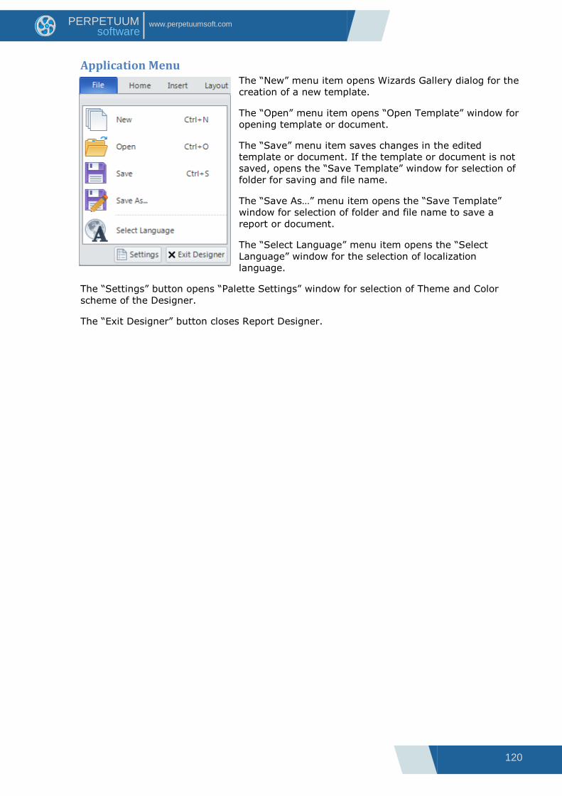
120
www.perpetuumsoft.com PERPETUUM software
Application Menu The “New” menu item opens Wizards Gallery dialog for the
creation of a new template.
The “Open” menu item opens “Open Template” window for
opening template or document.
The “Save” menu item saves changes in the edited
template or document. If the template or document is not
saved, opens the “Save Template” window for selection of
folder for saving and file name.
The “Save As…” menu item opens the “Save Template”
window for selection of folder and file name to save a
report or document.
The “Select Language” menu item opens the “Select
Language” window for the selection of localization
language.
The “Settings” button opens “Palette Settings” window for selection of Theme and Color
scheme of the Designer.
The “Exit Designer” button closes Report Designer.
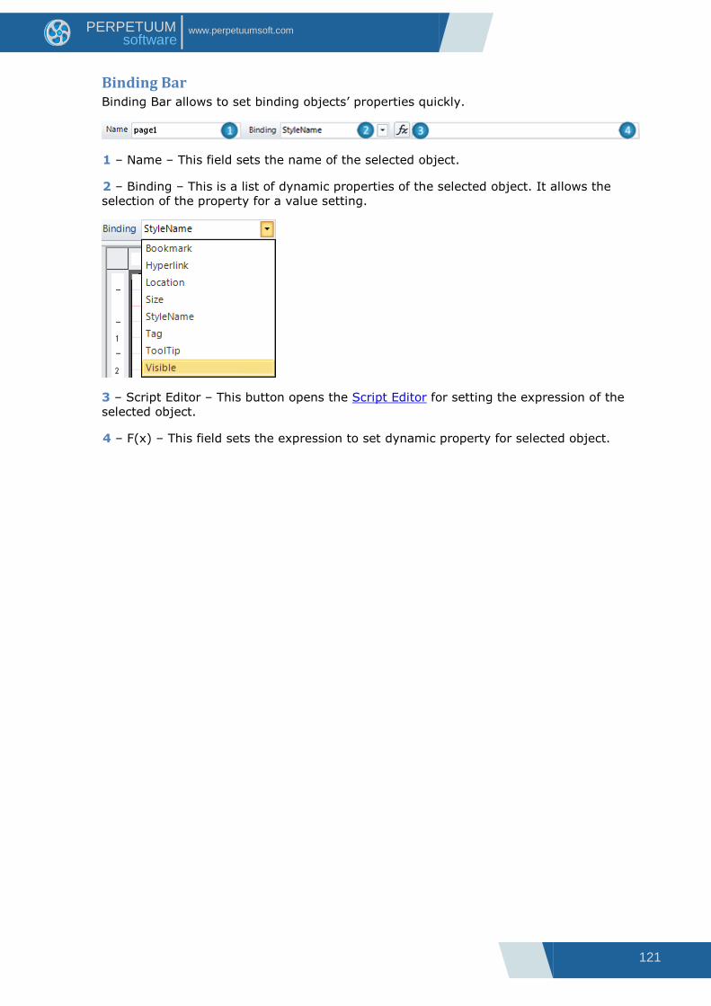
121
www.perpetuumsoft.com PERPETUUM software
Binding Bar Binding Bar allows to set binding objects‟ properties quickly.
1 – Name – This field sets the name of the selected object.
2 – Binding – This is a list of dynamic properties of the selected object. It allows the
selection of the property for a value setting.
3 – Script Editor – This button opens the Script Editor for setting the expression of the
selected object.
4 – F(x) – This field sets the expression to set dynamic property for selected object.

122
www.perpetuumsoft.com PERPETUUM software
Quick Access Toolbar The Quick Access Toolbar is used to provide access to frequently used commands.
Customization allows adding necessary commands.
The next command can be added to Quick Access Toolbar:
Button Action
New Document Create a new template
Save Save changes in a template
Open Load a template or document from file
Select Language Open “Select Language” dialog
Font Open “Font” dialog
Use Style Only Set the style settings
Fill Open “Fill Editor” to set Fill property
Text Fill Open “Fill Editor” to set TextFill property
Border Open “Border Editor”
Margins Open “Margins Editor”
Text Format Open “Format Editor”
Style Sheet Editor Open “Style Sheet Editor”
Align Open “Align” dialog
Actual Size Set zoom to 100%
Page Width Fit to page width
Whole Page Fit to whole page
Properties Open “Properties” window
Document Tree Open “Document Tree” window
Data Source Open “Data Source” window
Error List Open “Error List” window
Show Grid Switch on/off the display of a grid

123
www.perpetuumsoft.com PERPETUUM software
Snap to Grid Switch on/off the option of binding to a grid
Show Rulers Switch on/off the display of a rule
Show Objects Bounds Switch on/off the display of objects bounds
Layout Bands Switch on/off the option of automatic layout of the bands
Template Properties Open template properties

124
www.perpetuumsoft.com PERPETUUM software
Context Menu Context menu contains most frequently used items. List of menu items depends on
currently selected report objects.
Common Actions
1 Cut Objects – This menu item cuts the selected
objects and put it on the Clipboard.
2 Copy Objects – This menu item copies the
selected objects and put it on the Clipboard.
3 Paste – This menu item pastes the contents of
the Clipboard into the selected area.
4 Delete Objects - This menu item deletes the
selected objects.
Editing and Positioning
1 Edit – This menu item opens an editor:
Text Editor for TextBox element to set TextBox.Text property;
Formatted Text Editor for AdvancedText element to set AdvancedText.Text property;
RichText Editor for RichText element to set RichText.RTFtext property;
Open file dialog to choose image and to set Picture.Image property;
Text Editor for BarCode element to set BarCode.Code property;
Chart ModelKit designer for ChartControl element to set ChartControl.Chart property;
Instrument Designer for Widget element to set Widget.Instrument property;
Source Fields for PivotTable section to set PivotTable.Layout property.
2 Clean – This menu item cleans the content:
TextBox.Text property for TextBox element;
AdvancedText.Text property for AdvancedText element;
RichText.RTFtext property for RichText element;
Picture.Image property for Picture element;
BarCode.Code property for BarCode element;
ChartControl.Chart property for ChartControl;
Widget.Instrument property for Widget element.

125
www.perpetuumsoft.com PERPETUUM software
3 Arrange – This submenu contains items for managing objects order, position and size.
3.1 Bring to Front - This menu item brings the
selected objects in front of all other objects so that
no part of it is hidden behind another object in the
current container.
3.2 Move Forward - This menu item brings the
selected object forward so that it is hidden by
fewer objects that are in front of it in the current
container.
3.3 Move Back - This menu item sends the
selected objects backward so that it is hidden by
the objects that are in front of it in the current
container.
3.4 Send to Back - This menu item sends the
selected objects behind all other objects in the
current container.
The following items are available only if multiple
objects are selected:
3.5 Align Left – This menu item aligns lefts of the
selected objects by the left border of the most left
object.
3.6 Align Center - This menu item aligns centers of
the selected objects by the center between the
most left and the most right objects.
3.7 Align Right - This menu item aligns rights of
the selected objects by the right border of the most
right object.
3.8 Align Top - This menu item aligns tops of the selected objects by the top border of the
most top object.
3.9 Align Middle - This menu item aligns middles of the selected objects by the middle
between the most top and the most bottom objects.
3.10 Align Bottom - This menu item aligns bottoms of the selected objects by the bottom
border of the most bottom object.
3.11 Distribute Horizontally – This menu item distributes selected objects horizontally
making horizontal spaces between them equal to each other.
3.12 Distribute Vertically – This menu item distributes selected objects vertically making
vertical spaces between them equal to each other.
3.13 Same Height as <main selected object*> - This menu item sets height of every
selected object as the main selected object‟s height.
3.14 Same Width as <main selected object> - This menu item sets width of every selected
object as the main selected object‟s width.
3.15 Same Size as <main selected object> - This menu item sets size of every selected
object as the main selected object‟s size.
* Main selected object – object, which was last selected at current selected objects. This
object is marked in a darker blue.
126
www.perpetuumsoft.com PERPETUUM software
Element-dependent Menu Items
Here are menu items used for setting unique objects‟ properties.
SizeMode – This is for setting Picture.SizeMode property; the submenu under it contains the
list of SizeMode property values.
ShapeStyle – This menu item is for setting Shape.ShapeStyle property; the submenu under
it contains the list of ShapeStyle property values.
CodeType – This menu item is for setting BarCode.CodeType property; the submenu under
it contains the list of CodeType property values.
DataSource – This menu item is for setting DataSource property of DataBand, PivotTable
and CrossBand sections; the submenu under it contains the list of data sources of the
template.
GroupExpression – This menu item opens Script Editor for setting
GroupBand.GroupExpression property.

127
www.perpetuumsoft.com PERPETUUM software
SubReport – This menu item is for setting SubReport.TemplateName property; the submenu
under it contains the list of Report Names contained in the current ReportManager.
Editing Elements Styles
1 StyleName – This submenu is for setting StyleName property of the objects; contains the
list of styles defined in the template.
2 Style – This submenu contains the following items:
2.1 Use Style Only – This menu item clears all formatting
settings (e.g. font, border, etc.) of the element; appearance
of the element is defined by style currently applied to.
2.2 Font – This menu item opens Font dialog for setting Font
property;
2.3 TextFormat – This menu item opens Format dialog for
setting TextFormat property;
2.4 Border – This menu item opens Border Editor for setting
Border property;
2.5 Fill - This menu item opens Fill Editor for setting Fill
property;
2.6 TextFill - This menu item opens Fill Editor for setting
TextFill property;
2.7 Align – This menu item is for setting TextAlign or
ImageAlign properties; submenu under it contains align options;
2.8 Margins - This menu item opens Margins Editor for setting Margins property;
2.9 Angle – This menu item is for setting Angle property; contains the list of allowed
property values;
Render Submenu
This submenu provides ability to set elements‟ properties that affect their rendering.
1 CanGrow – This menu item sets CanGrow property to True
or False.
2 CanShrink – This menu item sets CanShrink property to
True or False.

128
www.perpetuumsoft.com PERPETUUM software
3 CanBreak – This menu item sets CanBreak property to True or False.
4 GrowToBottom – This menu item sets GrowToBottom property to True or False.
5 Visible – This menu item sets Visible property to True or False.
6 Mode – This menu item sets Mode property; submenu under it contains the list of allowed
property values.
Misc Items
Show Properties – The menu item shows Property Grid with the selected objects‟ properties.
Group selection
When multiple objects are selected, context menu contains items which are common for all
selected objects. Commands are applied to each selected object.
AdvancedText element is selected objects main at the following picture:
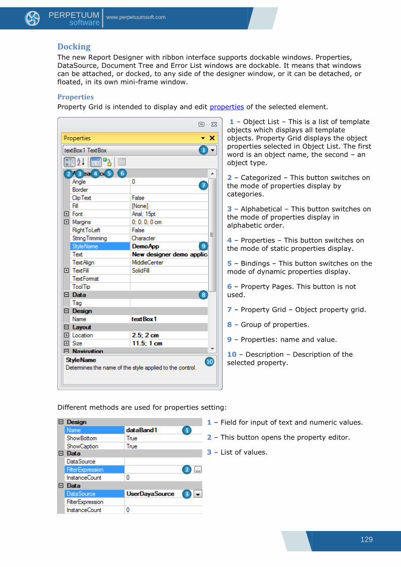
129
www.perpetuumsoft.com PERPETUUM software
Docking The new Report Designer with ribbon interface supports dockable windows. Properties,
DataSource, Document Tree and Error List windows are dockable. It means that windows
can be attached, or docked, to any side of the designer window, or it can be detached, or
floated, in its own mini-frame window.
Properties
Property Grid is intended to display and edit properties of the selected element.
1 – Object List – This is a list of template
objects which displays all template
objects. Property Grid displays the object
properties selected in Object List. The first
word is an object name, the second – an
object type.
2 – Categorized – This button switches on
the mode of properties display by
categories.
3 – Alphabetical – This button switches on
the mode of properties display in
alphabetic order.
4 – Properties – This button switches on
the mode of static properties display.
5 – Bindings – This button switches on the
mode of dynamic properties display.
6 – Property Pages. This button is not
used.
7 – Property Grid – Object property grid.
8 – Group of properties.
9 – Properties: name and value.
10 – Description – Description of the
selected property.
Different methods are used for properties setting:
1 – Field for input of text and numeric values.
2 – This button opens the property editor.
3 – List of values.

130
www.perpetuumsoft.com PERPETUUM software
Data Sources
1 – Switching between Bands and Data
Sources parts. Data from report bands and
special fields are displayed in Band part.
Data from report data sources are displayed
in Data Sources part.
2 –The tree of fields from data source
allows the creation of TextBox objects for
information output from data source by
dragging the fields.
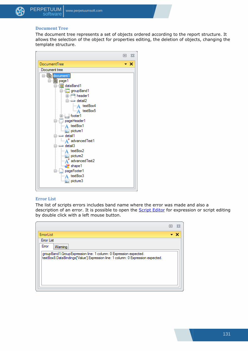
131
www.perpetuumsoft.com PERPETUUM software
Document Tree
The document tree represents a set of objects ordered according to the report structure. It
allows the selection of the object for properties editing, the deletion of objects, changing the
template structure.
Error List
The list of scripts errors includes band name where the error was made and also a
description of an error. It is possible to open the Script Editor for expression or script editing
by double click with a left mouse button.

132
www.perpetuumsoft.com PERPETUUM software
Editors
Text Editor
This editor is for input of text values. It allows the input of simple text.
The editor is opened by double click on the TextBox element area, hotkeys Enter or Ctrl +
Enter, when TextBox element is selected, or by button, which is located near the property
on Property Grid.
1 – Area for text input.
2 – OK – This button applies changes, closes the editor.
3 – Cancel – This button cancels changes, closes the editor.
Script Editor
This editor is for input of scripts and expression of various destinations.
The editor is opened by the button, which is located near the property on the Property Grid
or by the “Script Editor” button on the Binding bar.
1 – Area for script input.
Script Editor provides syntax highlighting, changes selection and code auto-completing.
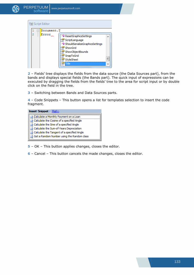
133
www.perpetuumsoft.com PERPETUUM software
2 – Fields‟ tree displays the fields from the data source (the Data Sources part), from the
bands and displays special fields (the Bands part). The quick input of expressions can be
executed by dragging the fields from the fields‟ tree to the area for script input or by double
click on the field in the tree.
3 – Switching between Bands and Data Sources parts.
4 – Code Snippets – This button opens a list for templates selection to insert the code
fragment.
5 – OK – This button applies changes, closes the editor.
6 – Cancel – This button cancels the made changes, closes the editor.
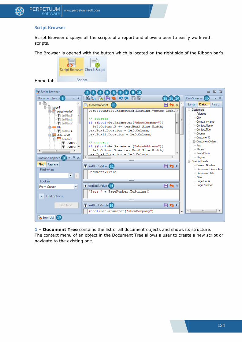
134
www.perpetuumsoft.com PERPETUUM software
Script Browser
Script Browser displays all the scripts of a report and allows a user to easily work with
scripts.
The Browser is opened with the button which is located on the right side of the Ribbon bar's
Home tab.
1 – Document Tree contains the list of all document objects and shows its structure.
The context menu of an object in the Document Tree allows a user to create a new script or
navigate to the existing one.
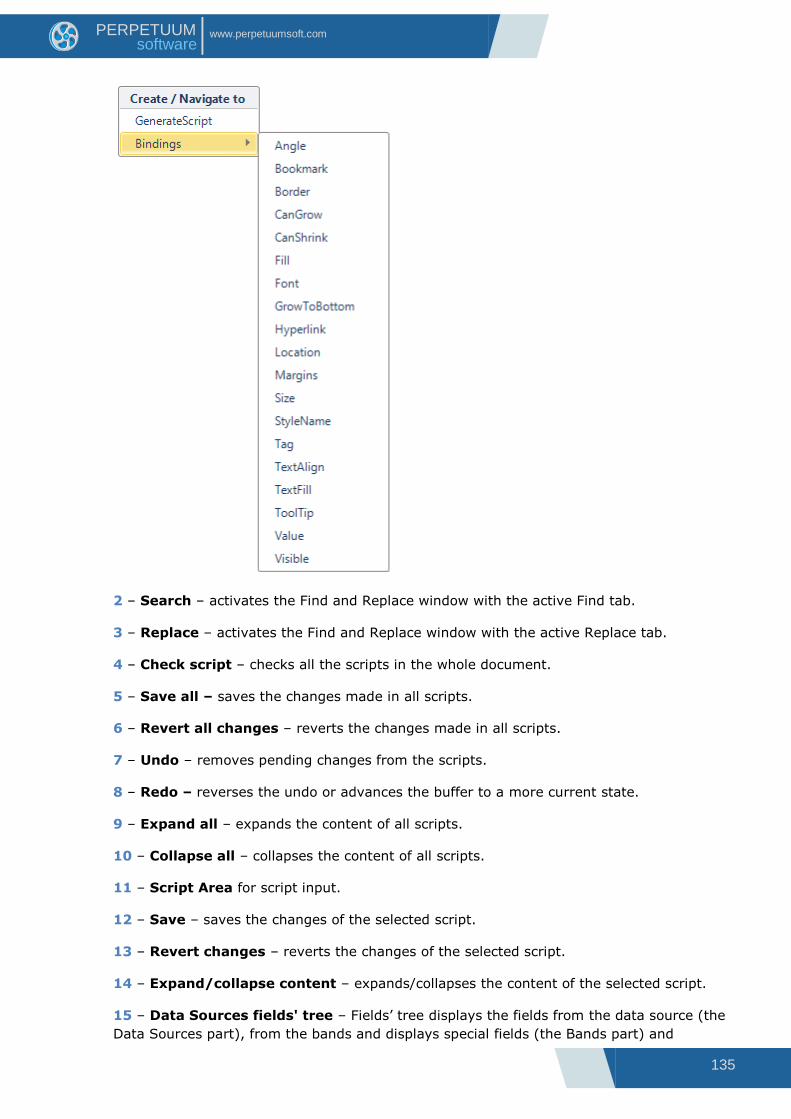
135
www.perpetuumsoft.com PERPETUUM software
2 – Search – activates the Find and Replace window with the active Find tab.
3 – Replace – activates the Find and Replace window with the active Replace tab.
4 – Check script – checks all the scripts in the whole document.
5 – Save all – saves the changes made in all scripts.
6 – Revert all changes – reverts the changes made in all scripts.
7 – Undo – removes pending changes from the scripts.
8 – Redo – reverses the undo or advances the buffer to a more current state.
9 – Expand all – expands the content of all scripts.
10 – Collapse all – collapses the content of all scripts.
11 – Script Area for script input.
12 – Save – saves the changes of the selected script.
13 – Revert changes – reverts the changes of the selected script.
14 – Expand/collapse content – expands/collapses the content of the selected script.
15 – Data Sources fields' tree – Fields‟ tree displays the fields from the data source (the
Data Sources part), from the bands and displays special fields (the Bands part) and
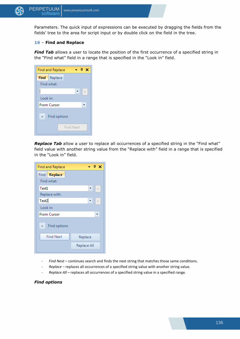
136
www.perpetuumsoft.com PERPETUUM software
Parameters. The quick input of expressions can be executed by dragging the fields from the
fields‟ tree to the area for script input or by double click on the field in the tree.
16 – Find and Replace
Find Tab allows a user to locate the position of the first occurrence of a specified string in
the “Find what” field in a range that is specified in the “Look in” field.
Replace Tab allow a user to replace all occurrences of a specified string in the “Find what”
field value with another string value from the “Replace with” field in a range that is specified
in the “Look in” field.
- Find Next – continues search and finds the next string that matches those same conditions.
- Replace – replaces all occurrences of a specified string value with another string value.
- Replace All – replaces all occurrences of a specified string value in a specified range.
Find options

137
www.perpetuumsoft.com PERPETUUM software
- Match case – when selected, Find search will be case-sensitive.
- Match whole word – when selected, Find search will only return whole word matches.
- Search up – specifies the search direction.
- Search hidden text – searches the hidden text.
- Use regular expressions – when selected, enables the Expression Builder button
.
Find more information about the Expression Builder on Microsoft Library page.
- Prompt on replace – when selected, notifies a user with the confirmation window of
replacing a string.
17 – Error list – opens the “Error list” window.
Yellow color in this default Palette indicates current active elements.

138
www.perpetuumsoft.com PERPETUUM software
Formatted Text Editor
This editor is for input of formatted text in the form of HTML, similar markup language and
for RTF-text loading.
The editor is opened by double click on the AdvancedText element area, by hotkeys Enter or
Ctrl + Enter, when AdvancedText element is selected, or by the button, which is located
near the Text property on Property Grid for AdvancedText element.
1 – Area for text input.
2 – The fields‟ tree displays fields from the data sources (the Data Sources part), from
bands and displays special fields (the Bands part). The quick input of expressions can be
executed by dragging the fields from the fields‟ tree to the area for script input or by double
click on the field in the tree.
3 – Switching between Bands and Data Sources parts.
4 – Open RTF Document – This button opens the Open dialog for the selection of RTF file.
5 – Bold – This button inserts <b></b> tags into the text for setting the bold font of the
selected text.
6 – Italic – This button inserts <i></i> tags into the text for setting the italic font of the
selected text.
7 – Underline – This button inserts <u></u> tags into the text for setting the underline
font of the selected text.
8 – Font – This button opens the Font editor for setting the style and font of the selected
text, inserts <font=></font> tags into text.
9 – Color – This button opens the Color editor for setting the color of the selected text,
inserts <font color=></font> tags into text.
10 – Left Align – This button inserts <p></p> tags into text for setting the left alignment of
selected text.

139
www.perpetuumsoft.com PERPETUUM software
11 – Center Align – This button inserts <p align=”center”></p> tags into text for setting
the center alignment of selected text.
12 – Right Align – This button inserts <p align=”right”></p> tags into text for setting the
right alignment of selected text.
13 – Justify – This button inserts <p align=”justify”></p> tags into text for setting the
justify alignment of selected text.
14 – Insert Space –This button inserts   tag into text to display a space.
15 – Insert Line Break – This button inserts <br/> tag into text for text breaking into
strings.
16 – OK – This button applies changes, closes the editor.
17 – Cancel – This button cancels changes, closes the editor.
RichText Editor
The editor for loading and editing RTF text.
The editor is opened by double click on the RichText element area, by hotkeys Enter or Ctrl
+ Enter, when RichText element is selected, or by the button, which is located near the
RTFText property on Property Grid for RichText element.
1 – The area for the text input.
2 – Open File – This button opens the Open dialog for selecting the RTF file.
3 – Save to File – This button opens the Save As dialog for text saving into the RTF file.
4 – OK – This button applies changes, closes the editor.
5 – Cancel – This button cancels the changes, closes the editor.
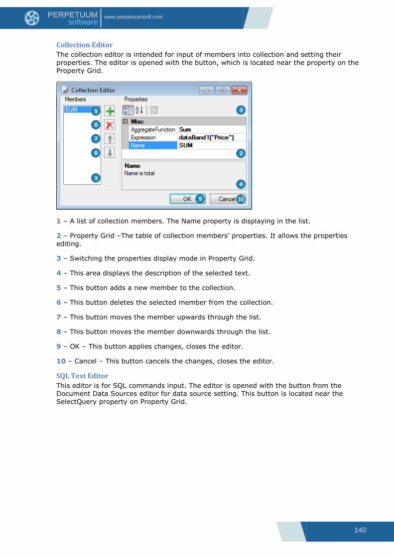
140
www.perpetuumsoft.com PERPETUUM software
Collection Editor
The collection editor is intended for input of members into collection and setting their
properties. The editor is opened with the button, which is located near the property on the
Property Grid.
1 – A list of collection members. The Name property is displaying in the list.
2 – Property Grid –The table of collection members‟ properties. It allows the properties
editing.
3 – Switching the properties display mode in Property Grid.
4 – This area displays the description of the selected text.
5 – This button adds a new member to the collection.
6 – This button deletes the selected member from the collection.
7 – This button moves the member upwards through the list.
8 – This button moves the member downwards through the list.
9 – OK – This button applies changes, closes the editor.
10 – Cancel – This button cancels the changes, closes the editor.
SQL Text Editor
This editor is for SQL commands input. The editor is opened with the button from the
Document Data Sources editor for data source setting. This button is located near the
SelectQuery property on Property Grid.
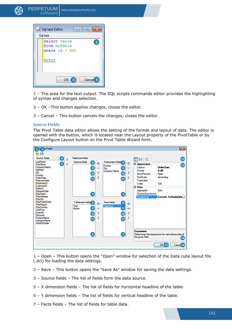
141
www.perpetuumsoft.com PERPETUUM software
1 – The area for the text output. The SQL scripts commands editor provides the highlighting
of syntax and changes selection.
2 – OK –This button applies changes, closes the editor.
3 – Cancel – This button cancels the changes, closes the editor.
Source Fields
The Pivot Table data editor allows the setting of the format and layout of data. The editor is
opened with the button, which is located near the Layout property of the PivotTable or by
the Configure Layout button on the Pivot Table Wizard form.
1 – Open – This button opens the “Open” window for selection of the Data cube layout file
(.dcl) for loading the data settings.
2 – Save – This button opens the “Save As” window for saving the data settings.
3 – Source fields – The list of fields form the data source.
5 – X dimension fields – The list of fields for horizontal headline of the table.
6 – Y dimension fields – The list of fields for vertical headline of the table.
7 – Facts fields – The list of fields for table data.
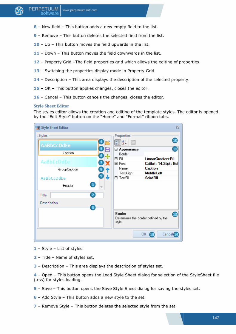
142
www.perpetuumsoft.com PERPETUUM software
8 – New field – This button adds a new empty field to the list.
9 – Remove – This button deletes the selected field from the list.
10 – Up – This button moves the field upwards in the list.
11 – Down – This button moves the field downwards in the list.
12 – Property Grid –The field properties grid which allows the editing of properties.
13 – Switching the properties display mode in Property Grid.
14 – Description – This area displays the description of the selected property.
15 – OK – This button applies changes, closes the editor.
16 – Cancel – This button cancels the changes, closes the editor.
Style Sheet Editor
The styles editor allows the creation and editing of the template styles. The editor is opened
by the “Edit Style” button on the “Home” and “Format” ribbon tabs.
1 – Style – List of styles.
2 – Title – Name of styles set.
3 – Description – This area displays the description of styles set.
4 – Open – This button opens the Load Style Sheet dialog for selection of the StyleSheet file
(.rss) for styles loading.
5 – Save – This button opens the Save Style Sheet dialog for saving the styles set.
6 – Add Style – This button adds a new style to the set.
7 – Remove Style – This button deletes the selected style from the set.

143
www.perpetuumsoft.com PERPETUUM software
8 – Move Up Style – This button moves the selected style upwards in the list.
9 – Move Down Style – This button moves the selected style downwards through the list.
10 – Switching the properties display mode in Property Grid.
11 – Property Grid – The style property grid which allows the editing of properties: Border,
Fill, Font, Name, TextAlign, TextFill.
12 – Description – This area displays the description of the selected property.
13 – OK – This button applies changes, closes the editor.
14 – Cancel – This button cancels the changes, closes the editor.
Align Editor
The editor allows the setting of the elements alignment in a template. The editor is opened
with the “Align” button on the “Layout” ribbon tab.
1 – Horizontal – The settings of horizontal alignment allow the changing of location and size
of the selected objects.
None – Without alignment;
Left – Alignment by the left border of the most left object (sets the Location property);
Center – Alignment by center between the most right and the most left objects (sets the
Location property);
Right – Alignment by the right border of the most right object (sets the Location property);
Justify – Alignment by width on the gap between the right and left objects (sets the Size
and Location properties).
2 – Vertical – The settings of vertical alignment allows the changing of location and size of
the selected elements:
None – Without alignment;
Top – Alignment by the top border of the most top object (sets the Location property);
Center – Alignment by center between the most top and the most bottom object (sets the
Location property);

144
www.perpetuumsoft.com PERPETUUM software
Bottom – Alignment by the bottom border of the most bottom object (sets the Location
property);
Justify – Alignment by height on the gap between the top and bottom objects (sets the Size
and Location properties).
3 – Within – The setting of center alignment allow the changing of location of the selected
elements:
Page – Alignment by center of the page on which the selected objects are located (sets the
Location property);
Selection – Alignment by center of the area occupied by the selected objects (sets the
Location property);
Band – Alignment by center of the band-container in which the selected objects are located
(sets the Location property);
4 – Apply – This button applies changes.
5 – Close – This button closes the editor.
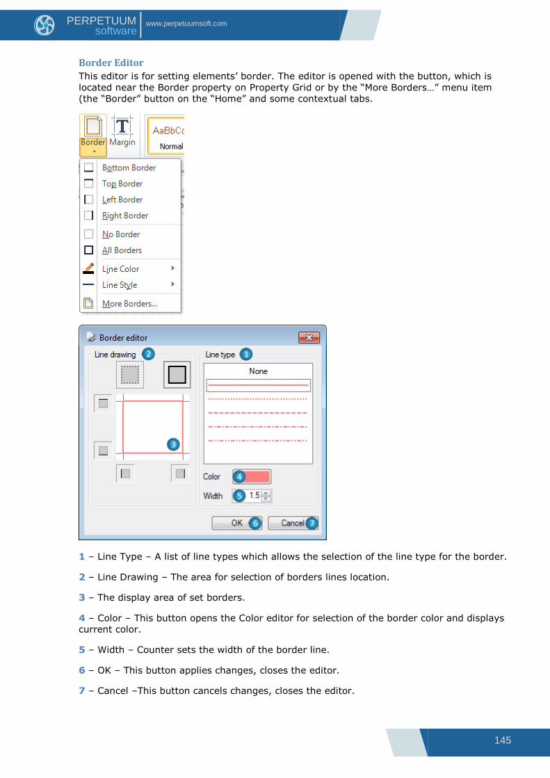
145
www.perpetuumsoft.com PERPETUUM software
Border Editor
This editor is for setting elements‟ border. The editor is opened with the button, which is
located near the Border property on Property Grid or by the “More Borders…” menu item
(the “Border” button on the “Home” and some contextual tabs.
1 – Line Type – A list of line types which allows the selection of the line type for the border.
2 – Line Drawing – The area for selection of borders lines location.
3 – The display area of set borders.
4 – Color – This button opens the Color editor for selection of the border color and displays
current color.
5 – Width – Counter sets the width of the border line.
6 – OK – This button applies changes, closes the editor.
7 – Cancel –This button cancels changes, closes the editor.

146
www.perpetuumsoft.com PERPETUUM software
Document Data Sources
The editor of the embed data sources collection. It allows the setting of data sources for the template
(the Document.DataSources property). The editor is opened with the button, which is located near the
DataSource property of the Document object on Property.
1 – Document Data Sources – A list of data sources for the document.
2 – Add – This button opens a list of data source types for addition to a template: SqlDataSource,
OdbcDataSource, and XmlDataSource.
3 – Delete – This button deletes the selected data source.
4 – Property Grid – Data source property grid which allows the property editing.
5 – Switching the property display mode in Property Grid.
6 – Description – This area displays the description of the selected text.
7 – OK – This button applies changes, closes the editor.
8 – Cancel – This button cancels changes, closes the editor.
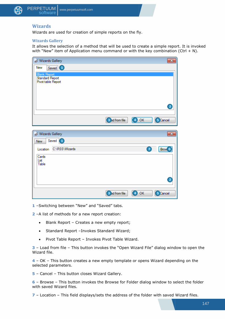
147
www.perpetuumsoft.com PERPETUUM software
Wizards Wizards are used for creation of simple reports on the fly.
Wizards Gallery
It allows the selection of a method that will be used to create a simple report. It is invoked
with “New” item of Application menu command or with the key combination (Ctrl + N).
1 –Switching between “New” and “Saved” tabs.
2 –A list of methods for a new report creation:
Blank Report – Creates a new empty report;
Standard Report –Invokes Standard Wizard;
Pivot Table Report – Invokes Pivot Table Wizard.
3 – Load from file – This button invokes the “Open Wizard File” dialog window to open the
Wizard file.
4 – OK – This button creates a new empty template or opens Wizard depending on the
selected parameters.
5 – Cancel – This button closes Wizard Gallery.
6 – Browse – This button invokes the Browse for Folder dialog window to select the folder
with saved Wizard files.
7 – Location – This field displays/sets the address of the folder with saved Wizard files.

148
www.perpetuumsoft.com PERPETUUM software
8 – A list of Wizard files which are located in the folder specified in the Location field.
Standard Wizard
It allows the creation of standard reports which include lists and groups. It is invoked from
the Wizards Gallery dialog.

149
www.perpetuumsoft.com PERPETUUM software
1 – The data tree displays a report common settings part and added data sections. It allows
the switching of the settings modes.
2 – Add Data – This button adds a data section.
3 – Remove Data –This button deletes a data section.
4, 19 – Save Wizard – These buttons invoke the Save Wizard File dialog window for
selection of the folder and file name to save Wizard settings.
5, 20 – Preview Template – These buttons create the template with set parameters, open it
in Report Designer.
6, 21 – Preview Document – These button launches generation of a report with set
parameters, open final document in Report Viewer.
7 – Show Title – Check for switching on/off report title in the report.
8 – Report Title – This field sets report name (sets the Document.Title property).
9 – Measure Unit – A list of measure units which allows the selection of measure unit for the
template (sets the Document.MetricUnit).
10 – Style Sheet – A list of styles which allows the selection of style for the report (sets the
Document.StyleSheet property).
11 – Script Language – A list of supported programming languages which allows the
selection of language for scripts writing in the report (sets the Document.ScriptLanguage
property).
12 – Standard – A list of page formats which allows the selection of the page format for the
report (sets the Page.PaperKind property).
13 – Custom – This field sets the page size for the report (sets the Page.CustomSize
property).
14 – Orientation – Radio buttons set the page orientation for the report (sets the
Page.Orientation property).
15 – Position – A list of values of headlines positions which allows the selection of the
position in the template for headlines display with page numbers (top, bottom headlines).
16 – Align – A list of alignment values allows the selection of number text alignment for
display in headlines.
17 – Columns Count – The counter which sets the columns number in the list in the report
(sets the DataBand.ColumnsCount property).
150
www.perpetuumsoft.com PERPETUUM software
18 – Columns Gap – The counter which sets the gap between columns in the list in the
report (sets the DataBand.ColumnsCount property).
22 – OK – This button shut downs Wizard work, creates a template with selected
parameters, and opens it with Report Designer.
23 – Cancel – This buttons completes Wizard work.
24 – Data Source – This button opens the data sources tree for selection of a data source.
The field displays the name of the selected data source.
25 – Field Layout – This list allows the selection of data display method.
26 – All Fields – Data sources fields‟ tree.
27 – Move Right – This button adds the selected field from data sources tree to the Groups
list or the Visible Fields table. At this, the values of the Caption, Width, and Aggregate
properties are set by default.
28 – Move Left – This button deletes the selected field from the Visible Fields table or the
Groups list.
29 – Add Blank – This button adds a field with empty properties to the Visible Fields table.
30 – Move Up – This button moves the selected field upwards in the Visible Fields Table or
the Group list.
31 – Move Down – This button moves the selected field downwards in the Visible Fields
table or the Group list.
32 – Switching between the Visible Fields table and the Groups list.
33 – Visible Fields – This is a table of fields for report creation. It displays the added fields
and their properties. The fields can be added from the data source or it can be new fields.
The FieldName property displays the field name. The Caption property displays the title of
the visible field. The Width property sets the column width. The Aggregates property sets
the aggregation functions.
34 – Caption – This field sets the Caption property for record from the Visible Fields table.
It sets the Textbox.Text property for the element which sets the title for field output in the
report.
35 – Width – This field sets the Width property for record from the Visible Fields table,
defines the list column width in percent.
36 – Aggregate – This is a list of aggregation functions which allows the selection of the
function for calculation of aggregate value by field. The value will be output at the end of
the list.
37 – Groups – This is a list of fields from data source for the list grouping.
Pivot Table Wizard
Pivot Table Wizard allows the creation of reports which include pivot table. It invokes from
Wizards Gallery dialog.
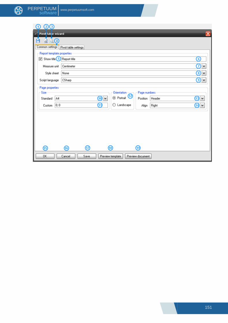
151
www.perpetuumsoft.com PERPETUUM software
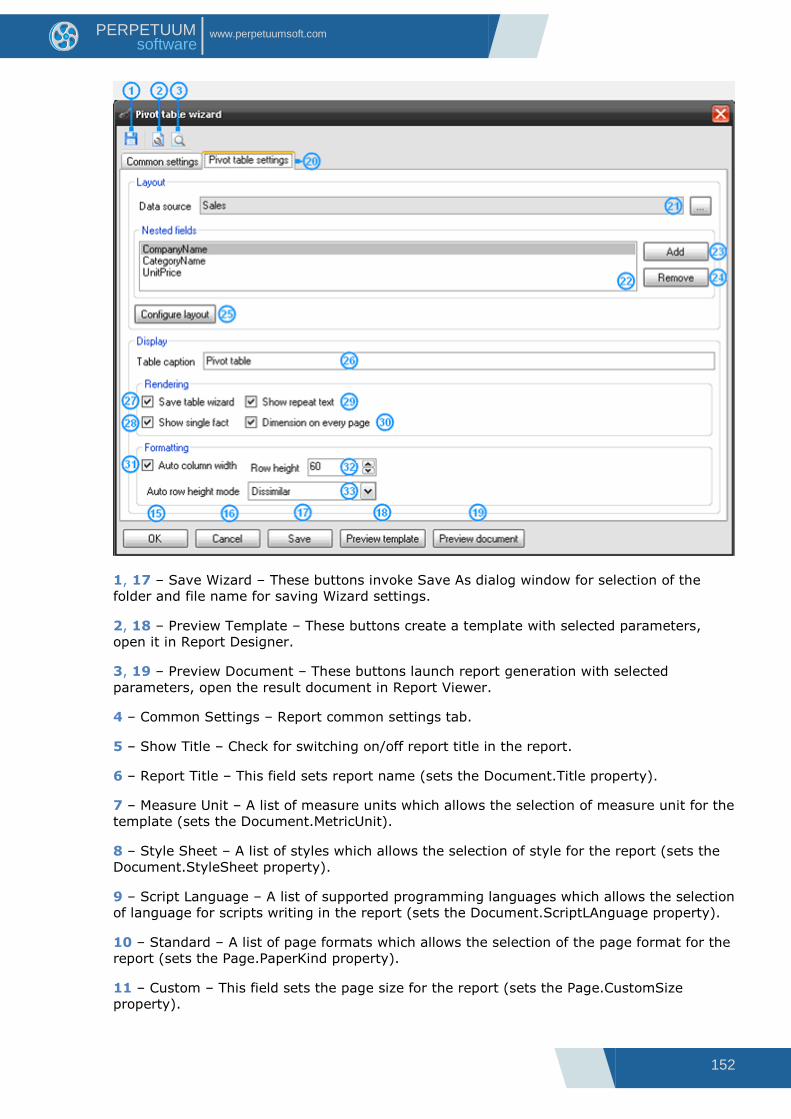
152
www.perpetuumsoft.com PERPETUUM software
1, 17 – Save Wizard – These buttons invoke Save As dialog window for selection of the
folder and file name for saving Wizard settings.
2, 18 – Preview Template – These buttons create a template with selected parameters,
open it in Report Designer.
3, 19 – Preview Document – These buttons launch report generation with selected
parameters, open the result document in Report Viewer.
4 – Common Settings – Report common settings tab.
5 – Show Title – Check for switching on/off report title in the report.
6 – Report Title – This field sets report name (sets the Document.Title property).
7 – Measure Unit – A list of measure units which allows the selection of measure unit for the
template (sets the Document.MetricUnit).
8 – Style Sheet – A list of styles which allows the selection of style for the report (sets the
Document.StyleSheet property).
9 – Script Language – A list of supported programming languages which allows the selection
of language for scripts writing in the report (sets the Document.ScriptLAnguage property).
10 – Standard – A list of page formats which allows the selection of the page format for the
report (sets the Page.PaperKind property).
11 – Custom – This field sets the page size for the report (sets the Page.CustomSize
property).
153
www.perpetuumsoft.com PERPETUUM software
12 – Orientation – Radio buttons set the page orientation for the report (sets the
Page.Orientation property).
13 – Position – A list of values of headlines positions which allows the selection of the
position in the template for headlines display with page numbers (top, bottom headlines).
14 – Align – A list of alignment values allows the selection of number text alignment for
display in headlines.
15 – OK – This button shut downs Wizard work, creates a template with selected
parameters, and opens it in Report Designer.
16 – Cancel – This buttons completes Wizard work.
20 – Pivot Table Settings – Pivot table settings tab.
21 – Data source – This button opens the tree for data source selection for pivot table, the
field displays the selected data source.
23 – Add – This button adds a new field to the Nested fields list.
24 – Remove – This button removes the selected field from the Nested fields list.
25 – Configure layout – This button opens Source Fields editor for editing of pivot table
data.
26 – Table Caption – This field sets the table title (sets PivotTable.TableCaption property).
28 – Show Single Fact – A flag which sets the display of fact column title (sets the
PivotTable.ShowSingleFact property).
29 – Show Repeat Text – A flag which sets the repetition of the text on a new page (sets
the PivotTable.ShowRepeatText property).
30 – Dimension Every Page – A flag which sets the headline output on each page (sets the
PivotTable.DimensionOnEveryPage property).
31 – Auto Column Width – A flag which sets the default column width (sets the
PivotTable.AutoColumnWidth property).
32 – Row Height – A counter which sets the row height (sets the PivotTable.RowHeight
property).
33 – Auto Row Height Mode – A list which sets the auto height mode of the row (sets the
PivotTable.AutoRowHeight property).

154
www.perpetuumsoft.com PERPETUUM software
Status Bar
1 – The Name of object, which is currently located under cursor.
2 – The control for setting Metric Unit.
5 – The button opens “Zoom” dialog to manually input Zoom value.
The Zoom slider sets zoom values.
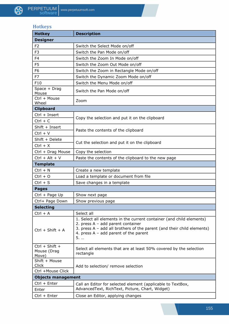
155
www.perpetuumsoft.com PERPETUUM software
Hotkeys
Hotkey Description
Designer
F2 Switch the Select Mode on/off
F3 Switch the Pan Mode on/off
F4 Switch the Zoom In Mode on/off
F5 Switch the Zoom Out Mode on/off
F6 Switch the Zoom in Rectangle Mode on/off
F7 Switch the Dynamic Zoom Mode on/off
F10 Switch the Menu Mode on/off
Space + Drag
Mouse Switch the Pan Mode on/off
Ctrl + Mouse
Wheel Zoom
Clipboard
Ctrl + Insert Copy the selection and put it on the clipboard
Ctrl + C
Shift + Insert Paste the contents of the clipboard
Ctrl + V
Shift + Delete Cut the selection and put it on the clipboard
Ctrl + X
Ctrl + Drag Mouse Copy the selection
Ctrl + Alt + V Paste the contents of the clipboard to the new page
Template
Ctrl + N Create a new template
Ctrl + O Load a template or document from file
Ctrl + S Save changes in a template
Pages
Ctrl + Page Up Show next page
Ctrl+ Page Down Show previous page
Selecting
Ctrl + A Select all
Ctrl + Shift + A
1. Select all elements in the current container (and child elements)
2. press A – add parent container
3. press A – add all brothers of the parent (and their child elements)
4. press A – add parent of the parent
5. …
Ctrl + Shift +
Mouse (Drag
Move)
Select all elements that are at least 50% covered by the selection
rectangle
Shift + Mouse
Click Add to selection/ remove selection
Ctrl +Mouse Click
Objects management
Ctrl + Enter Call an Editor for selected element (applicable to TextBox,
AdvancedText, RichText, Picture, Chart, Widget) Enter
Ctrl + Enter Close an Editor, applying changes
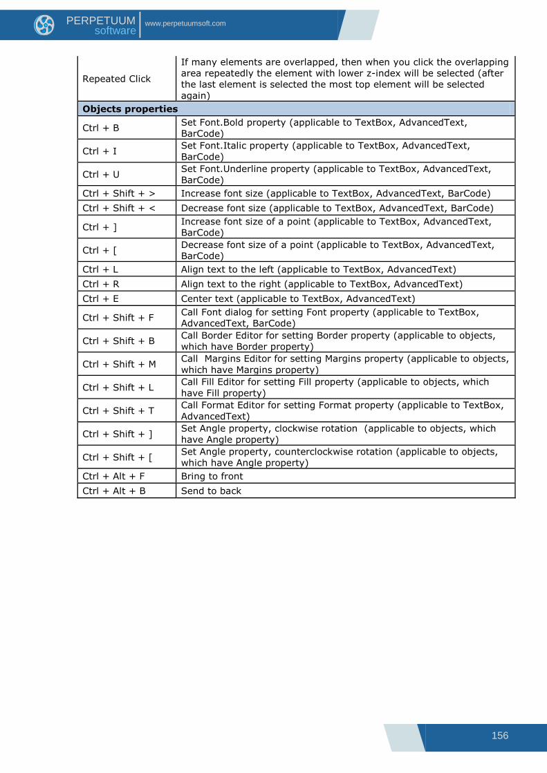
156
www.perpetuumsoft.com PERPETUUM software
Repeated Click
If many elements are overlapped, then when you click the overlapping
area repeatedly the element with lower z-index will be selected (after
the last element is selected the most top element will be selected
again)
Objects properties
Ctrl + B Set Font.Bold property (applicable to TextBox, AdvancedText,
BarCode)
Ctrl + I Set Font.Italic property (applicable to TextBox, AdvancedText,
BarCode)
Ctrl + U Set Font.Underline property (applicable to TextBox, AdvancedText,
BarCode)
Ctrl + Shift + > Increase font size (applicable to TextBox, AdvancedText, BarCode)
Ctrl + Shift + < Decrease font size (applicable to TextBox, AdvancedText, BarCode)
Ctrl + ] Increase font size of a point (applicable to TextBox, AdvancedText,
BarCode)
Ctrl + [ Decrease font size of a point (applicable to TextBox, AdvancedText,
BarCode)
Ctrl + L Align text to the left (applicable to TextBox, AdvancedText)
Ctrl + R Align text to the right (applicable to TextBox, AdvancedText)
Ctrl + E Center text (applicable to TextBox, AdvancedText)
Ctrl + Shift + F Call Font dialog for setting Font property (applicable to TextBox,
AdvancedText, BarCode)
Ctrl + Shift + B Call Border Editor for setting Border property (applicable to objects,
which have Border property)
Ctrl + Shift + M Call Margins Editor for setting Margins property (applicable to objects,
which have Margins property)
Ctrl + Shift + L Call Fill Editor for setting Fill property (applicable to objects, which
have Fill property)
Ctrl + Shift + T Call Format Editor for setting Format property (applicable to TextBox,
AdvancedText)
Ctrl + Shift + ] Set Angle property, clockwise rotation (applicable to objects, which
have Angle property)
Ctrl + Shift + [ Set Angle property, counterclockwise rotation (applicable to objects,
which have Angle property)
Ctrl + Alt + F Bring to front
Ctrl + Alt + B Send to back