repaired evaluation
TRANSCRIPT
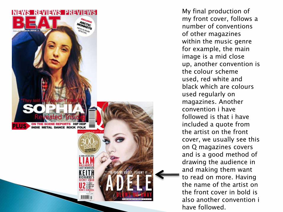
My final production of my front cover, follows a number of conventions of other magazines within the music genre for example, the main image is a mid close up, another convention is the colour scheme used, red white and black which are colours used regularly on magazines. Another convention i have followed is that i have included a quote from the artist on the front cover, we usually see this on Q magazines covers and is a good method of drawing the audience in and making them want to read on more. Having the name of the artist on the front cover in bold is also another convention ihave followed.
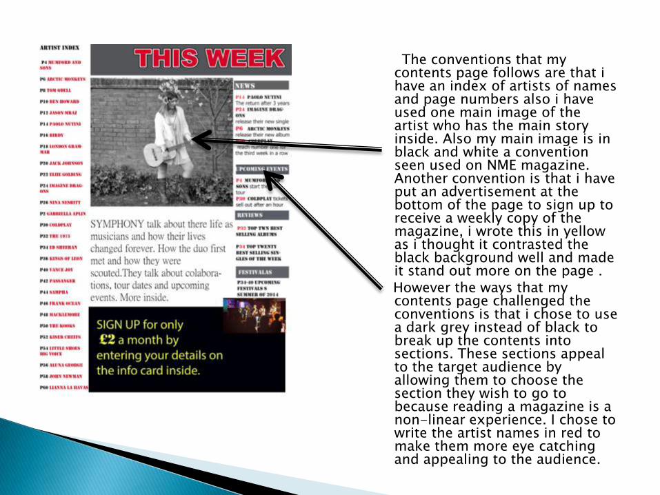
The conventions that my contents page follows are that ihave an index of artists of names and page numbers also i have used one main image of the artist who has the main story inside. Also my main image is in black and white a convention seen used on NME magazine. Another convention is that i have put an advertisement at the bottom of the page to sign up to receive a weekly copy of the magazine, i wrote this in yellow as i thought it contrasted the black background well and made it stand out more on the page . However the ways that my contents page challenged the conventions is that i chose to use a dark grey instead of black to break up the contents into sections. These sections appeal to the target audience by allowing them to choose the section they wish to go to because reading a magazine is a non-linear experience. I chose to write the artist names in red to make them more eye catching and appealing to the audience.
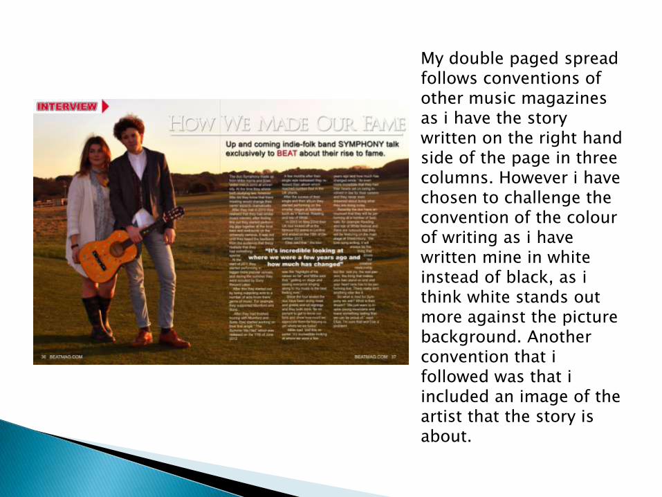
My double paged spread follows conventions of other music magazines as i have the story written on the right hand side of the page in three columns. However i have chosen to challenge the convention of the colour of writing as i have written mine in white instead of black, as ithink white stands out more against the picture background. Another convention that ifollowed was that iincluded an image of the artist that the story is about.
I have followed the codes and conventions of other magazines as it has helped me to identify what appeals to my target audience of teenagers and young adults between the age of 16-27 both men and women. My unisex target audience was shown by my colour scheme using colours such as white, red, black and yellow which appeal to both sexes.
I have used theorists to help me represent my models for example Kilbournes theory of models having perfect hair and make-up.
My magazine represents both males and females, i have managed to represent males by using a female on the front cover however the women haven’t been made to look like a sex object as the model was covered up going against wolfs theory so it also appeals to women also i have included a range of artist within my magazine for example Ben Howard and Birdywhich means it appeals to a larger target audience. I have also managed to represent different social groups through my colour scheme by using colours that appeal to both sexes for example the black, white and red. The range of artist featured inside my magazine also means that my magazine will appeal to a larger age group.
In my opinion i think the best institution to distribute my media product would be ‘BAUER media’ as it distributes indie and alternative products similar to my magazine. BAUER has distribute other magazines such as Kerrang and Empire.
The reason i think the institution would be interested in my magazine is that it has a similar target audience to the other magazines distributed by the institution and my magazine has a similar indie theme to the other magazines distributed by BAUER.
Research has shown me that ‘BAUER media’ has distributed over 300 magazines world wide, making it a very successful institution making it a good distributer for my magazine.
I did look at other institutions such as ‘IPC media’ the institution that distributes NME magazine however i thought that most magazines distributed were aimed at a female audience, where as my magazine is aimed at a unisex audience.
The target audience for my magazine is both females and males between the ages of 16-27.
The way that i aimed to attract my audience was that i featured a range of artist inside appealing to both sexes and different ages, for example acts like Ben Howard might appeal to a slightly older audience to an act like Aluna George.
By including both male and female models on my contents page and double page showed that my magazine was aimed at a unisex audience.
The colours that i used were unisex not favouriting a particular set, using colours such as black, white and red.
The fonts used in my magazine also appeal to both sexes, this was shown by using a range of fonts.
The process of creating my own magazine has meant that i have had to learn to use a number of different pieces of technology, for example i had to learn how to use Photoshop.
I have also learnt how to use slide share to help me upload PowerPoint's to my plog.
Whilst taking my images for my magazine ihave learnt how to use the cannon camera and which settings to use to improve the quality of my image.
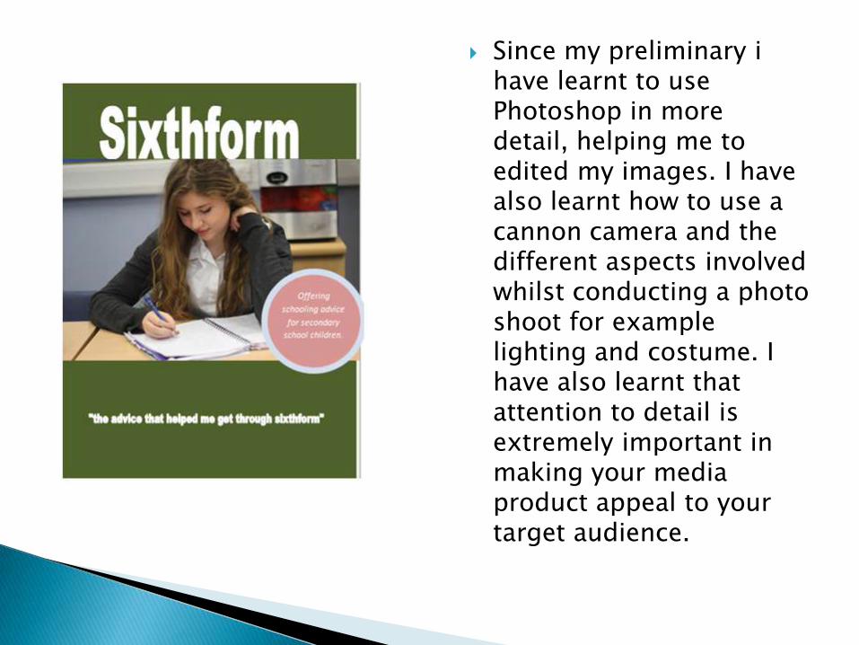
Since my preliminary ihave learnt to use Photoshop in more detail, helping me to edited my images. I have also learnt how to use a cannon camera and the different aspects involved whilst conducting a photo shoot for example lighting and costume. I have also learnt that attention to detail is extremely important in making your media product appeal to your target audience.