re-branding for the ymca
TRANSCRIPT

Re-branding for the YMCA
A Senior Project
presented to
the Faculty of the Graphic Communication Department
California Polytechnic State University, San Luis Obispo
In Partial Fulfillment
of the Requirements for the Degree
Bachelor of Science in Graphic Communication
by
Kelly Dumas
March, 2011
© 2011 Kelly Dumas

1
Abstract
Re-branding for the YMCA
Kelly Dumas
Graphic Communication Department, March 2011
Advisor: Kevin Cooper
The purpose of this study was to clearly define the steps involved with re-
branding, specifically print media, for the Young Men’s Christian Association, and relate
the execution of these steps to the overall success of the YMCA’s nation-wide re-
branding effort. This study outlined the guidelines one must follow when designing any
print collateral for the Y, in order to adhere to the new branding standards. After going
over the guidelines for design, print pieces, designed for the purpose of this study and as
part of the Y’s re-branding, were examined by Y employees. The employees of the Y in
Shasta, Ca provided feedback on the success of the pieces in the re-branding effort. This
study examined the transformation of print media at one Y location during re-branding
and related it to the contribution of successfully re-branding the Y across the country.
2
Table of Contents
Chapter 1
Introduction ………………………………………………………………………………. 3-4
Chapter 2
Existing Research …………………………………………………………………….… 5-12
Chapter 3
Method of Study ………………………………………………………………………... 13-15
Chapter 4
Results ……………………………………………………………………………………... 16-18
Chapter 5
Conclusion …………………………………………………………………………………. 19-20
Figures ………………………………………………………………………………………………… 21-37
Works Cited …………………………………………………………………………………………. 38

3
Chapter 1: Re-branding for the YMCA
Re-branding is a complex process that organizations must execute carefully to
maintain the public’s knowledge of their brand. Before expanding on re-branding it is
important to understand what brand awareness is. Brand awareness relates to people’s
ability to identify a certain logo when encountering specific symbols, colors or ideas that
represent an organization. As organizations become established in a given industry,
public awareness of the product they sell or the service they provide, spreads. This is
true not only for companies and businesses that sell a product or service, but also for
non-profit organizations. If a non-profit organization is well established, many people
will easily recognize and associate with the brand after seeing their print or digital
media. This brand awareness is important for organizations to create and maintain in
order to have people who recognize and support them. Brand awareness is also
important for consumers. People often find comfort in brands they are familiar with.
They generally like being able to recognize, and have an opinion about a product or
service after seeing a logo. This study examined the process of transformation for print
media during re-branding for the Y, a non-profit organization.
Understanding why brand awareness is important for non-profit organizations
prepares one to follow the significance of re-branding. The non-profit organization, the
YMCA (Young Men’s Christian Association), is in a five year, nation-wide process of re-
branding themselves. The Y is a non-profit organization whose goal is to strengthen the
foundations of community for men, women and children. For 43 years the Y has
maintained the same brand image. They want to use a new brand image as a marketing
tool. The Y is undergoing this change to share their story with the public and obtain a
unified look for Ys across the nation. Re-branding may lead to only slight differences in
4
appearance, or it could lead to significant differences. However, either way it is
important that people not lose recognition of the organization after this change. If
design and branding specifications are followed when creating print media for
individual locations, and the Y employees respond favorably, the Y re-branding process
will be a success.
Re-branding is a powerful tool that the Y will use to share their story and market
themselves simply as the Y. It has the potential to strengthen the organization if they
achieve their goal with a nation-wide cohesive look. However, re-branding also has the
potential to weaken the Y for a period of time while people adjust and learn that they are
making this iconic change. It may take some time before people associate the Y with the
familiar Y brand.
The purpose of this study was to clearly define the steps involved with re-
branding, specifically print media, for the Y, and relate the execution of these steps to
the success of the Y’s nation-wide re-branding effort. The Y has provided guidelines to
locations nation-wide to follow while transitioning any print or digital media made for
the Y in the future. As a non-profit organization, the Y will try to find as much unpaid
help during this process as possible. Students who are looking for real world experience
are great resources for the Y organizations to use for this process. There are a number of
handbooks on the Y, and the logistics of their re-branding process. These are resources
that people will use when designing collateral for the Y.
5
Chapter 2: Re-branding Process
A brand is an organization’s identity. Branding is how an organization represents
itself physically as well as the values it promotes and believes in. Branding encompasses
logos, print and digital media used for advertising, and promoting values, all of which
combine to form an organization’s identity. These elements of an organization’s brand
do not always remain the same. Organizations may decide to update their look or
change their values. This transition process is called re-branding.
The YMCA is on a five-year plan to re-brand themselves and transition all of their
print and digital media from the old look to the new look. “Our brand is our essence –
what we are about, the benefit we provide and why our stakeholders should engage with
us. To use and manage it effectively, we must present ourselves as a unified cause with
shared values and a common voice” (The Brand Resource Center). The Y, formerly
known as the YMCA, has shortened their name, and taken on a new look. Each Y
location in the United States is responsible for transitioning themselves in this nation-
wide re-branding effort. As a non-profit organization, the organization will accomplish
this transition with volunteers’ help in addition to employees.
It has been 43 years since this organization has gone through any re-branding. It
is time to update their look and focus. Although they still maintain the same values and
goals as in the past, this re-branding will increase focus and awareness. The Y will re-tell
their story. Senior vice president and chief marketing officer of the Y Kate Coleman says,
“We are changing how we talk about ourselves so that people better understand the
benefits of engaging with the Y. We are simplifying how we describe the programs we
offer so that it is immediately apparent that everything we do is designed to nurture the
potential of children and teens, improve health and well-being and support our

6
neighbors and the larger community” (Kieke). They are officially changing their name
from the YMCA to what many people already recognize and call them by, the Y.
CEO, Neil Nicoll, has helped create a corporate handbook outlining the
importance of holding true to what the Y stands for through the re-branding process.
This re-branding effort will apply to national campaigns as well as local, state and
regional campaigns. Within The Y Look are explanations of its core values, design
specifications for print and digital media, and the reasons behind color and type choice.
According to the Y, “Each element is designed to work in harmony with the others.
When combined, the elements convey the richness of our brand” (12). This handbook
will guide individual Y branches through the process of re-branding. The steps in the
handbook will help those working for the Y in designing any material using the new
look. This will make the nation wide transition more smooth and effective. The design
specifications for the re-branding process of the Y have multiple elements.
The logo is perhaps the most visible change in the Y’s re-branding effort. The new
logo drops the last three letters of the previous one and has a large two-colored “Y” with
the letters Y running along the side. When designing print or digital media for the
organization there are five color combinations with a complementary color family used
for the type in the design. The new logo “better reflects the vibrancy of the Y and the
diversity of the communities it serves” (Kieke). It also reflects the simpler version of the
organization’s name: the Y. The branding handbook also includes a list of ways not to
use the logo or colors. The Y understands that using colors or type for the logo
incorrectly will only confuse people and weaken their re-branding process. For example,
the popular clothing store Gap Inc., recently attempted to re-vamp their logo yet they
had to withdraw the logo after only one week due to consumer complaints. Gap did not

7
put in the research required to execute such a change and suffered the consequences.
They realized this and mentioned it was “a well-intentioned desire to signal
change…changing the logo…was one change too many and executed too fast” (Hansen).
People really use an organization’s logo to associate with the organization. The Y has
been studying branding and understands the importance of a consistent presence after
introducing their new brand (Kieke). Below are figures of the old Y logo (left) and the
new logo (right) in the five different color combinations.
Color is an important aspect of their re-branding, and any design material for the
Y. The new colors for their logo are bright and vibrant with five main color palettes:
green, blue, purple, red and orange, which each have three shades. The Y supplies cyan,
magenta, yellow, black color specifications for three shades in five main color palates for
anyone doing print design to use. They also provide red, green, and blue specifications
for each of the three shades in the five main palettes for anyone doing web design. The Y
gives a PANTONE® alternative if CMYK is not available. This PANTONE® color system
that a standardized color matching system that uses a number system to identify colors.
These color specification allow any individual designing a piece for the Y to easily create
the exact colors that the Y wants to use. These color specifications allow no room for
interpretation and help maintain the consistency the Y is striving for. The Y Look gives
directions on how to properly use white space, two-color design, and four-color design.
It also has appropriate combinations to use for the main palettes and the shades within
them. Below is a figure of the Y’s new color palette.

8
The psychology of color plays an important role in an organization’s re-branding
decisions. Colors have meanings associated with them. In branding, organizations
choose colors carefully based on emotions that colors trigger for people. In their cross-
national study of color meanings and preferences Madden, Hewett, and Roth noted
“color is an integral part of products, services, packaging, logos, and other collateral and
can be an effective means of creating and sustaining brand and corporate images in
customers’ mind.” They Y replaced their old red and black logo with a two-color logo
that has five possible color combinations. The shades and combinations of green, blue,
purple, red and orange that make up the new logo will reflect the vibrancy and diversity
of the Y. As Madden at el. pointed out, “colors are known to possess emotional and
psychological properties. The meanings associated with the different colors are
important to marketers because the tools used to communicate brand image are
mechanisms of meaning transfer.” The Y has five vibrant colors in three distinguished
shades. They want these colors to encompass men, women and children and reflect their
diverse nature. There are other important visual aspects to consider when re-branding.
Imagery and type are two more important factors for the Y to use through their
transformation. They want images of “high qualities that make [one] smile or strike a
positive emotional chord, and that show the nature of [their] role in communities [they]
serve” (The Brand Resource Center). The Y considers silhouettes, images with
backgrounds and illustrations important design elements to remain consistent, and
reflective of their organization. Type is yet another key element for the Y to use as a tool
9
to effectively re-brand their organization. They have chosen Cachet as the primary font
for print media and Verdana for the web.
Given all of these pieces for design, logo, color, imagery, and type, the Y goes
further and provides suggestions on how to combine these elements to create an
effective layout. The corporate handbook provides examples of page layouts for
inspiration and steps to follow while working on a layout. The handbook suggests using
the Y logo with the areas of focus, creating a message that matters, applying supporting
imagery, and finally adding brand architecture while designing a layout (Nicoll). There
are guidelines for single as well as multiple page layouts.
Through this process, the Y hopes to accomplish a few key goals. They are looking
to make their core values of youth development, healthy living, and social responsibility
clear to everyone. The organization refers to these values as their “areas of focus.” By re-
branding themselves the Y hopes to “better inform the public of the organization’s
mission” and “do a better job of telling [their] story” (Freehling). The Y wants the re-
branding to encompass all that the organization stands for. “The marketing campaign is
a way to remind people of the impact that the nonprofit organization has the
community” (Lawrence-Turner).
Through their new logo and re-branding the Y wants to convey their values, voice,
and areas of focus. The Y hopes to introduce themselves all over again to the public
through this process. As The Y Look states, “As we move forward, our promise and our
values will guide the elements of our brand. Our look, our voice, our architecture and
our areas of focus will be used to tell our story in an insightful and inspiring way”. The
organization will share these elements of their brand in a unified manner.

10
As they tell their story and share their values to communities across the country,
the Y understands the necessity of keeping it consistent. They offer a vast variety of
programs and serve many different communities. One of the tools they use to clearly
present themselves is what they call, brand architecture. “The Y brand architecture is a
hierarchy of information designed to help external audiences understand who [they] are
and how [they] deliver on [their] promise” (Nicoll). Within any given design for the Y
the logo should appear on top, underneath this is the area of focus, further down is the
category of their offerings, underneath this is the program or service that goes with the
offering, and at the bottom of the program or service is the Y location (Nicoll). These
levels of architecture must remain consistent in all designs with custom information to
suit the category for each level. In addition to brand architecture, the Y has additional
resources to help designers with re-branding.
The Y provides templates and examples for many print pieces that could be used
in any Y campaigns or initiatives. The templates are in the corporate handbook as well
as online. There are templates of multiple brochure spreads, postcards, newsletters, and
power point presentations. Select images that the Y approves of, and the Y font (Cachet)
are available for download on YMCAexchange (Nicoll). The Y believes that their “visual
system is designed to provide…freedom within a framework” (Nicoll). Both paid and
volunteer designers have access to these resources via individual Y locations. Y locations
across the country have access to tools online to aid in the re-branding steps.
The Y has a website that includes all of the information in The Y Look handbook
as well as resources for download. The website requires a user name and password in
order to access the online tools needed to design print and digital media for the Y. These
are available through contacts at Y locations. The website is useful in re-branding

11
because it is easily accessible to those who need to understand the new Y look and
essence. During re-branding, the physical appearance of a brand represented through
designs using print and digital media, is only one part of the re-brand. The essence and
meaning of the re-branding must be clearly expressed as well. Corporate understands
this and has provided necessary resources.
In addition to a handbook on the Y look, there is also a guide on voice messaging
online. This includes suggestions on ways that people should use written and verbal
communication in a way that represents the Y. This guide is “intended to help [one]
translate the brand platform into external-facing messages and provide a customizable
framework for creating clear communications that speak with all…audiences in mind”
(The Brand Resource Center). Communication is an important tool to implement
during re-branding for a non-profit organization as large as the Y. In this handbook,
corporate breaks communication down into two key factors.
The document includes guidance on voice and message, two critical elements in
re-branding, to help the organization consistently communicate the new brand, both
internally and externally. It includes “an overview of the Y brand, guidance for using the
Y voice in communications, standard descriptions for use in external communications,
and tactics for creating audience-centric messages” (The Brand Resource Center).
Corporate gives a detailed description of what brand voice is, why it is so important,
where it is appropriate to use, and its impact. To help everyone involved in the re-
branding process the Y has a mission to focus on. This mission is to “put Christian
principles into practice through programs that build healthy spirit, mind and body for
all” (The Brand Resource Center). The Y uses voice to describe the way their brand
sounds and looks. The Y’s brand is their essence. It is who they are and what they are

12
about. It encompasses more than what someone sees on paper or online (The Brand
Resource Center). Their voice allows them to share their message. As the Y reintroduces
themselves, in order to “shift perceptions of the Y from service provider to cause-driven
movement, and drive membership, engagement, giving, volunteerism and advocacy,
[they] have created focused messages for different external audiences” (The Brand
Resource Center). These messages express the change the Y is undergoing in the way
that they operate. This new method of operation is a fundamental part of their re-
branding.

13
Chapter 3: Method of Study
There are different ways to approach and implement re-branding for an
organization. Some of the variables to consider include budget, time frame, size of the
organization, and available resources. The purpose of this study was to clearly define the
steps involved for a non-profit organization to re-brand, specifically; it looked at the
YMCA’s nation-wide re-branding effort in relation to the Shasta family Y. This study
defined the re-branding steps using the descriptive research and content analysis
methods.
In order to understand one approach to re-branding an organization, this study
used the steps in descriptive research as defined in Dr. Harvey Levenson’s book, Some
Ideas about Doing Research in Graphic Communication. Descriptive research studies
are “designed to determine the nature of a situation as it exists at the time of study. The
aim is to describe ‘what exists’ with respect to variables or conditions in a situation”
(Levenson, 27). The descriptive research process is summarized in relation to re-
branding for the Shasta Family YMCA as follows:
1. The YMCA needs to re-brand to increase the organization’s presence in
households across the country.
2. In order to re-brand successfully, each Y location must follow the re-branding
standards produced by corporate for all of their new print and digital media.
3. Through weekly emails between the conductor of the study and Kristen Lyons
from the Shasta family Y, Kristen confirmed branding standards were maintained
and the Shasta Family Y’s story could be told through each of the printed pieces
designed. Due to schedules, a strict timeline was not followed. Kristen gathered
information for printed pieces as she had time and could coordinate with other

14
employees of the Shasta Y. Four printed pieces were designed in this study. Two
versions of a personal training brochure, and a Spring swim lesson flyer and a
Summer swim lesson brochure. The personal training brochure was composed of
new content that had not been put into circulation yet. The swim flyers were also
new . Each piece needed to be designed following Y branding standards. Both
4. The target population for this study was the Shasta family Y.
5. The conductor of this study communicated with a contact from the Shasta family
Y, Kristen Lyons, to determine how many employees at this location responded
favorably, or unfavorably to each new re-branded piece created. As print media
circulated to employees at the Shasta Y location, a record showed who said yes
and who said no when asked, “does this piece follow the Y’s new brand standards
and will it help tell the Shasta Y Family’s story?” Kristen Lyons responded to this
question, as well as Sheri, the membership director, Chip, the wellness director,
and Yvonne, the personal trainer. A bar graph, with “yes” documented in one
column and “no” documented in another, displays the responses to the two
questions asked for each design product. Yes represents a favorable response,
while no represents an unfavorable response.
6. After feedback from the employees regarding the re-branded print pieces, this
study determined whether the steps to re-brand the Y provided by corporate
satisfy the Shasta family employees.
After the descriptive research was gathered, this study used content analysis to quantify
the qualitative information. Using the responses from the question directed to the
employees about the effectiveness of the print pieces, this study displayed and analyzed
a graph of the responses, yes or no, to determine if following the design and branding

15
specifications when creating print media results in favorable response. If all
respondents answer, “yes” to the question, then the pieces designed for the Shasta Y will
have a good chance of obtaining the desired outcome of the nation wide re-branding
goal. This response rate then determined a small portion of the overall success
likelihood of the YMCA re-branding process.

16
Chapter 4: Results
The purpose of this study was to clearly define the steps involved with re-
branding, specifically print media, for the Y, and relate the execution of these steps to
the success of the Y’s nation-wide re-branding effort. To do this, the conductor of this
study worked with Kristen Lyons, marketing director for the Shasta family Y, in
designing a brochure and flyers following the new brand guidelines.
Before designing any printed pieces, it was necessary to fully understand the
details and rules of the Y’s new branding standards. Kristen Lyons provided the
conductor of this study with the necessary resources to understand these standards. She
provided PDF handbooks on the Y “look”, voice, message, and examples upon which to
model printed pieces. She also provided access to a database of branding resources such
as logo files, images, and the Y font. It was important to understand both the design
principals and concepts as well as the reason behind this transition and the desired
outcome. Substantial time was spent researching the elements of the Y’s identity such
as: their logo, acceptable and unacceptable versions of the logo, color choices, clear
space, minimum space, imagery, font and typography. In addition to studying the
elements of the organization’s identity, the conductor of this study also learned who the
Y is - their promise, voice, values and areas of focus as well as how they want to
structure themselves through brand architecture. These elements all come together to
form the Y’s identity and accomplish their goal in re-branding: to better share their story
with people in a unified manner. The time invested in studying these elements was
necessary to design print pieces that follow the standards and help the Y achieve their
goal. The more the designer understands who the organization is and what it stands for,
the more likely he or she will be able to help it achieve it’s purpose through print.

17
After the conductor of this study had knowledge of the organization and it’s
elements of identity, the next steps in the re-branding process began. Communication,
design and layout were the steps that brought the brochure together to represent the
new brand. Through emails, Kristen Lyons sent Word documents with content for a
personal training brochure to be designed and laid out (e.g. [figure 1]). The content had
no previous brochure design it belonged to; it was simply text waiting to be formatted.
Using handbooks on the Y’s look as a guide, the brochure was put together. Appropriate
images along with the logo were taken from the Y’s brand resource database to
incorporate into the brochure. After an initial design and layout for the brochure was
completed, it was sent to the Shasta Y for review. After the staff gave feedback on the
brochure, it was returned to the designer and edits were made. Kristen sent an
additional questionnaire to be added to the brochure (e.g. [figure 2]). This additional
information was formatted into two versions of the brochure: one version the designer
preferred, and one version the way the Shasta Y requested. Communication and edits on
this brochure continued for two months until two final versions (e.g. [figure 3] and
[figure 4]) of the brochure were agreed upon. One of these two versions will be printed
and distributed to members of the Shasta community.
In addition to the Personal Training brochure, a Spring swim flyer and a Summer
flyer were also designed for the Shasta Family Y. Communication through emails with
Kristen Lyons continued for these flyers just as for the brochure. The same branding
standards were used and implemented into the designs. Word documents were provided
with the content for both the Spring (e.g. [figure 5]) and Summer (e.g. [figure 6]) flyers.
These documents were transformed into documents that represented the Y’s new brand
(e.g. [figure 7] and [figure 8]).

18
The concept, design and distribution of the personal training brochure, swim
flyer and swim brochure, are small steps in the nation-wide re-branding process.
Processes similar to the ones conducted for this study will be done at Y locations across
the country for the Y’s re-branding to be a success. After the five-year transition period
that corporate has allowed, the Y-USA should have a cohesive look that they can use to
share their story. The Shasta family Y has five years to transition all of their printed
material to adhere to the new brand image. This includes modifying existing print as
well as applying the standards to any new print pieces. Corporate has made a lot of
resources available to ensure consistency in following standards and sharing they Y’s
story through re-branding.
This study gathered data on how well the conductor of this study did in assisting
they Y’s re-branding effort, specifically for the Y location in Shasta, Ca. After the
personal training brochure was complete, the employees at the Shasta Y including, the
wellness director, the membership director, the personal trainers and the marketing
director, were asked the following questions: “Does this printed piece follow the
branding standards established by corporate?” and “Will this printed piece help tell the
Shasta family Y’s story?” Of the five employees, all five agreed that the personal training
brochure followed the branding standards, while two believed that it would help tell the
Shasta Y’s story. Given these responses, it is safe to assume that the steps followed
successfully adhere to the new Y branding standards and contribute to the nation-wide
process. This process was repeated for an additional two printed pieces: a Spring swim
lesson flyer and a Summer swim lesson flyer. Branding standards were closely followed
for these pieces as well and were designed in a way to “share the Shasts Y’s story.”

19
Chapter 5: Conclusions
From this study, one can draw several conclusions on the process of, and steps
involved with re-branding as well as determine how an individual case contributed to
the nation-wide project.
This study showed that re-branding, especially for organizations as large as the Y,
involved extensive effort from many levels of people, including: corporate, each Y
location, and individuals assisting Y locations in transitioning their print media to the
new brand. Those working for corporate are responsible for providing all of the
necessary resources to locations across the country. They are also responsible for
ensuring that all locations understand why they made the decision to re-brand, how this
goal will be achieved, and the time period the process should take. Corporate is the
driving force behind re-branding and is responsible for providing the organization’s
locations with a clear vision of what the new brand looks like and what it will represent.
In addition to efforts from corporate, the re-branding process requires that members at
each Y location across the country participate in this process. It is the employees and
volunteers job at each location to use the resources provided by corporate and delegate
the actual work to transition print media to the new brand. This may involve Y
employees re-designing print or, in cases such as this study, finding outside human
resources to do the re-designing, or a combination of the two. Each location is
responsible for making sure that any print media that circulates adheres to the new
branding standards. This strengthens the new brand and makes it easier for the public
to identify with the new Y brand. In addition to re-designing all the new print, Y
locations are responsible for sharing the Y’s goal in re-branding with anyone helping to
re-design. They also need to share the new Y brand with the public.

20
Sharing the new brand with the public is a very important step in the re-branding
process. As this study mentioned, the Y hopes to better share their story with the public
through re-branding. This study showed how the efforts of the Y in Shasta, Ca
contributed to the overall success of the Y-USA’s re-branding in sharing their story with
the public. The Shasta family Y took the resources from corporate, recruited outside
help to re-design their print, approved versions of this print that followed brand
standards, and will distribute the new brochures and flyers that they believe contributes
to the Y-USA’s re-branding project.
The Y has a very structured and detailed plan for re-branding that should help
them achieve their goal more easily. Corporate handbooks give designers specific
guidelines to follow that lead to the desired look. They have provided ample resources
for re-designing and given locations plenty of time to transition all of their material. For
these reasons, the Y will hopefully find their nation-wide re-branding effort to be a
success.
To get different perspectives on re-branding, it may be beneficial to do case
studies on other organizations and companies that have re-branded, or are currently in
the process. A brand is an organization’s identity. This includes who they are and what
they stand for, which is largely represented through their “look”. The graphic
communication industry is responsible for the print media that represents many
organizations. Studying how to use print most effectively in re-branding may also give
interesting insight to the process as a whole.

21
List of Figures
Figure 1
Original format personal training brochure…………………….…..………………. 22-23
Figure 2
Original format of weight room questionnaire…………………………..………… 24
Figure 3
Version 1 of personal training brochure………………………………..…….……… 25-26
Figure 4
Version 2 of personal training brochure………………………………….….……….. 27
Figure 5
Original format of Spring swim flyer…………………………………………………… 28-30
Figure 6
Original format of Summer swim brochure………….……………………………... 31-35
Figure 7
Spring swim flyer…………………….………………………………………………………… 36
Figure 8
Summer swim flyer…………………………………………………………………………... 37

22
Figure 1: Original Personal Training brochure material received as a .doc
Find the Program that Fits You _____ $35 Single 1 hour session _____ $190 6-One hour sessions _____ $22 Single 1/2 hour session _____ $116 6-1/2 hour sessions
Partner Fitness Training (2 people) _____$295 6-One hour sessions
Personalized Weight Room Orientation _____ $35 One hour session
Back cover, when folded Start Today, We're Better Together For more information call us at 246-9622
Shasta Family YMCA
1155 N. Court Street, Redding CA 96001 www.sfymca.org
PAGE 1: Front Cover, when folded We're here to help Let our Personal Trainers help you become healthier and happier. Image
Inside left panel Let's Work Together Our Personal Trainers all have national certifications and years of experience. They can meet with you and assist you in learning, practicing and achieving your health and fitness goals. Y Personal Trainers can help you with:
• Weight loss • Body toning
Inside center panel Commit Today For Better Health Name________________________
M / F DOB ____ / ____ / _____
Home Phone # _________________ Other Phone #_____________________ Address__________________________
City ___________________
Zip____________
Email address: _________________
Parent Name _________________ Parent’s DOB ____ / ____ / _____ (if parent is under 18 years old) We accept cash, check or credit card.
Inside right panel Shasta Family YMCA Program Waiver I hereby agree for myself, my child(ren), my heirs, executors and administrators, to indemnify, defend and hold the Shasta Family YMCA and its officers, directors, board members, employees, volunteers, agents, independent contractors and other participants in the program, harmless from any and all liability and claims with respect to any bodily injury, personal injury or illness, including death, or property damage which may occur to myself or my child(ren) or which may be aggravated by participating in a YMCA program. I take full responsibility for my welfare and safety, and that of my minor children, during Shasta Family YMCA activities and know that activities should only be engaged in by those in good health and that I should consult a physician before enrolling in a YMCA

23
• Sport Specific Training
• Injury Prevention and Post Rehabilitation
Attainment of your goals for overall lifestyle
Paid sessions must be used within a 3 month period. Unused sessions are non-refundable.
program. I understand the Shasta Family YMCA carries no medical insurance, and it is expected that I have health insurance to cover any injuries or losses. In case of accident or illness, the Shasta Family YMCA has my permission to secure the necessary medical attention if unable to contact me or if I am unable to give conscious permission. I, individually, and on behalf of any minor children, hereby release the Shasta Family YMCA from any claim whatsoever which may arise as a result of any first aid treatment or assistance provided to me in connection with any injury that arises from participating in a YMCA activity. I consent to be photographed and to allow the Shasta Family YMCA to use photos taken of me and/or my minor children for promotional purposes. AdultSignature_________________ Date_______________________________ FOR OFFICE USE: Date__________ Amount Paid__________ Staff Initial _________

24
Figure 2: Original version of a questionnaire to be added to personal training brochure
Personalized Weight Room Orientation Experience and Medical Questionnaire Form
1. Do you have any experience with weight training? Please rate (x) yourself:
( ) A. Not experienced ( ) B. Semi-experienced ( ) C. Experienced 2. Using the above scale, rate your level of experience with the following weight training equipment:
A B C Cybex _______ _______ _______ Free Weights _______ _______ _______ Others (list) _______ _______ _______
3. Have you ever participated in a weight training program on a regular basis (i.e., at least twice a week)?
Yes ______ No ______ 4. If you answered yes to question 3, how recently have you been weight training? _____ presently training _____ not training now, but I was ___ weeks ago _____ not training now, but I was ___ months ago _____ not training now, but I was ___ years ago 5. If you answered yes to question 3, circle the best answer below that describes the length of training:
a. 1-2 months b. 3-5 months c. 6 months - 1 year d. more than 1 year
1. What is your age? _____ 2. Do you have any medical limitations? Circle all those that apply and provide a brief description. A. Recent surgery B. Past/present bone, muscle, tendon, ligament, and/or joint injury C. Respiratory problems (e.g., asthma, bronchitis) D. Cardiovascular problems (e.g., hypertension, heart irregularities)
E. Physical impairments F. Other, please list here: ________________________________
Description:______________________________________________________________________________________________________________________________________________________________________________________________________________

25
Figure 3: Version 1 of the personal training brochure. Includes the weight room questionnaire as a separate insert for the brochure.

26

27
Figure 4: Version 2 of the personal training brochure. Includes the weight room questionnaire as part of the brochure as the Shasta Y requested.

28
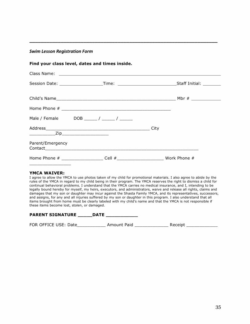
Figure 5: Original format of the content sent for the Spring swim flyer. Safe Swimming Saves Lives And, it’s fun too The reason the Y is referred to as "America's Favorite Swim Instructor" is because we don't just focus on swimming fundamentals but also on building self-confidence, making friends and building the whole person – from the inside out. Spring Break, April ** to ** 30-minute classes, Monday through Friday 6 months to 14 years old YMCA Heated Pool Member Fees: $20 Non-Members Fees: $30 Sessions: 9:15–9:45a.m. 9:50–10:20 a.m. 10:25–10:55a.m. 11:00–11:30a.m. Tadpole _____ Starfish _____ Minnow/Fish____ Seahorse _____ Polliwog _____ Tadpole _____ Guppy _____ Shrimp _____ Starfish _____ Guppy _____ Tadpole _____ Starfish _____ Pre-registration and payment required. Swim Lesson Registration Form Find your class level, dates and times on back. Class Name: Session Date: Time: Staff Initial: Child’s Name______________________________________________ Mbr # Home Phone # __________________________________________ Male / Female DOB _____ / _____ / _____ Address________________________________________ City __________Zip__________________ Parent/Emergency Contact___________________________________________________________ Home Phone # ____________ Cell #__________________ Work Phone # ____________ YMCA WAIVER: I agree to allow the YMCA to use photos taken of my child for promotional materials. I also agree to abide by the rules of the YMCA in regard to my child being in their program. The YMCA reserves the right to dismiss a child for continual behavioral problems. I understand that the YMCA carries no medical insurance, and I, intending to be legally bound hereby for myself, my heirs, executors, and administrators, waive and release all rights, claims and damages that my son or daughter may incur against the Shasta Family YMCA, and its representatives, successors,

29
and assigns, for any and all injuries suffered by my son or daughter in this program. I also understand that all items brought from home must be clearly labeled with my child’s name and that the YMCA is not responsible if these items become lost, stolen, or damaged. PARENT SIGNATURE _____DATE ___________ FOR OFFICE USE: Date _______________ Amount Paid _____________ Receipt ______________Inside Left
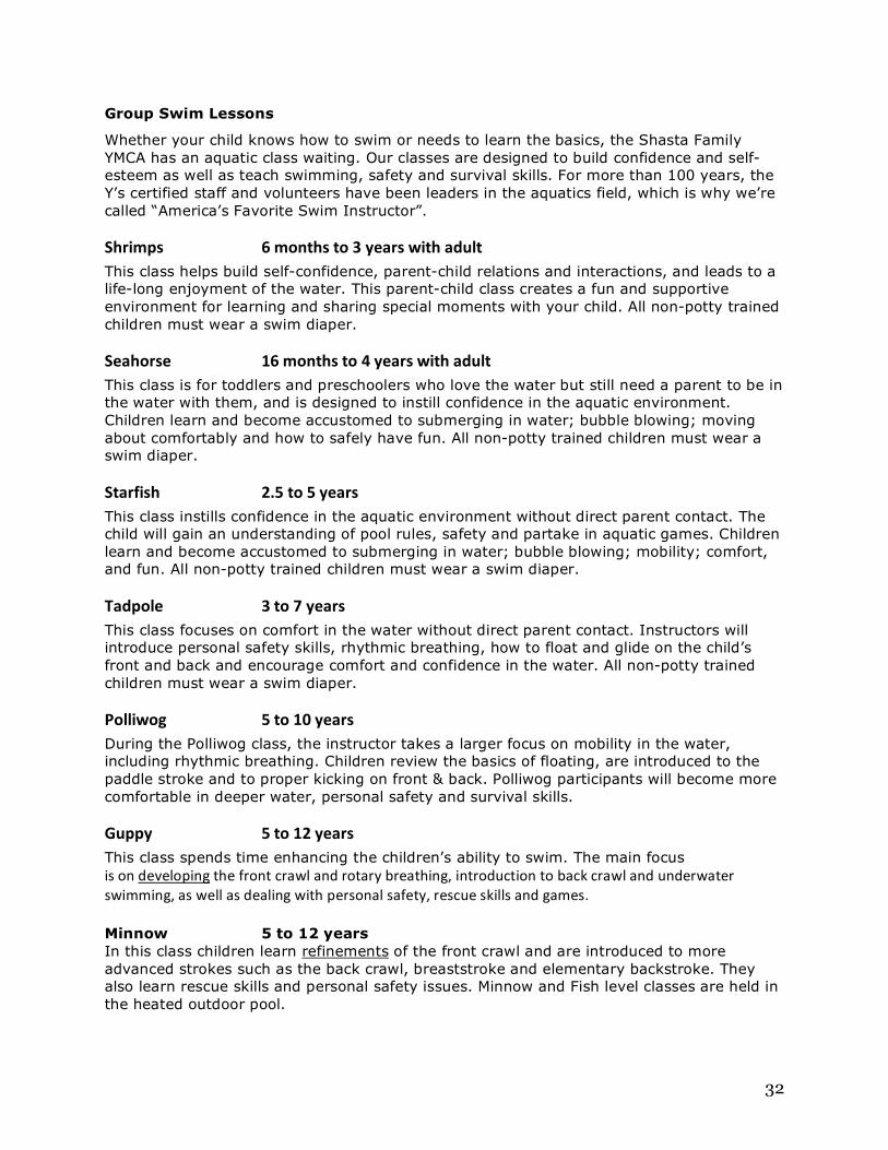
Group Swim Lessons
Whether your child knows how to swim or needs to learn the basics, the Shasta Family YMCA has an aquatic class waiting. Our classes are designed to build confidence and self-esteem as well as teach swimming, safety and survival skills. For more than 100 years, the Y’s certified staff and volunteers have been leaders in the aquatics field, which is why we’re called “America’s Favorite Swim Instructor”.
Shrimps 6 months to 3 years with adult This class helps build self-confidence, parent-child relations and interactions, and leads to a life-long enjoyment of the water. This parent-child class creates a fun and supportive environment for learning and sharing special moments with your child. All non-potty trained children must wear a swim diaper.
Seahorse 16 months to 4 years with adult This class is for toddlers and preschoolers who love the water but still need a parent to be in the water with them, and is designed to instill confidence in the aquatic environment. Children learn and become accustomed to submerging in water; bubble blowing; moving about comfortably and how to safely have fun. All non-potty trained children must wear a swim diaper.
Starfish 2.5 to 5 years This class instills confidence in the aquatic environment without direct parent contact. The child will gain an understanding of pool rules, safety and partake in aquatic games. Children learn and become accustomed to submerging in water; bubble blowing; mobility; comfort, and fun. All non-potty trained children must wear a swim diaper.
Tadpole 3 to 7 years This class focuses on comfort in the water without direct parent contact. Instructors will introduce personal safety skills, rhythmic breathing, how to float and glide on the child’s front and back and encourage comfort and confidence in the water. All non-potty trained children must wear a swim diaper.
Polliwog 5 to 10 years During the Polliwog class, the instructor takes a larger focus on mobility in the water, including rhythmic breathing. Children review the basics of floating, are introduced to the paddle stroke and to proper kicking on front & back. Polliwog participants will become more comfortable in deeper water, personal safety and survival skills.
30
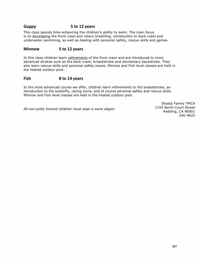
Guppy 5 to 12 years This class spends time enhancing the children’s ability to swim. The main focus is on developing the front crawl and rotary breathing, introduction to back crawl and underwater swimming, as well as dealing with personal safety, rescue skills and games.
Minnow 5 to 12 years
In this class children learn refinements of the front crawl and are introduced to more advanced strokes such as the back crawl, breaststroke and elementary backstroke. They also learn rescue skills and personal safety issues. Minnow and Fish level classes are held in the heated outdoor pool.
Fish 8 to 14 years
In the most advanced course we offer, children learn refinements to the breaststroke, an introduction to the butterfly, racing turns, and of course personal safety and rescue skills. Minnow and Fish level classes are held in the heated outdoor pool.
All non-potty trained children must wear a swim diaper.
Shasta Family YMCA 1155 North Court Street
Redding, CA 96001 246-9622

31
Figure 6: Original format of the content sent for the Summer spring flyer.
Front page
Safe Swimming Saves Lives And, it’s fun too The reason the Y is referred to as "America's Favorite Swim Instructor" is because we don't
just focus on swimming fundamentals but also on building self-confidence, making friends
and building the whole person – from the inside out.
June 6 through August 11
30-minute classes, Monday through Thursday
2-week sessions all summer
6 months to 14 years old
YMCA Heated Pool
Member Fees
$35 (Shrimp & Seahorse = $25)
Non-‐Members Fees
$45 (Shrimp & Seahorse = $30)
Pre-registration and payment required.
Shasta Family YMCA
1155 North Court Street
Redding, CA 96001
246-9622
32
Group Swim Lessons
Whether your child knows how to swim or needs to learn the basics, the Shasta Family YMCA has an aquatic class waiting. Our classes are designed to build confidence and self-esteem as well as teach swimming, safety and survival skills. For more than 100 years, the Y’s certified staff and volunteers have been leaders in the aquatics field, which is why we’re called “America’s Favorite Swim Instructor”.
Shrimps 6 months to 3 years with adult This class helps build self-confidence, parent-child relations and interactions, and leads to a life-long enjoyment of the water. This parent-child class creates a fun and supportive environment for learning and sharing special moments with your child. All non-potty trained children must wear a swim diaper.
Seahorse 16 months to 4 years with adult This class is for toddlers and preschoolers who love the water but still need a parent to be in the water with them, and is designed to instill confidence in the aquatic environment. Children learn and become accustomed to submerging in water; bubble blowing; moving about comfortably and how to safely have fun. All non-potty trained children must wear a swim diaper.
Starfish 2.5 to 5 years This class instills confidence in the aquatic environment without direct parent contact. The child will gain an understanding of pool rules, safety and partake in aquatic games. Children learn and become accustomed to submerging in water; bubble blowing; mobility; comfort, and fun. All non-potty trained children must wear a swim diaper.
Tadpole 3 to 7 years This class focuses on comfort in the water without direct parent contact. Instructors will introduce personal safety skills, rhythmic breathing, how to float and glide on the child’s front and back and encourage comfort and confidence in the water. All non-potty trained children must wear a swim diaper.
Polliwog 5 to 10 years During the Polliwog class, the instructor takes a larger focus on mobility in the water, including rhythmic breathing. Children review the basics of floating, are introduced to the paddle stroke and to proper kicking on front & back. Polliwog participants will become more comfortable in deeper water, personal safety and survival skills.
Guppy 5 to 12 years This class spends time enhancing the children’s ability to swim. The main focus is on developing the front crawl and rotary breathing, introduction to back crawl and underwater swimming, as well as dealing with personal safety, rescue skills and games. Minnow 5 to 12 years In this class children learn refinements of the front crawl and are introduced to more advanced strokes such as the back crawl, breaststroke and elementary backstroke. They also learn rescue skills and personal safety issues. Minnow and Fish level classes are held in the heated outdoor pool.

33
Fish 8 to 14 years In the most advanced course we offer, children learn refinements to the breaststroke, an introduction to the butterfly, racing turns, and of course personal safety and rescue skills.
Minnow and Fish level classes are held in the heated outdoor pool. Inside Right Session Dates and Times these dates are actually June 6 to Aug 11, please change according to a 2011 calendar.

34
All non-potty trained children must wear a swim diaper. Back Grow stronger together. There is limited enrollment, sign up today!
June 6 through August 11
30-minute classes, Monday through Thursday
2-week sessions all summer
6 months to 14 years old
YMCA Heated Pool
Member Fees
$35 (Shrimp & Seahorse = $25)
Non-‐Members Fees
$45 (Shrimp & Seahorse = $30)
Pre-registration and payment required. Sorry no refunds available. All non-potty trained children must wear a swim diaper.
35
__________________________________________________________________
Swim Lesson Registration Form Find your class level, dates and times inside. Class Name: Session Date: Time: Staff Initial:
Child’s Name______________________________________________ Mbr # Home Phone # __________________________________________ Male / Female DOB _____ / _____ / _____ Address________________________________________ City __________Zip__________________ Parent/Emergency Contact___________________________________________________________ Home Phone # ________________ Cell #__________________ Work Phone # ________________ YMCA WAIVER: I agree to allow the YMCA to use photos taken of my child for promotional materials. I also agree to abide by the rules of the YMCA in regard to my child being in their program. The YMCA reserves the right to dismiss a child for continual behavioral problems. I understand that the YMCA carries no medical insurance, and I, intending to be legally bound hereby for myself, my heirs, executors, and administrators, waive and release all rights, claims and damages that my son or daughter may incur against the Shasta Family YMCA, and its representatives, successors, and assigns, for any and all injuries suffered by my son or daughter in this program. I also understand that all items brought from home must be clearly labeled with my child’s name and that the YMCA is not responsible if these items become lost, stolen, or damaged. PARENT SIGNATURE _____DATE ___________ FOR OFFICE USE: Date___________ Amount Paid _____________ Receipt ____________
36
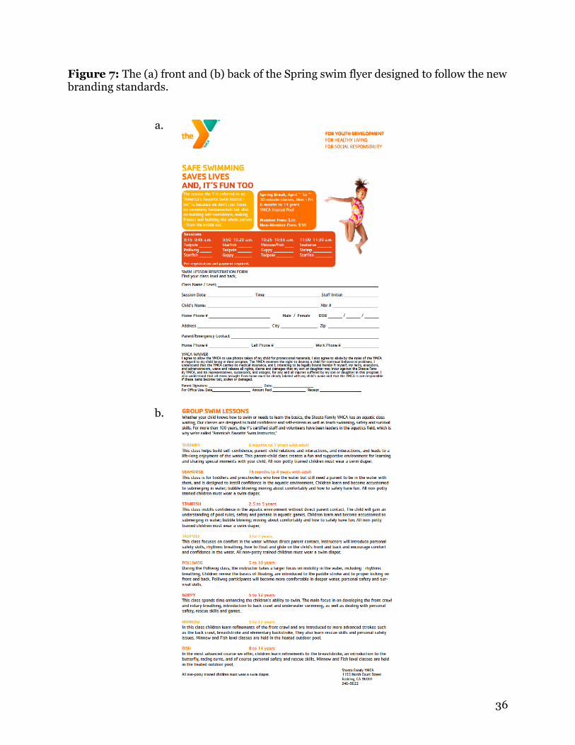
Figure 7: The (a) front and (b) back of the Spring swim flyer designed to follow the new branding standards.
a.
b.

37
Figure 8: The Summer swim brochure designed to follow the new branding standards.

38
Works Cited
Freehling, Bill. “Rebranding of YMCA to Highlight Mission.” Tribune Business News.
Dow Jones Factiva. Downloaded 16 Oct. 2010.
Kieke, Carl. “Known by a Single Letter”. Reporter News 4 (2010). Dow Jones Factiva.
Downloaded16 Oct. 2010.
Lawrence-Turner, Jody. “YMCA Shortens its Name by Three Letters.” The Spokesman-
Review. Dow Jones Factiva. Downloaded 16. Oct. 2010.
Levenson, Harvey. Some Ideas about Doing Research in Graphic Communication.
2001.
Nicoll, Neil. The Y. The Y Look. Chicago, Il, 2010.
The Brand Resource Center. 2010. The Y USA. 17 Oct. 2010.
http://www.ymcaexchange.org.
Thomas J Madden, Kelly Hewett, and Martin S Roth. “Managing Images in Different
Cultures: A Cross-National Study of Color Meanings and Preferences.” Journal of
International Marketing 8 4 (2000): 90-107. ABI/INFORM Global. ProQuest,
Web. 29 Nov. 2010.
Zmuda, Natalie, Andrew Hampp, and Rupal Parekh. “Filling in the Gap of a Rebranding
Disaster.” Advertising Age 81.37 (2010): 2-24. Academic Search Elite. EBSCO.
Web. 2 Dec. 2010.