ranking up by moving out: the effect of the texas top 10% ...ftp.iza.org/dp5026.pdf · ranking up...
TRANSCRIPT

DI
SC
US
SI
ON
P
AP
ER
S
ER
IE
S
Forschungsinstitut zur Zukunft der ArbeitInstitute for the Study of Labor
Ranking Up by Moving Out: The Effect of theTexas Top 10% Plan on Property Values
IZA DP No. 5026
June 2010
Kalena E. CortesAndrew I. Friedson

Ranking Up by Moving Out:
The Effect of the Texas Top 10% Plan on Property Values
Kalena E. Cortes Syracuse University
and IZA
Andrew I. Friedson Syracuse University
Discussion Paper No. 5026 June 2010
IZA
P.O. Box 7240 53072 Bonn
Germany
Phone: +49-228-3894-0 Fax: +49-228-3894-180
E-mail: [email protected]
Any opinions expressed here are those of the author(s) and not those of IZA. Research published in this series may include views on policy, but the institute itself takes no institutional policy positions. The Institute for the Study of Labor (IZA) in Bonn is a local and virtual international research center and a place of communication between science, politics and business. IZA is an independent nonprofit organization supported by Deutsche Post Foundation. The center is associated with the University of Bonn and offers a stimulating research environment through its international network, workshops and conferences, data service, project support, research visits and doctoral program. IZA engages in (i) original and internationally competitive research in all fields of labor economics, (ii) development of policy concepts, and (iii) dissemination of research results and concepts to the interested public. IZA Discussion Papers often represent preliminary work and are circulated to encourage discussion. Citation of such a paper should account for its provisional character. A revised version may be available directly from the author.

IZA Discussion Paper No. 5026 June 2010
ABSTRACT
Ranking Up by Moving Out: The Effect of the Texas Top 10% Plan on Property Values*
Texas engaged in a large-scale policy experiment when it instituted the Top 10% Plan. This policy guarantees automatic admission to their state university of choice for all high school seniors who graduate in the top decile of their high school class. We find evidence that households reacted strategically to this policy by moving to neighborhoods with lower-performing schools, increasing both property values and the number of housing units in those areas. These effects are concentrated among schools that were very low-performing before the change in policy; property values and the number of housing units did not change discontinuously for previously high-performing school districts. We also find evidence that these strategic reactions were influenced by the number of local schooling options available: areas that had fewer school choices showed no reaction to the Top 10% Plan. JEL Classification: H31, H41, H73, I20 Keywords: property values, college choice, affirmative action, Top 10% Plan Corresponding author: Kalena E. Cortes Syracuse University 350 Huntington Hall Syracuse, NY 13244-2340 USA E-mail: [email protected]
* We are indebted to Catherine Kilgore, Property Tax Division, Texas Comptroller of Public Accounts for making the data available for this project. We would like to thank David E. Card, Jeffrey D. Kubik, Christopher Rohlfs, Stuart Rosenthal, Cecilia E. Rouse, Michael J. Wasylenko, and John Yinger for all of their encouragement and most valued advice throughout this research. A special thank you to Julie Berry Cullen for sharing her Stata macro programs for the extraction of the Academic Excellence Indicator System data, the Texas Education Agency, and to Katie Fitzpatrick for excellent research assistance. Also, we would like to thank seminar participants at the University of Kentucky, Syracuse University, Tufts University, Harvard University; and conference participants at the National Tax Association (NTA) and the American Education Finance Association (AEFA). We are thankful to the Maxwell School of Citizenship and Public Affairs at Syracuse University for providing an internal grant in support of this project. Institutional support from the Center of Policy Research at the Maxwell School of Citizenship and Public Affairs, Harvard University, and the National Bureau of Economic Research are also gratefully acknowledged. Research results, conclusions, and all errors are naturally our own.

2
1. Introduction
Texas engaged in an unforeseen large-scale experiment when it replaced the use of
affirmative action policies in its college admissions with the Top 10% Plan admissions policy. The
Top 10% Plan guarantees admission into any of Texas’ public universities to all high school seniors
who finish within the top decile of their graduating class. This includes the most selective state
universities: The University of Texas at Austin and Texas A&M at College Station. For school
districts that had poor acceptance rates to postsecondary institutions this admissions policy suddenly
provided a valuable local amenity: improved access.
In this study, we analyze the effect of the Top 10% Plan on property values. More
specifically, we analyze whether the change in admissions policies led to an increase of the value of
residential homes in school districts with low-performing high schools relative to school districts
with higher-performing high schools. School districts with low-performing high schools are
expected to be the areas where property values are most responsive to the policy change because it is
at these schools where access to selective public colleges was improved the most. We expect to find
little reaction to the Top 10% Plan in areas with high-quality schools. Because these high schools
already place far more than their top 10% of graduates in highly ranked postsecondary institutions,
the Top 10% Plan would do little to increase access.
Using a difference-in-differences methodology, we find that, as a consequence of the change
in admissions policy, residential property values in the areas served by schools in the bottom quintile
of school quality grew more rapidly relative to areas served by schools in the 2nd quintile (second
from the bottom). We also compare the 4th quintile with the top quintile and find that the growth in
home values did not occur in the top end of the school quality distribution. Moreover, we find that
this relative growth in property values found in the bottom quintile of school quality is a result of
both a bidding up of home prices in the existing housing stock and an increase in the number of
3
housing units available (likely through construction). We do this by also analyzing the quantity of
housing.
Furthermore, we observe that changes in property values are sensitive to the number of
schooling options locally available. If a household is going to react strategically to the Top 10% Plan
by moving, then moves would be easier in areas with a large number of local schooling options (e.g.,
a shorter distance to find a new school would not require finding a new job). Specifically, counties
with a relatively high Herfindahl-Hirschman Index (HHI) for schooling would show little to no
reaction to the change in policy, whereas counties with a relatively low HHI for schooling would
show the greatest reaction to the policy change. This is precisely the case: we find that the
disproportionate growth of property values in the bottom quintile of school quality relative to the
2nd quintile did not occur in counties that were more monopolistic, but did occur in counties that
were more competitive.
Lastly, our analysis estimates that the Top 10% Plan had a rate of return of 4.9 percent in
relative average property value gains of the lowest quintile of school quality compared to the 2nd
quintile of school quality. As property values vary greatly from district to district before the policy
shift and property tax rates also vary greatly it is easy to see how the Top 10% Plan had a powerful
impact not only on admissions decisions, but also on school finance and local taxation decisions.
The paper is organized as follows: Section 2 presents background on the Top 10% Plan and
a literature review; Section 3 presents a conceptual model of sorting and bidding; Section 4 outlines
the various empirical strategies used in the paper; Section 5 describes the data used in the analysis
and sample characteristics; Section 6 reports and discusses our results; and Section 7 concludes.
4
2. Background of the Top 10% Plan and Literature Review 2.1 The Top 10% Plan
The 5th Circuit Court’s decision in Hopwood v. University of Texas Law School judicially
banned the use of race as a criterion in admissions decisions in all public postsecondary institutions
in Texas.1 The end of affirmative action admissions policies was overwhelmingly felt, especially at
the two most selective public institutions, The University of Texas at Austin and Texas A&M
University at College Station, where the number of minority enrollees plummeted (Tienda et al.
2003; Bucks 2004; Walker and Lavergne 2001). In response to this ruling, Texas passed the H.B.588
Law on May 20, 1997–more commonly known as the Top 10% Plan. The Top 10% Plan guarantees
automatic admission to any public university of choice to all seniors who graduate in the top decile
of their graduating high school class.2,3 This is similar to other states’ percent plans (e.g., California,
Florida, and Washington), but is unique in the sense that it gives students the choice of which public
institution they would like to attend rather than assigning the institution outright.4
Proponents of the plan believed that it would restore campus diversity because of the high
degree of segregation among high schools in Texas. Their logic was that the number of minority
students who would be rank-eligible under the Top 10% Plan would be sufficient to restore campus
diversity throughout the state. Even though the goal of the Top 10% Plan was to improve access
for disadvantaged and minority students, the use of a school-specific standard to determine eligibility
may have led to some unintended effects if households responded strategically. In a recent study,
1 See Hopwood v. University of Texas Law School 78 F.3d 932, 944 (5th Cir. 1996). 2 In 2009, Texas placed some limits on student choice: the University of Texas at Austin is now allowed to cut off the proportion of Top 10% Plan students in a given freshman class at 75 percent. 3 Although private universities are duty-bound by the Hopwood ruling, they are not subject to the automatic admissions guarantee (Tienda et al. 2003). 4 For instance, students in California eligible for admission to the University of California system are determined on a statewide basis using a standardized criterion, and the allocation of students to specific campuses is a system wide decision. The top 4% of local schools not included in the statewide admissions are also assigned a University of California institution. Similarly, the Talented 20 Plan in Florida guarantees the top 20% of public high school graduates admission to a college, but students are assigned an institution.

5
Cullen, Long, and Reback (2009) find that students increased their chances of being in the top 10%
by choosing a high school with lower-achieving peers. They analyze student mobility patterns
between the 8th and 10th grades before and after the policy change, and conclude that the change in
admissions policies in Texas did indeed influence the high school choices of students. This goes a
long way towards explaining the changes in enrollment probabilities for minority and non-minority
students found in Tienda et al. (2003), Bucks (2003), Walker and Lavergne (2001), Niu et al. (2006),
and Cortes (2010).
If households are moving strategically between school districts then their valuation of those
school districts must have changed due to the policy. Our analysis pushes this idea further by
looking for evidence of this change through households’ maximum willingness to pay for housing
services. This is reflected in changes in property values in school districts whose desirability
changed when the Top 10% Plan was implemented.
2.2 Related Literature The Top 10% Plan changed how much certain households are willing to pay for school
district quality through their housing prices. This sort of reaction is best illustrated with bidding and
sorting models, which are a part of the local public finance literature. This branch of the literature is
widely seen as starting with Tiebout (1956) who put forth the idea that households shop for
property tax and public service packages through their choice of location, and compete for entry
into communities with more desirable packages by bidding on housing. This forms the cornerstone
of bidding and sorting models in which different income and taste classes of households sort
themselves based on their maximum willingness to pay for a quality adjusted unit of housing in

6
communities with different tax and service packages.5 Ross and Yinger (1999) provide a discussion
of this class of model as well as a review of the capitalization literature that analyzes how differing
property tax or public service levels are reflected in housing prices.
The part of this literature that is germane to our analysis deals with estimating the
capitalization of school district characteristics. The main empirical hurdle with these studies is
disentangling the capitalization of school district characteristics from the capitalization of
neighborhood characteristics and taxes because these attributes are also spatially linked. A popular
solution to this empirical hurdle is to use school districts that have more than one school in them
and identify capitalization effects using variation across boundaries inside of the school district.
Variations on this strategy have been used by Bogart and Cromwell (1997), Black (1999), as well as
Weimer and Wolkoff (2001).
Another possibility is to use panel data and difference out the undesired effects; this allows
analysis of the capitalization of school district characteristics that vary over time. Barrow and Rouse
(2004) use school district fixed effects to see how differences in state aid to schools are capitalized
into property values. Their identification strategy is similar to Clapp, Nanda and Ross (2008) who
use census tract fixed effects to study the capitalization of differences in state standardized test
scores and school district demographics over time. Also, a study by Figlio and Lucas (2004) uses
repeat sales data, which allows for property level fixed effects, to look at the effect of school report
card grades on property values.
Our identification strategy is closer to the second set of papers: we tackle neighborhood and
tax effects by differencing over time as part of our difference-in-differences estimator. However,
our analysis is different in that we are not interested in the level of public service capitalization into
5 Households sort along income for both property taxes and public services, but they only sort along preferences for public services. This is because regardless of tastes any household is willing to pay a maximum of one dollar to avoid one dollar of taxes.

7
property values as much as we are interested in how property values change in response to a policy
shift. There are not a lot of studies that take such an approach, the only paper that we are aware of
is by Reback (2005), who analyzes how property values respond to the introduction of a school
choice program in Minnesota.
3. Theoretical Framework: The Effect of the Top 10% Plan on Property Values
This section presents the conceptual model that sheds light on our identification strategy.
Our hypothesis is that after the implementation of the Top 10% Plan property values will increase in
lower-quality school districts relative to higher-quality school districts. To explain why we expect
this to be the case we will briefly introduce a model of bidding and sorting. Following Ross and
Yinger (1999), we make the following assumptions:6
(A.1) Household utility depends on consumption of housing, public services (in our case
school district quality), and a composite good. Furthermore we will assume that the
households utility function takes on a Cobb-Douglas functional form, this will make the
specific effect of the Top 10% Plan easier to see algebraically.
(A.2) Every household falls into a distinct income and taste class of which there are a finite
number.
(A.3) Households are perfectly mobile homeowners.
(A.4) All households in the same school district receive the same level of school district
quality, and the only way to gain access to a school district is to reside within its borders.
6 For a complete treatment of this class of models as well as a review of the relevant bidding and sorting literature refer to Ross and Yinger (1999).
8
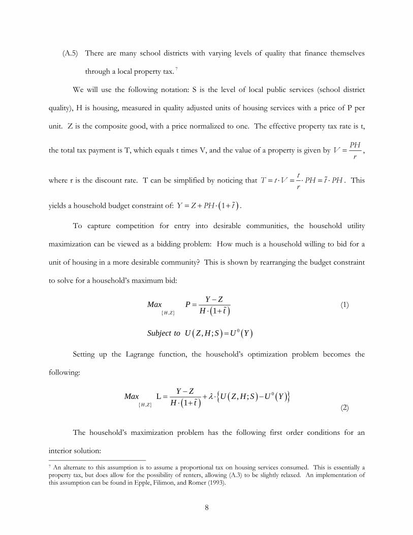
(A.5) There are many school districts with varying levels of quality that finance themselves
through a local property tax. 7
We will use the following notation: S is the level of local public services (school district
quality), H is housing, measured in quality adjusted units of housing services with a price of P per
unit. Z is the composite good, with a price normalized to one. The effective property tax rate is t,
the total tax payment is T, which equals t times V, and the value of a property is given by PH
Vr
,
where r is the discount rate. T can be simplified by noticing that t
T t V PH t PHr
. This
yields a household budget constraint of: 1Y Z PH t .
To capture competition for entry into desirable communities, the household utility
maximization can be viewed as a bidding problem: How much is a household willing to bid for a
unit of housing in a more desirable community? This is shown by rearranging the budget constraint
to solve for a household’s maximum bid:
,
1
H Z
Y ZMax P
H t (1)
0 , ; Subject to U Z H S U Y
Setting up the Lagrange function, the household’s optimization problem becomes the
following:
0
,
L , ;1
H Z
Y ZMax U Z H S U Y
H t (2)
The household’s maximization problem has the following first order conditions for an
interior solution: 7 An alternate to this assumption is to assume a proportional tax on housing services consumed. This is essentially a property tax, but does allow for the possibility of renters, allowing (A.3) to be slightly relaxed. An implementation of this assumption can be found in Epple, Filimon, and Romer (1993).

9
2: 0
1
H
L Y ZU
H H t (3)
1
: 01
Z
LU
Z H t (4)
These results allow us to solve for the Lagrange multiplier, which will be needed later to get
comparative statics via the envelope theorem. There are two possible solutions for the Lagrange
multiplier. Using the first order condition with respect to housing, H, the solution is:
2 1
H
Y Z
H t U (5)
And using the first order condition with respect to the composite good, Z, the solution is:
1
1
ZH t U (6)
These are both apt expressions for the Lagrange multiplier, λ, however, the second
expression lends itself to ease of interpretation in the next step. If we recognize that school district
quality, S, is a parameter in this setup, then we can solve for the impact of S on the bid P by applying
the envelope theorem to equation (1):
S SP U (7)
We can then substitute in equation (6) for λ to get,
* *
1
1 1
S
SZ
MBUP U H t H t (8)

10
This is greatly simplified by our use of the second expression for λ, since S
Z
UU is the
marginal benefit of a unit of S (as the price of a unit of Z has been normalized to one). SP is an
expression for the slope of a bid-function (i.e., maximum willingness to pay for a quality adjusted
unit of housing) with respect to S for an arbitrary income and taste class. If we notice that the value
of this slope will be different for different income and taste classes then we can display a group of
bid-functions as shown in Figure 1.
Hence, B1, B2, and B3 represent bid-functions for three different income and taste classes.
Since housing is purchased by the highest bidder, the market bid-function is the upper envelope of
the bid-functions of all income and taste classes. To look at the theoretical impact of the Top 10%
Plan, consider a Cobb-Douglas utility function:
, ; ln ln 1 ln U Z H S S Z H 0 < α, β < 1, α + β < 1 (9)
The Top 10% Plan makes school district quality less valuable to a specific income and taste
class, namely households whose children would now benefit from having peers who perform more
poorly. This can be viewed as a decrease in the parameter α, which captures the household’s taste
for school district quality. Hence, we can find the effect of the Top 10% Plan on housing prices of
a change in the parameter α by substituting equation (9) into equation (1) and then applying the
envelope theorem:
*
**
ln lnln ln
1
Z
S HP S H
H t U (10)
Equation (10) is positive if S > H, negative if S < H, and zero when the two are equivalent.
Suppose B2 is the bid-function for the income and taste class that will be affected by the Top 10%

11
Plan, then as shown in Figure 2, B2’ is the income and taste class bid function after the Top 10%
Plan is enacted.
Since S and P are both in per quality adjusted unit of housing terms, there exists some *S
such that there is one unit of school district quality per unit of housing. For school districts with
higher quality than *S the affected income and taste class will have a smaller bid after the policy is
enacted, and for school districts with lower quality than *S the affected income and taste class will
have a larger bid after the policy is enacted. If we compare the upper envelope of B1, B2, and B3
with the upper envelope of B1, B2’, and B3 the impact of the Top 10% Plan is clear. The two
wedges to either side of *S show the potential distortion in housing prices caused by the policy
change. It should be noted that the part of the B2’ bid function that is mapped to *S will not
necessarily be part of the market bid-function envelope. This means that the part of the post-policy
market bid-function that comes from the affected income and taste class could be either greater or
less than it was prior to the policy change. That is, housing prices will solely increase on the affected
portion of the bid-function if *S is to the right of or equal to the point where B2’ and B3 intersect,
whereas housing prices will solely decrease on the affected portion if *S is to the left of or equal to
the point where B2’ and B1 intersect. Which case prevails does not change the qualitative result of
the policy change. The Top 10% Plan makes school districts of lower quality than *S increase in
value relative to those school districts of higher quality than *S . Whether the relative gain is
because of an increase in value for low-quality school districts, a decrease in value for high-quality
school districts, or some amalgam of the two is uncertain.
Realistically the Top 10% Plan will influence multiple household types all at the same time.
This can be visualized as an overall flattening of the distribution of bid functions. Households that
have more to gain by improved access will just flatten their bid functions to a larger extent. Though

12
there is some uncertainty as to the specific mechanism by which the property values change,
evidence presented by Cullen, Long, and Reback (2009) points towards changes in property values
being driven by households making strategic moves between school districts. However, it is also
possible that the relative change in property values is driven by households that change their
willingness to pay for housing in their current district. These households could change residence
without leaving the district and have their new willingness to pay capitalized into their property’s
value.
4. Empirical Strategies and Model Specification 4.1 Difference-in-Differences Analysis
We use a difference-in-differences analytic approach to study the effect of the Top 10% Plan
on property values. We compare changes in home values before and after the Top 10% Plan was
enacted by differencing property values in the pre-policy period (the 1994-95 school year through
the 1996-97 school year) from property values in the post-policy period (the 1997-98 school year
through the 2005-06 school year). This removes any effects that are constant between the pre and
post-periods such as omitted neighborhood effects. The second difference is between the 1st and 2nd
quintiles of school quality. This should yield the net effect of the Top 10% Plan on home values in
the 1st quintile relative to the 2nd quintile. Our identification strategy hinges on the assumption that
there were no other exogenous factors that could have caused these differences in this time frame.
Several models of the following form are estimated by ordinary least squares (OLS) with
interest on the parameter , the difference-in-differences estimator,
ln t i t i tjtY Post Treatment Post Treatment Ltrend
it kt jtX C (11)
13
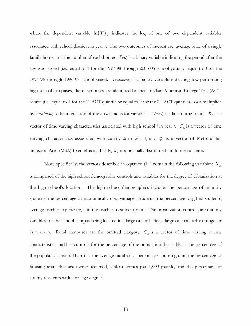
where the dependent variable lnjt
Y indicates the log of one of two dependent variables
associated with school district j in year t. The two outcomes of interest are: average price of a single
family home, and the number of such homes. Postt is a binary variable indicating the period after the
law was passed (i.e., equal to 1 for the 1997-98 through 2005-06 school years or equal to 0 for the
1994-95 through 1996-97 school years). Treatmenti is a binary variable indicating low-performing
high school campuses, these campuses are identified by their median American College Test (ACT)
scores (i.e., equal to 1 for the 1st ACT quintile or equal to 0 for the 2nd ACT quintile). Postt multiplied
by Treatmenti is the interaction of these two indicator variables. Ltrendt is a linear time trend. itX is a
vector of time varying characteristics associated with high school i in year t. ktC is a vector of time
varying characteristics associated with county k in year t, and is a vector of Metropolitan
Statistical Area (MSA) fixed effects. Lastly, jt is a normally distributed random error term.
More specifically, the vectors described in equation (11) contain the following variables: itX
is comprised of the high school demographic controls and variables for the degree of urbanization at
the high school’s location. The high school demographics include: the percentage of minority
students, the percentage of economically disadvantaged students, the percentage of gifted students,
average teacher experience, and the teacher-to-student ratio. The urbanization controls are dummy
variables for the school campus being located in a large or small city, a large or small urban fringe, or
in a town. Rural campuses are the omitted category. ktC is a vector of time varying county
characteristics and has controls for the percentage of the population that is black, the percentage of
the population that is Hispanic, the average number of persons per housing unit, the percentage of
housing units that are owner-occupied, violent crimes per 1,000 people, and the percentage of
county residents with a college degree.

14
The difference-in-differences approach requires that the treatment and control groups have
similar attributes with the exception of the characteristic that places one group under the influence
of the policy change and excludes the other. Our data does not always match up perfectly on
observable characteristics, and this emphasizes the importance of the inclusion of the controls and a
linear time trend. Omitted variables remain a potential source of bias, but as long as their effect is
the same before and after the policy shift their effects will difference out.
Our theoretical model from the previous section cannot tell us whether the relative price
change is driven by low or high-quality school districts, and neither can the difference-in-differences
estimator. However, the difference-in-differences estimator has some nice properties when faced
with some highly probable types of misspecification. Incorrect specification of *S the border
between the treatment and control groups will bias the difference-in-differences estimator towards
zero. Moreover, incorrectly specifying the bottom edge of the treatment group or the top edge of
the control group will also bias the difference-in-differences estimator towards zero.
Also, high school switching could realistically happen between any two schools of
differential quality in the lower end of the school quality distribution. Not all switches will be from
the 2nd ACT quintile of school quality to the bottom ACT quintile of school quality – there is a
possibility for intra-quintile switches. However, if we assume that all switches inspired by the policy
change are from higher to lower-quality schools, then failing to capture price changes coming from
these intra-quintile switches will bias the difference-in-differences estimation towards finding no
effect from the legislative change.
We will also run the difference-in-differences analysis for the top two ACT quintiles of the
school quality distribution. High schools with top levels of academic performance should be placing
much more than their top 10% of graduates into institutions of quality and as such should be largely
unaffected by the implementation of the Top 10% Plan. If in the top end of the school quality
distribution, relatively “poor” performing school districts (the 4th ACT quintile) are gaining in

15
property value relative to better performing school districts (the 5th ACT quintile), then our
proposed mechanism for property value changes in the bottom end of the school quality
distribution would be called into serious doubt. Such a result would show that migration from
higher to relatively “lower” quality school districts occurred in a part of the school quality
distribution where the Top 10% Plan should have no effect, making it likely that any changes
observed in the bottom part of the school quality distribution were caused by some other
phenomenon all together. Our hypothesis will be greatly strengthened if there are noticeable
differences-in-differences between the 2nd and the 1st ACT quintiles but not between the 5th and 4th
ACT quintiles.
4.2 Herfindahl-Hirschman Index Analysis
Our second estimation strategy investigates if the number of schooling options available
influenced the effect of the Top 10% Plan on property values. If it is costly to change school
districts, which is the proposed mechanism for the property value changes, then it is less likely that
households will react to the policy change. Therefore, if there are more local schooling options then
it should be less costly to change school districts and there should be a larger reaction. For example,
a move across the state to find a more strategic school seems unlikely because of the costs of finding
new employment for the parents. However, a move of a smaller distance such as a couple blocks
seems much more reasonable.8
One approach is to measure how concentrated the schooling industry is at the county level.
This can be done by calculating the Herfindahl-Hirschman Index (HHI) for each county,
2i
i
HHI s (12)
8 It is not necessary for the household to move because of the policy change to get a resulting change in property values. A change in values may be driven by households that were already planning to move and simply found lower-performing schools to suddenly be more desirable.
16
where is is the market share of each high school i in county k. For schooling, a measure of the
market share is the number of students at the high school divided by the total number of students in
the county. A HHI value close to 1 indicates a more monopolistic county, whereas a HHI value close
to 0 indicates a more competitive county.
To analyze whether the number of schooling options available influenced the effect of the
Top 10% Plan on property values, we interact the pre-policy county level HHI measure with our
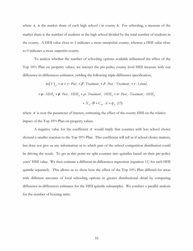
difference-in-differences estimator, yielding the following triple-difference specification,
ln t i t i tjtY Post Treatment Post Treatment Ltrend
kitkiktk HHITreatmentPostHHITreatmentHHIPostHHI
jtktit CX (13)
where is now the parameter of interest, estimating the effect of the county HHI on the relative
impact of the Top 10% Plan on property values.
A negative value for the coefficient would imply that counties with less school choice
showed a smaller reaction to the Top 10% Plan. This coefficient will tell us if school choice matters,
but does not give us any information as to which part of the school competition distribution could
be driving the result. To get at this point we split counties into quintiles based on their pre-policy
years’ HHI value. We then estimate a different-in-differences regression (equation 11) for each HHI
quintile separately. This allows us to show how the effect of the Top 10% Plan differed for areas
with different amounts of local schooling options in greater distributional detail by comparing
difference-in-differences estimates for the HHI quintile subsamples. We conduct a parallel analysis
for the number of housing units.

17
5. Data Sources and Sample Characteristics 5.1 Data Sources
The data for this study was compiled from five sources: the Texas Comptroller Property Tax
Division (TCPTD); the Academic Excellence Indicator System (AEIS) from the Student Assessment
Divisions of the Texas Education Agency; the National Center for Education Statistics (NCES); the
U.S. Census Bureau; and lastly, the Federal Bureau of Investigation’s Uniform Crime Reporting
(UCR) database. The TCPTD, AEIS, and NCES all utilize Independent School District unique
identification numbers that are identical across datasets and enable the linkage of variables in each of
these datasets to their specific high school campuses.
The TCPTD database, contains information on total appraised home values for all school
districts from 1994-95 to 2005-06, which covers both pre and post-policy years. This value is an
aggregation of all residential homes that are served by a specific school district. Our analysis uses
property values for single family homes only. This excludes multiple family dwellings and
condominiums as well as all non-residential properties from our analysis.
Property appraisals in Texas follow a specific procedure. A property must be reappraised by
its appraisal district at least once every three years, but this can be done more frequently. If a
property is sold in a given year, then the sale price of the property is automatically used as the new
appraised value of the property. For properties that do not sell, they are assigned a value based on
how their characteristics compare to the characteristics of properties that were sold recently. The
tax assessors generate a model based on recent sales and then use that model to predict what the
assessment should be for the unsold properties. There are also limits on how much an appraisal
can increase over the previous year’s appraisal.9 Given how Texas calculates its home appraisals our
data accounts fairly well for property value changes as reflected by housing transactions.
9 An appraisal may not increase to more than the lesser of:
18
The TCPTD data also has information on the number of residential housing units in each
school district. We use this information as one of our dependent variables, again restricting our
attention to only single family homes. Our main dependent variable of interest, average price of a
residence is obtained by dividing the aggregate value of all residential homes in a school district by
the number of housing units in that district. All home values are in terms of 1990 dollars.
We use the AEIS data in the pre-policy years (i.e., 1994-95 through 1996-97) to identify low-
performing high school campuses using the median American College Test (ACT) scores of the
graduating class. The mean of the median ACT scores in the pre-policy years is then used to sort
campuses into quintiles. This allows for the identification of poor-performing schools that are most
likely to be targeted by parents who chose to move in order to increase the chances of their children
being rank-eligible for automatic admission. While some states use the ACT as their assessment
measure for the No Child Left Behind Act (NCLB) to hold schools accountable, this is not the case
in Texas. Texas has its own state assessment test. Thus, using the ACT scores allows us to more
reliably identify low-performing schools relative to higher-performing schools.10
The AEIS data also contains detailed information on student and teacher demographic
variables; this allows us to calculate the percentage of minority students, the percentage of
economically disadvantaged students (i.e., those who qualify for reduced price school lunch), the
percentage of students that participate in a gifted program, average teacher experience, and the
teacher-to-student ratio at a given high school. Our analysis is restricted to “regular” high schools;
any alternative or magnet high schools as well as any juvenile delinquency centers are dropped from
the analytic sample.
a) The sale price of the property if it sold that year, or b) 110 percent of the previous year’s appraisal plus the market value of any new improvements on the property.
10 Our analysis was also conducted using the Scholastic Aptitude Test (SAT) scores and found similar results to that of the ACT analysis.

19
The NCES data link high school campuses to the urbanization level of their surrounding
area. For the purposes of this study, campuses are considered to be located in a large city if they are
in the central city of a Consolidated Metropolitan Statistical Area (CMSA) with a population greater
than 250,000. Campuses are considered to be located in a small city if they are in the central city of
a CMSA with a population less than 250,000. Campuses located in large and small fringes refer to
addresses that are within the CMSAs for large and small cities respectively, but are not located in the
central city of that CMSA. Campuses located in towns are in areas that are not incorporated into the
above definitions and also have a population greater than or equal to 2,500. All other campuses are
considered to be located in a rural setting, which is the omitted category in our analysis.
In addition, we use the U.S. Decennial Census and UCR data to merge in additional controls
needed in the analysis. We use the 1990 and 2000 U.S. Decennial Censuses to create county-level
variables to capture the trends in the percentage of the population that is black, the percentage of
the population that is Hispanic, the average persons per housing unit, and the percentage of housing
units that are owner-occupied. Lastly, the UCR database provides us with county-level variables on
violent crimes (i.e., murder, rape, robbery, and assault).11 Combining the UCR data with the Census
data allows us to use estimates of the county-level violent crime rate for the school years of interest.
5.2 Sample Characteristics
Table 1 reports means and standard deviations for the variables used in our analysis. It also
reports the data for the relevant subsamples. For our main specifications the subsample of interest
is the bottom two quintiles of school quality with regards to the ACT score distribution.12 The 1st
quintile (bottom) serves as the treatment group and the 2nd quintile as the control group. The 1st
11 There are several measures of crime available in the UCR database. We use violent crimes because they are largely not financially motivated and thus exogenous with respect to local property values, as opposed to an alternate measure of property crimes (grand theft auto, larceny, etc.), which are highly endogenous. 12 Appendix Table A1 shows descriptive statistics for all of the ACT quintiles. Table A1 provides the statistics for the quintiles used in the analysis of the top two quintiles as well for the middle quintile, which is not used in any of the analysis.
20
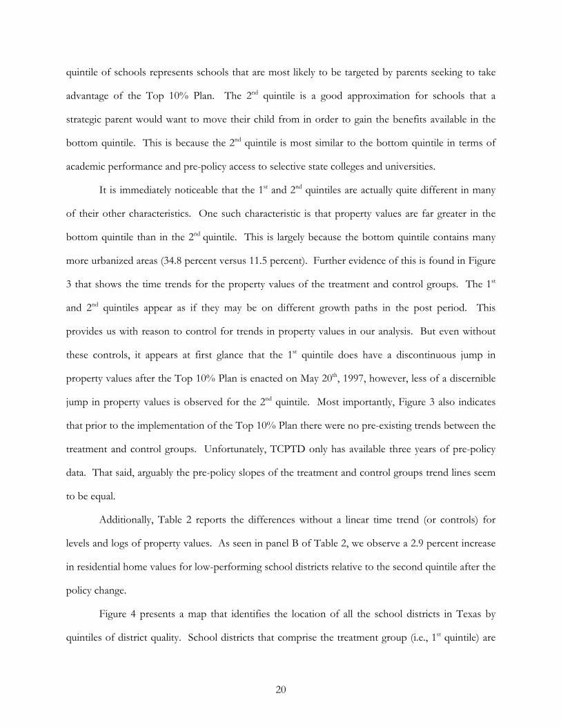
quintile of schools represents schools that are most likely to be targeted by parents seeking to take
advantage of the Top 10% Plan. The 2nd quintile is a good approximation for schools that a
strategic parent would want to move their child from in order to gain the benefits available in the
bottom quintile. This is because the 2nd quintile is most similar to the bottom quintile in terms of
academic performance and pre-policy access to selective state colleges and universities.
It is immediately noticeable that the 1st and 2nd quintiles are actually quite different in many
of their other characteristics. One such characteristic is that property values are far greater in the
bottom quintile than in the 2nd quintile. This is largely because the bottom quintile contains many
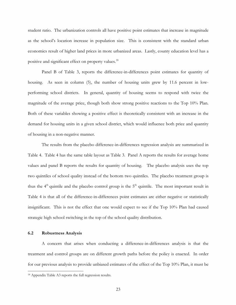
more urbanized areas (34.8 percent versus 11.5 percent). Further evidence of this is found in Figure
3 that shows the time trends for the property values of the treatment and control groups. The 1st
and 2nd quintiles appear as if they may be on different growth paths in the post period. This
provides us with reason to control for trends in property values in our analysis. But even without
these controls, it appears at first glance that the 1st quintile does have a discontinuous jump in
property values after the Top 10% Plan is enacted on May 20th, 1997, however, less of a discernible
jump in property values is observed for the 2nd quintile. Most importantly, Figure 3 also indicates
that prior to the implementation of the Top 10% Plan there were no pre-existing trends between the
treatment and control groups. Unfortunately, TCPTD only has available three years of pre-policy
data. That said, arguably the pre-policy slopes of the treatment and control groups trend lines seem
to be equal.
Additionally, Table 2 reports the differences without a linear time trend (or controls) for
levels and logs of property values. As seen in panel B of Table 2, we observe a 2.9 percent increase
in residential home values for low-performing school districts relative to the second quintile after the
policy change.
Figure 4 presents a map that identifies the location of all the school districts in Texas by
quintiles of district quality. School districts that comprise the treatment group (i.e., 1st quintile) are

21
shown in blue, whereas school districts that comprise the control group (i.e., 2nd quintile) are shown
in brown.13 All other school districts in the 3rd, 4th, and 5th quintiles are shown in green. The
locations of Texas’ flagship universities (i.e., UT-Austin and Texas A&M, whose locations are
marked by stars), as well as several other competitive universities are shown in Figure 5.14
The school districts that make up the treatment and control groups are geographically
clustered around the Rio Grande and the Eastern part of the state. The specific clustering of the
bottom two quintiles of school quality makes sense if one considers the racial residential patterns in
Texas. Figure 6 displays the percentage of minorities (total, blacks, and Hispanics) in the population
by school districts in 1990.15 Hispanics reside predominately in South Texas, whereas blacks reside
predominantly in the Eastern part of the state (close to the South). Figure 6 also illustrates the high
degree of segregation that still exists in Texas.16 Thus, it is no coincidence that the bottom two
quintiles of school quality match up quite well with Texas’ demographic racial patterns, and that
Hispanics and blacks predominantly reside in (and attend) low-performing school districts.
6. Discussion of Results 6.1 Difference-in-Differences Analysis
The results for the regression adjusted difference-in-differences analysis are summarized in
Table 3 for the two outcomes of interest: log average price (shown in panel A) and log number of
13 All maps are generated using the program ArcMap. 14 Only the locations of the 16 competitive institutions are shown in Figure 5. There are a total of 35 four-year public universities in Texas, of these 35 universities 16 are regarded as being competitive universities. The classification of four-year public universities into competitive and less competitive institutions is based on an independent college ranking measure: Barron’s Profiles of American Colleges 25th Edition (2003). 15 Data used in the maps shown in Figure 6 are from the 1990 U.S. Census. The same maps were also generated using the 2000 U.S. Census and the exact racial residential patterns for Hispanic and blacks were seen using the 2000 U.S. Census data. The default classification method in ArcMap called natural breaks is used to display the data. The natural breaks method identifies breakpoints between classes using a statistical formula (Jenk’s optimization). Jenk’s method (1967) minimizes the sum of the variance within each of the classes. Natural breaks finds groupings and patterns inherent in the data. 16 A very common measure of segregation is the entropy index (H), which is a multi-group measure of evenness indicating the overall degree that Hispanic, black, Asian, and non-Hispanic white populations are separated from one another. Texas’s statewide entropy index is 0.33, this level of entropy classifies Texas as a state with high levels of school segregation (Tienda and Niu 2006; Reardon and Yun 2001).
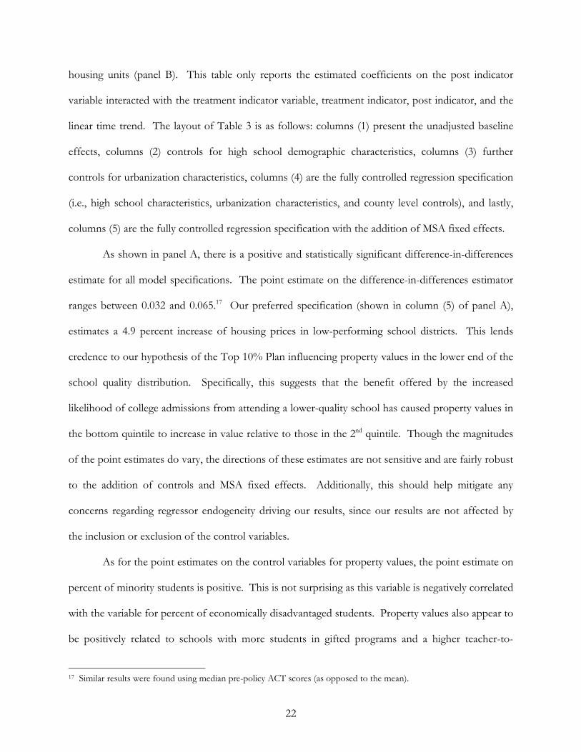
22
housing units (panel B). This table only reports the estimated coefficients on the post indicator
variable interacted with the treatment indicator variable, treatment indicator, post indicator, and the
linear time trend. The layout of Table 3 is as follows: columns (1) present the unadjusted baseline
effects, columns (2) controls for high school demographic characteristics, columns (3) further
controls for urbanization characteristics, columns (4) are the fully controlled regression specification
(i.e., high school characteristics, urbanization characteristics, and county level controls), and lastly,
columns (5) are the fully controlled regression specification with the addition of MSA fixed effects.
As shown in panel A, there is a positive and statistically significant difference-in-differences
estimate for all model specifications. The point estimate on the difference-in-differences estimator
ranges between 0.032 and 0.065.17 Our preferred specification (shown in column (5) of panel A),
estimates a 4.9 percent increase of housing prices in low-performing school districts. This lends
credence to our hypothesis of the Top 10% Plan influencing property values in the lower end of the
school quality distribution. Specifically, this suggests that the benefit offered by the increased
likelihood of college admissions from attending a lower-quality school has caused property values in
the bottom quintile to increase in value relative to those in the 2nd quintile. Though the magnitudes
of the point estimates do vary, the directions of these estimates are not sensitive and are fairly robust
to the addition of controls and MSA fixed effects. Additionally, this should help mitigate any
concerns regarding regressor endogeneity driving our results, since our results are not affected by
the inclusion or exclusion of the control variables.
As for the point estimates on the control variables for property values, the point estimate on
percent of minority students is positive. This is not surprising as this variable is negatively correlated
with the variable for percent of economically disadvantaged students. Property values also appear to
be positively related to schools with more students in gifted programs and a higher teacher-to-
17 Similar results were found using median pre-policy ACT scores (as opposed to the mean).
23
student ratio. The urbanization controls all have positive point estimates that increase in magnitude
as the school’s location increase in population size. This is consistent with the standard urban
economics result of higher land prices in more urbanized areas. Lastly, county education level has a
positive and significant effect on property values.18
Panel B of Table 3, reports the difference-in-differences point estimates for quantity of
housing. As seen in column (5), the number of housing units grew by 11.6 percent in low-
performing school districts. In general, quantity of housing seems to respond with twice the
magnitude of the average price, though both show strong positive reactions to the Top 10% Plan.
Both of these variables showing a positive effect is theoretically consistent with an increase in the
demand for housing units in a given school district, which would influence both price and quantity
of housing in a non-negative manner.
The results from the placebo difference-in-differences regression analysis are summarized in
Table 4. Table 4 has the same table layout as Table 3. Panel A reports the results for average home
values and panel B reports the results for quantity of housing. The placebo analysis uses the top
two quintiles of school quality instead of the bottom two quintiles. The placebo treatment group is
thus the 4th quintile and the placebo control group is the 5th quintile. The most important result in
Table 4 is that all of the difference-in-differences point estimates are either negative or statistically
insignificant. This is not the effect that one would expect to see if the Top 10% Plan had caused
strategic high school switching in the top of the school quality distribution.
6.2 Robustness Analysis
A concern that arises when conducting a difference-in-differences analysis is that the
treatment and control groups are on different growth paths before the policy is enacted. In order
for our previous analysis to provide unbiased estimates of the effect of the Top 10% Plan, it must be 18 Appendix Table A3 reports the full regression results.

24
the case that the treatment and control groups exhibit common trends in the pre-policy period. This
assumption in the difference-in-differences framework is commonly known as the parallel-trends
assumption. Even though we use a linear time trend in our analysis it is still a possibility that the
treatment and control groups are on different growth paths even after this inclusion. Figure 3
suggests that this assumption holds for our analytic sample. In this section we formally test the
parallel-trends assumption. More specifically, we drop all post-policy observations (i.e., 1997-98 to
2005-06) and redefine the “post” variable to a “fake year” (i.e., 1995-96), choosing a year when the
Top 10% Plan was not in effect.
Additionally, in 1995 Texas enacted open enrollment laws that gave students in poorly
performing school districts the option to enroll in higher-quality schools without changing
residence. This could have potentially increased property values in low-performing school districts
making the effects we are attributing to the Top 10% Plan simply a residual change from the
enactment of open enrollment. However, the open enrollment laws did not have much of an effect
on property values at the school district level. This is because though school districts were required
to accept transfer requests from within the district they were not required to accept out of district
transfer requests. This made across district switches extremely rare and unlikely to influence
property values. To verify this, the above test of the parallel trends assumption also coincides with
the enactment of open enrollment laws. The results of this analysis are reported in Table 5. None
of the regressions show any significant difference-in-differences point estimates. This helps to rule
out open enrollment as an alternative explanation of our results.
Another concern is that our results could be driven by an event other than the
implementation of the Top 10% Plan that occurred in our post-policy period. One such possibility
is the passing of the No Child Left Behind (NCLB) Act on January 8, 2002. The first school year
affected by the NCLB was 2002-03. To check against such a possibility and gauge the stability of

25
the point estimates shown in Table 3, we re-run our difference-in-differences analysis using different
sized post-period windows. Table 6 reports alternative regression results using three different sized
post-period windows. Columns (1) report results using the full twelve year sample, which are the
results from Table 3. Columns (2) report results using an eight-year period subsample, this analysis
drops all of the school years in which NCLB was in effect: school years 2002-03, 2003-04, 2004-05
and 2005-06. Columns (3) further restrict the sample to a six-year period window, three years in the
pre-policy period, and an equal number in the post-policy period. The difference-in-differences
point estimates are positive and significant in all of the alternative subsample analyses. Thus, the
results shown in Table 3 are robust to considering smaller windows around the implementation of
the Top 10% Plan.
6.3 Herfindahl-Hirschman Index Analysis
The results for the number of schooling options are presented in Tables 7 and 8. Table 7
shows results from estimating equation (13). Panel A reports results for average price, and panel B
reports results for the number of housing units. All controls used in column (4) of Table 3 are used
in the regressions for Table 7. For the HHI analysis we do not include MSA fixed effects because
they are too closely related to the key variable for sorting this analysis (the county level HHI values)
to be used reliably. The coefficient of interest is the cross between the difference-in-differences
estimator and the county level HHI. This is reported in the first row of each panel. The interaction
is negative and significant for both property values and the number of housing units. This implies
that the more monopolistic the county, the less the school districts in that county reacted to the
implementation of the Top 10% Plan.
Table 8 shows the difference-in-differences estimates from subsamples of counties that are
the most monopolistic (i.e., have a higher HHI value for schooling) at the bottom of the table, and
the least monopolistic (i.e., having a lower HHI value for schooling) at the top of the table. Only

26
the difference-in-differences estimators are reported, and each coefficient represents a separate
regression. Again, all controls used in column (4) of Table 3 are used in the regressions for Table 8.
MSA fixed effects were again not included because they are too closely related the quintile of HHI
values to be used reliably given the sample size of the subsamples.
The main result for the property values and quantity of housing are reported in panels A and
B and are very noticeable. The difference-in-differences point estimates only measure positive and
significant in the locations with the largest amount of school choice. Specifically, counties that were
more monopolistic in nature were unresponsive to the policy shift. In other words, areas where
there are not a lot of local high school options to switch to did not respond to the Top 10% Plan.
In contrast, the most responsive areas were counties with the lowest fifth of HHI measures. The
difference-in-differences point estimates are only positive and significant for the least monopolistic
school districts. Our results show that for counties with the lowest fifth of HHI measures, the
average price and the number of housing units grew by 3.4 and 10.2 percent, respectively, in low-
performing school districts.
Overall, the HHI analysis suggests that if the changes in property values are due to
households moving strategically, then these moves are likely short distance. Furthermore, the HHI
analysis reinforces the results presented in the previous section, as these results help to rule out
alternative explanations. For instance, it is possible that the growth in property values in low-quality
school districts was due to the housing bubble and rapid growth of subprime mortgages in the early
years of the 2000s. However, any growth in property values due to this housing bubble should be
orthogonal to the schooling option variation used in the HHI analysis.
Lastly, Figures 7 and 8 show the growth in property values from the pre-policy period to the
post-policy period. Figure 8 adds the location of the least monopolistic counties from Table 8. A
possible concern is that much of the treatment group is located in the southwest of Texas (as shown

27
in Figure 4) and that some unique feature of the Rio Grande valley might be driving our results.
Figures 7 and 8 should help to allay such concerns by showing that the growth in property values is
spread across the state, and that the HHI analysis shows strong responses to the program in a
different part of the state. Figure 8 also shows that for the least monopolistic counties, roughly 2/5
of the map area consists of the treatment and control groups and 3/5 of the map area consists of
the other quintiles. This further reinforces that the HHI quintiles are orthogonal to the school
quality quintiles.
7. Conclusion
Since its implementation over 10 years ago, the Top 10% Plan has received only mixed
reviews. One of the main criticisms of this policy is that it is unfair to high-achieving students who
attend elite high schools. Because the Top 10% Plan is solely based on class rank and this criterion
is applied to all high schools that use grade point averages to rank students, there is redistribution in
the university system from students who graduate from high-performing high schools to
automatically admitted students who graduate from low-performing high schools. On the other
hand, while the goal of the Top 10% Plan was to improve access for disadvantaged and minority
students, the use of a school-specific standard to determine eligibility has led to some other
unintended effects.
The estimate from our preferred specification implies that the implementation of the Top
10% Plan had a rate of return of 4.9 percent in the form of relative property value gains of the
bottom quintile compared to the 2nd quintile. We can add this to the rate of return for the number
of housing units to get the relative effect of the Top 10% Plan on the property tax base, which is

28
16.6 percent.19 If we arbitrarily divide the 16.6 percent evenly (i.e., assuming an 8.3 percent gain in
aggregate property values in the bottom quintile and an 8.3 percent loss in aggregate property values
in the second quintile) then one can see that the effect of the Top 10% Plan on the property tax
base was potentially quite large. The average district in the bottom quintile would have gained
$344.9 million in their tax base and the average district in the 2nd quintile would have lost $129.9
million in their tax base. If we apply an arbitrary property tax rate of 0.4796 percent (i.e., the
property tax rate in the city of Austin, Texas in 2008) then there would be an additional $1.65
million in property taxes for the average district in the bottom quintile and $0.6 million less in
property taxes for the average district in 2nd quintile. These property tax estimates are by no means
exact, especially since we do not know how the relative value shift is distributed between 2nd quintile
losses and bottom quintile gains, and because these are only changes in single family homes and do
not include other taxable properties that could have been affected. However, these tax estimates do
illustrate the type of effect that the Top 10% Plan had on the property tax landscape in Texas.
The results from the HHI analysis reinforce this point even further. The effects of the Top
10% Plan appear to be both spatially concentrated and of larger magnitude in places with many
schooling options. This implies that these places were likely hit with particularly large distortions to
their property tax bases. Any future implementations of or modifications to top x-percent plan
admissions policies should bear in mind that the redistribution of educational resources will not be
the only effect of such a policy change.
19 Because aggregate home values are the product of price and quantity of housing, the total growth in aggregate home values can be decomposed into two separate growth components: the growth in average home prices and growth in the quantity of housing. Table A4 presents the regression results for the dependent variable log total appraised value (1990 dollars).

29
References
Barron’s College Division (2002), Barron’s Profiles of American Colleges: 25th Edition 2003 (Hauppauge, NY: Barron’s Educational Series, Inc.).
Barrow, L. and C.E. Rouse (2004). “Using market valuation to assess public school spending,” Journal of Public Economics 88: 1747-1769.
Black, S.E. (1999). “Do better schools matter? Parental valuation of elementary education,” Quarterly Journal of Economics 114(2): 577-600.
Bogart, W.T. and B. Cromwell (1997). “How much is a good school district worth?,” National Tax Journal 50: 215-232.
Bucks, Brian (2003). “The Effects of the Top Ten Percent Plan on College Choice,” University of Wisconsin-Madison, Department of Economics, unpublished manuscript.
Clapp, J.M. Nanda, A. and S.L. Ross (2008). “Which school attributes matter? The influence of school district performance and demographic composition on property values,” Journal of Urban Economics 63: 451-466.
Cortes, Kalena E. (2010). “Do Bans on Affirmative Action Hurt Minority Students? Evidence from the Texas Top 10% Plan.” Princeton University, mimeo.
Cullen, B. Julie, Mark C. Long, and Randall Reback (2009). “Jockeying for Position: High School Student Mobility and Texas’ Top-Ten Percent Rule.” U.C. San Diego, mimeo.
Epple, Dennis, Radu Filimon, and Thomas Romer (1993). “Existence of Voting and Housing Equilibrium in a System of Communities with Property Taxes,” Regional Science and Urban Economics 22(3): 585-610.
Figlio, D.N. and M.E. Lucas (2004). “What’s in a Grade? School Report Cards and the Housing Market,” American Economic Review 94(3): 591-604.
Hopwood v. University of Texas Law School (1996). 78 F.3d 932, 944, 5th Cir.
Jenks, George F. (1967). “The Data Model Concept in Statistical Mapping,” International Yearbook of Cartography 7, 86-190.
Niu, Sunny, Marta Tienda, and Kalena E. Cortes (2006). “College Selectivity and the Texas Top 10% Law: How Constrained are the Options?” Economics of Education Review 25(3): 259-27.
Niu, Sunny and Marta Tienda (2006). “Capitalizing on Segregation, Pretending Neutrality: College Admissions and the Texas Top 10% Law.” American Law and Economics Review 8(2): 312-346. Reardon, Sean F. and John T. Yun (2001). “Suburban Racial Change and Suburban School Segregation.” Sociology of Education 74: 79-101.

30
Reback, R (2005). “House prices and the provision of local public services: capitalization under school choice programs,” Journal of Urban Economics 57: 275-301.
Ross, S.L. and J. Yinger. “Sorting and Voting, a Review of the Literature on Urban Public Finance,” in Handbook of Urban and Regional Economics, Vol. III, Applied Urban Economics, edited by P. Cheshire and E.S. Mills (Amsterdam: Elsevier, 1999).
Tiebout, C.M. (1956). “A pure theory of local expenditures,” Journal of Political Economy 64: 416-424.
Tienda, M., K. T. Leicht, T. Sullivan, M. Maltese, and K. Lloyd (2003). “Closing the gap?: Admissions and enrollments at the Texas public flagships before and after affirmative action.” Working Paper 2003-1, Princeton University, Office of Population Research.
Texas Education Code 29.201 – 29.204
Walker, B. and G. Lavergne (2001). “Affirmative action and percent plans: What we learned from Texas,” The College Board Review 193: 18-23.
Weimer, D.L. and M. J. Wolkoff (2001). “School Performance and Housing Values: Using Non-Continuous District and Incorporation Boundaries to Identify School Effects” National Tax Journal 54(3): 231-253.

Figure 1: Bid-Functions for Several Income and Taste Classes
S
P
B1
B2
B3
Figure 2: Bid-Functions Before and After the Top 10% Plan
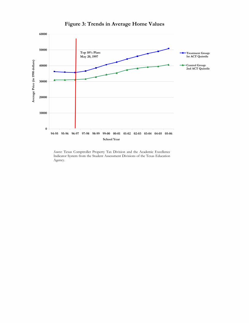
Figure 3: Trends in Average Home Values
0
10000
20000
30000
40000
50000
60000
94-95 95-96 96-97 97-98 98-99 99-00 00-01 01-02 02-03 03-04 04-05 05-06
School Year
Ave
rage
Pri
ce (
in 1
990
dol
lars
)
Treatment Group:1st ACT Quintile
Control Group:2nd ACT Quintile
Top 10% Plan:May 20, 1997
Source: Texas Comptroller Property Tax Division and the Academic Excellence Indicator System from the Student Assessment Divisions of the Texas Education Agency.
Figure 4: Quintiles of School District Quality
Treatment: 1st ACT Quintile
Control: 2nd ACT Quintile
Top 3 ACT Quintiles
Figure 5: Quintiles of School District Quality –Locations of Highly Ranked Universities
Treatment: 1st ACT Quintile
Control: 2nd ACT Quintile
Top 3 ACT Quintiles
Flagship Universities
Competitive Universities

Figure 6: Texas School Districts byPercent Minority, Hispanic, and Black
Percent Minority (1990)
2.0 - 19.0
19.1 - 36.0
36.1 - 60.0
60.1 - 97.0
Percent Hispanic (1990) Percent Black (1990)
1.0 - 14.0
14.1 - 33.0
33.1 - 61.0
61.1 - 97.0
0.0 - 5.0
5.1 - 14.0
14.1 - 23.0
23.1 - 37.0
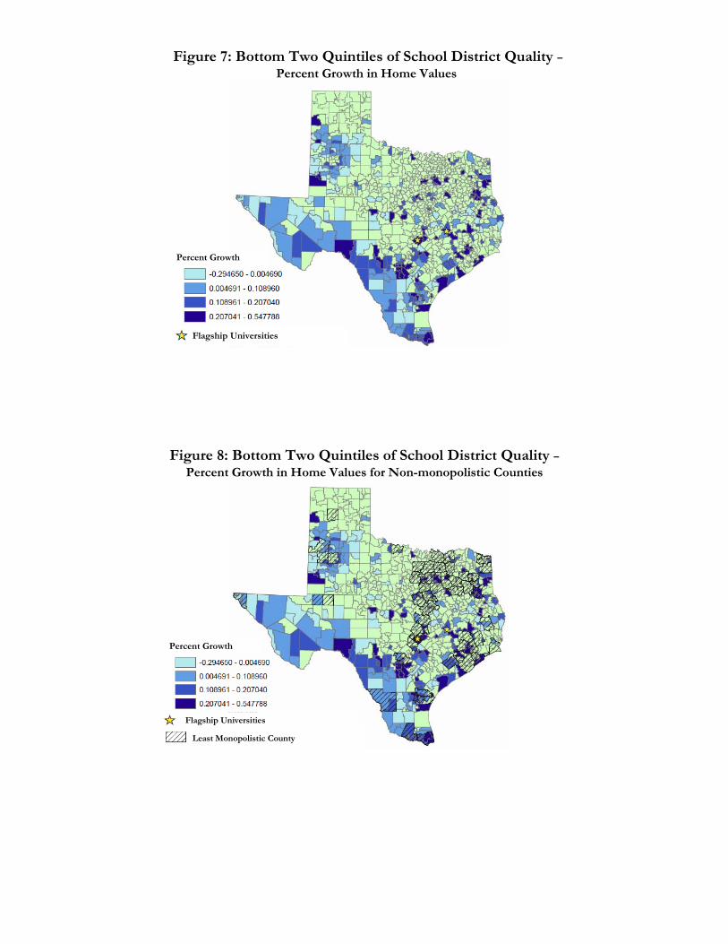
Figure 7: Bottom Two Quintiles of School District Quality –Percent Growth in Home Values
Percent Growth
Flagship Universities
Percent Growth
Flagship Universities
Least Monopolistic County
Figure 8: Bottom Two Quintiles of School District Quality –Percent Growth in Home Values for Non-monopolistic Counties
Subsample 2nd Quintile 1st Quintile
(Both) (Control) (Treatment)Dependent VariablesAverage Value per Unit (in thousands) 38.47 35.18 41.96
(26.49) (24.93) (27.63)Total Housing Units (in thousands) 37.53 20.42 55.62
(72.75) (52.08) (85.95)High School DemographicsPercent Minority Students 0.690 0.514 0.876
(0.240) (0.177) (0.136)Percent Disadvantaged Students 0.571 0.466 0.682
(0.187) (0.137) (0.167)Percent Gifted Students 0.094 0.094 0.093
(0.067) (0.069) (0.065)Average Teacher Experience 12.641 12.659 12.623
(2.515) (2.467) (2.565)Teacher Student Ratio 13.046 12.300 13.835
(3.291) (3.249) (3.148)
Urbanization CharacteristicsPercent in a Town 0.222 0.228 0.215
(0.415) (0.420) (0.411)Percent in a Small Fringe 0.061 0.066 0.056
(0.239) (0.248) (0.229)Percent in a Large Fringe 0.041 0.057 0.025
(0.199) (0.232) (0.155)Percent in a Small City 0.120 0.080 0.162
(0.325) (0.271) (0.369)Percent in a Large City 0.228 0.115 0.348
(0.420) (0.320) (0.476)Percent in a Rural Area 0.328 0.454 0.195
(0.469) (0.498) (0.396)County Level CharacteristicsPercent Black 0.092 0.100 0.084
(0.420) (0.079) (0.085)Percent Hispanic 0.427 0.299 0.563
(0.269) (0.189) (0.274)Persons per Housing Unit 2.848 2.730 2.972
(0.321) (0.246) (0.343)Percent Owner Occupied 0.682 0.703 0.660
(0.092) (0.092) (0.085)Violent Crimes (per 1,000 People) 0.017 0.017 0.018
(0.008) (0.009) (0.007)Percent with College Degree 0.172 0.170 0.174
(0.075) (0.077) (0.072)
Observations (school-by-year) 5,650 2,910 2,740
Sources: Texas Comptroller Property Tax Division (TCPTD), 1995 to 2006; Academic Excellence Indicator System (AEIS), TexasEducation Agency (TEA), 1994-95 to 2005-06; National Center for Education Statistics (NCES), 1994-95 to 2005-06; U.S. CensusBureau Decennial Census, 1990 and 2000; and the Federal Bureau of Investigation’s Uniform Crime Reporting (UCR) database,1995 to 2006.
Notes: Numbers in parentheses are standard deviations. Average value per unit is reported in real terms of 1990 dollars. 1stquintile (treatment group) is defined as the bottom fifth (0-20%) of school quality based on pre-policy ACT Scores. 2nd quintile(control group) is defined as the lower middle (20-40%) of school quality based on pre-policy ACT Scores.
Table 1: Descriptive Statistics - Means and Standard Deviations
School Quality Quintiles Based on ACT Scores

2nd Quintile 1st Quintile(Control) (Treatment) Difference
Pre Policy (1994/95 - 1996/97) 31.26 35.91 4.65
Post Policy (1997/98 - 2005/06) 36.93 43.76 6.83
Difference 5.66 7.84 2.18
2nd Quintile 1st Quintile
(Control) (Treatment) DifferencePre Policy (1994/95 - 1996/97) 10.184 10.329 0.145
Post Policy (1997/98 - 2005/06) 10.310 10.484 0.174
Difference 0.125 0.155 0.029
Table 2: Difference-in-Differences School Quality Quintiles Based on ACT Scores
Notes : Average price of residential homes is reported in real terms of 1990 dollars. 1st quintile (treatment group) isdefined as the bottom fifth (0-20%) of school quality based on pre-policy ACT Scores. 2nd quintile (control group) isdefined as the lower middle (20-40%) of school quality based on pre-policy ACT Scores.
Panel A: Average Price of Residential Homes (in thousands)
Panel B: Log Average Price of Residential Homes
(1) (2) (3) (4) (5) (1) (2) (3) (4) (5)
Post x Treatment 0.032 ** 0.065 *** 0.047 *** 0.051 *** 0.049 *** 0.097 *** 0.166 *** 0.108 *** 0.123 *** 0.116 ***
(0.015) (0.213) (0.017) (0.016) (0.016) (0.035) (0.060) (0.035) (0.035) (0.035)
Treatment (1st quintile) 0.153 *** -0.082 -0.087 * -0.044 -0.060 1.401 *** -0.143 -0.199 * -0.227 * -0.265 **
(0.052) (0.057) (0.047) (0.044) (0.046) (0.205) (0.159) (0.117) (0.118) (0.119)
Post (yr after 1996-97) -0.036 *** -0.044 *** -0.040 *** -0.031 *** -0.031 *** -0.035 *** -0.082 * -0.063 ** -0.066 ** -0.066 ***
(0.009) (0.015) (0.011) (0.011) (0.010) (0.013) (0.046) (0.024) (0.026) (0.025)
Linear Trend 0.027 *** 0.043 *** 0.038 *** 0.035 *** 0.034 *** 0.011 *** 0.050 *** 0.033 *** 0.026 *** 0.020 ***
(0.001) (0.122) (0.002) (0.002) (0.002) (0.002) (0.007) (0.004) (0.340) (0.006)
Constant 10.122 *** 8.841 *** 9.616 *** 8.545 *** 8.439 *** 7.670 *** 0.178 3.036 *** 1.178 0.104(0.035) (0.132) (0.129) (0.257) (0.297) (0.137) (0.339) (0.338) (0.823) (0.908)
Controls :High School Demog. No Yes Yes Yes Yes No Yes Yes Yes YesUrbanization No No Yes Yes Yes No No Yes Yes YesCounty Level No No No Yes Yes No No No Yes YesMSA Fixed Effects No No No No Yes No No No No Yes
Obs (school-by-year) 5,650 5,650 5,650 5,650 5,650 5,650 5,650 5,650 5,650 5,650
R2 0.04 0.06 0.71 0.77 0.78 0.10 0.75 0.87 0.88 0.89Notes : Numbers in parentheses are robust standard errors clustered by high school campus ID. 1st quintile (treatment group) is defined as the bottom fifth (0-20%) of school quality based on pre-policy ACT Scores. 2nd quintile (control group) is defined as the lower middle (20-40%) of school quality based on pre-policy ACT Scores. ***, **, * indicates statistical significance atthe 1%, 5%, and 10% level, respectively.
Table 3: Difference-in-Differences Regressions of Log Average Price and Log Quantity of Residential Homes
Panel A: Log Average Price (1990 Dollars) Panel B: Log Number of Housing Units

(1) (2) (3) (4) (5) (1) (2) (3) (4) (5)Post x Placebo Treatment -0.028 ** 0.011 0.005 0.007 0.005 -0.102 *** -0.007 -0.026 -0.031 -0.036
(0.013) (0.016) (0.015) (0.014) (0.014) (0.026) (0.042) (0.033) (0.033) (0.032)
Placebo Treatment -0.443 *** -0.146 *** -0.134 *** -0.087 *** -0.095 *** -0.514 *** -0.129 -0.055 0.000 0.002(0.047) (0.037) (0.036) (0.032) (0.032) (0.155) (0.091) (0.083) (0.082) (0.082)
Post (yr after 1996-97) 0.001 -0.054 *** -0.057 *** -0.051 *** -0.050 *** 0.074 *** 0.152 *** 0.133 *** 0.139 *** 0.149 ***
(0.009) (0.015) (0.014) (0.013) (0.013) (0.019) (0.035) (0.029) (0.030) (0.028)
Linear Trend 0.037 *** 0.061 *** 0.061 *** 0.049 *** 0.050 *** 0.024 *** 0.019 *** 0.023 *** 0.014 * 0.021 ***
(0.001) (0.003) (0.003) (0.003) (0.003) (0.002) (0.007) (0.006) (0.007) (0.008)
Constant 10.696 *** 10.268 *** 10.471 *** 9.838 *** 9.945 *** 8.216 *** 2.862 *** 3.721 *** 4.250 *** 4.530 ***
(0.035) (0.114) (0.117) (0.325) (0.325) (0.101) (0.306) (0.306) (0.775) (0.794)
Controls :High School Demog. No Yes Yes Yes Yes No Yes Yes Yes YesUrbanization No No Yes Yes Yes No No Yes Yes YesCounty Level No No No Yes Yes No No No Yes YesMSA Fixed Effects No No No No Yes No No No No Yes
Obs (school-by-year) 5,491 5,491 5,491 5,491 5,491 5,491 5,491 5,491 5,491 5,491
R2 0.19 0.64 0.66 0.73 0.74 0.03 0.73 0.77 0.79 0.81Notes : Numbers in parentheses are robust standard errors clustered by high school campus ID. 4th quintile (placebo treatment) is defined as the upper middle fifth (60-80%) of school qualitybased on pre-policy ACT Scores. 5th quintile (placebo control) is defined as the top (80-100%) of school quality based on pre-policy ACT Scores. ***, **, * indicates statistical significanceat the 1%, 5%, and 10% level, respectively.
Table 4: Placebo Difference-in-Differences Regressions of Log Average Price and Log Quantity of Residential Homes
Panel A: Log Average Price (1990 Dollars) Panel B: Log Number of Housing Units

(1) (2) (3) (4) (5) (1) (2) (3) (4) (5)Fake Post x Treatment -0.002 0.009 0.003 0.002 0.002 0.016 0.032 0.014 0.010 0.008
(0.005) (0.011) (0.007) (0.007) (0.007) (0.013) (0.039) (0.021) (0.020) (0.019)
Treatment (1st quintile) 0.154 *** 0.032 -0.021 0.013 -0.006 1.395 *** 0.192 -0.031 -0.117 -0.174(0.052) (0.060) (0.050) (0.048) (0.050) (0.205) (0.182) (0.130) (0.131) (0.132)
Fake Post (yr is 1995-96) -0.004 -0.007 -0.006 -0.005 -0.005 -0.003 -0.004 -0.001 0.001 0.002(0.005) (0.007) (0.005) (0.005) (0.005) (0.009) (0.025) (0.014) (0.013) (0.013)
Linear Trend -0.003 0.009 ** 0.006 ** 0.005 0.003 0.013 ** 0.034 ** 0.027 *** 0.024 ** 0.017(0.002) (0.004) (0.003) (0.003) (0.004) (0.006) (0.016) (0.009) (0.011) (0.012)
Constant 10.184 *** 9.098 *** 9.691 *** 8.585 *** 8.596****** 7.668 *** 0.699 3.098 *** 1.039 0.001(0.036) (0.153) (0.155) (0.319) (0.371) (0.138) (0.437) (0.418) (0.976) (1.100)
Controls:High School Demog. No Yes Yes Yes Yes No Yes Yes Yes YesUrbanization No No Yes Yes Yes No No Yes Yes YesCounty Level No No No Yes Yes No No No Yes YesMSA Fixed Effects No No No No Yes No No No No Yes
Obs (school-by-year) 1,416 1,416 1,416 1,416 1,416 1,416 1,416 1,416 1,416 1,416R2 0.02 0.59 0.72 0.76 0.77 0.09 0.77 0.87 0.88 0.89Notes : Numbers in parentheses are robust standard errors clustered by high school campus ID. Years of analysis are 1994-95, 1995-96, and 1996-97 (pre-policy data). 1st quintile (treatmentgroup) is defined as the bottom fifth (0-20%) of school quality based on pre-policy ACT Scores. 2nd quintile (control group) is defined as the lower middle (20-40%) of school quality based onpre-policy ACT Scores. ***, **, * indicates statistical significance at the 1%, 5%, and 10% level, respectively.
Table 5: Pre-policy Difference-in-Differences Regressions -- Parallel Trends Assumption Test
Panel A: Log Average Price (1990 Dollars) Panel B: Log Number of Housing Units

Post x Treatment 0.049 *** 0.032 ** 0.025 ** 0.116 *** 0.095 *** 0.079 ***
(0.016) (0.013) (0.011) (0.035) (0.031) (0.029)
Treatment (1st quintile) -0.060 -0.034 -0.019 -0.265 ** -0.210 * -0.200(0.046) (0.046) (0.047) (0.119) (0.121) (0.123)
Post (yr after 1996-97) -0.031 *** -0.023 ** 0.004 -0.066 *** -0.057 *** -0.019(0.010) (0.009) (0.008) (0.025) (0.020) (0.020)
Linear Trend 0.034 *** 0.032 *** 0.023 *** 0.020 *** 0.024 *** 0.014(0.002) (0.003) (0.003) (0.006) (0.007) (0.010)
Constant 8.439 *** 8.389 *** 8.486 *** 0.104 0.026 0.131(0.297) (0.311) (0.325) (0.908) (0.941) (0.981)
Controls:High School Demog.UrbanizationCounty LevelMSA Fixed Effects
Obs (school-by-year)
R2 0.89Notes : Numbers in parentheses are robust standard errors clustered by high school campus ID. 1st quintile (treatment group) is defined as the bottom fifth (0-20%) of school quality based on pre-policy ACT Scores. 2nd quintile (control group)is defined as the lower middle (20-40%) of school quality based on pre-policy ACT Scores. ***, **, * indicates statistical significance at the 1%, 5%, and 10% level, respectively.
3,7820.78 0.77 0.77 0.89 0.89
5,650 3,782 2,837 5,650
Yes YesYes Yes
2,837
Yes Yes Yes Yes
Yes
Yes Yes Yes YesYes Yes
Yes YesYes Yes Yes Yes
Yes Yes Yes
(3 Yrs Pre, 9 Yrs Post) (3 Yrs Pre, 5 Yrs Post) (3 Yrs Pre, 3 Yrs Post)
8-Year Window:
(3 Yrs Pre, 9 Yrs Post) (3 Yrs Pre, 5 Yrs Post) (3 Yrs Pre, 3 Yrs Post)
(2)8-Year Window: 6-Year Window:
1994-95 to 2005-06 1994-95 to 2001-02 1994-95 to 1999-00 1994-95 to 2005-06 1994-95 to 2001-02 1994-95 to 1999-00Full Sample:
(3)6-Year Window: Full Sample:
Table 6: Alternative Difference-in-Differences Regressions of Log Average Price and Log Quantity of Residential Homes
Panel A: Log Average Price (1990 Dollars) Panel B: Log Number of Housing Units
(1) (2) (3) (1)

Post x Treatment x HHI -0.171 ** -0.252 *
(0.070) (0.140)Post x Treatment 0.058 *** 0.162 ***
(0.022) (0.046)Post x HHI -0.218 *** -0.013
(0.047) (0.083)Treatment x HHI 0.226 * -0.561 *
(0.131) (0.339)Post (yr after 1996-97) 0.028 * -0.058 *
(0.016) (0.035)Treatment (1st quintile) -0.073 -0.057
(0.055) (0.144)Herfindahl-Hirschman Index (HHI) -0.073 0.637 ***
(0.084) (0.236)Linear Trend 0.035 *** 0.026 ***
(0.002) (0.006)
Constant 8.719 *** 0.838(0.263) (0.821)
Controls:High School Demog.UrbanizationCounty Level
Obs (school-by-year)
R2
YesYes
5,650
Yes
Notes : Numbers in parentheses are robust standard errors clustered by high school campusID. Schooling market power is mesured by Herfindahl-Hirschman Index (HHI) per pupils.1st quintile (treatment group) is defined as the bottom fifth (0-20%) of school quality basedon pre-policy ACT Scores. 2nd quintile (control group) is defined as the lower middle (20-40%) of school quality based on pre-policy ACT Scores. ***, **, * indicates statisticalsignificance at the 1%, 5%, and 10% level, respectively.
Table 7: DID Regressions of Schooling Market Power
Panel A: Log Average Price (1990 Dollars)
Panel B: Log Number of Housing
YesYes
5,6500.88
Yes
0.77

Panel A: Log Average Price (1990 Dollars)
Panel B: Log Number of Housing
Units
1st Quintile HHI: 1st Quintile HHI:
(Least Monopolistic) (Least Monopolistic)Post x Treatment 0.034* 0.102**
(0.019) (0.045)Controls Yes YesObs (school-by-year) 3,133 3,133
R2 0.72 0.86
Post x Treatment -0.012 -0.054(0.048) (0.097)
Controls Yes YesObs (school-by-year) 818 818
R2 0.57 0.76
Post x Treatment -0.043 0.051(0.039) (0.110)
Controls Yes YesObs (school-by-year) 923 923
R2 0.58 0.72
Post x Treatment -0.079 0.175(0.058) (0.128)
Controls Yes YesObs (school-by-year) 532 532
R2 0.51 0.62
(Most Monopolistic) (Most Monopolistic)Post x Treatment -0.009 0.042
(0.070) (0.128)Controls Yes YesObs (school-by-year) 244 244
R2 0.61 0.77
Subsamples by County Schooling Market Power
2nd Quintile HHI:2nd Quintile HHI:
Table 8: Differences-in-Differences Regressions
Notes : Numbers in parentheses are robust standard errors clustered by high school campus ID.Schooling market power is mesured by Herfindahl-Hirschman Index (HHI) per pupils. Eachcoefficient represents a separate regression of the log average price (in 1990 Dollars) or lognumber of housing units on a constant, post indicator, treatment indicator, post*treatmentindicator, and a linear time trend, controlling for high school demographics, urbanization, andcounty level characteristics. ***, **, * indicates statistical significance at the 1%, 5%, and 10%level, respectively.
5th Quintile HHI:
4th Quintile HHI: 4th Quintile HHI:
3rd Quintile HHI: 3rd Quintile HHI:
5th Quintile HHI:

1st Quintile 2nd Quintile 3rd Quintile 4th Quintile 5th Quintile(Treatment) (Control) (Not Used) (Placebo Treatment) (Placebo Control)
Dependent VariableTotal Appraised Value (in millions) 1,707.01 4,155.70 1,565.56 468.40 1,014.51 1,360.23
(4656.37) (7695.82) (4678.03) (2229.98) (2871.57) (2476.57)Total Housing Units (in thousands) 22.26 55.62 20.42 7.16 14.08 14.33
(52.69) (85.95) (52.08) (26.08) (33.70) (22.86)Average Value per Unit (in thousands) 42.85 41.96 35.18 30.53 40.65 66.78
(32.33) (27.63) (24.93) (17.76) (23.24) (47.34)
High School Demog. ControlsPercent Minority Students 0.419 0.876 0.514 0.297 0.240 0.163
(0.295) (0.136) (0.177) (0.167) (0.141) (0.101)Percent Disadvantaged Students 0.396 0.682 0.466 0.377 0.289 0.161
(0.215) (0.167) (0.137) (0.122) (0.101) (0.088)Percent Gifted Students 0.096 0.093 0.094 0.094 0.099 0.098
(0.068) (0.065) (0.069) (0.064) (0.077) (0.062)Average Teacher Experience 12.685 12.623 12.659 12.703 12.582 12.860
(2.411) (2.565) (2.467) (2.479) (2.452) (2.042)Teacher Student Ratio 12.842 13.835 12.300 11.591 12.660 13.888
(3.040) (3.148) (3.249) (2.732) (2.744) (2.585)
Urbanization ControlsPercent in a Town 0.231 0.215 0.228 0.240 0.239 0.232
(0.421) (0.411) (0.420) (0.427) (0.427) (0.422)Percent in a Small Fringe 0.079 0.056 0.066 0.039 0.086 0.152
(0.270) (0.229) (0.248) (0.193) (0.281) (0.359)Percent in a Large Fringe 0.069 0.025 0.057 0.059 0.039 0.165
(0.253) (0.155) (0.232) (0.236) (0.194) (0.371)Percent in a Small City 0.093 0.162 0.080 0.043 0.102 0.078
(0.290) (0.369) (0.271) (0.203) (0.303) (0.268)Percent in a Large City 0.112 0.348 0.115 0.021 0.039 0.040
(0.316) (0.476) (0.320) (0.142) (0.194) (0.195)Percent in a Rural Area 0.404 0.195 0.454 0.599 0.487 0.334
(0.491) (0.396) (0.498) (0.490) (0.500) (0.472)
County Level ControlsPercent Black 0.094 0.084 0.100 0.098 0.090 0.100
(0.078) (0.085) (0.079) (0.076) (0.069) (0.077)Percent Hispanic 0.281 0.563 0.299 0.197 0.178 0.169
(0.231) (0.274) (0.189) (0.141) (0.125) (0.108)Persons per Housing Unit 2.748 2.972 2.730 2.695 2.663 2.683
(0.275) (0.343) (0.246) (0.265) (0.188) (0.175)Percent Owner Occupied 0.701 0.660 0.703 0.728 0.720 0.693
(0.091) (0.085) (0.092) (0.084) (0.084) (0.095)Violent Crimes (per 1,000 People) 0.017 0.018 0.017 0.016 0.017 0.016
(0.009) (0.007) (0.009) (0.009) (0.009) (0.008)Percent with College Degree 0.180 0.174 0.170 0.160 0.177 0.219
(0.079) (0.072) (0.077) (0.064) (0.074) (0.095)
Obs (school-by-year) 13,943 2,740 2,910 2,802 2,757 2,734
Sources : Texas Comptroller Property Tax Division (TCPTD), 1995 to 2006; Academic Excellence Indicator System (AEIS), Texas Education Agency (TEA), 1994-95 to 2005-06; National Center for Education Statistics (NCES), 1994-95 to 2005-06; U.S. Census Bureau Decennial Census, 1990 and 2000; and the Federal Bureau of Investigation’sUniform Crime Reporting (UCR) database, 1995 to 2006.
Table A1: Descriptive Statistics Means and Standard Deviations for ACT Quintiles
Notes : Numbers in parentheses are standard deviations. Total appraised value and average value per unit are reported in real terms of 1990 dollars. 1st quintile (treatment group)is defined as the bottom fifth (0-20%), 2nd quintile (control group) is defined as the lower middle (20-40%), 3rd quintile is defined as the middle (40-60%), 4th quintile (placebotreatment) is defined as the upper middle (60-80%), and 5th quintile (placebo control) is defined as the top fifth (80-100%). All school quality quintiles are based on pre-policyACT scores.
Total
School Quality Quintiles Based on ACT Scores
2nd Quintile 1st Quintile(Control) (Treatment) Difference
Pre Policy (1994/95 - 1996/97) 20.47 52.70 32.23
Post Policy (1997/98 - 2005/06) 22.03 56.11 34.08
Difference 1.57 3.41 1.85
2nd Quintile 1st Quintile
(Control) (Treatment) DifferencePre Policy (1994/95 - 1996/97) 7.75 9.11 1.36
Post Policy (1997/98 - 2005/06) 7.78 9.23 1.45
Difference 0.03 0.12 0.09
Notes : 1st quintile (treatment group) is defined as the bottom fifth (0-20%) of school quality based on pre-policy ACT Scores. 2nd quintile (control group) is defined as the lower middle (20-40%) of school qualitybased on pre-policy ACT Scores.
Table A2: Difference-in-Differences School Quality Quintiles Based on ACT Scores
Panel A: Total Housing Units (in thousands)
Panel B: Log Number of Housing Units

(1) (2) (3) (4) (5) (1) (2) (3) (4) (5)Post x Treatment 0.032** 0.065*** 0.047*** 0.051*** 0.049*** 0.097*** 0.166*** 0.108*** 0.123*** 0.116***
(0.015) (0.021) (0.017) (0.016) (0.016) (0.035) (0.060) (0.035) (0.035) (0.035)Treatment (1st quintile) 0.153*** -0.082 -0.087* -0.044 -0.060 1.401*** -0.143 -0.199* -0.227* -0.265**
(0.052) (0.057) (0.047) (0.044) (0.046) (0.205) (0.159) (0.117) (0.118) (0.119)Post (school year after 96/97) -0.036*** -0.044*** -0.040*** -0.031*** -0.031*** -0.035*** -0.082* -0.063*** -0.066** -0.066***
(0.009) (0.015) (0.011) (0.011) (0.010) (0.013) (0.046) (0.024) (0.026) (0.025)Linear Trend 0.027*** 0.043*** 0.038*** 0.035*** 0.034*** 0.011*** 0.050*** 0.033*** 0.026*** 0.020***
(0.001) (0.002) (0.002) (0.002) (0.002) (0.002) (0.007) (0.004) (0.006) (0.006)HS Demographic ControlsPercent Minority Students 0.628*** 0.108 0.004 0.006 3.460*** 1.604*** 2.258*** 2.120***
(0.122) (0.122) (0.138) (0.145) (0.360) (0.272) (0.340) (0.346)Percent Disadvantaged Students -0.877*** -0.591*** -0.425*** -0.422*** -2.017*** -1.100*** -0.843*** -0.766***
(0.119) (0.116) (0.105) (0.110) (0.320) (0.270) (0.261) (0.259)Percent Gifted Students 0.357 0.203 0.109 0.137 2.448** 1.812*** 1.788*** 1.544***
(0.362) (0.195) (0.178) (0.163) (1.230) (0.594) (0.566) (0.581)Average Teacher Experience -0.009 -0.016*** -0.007 -0.006 0.069*** 0.038** 0.036** 0.044***
(0.006) (0.006) (0.005) (0.006) (0.019) (0.016) (0.015) (0.016)Teacher Student Ratio 0.110*** 0.047*** 0.040*** 0.036*** 0.434*** 0.210*** 0.200*** 0.189***
(0.006) (0.007) (0.006) (0.006) (0.017) (0.018) (0.018) (0.017)Urbanization ControlsTown 0.144*** 0.158*** 0.180*** 0.784*** 0.834*** 0.919***
(0.048) (0.044) (0.045) (0.126) (0.122) (0.123)Small Fringe 0.453*** 0.322*** 0.335*** 1.402*** 1.317*** 1.440***
(0.070) (0.065) (0.069) (0.172) (0.162) (0.171)Large Fringe 0.696*** 0.338*** 0.342*** 1.838*** 1.576*** 1.570***
(0.081) (0.068) (0.076) (0.216) (0.207) (0.213)Small City 0.650*** 0.475*** 0.503*** 2.500*** 2.436*** 2.505***
(0.057) (0.054) (0.066) (0.156) (0.160) (0.172)Large City 0.931*** 0.600*** 0.609*** 3.406*** 3.199*** 3.240***
(0.071) (0.069) (0.077) (0.190) (0.200) (0.231)County Level ControlsPercent Black 0.313 0.364 1.652** 2.116***
(0.288) (0.306) (0.684) (0.738)Percent Hispanic -0.182 -0.197 -0.822** -0.769**
(0.143) (0.151) (0.347) (0.374)Persons per Housing Unit 0.283*** 0.287*** 0.268 0.307
(0.071) (0.074) (0.175) (0.193)Percent Owner Occupied -0.249 -0.053 1.008 2.202***
(0.232) (0.268) (0.741) (0.846)Violent Crimes (per 1,000 People) 4.763*** 5.018*** 0.088 0.311
(1.242) (1.148) (3.585) (3.780)Percent with College Degree 0.028*** 0.027*** 0.016** 0.028***
(0.002) (0.003) (0.006) (0.008)
Constant 10.122*** 8.841*** 9.616*** 8.545*** 8.439*** 7.670*** 0.178 3.036*** 1.178 0.104(0.035) (0.132) (0.129) (0.257) (0.297) (0.137) (0.339) (0.338) (0.823) (0.908)
MSA Fixed Effects No No No No Yes No No No No YesObs (school-by-year) 5,650 5,650 5,650 5,650 5,650 5,650 5,650 5,650 5,650 5,650
R2 0.04 0.57 0.71 0.77 0.78 0.10 0.75 0.87 0.88 0.89Notes : Numbers in parentheses are robust standard errors clustered by high school campus ID. ***, ** , * indicates statistical significance at the 1%, 5%, and 10% level, respectively.
Table A3: Difference-in-Differences Regressions - All Controls Reported
Panel A: Log Average Price (1990 Dollars) Panel B: Log Number of Housing Units

(1) (2) (3) (4) (5)Post x Treatment 0.129*** 0.231*** 0.155*** 0.174*** 0.166***
(0.043) (0.076) (0.045) (0.043) (0.043)Treatment (1st quintile) 1.554*** -0.23 -0.285** -0.271** -0.325**
(0.250) (0.197) (0.136) (0.132) (0.134)Post (school year after 96/97) -0.070*** -0.125** -0.103*** -0.097*** -0.097***
(0.017) (0.058) (0.030) (0.031) (0.030)Linear Trend 0.038*** 0.093*** 0.071*** 0.061*** 0.055***
(0.003) (0.009) (0.005) (0.007) (0.007)HS Demographic ControlsPercent Minority Students 4.088*** 1.712*** 2.262*** 2.126***
(0.436) (0.324) (0.397) (0.411)Percent Disadvantaged Students -2.894*** -1.691*** -1.269*** -1.187***
(0.386) (0.330) (0.315) (0.318)Percent Gifted Students 2.805* 2.015*** 1.897*** 1.681**
(1.565) (0.733) (0.694) (0.690)Average Teacher Experience 0.060*** 0.02 0.029* 0.038**
(0.021) (0.016) (0.016) (0.016)Teacher Student Ratio 0.544*** 0.257*** 0.240*** 0.225***
(0.020) (0.021) (0.020) (0.020)Urbanization ControlsTown 0.928*** 0.992*** 1.098***
(0.136) (0.131) (0.133)Small Fringe 1.855*** 1.639*** 1.775***
(0.207) (0.186) (0.192)Large Fringe 2.534*** 1.914*** 1.912***
(0.259) (0.237) (0.249)Small City 3.150*** 2.911*** 3.008***
(0.184) (0.188) (0.210)Large City 4.337*** 3.799*** 3.849***
(0.229) (0.240) (0.275)County Level ControlsPercent Black 1.966** 2.480***
(0.801) (0.874)Percent Hispanic -1.003** -0.966**
(0.398) (0.427)Persons per Housing Unit 0.551*** 0.594***
(0.201) (0.215)Percent Owner Occupied 0.759 2.148**
(0.834) (0.923)Violent Crimes (per 1,000 People) 4.852 5.329
(4.254) (4.262)Percent with College Degree 0.044*** 0.055***
(0.007) (0.010)
Constant 3.977*** -4.797*** -1.163*** -4.093*** -5.273***(0.168) (0.383) (0.346) (0.835) (0.911)
MSA Fixed Effects No No No No YesObs (school-by-year) 5,650 5,650 5,650 5,650 5,650
R2 0.08 0.74 0.87 0.89 0.89Notes : Numbers in parentheses are robust standard errors clustered by high school campus ID. ***, ** , * indicates statisticalsignificance at the 1%, 5%, and 10% level, respectively.
Dependent Variable: Log Total Appraised Value (1990 Dollars)Table A4: Difference-in-Differences Regressions - All Controls Reported