radmenu radmenu skinning whitepaperstandards.corkscrew.vg/portals/0/catalook/radmenu.pdf · to...
TRANSCRIPT

Page 1 of 17
RadMenu Date: 5/3/2013
Copyright © 2005-2007 – Telerik – All Rights Reserved
RadMenu Skinning Whitepaper
Date Version Description Author
June 2005 1.0 Initial version Stoyan Stratev
June 2006 2.0 RadMenu v4.0 update Stoyan Stratev
January 2007 2.1 RadMenu v4.2 update Stoyan Stratev
April 2007 2.2 Updated control name Stoyan Stratev
August 2007 / parameter names and descriptions updated to use this control in the
CATALooK menu module CAT_MenuNF.

Page 2 of 17
RadMenu Date: 5/3/2013
Copyright © 2005-2007 – Telerik – All Rights Reserved
Table of Contents
RadMenu Skinning Whitepaper ..................................................................................... 1 Introduction .............................................................................................................. 3 Installation Instructions .............................................................................................. 3 Skin Object and Menu module control signatures ........................................................... 5 Skin Object and Menu module control Attributes ............................................................ 7

Page 3 of 17
RadMenu Date: 5/3/2013
Copyright © 2005-2007 – Telerik – All Rights Reserved
Introduction
This whitepaper will explain how to add RadMenu parameters to the skin of module
CAT_MenuNF.
To select the Telerik RAD menu control for the menu module (CAT_MenuNF), select 'View
Options' from the module menu and set: [Category System] = [Advanced] and [Control Type] =
[Telerik RAD Menu].
This menu control can be used with advanced categories and ASCX skins (blue, blue-neutral,
theme-grey etc.; file menu.ascx must be included) only.
Installation Instructions
1. Login into your Portal with host account
2. If you have updated to a CATALooK.netStore version >=v05.04.01 and use an older
CATALooK.netStore skin from a CATALooK.netStore version <v05.04.01 and not the
default ‘blue’ CATALooK skin, you must reload this skin from folder
\CATALooK_SkinPackages of the currently installed CATALooK.netStore package via
module CAT_StoreSettings (CATALooK.netStore -> Store Settings) -> Skins to get this
functionality.
If you use a custom skin you can use the menu.ascx skin file from one of the included
CATALooK skins for your skin (copy this file into folder:
\Desktopmodules\CATALooKStore\Skins\Your currently selected CATALooK skin or select
‘Edit Skin’ from the module action menu of module CAT_MenuNF and add the red marked
section below to the menu.ascx skin file of your CATALooK.netStore skin:
<asp:Panel runat="server" ID="pnldropdownlistcontrol" Visible="False">
<tr valign="top">
<td class="CATRow" valign="top" width="100%">
<cat:DROPDOWNLISTCONTROL id="catdropdownlistcontrol" Runat="server"
CssClass="CATNormalDropDownList">
</cat:DROPDOWNLISTCONTROL></td>
</tr>
</asp:Panel>
<tr id="rowRadMenuControl" runat="server" valign="top" visible="False">
<td class="CATMenuBG" valign="top" width="100%">
<cat:RADMENUCONTROL id="catRadMenuControl" Runat="server"
SkinsPath="*SkinPath*/RadControls/Menu/"
Skin="CATCssBlue" style="float: left;" />
</td>
</tr>

Page 4 of 17
RadMenu Date: 5/3/2013
Copyright © 2005-2007 – Telerik – All Rights Reserved
<asp:Panel runat="server" ID="pnlDemo" Visible="False">
<tr>
<td class="CATRowHighLight" valign="bottom" width="100%">
<!-- DO NOT DELETE -->
<br>
<asp:Label ID="lblDemo" runat="server" Visible="False"></asp:Label><br>
<asp:HyperLink ID="hypCATALooK" runat="server" Visible="False"
Target="_blank"></asp:HyperLink></td>
</tr>
</asp:Panel>
3. The Telerik RadMenu control can not change the width of the menu module automatically to
match it to the length of the category names.
Therfore you must add a width parameter to the menu module skin:
Select ‘Edit Skin’ from the module menu of module CAT_MenuNF and change:
<table class="CATContainerBorder" cellspacing="0" cellpadding="0" width="100%">
to
<table class="CATContainerBorder" cellspacing="0" cellpadding="0" width="200">
This will change the width to a fixed value of 200px.
Or add a width parameter to the css file of the RadMenu in the currently selected
CATALooK.netStore skin: e.g. if your currently selected CATALooK skin is the default
‘blue’ skin and the name of the RadMenu skin is ‘CATCssBlue’, open
\DesktopModules\CATALooKStore\Skins\blue\RadControls\Menu\CATCssBlue\styles.css
in a text editor and add the red marked text below to change it to a fixed width of 200px:
.RadMenu_CATCssBlue
{
background: #a7cfe8;
font-family: Arial, Verdana, Tahoma;
font-size:11px;
width: 200px;
}
(This changing is also necessary to display the menu with the full width in Firefox browsers.
To display also sub menu items with the full width in Firefox, also all other: ‘width: 100%;’
parameters must be changed to a fixed value e.g.: ‘width=200px;’)

Page 5 of 17
RadMenu Date: 5/3/2013
Copyright © 2005-2007 – Telerik – All Rights Reserved
Skin Object and Menu module control signatures
CAT_MenuNF / menu.ascx Skin Object Description <td class="CATMenuBG" valign="top"
width="100%">
<cat:RADMENUCONTROL
id="catRadMenuControl" Runat="server"
SkinsPath="*SkinPath*/RadControls/Menu/"
Skin="CATCssBlue" style="float: left;"
/>
</td>
<radm:radMenu1
runat="server"
id="dnnRadMenu">
Displays the
hierarchical
navigation menu
Notes: - Values starting with “RootItem” apply only for the root group of menu items. For example “RootItemImageUrl”, “RootItemCssClass”.
- Values starting with “Item” or “Group’’ apply to all items not in the root group. For
example “GroupFlow”, “ItemCssClass”.
Special tokens: *SkinPath* - refers to the location of the current skin. For example: /DesktopModules/CATALooKStore/Skins/My Skin
*CatgoryName* - represents the name of the advanced category, which the menu item
represents(this is the value used for the menu item’s text). For example: books *target* - If you set the Link Url of a new page to an external resource using this token, the link will be opened in a new window. You can use this scheme to set targets to external links in a way that matches your needs. For example: *_blank*http://www.telerik.com/
Additional sample skins
1. Unzip the skin package from folder: \RadControls of the CATALooK.netStore package into folder: \DesktopModules\CATALooKStore\Skins\Currently selected CATALooK.netStore skin\RadControls\Menu of your DNN installation.
2. Login into your Portal with host account 3. Select [Edit Skin] from the module action menu of module CAT_MenuNF and change the [Skin] parameter to any other folder name of a skin package in folder: \DesktopModules\CATALooKStore\Skins\Currently selected CATALooK.netStore
skin\RadControls\Menu. e.g. change:

Page 6 of 17
RadMenu Date: 5/3/2013
Copyright © 2005-2007 – Telerik – All Rights Reserved
<td class="CATMenuBG" valign="top" width="100%"> <cat:RADMENUCONTROL id="catRadMenuControl" Runat="server" SkinsPath="*SkinPath*/RadControls/Menu/" Skin="CATCssBlue" style="float: left;" /> </td> to:
<td class="CATMenuBG" valign="top" width="100%"> <cat:RADMENUCONTROL id="catRadMenuControl" Runat="server" SkinsPath="*SkinPath*/RadControls/Menu/" Skin="Vista" style="float: left;" /> </td>

Page 7 of 17
RadMenu Date: 5/3/2013
Copyright © 2005-2007 – Telerik – All Rights Reserved
Skin Object and Menu module control Attributes Skin Attributes (used in Skin.xml or added to the control signature e.g.
SkinsPath="*SkinPath*/RadControls/Menu/")
Token Attribute Value Description
[RADMEN
U]
RadControlsDir The location of the RadControls folder for RadMenu
ExpandAnimationType and ExpandAnimationDuration
AnnimationSettings that represent the expand animation.
Gets the settings for the animation played when an item opens.
CollapseAnimationType and CollapseAnimationDuration
An AnnimationSettings that represents the collapse animation.
Gets the settings for the animation played when an item closes.
IsContext False a value indicating whether the menu is context or not.
EnableScreenBoundaryDetection
a value indicating whether the screen boundary detection will be applied when expanded.
ContextMenuElementID the ID of the html element which if right-clicked will display the context menu.
ClickToOpen
True if the root items open on mouse click; otherwise false. The default value is false.
a value indicating whether root items should open on mouse click.
SkinsPath
A string specifying the relative path to the folder which contains RadMenu skins. The default value is "~/RadControls/Menu/Skins".
the relative path of the folder containing the skins. This property accepts the *SkinPath* token.

Page 8 of 17
RadMenu Date: 5/3/2013
Copyright © 2005-2007 – Telerik – All Rights Reserved
Skin
A String specifying the skin. The default value is Default.
The skin used by RadMenu. 1. Unzip the skin package from folder: \RadControls of the CATALooK.netStore package into folder: \DesktopModules\CATALooKStore\Skins\Currently selected CATALooK.netStore skin\RadControls\Menu of your DNN installation. 2. Login into your Portal with host account 3. Select [Edit Skin] from the module action menu of module CAT_MenuNF and change the [Skin] parameter to any other folder name of a skin package in folder: \DesktopModules\CATALooKStore\Skins\Currently selected CATALooK.netStore skin\RadControls\Menu. e.g. change: <td class="CATMenuBG" valign="top" width="100%"> <cat:RADMENUCONTROL id="catRadMenuControl" Runat="server" SkinsPath="*SkinPath*/RadControls/Menu/" Skin="CATCssBlue" style="float: left;" /> </td> to: <td class="CATMenuBG" valign="top" width="100%"> <cat:RADMENUCONTROL id="catRadMenuControl" Runat="server" SkinsPath="*SkinPath*/RadControls/Menu/" Skin="Vista" style="float: left;" /> </td>
CausesValidation
true if validation is performed when an item is selected; otherwise, false. The default value is true.
a value indicating whether validation is performed when an item within the RadMenu control is selected.
ExpandDelay
An integer specifying the timeout measured in milliseconds. The default value is 0 which means that menu items open immediately.
a value indicating the timeout after which a menu item starts to open.
Flow
One of the ItemFlow values. The default value for top level items is Horizontal. a value indicating the way top level items will flow.

Page 9 of 17
RadMenu Date: 5/3/2013
Copyright © 2005-2007 – Telerik – All Rights Reserved
CollapseDelay
An integer specifying the timeout measured in milliseconds. The default value is 500 (half a second).
a value indicating the timeout after which a menu item starts to close.
OnClientMouseOver
A string specifying the name of the JavaScript function that will handle the event. The default value is empty string.
a value indicating the client-side event handler that is called when the mouse moves over a menu item in the RadMenu control.
OnClientMouseOut
A string specifying the name of the JavaScript function that will handle the event. The default value is empty string.
a value indicating the client-side event handler that is called when the mouse moves out of a menu item in the RadMenu control.
OnClientItemFocus
A string specifying the name of the JavaScript function that will handle the event. The default value is empty string.
a value indicating the client-side event handler that is called when a menu item gets focus.
OnClientItemBlur
A string specifying the name of the JavaScript function that will handle the event. The default value is empty string.
a value indicating the client-side event handler that is called after an item loses focus.
OnClientItemClicking
A string specifying the name of the JavaScript function that will handle the event. The default value is empty string.
a value indicating the client-side event handler that is called when a menu item is clicked.
OnClientItemClicked
A string specifying the name of the JavaScript function that will handle the event. The default value is empty string.
a value indicating the client-side event handler that is called after a menu item is clicked.
OnClientItemOpen
A string specifying the name of the JavaScript function that will handle the event. The default value is empty string.
a value indicating the client-side event handler that is called when a group of child items opens.
OnClientItemClose
A string specifying the name of the JavaScript function that will handle the event. The default value is empty string.
a value indicating the client-side event handler that is called when a group of child items closes.
OnClientLoad
A string specifying the name of the JavaScript function that will handle the event. The default value is empty string.
a value indicating the client-side event handler that is called after the RadMenu client-side object is initialized.
CssClass A CSS class to be applied to the menu
Style A list of style properties for the menu

Page 10 of 17
RadMenu Date: 5/3/2013
Copyright © 2005-2007 – Telerik – All Rights Reserved
Height sets the height of RadMenu
Width sets the width of RadMenu
ItemCssClass
If using the item or level css options of the skinobject then the level and item number will be added to the name of the CSS class.
ItemDisabledCssClass
The CSS class applied when the menu item is disabled. The default value is "disabled".
the Cascading Style Sheet (CSS) class applied when the menu item is disabled. If using the item or level css options of the skinobject then the level and item number will be added to the name of the CSS class.
ItemExpandedCssClass
The CSS class applied when the menu item is opened. The default value is "expanded".
the Cascading Style Sheet (CSS) class applied when the menu item is opened (its child items are visible). If using the item or level css options of the skinobject then the level and item number will be added to the name of the CSS class.
ItemFocusedCssClass
The CSS class applied when the menu item is focused. The default value is "focused".
the Cascading Style Sheet (CSS) class applied when the menu item is focused. If using the item or level css options of the skinobject then the level and item number will be added to the name of the CSS class.
ItemClickedCssClass
The CSS class applied when the menu item is clicked. The default value is "clicked".
the Cascading Style Sheet (CSS) class applied when the menu item is clicked. If using the item or level css options of the skinobject then the level and item number will be added to the name of the CSS class.
ItemImageUrl
The path to the image to display for the item. The default value is empty string.
the path to an image to display for the item. This property accepts the special tokens *SkinPath* and *CategoryName*.
ItemImageOverUrl
The path to the image to display when the user moves the mouse over the item. The default value is empty string.
the path to an image to display for the item when the user moves the mouse over the item. This property accepts the special tokens *SkinPath* and *CatgoryName*.
ItemTarget
The target window or frame to load the Web page linked to when the Item is selected
the target window or frame to display the Web page content linked to when the menu item is clicked.
ItemBackColor inherited from the default webcontrol class
ItemBorderColor inherited from the default webcontrol class
ItemBorderWidth inherited from the default webcontrol class
ItemBorderStyle inherited from the default webcontrol class
ItemForeColor inherited from the default webcontrol class
ItemHeight inherited from the default webcontrol class
ItemWidth inherited from the default webcontrol class
RootItemCssClass
If using the item or level css options of the skinobject then the level and item number will be added to the name of the CSS class.
Page 11 of 17
RadMenu Date: 5/3/2013
Copyright © 2005-2007 – Telerik – All Rights Reserved
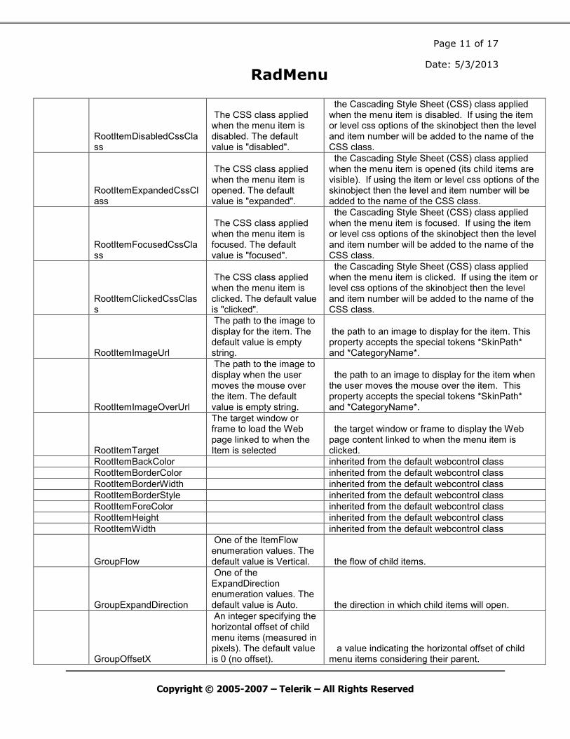
RootItemDisabledCssClass
The CSS class applied when the menu item is disabled. The default value is "disabled".
the Cascading Style Sheet (CSS) class applied when the menu item is disabled. If using the item or level css options of the skinobject then the level and item number will be added to the name of the CSS class.
RootItemExpandedCssClass
The CSS class applied when the menu item is opened. The default value is "expanded".
the Cascading Style Sheet (CSS) class applied when the menu item is opened (its child items are visible). If using the item or level css options of the skinobject then the level and item number will be added to the name of the CSS class.
RootItemFocusedCssClass
The CSS class applied when the menu item is focused. The default value is "focused".
the Cascading Style Sheet (CSS) class applied when the menu item is focused. If using the item or level css options of the skinobject then the level and item number will be added to the name of the CSS class.
RootItemClickedCssClass
The CSS class applied when the menu item is clicked. The default value is "clicked".
the Cascading Style Sheet (CSS) class applied when the menu item is clicked. If using the item or level css options of the skinobject then the level and item number will be added to the name of the CSS class.
RootItemImageUrl
The path to the image to display for the item. The default value is empty string.
the path to an image to display for the item. This property accepts the special tokens *SkinPath* and *CategoryName*.
RootItemImageOverUrl
The path to the image to display when the user moves the mouse over the item. The default value is empty string.
the path to an image to display for the item when the user moves the mouse over the item. This property accepts the special tokens *SkinPath* and *CategoryName*.
RootItemTarget
The target window or frame to load the Web page linked to when the Item is selected
the target window or frame to display the Web page content linked to when the menu item is clicked.
RootItemBackColor inherited from the default webcontrol class
RootItemBorderColor inherited from the default webcontrol class
RootItemBorderWidth inherited from the default webcontrol class
RootItemBorderStyle inherited from the default webcontrol class
RootItemForeColor inherited from the default webcontrol class
RootItemHeight inherited from the default webcontrol class
RootItemWidth inherited from the default webcontrol class
GroupFlow
One of the ItemFlow enumeration values. The default value is Vertical. the flow of child items.
GroupExpandDirection
One of the ExpandDirection enumeration values. The default value is Auto. the direction in which child items will open.
GroupOffsetX
An integer specifying the horizontal offset of child menu items (measured in pixels). The default value is 0 (no offset).
a value indicating the horizontal offset of child menu items considering their parent.

Page 12 of 17
RadMenu Date: 5/3/2013
Copyright © 2005-2007 – Telerik – All Rights Reserved
GroupOffsetY
An integer specifying the vertical offset of child menu items (measured in pixels). The default value is 0 (no offset).
a value indicating the vertical offset of child menu items considering their parent.
GroupWidth
A Unit that represents the width of the child item group. The default value is Unit.Empty.
a value indicating the width of child menu items (the whole item group).
GroupHeight
A Unit that represents the height of the child item group. The default value is Unit.Empty.
a value indicating the height of child menu items (the whole item group).
SelectedPathHeaderI
temCss
The CSS class for the root group item
that is currently selected or one of
it’s children is currently selected
SelectedPathItemCss The CSS class for the item that is
currently selected or one of its
children is selected. Note: does not
apply to the root menu group. See
SelectedPathHeaderItemCss.
SelectedPathItemIma
ge
This image(breadcrumb) will be shown
if the menu item or one of its
children items is selected. The image
accepts the tokens *CategoryName* and
*SkinPath*.
SelectedPathHeaderI
temImage
This image(breadcrumb) will be shown
if the menu item or one of its
children items is selected. The image
accepts the tokens *CategoryName* and
*SkinPath*.
EnableToolTips False If set to true, the category
description will be displayed as a
tooltip when you hover over the menu
item.
ImagesOnlyMenu False The menu item uses the icon file
specified for the category instead of
the category name. However, if no
icon file is specified, then the
category name is used as the item
text.

Page 13 of 17
RadMenu Date: 5/3/2013
Copyright © 2005-2007 – Telerik – All Rights Reserved
EnableLevelCss
False If set to true, “Level” and the level
of the menuitem will be added to the
beginning of its CSS class. Works for
ItemCssClass, ItemCssClassOver,
ItemCssClassClicked,
ItemCssClassDisabled.
For example: if ItemCssClass =
“menu_item” then the menu will use
“Level0menu_item” for the root group
of items, “Level1menu_item” for the
level 1 items and so on.
EnableItemCss False If set to true, each item in the menu
that is not in the root group will
have its CSS class changed according
to the position of that item in the
menu group. The number will be
appended in the end of the CSS
classes ItemCssClass,
ItemCssClassOver,
ItemCssClassClicked,
ItemCssClassDisabled.
For example: if ItemCssClass =
“menu_item” then the menu will use
“menu_item1” for the first item,
“menu_item2” for the second and so
on. This property can be combined
with EnableLevelCss.
EnableRootItemCss False If set to true, each item in the root
menu will have its CSS class changed
according to the position of that
item in the group. The number will be
appended in the end of the CSS
classes ItemCssClass,
ItemCssClassOver,
ItemCssClassClicked,
ItemCssClassDisabled.
For example: if ItemCssClass =
“menu_item” then the menu will use
“menu_item1” for the first item,
“menu_item2” for the second and so
on. This property can be combined
with EnableLevelCss.

Page 14 of 17
RadMenu Date: 5/3/2013
Copyright © 2005-2007 – Telerik – All Rights Reserved
MaxLevelNumber 10 If EnableGroupLevelCss or
EnableLevelCss are set to True, this
property limits the number of levels
that will use the modified CSS
classes. If there are more levels
after MaxLevelNumber, their CSS
classes will be the default ones. For
example when MaxLevelNumber = 3 and
ItemCssClass = “menu_item” all items
after level 3 will have their
ItemCssClass set to “menu_item”,
while all items below level 3 will
have the ItemCssClass and the value
of the level “Level0menu_item”,”
Level0menu_item” etc.
MaxItemNumber 20 If EnableItemCss or EnableRootItemCss
are set to True, this property limits
the number of items that will use the
modified CSS classes. If there are
more levels after MaxLevelNumber,
their CSS classes will be the default
ones. For example when MaxItemNumber
= 3 and ItemCssClass = “menu_item”
all items after the third one will
have their ItemCssClass set to
“menu_item”, while the first three
will have the ItemCssClass and the
order of the item -
“menu_item1”,”menu_item2”,
“menu_item3”.
MaxLevel The maximum number of levels to
display. Useful if you have a big
menu and would like to show only a
part of it. If set to 0 only the root
group will be shown.

Page 15 of 17
RadMenu Date: 5/3/2013
Copyright © 2005-2007 – Telerik – All Rights Reserved
ShowOnlyCurrent If set to “ChildItems” the menu will
render only the child items of the
current category. If set to
“CurrentItem” it will render child
items plus the current category. If
set to “RootItem” then the menu will
render all child items of the root
group item that is selected or is a
part of the path to the currently
selected menu item. If you specify a
Category ID, the menu will display
only the child items of the specified
category. You can also specify a the
name of the category instead of its
ID- the format is
“CategoryItem:Home”(where “Home” is
the category name).
Allowed values are “CurrentItem”,
“RootItem”, and the ID or name of a
Category.
EnableItemId False If set to “True”, the menu will
generate an ID property for each menu
item. The ID will have a value “M_” +
the database ID of the category. For
example “M_36”
EnableCategeoryIcon
s
True Specifies whether to show the
category icons as a left logo of the
menu item.
HeaderFirstItem An image to be displayed at the start
of the header menu group. Can contain
the token *SkinPath*, which will be
replaced with the current skin’s
path.
HeaderSeparator
An image to be displayed between the
menu items in the header group. Can
contain the token *SkinPath*, which
will be replaced with the current
skin’s path.
HeaderLastItem
An image to be displayed at the end
of the header menu group. Can contain
the token *SkinPath*, which will be
replaced with the current skin’s
path.
HeaderFirstItemCssC
lass
A CSS class name, which will be
applied to HeaderFirstItem.
HeaderFirstItemCssC
lassClicked
A CSS class name, which will be
applied to HeaderFirstItem when the
user clicks on it.
HeaderFirstItemCssC
lassOver
A CSS class name, which will be
applied to HeaderFirstItem when the
mouse hovers over it.

Page 16 of 17
RadMenu Date: 5/3/2013
Copyright © 2005-2007 – Telerik – All Rights Reserved
HeaderSeparatorCssC
lass
A CSS class name, which will be
applied to HeaderSeparator
.
HeaderSeparatorCssC
lassClicked
A CSS class name, which will be
applied to HeaderSeparator
when the user clicks on it.
HeaderSeparatorCssC
lassOver
A CSS class name, which will be
applied to HeaderSeparator
when the mouse hovers over it.
HeaderLastItemCssCl
ass
A CSS class name, which will be
applied to HeaderLastItem .
HeaderLastItemCssCl
assClicked
A CSS class name, which will be
applied to HeaderLastItem when the
user clicks on it.
HeaderLastItemCssCl
assOver
A CSS class name, which will be
applied to HeaderLastItem when the
mouse hovers over it.
childGroupFirstItem An image to be displayed at the start
of a child menu group. Can contain
the token *SkinPath*, which will be
replaced with the current skin’s
path.
childGroupSeparator
An image to be displayed between the
menu items in a child group. Can
contain the token *SkinPath*, which
will be replaced with the current
skin’s path.
childGroupLastItem
An image to be displayed at the end
of a child menu group. Can contain
the token *SkinPath*, which will be
replaced with the current skin’s
path.
childGroupFirstItem
CssClass
A CSS class name, which will be
applied to childGroupFirstItem.
childGroupFirstItem
CssClassClicked
A CSS class name, which will be
applied to childGroupFirstItem when
the user clicks on it.
childGroupFirstItem
CssClassOver
A CSS class name, which will be
applied to childGroupFirstItem when
the mouse hovers over it.
childGroupSeparator
CssClass
A CSS class name, which will be
applied to childGroupSeparator.
childGroupSeparator
CssClassClicked
A CSS class name, which will be
applied to childGroupSeparator
when the user clicks on it.
childGroupSeparator
CssClassOver
A CSS class name, which will be
applied to childGroupSeparator
when the mouse hovers over it.
childGroupLastItemC
ssClass
A CSS class name, which will be
applied to childGroupLastItem.

Page 17 of 17
RadMenu Date: 5/3/2013
Copyright © 2005-2007 – Telerik – All Rights Reserved
childGroupLastItemC
ssClassClicked
A CSS class name, which will be
applied to childGroupLastItem when
the user clicks on it.
childGroupLastItemC
ssClassOver
A CSS class name, which will be
applied to childGroupLastItem when
the mouse hovers over it.
EnableUserMenus True A Boolean parameter, specifying
whether or not to show the
normal(non-admin) menu categories in
the menu.
EnableAdminMenus True A Boolean parameter, specifying
whether or not to show the
admin(Admin and Host) categories in
the menu.
CopyChildItemLink False Some menu items have disabled
links(for example “Admin”, “Host”
etc.). If you have a menu with
MaxLevel=0, then these menus will be
inaccessible because you cannot click
on “Admin” or “Host” items. With this
option set to True, all menu items
that do not correspond to a category
will point to their first child item.
For example clicking on the Admin
menu will redirect the user to
“Admin>Site Settings”(the first child
category in the admin menu).
ShowPath False If set to true, the current category
item and its parents will be
displayed as focused. You can change
the default CSS class using the
SelectedPath skinobject attributes.
CategoriesToExclude A comma-separated list of category
IDs OR Names that will NOT be
included in the menu navigation
control.