question one
TRANSCRIPT

There are many similarities between my media product and the existing one.
The Title:
The first similarity is the colourful theme. I chose to use a similar theme as I thought it worked really well as it stood out from other, available magazines.
Both of the titles in the media products have bold, large text. This is to help the readers know what magazine it is and to help them familiar themselves to it.
I have no included too much text around the title as I think this may draw attention away from it.
The Main Image:
Both of the magazines have full sized images covering the whole front cover. Magazines can do this when the star on the cover is so famous that there is no need for any other artists to be included.
Both images have the artists using direct mode of address to pull the readers in

Both backgrounds of the pictures are white. I used this as I think it helps the photograph to look more professional. I also used this as I think it does not draw attention away from the text or image.
In both pictures the artists are using wearing dark colours. This is to make sure that no attention is drawn away from the text.
Headings:
Both magazines have the main heading or quotes in bold, in front of the artist. Again they use bright colours in order to stand out. I chose to use a pull quote instead of a headline related to the article as I thought
this way I would be able to let my readers know that it Is not just an article about the artist but with them as well which I believe is more appealing as the readers can learn more, intimate things about the star. Using a pull quote is a common convention found in most music and non-music magazines.
Cover Lines:
Both magazines have a similar layout, where the cover lines are all down one side.
They both have the text highlighted in different colours to help the reader notice the most important things first in order to catch their attention
Barcode:
To make my magazine look more authentic I made sure I also included a barcode. I also chose to place my barcode in the bottom corner of my magazine, as this way it does not draw too much attention away from the
magazine.
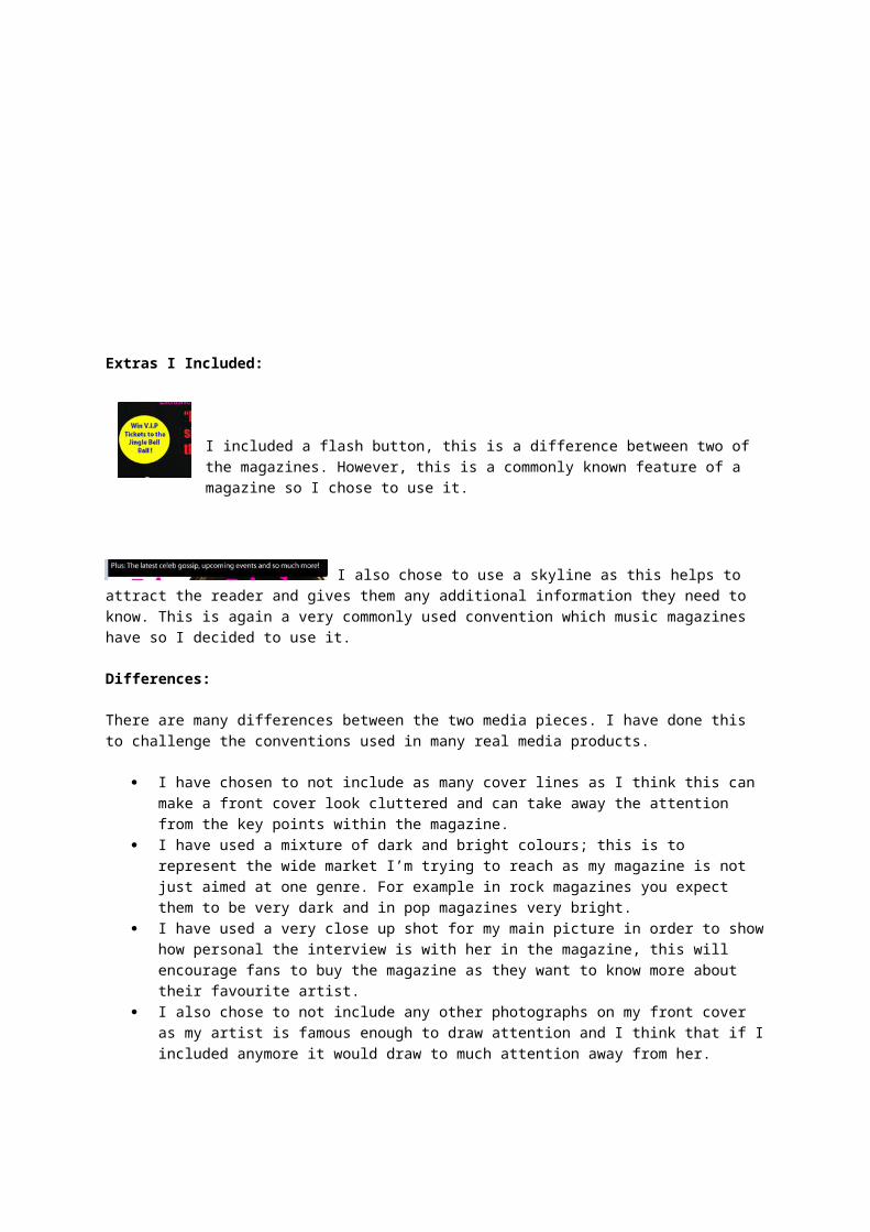
Extras I Included:
I included a flash button, this is a difference between two of the magazines. However, this is a commonly known feature of a magazine so I
chose to use it.
I also chose to use a skyline as this helps to attract the reader and gives them any additional information they need to know. This is again a very commonly used convention which music magazines have so I decided to use it.
Differences:
There are many differences between the two media pieces. I have done this to challenge the conventions used in many real media products.
I have chosen to not include as many cover lines as I think this can make a front cover look cluttered and can take away the attention from the key points within the magazine.
I have used a mixture of dark and bright colours; this is to represent the wide market I’m trying to reach as my magazine is not just aimed at one genre. For example in rock magazines you expect them to be very dark and in pop magazines very bright.
I have used a very close up shot for my main picture in order to show how personal the interview is with her in the magazine, this will encourage fans to buy the magazine as they want to know more about their favourite artist.
I also chose to not include any other photographs on my front cover as my artist is famous enough to draw attention and I think that if I included anymore it would draw to much attention away from her.
