question 3
TRANSCRIPT

QUESTION 3What have you learned from your audience feedback?
By Simone

With every idea we had for our film, our group pitched these ideas to each other and to our class during reflection sessions. The feedback received from these sessions about our film (both positive and negative) enabled my group members to reflect on our work and come up with alternative ways to improve it. The feedback enabled us to think about how we were going to get the story line across to our audience with minimal amount of verbal communication. This in turn made us think about:• The use of camera angles - to give the perception that the story was about a stalker.
• Depth of field - to give the appearance that the jogger was being watched from a distance.
• Lighting - to put across the audience that the film started off innocently (being shot in daylight) and changed to being sinister (being shot in low light in a container).
• The use of non-verbal communication between the two actresses and the use of props to bring out the storyline.
• Who the target audience should be as the film is a thriller with the implication of violence.
The feedback received from the reflection sessions was really helpful as the information was used to help us reshoot certain scenes so that we achieved the desired effect. Further feedback from family and friends after showing them the draft cuts of the film enabled the group to make further improvements to the film e.g. continuity of clothing and props, close ups of the face to see non-verbal expressions clearer and filming behind the actress to give anonymity to the character.

PRE-PRODUCTION
SHORT FILM
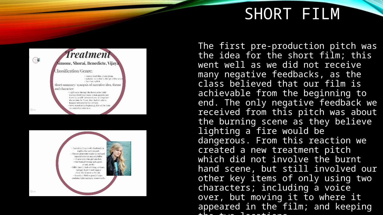
The first pre-production pitch was the idea for the short film; this went well as we did not receive many negative feedbacks, as the class believed that our film is achievable from the beginning to end. The only negative feedback we received from this pitch was about the burning scene as they believe lighting a fire would be dangerous. From this reaction we created a new treatment pitch which did not involve the burnt hand scene, but still involved our other key items of only using two characters; including a voice over, but moving it to where it appeared in the film; and keeping the two locations.

PRINT PRODUCTSThe second pre-production pitch was the idea for our print products; this also went well as the mock up ideas we created (the one consisting of the image of the eye), attracted everyone’s attention in the class. This was a good positive start for our group as it showed that other students were interested in what we were planning. This in turn urged my group to go down this design route. While the poster design was a positive hit, the name of our film and the layout of the text did not attract as much positive attention from the class. The original ‘R’ for the word ‘Run’ was reversed within the title. This was later changed as feedback indicated that there was no added benefit in doing this and linking it to the title. On reflection, it may have been better to keep the reversed ‘R’ as it would have represented the reverse in roles of the two actresses. We also tried making the letter ‘R’ look like it was running by angling the lower two parts of the letter to make them look like legs and feet. Again, feedback from the group resulted in this being removed as the class members felt that there was no connection with the other media. In its place my group agreed on replacing the pupil of the eye on the poster with an image of one of the actress’s feet wearing jogging shoes to character being observed while running.

ROUGH CUT/ POST PRODUCTION:
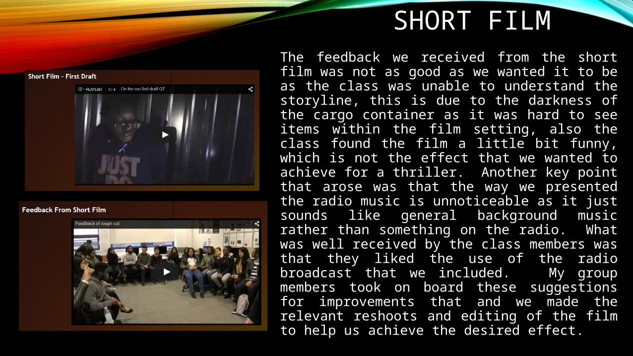
SHORT FILMThe feedback we received from the short film was not as good as we wanted it to be as the class was unable to understand the storyline, this is due to the darkness of the cargo container as it was hard to see items within the film setting, also the class found the film a little bit funny, which is not the effect that we wanted to achieve for a thriller. Another key point that arose was that the way we presented the radio music is unnoticeable as it just sounds like general background music rather than something on the radio. What was well received by the class members was that they liked the use of the radio broadcast that we included. My group members took on board these suggestions for improvements that and we made the relevant reshoots and editing of the film to help us achieve the desired effect.
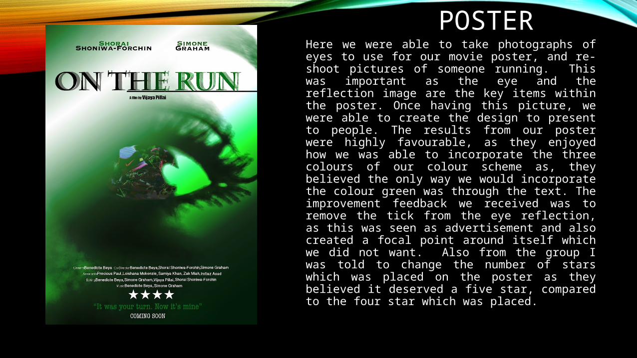
POSTERHere we were able to take photographs of eyes to use for our movie poster, and re-shoot pictures of someone running. This was important as the eye and the reflection image are the key items within the poster. Once having this picture, we were able to create the design to present to people. The results from our poster were highly favourable, as they enjoyed how we was able to incorporate the three colours of our colour scheme as, they believed the only way we would incorporate the colour green was through the text. The improvement feedback we received was to remove the tick from the eye reflection, as this was seen as advertisement and also created a focal point around itself which we did not want. Also from the group I was told to change the number of stars which was placed on the poster as they believed it deserved a five star, compared to the four star which was placed.

FILM REVIEWThe film review was originally created as a double page spread using the colour scheme which we chose green, black and white. We had mixed feedback about our review page. While undertaking further research on the layout of print on a page, we decided that a single page rather than double page spread would make a better impact. The improvements we made was to remove the peach colour as it did not match our colour scheme; redo the bottom right text as it is confusing to read; and to find better stills as the blue square as it was still inside the still.

OVERALL PRODUCTS
SHORT FILM
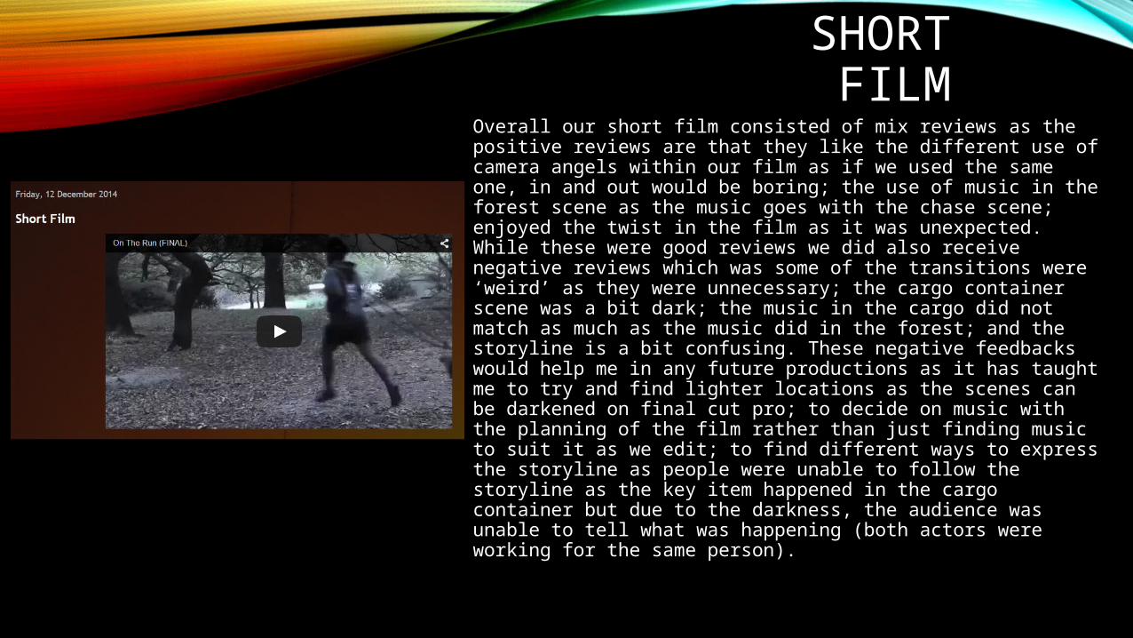
Overall our short film consisted of mix reviews as the positive reviews are that they like the different use of camera angels within our film as if we used the same one, in and out would be boring; the use of music in the forest scene as the music goes with the chase scene; enjoyed the twist in the film as it was unexpected. While these were good reviews we did also receive negative reviews which was some of the transitions were ‘weird’ as they were unnecessary; the cargo container scene was a bit dark; the music in the cargo did not match as much as the music did in the forest; and the storyline is a bit confusing. These negative feedbacks would help me in any future productions as it has taught me to try and find lighter locations as the scenes can be darkened on final cut pro; to decide on music with the planning of the film rather than just finding music to suit it as we edit; to find different ways to express the storyline as people were unable to follow the storyline as the key item happened in the cargo container but due to the darkness, the audience was unable to tell what was happening (both actors were working for the same person).

POSTEROverall, the poster received good comments as they are able to understand the colour scheme which was chosen to relate to the film “the use of green fits in well with the theme of the film which is mostly in the forest”; “the reflection of the feet running in the eye is a good connotation of being watched”, “…edited a part of the forest into the eye”; what “is good is the use of the shadow in the title, representing running”.
The improved points we received was to “add ... Who the film is presented and sponsored by to make it look like a professional poster”; make “the font at the bottom of the page should be the same as the other font used in order to keep it looking consistent.” These are good points as these are things seen within other movie posters and they also add consistency into the product.

FILM REVIEWOur poster went through many improvements but resulted into one final piece. The positive comments we received was that the main image “… covers the top half of the page”; “the Q&A box on the right hand side of the page”; “you have used conventions such as gutters, page numbers, and pull quotes.”; “You have kept to a clear colour scheme through the poster which is good”.
The improvements we received were to “change the font to Arial as I think it would read better”; “change the background colour to white”; “the quote is placed in the middle which distorts the columns and ruins the alignment of the work”; “double page spread you could have included more content”. For future productions these are good points to continue with me as people would want to know more about the film, so more content is needed allowing audience to see if it is worth their time; it is always better to use a font which people can read, so Arial is always the best choice as it is the most common font.