question 1 re do
TRANSCRIPT

In what ways does your media product use, develop or
challenge forms and conventions of real media products?
First question out of seven using PowerPoint

What is conventions?
A convention in media can be defined as a unique, and different style of media text. Every different branded magazine has their own style of text and how their present it to the audience. These are important as It really emphasis the unique format and content of the magazine.
As seen here, the media conventions is within the text ‘contents’, as its re-shaped to make the reader interested within the writing.

Use of media conventions on my front cover
The conventions I used in my magazine were based upon the typical conventions, VIBE magazine use in their magazine. For instance my magazine media text follows, the structure of my chosen model’s face, just like VIBE magazine.
Furthermore another convention is the way the texts is laid out. For example the ‘exclusive hit album’ text is placed inside a block colored background. I used this to really make the text stand out.
Lastly another convention I used is the barcode and QR code. This is a key feature on any magazine a it displays the price and further details. I used the same convention on my magazine for further realism.
VIBE
My magazine
Double spread page
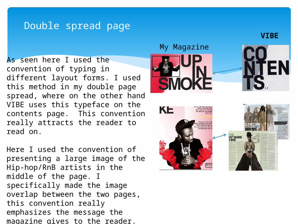
As seen here I used the convention of typing in different layout forms. I used this method in my double page spread, where on the other hand VIBE uses this typeface on the contents page. This convention really attracts the reader to read on.
Here I used the convention of presenting a large image of the Hip-hop/RnB artists in the middle of the page. I specifically made the image overlap between the two pages, this convention really emphasizes the message the magazine gives to the reader. As seen here VIBE uses the same conventi0n for their double page spread.
VIBE
My Magazine

Contents pageFor contents page I used the contention of typing the text in a different layout. In comparison to the convention vibe used, I differed mine by making two letters in drop down which shows creativity. This allows the reader to stay interested.
Secondly I used a structured layout of what is expected within the magazine. I used the convention of typing numbers next to the texts. I used bright and bold colours just as the convention vibe uses. This makes it visually clear for the readers to read.
My magazine
VIBE

Re doing of my magazine
Although I have kept the similar conventions in my magazine as previously seen, I have changed some conventions in order to make my magazine stand out.
I have re done my contents page and front cover, and just made minor adjustments to my double page spread.
Redo – Front cover
VIBE
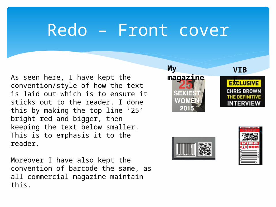
My magazine As seen here, I have kept the
convention/style of how the text is laid out which is to ensure it sticks out to the reader. I done this by making the top line ‘25’ bright red and bigger, then keeping the text below smaller. This is to emphasis it to the reader.
Moreover I have also kept the convention of barcode the same, as all commercial magazine maintain this.
Redo – Contents page
VIBE
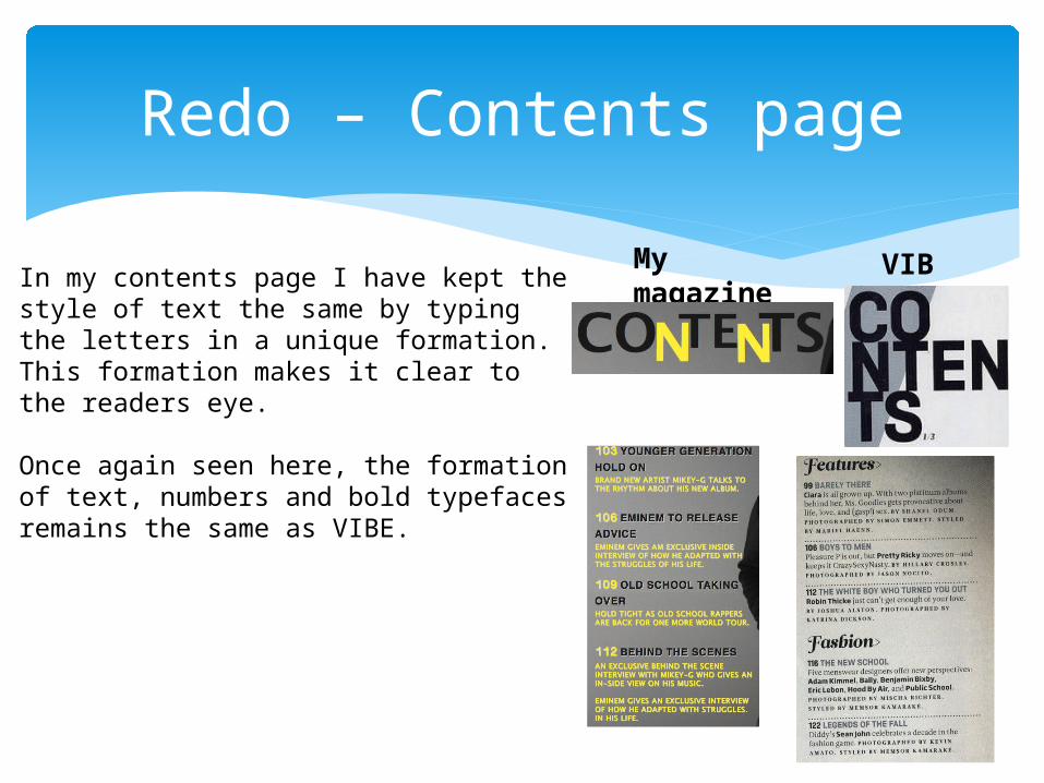
My magazine In my contents page I have kept the style
of text the same by typing the letters in a unique formation. This formation makes it clear to the readers eye.
Once again seen here, the formation of text, numbers and bold typefaces remains the same as VIBE.

Redo – Minor changes to double page spread
VIBE
My magazine
As seen above I have simply enlarged my main picture, and moved it to one side of the page. I done this with the purpose of making it look more like a Hip-Hop magazine like VIBE. As they have a enlarged picture on one side of the page.