question 1 complete
TRANSCRIPT
Question 1 - In what ways does your media product use, develop or
challenge forms and conventions of real media products?
Sauzanne Micael

Throughout my studies, my group and I created amusic video for the song ‘Youth’ by Daughter. Thissong belongs to the hybrid genre Indie Folk. In orderto conduct a media product that was true to thisgenre, it was necessary to carry out both primaryand secondary market research; analysing therepetitive features that were included in successfulexisting music videos, highlighting what we weretrying to achieve. As a result of this, I would be ableto assess the ways in which the conventions I hadrecognised could be introduced in my own product.In the construction of my ancillary tasks, I created aposter advertisement endorsing the EP Daughterwas releasing as well as a digipak consisting of afront, inside, cd cover and back design of an album.Similar to the music video, I analysed currentexamples of both poster ads and digipaks asrecognising the conventions of existing promotionpackages gives me an idea of what successfulexamples within my chosen genre were including.

Initially, my primary market researchemphasised that natural settings are idealmise-en-scene locations for music videoswithin the indie folk genre. For instance, themusic video for ‘Holocene’ by Bon Iver usesthis convention to represent the positivity theyoung male protagonist is moving towardswith particular shots of beautiful skiesconnoting a ‘brighter future’. Particularly areasthat are relatively isolated, generating anambiguous theme in which audiencesquestion why they are there and how it linksto the song. The open land also contributes toescapism audiences may feel according to theuses and gratifications theory as it forms a zenlike atmosphere that distracts people fromtheir own thoughts.
Music Video

Music Video
We decided to use this convention in ourmedia product, as we felt it reflected thelyrics of the song well. The lyrics are basedon the struggles young people face andwhat they turn to help them cope. Naturalsettings such as parks with a heavy sense ofgreen imagery link closely to thestereotype of young people being vibrantand pure. In our own music video, wedecided to use a field setting and low angleshots looking up at the sky with greenerycoming in the sides of the shots. This wasvery effective as it meant we were directlyexhausting a feature that indie folk genremusic videos were including whichtherefore recognises the music video wewere creating as belonging to the genre.

Music Video
Another convention weused is the need for awide-angle shot. Wide-angle camera shots act ina way that allows a lot ofbackground details intothe composition of theshot so audiences tend tohave more to take inalthough the subject takesup the full frame.
Many of the music videos I had researched included this specific feature involving theGrizzly Bears music video for ‘Two Weeks’. This particular shot of the four groupmembers clearly allows audiences to take in the background and the colours incooperated in the stained glass. This innovative way of introducing the Grizzly Bears isinteresting as it is a simple way of attracting an audiences appeal, as they becomefamiliar with the group.
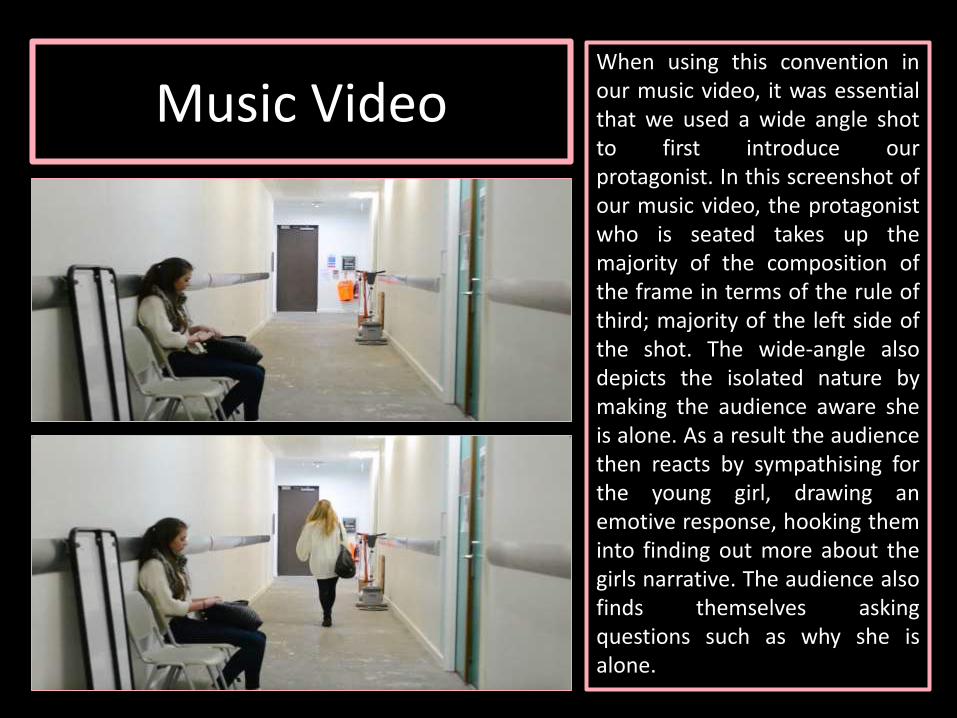
Music VideoWhen using this convention inour music video, it was essentialthat we used a wide angle shotto first introduce ourprotagonist. In this screenshot ofour music video, the protagonistwho is seated takes up themajority of the composition ofthe frame in terms of the rule ofthird; majority of the left side ofthe shot. The wide-angle alsodepicts the isolated nature bymaking the audience aware sheis alone. As a result the audiencethen reacts by sympathising forthe young girl, drawing anemotive response, hooking theminto finding out more about thegirls narrative. The audience alsofinds themselves askingquestions such as why she isalone.

Music VideoAdditionally, my research identified that a solidmajority of music videos within this hybridgenre are narrative based, however they seemto be at a very slow pace of being progressiveand lack detail. This is the case in the musicvideo for Damien Rice’s ‘9 Crimes’; a slow buildup between his character and the balloon withthe face of a women eventually being poppedin the end. The lack of storyline was aconvention I wanted to develop as I found itwould be effective if my target audience couldhave a physical interpretation of the struggleyoung people go through. Therefore in mymusic video, the character is seen in variouslocations, that each contribute to her storybeing told and the development of thenarrative.

Music Video
Although we did proceed to use natural settings as locations,we decided to challenge the traditional convention of just thistype of location seen in my research; by in cooperating busylocations. Even though it is unconventional to the genre, it wasimportant to vary the scenes as the music video is set incontemporary London. This is associated with busy people.Emphasizing how careless people can be about others. Thisportrayed in the bus stop scene which was sot in Oxford Street.The many people passing the young female character as she issat statically exaggerates how little she is cared for. This canalternatively be seen as a metaphor for the people in her lifenot paying attention to her. According to Andre Goodwin'stheory, there is a succinct relationship between visuals andmusic. This demonstrated by the increasing pace of thesoundtrack amplifying in the music video of the people walkingpast her quickly. As the audience witness this, they begin tosympathize with her, identifying themselves as being in hersituation and being drawn in from the emotive imagery.
Digipak
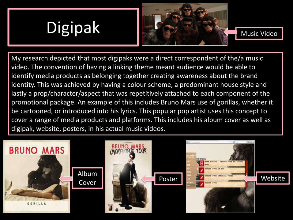
My research depicted that most digipaks were a direct correspondent of the/a music video. The convention of having a linking theme meant audience would be able to identify media products as belonging together creating awareness about the brand identity. This was achieved by having a colour scheme, a predominant house style and lastly a prop/character/aspect that was repetitively attached to each component of the promotional package. An example of this includes Bruno Mars use of gorillas, whether it be cartooned, or introduced into his lyrics. This popular pop artist uses this concept to cover a range of media products and platforms. This includes his album cover as well as digipak, website, posters, in his actual music videos.
Music Video
AlbumCover Poster Website
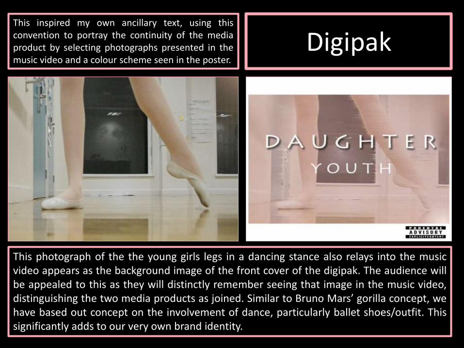
DigipakThis inspired my own ancillary text, using thisconvention to portray the continuity of the mediaproduct by selecting photographs presented in themusic video and a colour scheme seen in the poster.
This photograph of the the young girls legs in a dancing stance also relays into the musicvideo appears as the background image of the front cover of the digipak. The audience willbe appealed to this as they will distinctly remember seeing that image in the music video,distinguishing the two media products as joined. Similar to Bruno Mars’ gorilla concept, wehave based out concept on the involvement of dance, particularly ballet shoes/outfit. Thissignificantly adds to our very own brand identity.
Digipak
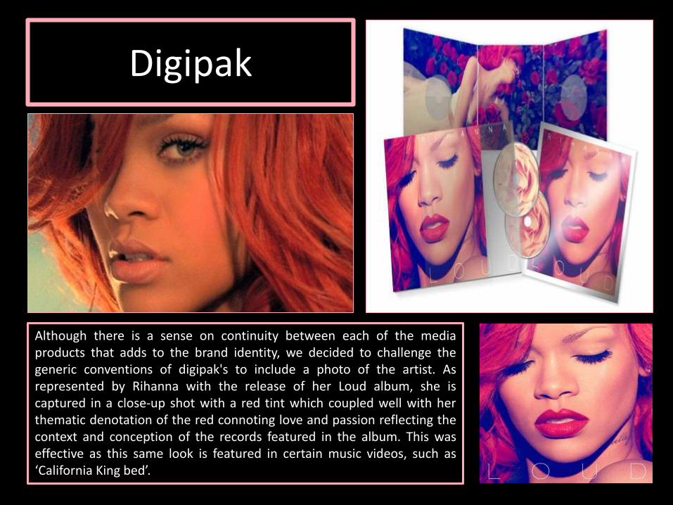
Although there is a sense on continuity between each of the mediaproducts that adds to the brand identity, we decided to challenge thegeneric conventions of digipak's to include a photo of the artist. Asrepresented by Rihanna with the release of her Loud album, she iscaptured in a close-up shot with a red tint which coupled well with herthematic denotation of the red connoting love and passion reflecting thecontext and conception of the records featured in the album. This waseffective as this same look is featured in certain music videos, such as‘California King bed’.

Digipak
By not including the artist we allow theaudience to interpret whether they wantto purchase the CD Digipak solely on itsappearance. Arguably, even though wedecided not to use the main artist, whichin this case is Daughter to appear on ourdigipak, our creation still manages to bejust as effective as it still conveys thebrand identity that was crucial for us toachieve. As well as this, Daughter is notwidely known for their appearance as aband. This due to the indie folk genre notbeing relatively new in comparison toother musical genres. Therefore theywould not stand out amongst otherartists in stores or across mediatechnologies.

Poster
The first convention we decided to develop was the use oftaglines that sell how successful the music is. Usually passiveaudiences according to the hypodermic syringe approach endup positively reacting the information being shared. Capital FM,MTV and Billboard are all three credited sources that have a lotof influence on young people as they tend to deliver whatyoung people enjoy. This combined with the actual purpose ofposters which is to promote an album that is new. Thusencourages audiences interacting to the news.
Poster
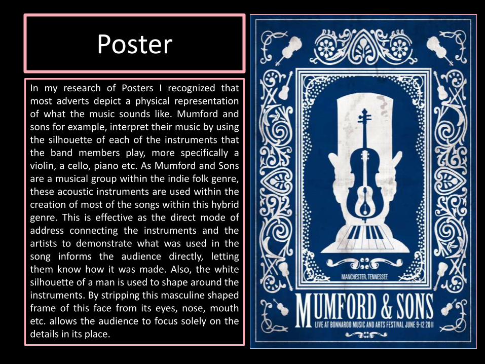
In my research of Posters I recognized thatmost adverts depict a physical representationof what the music sounds like. Mumford andsons for example, interpret their music by usingthe silhouette of each of the instruments thatthe band members play, more specifically aviolin, a cello, piano etc. As Mumford and Sonsare a musical group within the indie folk genre,these acoustic instruments are used within thecreation of most of the songs within this hybridgenre. This is effective as the direct mode ofaddress connecting the instruments and theartists to demonstrate what was used in thesong informs the audience directly, lettingthem know how it was made. Also, the whitesilhouette of a man is used to shape around theinstruments. By stripping this masculine shapedframe of this face from its eyes, nose, mouthetc. allows the audience to focus solely on thedetails in its place.

Poster
The previous convention acknowledgedreflects in our own media product as wedecided to directly in cooperate theguitar. This was achieved byphotographing the main character in ournarrative seated on the ground croucheddown resting on the guitar. Thecharacters face is covered to add moreemphasis on the guitar and make surethat stands out. Similar to the Mumfordand Sons poster, we decided by reducingthe facial features of the young female,
the guitar is more so the focus in this photograph. The guitar also takes up the majorityof the space in the composition of the shot to support this. This also correlates with thedigipak as back cover of the digipak design does not present the young girls face is alsonot clearly seen. Continuing this on to the poster is essential in creating products thatare fluent together.

However, we further developed theconvention by ensuring we stuck to thethematic colour scheme we aimed to pursuein the planning stage of the design as brandidentity requires a package to be similar. Thiswas carried out by firstly using a pink guitarprop. This light pink coloured guitar wasperfectly matched to the light pink filter weintroduced to the digipak. Audiences wouldbe able to identify the character mockinglyplaying the guitar as the same characterwithin our music video and photographed inthe digipak as the same individual since wemade the purple ballet mise-en-scenecostume iconic as well as the ballet shoes.
Poster

Poster
In my research of conventions of general poster advertisements, it was evident thatmost musical artists tend to model their on their own album digipak's and promotionaladvertisements. According to the Andrew Goodwin theory, this is so their ‘star image’remains intact, as the camera shot portrays the identity of the main person involved.As a result of this, the audience is made aware of who the content belongs to. This alsohelps create make someone more famous as a public figure as their face will be morememorable to consumers, essentially putting a face on the music. This particularconvention was demonstrated in the exhibition of the advertisement Ed Sheeran usedto promote his popular ‘+’ album.

Poster
We decided to challenge this convention as we recognisedthe artist is not shown in the duration of the music videonor is she seen in any of designs for the digipak. Thereforewe realised it may be confusing for audiences to not haveseen the artist before hand and then later be introduced to‘Daughter’ in the poster advertisement. Instead, wefeatured the same protagonist character seen in theancillary product and music video on our poster. We wentfurther and also included a photograph of the front of thealbum so the consumers were aware of what they should belooking out for when wanting to purchase the accompanyingCD digipak for this EP.

Poster
A convention we realised would be very beneficial to use in our own ancillary task is the sharing when the album will be available for purchase for our targeted demographic. This ensures consumers are made ready for the sale of the EP and informs them on where they may be able to purchase it from. This aspect is often included in most poster advertisements in a variation of genres as it ultimately draws in an audience leading to an increase in revenue, thus an increase in financial gains of the EP selling.

Poster and Digipak
I also noticed that the combination of the main product andancillary tasks were often designed so that they each coordinatedtogether, using a repetitive font, font colour and size. Again, usingthe example of Ed Sheerans ‘+’ album, the simplistic denotationof the white plus symbol position in the bottom half of both thedigipak front cover and poster ad, is quite small. The same font isalso used throughout the creation of the poster. This conventionis interpreted also in my own products as they all remain thesame even though they are on different media platforms.