question 1
TRANSCRIPT

Question 1 In what ways does your media product
use, develop or challenge forms and conventions of real media products?

I followed the front cover convention of a cover image, if the front cover has a person on it, the person usually gives thee audience direct address. Using direct mode of address engages the audiences interest so I was using uses and gratification theory, meaning there more likely to buy the product. The cloths worn buy the model is very simple meaning that the attention of the target audience will be on the models face, background and text.
My front cover also conformed to stereotypical regional magazines by using supportive information such as barcodes, price tags and websites, in order to provide a sense of realism and professionalism within the magazine.
I used a subheading below the masthead with the word “Thanet” to establish regional identity, which follows the same style as one of my main inspirations, Absolute magazine
If we look at the master head used within my front cover, you can see that the word is presented largely on the page and is in upper case so it grabs potential readers attention because most people read from the top left so its important that the master head makes a big impact on your target audience, and also having your master head here is a very common theme in my research.The reason I decided to call my magazine “UNLIMITED” is because it is catchy and gives the target audience the impression that this magazine is unlimited with information.

My magazine follows a colour scheme because this was shown as a convention of Absolute magazine and this was my main focus. I decided to follow a red colour scheme because some of Absolutes followed a red colour scheme and it shows my ,magazine as edgy and bold and this is the look I was going for as it reflects my brand image, also, when I showed my focus group a variety of colours put onto my front page red was voted their favourite and the most eye catching.
I followed the convention of airbrushing the cover star as seen on Time out and absolute. I did this so the cover star will appeal to the members of my target audience. I used an attractive model so other females would aspire to be like her. I airbrushed my cover star by: contouring her face, evening out the skin tone, eliminating spots, reducing darkness under the eyes and neatening her hair.
The cover lines are normally justified to the left so they do not disrupt the main image, this is a common convention of regional magazines if there is a strong main image, so this is why I decided to put the cover lines there, also I used a bold sans serif font so they were readable. The above pictures shows where absolute put there cover lines.
I used a bottom strip because it was conventional on Absolute Brighton, It will also appeal to your target audience because it briefly says what is going to be inside the magazine so its using Barthes theory.
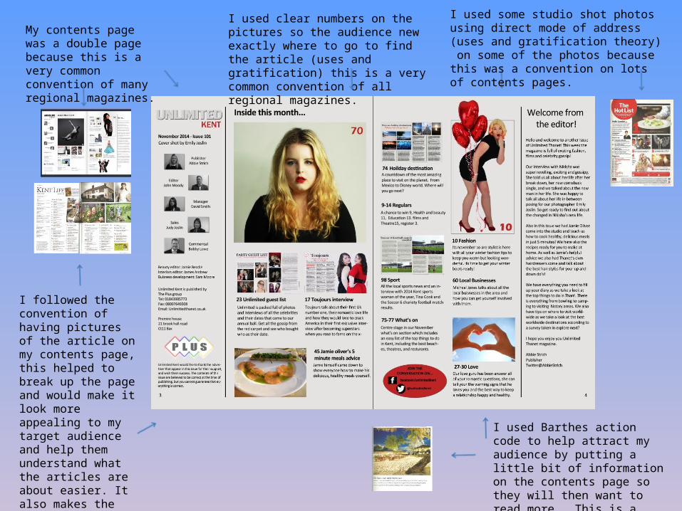
I used some studio shot photos using direct mode of address (uses and gratification theory) on some of the photos because this was a convention on lots of contents pages.
I used Barthes action code to help attract my audience by putting a little bit of information on the contents page so they will then want to read more. This is a convention of lots of regional magazines.
My contents page was a double page because this is a very common convention of many regional magazines.
I used clear numbers on the pictures so the audience new exactly where to go to find the article (uses and gratification) this is a very common convention of all regional magazines.
I followed the convention of having pictures of the article on my contents page, this helped to break up the page and would make it look more appealing to my target audience and help them understand what the articles are about easier. It also makes the page easy to read.

I followed the convention of advertising the magazines social media accounts. This will appeal to a younger target audience as they will recognize the brand so its making my magazine appeal to a younger audience, which is ideal as this is the age I am aiming for.
I followed the convention of using a sans serif font on my contents page because it is easy to read so my target audience wont struggle to read it. The black font looks sophisticated and the odd bits of red on the page keeps in with my house style.
Having the name of the magazine on the contents page reminds the target audience of the logo so it becomes memorable. By having it in upper case makes it stand out and creates a sense of excitement and importance
I added a paragraph from the editor as it appeals to my target audience by building a more person relationship with them. This is a convention seen in Absolute Brighton.
I followed one of absolute Brighton convention of having a logo of a sponsor for the magazine, I did this because it made my contents page look more real.

I used social media sites on my advert so the audience could feel involved with the advert and would know how to get involved.
I advertised the different shops that will be at the shopping centre because this grabs my target audiences attention because they might see a logo they recognise.
I put the logo of the shopping centre on the advert so people would have something to recognise, this is a normal convention of adverts.
I used a picture of something that people will recognise because it will grabs people’s attention and make them read the rest of the advert. This is not a convention of many adverts but I did find one that used Santa.
I used a background colour with snow flakes because it gave the advert a Christmassy feel so would show the target audience that not only was the advert advertising a shopping centre it is also advertising different things that are happening due to it being Christmas time.

The page is layed out so you start read from the top and go down this is set out like this so its clear for the target audience to read this is a normal convention of adverts,
I used pictures from Westwood cross because it shows the audience what you are describing so they can physically see it to. I took the picture in the evening and edited some of them darker because it made it seem more like Christmassy.This is a normal convention to show a picture of the product you are advertising.
I used a colour scheme of blue’s and purple because it makes the advert look sophisticated because its not covered with lots of different colours and it also makes it look more eye catching for my target audience. Having a colour scheme Is a normal convention of adverts.
Reception theory was considered when I create my advert because I wanted my target audience to have a preferred reading that this was aimed at working class (due to the shops advertised) and both male and female because everybody needs to go shopping.

I used a sans serif font because I wanted my advert to stick with my house style, also the example I found of billboards used a sans serif font.
I followed the convention of having recognizable logo, which is easy to read. The logo is bold and in capital so it stands out and is readable. By having it the same font as my magazine means that my target audience will recognise my magazine.
I followed the convention of having a slogan that appeals to my target audience, This links with the “uses and gratification theory” of “surveillance”. This is because the target audience can gain information.
I put pictures of my magazine on the billboard and on a iPad and iPhone to show the target audience everywhere they could get the magazine from.

I followed the convention of having the digital version of the magazine displayed on the website. This will appeal to the target audience, as digital forms of magazines are popular.
I also followed the convention of having a master head at the top of the website. This enables greater brand recognition for the target audience.
I followed the convention of having adverts on my website.
I also have the page bar displayed at the top of the website. This is so the target audience can easily navigate . The pages varies in content, which will also appeal to the target audience.

I also followed the convention of advertising the magazines social media accounts, showing my magazine is appealing to my target audience because it is showing it is young and up to date.
I also put a selection of articles on my main page so people can link straight to more information. I did this to appeal to the target audience and because it’s a convention of Absolute Brighton.
One of the pages that was on my website was to a survey that you could fill out for a chance to win something. This will appeal to my target audience as they will have a chance to win something.

Another page on my website was a store where you could buy the magazine from, this is a very common convention because it means the company will make money by people purchasing the magazine.
My gallery page was put on my website because this is also a common convention, as it is a good way of keeping your target audience interested.
Another page on my website was news, most regional magazines have a news link or something similar as a way to update the audience of events.