q1. in what ways does your media product use, develop or challenge forms and conventions of real...
TRANSCRIPT

Q1. IN WHAT WAYS DOES YOUR MEDIA
PRODUCT USE, DEVELOP OR
CHALLENGE FORMS AND
CONVENTIONS OF REAL MEDIA PRODUCTS?
COVER
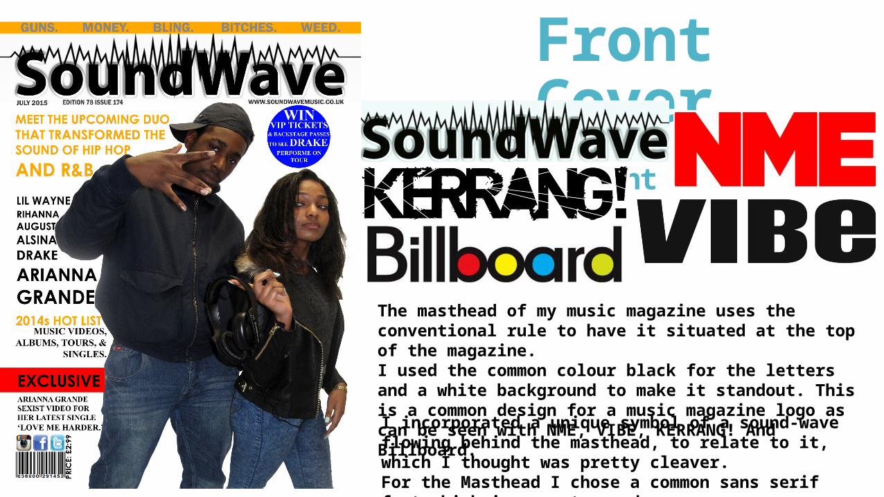
Front Cover
Masthead and font
The masthead of my music magazine uses the conventional rule to have it situated at the top of the magazine. I used the common colour black for the letters and a white background to make it standout. This is a common design for a music magazine logo as can be seen with NME, VIBE, KERRANG! And Billboard.I incorporated a unique symbol of a sound-wave flowing behind the masthead, to relate to it, which I thought was pretty cleaver.For the Masthead I chose a common sans serif font which is easy to read.

Barcode, Date, USP, Main Cover-line & Cover-linesThe barcode challenges the conventions of a real
music magazine, as it is not situated in the “normal” place on the magazine. A barcode is usually situated at the bottom right-hand corner of a magazine whereas mine is situated at the bottom left-hand corner along with the price.Again to challenge the conventions of a real music magazine I positioned the date, issue number and edition number directly below the masthead. This was done to keep the bottom of the magazine visual and not too crowded with information. Also by placing the date directly under the masthead it allows the audience to identify the how recent the magazine is instantly, which is more appealing to them.
The main cover line follows the conventional rule of a magazine, as it is the largest text on the cover. This shows importance to the text and attracts the attention of the audience, it also links to the story on the double page.The layout of the cover-lines develops and challenges the conventions of a real music magazine, as they flow down the left-hand side of the magazine adapting the shape of the male model. This I think is a unique and creative design that doesn’t make the magazine look too crowded and it will attract the target audience.
The Unique selling point of the magazine contains language that is common by is not likely to be seen on the cover of a music magazine.
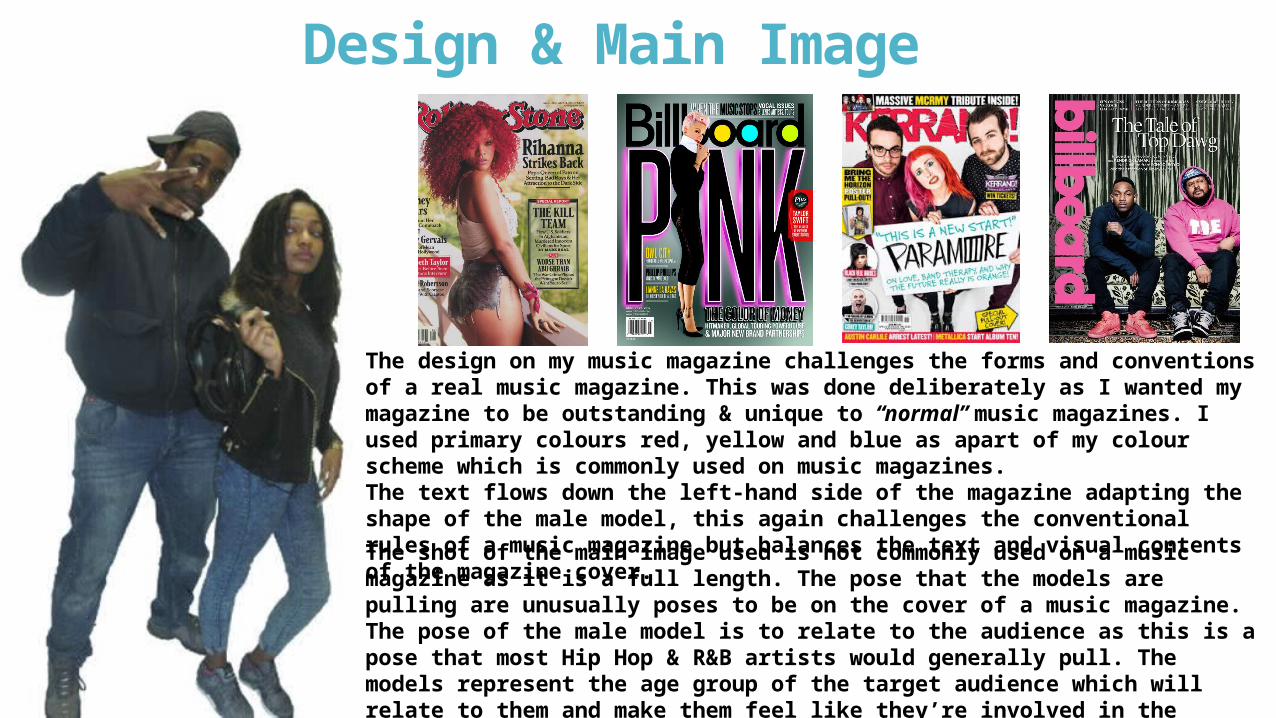
Design & Main Image
The design on my music magazine challenges the forms and conventions of a real music magazine. This was done deliberately as I wanted my magazine to be outstanding & unique to “normal” music magazines. I used primary colours red, yellow and blue as apart of my colour scheme which is commonly used on music magazines.The text flows down the left-hand side of the magazine adapting the shape of the male model, this again challenges the conventional rules of a music magazine but balances the text and visual contents of the magazine cover.The shot of the main image used is not commonly used on a music magazine as it is a full length. The pose that the models are pulling are unusually poses to be on the cover of a music magazine. The pose of the male model is to relate to the audience as this is a pose that most Hip Hop & R&B artists would generally pull. The models represent the age group of the target audience which will relate to them and make them feel like they’re involved in the magazine. As there is no hierarchy in class or power it’ll make the audience feel more comfortable with the product they’re buying.