pure design: front matter
DESCRIPTION
The foreword and introduction from Mario Garcia's "Pure design"TRANSCRIPT
pure design
pure design
mario garcia
7 9 S I M P L E S O LU T I O N S F O R M AG A Z I N E S
B O O K S , N E W S PA P E R S , A N D W E B S I T E S
M I L L E R M E D I A
S T. P E T E R S B U R G , F L O R I D A
Published by
Miller Media
St. Petersburg, Florida
© 2002 Dr. Mario Garcia
All rights reserved.
No part of this book may be reproduced in whole or in part without
permission from the publisher, except by a reviewer who may quote
brief passages in a review, nor may any part of this book be repro-
duced, stored in a retrieval system, or transmitted in any form or by
any means electronic, mechanical, photocopying, recording, or other,
without written permission from the publisher.
Special thanks to Dr. Pegie Stark Adam, Rodrigo Fino,
Mario Garcia, Jr., Ed Hashey, Mignon Kagnie, Aaron Kenedi,
Jan Kny, Theresa Kral, Elena Lazaro, John Miller,
Robert Newman, Ron Reason, Paul Ripoll, and Robyn Spoto.
Cover and interior design by Miller Media
Research by Robyn Spoto and Elena Lazaro
Copy editing and proofreading by Mimi Kusch
Front cover photograph courtesy of GettyOne Images
Aesop fable image courtesy of Mr. Agustin Edwards
Library of Congress CIP
ISBN 0-9724696-0-5
Printed in Spain
10 9 8 7 6 5 4 3 2 1
To the memory of my father,
whose passion for his craft
inspired my own
M.G.
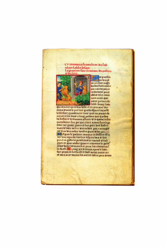

Last year, I was lucky enough to be in Chile, as a
guest of Mr. Agustin Edwards, the publisher of El
Mercurio. At one point, Mr. Edwards took me into
his magnificent library to show me several rare
books, among which was an illuminated manu-
script, circa 1495, of Aesop’s Fables. In addition to
admiring the Gothic-style lettering and the 66
miniature illustrations drawn in liquid gold, I rec-
ognized instantly the author’s ability to tell a com-
plete story in a few lines. Aesop was a precursor of
the Internet, I thought. One does not need to
“scroll” to read an entire fable. Whata utilitarian
and “modern” way to present valuable informa-
tion. The inspiration for the short “fables” in this
book was born there.
— D R . M A R I O G A R C I A
S E P T E M B E R 1 , 2 0 0 2

forewordJ O H N M I L L E R x i
introductionM A R I O G A R C I A 1
wordsH OW TO T E L L A S TO R Y 1 1
typeH OW TO U S E F O N T S 4 3
layoutH OW TO B U I L D A PA G E 7 5
contents

colorH OW TO C R E AT E PA L E T T E S 1 3 7
picturesH OW TO U S E P I C T U R E S 1 5 9
processH OW TO M A K E A R E D E S I G N W O R K 1 8 7
A P P E N D I X
ten myths of design2 0 1
acknowledgments2 1 0


xi
forewordJ O H N M I L L E R
If I had designed 450 newspapers and been called the most impor-
tant newspaper designer in the world, I’d be tempted to rest on my
laurels. Not Mario Garcia.
The architect behind some of the most successful redesigns in the
world, including The Wall Street Journal (U.S., Europe, and Asia),
Die Zeit (Germany), El Mercurio (Chile), El Tiempo (Colombia),
Liberation (France) and The San Jose Mercury News, Mario Garcia
continues to be a visionary leader in the world of publication design.
For the last thirty years, he has championed ideas about readability,
storytelling, and multiple points of entry and has helped define how
content is presented in all media with one fundamental goal in
mind: always design with the reader in mind.
But today readers have changed. People are inundated from so
many directions they don’t have the time to make sense of it all.
They flip, they scan, and they surf. All at once. Scarborough
Research recently reported that 91 percent of Internet users with a
TV in the same room surfed and watched television simultaneously!
(We usually blame the web for this, but it probably should fall on
remote controls, the device with which people began seriously
determining whether or not they were interested in a television
station—within five seconds.)
mario garcia
xii
Editors and designers have responded by cramming in more
and more and more and more, cranking up the volume in a
cacophony of grueling, information-dense pages and mesmerizing,
whirring screens.
But Mario’s response is a new kind of design: Clean, elegant,
usable, and true to itself. Design that stands out from the clutter
by presenting information in a radically simple, stripped-down
way. In a word, pure.
Pure design is not a revolutionary concept. In fact, its basic, “less
is more” principles apply to all forms of design. Mario’s series of
design solutions presented here will give designers new perspective,
help them decide what information is most important, and
provide successful ways to present it.
Mario’s ideas on pure design have been immensely helpful to
my team and are the reason for my involvement in this book.
We’ve been privileged to work alongside him and have seen the
effectiveness of pure design in action. Today, this philosophy affects
all of my work.
During a recent redesign, we finished the look and feel of the pages
quickly, but went through round after round of designs of the
information graphics, a key element in the new style. With each
successive revision, we peeled off another layer of unnecessary
information. It was a lot of work, but in the end we were left with

pure design
xiii
something brilliant: designs that were clean, simple, and instantly
accessible.
For decades, designers have looked to Mario Garcia for inspiration,
direction, and new thinking. In today’s information-riddled world,
the idea of pure design makes more sense than ever.
1
introductionM A R I O G A R C I A
Pure design is just what it sounds like—creating storytelling struc-
tures that are simple and uncomplicated.
Whether it is for the design of a newspaper, magazine, website,
CD cover, newsletter, or annual report, the inspiration for pure
design comes first and foremost from the content to be presented.
Once that has been established, pure design calls for what I refer to
as “look and feel” that is appropriate for the content and audience
for which it is intended.
After years of print design developing as a means to adapt to
rapidly growing technology, today design is starting to relax a bit,
sort of what happened in the late 1960s, when the so-called minimal
artists who emerged in that era insisted on stressing a certain
architectural precision, which led to clarity and a non-relational
organization of parts. Indeed, it was a style of expression stripped of
decoration and excesses. As minimalist artist Frank Stella famously
said of his painting, “What you see is what you see.”
For the visual journalist—those of us dealing with very specific
content aimed at chronicling a story—the motto could be “what you
see is how it is.”
mario garcia
2
My idea of pure design is inspired by minimalism. And, although
this movement found its truest manifestations in sculpture—
composed of modular units, aluminum and steel cubes, etc.—
one can relate to how artists of this group created, for example,
horizontal sculptures made of identical units. The overall impres-
sion, however, is what contributed to “telling the story.”
Likewise, pure design is a series of repetitions: how story structures
are created, how a grid is adhered to, with the same number of
columns and equal repetitions of white space, for example, with a
typographic cluster that is identical, and, if possible, based on one
family of type; all of which is ultimately highlighted by a color
palette, again, made up of similarly hued colors, and only a few,
which are constantly repeated.
To the minimalist artist, repetition of forms gave way to a grand
overall impression. The same is true for those of us who adhere to
pure design for telling stories in print and the web.
The segments that follow attempt to make clarity and simplicity
foundations for all we do as designers. If the story is told with clarity
and simplicity, then, indeed, “what you see is the story”. That, after
all, is the most important part of our job. However, in our work, clar-
ity and simplicity rely more on the designer’s instinct than on theory.
pure design
3
Design Theories
A graduate student from an American university recently wrote
seeking assistance with her doctoral dissertation. “I am trying to
establish some theories of newspaper design,” she explained.
My response was that there are no “theories” of newspaper design,
at least not in the abstract sense of the word. Newspaper design is
deeply rooted in practical realities and is more an organic than an
abstract theoretical process.
The most I could offer were some generalizations about what we
do with visual journalism:
Make it easy to read—use typography that is clear, easy on the
eyes and very legible.
Make it easy to find—employ navigational tools that allow the
reader to get to the content he or she wishes to read in the least
amount of time possible.
Make it visually appealing—provide an environment in which
good content will find attractive display, thus increasing the
number of readers who will use it.
Pure design is all about paving the way for readers to move
through a publication or website almost effortless, while enjoying
the experience.

mario garcia
4
Achieving Design Balance
How we achieve this level of design varies from medium to medi-
um, as factors such as size, format and time spent make a difference.
For practical purposes, let us examine how pure design applies to a
well-designed newspaper, knowing that its applications to magazine
and Web design almost parallel. A well-designed newspaper must
have:
Newsy and appealing front pages.
At least three powerful stories (high on emotion, low on baggage).
At least one wonderful photo that conveys it all in ten seconds.
A list of what I must know I’ll find in the paper today.
A very short list of what I should know if I have an extra five
minutes.
Something to make me feel good about me. . . .
Good indexing
An index has always been an important part of a good newspaper.
However, the emergence of the Internet, and the fact that so many
newspaper readers browse web sites, where navigation is a key
element, has made it even more important for the modern
newspaper.
pure design
5
Legible typography
A newspaper is, after all, for reading. It is a fact that about 85 per-
cent of what appears in most newspapers is text.
Uncomplicated page architecture
Good design uses a precise grid, with combinations of columns
based on a specific basic set, let us say five or six, from which other
combinations are created.
Steps to Design Success
In 1981, in the first edition of my textbook, Contemporary Newspaper
Design, I listed three challenges redefining the role of newspapers.
Today these also apply to the various media:
Accepting the emergence of television as a far-reaching medium
for news and entertainment
Satisfying the informational needs of a greater number of readers
who have moved to the suburbs and created news microcosms
within the large metropolitan area
Developing content relevant to the changing lifestyles of young
readers and reestablishing the newspaper habit among the large
number of nonreaders
mario garcia
6
For the most part, these challenges remain with us. But if I were to
reconsider them for today’s publication design environment, as a
publisher recently asked me to do, I’d list the top three contempo-
rary challenges redefining the role of newspapers as these:
Include local news. It’s what readers everywhere crave, followed
by better and easier-to-use information on health, technology, and
personal finance.
Coordinate with your website to provide more service-oriented
features and lists. Lists do very well with today’s readers.
Introduce supplements for younger readers, not necessarily about
entertainment but about issues of particular interest to this age group.
These challenges make the process of change, of redesign, even
more important than ever before. The key is getting all the
pertinent information before the project starts, and then establishing
a time line that accommodates a gradual process.
Here are some steps that are crucial to redesigning any product,
from a simple two-page brochure, to a major annual report,
magazine, newspaper, or website:
The briefing stage: All those involved discuss the scope of the project,
where they wish to take the subject of the redesign, visions of the
future (a redesign is done for the next two to four years, not for the
here and now), changes in content (which are vital to a good
redesign), navigation of the new product, and links to its website.

pure design
7
After this briefing, the team is ready to work on sketches, to visual-
ize abstract discussions, to make them a bit more real.
The sketching phase: Here the designers prepare two or three ver-
sions with different styles and typography to present for discussion.
This is one of the more creative aspects of the project, and my
favorite. The sketches are presented, discussed by all, and then
some conclusions are drawn. Now we either go back to the draw-
ing board and start again, or we take concepts from here and
there, to incorporate into a more final prototype.
The prototype phase: Here the team puts together a complete sample
of the new product incorporating all the agreed-upon changes.
Perhaps this version is tested with focus groups, which are then dis-
cussed, analyzed and a final prototype is then prepared.
The implementation phase: The team prepares its style manual and
trains designers and subeditors for the launching of the new
design. Training is an important part of what happens here. This
is what guarantees that a design will be followed.
Design for people and place
Finally, publications, especially newspapers, must fit in with their
city, their readers, and the communities they serves. Each newspaper
must have its own identity and personality, and not copy that of
another paper. Aesthetics is secondary to individuality.
mario garcia
8
Newspapers that do this that will be around for many more years.
Pure design does not work outside the limitations and requirements
of the technology we use to produce our work, and, most important,
without taking into account the realities of marketing, circulation
and the changing reading habits of people who live in an unprece-
dented information revolution.
The most successful projects are those in which a content realignment
precedes the redesign process, and the editors are ready to tackle the
issue of how to highlight that good content through design.
To that effect, we start with the creation of story structures, which
eventually lead to typographic components and then to the right
page architecture and color palette.
I could have probably told that doctoral student who asked about
theories of newspaper design that the phases described above,
although not specifically theoretical, constitute the basis of good
progression for design generally, allowing both journalists and
designers to divide the work into units that link processes and
stimulate creative thinking.
And pure design does not exist without a good sprinkling of
common sense, the ability to surprise oneself with new concepts,
and that element of passion that separates the magnificent project
from the rest.